For my first assignment, I had to create a greetings card to introduce myself to my tutor. I had to use it to communicate my interests, inspirations, the materials I feel happy working with, and maybe what I want to get out of the course. I could produce it in any form an size, using any materials.
I started by splitting a page of my sketchbook into 4 and jotting down anything that came to mind in relation to the 4 areas I needed to communicate.
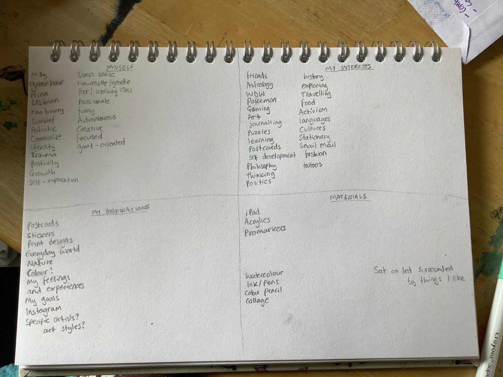
Then, I started drawing out ideas, trying to figure out what it was I wanted to say. I reduced down my initial list to the key things that I felt were important. Me: my name or myself, my green hair, my identity as a lesbian and as a disabled person, my cat, my dress sense. My interests: the TV show Friends, astrology, pokemon, gaming, art, postcards, my love of learning. My inspirations: colour, nature, the world around me, and specifically patterns on anything and everything I see. Materials: I’m most comfortable using my iPad and creating digital art. I do enjoy physical art too, but digital is where I feel best suited.
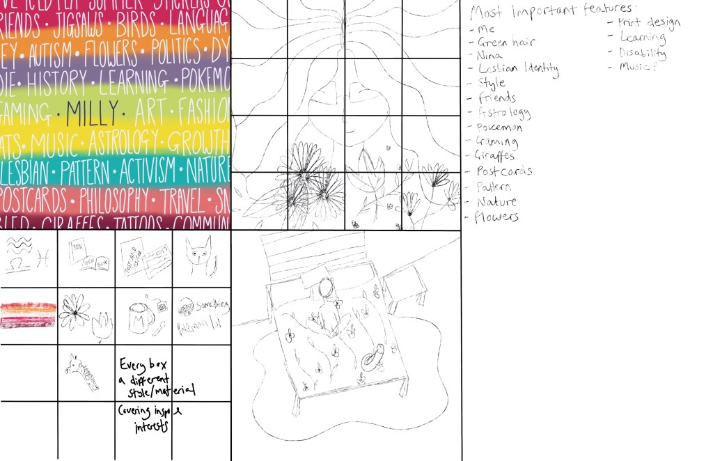
My first idea was to paint a background using acrylics, something I’m less comfortable with but use quite a bit, and then simply write the things that are important to me over it in white pen/ink, with my name being in a darker bolder colour in the centre. This felt like a greetings card, but it also felt a bit too simple and basic. It included a lot of information about me, and touched on some of my artistic tastes, but I didn’t feel it expressed enough.
The second and third ideas were similar. The basic idea was to split the card into 16 squares, every square being drawn in a different style or with a different material. I don’t feel like I’ve found a specific style that I can call mine yet, and I’m still exploring a experimenting with that. I have a lot of different inspirations and interests artistically and I wanted to express that. The second idea was to have one drawing, of myself, with various flowers and leaves surrounding me, and split that into different styles. The third was the have 16 different drawings of the different things relating to me, again split into the different styles.
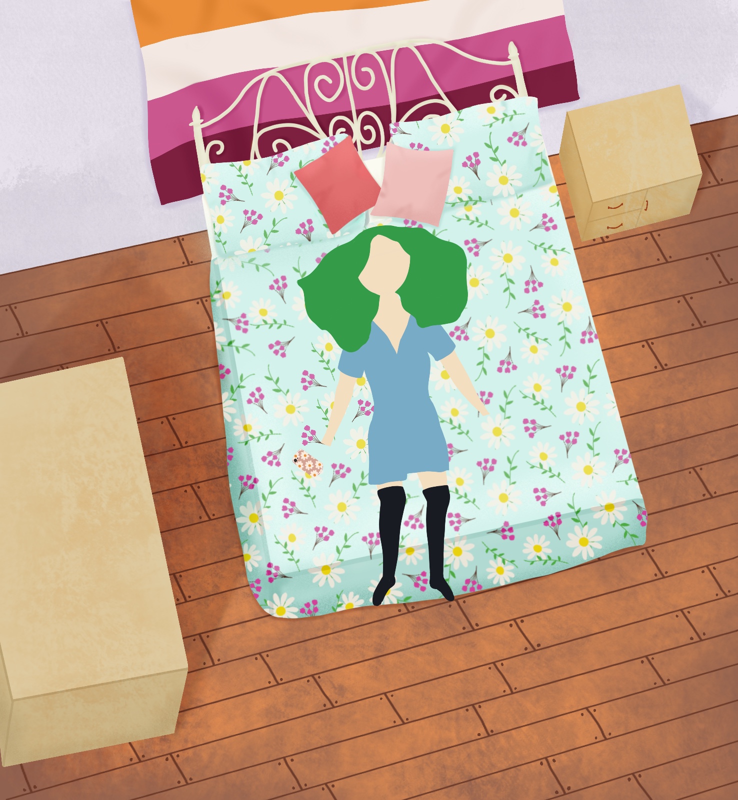
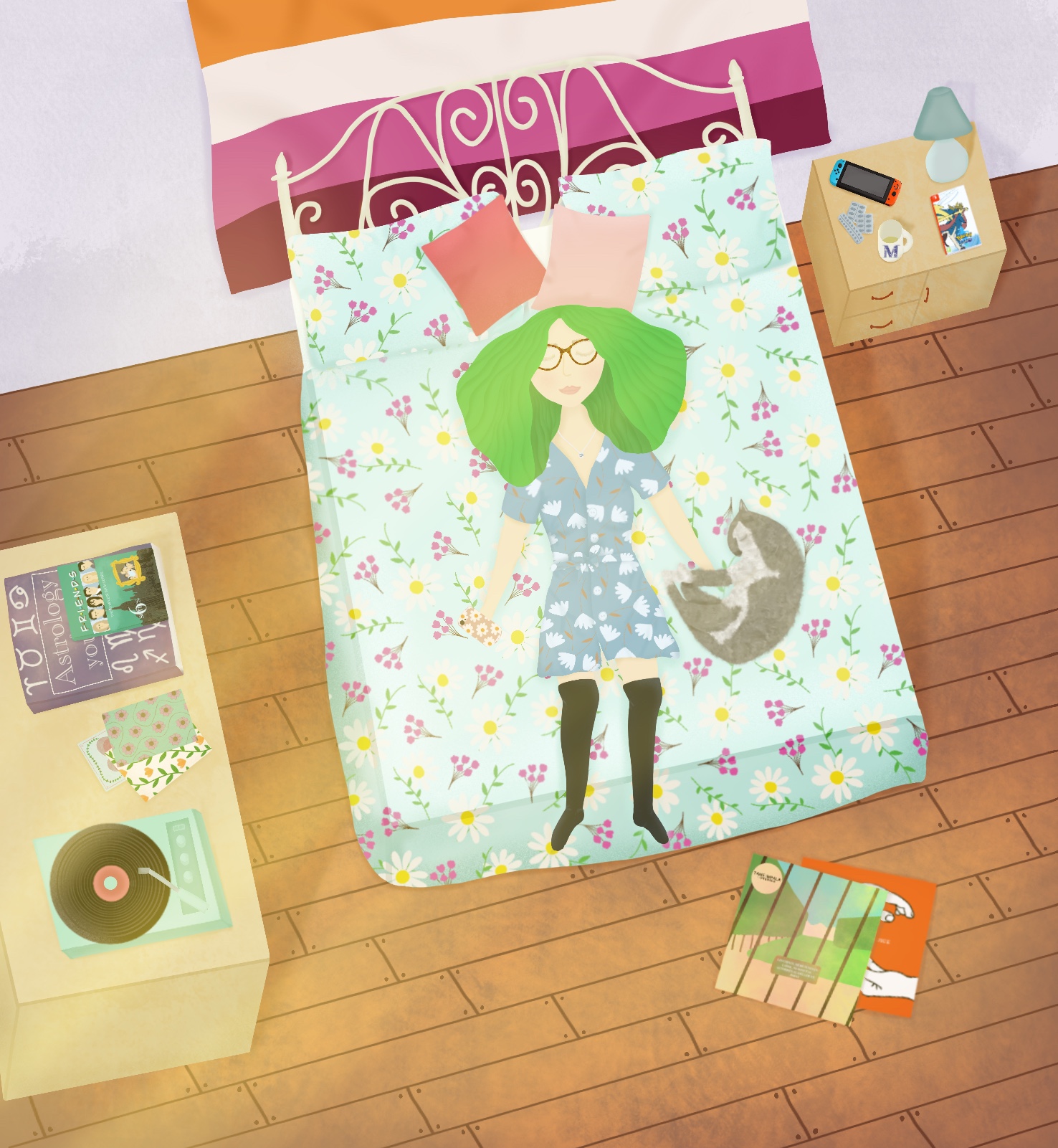
The fourth idea was one I suddenly had when I wasn’t actually working on the assignment. It seemed really simple and like it connected to me, but was also disconnected enough to seem like a greetings card. It would be me, sitting on my bed, surrounded by things that hint at my various hobbies and identities. I decided to go with this one, as I had a good idea of how to produce it, and I felt confident in it as a final piece.
I decided to add a video of the design process here, so it can be referenced whilst I discuss it. I began by writing a list of the elements I felt needed to be included in the piece. Then, I drew up a rough draft of what would be included and where it would go. I had a top down view of a fantasy bedroom, with me sitting cross legged on the bed. I added tables to display books and had several items on the bed around me.
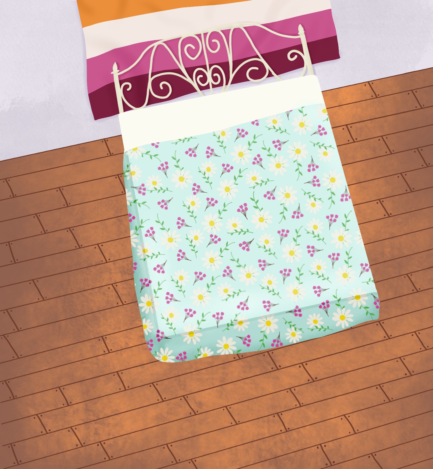
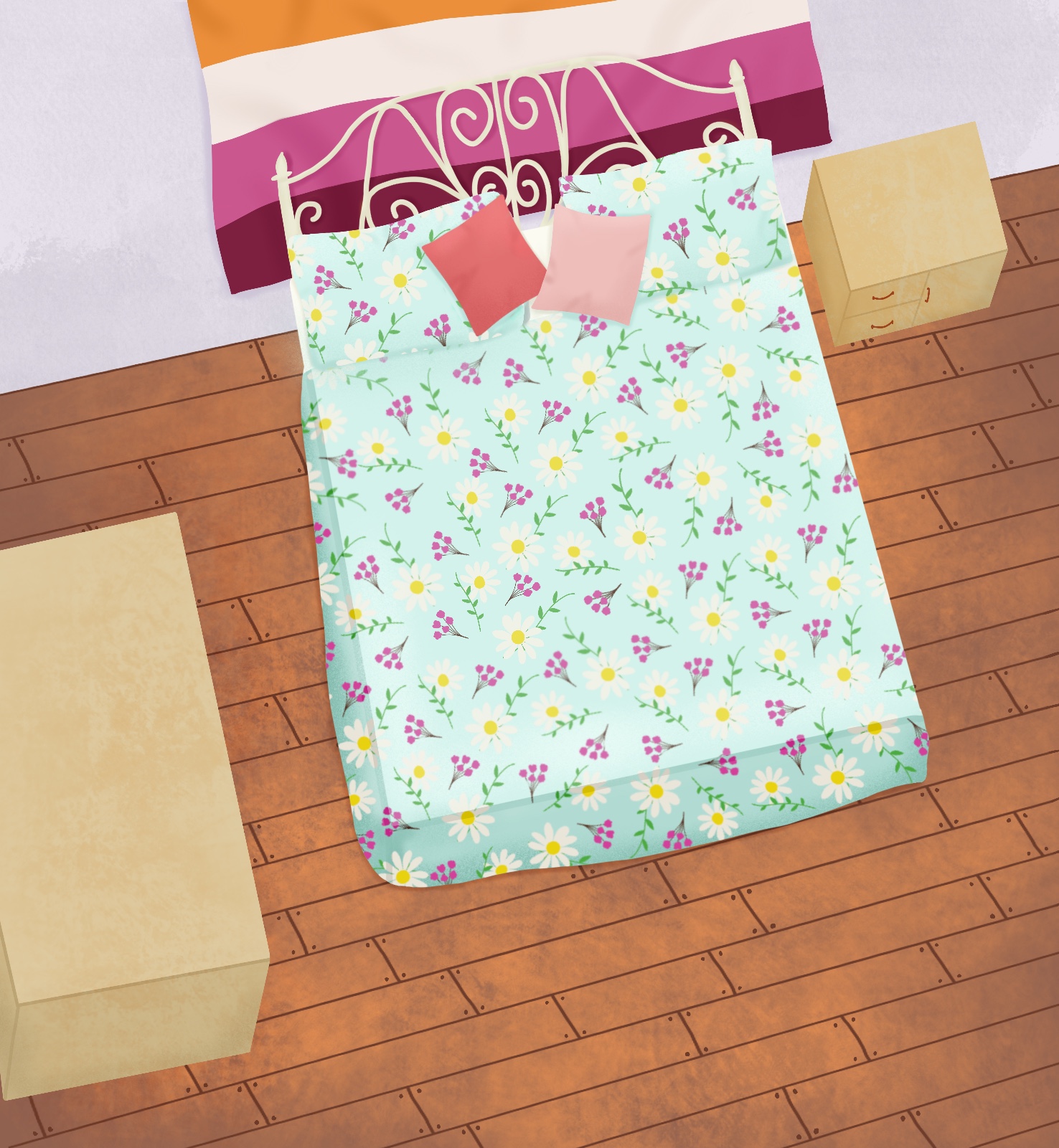
Starting the piece was hard. I didn’t know where to begin, it was a lot to do and it felt quite overwhelming. I tried drawing some outlines and colour blocking but it just didn’t feel right. I decided to strip everything back and work from the ground up, starting with the floor and wall, and adding each element individually as if it were a real life room.
This was a slow going piece at first. I didn’t know exactly what I was doing or how to create the look I was going for. However, about half way into the piece, I had a solid idea of what I was doing, and that sped up my process hugely. Hopefully if I create work like this again, it’ll be even faster, because I know how to create the textures and styles I want to.
Whilst working on the piece I made several changes from my original sketch. I moved the table at the front of the piece to the left as I felt it filled the space better, and I removed the door. I decided to draw myself lying down rather than cross-legged, as it worked better with the top-down view. I moved the elements from my bed to the tables as the pattern on the bed made it difficult to see anything on it, leaving only my phone in my hand. I also decided to not draw a rug, as I really liked the flooring, and felt the rug made the piece too busy.
I loved designing the prints for the bedding, my dress, and the post cards. This is the sort of thing I would like to do with my illustrations, so getting to do it on a micro level was so enjoyable. The prints are similar to ones I would buy and also ones I would create. I also felt it showed my style really clearly.
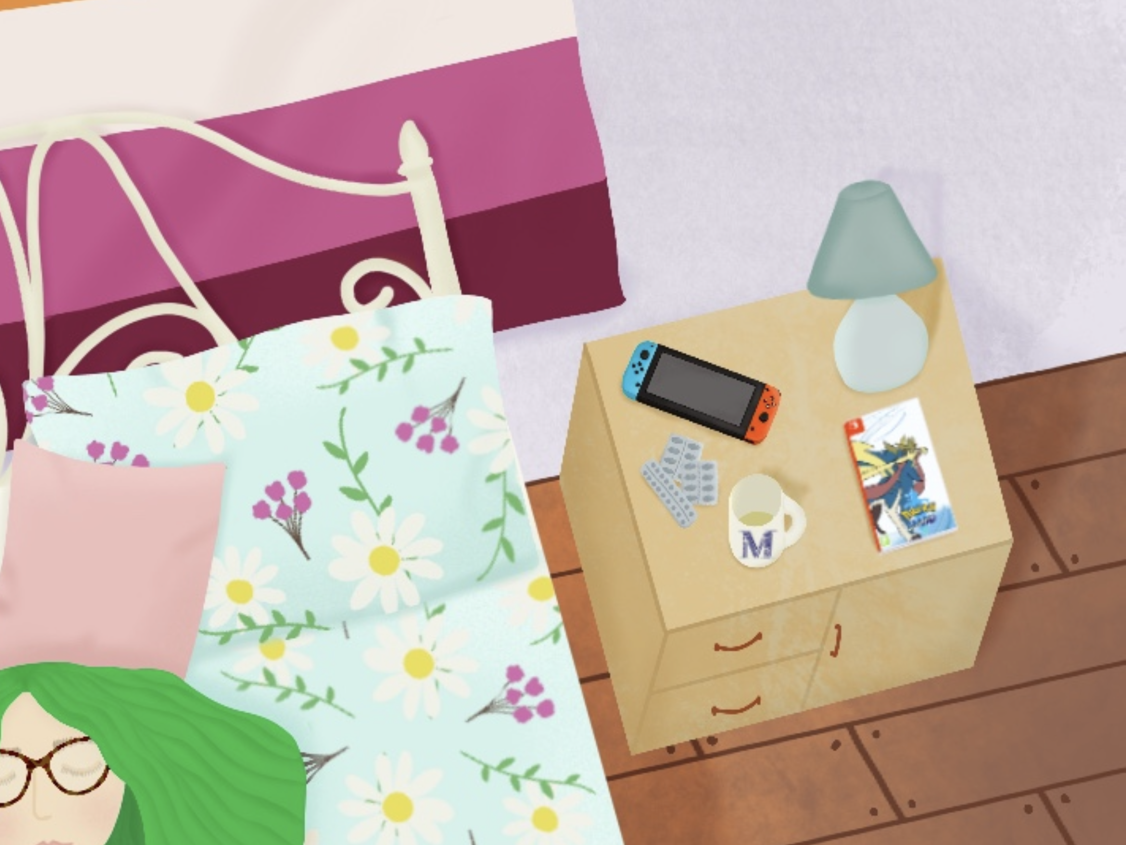
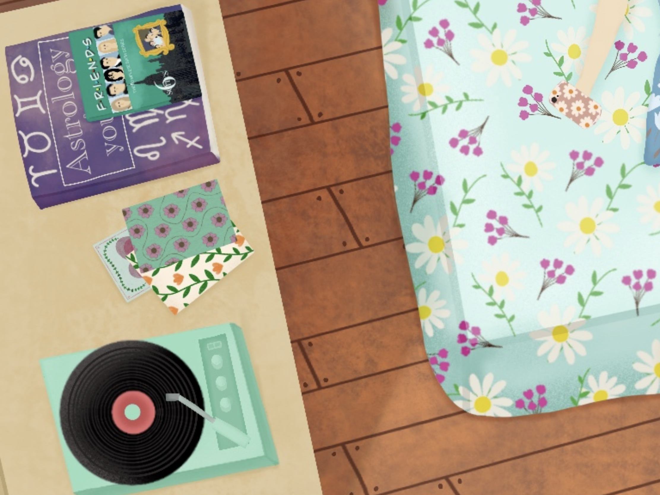
On the table on my right, I have a Nintendo Switch, a Pokemon game, a mug, and some medication packets. The Pokemon game replaced the Pokemon plush I was originally going to draw on the bed. I also drew a standard Switch, as the one I own is a limited edition Pokemon themed one, and I wanted it to be recognisable. The mug is one of my favourites, and it was really fun to recreate it. I also included the medication packets as a nod to my experiences being disabled.
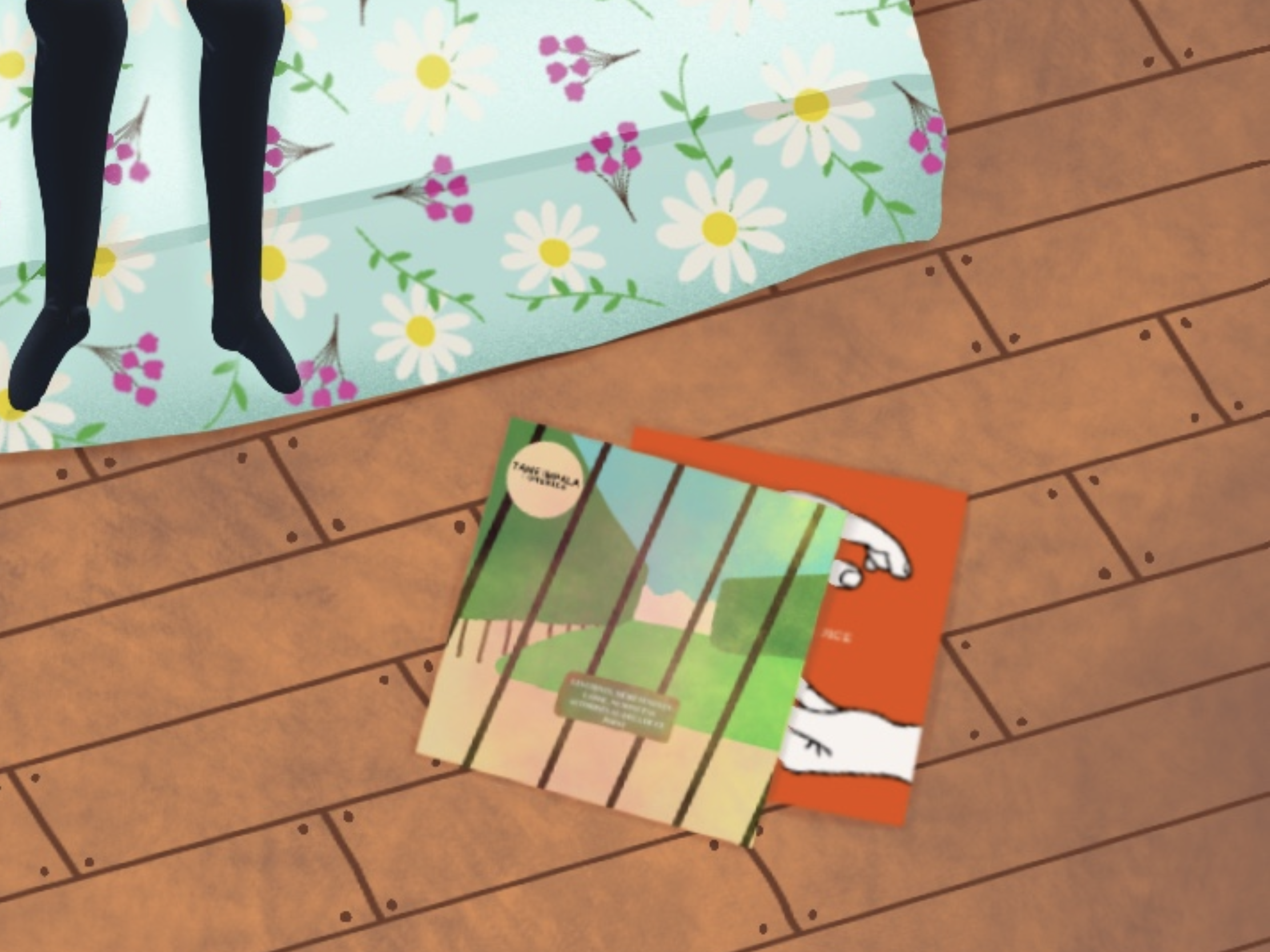
As this piece progressed, I realised that music was such a huge part of my life I had completely bypassed when working on ideas. To have me lying on my bed listening to a record seemed brilliant, and fitting to how I spend my time. So the record player and vinyls took centre stage. It worked well as I was looking for something to include in the bottom right space. I had thought a plant would work, but I feel the floral decorations point to my nature inspired style enough. The vinyls are two albums I love, Lonerism by Tame Impala, and Hospice by The Antlers.
The table also has three postcards, an astrology book, and a Friends DVD case. They all had their own challenges. The Friends case was hard to do on such a small scale, the astrology book seemed really plain, and the postcards, again, were difficult to scale. I had to go simple to keep the detail, which I learned quickly with the Friends case.
I did trace a few elements of this piece. First was my glasses. I wanted to maintain the shape, but as I need them to see, I struggled using them as a reference. It felt easiest to just outline them and create the texture myself. Then I traced the pictures of the Friends cast, just to colour block roughly where things were meant to be, so I could shrink it down and it still be recognisable. I also edited an image of the New York skyline to use on the DVD cover. Then, I traced a rough outline of Zacian (the Pokemon on the game box), and the Pokemon logo. Lastly I traced an outline of the hands for The Antlers vinyl cover. For all of these elements, I wanted them to be recognisable for what they are at a small scale, and tracing them was the best way I could think to do that.
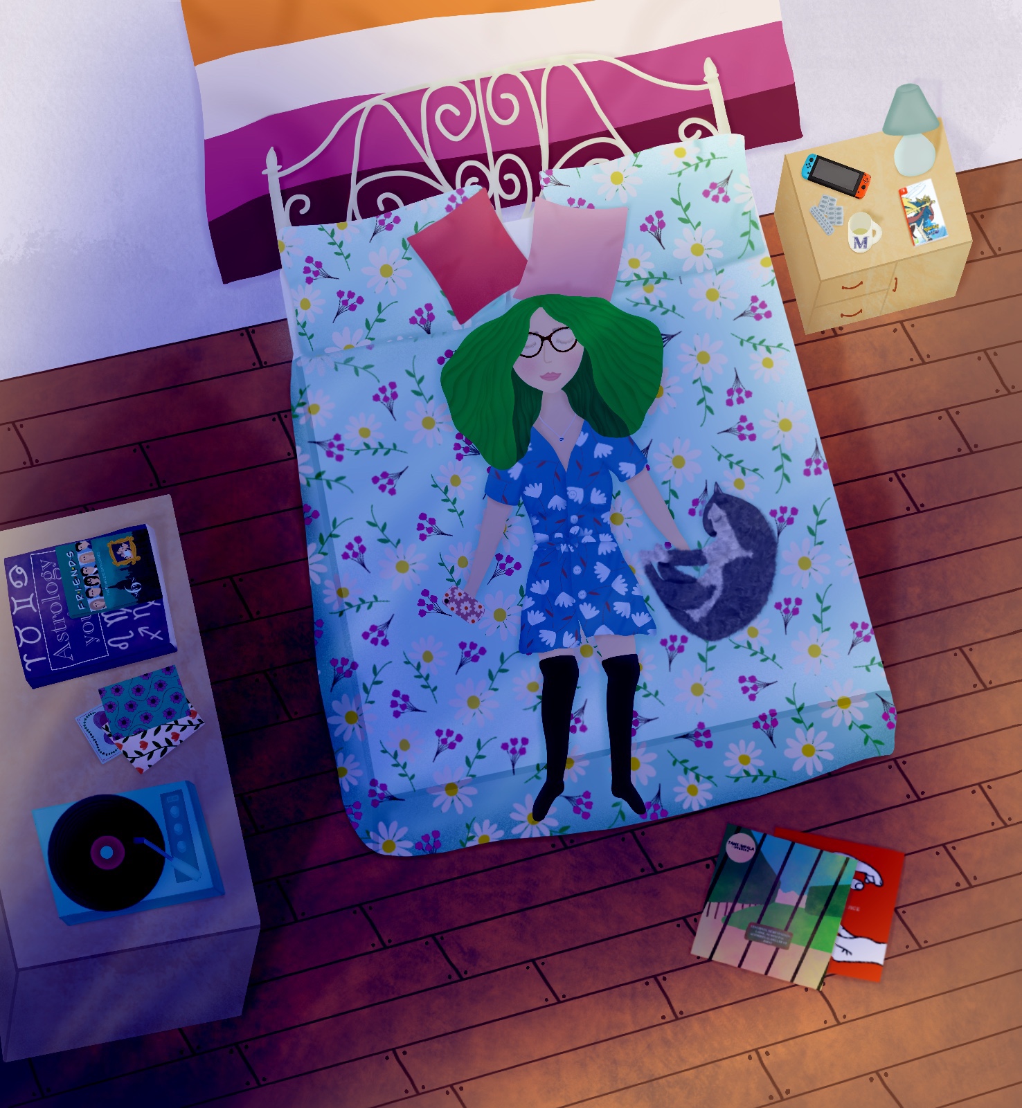
The last thing I did for this piece was add in some rays of light. I tried a few different blend modes and techniques, and ended up with day and night versions. I don’t know if I prefer the piece without the light, and I think as the intention was to have it in daylight, the night version could do with some more work.
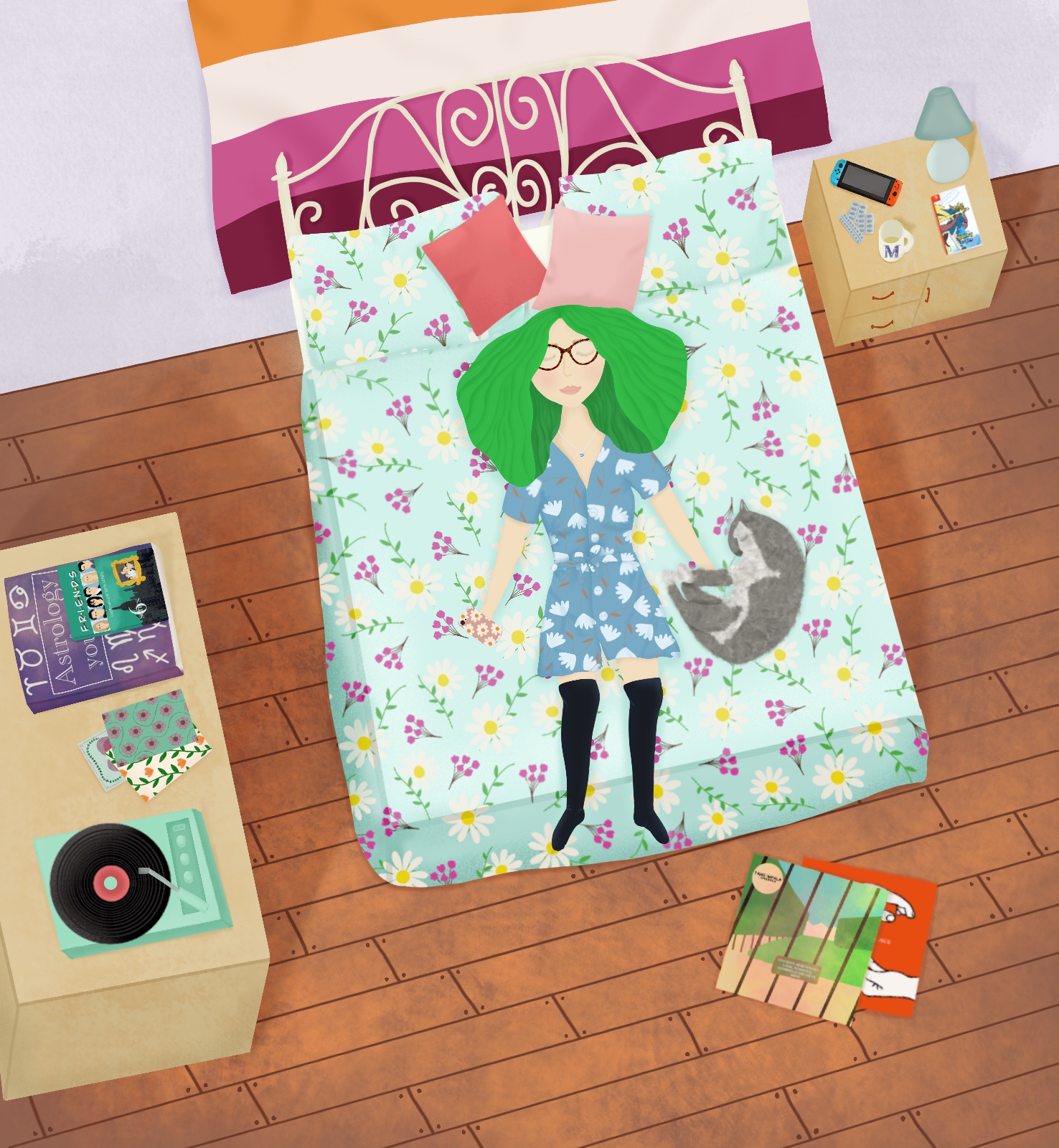
On reflection, I think I bit off a little more than I could chew with this piece. I loved doing it, but found myself having to scale back repeatedly on what would be in the final piece. I wanted to include as much as possible, but found it getting busy and cluttered, and that I was taking lot of time on tiny individual elements. Despite that, I am really proud of the finished image. I love the way it looks and how everything fits together. The only thing I would change is my cat, Nina. I wanted to add a fur texture to her, and as a standalone I think it works well, however it looks out of place with the rest of the image. I think redrawing her, maybe stretching by the bed, would look better.
I learned so much whilst doing this piece, and I have a lot of areas I would like to develop and explore. I want to experiment with what exactly my style is, to learn how to use more bold and striking colour palettes, and I would love to develop my Procreate skills even further.

[…] Whilst reviewing the brief, I remembered how my first assignment for Key Steps in Illustration was a very similar theme. I was asked to design a greetings card that introduced myself to my tutor, much in the same way as this brief asks. This was my first-ever assignment for my degree, and before I continued with this assignment, I wanted to take a minute to reflect on it and on how my work has grown since. The full assignment can be found here. […]
LikeLike