The first exercise in part 2 asks you to work backwards, finding an illustration you have some connection with and writing the brief that could have been for it. To find my illustration, I started searching the list of artists I saved from IllustrationX in part 1. It was hard to find something I had a connection to that I also thought could be worked with for this exercise, as many of the illustrations don’t seem obviously for any purpose.
I ended up picking an illustation by Paul Daviz. I love the flat colours and style, and the texture overlay that makes the image seem like its straight from the 60s, despite it being from 2019.
The brief
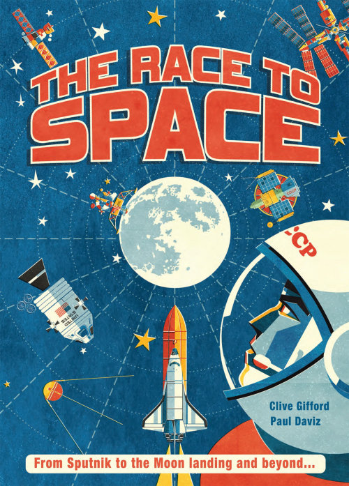
I am looking for an artist to create a book cover for a children’s book entitled ‘The race to space’. The cover must include the title text, and the text ‘From Sputnik to the Moon landing and beyond…’. The authors name, and the name of the artist, will also be featured. The book is educational and aims to teach children about the history of space travel and the rivalry between the USA and Soviet union in the 1960s. It is being released to commemorate the 50th anniversary of the US moon landing. The book should look historical, dated, and of the time it is celebrating. Inspiration from 1960s space propaganda is required and encouraged.
The cover must include illustrations of the moon, multiple different space shuttles/stations/satellites, at least one rocket (used in the space race), and at least one astronaut. Use space technology from both sides of the space race. Moon and astronaut illustrations should be a focal point, as the book is about the moon landing and what got us there. The text should also be a focal point, and easily readable. It should be understood from the image what the book is about and what it contains.
Please use eye catching colours, especially bold ones, with a similar colour palette to NASA/Soviet space developments. Cartoonish and stylised designs are desired, much like those in early space propaganda. A hand drawn, photocopied effect would suit this well. Flat colour, and block shading.
Reflection
I found this to be a challenging exercise, and actually put it off for a while as I was quite overwhelmed. Working backwards was difficult and daunting. I felt like by choosing something that is obviously a book cover I was almost giving myself the easy way out. However, I ended up enjoying analysing it and thinking like a client rather than an artist. I feel like I understand how to get the most out of a brief too, now.
