
This exercise was about experimenting with different materials and papers. I was asked to create a sketchbook with different kinds of paper using a variety of surfaces and textures. I then had to pick an object, and draw it on all the different sheets in my sketchbook, using a wide range of different media to do so. I had to practice using the media in different ways, and explore how each one worked with the different papers.
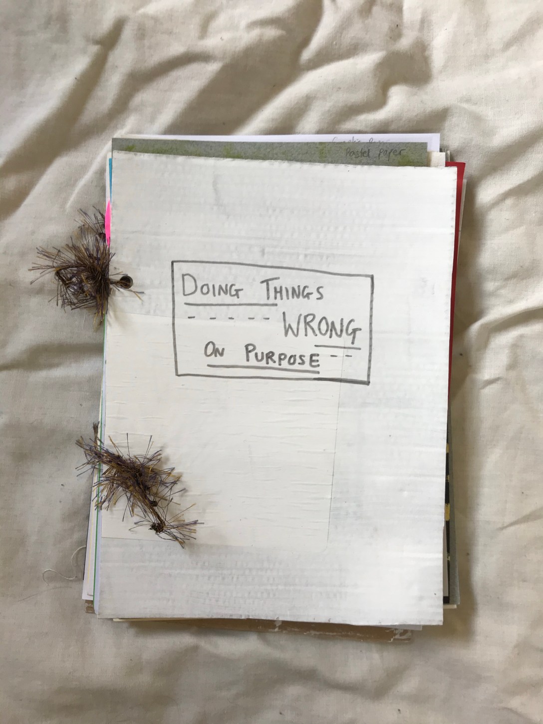
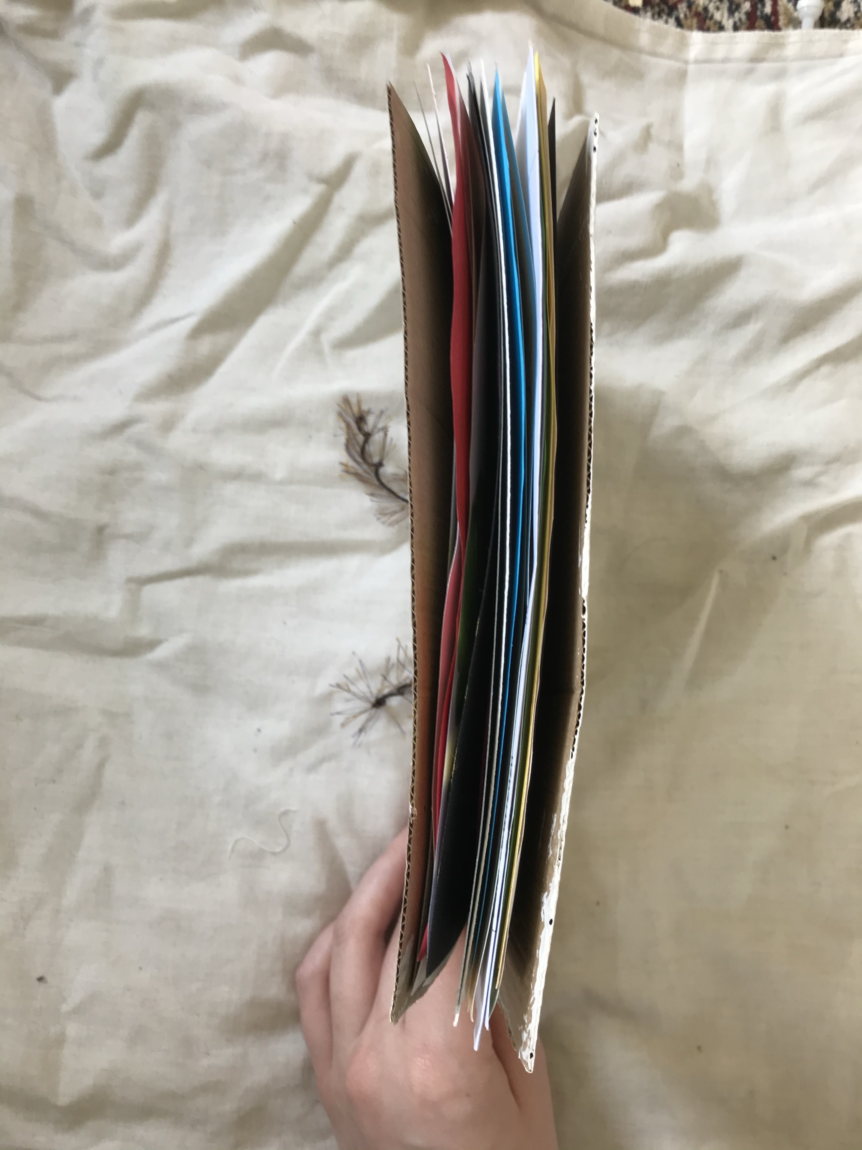
To start, I collected paper for my sketchbook. I decided to make an A5 sized book, and as most of the paper I collected was A4, I wanted to have two pages of each paper type. I ended up with 22 pages, and a cover I made out of cardboard. I painted the cover white using acrylic, and decided to name the book ‘Making Mistakes on Purpose’. I find naming my sketchbooks useful as they help me stay focused to a theme, if I pick one. Finally, I punched holes in each page and strung them together with some wool I found and liked. I did want to use string originally, but didn’t have any.
My sketchbook is made of:
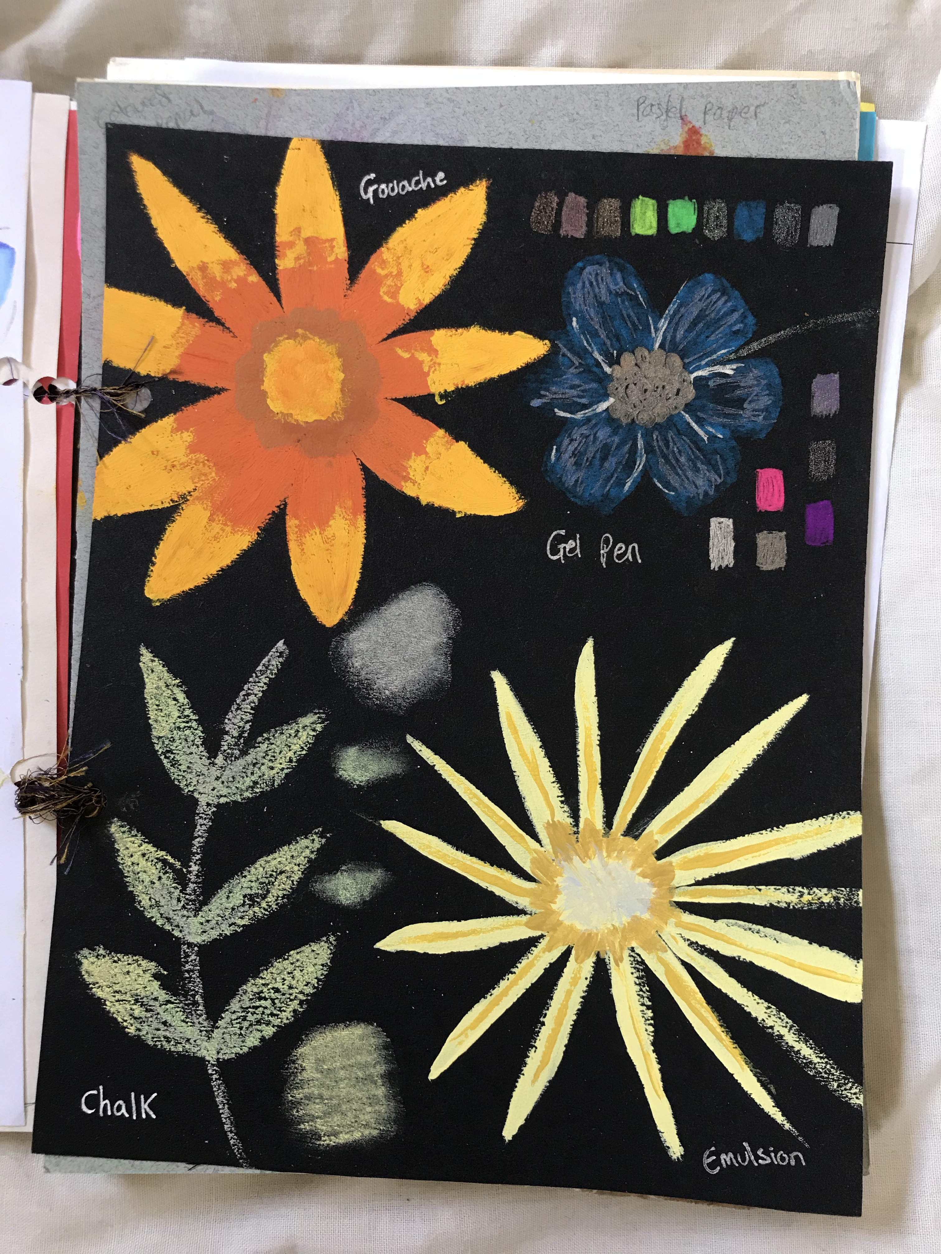
– Pastel paper, in shades of grey and sand
– Acrylic paper
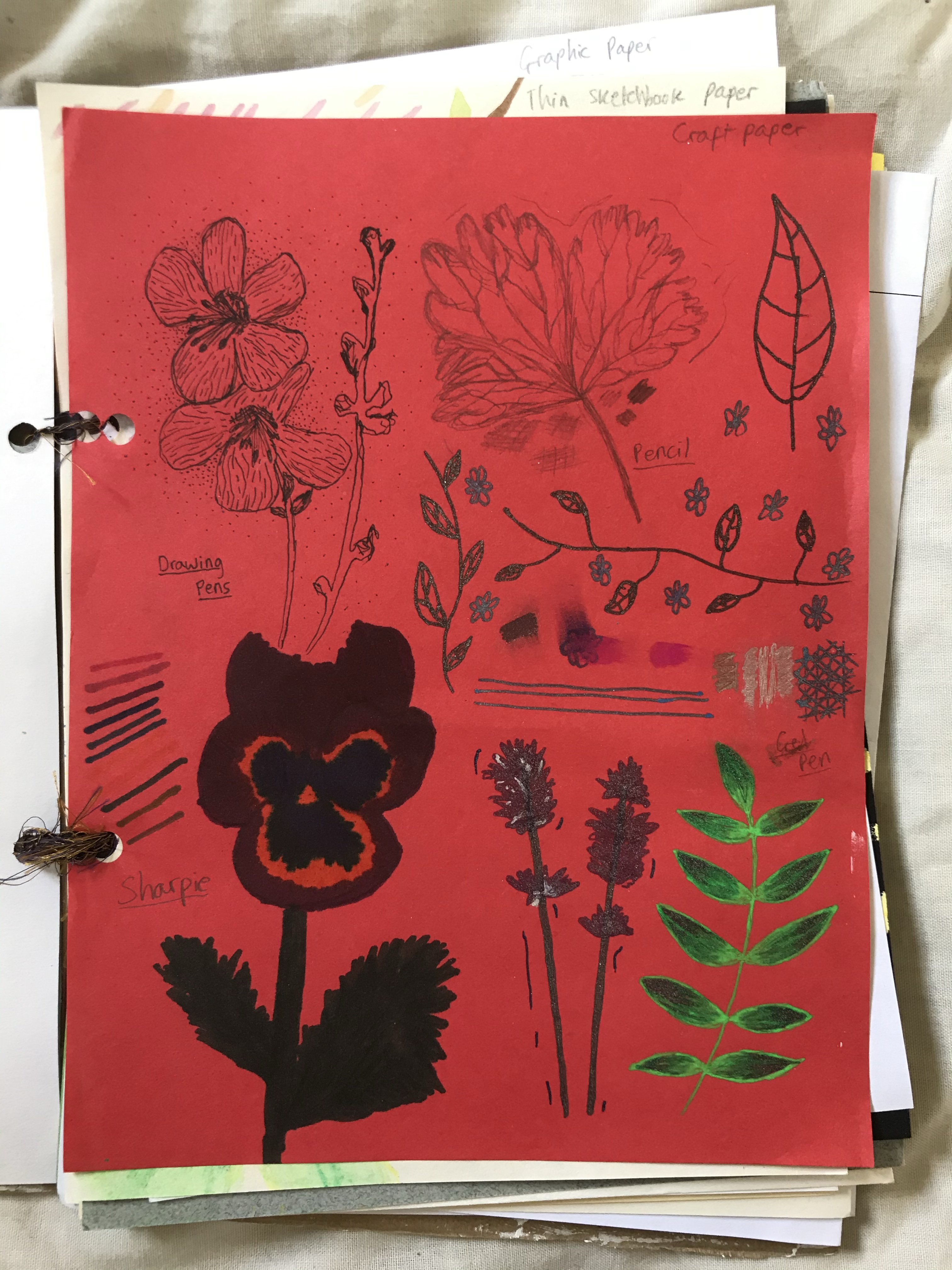
– Four colours of craft paper; Red, Blue, Green, Yellow
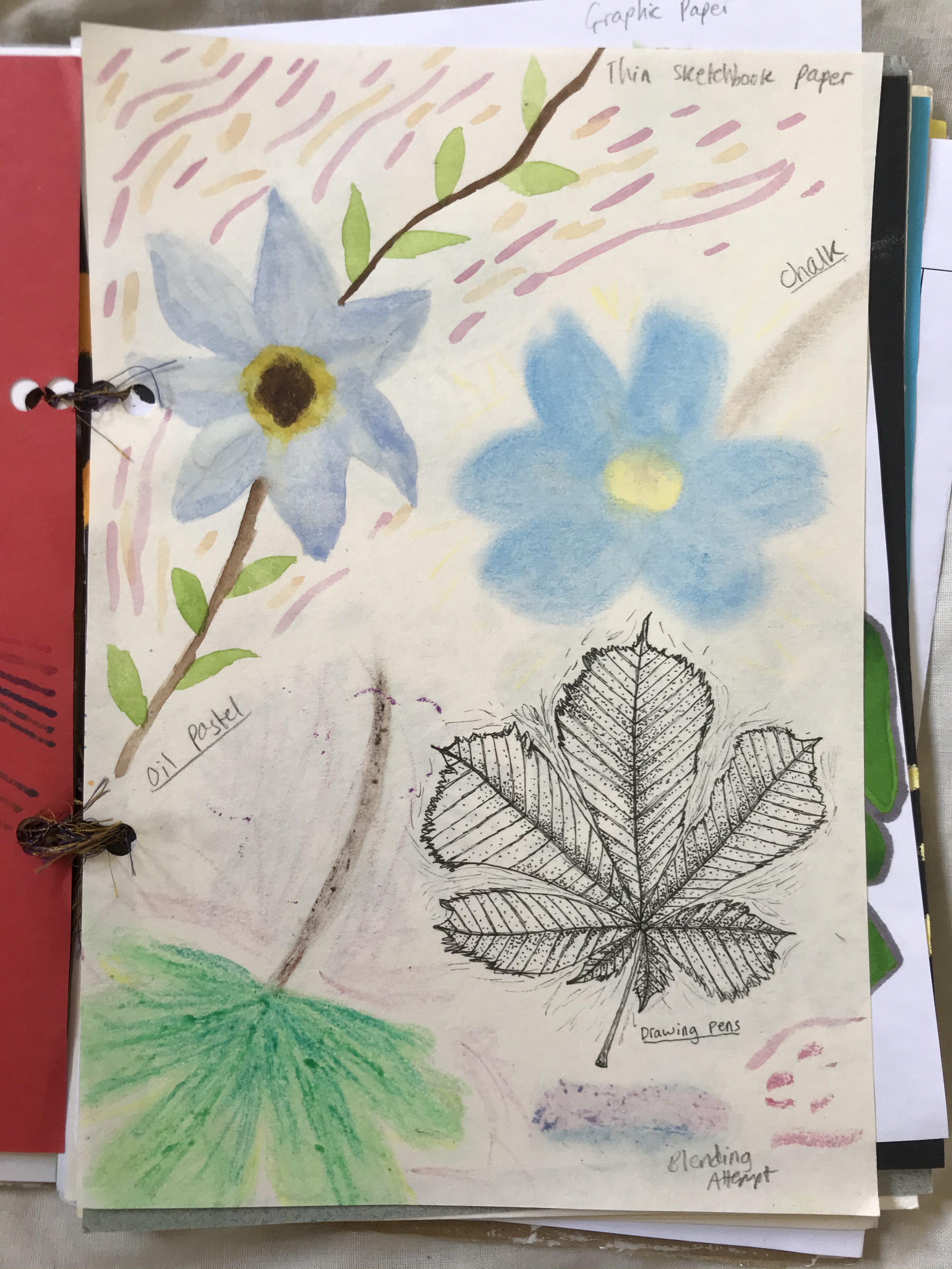
– Thin, cheap sketchbook paper
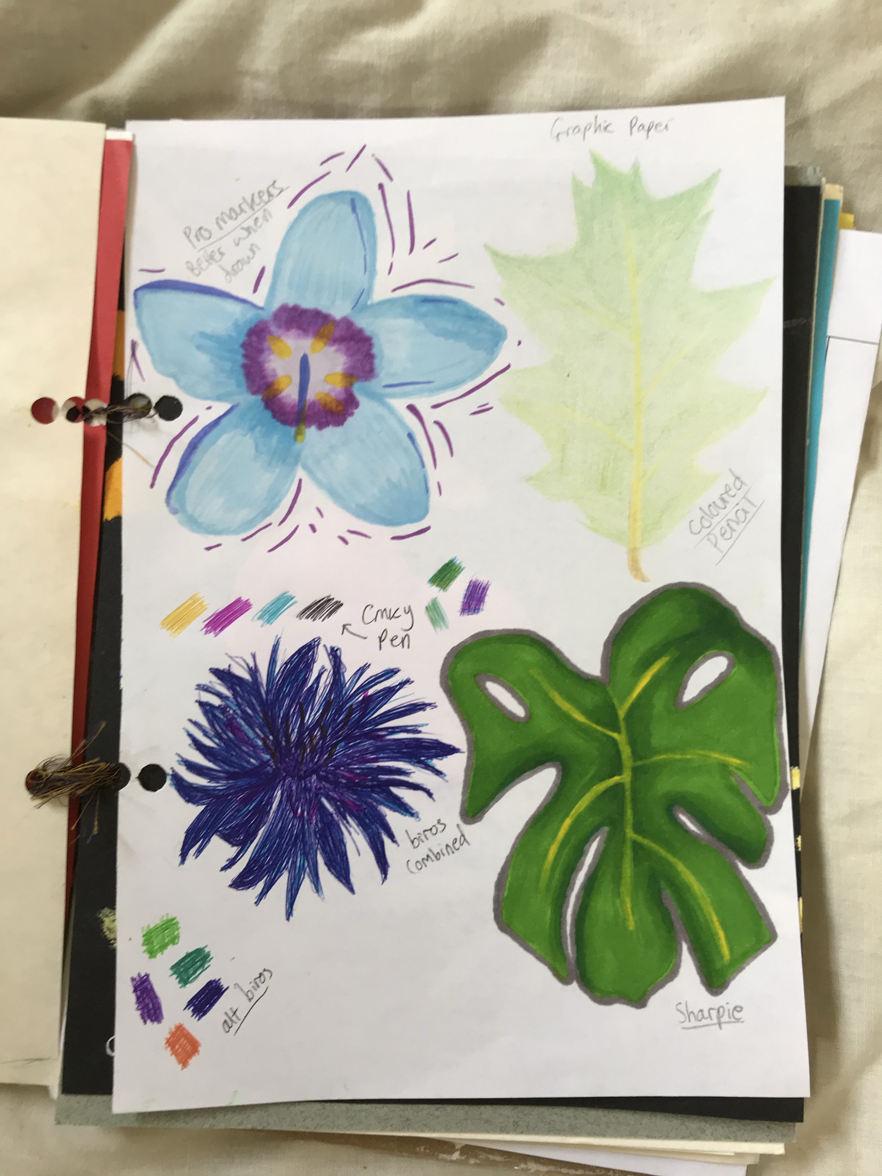
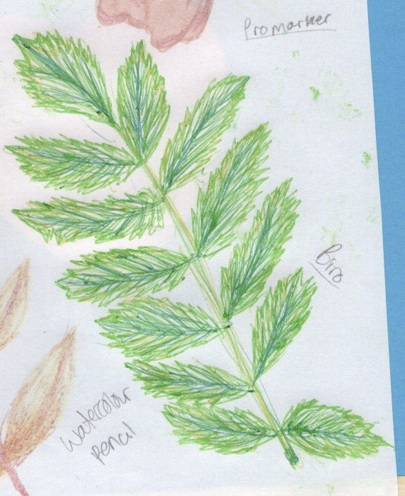
– Promarker graphic paper
– Black card
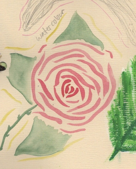
– Watercolour paper
– Printer paper
– Heavier, higher quality sketchbook paper
I organised the paper randomly, so that each page is different from the last with no consistent order. This was both for visual appeal, and to ensure I didn’t get too comfortable. I felt that if I knew which page was coming, I would plan accordingly, and try to line up which materials I used and stay ‘safe’. At first, I also picked the materials randomly. I drew up a numbered list of all the materials I was using, then got friends to suggest numbers without knowing what they were picking or why. This made it challenging for sure! Later on in my process I started choosing my materials myself, as I wanted to ensure each one got enough usage.
The materials I used are:
– Promarkers
– Watercolour pans
– Gouache
– Emulsion sample pots
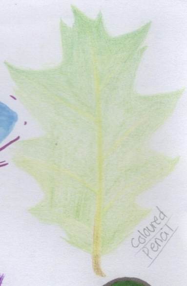
– Coloured pencils
– Biros
– Oil pastels
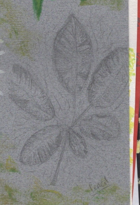
– Pencil
– Gel pens
– Watercolour pencil
– Sharpie
– Acrylic
– Chalk
– Drawing pens
I raided my art supply cupboards for these, and made sure I picked things I hated using, that I was unfamiliar with, or that I felt were ‘bad’. The oil pastels for example are very cheap and old, and I very rarely use them as the quality is poor. The gouache was brand new and unopened, and was a material I was entirely unfamiliar with. Some of the papers were new, too, and I hadn’t used some (like the graphic paper) for quite a while. Aside from the odd piece of physical work, I have spent the last few years working digitally. I was really excited to get stuck in and to start exploring each of the materials I had picked.
Choosing an object was easy. I love drawing florals, so I went with flowers and leaves. I thought it would give some change in content (so I wasn’t drawing exactly the same flower on repeat) but also similarity enough to see consistency and differences in the materials. It also would allow me to use a range of colours and tones. My plan was to fill each page with 4 flowers/leaves, each with a different medium. I’ve done a lot of mixed media in the past, but rarely experimented with singular mediums, so I wanted to use each medium alone. No sketches, no planning, no additions, just plain and on paper. I was going to fill one side of the book, then flip it, and fill the backs of each page, introducing mixed media at that point once I had a better understanding of my canvases.
My first page was a joy. I loved getting messy with the paints and using new paper. I felt like I was learning already! On my second page, however, I hit a wall. The materials weren’t working how I wanted them to, I had spent 45 minutes on the first page, and I was starting to get stressed and tired. Creating a beautiful sketchbook filled with experiments felt unlikely, and I was crushed. I took a step back from the work, intending to return to it the next day, and instead came back weeks later.
I was very, very in my head. I wanted it to look good. I wanted to be proud of it, and to feel a sense of achievement. But I was dreading it. I didn’t want to use materials I was unfamiliar with, and I couldn’t stop finding mistakes in my work. When I was working on the pieces, I was getting so frustrated by my inability to create exactly what I wanted that I was giving up. I procrastinated and put off each new page for weeks, filling my time with other art instead.
In a way, this was actually a super helpful experience. While putting off these experiments, I joined a sketchbook circle, bought a travel sketchbook, invested in new sketching pencils and chalk pastels, researched how other artists use their sketchbooks and specifically watched sketchbook ‘fails’. I followed many new illustrators and artists on Instagram, and saw their raw work and processes. I experimented in my own ways with style and worked through a great deal of stress through these books. It wasn’t intentional, it just fell into place at the right time. I felt so much freer and able to make mistakes and be imperfect. I think this is visible in the progression of this sketchbook. The later pages are a lot less pretty and careful.
The experimental sketchbook, however, was still haunting me. I knew I could be freer and easier on myself, but actually doing the pages was a huge trial. Part of this was boredom, I was sorta sick of seeing the same things all the time. Another reason was the sheer massiveness of the task. If I completed the entire sketchbook including mixed media on the reverse sides of the pages, I would have 184 individual illustrations. Even half of this, at 92, felt really extreme. I decided to only fill the first half of the book, 46 individual drawings, and leave the rest as an option for an ongoing project. I love drawing flowers and leaves, and it’s something I will always want to do. Having space to play and mess around whilst doing this is something I think I will value.
Material Analysis
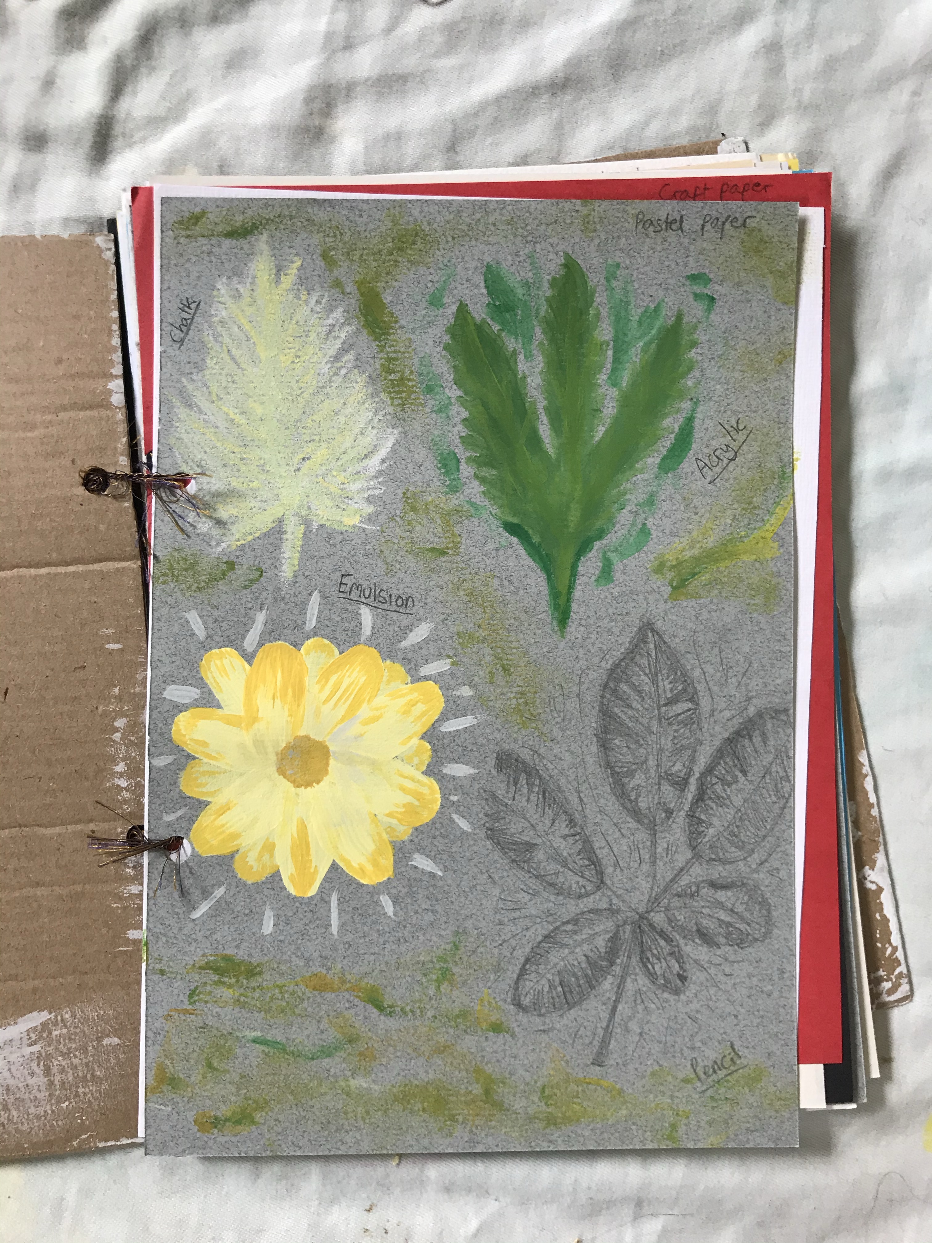
Chalk
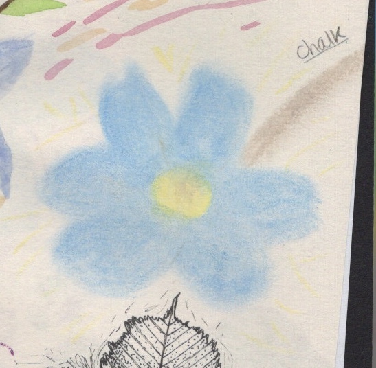
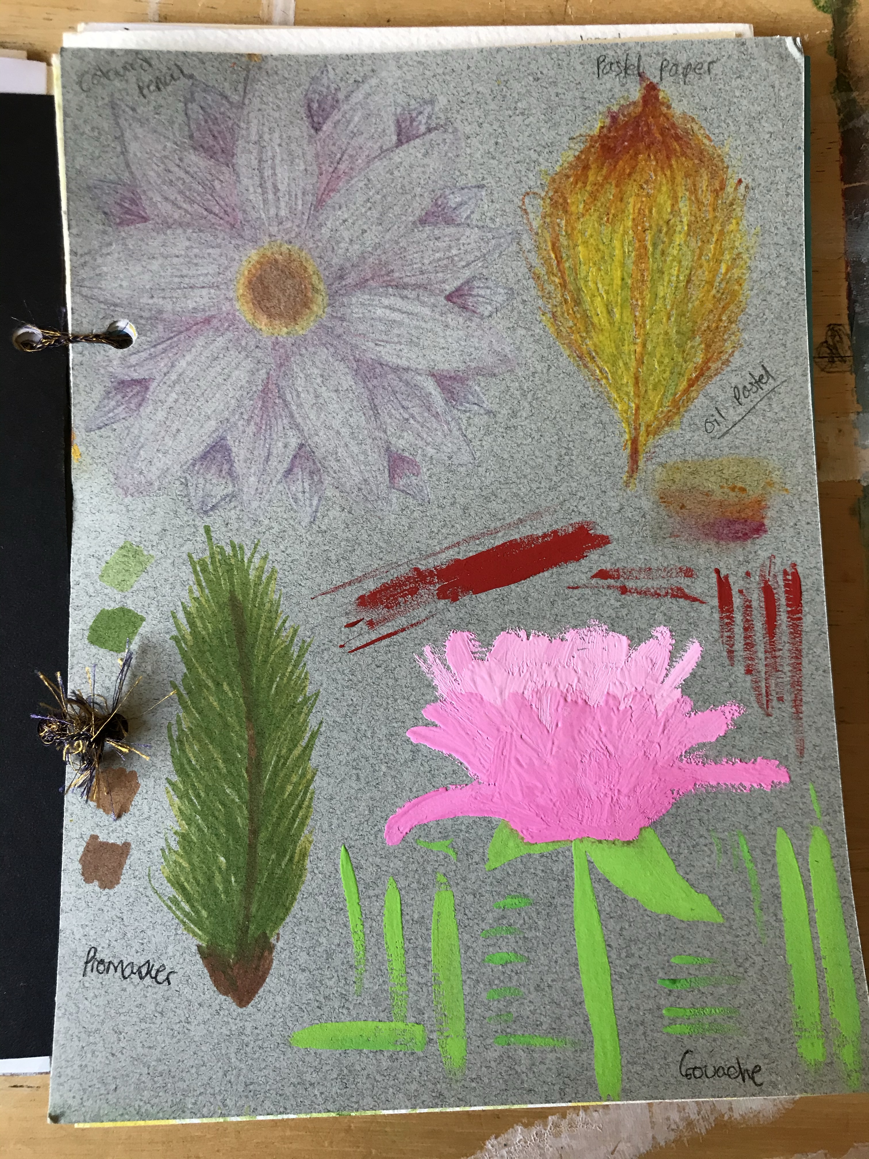
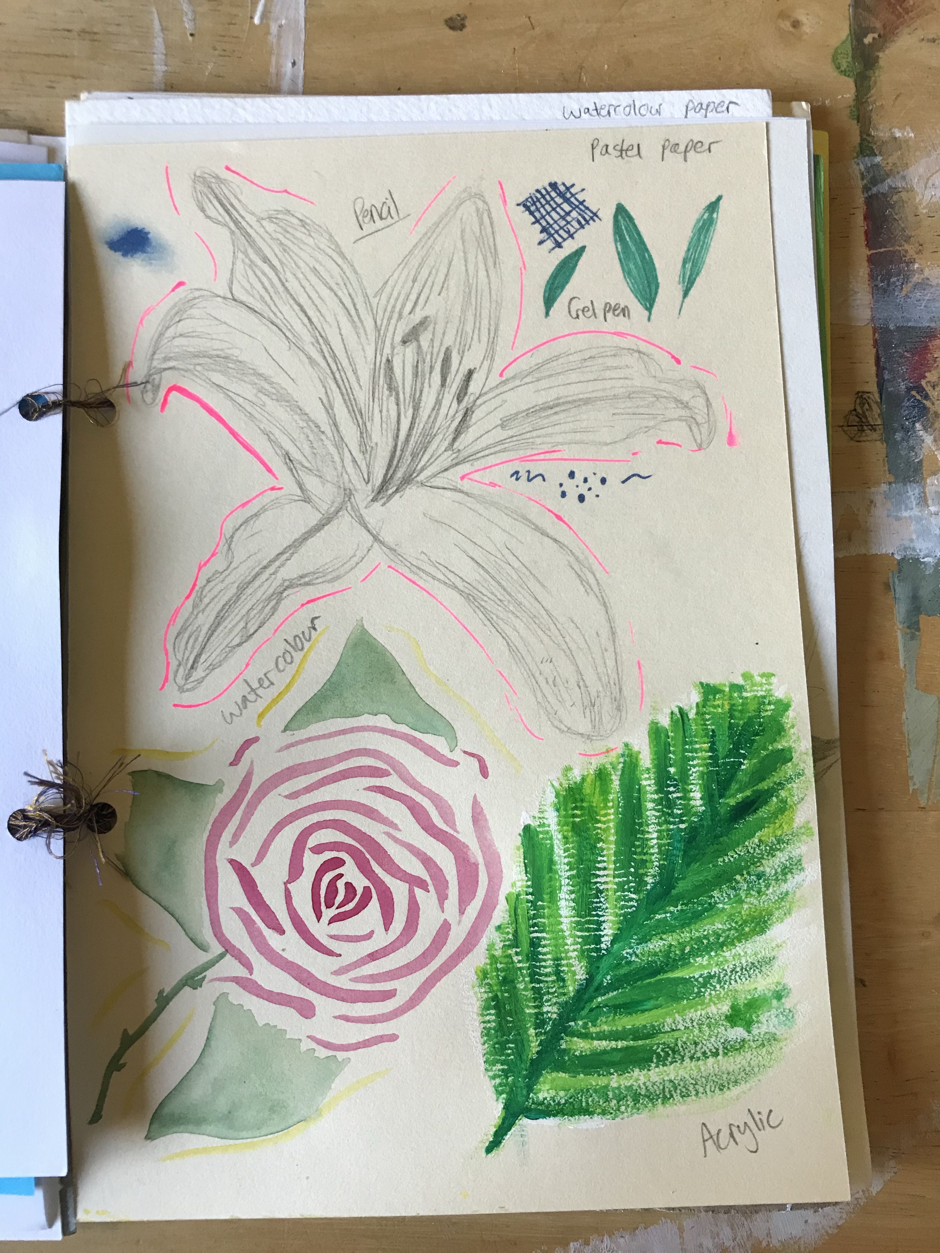
For this, I used a bag of basic street chalk I’ve had lying around since I was a child. It’s a material I haven’t used before in this sense, but I wasn’t too nervous as I have experience with chalk pastels which are of a similar consistency. The first paper I used it on was pastel paper, which is designed for chalk and oil pastels. It has a textured side and a non-textured side. I used the textured side here, and found it easy. I liked the ability to have different colours clearly shown but still blending.
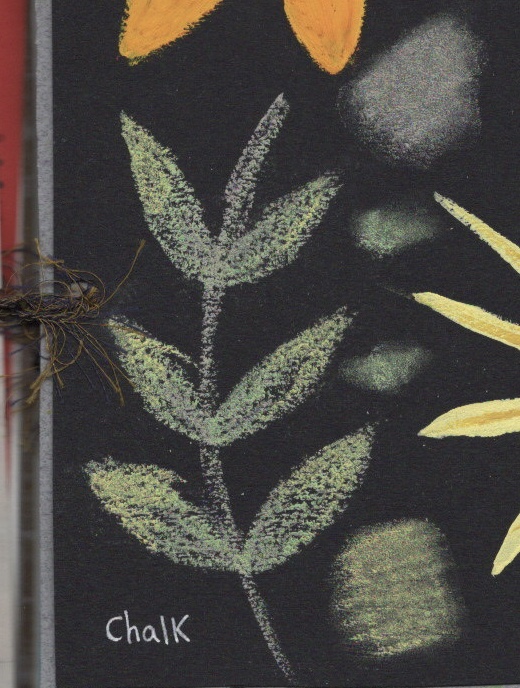
The second chalk drawing was on thin, poor quality sketchbook paper. The lines lost their definition, and the chalk smudged very easily, creating a wispy cloud-like look which I liked. It was difficult, though, to communicate harsh lines. The last chalk drawing I did was on black card. This was intentional, as I felt the contrast would look amazing – and it did. I drew the leaves, which were really fun in contrast to the soft smudged flower I had done previously. Then I experimented with some smudging as I wanted to see the variation between that and the harsh untouched lines. I love the way chalk looks when it isn’t blended – the clear and distinct lines of colour that can seem like one solid colour if you unfocus your eyes.
I may use chalk in future, but add it to pieces rather than use it on it’s own. If I were to want a full piece I may use chalk pastels, as they have a wider range of colours, but still allow for the incorporation of chalk.
Acrylic
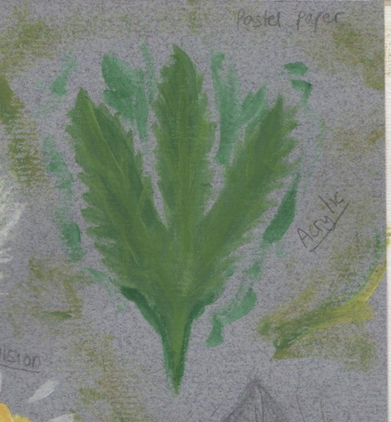
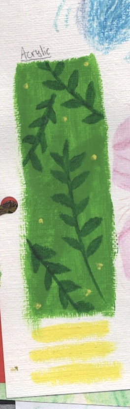
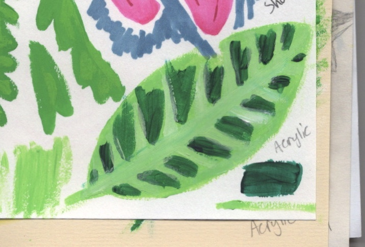
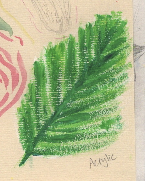
I have worked with acrylic quite a lot in the past. However, in my acrylic paintings I’ve found a niche and sorta stuck with it. I typically paint onto cardboard in a very messy and chaotic style, overlapping colours and with an emphasis on texture. I haven’t much experience using acrylic for observational art or on other surfaces. I found it really difficult, actually, to use this medium for precision. I thought I had bad paintbrushes so bought some new, smaller ones, and it didn’t really help. I don’t think I want to change how I use this medium – but I definitely want to experiment with other surfaces and textures.
The first acrylic experiment was on pastel paper. The way the two interacted was fascinating. Acrylic usually dries glossy and thick, but this paper almost absorbed it, and it dried very quickly and very matte. I tried to add more layers but they just sorta blended in and faded into the background. The pastel paper also has some dry brush acrylic detailing which I used the leftover paint for. I actually love the finish on this and how the texture of the paper comes through the acrylic.
The next painting was on acrylic paper, which to my surprise I hated working on! Accuracy disappears with this paper. The texture of it causes the paint to bleed, which infuriated me. I ended up trying to work around it by layering the paint over my mistakes which sort of worked. I also did more experiments with dry brushes/smudging/texturing the paint. Again, I’m a big fan of this. I think the paper needs priming before using for accurate paintings, though, as it’ll prevent the bleeding of the paint.
I then used acrylic on sketchbook paper. By this point in the sketchbook I had gotten over my need for perfection, so started leaning into the messy and inaccurate nature of the paint. The paper wasn’t particularly interesting. I preferred it to acrylic paper, but it was just paper – nothing to write home about. I was experimenting with adding too much vs too little paint to my brush, and seeing the impact it had on the outcome. I also did a couple of testers on the page, one with too much paint and one with too little. The results of this – the brush strokes showing when too much paint is used, and the texture of the paper coming through when too little is used – were very cool.
The last acrylic piece was on pastel paper. The texture of the paper was similar to acrylic paper but it had a wider tooth grain. Originally I started with a normal amount of paint on my brush, but once I discovered the way the texture impacted the paint, I started using less paint so the texture would be even more visible. I love the way the piece looks. The layers of paint and texture combined create a really interesting effect.
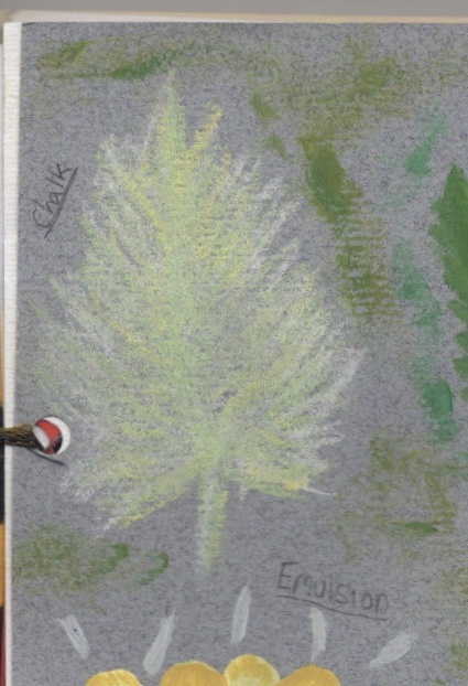
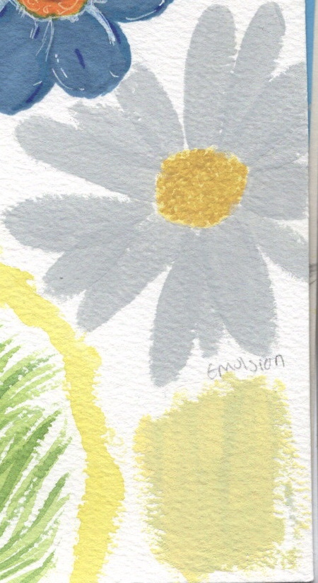
Emulsion
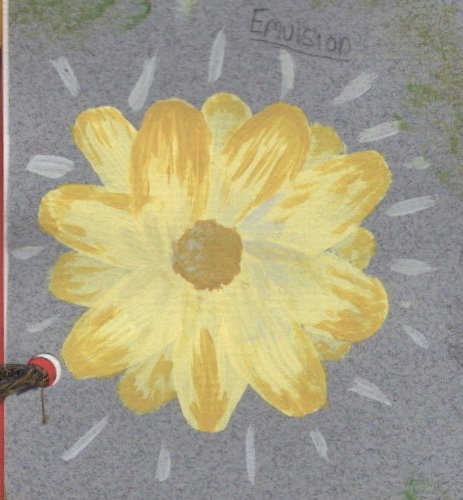
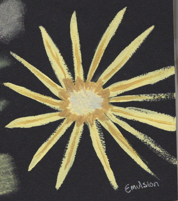
I had kept tester pots of emulsion for using in my paintings for a while, but not yet had the opportunity to do so. My first piece was on pastel paper. I knew the paint was thin and would dry fast, so I picked a flower that I could layer. I really enjoyed this piece and it was interesting to see how the paper interacted differently with the emulsion vs the acrylic. It wasn’t absorbed by the paper, but still looked very matte. Because of the opacity of emulsion, I decided to also use it on the black card. I was using new brushes that are thin and meant for detail work. They didn’t pick up the emulsion very well, and in turn the detail was lost. The card is also quite textured, so keeping the edges smooth was tricky. I found the paint dries fast which meant the texture of the layers quickly became visible.
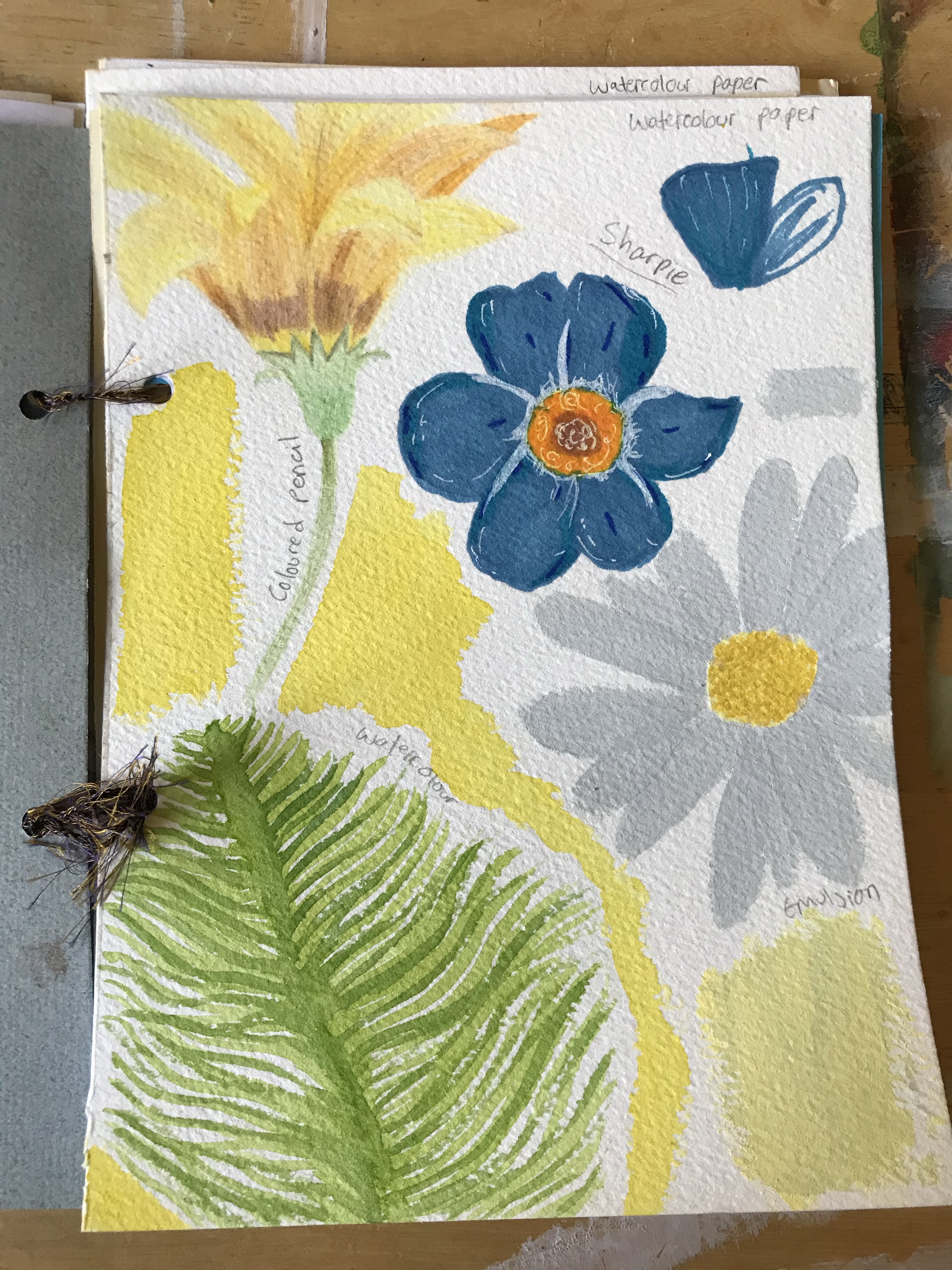
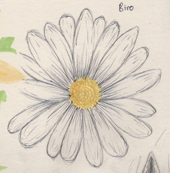
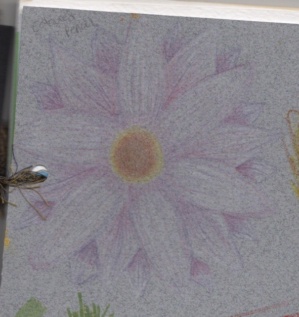
For the final drawing, I used watercolour paper, and returned to my original technique of layering petals for the flowers. I picked a daisy for this, and used the fine detail brushes for the centre. This paper was sort of like a midway between the pastel paper and card. It’s textured, so the lines are less sharp and the layers dry quite solidly, but the almost cotton-like feel of the paper means the paint is absorbed somewhat and dries matte. I like how the petals look and how they stand out from each other. I also attempted to mix the paints on the page, something I do a lot with acrylic, but in drying the colours separated and began to look more like different layers.
Pencil
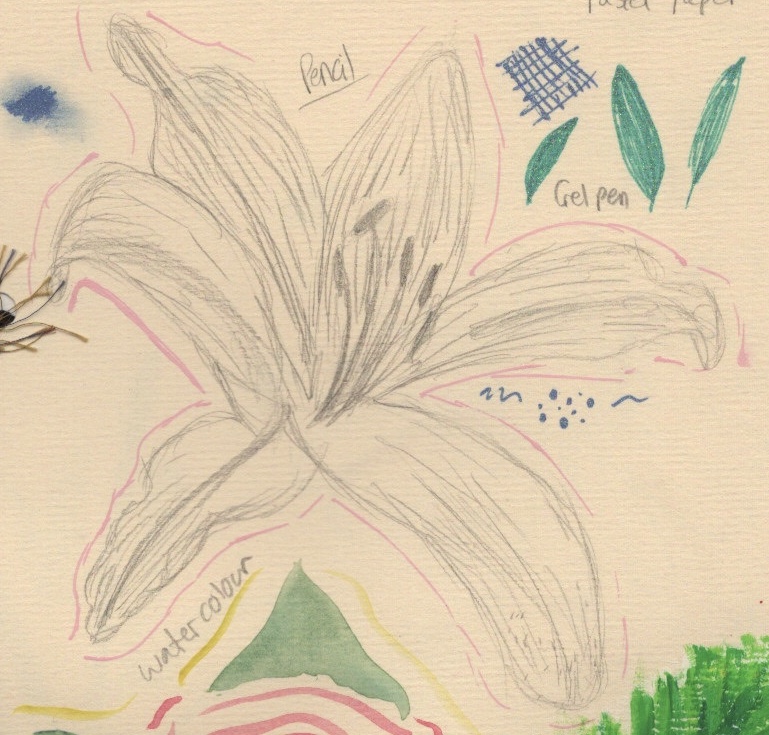
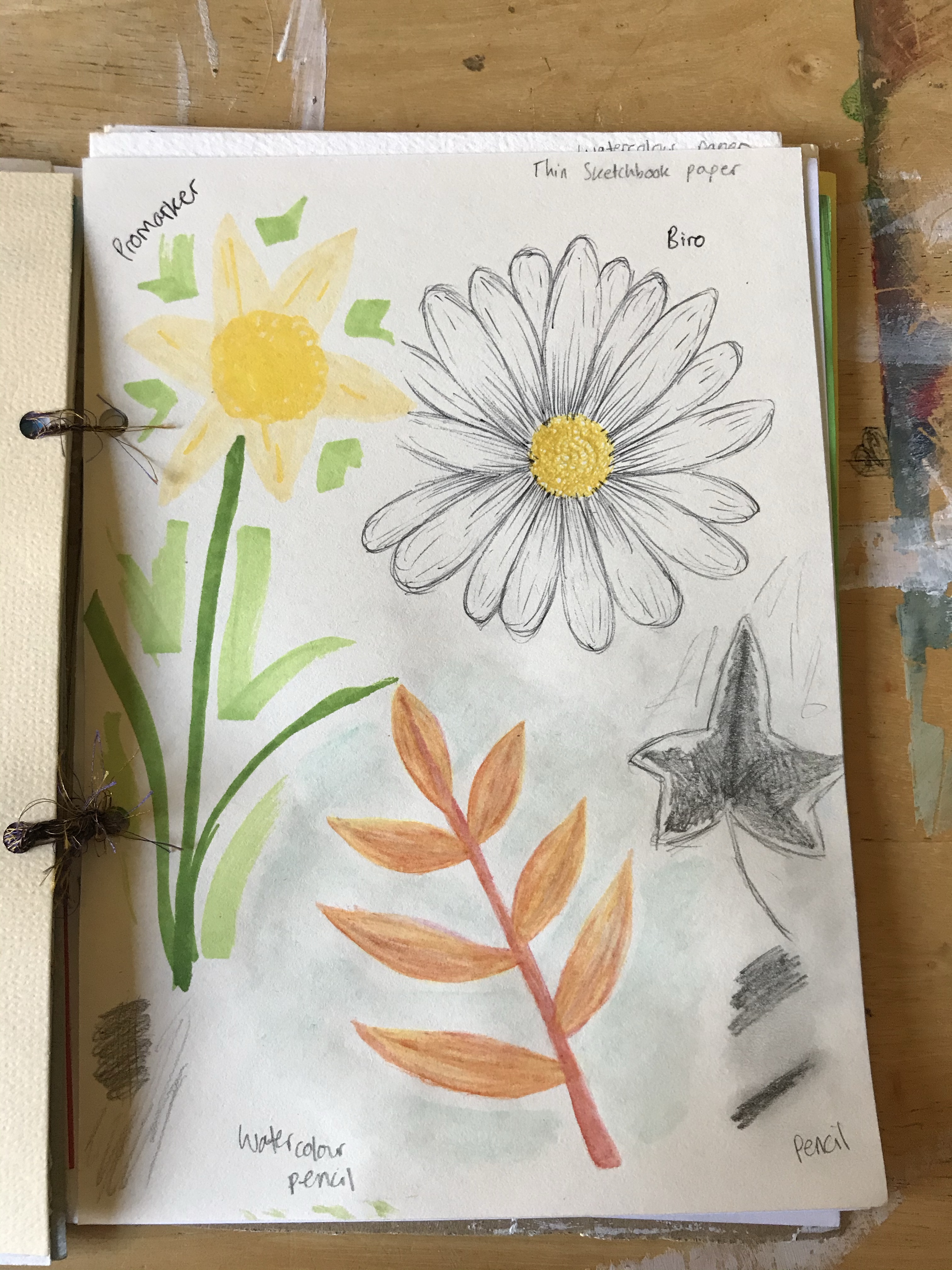
I doubt there’s an artist out there who hasn’t used a pencil before. They’re very basic tools. I’ve never ever been a fan of them. I find them incredibly dull and boring, and feel they communicate very little. I use them for outlines and sketches, and that’s it. I feel I could’ve pushed myself harder with my pencil experiments for this piece. I don’t actually own a sketching pencil set, which restricts me somewhat. During my brief hiatus from this project, I acquired some coloured sketching pencils, which I love and have been a lot more experimental with. I didn’t want to add them to this project, though, as I felt already overwhelmed by my 14 mediums.
The first two sketches I have nothing much to say about. I wasn’t comfortable, nor was I pushing or challenging that. I was just trying to make something happen. I was happy with the outcomes, but I don’t feel they serve the purpose they needed to. The third drawing, however, I tried to explore a little. I wanted to see how I could communicate tone, and use the colour of the paper to show the pale yellow areas of the leaf. I also attempted some smudging, and I regret not taking it further with a larger piece of pencil work. I’m happy, though, that in my other sketchbooks I am exploring pencil as a medium and becoming much more comfortable with it and with pushing the boundaries.
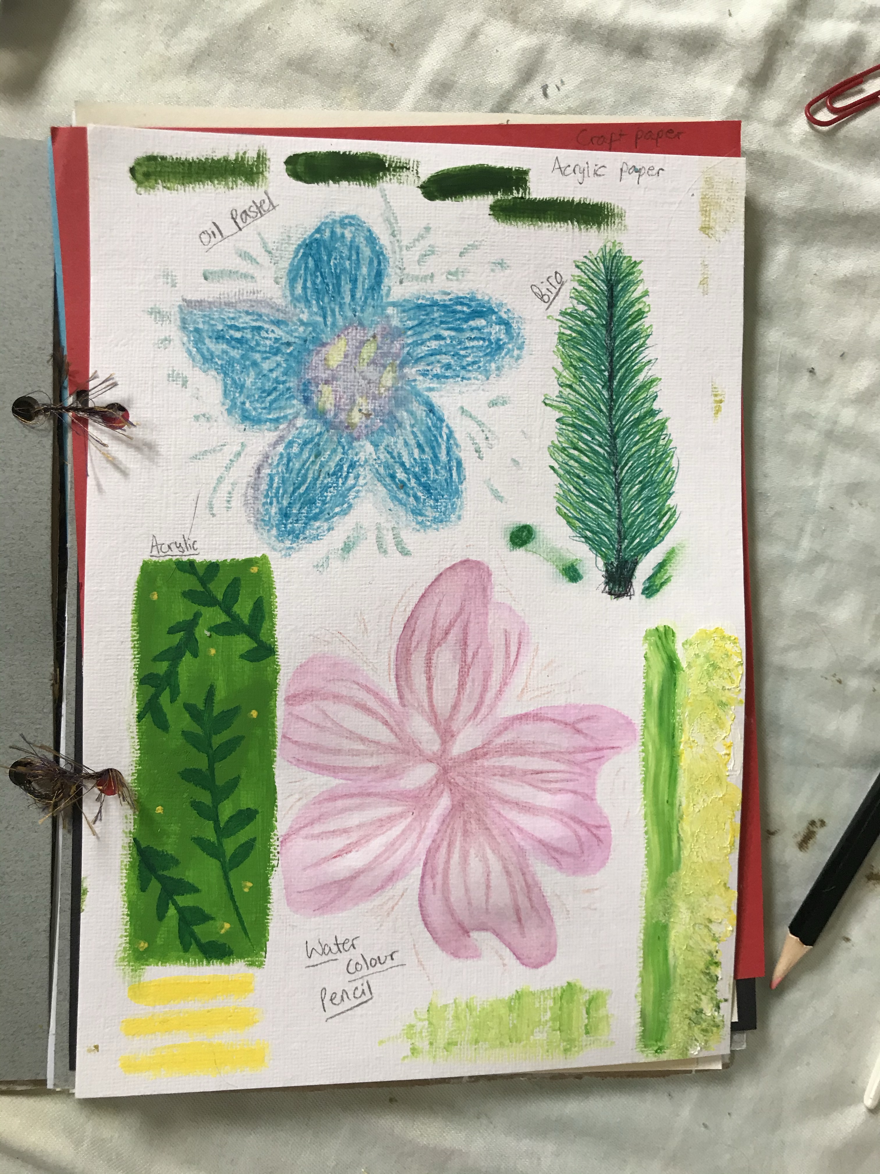
Oil Pastel
As I mentioned before, I avoid using the oil pastels I own. The reason I haven’t replaced them is because I really don’t enjoy using them and haven’t even wanted to explore what I can do with them. In the first drawing I used acrylic paper, and I began with some attempts at blending. It was difficult, which could be due to the quality of my pastels or maybe the paper. I wasn’t happy with the outcome, so decided against blending in the petals. Personally, I don’t like how this looks, but I can see that it can serve a purpose. I took part in a Zoom tutorial and someone commented on how they loved the texture in the petals. This really showed me that my own ideas of perfect/good are subjective, and that the texture could be used for a specific design.
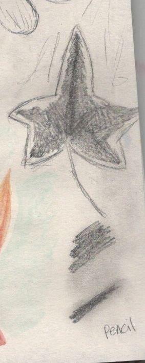
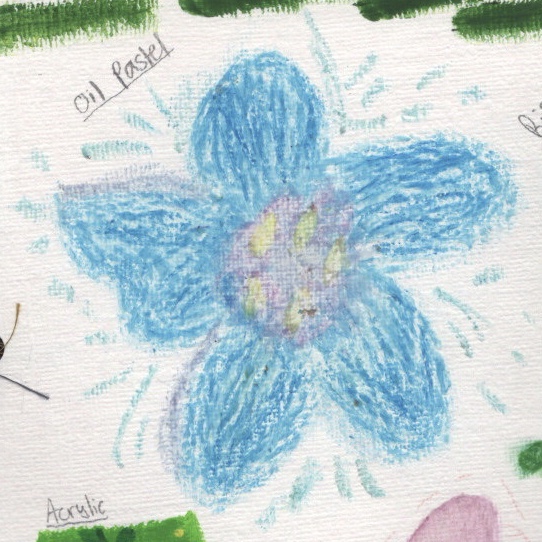
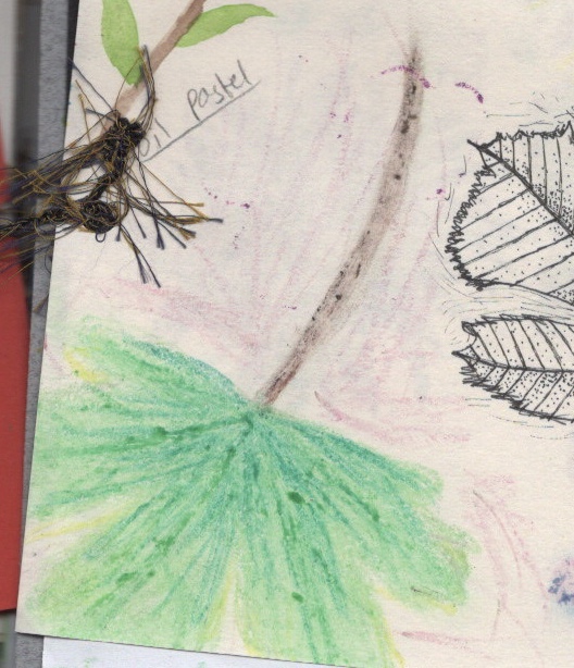
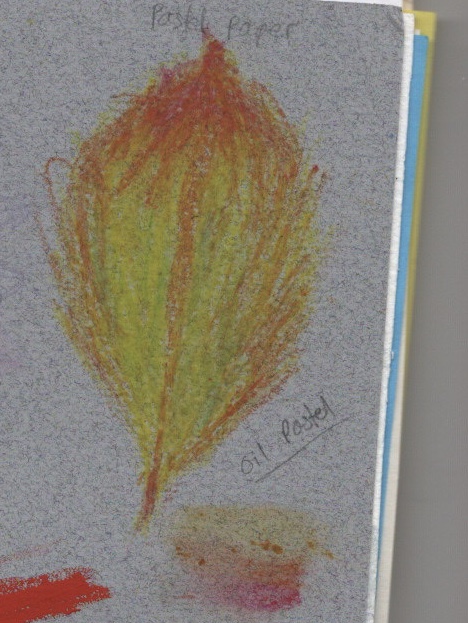
The second drawing was done on thin sketchbook paper. I managed to blend easier on this, and ended up with quite a smooth texture. Looking back, I now wonder what would happen if I scraped off the residue from the pastels, leaving just the blended bits. For the third piece I opted for an autumn leaf on pastel paper. I was more comfortable making mistakes and being messy by this point, so I just experimented with rough outlines and layering colours. The colours show up best on this paper, presumably because it’s made for pastels specifically. I also attempted some blending, but definitely prefer the look of the unblended leaf.
Biro
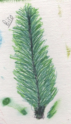
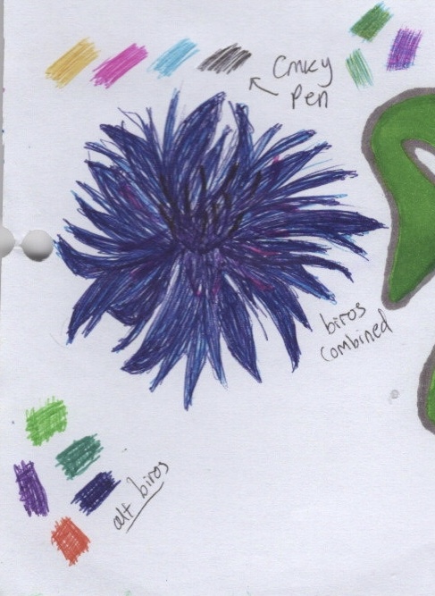
I have many different colours of biro that I have collected over the years, used primarily for notetaking and occasionally for adding flair or doodles to my lists/notebooks. I haven’t ever used them for creating ‘proper’ artwork, so this was new to me. I loved using them and I definitely want to use them more. The layering and blending of the ink is unique and I appreciate it in ways similar to the chalk. I didn’t find too much difference between the papers I used – acrylic being textured meant the texture was slightly visible in the drawing, however the graphic paper and printer paper were very similar.
I experimented with layering, smudging, blending, and using the ‘wrong’ colour to communicate the same ideas, as with the black in the first drawing as a replacement for brown. I also swatched my various biros and tested a CMYK biro pen I have on the graphic paper. I love the scratchy, intentional lines, and how the colours mix on the page. Before these experiments, I would never have thought to use biro for drawing, but now I want to take one everywhere with me to try it. In my final drawing, I used empty space to show white petals, and tried lots of tiny circles to show the texture of the centre. I definitely want to use more of this.
Watercolour Pencils
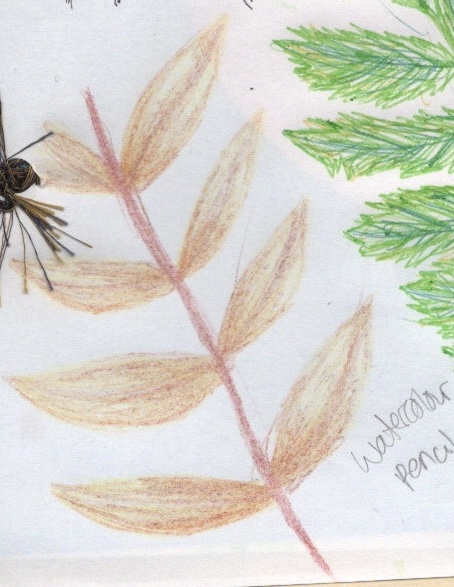
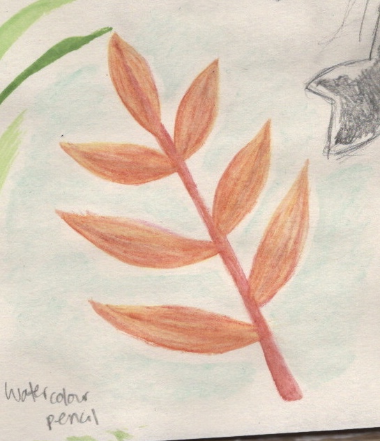
I have always been fascinated by watercolour and wanted to use it more, but found myself afraid to try. Watercolour pencils always felt like a safe option, as I have experience with coloured pencils, and they bridge the gap. Still, I have very little experience with using them as actual watercolour, and found in this exercise I preferred watercolour pans to the pencils. The first drawing is on acrylic paper, and I was surprised at how well it held up both the colour and the water. I suppose it’s not too dissimilar to watercolour paper in texture. I layered different shades of pink for the petals, then used water to blend them together and incorporate some white space. I then added detail with the pencils and left it dry.
The next piece, I skipped water entirely. I hadn’t planned this originally, but the pencils were really difficult to use on the printer paper. The paper is quite glossy, and not a great deal of pigment was being used. I feared adding water would destroy the paper, so left it without. I drew the same thing again on thin sketchbook paper, and this time added water. I do really like how it looks, and how you can still see the original pencil markings through the blending. I think watercolour pencils are a good asset to have, but I would like to use them alongside pans or perhaps other mediums.
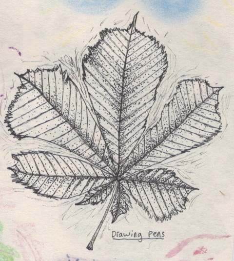
Drawing Pens
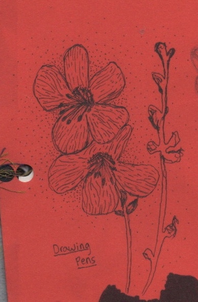
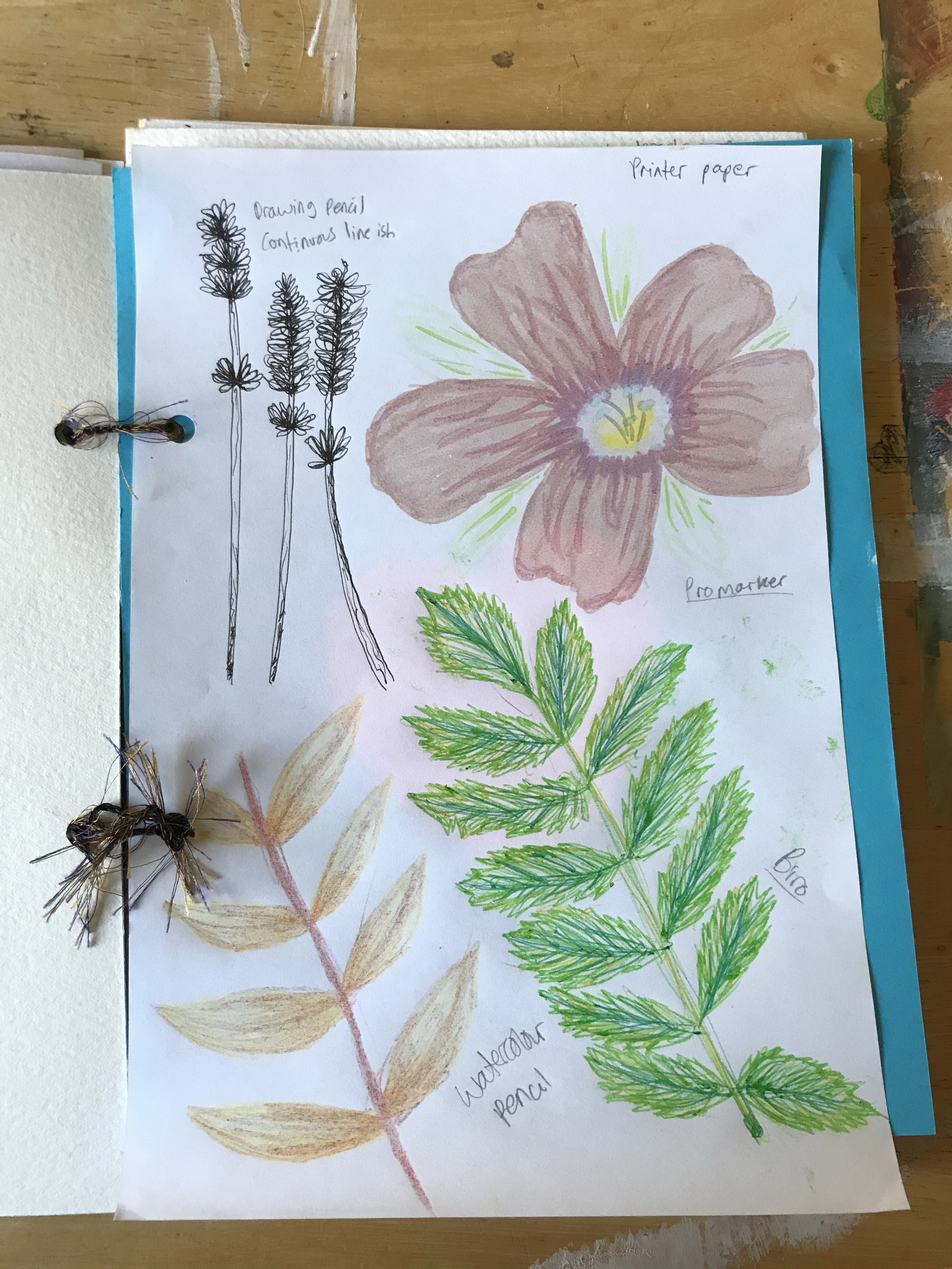
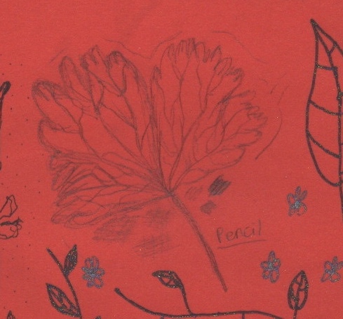
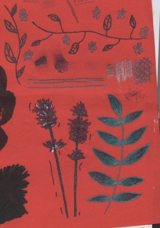
I use drawing pens nearly daily in my bullet journal – a type of planner/organisation tool crossed with an art journal. I rarely however do very creative drawings. Typically my journal is very neat, technical, and rigid. I used my drawing pens in part 1 for the first exercise and I enjoyed it, so I was looking forward to using them for this exercise too. The first drawing I did was on red craft paper. I didn’t think about how I could utilise the paper prior to drawing, and I regret that now. I wish I had picked a poppy as my flower, or a rose, and had the paper show the colour of the petals. I used stippling to draw attention to the illustration, and experimented with line work in the petals. It’s interesting seeing how straight lines vs curved lines show direction and relationship to other things.
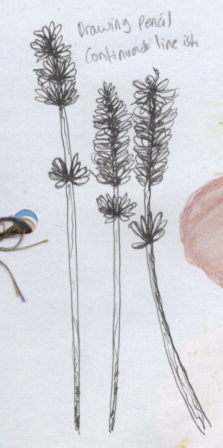
The next drawing was on thin sketchbook paper, which didn’t impact the drawing too much. I again experimented with stippling, trying to show shading and darker areas, as well as messy thinner lines to draw attention to the piece. I was also experimenting with how hard/soft I could be with the pens and what impact that would have. The last drawing I did was on printer paper, which made the pens seem duller and greyer, rather than intensely black as on the other surfaces. I drew three sprigs of lavender, the first one not deviating much from my regular style. I started the second in the same way, but half way through began adding elements of continuous line drawing. The third sprig was almost entirely continuous line. I felt like the nature of lavender lent itself to this type of drawing style. I definitely want to use this more, either alone or as a supplement to watercolour or marker work.
Gel Pen
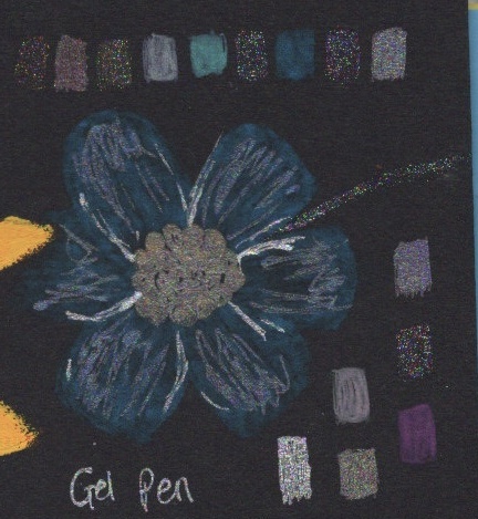
Gel Pens were one of the mediums I was most excited to work with when starting out. I used them a lot as a child, and sorta grew detached from them as I explored more ‘grown up’ mediums such as Promarkers and digital design. Recently I have seen them being used more and more in art, and I have been inspired to use them myself. Unfortunately, they ended up being one of the mediums I hated using. I think they have a place in mixed media, but I definitely don’t plan on using them as standalone medium anytime soon!
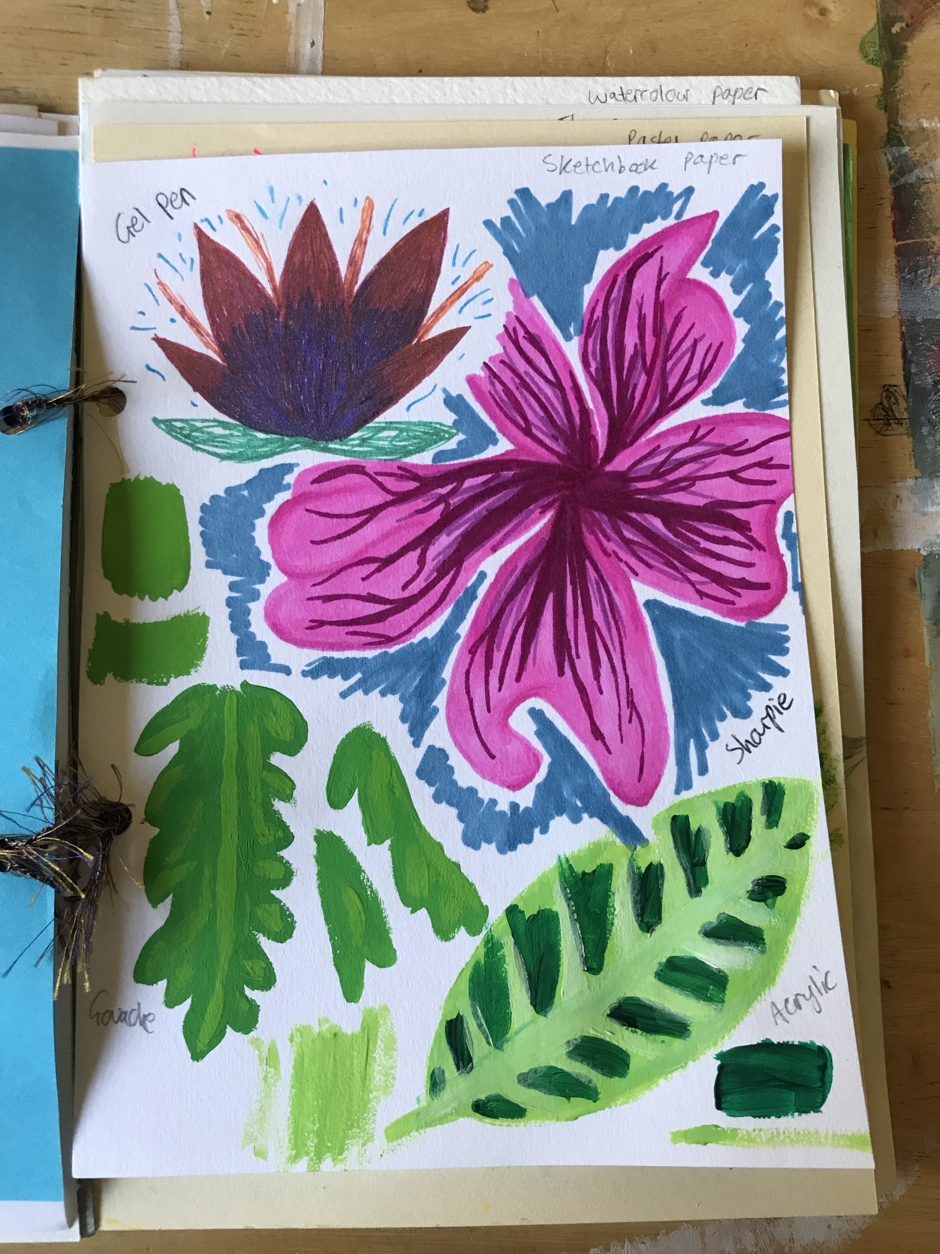
The first experiments with them were done on red craft paper. The colour of the paper meant the gel pens discoloured. I only had one sheet of red craft paper – the one in my sketchbook – so I ended up testing out a lot of the colours just to see how they looked. I also tried smudging them, drawing over other colours, and seeing how I could manipulate the wet ink. I then drew two sprigs of lavender and some leaves, trying out some of the colours I had confidence in. I really like how these drawings look. I tried blending the wet ink on the leaves, but as it dried the colours almost separated. They do look blended still, but they were better when wet. I added some highlights with silver gel pen on one of the sprigs, and I like the effect that has too. Maybe I will use gel pens for highlighting in other work.
I then used gel pen on the black card, hoping it would stand out starkly against the dark background. I drew the flower to start with, and when wet, it was barely visible. I wasn’t particularly happy about it. I decided to swatch all the colours I had, though, so I could come back to it as a reference. It’s interesting that when wet the gel pens look different to when dry. This makes it a hard medium to work with. The consistency of the ink and pressure from the nib of the pen also makes it difficult to achieve smooth lines and block colour. I tried to lean into this on my last drawing, intentionally being scratchy and messy, trying to see how I could layer the pens and make it work.
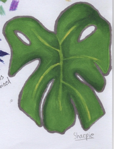
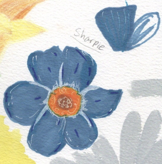
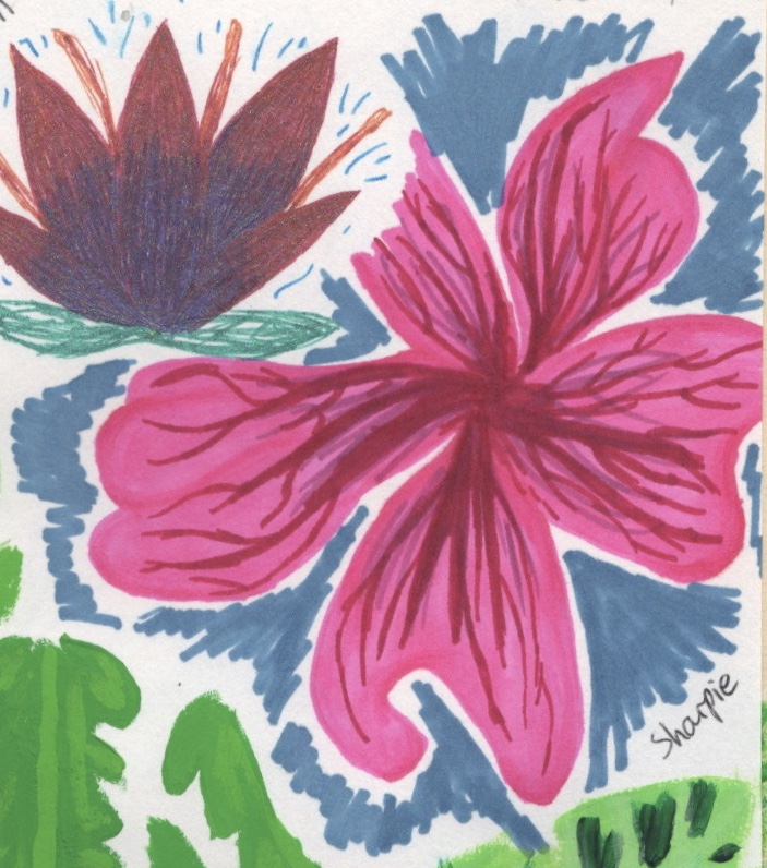
Sharpie
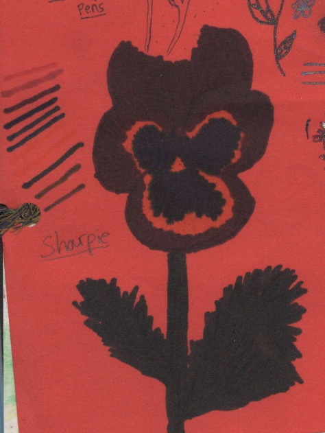
I have used graphic markers in artwork since I was studying at college, however I rarely used Sharpies specifically. I love how bold the colour is and have wanted to incorporate them more. As the first drawing I did was on red paper, I tested the pens to see what they would show up as, knowing they would change with the background. The flower was difficult to draw. I wasn’t used to blending with Sharpies and they dry very fast on paper. They also bled a lot.
I thought I would be happier with my results on graphic paper. I found I had a lot more control and could blend easier. I worked with layering colour and also creating texture. However, I was still focused on making things look ‘perfect’, and found myself disappointed. The last two Sharpie drawings I did felt a lot more experimental. The third drawing was on watercolour paper, which absorbed the ink really well and made the colour really bold. I tried to draw block colour and focus less on blending perfectly. I also added some white highlights using a white Gellyroll gel pen. The last Sharpie drawing I did used similar techniques. I started with some blending and softer edges, then went kinda crazy with block colour for the veining. I love how this flower looks, and I’m glad I pushed out of my comfort zone to experiment in this way.
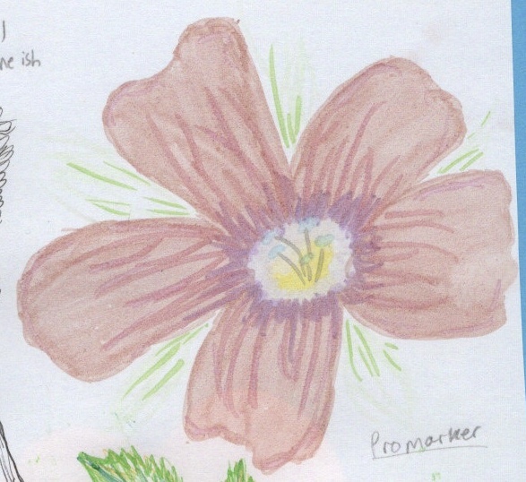
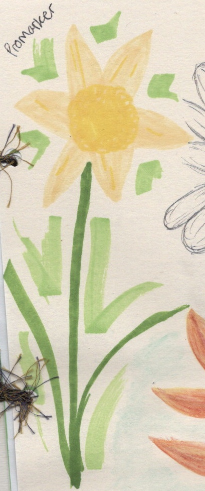
Promarkers
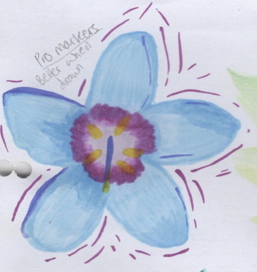
Promarkers were my first graphic marker and they have remained a favourite of mine ever since. I love doodling with them and find them very playful. The first paper I tried them on was graphic paper – designed for alcohol based ink markers like these – and surprisingly I had an incredibly hard time with it. I haven’t used them for ‘proper’ artwork for years, mostly filling doodles or patterns, and so struggled. I also realised that filling in the colour was difficult without guidelines. I wrote ‘better when drawn’ after I finished the piece – meaning ‘better when I sketch an idea out first’.
When I got onto the other papers, I had a much easier time. I’m not sure if this is because it coincided with me feeling more comfortable about experimenting, or if it was better paper to be working on, but either way I started to enjoy the process more. I like the way the pastel paper made the pens look matte, and enjoyed seeing the layering of colours take effect. The printer paper almost rejected the alcohol in the markers, making for a really interesting texture and pattern in the petals on that drawing. In the last piece, I tried using only the chisel side of the marker. It was interesting the shapes I was able to create doing this. I’d like to do more work with my Promarkers outside of doodling, and hopefully I can think of the right project to fit this into.
Coloured Pencils
Surprisingly, despite being an avid lover of colour, I have always had beef with colouring pencils. I never liked them as a child as I couldn’t make them look neat. As an adult I have felt they don’t provide a strong enough colour – they’re too pastel, too pale, too light on the page. I do own multiple sets however, and have frequently tried to make friends with them. Prior to this exercise I would say I was ambivalent towards them. Something I do really appreciate about them is their ability to blend, and also to not blend! You can definitely create magic with them.
My first drawing was on graphic paper, and it did definitely have that pallor to it. I tried endlessly to make the colour richer, to no avail. I do really like how the yellow of the veins stands out against the green, though. My second drawing was on pastel paper, and I was so proud of it. I drew the entire thing out in white and then shaded it with pinks and purples. The white is now barely visible. Using this paper, and the watercolour paper, completely changed my relationship with these pencils. I felt way less constricted and like I could move more freely. I experimented with depth using different tones and tried to create shadow. The pencils showed up so bright on the watercolour paper – I was in awe! I tried layering as many colours as I could, and experimented with dull vs sharp pencils, seeing how the accuracy changed and how the pigment did too. I now feel like I was just using them wrong all these years, and I definitely want to play with them some more – maybe on other textured paper, or even just alongside watercolour.
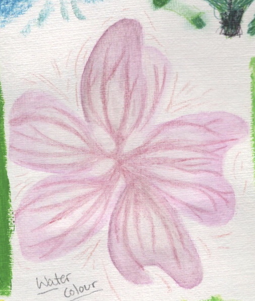
Watercolour
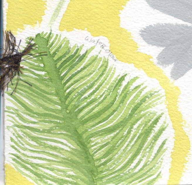
Watercolour has always enchanted me but I have always felt that I’m not very good at it. Clinging to perfectionism has not served me well in this pursuit. I love how it looks and how delicate it can be. My first piece was on thin sketchbook paper, and I felt incredibly frustrated. The flower itself I was disappointed with, but interestingly looking back I love the details around it. It almost looks like confetti or blossom. That was experimenting, just filling the page and seeing how it looked. I tried a similar technique on watercolour paper, layering colours to look like separate fronds on the leaf. I also did a wash in yellow, which I love, and I think it really ties the page together.
The last watercolour piece I did was on pastel paper. I tried a similar technique again, with separate broken strokes, but this time to create petals on a rose. I also filled block space for the leaves. I think this style works well and I enjoyed using it. I found I could be more expressive and creative, almost like I was doodling but with paint. I want to continue using and experimenting with watercolour, probably in sketchbooks and maybe in projects too.
Gouache
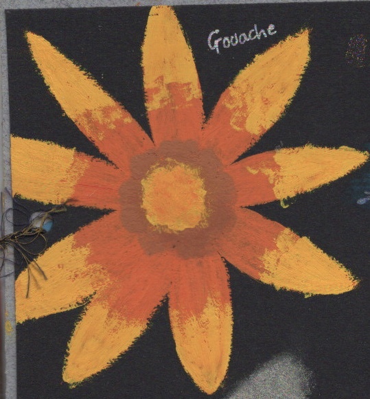
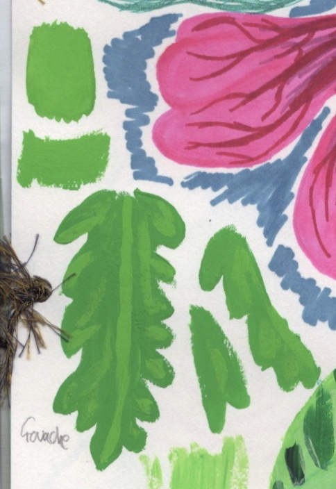
My gouache paints were unopened and unused when I began this project. I tested them on some watercolour paper to see how the colours looked, then I began in my sketchbook. I had no idea what I was doing, and through experimenting I have slowly started to learn how the paint works. The paint seems to be growing in popularity, and as a midway point for watercolour and acrylic, it seems pretty up my street. In a way I’m glad that I had the opportunity to experiment with it without knowing what I was meant to be doing, as it showed me unconventional ways I could use the paint and helped me understand the dynamics of it so much more.
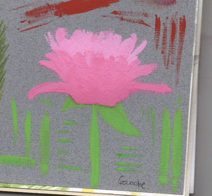
The first painting I did was on black card, which I picked because gouache is known for its boldness and for the strength of it’s colour. I struggled. I did not add water to it at all, which made it dry super quickly and the texture was very tacky. Still, I plodded on, layering it up and trying to create texture with various brushes and adding more/less paint to my brush. By the second piece, I felt I had an idea of what I was doing. I still did not add water, and just layered the paint over itself, trying to create depth and texture. The paint was really hard to work with. Adding water was a complete accident, my brush was still wet from having been cleaned, and wow! The difference it made. The stem and leaf were done using water and the colour feels so much more vivid and smooth. It clicked in my head that I should try adding water, so I experimented a little around it with adding various amounts.
The last painting I decided to add water too, and was excited by the control and surface area covered. I wasn’t really trying to make it look like anything at this point, I was just excited about how the paint could be used! If I had decided to fill the rest of this sketchbook before moving on, I would’ve done so much more with gouache. Now I know vaguely how to use it, I want to experiment a lot more. I also would like to take a class or watch some tutorials online about the paint so I can understand it better.
Reflections
This exercise was an extremely hard one for me in so many ways. I had to overcome a lot of personal hurdles that have always plagued me, and learn to embrace the chaos that art can be. Doing this has been a great benefit to me. I learned so much about my own style, what I enjoy within art, and how to be kinder to myself when creating.
My favourite papers from this exercise were watercolour, pastel, and the thinner sketchbook paper. I definitely want to use these more and maybe experiment with some bigger mixed media pieces on them. Going forwards, I want to continue to experiment with materials and try out new styles.
I am really grateful for the challenges in this exercise and for how I managed to face them and begin to overcome them. I’m really proud of the work I produced, especially in the later pages when I was allowing myself to make more mistakes. It’s shown me that looking back at work often gives you a different perspective and that my own thoughts on my work aren’t necessarily shared by those viewing it. I’m also glad I have a reference book to look back on now throughout my studies, and to continue filling with more floral studies.

[…] too. I chose to sketch on pastel paper as I really love the texture and enjoy working with it as I learned in Exercise 8. At this point I was considering scanning the sketch in digitally once completed, or redrawing it […]
LikeLike
[…] a couple of sketchbooks with my mum, and during Key Steps in Illustration, I made a sketchbook for Exercise 8. The sketchbooks I made as a child were stitched and bound using cardboard, but the one made in KSI […]
LikeLike