This exercise, like the one before, was to understand the differences between objective and subjective drawing. It asked me to pick another object, and this time draw it subjectively. The Key Steps in Illustration book defines ‘subjective’ as ‘based on or influenced by personal feelings, tastes, or opinions’. Picking an object that could be easily translated in this way was difficult! I decided to pick one from the list originally given, as picking any object was just too open.
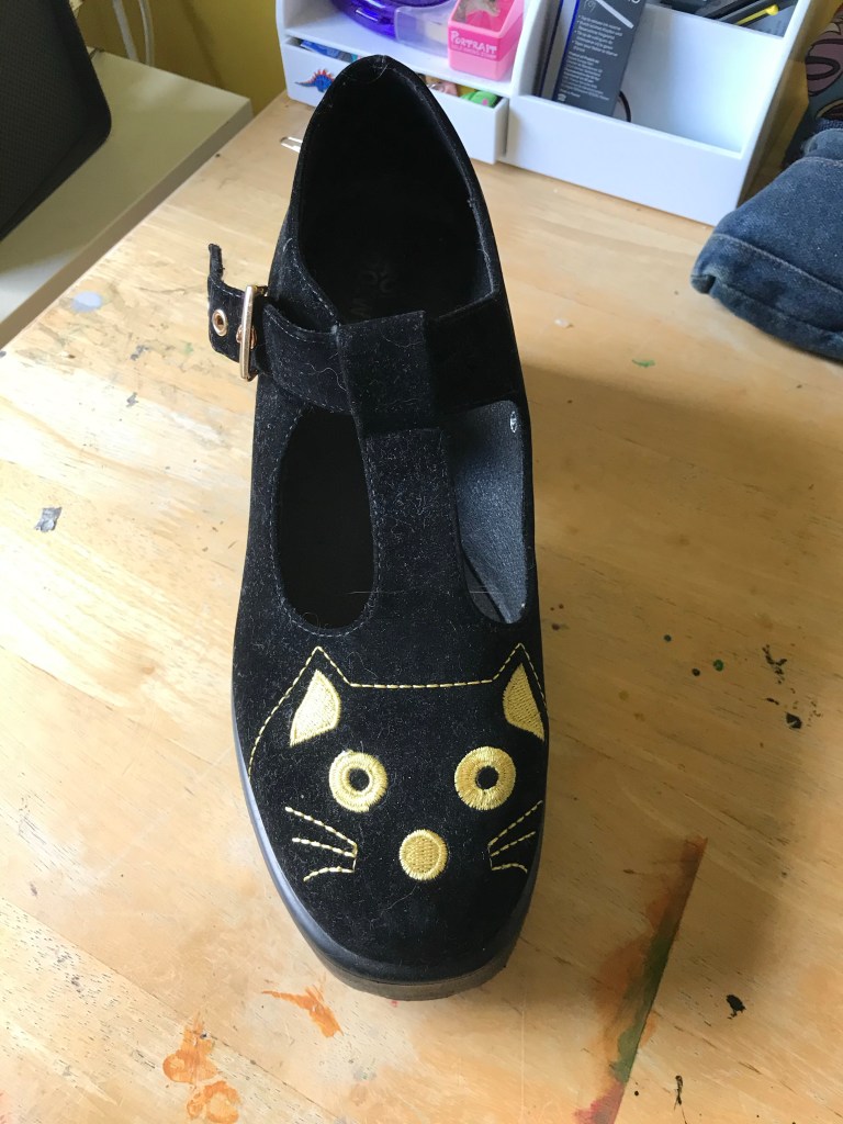
I picked this shoe. It’s one of my favourites – I love cats, and nobody seems to own ones like it. The first step in the exercise was to write a list of words to describe the shoe. My list was:
– Unique
– Soft
– Fluffy
– Velvet
– Tough
– Elegant
– Vintage
– Alternative
– Smooth
– Flexible
– Stylish
– Quirky
– Eye-catching
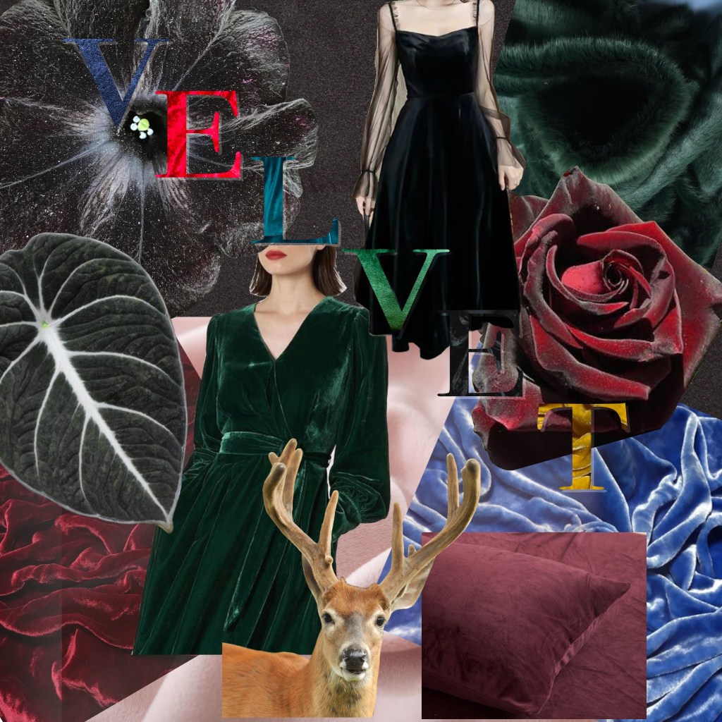
I then had to pick a word from the list to base my drawing around. I decided to pick ‘velvet’, as I felt the fact the shoe is velvet is an important thing that I wanted to communicate. The exercise then asks you to make a mood board exploring the word visually. It does ask you to do this physically, using collage, found materials, and cutting from magazines. However, due to COVID-19 I am currently shielding, and I am very limited on what I can use for this. I completed the mood board digitally, as I did in my mood board exercise, but I still attempted to find materials and use a wide range of resources.
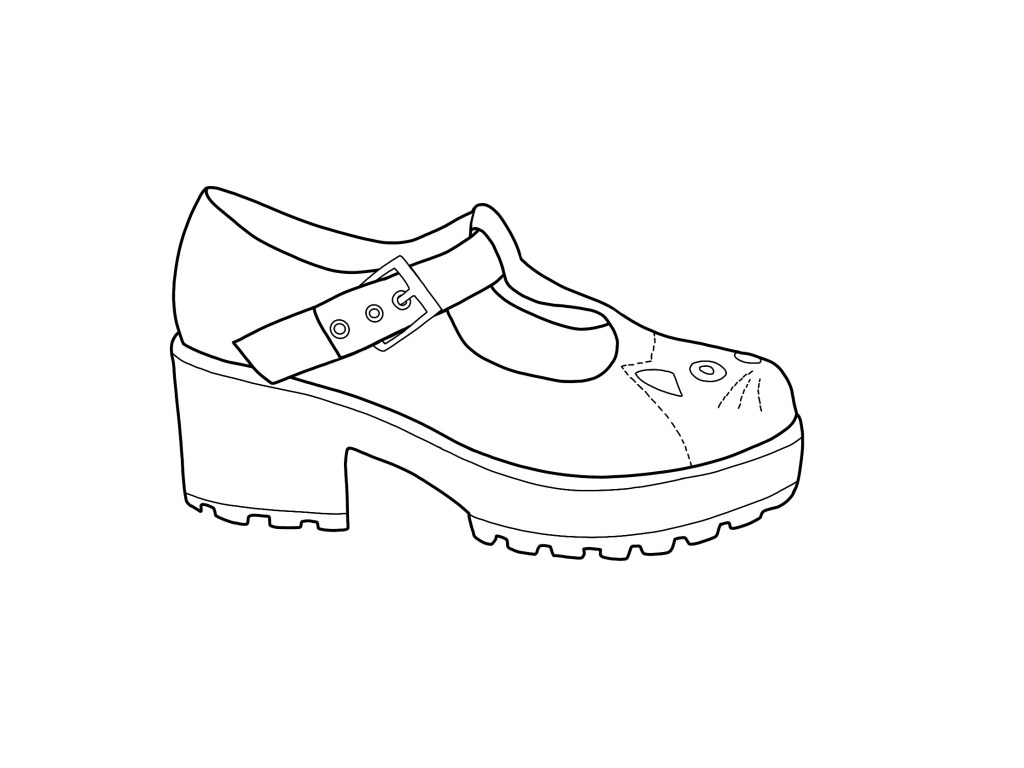
I loved the mood board and the feelings it evoked. It alone felt like it communicated my feelings and views towards the shoe. The next step was to create a line drawing, which I decided to do digitally too as I was already there. I was then asked to print it and complete the drawing physically, but as I wanted to use collage I opted to remain digital. I did however choose paper and materials that I felt would communicate the shoe non-digitally.
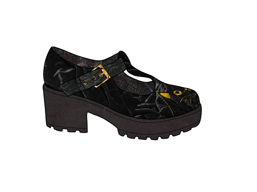
I found a velvet flower [needs name] whilst creating my mood board, and I really wanted to use this for the main part of my shoe. This is because the white specks on the petals looked like the dust and cat hair that the shoes are covered in – velvet has a tendency to attract small debris like this. I was really excited about the fact I could communicate this texture. I also decided to use the velvet leaf for part of the strap, to indicate that it’s a different part of the shoe. I reduced the saturation on a photo of red velvet I found for the inside of the shoe, and I used a picture of taut crushed velvet for the sole. For the cat detailing, I used a photo of gold velvet, and I used an image of gold rocks for the buckle. I was very happy with my finished piece and what it communicated.
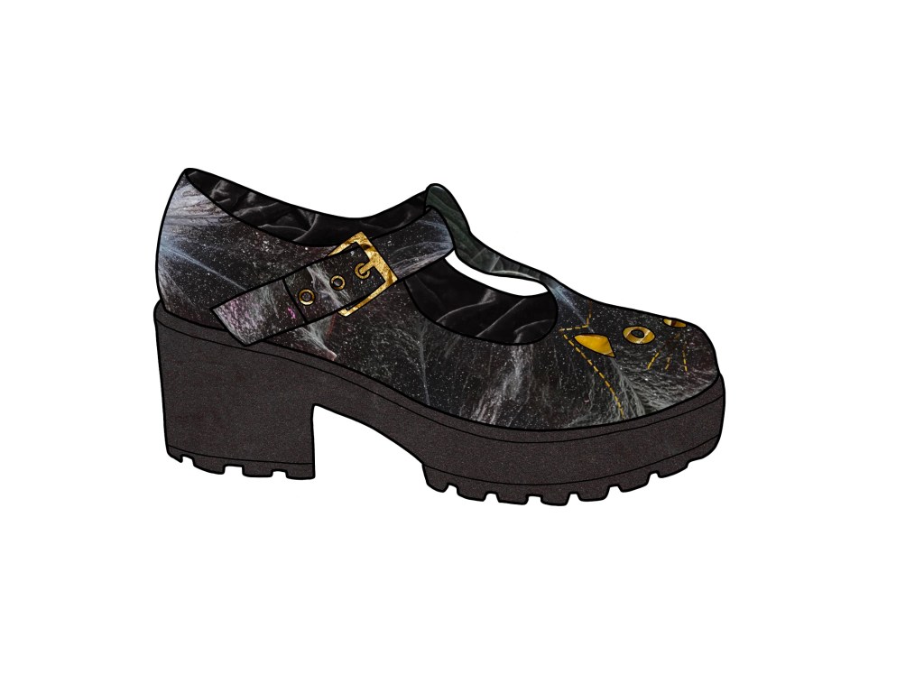
I showed it to a friend and asked if she felt it communicated ‘velvet’. She said yes, but also said her first thought was ‘space’. I agree that the flower used for the main body of the shoe creates a very galaxy/constellation type look. I decided to edit it so it was clearly velvet, even if it meant losing the cat fur/dust effect. I swapped the flower and desaturated red velvet, making the flower the inside of the shoe and the velvet the outside. I kept everything else the same, except this time I used the velvet leaf on the main strap. I felt it made it even clearer that it was a different part of the shoe. I’m happy with this outcome, and I agree it communicated velvet clearer, but I preferred my original collage.

Had I completed this physically too, I would have used grey pastel paper. The texture and graininess of the paper would work well for velvet. I would have also experimented with tissue paper, seeing if I could recreate the way velvet looks. If I could visit craft stores, I would have tried to find some velvet wool or similar, and collaged with it. I also would have used gouache, as the sticky non-watered down paint becomes very textured and sort of sticks up like velvet does. I may have also used oil pastel, and acrylic, as they show the texture of the paper hugely, and also could appear like velvet does. I referenced my sketchbook created for exercise 8 whilst thinking about how I could communicate velvet physically, and it was helpful to have. Finally, if possible, I would’ve loved to have stitched into the paper using gold thread to create the cat.
I think maybe after the sketchbook exercise I feel a sense of artistic fatigue towards physical art. I love digital work, and I spent so long being frustrated and bored with physical work that returning to it is almost exhausting. I was very confused and a little overwhelmed with this exercise, and I struggled to understand what I was trying to achieve. Doing it digitally though, I felt like I did achieve an understanding of subjectivity. I feel like my pieces communicate velvet well, and it is also clear that it’s a shoe.
