This exercise was split up into several parts. The first part was to read an extract from The Daffodil Affair by Michael Innes, and answer the following questions:
– If this were to be made into a film, what would the main character be like?
– What clothes would the character be wearing?
– What furniture is in the main area in which the action takes place?
I feel like the main character would be in his late 40s/early 50s. He’s disillusioned, bleak, and emotionally hardened by the life he’s lived. He’s quite disengaged and settled in his anger, which makes him appear almost robotic. Towards others, he is stern, direct, firm, and intimidating. He seems traumatised from war and his experiences as a detective. He carries his anger everywhere he goes, wearing it on his face and in how he holds himself. He would be dressed appropriately for his job and the time he’s in, most likely wearing a suit and tie with suspenders. He doesn’t relax often, and wears a suit even out of work.
There is very little furniture in the scene – The only items that are mentioned are a large desk in the centre of the room with a chair at it, paired with tall uncurtained windows. It’s also mentioned that this is intentional, as the man in question does not want to feel comfortable. There may be a few items on the desk, such as a typewriter or lamp, but they aren’t mentioned in the text.
The next part of the exercise was to collect visual reference for the scene. I used Google, and searched thoroughly to find images that reflected what I felt was in this scene. The book was published in 1942, so I focused on World War 2 era images.
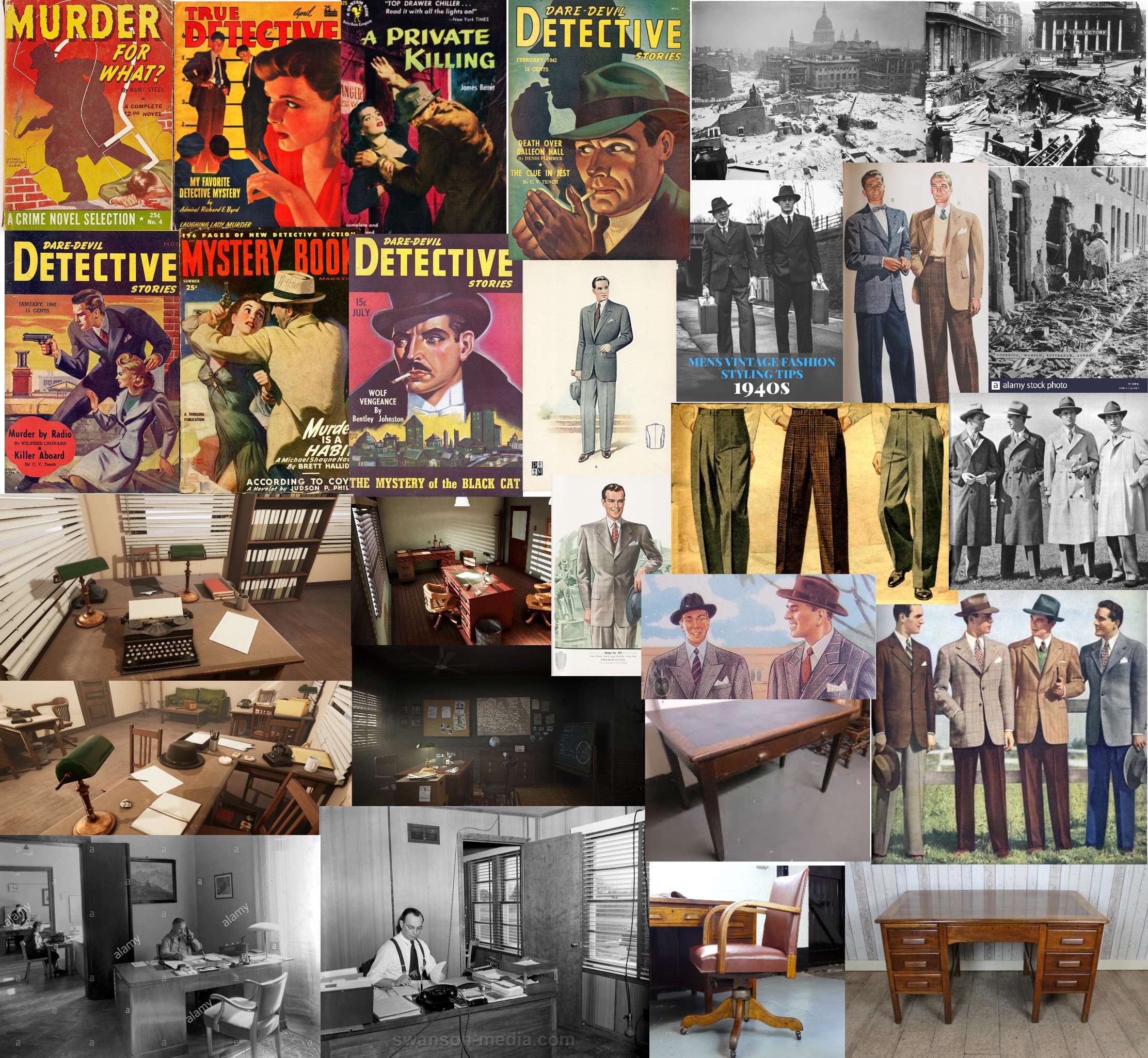
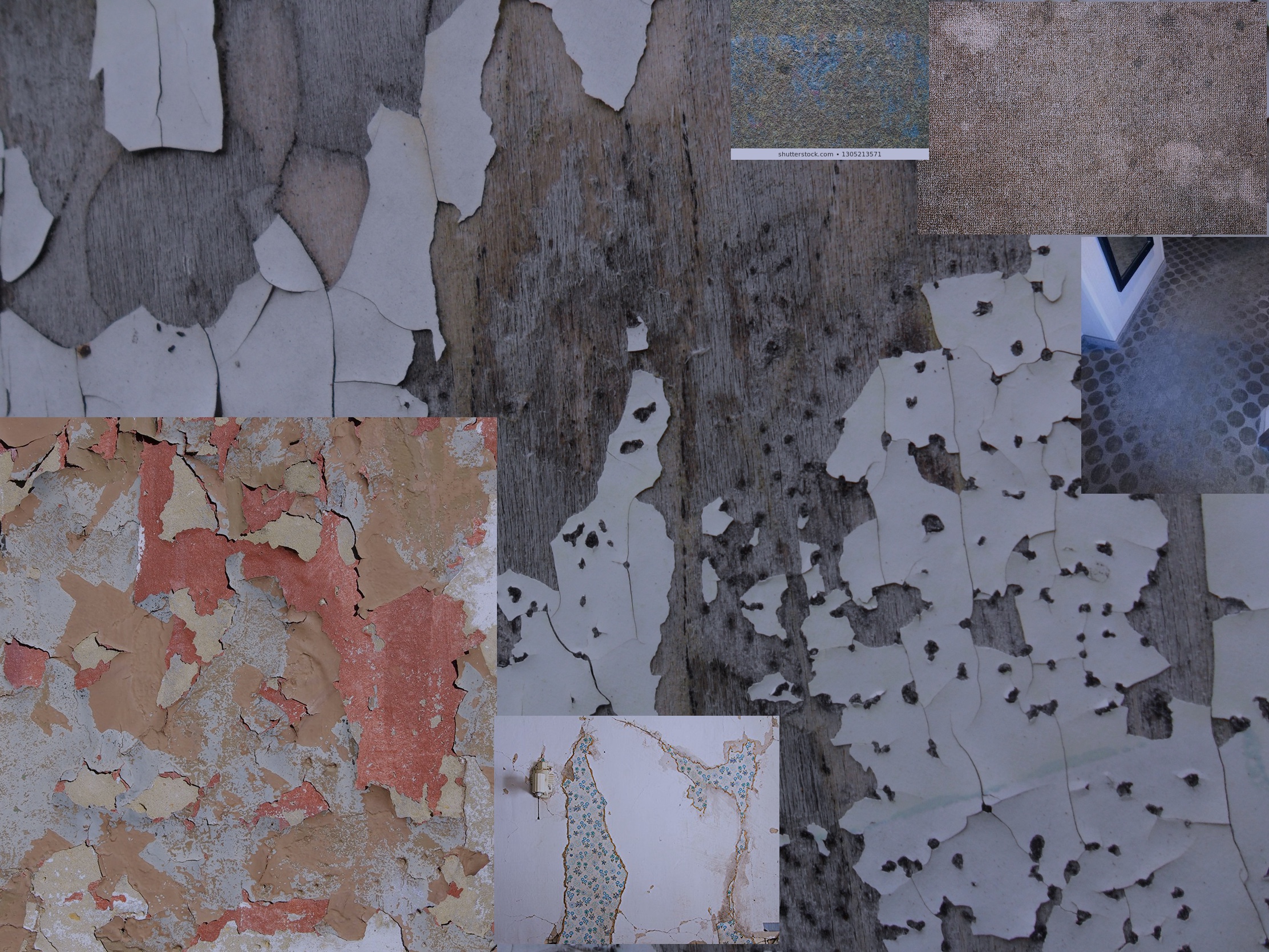
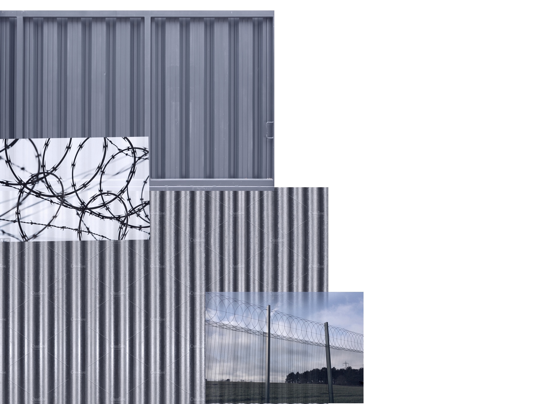
I collected images of war-torn London, typical clothing men wore at the time, the type of desks and furniture used in offices, and several covers of detective novels published during that period. I wanted to reference these to see how detectives were typically depicted.
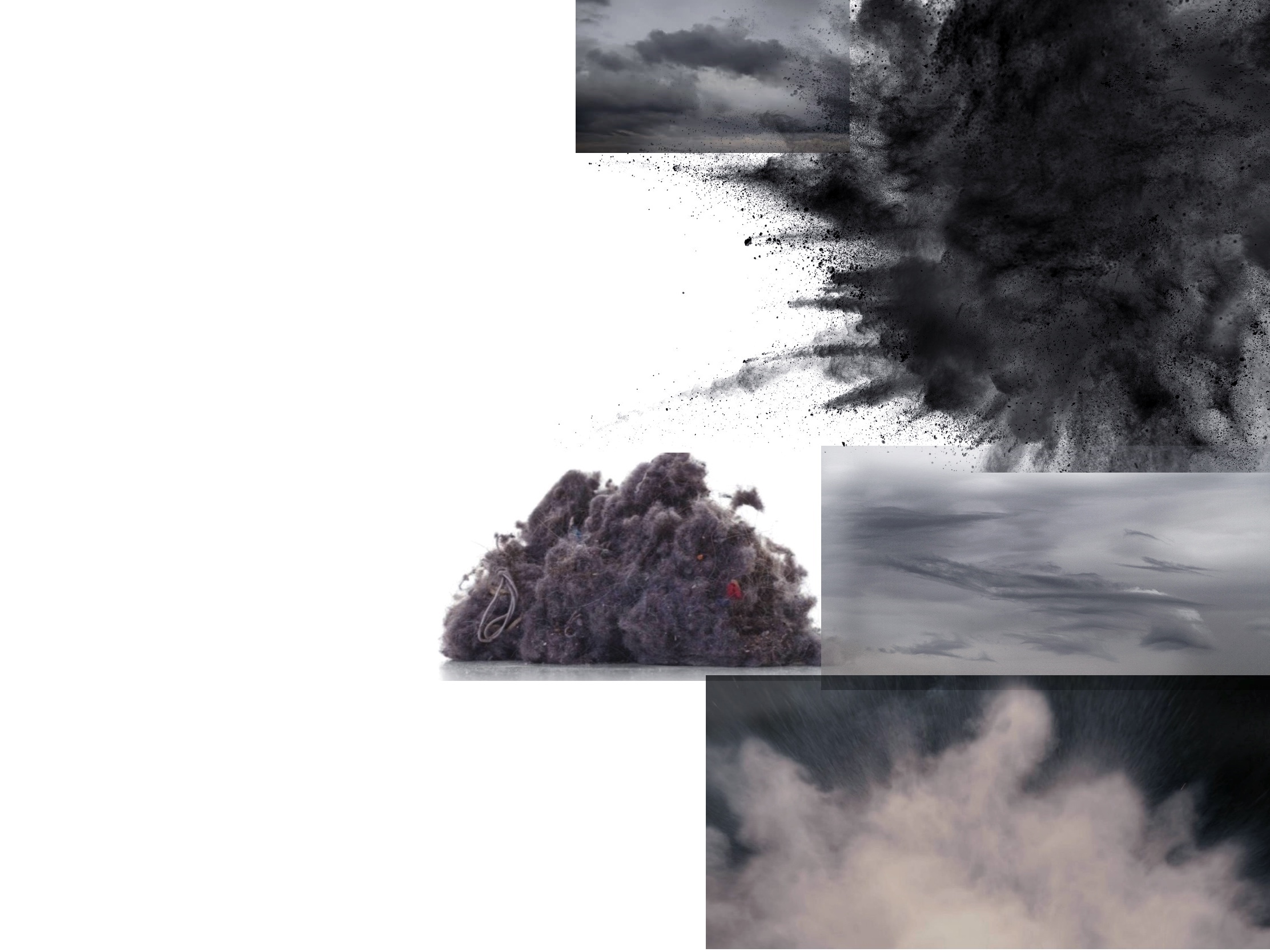
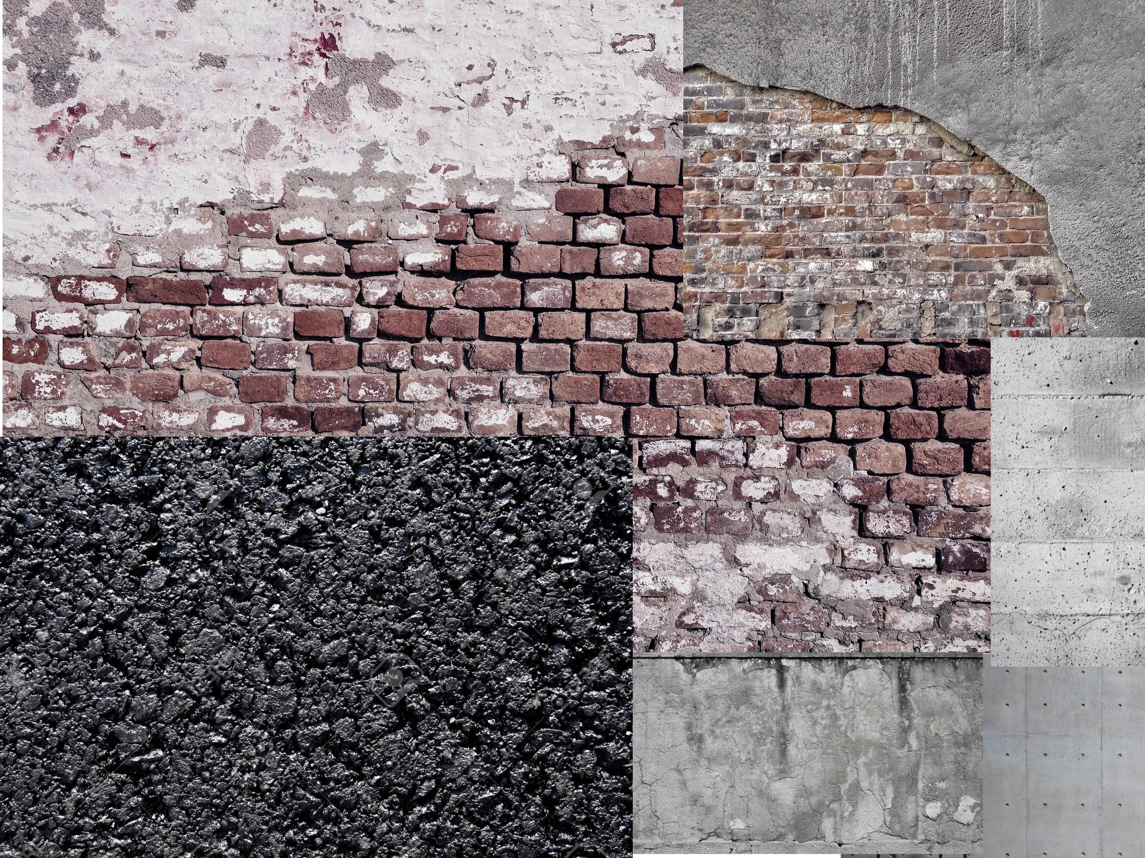
Next, the exercise asked me to choose a word that captured the mood I wanted to convey and to create mood boards for textures and colours I associated with that word. I picked the word ‘bleak’, which is quite vague and proved difficult to instinctively find textures for. I started writing a list of all the things that I thought were bleak, especially in reference to the portrait I would be drawing. My list was:
– Concrete
– Car parks
– Suburban architecture
– Brick walls
– Dull/washed out
– De-saturated
– Grey clouds
– Rain
– Dust
– Gravel
– Bare wall
– Peeling wallpaper
– Worn carpet
– Brutalism
– Tight, worn leather
– Corrugated cardboard/steel
– Barbed wire
– Metal fencing
– Exposed wiring
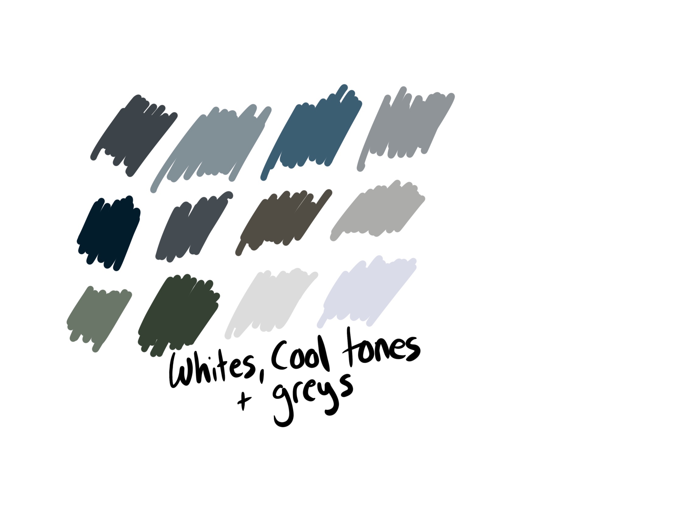
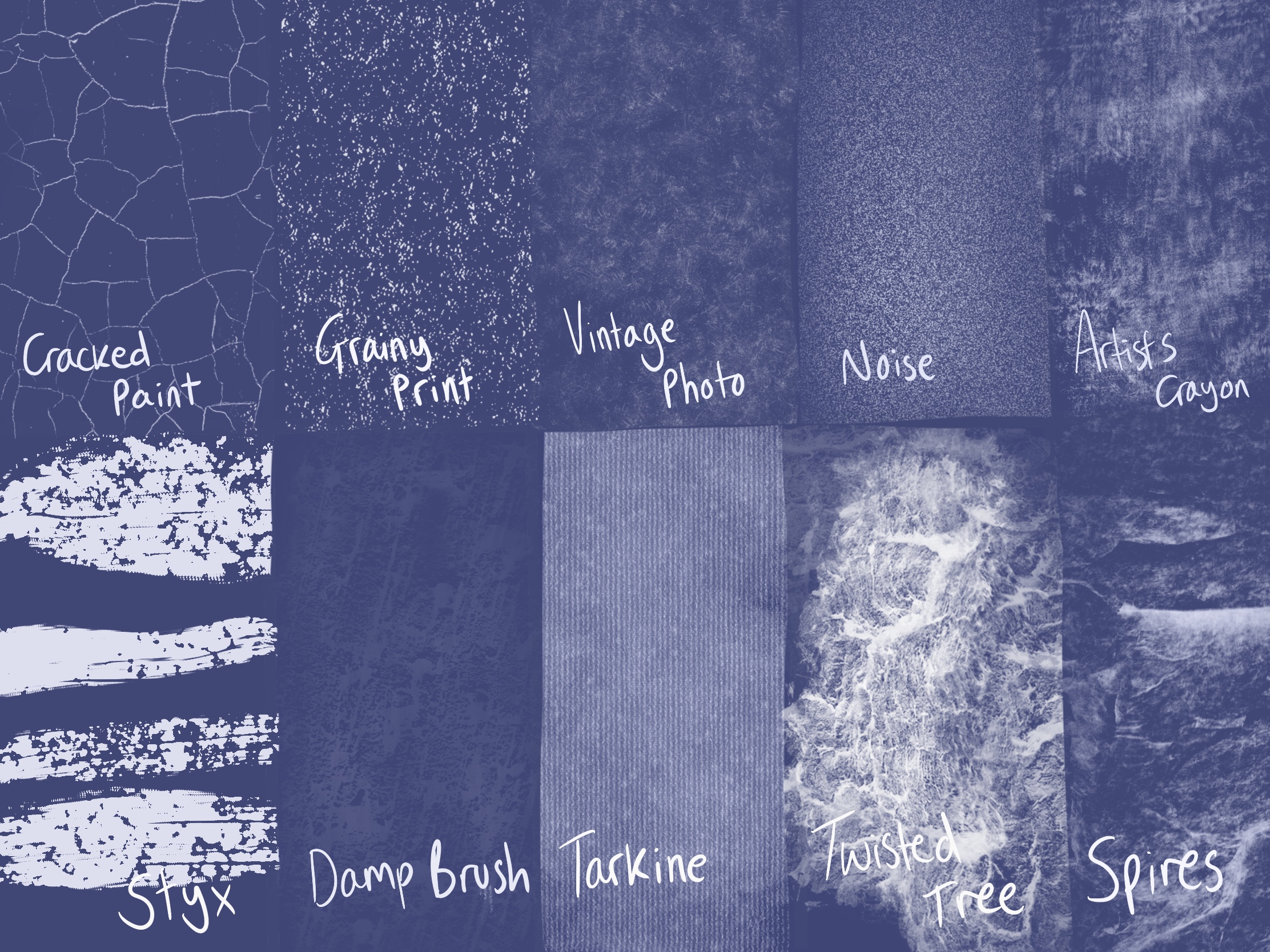
Writing this list gave me a better idea of what I wanted to look for to add to a mood board. I also picked some colours I felt were bleak – blues/greys and cool toned colours – and swatched them on a canvas. I then searched for imagery that fitted my idea of ‘bleak’ texturally. I organised them together into categories and put them onto individual mood boards. Because one of my focuses was a de-saturated colour palette, I then added a cool toned blue overlay to each mood board. I felt very inspired by how dull this made each one look, and it gave me a clearer idea of what I wanted to create. Finally, I looked through my texture brushes on Procreate and swatched ones that I felt fitted the tone of the image, so I could revisit this to use them in my illustration.
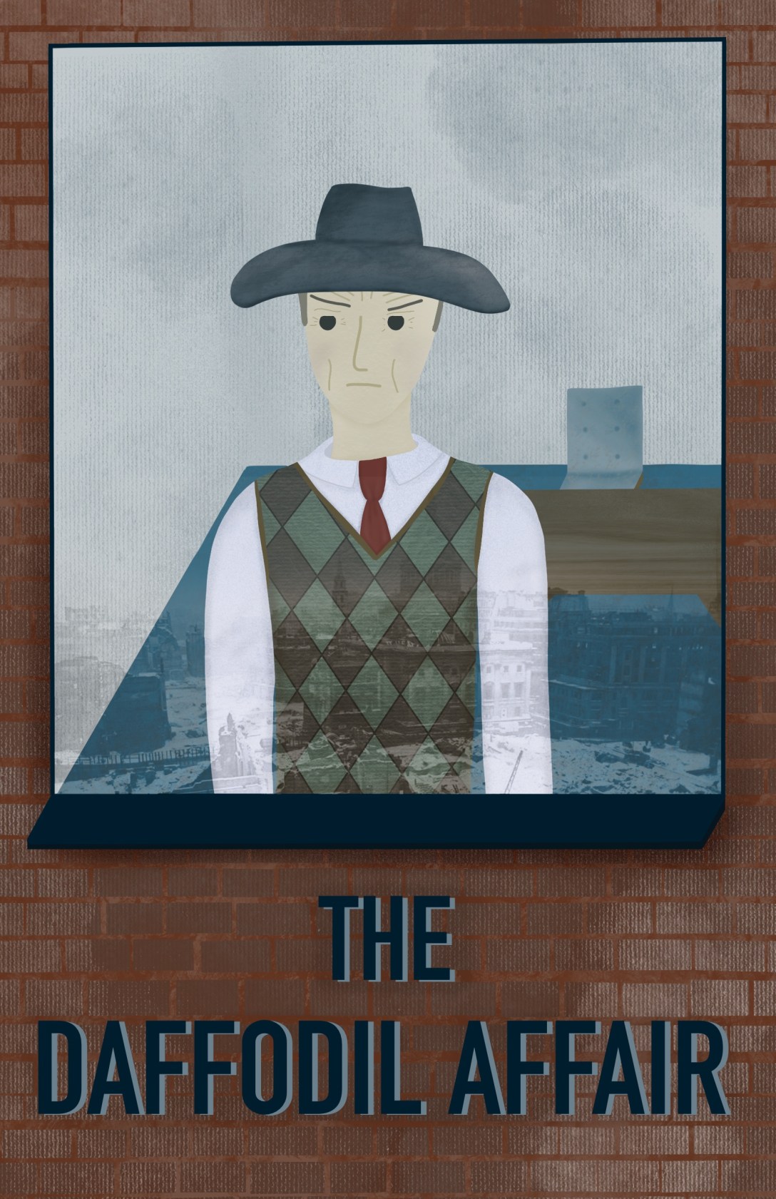
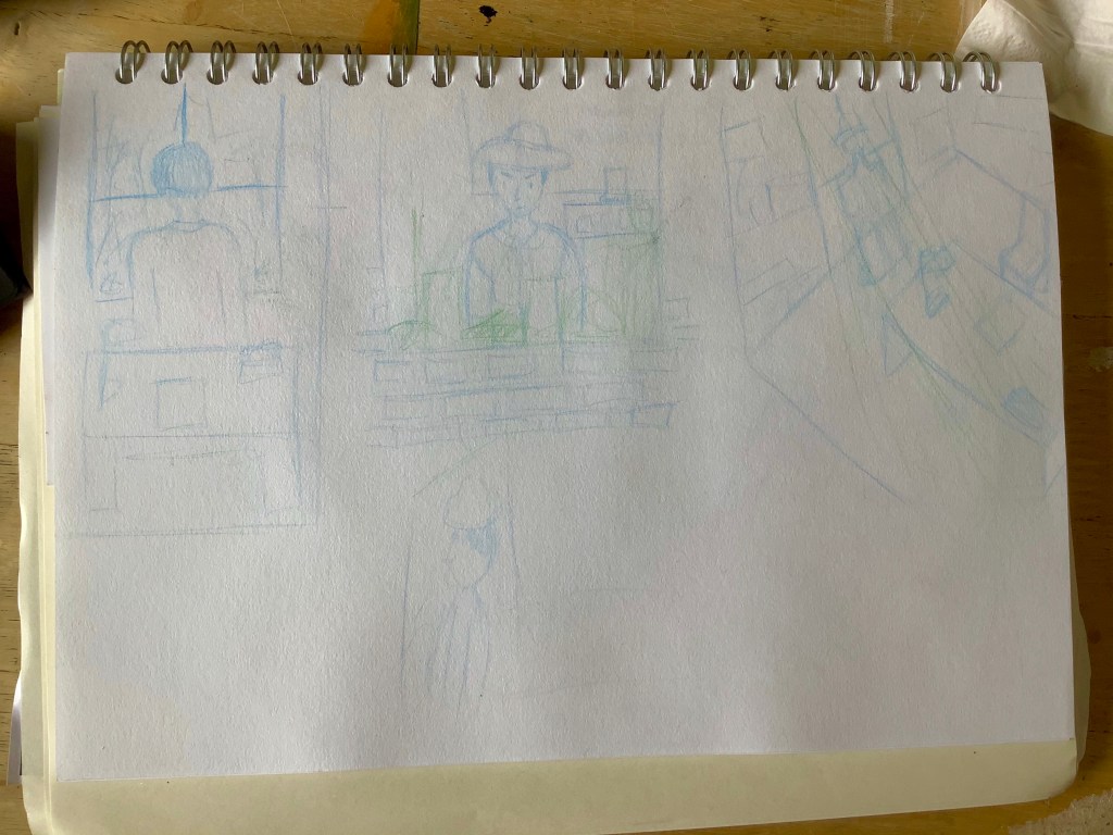
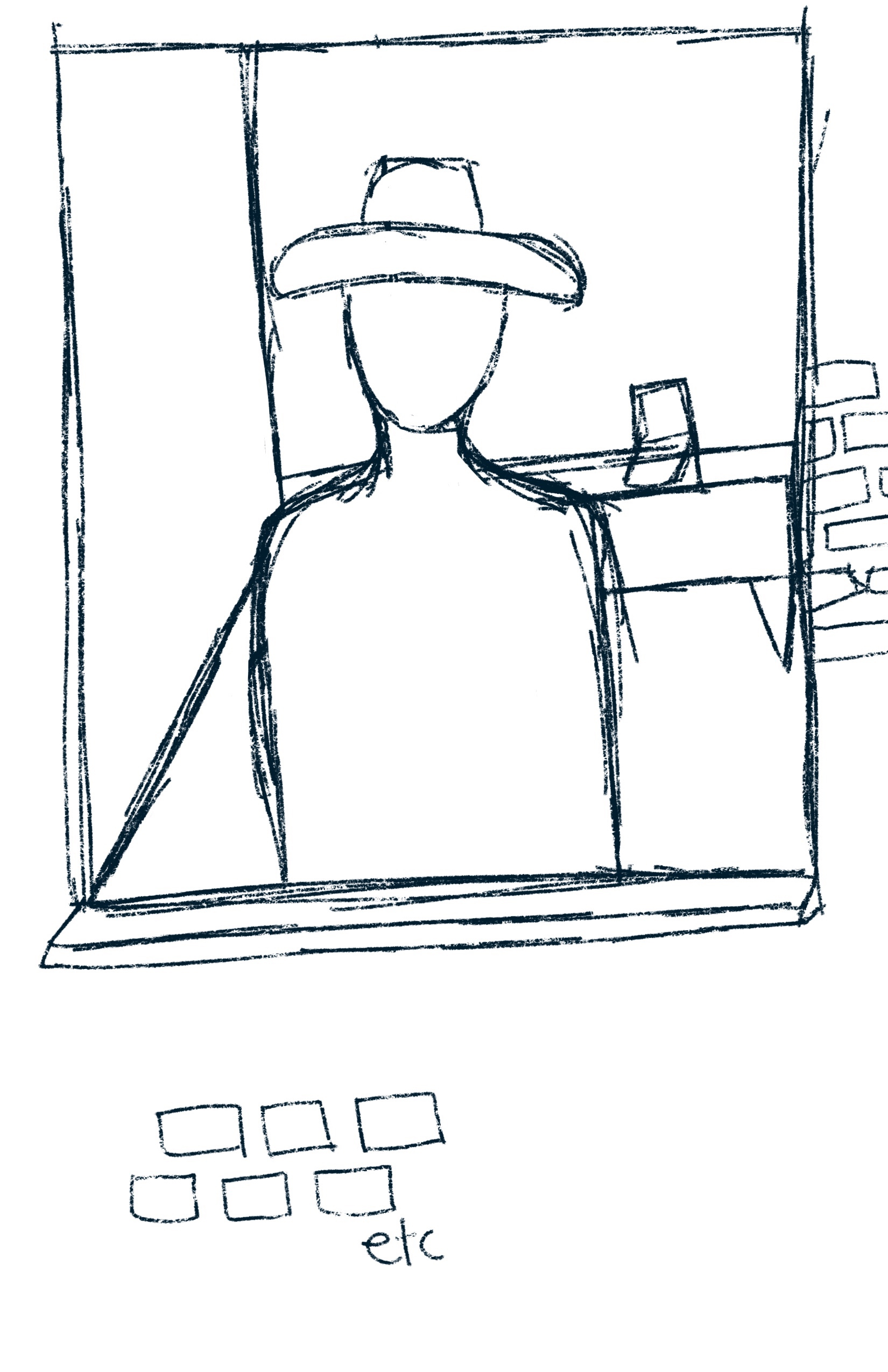
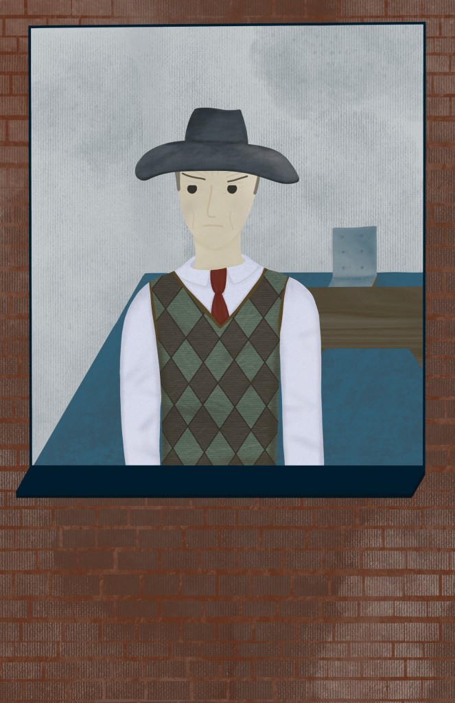
The final step for this exercise was to create a simple portrait of the character using the reference I had gathered. I started by thinking about how I wanted to portray the man. How would he be standing? Where would he be standing? I sketched out a few ideas for the layout of the piece. I really wanted to capture the fact he was looking out at London during World War 2. My first sketch was from behind, and I figured I could draw out the scenes of London through the window and have emphasis on the emptiness of the room. The second sketch showed him from outside of the window. I thought this would work well as I could focus on showing his anger and still capture the bare room and have the reflections of London in the window. My third idea was to show the room at an angle, with the man standing at the window looking over London. I roughly sketched a fourth idea but gave up on it almost instantly, as I just felt the perspective was too tricky. Reading over the brief, I decided to go with my second idea for the final illustration, as it fit it best and could convey the most information. I would also be able to include many of my ‘bleak’ textures and concepts.
I wanted to illustrate this digitally, so I sketched out the same concept on Procreate. I had a colour palette picked already and brushes I knew would work for the tone I wanted to convey, so it was a seamless transition. I began adding block colour to the piece, and drew out the bricks around the window. Then I started adding texture and shading. I tried to only use the texture brushes I had picked out in my swatch sheet, along with my regular shading brushes. I found the reference I had gathered was very useful when colouring and texturing the clothing, but had to dig around a little more for how a sweater vest would look. I thought it made more sense for him to not be wearing his jacket as he is indoors.
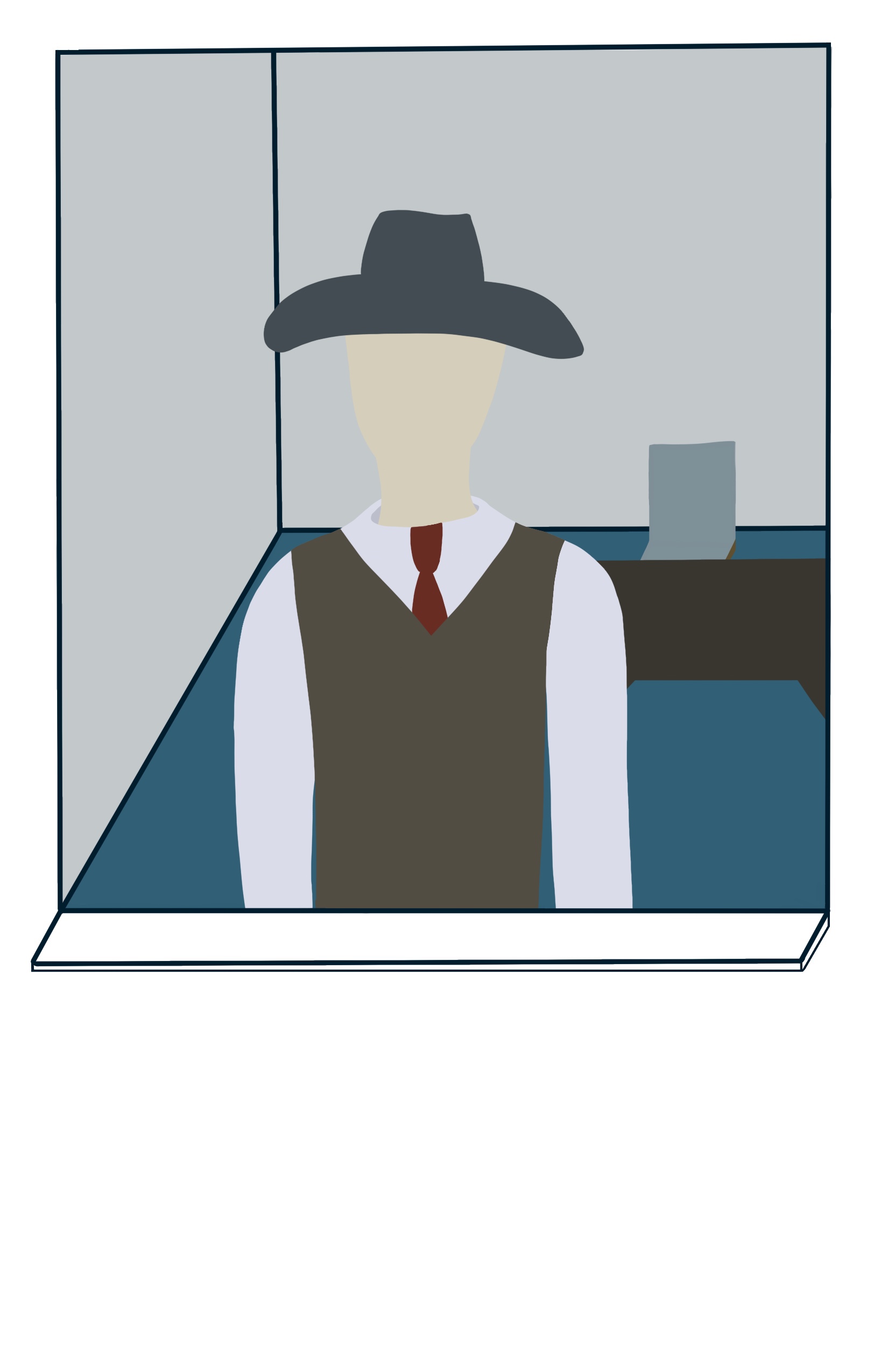
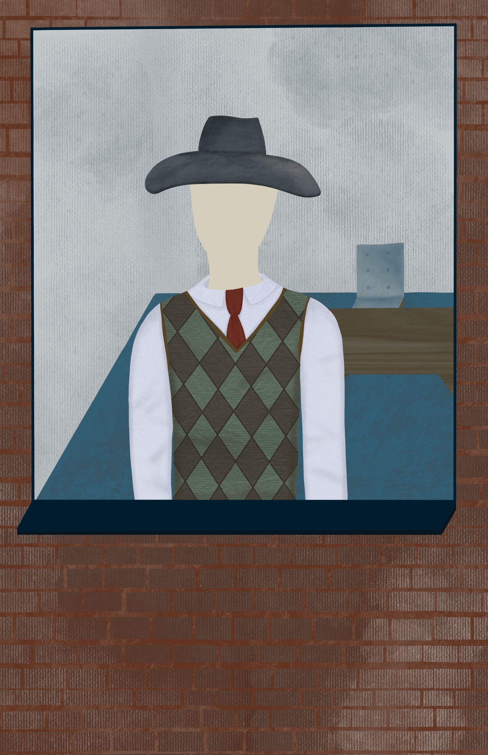
I saved the face for last as it was the bit I was most dreading. I have talked before about not enjoying drawing people and faces, as I struggle with it. It’s one area I find it really hard to let go of my perfectionism with. I also feel I haven’t quite found a ‘style’ for my faces. I do have a consistent go-to for how I draw them, but it doesn’t feel right. I was pretty impressed with how it came out, however, and how I was able to convey his anger. I added wrinkles and frown lines to show his constant disappointment and age. Usually I do full circles for eyes, but I opted to trim the tops off, which I thought helps convey his annoyance. Rather than going for the rosy blushed cheeks I normally would, I shaded them with a darker greyish brown, as I was trying to keep it bleak.
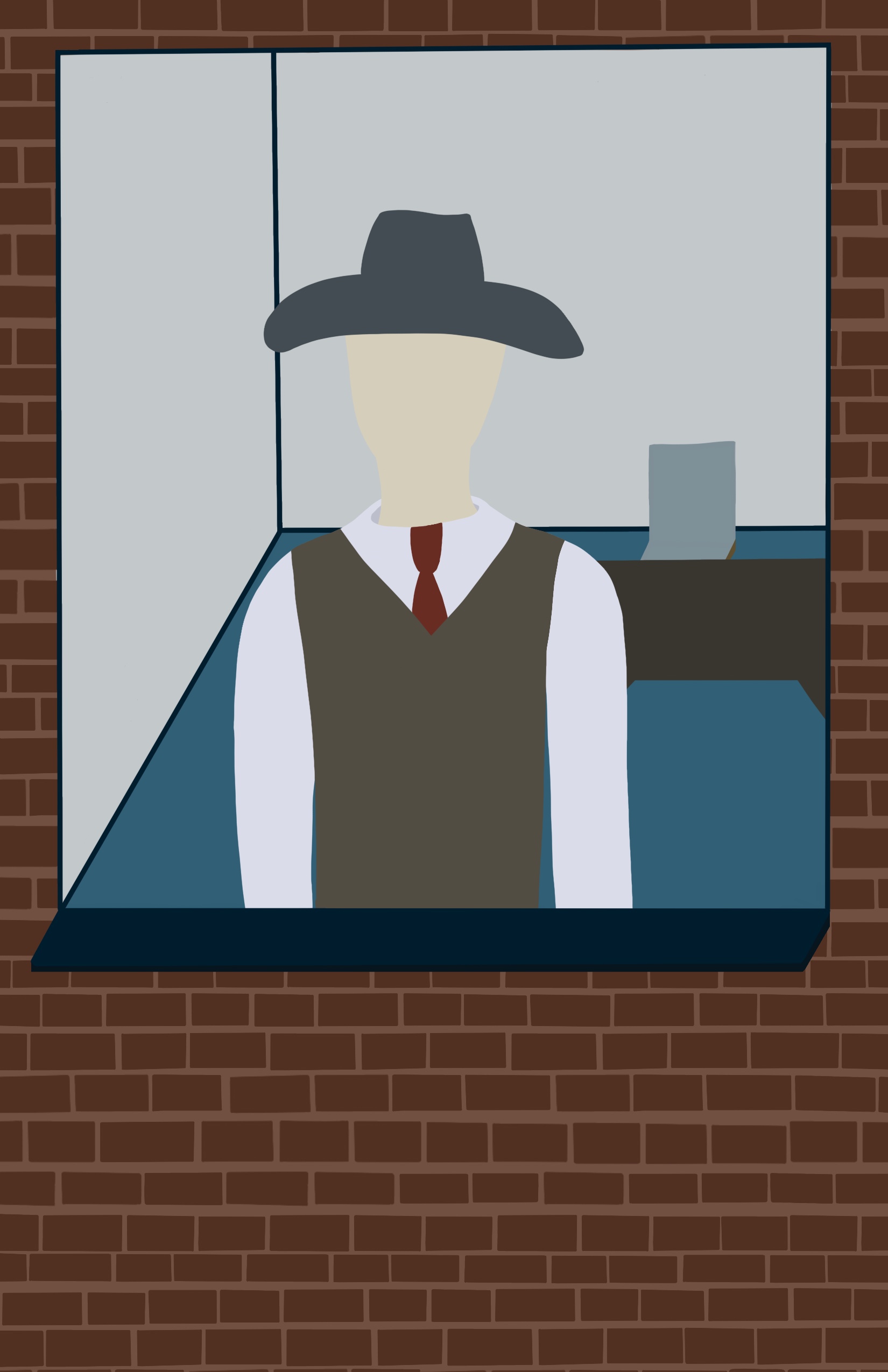
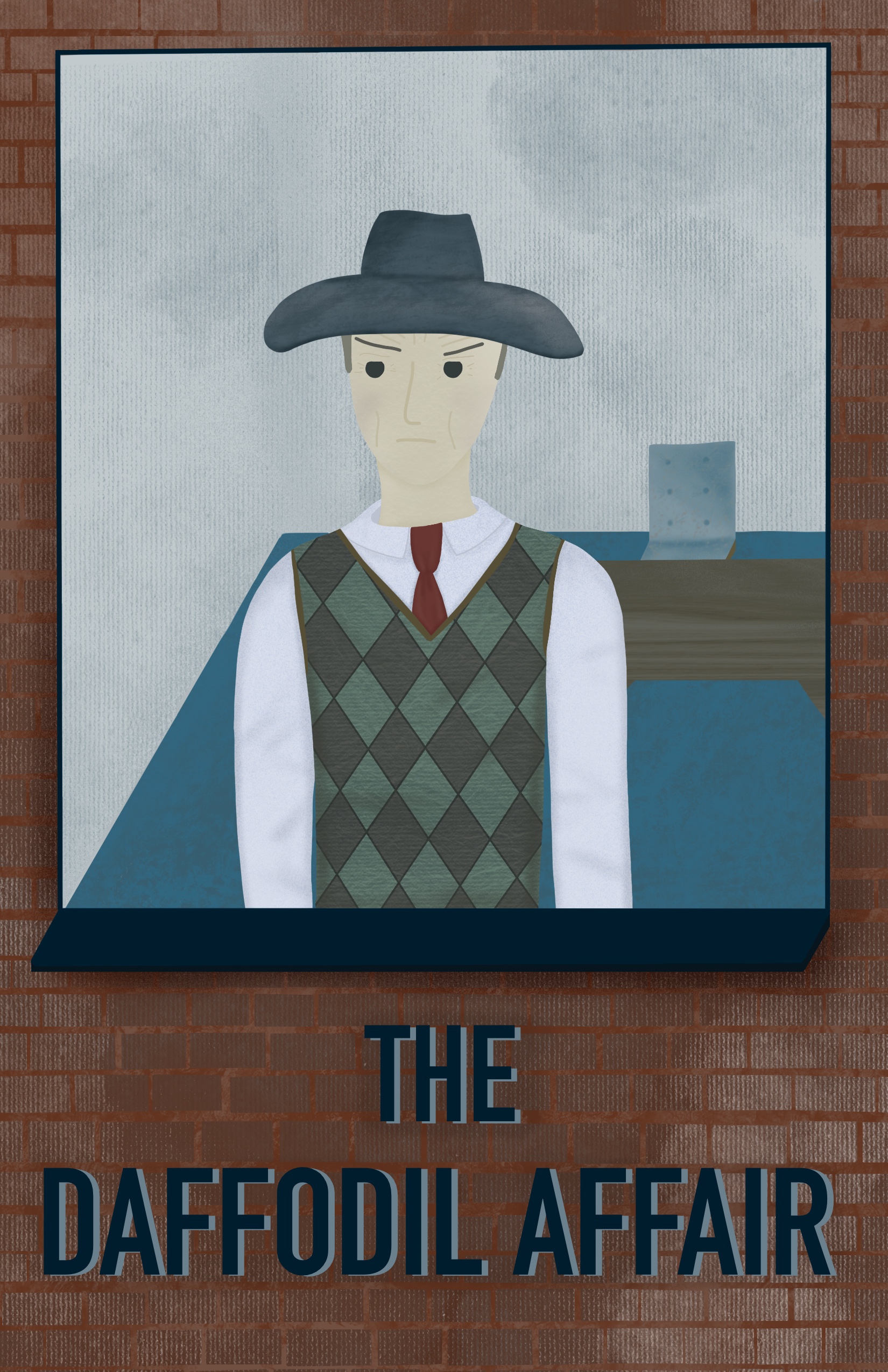
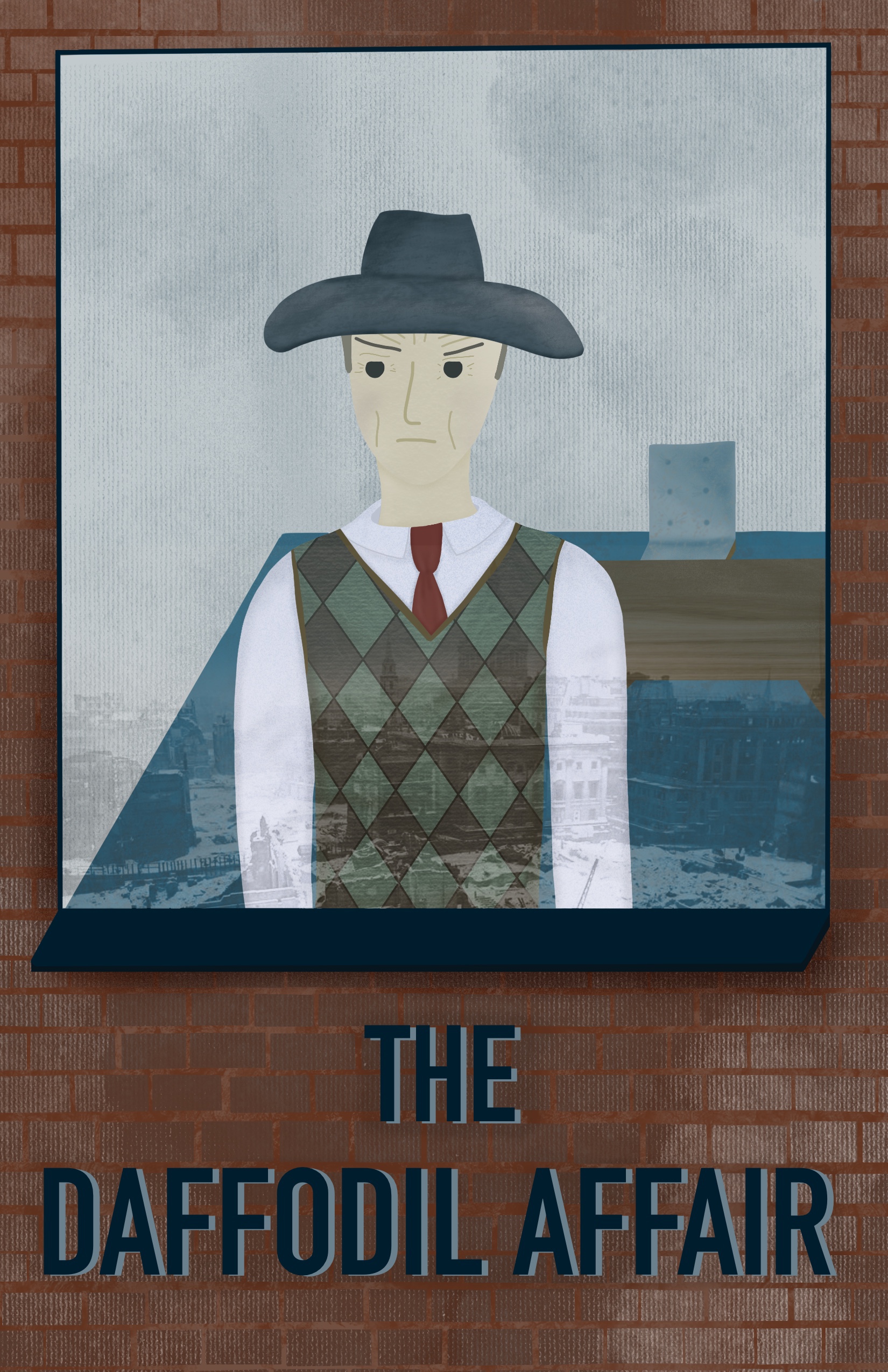
I decided to overlay an image I found when collecting reference onto the window as a reflection of the city outside. Normally I would attempt to draw this myself, but as I’m trying to not give myself more work than necessary and get hung up on being perfect, I chose this method instead. I really like how it looks, but I’m still not too sure of it. I have shown the illustration both with and without below. To finish up, I added some text so it would appear like a book cover – despite that not being required – as I felt the empty space was perfect for it. I think the text could probably use work, but I can’t quite figure out what it needs.

I sent this piece to the OCA Visual Communications student Discord server and asked for feedback. Someone commented that the contrast on the facial features wasn’t high enough, and that,at a small scale, they aren’t visible. I altered the contrast a little, which I agree makes a huge difference.
I really enjoyed this exercise and the process it required. I found that despite avoiding drawing people, having to do it repeatedly is improving my ability and I didn’t struggle as much as I did last time. It brought me comfort to see such improvement and made me consider drawing more people and expanding on that. I also love working with texture and colour, so focusing on that and how to apply it to certain contexts was a lot of fun. I definitely think this illustration could be better, and with more practice at drawing people I could create much stronger portrait illustrations. As I mentioned, I do think the text is a little jarring, but I’m unsure on how to fix that at this point.
