The second sketchbook to arrive with me was themed around hobbies and interests. I found it hard to think up things to draw for this but managed to get into the swing of things after a while. I struggled with art block a lot this month, and ended up rushing a lot of the pages as I had to finish it in order to send it on. This sketchbook, however, contained a lot of work that I want to develop further, and it has provided me with insight on how to utilise my sketchbooks in this way.
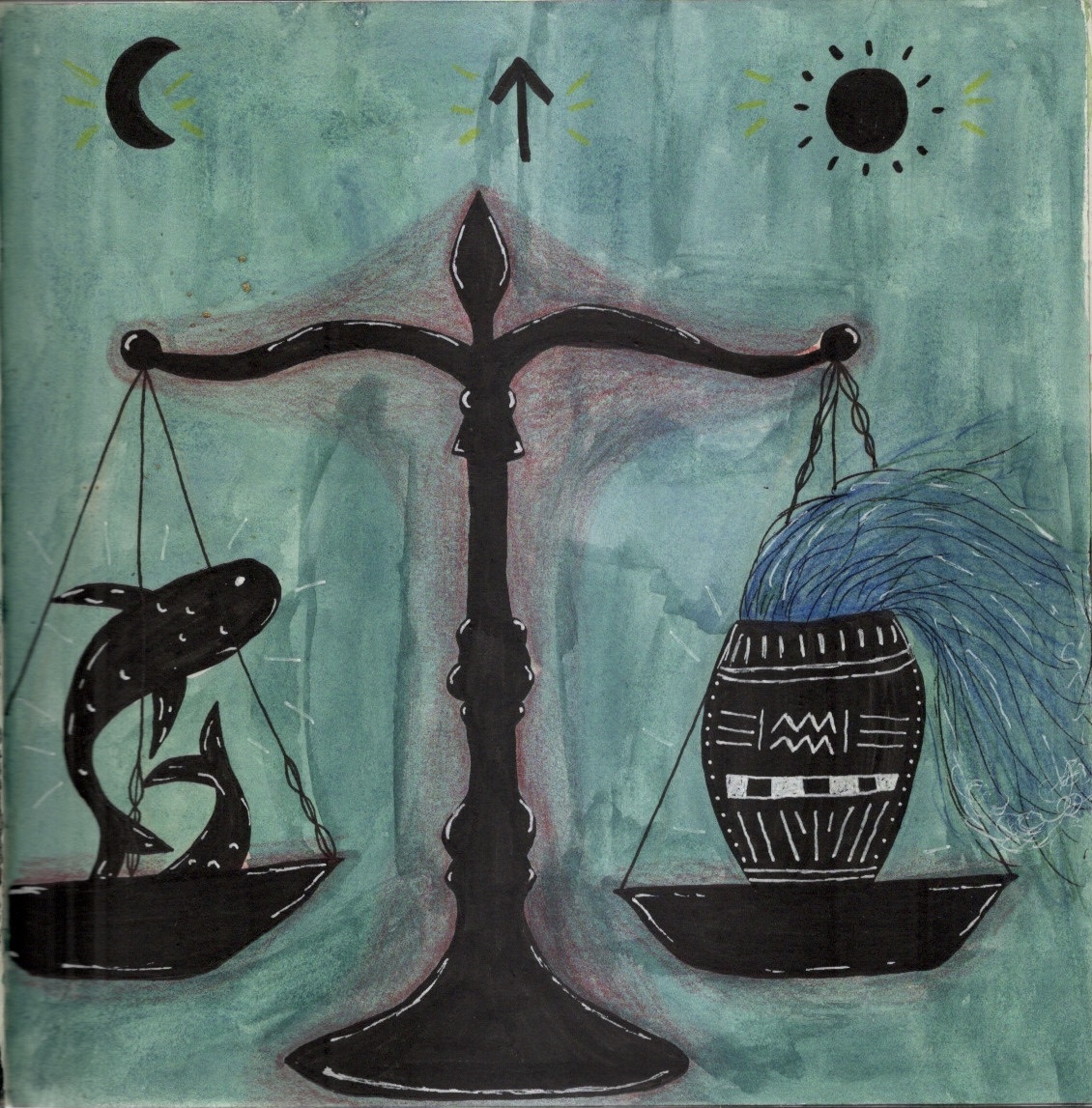
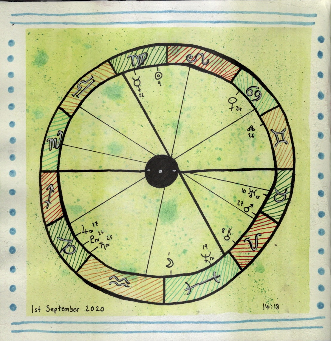
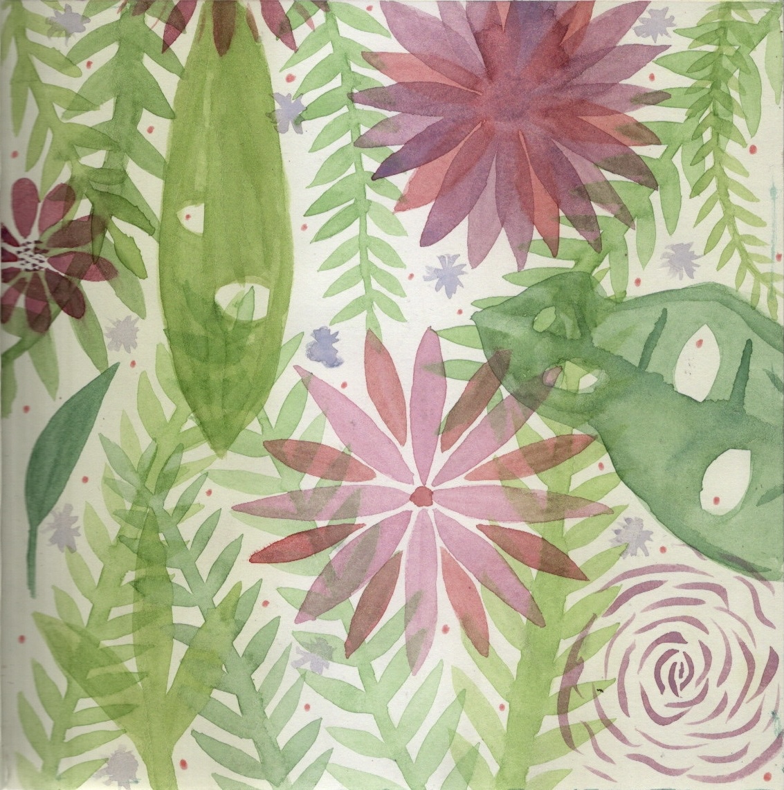
The first two pages I did were astrology-based. Beth, who owns the sketchbook, had included some astrology pages too, and I felt it flowed well. I really want to re-do the first page and add more detail to it, maybe digitally. It was great to get the idea down on paper though. The second page is a chart of the moment for the exact moment I was drawing it. I like how I did the background, but I think my circle drawing skills could do with improving! I then decided to fill a page with watercolour leaves and flowers as they are some of my favourite things to draw/paint.
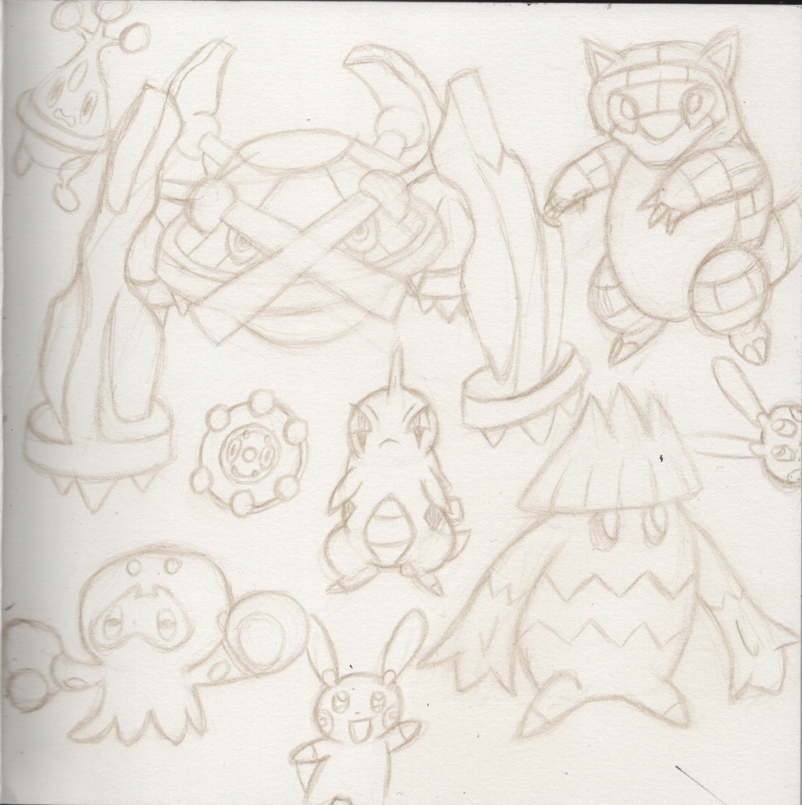
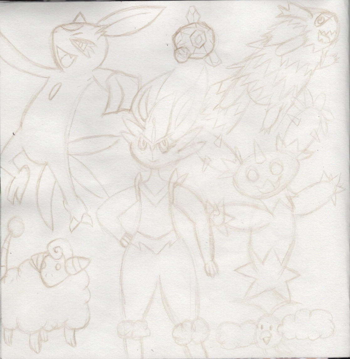
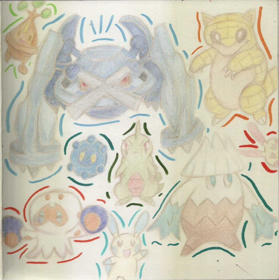
For the next two pages I drew out some of my favourite Pokémon. The first page was fairly rough and inaccurate, but when drawing the second page something suddenly clicked in my mind and I realised how to accurately draw what I wanted to. This was amazing, and the quality of the sketches on the second page outweighed the first page massively. I scanned the original sketches in so I could work on them digitally. I then coloured the second page, which I now regret, as I feel it looked so much sharper and fresher without colour.
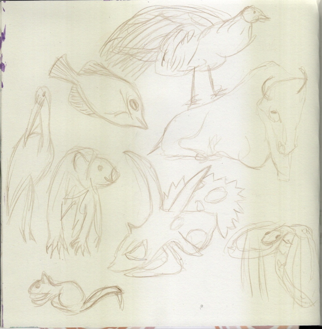
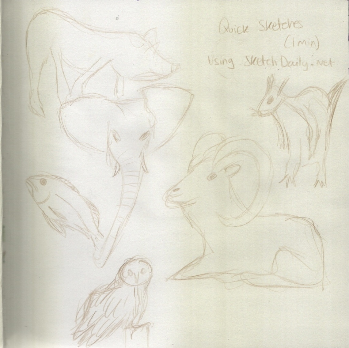
I was struggling to think of what to draw for the next two pages, and I decided to fill them with quick sketches of animals. Beth had filled two pages with quick sketches of her cat, so it still felt on-theme. I am doing more and more quick sketches at the minute and finding it very helpful in developing my art.
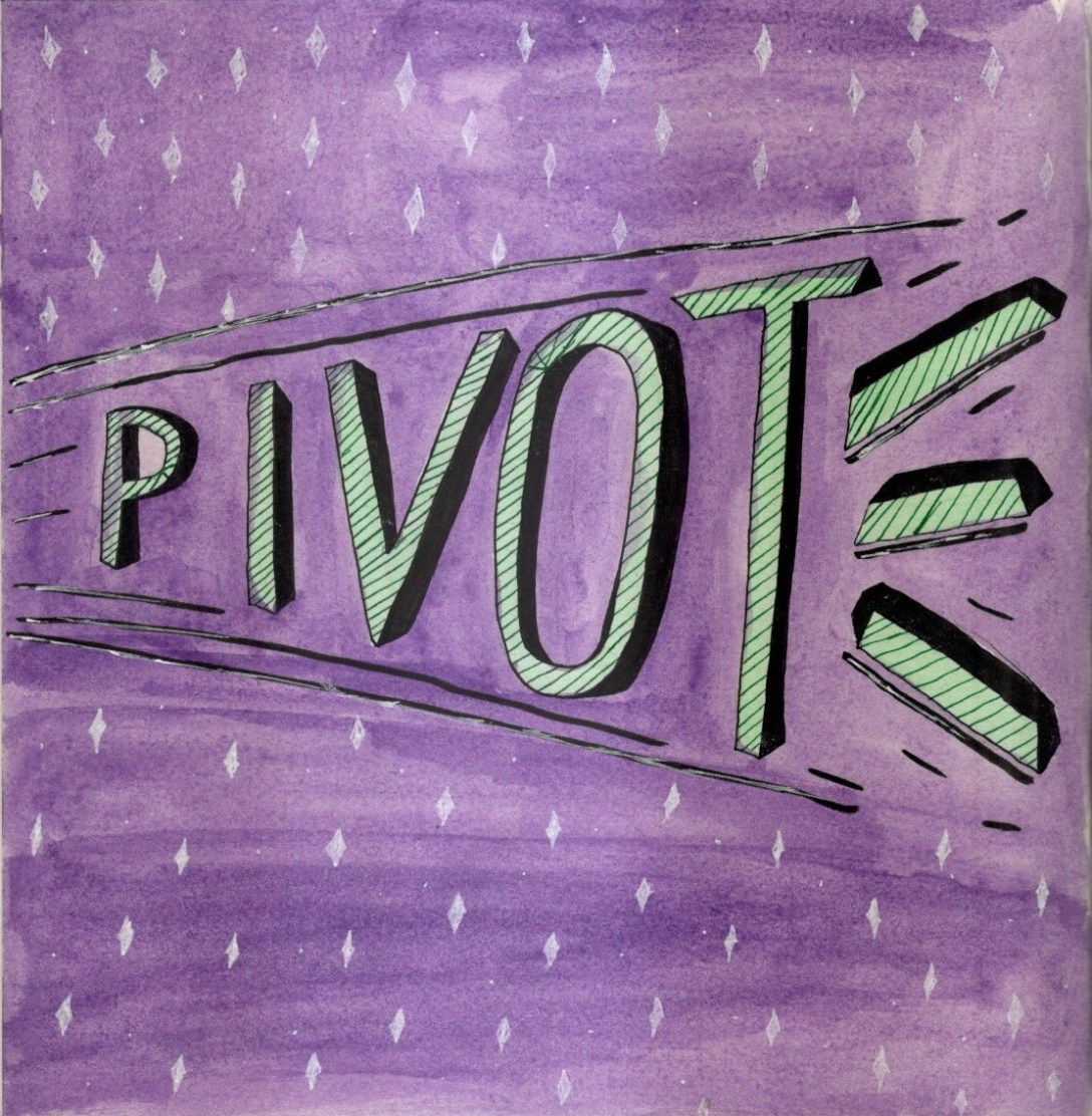
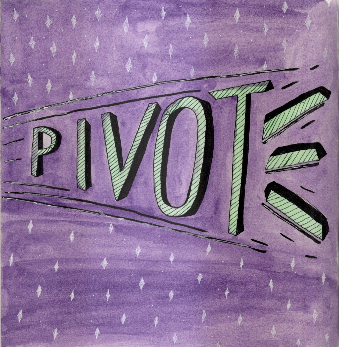
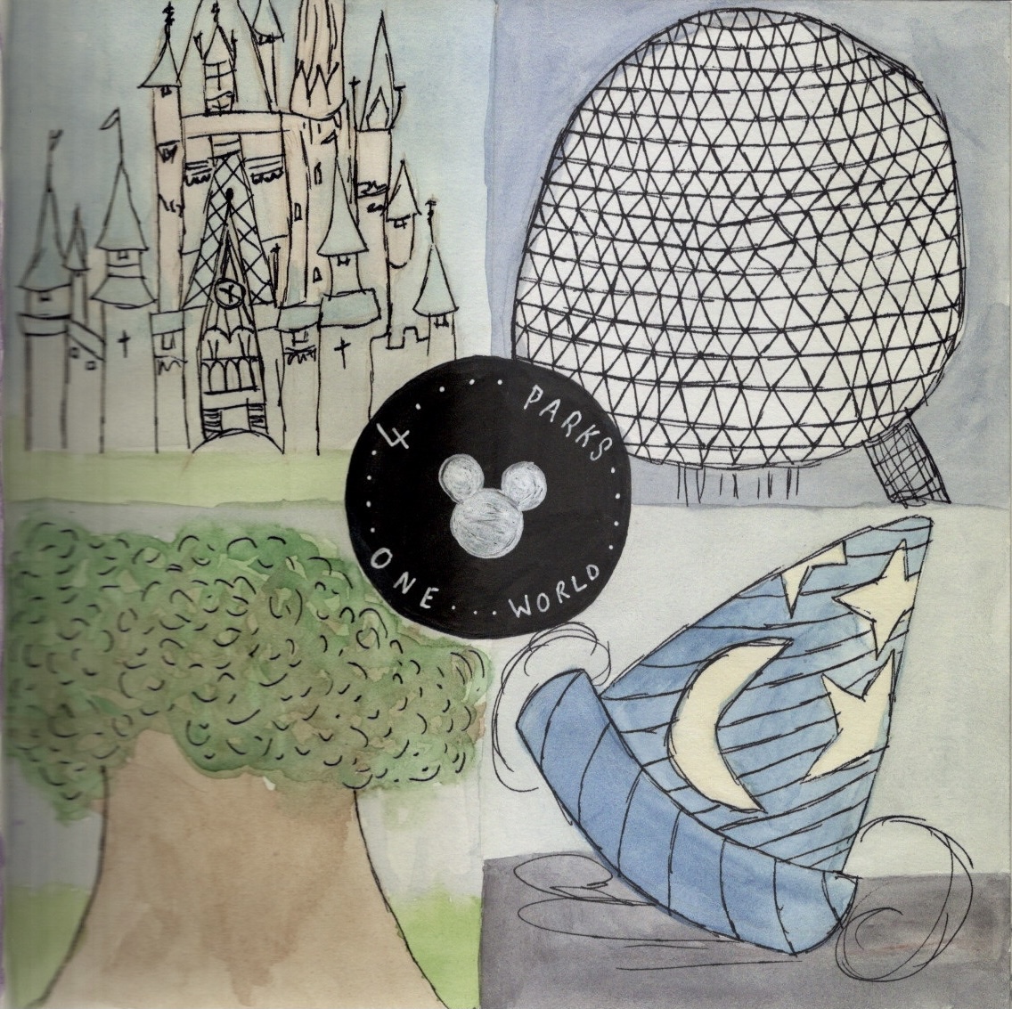
Typography is something I really enjoy and I would like to include a page of this in every sketchbook during this circle. For my typography page, I designed the word ‘pivot’, a reference to the TV show Friends. I then drew the four park mascots for the Walt Disney World theme parks, filling them with watercolour and loose ink outlines. This piece was rushed and could do with some TLC. I like the concept though, and may revisit it.
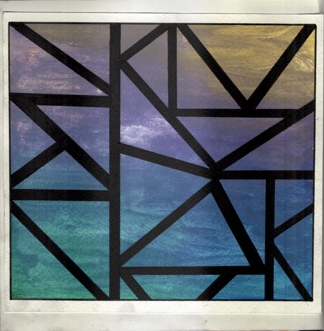
For my final page, I wanted to express my love of colour. I chose some watercolour paper and random gouache paints and dolloped them onto the page. I messily blended them hoping to create a fun, colourful, and expressive page, but accidentally made it look like a sunset over the sea. I wanted a more abstract page, so I chose to add the triangles and make it look a little more random.
I’m a little disappointed in the quality of my work in this sketchbook. I don’t think I did it justice and I was having a really hard time with it. I do feel like I learned a lot from filling it, such as how to draw more accurately and freely, and I have several pieces of work I want to develop further. I’m looking forward to the rest of the sketchbooks and trying out more themes.
