
The first exercise of part 3 focuses on composition and viewpoint. I was asked to find an image of a tree, a child running or walking, and a building, and combine them into a representational image. The goal was to play with visual space and see the different ways you can draw attention to certain elements of an illustration in order to tell a story. I decided to work digitally in order to save paper.
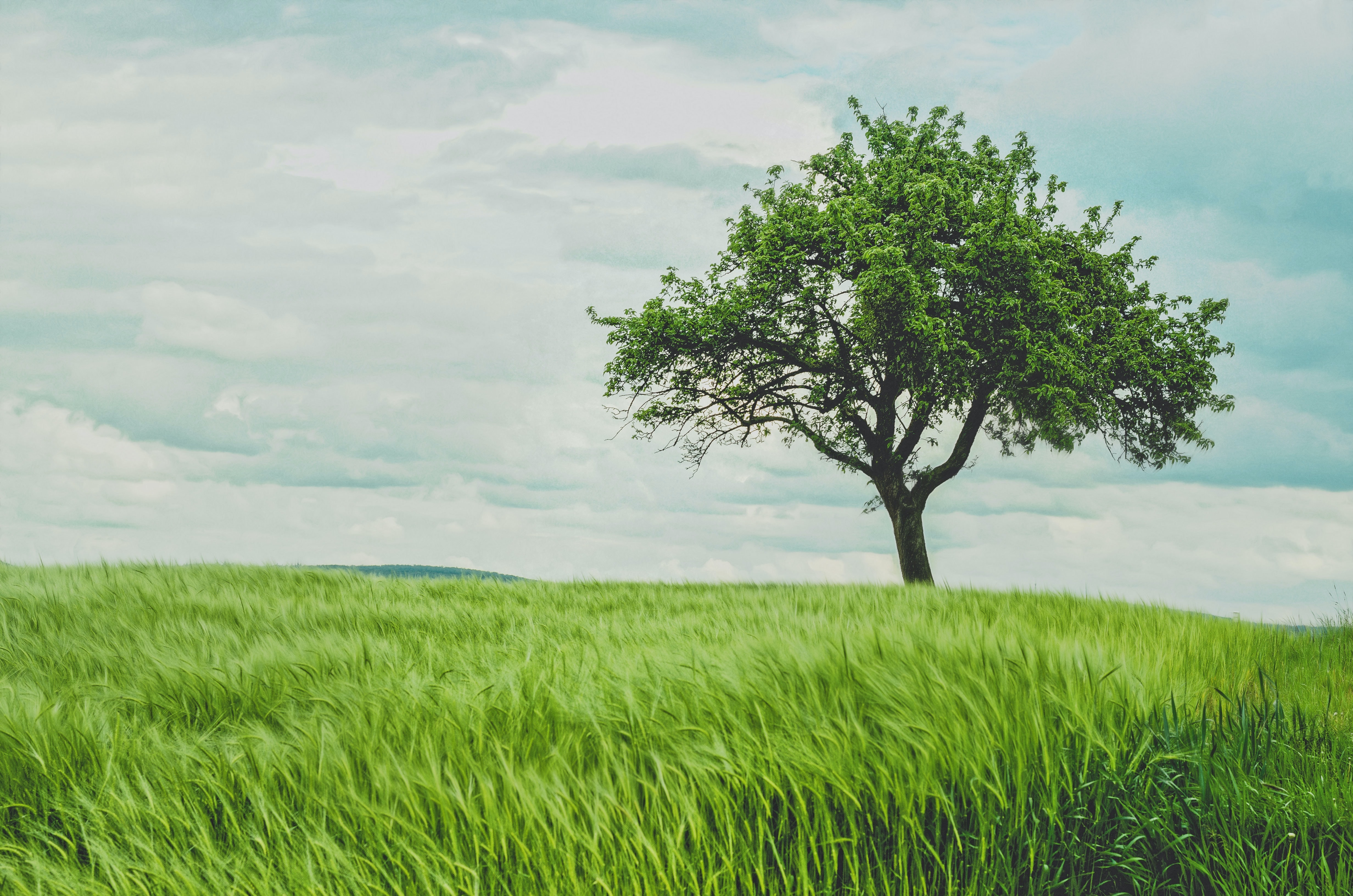
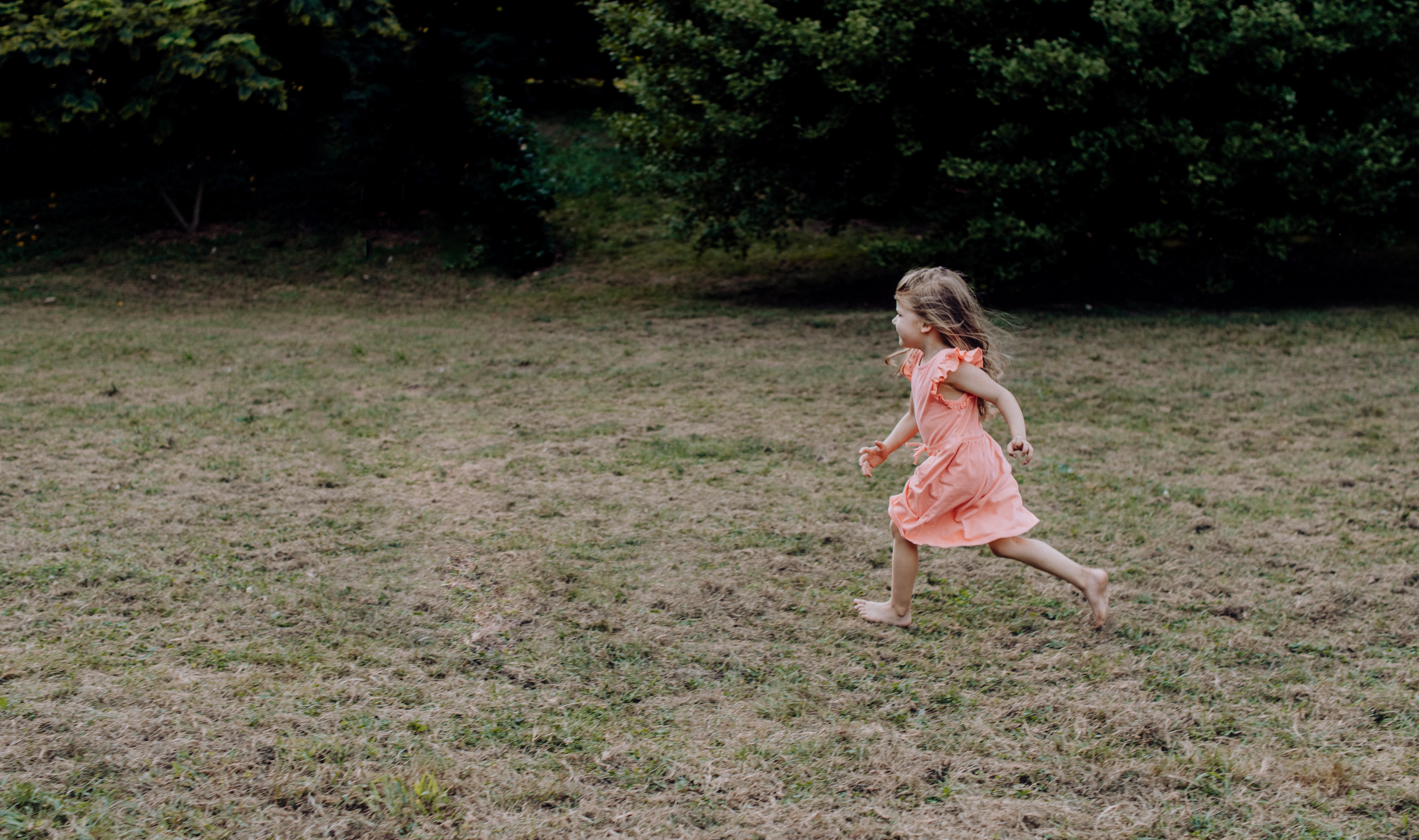
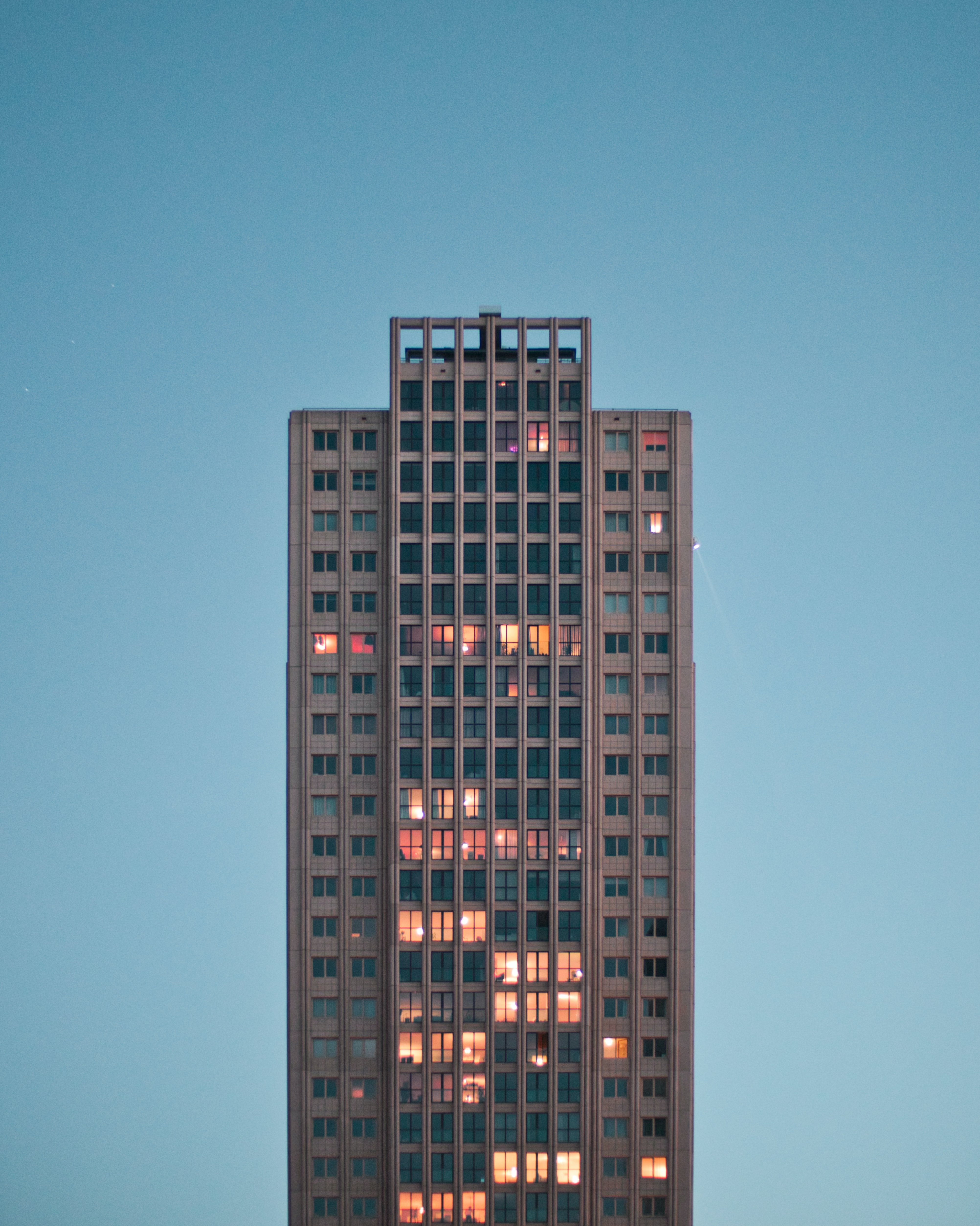
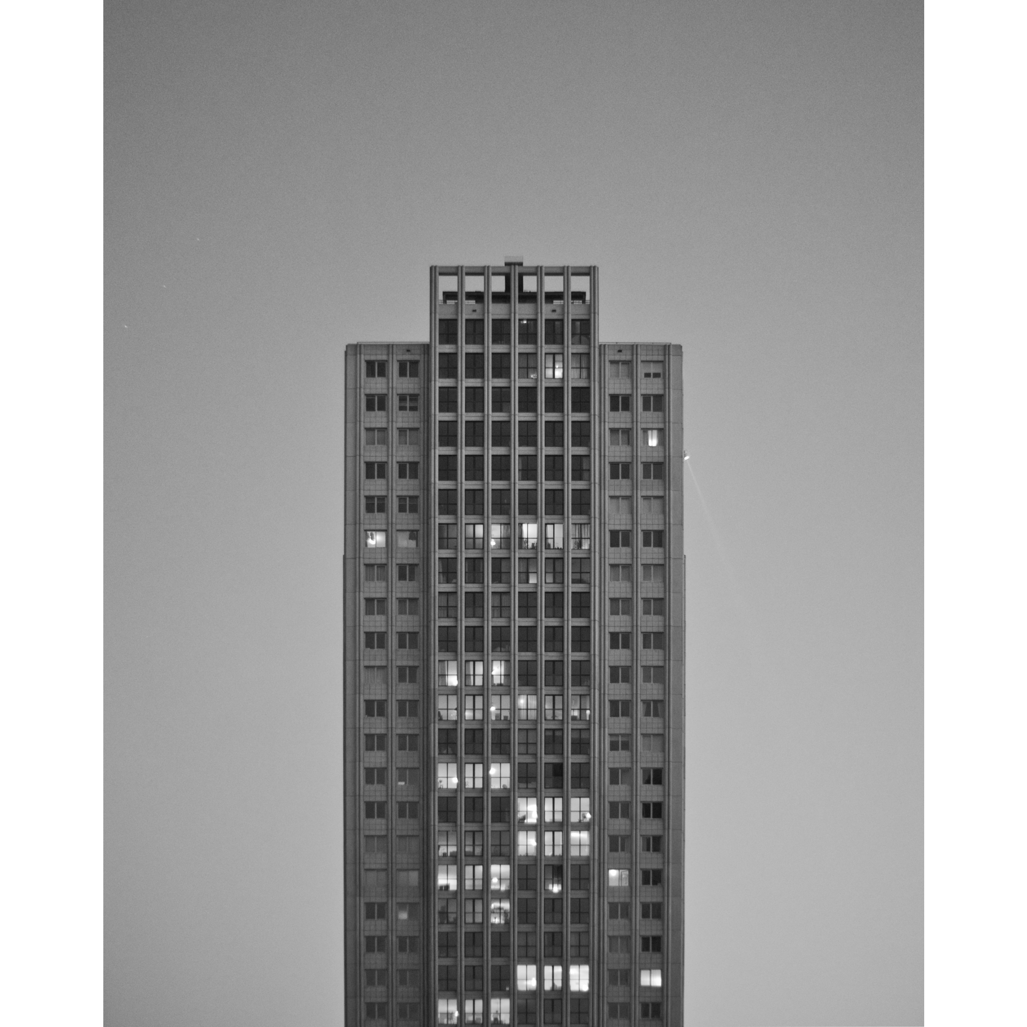
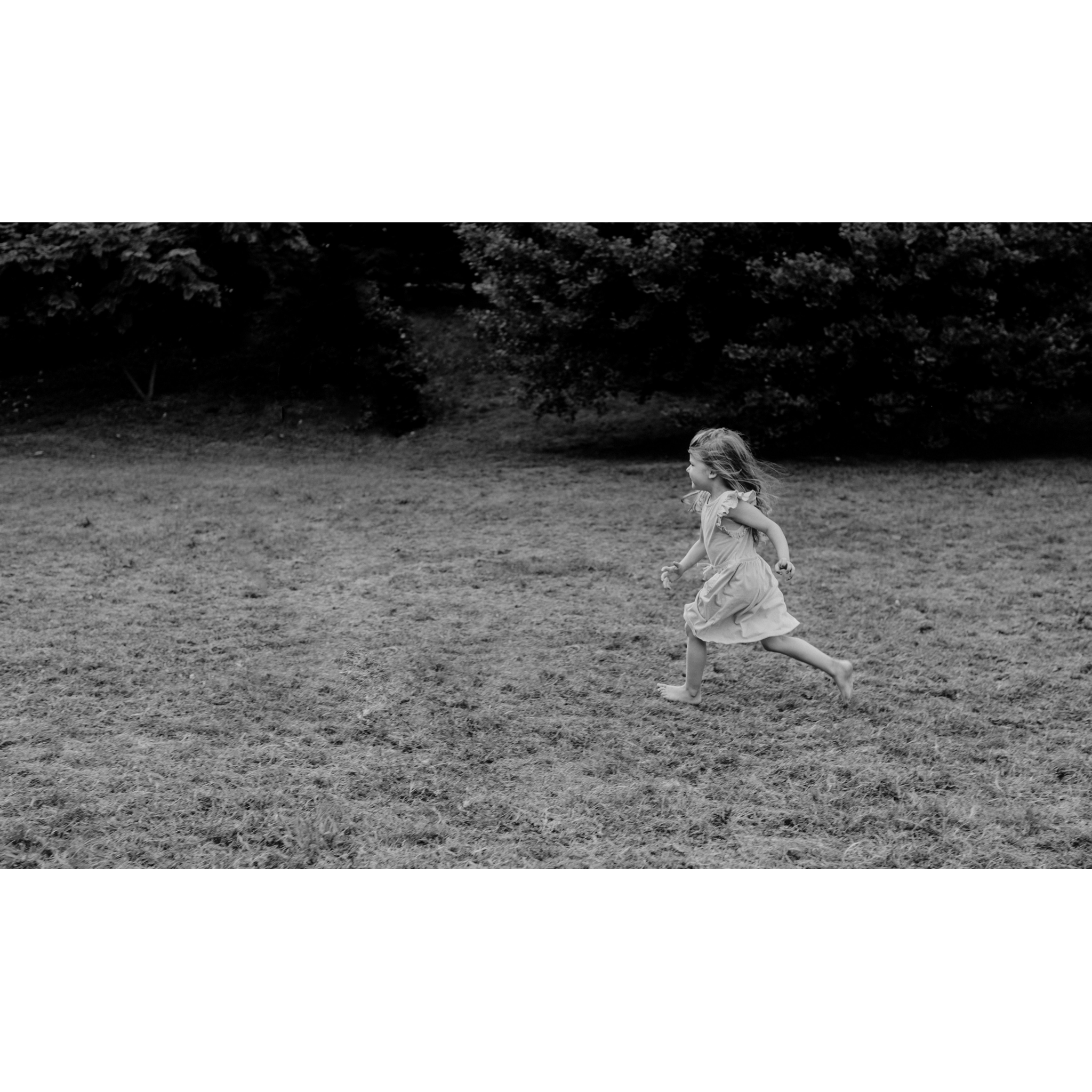
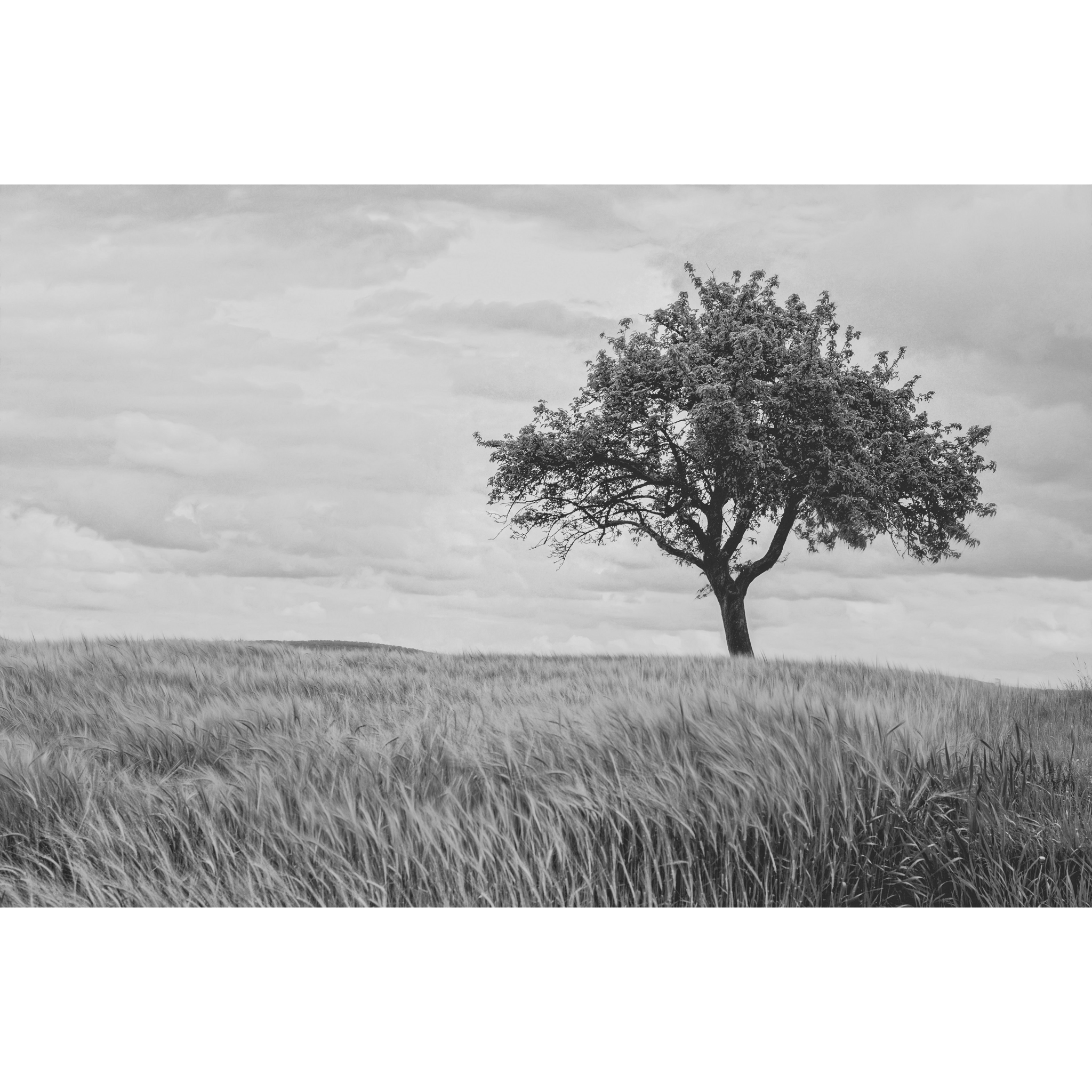
I started by going to Unsplash and finding the images I wanted to work with, then reducing the saturation to make them black and white. I picked these three as I thought they would be simple yet versatile and could offer a lot of options for layouts. I then cut any backgrounds out so that I was left with three standalone elements.
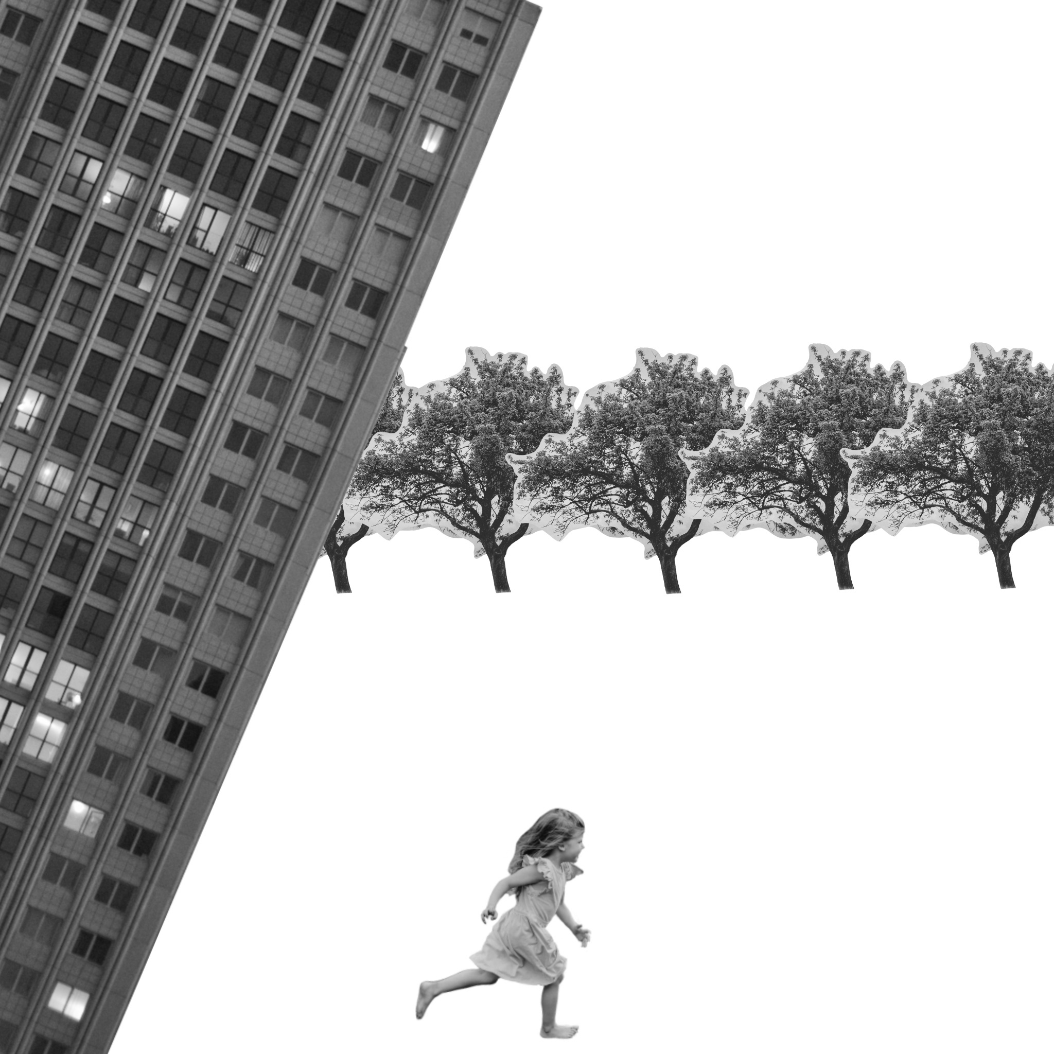
I spent some time arranging the elements in different ways, duplicating and resizing them, changing the angle of them, and adding horizons. I was mostly trying to work with a narrative and see where it led me. I was trying to tell a story through the lens of the girl, almost like a children’s book, being inspired by children’s imaginations. This also helped me feel able to ‘play’ more with the elements instead of being confined to what’s ‘normal’ or ‘real’, as the perspective of the imaginative child gave me more freedom to experiment with.
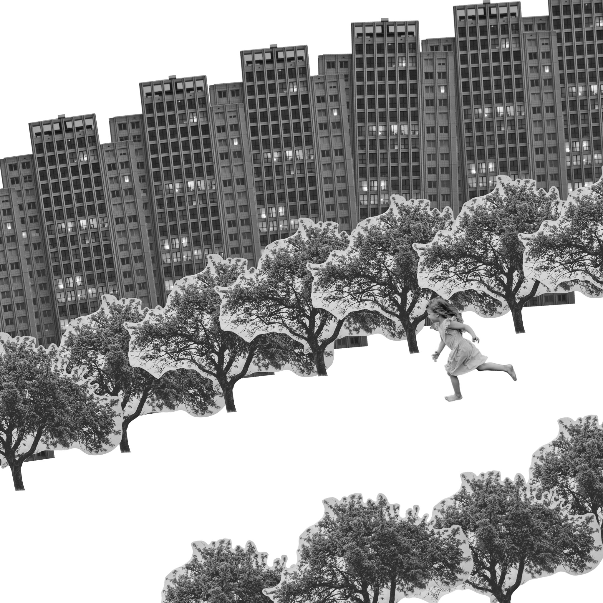
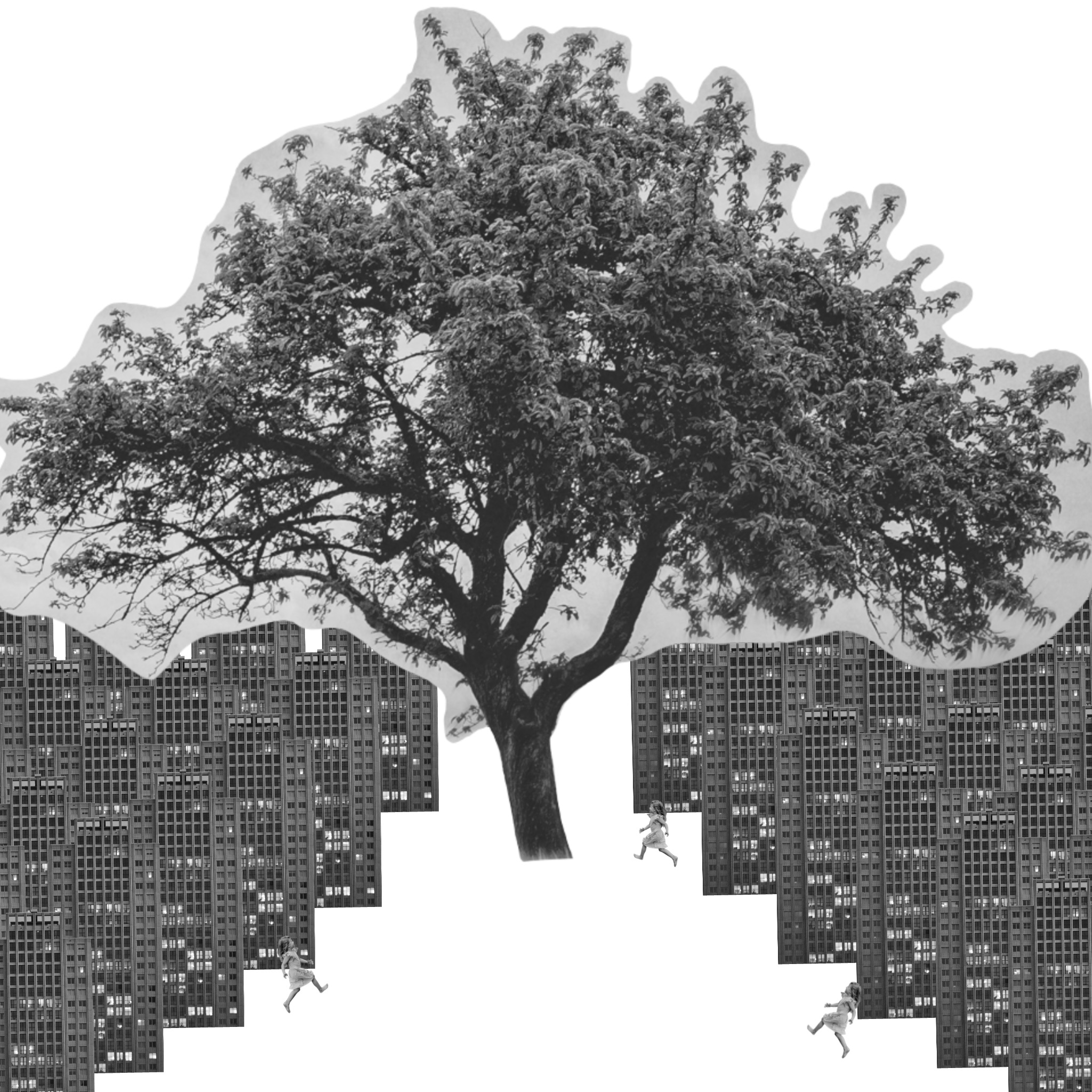
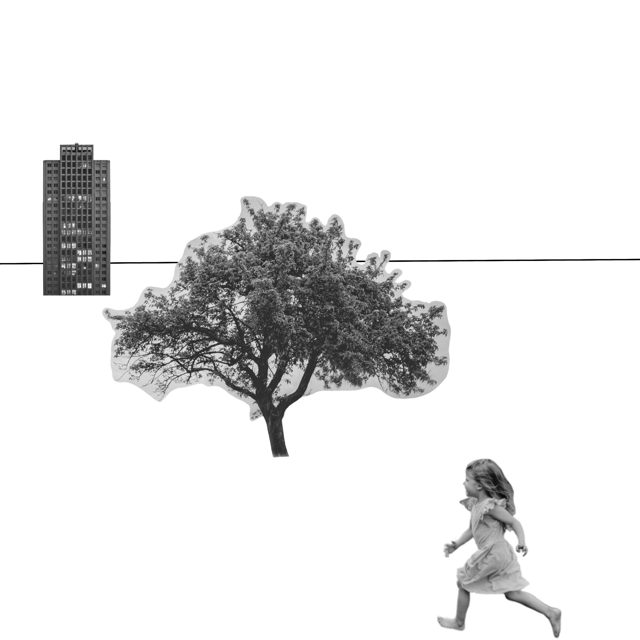
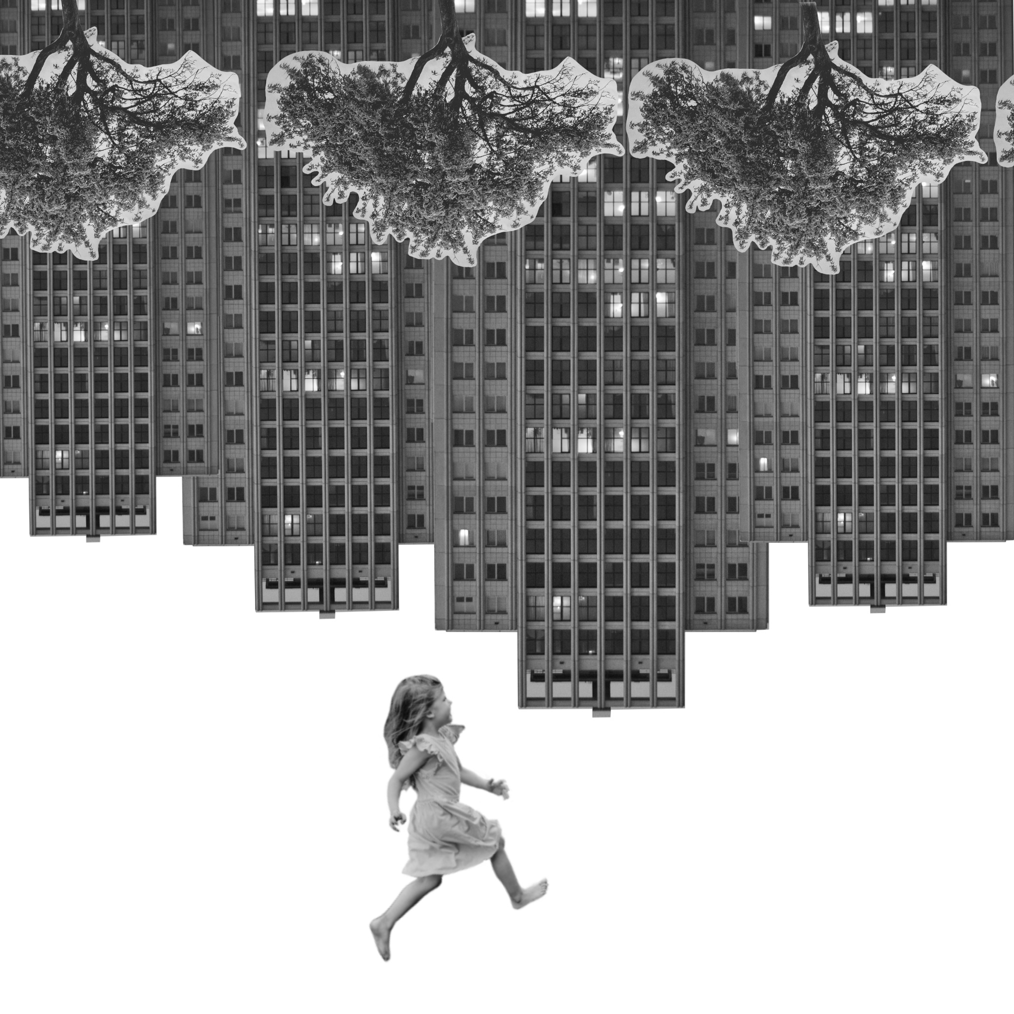
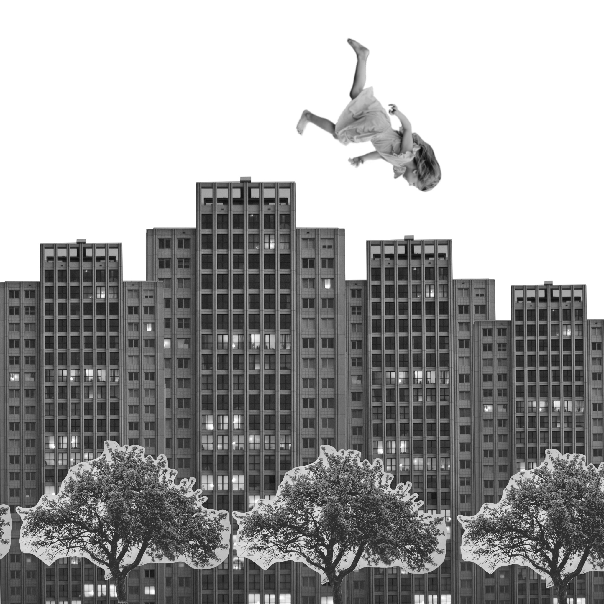
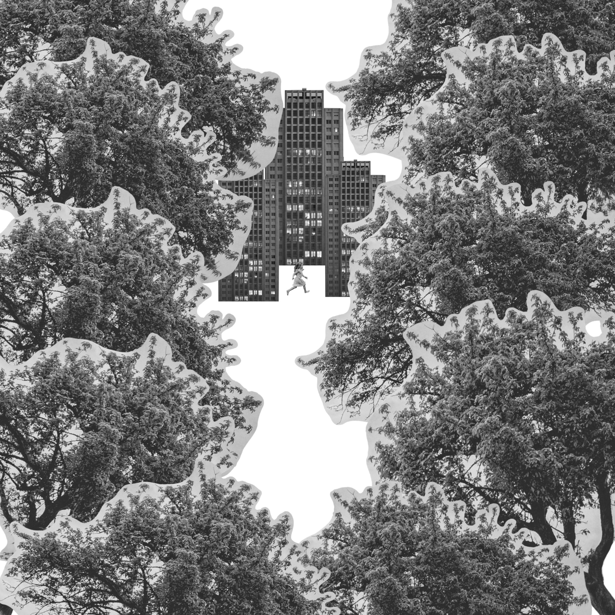
Some of the images would work better with altered elements, for example one looks like you’re looking through trees at a city or village. A different view of a child would be better for this, like seeing them from behind as if they are looking in. I also attempted to show the world turned upside down with the girl hanging from the buildings, but it didn’t quite work. Flipping it, however, did work as it looks like she’s falling.
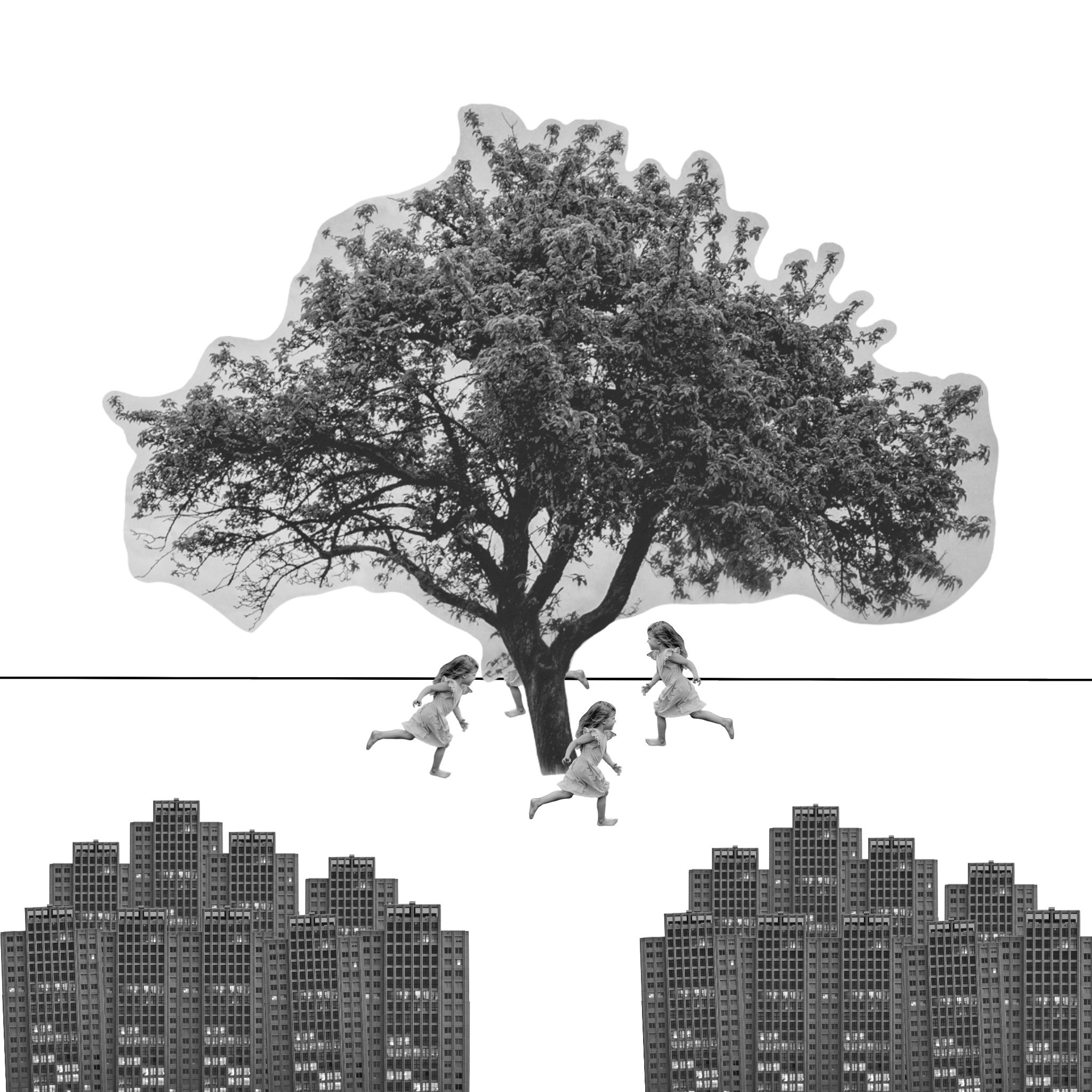
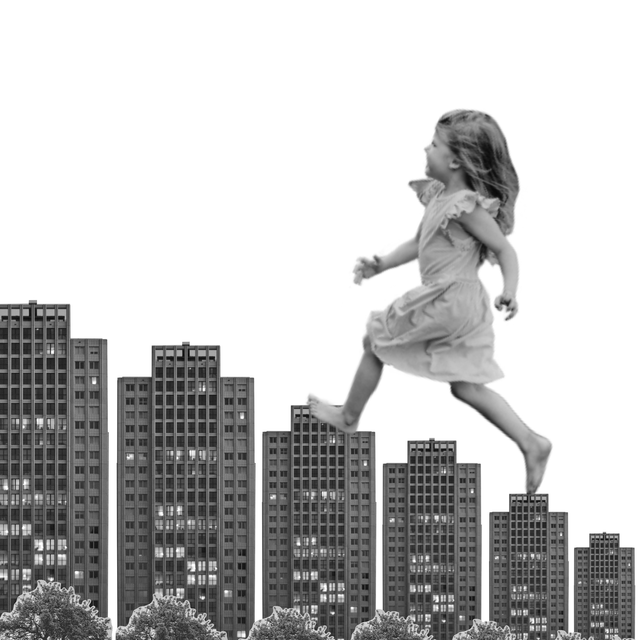
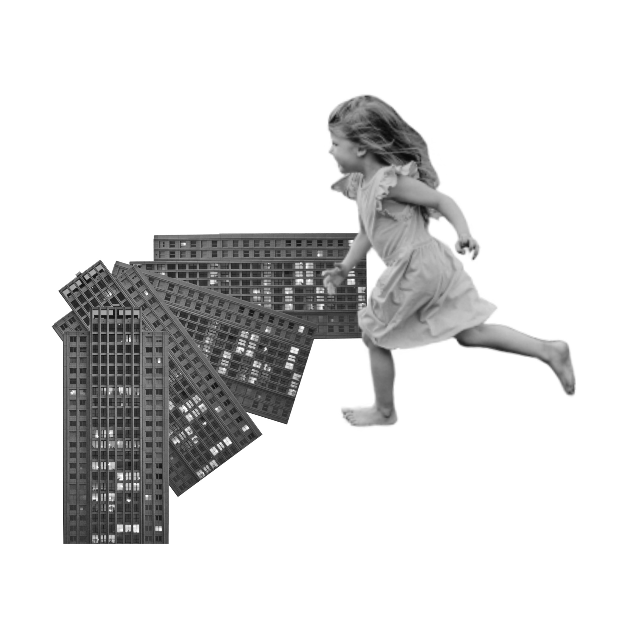
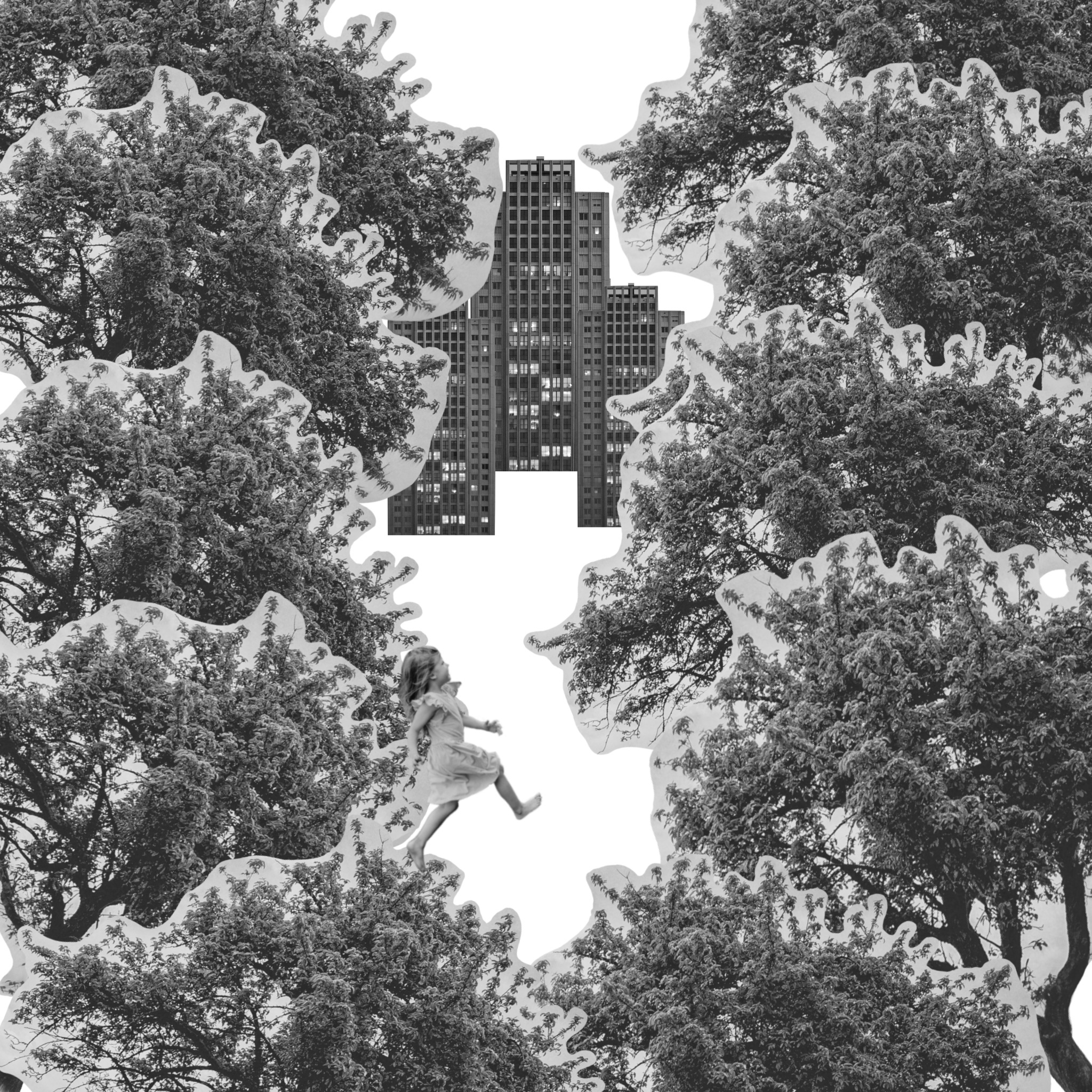
Changing the size of the elements show very different narratives and meanings. For example, when I made the child very large in comparison to the buildings and trees, it looked as if she is climbing the buildings like stairs. Making the child very small shows the magnitude of the elements around her, or the distance the viewer is from her and the other elements. In one image, the larger child in the foreground and the smaller building in the background shows distance between the two. In the image where you are ‘looking through’ the trees, the size of the child shows the relativity of the buildings and the fact they are far away, but the trees are close.
When angling the elements, several stories can be told. In the first image the angle of the buildings show an incline in the road they are on. In another, the angle and size of the building make it look as though it is falling. Angling the trees makes it appear as though there are many all around the viewer. Alternatively, when all the elements are completely horizontal and vertical to the frame, it creates a sense of order and normality. If you remove the girl from the image in which she is falling, it seems like a very simple and plain street. Adding the falling girl alters the dynamic completely, and creates disorder.
My favourite composition is probably the one where it appears the child is walking up the ‘stairs’ made out of buildings. I love the concept of a child being lost in a daydream about being a giant, and what they would do for the day. Using the buildings as stairs to get around is an amusing thought and definitely very childlike. I feel like the composition is playful and fun, and tells a clear story.
I enjoyed this exercise and the way it got me to think about how I use space. Trying to communicate specific narratives whilst only using three images was challenging but fun.
