This exercise required me to analyse an image and answer some questions on the hierarchy within it.
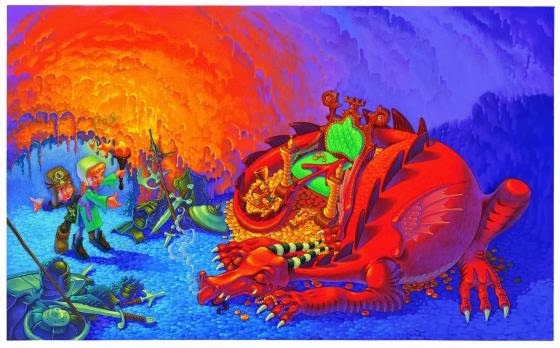
The content of this image can be broken down into:
– A dragon
– The dragon’s treasure
– Armour and weaponry
– Fire, and a torch emitting it
– Two characters
– A cave
What is the image about? What is it saying?
The image depicts two young people coming across a sleeping dragon in a cave. It appears they are not prepared for such an encounter, as one is pointing back to where they have come from, and neither of them have weapons or armour. There is armour on the floor near the dragon, but its colouring implies it is old and rusted. This tells us that several unsuccessful attempts at slaying the dragon have been made. The dragon is sleeping curled up on its stash of gold, and hasn’t yet noticed the two people.
Work out the narrative and identify the story
I think the narrative is clear – two young kids went exploring in a cave and happened upon a dragon. One is slightly braver, holding the torch and standing in front, pointing to the dragon excitedly, whereas the other is fearful and wants to turn back. The dragon is definitely a threat, and as the two are unprepared to fight it they are stood unmoving waiting on what to do next.
Describe the palette and tonal range which has been used
This image uses a mix of hot and cold colours to show contrast in the areas of the image and create a hierarchy. The palette is quite simple, using only a few colours and their shades. The hot colours are used to represent the dragon, stereotypically portrayed as being able to breathe fire, and the flames and light emitted by the torch. The usage of red in these instances tie the two together and remind the viewer that dragons breathe fire.
The cold blue and green colours have been used for the cave, armour, and outfits of the two children. The cave looks vast and empty because of the usage of blue tones, and the armour is noticeably rusted and ‘cold’ – untouched for quite some time. The cool tones being used for the children’s outfits shows that they are intruders, contrasting against the warm tones of the dragon and highlighting how out of place they are in the dragon’s habitat. The ‘braver’ character notably has brighter colours, which makes them appear bolder and more confident. The light from the torch shows the texture of the cave, and the colouration makes it appear like lava, again evocative of the dragons fiery breath.
Is there any connection between hot colour and the importance of the element in telling the story?
Although the dragon and the two characters seem to be the focal points of the image, the eye is initially drawn to the contrast of the neon green cushioning of the chair against the red of the dragon. The bright red of the dragon and the orange heat of the torch contrasted against the cold blue of the walls and floor of the cave cleverly tells a narrative, and shows where the danger within the image is. The cave is safe, the dragon is not. It uses the green to draw your eye to the dragon, and from there, the hot colour takes you on a journey around the image.
Begin to identify the hierarchy within the image. Which are the most important elements in terms of carrying the narrative or conveying the ideas and how have these been treated?
The dragon is occupying almost a third of the space in the image, and appears more powerful as a result. The positioning of the dragon closer to the viewer supplements this, and makes the two characters appear smaller. The dragon is positioned facing in the direction of the two characters, which suggests opposition or conflict even though the dragon is passive and asleep. The treasure pile beneath the dragon is highlighted somewhat less than the dragon itself – as the yellow gold is caught between the red of the dragon and the orange of the torchlight it doesn’t stand out as much as either of the other two elements. This suggests that it is less important than the dragon itself, and also suggests that the characters aren’t there for the treasure – this portrays them as more heroic explorers, rather than as greedy or opportunistic.
Reflection
Having studied this image in close detail, I’m not sure that it’s the hot colours of certain elements that are most critical to conveying the hierarchy. It is the green of the chair which initially catches the eye so that the hot colours of the dragon and the torchlight can lead the eye around the image. To me, the most important usage of colour is the cold colours, and I feel they inform the narrative much more than the hot colours. The hot colours are so intense they overwhelm the image, and in some places force you to look away to the cool colours.
This exercise definitely helped me think more about how I utilise space and colour in my illustrations in order to tell a story. I think I would find it more beneficial to look at illustrations closer to my own style and apply a similar analysis, which I would like to do more when researching or finding inspiration.
