This exercise asked me to find an image with a range of content, then crop it repeatedly to create different formats and compositions, exploring how the focus of the image changes. I then had to choose a word for each image that describes it in some way, then use one of the images as the basis for an illustration. The illustration was to be a poster and use colours and textures that emphasise the message behind the word.
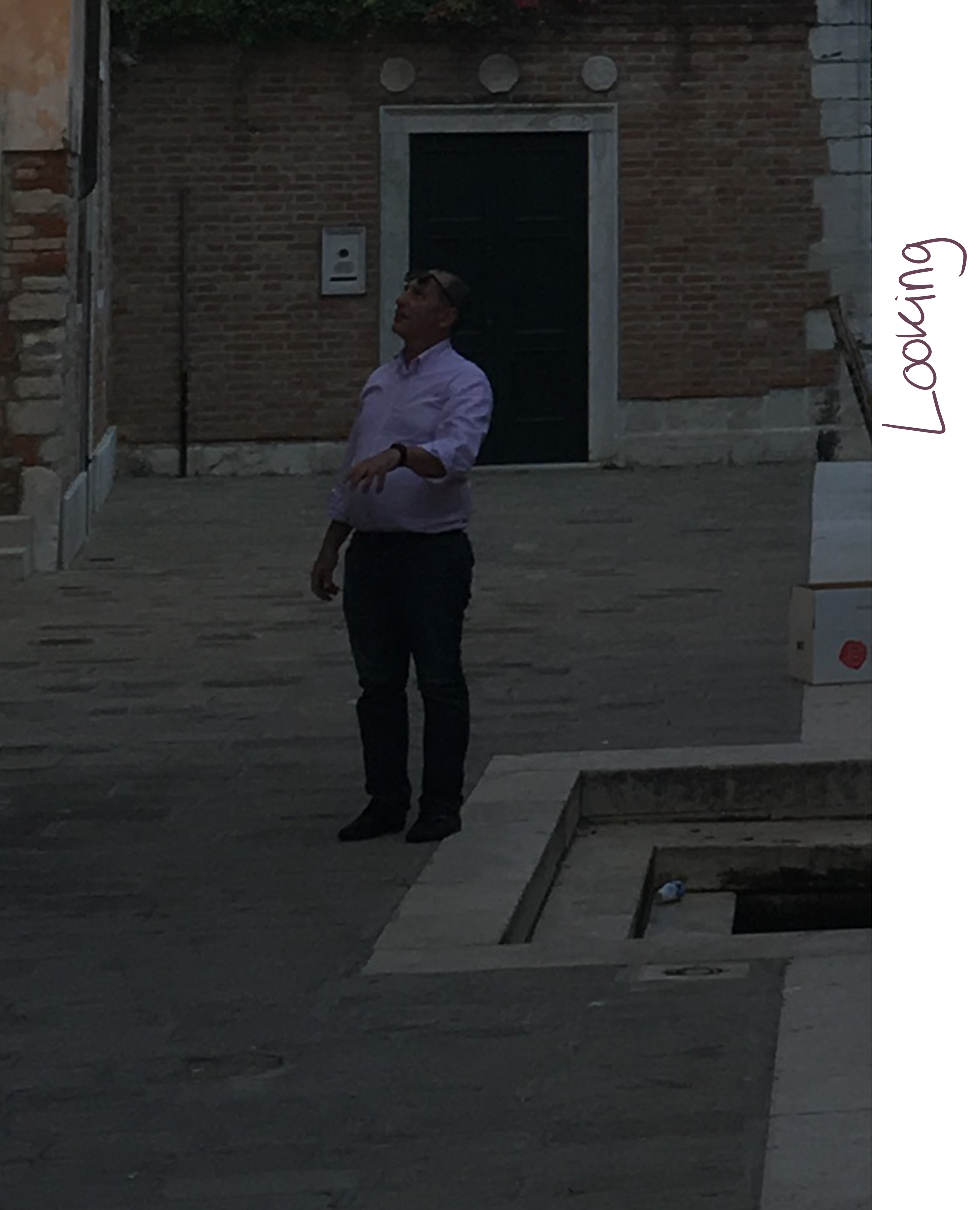
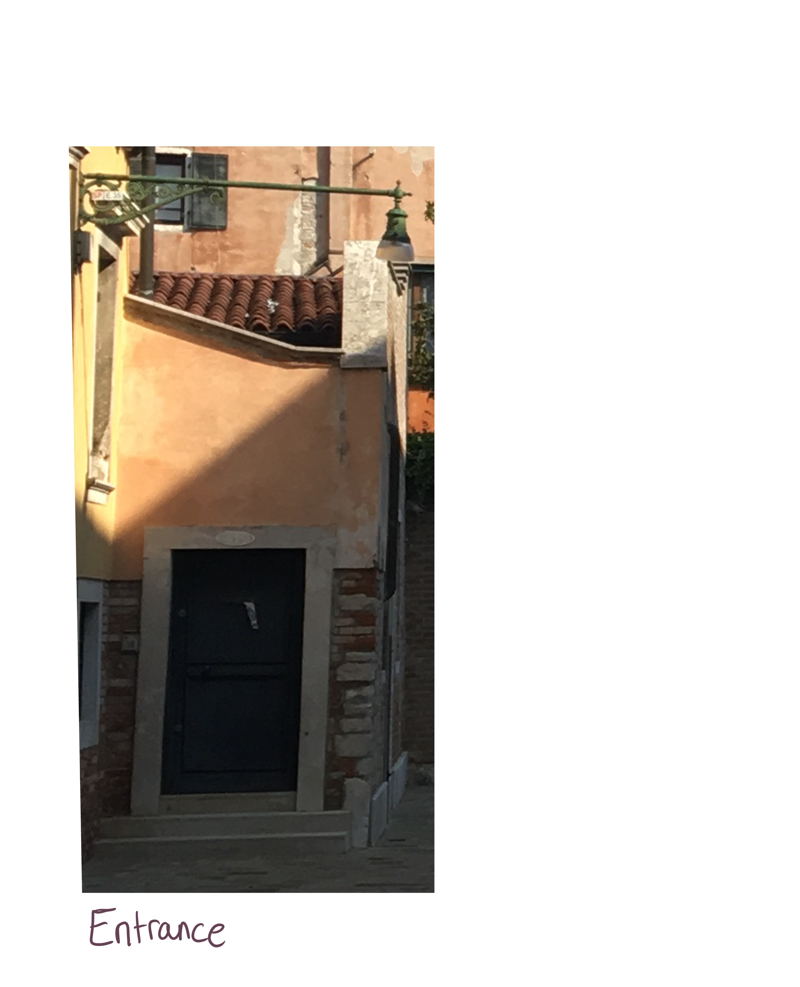
I struggled finding an image I could use for this, as most the images I found were already composed in a very specific way. I looked through my own photos, asked friends to look through theirs, and searched Pinterest for relevant images. I was looking for an image that contained a lot of content but wasn’t too framed, as this would make the exercise almost impossible. Eventually I came across an photo I took on a trip to Venice that isn’t super framed or set up – it’s just a photo of a back street.
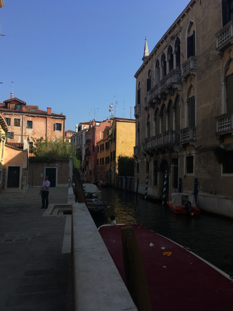
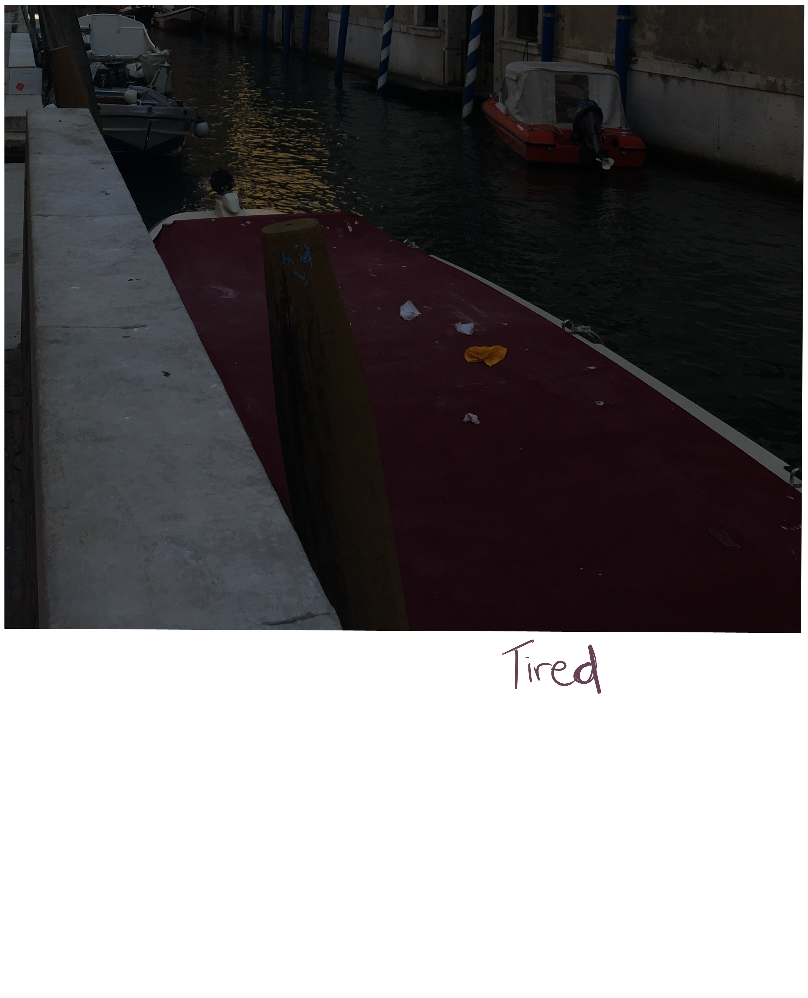
Maybe I went at this the wrong way, as I was cropping the image where I felt I could add narrative rather than cropping the image and adding narrative after. I still found this useful as it helped me to dissect the image and discover potential stories hidden within. The content shown in the cropped images changes the focus of the image hugely and was interesting to look at from a poster POV. What was interesting about working with this image is the lighting. There’s a lot of shadow and darkened areas, which meant I could use the change in lighting to my advantage. Sometimes I would be left with just dark areas which emphasised the mood of the image, or contrast that altered the narrative.
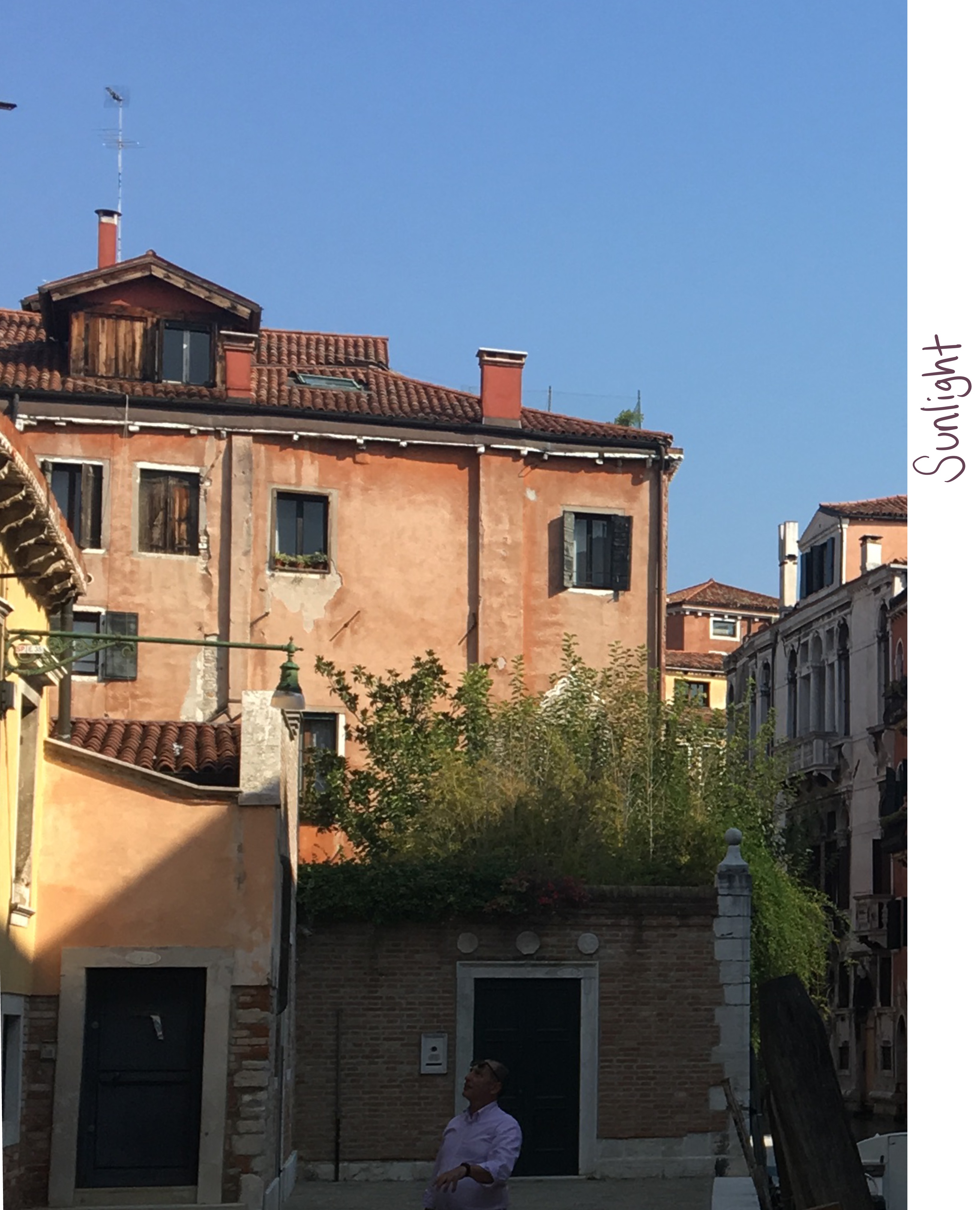
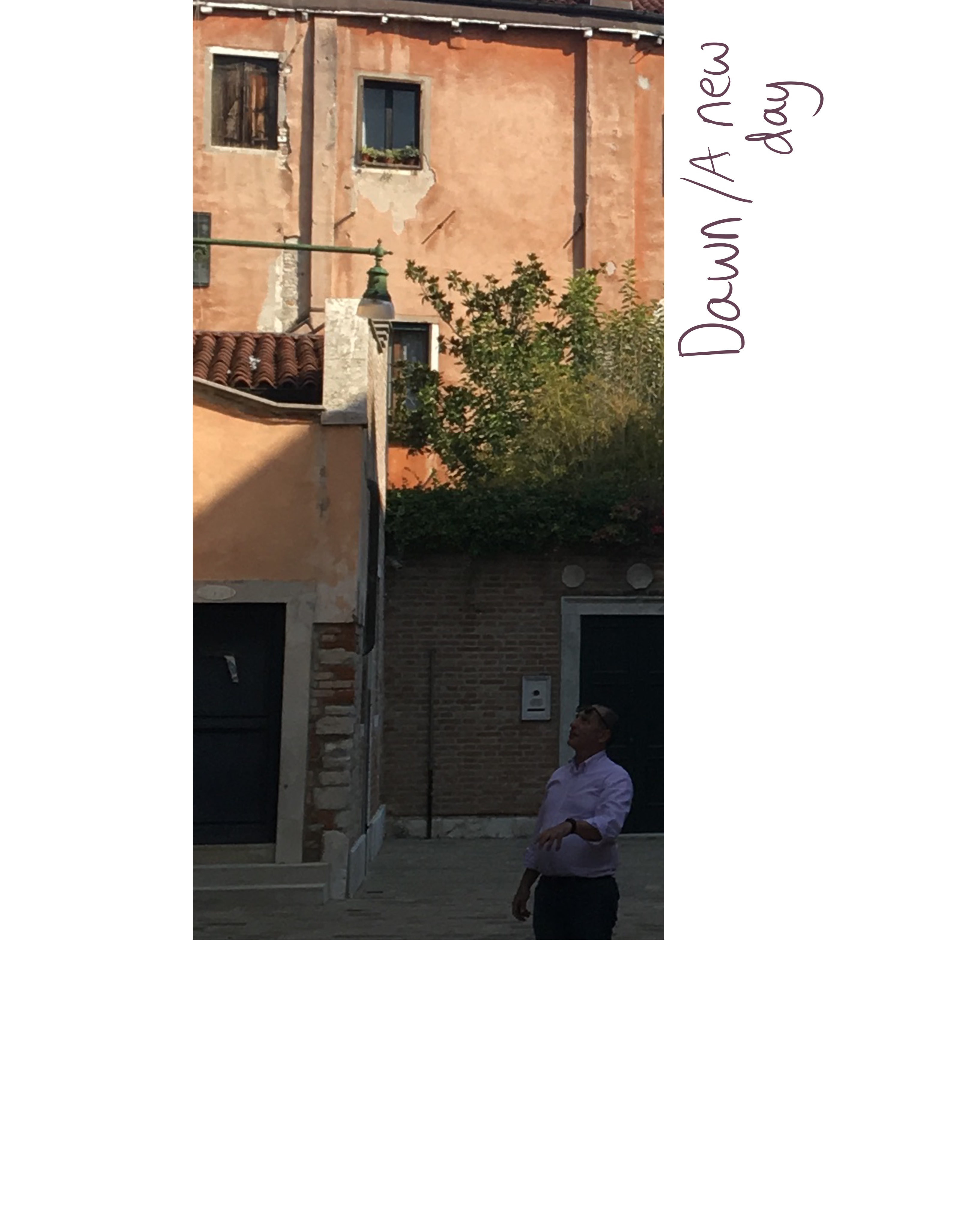
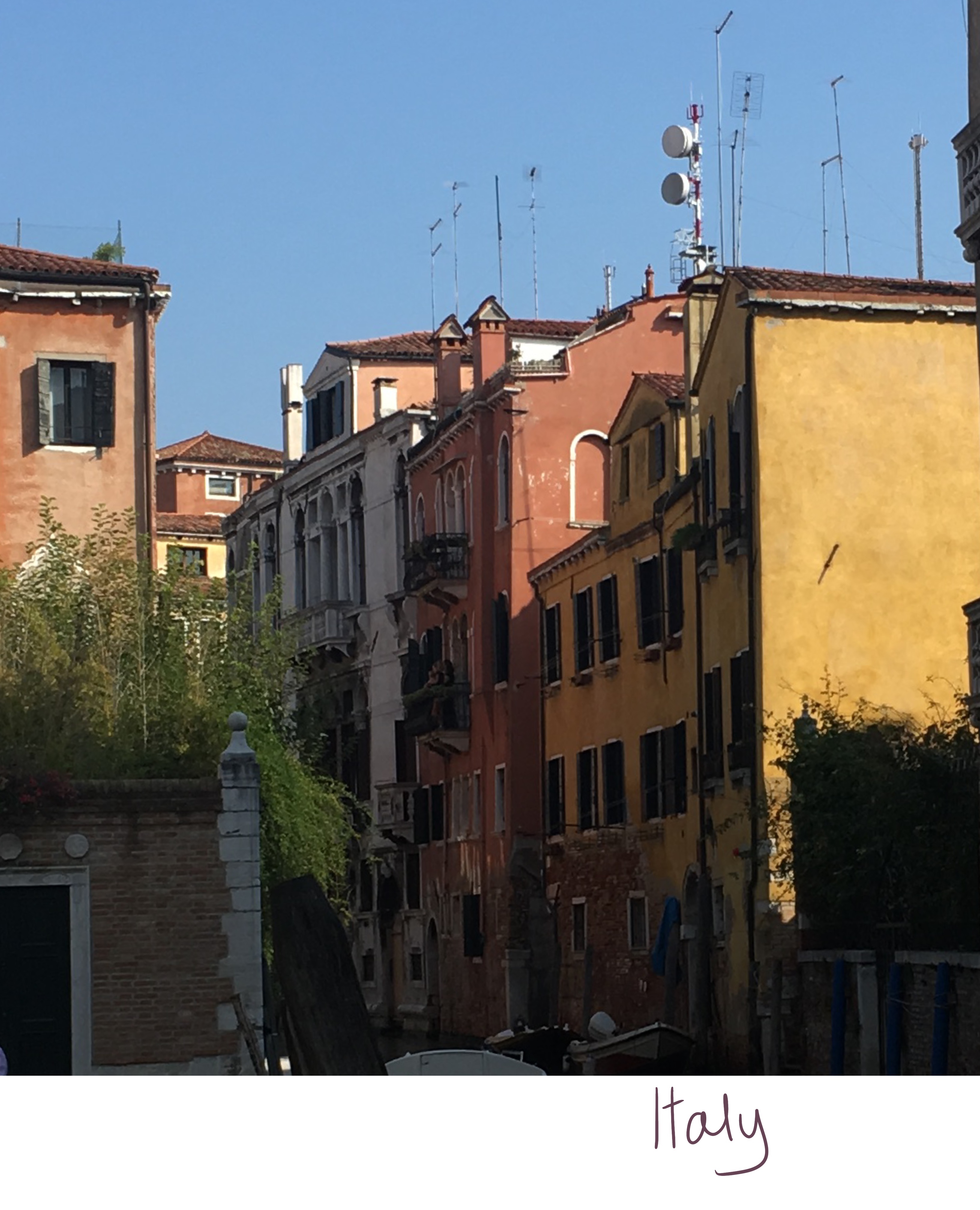
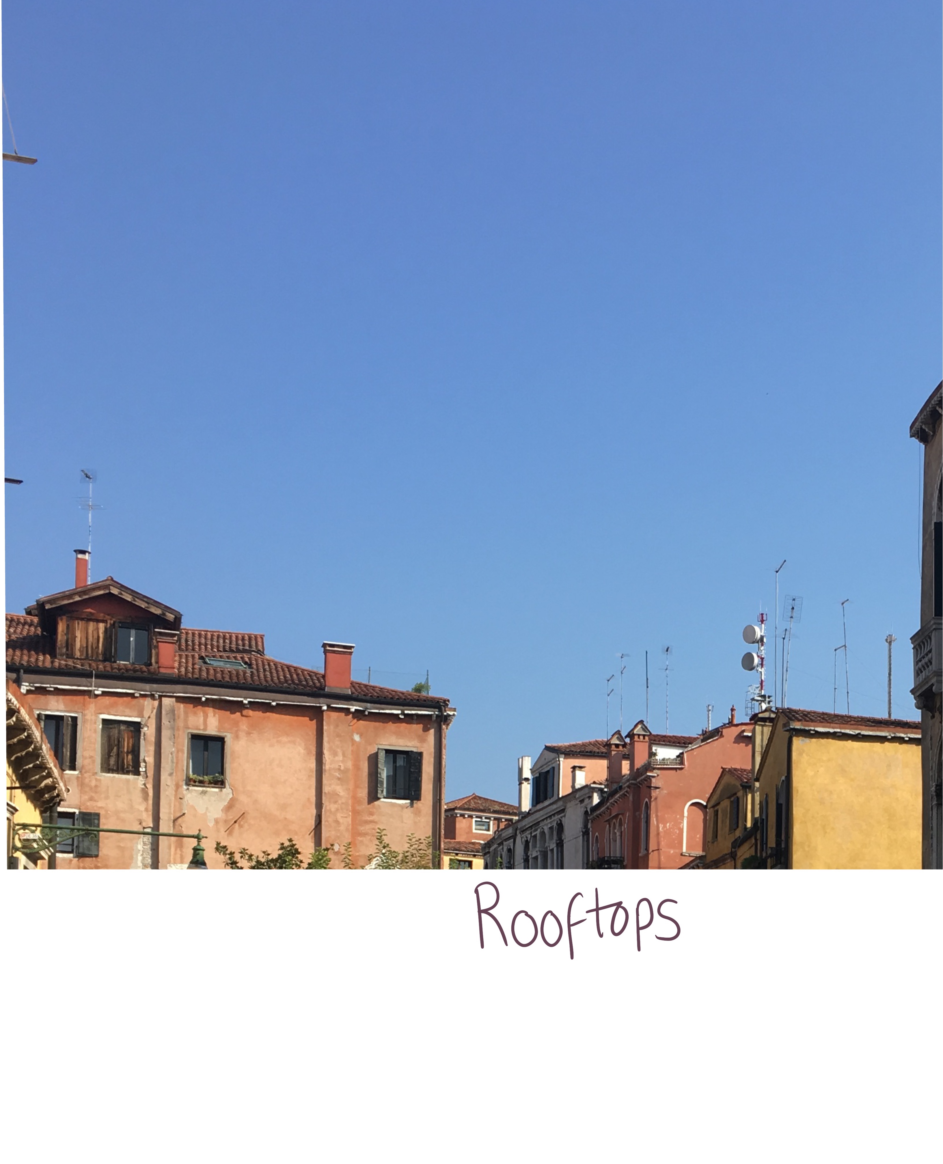
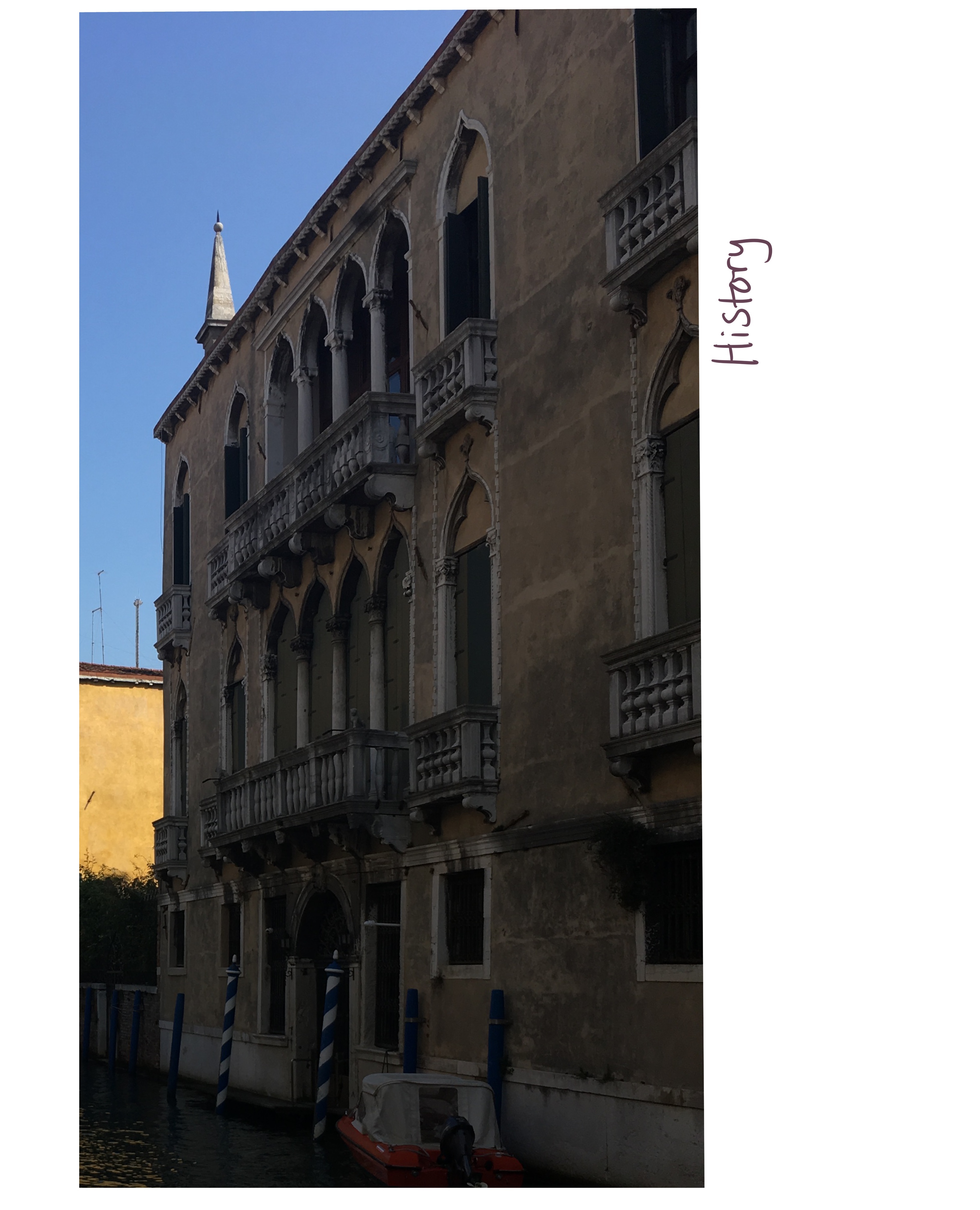
Initially, I wanted to use the ‘Italy’ image as a basis for my poster, combining it with the ‘rooftops’ image and having the placement of the buildings quite low in the frame with the word ‘Italy’ above. I tried to sketch out some ideas and wasn’t very happy with them. I looked back again at my images and the words tied to them, and how the colours in them and potential textures relate to the chosen words, and realised ‘History’ was a much stronger piece.
I began my usual process of sketching out digitally, planning to complete the piece using Procreate. I really wasn’t happy with it. I’ve been sketching a lot more on paper and I am slowly realising I prefer this to sketching digitally. In artwork I am developing outside of coursework, I now begin with a physical sketch that is scanned into Procreate, and work from there. I decided to use this method for this illustration too. I chose to sketch on pastel paper as I really love the texture and enjoy working with it as I learned in Exercise 8. At this point I was considering scanning the sketch in digitally once completed, or redrawing it on watercolour paper.
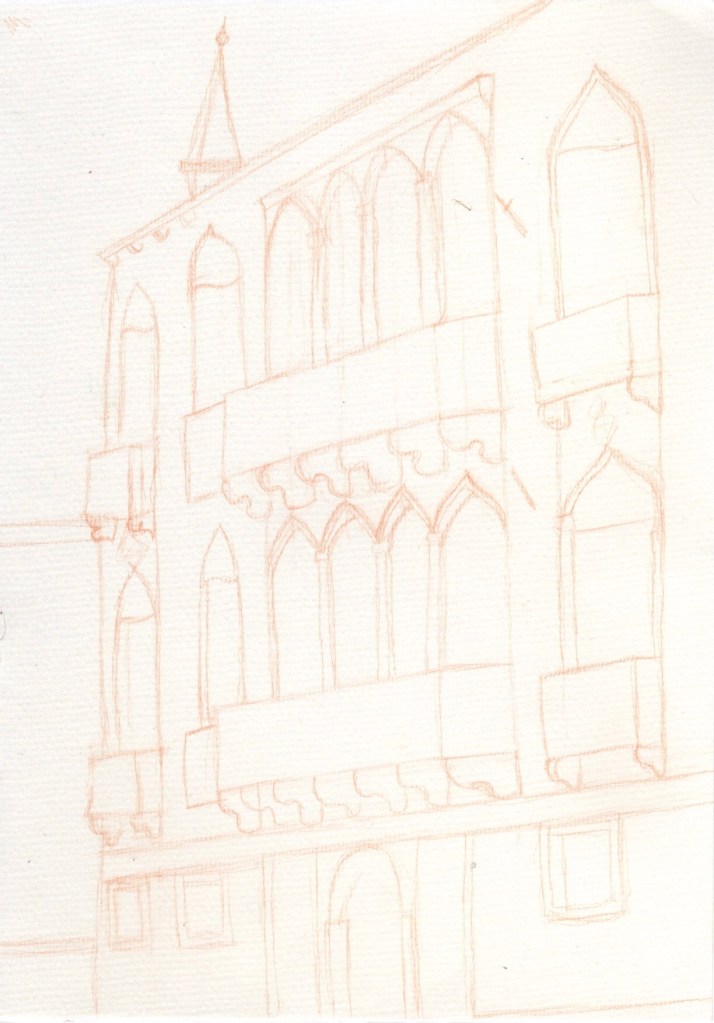
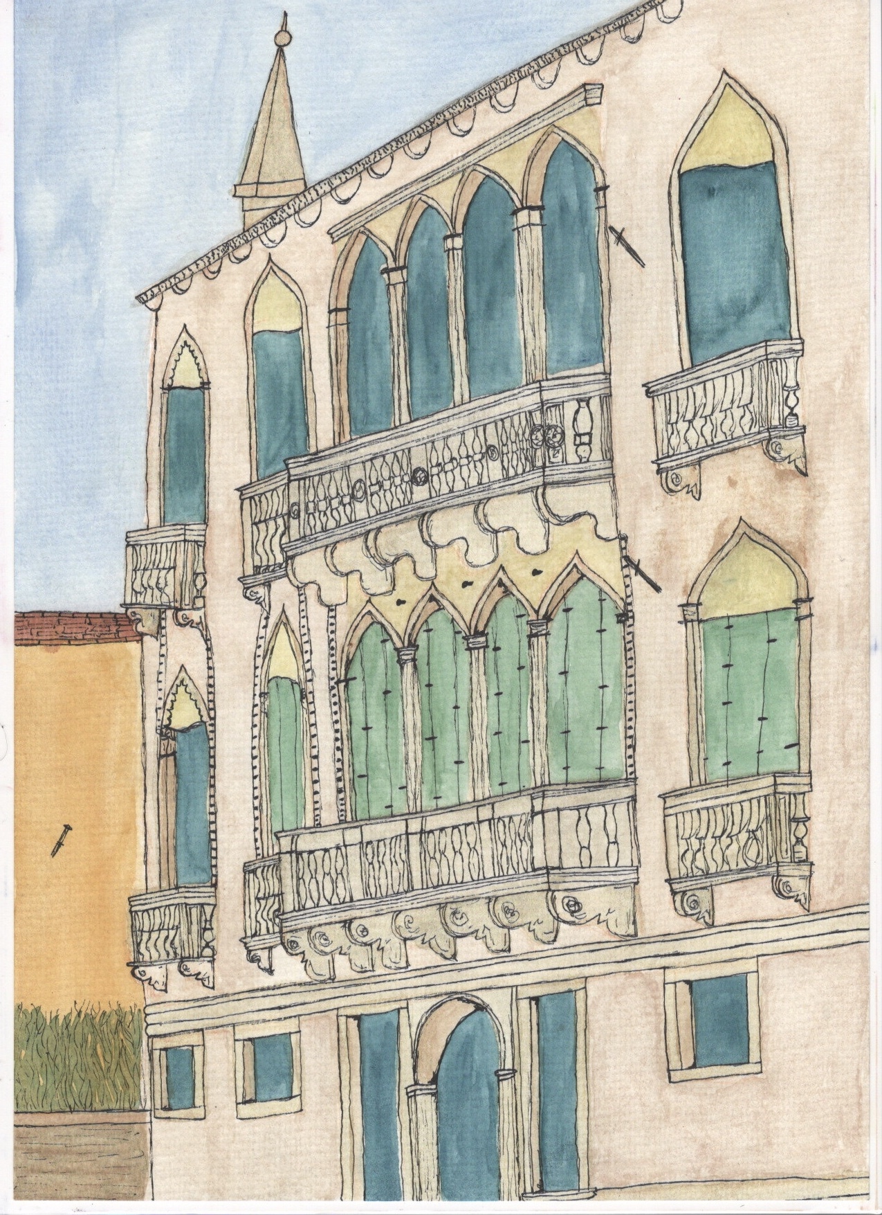
Sketching out this piece was an enjoyable and challenging process. Working with the angle I was at and trying to convey that the building is three-dimensional was difficult but a great learning experience. As I was sketching I was considering the different textures, colours, and mediums that could work for this piece to emphasise the ‘historical’ attributes. I felt very comfortable working with physical materials as opposed to digitally, so I wanted to continue doing so. I would either have to transfer the sketch onto watercolour paper using a lightbox, or I could continue the piece on the original pastel paper I had sketched on.
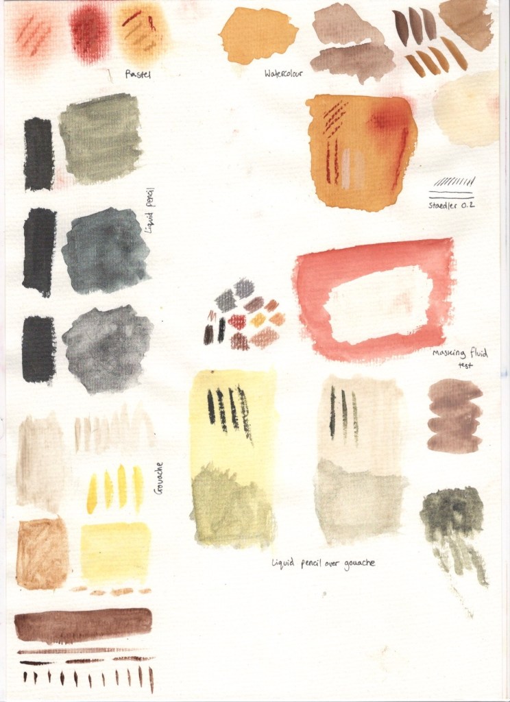
I decided to try out various materials and colourings to see how they interacted with the pastel paper and ensure I could achieve the effects I wanted to. This stage of the process was also a lot of fun, and taught me about the importance of experimenting before working on a final piece. It was great being able to reference this sheet as I continued with the illustration, and to use it to experiment further if I was curious about what to do next or how something would look on top of my previous layers.
I first tried out some pastels and watercolour. I knew pastels would work with the paper as that is what it’s designed for, but I wasn’t sure on the texture and colour for this particular piece. I also wanted to see how well the paper held up when used with water – it reacted exceptionally well and showed the colours beautifully too. I also experimented with layering pastel over watercolour to create different textures and colours. At this point I felt confident that I could continue working on my original sketch sheet, and I wanted to use mixed media. I wasn’t sure on how to involve pastels, and initially wanted to use them to add contrasting highlights and shadows over the base layers of watercolour. Later I changed by mind and used coloured pencils instead, as I felt I had more control with them.
I then decided to try out masking fluid on the pastel paper, as it can often destroy paper and paintings when used. It also worked very well, though I didn’t end up needing any. I then moved on to trying some different shades of gouache, with varying amounts of water, and ‘liquid pencil’, a rewettable liquid graphite paint I discovered recently. I loved how this looked especially in the context of ‘history’, and the effect it had on the gouache. I was satisfied with my reference sheet and the materials I had chosen at this point, so began working on completing the illustration.
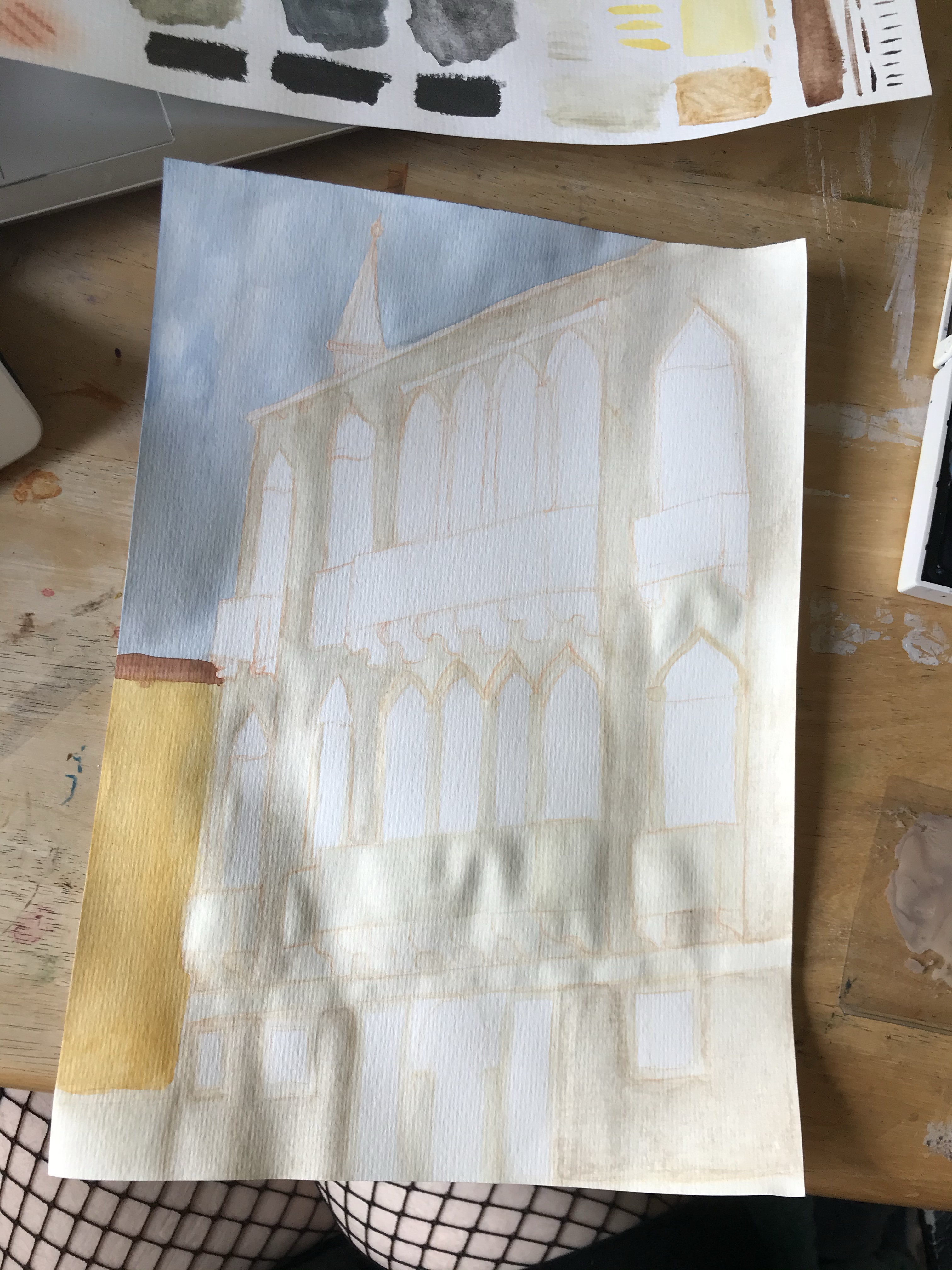
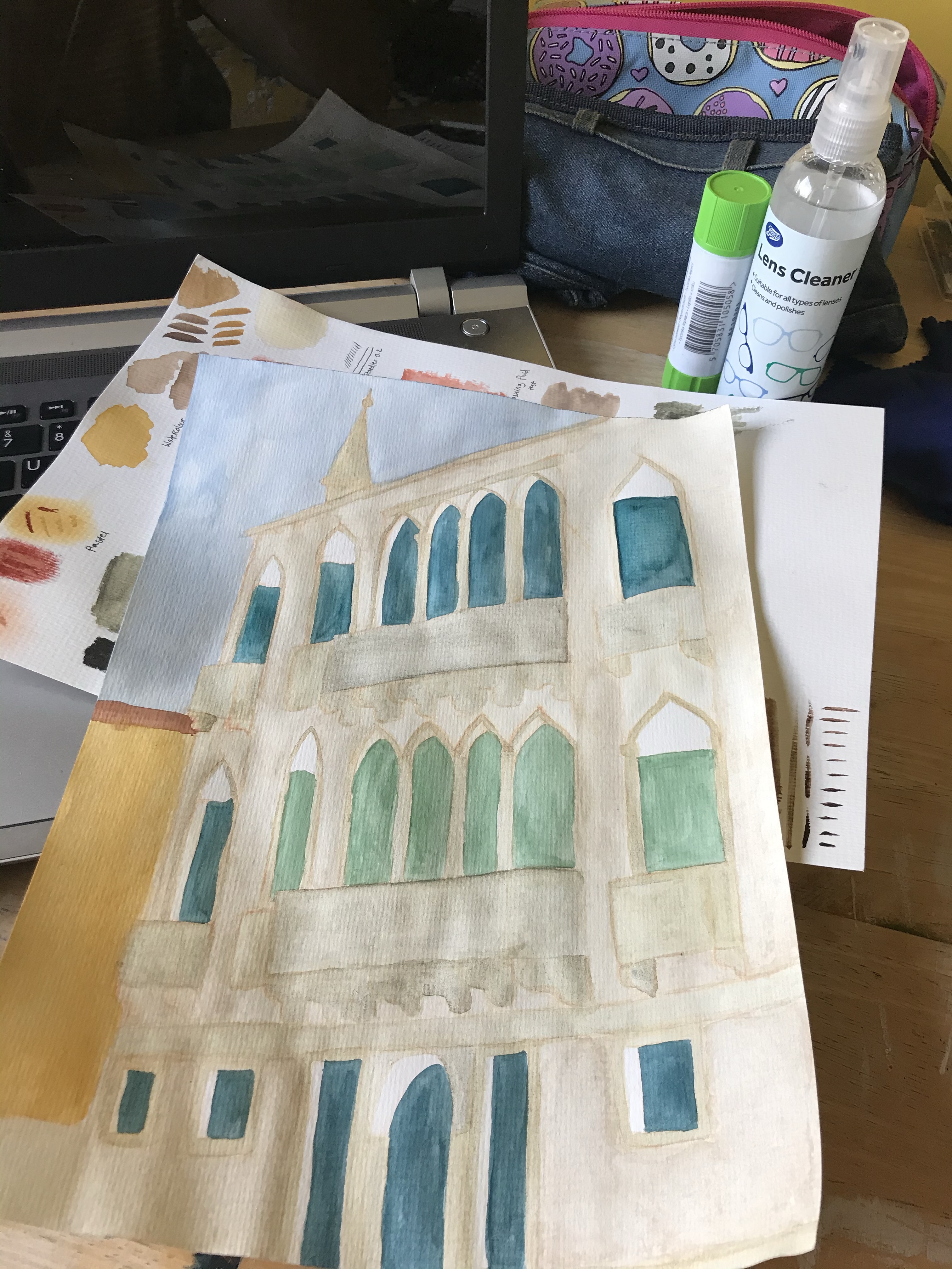
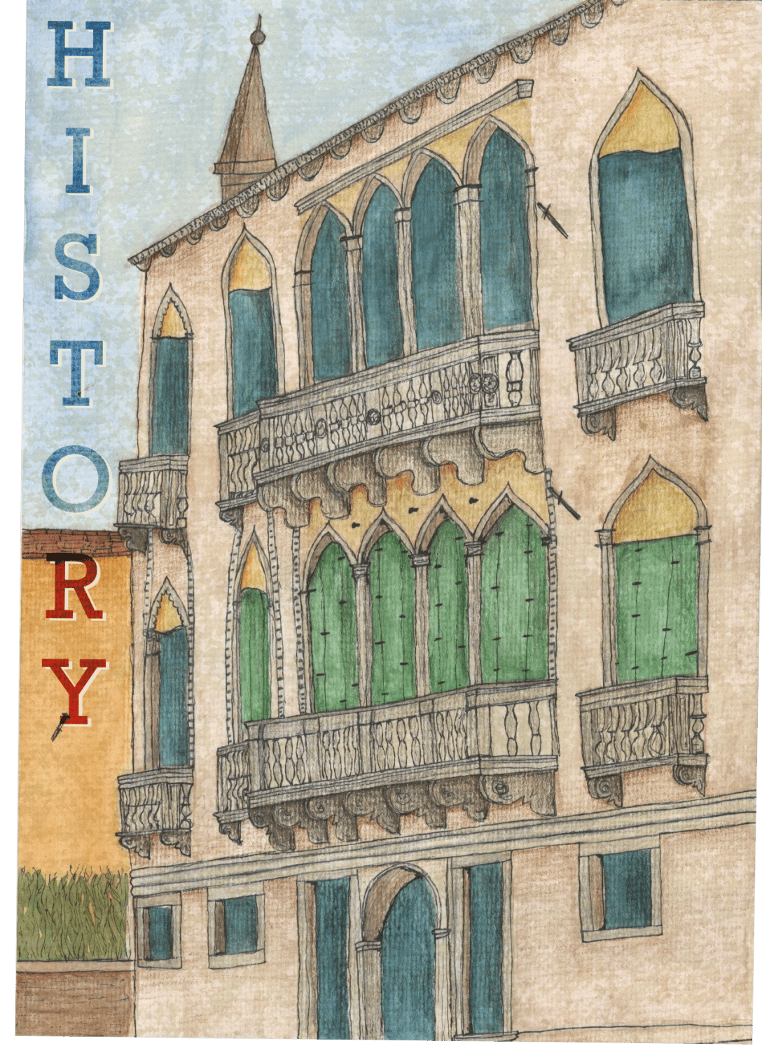
To start with I used gouache and watercolour to form a base for my illustration. I layered various colours to create texture and a rustic look. At this stage I was focused on building colour and texture aiming for duller grey tones. I was inspired by the idea of old parchment, historical documents, and lost artefacts, and the washed out, weathered feel they have to them. I used kitchen roll to remove darker watercolour from the light gouache base and create a tea-stained look. I then used the liquid pencil over the gouache on the marble railings as I felt this mimicked the old, greying, washed out marble look. I chose a deep teal for the open doors as I felt the contrast was really beautiful whilst still communicating an empty depth.
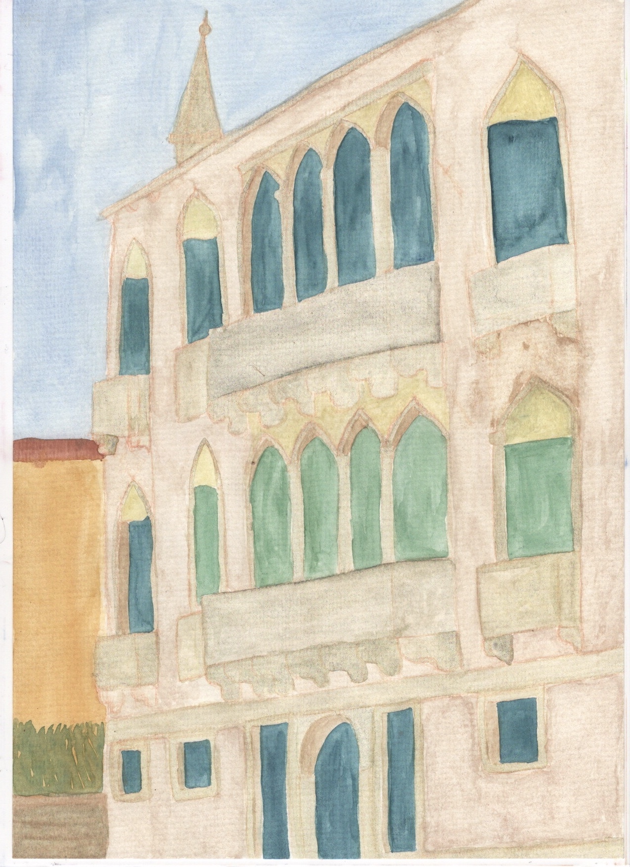
I then moved on to adding lineart and detail with fineliners. This took the illustration in a whole new direction as it really emphasised the building and the angle it’s at. Adding the detail brought it to life and transformed it from the flat image it was before – I enjoyed this step a lot. Next, I began shading and adding some extra texture and contrast using coloured pencils. This further emphasised the angle of the building and gave it a lot more depth. The pencil brings out the texture of the paper so much more than the paint, which added to the aged/historical look of the piece.
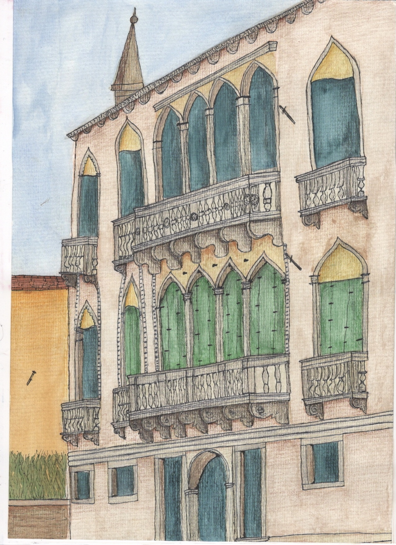
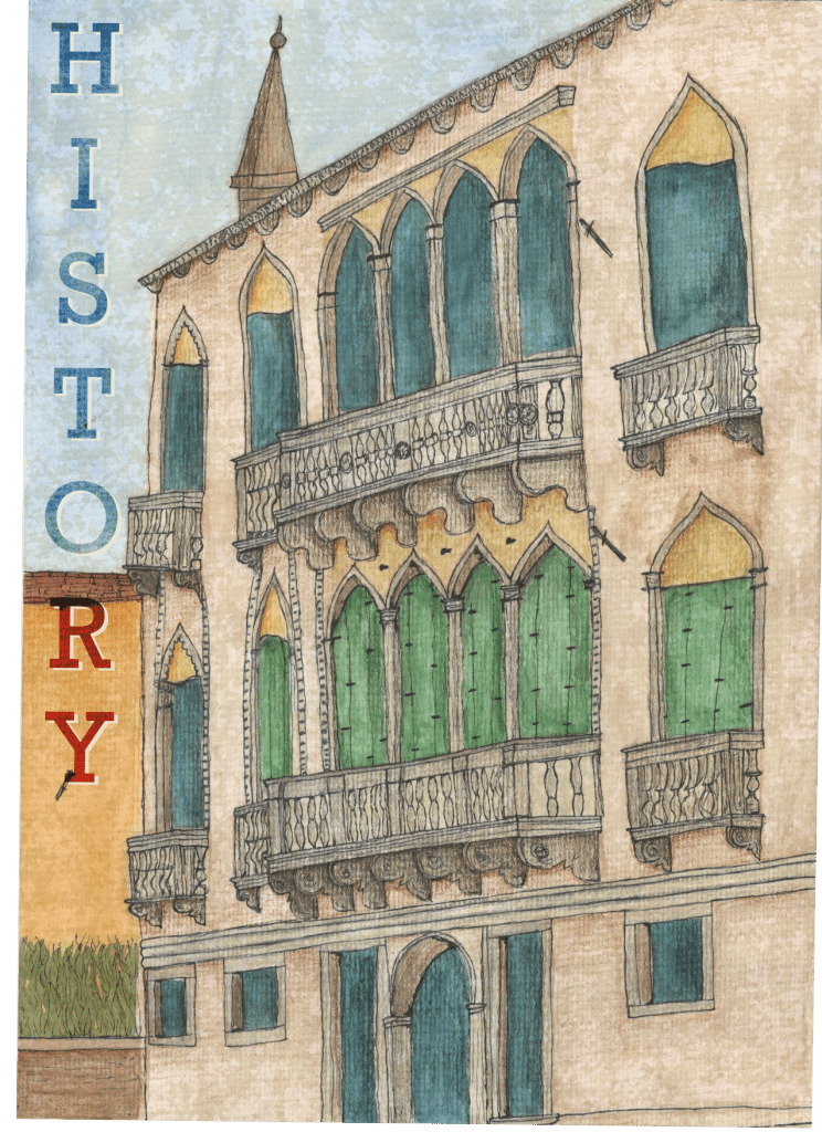
In order to add text to this piece I scanned it in to work digitally. I also tweaked the piece slightly, adding one final texture layer over it to truly capture the weathering of the building, and to desaturate the colours somewhat as I felt they were a bit too bright. I then tried out several different font options that I felt represented the word ‘history’ best. I ended up choosing a serif font that is bold and commanding. It’s a modernised serif font so it could be used in a contemporary poster but still looks historical and ‘old’ so relates to the theme of the image/word. I placed the word horizontally in the empty space alongside the building and applied a blending mode to it in order to ensure it maintained the feeling I was going for. I then duplicated the layer and added a drop shadow to help the text stand out. I did this with a lighter colour rather than a darker one as the dark shadow brought the mood of the piece down significantly.
I really loved this exercise and I am so happy with my final piece. Every step of the process was exciting and inspiring and helped me develop ideas and learn about new things. I am so impressed with my final piece and feel it’s almost exactly what I envisioned going into it. I love drawing architecture and cityscapes and definitely want to do this more. I’m also learning how much I enjoy traditional mediums of art and my skill in these areas is developing.
The process of sketching out my work physically and scanning it in to work with digitally, or even completing work physically and altering digitally, and generally combining the two mediums, is something I want to incorporate more often if not always. I am however unsure of whether the final illustration really looks like a poster. I am uncertain of the context it would be used in, maybe in an advertising campaign to attract tourists to Venice, alongside several other posters describing other attractions the city has to offer. Nonetheless I feel I achieved my goal of creating a historical looking image, and I’m proud of it.
