
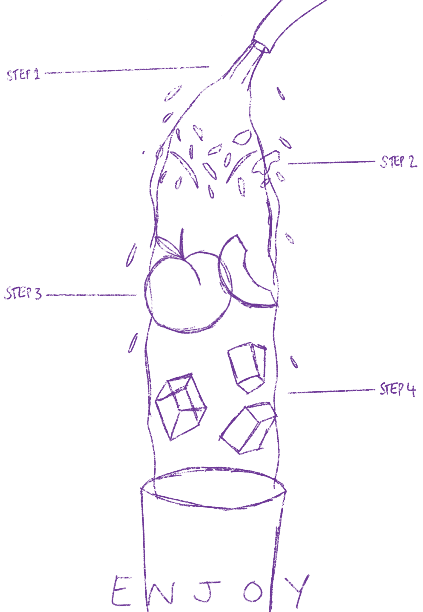
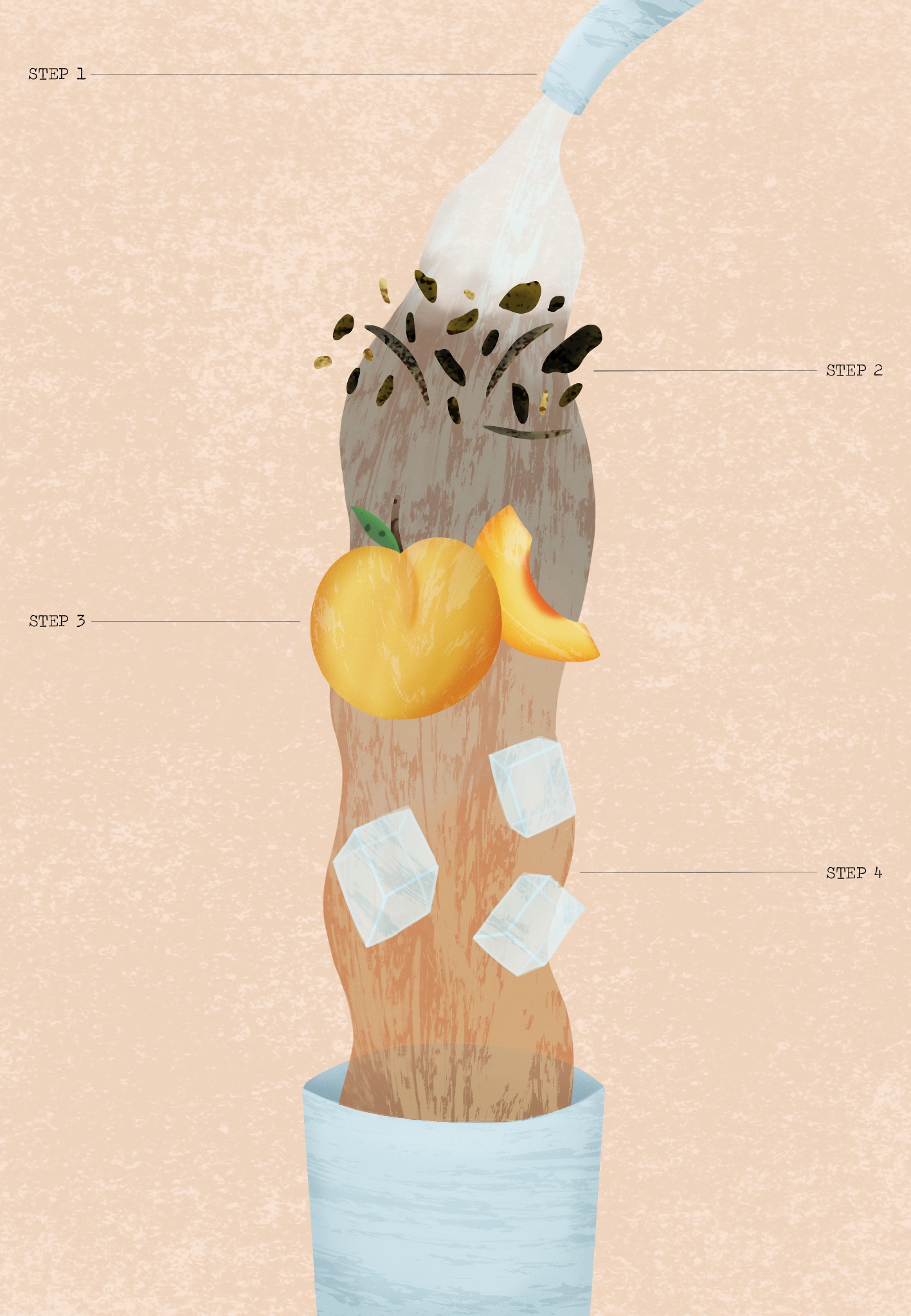
This exercise was about diagrammatic illustration. I was asked to design an illustration giving instructions on one of three areas: ‘making a cup of tea’, ‘getting to my house’, or ‘playing a tune on an instrument’. I had to try to use as few words as possible and let the imagery in the illustration explain a narrative, in this case an instructional narrative. I then had to show my finished work to other people to check that it works both as an attractive illustration and as a diagrammatic illustration that gives clear instructions.
I decided to pick ‘making a cup of tea’ and chose to put a twist on this. Instead of my instructions showing how to make a regular cup of tea, I would be showing how to make iced tea instead. I love iced tea and drink it more than regular hot tea, and I think the process is pretty interesting too. I started by researching diagrammatic illustration on Behance and Pinterest, looking at how other illustrators had portrayed similar things. I really liked the dissection portrayal that was quite common in illustrations I found, showing each individual layer/item separated but still in order of how they would combine in the finished product.
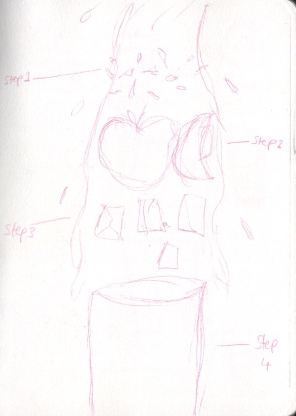
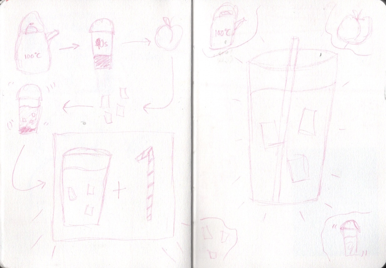
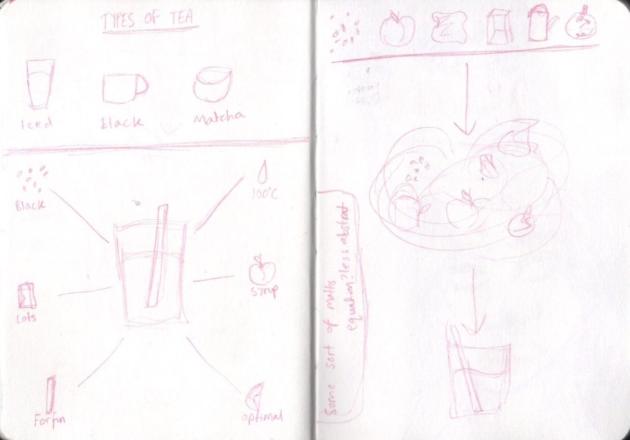
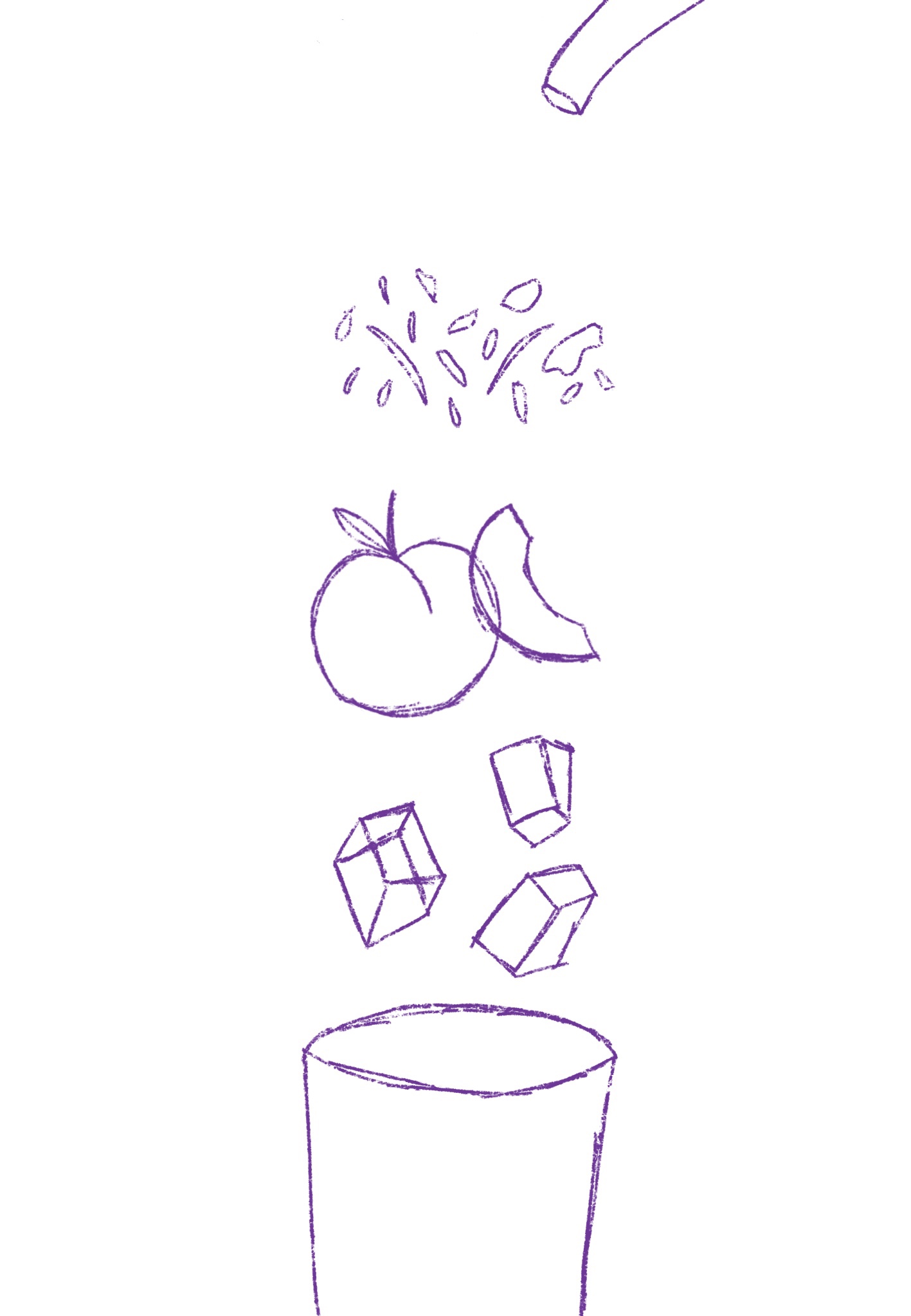
Inspired by what I’d found, I started sketching out some ideas. My first idea was to dissect the drink and place the elements in order of when they’re used in the making process, and have water flowing over them. My second idea was to draw each individual element and have arrows pointing to the next step. My third idea was to have a finished cup of iced tea in the centre of the page with elements circling around it showing the order in which you complete each step. My fourth idea was to do some sort of maths equation, having each element laid out and showing how they add up to equal iced tea. I felt my first and third ideas were strongest, but my first idea was my favourite overall. I did develop my third idea a little further to make sure I was confident on the first one, however.
I really enjoyed this idea generating process and found that after getting inspiration from other illustrations my ideas flowed quickly and easily. I could’ve quite happily turned any of these ideas into finished illustrations. I was confident I would be able to communicate the instructions well and I was looking forward to seeing if I could achieve the illustration I had in mind. During this part of the idea development process I pieced together a colour palette in my mind of soft tones and pastel colours, hoping for a sort of vintage look with textures and text.
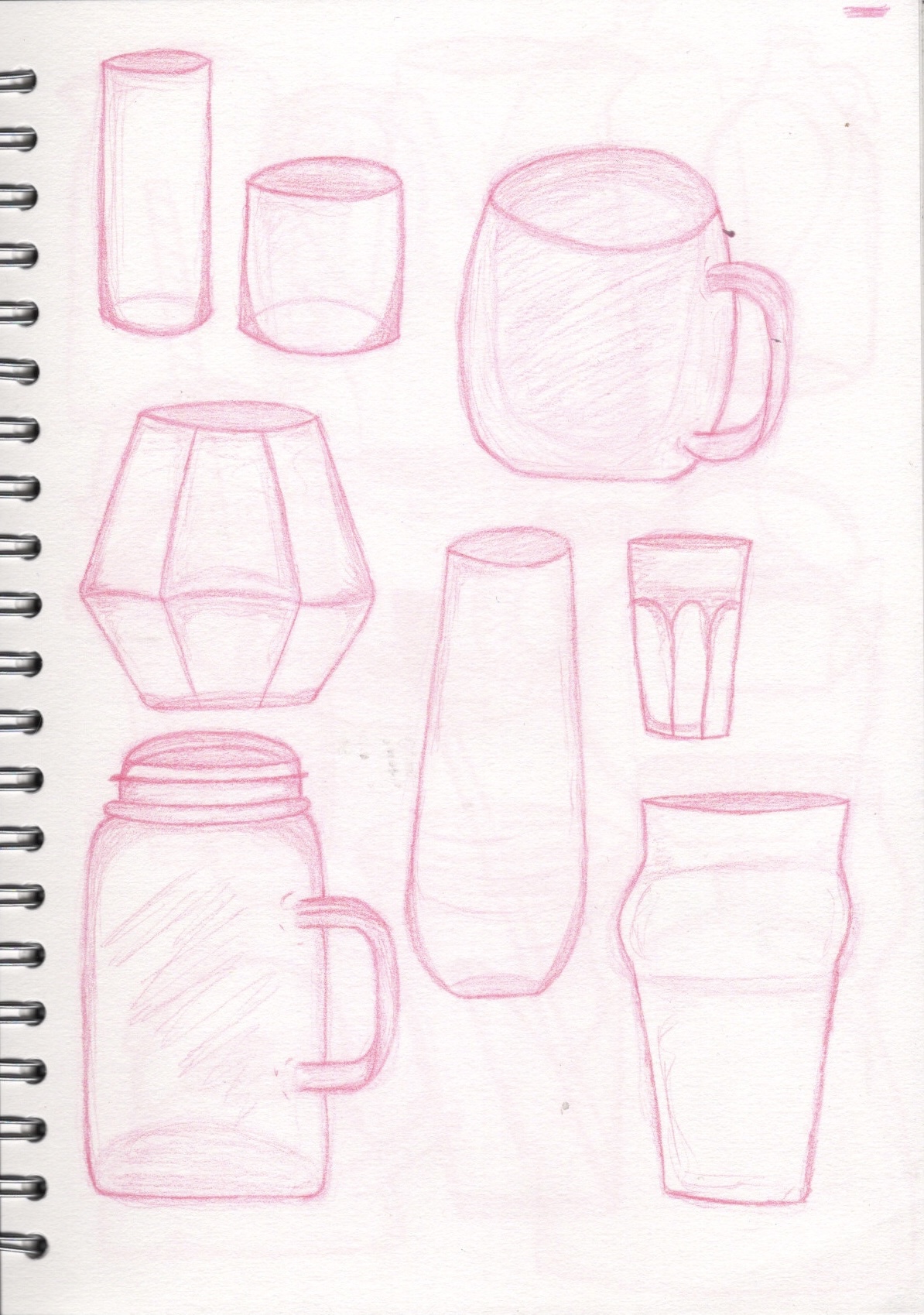
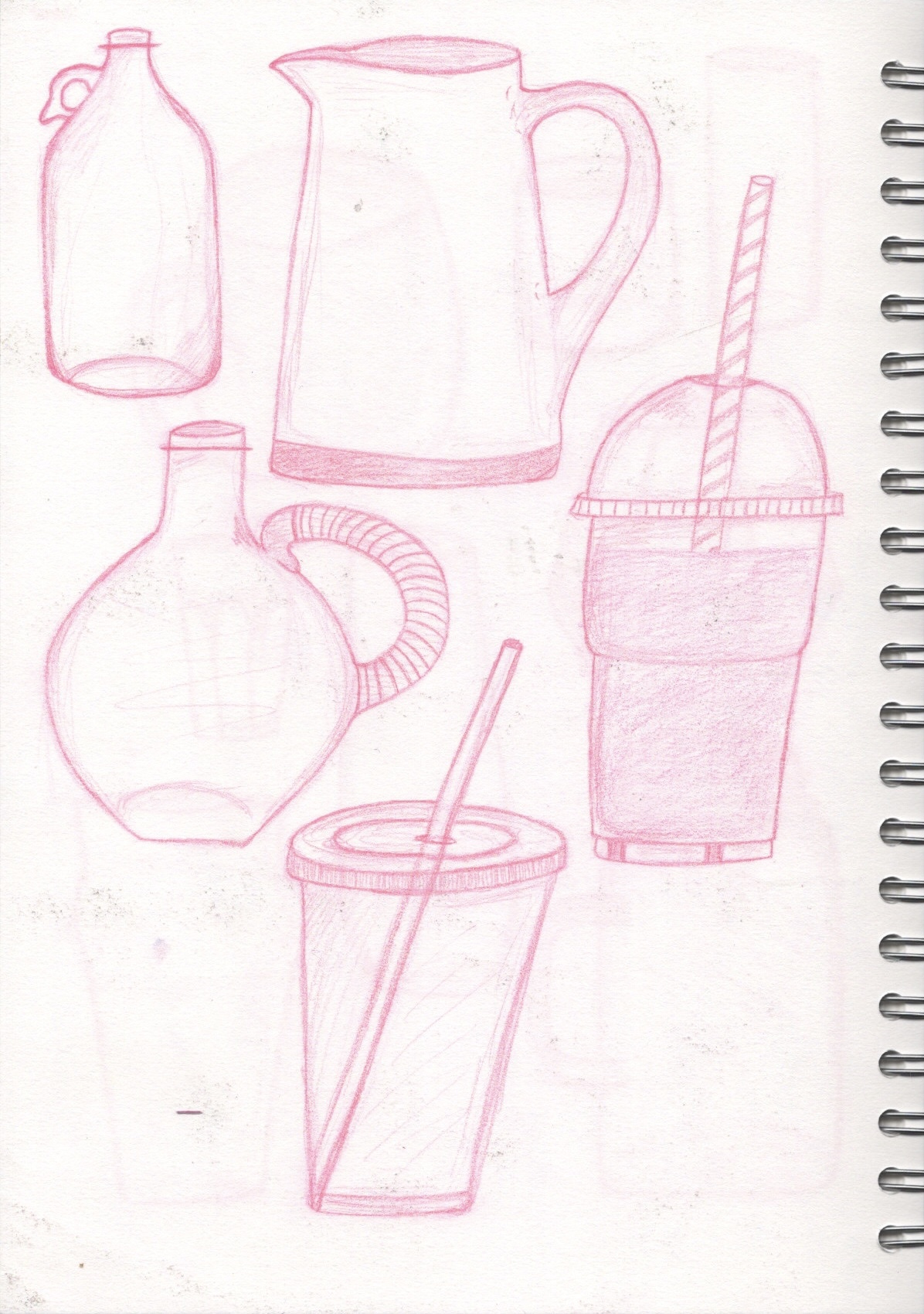
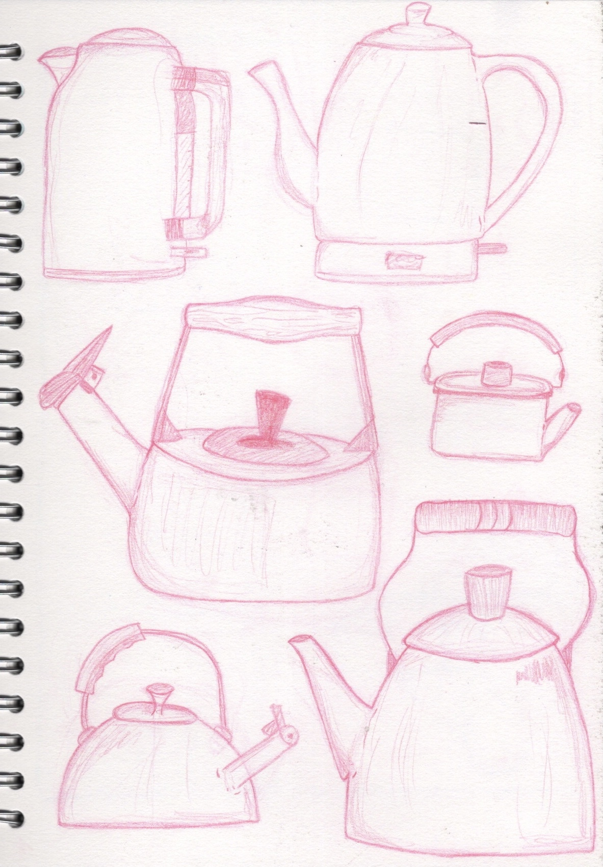
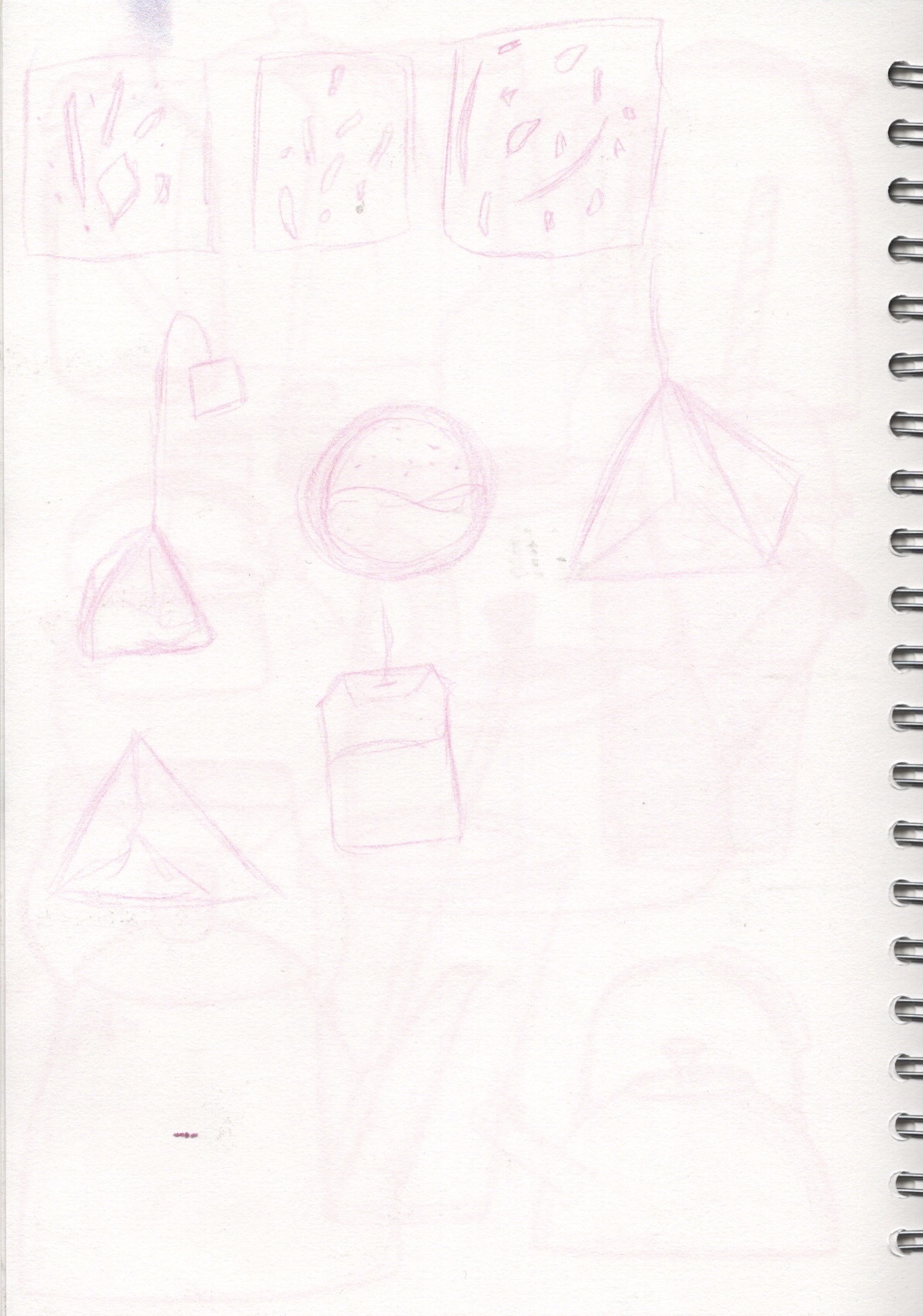
I knew that in my final piece I would have: a kettle or jug, tea in some form, peaches, ice cubes, and a glass or container for the tea. I wasn’t sure how to draw these or what shapes I wanted to include, so I made another pinterest board filled with references and options for what I could draw. I also included some illustrations by other artists to inspire me. I then sketched out variations of glasses, take-away cups, kettles, jugs, and tea bags, in an attempt to get a feel for the different objects and see what my preferred styles were. I really enjoyed this sort of observational drawing, and it helped me design the final piece.
Taking my cues from my previous exercises – where I learned that sketching out my work on paper then scanning it in digitally makes a big difference – I sketched out my final illustration on a large piece of paper. I thought I would spend longer perfecting the sketch before scanning it in, but I was quite happy with having just the rough loose guidelines in place. I was also starting to get stressed about the positioning of different elements and knew it would be easier to move them around when working on my iPad.

I opened the sketch in Procreate and began sketching over it digitally. This was definitely less stressful, and I think I didn’t even need to base sketch to begin with. I think sketching my work on paper is a good step to take as it helps me finalise my ideas, so I’ll continue doing it, but in some cases a digital sketch can work fine as a base. I then began outlining the elements in preparation for colour. This was pretty easy because I’d already drawn most of the elements repeatedly, so my hand almost knew where to go without much effort.
I utilised the hue/saturation/brightness tool a lot in this illustration. This was so helpful – being able to see exactly how the colours will look when already placed in the illustration helped me to ensure the piece worked coherently. However, I really struggled with drawing the water. I wanted it to appear as if the water was flowing over each element, rather than behind everything, and that the colour changed as it interacted with each next step. I got the colours down okay, but the positioning was really tough. I tried looking at other illustrations of water and googling how to draw this sort of flowing water, but just couldn’t wrap my head around it. I decided ultimately to leave it be and learn how to do this later on if necessary. It doesn’t look bad the way it is, just not how I pictured it in my head.
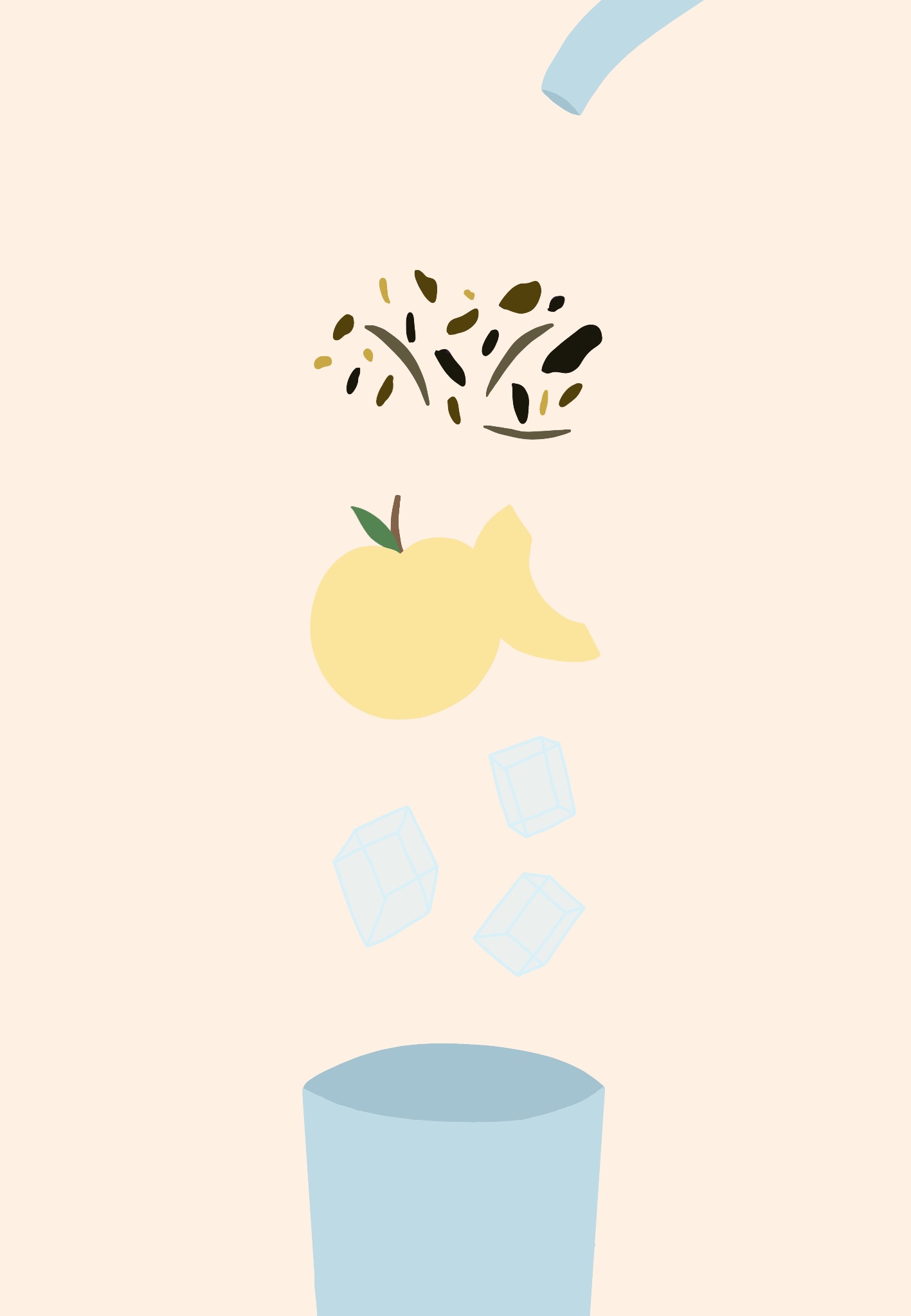
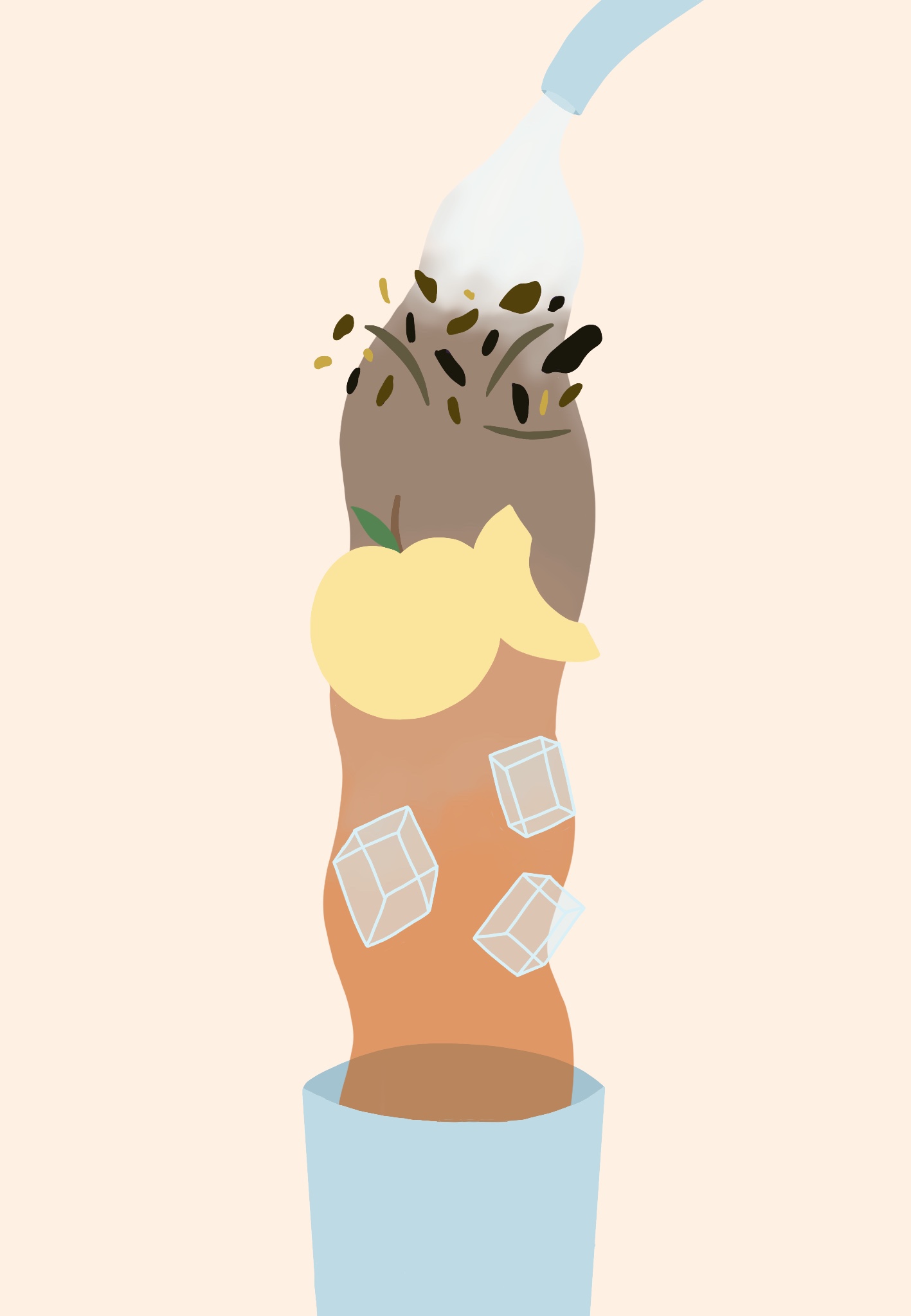
I also initially had some issues with texturing this illustration. I wanted to add textured line art and have a messy faded sort of look to the elements. I was struggling at first with figuring out how to successfully achieve this, and ended up going a slightly different route. I really love how the texturing has ended up looking, especially the water and peach textures.
As for the text, I downloaded some free typewriter fonts to achieve the vintage look I was going for. I just wanted to highlight each step so as to make it clearer that this is an instructional diagram, not just an illustration of tea. I also texted the word ‘Enjoy’ at the base of the illustration – which I would’ve put more work into if I chose to add it to the image – but I thought it wasn’t needed. I also saved a second copy of the final piece with less saturation in the colours. I wanted to see if it looked better this way and fit the original feel of the illustration I was aiming for, but I preferred the saturated version.
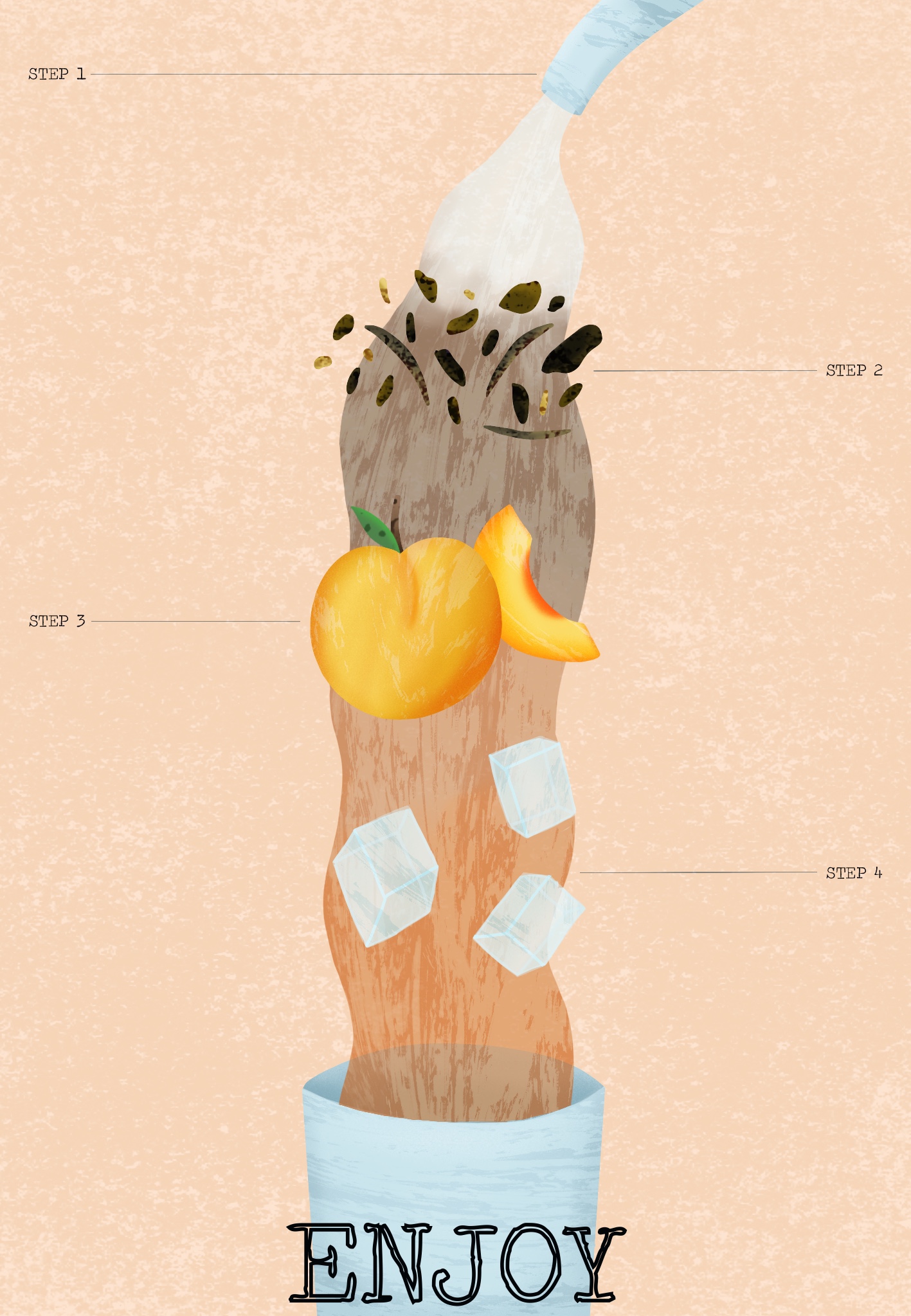
I then sent the finished illustration to the OCA Visual Communications Discord server, and also to some friends, asking their thoughts on it and if it was a clear instructional illustration. The general consensus was that the concept was great, easy to understand, and unique. One criticism was that the loose tea leaves aren’t obviously tea, and that if it was a teabag instead it would be clearer. I can definitely see this and didn’t consider it during the illustration process as I’m personally very familiar with loose leaf tea. I’m glad that it reads well as instructions, however.
I’m very happy with my final illustration. It’s not quite what I had in mind when I initially began this exercise, but I’m not disappointed with that. I feel like I fulfilled both the brief that the exercise laid out, and my own personal brief of having a vintage feel, using interesting textures, and creating a dissected diagram. This exercise was a lot of fun for me to do and the ease in which I found myself generating ideas and solving problems, plus being okay with the mistakes I was making, has made me really excited for what’s to come. I can really feel myself developing and making progress, which feels so rewarding.

[…] meantime I thought about what I could do with the rest of my designs. The sketches I created for Exercise 18 – of various cups and kettles – are ones I probably wouldn’t have ever revisited […]
LikeLike
[…] next research point was the general topic of ‘diagrammatic illustration’. I revisited Exercise 18 to see if I had any research there that would be useful. Most of my research was geared towards the […]
LikeLike