This exercise was focused on learning how to create for specific audiences. I had to produce three illustrations to be used as a series of A3 posters to publicise a museum. The posters had to each target one of the following audiences: Children ages 5-9, Teenagers, and a general adult audience. I had to select one object for each of the audiences and create an image centered around that. I was asked to consider whether I wanted the illustrations to be a ‘family’ or very different, and how I would make the same exhibition interesting to many groups of people. I had to produce colour visuals of all three posters, and complete one of them.
To start with, I began researching the three target audiences to get a clearer idea of my market. It made sense to me to start with the youngest audience and work from there, so I began by researching marketing strategies aimed at children. I found this article by Concordia University St. Paul (CSP) which states that children influence the buying habits of their parents, which makes them a key target demographic for marketers. More relevant to the exercise, the article included the statistic that children influence family trip destinations 94% of the time – this would make them a crucial target market for museums, as appealing to a single child can bring a whole family’s worth of traffic.
Another article I found, hosted on Socialnomics, was clear about the need for caution when coming up with marketing campaigns specifically aimed at a young audience. The article stated that ‘many kids are savvy enough to detect when someone is being inauthentic … out-of-touch pandering creates negative brand perception’, meaning that children know when they’re being talked down to and that advertisers must be careful to avoid pushing too hard to be relatable and patronising their audience in the process. This tied into the suggestion in the exercise brief that I should avoid playing into stereotypes and generalisations.
I then researched how marketers approach advertising to a teenage audience. I found an article on Business.com which outlines tips on how best to market to teens, opening by saying ‘when it comes to reaching young people, technology and trends are key’. The article stressed the importance of having a ‘cool factor’ – meaning that any brand wishing to capture a teen audience’s attention must remain up-to-date with new trends and always remain current. Business.com also observes that teens are a socially-conscious demographic and are drawn to brands which ally themselves with social justice causes. I thought about ways I could incorporate this into my poster in order to appeal to the teen demographic, especially in the wake of the current social justice movements such as Black Lives Matter, environmental concerns, and LGBT rights.
I struggled to find reference material for marketing toward a general adult audience, as this is incredibly vague and can encompass just about anything. When I think about how something geared towards this audience would look, I feel as if it would be more sophisticated, boring, and have more of an educational focus than the previous two target markets. I also feel, however, that young adults share many qualities with the teen category. Due to advances in technology there is a lot of overlap between the interests and popularised content that teens and young adults engage in. This is also a contributing factor to why its hard to gauge what a general adult market might enjoy. I decided to start looking at pre-existing museum posters to see if I could understand this market better and begin generating ideas inspired by what’s already out there.
I mostly used Pinterest to find these posters, though I also looked on Behance and tried to use Google but didn’t have much luck. A consistent theme I noticed is that even the most modern posters were heavily inspired by vintage designs and seemed to blend the contemporary with the vintage, as is often seen in current designs. They were all very illustrative and artistic – this could be due to the fact that many of the posters were for art galleries, but even the museum posters had central illustrative elements. This was definitely inspiring to see and it helped me get a get a sense of what needed to feature in my own posters, especially regarding text and text-based content.
Almost all of the posters I looked at used a sans-serif font, and often opted for dramatically curved and smooth lettering, whilst also intentionally leaving certain words in lower case. This really added to the ‘modern vintage’ vibe. There were numerous examples of families of posters which was really useful for getting an idea of how my own family of posters could ultimately look. I also noticed that the ones that seemed to be aimed towards children tended to use playful illustrations featuring children and animals with lots of bold colours and plenty of texture. I decided these were important elements that I would try to work into my own poster.
The exercise brief asked me to visit an exhibition in person and document it. Due to COVID-19 there are currently no exhibitions available to do this with. I would’ve loved to have visited my local museums for this exercise, and I’m sad that I wasn’t able to. Thankfully, many museums and galleries have started featuring online tours of their exhibitions. At first I wasn’t keen on them as they aren’t as immersive or engaging as real-life exhibits, and it took a while for me to find one I was inspired by. The Discovery Museum in Newcastle, my favourite local museum, has an online exhibition called Colourful Discoveries. As a lover of colour this exhibition was fascinating and the concept felt like something I could easily work with.
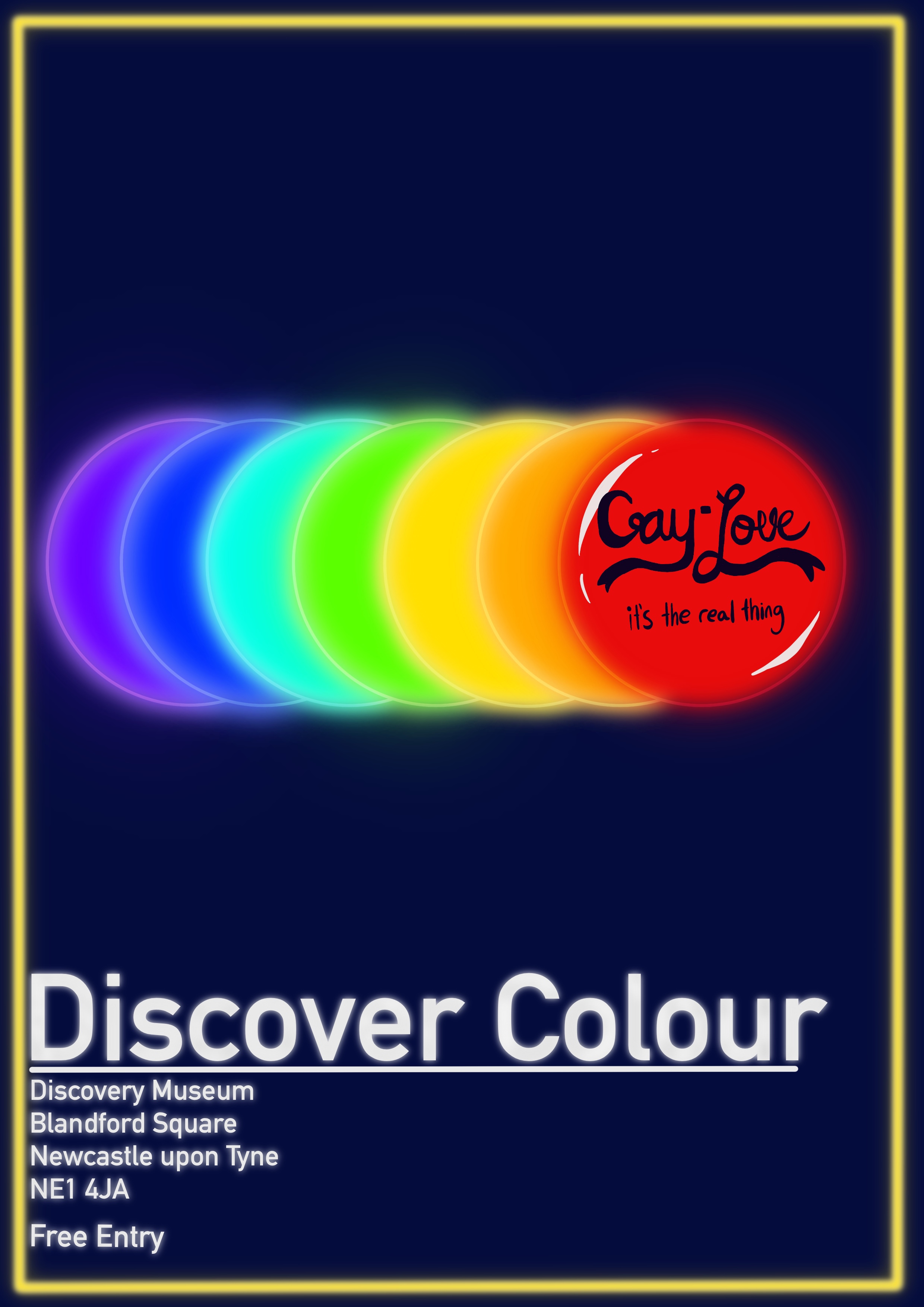
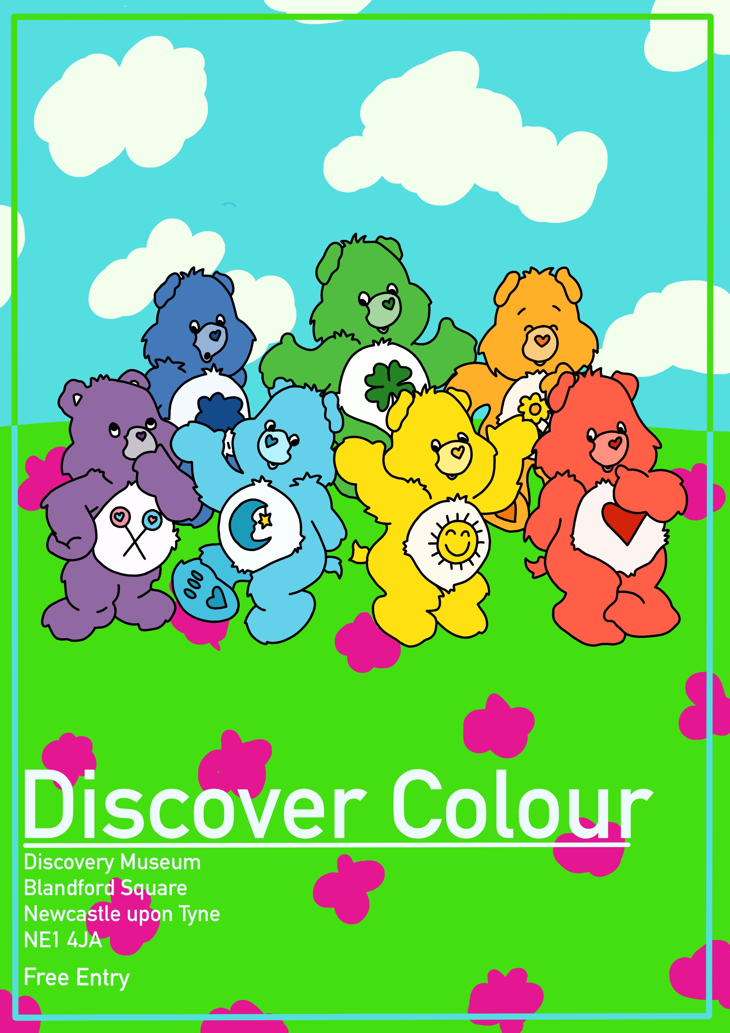
Next, I had to pick one object for each of my posters. I really liked the ‘gay love’ badge and felt it fit the teen profile really well, as I’d already established that the teenage audience is drawn to social justice movements. I thought the illustration could centre around one badge, or maybe many. For adults I considered shoes, bottles, or hats for my object. This was the hardest audience to work for, as it was so broad and generalised. The objects all felt a bit boring and there was nothing connecting me to them. I also found that the lack of resources detailing how to market to such a wide audience left me stumbling around in the dark a little. For children, I considered plastic dinosaurs, soft toys, or toy cars. These felt appropriate to the market and featured heavily throughout the exhibition.
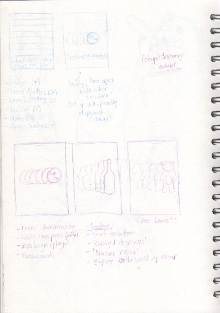
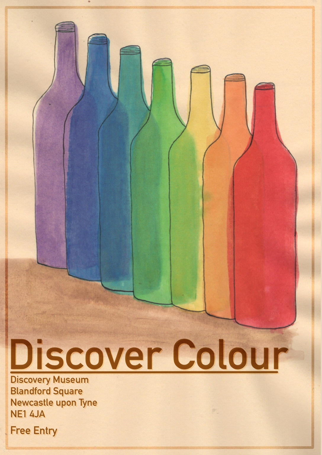
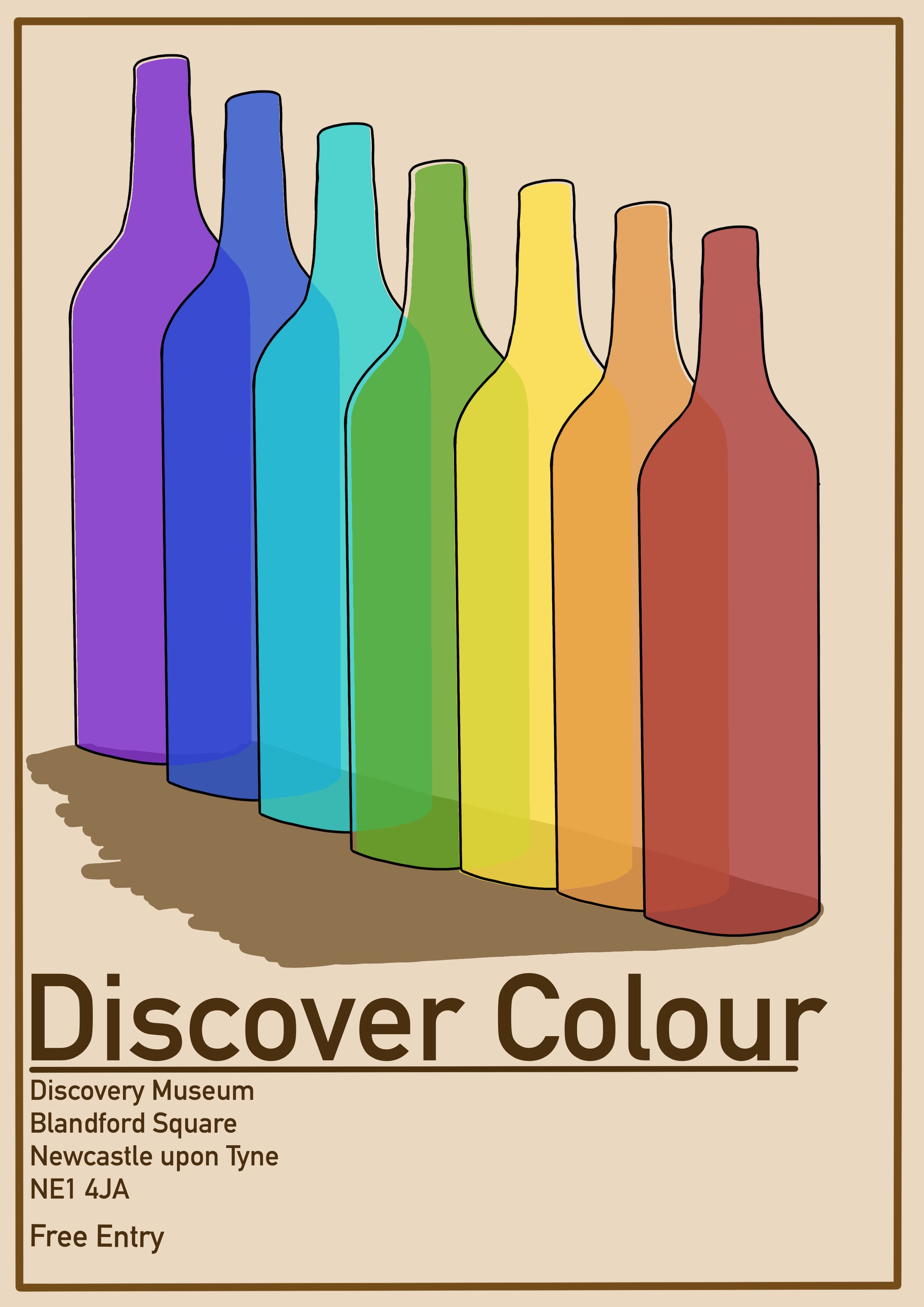
My idea development for this exercise was pretty rapid. I umm’d and aah’d around which objects would fit best, but the central concept came quickly to me and felt like a perfect idea. My first idea was a very brief pride flag style poster with the words ‘what does colour mean for you?’ written at the bottom – aimed at a teen audience – but that was scrapped once I focused on the badge concept. I definitely wanted a family of posters, and I thought they would tie in together really well if I did one repeating object in all the colours of the rainbow. For the teen poster I would design a bold, edgy, neon illustration of the ‘gay love’ badge repeated in every colour. For the adult poster, I would do a more formal upscale poster, using muted tones and transparency in the colours, featuring wine bottles in repeating colours. And for the children’s poster I would feature Care Bears in bright bold eye catching colours, perfect for this concept as they already come in a wide variation of colours. I also wanted to feature identical borders and text on all three to further tie them together.
I moved into Procreate to begin sketching out some more finalised concepts. Frustratingly, I didn’t save these sketches but they are visible in the progress videos below. I began by creating a border and adding the text I wanted and duplicating this canvas so I had 3 copies. This meant I could work with the exact same framework for each one. Then I sketched out the general shape of the objects and began lining them. As the posters were relatively simple, there wasn’t much sketching involved as I could just repeat objects. However, for the children’s poster, I was conscious of the fact Care Bears are a known brand and that they would have to be properly represented. I chose to trace the general outline of some pre-existing care bears for the colour visual as I wanted them to be recognisable. If I was working with a client on a paid project, I would likely not choose Care Bears as they aren’t my intellectual property.
Next, I started blocking in colour for the posters. This was difficult as finding the line between colour visual and finished artwork is hard for me. I always want to just complete the entire illustration as I feel it doesn’t look ‘good enough’ when left as a colour visual. For the teen poster I tried to evoke a neon light feel to it. I’m not sure how well I achieved this, but I guess it’s unfinished work. In the adult poster design, I intentionally offset the lineart and the colouring, attempting to go for a sketchy watercolour style. And for the children’s piece I went as bright and bold as possible. When I put these three colour visuals together, I feel they are cohesive and fun. They are really exciting as I feel they could actually be used for a museum exhibition. I really like how the concepts have turned out. My only real criticism is that the children’s poster isn’t entirely my work. Had I have chosen this poster to fully illustrate, I would definitely have tried to draw the characters myself, or I would have picked a different theme.
Originally I wanted to research how to create a perfect neon effect and further develop the teen poster. However for Christmas I was gifted a set of drawing inks – a medium I have wanted to explore for a long time – and I felt they would look fantastic if used for the general adult audience poster. After swatching my colours I set up a palette with some watered down rainbow tones. I picked darker colours and, where necessary, mixed inks together to get the rustic ‘old and and sophisticated’ feel I wanted. I then printed an A4 copy of my line art to copy onto some pastel paper. I picked this paper as I wanted to have a slightly cream/brown background, and I knew from experience that this paper held up well when wet.
In hindsight, I probably should’ve experimented with this a bit. The paper crinkled and I couldn’t get it to flatten again no matter how hard I tried. This meant the final scanned in product didn’t look anywhere near as polished as I would’ve liked. If I did this again, I would stain a high quality piece of watercolour paper using coffee or tea bags, then paint my illustration over that. In fact, using ink instead of tea/coffee may work even better as ink is not water soluble.
I traced my design onto my paper using a light box. I also ended up regretting this decision, as the pencil was very dark and I had to erase it before painting, and then the lines were too faint and I couldn’t make out what I was meant to do. I would in future leave the lightbox on and paint the design without sketching it out first. This way I could be sure I was doing the right thing. Then I got to paint the bottles, the thing I was most excited for! I began with the furthest away bottle, with my goal being to layer them over each other working my way towards the red one. I was a little too overenthusiastic, however, and did not leave enough drying time between layers. I think this is a pitfall of digital art, you get so used to instantaneous results that waiting for things like paint drying don’t occur to you! I know that ink dries waterproof, but sadly I didn’t know how long it took for that to happen.
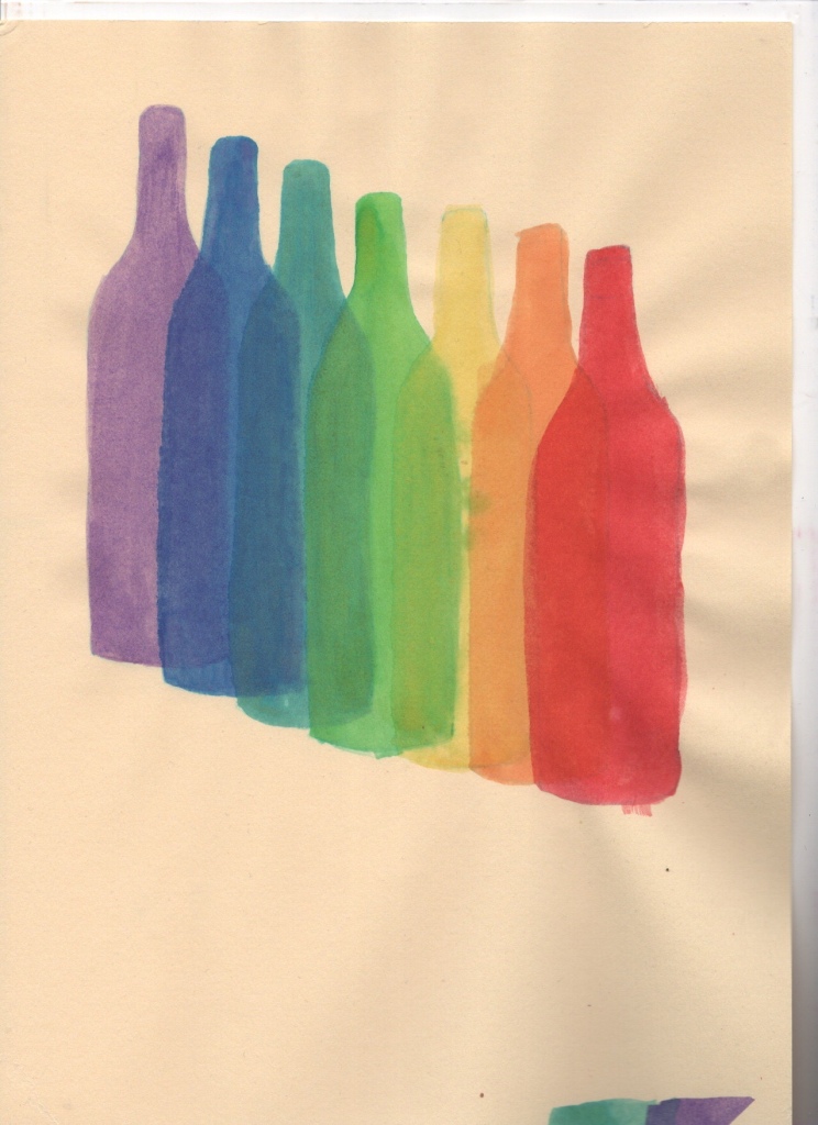
I forced myself to slow down and take breaks between each layer. I still managed to mess this up several times, but overall I think it looks okay. Once I finished painting each bottle I added some linework. I was intentionally messy and disjointed with this as I wanted to capture that sketchy look Ihad envisioned. I also added some bottle cap detailing as I felt the bottles were a bit plain without. I think this added to the piece massively, and I really like how it looks. Finally, I scanned in the painting and added the border and text to it, tweaking the colours slightly to make it all fit.

Illustrating this piece was a huge learning curve for me – largely because I was using a medium I haven’t ever used before – but also because I was forced to leave most of my work unfinished and messy. I feel disappointed with my results because of this. I know they could all look better and have more potential, and I know if I re-did the final illustration with a lot more experimentation and practice, it could be perfect. But, I am also trying to embrace these things and try to view them as part of the learning process. Being okay with unfinished work is an important step in my artistic journey, I think, especially coming from a place of perfectionism. The insight I gained from the research in this exercise, and my confidence in my ability to design for a specific purpose, have both been very rewarding nonetheless.

[…] and analysing the brief. I also reflected on previous projects where I created posters, such as Exercise 23 and Assignment 3 – both from Key Steps in Illustration. I read through the learning logs […]
LikeLike