
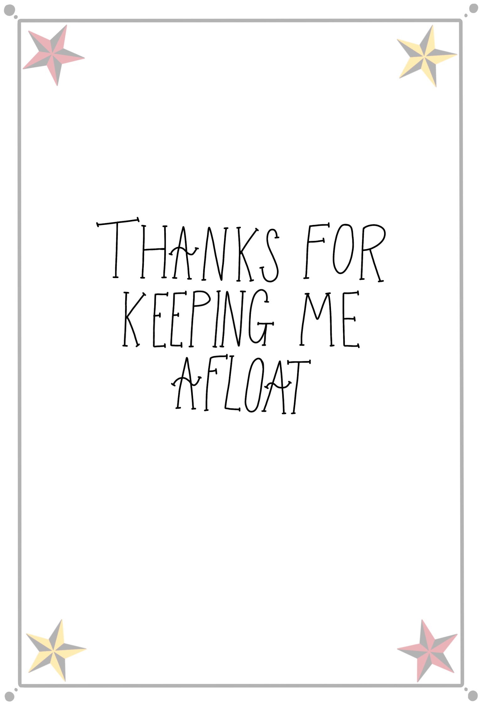
This exercise asked me to design a tattoo for a friend based on the word ‘Mum’. The design would also be used on a Mother’s Day card, so it needed to be versatile and work at various different scales. I was asked to research the history of tattoos and body art, and explore tattooing in multiple different cultures. Finally, I had to produce a finished illustration ready for tattooing.
I am a big fan of tattooing and have a number of them myself, and I keep track of certain trends within the industry. Because of this, I already have a very good understanding of modern tattooing conventions and processes. I feel that this definitely gives me an edge when approaching this exercise, as I have a good idea of what clients might want when getting tattooed themselves. I don’t have a super in-depth understanding of the history of tattooing, however, so to begin this exercise I watched two videos that I hoped would provide further insight.
The first video I watched, made by the YouTube channel Grunge, was called The Old and Bizarre History of Tattoos. I was drawn to this video as I felt it would provide some interesting history, rather than a general overview. It was incredibly informative and covered a great deal of the art of tattooing and its origins. Two 5000-year-old Egyptian mummies were found to have the first figurative tattoos, which appear to depict animals, and these are the oldest known examples of aesthetic tattooing. However, tattoos have been found on bodies preserved in ice dating from as early as 3250BC, although these were thought to be intended as medicinal as they were mostly just lines etched over areas where joint and spinal issues were found.
The video also provided insight into the darker side of the history of tattooing, detailing the ways in which nonconsensual tattooing was used to permanently mark criminals and other socially ostracised people – most infamously done by the Nazis, who tattooed identification numbers onto Jewish prisoners during the Holocaust. This was especially traumatic as Judaism specifically forbids tattooing as a religious principle, although Grunge notes that this has not stopped young Jewish people getting tattoos today, especially ones related to Jewish iconography.
Christianity, meanwhile, has never had a blanket ban on tattooing, although Christian missionaries often outlawed the cultural tattooing practices of the areas they colonised – presumably to help pave the way for their own cultural overhauls. Christians have often held negative beliefs against tattoos within more modern history and the association with atheism and the devil has created a stigma against tattooed individuals within western and Christian societies.
The stereotyping of people who have tattoos as violent or criminal is a strong cultural bias that still remains today. The video mentioned that at times this has caused lawyers to advise defendants to cover their tattoos due to the possibility of them inciting negative bias from the jury. Today, this negative bias still remains, mostly within the older generation, and it’s ties to Christianity are probably to blame for this. Although, in the 1800s, heavily tattooed people used this stigma to their advantage by appearing as ‘freaks’ in circuses – crowds were particularly drawn to tattooed women, and this became one of the few ways women at the time could earn their own money.
The younger generation nowadays seems to have gravitated towards an opinion that tattooing is a high form of artistic expression. Tattooing is a highly competitive industry and only the best make it to the top. I know from my own experience that opinions on tattooing are divided generationally, and I would be very interested in seeing how that bias changes based on age. This change in perception began in the late 1950s, described in Grunge’s video as a ‘tattoo renaissance’. TIME magazine covered this resurgence in 1970 with an article that called body art ‘the vogue of counterculture’ and seemingly society has never looked back.
Unfortunately, cultural appropriation is a growing issue within tattooing, as cultures which had their tattooing practices banned are now seeing white westerners appropriate those same styles of artwork. Many people do not realise the roots of tattooing and how indigenous peoples were brutally harmed for engaging in the art. However, on the flip side, many indigenous peoples are reclaiming their ancient tattooing traditions as a means to honour their ancestry, and discussions around the harm that cultural appropriation causes are becoming mainstream.
In contrast to the Grunge video, this short video by Allure was rather uninformative, showcasing specific trends in tattooing across the 20th century and into the 21st. Despite the history of tattoos not being especially white or western in origin, this particular throwback is incredibly Americentric, focusing on tattooing trends which surfaced in American culture. This evidences the extent to which tattoo culture still suffers from cultural appropriation, as white Americans show off tattoos that have been blatantly appropriated without any respect for their original meanings or heritage. While the video was short and not especially informative, it was useful to me to see a visual depiction of how tattoo designs have changed over time.
Next, I decided to research the various styles of tattooing in order to decide which styles would influence my piece. I looked at two articles, A Beginner’s Guide: Popular Tattoo Styles Briefly Explained and Ultimate Guide to Tattoo Styles: Popular styles explained with images. Both were incredibly informative and provided enough information for me to easily narrow down which styles I appreciated without further exploration. The tattoos wizard article was especially useful as it showed the same design, a llama, in every style listed. This meant I could compare the styles easily and see which I would prefer to work in.
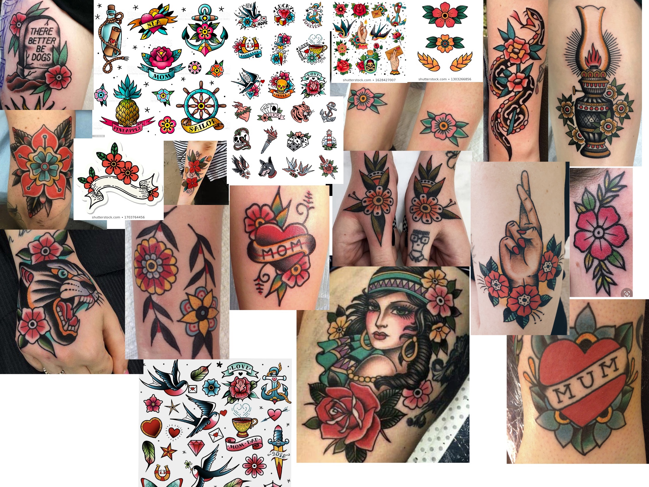
I narrowed down the styles I liked to 6: New School, Traditional/Old School, Neo Traditional, Illustrative, Anime, and Psychedelic. These styles all allow for bold colour and thick line work – elements I gravitate to in my own artwork, as well as in my preferred style of tattoos. In terms of my brief, Anime and Psychedelic styles don’t seem appropriate, so I cut them out and focused on the remaining 4 styles. I went to Pinterest to obtain some reference material in order to compare them in more depth and to figure out which style I wanted to go forward with. I started by looking at Old School style tattoos, and found so much reference imagery that I found myself getting lost in the beauty of the art style. Finding tattoos in the other 3 styles, however, seemed to be proving difficult, perhaps because they are less iconic.
My love of Old School tattooing combined with the lack of reference imagery for other styles made me wonder if I should proceed with this style as my focus, so I went back and read over the descriptors for the styles with my brief in mind. I realised that it would work perfectly, as Traditional tattooing focuses heavily on meaning and symbolism within the imagery. My next step was to research traditional symbolism for the concept of motherhood and honouring your mother, and to look for existing Old School tattoos themed around the word ‘mum’.
My first thought was to look at flower meanings, as many Old School designs feature them, as well as typical Old School symbols and general symbology associated with mothers. I found this article about which flowers to pick for mother’s day, which was perfect for what I needed. From reading it I noted that carnations are associated with mother’s day, azaleas refer to beauty and love, camellias are a sign of gratitude, and that various shades of roses communicate varying kinds of love. I then looked at this article from Ancient-Symbols.com and observed that the chalice and triple goddess are both familiar symbols for motherhood.
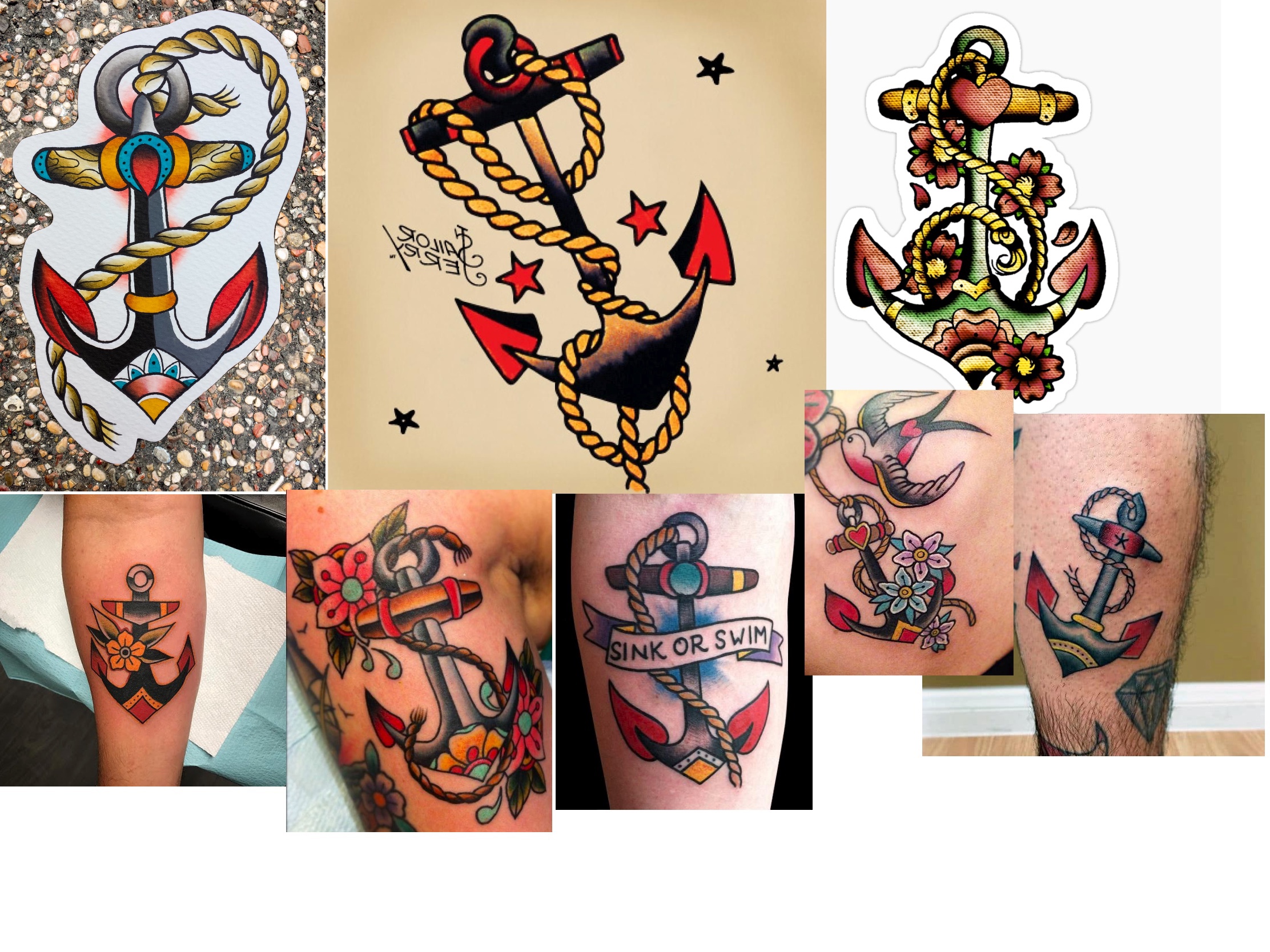
The concept of roses representing all love, not just romantic, made me wonder whether other ‘love’ symbology could be translated to a familial love. I found an article on love symbols and their meanings and from that felt that hearts, swans and doves, and maple leaves, were the most likely to lend themselves to the Old School style. Lastly, I checked out the Sailor Jerry website, as it featured a page on traditional tattoo meanings. Sailor Jerry is known as ‘the father of Old School’, so seeing what symbols he used felt important. I noted that swallows were used, which connected to the swans and doves I had previously taken note of, to mean ‘returning’. I thought this might relate to the idea of always coming back home to your family. I then read that anchors were used to represent stability, and often historically featured in tattoos with the word ‘Mum’.
I then started noting the key features of the style and which colours were included in the very simple colour palette. I found that primary colours, along with black, were the only colours used in very early Old School designs. More modern Old School style allows for secondary colours too, however with very limited variation and shading. The designs are very bold and have clean, heavy linework throughout. Bearing this in mind, and using my Pinterest board as a reference, I began sketching out ideas for my final illustration.

I also experimented with what colours I could use in my finished piece, unsure of whether I would design the tattoo digitally or paint it. Painting is a common technique that tattoo artists use when designing flash, though more artists are moving towards digital design based on its versatility. I found that I was struggling with developing my ideas on paper as I felt I needed to have very equal, symmetrical, and consistent linework, as is key to the Old School style. I decided to move into Procreate to finish brainstorming.

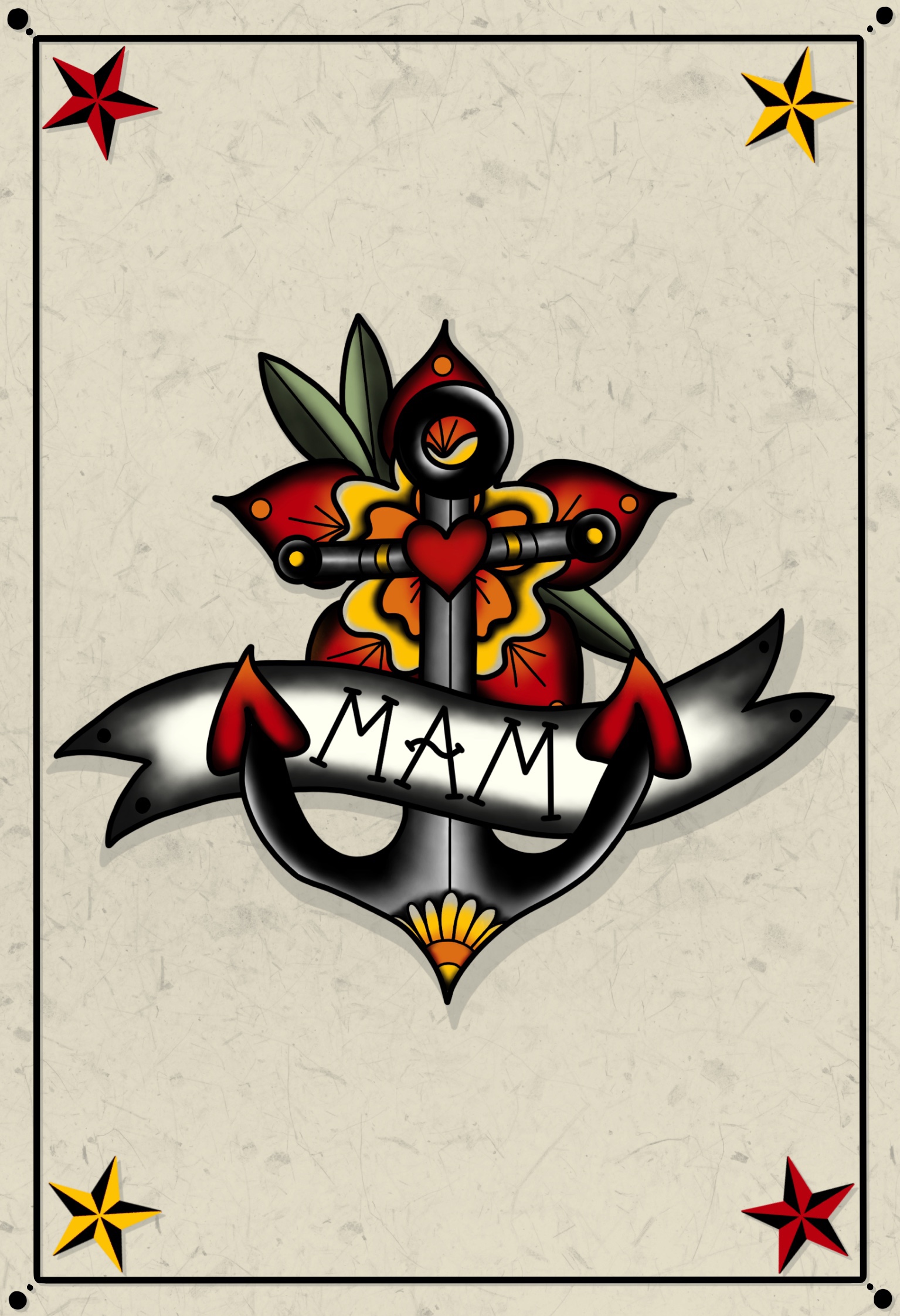
I was focused on three main ideas – the chalice, the heart, and the anchor. The heart felt very traditional, but I was very keen on including flowers in my design, and I liked that this allowed me that space. The chalice, however, felt like I was putting my own spin on the Old School style, but I couldn’t seem to get the ribbon to work in the way I wanted. The anchor seemed quite simple, but effective, and I ended up choosing this to develop even further. At this point in my design process, I opted to go for the word ‘Mam’, rather than mum, as a nod to my Geordie heratige. I was quite impressed with my idea sheet, though, and felt it looked akin to typical tattoo flash.
In order to further develop the anchor concept, I opened the original drawing in it’s own canvas. It felt quite plain and boring, and I wasn’t sure how to work past this. I knew I wanted to add flowers, but I wasn’t sure where or how to impliment them. I decided to create two mood boards – one of existing flower designs, and one of anchor tattoos, in order to use them for reference. I then started sketching in the additional elements onto the basic anchor design. I found drawing the flowers was quite tough, as they do need to be very precise, so I drew a guide based on a pre-existing design. This helped a lot.
Once I was happy with my line visual, I began experimenting with colours. Thankfully, as I had a reduced palette, this was quite easy. The hard part was figuring out exactly which primary colours I would use. There are so many variants in the shades of red, blue, and yellow! I found a website that sells tattoo ink and took screenshots of some different shades in order to colour pick from these. I found a red and yellow perfectly, but finding the right shade of blue was trickier. I also wanted to stick to the roots of the style and ensure I was getting a true middle-point for my secondary colours. I used this Hex Code colour blender to obtain this. I ended up with three varying colour palettes to pick from, and ended up – somewhat frustratingly – going with the first one.

Now that I had a colour visual, I could start on perfecting the final design. I started by filling in some heavy line work, then added colour where needed, and lastly spent some time shading various areas to get that authentic Old School look. Most of the articles I read about Old School specified that the style was light on shading – however, visually I feel this is untrue. Many, if not all, of the tattoos I saw – even the ones on the Sailor Jerry website – used black ink shading and blended colours. Perhaps this shading is simply gentle when compared to other styles, especially ones such as realism.

I am immensely proud and happy with this design. It feels original and unique, and not as if I just copied pre-existing designs, which is not hard to do when a style requires so much traditionalism. It also fits the brief very well, and I could see it existing on flash that I look through on a regular basis. It also translated easily onto a greetings card, as shown below. Overall, I had a lot of fun with this exercise and enjoyed the process from start to finish. It’s definitely an area of illustration I would be interested in exploring even further.


[…] I have designed them for friends and family for various occasions, and I roughly designed one for Exercise 26 of Key Steps in Illustration. This is a new area of design for me all things considered, so quite a […]
LikeLike