The focus of this exercise was to embark on a deliberate process of stylisation. It had 4 steps to it; the first was to draw either a cat or a dog from reference and make it look ‘real’, the second was to attempt to draw it again using no more than 5 lines, the third was to make a collage from cut-outs of magazines, and the fourth was to produce a drawing of the collage and add at least one other element in order to create a narrative.
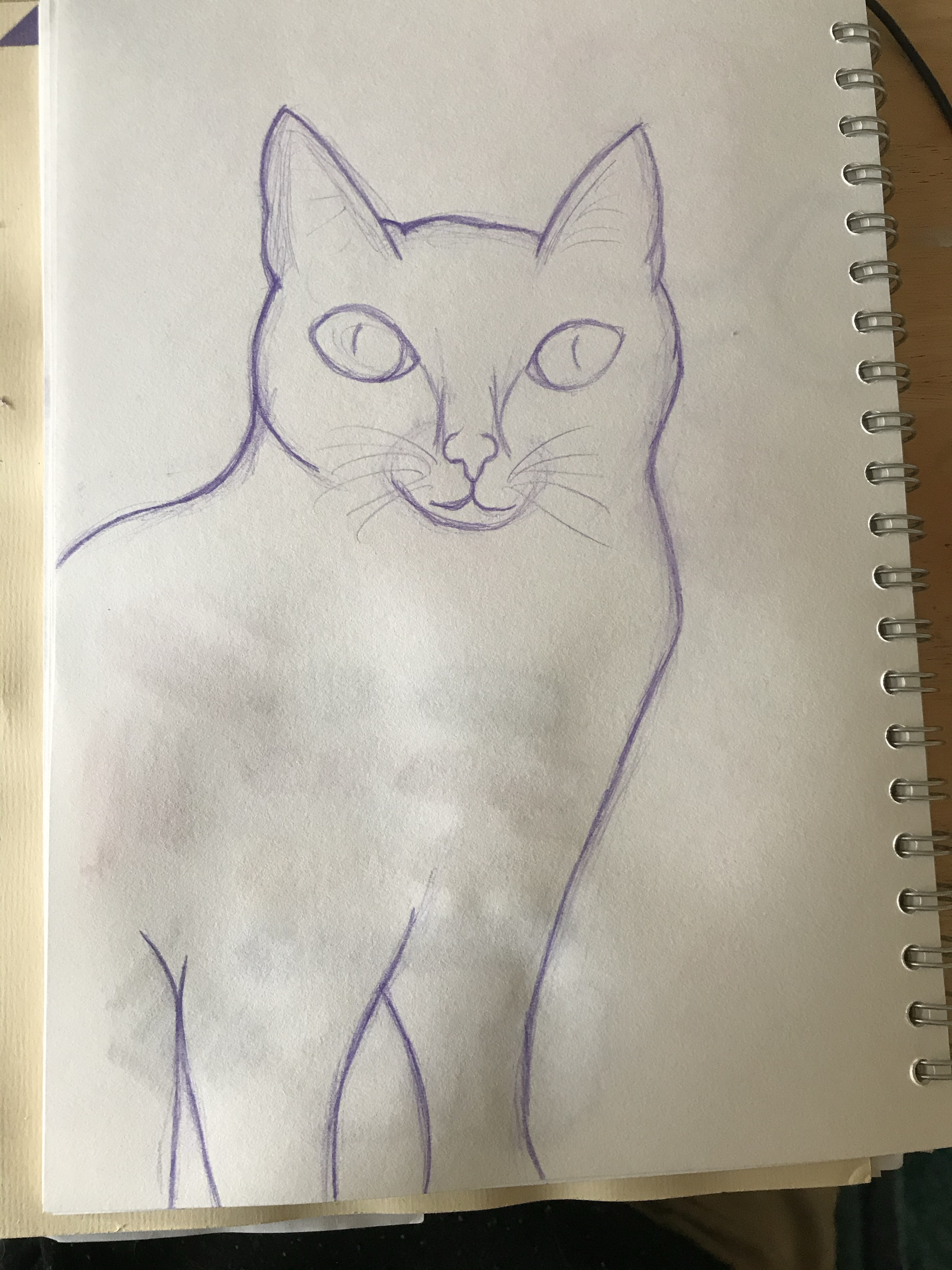
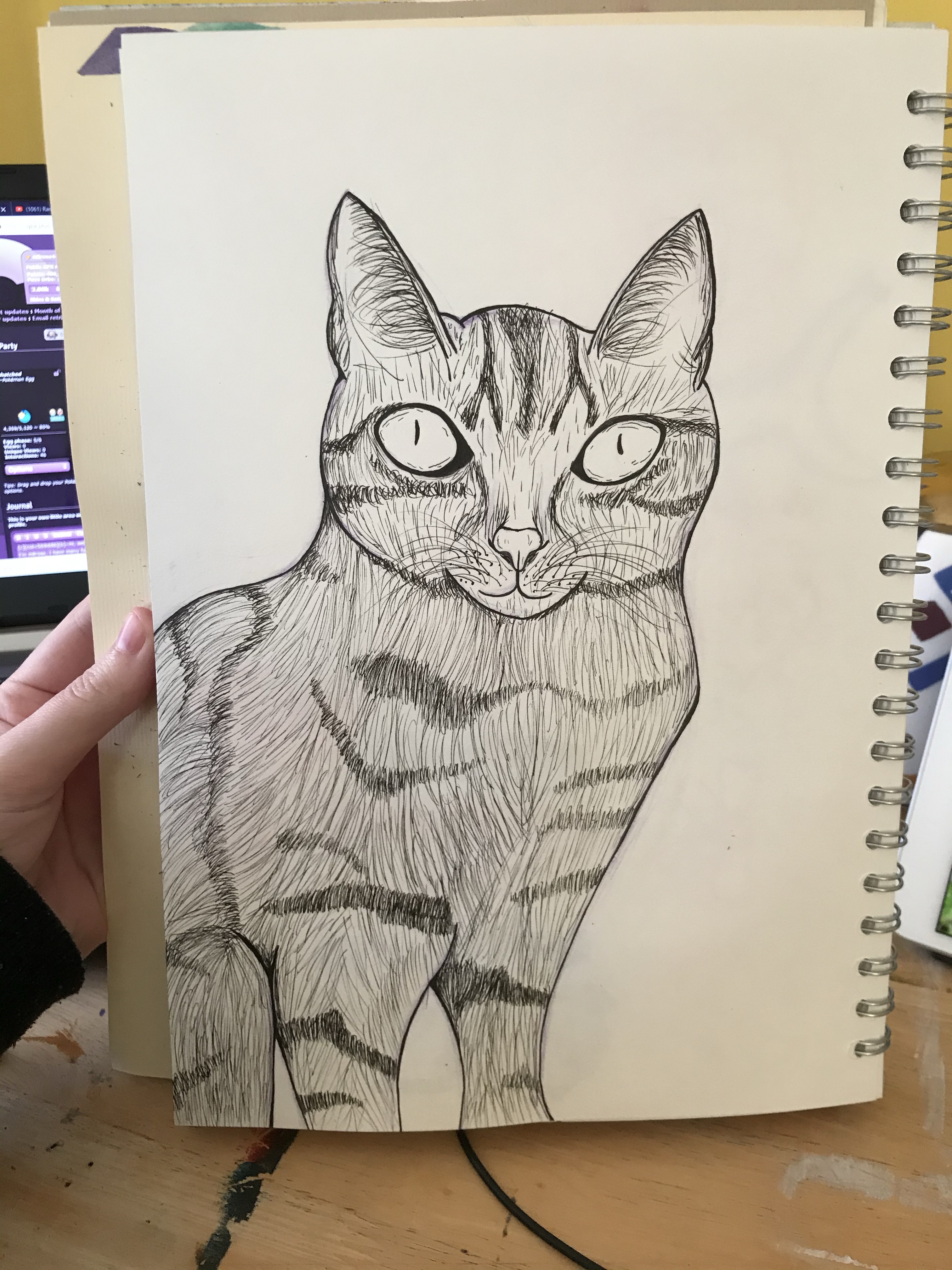
I wasn’t too excited about this exercise when going into it, as I honestly wasn’t sure what it could offer me. Plus, I felt it was quite a long and drawn-out process for achieving a unique style, something I didn’t want to undertake every time I illustrated something new. I think of myself as a ‘cat person’ through-and-through, so I trawled Pinterest to find a good reference to begin with. I picked an image of a nice little tabby sitting in a relatively normal position and sketched it out. I then chose to ink it using drawing pens, adding in the texture and the detailing of its fur. I had a lot of fun doing this and was amazed at how far my drawing ability has come since I started this course. This may actually be one of my favourite drawings to date!
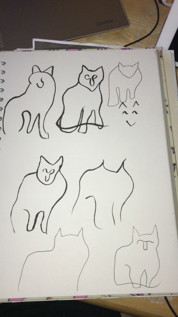
Next up was to draw the cat with no less than 5 lines. This was unsurprisingly a challenge for me. I decided to begin with an ink brush pen, rather than a pencil, in order to push myself out of my comfort zone and force myself to accept the imperfections. It was hard to figure out where the lines were needed in order for the image to still be readable as a cat, and using a pen meant the shapes didn’t always work fantastically. I then used a smaller inking pen to see if gaining more control would alter the imagery, and whilst it did make it easier I feel the brush pen drawings were more effective. I think I probably could’ve pushed this task a bit further and experimented even more, but visualising those 5 lines was getting harder and harder by the minute.
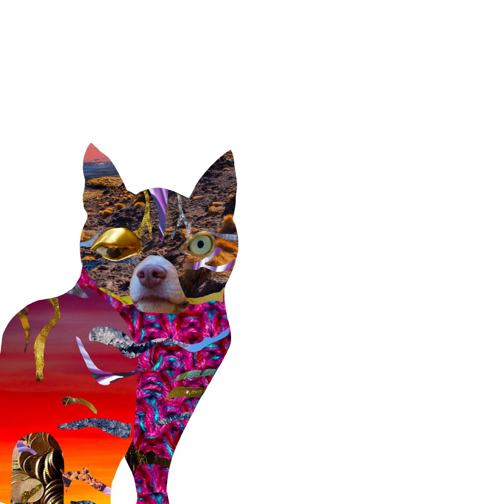
I then had to create a collage of my cat. The instructions for this part of the exercise stated ‘Have fun introducing surreal elements. Deliberately distort. How far can you bend reality?’. It also asked for a collage made from magazine cut-outs and printouts. As stated before, I don’t really have much collage material (though my collection is slowly growing) and I find it much easier to work digitally in this way. When collaging, I will typically have an idea of what I want the finished piece to look like, or what kinds of materials and textures I’d like to portray, and then I go out and find source material to cut this from. For example, I may think ‘maybe cat’s fur could be feathers’ and then I will go and find stock images of feathers. I felt that for the sake of the exercise, however, it was important to have a limited range of material to work from.
The challenge for me here was to make something unreal, to push the boundaries of ‘cat’, and I wouldn’t be successful in achieving this if I used my usual collage process. I found generatormix.com, a random image generator that uses Pixabay as a source, and decided to generate around 50 images and save every single one. I would then be limited to these images when picking my collage material, forcing me to be more selective and imaginative in how I create my final image.
To begin, I scanned in my first cat drawing in order to give myself an initial framework. I then started with the facial features, taking inspiration from Hannah Hoch’s collage work and usage of facial distortion. I built a body around that, trying to select fun and interesting textures and patterns for various parts of the body, and using placement of the various cut-outs to indicate where the different body parts connect. Finally, I picked a handful of interesting scenes to add in the fur markings. The finished result is really weird and chaotic. I don’t dislike it, but I’m not sure if I would share it with my friends beaming with pride, either.
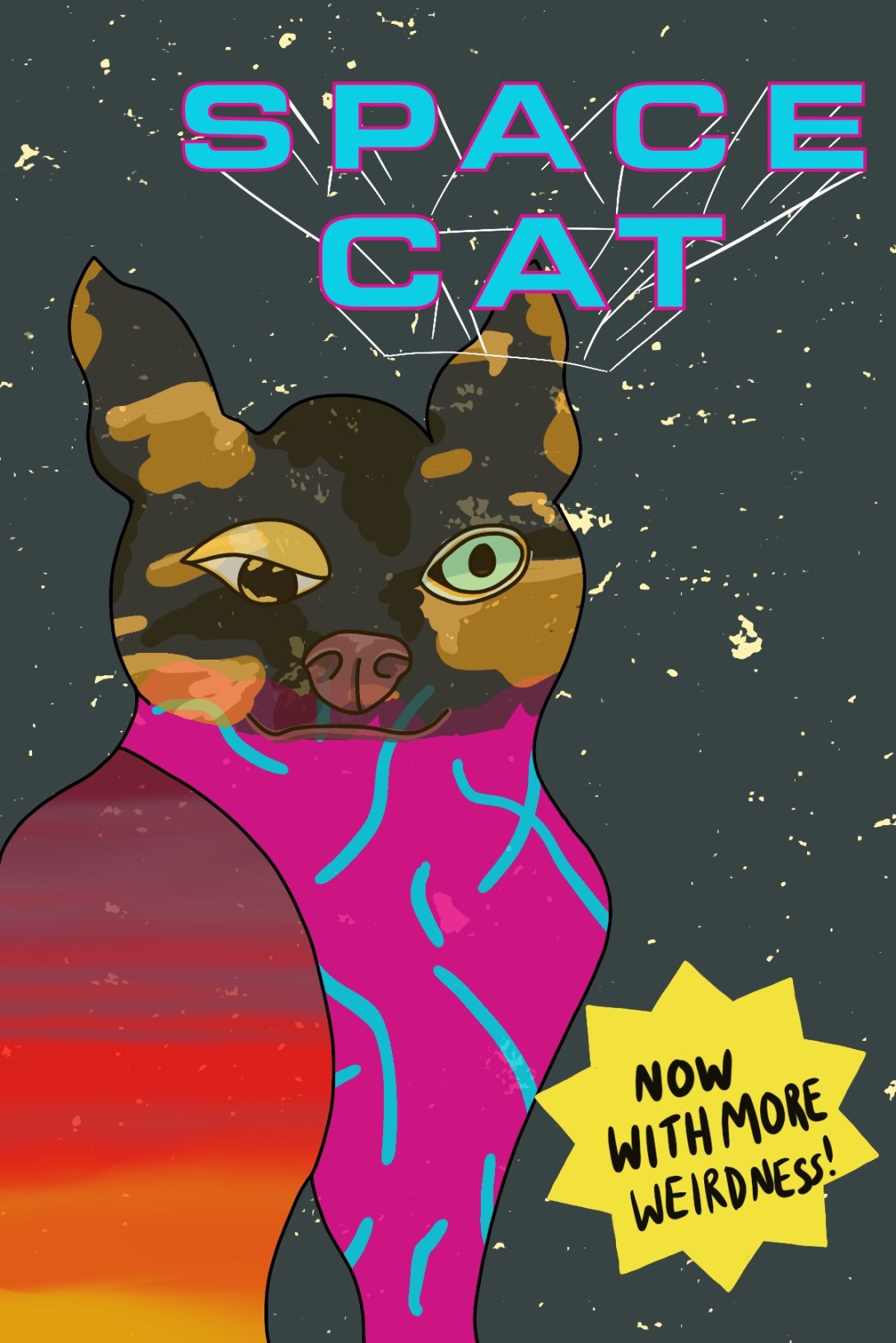
The instructions for the exercise very clearly indicate that the drawing taken from the collage should not be a tracing. I prefer sketching on paper anyway, so this worked well. I used my collage as a reference and once again drew a cat, making it look ‘real’ – if ‘real’ was the cat in the collage, of course. Whilst sketching I realised I wouldn’t be happy with the piece unless I added colour, which meant I would probably go back to working digitally. Because of this, I kept my sketch rough and marked out the most important areas of the drawing. I started to really love this character I was creating, and began thinking about who it would be, what its background was, what narrative I wanted to introduce into the image, and where I would take it.
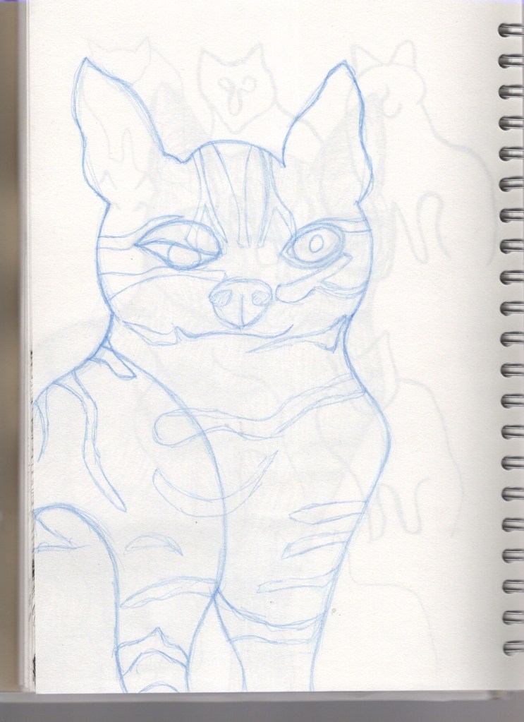
It all got too exciting, and I got a bit too involved in it. I came up with an entire world for this cat to live in, a whole style for the universe and vague plotlines for it to exist in. I decided it would be the main character in a comic called ‘Space Cat’ – it is a foreign, otherworldly breed of cat, and it does not live on Earth but in space with other space cats (and dogs and other animals too!). I could’ve spent weeks developing this character and the world it lives in, and designing panels for an entire story. I will probably go on to do this, and Space Cat will live in a collection of original characters for years to come. However, for the sake of this exercise, I caught myself before taking it too far and produced a colour visual of the front cover of the prospective comic book ‘Space Cat’.

I am aware it’s very rough, but a huge learning curve in part 4 for me has been knowing when to stop. I find that often I put 200% into each and every exercise, wanting to explore all options and develop as much as I possibly can at each stage. This isn’t necessarily a bad thing, but as the exercises started requiring more work and becoming more involved, I needed to learn that not every single project can be taken beyond what is necessary.
There was a lot of focus on producing colour visuals in this part, and to begin with I was very apprehensive to do this. The rough colour blocking stage of my illustrative process is my least favourite part, and the stage at which I feel my art looks the worst. Leaving my work unfinished and rough feels scary – like I haven’t done enough – and I know I could do better. But now, coming to the end of this part, I understand the benefit and I am starting to be okay with leaving things undone. I (hopefully) won’t leave Space Cat unfinished forever, but if I do, I’m okay with that.
This exercise ended up being wonderful for me and a way to develop ideas that I’d never considered before. Whilst yes, it is a lengthy process, I think I may adopt some of the steps into my illustrative process. I am a long-time fan of surrealism and I feel like in this exercise a lot of things ‘clicked’ in my head on how I can make it a reality in my work. I’m very grateful for it as an exercise, and I really feel I learned a lot.
