This exercise asked me to collect examples of lots of different characters and catalogue them in some way. I then had to consider a character that I would like to create, brainstorm around it, and then fully illustrate the front and back of it.
I was so excited about this exercise as character design is an area of illustration I’m very interested in exploring and understanding better. I have a copy of The Fundamentals of Character Design (written together by Randy Bishop, Sweeny Boo, Maybis Ruiz Cruz, and Luis Gadea) which I’m really keen to work through, though it’s pretty hefty and will take quite a while. To start this exercise, I thought about the characters I engage with on a regular basis through media. I play a lot of video games, watch animated films, and have several TV shows I especially love. Whilst the TV shows aren’t necessarily illustrated, the basic function of character design still exists, and using this as a reference point was very helpful for me.
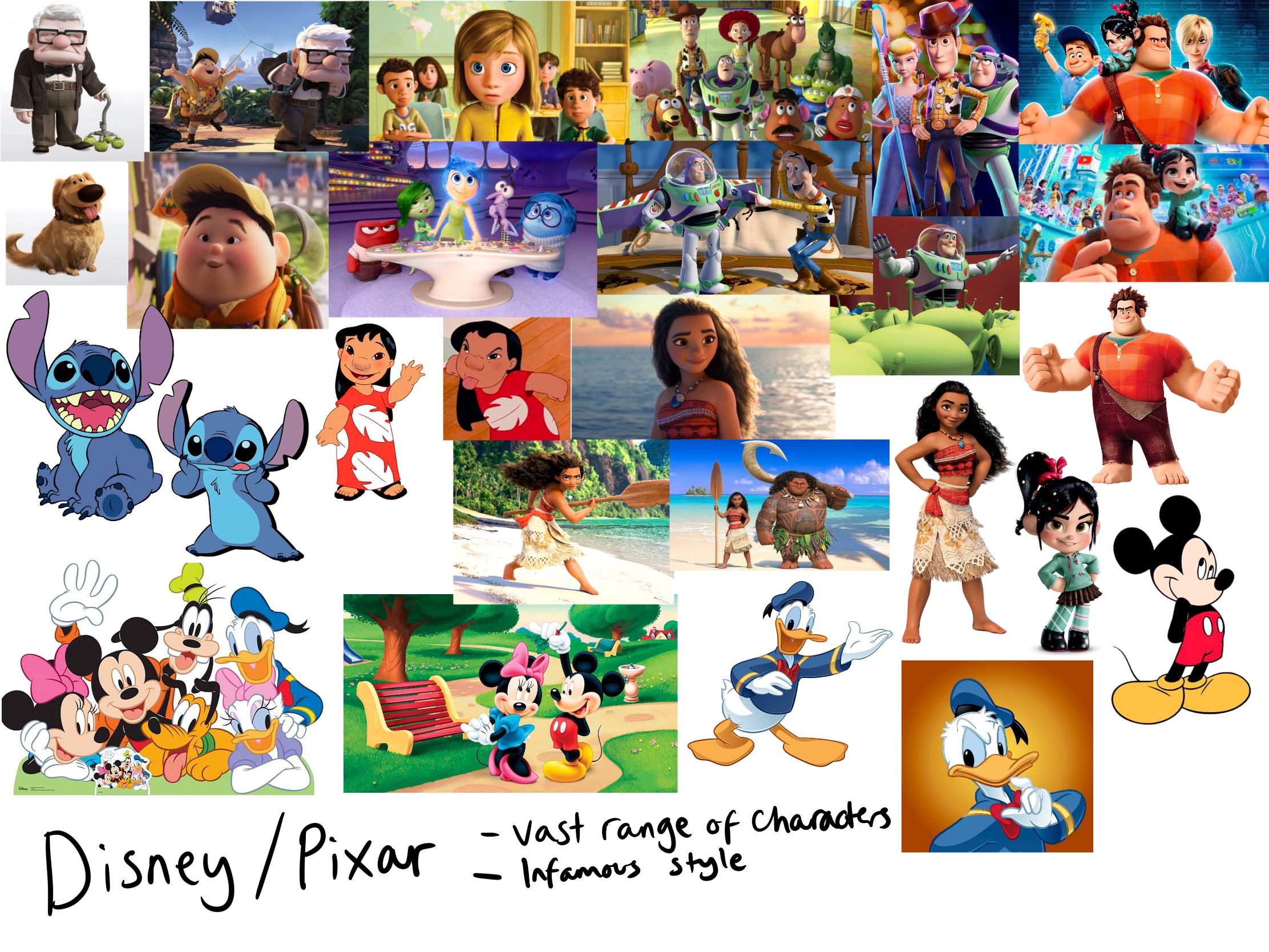
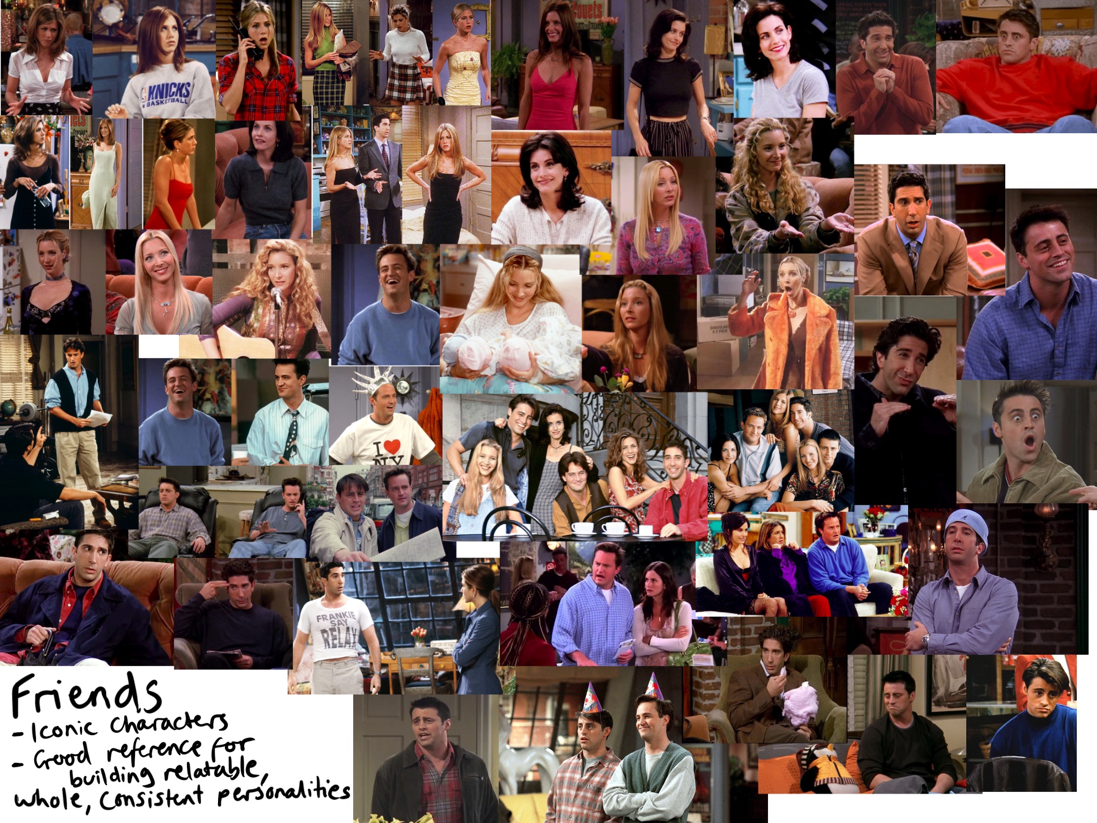
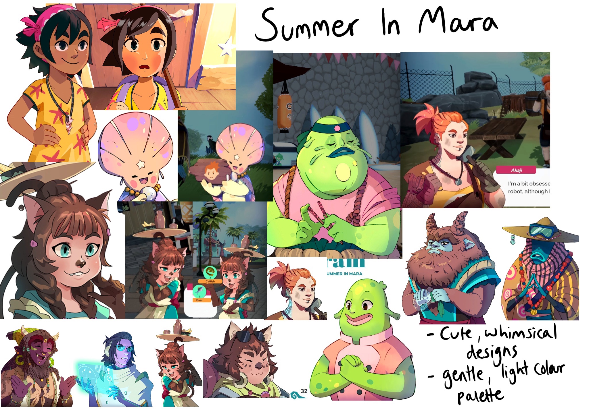
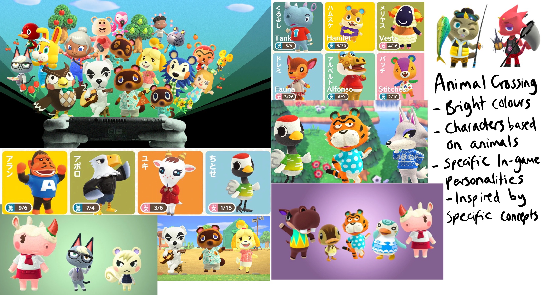
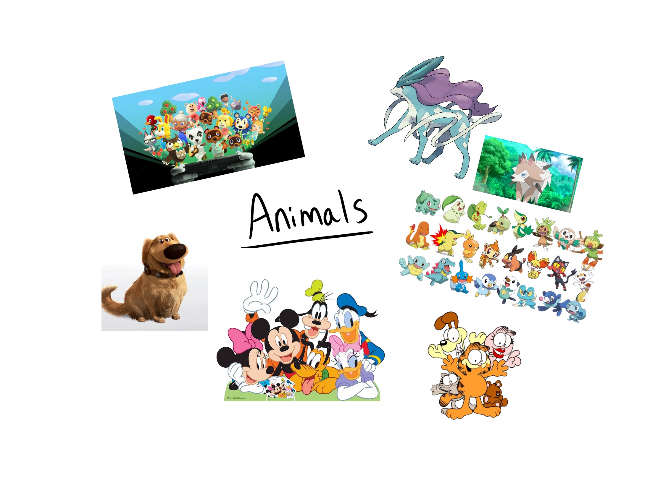
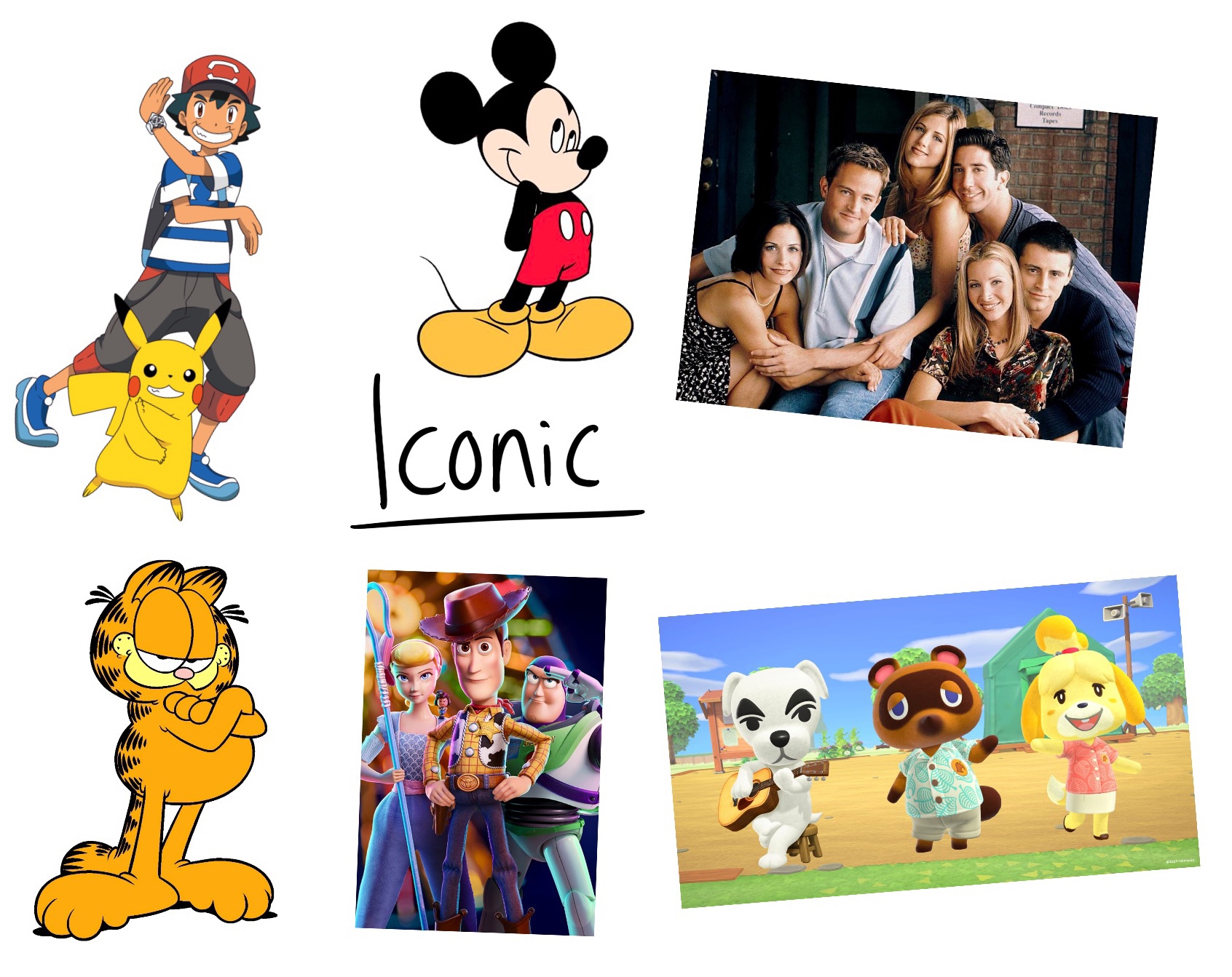
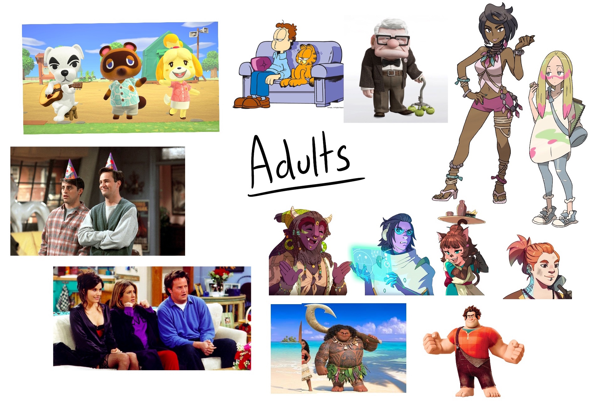
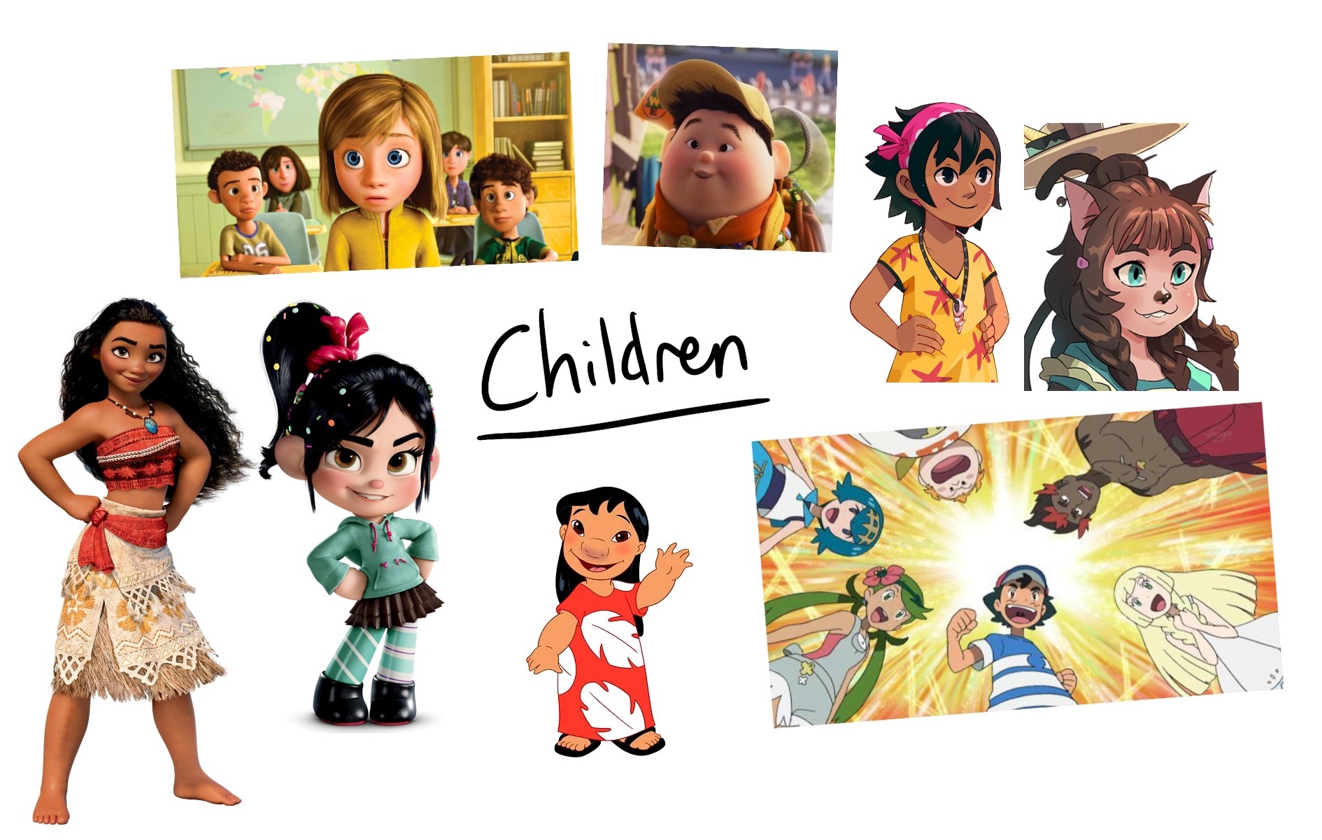
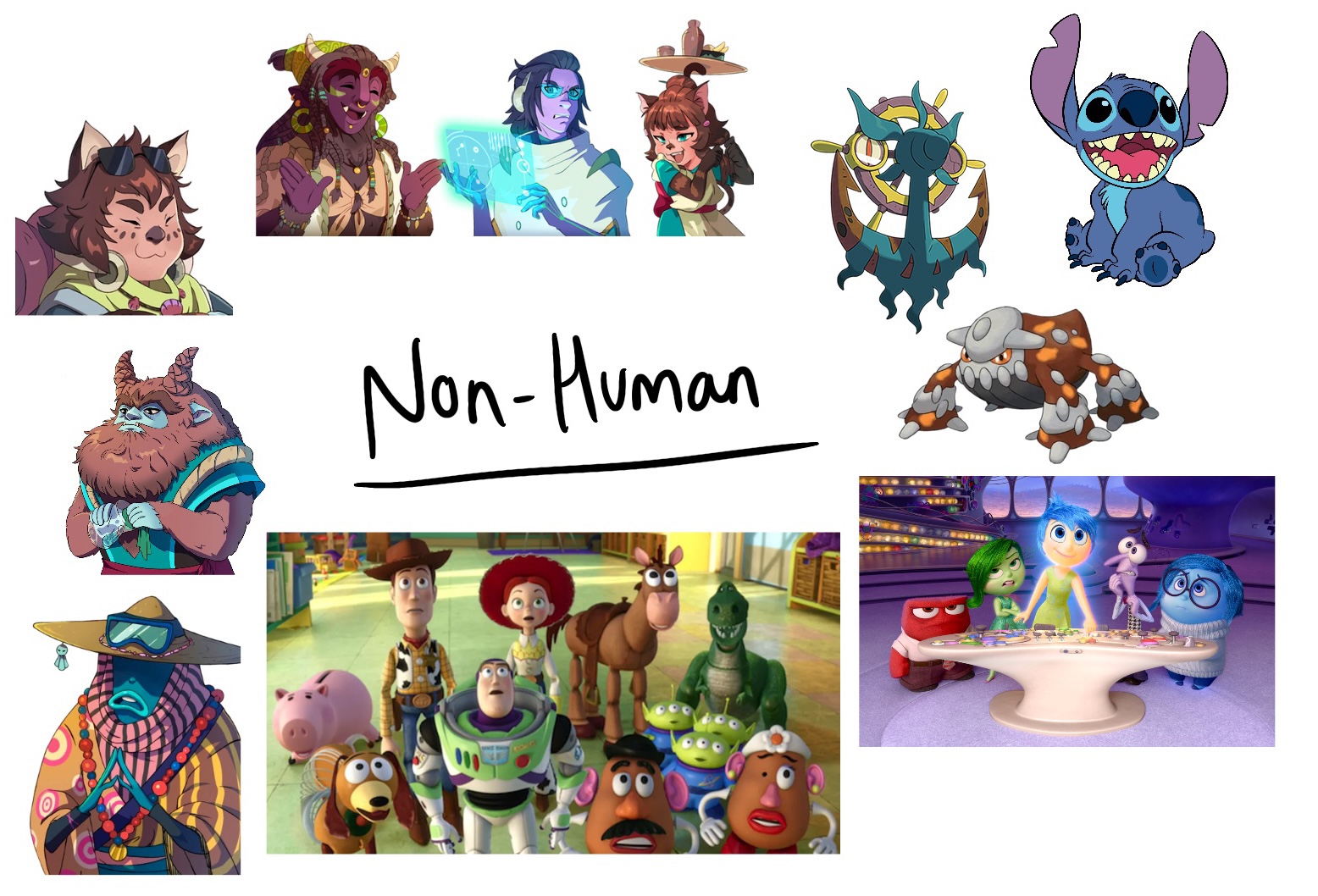
There were a lot of shared categories in the characters I found. To begin with, I organised them by which franchise they originate from. This was useful as it helped me identify consistencies in style and it also made me start to think about other categories I could create. I noted down any key design choices I felt I noticed, and also any contextual information that related to the designs. I then organised the characters into 5 categories; Animals, Iconic, Adults, Children, and Non-Human. These were all quite broad and could encompass many things, and many of the characters also fitted into several categories. I started to think about what I would want to create from these categories, and felt like ‘Animals’ and ‘Non-Human’ were my favourites, as I love the creativity involved in designing them.
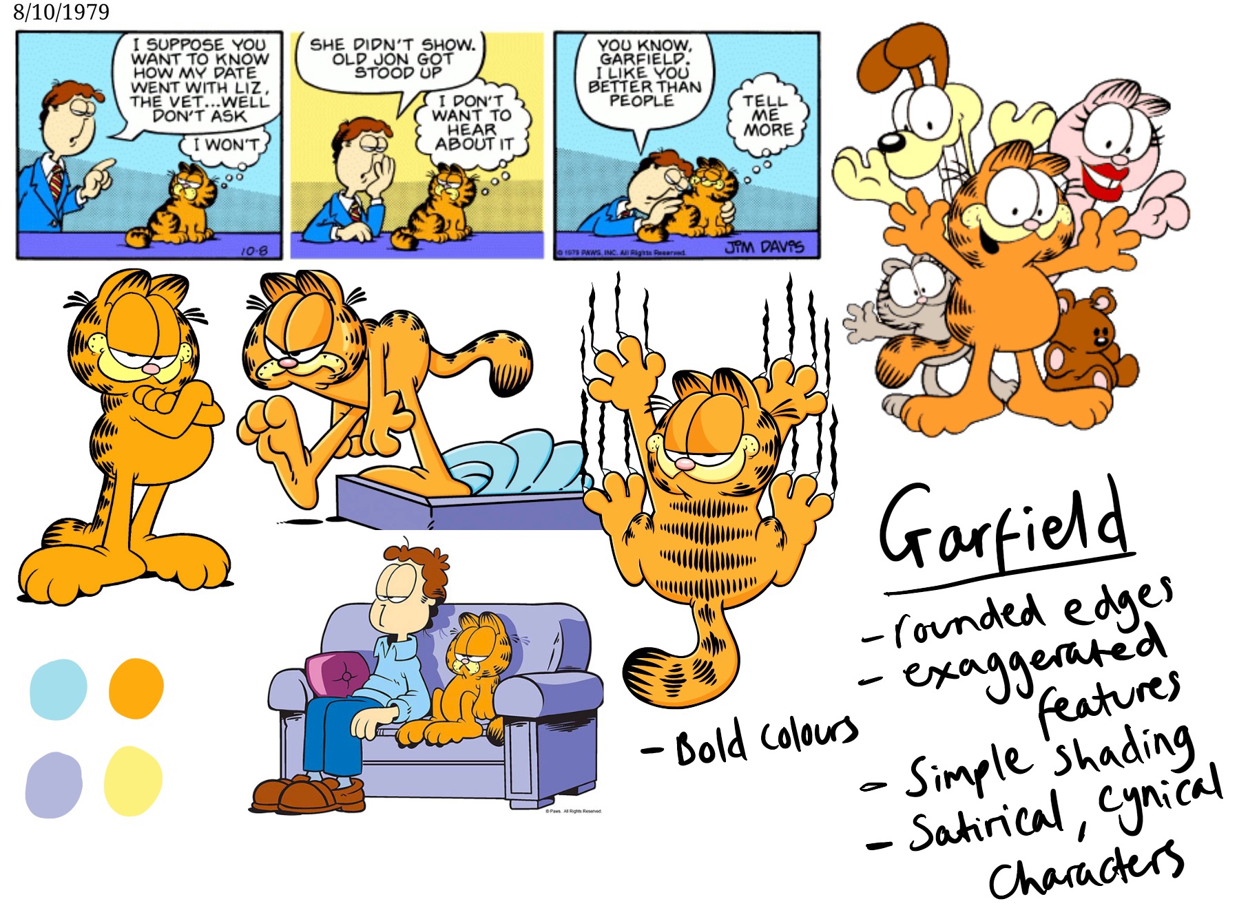
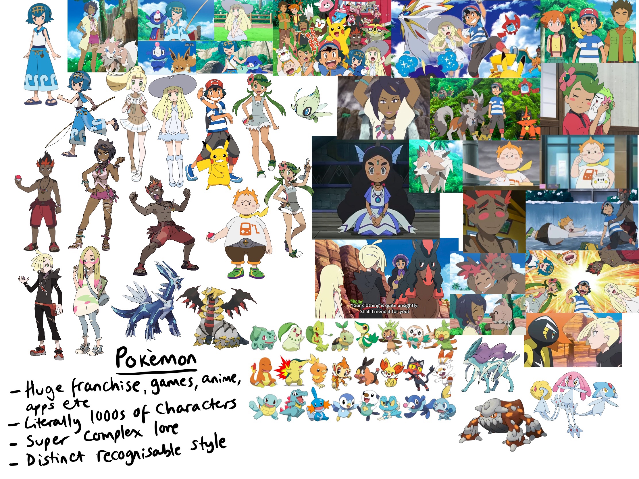
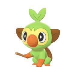
Whilst thinking about this exercise and what sort of thing I would like to create, at the forefront of my mind was Pokémon. Pokémon is my all-time favourite franchise, and I spend a lot of my time engaging in the content The Pokémon Company produces. I love the games, the anime, and all the characters involved. There is a lot of incredibly deep and well thought-out lore which makes even simple characters exciting and familiar. Ken Sugimori has been the art director for the franchise since it began in 1996, and his distinct style has evolved with the series. His involvement has lead to there being a well-known design style, with iconography used throughout the franchise being recognisable to almost everyone.
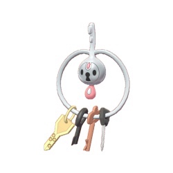
Pokémon are creatures – like animals in the real world – that inhabit the wild of the Pokémon world. They range from being based on recognisable animals (such as monkeys, fish, owls, and even uncommon animals like axolotls) to inanimate objects that have come alive (examples include a bin bag, ice cream, and set of keys). A commonly participated in activity within the Pokémon fanbase is the creation of ‘fakemons’ – fake Pokémon – often creatures or ideas fans could conceptualise existing in the Pokémon universe, with lore and background information that helps them fit into the existing canon. I have never created my own fakemon, having never really given the idea much thought (though having enjoyed looking at other artists creations). I felt this exercise was the perfect opportunity to give it a go, and I was excited to explore the possibilities in designing a character from a franchise I already know and love. As I am extremely new to character design (and not awfully good at imagining new worlds), having a pre-existing universe I could work within was a great help for me.
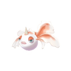
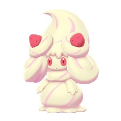
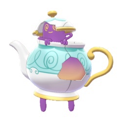
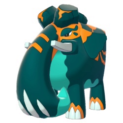
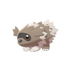
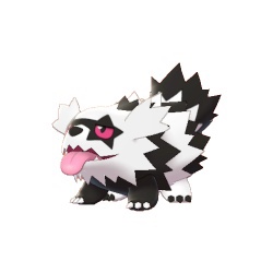
The Pokémon universe is based in various regions all of which draw inspiration from real-world locations. Every 4-5 years the company releases a new generation of games which feature a new region, and new Pokémon which are native to that region. For example, the most recent region of Galar is based on the UK, the previous region of Alola was based on Hawaii, and the one prior to that was Kalos, based on France. The Galar region debuted Pokémon such as Alcremie – based on cream cakes, Polteageist – based on a pot of tea, and Copperajah – an Indian elephant referencing the British colonial connections to India. There are also regional variants of Pokémon introduced in previous generations, such as Zigzagoon, which was redesigned to reference the British punk scene.
With this information in mind, I decided to create my own region based on my local area. I live in Newcastle upon Tyne, a place with very rich local history and a populace who are immensely proud of it. As a child, I learned in great detail about my local history and what made Newcastle what it is today. There are a lot of local myths, legends, and lore to take inspiration from, and so I began to brainstorm the different ideas for Pokémon. My first thoughts were a pair of magpie and panther-themed rivals, representing the rivalry between the Newcastle and Sunderland football teams. I then listed some commonly found animals, some of which already have Pokémon based on them, which lead me to thinking about my own regional forms. I thought about the different areas where I live, like the coastal areas and city areas, and any important landmarks. I also considered referencing the history of mining and shipbuilding in the area.
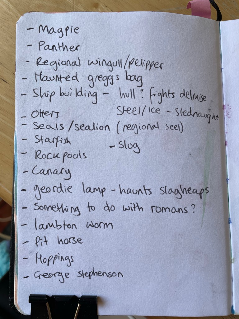
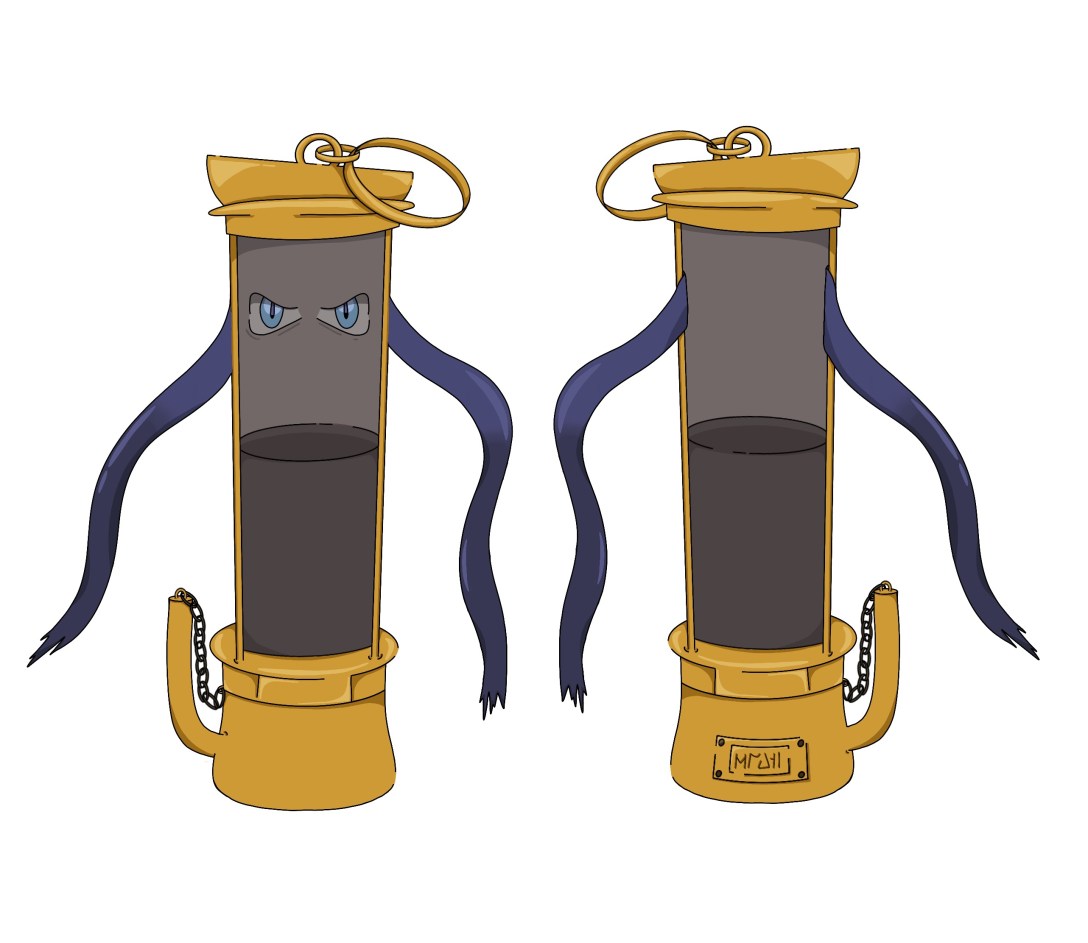
I then began looking at reference imagery I could potentially use for my designs. My favourite concepts were creating a regional variant an the existing Pokémon called Wingull – based on kittiwakes – the magpie/panther duo, and a haunted Geordie lamp. I felt the regional Wingull idea was too easy and unoriginal as I wouldn’t be creating a design from scratch, just building on one that already exists. The magpie/panther duo held strong as a concept, but felt like an awful lot of work. My favourite concept, and one I found it extremely easy to visualise and create background information for, was the haunted Geordie lamp. I also felt it was the most unique to the region, with ‘Geordie’ being in the name, and it referencing a key part of local history.
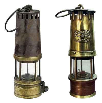
During the mining era it was common to use a Davy lamp when in the pits. This was a safety lamp that was invented to prevent explosions but still provide sutible lighting for workers. In 1815, George Stephenson – engineer and engine-wright at a colliery in what was then classed as Northumberland – invented a similar, but safer and more efficient, safety lamp. This gained popularity in the North-East of England and it remained the staple mining lamp used in the region until electricity was introduced. The Davy lamp continued to be used in other mining communities, and so the Geordie lamp became a known part of local history. ‘Geordie’ was a common nickname for people called George, with Geordies as a people getting their name in 1745 due to being favoured by Hanovarian King George.(reference: https://libguides.ncl.ac.uk/c.php?g=130223&p=851119) The lamp may be named after George Stephenson himself, or it could be named after the people who used the lamp most.
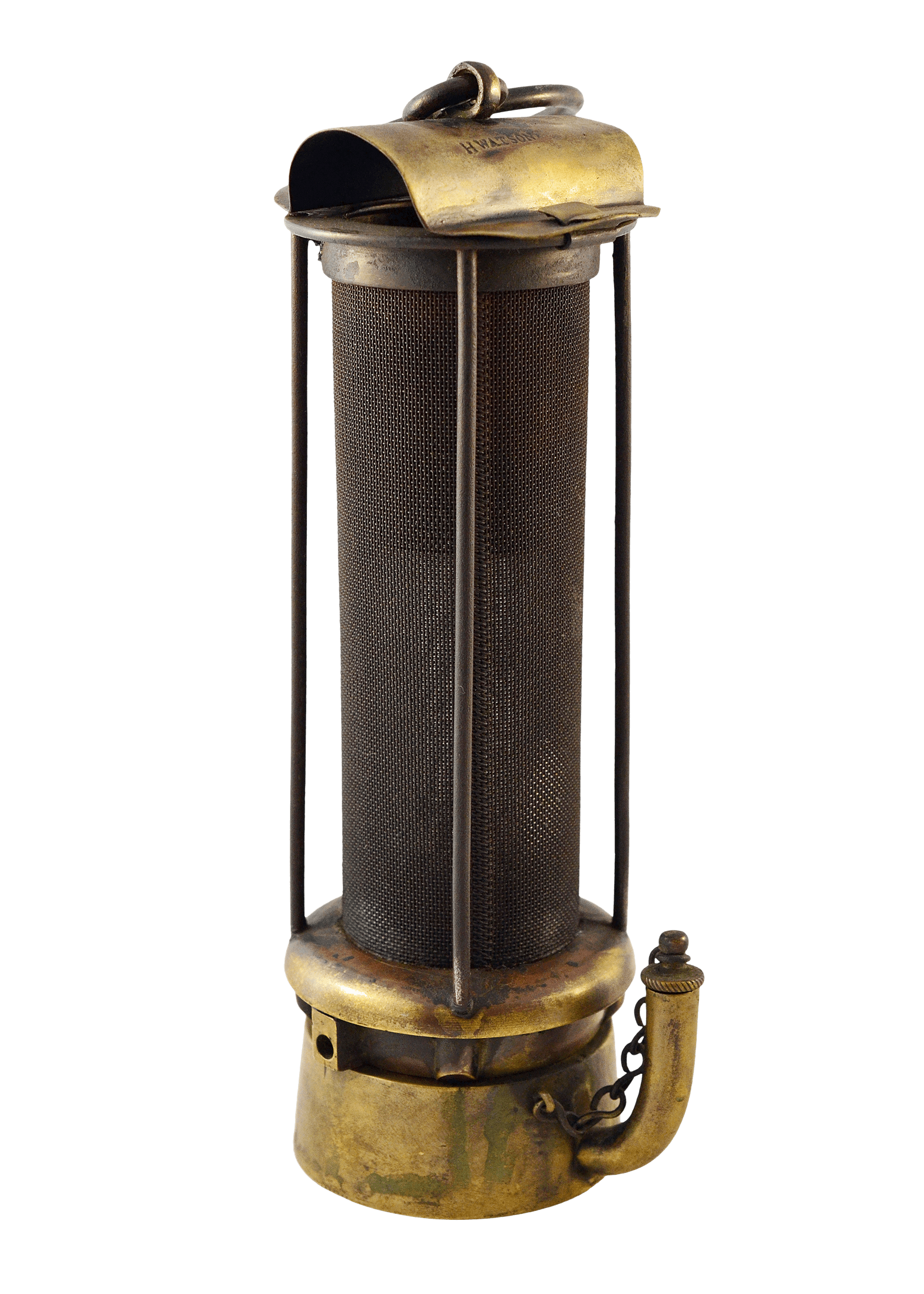
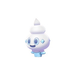
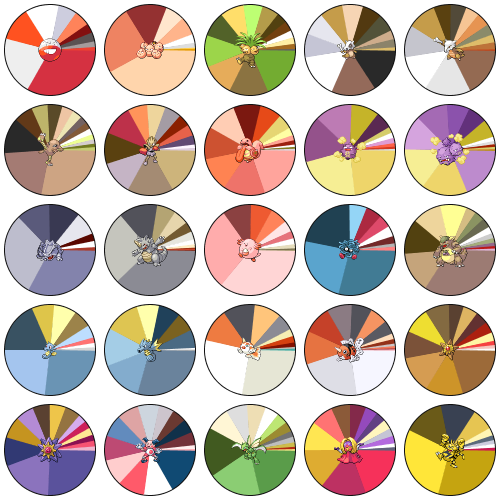
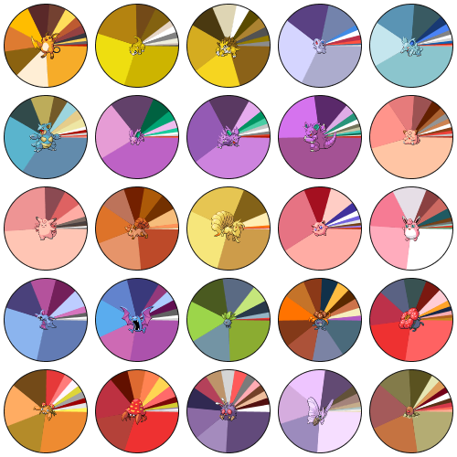
As most Pokémon are part of ‘evolution chains’ – starting as one Pokémon and then evolving into something better at a higher level – I was aware of this factor in my design process. There are also many single-stage Pokémon that don’t evolve at all, and I felt the Geordie lamp concept fit this profile. My other concepts fit an evolution chain style better, which again was more work than I was cut out for. I began sketching out my idea on paper, using the references I had collected. I then scanned the sketch into Procreate to begin adding lineart. I decided to just outline the design as I normally would, then go back later and edit it to make sure it looked ‘like a Pokémon’. I cleaned up some of the uneven linework and ensured it looked neat and polished. I then started blocking in basic colours. In order to do this, I googled ‘Pokémon colour palettes’ and found two images that broke down the colour palettes of common Pokémon. As the original colour palettes were extremely limited, it was important to me that I got this right. At this point I also started considering what ‘look’ this Pokémon would have. Each Pokémon has one or two of eighteen possible ‘types’ which determine their effectiveness in battle and what attacks and abilities they have access to. I decided this Pokémon would have Steel and Ghost typing due to it being a haunted metal lamp. I collected some reference imagery of similar Pokémon and used this to ensure that my colours, shading, and line art were accurate.
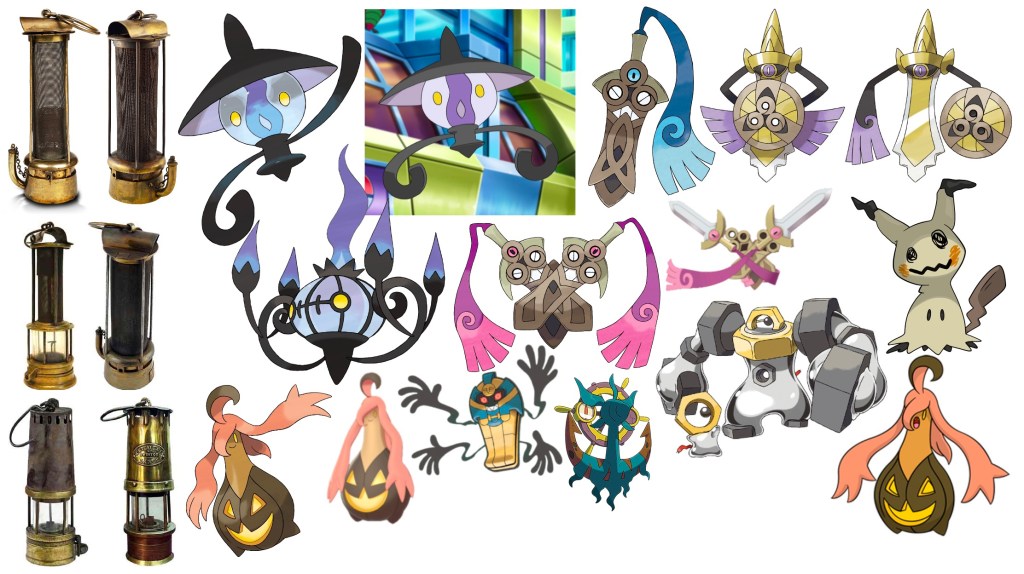
To do the reverse of the design, I duplicated the canvas and flipped the design, then made edits to the arms and ring to show how they would look. I also added an imprinted label in the fictional language of the Pokémon universe, removed the eyes, and changed some of the shading. I then started to think of a name for my character. A lot of Pokémon have names that play on words, like ‘Alcremie’ (playing on ‘alchemy’ and ‘cream’), or are portmanteaus such as ‘Wingull’ (‘wing’ + ‘seagull’). I ended up choosing the name ‘Ghordie’ as in a portmanteau of ‘Geordie’ + ‘ghost’.

I am extremely happy with this design, it’s one of my favourite pieces of work and I’m so proud of it. I can’t believe how well I captured the essence of Pokémon’s art style and how realistic this looks. I even sent it to a friend without saying it was my design and they thought it was a real Pokémon. I feel like I have a long way to go with character design and it’s an area of illustration I’m very interested in developing further. I also would love to revist this and develop more of the Pokémon concepts I had, and maybe illustrate Ghordie in action. I’m aware that this exercise asked for more than what I have done, and reflecting on that I think I put too much effort into making this a fully illustrated design. I’m still struggling with figuring out what’s too much and what’s not enough.
