
Assignment 4 had a very loose brief which I could explore and work within. I had to choose one of four topics to base an illustration upon which would then be used in a magazine. The illustration had to be based on a still life, which I had the freedom to set up and create myself. The choice of content, the method used to produce the illustration, and the colour palette used were all up to me. I was asked to produce a well-observed objective drawing of my still life set-up, considering alternative compositions and exploring different layouts and formats. I then had to copy this and produce a tonal drawing of it. From there, I had to edit my design, introducing new elements or removing pre-existing ones, to convey the essence of my chosen topic. Finally, I had to fully illustrate the piece.
Before even starting to consider my options for this piece, I researched what constitutes a still life drawing. I have often struggled with this term before as I feel like it’s quite open and vague, but as the brief gave distinct instructions to incorporate still life, I figured there would be specific guidelines to keep to. I found this article on the Tate museum website which stated that ‘essentially, the subject matter of a still life painting or sculpture is anything that does not move or is dead’. It also explained that in the 17th Century, still life was seen as the lowest form of art, along with landscapes, as it did not contain human subject matter. This is surprising as there are many extremely famous examples of still life pieces, such as Van Gogh’s Sunflowers and Pieter Claesz’s Still Life with a Skull and a Writing Quill. The attitude towards still life drawings has changed a lot since then, as they are now seen as highly technical and requiring a great deal of skill.
Still life artwork can be accurate and well-studied, like Claesz’s afformentioned work, or abstract and experimental, like Picasso’s 1918 Still Life. There is freedom within a still life format to create anything, using the inanimate objects as a backdrop for your experiments. After researching the history of still life, I felt that I had a better understanding of what I could create for my own piece, and felt less limited to using fruit, flowers, or other typical ‘still life’ material.
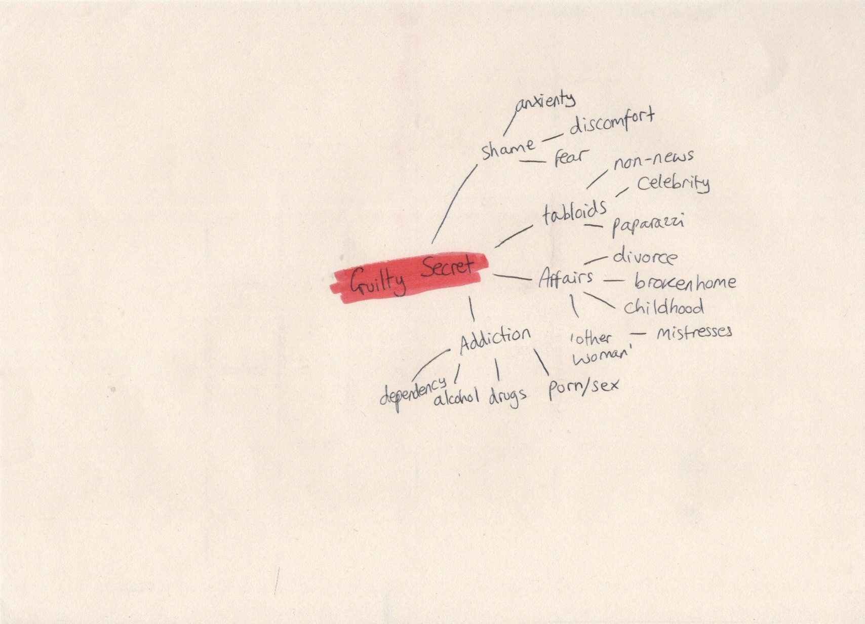
Next, I decided to brainstorm around each of the four topics to see which one I was most excited about. I chose to do mindmaps around the words, starting with ‘lost’, before moving onto ‘discovery’, then ‘disaster’, and finally ‘guilty secret’. I found it easy to think of ideas, words, colours, and concepts for all of these, but when I got to ‘guilty secret’ I started to struggle. I asked a friend if she had any thoughts on the topics, too, to see if I was missing anything. I was really excited about the ideas I had for the word ‘disaster’, which I think contributed to my struggles brainstorming around ‘guilty secret’.
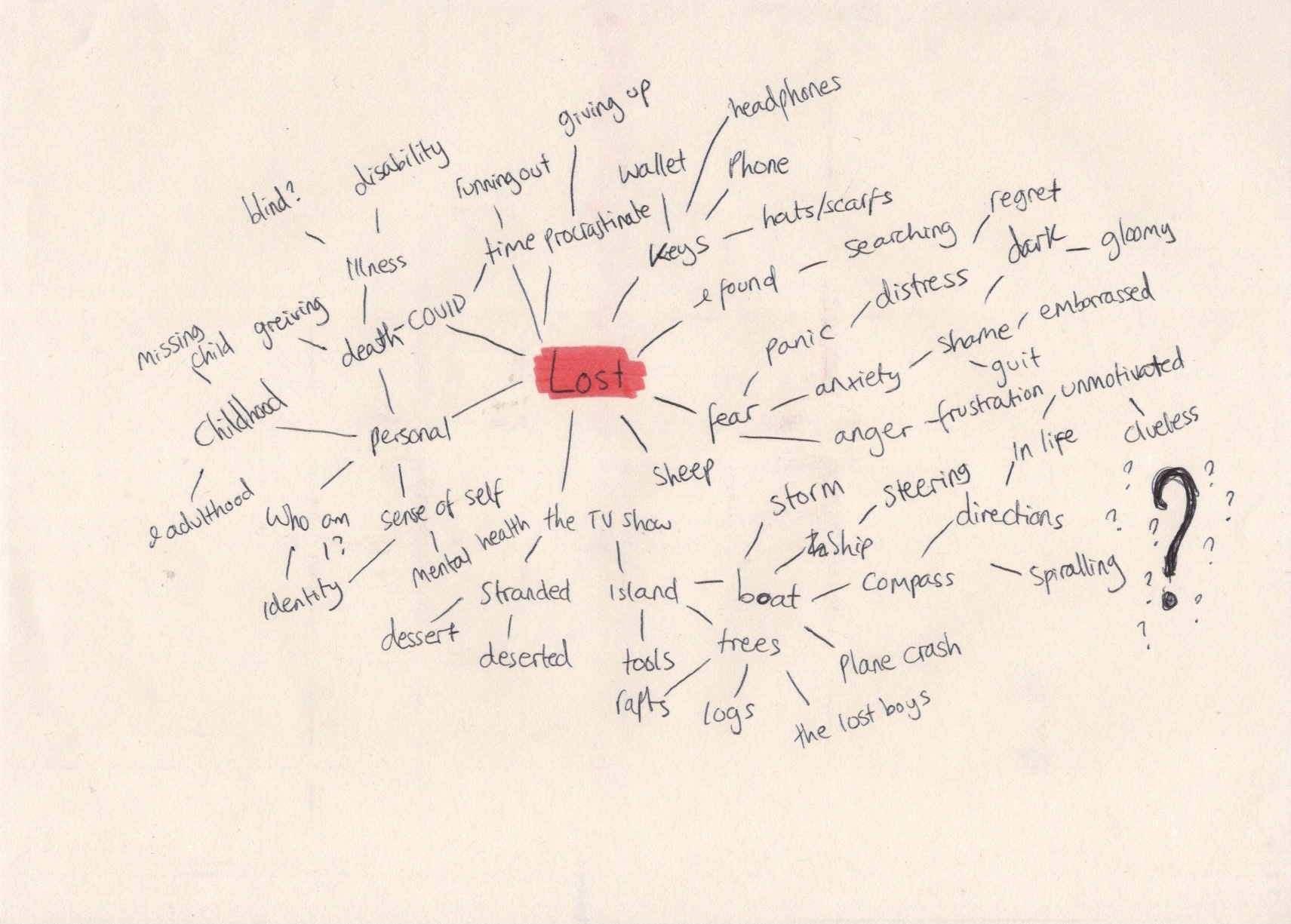
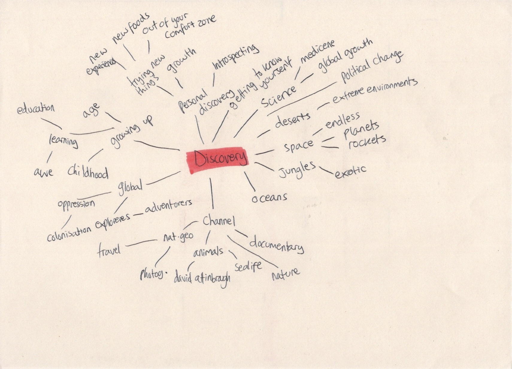
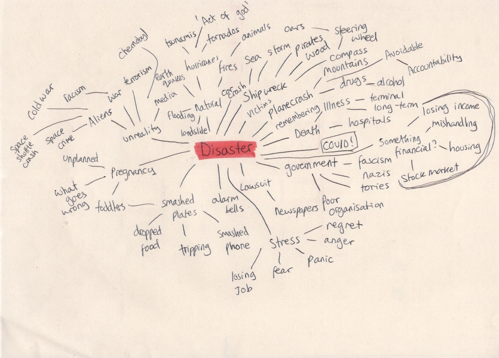
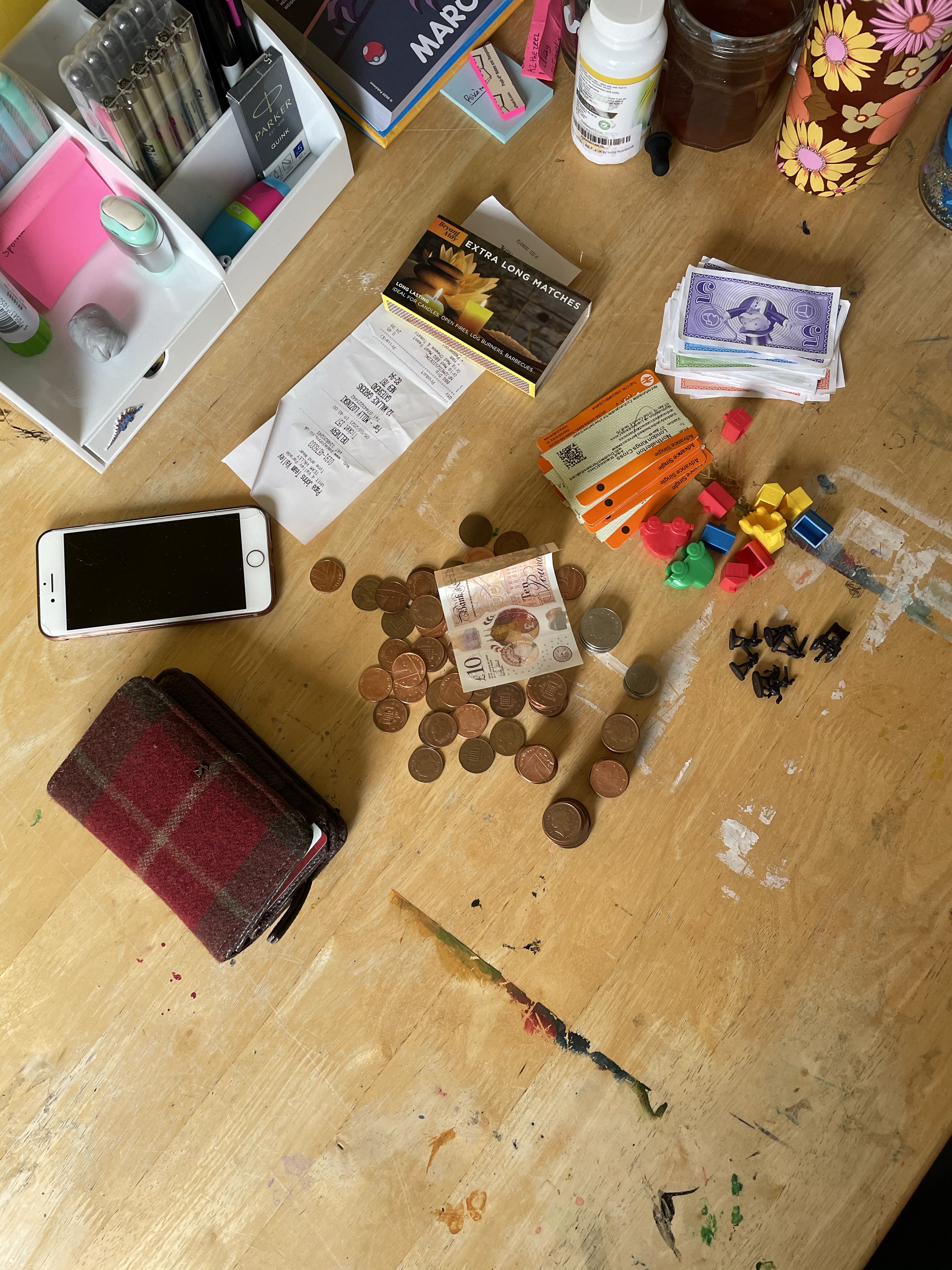
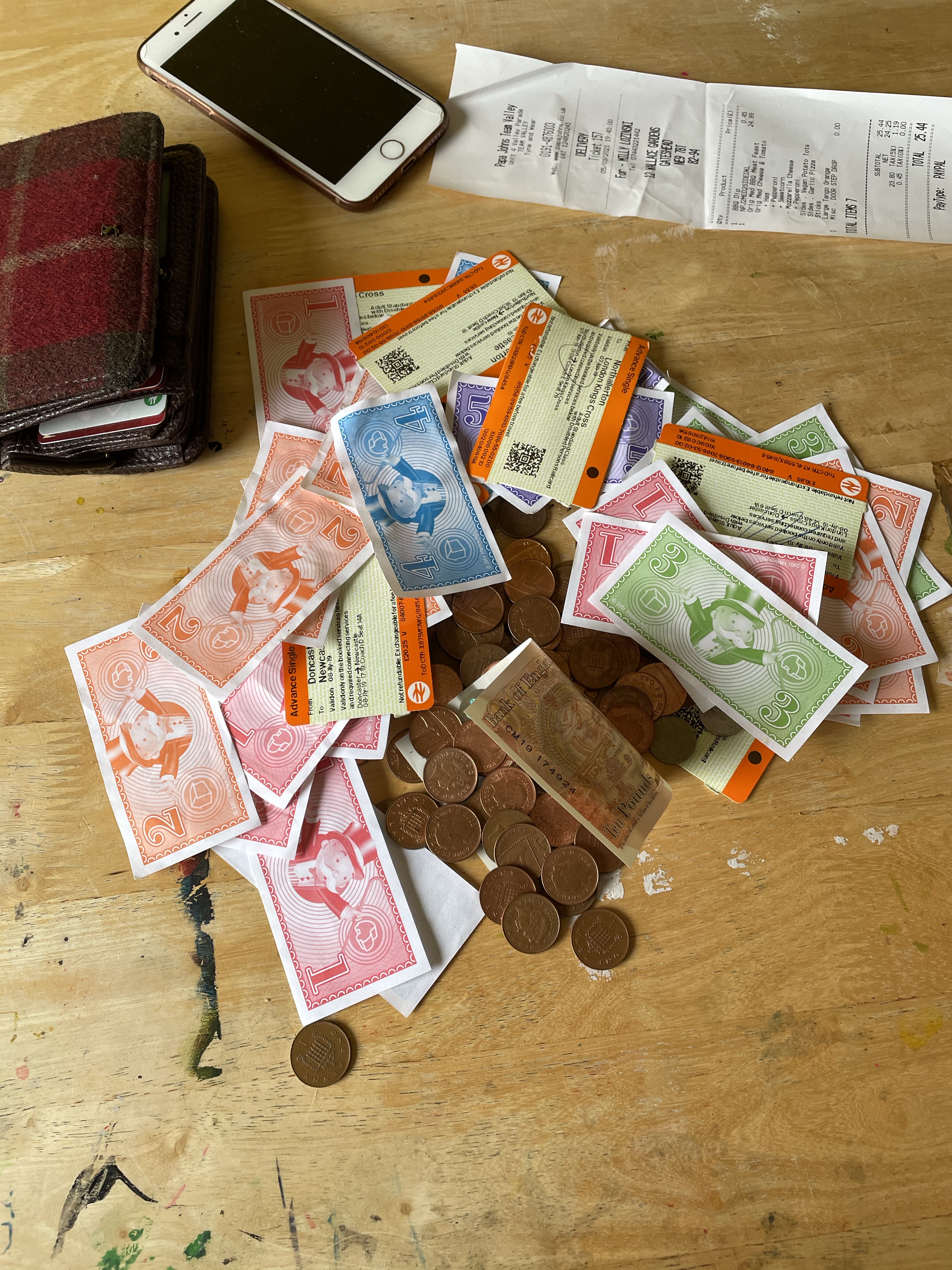
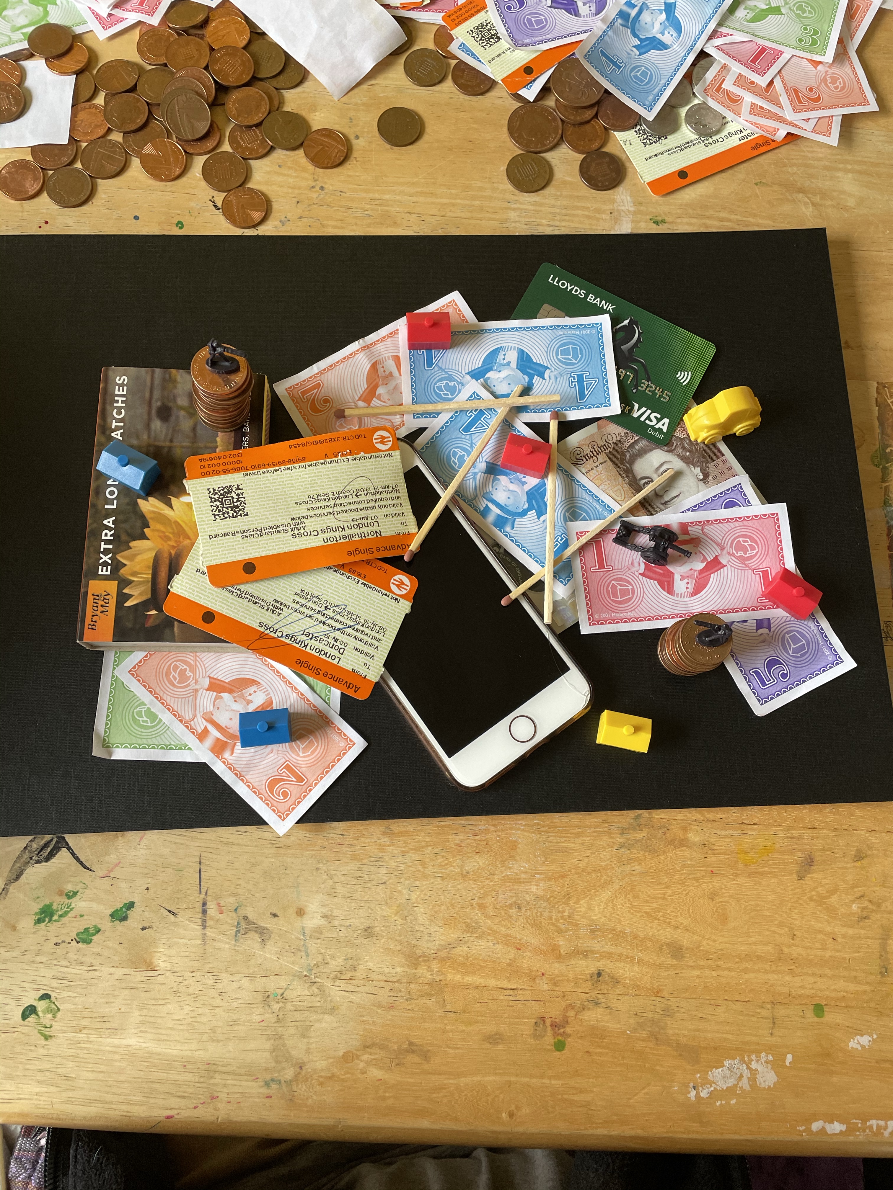
Based on the success of my mindmap, I decided to pick the word ‘disaster’, specifically wanting to focus on the phrase ‘financial disaster’. It felt very relevant to a lot of current events, and is a concept that brings up a lot of imagery in my head. I then started thinking about things I have around my house that I could use for a still life. My list included physical items I had to hand, and abstract concepts I could somehow incorporate or use reference imagery and superimpose it onto a real life still life set up. My list consisted of:
- Coins
- Bank notes
- Monopoly houses and money
- Army men
- Match box
- Map
- Reciepts
- Train tickets
- Bank cards
- Wallet
- Burnt paper/fire
- Phone or watch
- Fur
- Tigers
- Lions
- ‘Wall street’ as a concept
I also searched for any financial metaphors that I may be missing. I found ‘cash flow’, ‘drying up’, ‘wage freeze’, ‘economic decay’, ‘sinking economy’, and ‘(stock market) collapse’. I thought about ways I could incorporate these into my still life, like adding water to represent ‘cash flow’, having a cracked ground for ‘drying up’, freezing objects in ice for ‘wage freeze’, or showing things in a state of collapse. I had a good idea of what kind of set-ups I could produce, but before getting started I wanted to research existing financial editorial illustration to see if anything would inspire me.
I looked at the Financial Times, The Guardian, and The Independent, specifically looking at the economy sections on their websites, and had very little luck. The majority of the articles featured photographs, rather than illustrations, which I think comes from a desire to keep things grounded in reality. The target market for these kinds of articles expect a no frills, professional, and straight to the point approach. Even speculative articles are meant to inform and target a professional, work-oriented sort of market. Frustrated at my inability to find similar illustrations, I started searching things like ‘financial times editorial illustration’, and still had very little luck.
I decided to move on to my still life set up. The brief asked for me to explore different viewpoints, layouts, and the alteration of the still life to communicate a narrative. Instead of doing this after producing an objective drawing, then a tonal drawing, I chose to experiment with these possibilities in the creation of my still life, much like I did in Exercise 19. I started by laying out my chosen objects so I could get a feel for how they looked when assembled together. I then arranged them in different ways, some intentional, some unintentional, exploring how I could use my objects to create a narrative or tell a story. I took lots of photos whilst doing this, so that I could reference them later.
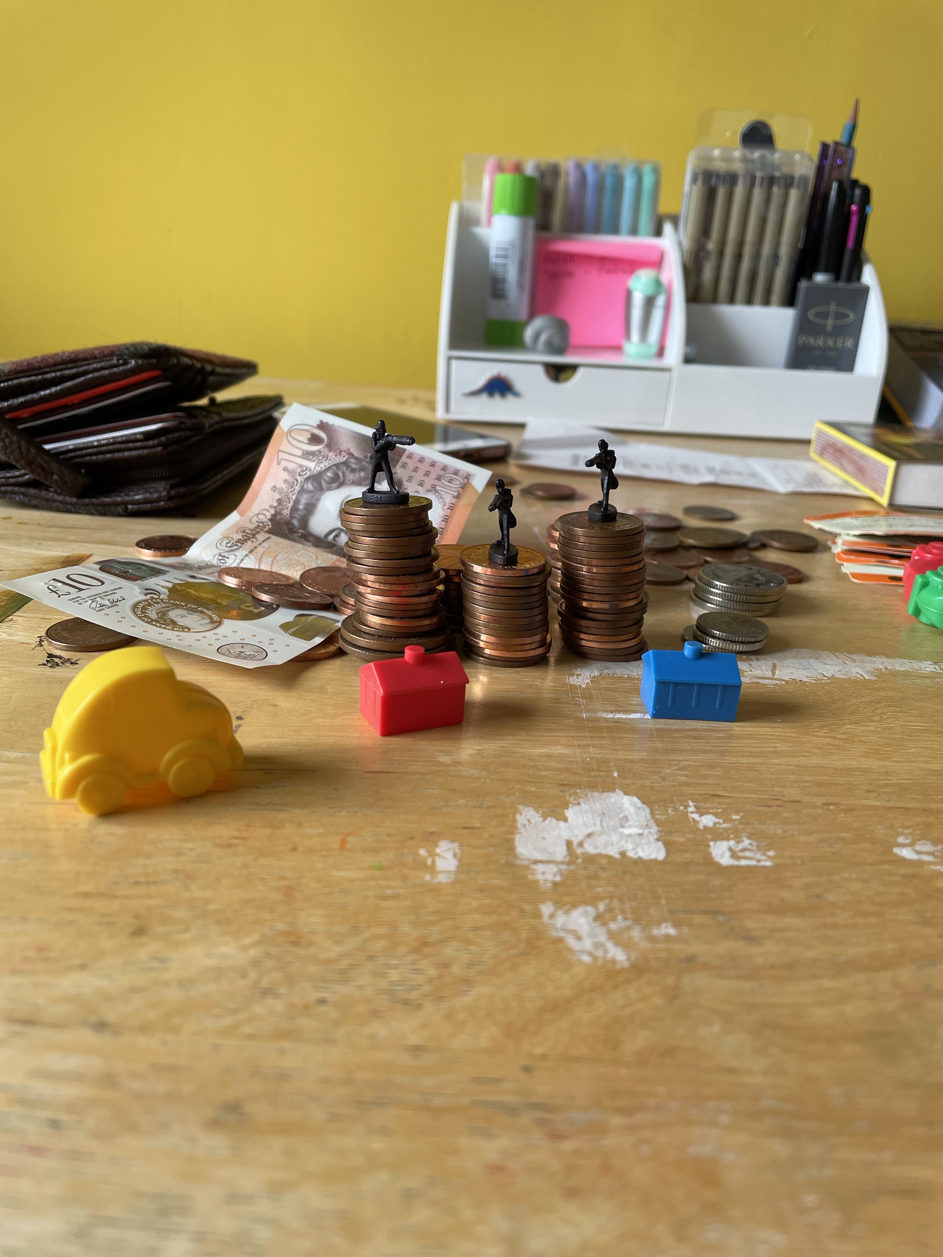
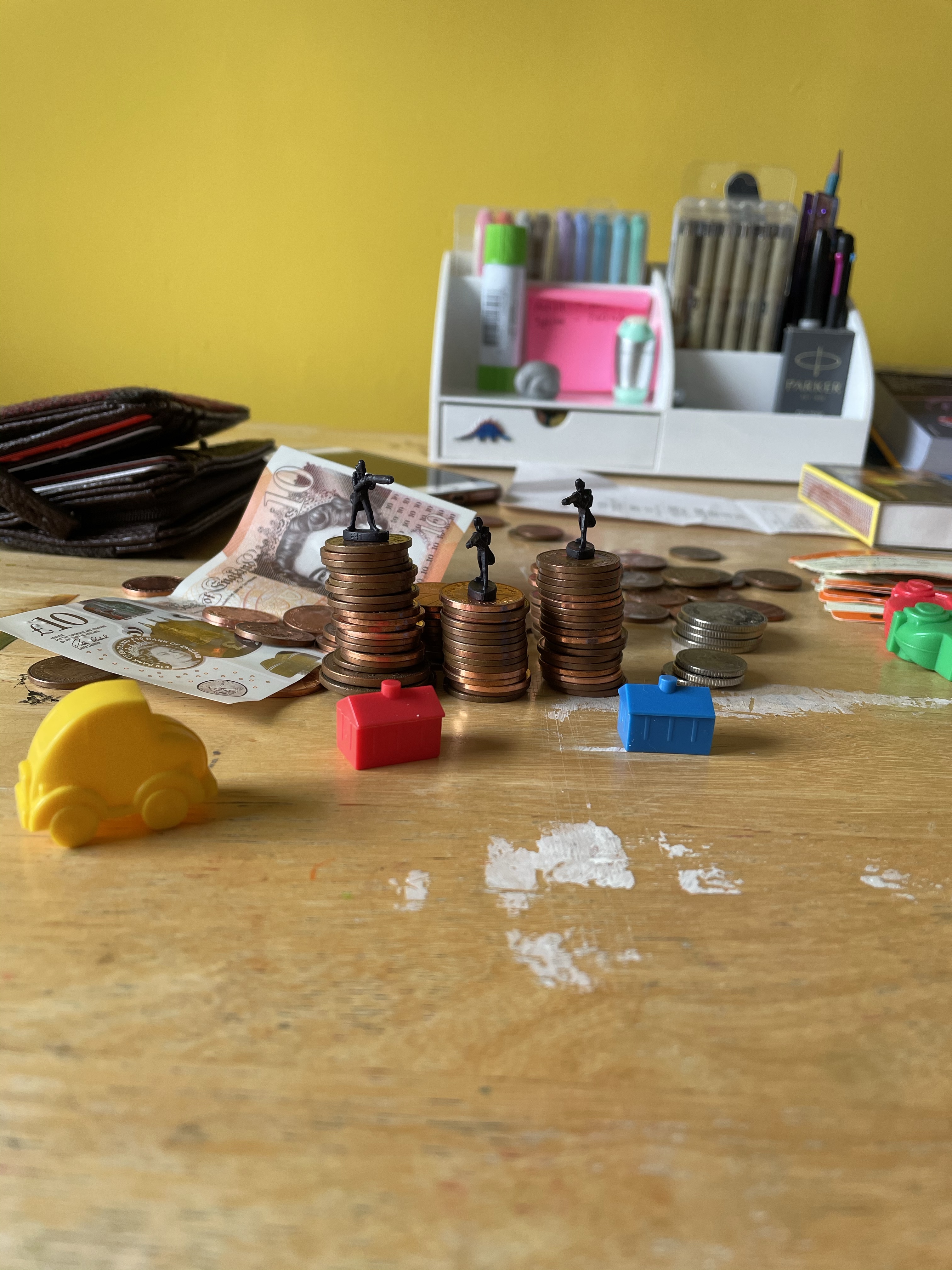
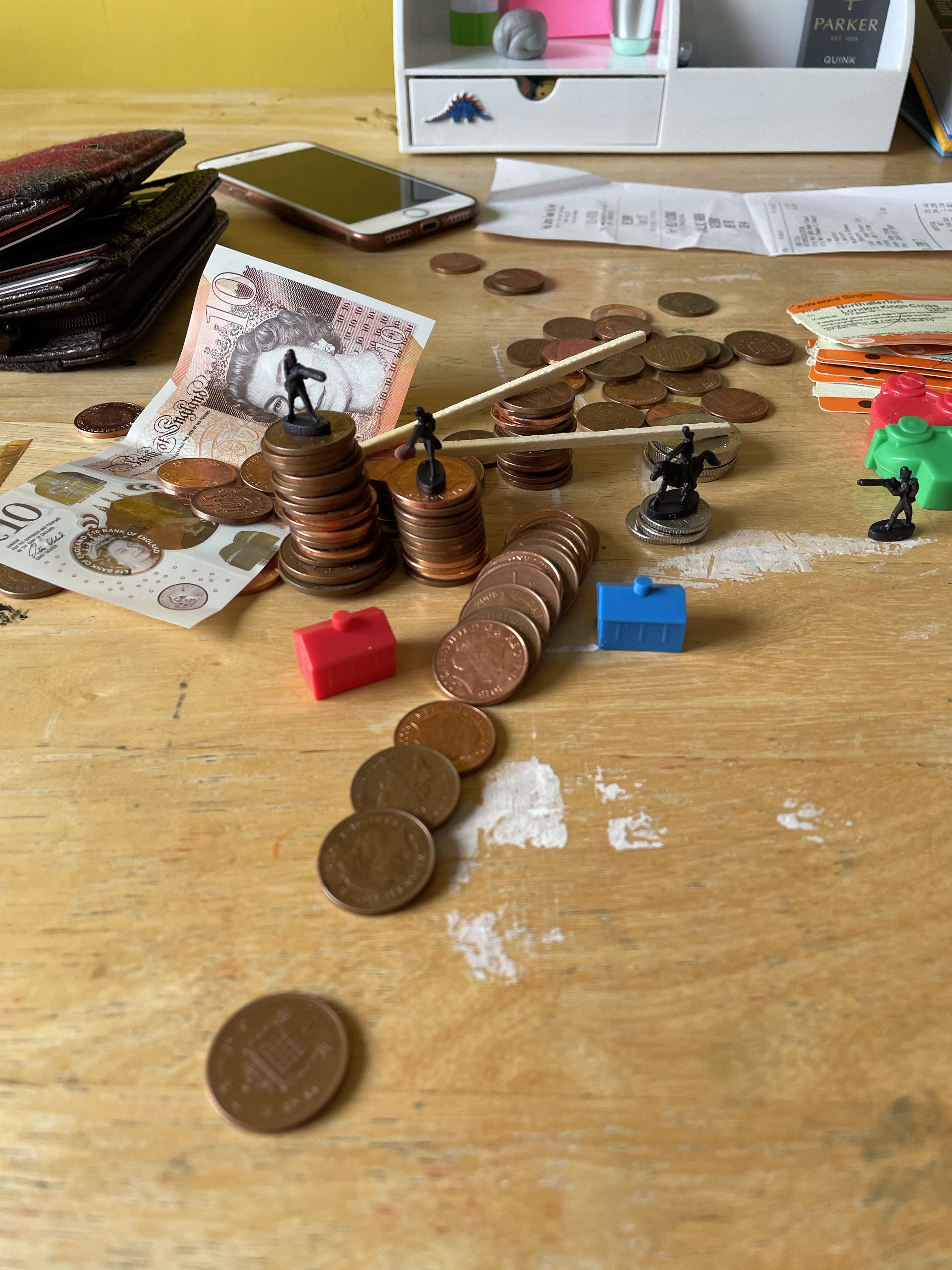
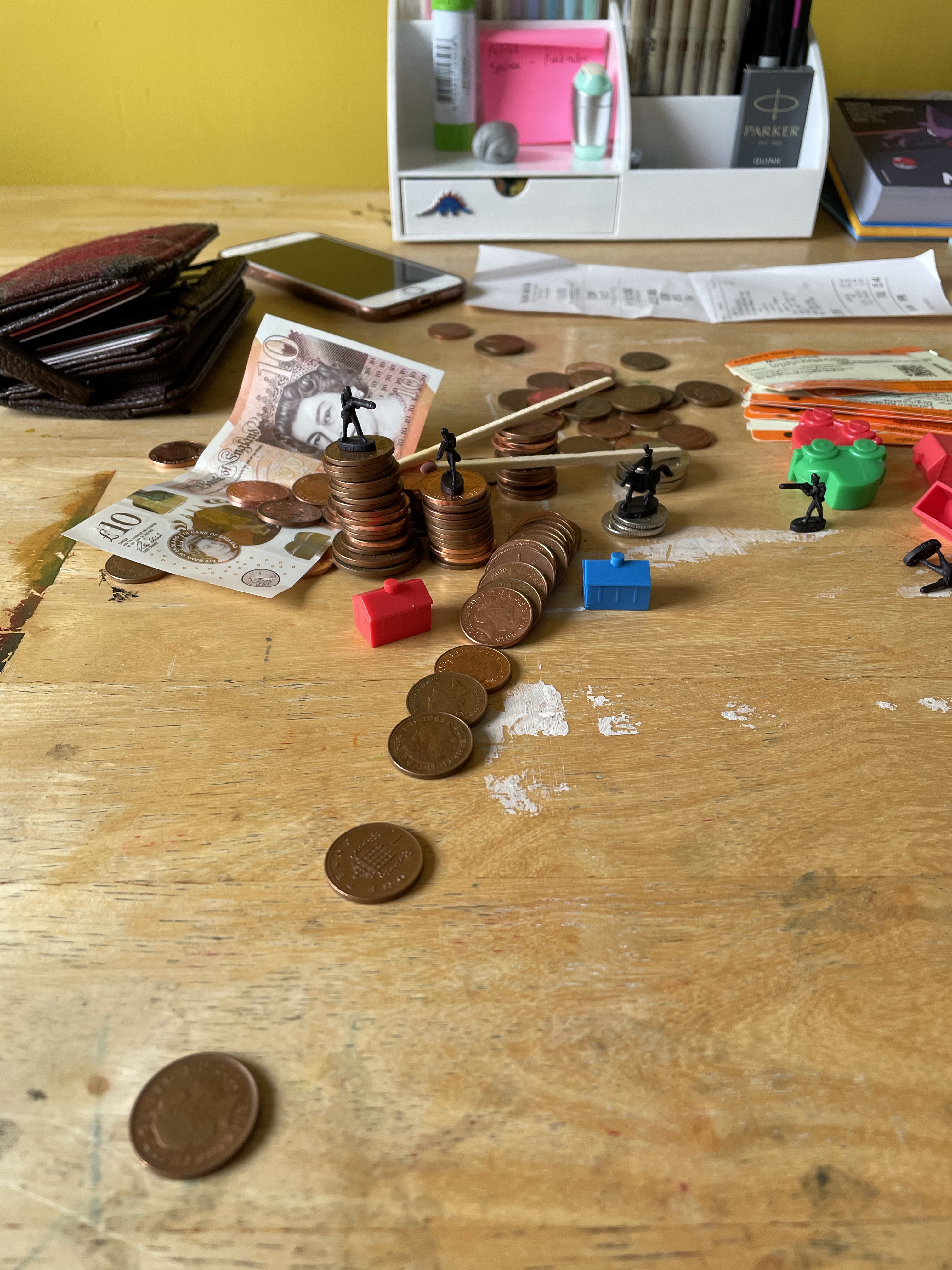
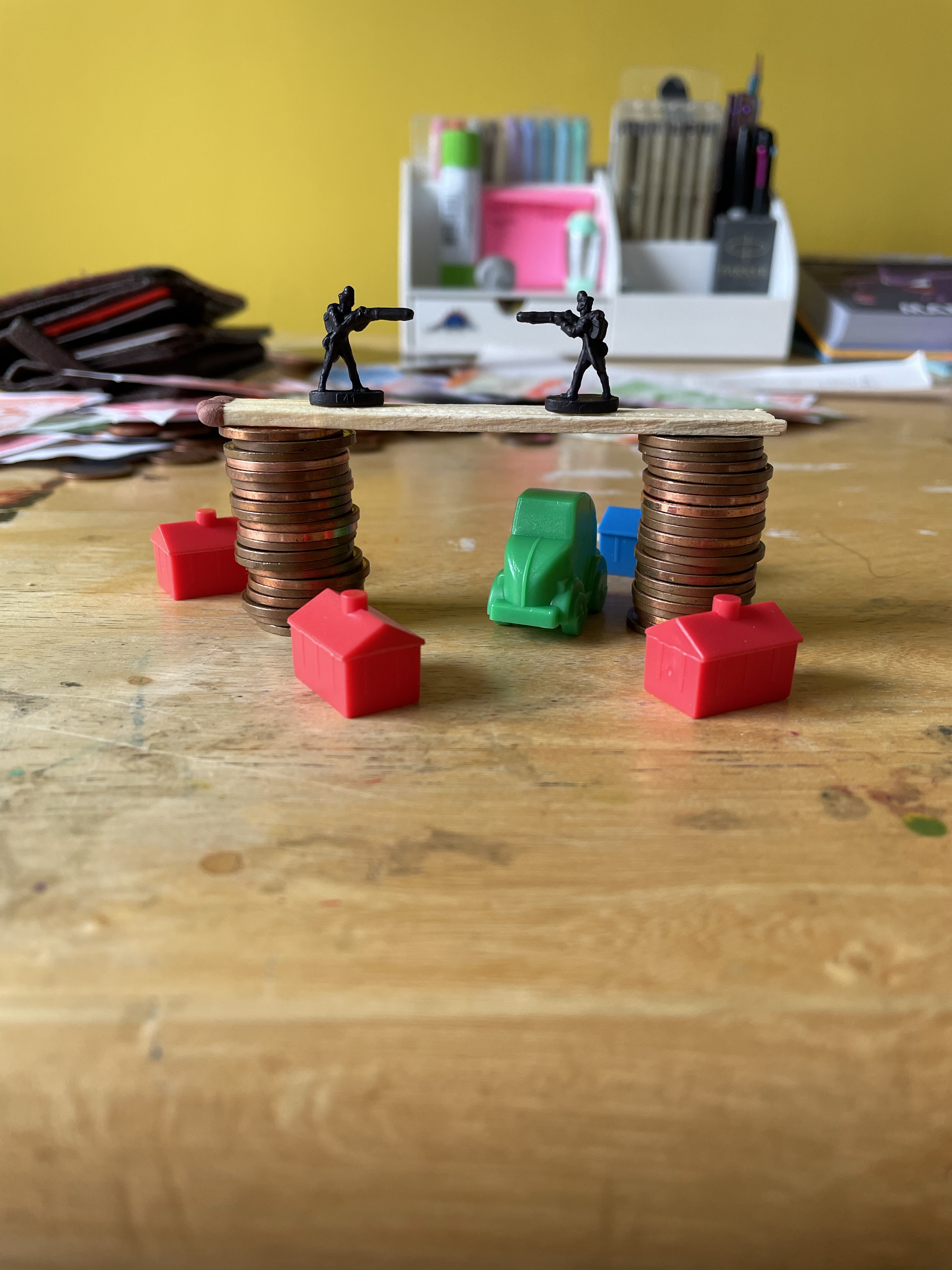
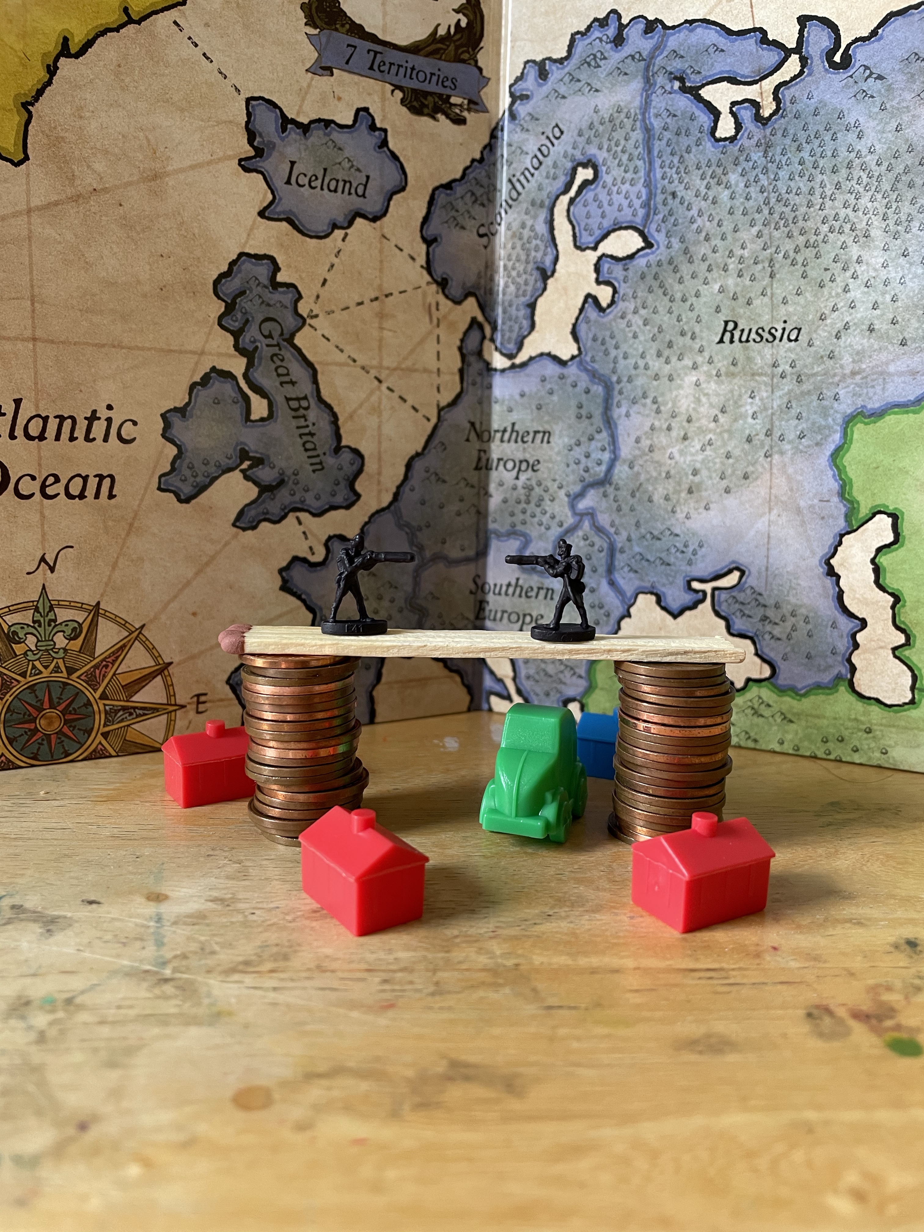
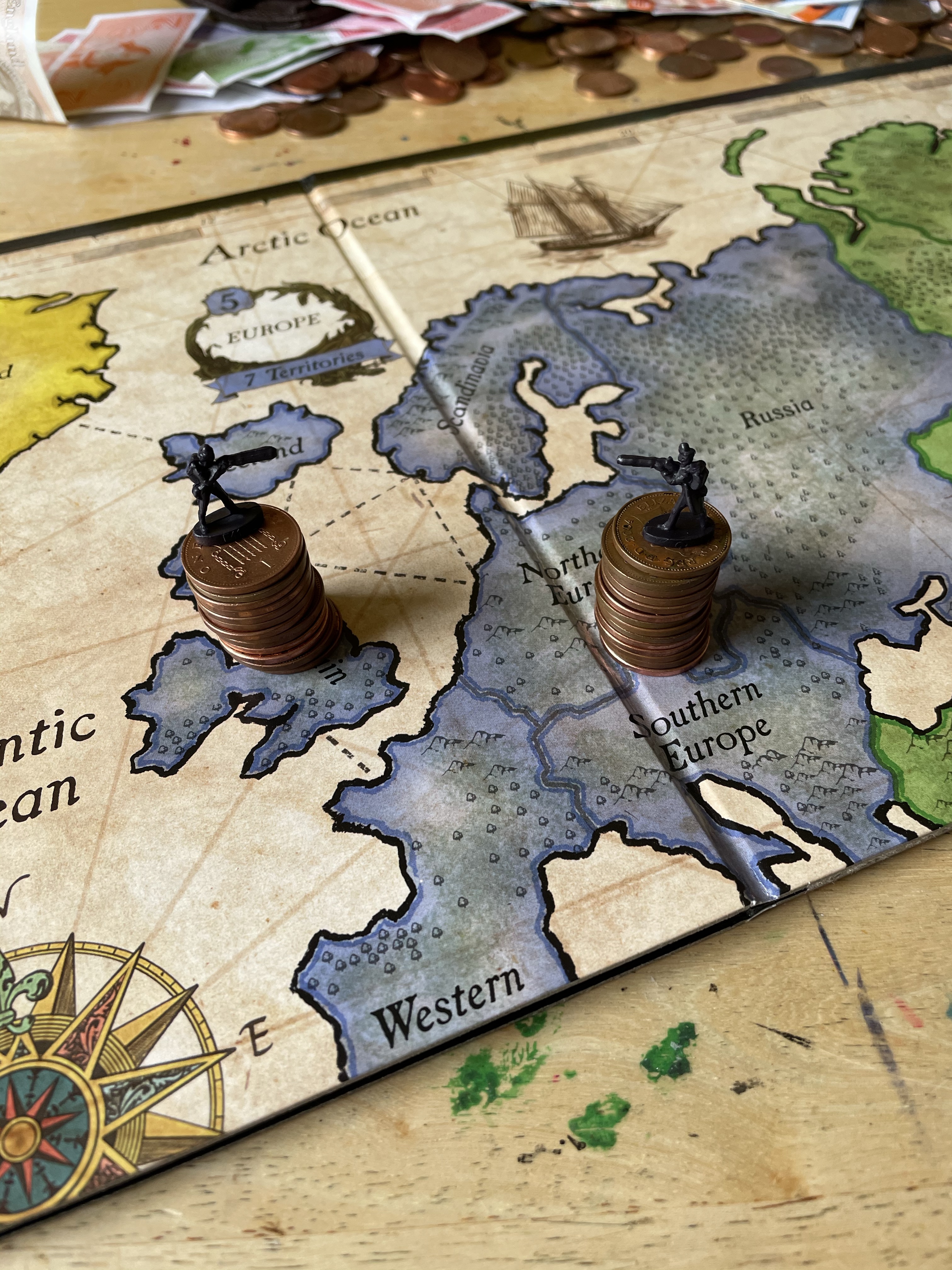
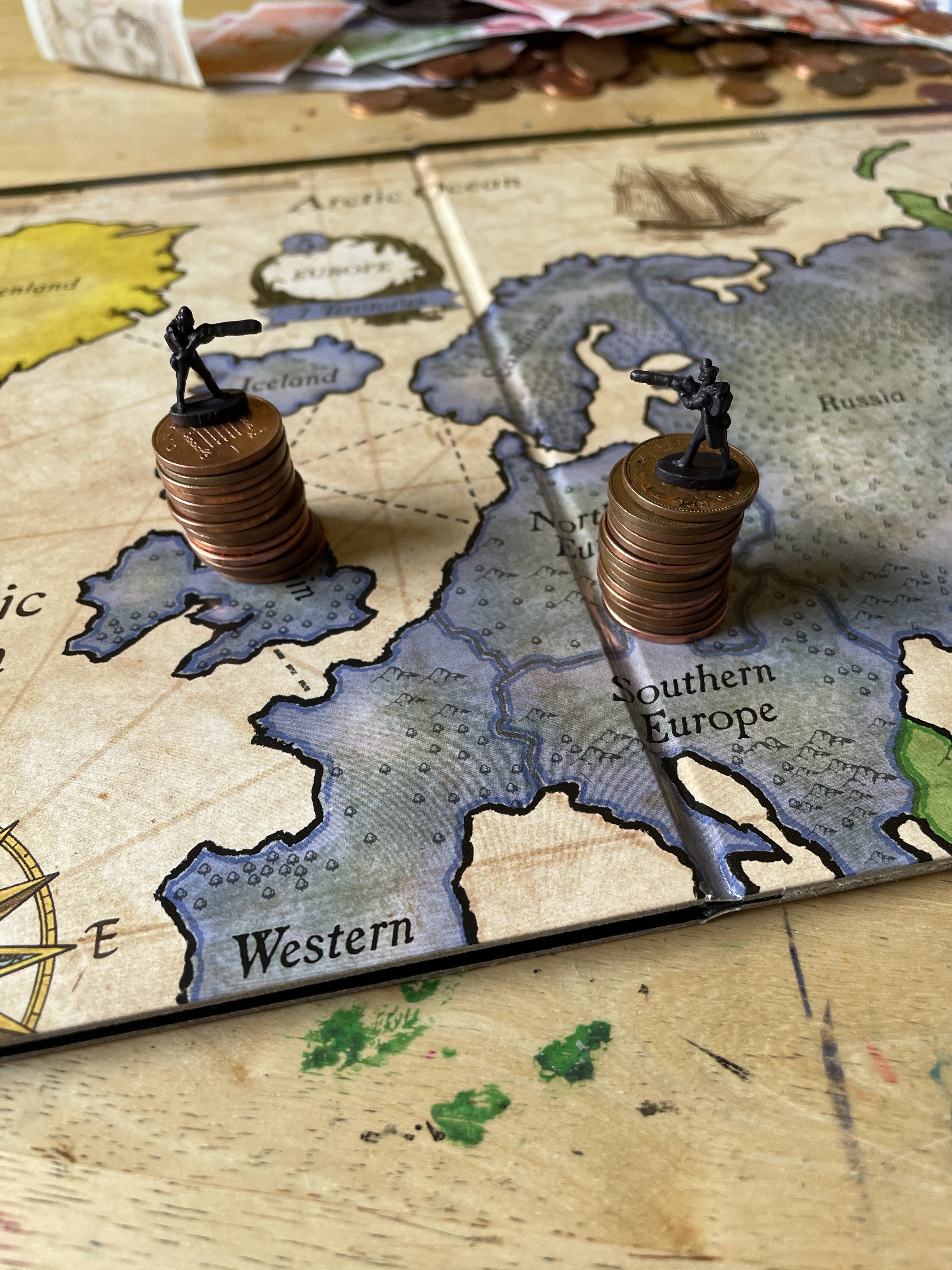
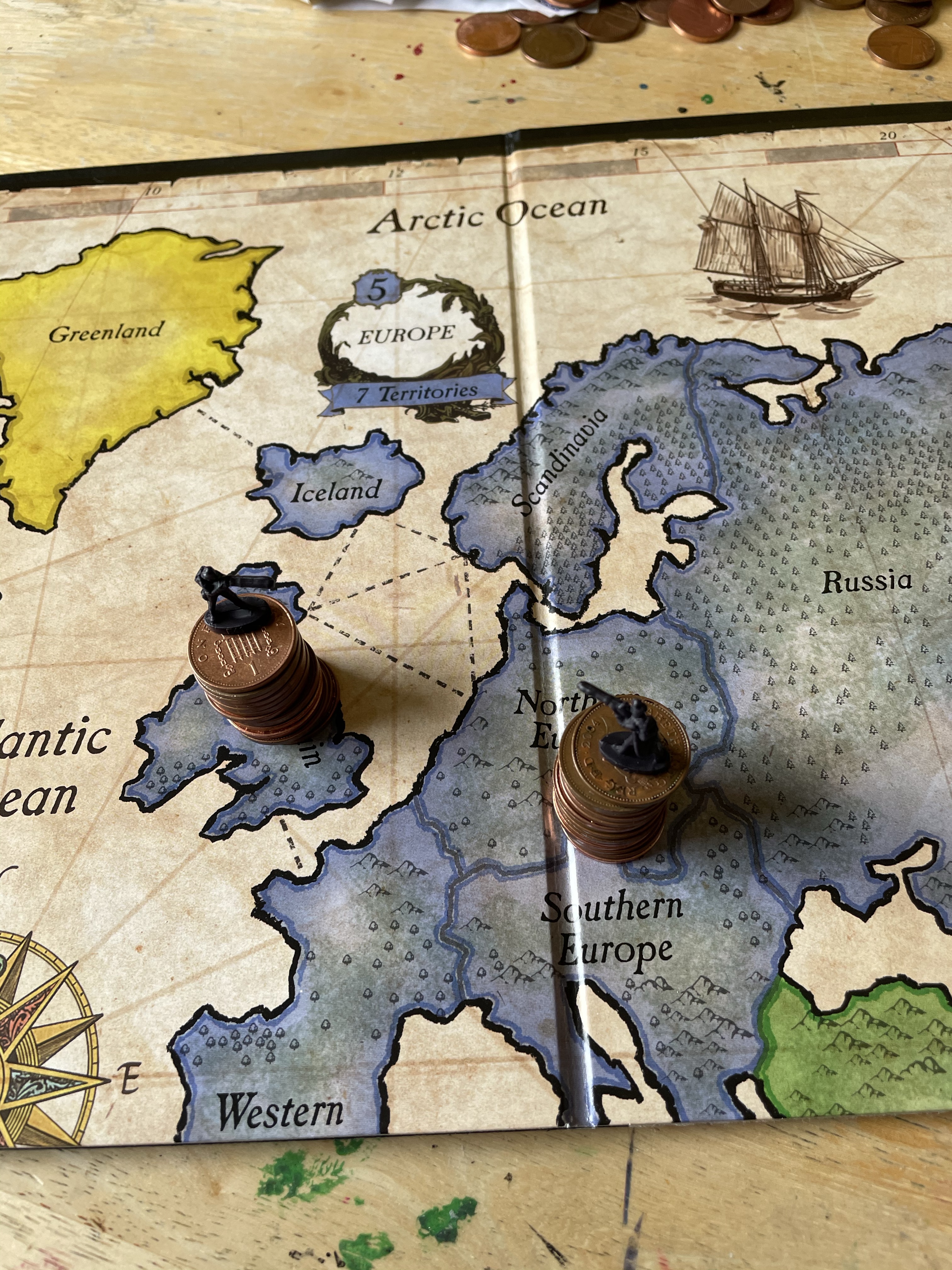
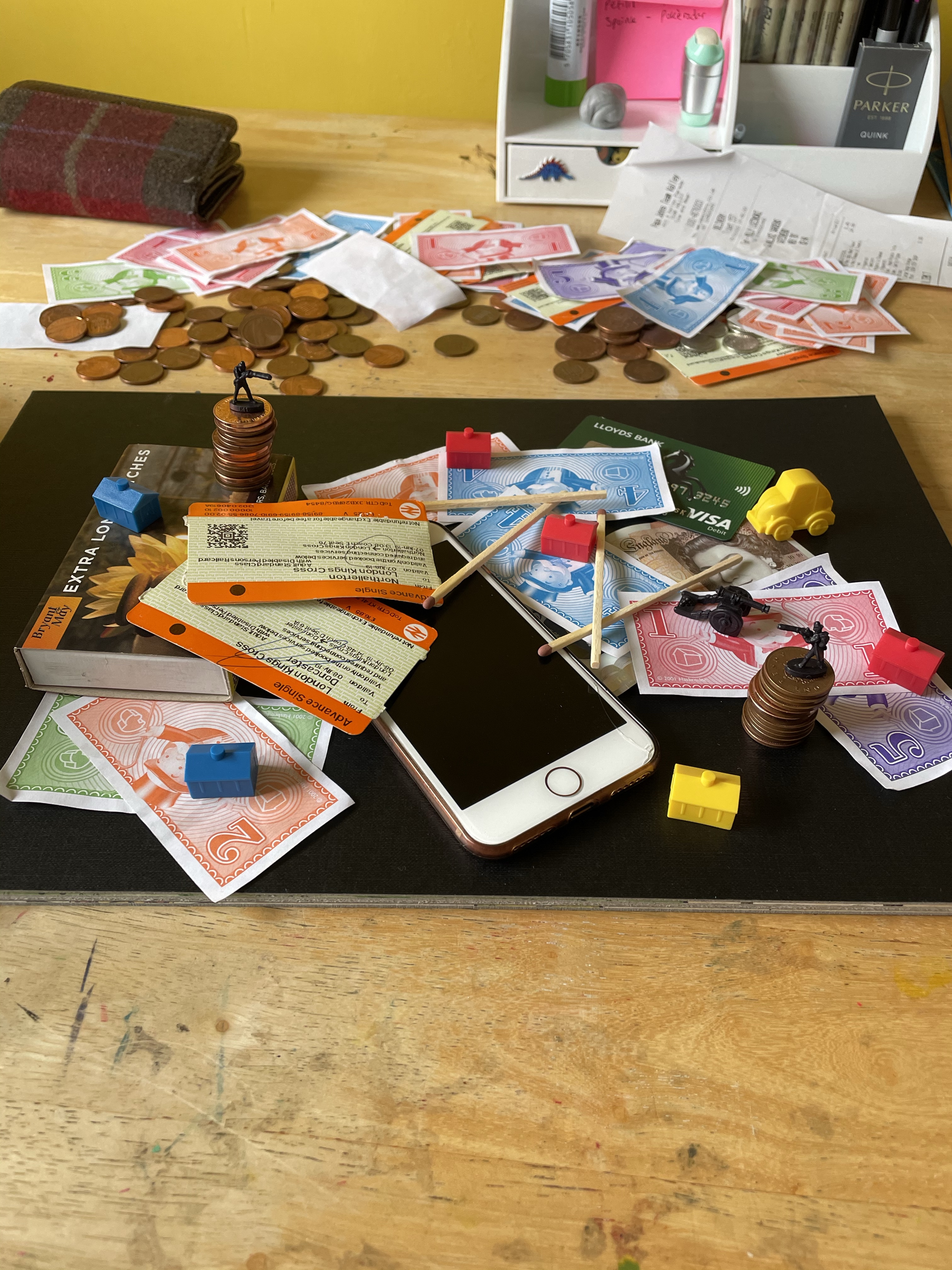
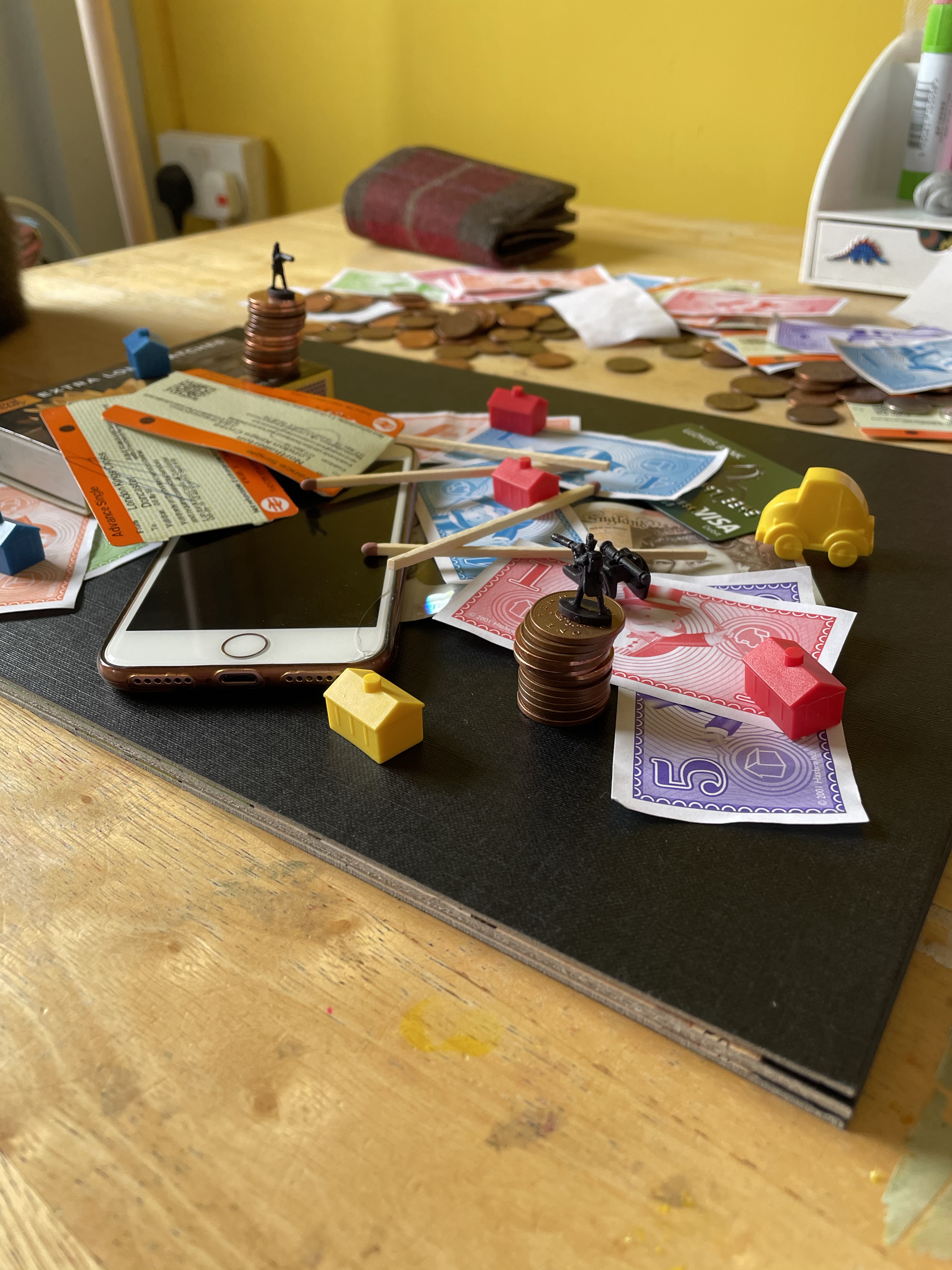
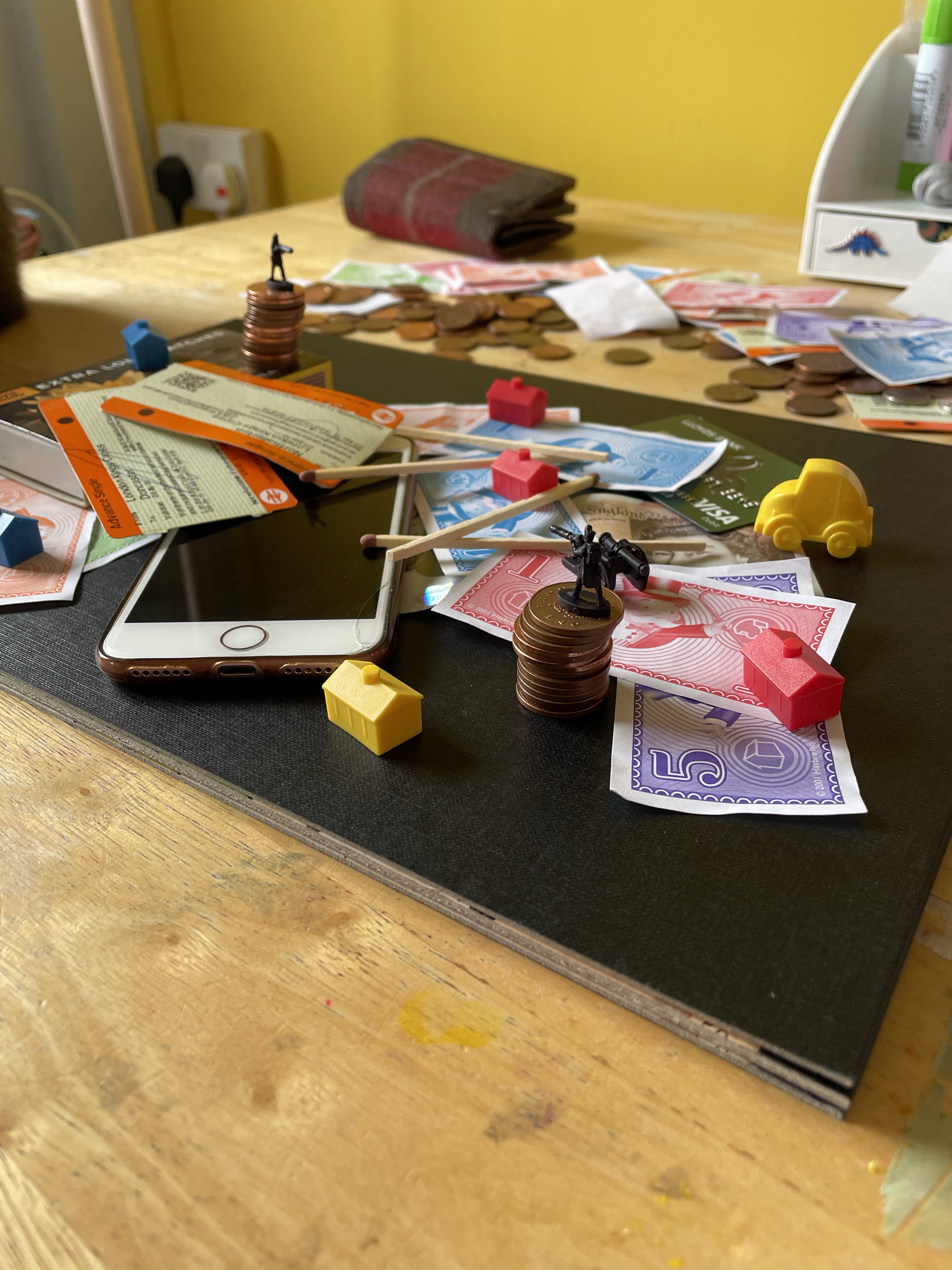
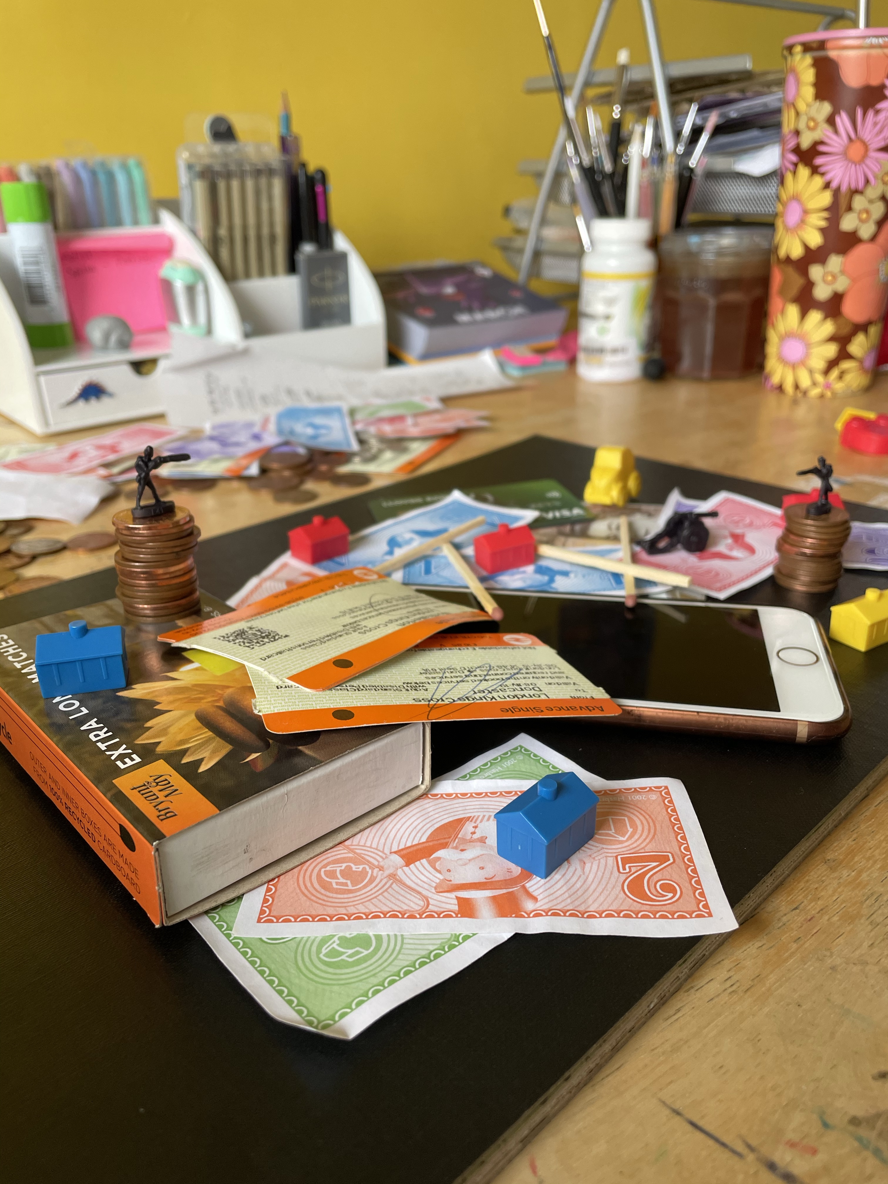
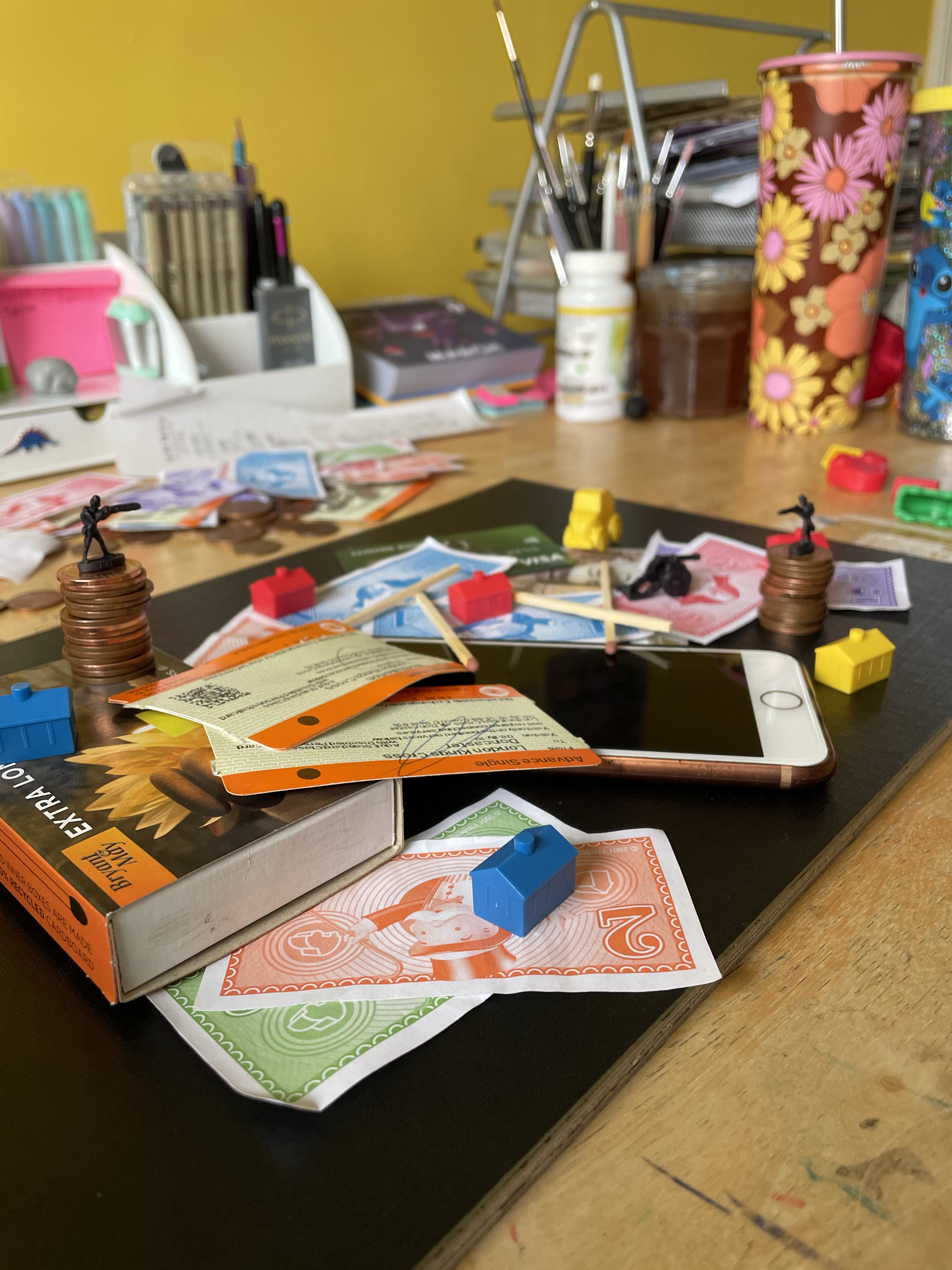
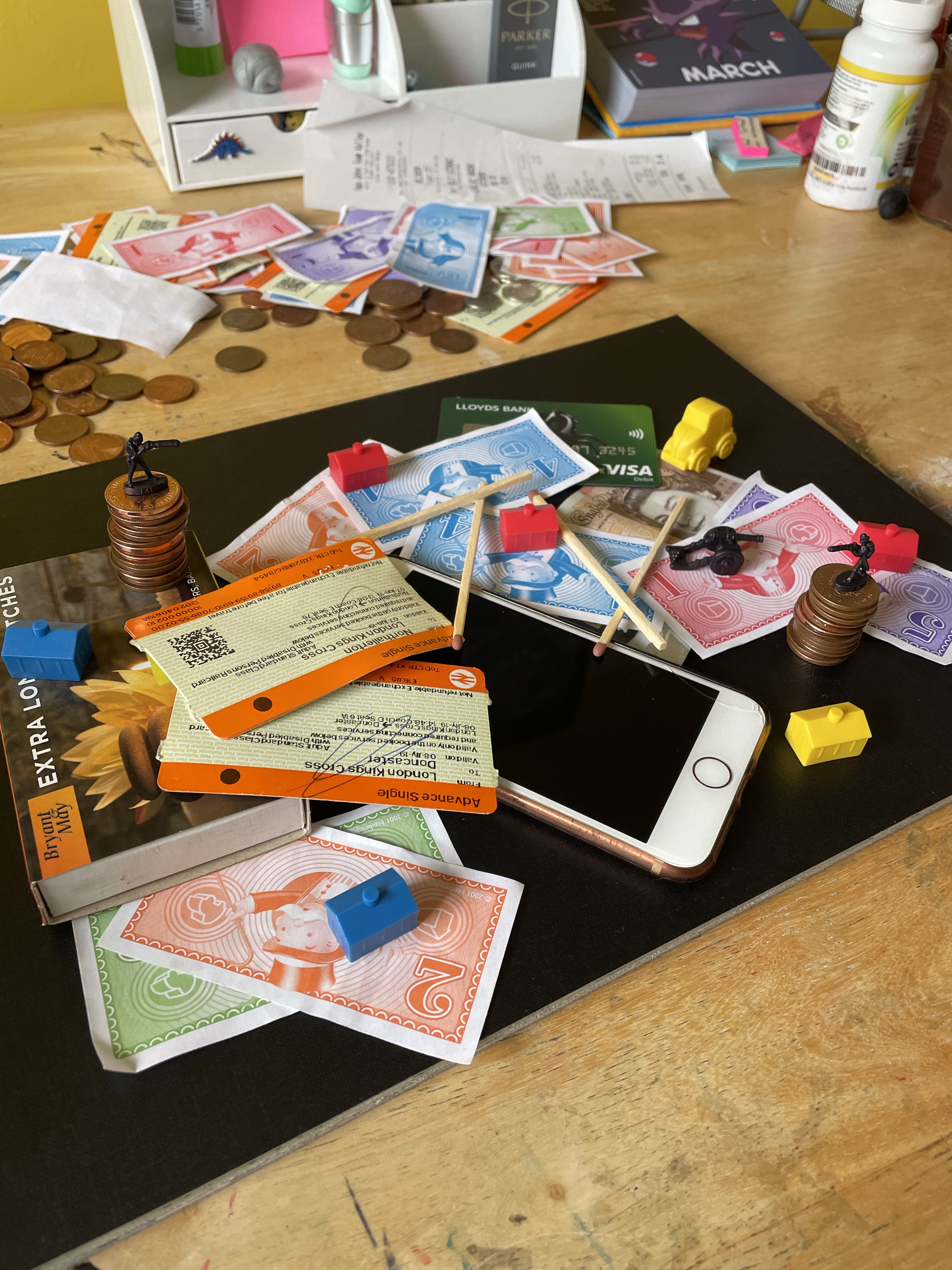
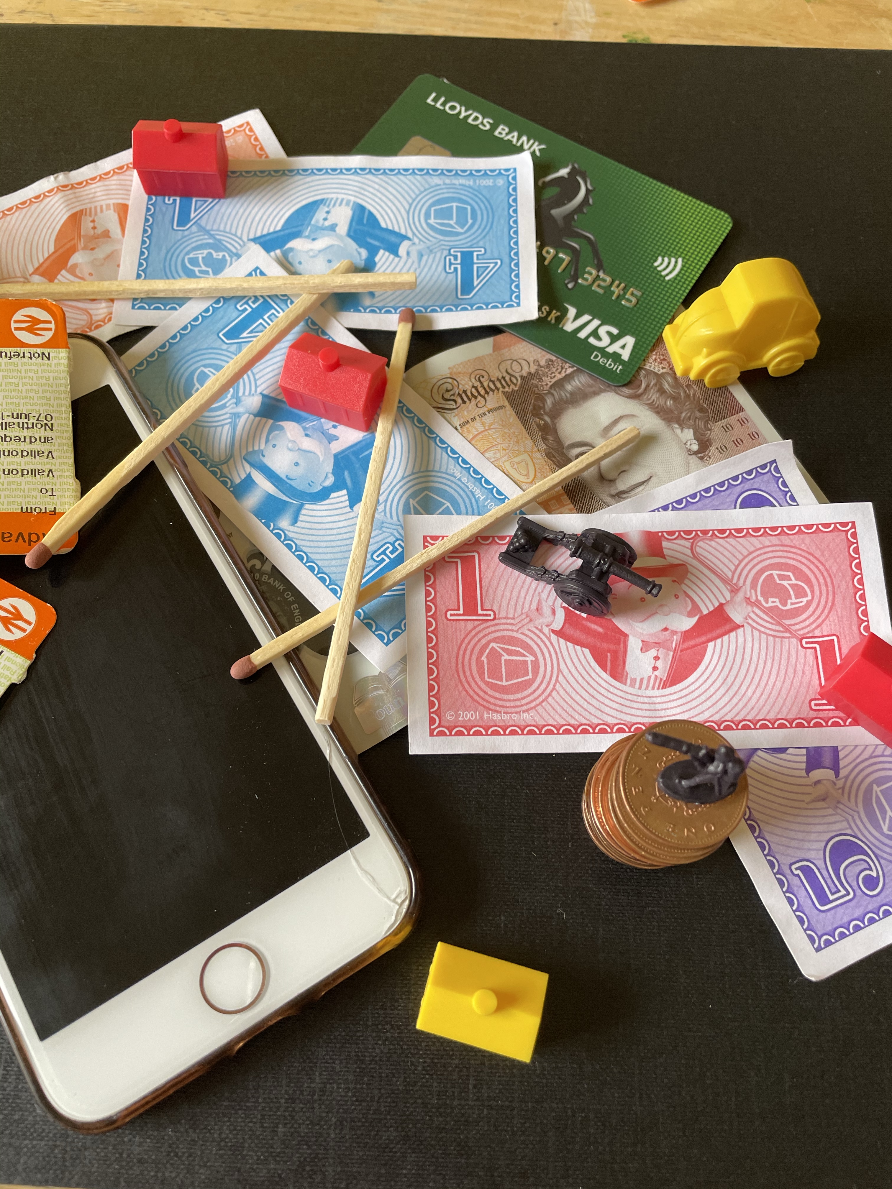
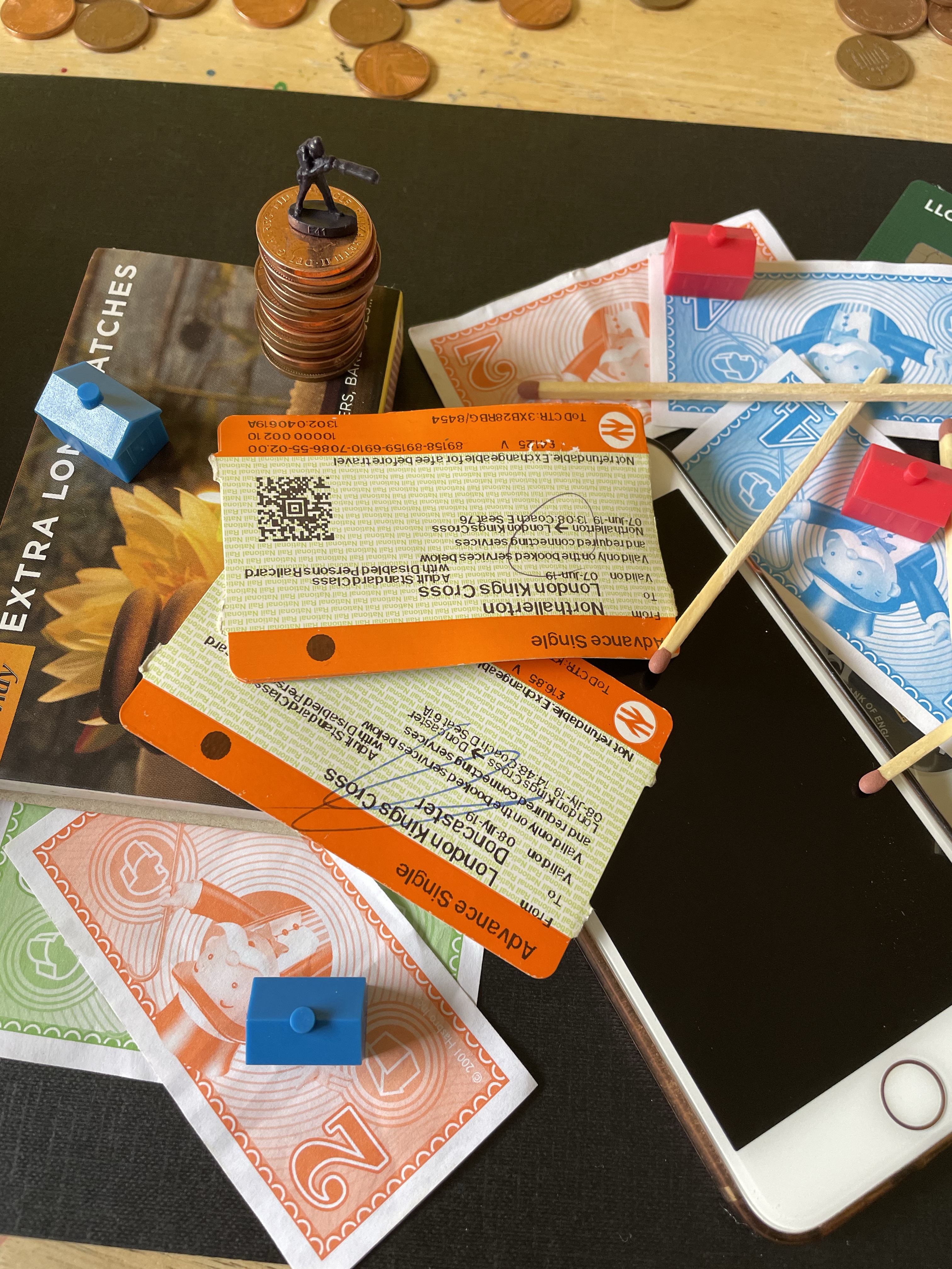
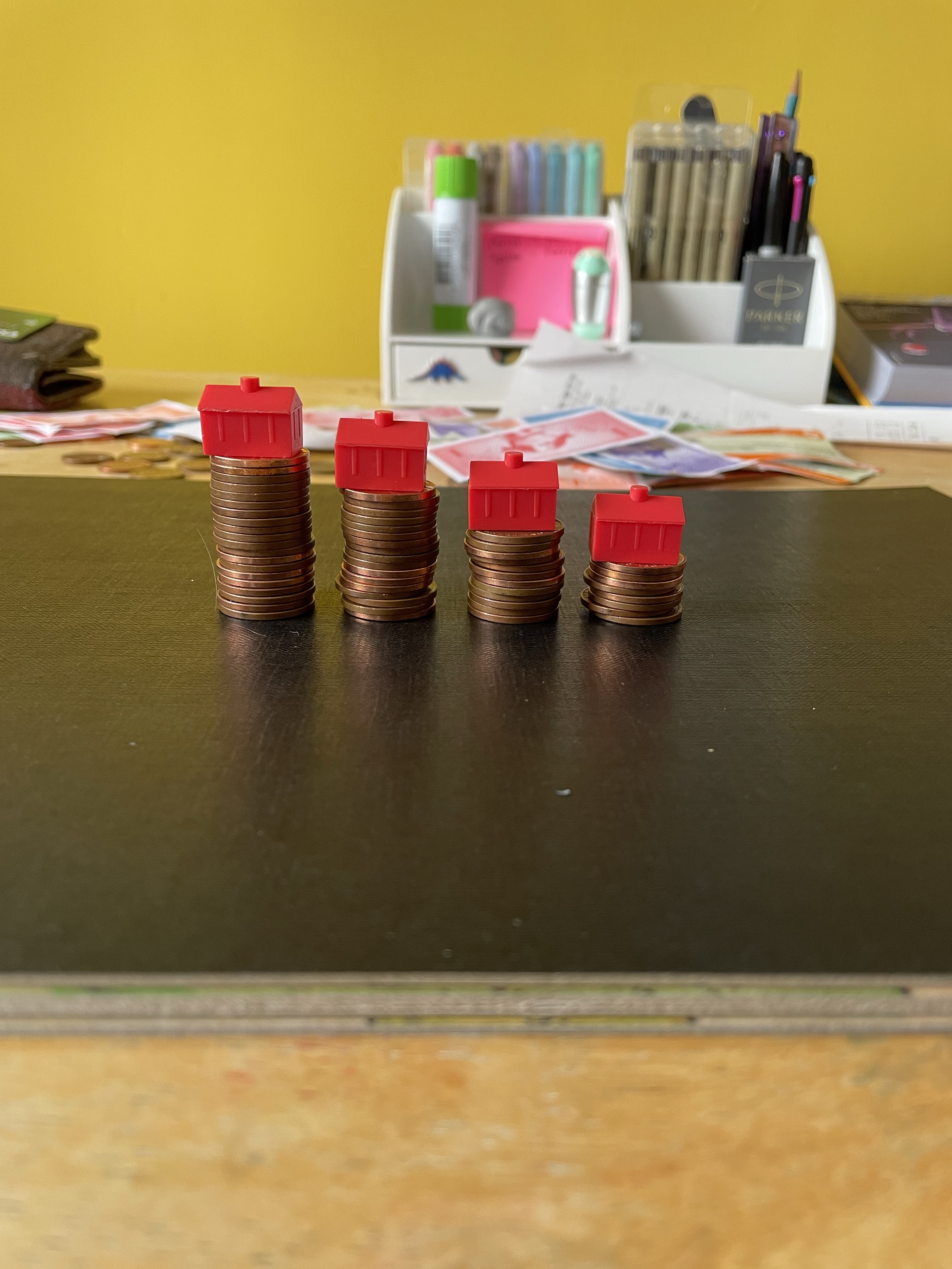
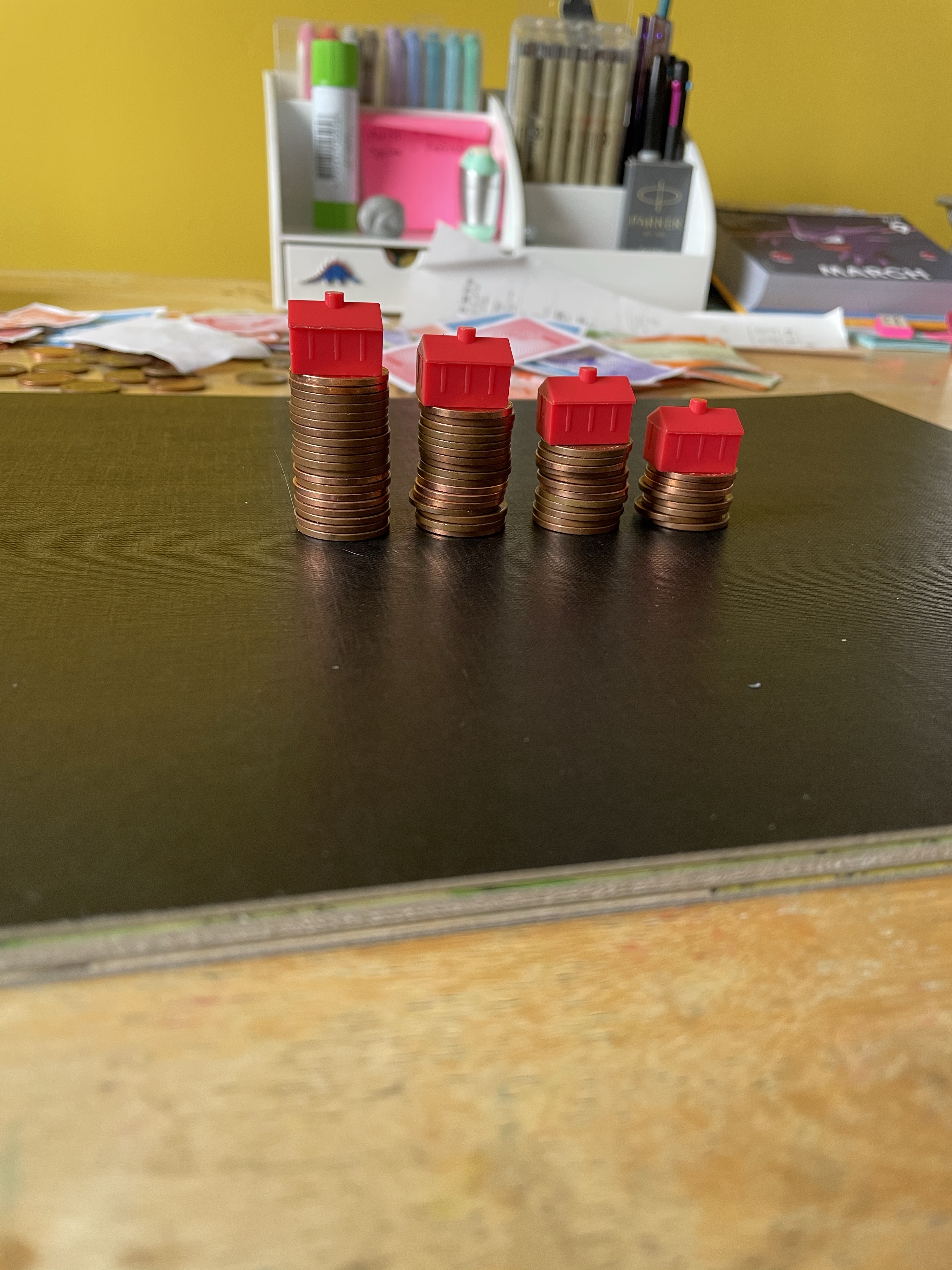
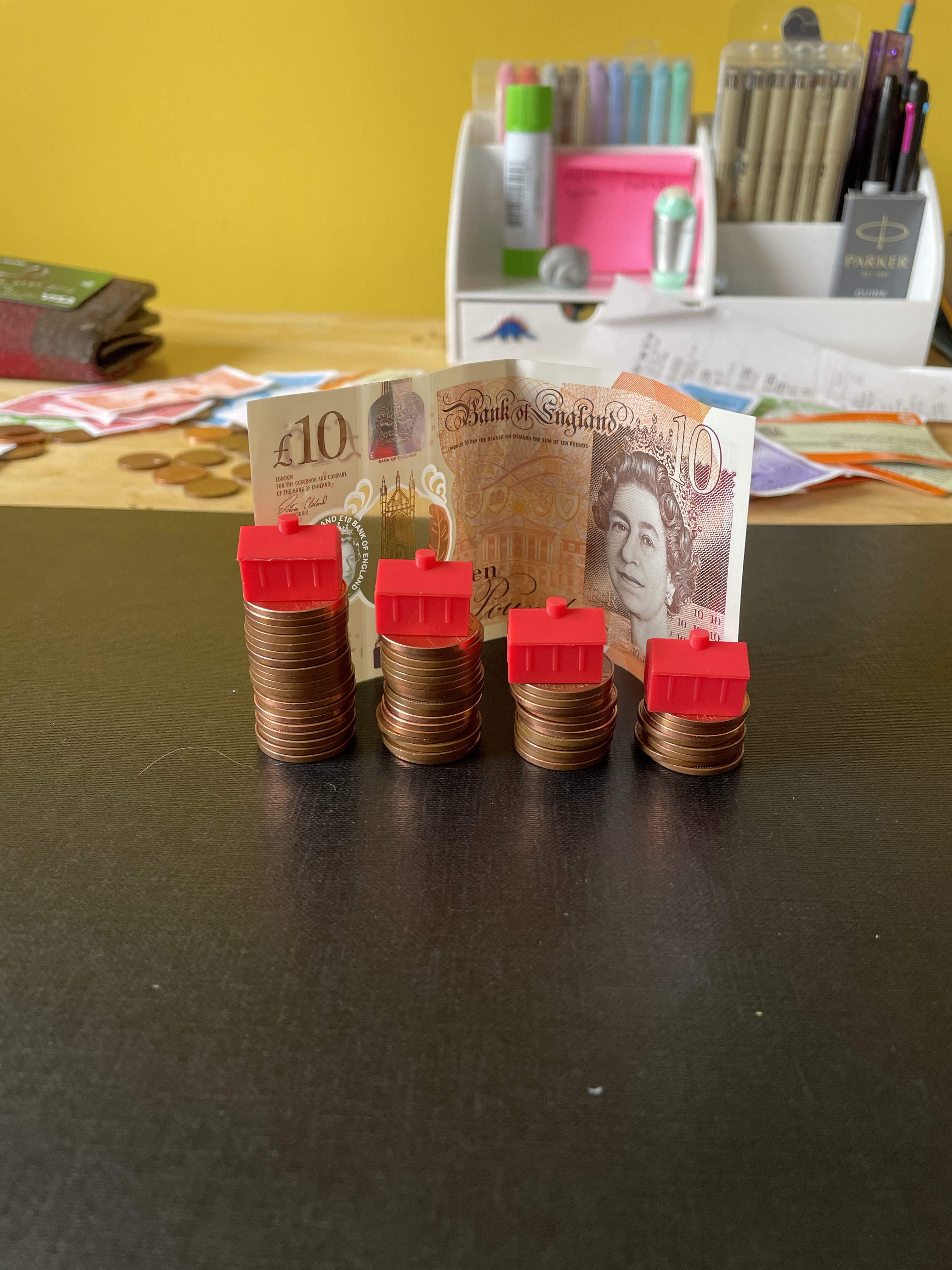
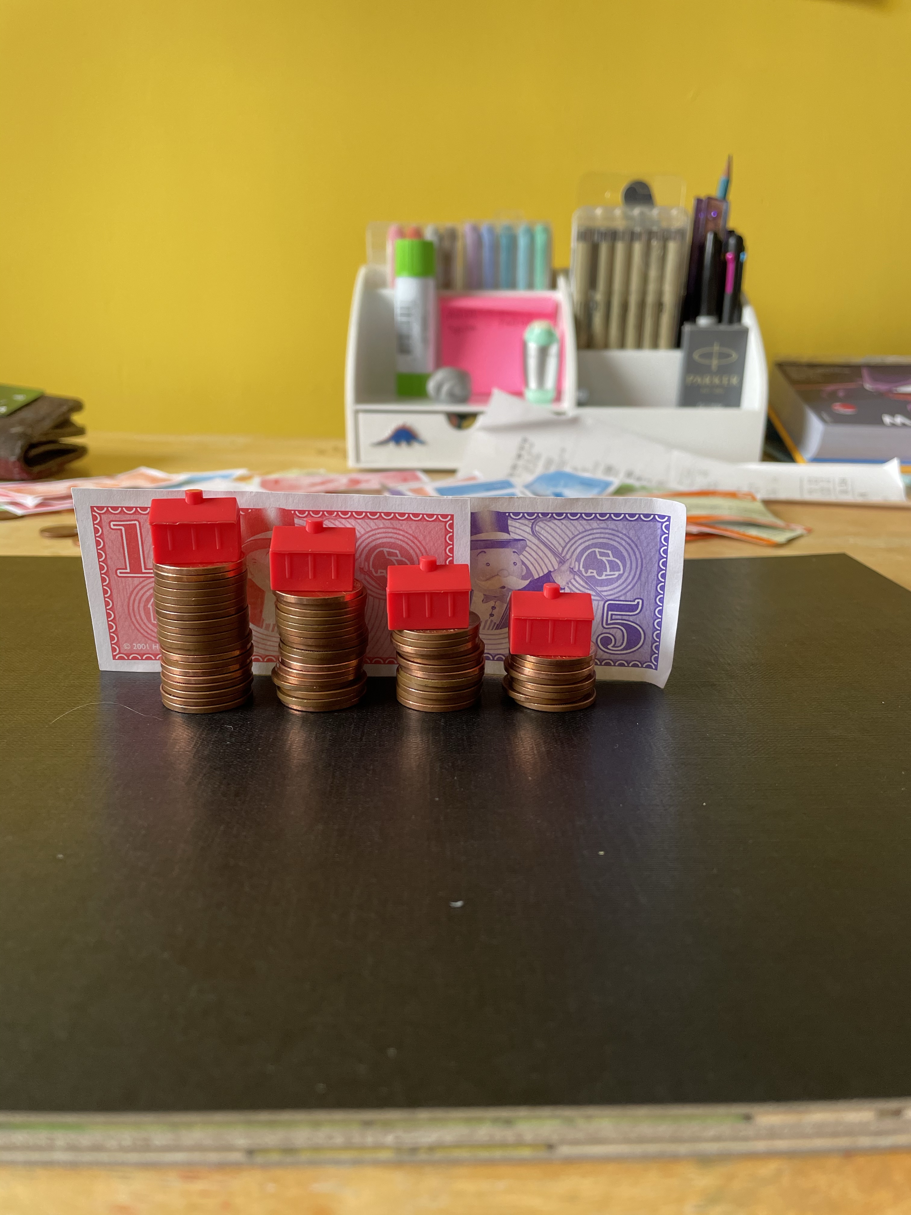
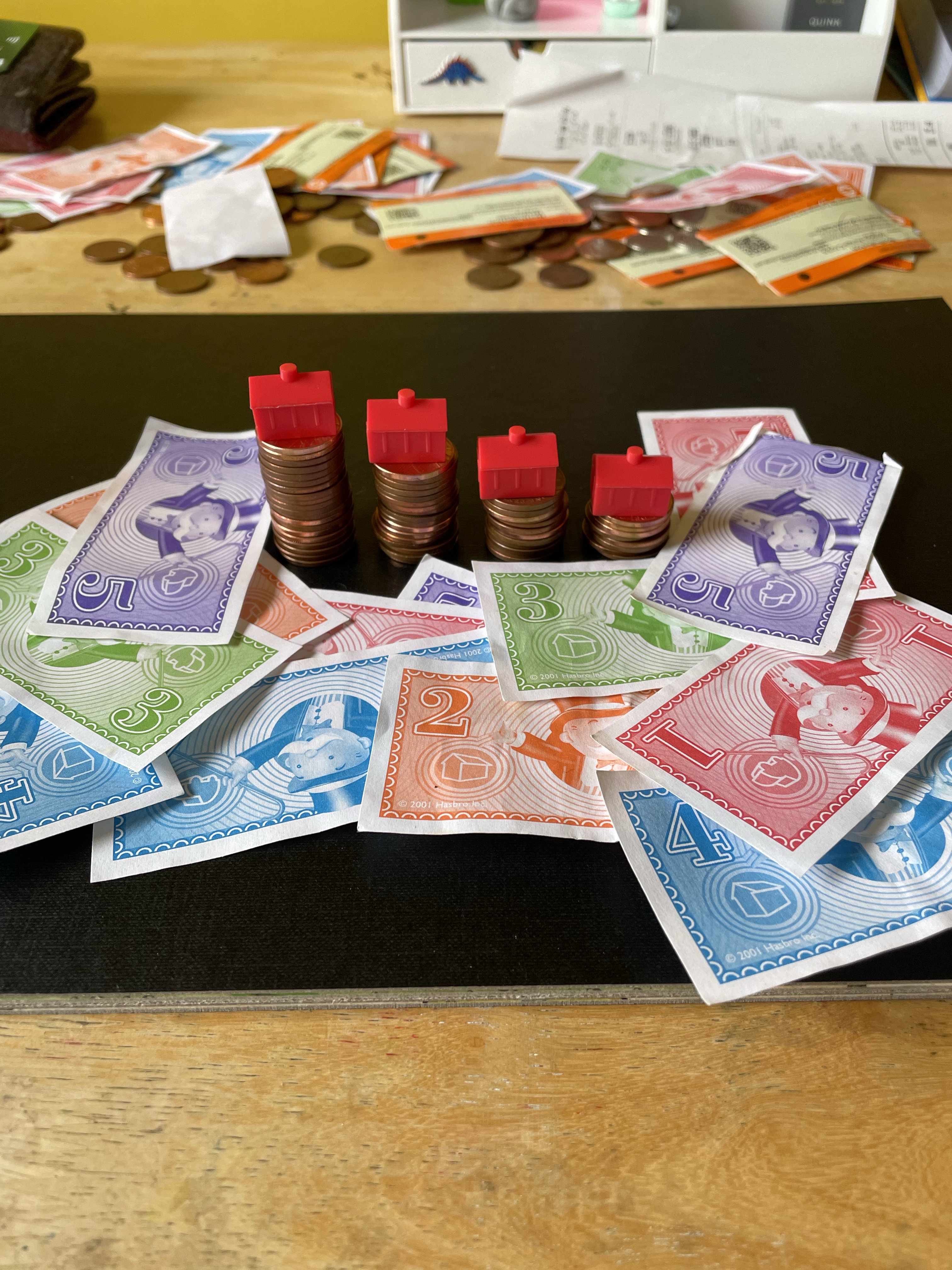
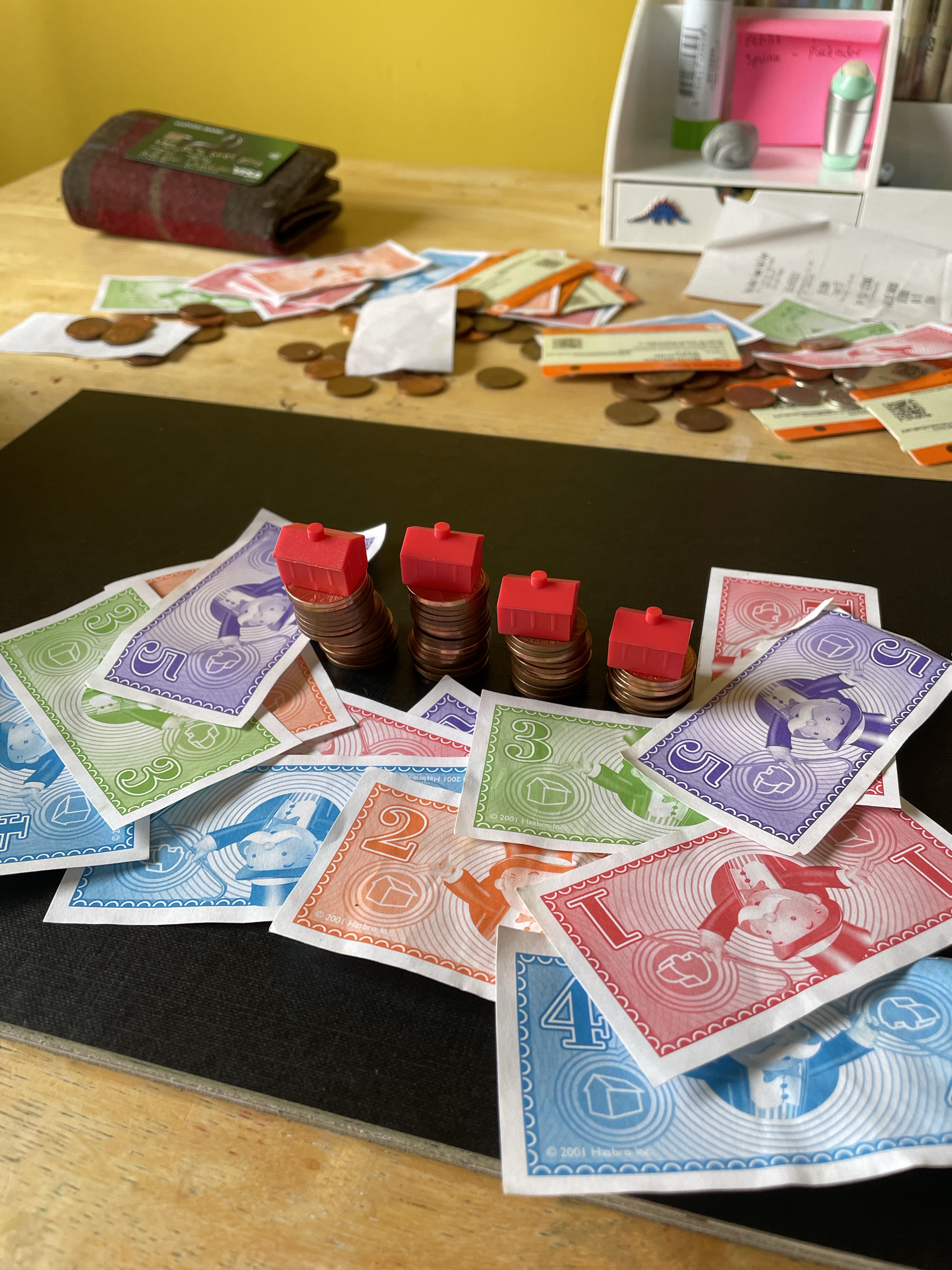
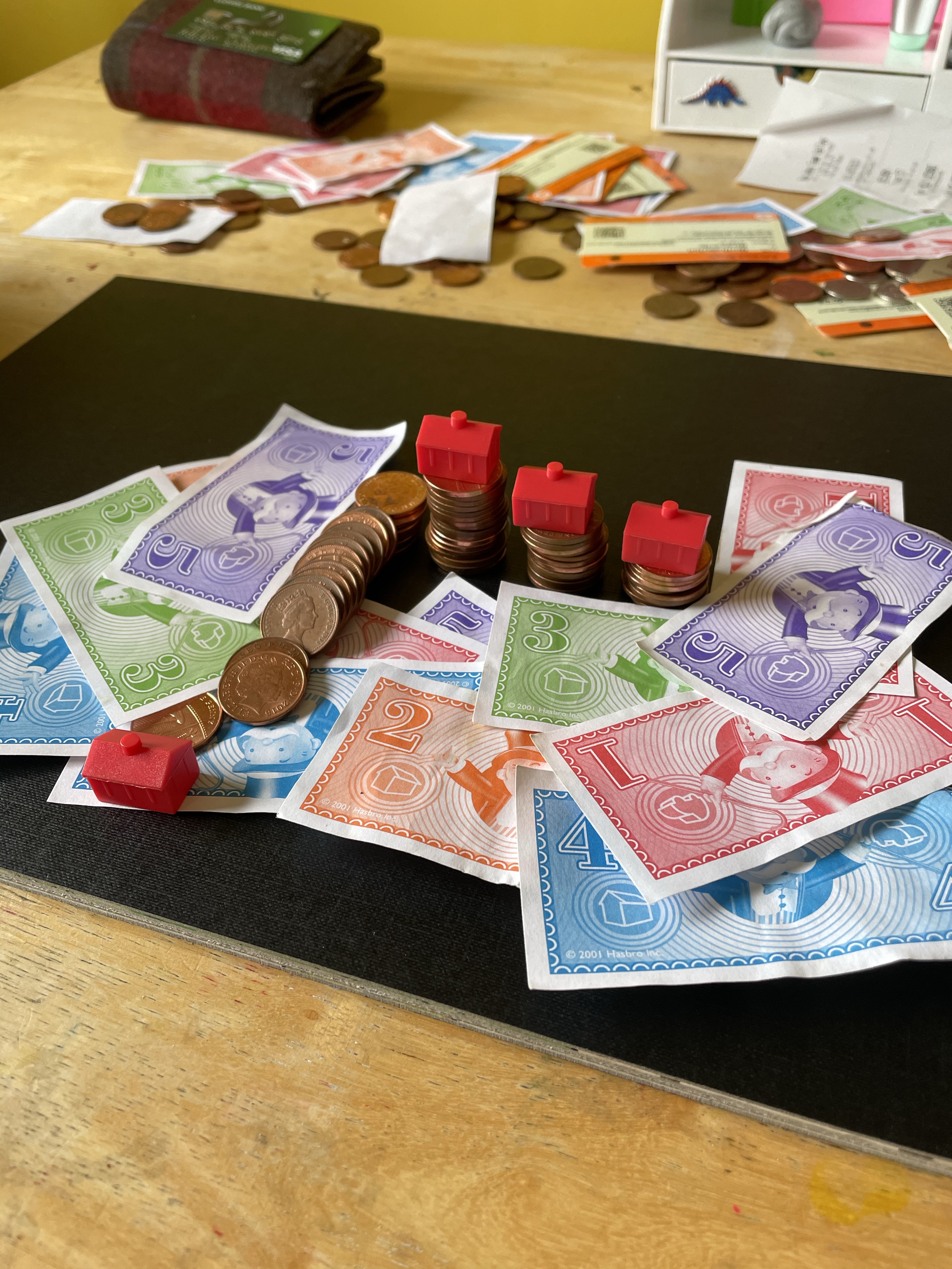
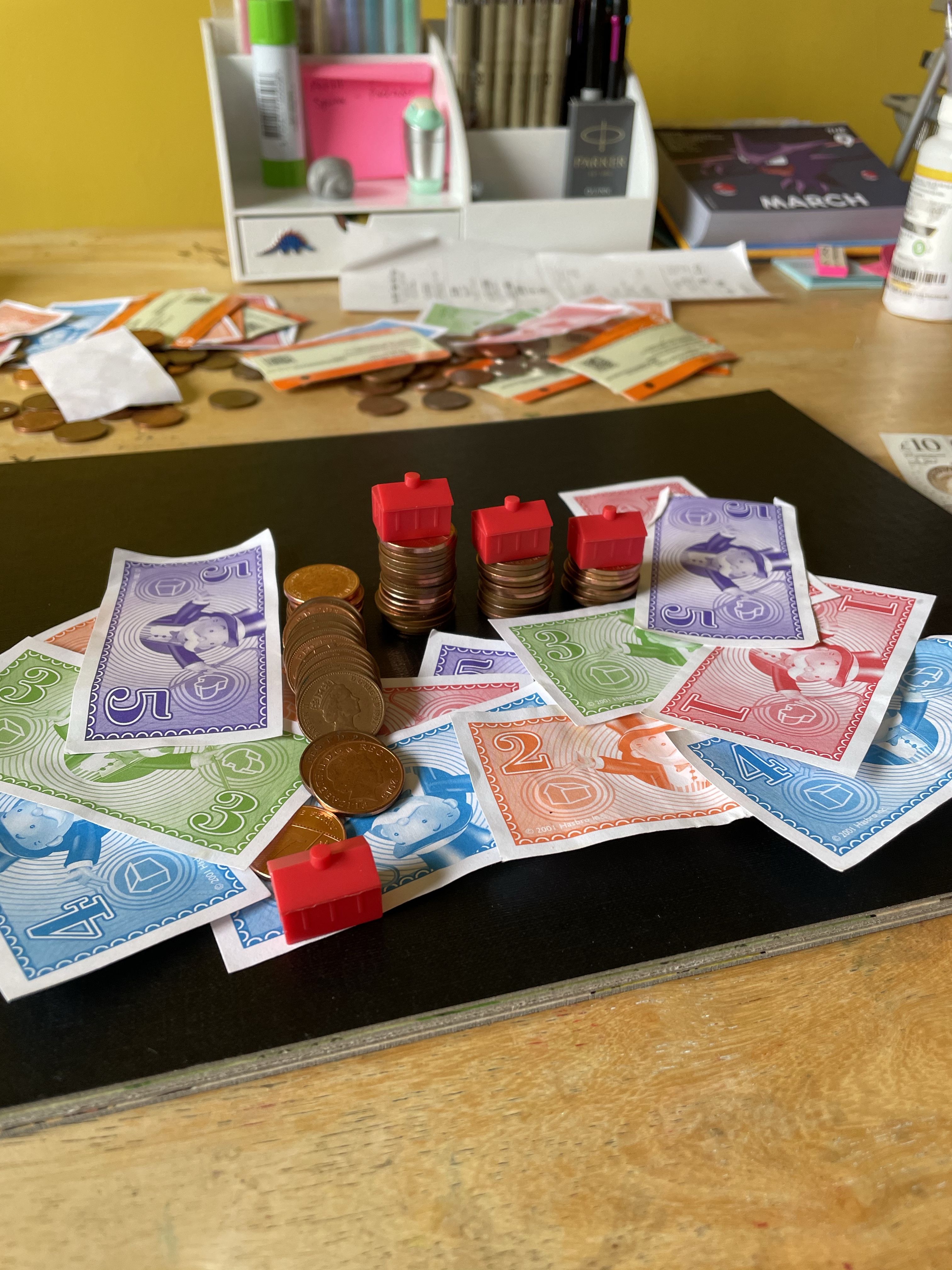
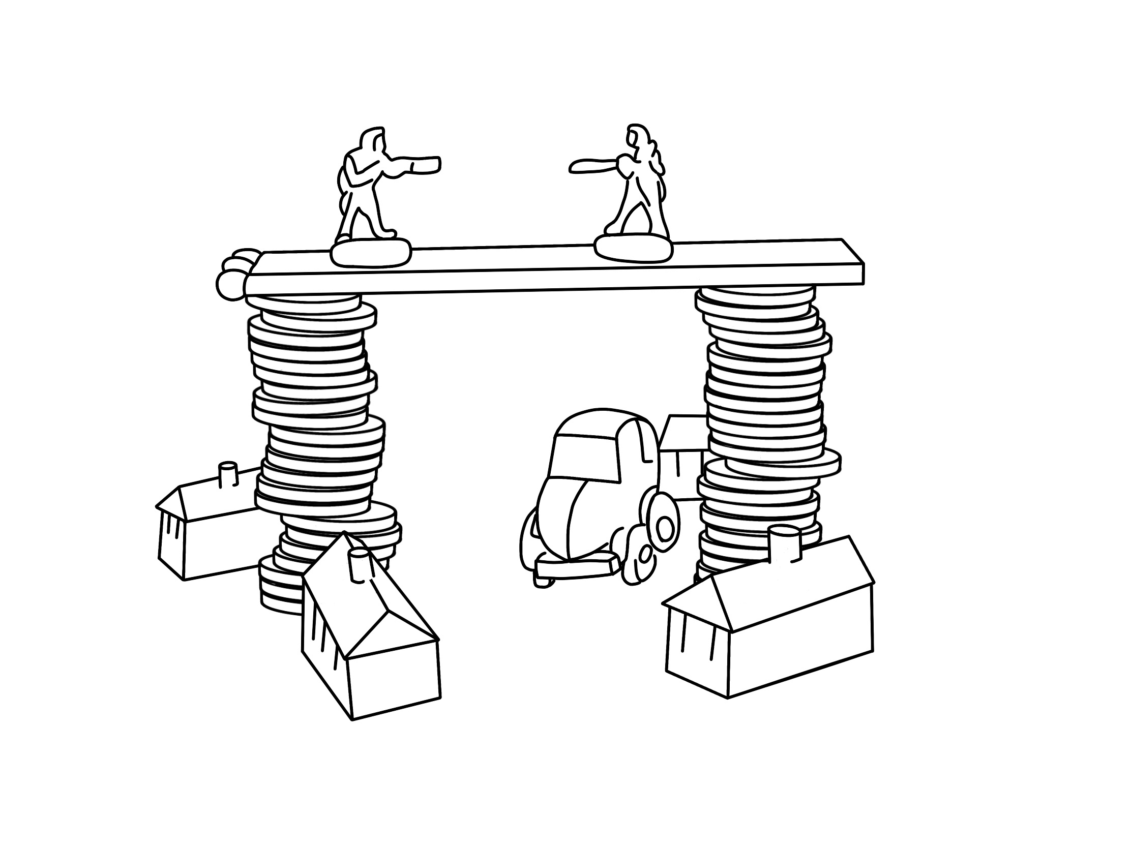
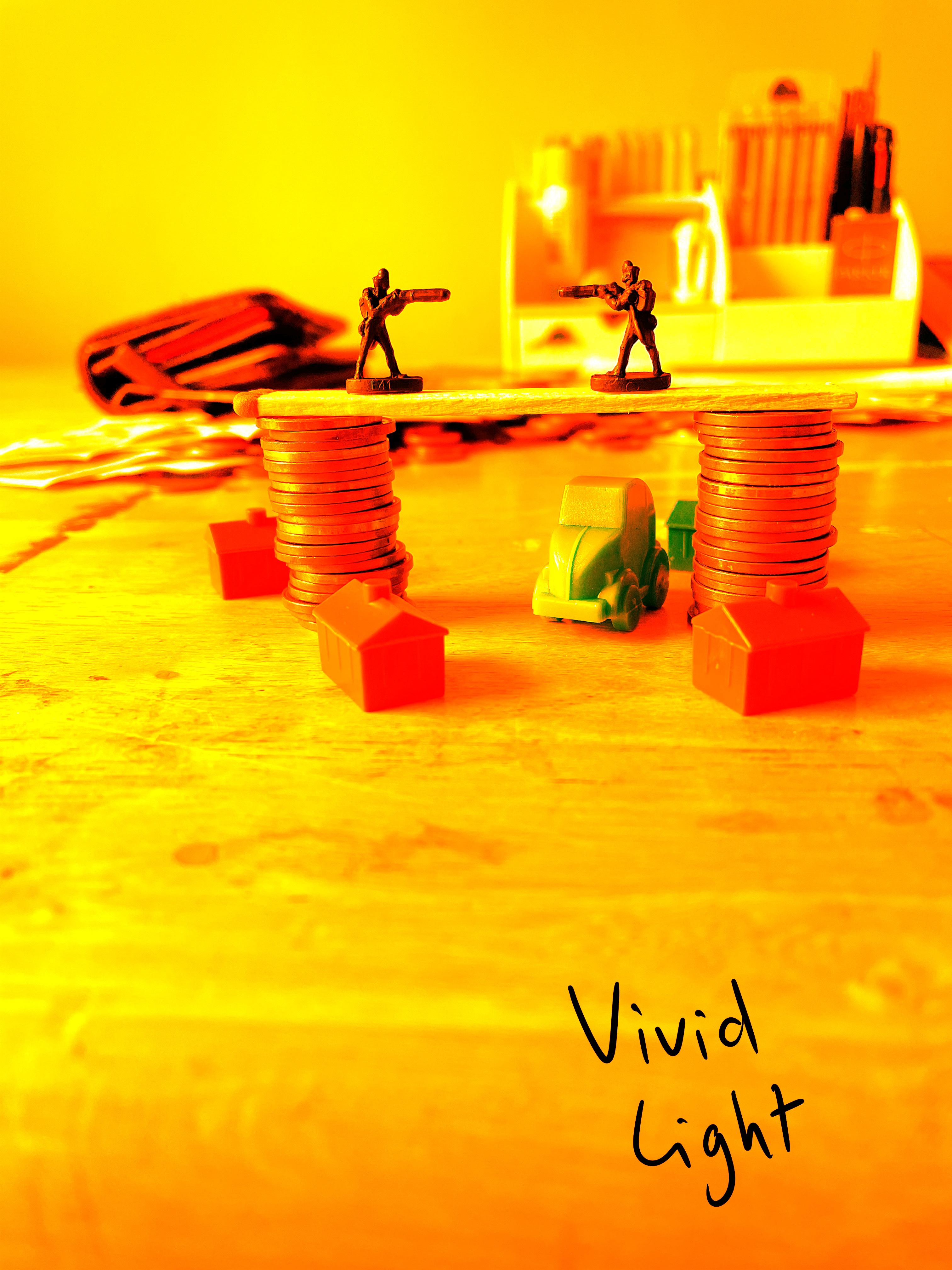
Once I felt I had exhausted my options for variations on the setup, I looked through the content I’d gathered. My favourite setup was one featuring two army men on a matchstick bridge that was held up by two stacks of coins, with monopoly pieces below invoking a village scene. I liked how this communicated ‘financial disaster’ and how the elements of the still life were used to do this. I decided that this setup would be my focus, and began sketching a simple observational line drawing.

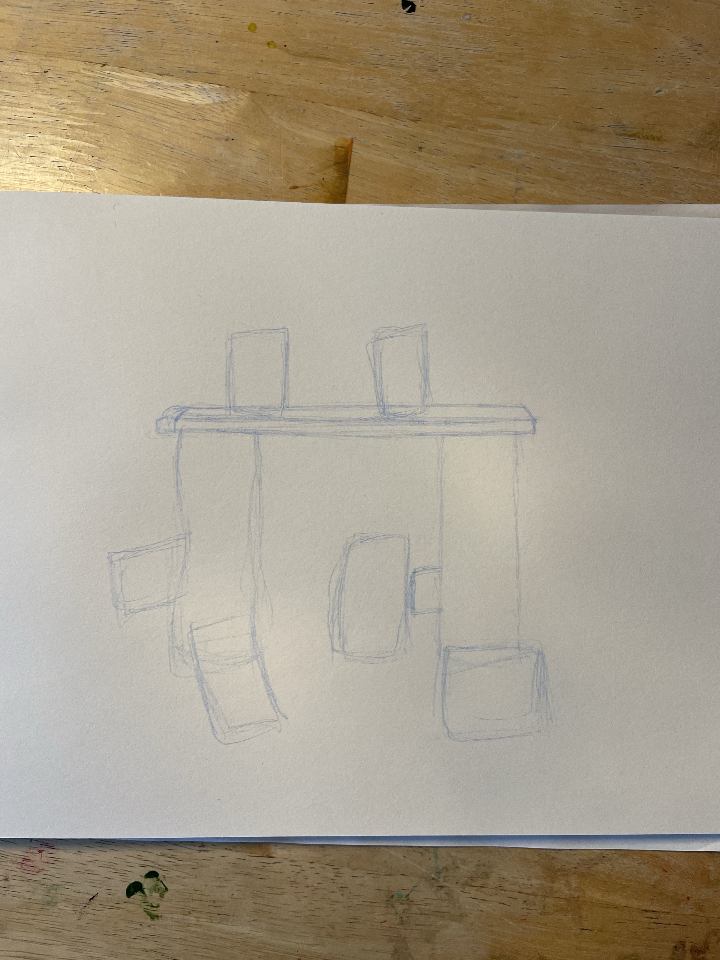
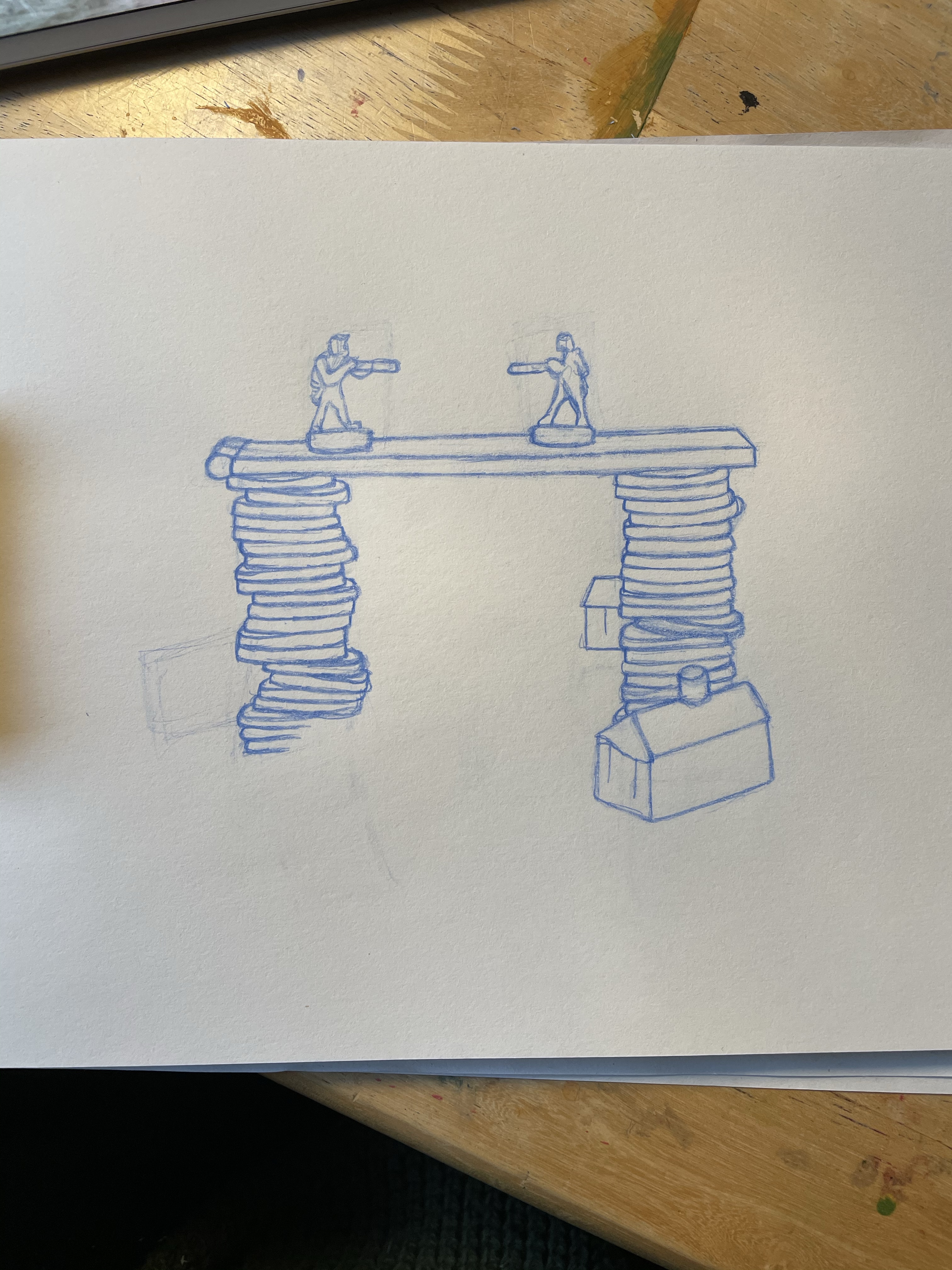
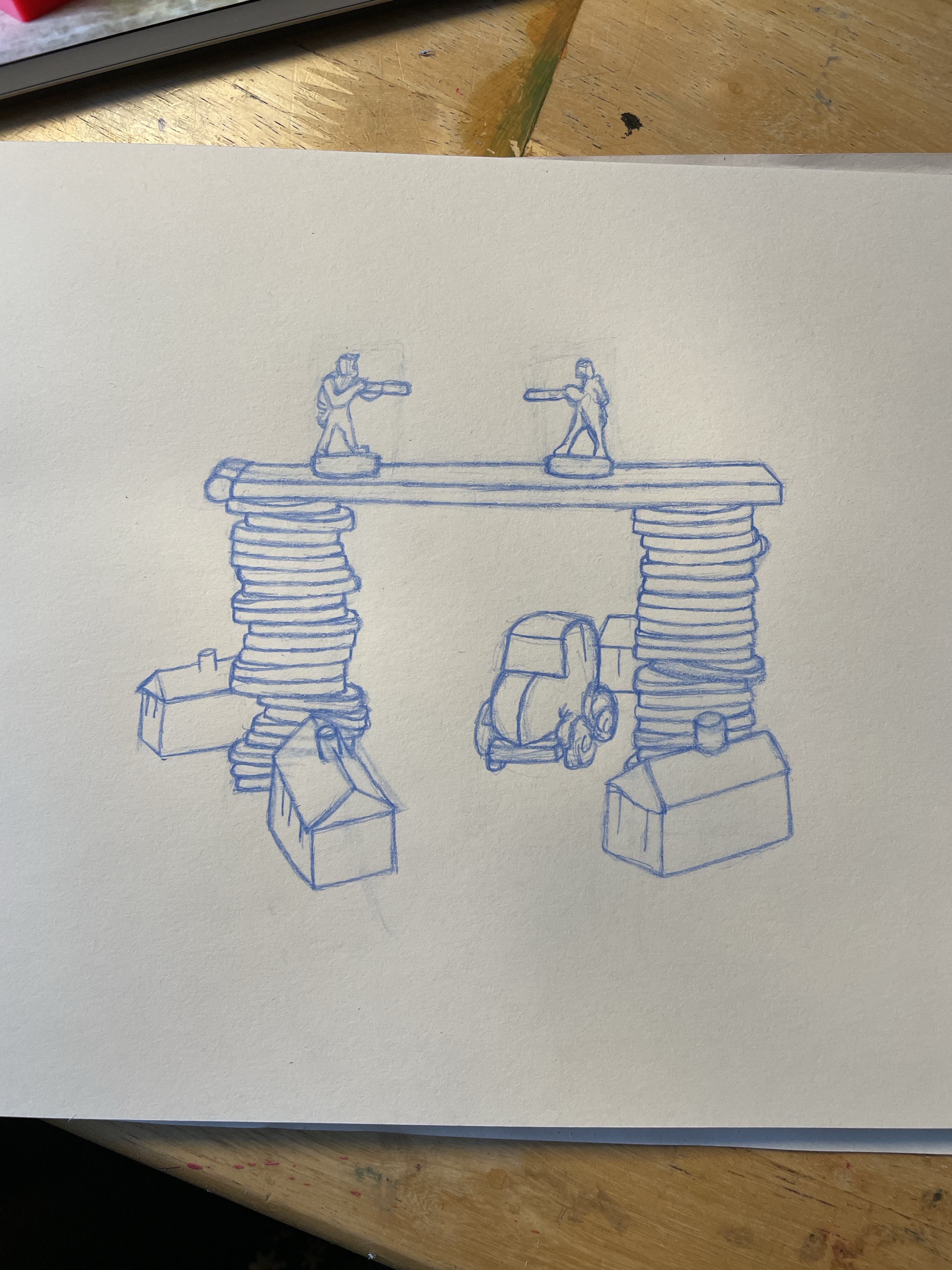
Since my last attempt at an observational drawing in Exercise 9 my drawing skills have hugely improved, particularly my ability to understand scale, dimension, and proportion. I began by roughly marking out where objects were in my still life, and then carefully marked out each object while taking care to ensure visual accuracy was maintained. It was quite hard – and a little repetitive – to draw each of the coins. I repeatedly found myself getting into a rhythm and simply drawing the same shape over and over, failing to look at the actual still life and individual coins. Pulling myself and my focus back to the still life was tricky, but I think I did well.
The assignment guide then says to ‘either trace, scan, or photocopy this drawing and then do a tonal drawing of it’. I really failed to see the point of this exercise. I didn’t see how it was a useful step in my illustrative process and couldn’t figure out how I could use it in my final piece. It felt like a step that was neccessary only because the assignment said to do it, not because it would actually contribute to my ideas and design process. This meant I hesitated, and I ended up stalling for much longer than I would’ve liked, frustrated that I had to do something seemingly unnecessary before being able to continue.
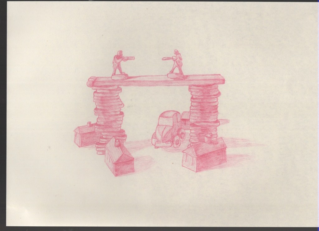
I used a lightbox to transfer the observational drawing onto another sheet of paper. I also used a different colour pencil to show that I wasn’t just adding tone into the same piece of work. I loosely drew an outline, copying the original drawing, then using my photo reference I added in tone and shadows. I actually ended up having a lot of fun with this, and felt like the shading really breathed life into my piece. I rarely attempt tonal drawings, as I always presume I’m ‘bad’ at them, and therefore wouldn’t be able to succeed. I think my tonal drawing looks fantastic, however, and I’m pleasantly surprised!
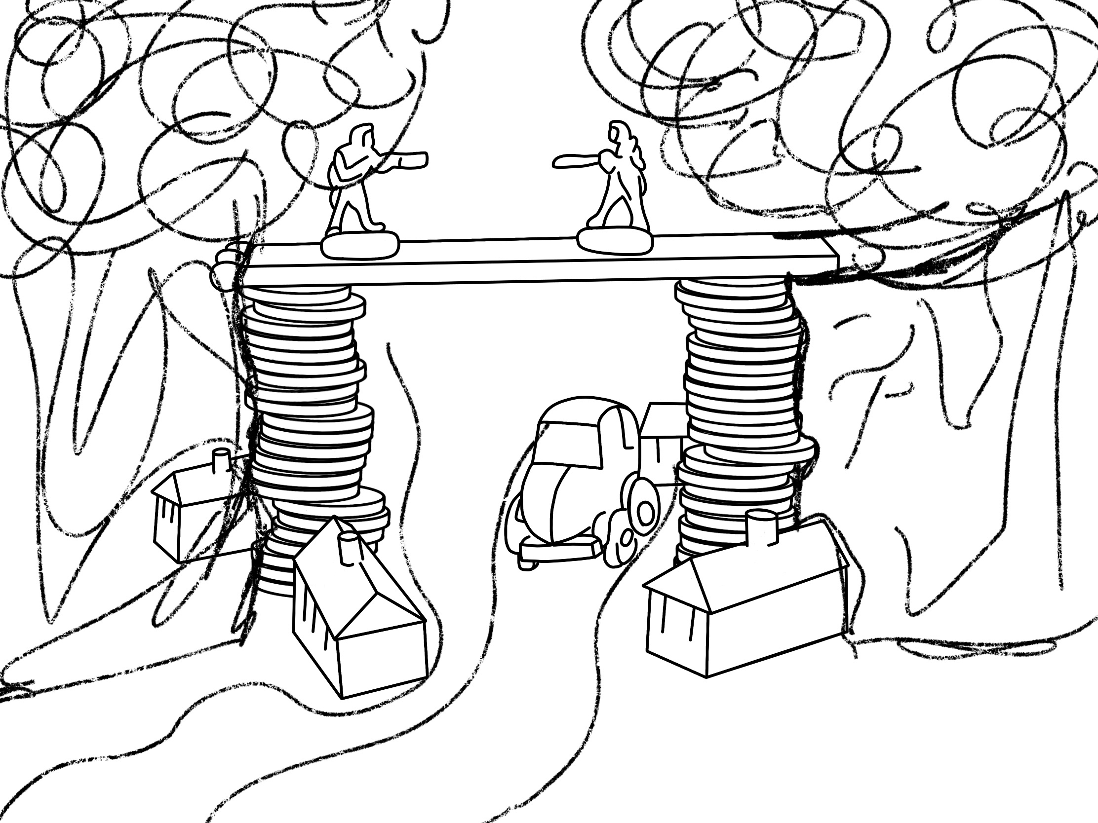
My next step was to figure out how to turn this into a full and complete magazine illustration. I decided to scan in my tonal drawing to use as a basis for my final design. Then, in Procreate, I traced over it to produce a line visual. The assignment guidelines advise that at this stage I may wish to introduce a character or location, to suggest a narrative. I thought about this a fair bit and considered what I could add, remove, or distort in my still life in order to convey the message of ‘financial disaster’. I had 3 main ideas. The first was to add in features such as a toy box, a child, or a playful background, to invoke the idea of ‘child’s play’. My second idea was to simply add a background of money falling, possibly using a repeating pattern, with the focus on my still life in the foreground. My third idea was to turn the scene into a full landscape, with the bridge connecting two locations and a road underneath, perhaps with a river flowing nearby.
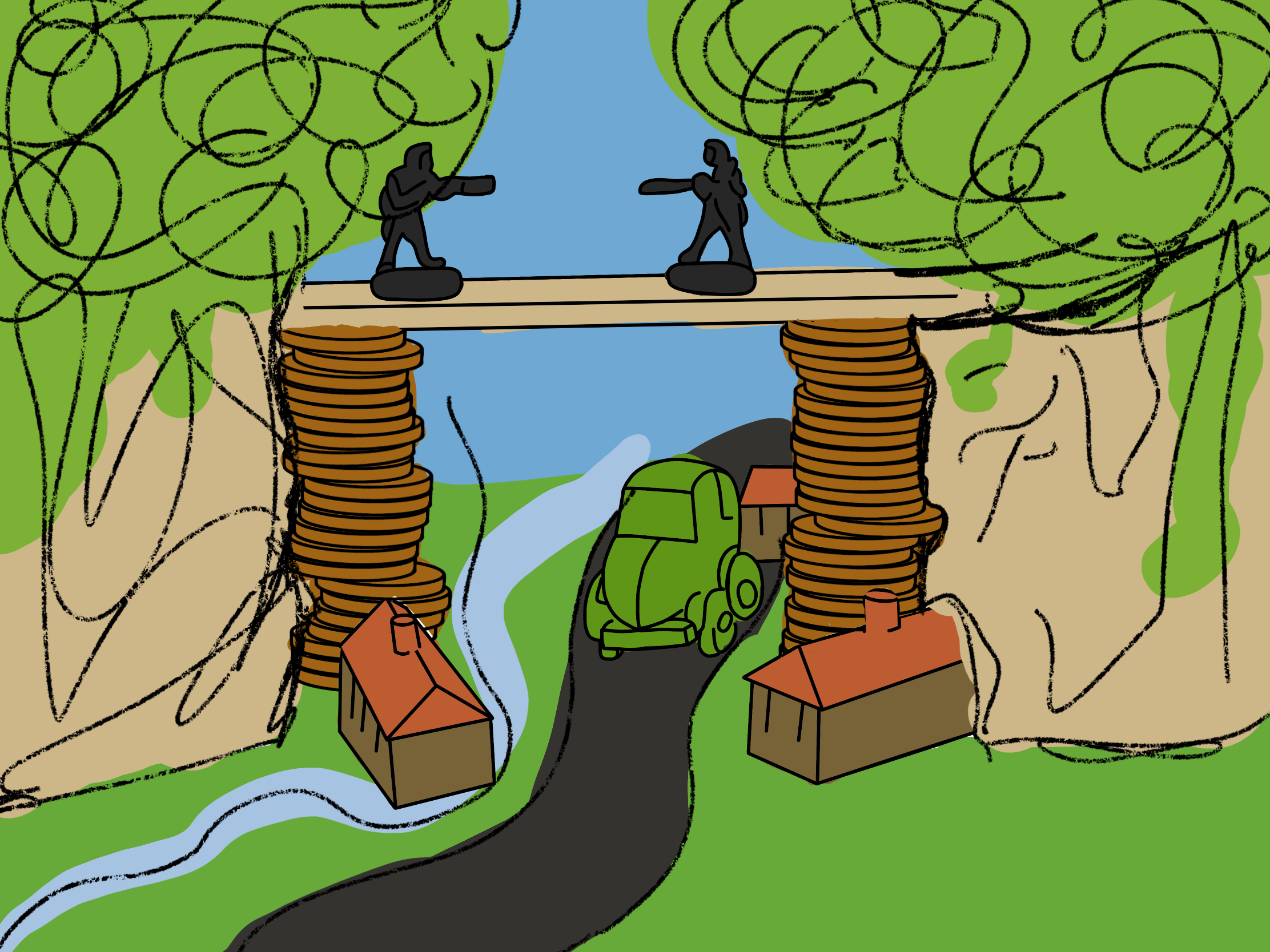
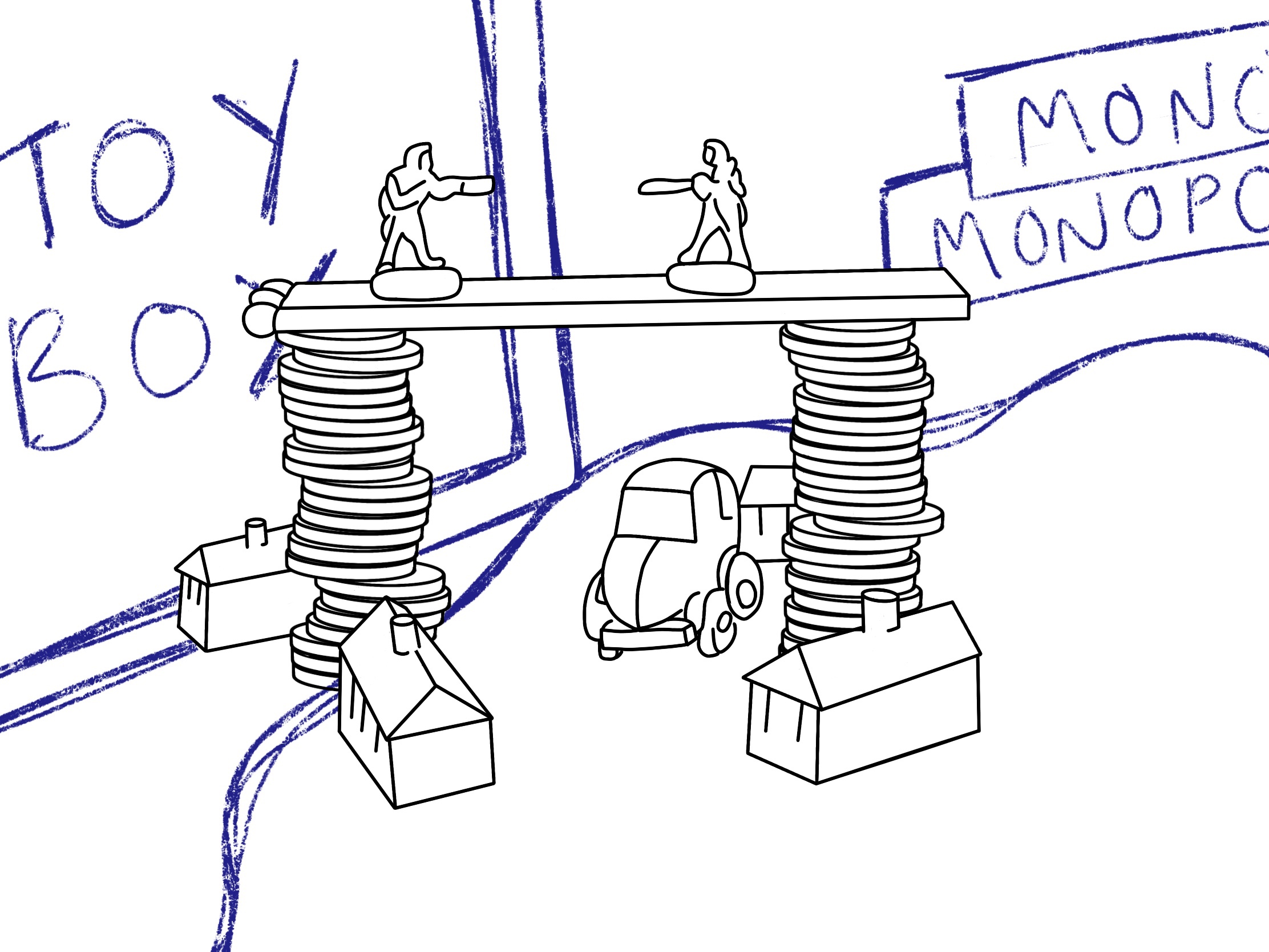
I duplicated my line drawing a few times so I could sketch out these ideas and see how they looked when thumbnailed. I liked the toy box idea a lot, and I thought the landscape concept was brilliant too. I even added colour, so I could have a fuller idea of how it would end up looking. I then used one of my still life setups as a tester background to see how it would look with money as the background. I stepped back and looked at all three ideas side by side, and I realised that I was straying quite far from my original theme. The assignment brief says ‘each decision you make…should contribute to the overall description of the theme you have chosen’. I didn’t think that my child’s play idea, or my landscape, really communicated the word ‘disaster’. It wasn’t immediately clear from either of these concepts that that was my focal word, except maybe through the soldiers holding guns. I also didn’t really feel like the ‘financial’ aspect of my choices was coming through either.
On this basis, I decided to go ahead with the idea of using money as a background. My original still life was heavily curated and a lot of thought went into ensuring a narrative was communicated, so I didn’t feel like I needed to add an overwhelming amount to achieve this. I considered whether my still life would ‘float’ or whether it would sit on a horizon, trying out a few different things to see how it would look. I realised I was struggling to visualise anything as I was just using filler imagery rather than my own illustrations, so I began illustrating the background hoping I could build my illustration up from there.
I began by loosely tracing two different pieces of Monopoly money at different angles from a picture I had taken earlier when setting up my still life. I then altered them slightly to ensure they weren’t just copies and coloured them. I began arranging them to appear as though they were falling, and filled the background with them. Once I was happy with it, I saved it and added it to my original canvas. Now that I had my background, I figured the rest of the piece would fall into place and I would figure out exactly how I wanted it to look. I was wrong. For a couple of months, my chronic illnesses have been very bad which has lead to me feeling very disconnected from my work and into total art block. I haven’t been able to come up with any ideas that have excited me or inspired me, and I’ve really struggled with actually getting work done. Unfortunately, this really impacted me once I reached this point in my illustrative process.
During all of the steps in this assignment I have been really drawn to the colour orange. I noted it down right back when I first started listing objects I could include in my still life, and have consistently gone back to it when trying to imagine my final illustration. I wasn’t sure how to translate a real still life into an orange-toned illustration, however, especially when there was virtually no orange in my original set up. I decided to add a solid orange layer to my still life photo and play around with the blending modes to see where, and how, I could use this colour. I came out with 14 different options, some of which I loved and some I didn’t think fitted.
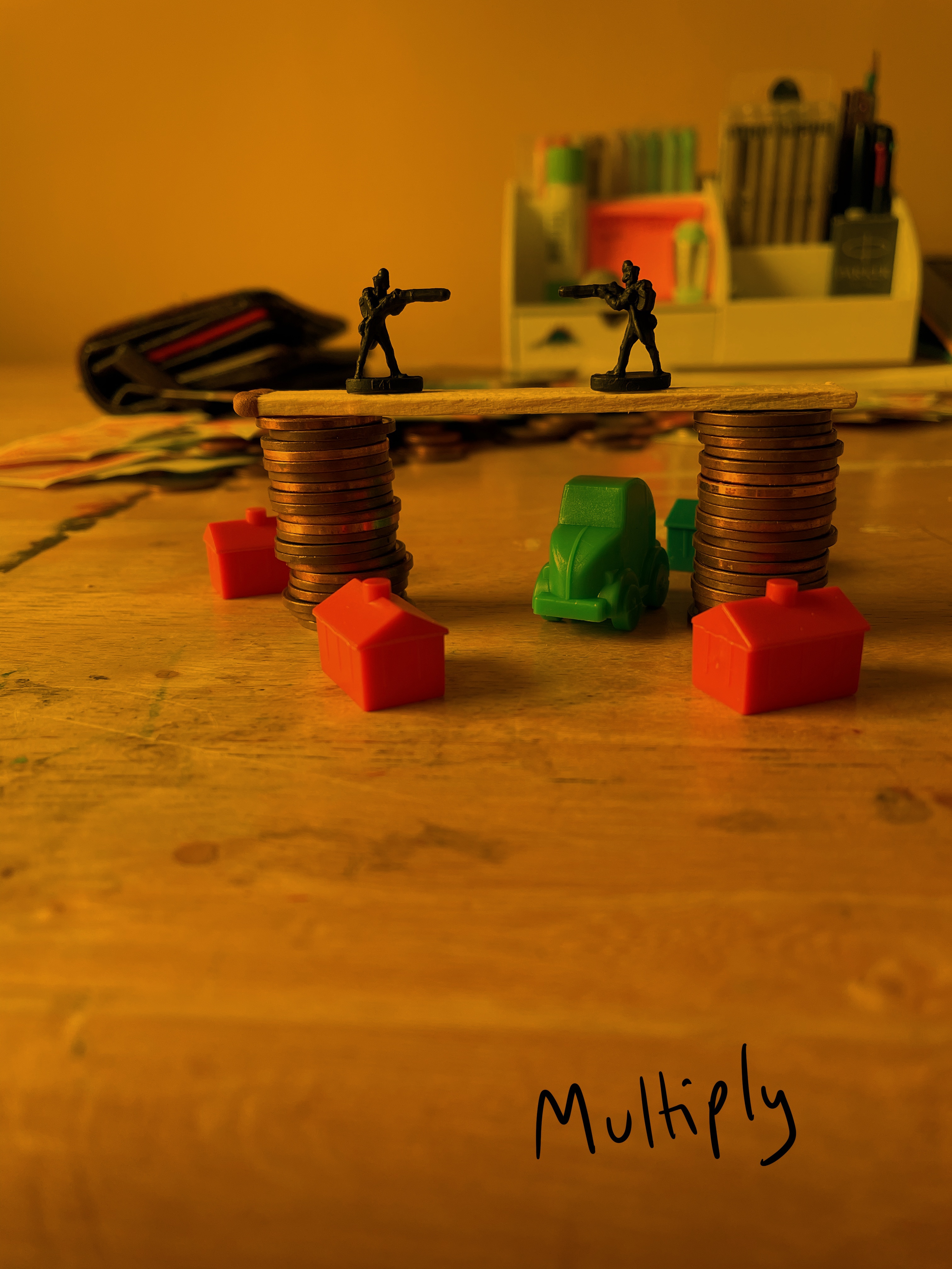
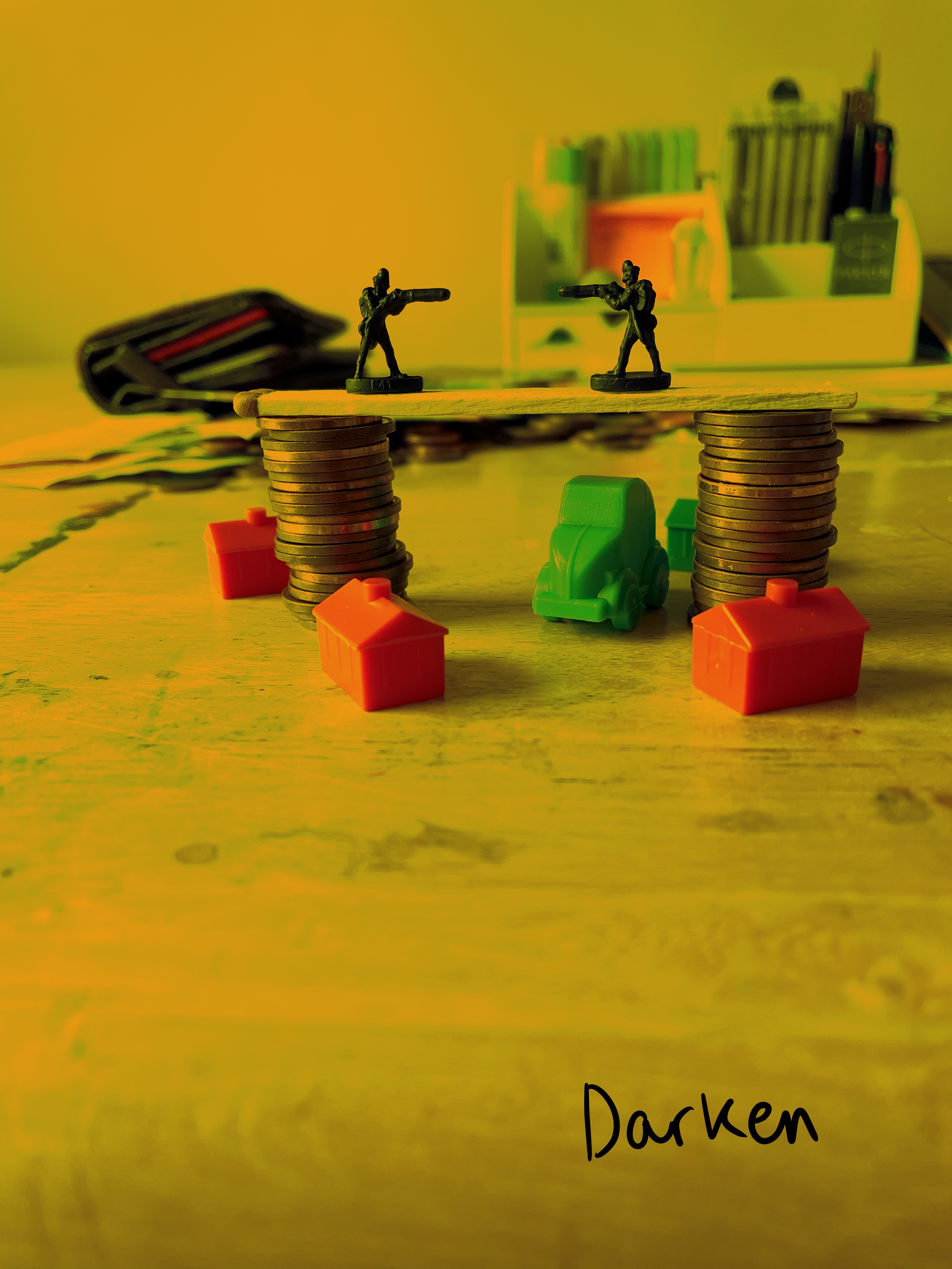
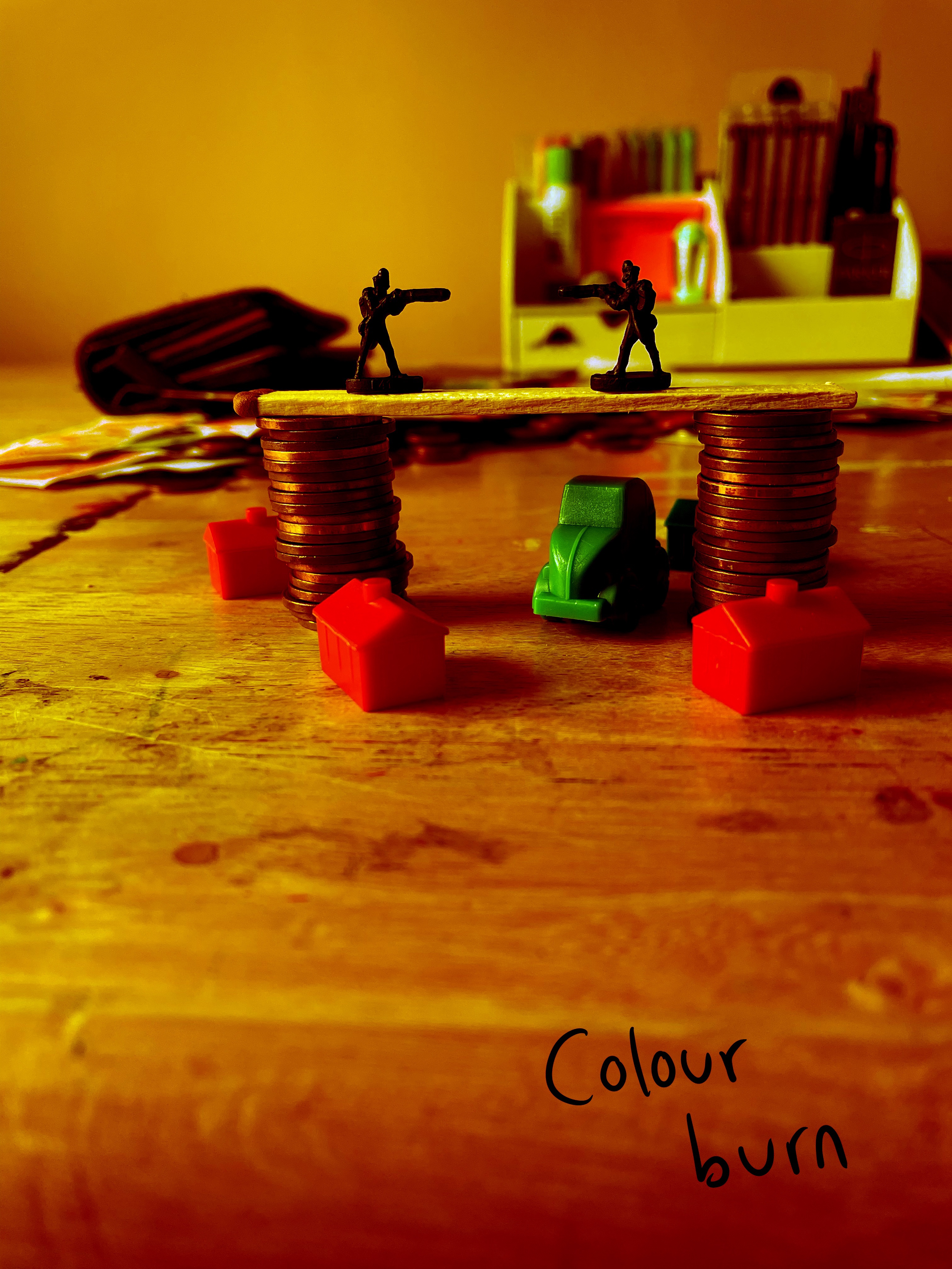
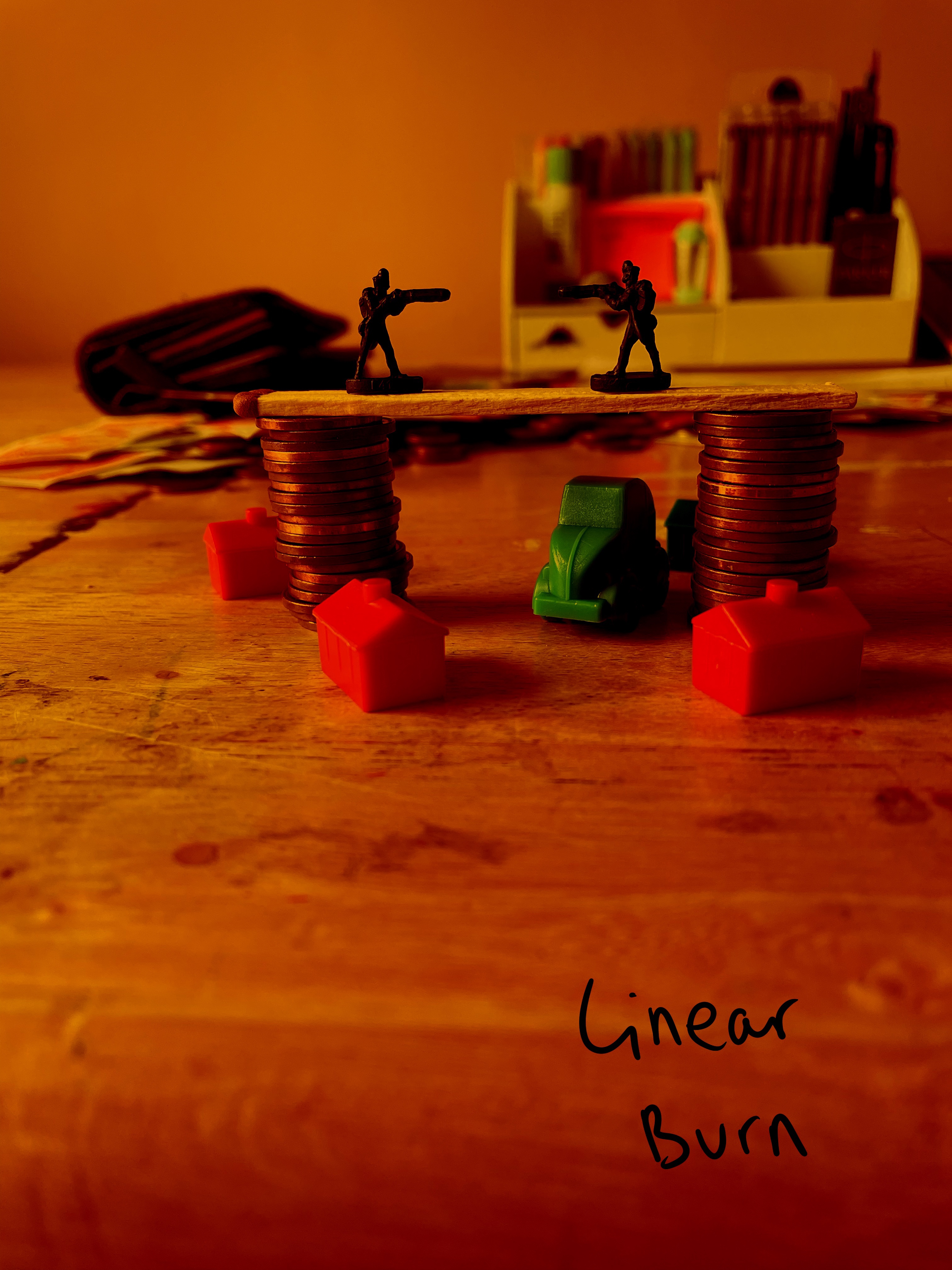
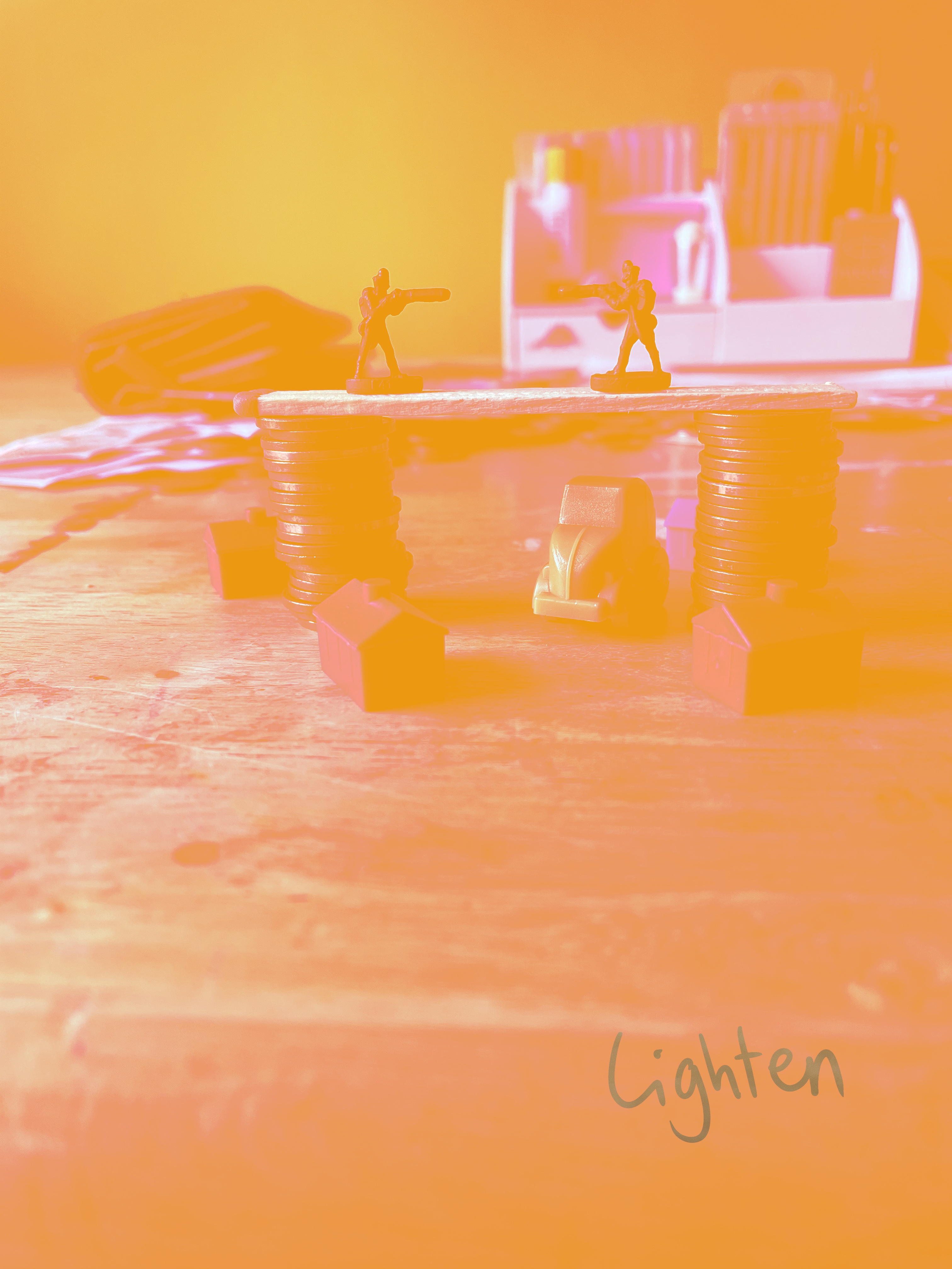
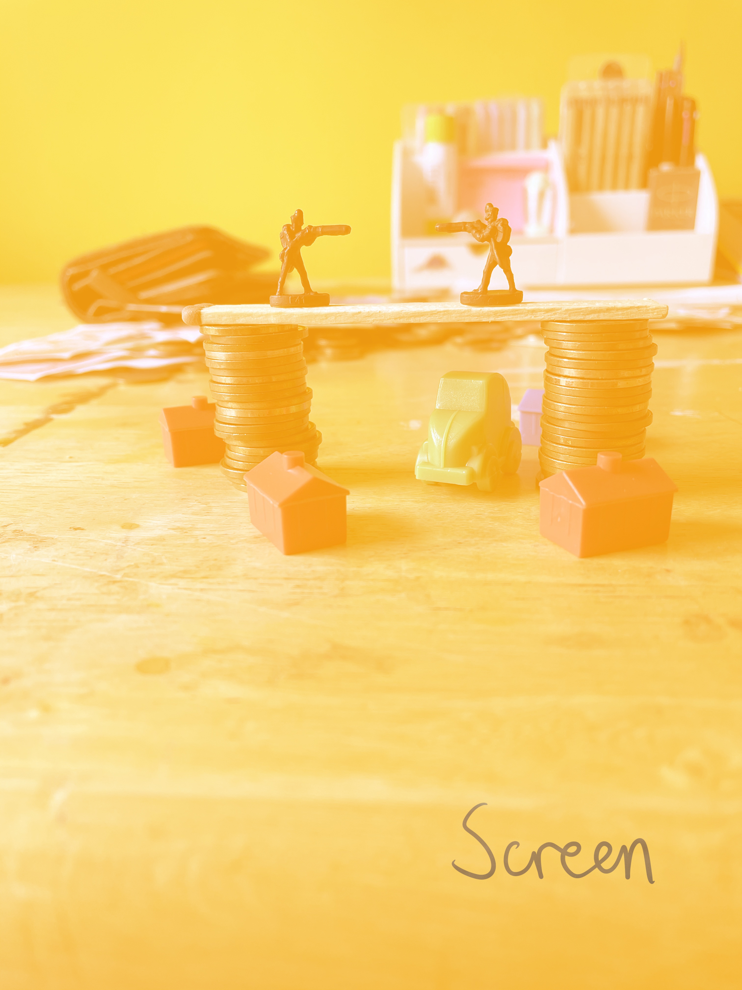
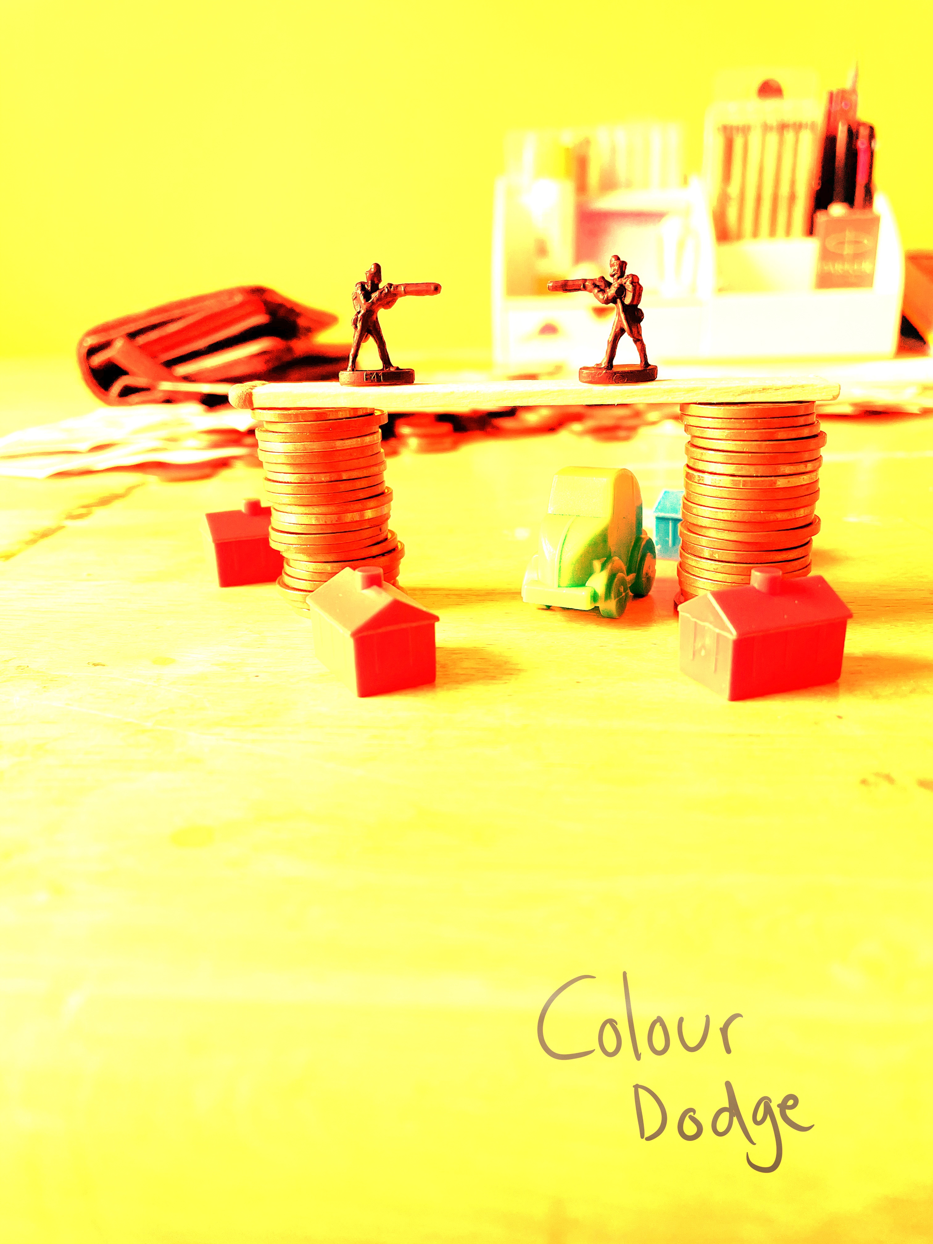
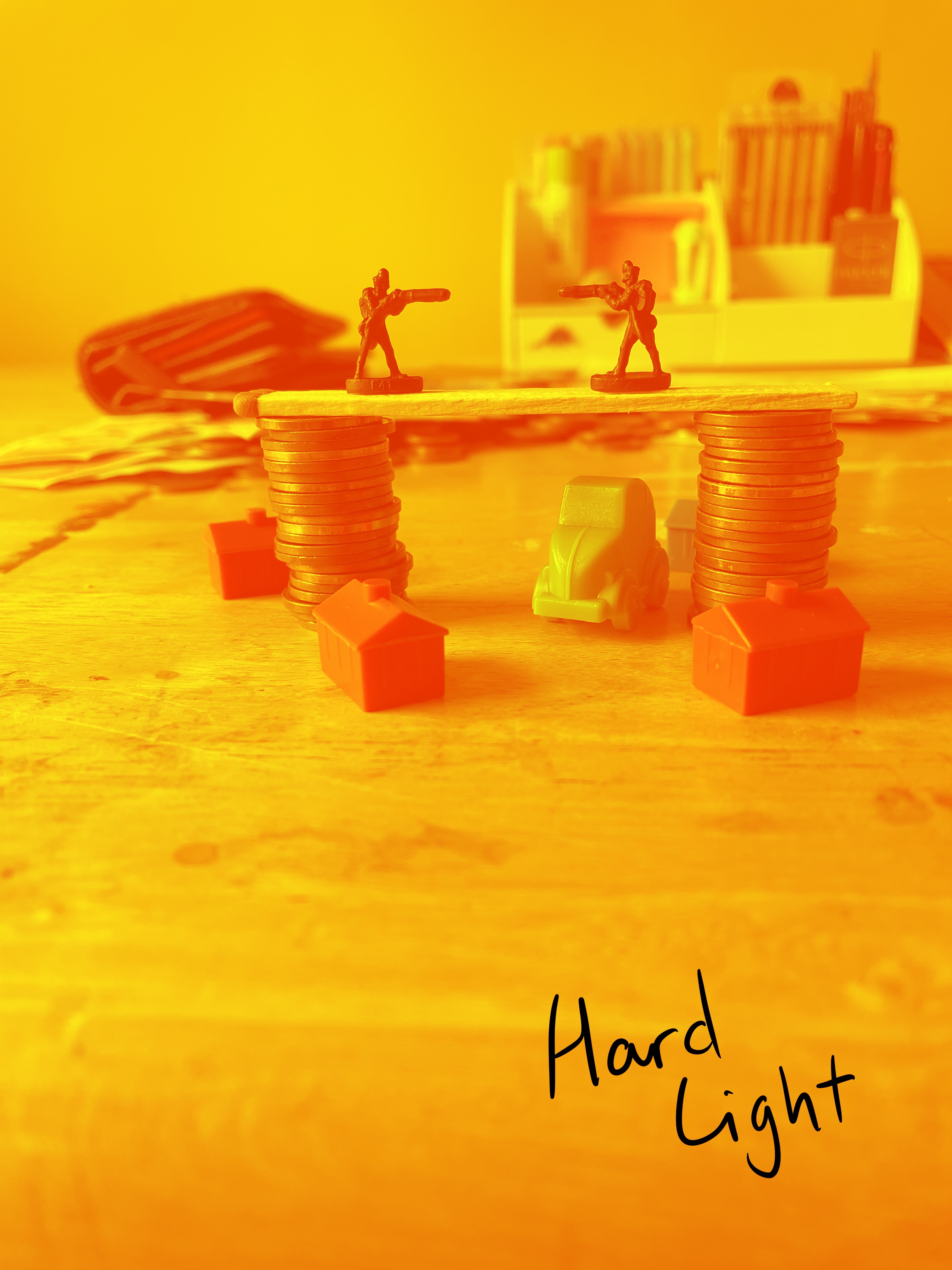
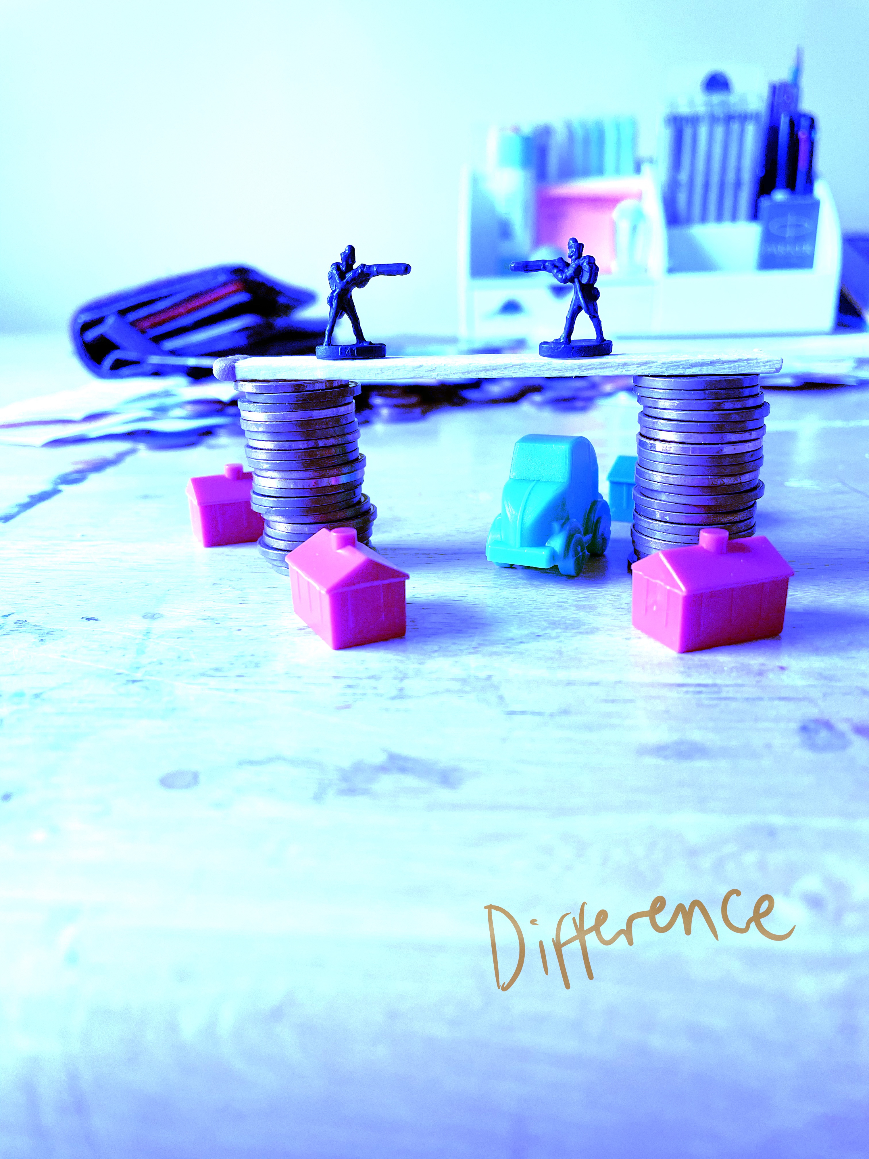
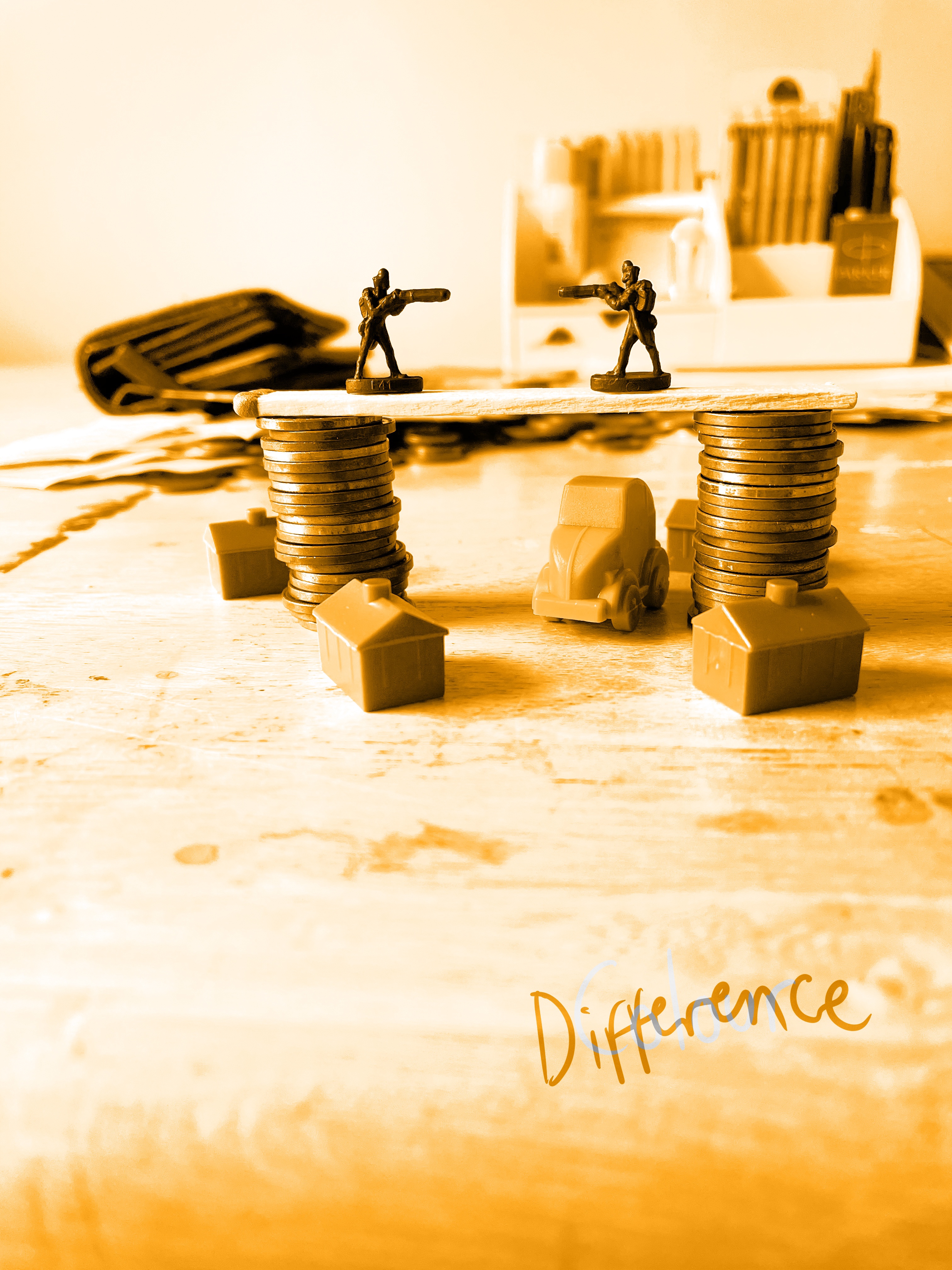
I liked the contrast in the ‘colour dodge’ and ‘colour burn’ options, the highlights in the ‘lighten’ and ‘screen’ options, and the shadows in the ‘multiply’ and ‘difference’ options. I wanted to figure out how to combine these different components and create a colour palette I loved. I considered layering these images over each other and erasing them to leave different areas exposed from different blending options, or simply jumping from reference image to reference image when focusing on different areas of my piece. I was excited at the prospect of doing this, but still couldn’t quite envision a final illustration. I was so frustrated and overwhelmed by how much I had to do that I spent around two weeks doing absolutely nothing. I kept sitting down to work on the illustration and feeling absolutely hopeless.
Eventually, I realised that trying to copy from all of these different reference images was causing me more stress than it was worth. I knew I just needed to get the illustration done, and by this point I didn’t really care how it ended up looking. I blocked in rough, simple colours which matched my original still life. I then changed the linework to be white, rather than black, matching the money in the background. I added some simple shading using a textured brush, thankful at this point that I had my tonal drawing to reference. I then reinserted the background and had a lightbulb moment! I could just add orange blending layers onto this final illustration. I was so frustrated, though, that it took me this long to realise this incredibly simple solution.
I played around with blending modes until I was happy, and then added a second blending layer over the focal still life. It looked a bit weird and didn’t fully stand out from the background, so I lowered the background opacity and gave the illustration a drop shadow. I selected a few different options and asked friends and family which they preferred, and also asked them what came to mind when they saw the illustration. Thankfully, they all said ‘financial crisis’ or words to that effect, which made me feel like I had successfully communicated the narrative I wanted to!
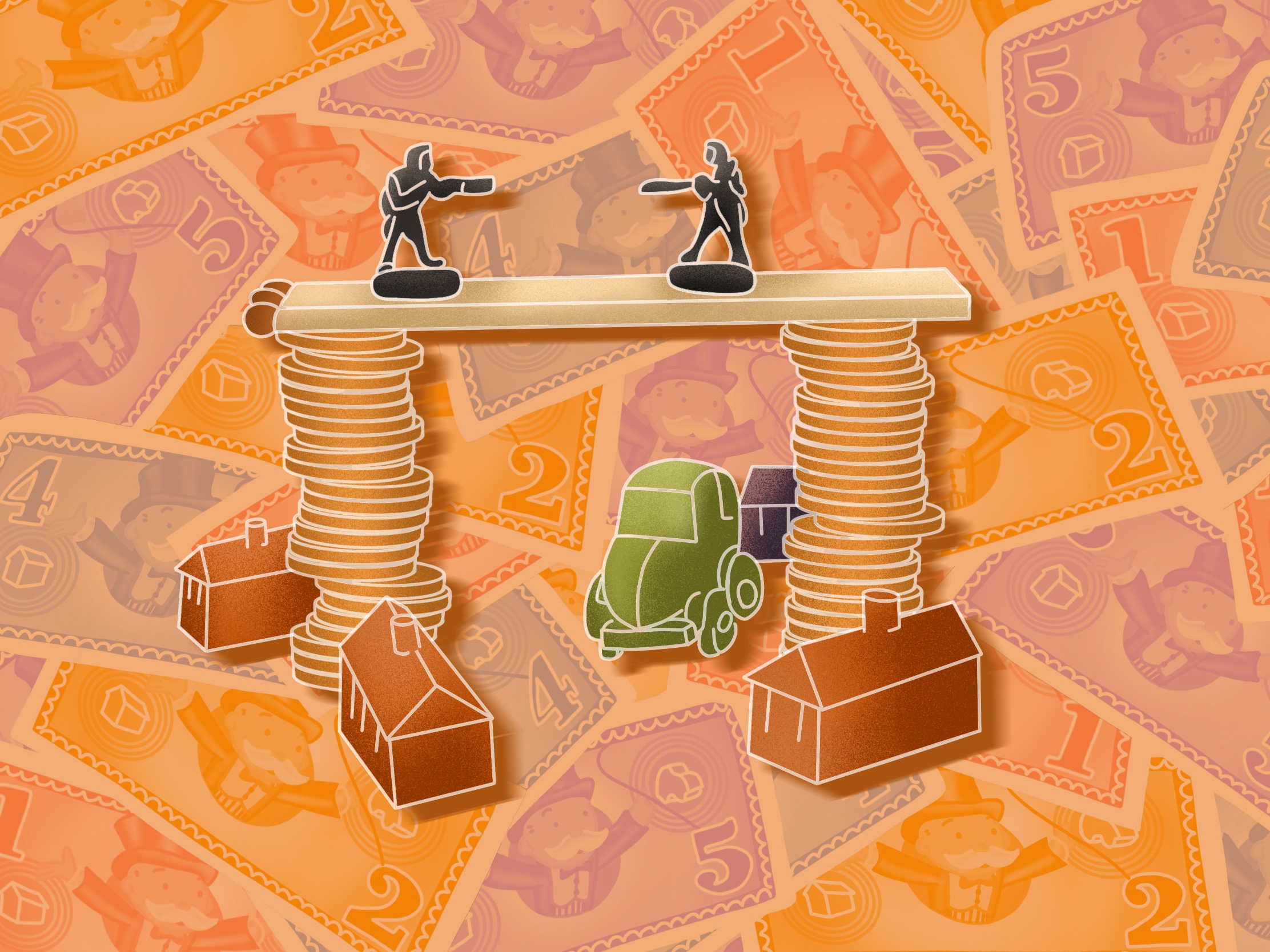
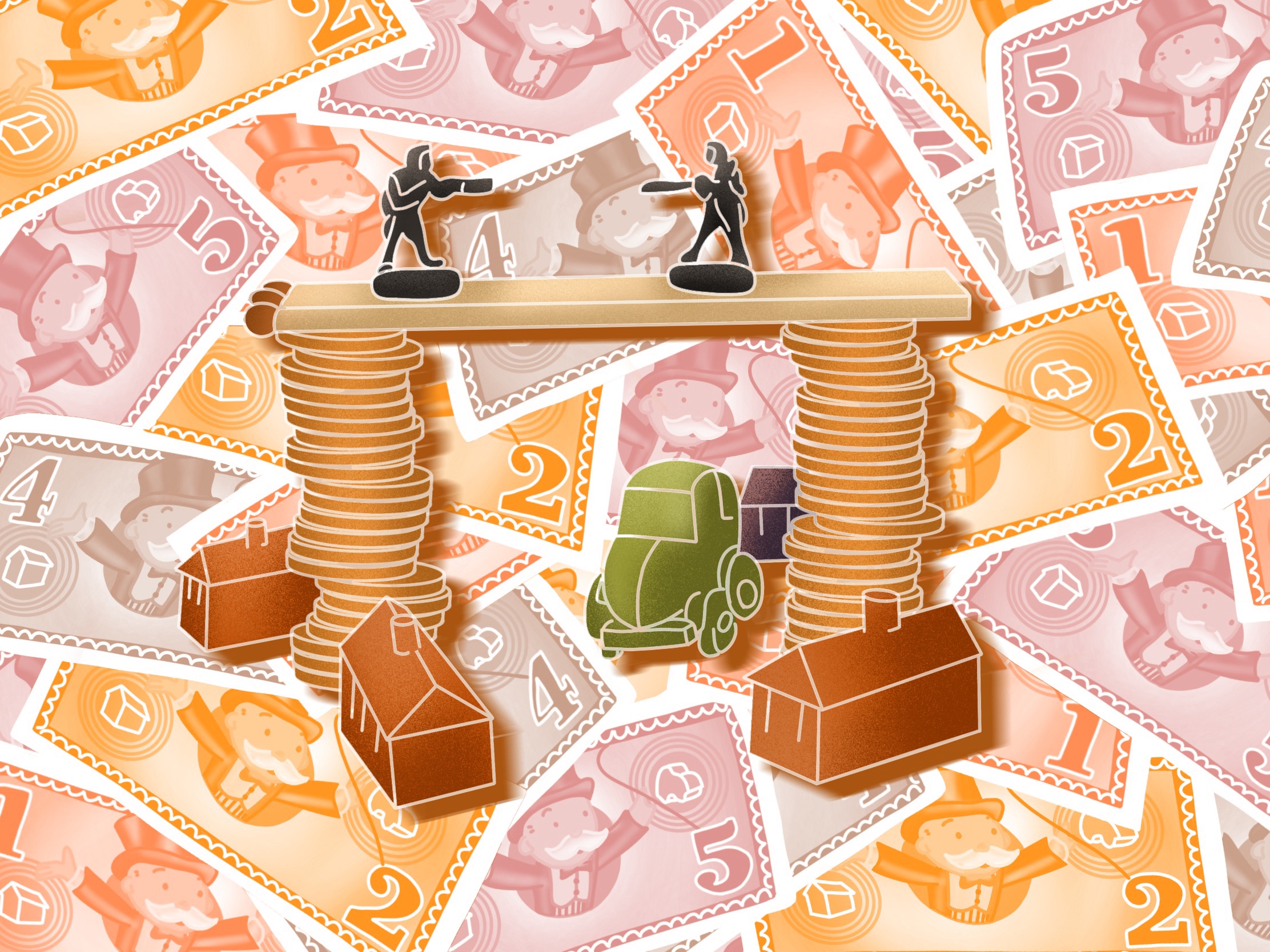
When sending this piece to friends I realised the illustration was off centre, so I quickly went back and changed that before feeling incredibly relieved to be finished. It took me two weeks to do 20 minutes of work and come out with something that I think looks absolutely incredible, especially when compared to what I thought I would come out with during my time of stress! I really did not see how I would end up with an illustration I was happy with. I found this assignment so difficult, but I can’t really put my finger on why. I think it was due to an accumulation of real-life issues building up, the stress of still being stuck in a nationwide lockdown, and overwhelming art block stemming from fear that nothing I produce is good enough.

Part 4 has been a rollercoaster for me. I started off feeling very confident with my work and working process and finished feeling immense relief that it’s finally over. It took me double the time I had hoped it would, and I kept facing the same challenge of ‘ugh, I just want to move on to the next thing now’. I feel like I lost my confidence somewhere along the way, and I found that repeatedly fulfilling briefs to standards I wasn’t comfortable with – unfinished work, mostly – was really difficult and disheartening. I think not being able to actually produce completed illustrations for a while lead to me struggling with this assignment, too. I felt as though I didn’t know what a finished illustration looked like for me anymore, and like no matter what I did it wouldn’t look good.
It’s interesting reflecting on how this has impacted my self esteem. Some of my favourite work ever produced was done in Part 4 (exercise 22), but I feel so disconnected from that now. I hope that during Part 5 I get to experiment more, explore more, and create more work that excites me. I also hope that when it doesn’t excite me, I still manage to get it done! It feels exciting to know that this is the last part of the unit, and to see how far I’ve come since I began. Looking back at the work I created in Part 1 is so strange, I can’t believe it took me over 24 hours to illustrate my first assignment! I feel really happy with the outcome of this assignment. Now on to Part 5!
