
The first step of this exercise was to buy a newspaper with a supplement, then go through it cutting out any article that contains an illustration. I then had to read the articles and analyse the illustrations paired with them, noting how they related to or enhanced the writing. I also had to analyse the illustration itself, whether it was decorative, conceptual, or informational, establishing if it used metaphors or had a narrative base, and whether it was representational, abstract, or diagrammatic.
I first looked at this exercise on a Saturday, which I felt was perfect as most Sunday newspapers contain large supplements and plenty of content to look through. I headed out the next day to find a paper that would fit the requirements for this exercise. I don’t ever purchase newspapers, as the majority of newspapers publish online for free which is much more appealing and easier to access. Due to COVID I am limited in my options here – as I live in a predominantly more working-class area, tabloid papers are the only newspapers sold at my local newsagents – so I ventured slightly further away to a local branch of the Co-op. Unfortunately the shop also sold largely tabloids, which did not contain supplements. There was one paper that did have a supplement, and I briefly flicked through it before deciding to buy it as I’d already made the trip out.
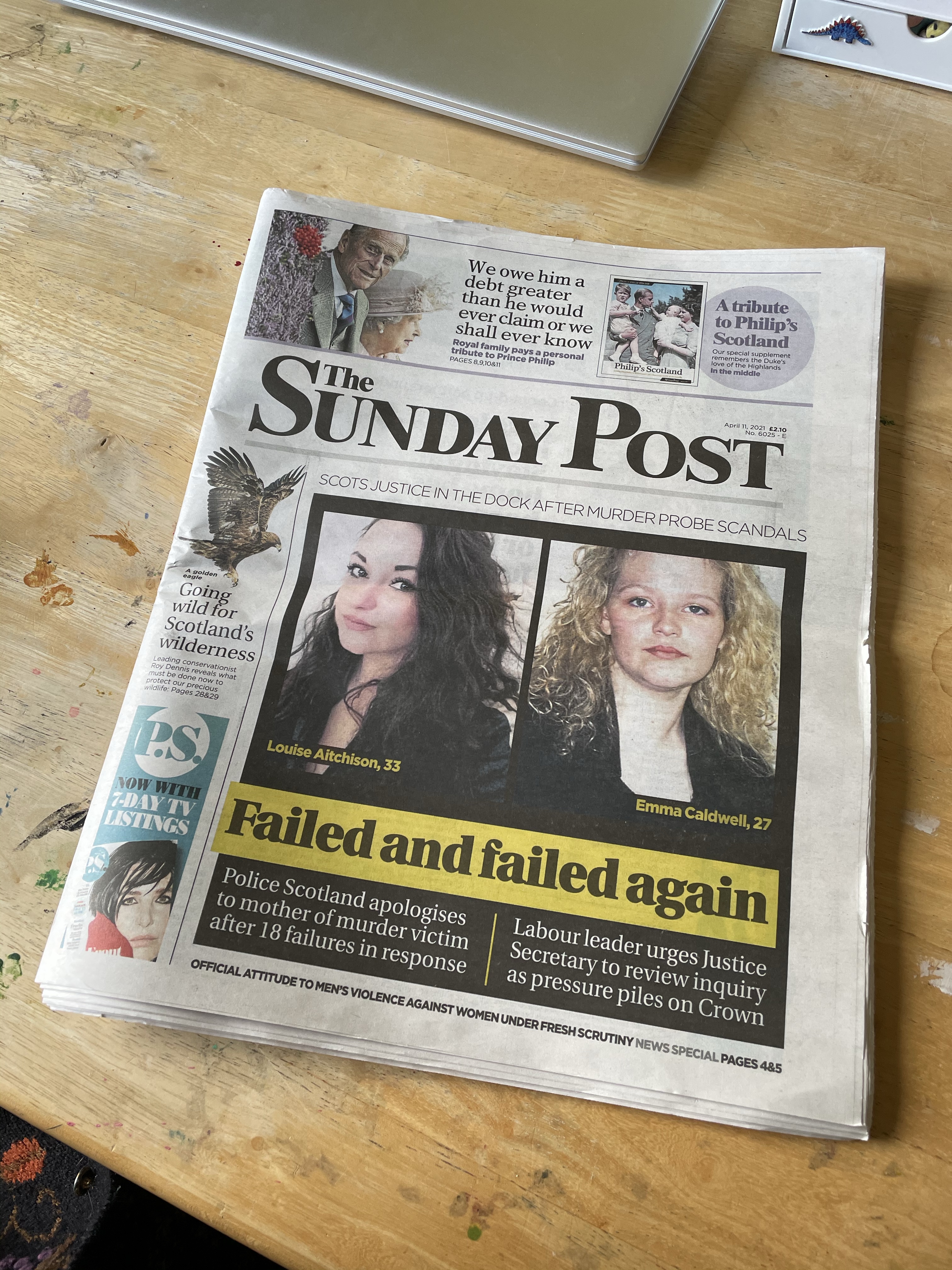
The newspaper I bought was the Sunday Post, which to my surprise was a Scottish newspaper rather than an English one. It was very large and featured several pull out segments – one about the recently deceased Prince Phillip, one about sports, and one that has previously won ‘supplement of the year’ called P.S. Magazine. I began by looking over the base newspaper, and didn’t find any illustrations there. I figured that was why I had to get one with a supplement, so that was where I looked next.. There were also no illustrations in there, and none in the other two pull outs either. The only illustrated content in the newspaper was the comic strips at the back, which I knew weren’t related to this exercise.
Frustrated, I vented in the OCA Visual Communications Discord server a little about wasting my time and money on this. I really wanted to use a real-life newspaper for this exercise as the experience is very different to online articles, and I was frustrated at not finding any usable material. I decided to continue my research online, as I can’t safely make it to a larger supermarket and I know from previous research tasks that there are plenty of available illustrations to be found in online articles. Students in the server recommended I look at The Guardian and The Observer, as well as the magazines Breathe and The Simple Things. I decided to start there, as several people agreed they had a range of illustrations to look at. I successfully found many articles with illustrations on the Guardian website. I went through them and picked 4 to analyse further, wanting to ensure I had variation in the type of article and in the type of illustration.

The first article is titled ‘Frontline workers trust the Guardian’s reporting on coronavirus more than any other UK print or online media outlet‘. The illustration accompanying it caught my eye immediately. This is a style I am very drawn to and appreciate very much. It shows images related to the pandemic, such as vaccine needles and the infamous COVID-19 virus illustration we have all become familiar with. It also shows healthcare workers front and centre, and as they are the topic of the article this makes sense. The simple red, white, and blue colour palette ties into the Union Jack colour palette (as no other UK based news reporting is as trustworthy) and also the NHS blue and white colours. It’s interesting to note that the healthcare worker in the centre of the image is posed similarly to the position the queen is often seen posed in, which invokes a narrative of healthcare workers as national heroes worthy of respect befitting royalty.
Technically, the illustration is a collage or photomontage. It is decorative and has a narrative to it, but is definitely open for interpretation. As most people would not analyse this illustration in-depth they probably wouldn’t recognise the subtle details within, however as mentioned before the colours and formatting make this piece eye catching, which I think is more important than a strong narrative in editorial illustration. It is abstract, and also representational of the world we are living in, and I think quite relatable to most of us even if we aren’t all healthcare providers. As an image, it is simple but powerful.

The second article I chose is titled ‘I’m bingeing on TikTok and cat videos: here’s my way back from the abyss’. At first, the illustration doesn’t seem hugely relevant to this title. It was a little confusing and I was unsure of how it related to the article. This was noticeably different to the previous illustration which was instantly recognisable and connected to the piece easily. The illustration here, however, refers to a specific quote within the article rather than providing a general sense of the piece. Author Romesh Ranganathan is proposing that after lockdown, we shut down all technology in order to force us back into reality. Upon reading that, I understood the meaning of the illustration and the ‘power off’ symbols.
This illustration is very metaphorical and conceptual, requiring further reading to contextualise it. It is a very simple decorative and representational illustration, using only a few colours in it’s palette. It’s interesting that without the text this illustration is kind of meaningless and totally open to personal interpretation, and it has clearly been inspired by the quoted line of text. The previous illustration, however, was so effective because of it’s ability to communicate so much without much further reading required.

The third illustration was another eye-catching piece for an article titled ‘I literally wrote the book on apocalypses. I never thought it would pan out like this.’ The illustration features text which connects directly to the piece, alongside colours that typically invoke horror and doom, signifying ‘end times’. The other people in the image are passing by and seem to not care about the text on the billboard, showing that they’re ‘half-assing’ the ‘end of the world’ as described in the article. The illustration is a direct commentary on the article itself and does a really good job of depicting the authors mental state, while the usage of motion blurring skilfully draws your eye right into the text in the centre.
This illustration is also decorative. I am unsure on whether it is metaphorical or not, but there is certainly a narrative within. It is representational of the feelings the writer is having and provides good commentary on the current state of the world. It is striking and eye catching, and is understandable without reading the text, however doing so enhances the illustration even further. In fact, the illustration does the same for the text, and the pairing of the two invokes a lot of emotion in one that would be missing without the other. Once again, this illustration uses a handful of colours and is relatively simple in it’s design.

My final illustration of choice was for an article titled ‘My daughter’s barbed comments hurt me. How should I respond?’. It is a simple but very clever illustration, which immediately catches the eye and requires very little thought to understand. I know that in media, especially in newspapers, ensuring that the reader can quickly digest and understand everything if needed is a primary goal. This illustration meets that criteria fantastically. It simply shows a person, presumably the daughter mentioned in the headline, with barbed wire forming a mouth, referencing the ‘barbed comments’ she has spoken. This alone is clear and effective, but looking a little deeper we can see that the girl has wide eyes – often a sign of fear – and quoted text below the illustration says ‘maybe something is still unresolved for your daughter’.
This illustration is conceptual and somewhat abstract, metaphorical in that it shows literal barbed wire for a mouth, but also forms a clear narrative alongside the text while being representational of feelings and real life situations. It is eye catching and striking, and very effective. Like all the other illustrations I have looked at, it only features a few colours. You could say in fact that it only features one colour, plus black and white. Personally I’m not a fan of the deep blue used here, but I can see how it extends the ‘fear’ narrative, maybe implying the girl is depressed.
After spending time analysing these pieces deeper I had a really good idea of what was required from an editorial illustration, at least those used at the Guardian. The clearest and most obvious thing was the colour palette: it had to be very simple. The illustrations themselves also required simplicity, things that are easy to understand and digest without needing to spend too much time dissecting them. All illustrations related to either a specific quote or the headline itself, and they were all contextualised easily by the text they were paired with. This means the illustrations can be abstract or seemingly irrelevant, provided they fit the wider narrative of the article. I didn’t come across any diagrammatic or informational illustrations, though I did try to find them, as the illustrations in the Guardian seem to mostly be representational and decorative.
With all of this in mind, I moved on to the next step in the exercise. I had been asked to imagine that I was commissioned to create an illustration for the same paper – in this case the Guardian. The brief provided a list of headlines, and I had to provide a visual interpretation of one of them. My interpretation could be as personal or as open as I wanted. I was advised to find some text that suits the heading, then go through a process of breaking it down and developing ideas. Finally, I had to turn my ideas into a completed illustration, ensuring I provided client visuals along the way.
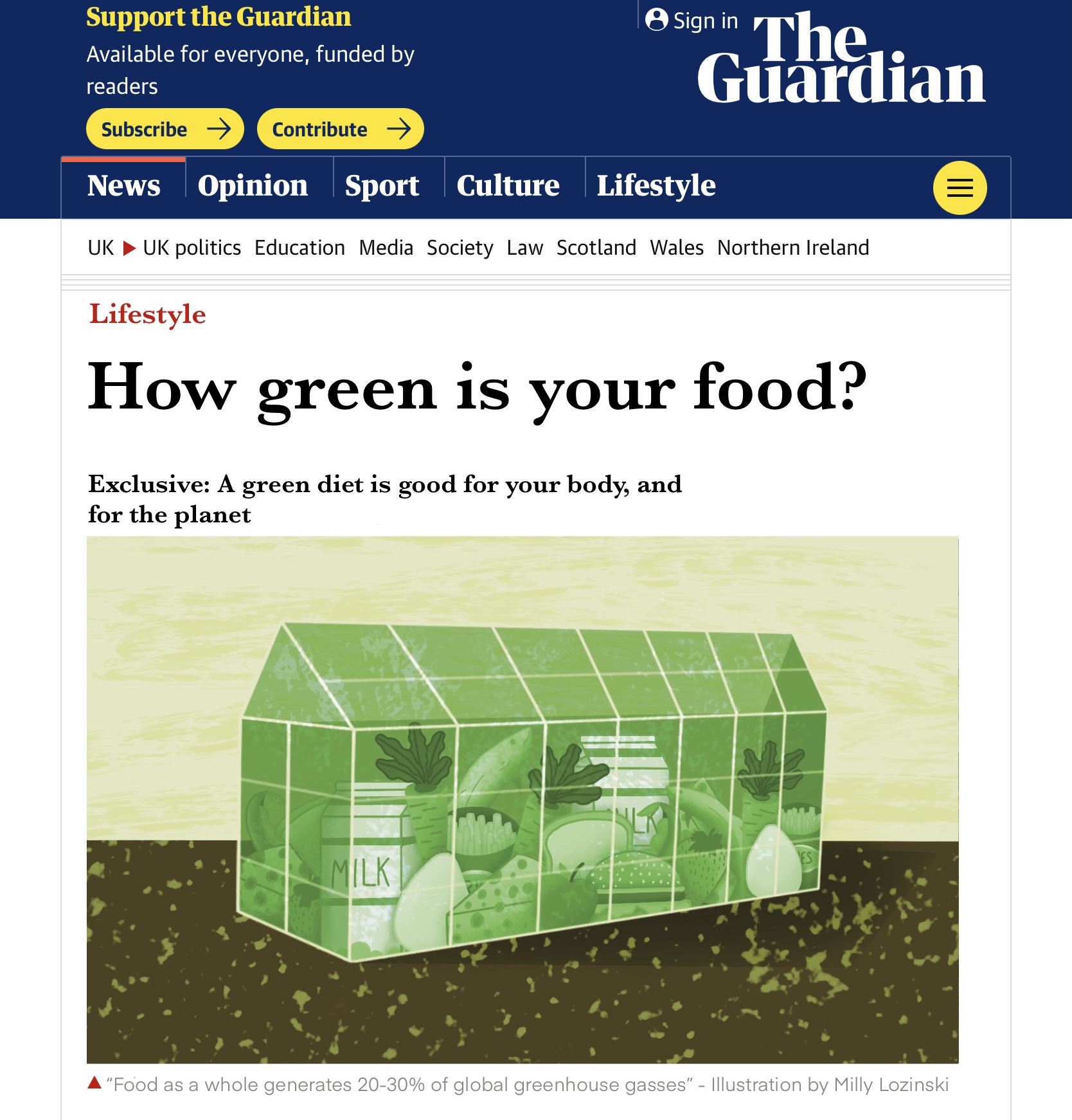
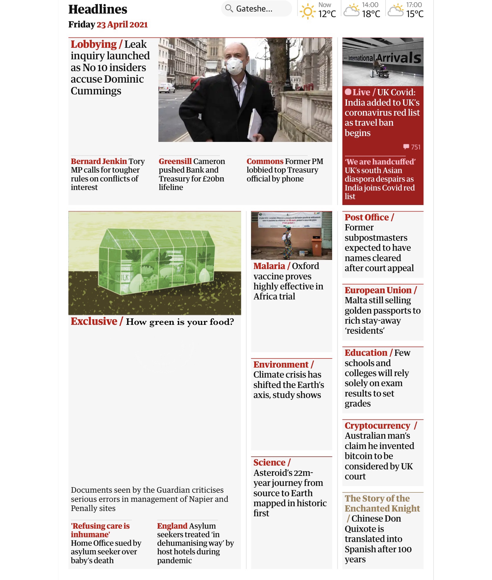
I decided to choose the heading ‘How green is your food?’ as it felt like a fun option I could easily come up with ideas for. I started searching for pre-existing text that fit this headline. I found 4 articles; one from BBC Good Food, one from One Meal a Day, one from Fork in the Road, and one from Greeneatz. The article from One Meal a Day wasn’t that useful and was more focused on an application that the company has developed that can be used to see your personal environmental impac. The Fork in the Road article was okay, but didn’t focus much on ‘How green is your food’ and seemed more like ‘How to make your food more green’. It seemed focused on people who were already conscious of their food being ethically sourced, and I felt this wasn’t appropriate for the heading I had picked.
The article on Greeneatz already featured an illustration, which put me off using the text as I didn’t want my ideas to be misguided by the pre-existing imagery. This meant that the BBC Good Food article was the best choice to take forward. It’s a how-to article aimed at total beginners and people who don’t already know the answer to the question ‘How green is your food?’. I feel like the article could easily have this headline instead of the actual title, ‘What does a green diet look like?’. I read over the article a few times, trying to make sense of it and figure out what it’s key points were. I then went back over it and noted down sentences or snippets of text that I felt were important or extremely relevant to the overall message of the text.
As the illustrations in the guardian were accompanied by quotes that they often directly related to, I wanted to work backwards and hopefully achieve the same thing. Alongside the heading ‘How green is your food?’ some quotes I picked out are:
- ‘Green eating isn’t just about following a healthy diet today – but ensuring that our children and grandchildren can eat nutritious food too’
- ‘Food as a whole generates 20-30 percent of global greenhouse gases’
- ‘Value your food. Ask about where it comes from and how it is produced. Don’t waste it’
- ‘If we cut down on animal products, upped out fruit and veg intake, and ate more cereals, we could make greenhouse gas reductions of around 40 percent’
- ‘A healthier you and a happier planet means the green diet may be the only diet we’ll ever need’
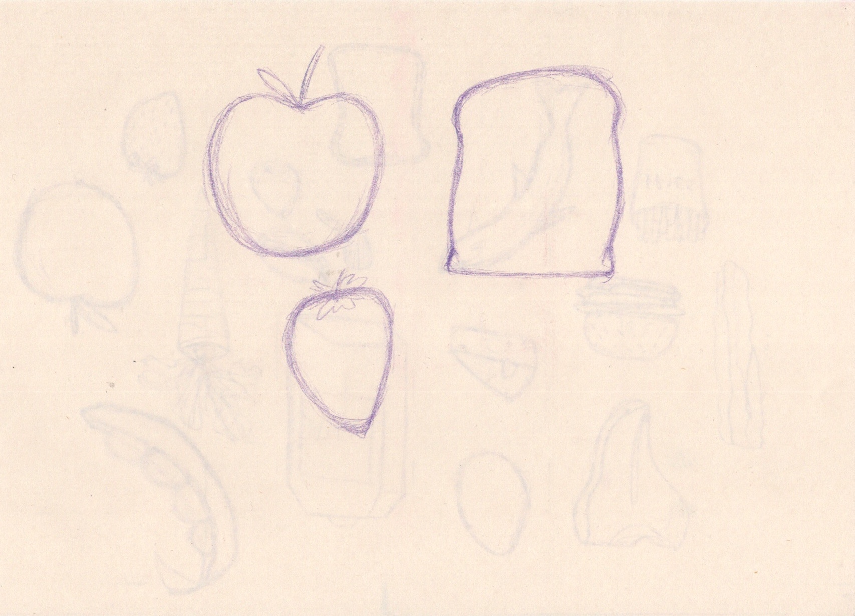
The article has an emphasis on the ‘green diet’ not being a ‘fad diet’, and how it is necessary for the wellbeing of the planet alongside having health benefits. It repeatedly discusses cutting down on meat and dairy, plus drinking more water. I noted down that the article mentions replacing beef with pork, which sparked my first illustration idea, a play off of Dr Seuss’s famous book ‘Green Eggs and Ham’. I then got some scrap sketchbook paper and began roughly mapping out this idea, as well as other ideas I was having. I kept referencing my notes and quotes I had selected and came up with a range of concepts I could develop.

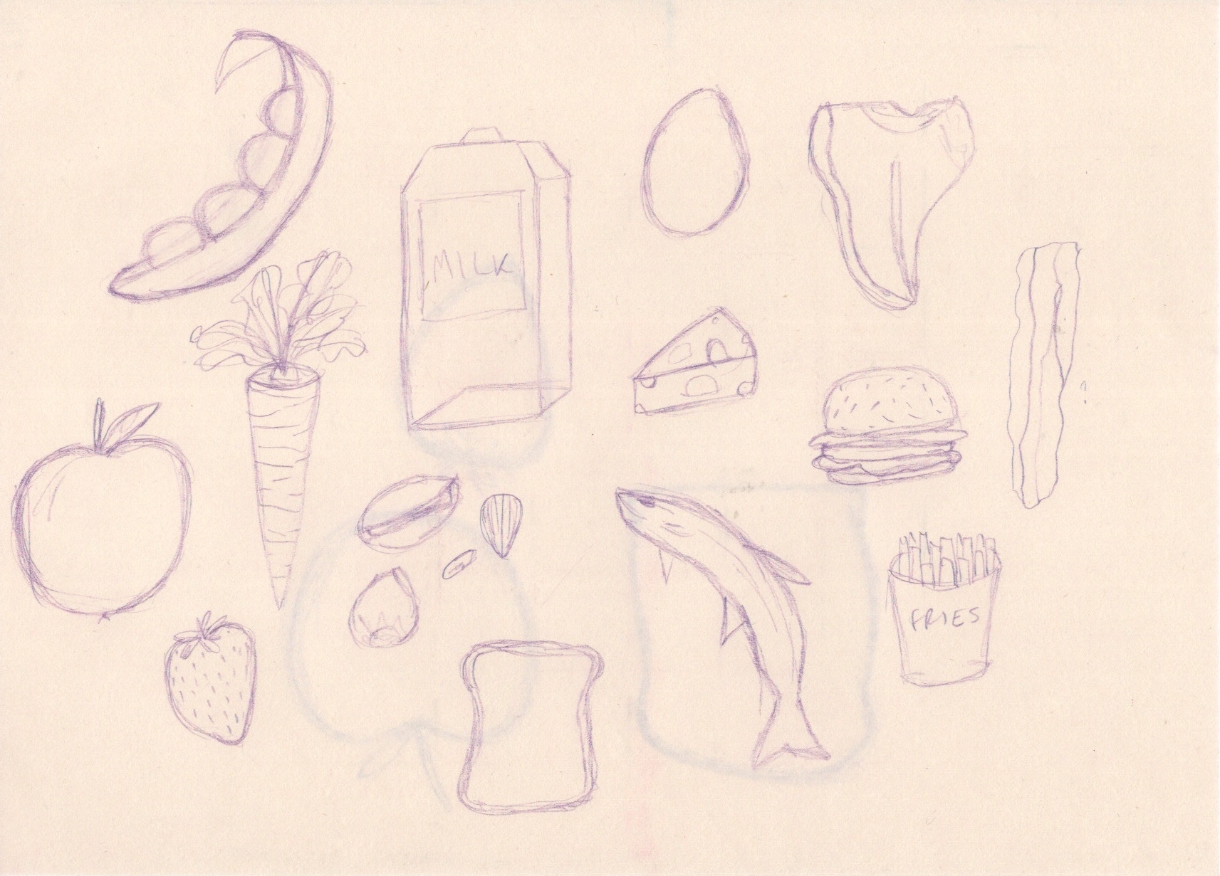
My initial ideas ranged from the earth with a measuring tape around it, to a cow with an ‘X’ through it and a pig with a tick. My favourite idea, however, was barely explored at this point and simply said ‘greenhouse full of food?’. I decided to explore it on a larger format and see how I could develop it further. I drew out the rough shape of a greenhouse alongside the quote ‘food as a whole generates 20-30% of global greenhouse gases’. This would be my focus for this idea. I then started noting down things I could include within the greenhouse, and also went back through the article again and listed down any mentions of food that I could include. I noted down some other thoughts I was having regarding colour palettes, background, and the size I would be working at.

I had a few different ideas for how to approach the colours in this illustration, and I decided the best way to figure it out would be to experiment. I decided to begin on the line drawing and work it out as I went along. I opened up a Procreate canvas the same size as the Guardian images and began drawing out the greenhouse structure, using references from Google to ensure my foreshortening was accurate. I then marked out the two background ideas I had to revisit later. At this point I also picked a narrow colour palette featuring two colours, a cream shade and an earthy green shade. I intended to only use these two colours, and shades/tones of each. This is a similar approach to the one I took in the OCA Discord Server 3-Colour Art Challenge.
Before drawing the elements in Procreate I wanted to get a feel for the items and narrow down my list a little, so I did some rough sketches on scrap paper. I then opened a new square canvas to begin drawing my food elements on. Initially I did this from memory, with the occasional help from references pulled from Google images, which was easy enough with a lot of simple solid lines. When moving on to the more rounded and complex shapes, however, I began to struggle. I scanned in my sketches from earlier and used them as a base for the final elements. I was really happy with all of the elements and how they ended up looking individually, as well as together.
Once all elements were drawn I saved them as PNGs with no background and opened them in my original canvas. I then began filling the greenhouse. This proved difficult as there were many overlapping lines and I found that everything sort of began to blur into one. I added some solid colour to each element so they would be easier to position, and I intentionally chose to add ‘random’ colours that had no correlation to the actual colouring of the items, as I didn’t want to be caught up in this later. Once I was happy with where everything was positioned, I duplicated the canvas to ensure everything would stay safe just in case, and I began my colour experiments. I blocked in rough realistic colours for each element, then I filled the greenhouse in green. I played with the blending modes a little to see how the green would interact, and I wasn’t too happy with the overall effect.

I thought this worked as a good client visual, but it wouldn’t be how I would achieve the final image. Back in Assignment 4 using an orange ‘filter’ layer was perfect, but here I would need to actually focus on the tones of each individual item, and turn them green. I was a little overwhelmed by the thought of this, but I got going anyway. I also re-did most of the lineart as the change in size between canvases had distorted it somewhat. I blocked in colours using shades of the same green throughout, and changed the lineart to match. I then edited the greenhouse similarly, changing the lineart to be the lighter cream colours and filling in the glass to be green. I erased the overlay of the green from most of the elements as I felt it was a bit too much, however I left it at the front to show that it was a seperate pane of glass.
I planned at this point to go back and add detail and texture to each individual element. I began by adding shading and highlights in places that needed it using my favourite textured shading brush. I then added texture to the two background options and took a step back from the piece to try to figure out which I preferred. I also asked a few people for their thoughts, which helped me narrow it down. Initially I preferred the circular design, but someone pointed out that it reminded them of the moon which they felt had no relevance to the piece. I agreed, and also felt the depth added in the ‘horizon’ background makes a huge difference.
When I came back to the piece the next day intending to add texture and detail to the elements, I realised there was no need. I was aiming for a simple design, and I had achieved that – the extra detail and texturing would just be overkill. I added some texture to the greenhouse in an attempt to make it look more like glass, and a touch of shading to the background to stop it from looking too floaty. I was super impressed with how the whole piece came together and how well I fulfilled all the goals I set out to achieve.

I really wanted to see my work in context, so I took a few screenshots of the Guardian website and edited it in, adding the relevant text too. Unfortunately I can’t access the official Guardian font, so it does look a bit weird, but it still helps bring the illustration to life. I feel like it genuinely looks like a piece I could see on their website! After posting the below images to the OCA Discord Server a fellow student mentioned a Google Chrome extension called ‘X-Ray goggles’ which allows you to directly edit the coding of a webpage and add your own images and text to it. In future I may explore this option when creating mockups!
I loved this exercise and felt really capable of following this process. It has shown me how well I can dissect a brief and understand the meaning of a text, as well as how I can use research to further my illustrations. I am so happy with my final illustration!
