This exercise focused on exploring typography and the various ways you can use visual language to communicate meaning behind words. I was looking forward to it, as typography is something I have been interested in since I was a kid. Whenever I had the opportunity I loved to spend time creating elaborate letters, making my own fonts, or looking at pre-existing typography.
Part of what drew me to a Visual Communications degree is the ability to explore this further, from both an illustrative and graphic design point of view. I was also really looking forward to letting go a bit, getting experimental and messy in my process. Most of the exercises I have been doing lately have required more of a professional and sophisticated approach. I saw this as a chance to really truly break free from that and see what I could create in the process.
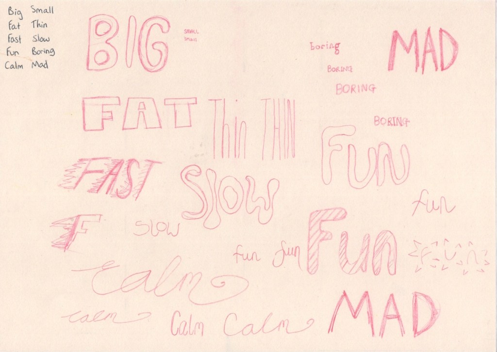
The first step in the exercise was to take 5 pairs of words and write them all in my regular handwriting. I then had to write each pair in a way that’s descriptive, using the shape and size of the word as well as the positioning of the letters, to express the meaning of it. This was a pretty easy and relatively enjoyable exercise to complete. The first two words I simply wrote out once, but as I got into the swing of things I started exploring multiple options for several words, writing them out repeatedly.
Then I was asked to use computer software to pick out fonts that suit each word, reflecting the qualities I was trying to express in my own drawings. I used Procreate for this, typing out each word then scrolling through the library of fonts, stopping when I felt one was suitable. I picked out a range of different fonts for each word and saved them as individual images. My font library on Procreate contains the basic Apple font families, plus multiple free fonts I have downloaded for using in projects throughout this course.
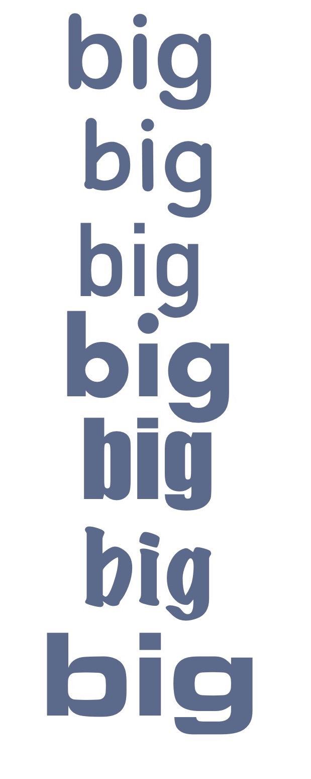
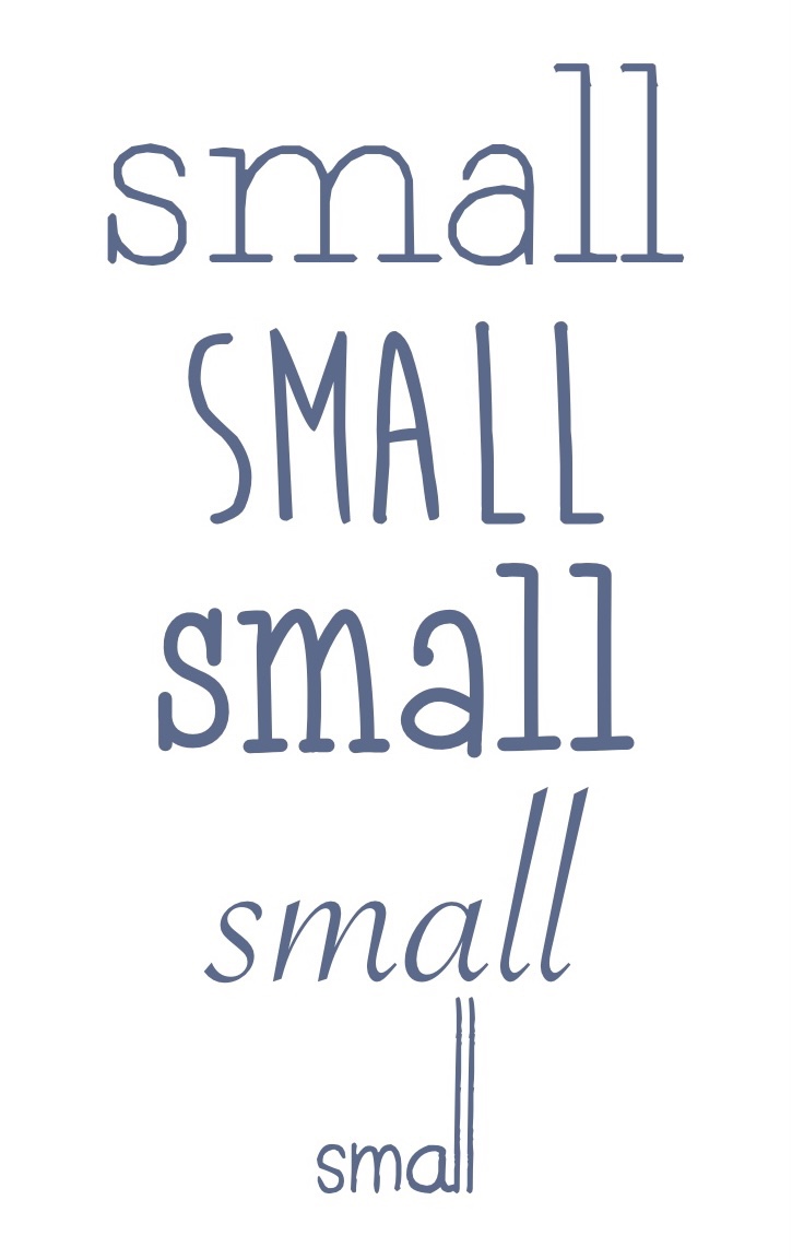
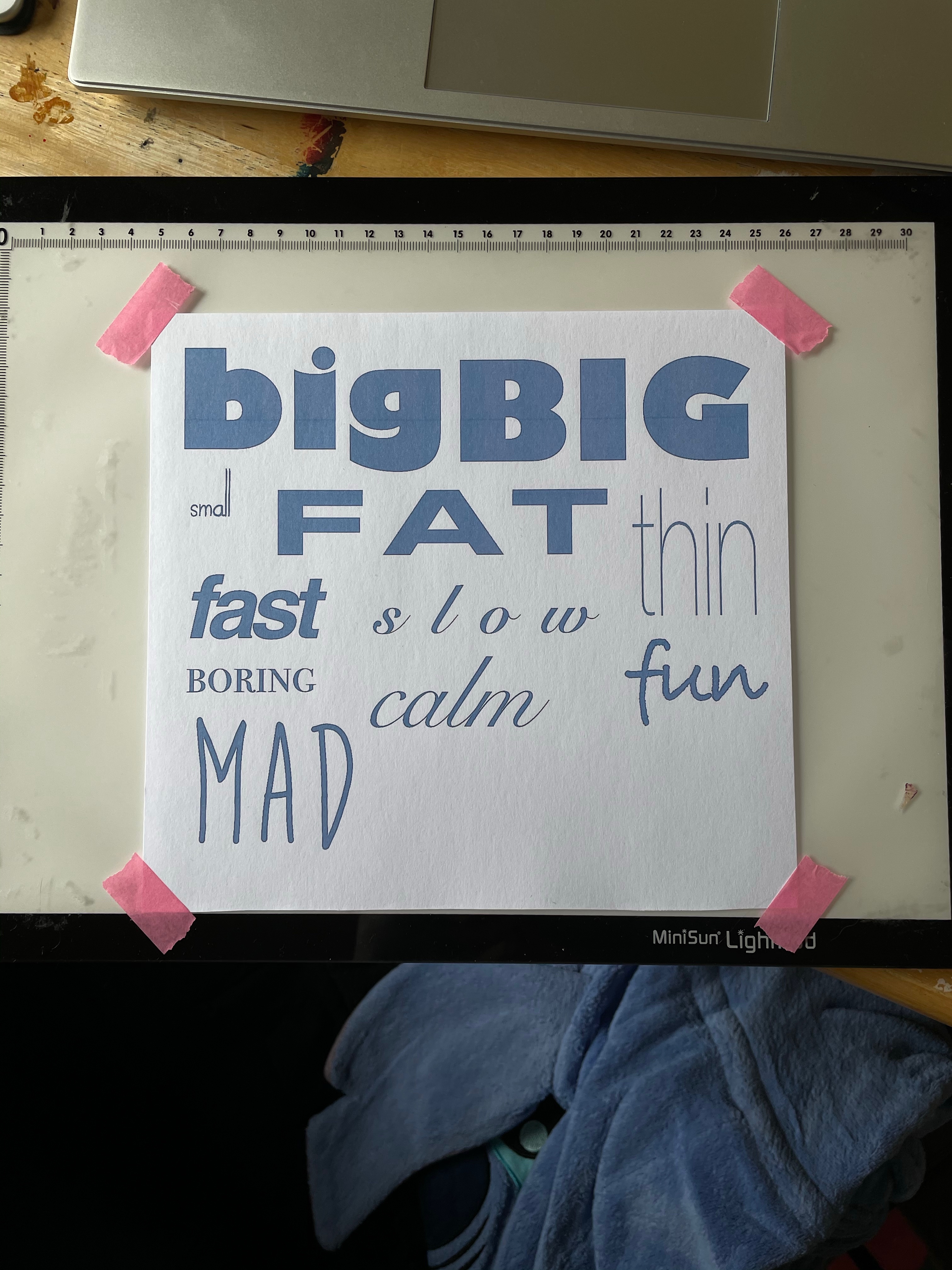
I then went through all of the images and selected one font for each word that I felt fitted it the best. I organised them on the canvas and took the opportunity to play around with the settings a little, ensuring I really captured the ideas I was trying to in my own drawings. The fonts I used are:
- Big: Gill Sans Ultra Bold
- Small: Today is the Oldest and Youngest You Will Ever Be
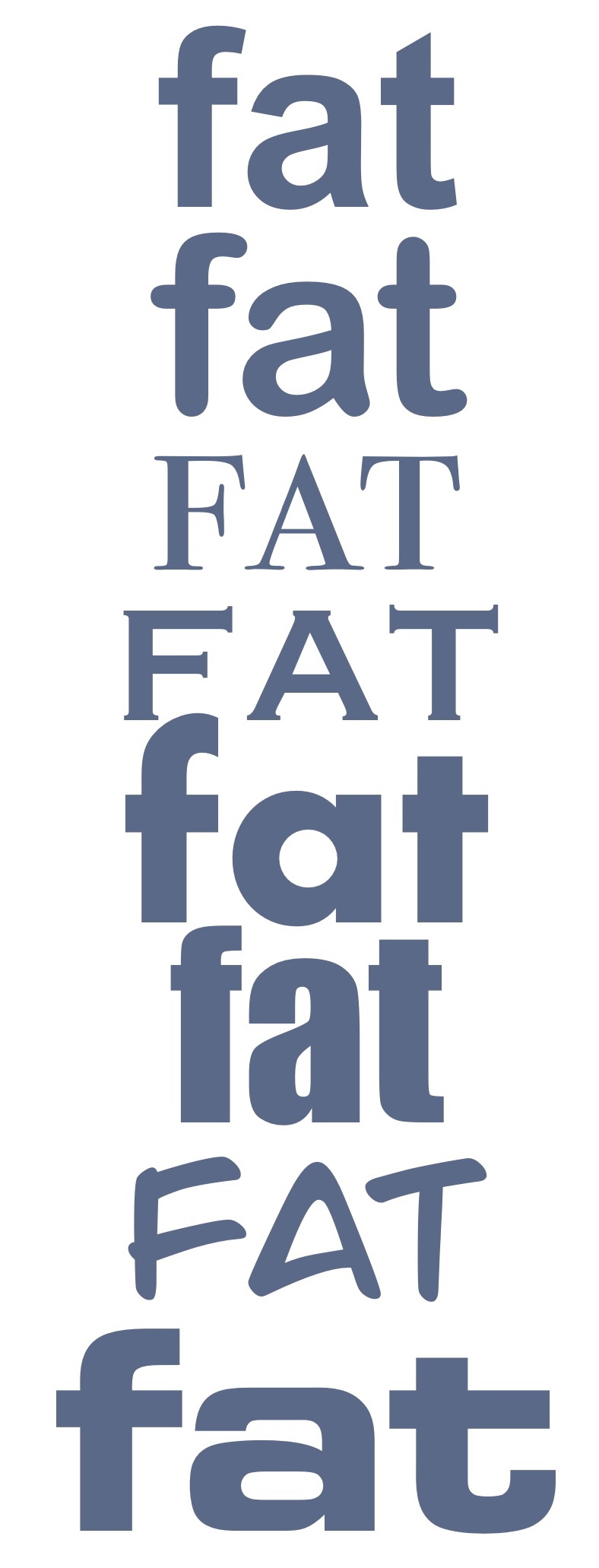
- Fat: OPTIEdgar
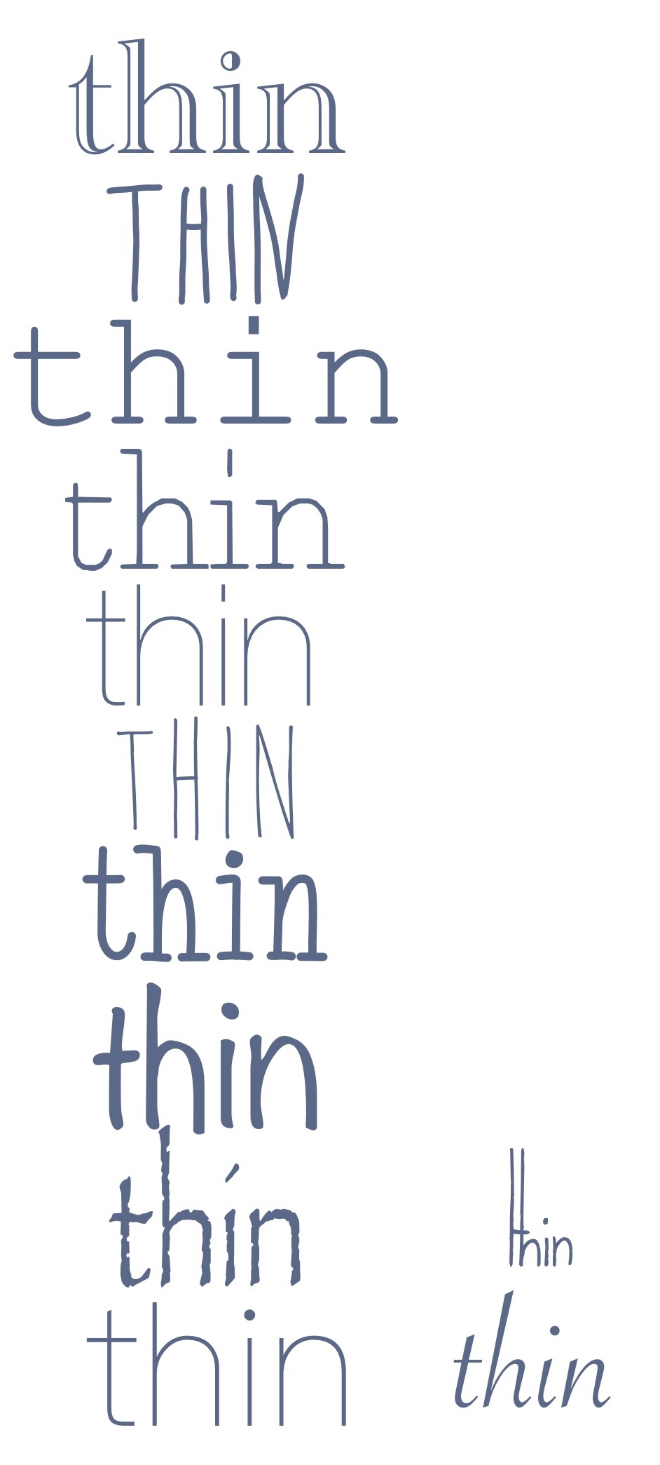
- Thin: Avenir Next Ultra Light
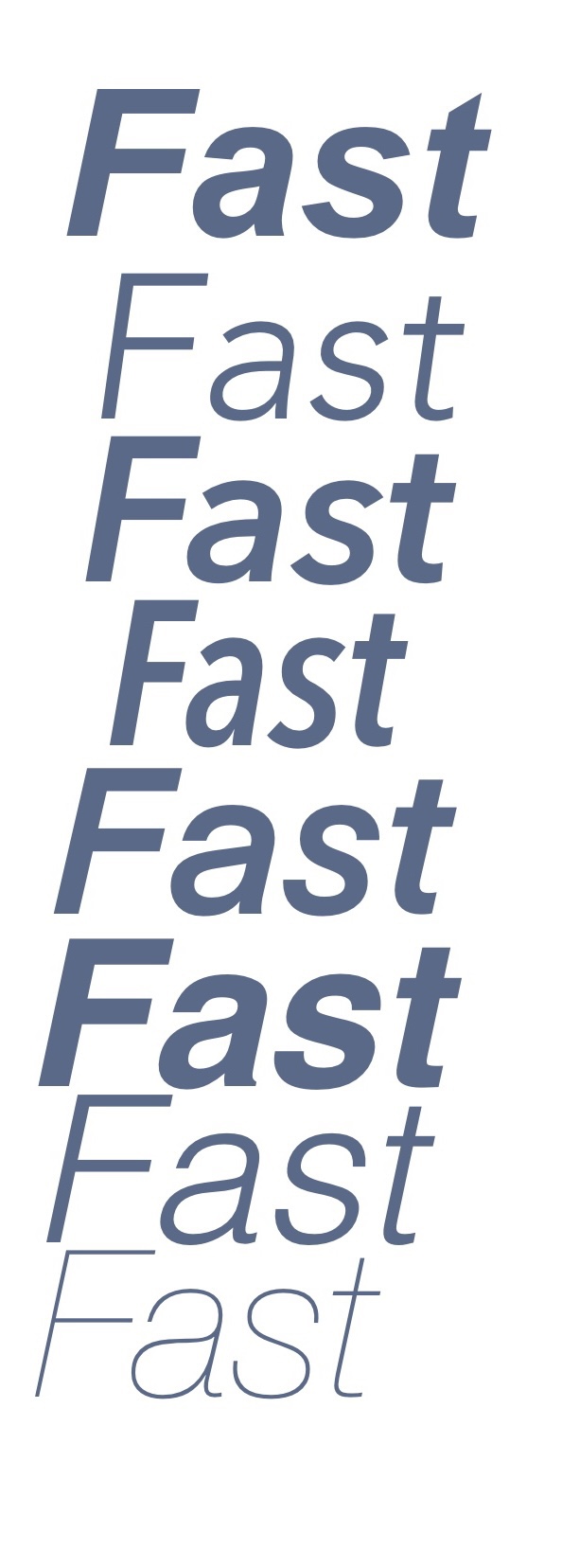
- Fast: Helvetica Bold Oblique
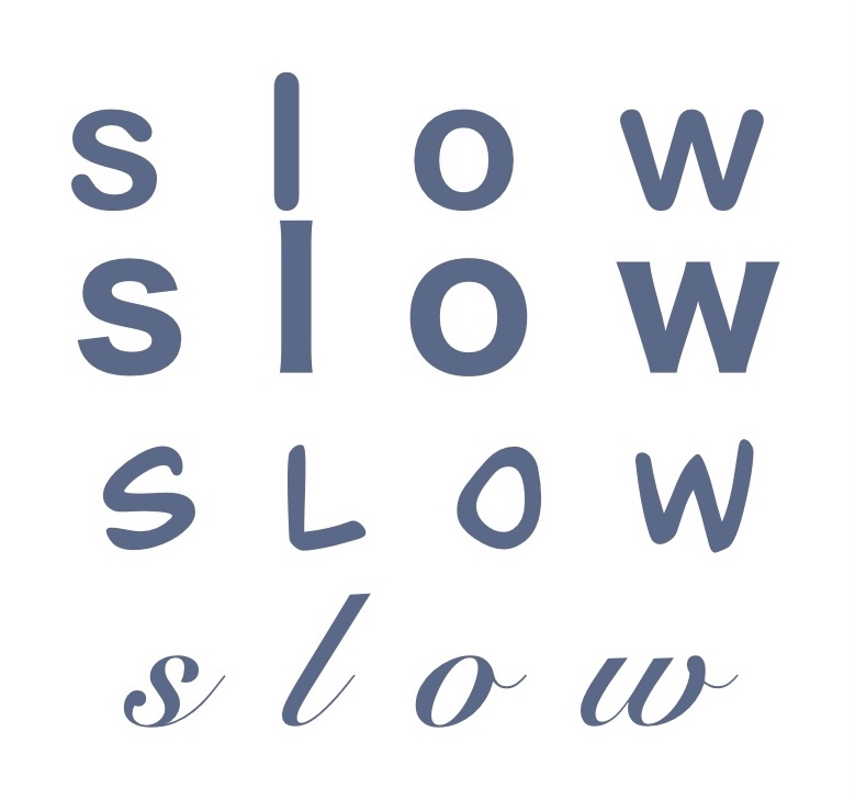
- Slow: Snell Roundhand
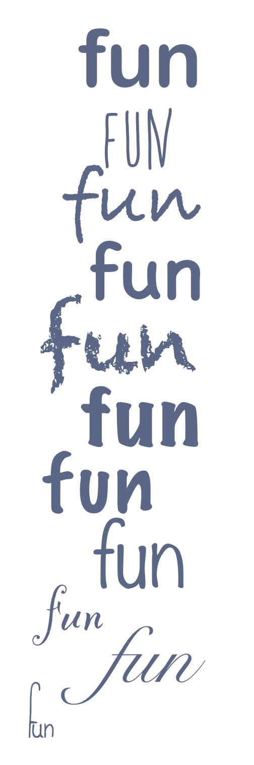
- Fun: Bradley Hand
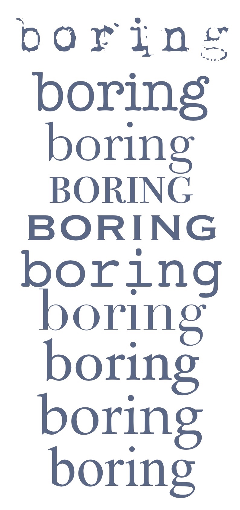
- Boring: Bodoni 72 Smallcaps
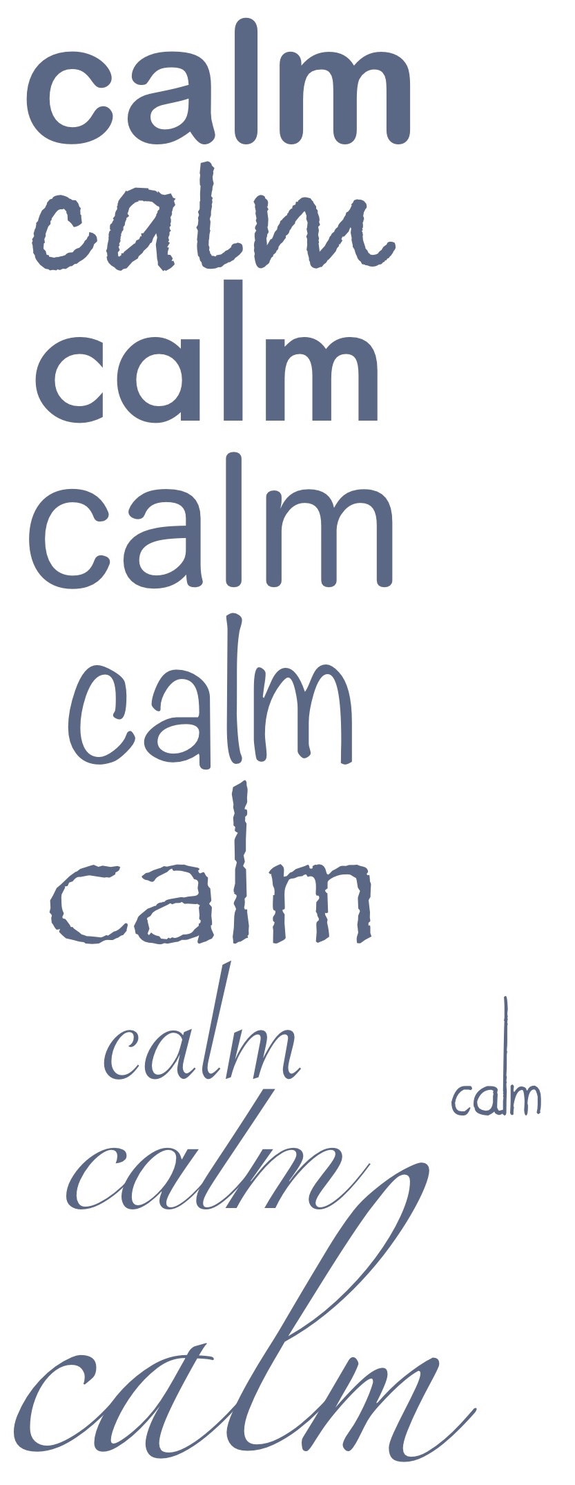
- Calm: Snell Roundhand
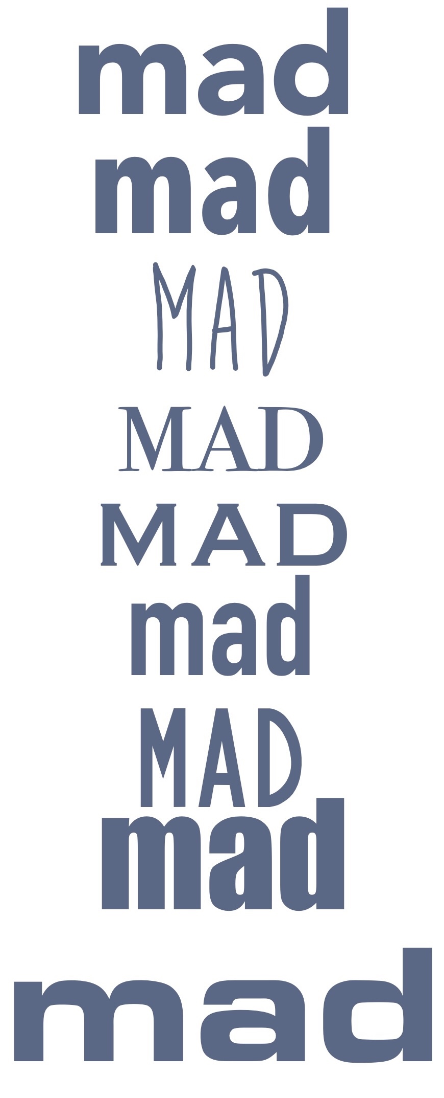
- Mad: Bite the Bullet
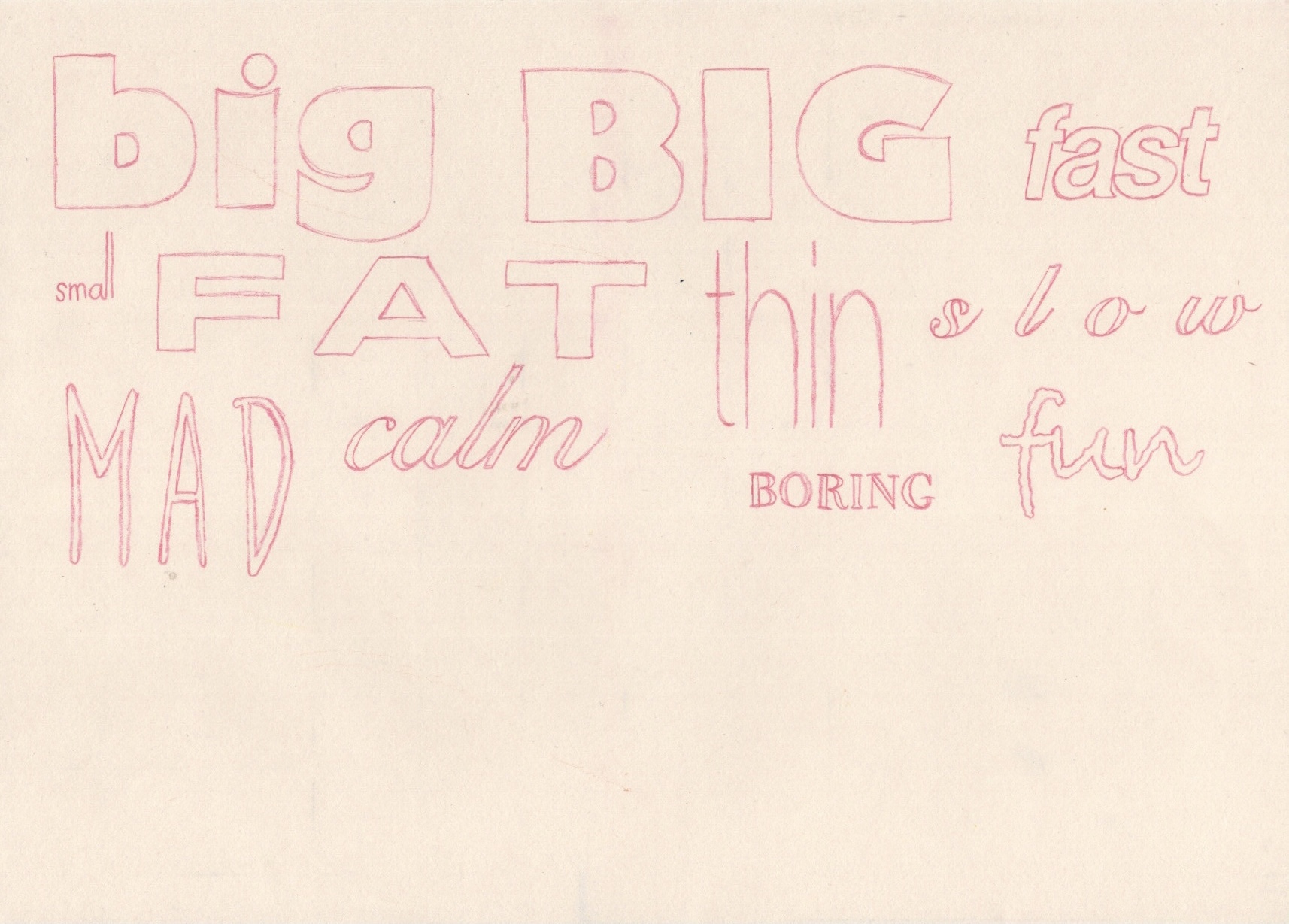
I then printed off the sheet of fonts and used a lightbox to trace them onto sketchbook paper. This was naturally quite a simple step, but it’s always very helpful to do as it helps you get a feel for each of the letters and how to draw the shapes. Comparing the traced fonts with my original drawings is very interesting, as neither seems ‘better’ than the other. The process of choosing the fonts was quite rigid, and sometimes I felt none of them really captured the essence of the word, whereas drawing without limitations creates a much freer text-designing process. Some fonts, however, represented the meaning of the words better than my hand drawn creations.
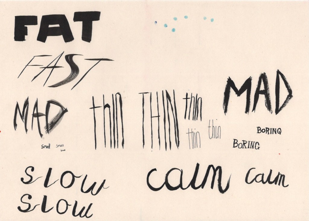
The exercise then prompted me to explore media qualities, colours, textures, and line variation that could communicate the meaning of each word. I began by using some black india ink – keeping it neutral so as to explore only the medium and line making tools. I took a medium sized flat square paint brush, as I thought this would be perfect for the word ‘Fat’, and I started painting. I then realised this brush could be used to make extremely thin lines too, and so I continued experimenting with how this brush could be used. I then chose a small fine round brush and did the same with that. Once I got onto the calligraphy, I remembered I have an ink based brush calligraphy pen, too, so I gave that a shot.
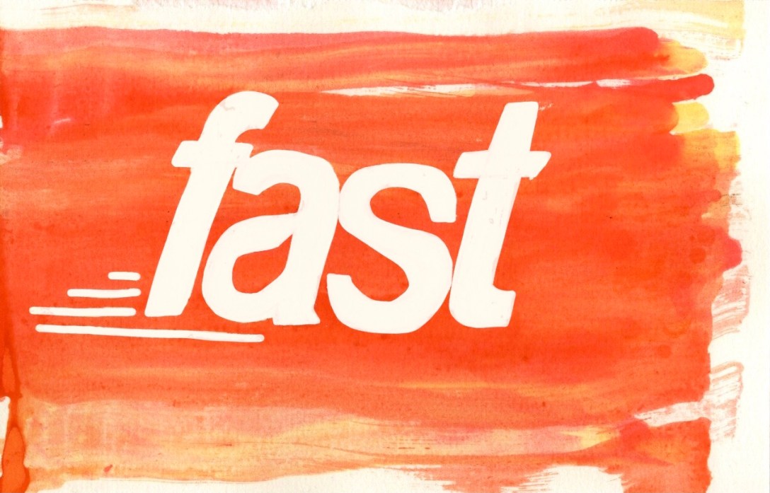
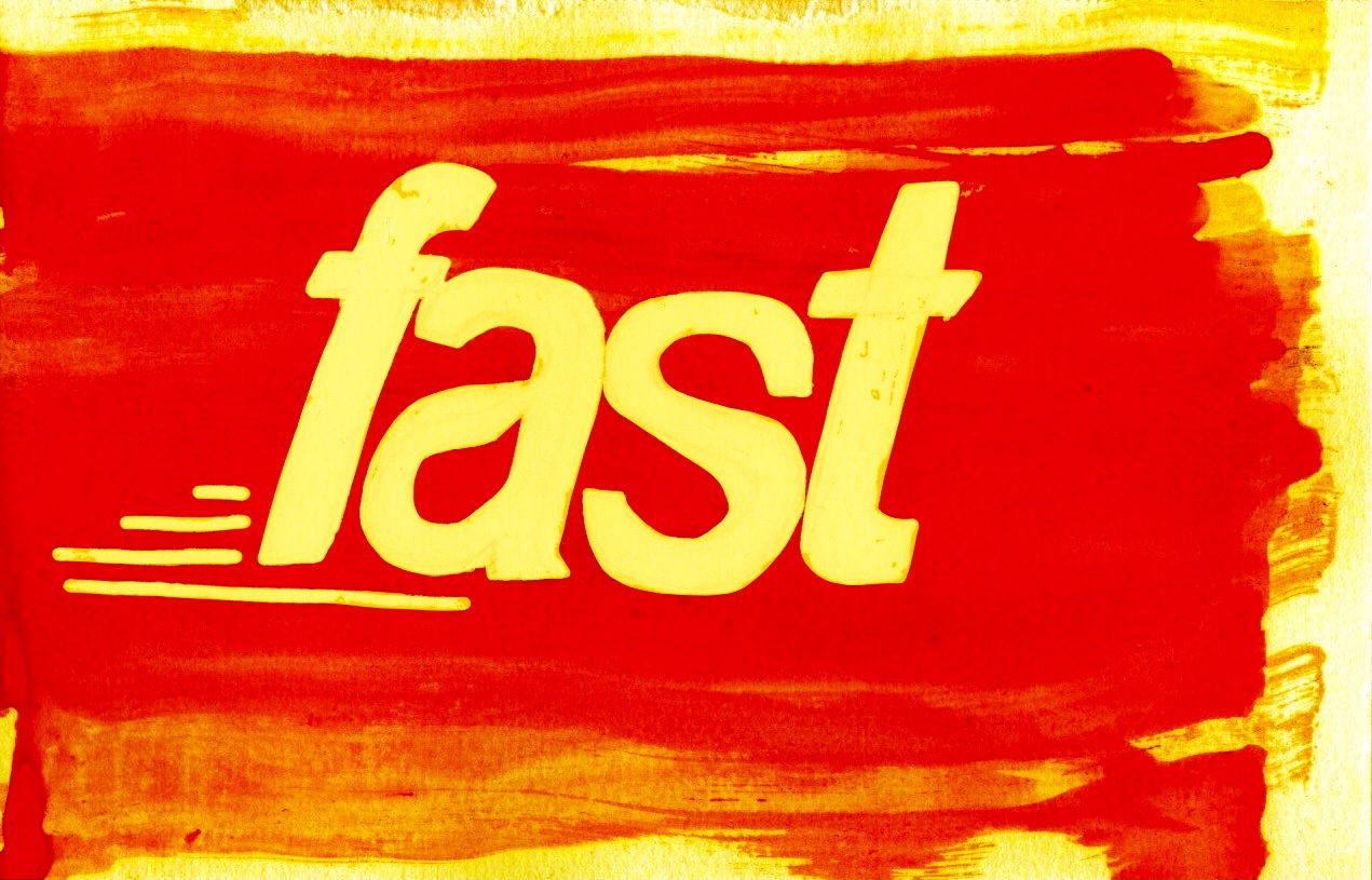
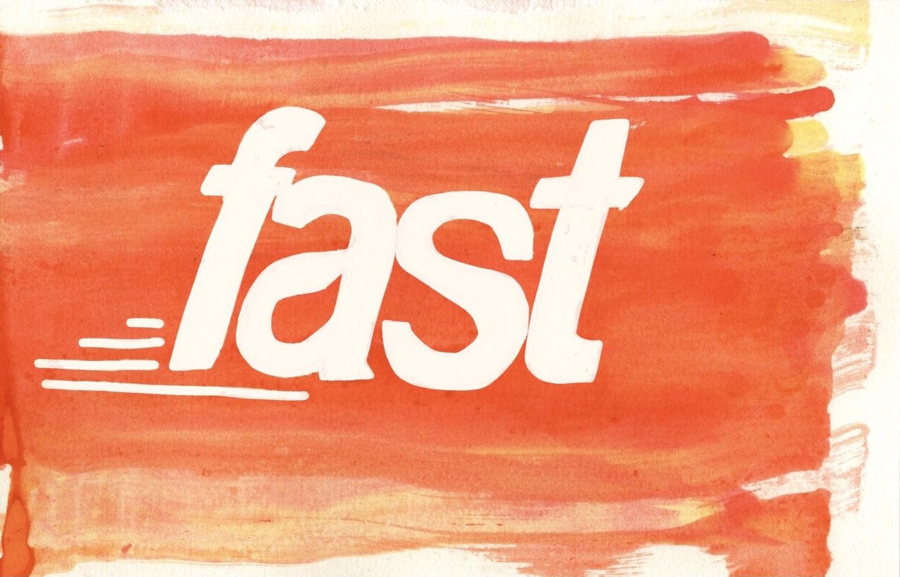
Whilst using the ink, I was drawn to the fluidity of it and felt it very much represented the word ‘fast’. I suddenly had an idea – I could use a masking fluid marker to draw out the word ‘fast’, then I could drag ink across the page to give a sense of motion, and then when I remove the masking fluid the word will be left behind. I tested this out a couple times, and then began ‘properly’ drawing it. I referenced the font I picked as I felt it was very suitable, plus it’s quite hard to draw italics without a reference. Once I sketched it out, I filled in the letters with masking fluid as well as adding some details around the word. Using an eyedropper, I dropped shades of yellow and red ink onto the left hand side of the paper, then used a folded piece of cardboard to drag the ink across the page.
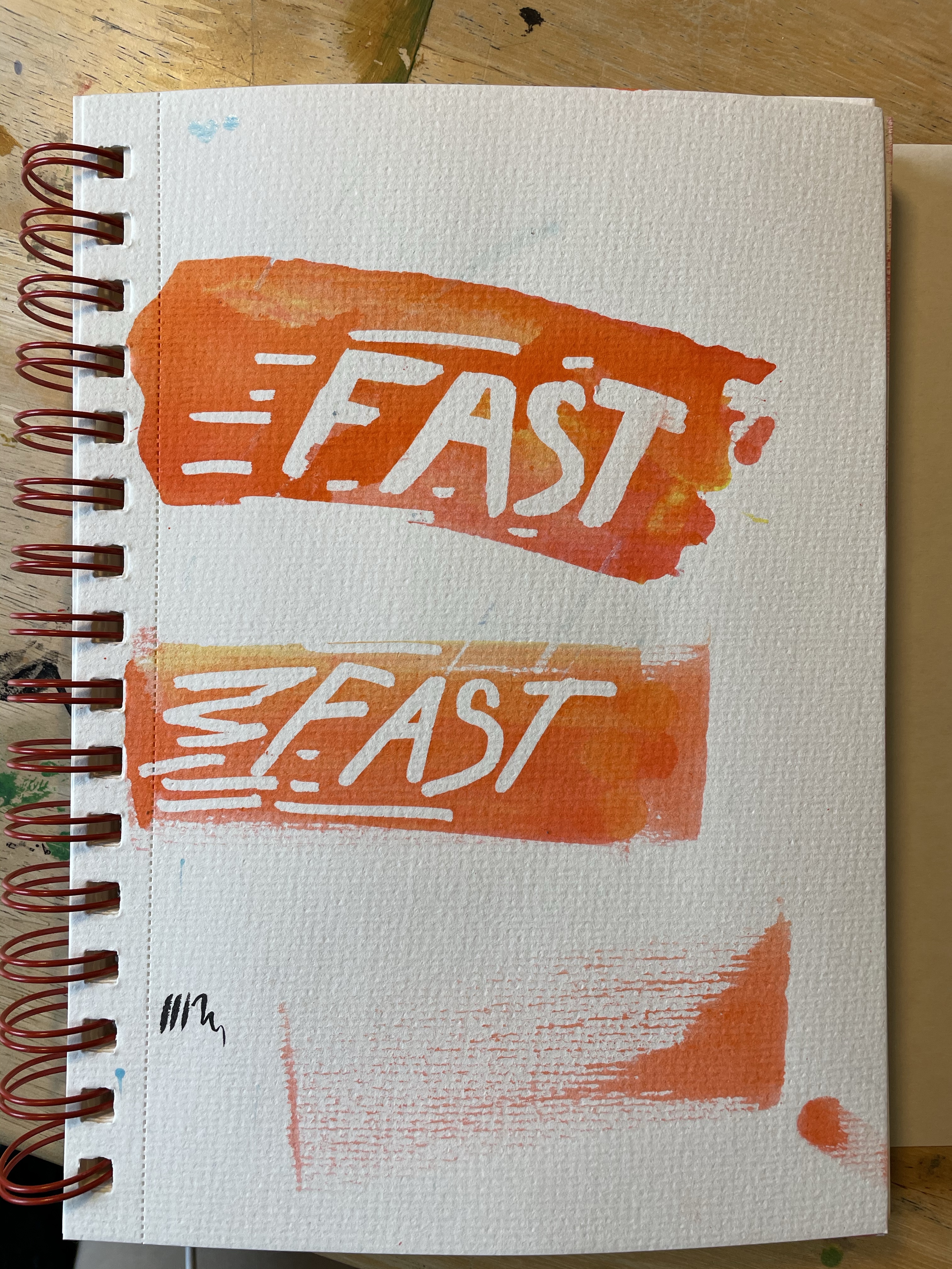
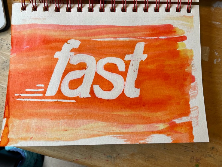
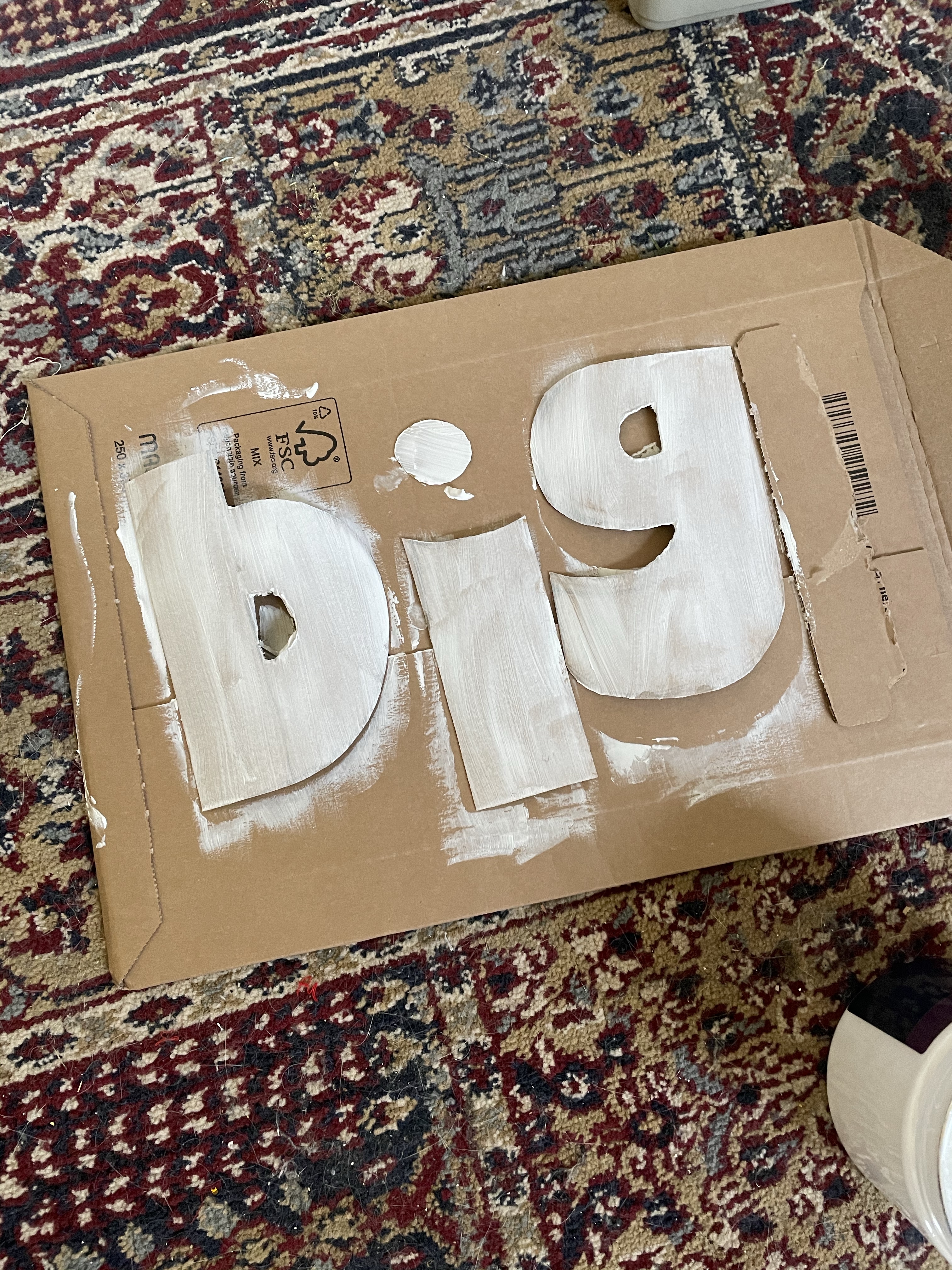
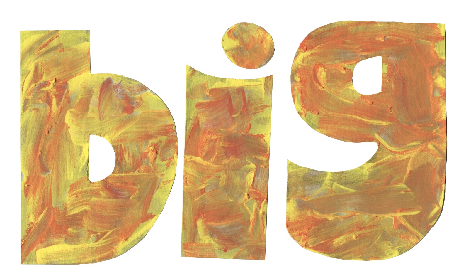
I was intentionally messy and rushed whilst doing this to try and increase the depth and feeling of ‘speed’ in the illustration. Once the ink had dried I removed the masking fluid to see the word revealed. I was impressed with the result. There were a few imperfections which I figured I could later clear up in Procreate. Having found this process incredibly fun, I looked at my other words and wondered what I could do with them. One concept I kept being drawn to was that the word ‘big’ was associated in my mind with primary school displays. I could imagine it being cut out of sugar paper in oversized rounded letters and stuck to the wall for all the children to see. Even better, the kids could even create their own giant letters!
The word and presentation of it in both the fonts and my own drawings just felt very childlike. I decided to explore this concept further and see what would become of it. I began by drawing out the letters on some carboard at a pretty large size, using the lower-case font I chose as a reference. I then cut out the individual letters and set them out on another piece of cardboard ready to be messily painted. I began by painting them with some white acrylic gesso to form a base layer. Whilst it was still wet, I pulled out some poster paints I had lying around and started pouring them on. I only had three colours – yellow, orange, and red, so I couldn’t exactly explore other colour options here, but it was pretty convenient as I’m not sure what other colours would suit the word.
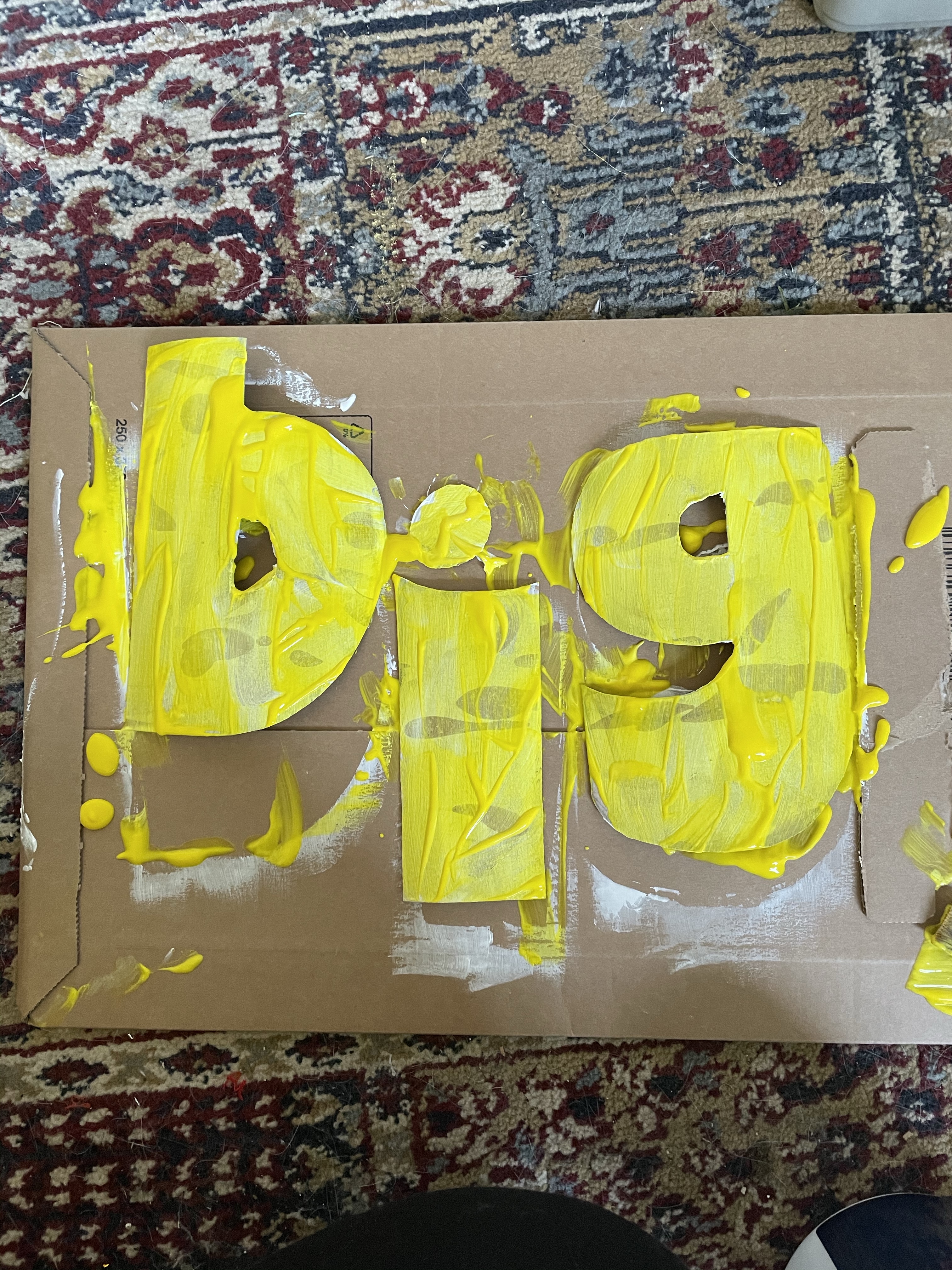
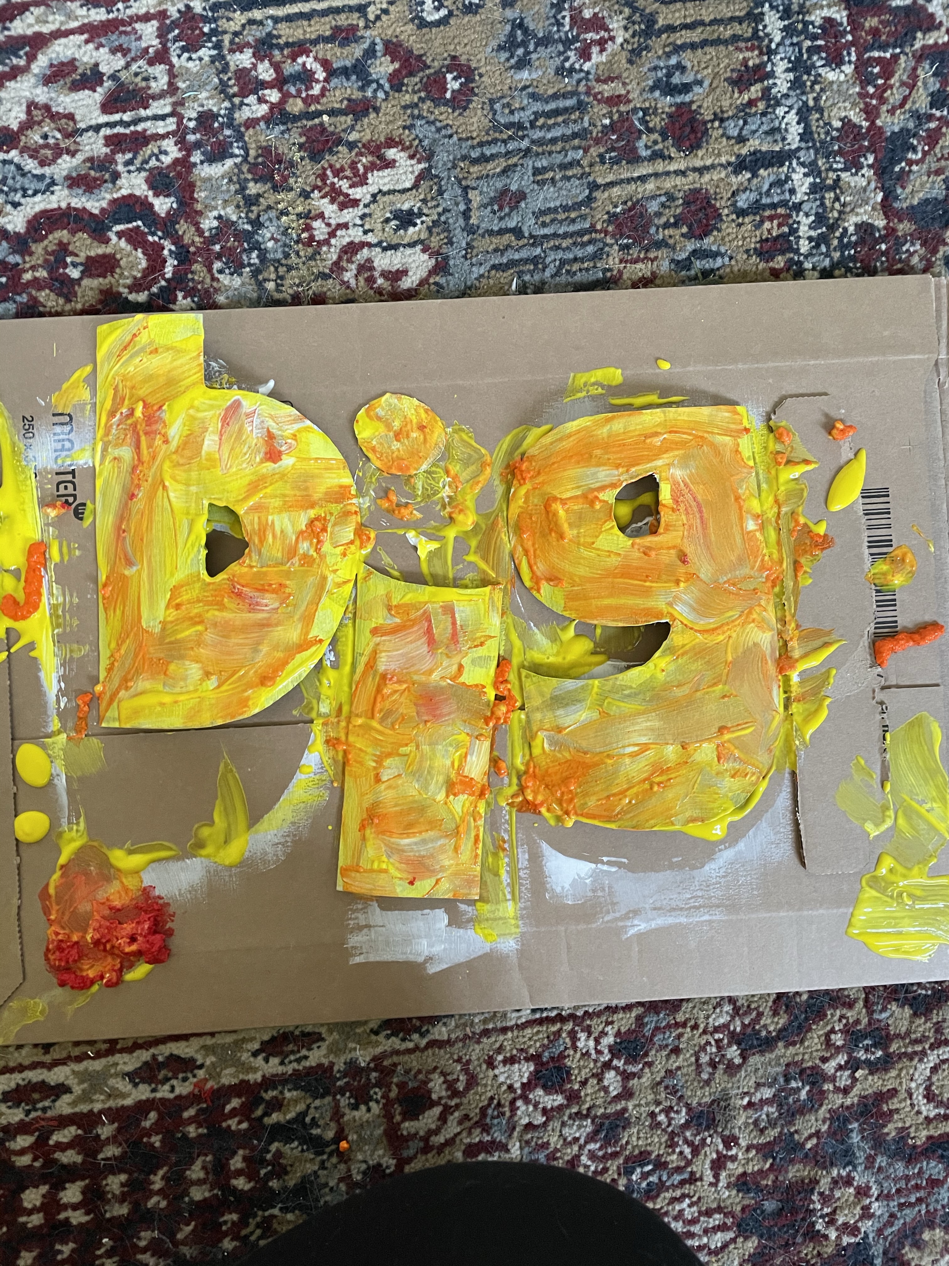
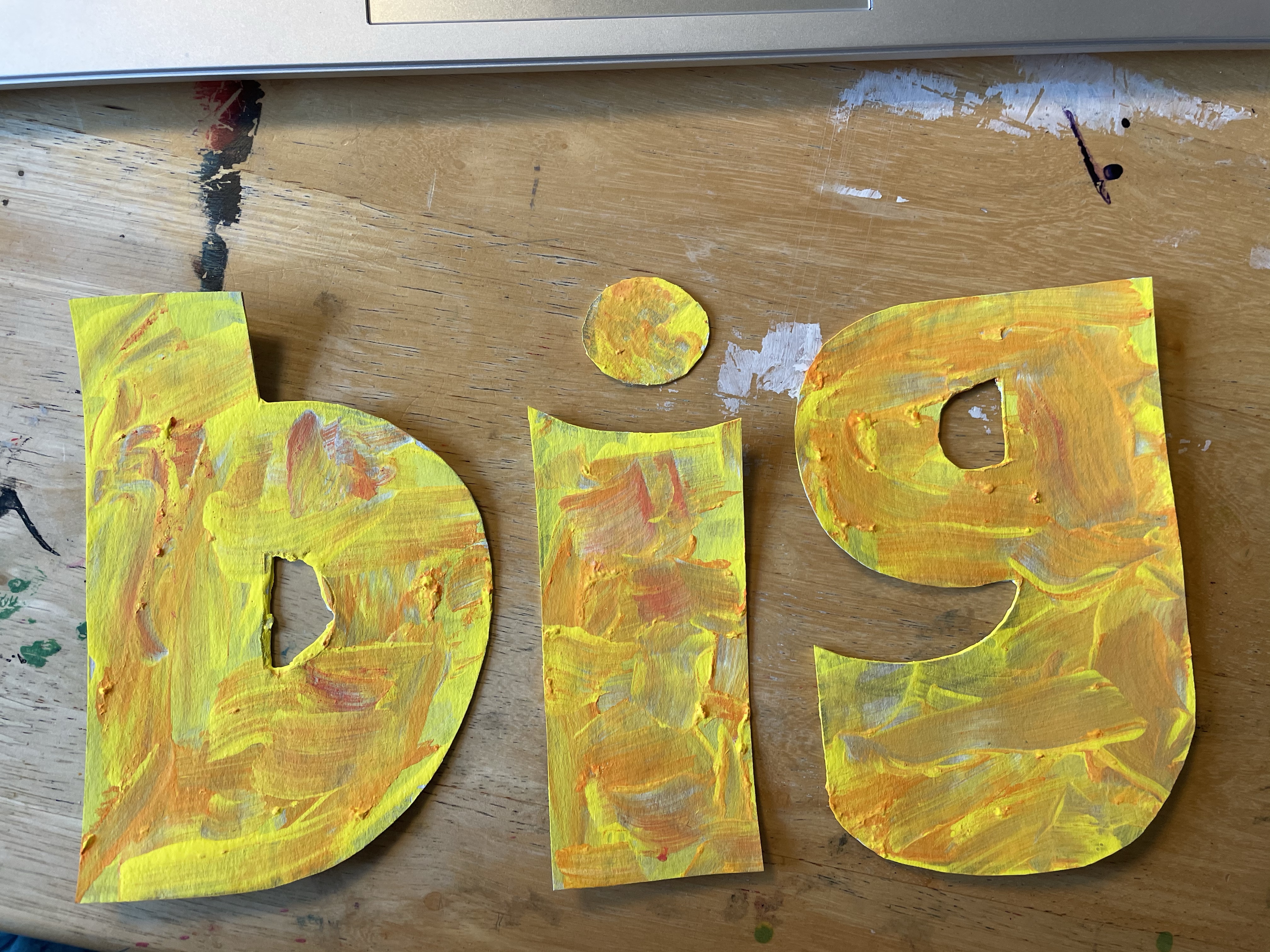
Again, this process was intentionally messy and playful. I wanted to capture the spirit of a primary-aged child in my painting. I began by drizzling the yellow paint all over the letters, which gave the exact effect I was hoping for. I then haphazardly moved the paint around with no intention of creating a neat or consistent layer. I opened the orange paint next and poured it over the yellow, discovering that the consistency of this paint was completely different and it had appeared to have congealed somewhat over time in storage. I tried to work with it regardless, mushing it about and using it to create texture. The red paint had the same texture, so I instead poured this onto the cardboard I was using as a surface and lifted it from there.
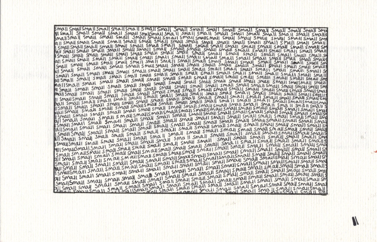
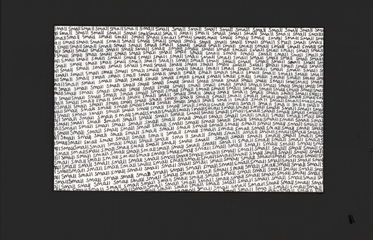
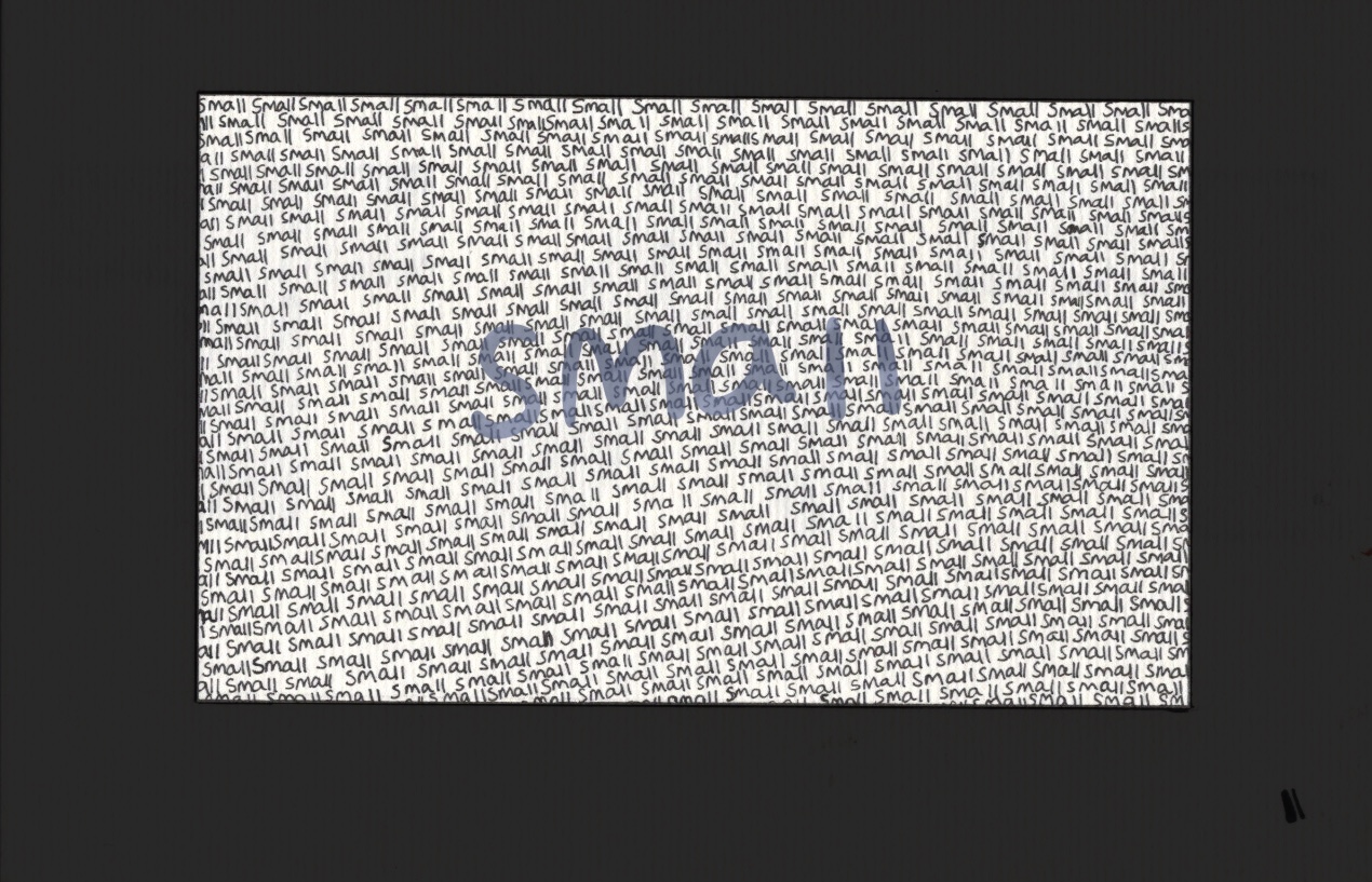
Once dry, I was very happy with this piece. It looks fantastic, totally has the effect I was aiming to capture, and I feel like the word is definitely amplified by how it was created. I planned to also scan this in and edit slightly on Procreate, but I wanted to explore a few other words first. A great thing about exercises like this is that the ideas just won’t stop coming. This is a little hindering, however, because you always just wanna move onto the next one! Whilst doing the previous two I had been thinking about the word ‘small’. I wasn’t sure how to explore it beyond writing it, very small, with a fineliner. I decided to do just that, and to fill a defined area of space with the word ‘small’, written over and over again.
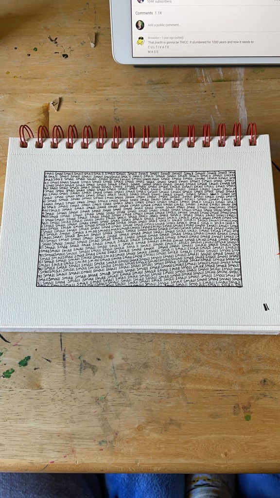
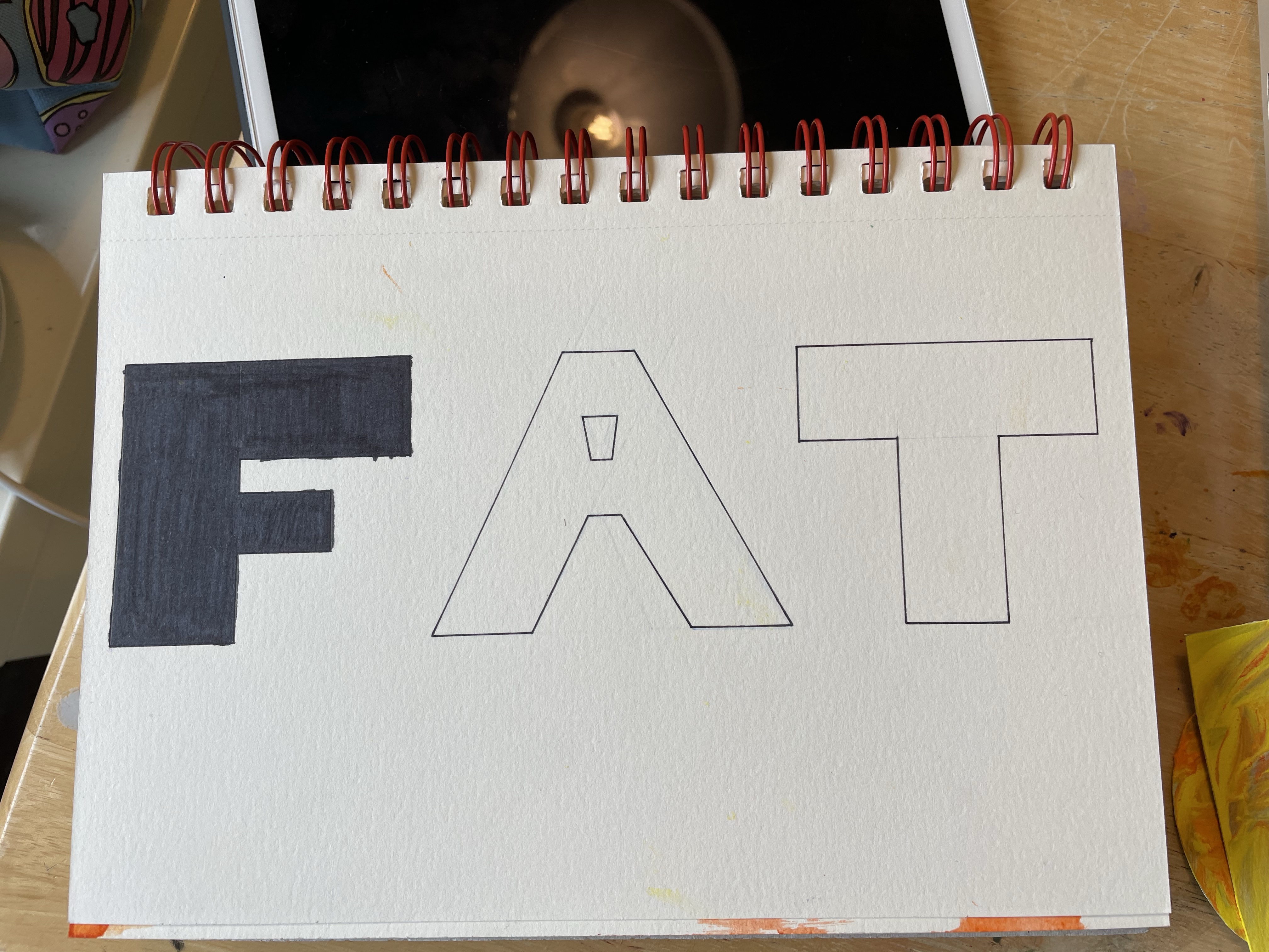
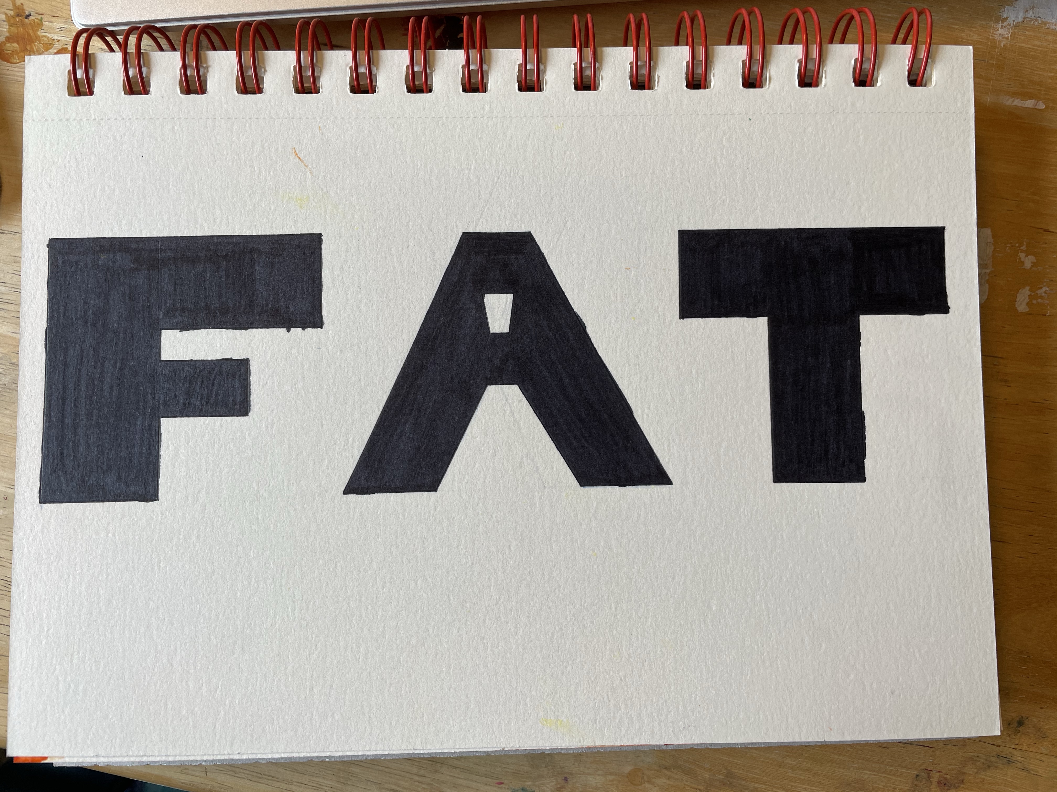
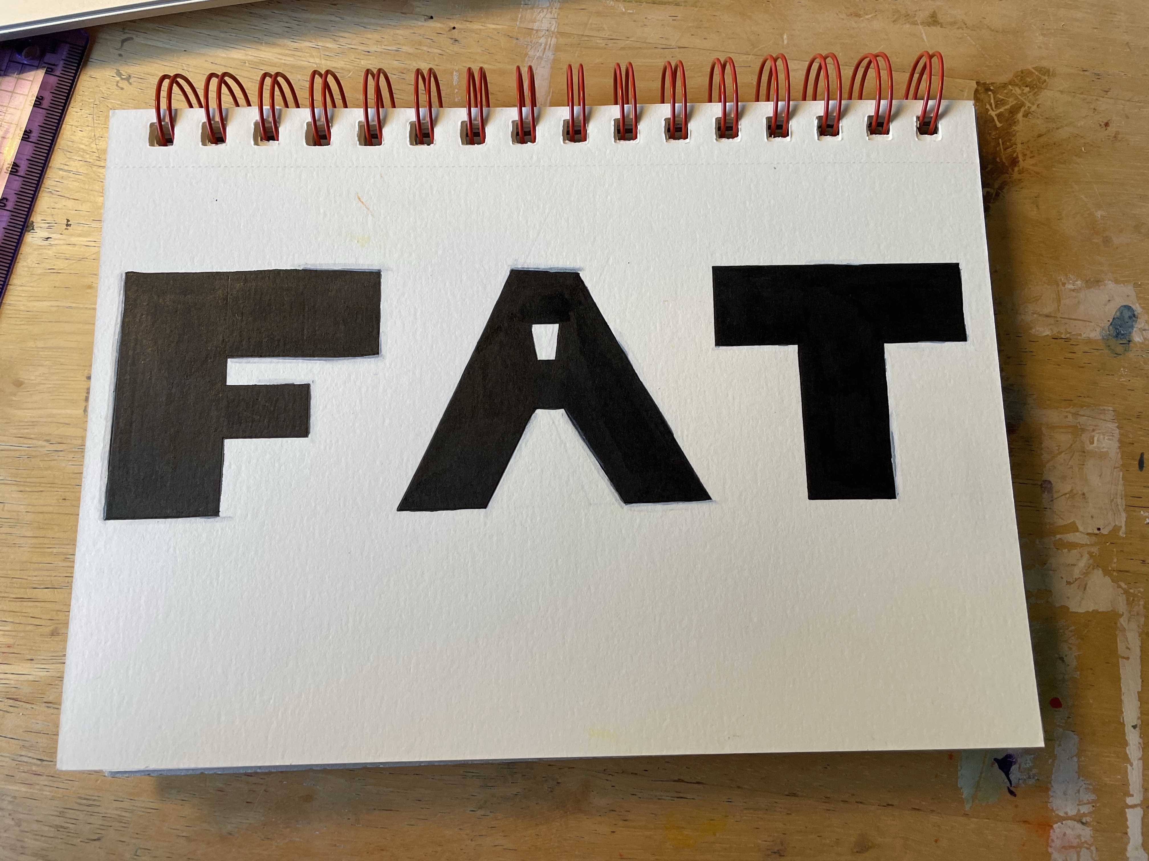
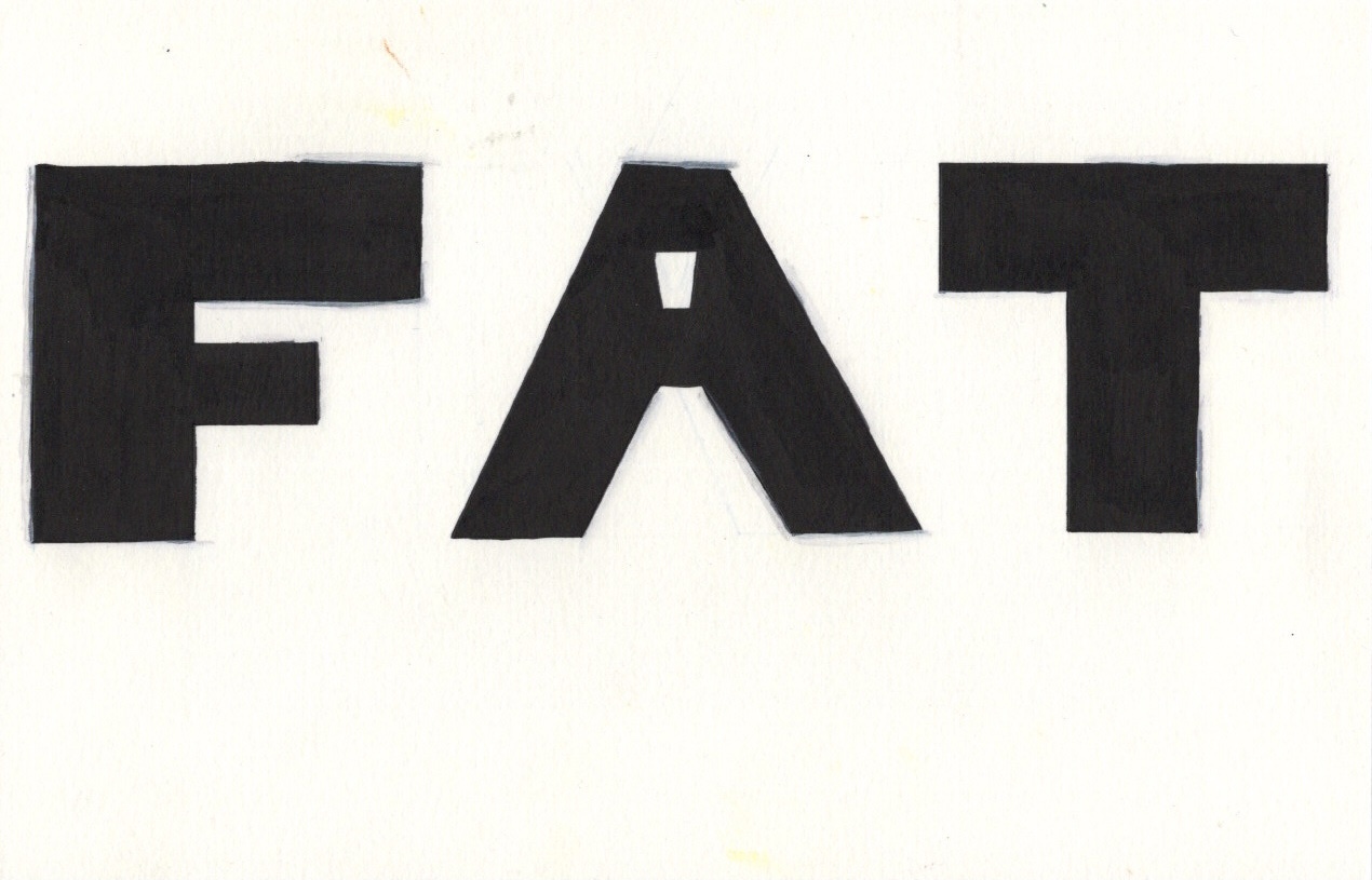
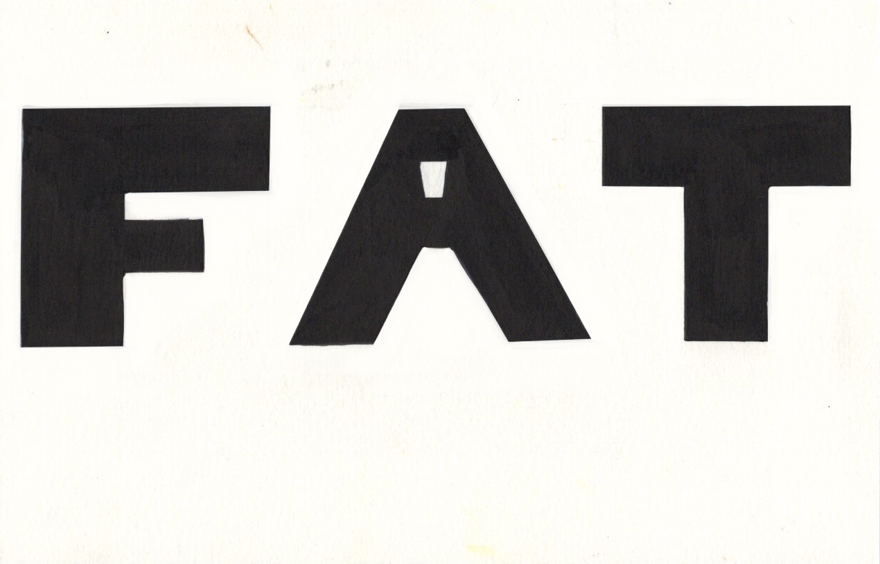
This was time consuming and tedious, but also pretty enjoyable. The repetitive motion and obvious visual progress was both relaxing and satisfying. I made a lot less mistakes than I expected, and the finished piece is great. I think it’s lacking colour, or some sort of additional flair, but I wanted to scan in the original piece before altering anything. I moved onto my next idea – ‘fat’. I loved that I could create chunky squished letters for this, and I thought it looked great when I used ink for the word. I wanted to do this, but a bit bigger. I started by sketching out the letters, then I marked off the edges using a ruler. I wasn’t sure whether to use India ink or sharpies to fill the shapes, and I probably should’ve done some testing on a separate piece of paper. Instead, I went straight in and started filling the F with sharpie.
Honestly, it didn’t look great. The stroke lines are visible and quite alarming. I also repeatedly messed up on keeping the lines totally straight. I decided to continue with the sharpie, then go over with India ink, and finally using a white acrylic marker to cover any mistakes. I had no idea if this would work or create the effect I was hoping to achieve, but I wanted to maintain consistency. It ended up looking good, but the white acrylic marker didn’t quite cover up my mistakes. It was pretty easy to keep things neat with a paintbrush and ink, but the damage had already been done with the sharpie.
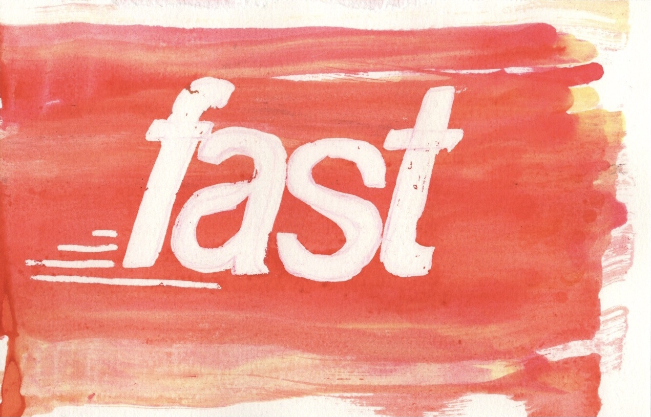

I decided to scan in all 4 of my designs and work with them in Procreate to see how I could improve them. I don’t often do this with my work, so I wasn’t sure where to start. I began with the ‘fast’ design as it felt like the most straightforward. Using the colourdrop tool I selected a colour similar to that of my original paper and I corrected the mistakes made with the masking fluid. I ended up basically filling in the whole word again with the colour. It looked fine, but a little superimposed, so I lowered the opacity a bit to help it blend better. I then added an orange layer over it and played with some blending modes to see how I could bring out the colours in the background better.
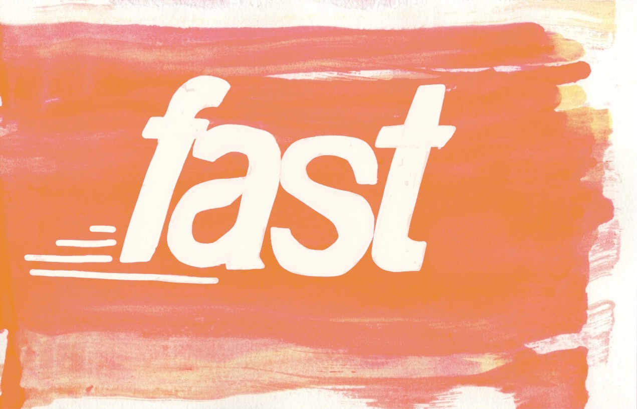

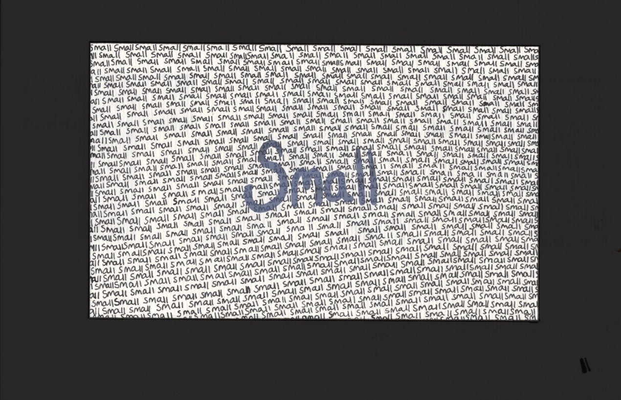
I loved how several of them looked, and I ended up settling on ‘overlay’ with the opacity reduced slightly. I also erased the colour where the word itself was, so that the overlay would only impact the background. Next I moved onto ‘small’. I wasn’t quite sure what to do here. I decided to add a bigger, more impactful border. Originally I did this in pure black but it was way too striking, so I lowered the opacity a touch. I then played around with adding a watercolour-esque central word. I’m not sure if I prefer it with or without, but it’s nice to have the option.

I then moved onto ‘fat’, which was quite easy to fix. I did what I wanted to do with the acrylic marker, and tidied up the edges using a colour that matched the paper. It was a little obvious and again superimposed, but I couldn’t lower the opacity this time or it would show the black underneath. Instead I took an airbrush and lightly blended out any harsh areas. This worked fantastically. As for ‘big’, not much work needed to be done here. I used the selection tool to cut out each letter (once again) and place them onto a white canvas. They look fine as they are, and I didn’t feel the need to do anything to touch them up.
In my opinion these designs all looks fantastic, and really communicate the words through how they are illustrated. I would love to spend more time in this area, continuing to see how I can push the boundaries and experiment with how to use different materials. I have had a lot of fun with this exercise and with testing out different ways to create text. I have so many ideas for more ways I could approach this, but unfortunately I must move on! I hope I can explore text more in future exercises, and put the skills I learned here to further use.
