
This exercise asked me to collect imagery made for children and group it into 5 age categories. I then had to take two of the age groups and select from a list a word for each group, brainstorming around the word and identifying themes, images, and ideas that relate to the age group. Once I had done this, I had to pick an animal that I felt was appropriate for the age group and create a simple image of the animal engaged in an activity that communicated my chosen word.
I once again approached this exercise using a research sheet, as I had found this very useful in the previous one. I began by writing a to-do list for the exercise and figuring out what I wanted to research. I have already spent quite a bit of time researching children’s illustration in previous exercises, so initially I went back over that and listed some artists I wanted to explore a little further. I also wanted to look at my Pinterest boards for previous exercises, and I re-read my post for Exercise 24, as this contained a wealth of useful research. After collecting imagery from my list of artists and making note of relevant information from my previous exercise, I visited the Waterstones website to delve even deeper.

The children’s section of the Waterstones website is split up into different age categories, but they are slightly different to the categories provided in the exercise. Their categories are ‘Baby & Toddler’, 5-8 years old, 9-12 years old, and ‘Teenage/Young Adult’. It was still helpful, however, to go through each age group, as it gave me a much better idea of the sort of illustrations that appealed to different age ranges. I saved plenty of examples to go alongside the ones taken from previous exercises in order to organise them into the required age groups.


Child psychology, development, and education are big interests of mine. For most of my life I have wanted to work with children in some form, especially younger children. I believe it’s vital that children have positive experiences in the first 7 years of their lives, as this is what becomes a foundation in their life-long development. Because of this, I absolutely love working for children as an artist. I love engaging in children’s media and art, as this inspires me and drives me to create my own, too. I also believe that as adults, we can hugely benefit from children’s media, and that the lines between ‘child’ and ‘adult’ when it comes to consuming media needn’t be as restrictive as they are. In fact, we could easily use the same approaches as we do in children’s illustration when communicating with adults.
Naturally, due to these interests, I was drawn to the younger age ranges when considering which to work for. I decided to choose one of the younger ages and one of the slightly older ones, to give myself a challenge and to widen my knowledge. I chose to further explore the ‘Preschool’ age range (3-5 years) and the ‘Established reader’ age range (7-9 years). I then considered which words I felt best fit these ranges. For preschoolers I felt ‘sad’, ‘growing’, and ‘family’ were good fits, and for the older age range I chose ‘wild’, ‘journey’, and ‘discovery’. Next, I looked at my two research boards for these age ranges, and compared them to my notes from Exercise 24. I found that the preschool board was pretty similar in style and design to my notes, the only difference being that there were more bold colours found throughout. My established reader board, however, was hugely different. This is exactly why I wanted to choose an older age range, as it’s something I’m totally unfamiliar with.
The illustrations on the established reader board featured text more centrally, and had less of a focus on the illustrations. It was clear from the usage of imagery that the text told a story and the illustrations illustrated, whereas in the younger age brackets the illustrations themselves were telling a story. The backgrounds in the book covers were more expansive and detailed, with more complex imagery and a lot less empty space. The colour palettes were wider and the shades much more intense, and they were found everywhere, often featuring across the entirety of the covers. There was a noticeable change in the emphasis in the imagery, moving from a more natural and realistic emphasis in the younger age categories to more out-there, wacky, surreal, and sci-fi type designs. The featured characters also underwent a clear change, and were more likely to be human instead of animal, with animals featuring more frequently as sidekicks rather than as main characters.
Going over these points helped me to narrow down which words I wanted to further explore: ‘wild’ for the established reader, and ‘sad’ for preschoolers. I decided to begin with ‘wild’ and started mindmapping my thoughts. It was really easy to brainstorm around this concept, especially with the age-range in mind, and I started coming up with ideas pretty quickly. It was hard to be focused on creating an animal character when I had just observed that the main characters for this age range seemed to more often be human, and this led to some issues with picking which animal I would use. I settled on a wolf, as I felt I could portray this in a human-like way with ease. My concept was that a young anthropomorphic wolf child would be standing in a forest, wearing scruffy torn clothes and holding some sort of carved stick while shouting ‘chaaaaarge!’, indicating some kind of imaginative play or game. The concept reminded me of my own brother at that age and the sort of media he would have been interested in, and I felt it was perfect.

I then moved on to the younger age group, and brainstormed around the word ‘sad’. This was a lot harder, as it’s more of an abstract concept than ‘wild’. It was especially hard to try to think of activities that represented the word ‘sad’, and how I could portray an animal doing them. I thought about the kinds of children’s books that may feature a sad animal, such as ones that teach children that sadness is a natural and okay emotion to feel. My first idea was a bear who was sad, taking a traditionally powerful and strong animal and portraying it as experiencing a ‘weak’ emotion in order to show kids that we all feel sad sometimes. From there, I Googled ‘animals that are symbols of happiness’ to see if there were any other animals that fit this criteria. I found an article about what messages are behind different animals, and almost immediately found the perfect idea.

The canary was the second animal on the list, and blue is a colour commonly related with sadness. Canaries are bright yellow, and I thought ‘what if there was a sad blue canary?’. This felt like the exact kind of content I would expect to see in a children’s book, and I was very excited to explore the idea further. I sketched out various canary shapes/poses using references found on Google Images, exploring how I wanted to portray the sadness through how the bird was posed. I also explored how simplified I wanted the shapes to be, and to what extent I would stylise the illustration.
Next, I decided to experiment with various mediums for this piece. As I have learned throughout my Key Steps research, children’s book illustrations are more likely to be done using traditional mediums rather than digital – or, when drawn digitally, imitating traditional mediums. Instead of creating the work digitally like I am usually drawn to doing, I decided to explore the various traditional options I had available. I first tried out some coloured pencils, then some watercolour, then I layered coloured pencil over watercolour. I also tried out some various fineliner widths, and experimented with using ink as a liner. I really liked the idea of using India inks to outline my piece, then going in with watercolour to colour it, and maybe finishing off with some coloured pencil for texture and layers.
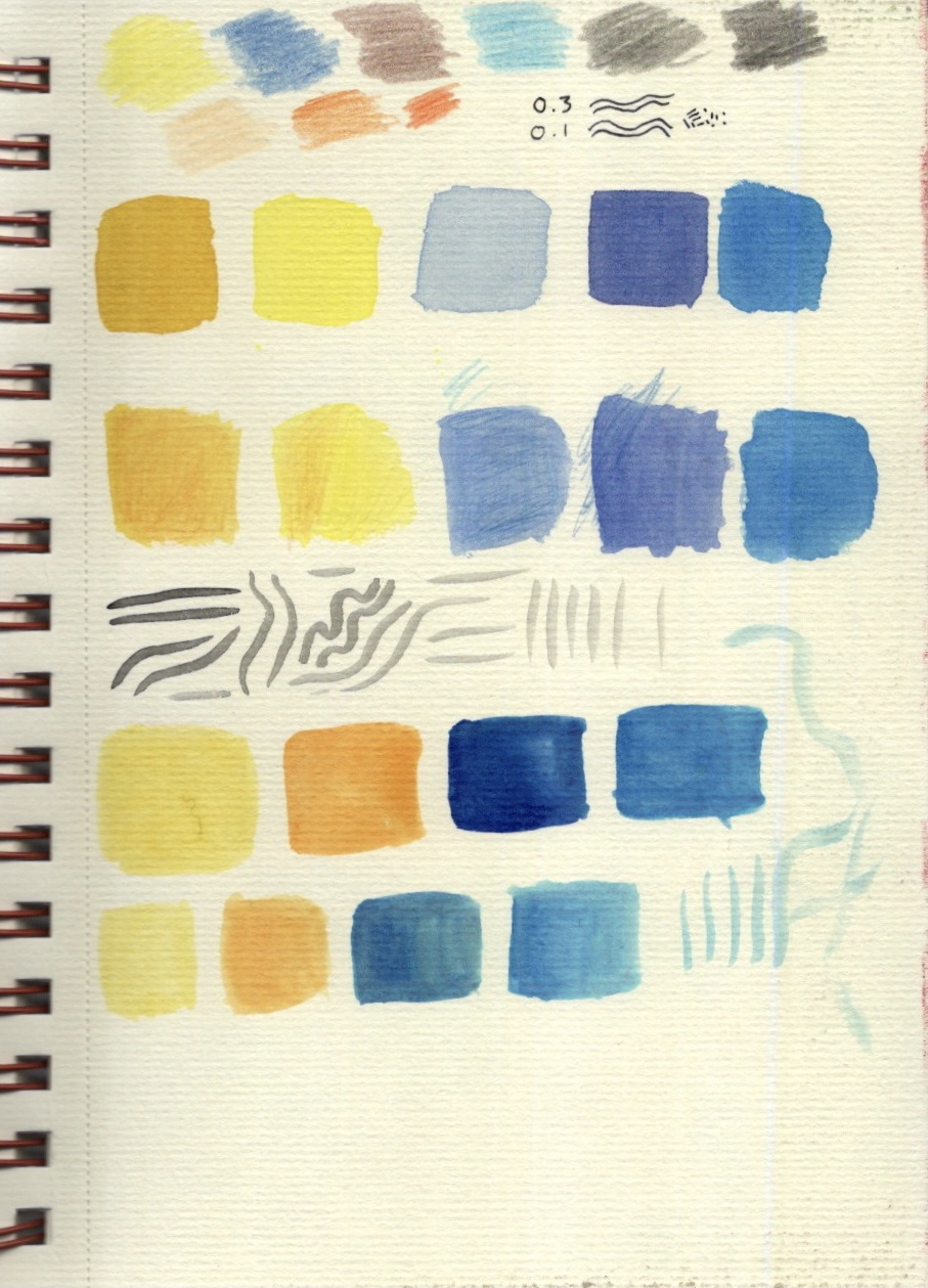
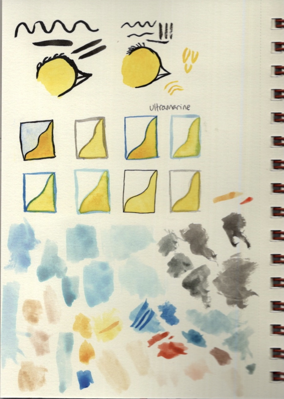
Because I was already using my India inks, I thought I might as well test out the colours for those, too. At this stage I preferred the watercolour, but I wasn’t sure what colour to do my linework with. I felt black was too harsh and contrasting, and I wasn’t confident that I’d be able to make it look soft and whimsical. I also wasn’t sure which brush to use to do my lining. I tested out a chunky round water-brush that is my typical go-to when using water based mediums. It was pretty thick and difficult to control when lining, however. I then tested out a 00 size brush which was much easier to control, producing much softer and appealing lines. In addition, I painted 6 boxes in various shades of ink, so I could test how they looked against the watercolours. I also tested fineliners and coloured pencil, just in case.
Frustratingly, because I am so used to using Procreate to illustrate and the ease of documenting the process there, I didn’t think to take photographs of my illustration process for this image. It hadn’t occurred to me until now, when writing up my process, that I should be doing that. The process itself was testing. I really enjoy painting and I love using inks, but I struggle with the patience it takes to complete a piece. Waiting between layers for the paint to dry was quite the challenge, and one that I have not previously succeeded at. I felt I did well this time, despite the exercise taking twice as long as I had planned. I feel like when compared to my digital work it’s clear I’m a beginner at using this medium, but I also think the image works really well for its intended purpose.

I chose to not proceed with exploring my wild wolf concept. This is largely due to the amount of time it took for me to illustrate the sad bird, and also my own confidence in the area of childrens illustration. I had started exploring it a bit more, considering what medium I would use and collecting image references, but I felt I couldn’t do it justice in the limited time I had. I think I would explore this concept digitally, trying to imitate traditional mediums on Procreate, and I hope I get to develop these skills more as time goes on.
I was asked to respond to three questions as part of this exercise, which I have done so below.
Are the target age brackets for children really as clear-cut as we’ve made them here?
No. Whilst going over my research and choosing which category to put each image into, I found that it was really difficult to pinpoint exactly where the boundaries are. I think that children’s media is much more broadly consumed – children of all ages have the potential to enjoy any of it. Before children can read independently their parents will read to them, and this doesn’t end when the child begins to read.
Many children enjoy books that aren’t marketed to them. Even the Waterstones website which I used for research had larger age groups than the ones listed here, and I still didn’t fully agree with their categorisation. I think if we allowed children to choose what they want to read, without limitations (of course, ensuring all content is age appropriate), we would see much more diversity in the age groups reading each kind of book. There often seems to be an assumption that children below a certain age are only interested in the images in their books, and that children above that age no longer care for imagery and just want text to read. This is a sad assumption, and one that is definitely untrue. Illustrations and text can be used together in books for people of all ages, certainly not just children. I believe that, sadly, what children read is influenced both by their parents and by the culture surrounding education and intelligence, which in turn influences the market.
The Waterstones website featured a subsection under each age category titled ‘dyslexic and reluctant readers’. This is both a great thing to see, as disabilities and levels of engagement are being recognised and accessibility needs potentially being met, and simultaneously disheartening – I feel like this feeds into the culture of certain books being strictly for certain people. A 12 year old dyslexic child has to read a book meant for 12 year old dyslexic children, rather than being given the freedom to choose any book in the bookshop, as none of them are age-specific and all of them are accessible to the child in question. Of course there are differences in developmental interests and abilities depending on age, but this in itself isn’t as clear-cut as often made out to be.
How did the function of text and image differ within the different age groups?
I touched on this earlier in this learning log. It was pretty clear that in younger age groups, imagery was the main focus and functioned as a storytelling device, slowly transforming to a supplementary and more descriptive device as the audience matured. Illustrations in the older age range seemed to function similarly to how an editorial illustration functions – its purpose is to work alongside the text to either provide more information or to excite and draw in the reader. In the younger age range, however, the roles are reversed with the text supplementing the content of the image.
What is your response to the idea ‘all children’s illustration has bright colours’?
This is not an entirely untrue statement. Children are typically drawn to bright, bold, contrasting imagery, and so that is used consistently throughout their media. I think the idea of ‘bright colours’ in children’s illustration, however, is one that is misleading. ‘Bright’ doesn’t necessarily mean garish neon primary colours. ‘Bright’ can be light and airy, pastel, and virtually any colour. I would say the majority if not all of the imagery I found features bright, eye-catching colours. The misconception in the statement comes, I believe, from the idea that children need bold, rainbow colours to be entertained, which certainly isn’t true.

[…] know for sure how the colours interact. This process, however, is similar to one I undertook during an exercise for Key Steps in Illustration when attempting to find the right colour combinations for a painting. I feel experimenting with […]
LikeLike