This research task focused on Lucy Austin – a painter and printmaker from the UK specialising in abstract imagery and experimental artwork. I was asked in the unit material to find another artist who uses watercolour predominantly in their work, as Austin has previously focused on this medium, and to compare the work of the two. I specifically was asked to focus on how their work differed in the use of the medium, and what the differences are in how they respond to their subject matter.
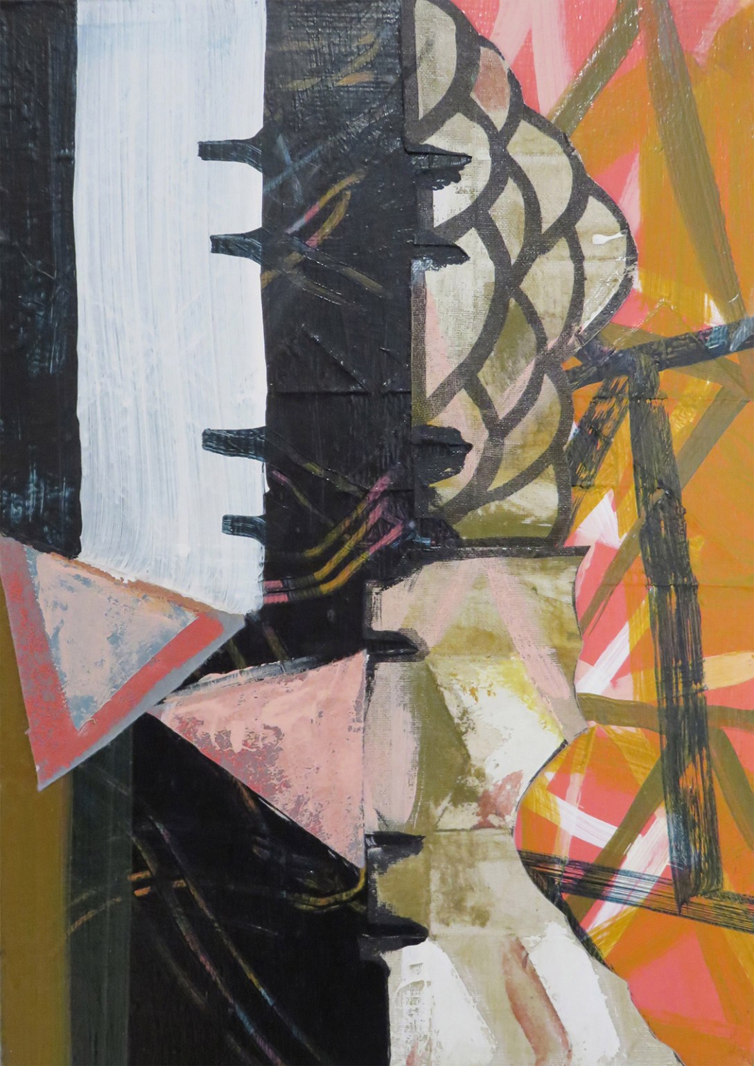
Alongside using watercolour, Lucy Austin has dabbled in 3D structures, acrylic paint, and incorporating gouache in her watercolour paintings. Contrary to the nature and landscape inspiration for most watercolour artists, she is inspired by the industrial and manmade world around us. She photographs the shapes, objects, and scenes she sees when out and about and uses them as references for her work. She displays some of these images on her website and says, ‘Looking at these, it often seems to me that I haven’t made anything up in my pictures.’
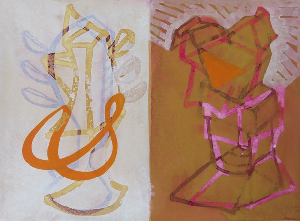
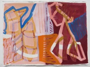
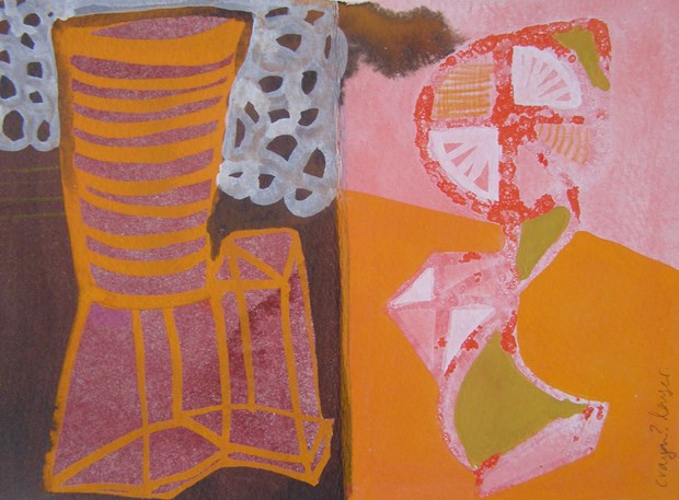
Austin’s style is abstract, eclectic, and playful. Her work features many overlapping shapes, objects, and colours, and to the untrained eye, may look like nothing at all. Some who have preconceived ideas about what art should be may find her work purposeless or weird. Quite the contrary, Austin’s purpose in creating is one of exploring. In watching her progress videos, it’s clear that she works freely and without much thought, following her intuition and letting the medium itself guide her process. However, as quoted above, there is clear intention in the shapes and patterns she makes. She is repeating the things she is most inspired by, perhaps subconsciously.
In her series, Duologues, Austin discusses her particular interest in the technical qualities of watercolour and gouache as mediums. She used this project to explore opacity and transparency, using various methods of masking before adding paint to her paper, or instead layering gouache and watercolour over each other. I particularly like the way she refers to her process here as ‘inventing images’. This is a unique way to discuss a creative process, and it really highlights how she is consistently exploring and expanding on how these mediums could be used.
Watercolour is not a medium I am particularly inspired by as I find it can be quite bland. Whilst I admire those who work with it, from experience, I have learned it’s not my first choice as a medium. I could not recall off the top of my head a single artist who uses watercolour predominantly, so I had to do some digging. I spent quite a while trawling through the Tate gallery website, looking for work that I felt connected to that was also watercolour. I ended up with a long list of fantastic artists I am deeply inspired by, many of them with similar art styles to Austin, but none of them favouring watercolour. A little more digging led me to the work of Frank Webb, an American watercolour specialist.
Webb taught watercolour extensively in the 1980s and has released three instructional books on the subject. His Wikipedia page states that he ‘stressed the importance of having a sketch or drawing of your painting before you paint, design, draw, etc.’ This immediately opposes Austin’s style of work in an almost laughable way. In spite of this concrete belief, Webb’s work strays away from traditional realism, which he considered to be ‘boring’. His work, like Austin’s, has a playful and fun feel to it, though it is clearer that he is trying to communicate ‘real’ things.
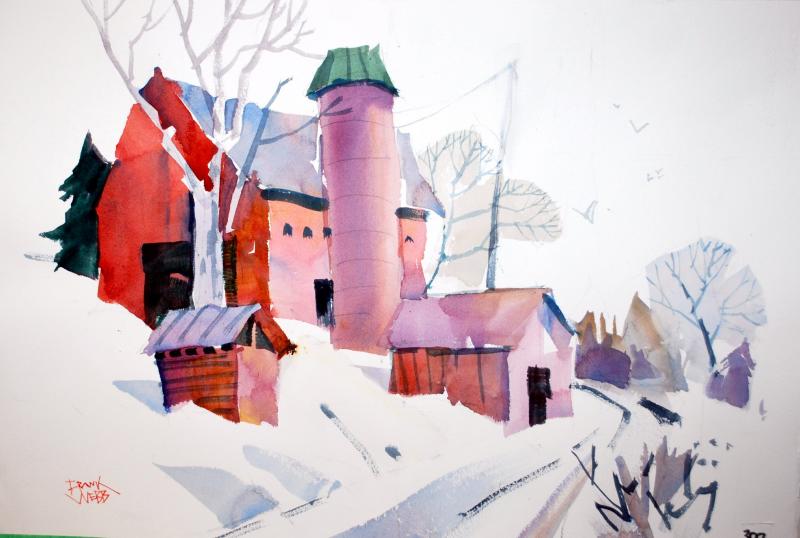
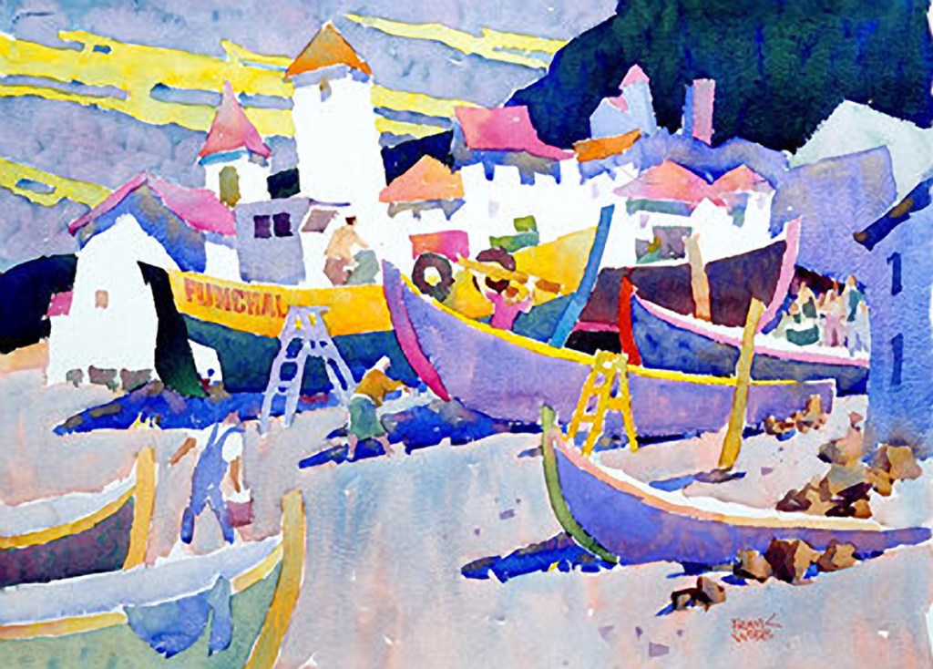
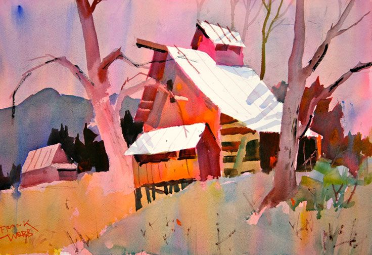
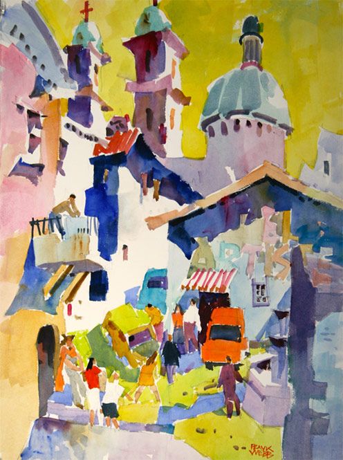
The content in his paintings focuses on buildings and architecture set in natural landscapes. It almost combines the two extremes of ‘traditional’ watercolour inspiration and Austin’s very industrial inspiration. He seems to be more interested in the interaction between manmade and natural landscapes rather than focusing on one or the other. It’s clear when comparing the work side by side that Austin’s work is quite distant from her references, as she figuratively responds to her subject matter.
Webb’s approach to the watercolour medium is much less curious. He uses it very traditionally, even if his colour choices and stylisation are less so. It seems he accepts and embraces the fact that watercolour is inherently transparent and soft as a medium, rather than seeing how far he can push the boundaries of that. By intentionally experimenting with masking and layering, Austin’s shapes are much more defined and robust, whereas Webb’s imagery all seems to blur into each other. Austin’s work appears to have much more depth to it, too, the clear layers of pattern adding almost a 3D effect to the pieces. Webb’s paintings are much flatter. It’s clear the subject matter is three dimensional, but the work itself is less dynamic.
Comparing the work of the two artists and considering their approaches to their practice only encourages me to experiment and explore more with the mediums I use. I can’t help but feel as though Webb’s work is too plain or basic, despite being drawn to it by his fantastic use of colours. Whilst Austin’s style is not exactly like my own, it’s closer in its free and playful approach. Sometimes it feels as though I want the art to show me what it wants to be, rather than for me to make it into something, and Austin’s approach inspires this further. I could learn a lot from both of these artists, however, as the basic underlying principles of a medium are just as important.

[…] the exercise was to reference the work of Lucy Austin – the focus for Research Task 2.1 – and because my tutor had emphasised my need to plan less when working in my sketchbook, my […]
LikeLike