For Assignment 2, I was asked to look back over the work created during part 2 and demonstrate how I use experimental drawing techniques to build and inform my illustrative processes. The assignment was split up into three parts, each referencing various exercises carried out in part 2. I was then asked a series of questions prompting me to reflect on my experiences throughout this part of the unit.
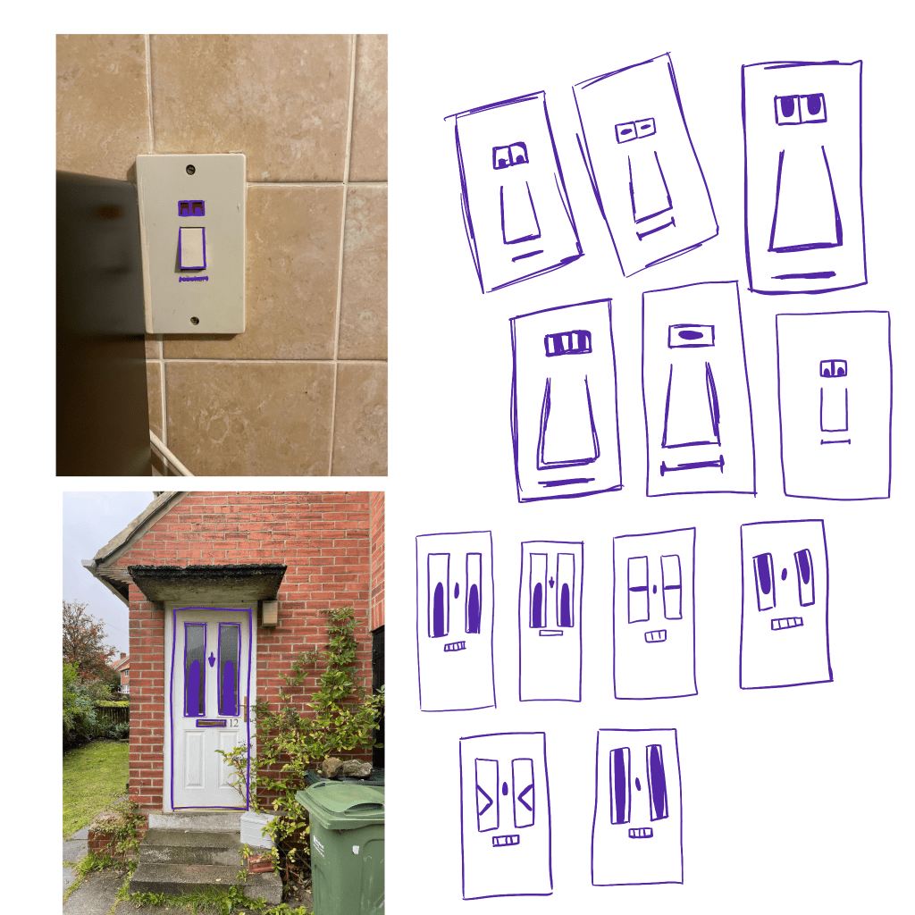
The first section of the assignment asked me to revisit the examples of pareidolia I had collected during Exercise 2.6. I was asked to reconsider them and develop them more fully as characters – adding narrative to the pieces and considering their properties and how this could be translated using artistic mediums. How I approached this was my choice: I could be very literal, surreal and abstract, or intentionally subversive.
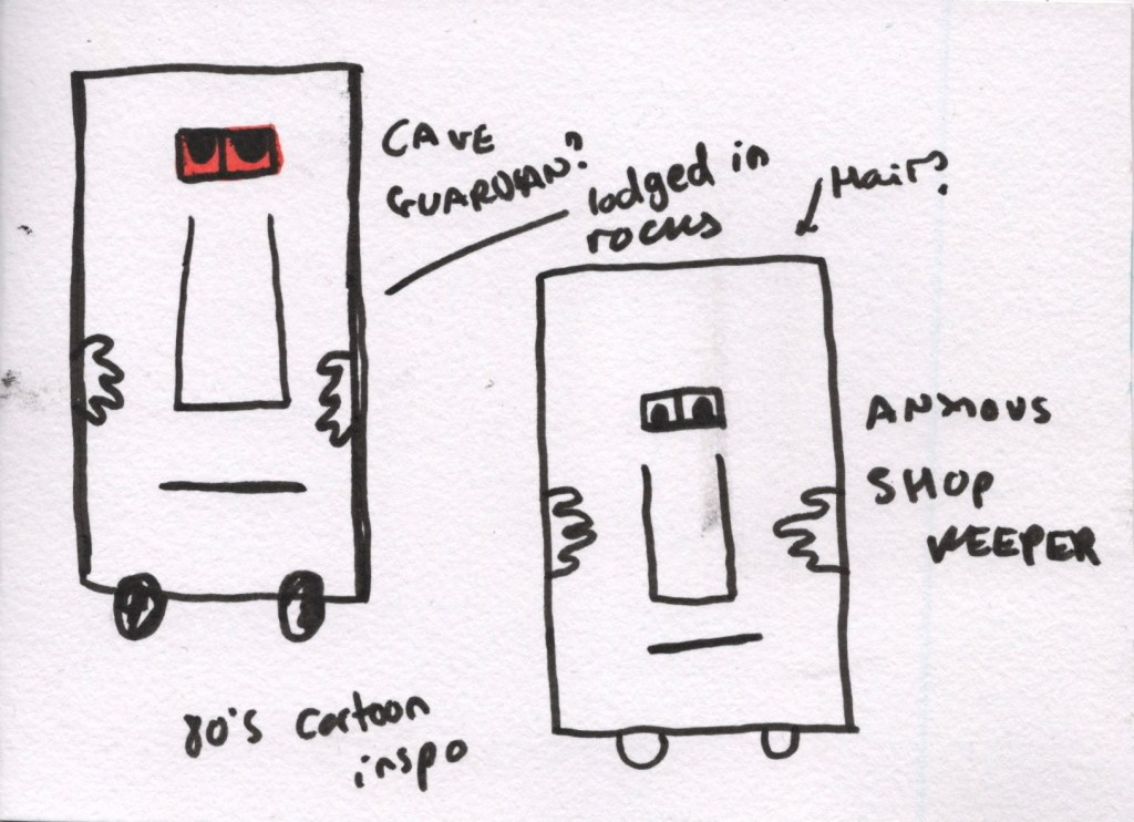
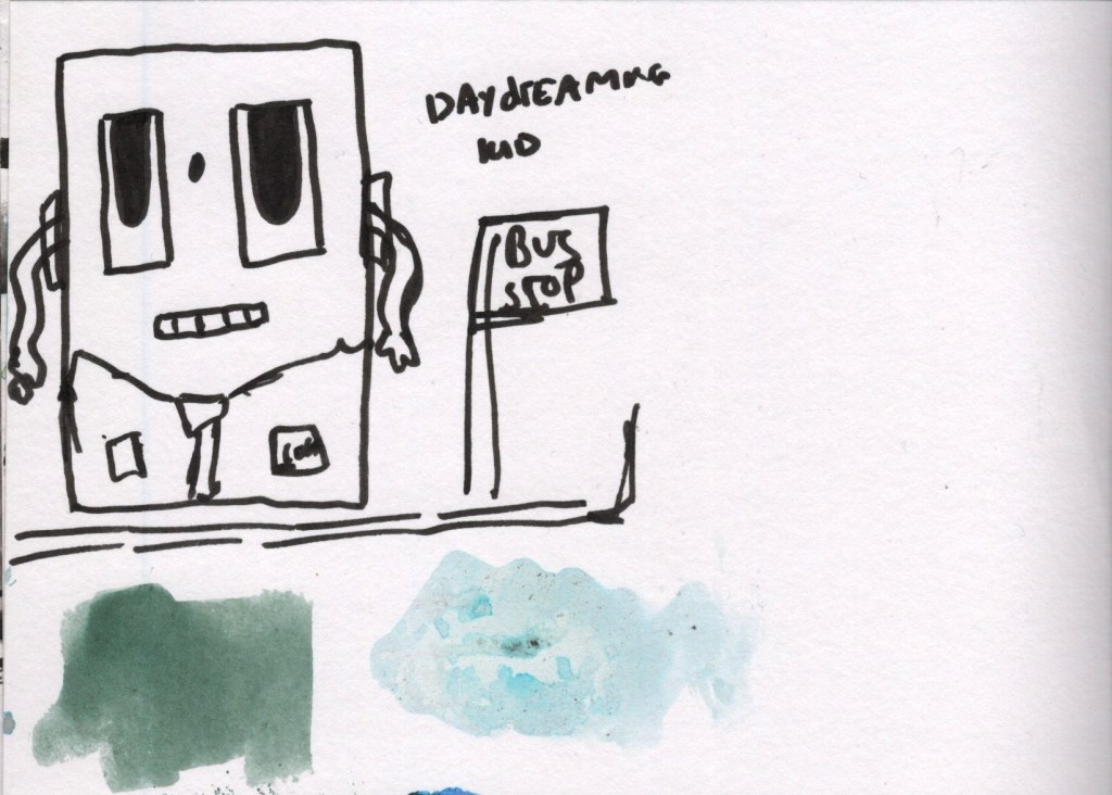
During Exercise 2.6, I had sketched out some of my favourite ‘faces’ in several different ways already, which was useful when it came to this part of the assignment. I looked through my drawings and picked out three that I felt especially connected to. I found it easy to imagine entire worlds for these characters to live in and stories for their final scenes. I initially began exploring these in my sketchbook but quickly realised I wanted to develop them using Procreate. I drew out lineart for all three of the characters, and once I was happy with how they looked, I started considering how to develop them further.
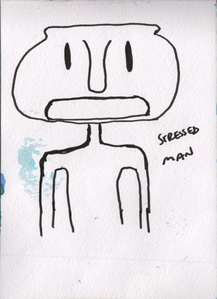
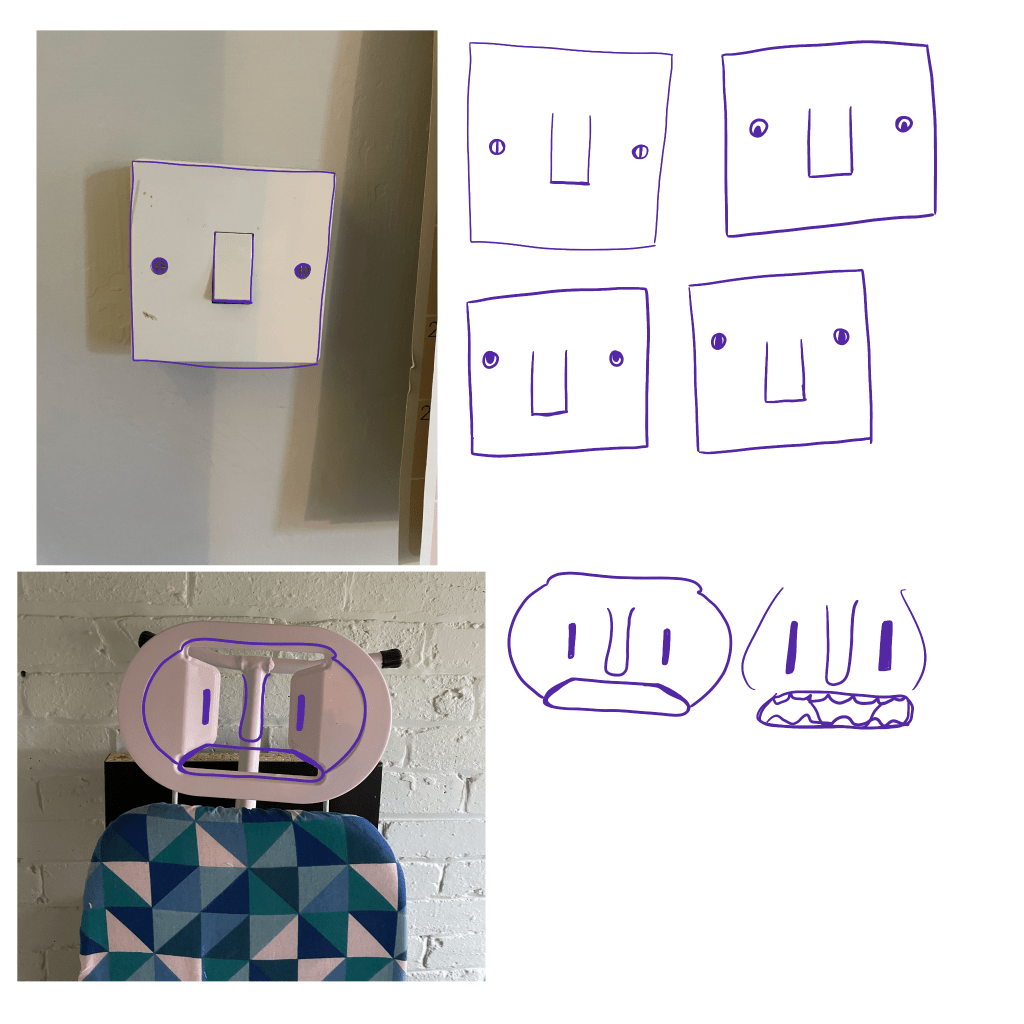
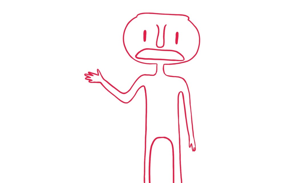
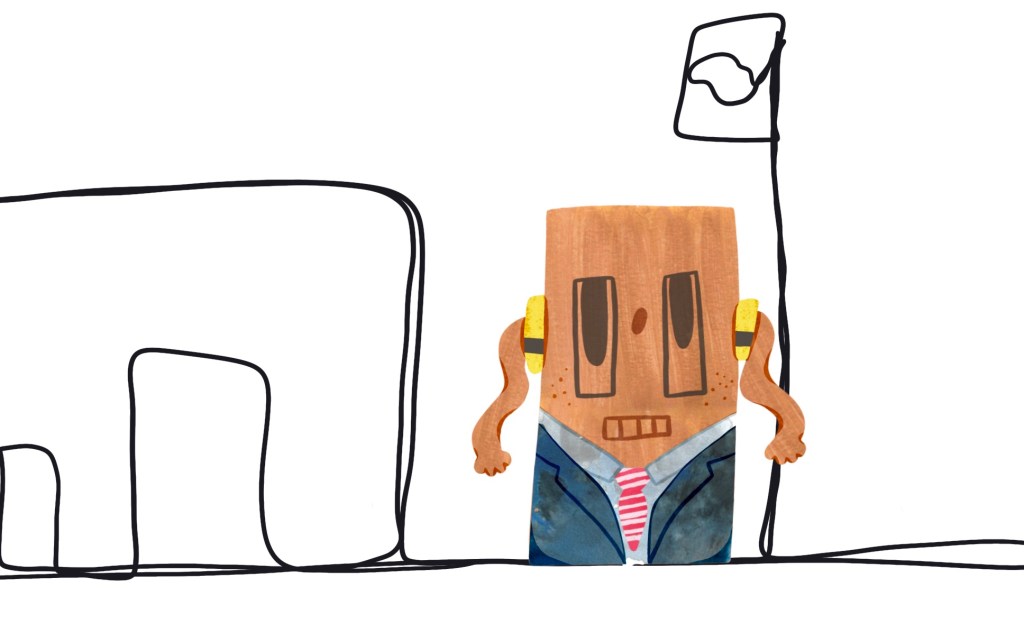
I began with the ‘ironing board man’. I wanted him to be wearing clothes, and I chose jeans and a t-shirt. I created a texture for the jeans in my sketchbook using a dry brush and gouache. I then created a face texture using cling film and gouache. This texture reminds me of tin foil, and I can’t help but think that because of that, it’s inherently metallic. I wanted that to emulate the metal of the ironing board in some way. I then used ink to paint a pattern inspired by the ironing board cover for his shirt and scribbled out some crayon for the skin texture. I was intentional with my colour selections for the jeans and t-shirt textures, but I didn’t think much about the others as I knew I would be changing them digitally.
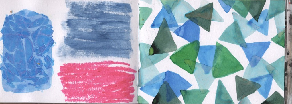
Once they had dried, I scanned in the textures and began digitally manipulating them in order to fully create my character. You can see from my video below how I approached this. I added in some shading once done and drew on the facial features. I was inspired by the sort of whimsical, bright, and fun cartoons that air on Cartoon Network, such as The Amazing World of Gumball and The Regular Show. I love this sort of character creation and the exaggeration of features and proportions. Upon showing this to a friend, she commented that it was obvious that it was inspired by the ironing board picture, which I was glad to hear.
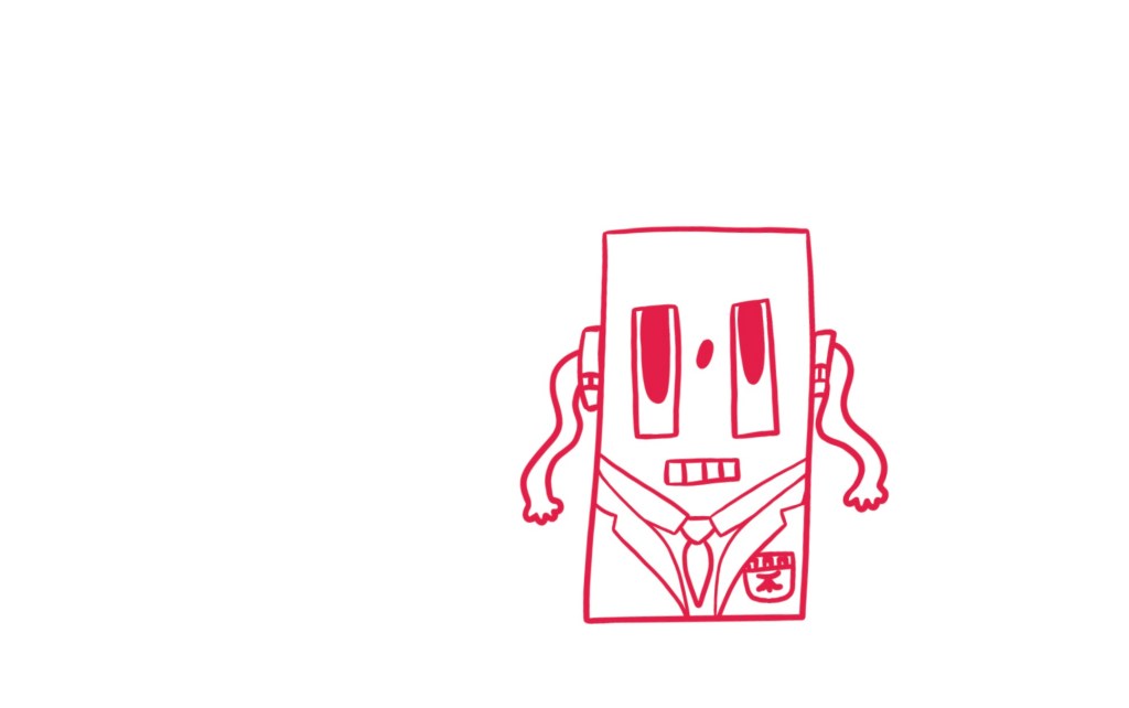
Next, I moved on to my character based off of my front door. The facial expression I chose I felt was reminiscent of a daydreaming schoolkid. I followed the same process as for the ironing board character, but I created some new textures for the piece. I used gold gouache to create a texture for the main body of the character, inspired by the gold door knocker and letterbox. I originally wanted to have a white texture with streaks of gold running through it, but I wasn’t sure how to achieve this. I decided to start with gold and then add white on top if I wasn’t happy with it. Once added to the character, though, I felt it worked out well.
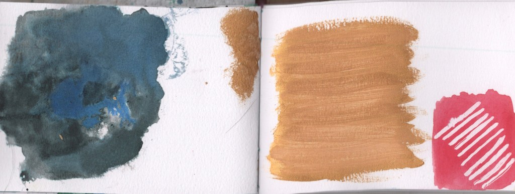
For the school blazer and shirt, I used the same texture. Initially, I created it with the blazer specifically in mind. I used a variety of blue tones mixed with black ink on a pre-wet patch of my sketchbook. I used the water to create interesting variations in colour and opacity, and I removed some ink in places using kitchen roll. Once in Procreate, I changed the brightness and saturation of the texture in order to use it for the shirt, too. I utilised masking fluid to create stripes for the tie, and for the backpack, I reused the crayon texture I had created earlier.
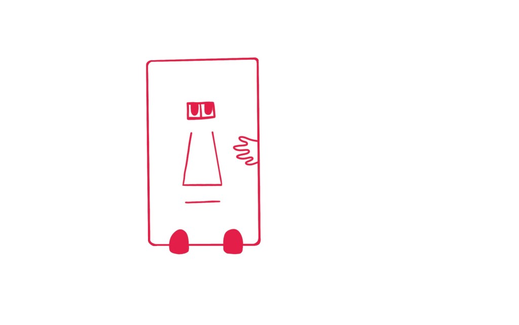
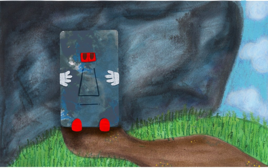
Overall, I’m less excited about this character. I’m not sure if that’s because I’m just less invested in it in general or if it’s down to the way I created the textures for it. I feel more attached to the ironing board character and more excited about fleshing out a narrative for him. Still, I moved on to my third character – inspired by a switch found in my kitchen – which I felt a little more positive towards. I envision this character to be a wise, old guardian, blocking the entryway to a cave. Whenever anyone tries to enter the cave, he presents them with riddles and trivia and only allows them to pass if he feels they are worthy. He isn’t mean or rude but stoic and protective.
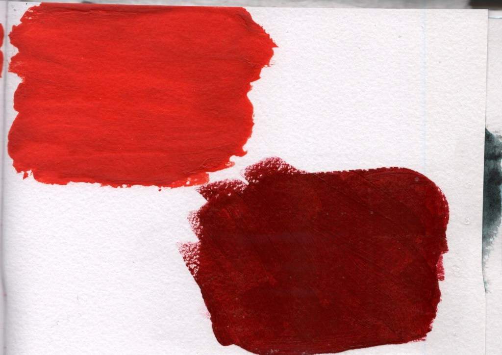
I reused the texture created for the school blazer here as I felt it was perfect. I did alter it slightly and changed the colour here and there to see how I could achieve a more ‘rock guardian’ type look. I once again used the crayon texture for the hands added and digitally drew facial features. I then used some acrylic paint to create a shiny red texture to use for the shoes and eyes, inspired by the red light on the switch. I thought that acrylic paint always dried glossy, but this time, it dried matte. Frustrated, I added some PVA glue over the paint and also mixed some with a brighter shade of red to try to get that shininess I desired.
A Note for Tutor
This is where I had gotten to in writing up my learning log before not being able to continue. I have since
- Finished the ‘rock guardian’ character lineart and colouring/texturing
- Created a background for the rock guardian using a variation of experimental and new techniques learned throughout part 2
- Combined the background with the character
- Started creating a background for the ‘schoolkid’ character using different techniques
You can find scans and videos of the above below. My plan for the rest of this assignment is
- To use more experimental techniques to continue building a background for the schoolkid character and to combine them in a similar way to the rock guardian piece
- To explore a variation of scenes in which I could fit the ironing board man – specifically photographs of real-world scenes with digital drawings over them or combined with other techniques inspired by Christoph Niemann and Saul Stienberg
- To assess the work completed for all three pieces and look at how effective my approaches have been, and to make changes where necessary
- To then reflect on this assignment using the prompts in the assignment brief and to reflect on part 2 as a whole
As discussed, these points are currently on hold as I focus on the circumstances in my life right now. I plan on continuing with this assignment and reflecting on the entire process later, once things are a little less chaotic. I will say, however, that I have learned a lot about my approach to using sketchbooks and what I like to do and dislike doing. I also miss doing work digitally now, which is ironic!
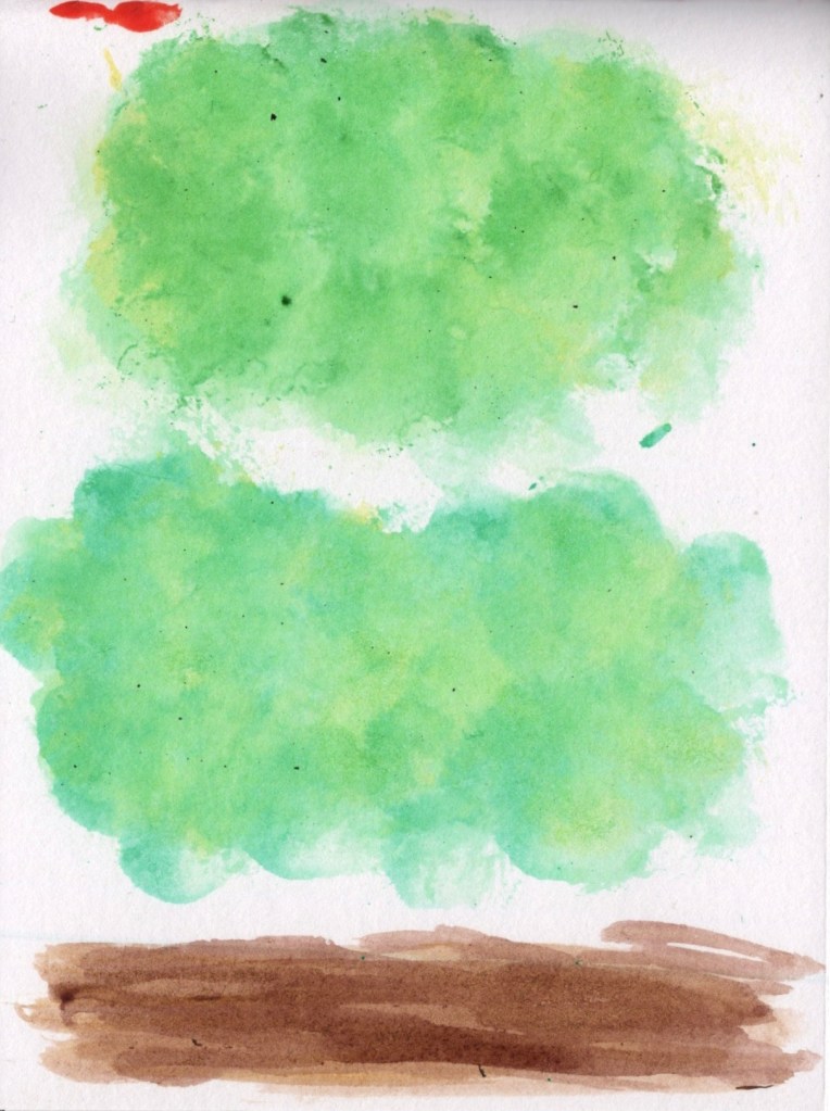
2 – Textures in my sketchbook intended for the schoolkid background created using cotton wool and cotton earbuds
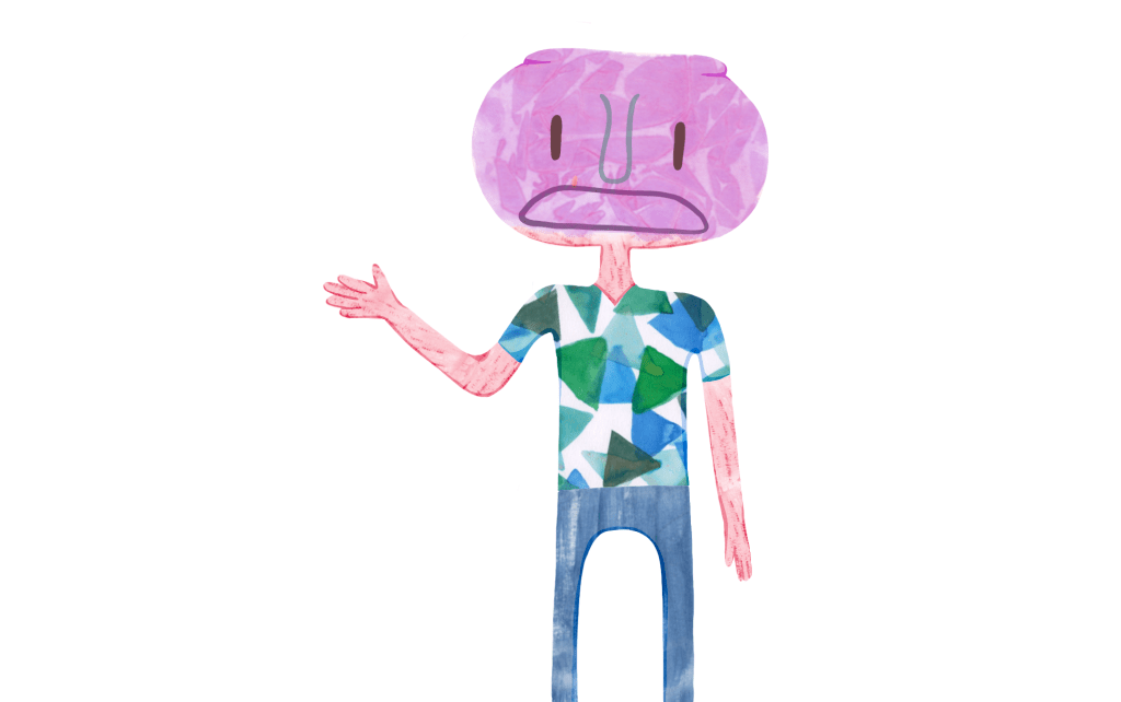
3 – The schoolkid as it currently stands. I have used a single line drawing to create outlines of spaces and I intend on adding more visual interest using textures from my sketchbook
4 – The ironing board man completed but with no background
A Note for the Assessor
Unfortunately, when I completed this assignment I was in an extremely stressful life circumstance – almost being made homeless – and despite completing the work I could not write up my learning log in full. I did revisit this assignment a short while later to add to my characters, however I do not feel able to re-write this learning log honestly. My tutor advised me to use existing pages of my sketchbook to create backgrounds for characters, rather than creating new pages, which I experimented with a fair bit in an attempt to create a background for my ‘schoolkid’ character.
I really enjoyed the process of creating charaters in this assignment, and I learned a lot from it. I applied the things I learned here in future exercises and assignments, and it helped shape my ability to see my work as something that could be developed further. The act of revisiting previous sketchbook pages and taking inspiration from them (or, in fact, using them for something new) was extremely helpful. One of my conclusions during Part Five of this unit was that creating fun, silly characters is something I have found great enjoyment in – and this assignment was very much the birth of that.
I hope that despite an in depth learning log, it is clear how this assignment influenced my development as an illustrator.
