For this exercise, I was asked to choose a piece of reportage and compare it with a photograph containing similar subject matter. The unit guide provided a series of questions to reflect on and explore further. As recommended in the unit guide, I briefly browsed the University of West England’s Reportager website and settled on Carly Larson’s ‘No justice, No peace’ as my chosen artwork. I then used Google to find a photograph taken during a similar protest.

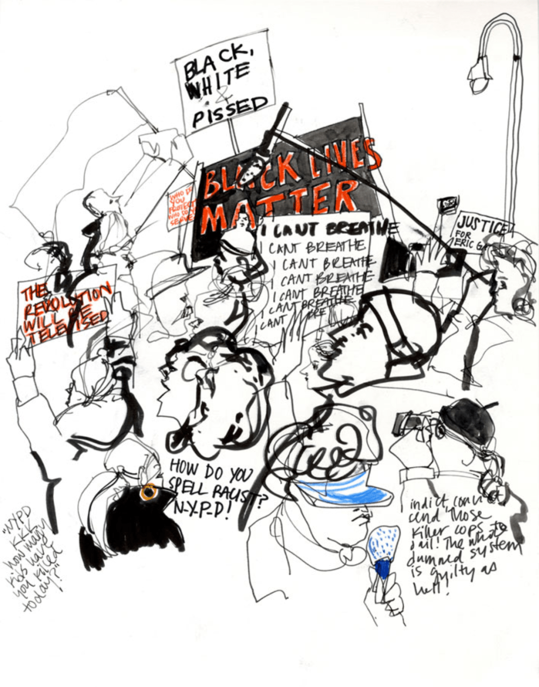
Carly Larson is an illustrator based in New York City who has a specific interest in reportage as well as surface design and hand-drawn animation. Larson drew the above piece during the 2014 protest for Eric Gardner in New York City. I chose this piece to use for this exercise as the focus on protest signs and the amount of text used in the image stood out to me. The way that Larson has chosen which aspects of her environment to include in the drawing really emphasises how it feels to be within a protest.
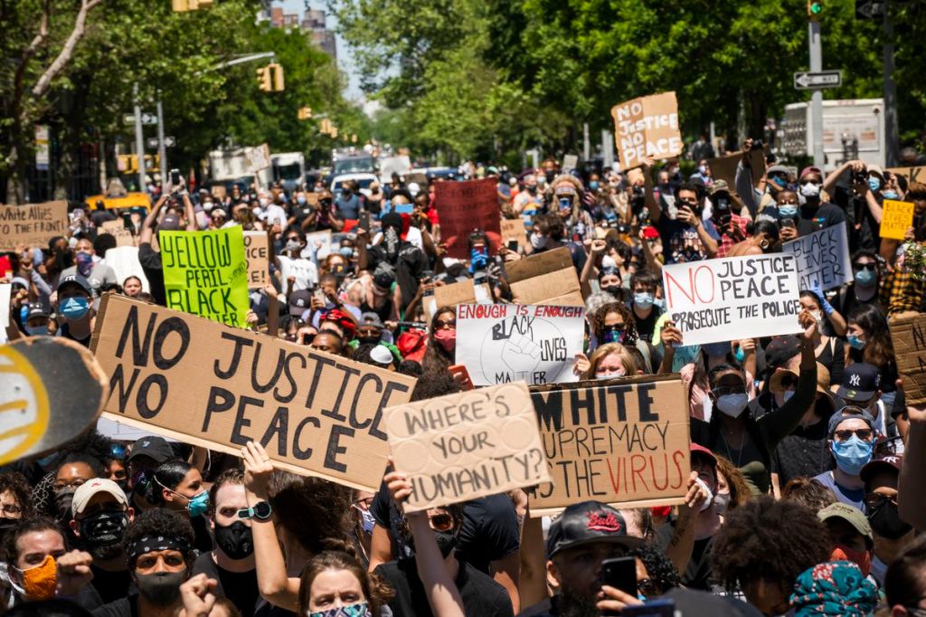
Initially, when I was searching for a photograph to compare Larson’s work to, I thought her piece was drawn during the George Floyd protests. I chose the above photo as it is very similar in content to Larson’s piece. The text on each protest sign is aligned with the text in Larson’s drawing, and the protests are for extremely similar events. The murder of George Floyd and Eric Gardener were both racially motivated attacks on Black men from varying police forces in the United States.
What is each image expressing, describing, or communicating?
Both images have been created to show the impact of the deaths in question and the response from the general public. They aim to communicate how protestors were feeling and to show the extent to which protests occurred. Larson’s sketch draws the viewer into the chaos and intensity of a protest and forces us to consider and acknowledge the words spoken (or written) in the protest. Whilst the photograph of the George Floyd protest does focus in on a handful of protest signs – it’s much easier to ignore them and get lost in the crowds. Larson’s use of empty space and selective markmaking is a much more effective tool when communicating emotions.
The photograph communicates some things the drawing doesn’t – such as the heat and the sprawl of the crowds. Larson’s drawing provides an ‘in the moment’ perspective that transports you to the heart of the protest itself, whereas the photo shows a zoomed out and disengaged view. It feels less emotive and more factual.
Which image is most memorable?
In my opinion, Larson’s drawing is more memorable than the photograph. This is due to it being uniquely Larson’s perspective and work. Many photographs are taken of many different protests, and they sort of merge together and become one. Some protest photographs, such as Taking a Stand in Baton Rouge by Jonathan Bachman, stand out and leave a long-lasting impression on the viewer. But, ones similar to the image above are easy to forget. Especially during the age of such aggressive social media consumption – photographs of crowds are sort of meaningless.
Does one seem more truthful? Why?
I am inclined to say the photograph seems more truthful. Firstly, it being a photograph removes a lot of emotion and presents the situation objectively. Whilst it’s easy to manipulate and edit photos, when they are presented unedited they are generally more accurate than drawings. Secondly, the zoomed-out perspective of the piece provides a bigger picture and shows more of what is happening in the event. This is not to say that Larson’s is not truthful or trustworthy as a piece – it just serves a very different purpose and communicates a more emotional and ‘on the ground’ point of view.
Which image would I be more likely to notice in a magazine or newspaper, and why?
I’m not sure if either piece would stand out to me more than another in a magazine or newspaper. As mentioned above, the photograph is pretty standard for a protest photograph and doesn’t have anything eye-catching in it. But, at the same time, Larson’s work is quite bland colour-wise. I don’t think it would specifically catch my eye or engage me personally as I am very drawn to colours and patterns in imagery. In saying that, it was enough to stand out to me in a sea of other reportage illustrations!
I’m quite surprised by my responses to these questions, as my research so far has led me to believe that photography is usually a stronger medium to use in situations such as these. It has shown me, at least, that there is a good use for reportage, and it can be powerful in the right circumstances. I would be interested in trying this again with a very different piece of reportage and seeing if I feel similarly to how I did in this exercise.
