
Assignment 4 aimed to bring together all I have learned throughout Part Four regarding developing ideas from pre-existing sketchbook work and turning them into narrative illustrations. I was asked to create a ‘foldy’ style zine which develops a narrative across a minimum of six stages. The story needed to be based on one of the ideas I had already played with in my sketchbook and built around Nigel Watt’s Eight Point Arc structure.
Whilst working through Part Four, there were a few ideas that I felt particularly connected to, such as Charlie Twinkles the secret clown, and the pigeon who sat at the cafe table. I wasn’t sure which of these I wanted to develop further, so I spent some time considering it and thinking about the different stories I could create. In order to help with this, I took some cartridge paper and made a mock zine so I could reference it throughout my process. I found the instructions in Part One quite hard to follow, so used this YouTube video instead. It left me with an 8-page zine, including the front and the back.
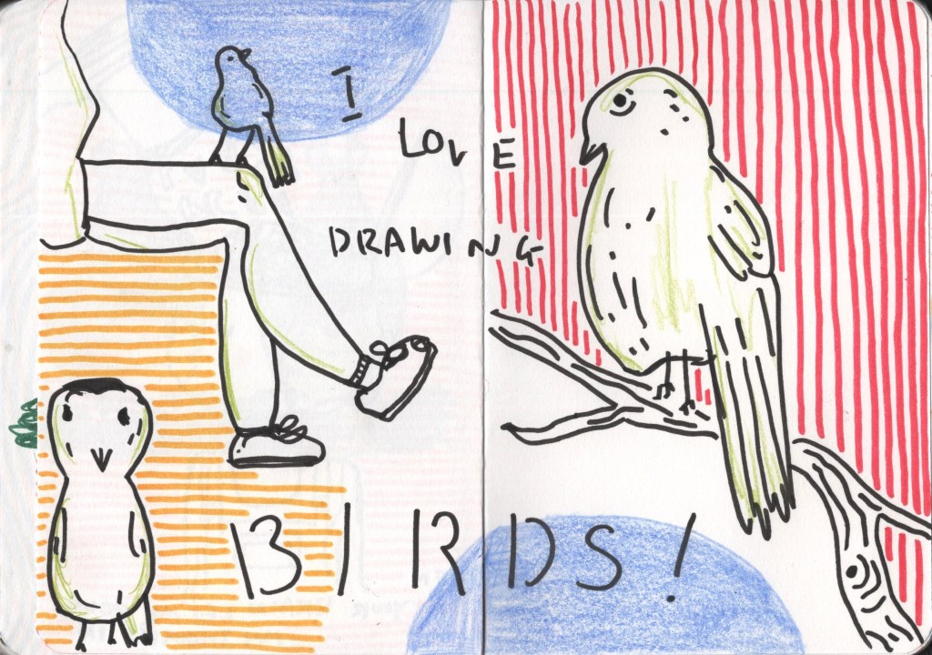
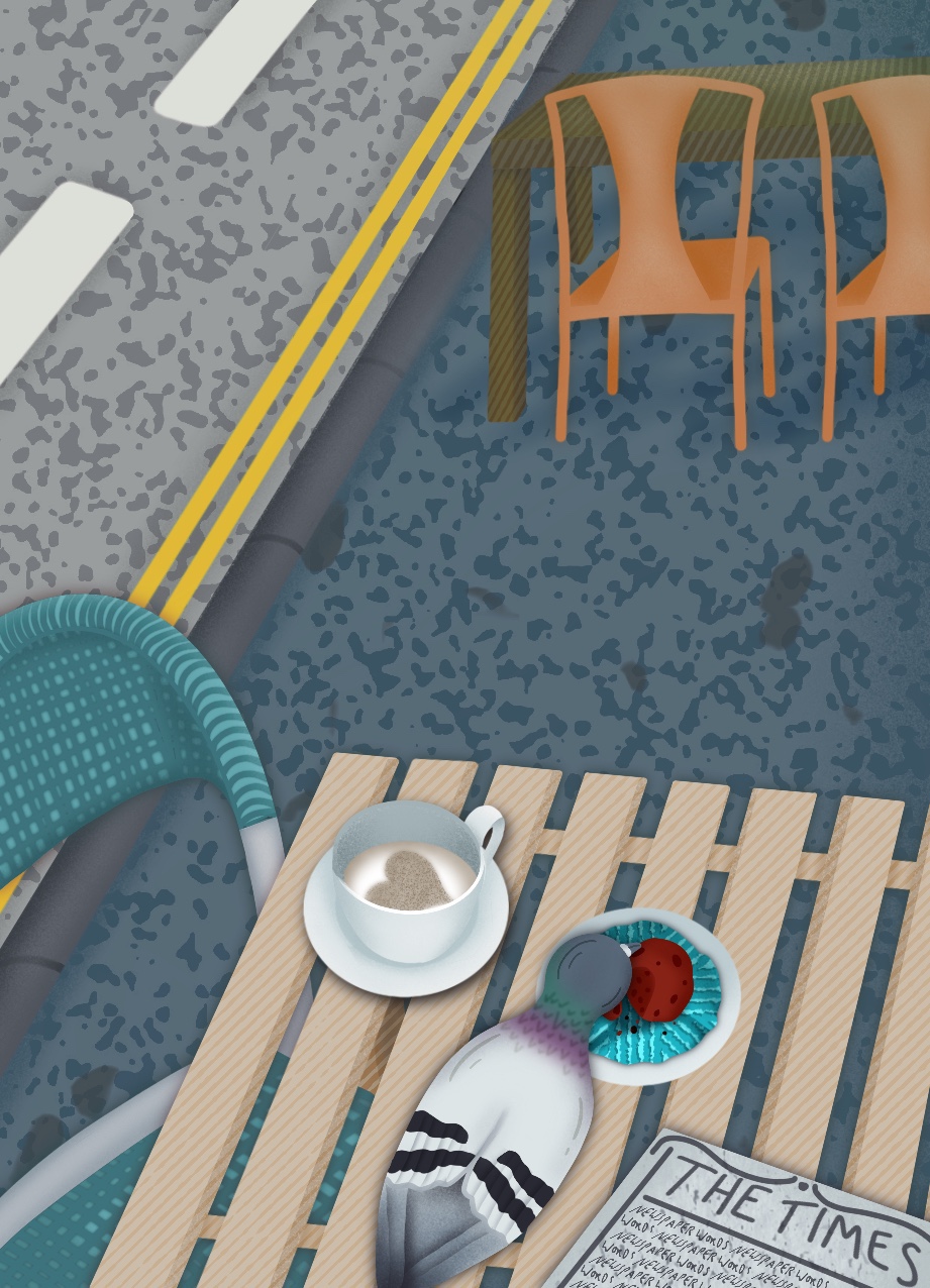
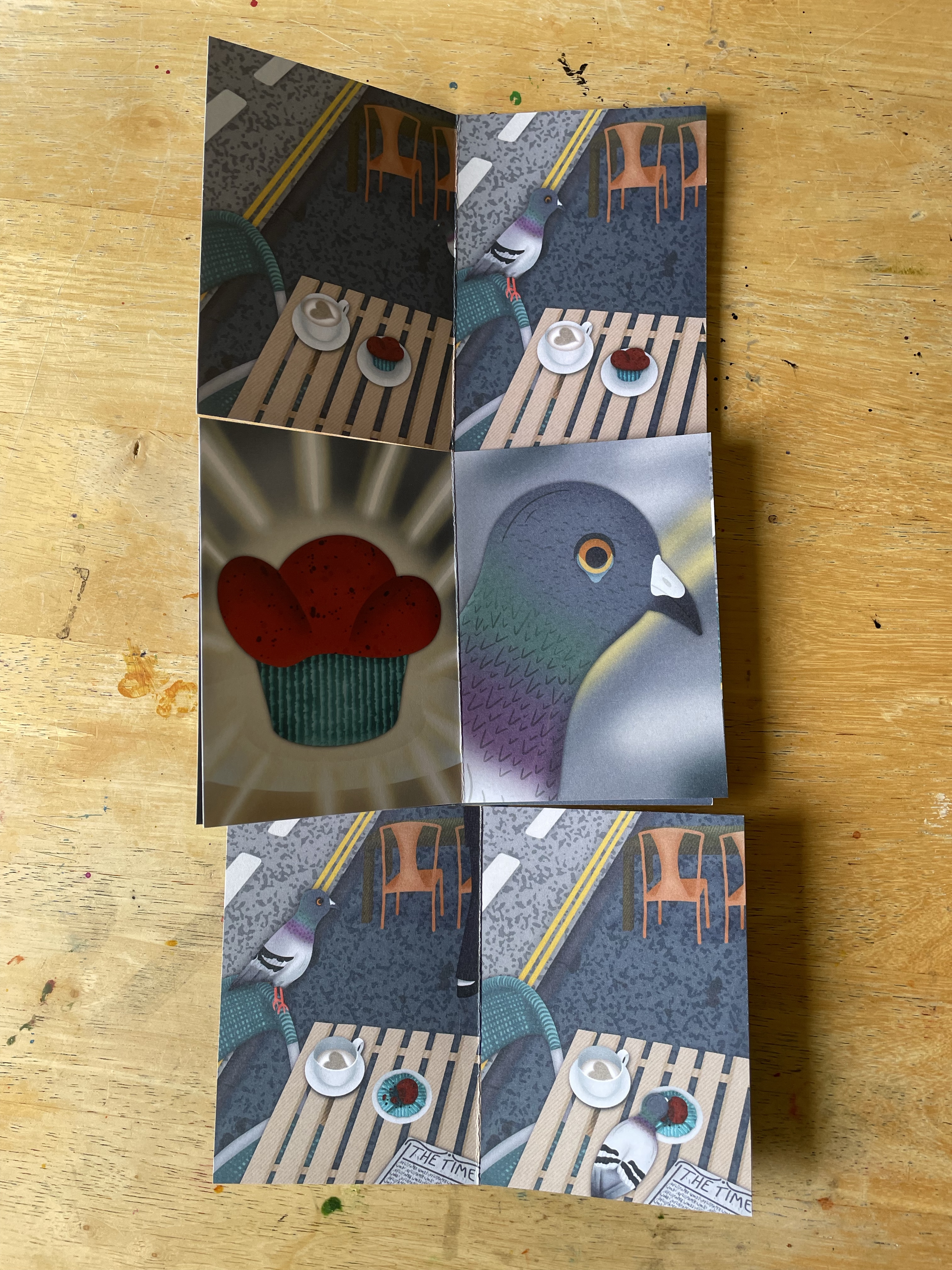
Despite feeling excited about this assignment, I was finding myself stuck on which idea to develop into my zine. I spent some time absent-mindedly drawing in one of my sketchbooks and realised I truly love drawing birds. I think that’s probably obvious to a bystander who has seen how frequently I draw them, but it seems I am only just realising this. I find them fascinating to look at and so fun to capture, especially as silly little characters full of personality. I knew, then, I had to continue with the pigeon concept.
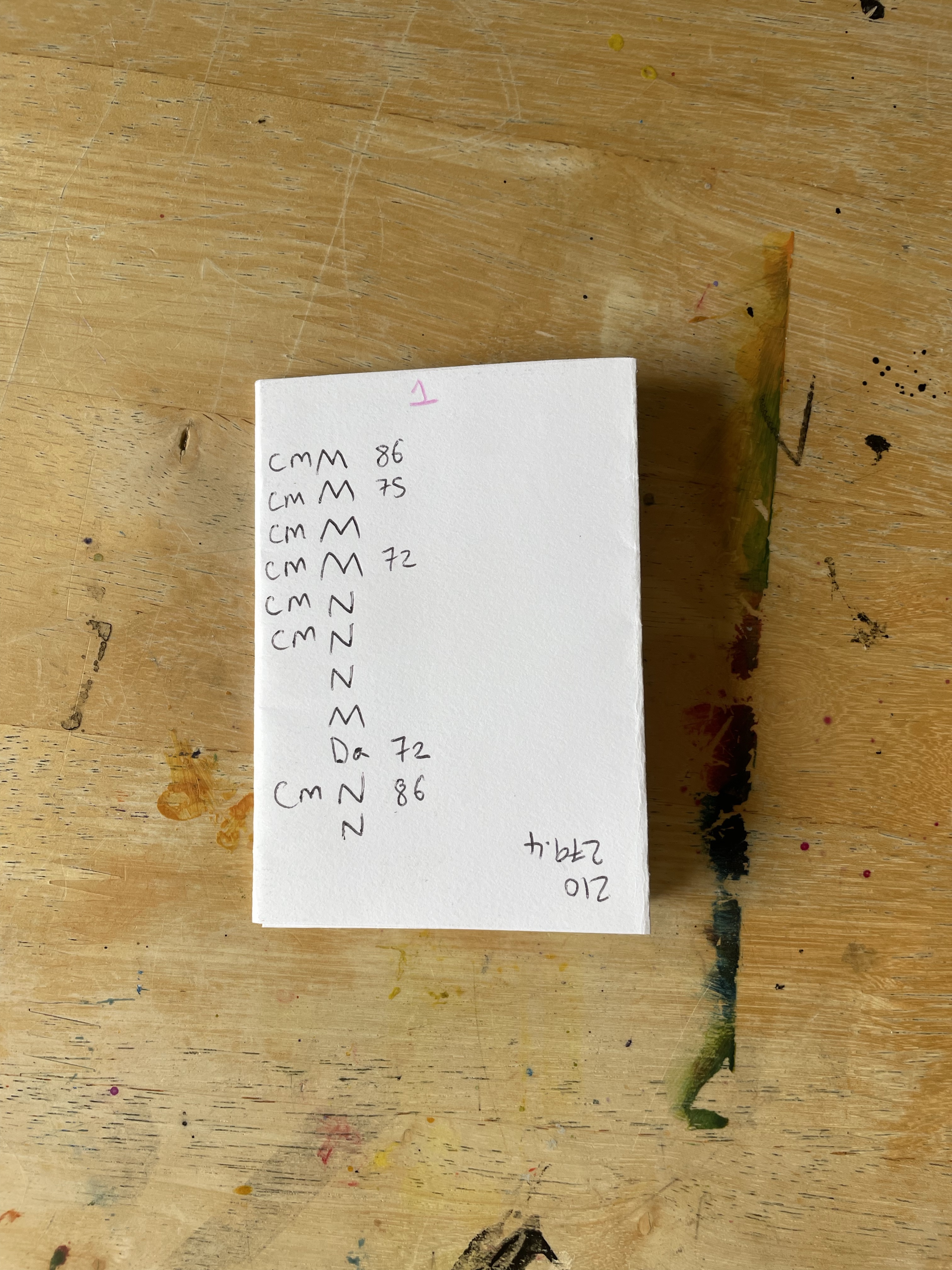
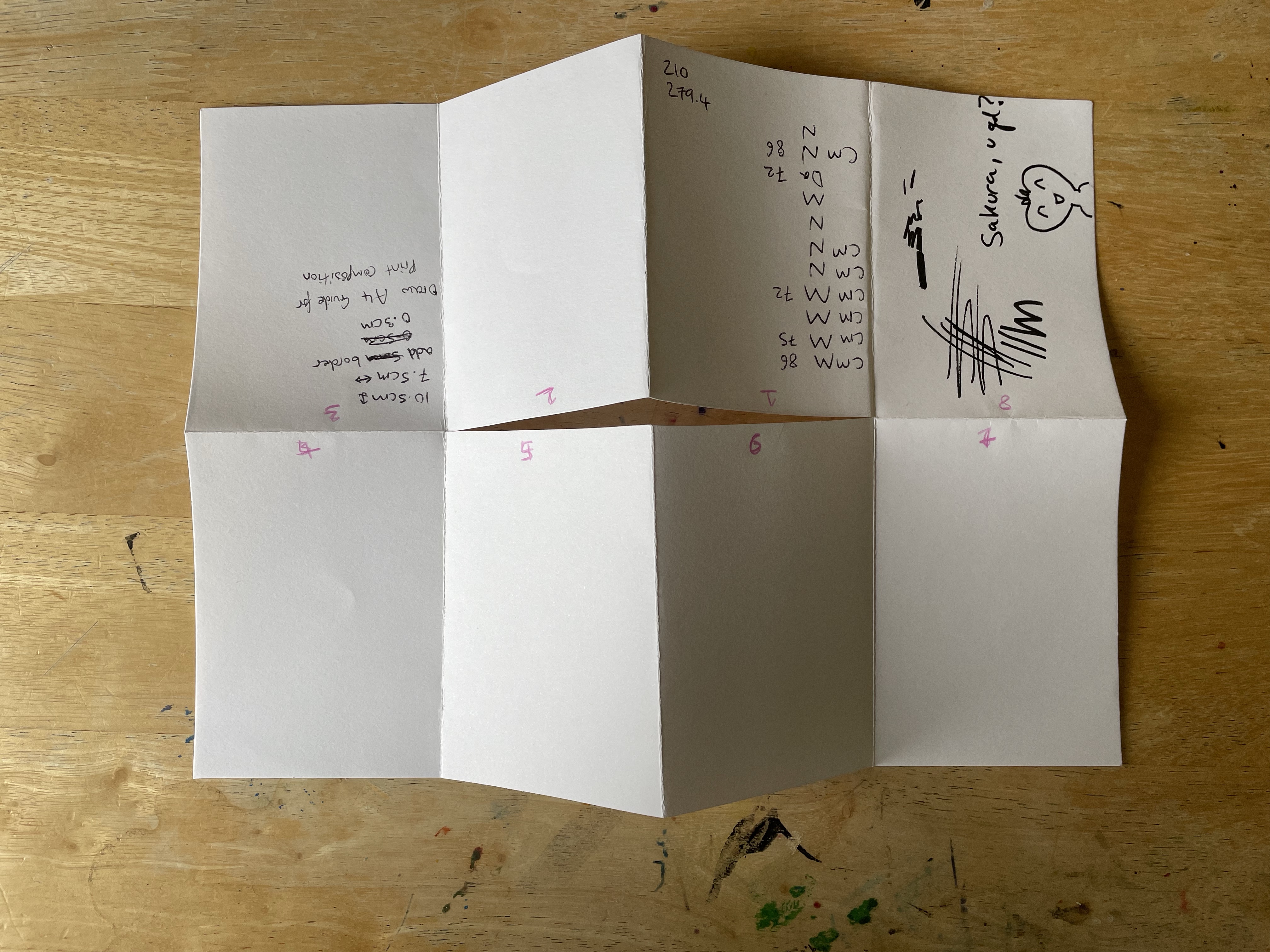
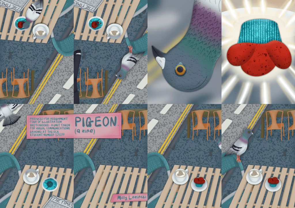
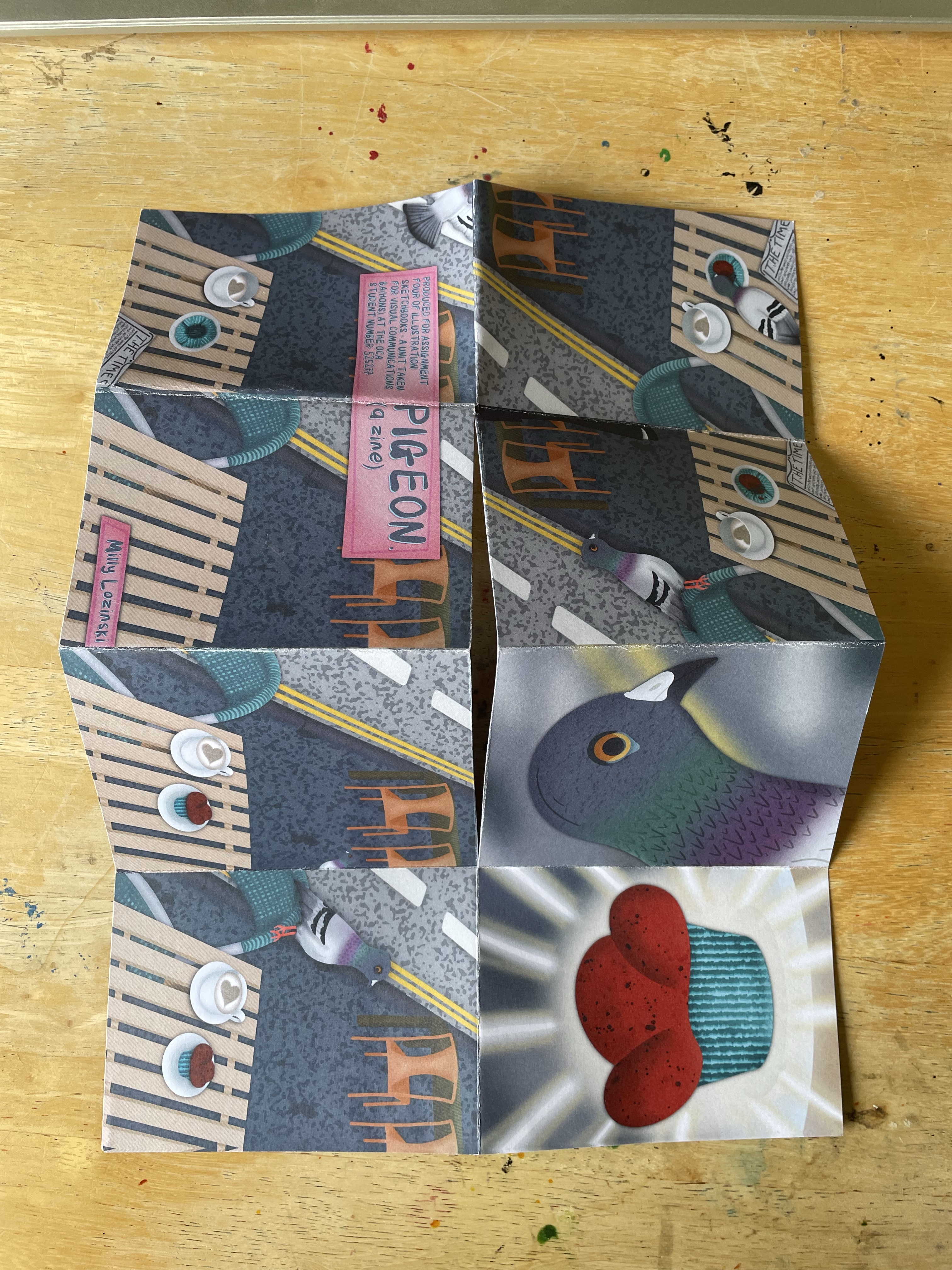
I began thumbnailing and exploring ideas for both the story and how I would illustrate it. I sketched out 8 panels for each page of the zine, and also a 9th panel for the inside of the zine. I thought it would be fun to create a poster that could be seen once the zine was folded back out into an A4 page. I then read through Nigel Watt’s story theory and picked out which elements I wanted in my own story. I wrote them under each panel and then started writing out the story on the page next to it. Finally, I thumbnailed out how I wanted each page to look.
Next, I began considering the colour scheme. I am a huge fan of limited palettes and unique colour schemes and always want to use them in my work. Initially, I was really drawn to having a blue and grey scheme, using the colours of pigeons and nothing more. I then thought about how different animals have different colour cones in their eyes and therefore perceive the world differently. This thought led me to research how pigeons see colour. It turns out they have one more cone than we do and can see ultraviolet light. As there’s no way I can see UV light and create a pigeon-vision colour scheme, I scrapped that idea and moved on. My other option was to use my usual limited 1960s inspired palette. I didn’t feel this would communicate what I wanted, so I chose to rely on my gut instinct and create a pigeon themed colour palette.
Having a colour scheme in mind was helpful, but I still didn’t know how exactly to use it. I started researching comic artists and zines that have limited colour palettes to get some inspiration – such as Fun Home by Alison Bechdel, This One Summer by Mariko Tamaki, Hostage by Guy Delisle, and Paper Girls by Brian K. Vaughan. The palettes used in all but Paper Girls are way more restricted than I wanted to go for, but they still helped me see how the palette could be used. I also looked at Brecht Evens’s webpage featuring his Short Comics. The colour schemes in his work are wonderful and unique, and seeing his short-form narratives helped me to see how I could tell similar stories with my work.
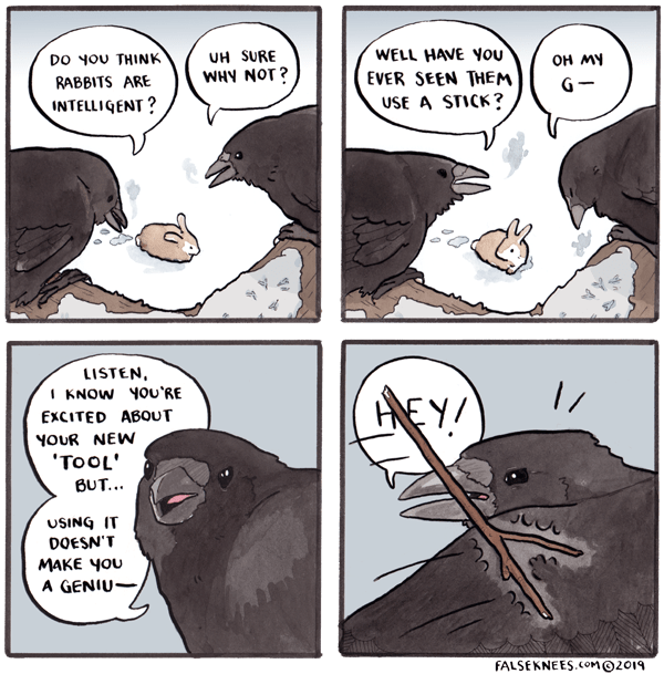
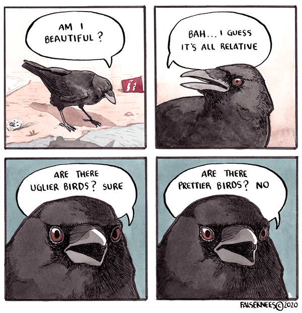
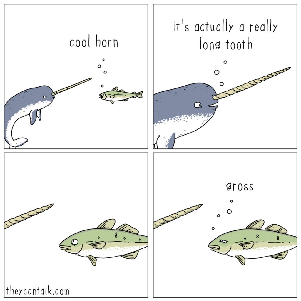
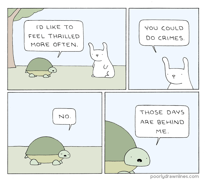
This inspired me to look closer at some short-form comics. I love webcomics, and as most are condensed into a few panels, it’s a perfect genre to help me see how other artists navigate telling a funny, endearing, or relatable story in this format. I looked at some of my favourites that I felt had similar narrative structures and characters to what I was aiming for in my zine. False Knees by Joshua Barkman was a great comic to look through in this context as it focuses specifically on birds and the conversations they might have. Whilst I didn’t want a conversational aspect to my zine, seeing these bird characters helped me when developing my own. Cute, funny, and human-like animal characters such as those also found in They Can Talk and Poorly Drawn Lines appeal to me and the idea of seeing the world from an animal perspective is one I’d like to explore in my work.
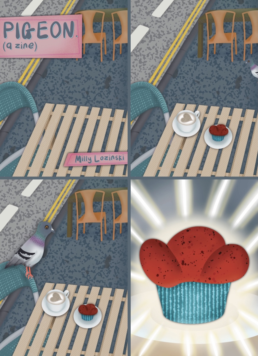
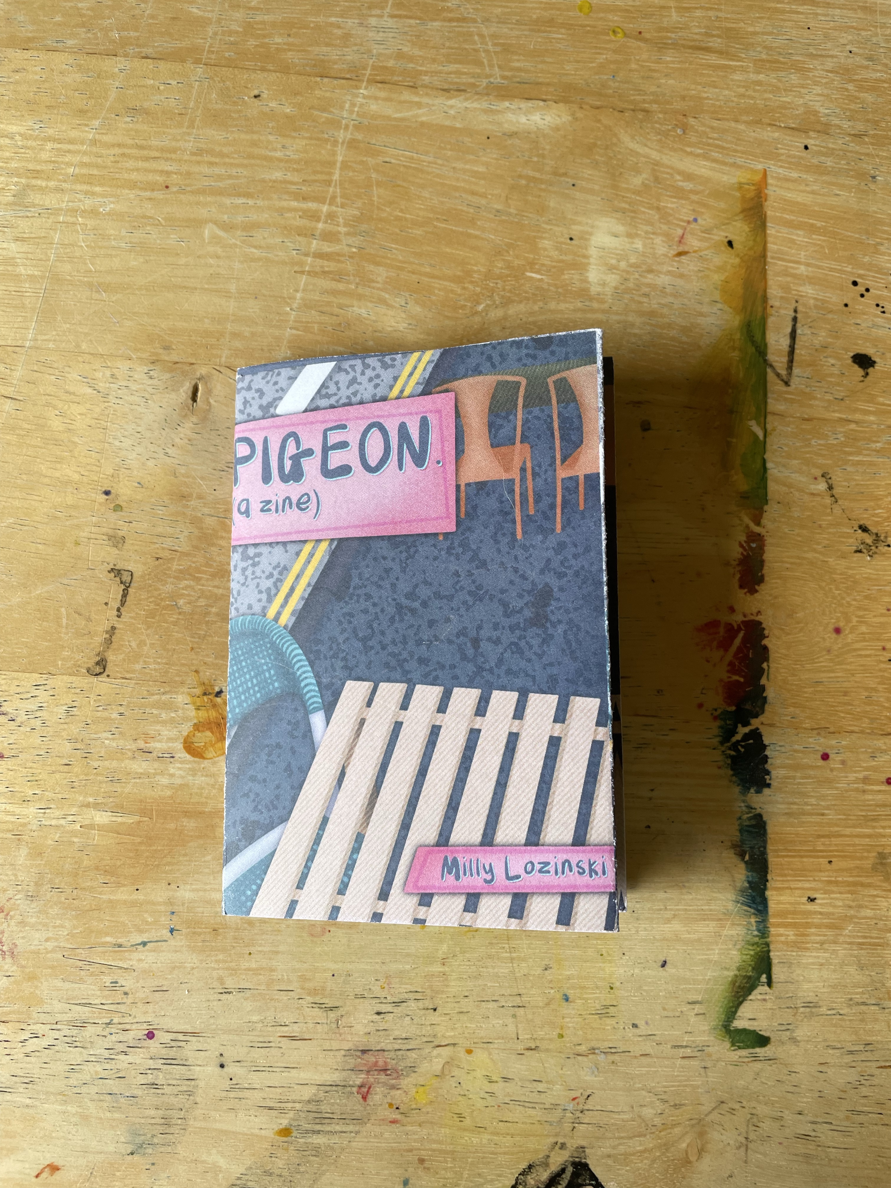
Now that I had a clearer idea of what I wanted the structure of my story to look like, and how I wanted the zine to look visually, I started brainstorming on a name. I liked the idea of the title being stylised ‘Title: A Zine’ so focused on snappy and short names. I thought about how pigeons are a part of the wider ecosystem in our society and considered ‘Cycles’ or ‘Ecosystems’ as the title on that basis. I also considered titles from the pigeon’s perspective such as ‘Voglio’ (Italian for ‘I Want’) or ‘Feast’. After some back and forth and discussions with other people, I decided the simplest and catchiest name was just ‘Pigeon’. At this point, I had all of the components of my zine ready and just needed to start making it. I wanted to design it digitally and then print it to fold. My printer has the capacity for this but it felt too complicated and expensive, so I researched a variation of printing companies and ordered some paper samples for when the time came.
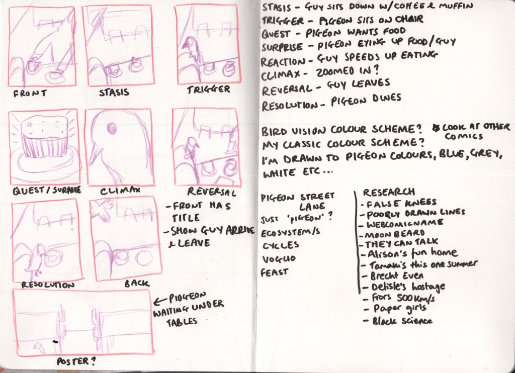
My go-to digital illustration software is Procreate, so I opened up 8 identical canvases sized 10.8cm by 7.8cm. I had measured the pages on my mock zine to get this sizing, then added a 0.3 border to use as a bleed between panels. I then sketched out a rough plan of the background as this would be consistent across most panels. I drew out a line visual to make sure I was happy with the placement of everything, then I was ready to start experimenting with my colours. I used google to find a picture of a pigeon and colour matched a range of colours from the bird to create my palette. Then I began filling in parts of the background with block colour, before adding textures and shading. It took me a while to figure out exactly what colours I wanted and I was worried that I wouldn’t actually be able to align my work with my vision. I used a lot of overlays to change the hues of different areas of the illustration, but ultimately it needed some bigger colour changes. Once I was happy with the background, I duplicated it into the other 5 panels it would feature in and began sketching each page out clearer.
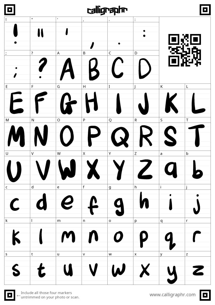
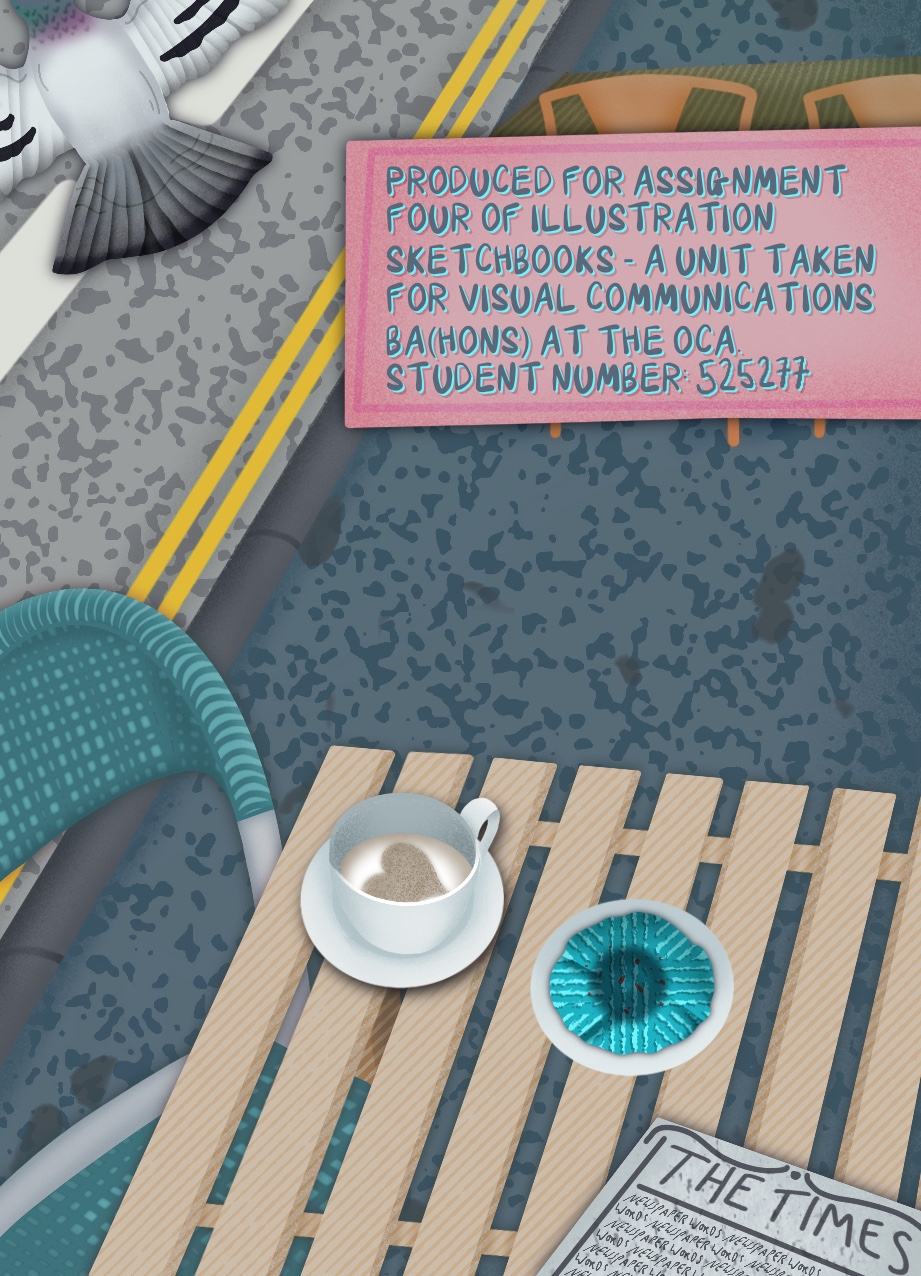
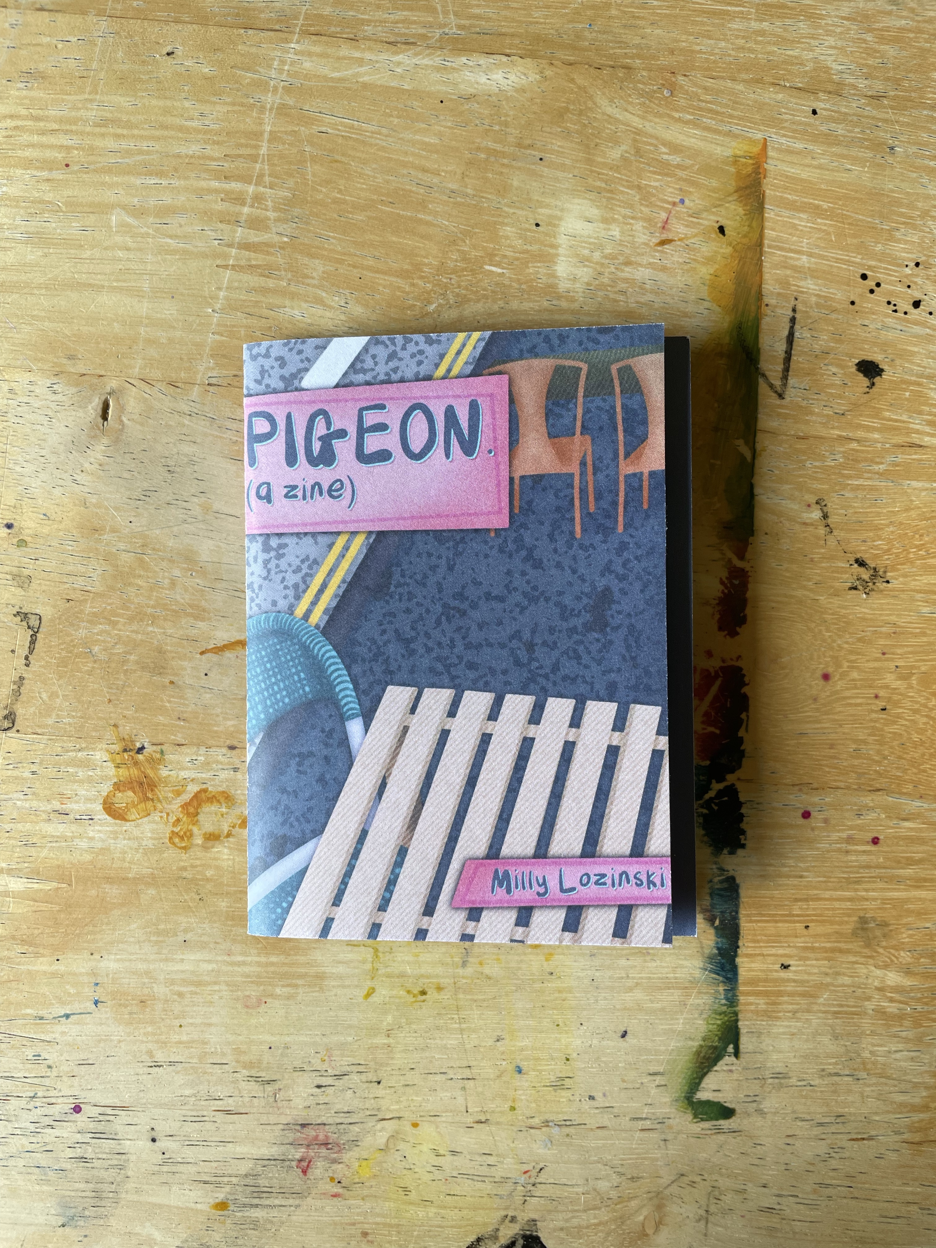
I focused on the front page to start with, figuring out which font I wanted to use for the text. I tried a couple I had saved on my iPad before realising the hand-drawn lettering that I sketched to indicate where the text would go actually captured the feeling I wanted from the font perfectly. I decided to design my own font to use, which was pretty simple and thankfully not time-consuming. I used the Callligraphr website which provides a template and then turns whatever you draw into a font. I wasn’t too careful here as I wanted the hand-drawn and messy look, and I’m so pleased with how it turned out. Having a font rather than drawing out each word myself was a huge benefit as not only did the text look consistent, but working with text layers rather than rasterised pixel layers allowed for more freedom and a better look overall. You can see on the back page where I had to draw the numbers myself how different this layer looks. It isn’t as easy to read, and the pixels really stand out.
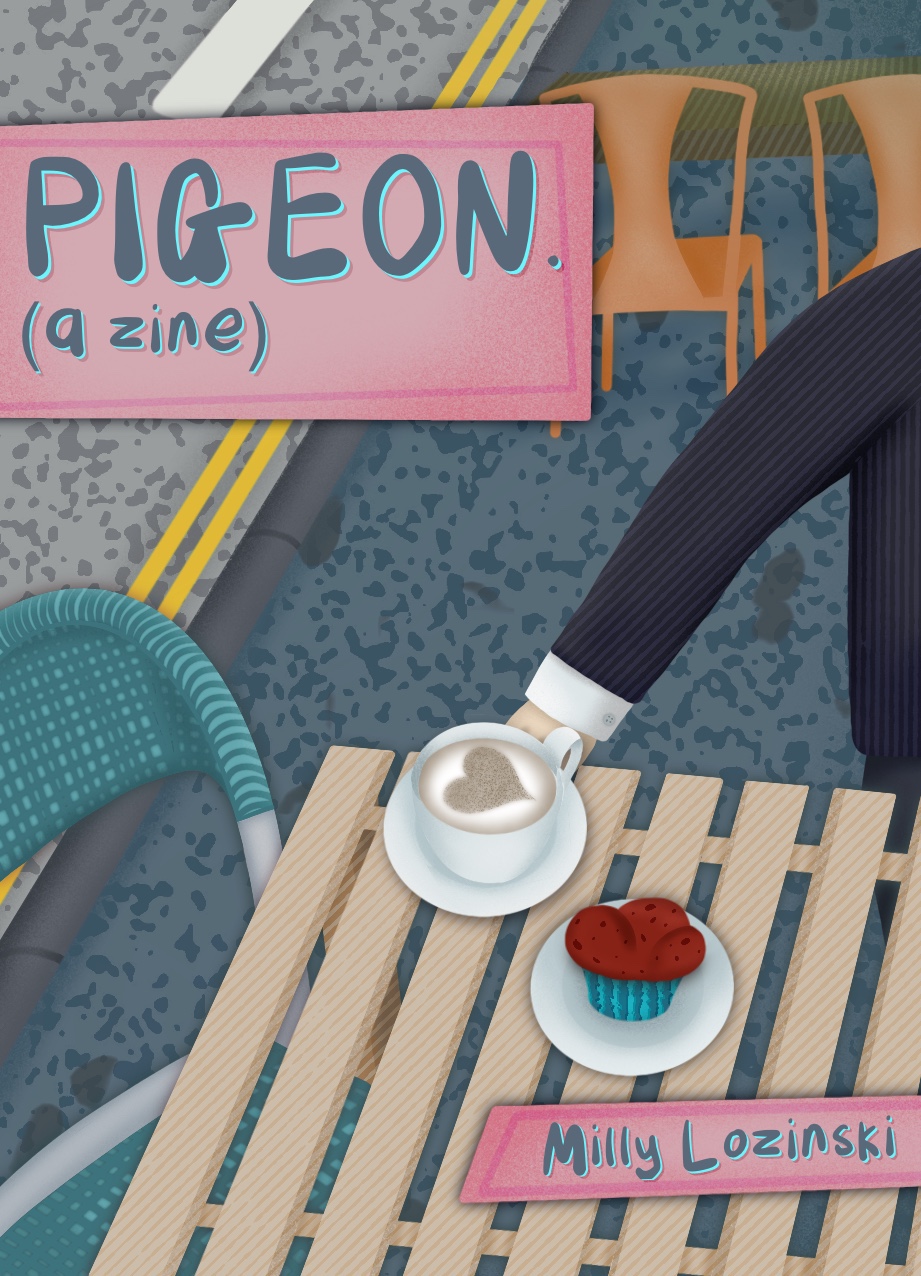
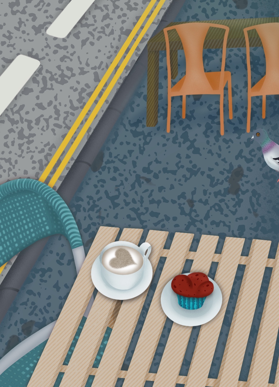
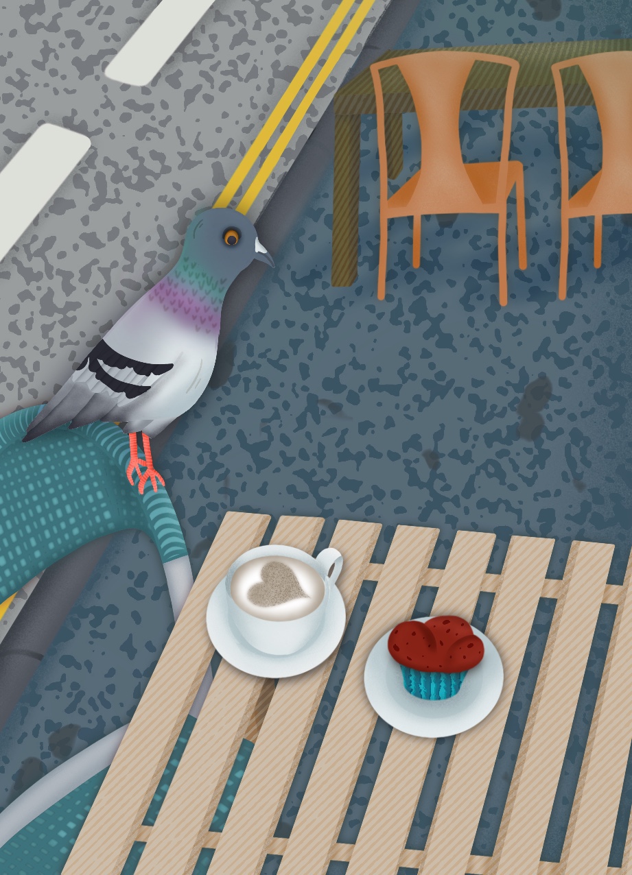
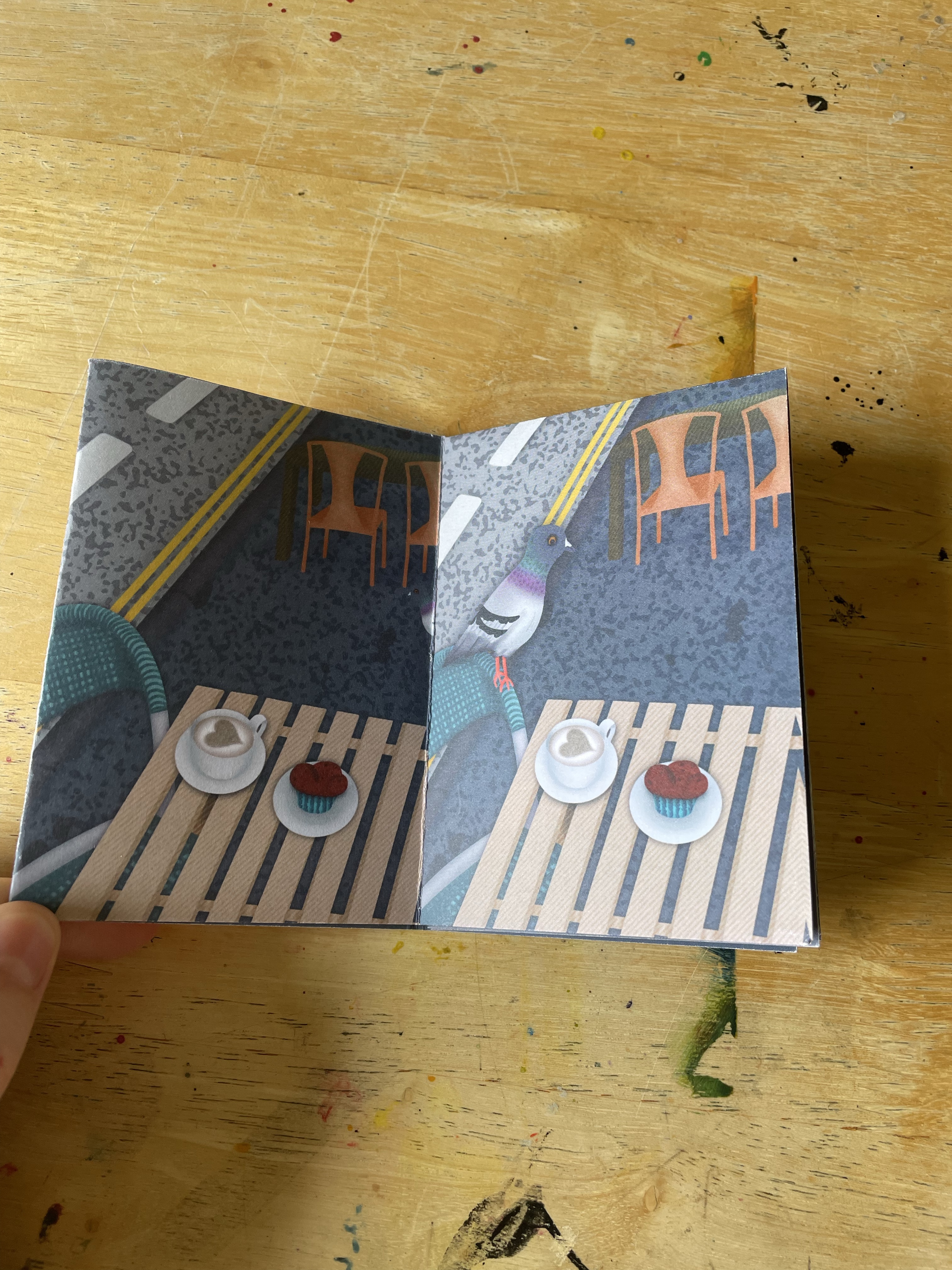
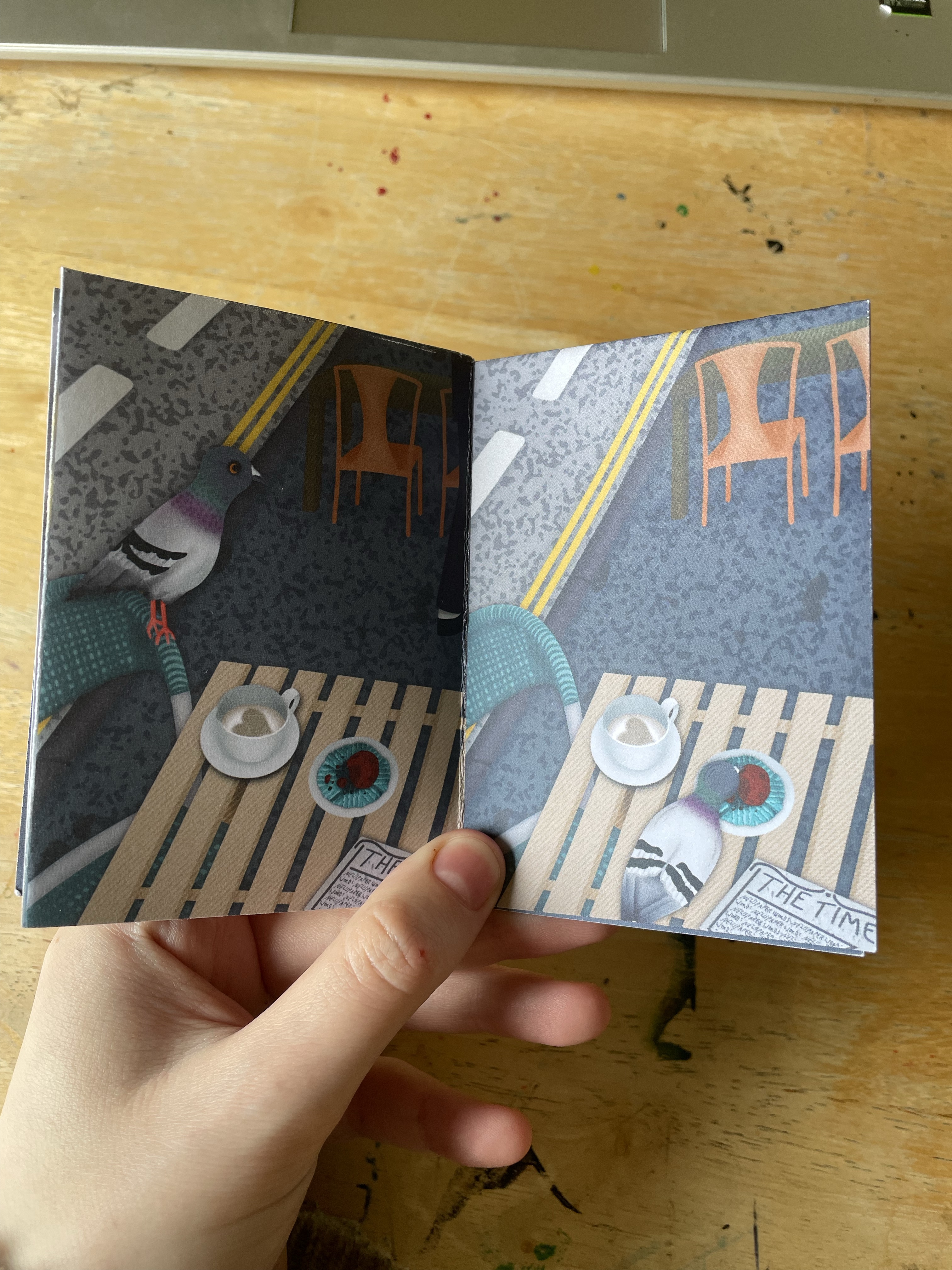
Next, I figured out how I wanted the text placement to look. This involved a lot of trial and error, figuring out which colours worked best and how to frame it. I feel good about the result and I’m glad I tried so many different options. To keep it consistent, I duplicated the text layers and copied them onto the back cover, where I ensured the framing would align to look as though it was wrapped around the zine. The mock zine I made came in handy here, as it helped me figure out where to place the text. After completing the text on the back cover, I finished the illustrations on the front cover. I wanted to add a human character placing the muffin and coffee down on the table. As the pigeon and the food are the stars of the show, not the human, I drew him out of frame.
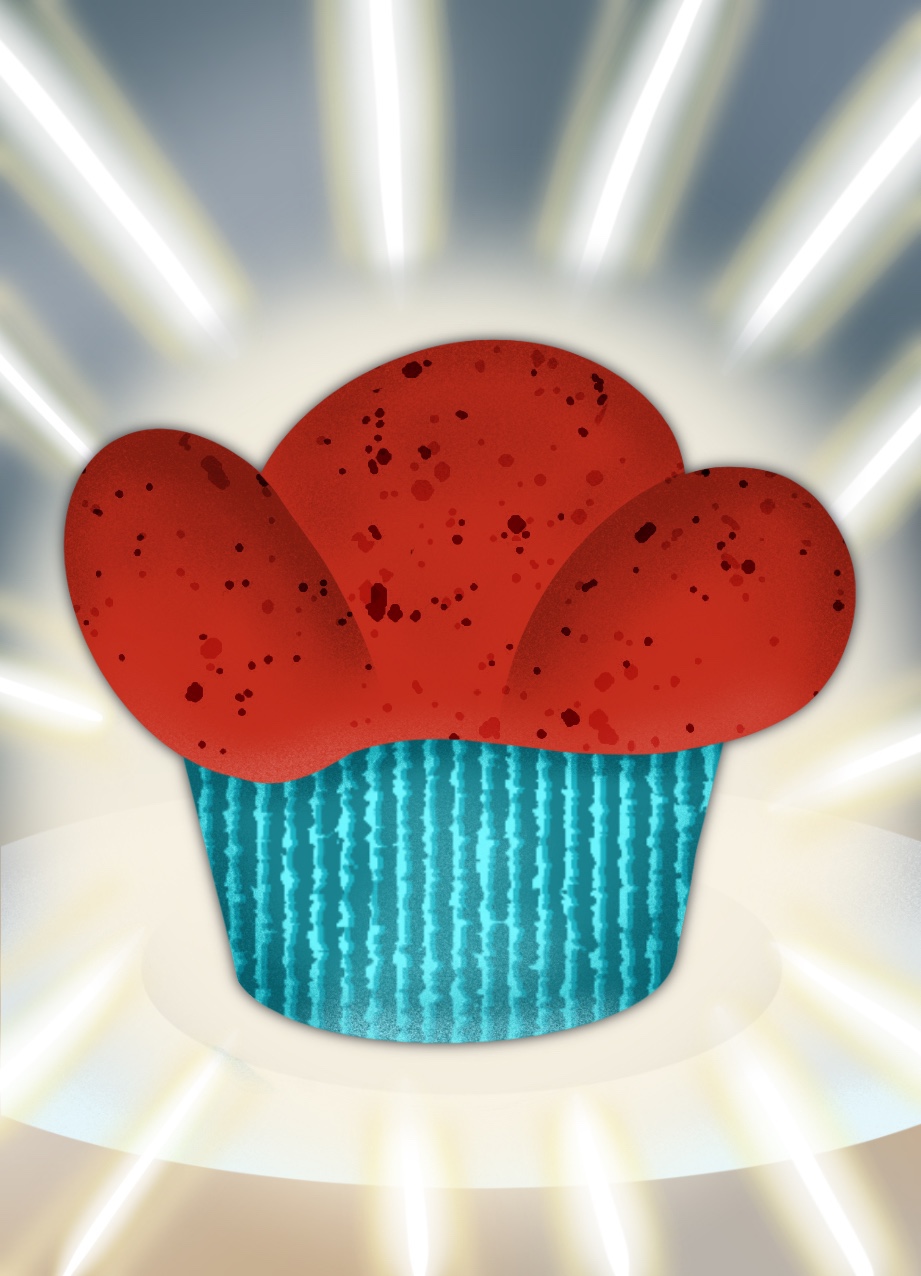
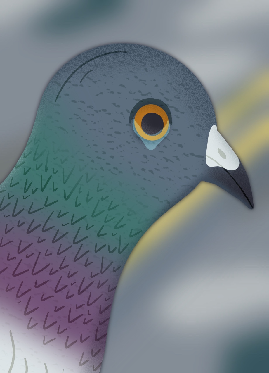
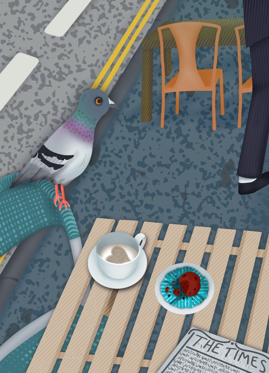
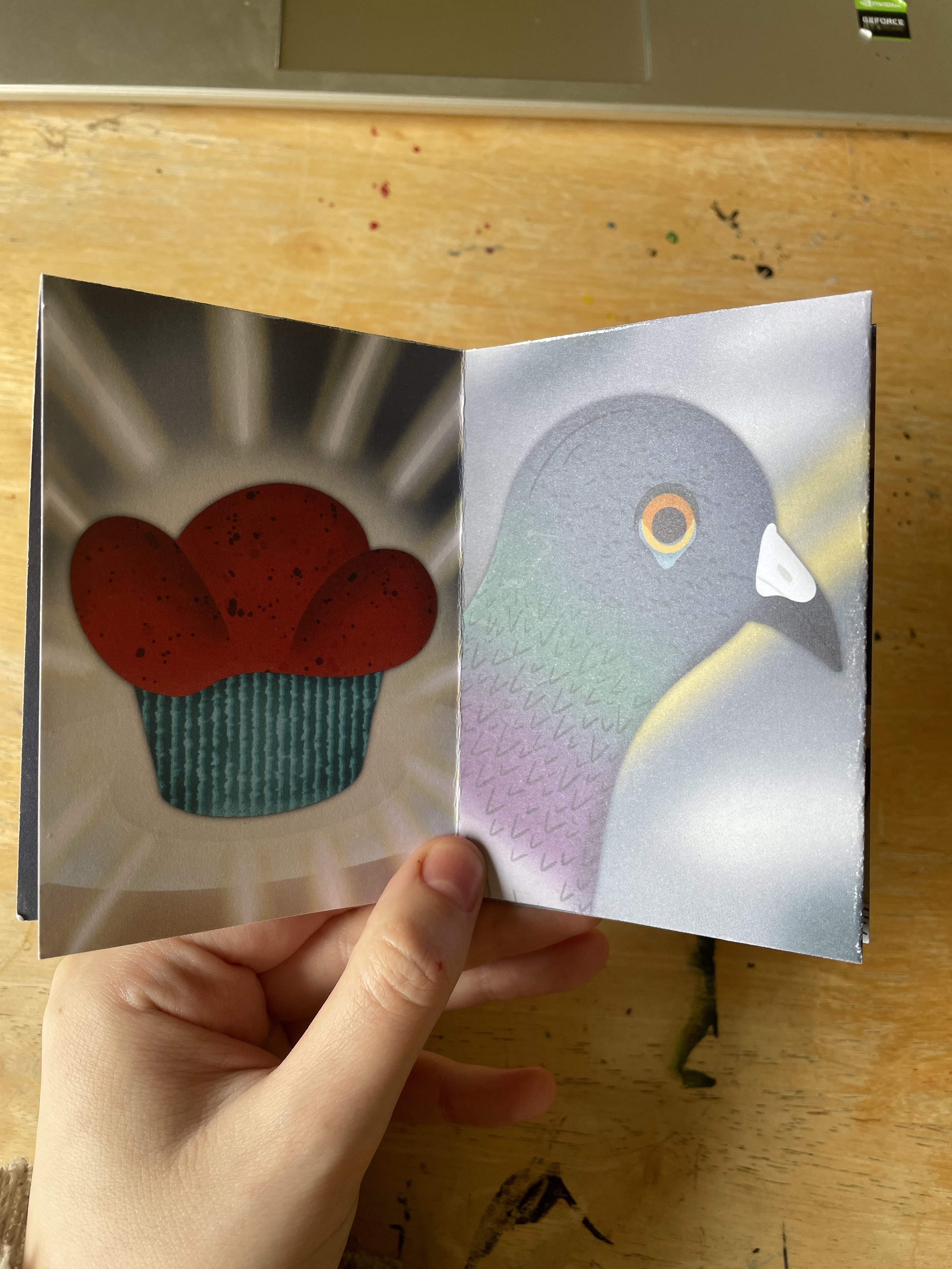
I then began to work on the rest of the pages. It was pretty easy to complete the zine once I had the elements and background drawn, as the same elements were used throughout most of the zine, and it made sense to copy and paste them throughout. I added in what was needed, such as the pigeon and newspaper, and changed elements slightly to show the half-eaten muffin and half-drank coffee. For the centre pages featuring the muffin and close-up of the pigeon, I redrew everything using the original drawings as a template.
Once I was finished with the illustrations, I moved into Affinity Designer to piece together my page for printing. I created a guide for myself to ensure each panel was in the correct location for folding, then inserted each panel into place. I filled the background in with a solid blue-grey colour to cover any potential gaps in between panels and added a 3mm bleed in the same colour. I then duplicated the file and removed the panels, leaving just the blue-grey colour, which ended up being used as the inside of the zine. As originally mentioned, I did want to create a poster, but I felt it was too much extra work and I hadn’t left myself enough time. I printed the zine using Instantprint and then created a web-friendly comic format.
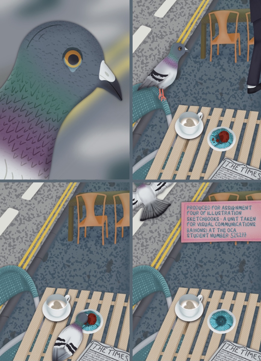
Despite triple checking, I didn’t realise until receiving the prints that I had selected an incorrect file for the front cover. The file I selected is missing the man and food elements, which I’m really frustrated about. Thankfully it doesn’t completely ruin the zine, but it does make me feel sad that I put so much work in only for it to be missing. I have learned from this mistake to check each individual file before printing, not just the final copy.
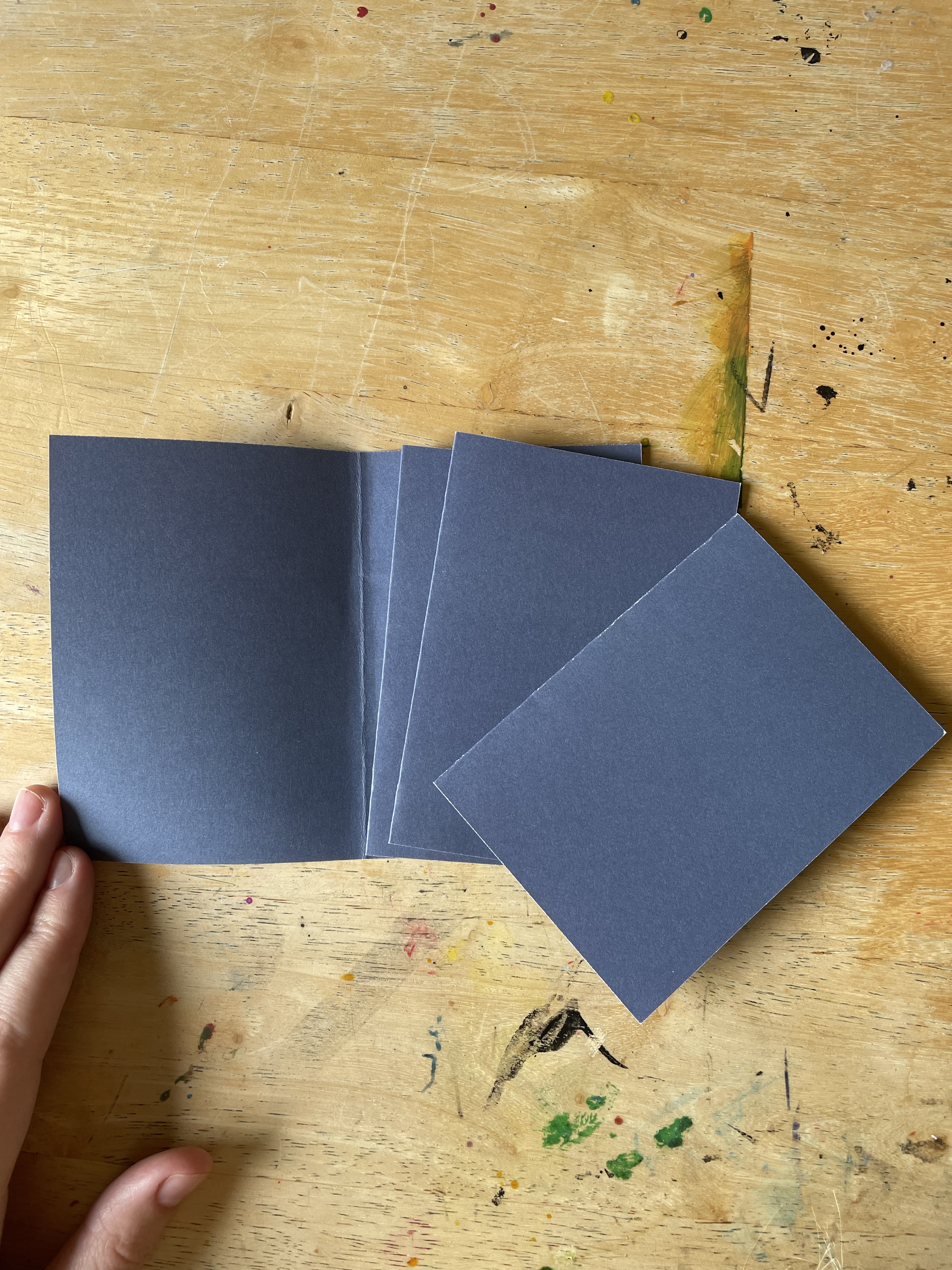
The zine folds well, though is a little bit misshapen. I ordered several copies just in case I made a mistake with the folding, so I was able to try out a slightly different technique, cutting out each set of panels and folding them together. This would work if I glued it back together, but without that, it’s not readable as a zine. Unfortunately, my glue is all packed and inaccessible right now, but I’d like to give it a go sometime.
Although the printing is technically wrong, seeing my zine like this makes me feel enormous pride. It is exactly as I envisioned, if not better, and I’m a little overwhelmed by that. There are a few elements I would change, such as the brightness of the pigeon’s legs, but overall I think it’s fantastic. I also had so much fun illustrating this, picking out textures, navigating my colour choices, and working with such a cute and silly story. I felt back at home illustrating a full project and seeing my ideas come to life.
To round up Part Four, the unit guide asked me some reflective questions.
How did including written description alongside your drawing affect the way you were ‘capturing’ information?
I think I have always been drawn to writing in my sketchbooks, and jotting my thoughts down in written format helps me to explore my ideas better. In my previous unit, I would write ‘research sheets’ which incorporated my thoughts, research points, and some basic thumbnailing, much like my thumbnail pages in this assignment. I find it very helpful to write my thoughts, and extending that to descriptions of what I’m seeing was helpful too. I’ve gotten a bit caught up in the idea that ‘sketchbooks are for drawing’ and that I should be trying to draw what I see, not write it, so it was refreshing to be reminded of this.
How did you find the process of moving from descriptive drawings towards fictional narratives?
I very much enjoyed the process and found it useful to explore exercises and techniques that help in achieving this. Some of the exercises I have done throughout Part Four will remain with me forever, I think. I feel like I have a great grasp on idea development in this way.
We talked about having conversations with previous illustrations, which of the illustrators mentioned in this section’s work did you have the most dialogue with?
Myfanwy Tristram’s work inspired me hugely, and further investigating artists who use visual diary techniques has helped me to see how my own artistic practice could utilise this. I am looking forward to implementing some of the themes I identified in Research Task 4.0.
Part Four has been very enjoyable. I feel I have learned so much about how I can use my sketchbook and the ways it can work for me. I have found much of the course difficult thus far, and Part Four has felt refreshing. I am excited now to move onto Part Five and to reflect on my sketchbook journey.

[…] I have on a few occasions made prototypes or real-world mock-ups prior to designing, like in Assignment 4 of Illustration Sketchbooks, or for Exercise 33 of Key Steps in Illustration. I think this is mostly down to the type of work […]
LikeLike