
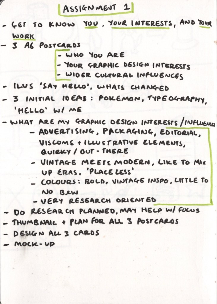
The first assignment of Graphic Design: Core Concepts focuses on introducing you, your interests, and your work to your tutor. I was asked to design three postcards that show who I am, my graphic design interests, and my wider cultural influences. The final size of the designs would be A6. I was able to use any medium or materials I wanted to and could do my initial designs in any size as long as they were reduced down for the final image.
I had read the unit guidance for this assignment months before I began the unit – so it had already been brewing in my mind for some time. This meant that upon starting, I already had a pretty good idea of three areas I wanted to focus on for my designs. I’d spent the months prior really thinking about what my interests are, what I’m inspired and influenced by, and what makes me excited about design. I didn’t know exactly what I wanted on each card, but a vague idea was in the works.
Despite this, I approached the brief as I would any, and began by writing out key points. It was important to me to make sure I was doing it properly and not getting caught up in the ideas I’d had whilst removed from the unit itself. I broke down each postcard into ‘you’, ‘your interests’ and ‘your work’. Each one would showcase my influences and inspiration, and hopefully my design interests too. My three initial ideas were a postcard with a portrait of myself on (you), one focused on the Pokémon franchise (your interests), and one centred around typography (your work). I then started to consider what my graphic design interests and influences are, to ensure I would represent them in my images.
Advertising, packaging, and editorial design are three areas of design that excite me and that I’d like to get into more. I’d like to merge illustration with my graphic design and create a quirky, out-there feel to my work. I’m hugely inspired by history and the past in general – especially the early and mid-20th century. I want to capture a ‘vintage meets modern’ vibe in my work, and I’m fascinated by ‘placeless’ aesthetics, where the merging of a range of popular design elements from various eras creates something new. Colour-wise, I prefer to stray away from blacks, whites, and greys, and love to be bold and bright in my choices. Even when working in my sketchbook – I can’t bear a colourless page.
Identifying my design interests, influences, and style in this way was helpful and got me thinking about what I needed to express in my postcards. I wrote out a plan for what to do next and then started thinking about how much my persona as an artist has changed since I first started this degree.
Whilst reviewing the brief, I remembered how my first assignment for Key Steps in Illustration was a very similar theme. I was asked to design a greetings card that introduced myself to my tutor, much in the same way as this brief asks. This was my first-ever assignment for my degree, and before I continued with this assignment, I wanted to take a minute to reflect on it and on how my work has grown since. The full assignment can be found here.
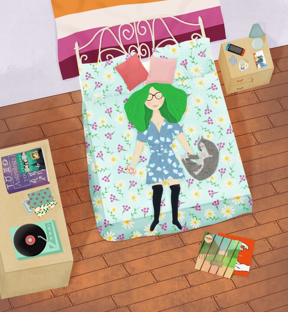
I feel like I have a much stronger idea of my interests and influences now. I know my style and feel confident in it too. I wrote at the end of Key Steps in Illustration that I finally felt like a ‘real artist’ – and that feeling has only grown. Through research and experimentation, I have learned technical skills and also figured myself out as a designer, which is awesome. Looking at this image, I can’t help but consider how it would look if I re-created it now, with my new skills, and new interests.
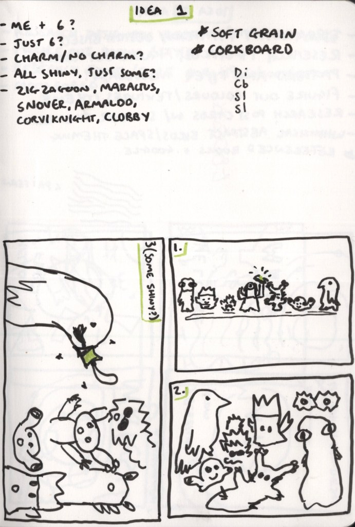
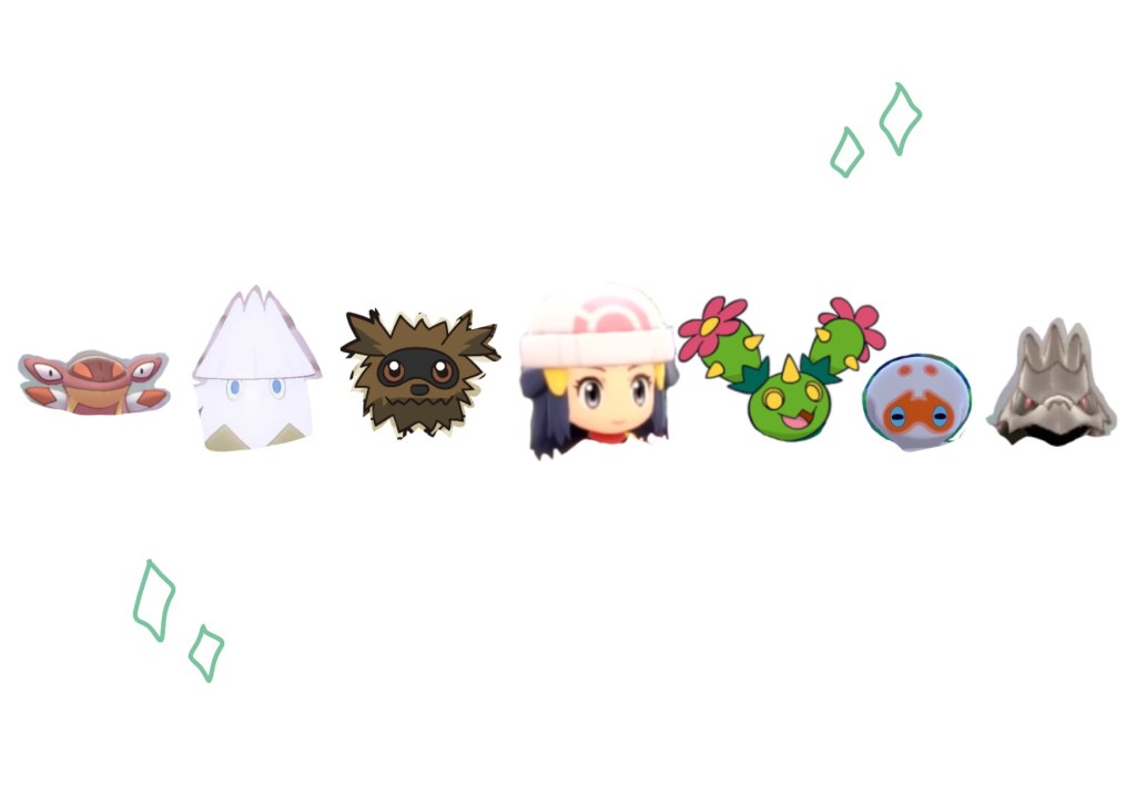
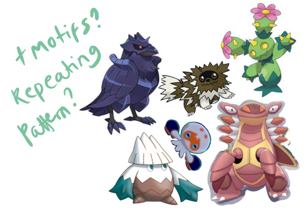
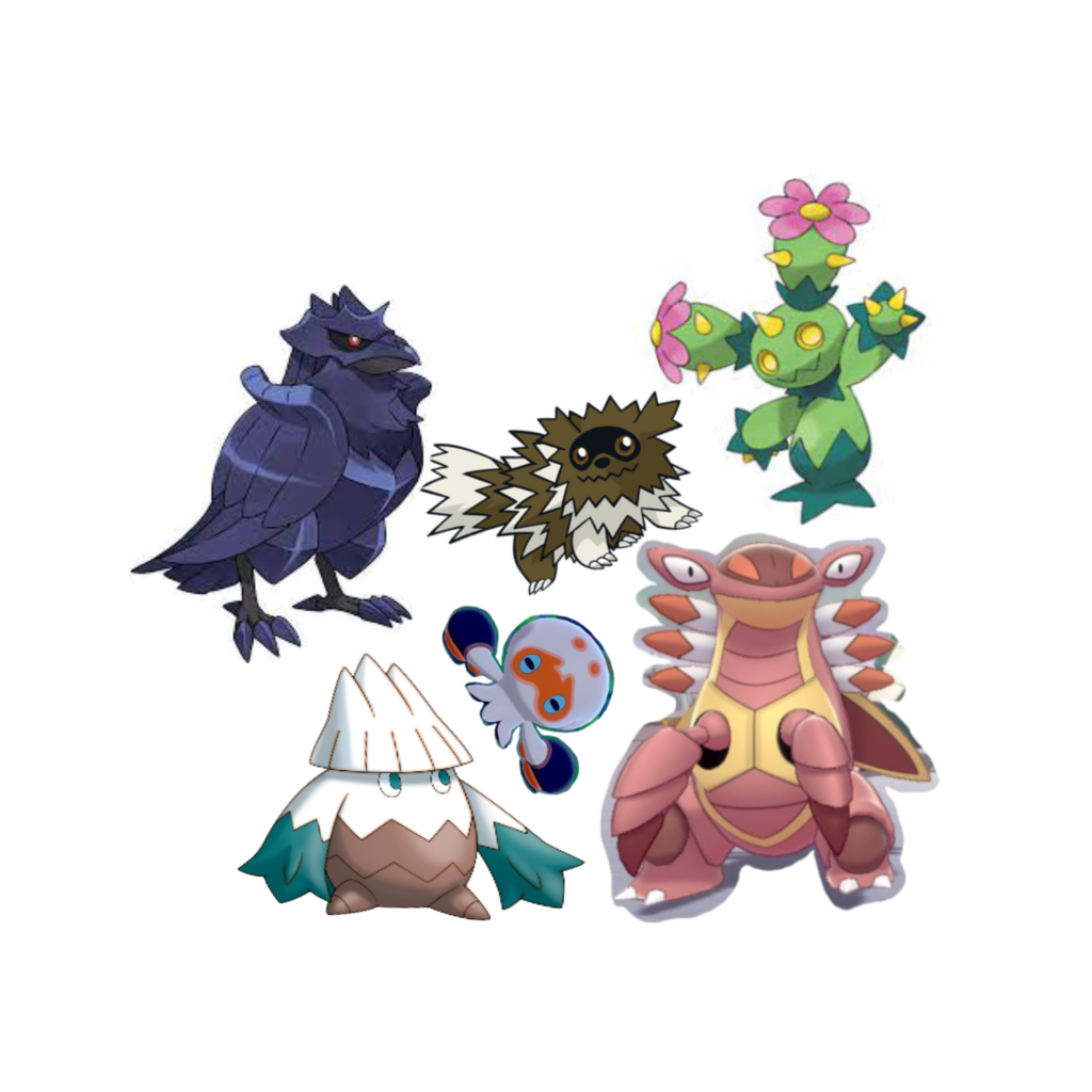
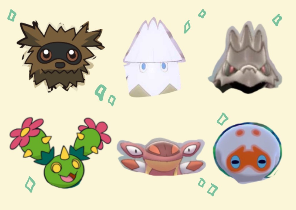
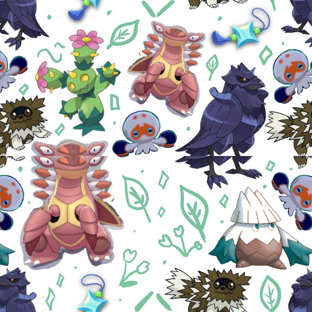
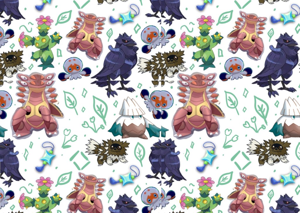
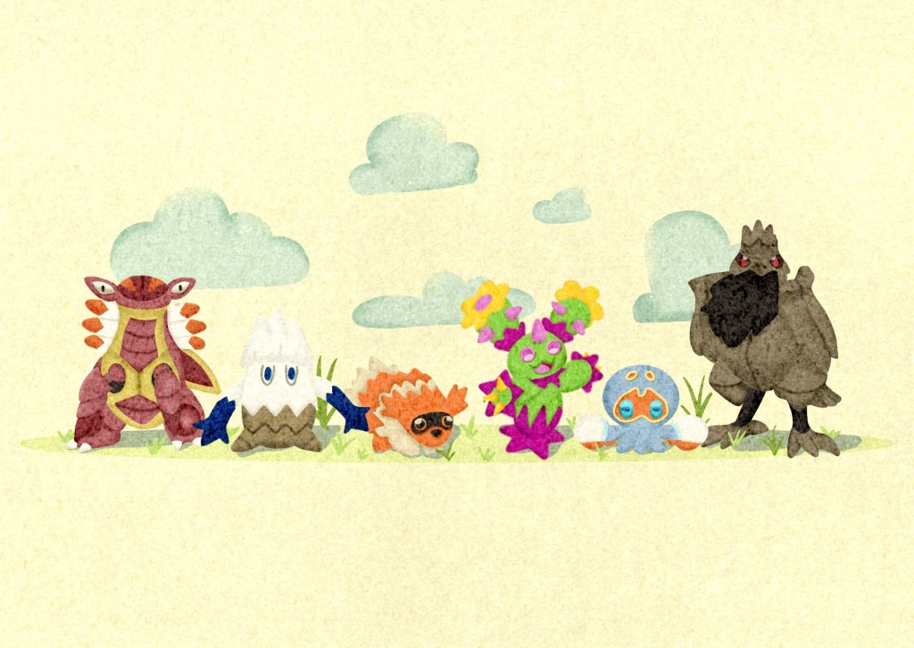
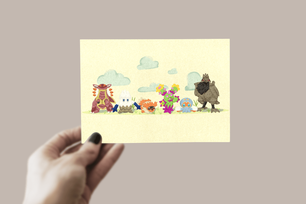
Reviewing my previous work made me feel nostalgic and excited, as my growth is so noticeable. I was looking forward to seeing how my work for this assignment would compare. I got back to my sketchbook and started planning out my postcards. I drew some boxes to thumbnail my ideas in and wrote some notes alongside. I started with the Pokémon postcard concept, as I felt it would be easiest to nail down. I began by choosing 6 of my favourite Pokémon – the size of a team in the game. I then started playing around with composition, content, and layout.
I had three initial ideas, but I was finding it quite hard to visualise them, so I decided to create some prototype designs using existing imagery. I find this to be a very helpful process, as I have aphantasia (meaning I can’t see images in my head) and struggle to know if something ‘looks good’ without literally seeing it.
Not only did this help me to get a better view of the designs I’d already come up with it also helped me with creating new concepts. I ended up with more than I started with, and with no idea which was the best one. I loved them all equally and they all felt well suited to a postcard. I asked for feedback from some friends and fellow OCA students, but the reception was mixed, and I felt no better off than prior. I managed to narrow it down to two concepts – the 6 faces shown as portraits, and the lineup including myself.
I didn’t want to give up the pattern concept, however, as it felt like a good way of showing my design interests. Initially, when I began my degree I wanted to work in surface design, and whilst I’ve strayed from that somewhat, pattern creation is a staple part of my creative identity. I decided to design a pattern concept for each postcard which I could use on the back, or as a secondary postcard that complements the first. This would not be a priority, though, and only a concept to work through if I have time spare.
I decided to move on to developing my other postcards further in the hopes that I would have a better idea of which option I preferred after some time away. For the second postcard, I wanted the focus to be ‘My Work’. I’d considered designing something typography focused but had no idea what to write or which parts of my work to showcase. I decided to do some research to try to get some inspiration.
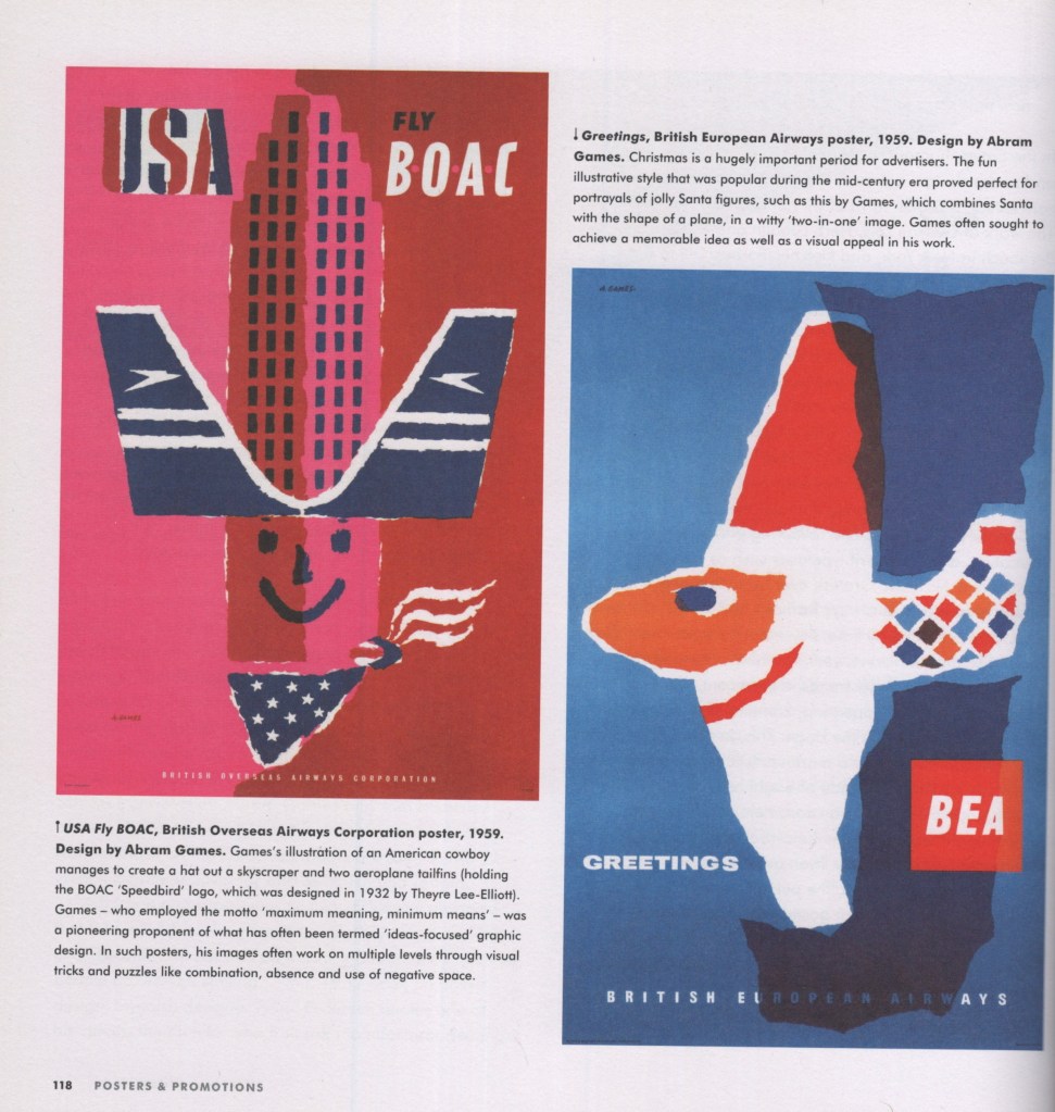
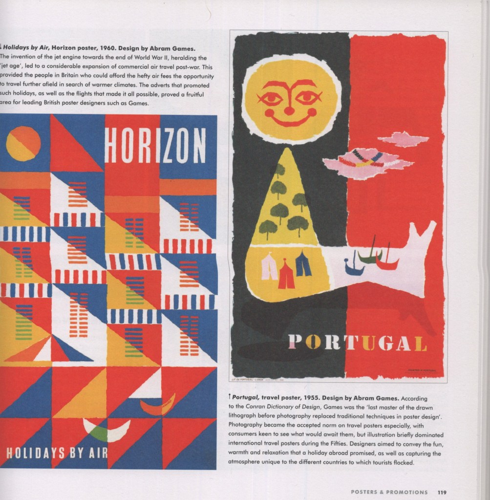
I started by looking through the book ‘Mid-Century Modern Graphic Design’ by Theo Inglis. The book contains examples of graphic design from the 1950s and is organised into categories based on how the designs were used. There is not a postcard section, so I decided to look through the poster chapter as it felt like the closest thing. Unfortunately not much was capturing my interest for this postcard design – however, I did find some colour palettes that I felt would fit well for my third design.
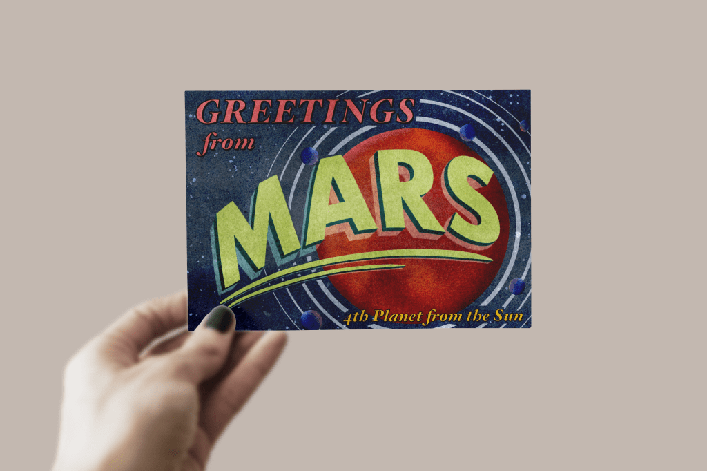
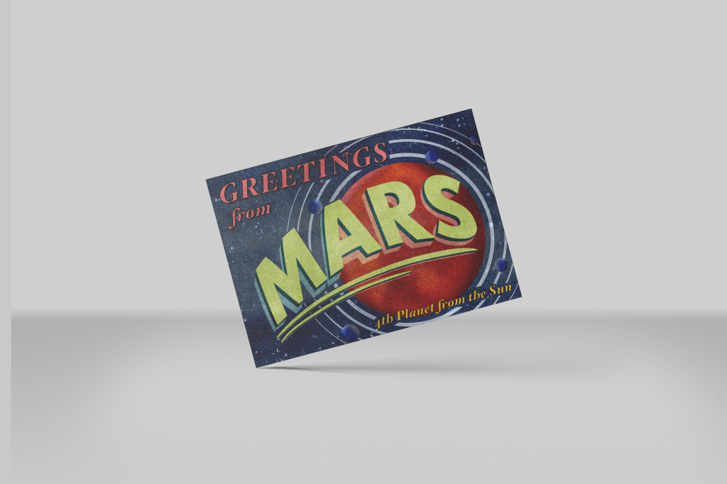
I then googled ‘typographic postcards’ and looked through some pre-existing designs. I didn’t feel that inspired by these, either. I began to reconsider my goal with this postcard and started to think some more about what I enjoy drawing and designing. Abstract and whimsical creations are always something I find fun and that I come back to. I also love to draw birds and to have some kind of space theme in my work. I wrote down ‘whimsical abstract birds/space theming’, and decided to continue onto my third concept whilst I thought more about where to go next.
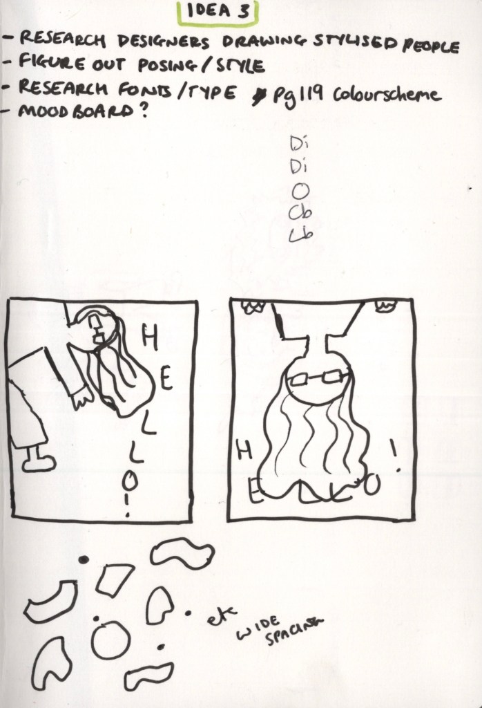
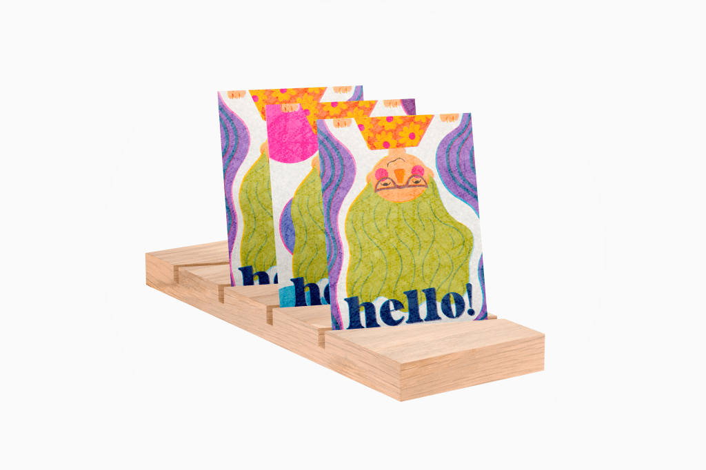
My third postcard concept had been sitting in my mind for many months. It randomly popped into my head as a design and I scribbled it down in my notebook so I couldn’t forget. I wanted a bold, stylised, colourful drawing of myself, peeping around the ‘corner’ of the postcard, saying ‘hello!’. I knew I needed to figure out the exact posing and play around with typefaces and composition, but I was very set on the idea. For good measure, I thumbnailed a second concept, just in case. I also figured out the accompanying pattern for the design – lots of fun and random shapes in the same colour palette picked for the postcard.
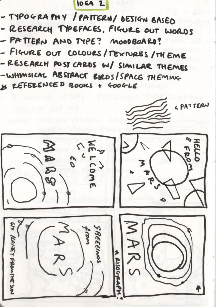
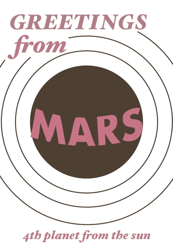
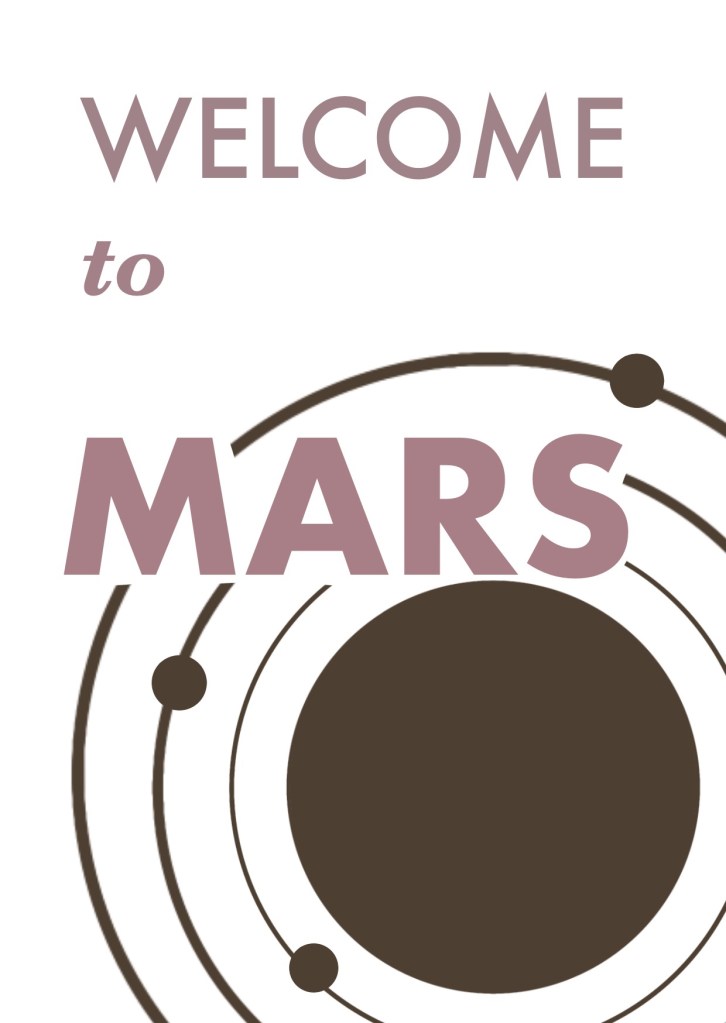
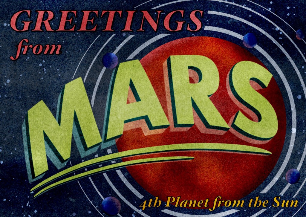
I thought some more about my whimsical space idea and the idea of a ‘postcard from mars’ came to me. I didn’t have any ideas on how this would look, but it felt fun and like a good representation of my style and interests. I played around with some thumbnails, pondered the idea of a risograph-esque style, and worked out an accompanying pattern. I was aiming for some sort of OS map of space with text overlaying it. I decided to create some prototypes for this concept, too, to get a better idea of how the text would interact with other elements.
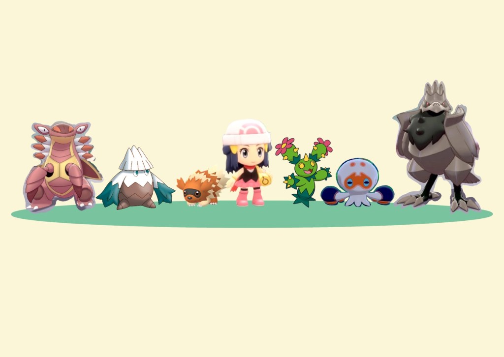
I felt like I had a good idea of how two of my postcards would look, so I revisited my Pokémon postcard. The time away from it had, as expected, helped me to figure out which design I wanted to develop as my final design. I chose the line-up design, as it felt more like a real Pokémon team. I got started drawing out some rough outlines of each Pokémon – and a sketch of myself. I then began to re-draw and add detail to the far left character. At this point, I was feeling a bit unhappy with my work and starting to get demotivated. I wondered if I’d chosen the right design, or if I should scrap what I’d done and try the other one. I was unsure, and the thought of giving up the hours of work I’d already done was frustrating. I stopped for the day and decided I’d rethink in the morning.
Despite my hesitation, I continued with the design the next day. I changed my approach slightly, and this helped a lot. It’s been a while since I illustrated or designed something in full – as my previous unit was focused on sketchbook work which was largely unfinished and experimental. I had forgotten that there’s a feeling at the start of most projects where it doesn’t really look great – or how you anticipate it to. You have to push through this feeling for it to start looking good. The middle part is always the hardest for me, and my time away had amplified these feelings. So I pushed through – and started to feel good about my work again.
For this project, I am using Bardot Brush’s ‘Magic Paper’ on my postcards. These are texture overlays that give the appearance of paper or traditional mediums whilst designing digitally. I love how they interact with my work and have become a huge fan of them. For the Pokémon postcard, I used the ‘Cork Board’ overlay. I had to turn the layers off regularly in order to ensure I was picking the right colours, as they impact how they look. I chose the alternate ‘shiny’ colouration for all 6 Pokémon, as I am a shiny hunter and this relates most to my hobbies.
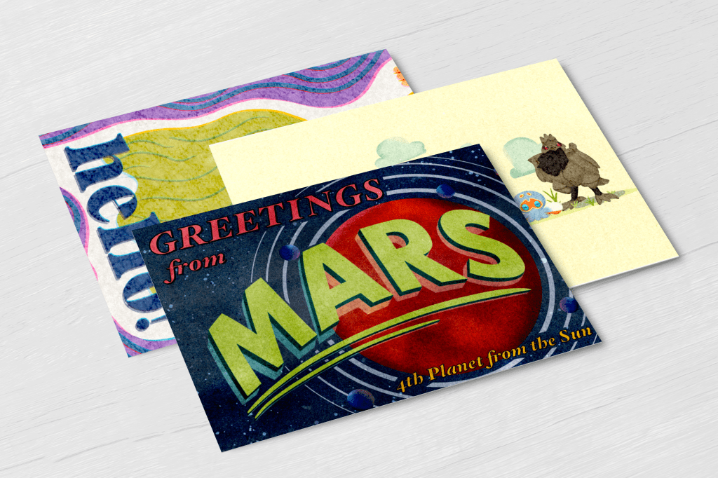
Once I had drawn each Pokémon, I realised it looked a lot better without the ‘me’ character. I’d also spent a lot of time on the piece already, and felt it wasn’t efficient to figure out how to fit my character in. I rearranged the Pokémon a little, added some shading to the grass, and some clouds in the sky, and then I was finished.
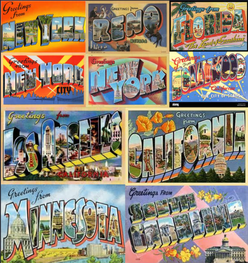
Before starting my next postcard, I did a little more research. I googled ‘1950’s postcards’ and ‘greetings from… postcards’ and found a few examples of the style that I had in mind. I realised that my designs were portrait in orientation and that wouldn’t work, I’d have to make changes. I selected the portrait design I felt worked best and began altering it to look more like the reference imagery I had. Taking a second to grab some reference images was really helpful to my design process and gave me much more direction than I’d had prior.
I struggled a lot with the colour palette for this postcard. I didn’t have one in mind at all when I started, and I had to experiment quite a bit whilst designing the piece before I felt I had a good fit. I’m not usually one for using darker backgrounds, so it was harder for me to pick colours I felt worked. In the end, I feel really good about my colour choices. The magic paper overlay used for this piece is ‘Vintage Print’ and I really love how it interacts with the colours and textures I used in the design. Working on this piece was a lot easier and went a lot smoother than the Pokémon postcard, which could be due to the fact I was back into the swing of things, or it could just be because I’m more comfortable with this sort of content.
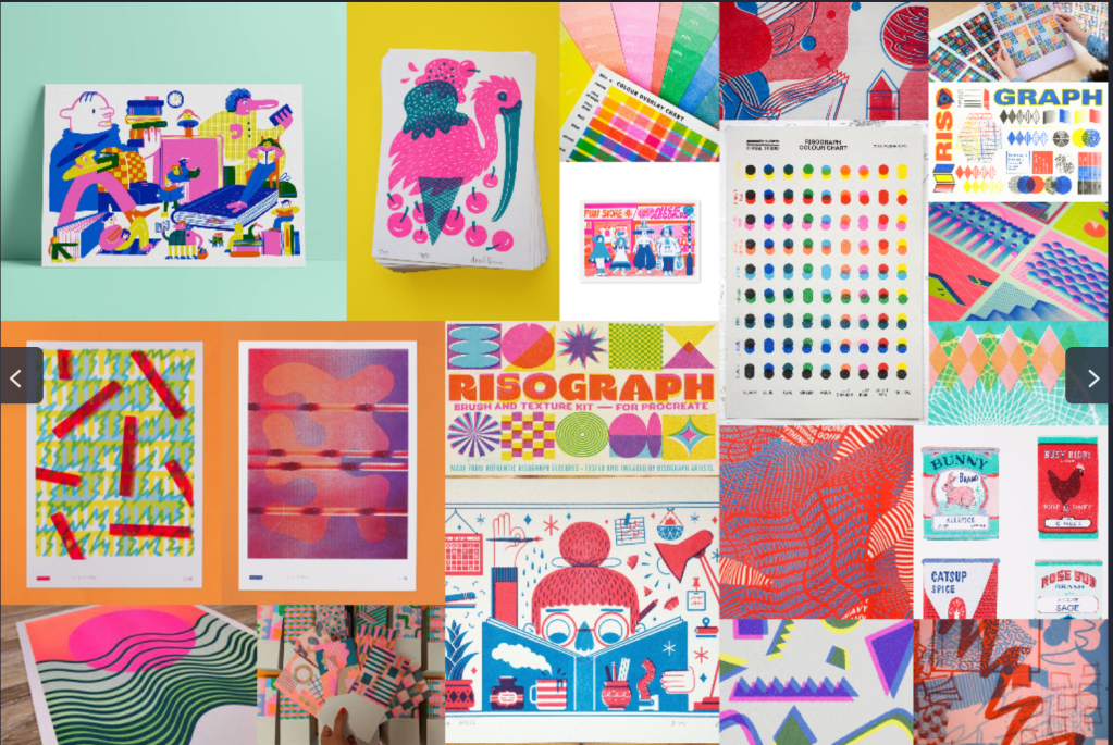
I’ve been pretty interested in risograph prints for some time now. The colours, style, and vintage look of the technique is really appealing to me. I wanted to create something that captured this same feel, as I had noted when trying to work out my design for my second postcard. Given the colour palette I had in mind for my third postcard, I felt I could apply it to this perfectly. I have never designed anything in this way before, nor have I printed anything using risograph techniques, but I’ve spent a lot of time looking at others’ work and felt I could give it a go. I started by collecting some reference imagery so I could ensure I wasn’t going completely off-piste. I managed to find a few colour guides which were helpful too!
I then opened my canvas in Procreate. I began to sketch out the character and figure out where it would be positioned exactly. I was struggling to get a feel for it, so I blocked in some colours, intending to edit it from there. It still didn’t feel right. I was quite disappointed, as this was the design I had held onto for so long excitedly waiting to create. I decided to give my other concept a go and see if it worked better. It did, and it felt like a much more playful concept than my first one.
I added the ‘Subtle Scribble’ magic paper overlay to the canvas and began blocking in the first layer of colours. I reduced the opacity of my layers and stuck to my 6-colour palette to build up colours in a similar way to risograph printing. I also offset each layer to add a ‘misprint’ effect.
I had so much fun with this process, figuring out the perfect opacity of each layer and which colour combinations created which colours. I felt so pleased with my design and the effect I had created. I decided to use the font ‘Fimlen’ for my ‘hello!’ as the curved serif design felt well suited to the shapes in the piece, and my historical inspiration.
I struggled to decide on a background for the piece. Initially, I planned to leave it empty, but it felt too empty. I played around with a few options and ended up torn between two – the polka dots and the purple waves. I asked some friends and other OCA students for their feedback, and almost everybody agreed that the polka dots were the stronger image. I still felt drawn to the waves, though, and couldn’t seem to agree.
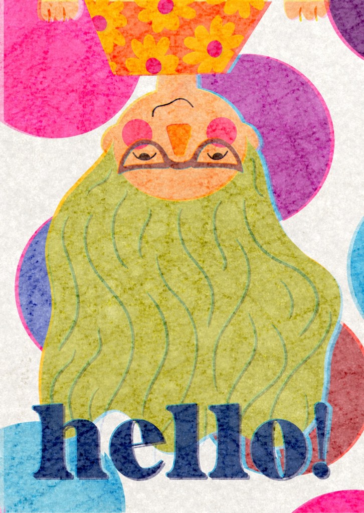
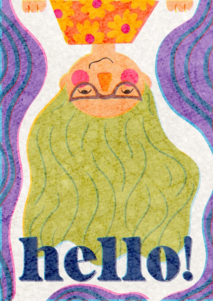
I attended a ‘show your work’ session for Visual Communications students hosted by Emma Powell on the 20th of September, where I showed all three of my designs. When I got to my final design, I showed both background options and explained that I wasn’t sure which to choose as my ‘final final’ design. I felt like the polka dot background was more postcard-y, whereas the waves felt more suitable for a magazine cover or spread. There was some really interesting discussion around how each background impacted the piece. It was noted that the text stands out clearer and that your eyes are drawn down to it in the waves background, but that the polka dot background complements the dots on my cheeks and dress very well.
Emma then said it was almost like camouflage, however, and that it depends on what my goal is. Do I want to stand out in the image, or do I want to blend in? I was also reminded of some feedback I received from my tutor in Key Steps in Illustration – that asking for feedback is useful and can help with decision making, but that at the end of the day I am the designer, and I get to make the choices on what I feel looks best. I want to stand out in this image, I want to be jumping into the frame, hanging upside down, surprising the viewer with ‘hello!’. So, I chose the wave design as my final piece.
During the workshop, I was asked about the backs of the postcards and what I was going to do with them. I realised I hadn’t actually considered this much at all – beyond maybe using the patterns I had designed at the start. I didn’t have enough time left to fully explore this concept, but it did get me thinking about how I could add motifs to the backs of the postcards to connect the designs on the front. I considered adding a ‘shiny charm’ – an item used in Pokémon games that increases your chances of obtaining shiny Pokémon – and some clouds to the back of the Pokémon card. I could add more wave decals to the back of the ‘hello!’ piece, and a planet or two along with more solar system lines on the back of the ‘Greetings from Mars’ card. I would like to come back and explore these options further and see how I could create a more ‘complete’ piece ready for printing.
Having finished all three postcards, I looked into some postcard mockups on Freepik to see how they’d look in the real world. It was a little tricky to find something I could fit all three cards onto, as one is portrait and the other two landscape, but I made do with what I had access to. My favourite are the 3 ‘hello!’ postcards in the holder, and the angled floating postcard for both landscape designs.
I feel so happy with my work for this assignment. I am shocked at my own abilities and the quality of my work – it is beyond what I expected. I feel an odd sense of imposter syndrome looking at the final pieces as if there’s no way that came from me! I think I’ve made a really good start to the unit, and whilst I’m a little bit out of practice following briefs and documenting my process, it feels natural to me to be working like this again.
