The aim of this exercise was to explore some of the different ways to fold paper to make interesting and engaging leaflets. I was asked to imagine I was designing a leaflet for an organisation inviting people to volunteer for a task – and to experiment with different formats considering size, types of paper, and how the content would be displayed within the leaflet. I had to identify what sort of folds would be successful at making people want to pick up the leaflet and get involved with the organisation.
As the title of Part 2 might suggest, the exercises in this section explore the different steps in the design process and how they’re used to solve creative problems. The process of visualising my ideas is usually one I embark on late in my design process, creating mock-ups of finished pieces – rather than before I begin designing. I have on a few occasions made prototypes or real-world mock-ups prior to designing, like in Assignment 4 of Illustration Sketchbooks, or for Exercise 33 of Key Steps in Illustration. I think this is mostly down to the type of work I have done previously – I don’t feel I have ever had to create a visual representation of my idea before finalising it. However, it’s a very useful step to take to ensure you aren’t making any major mistakes.
I felt hesitant about this exercise as it felt like wasting a lot of paper. I much prefer wherever possible to explore digital alternatives for exercises as, firstly, I don’t want to unnecessarily use a lot of ink/paper as it harms the environment, and secondly, I don’t ever know what to do with all of the physical pieces of paper I now have lying around my studio. It creates mess, clutter, and harms the environment, so it just doesn’t make sense for me to do. I recognise the value in exploring things in the physical world, however, especially if a product is going to exist in this form. So, I got to work writing out the requirements for this exercise.
The exercise says to not think too much about the content of the leaflet – but it does specify what is expected to be included. The organisation has provided a title, four 120-word chunks of text, and has requested that their contact details and address are also featured on the leaflet in an easy-to-find way. I was asked to work with an A4 piece of paper for this, so I grabbed a stack of printer paper to play around with.
When I was a kid, every time I was in a supermarket, service station, information centre, library, you name it – I made a beeline for the leaflet stands. I remember standing surveying all of the available leaflets, trying to find ones I hadn’t seen yet to add to my collection. My parents would set limits – ‘you can only take 3 this time!’ – and I would ponder which 3 were the best ones. I would spend hours reading and re-reading them. I don’t really understand why, other than I am autistic and the thought of collecting things was exciting to me, but it thankfully created a database of existing leaflets in my mind for life. Maybe I was just destined to be a designer.
So I decided to start by folding the paper in as many ways as I could think of off the top of my head with no research or experimenting. Just, here are some folds I know for leaflets from my experiences. This gave me five mock-ups to work with. I went through each one and blocked out where I felt content would be best going based on each fold. Then I assessed each one and whether I felt they worked, and how they could be better.
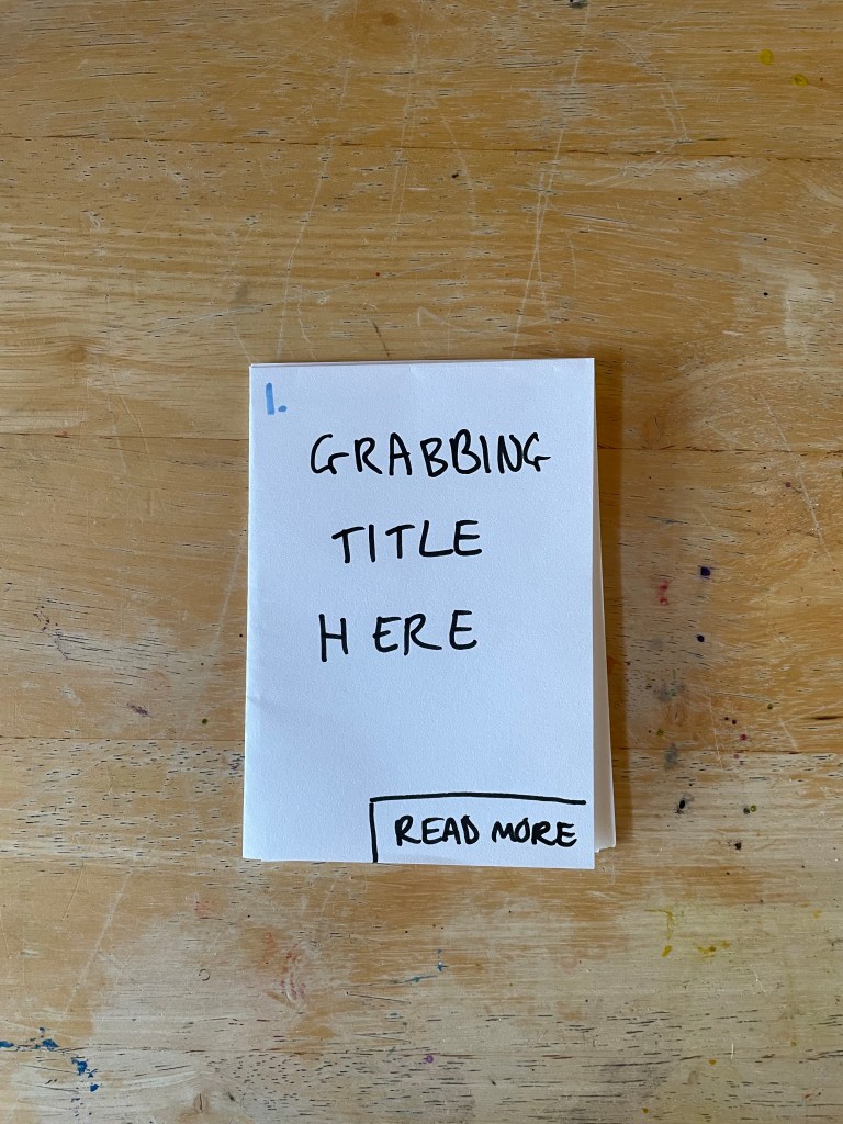
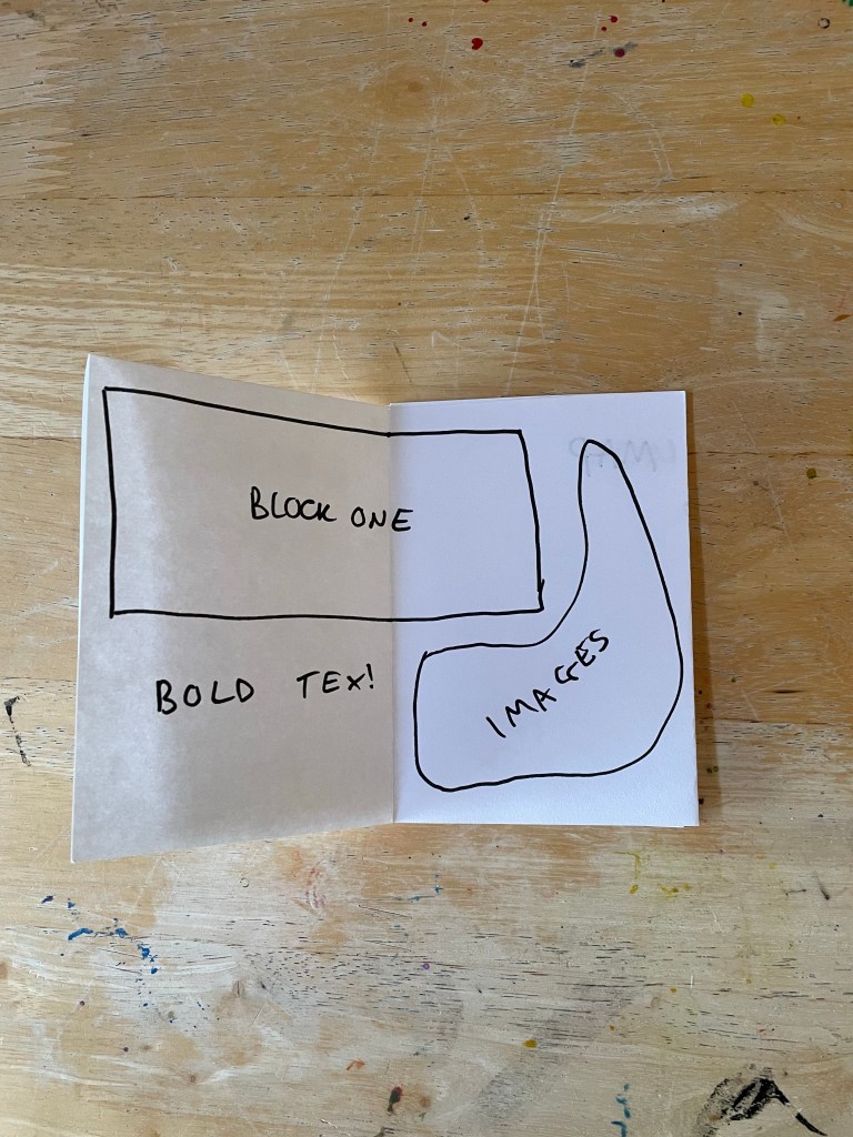
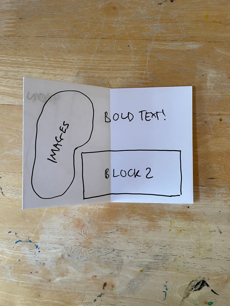
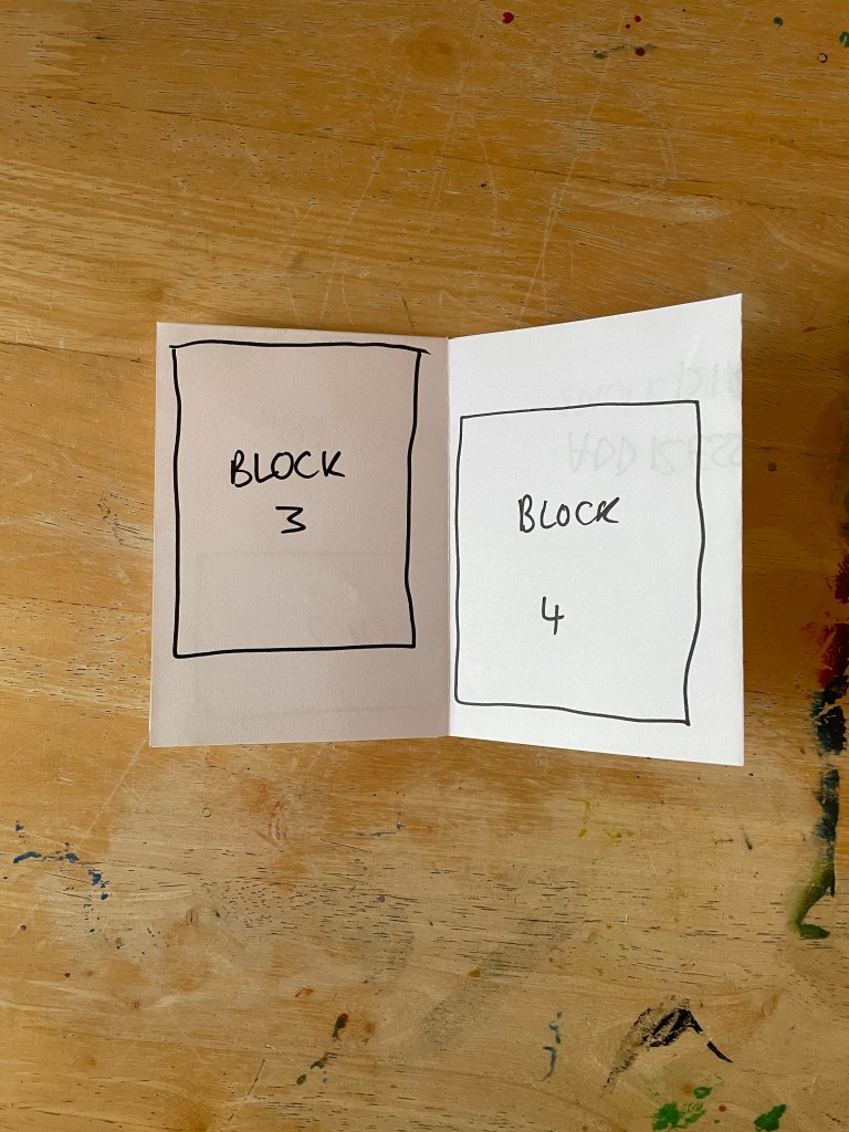
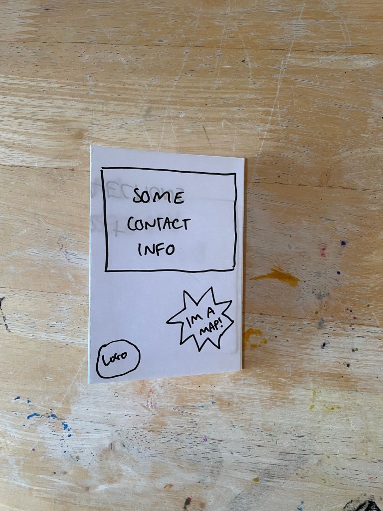
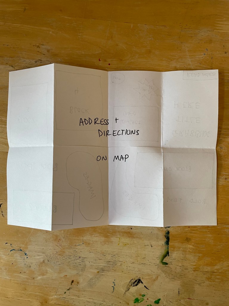
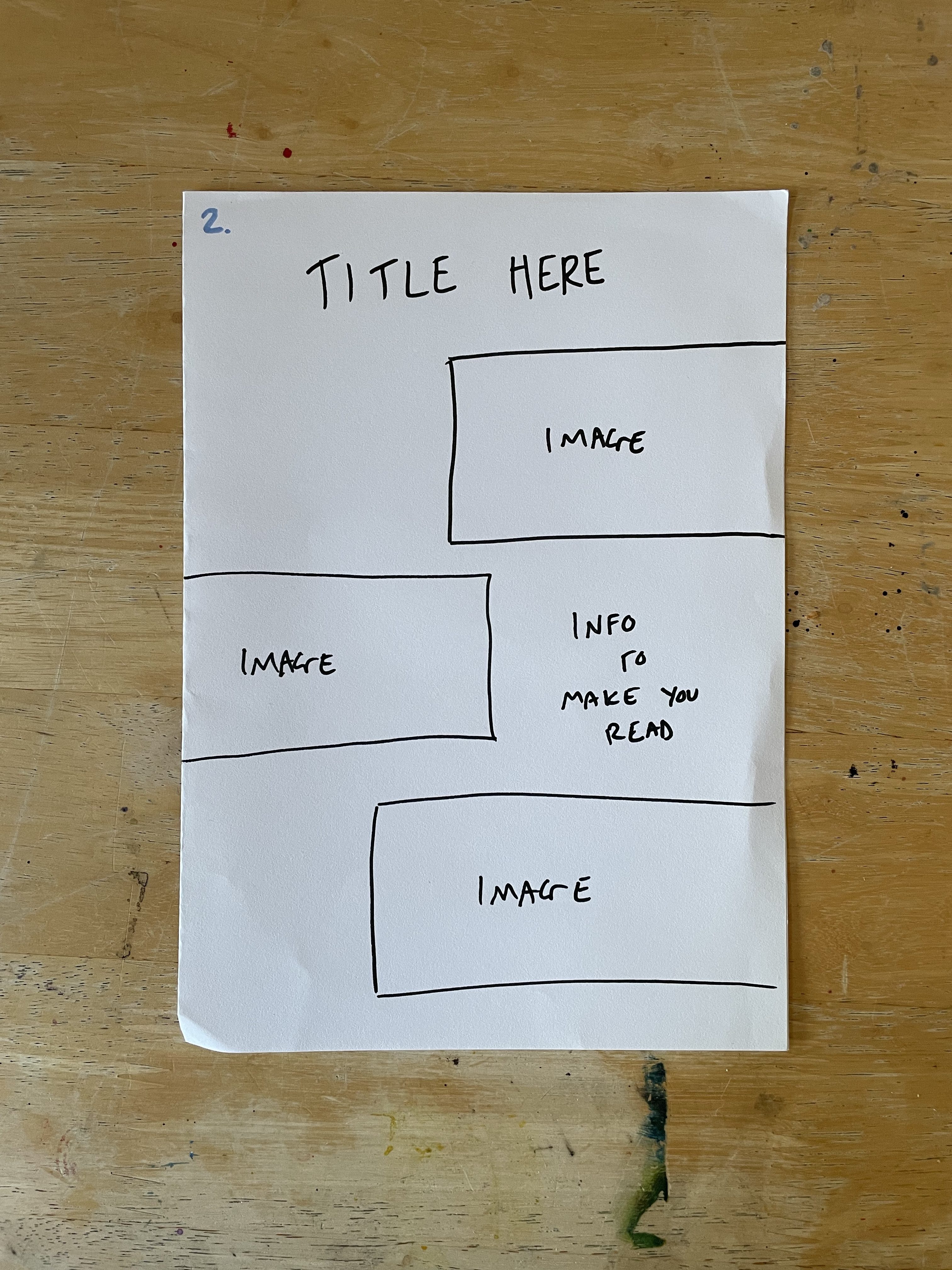
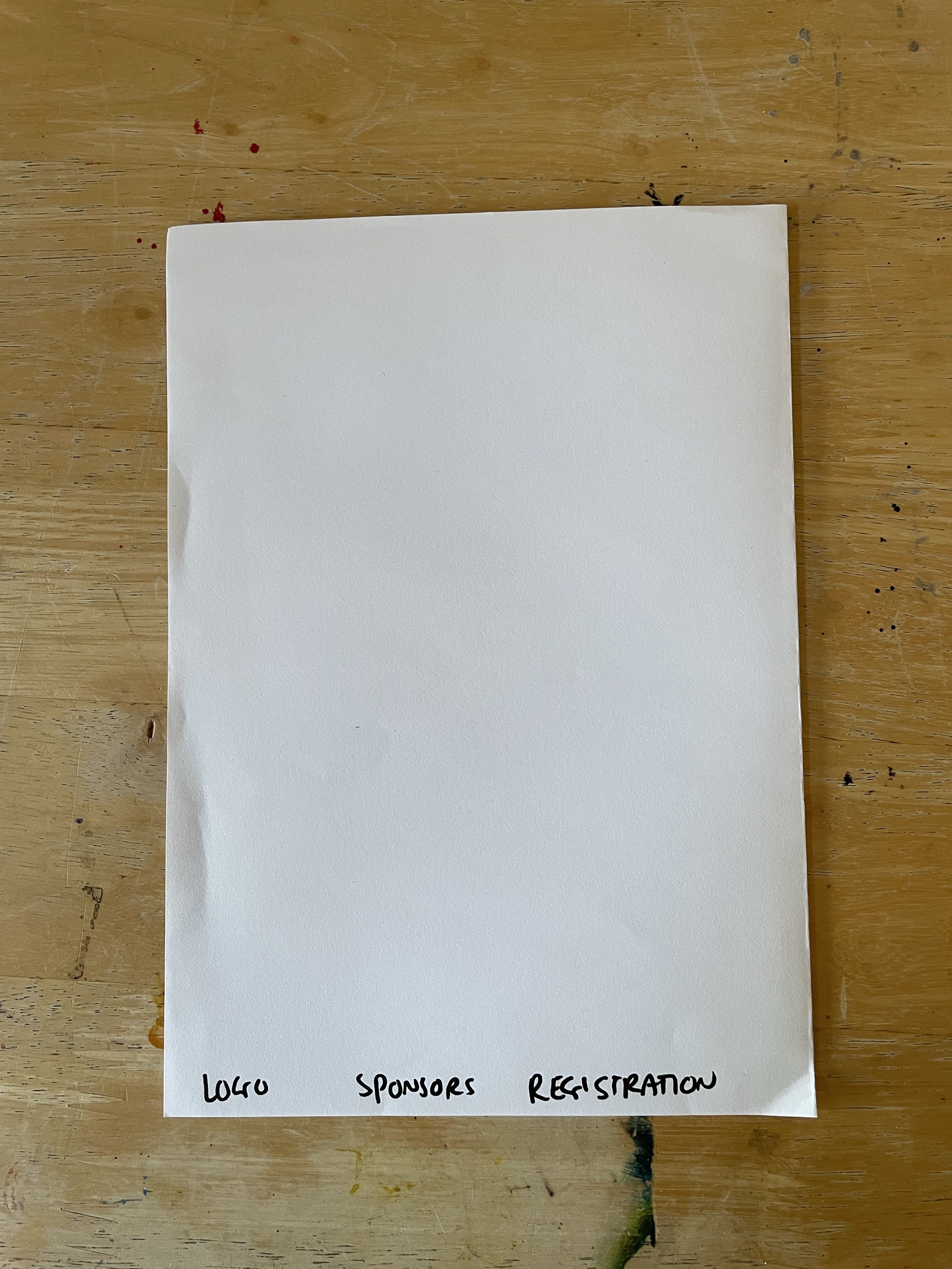
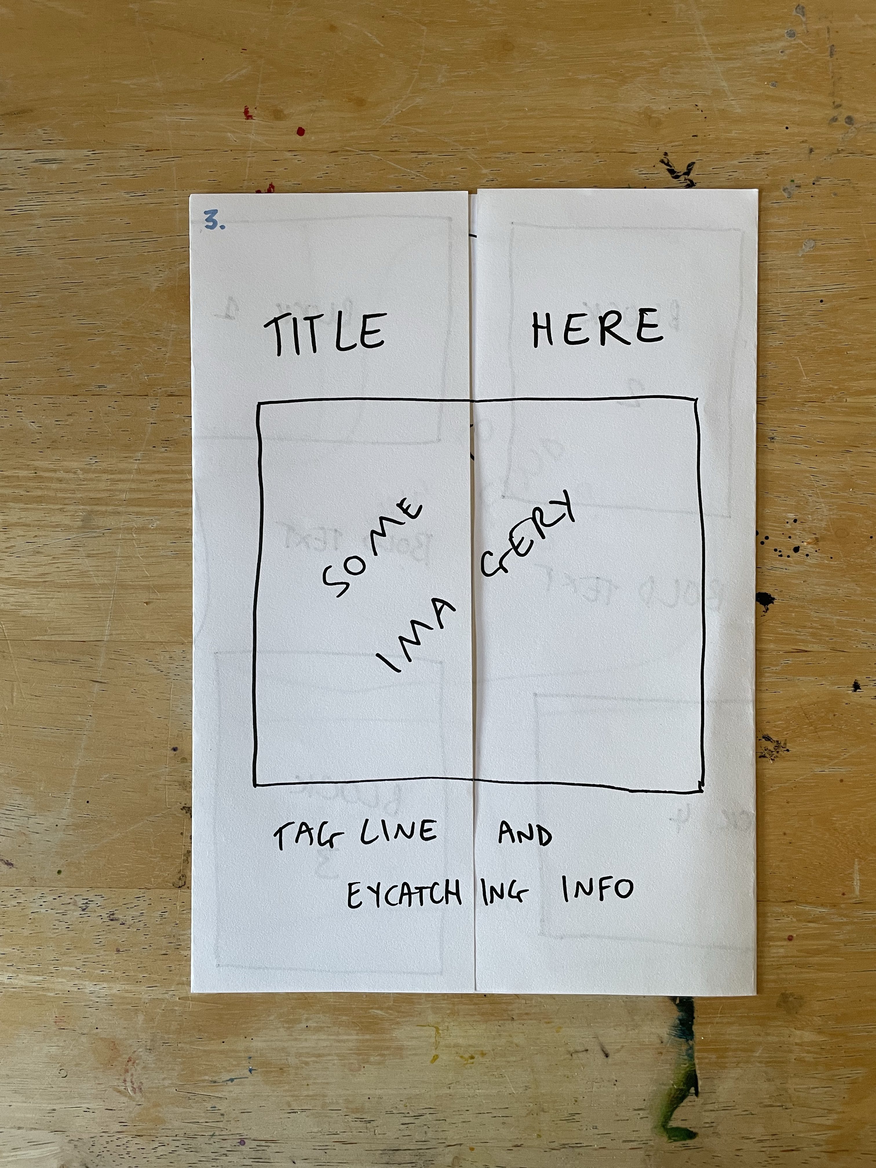
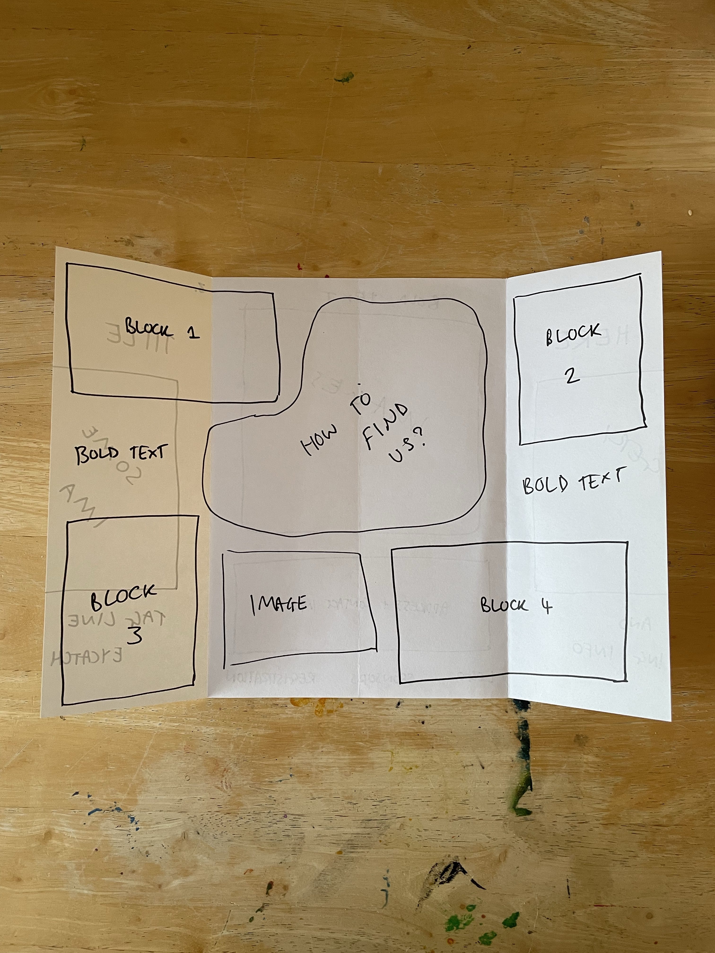
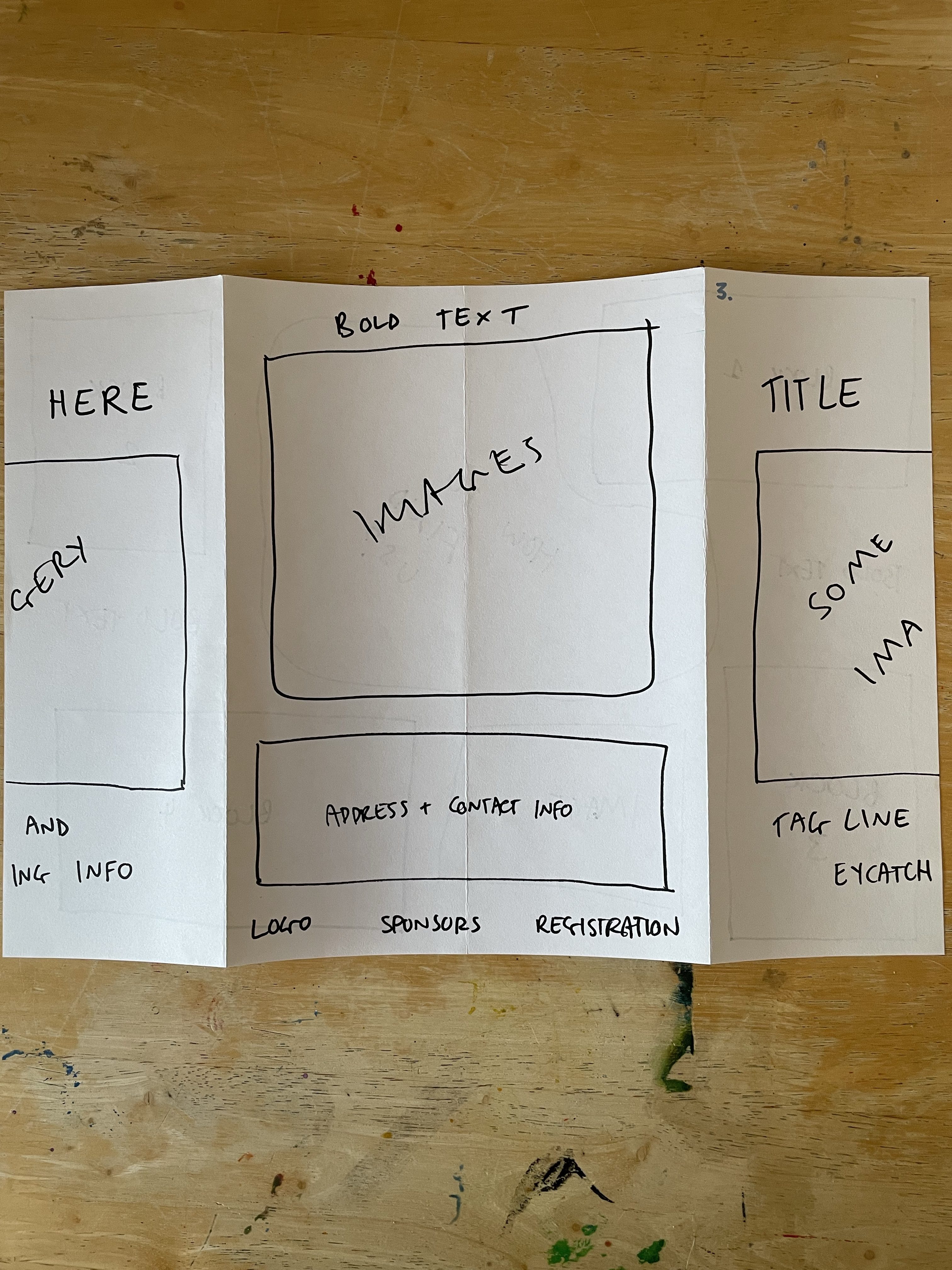
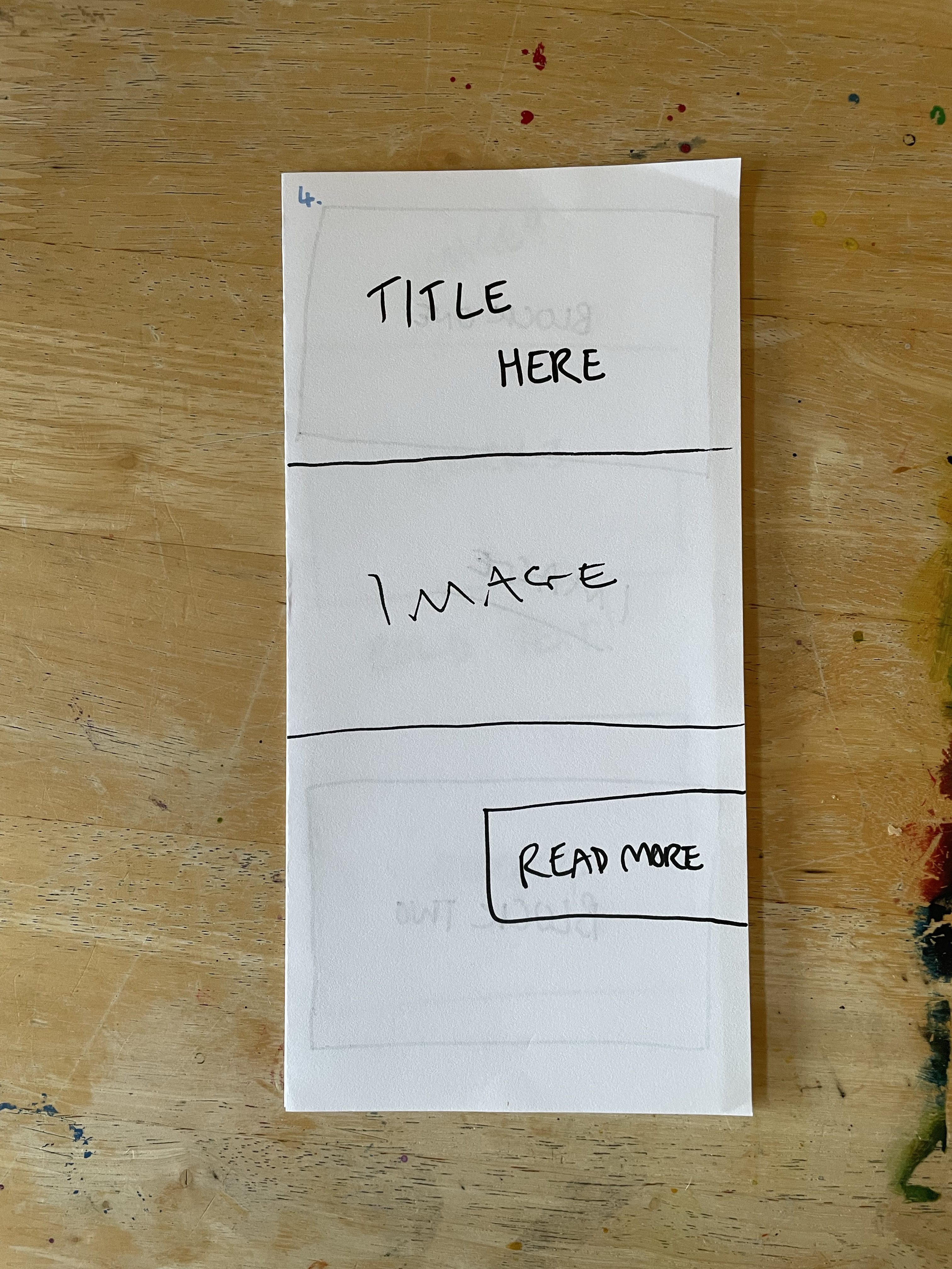
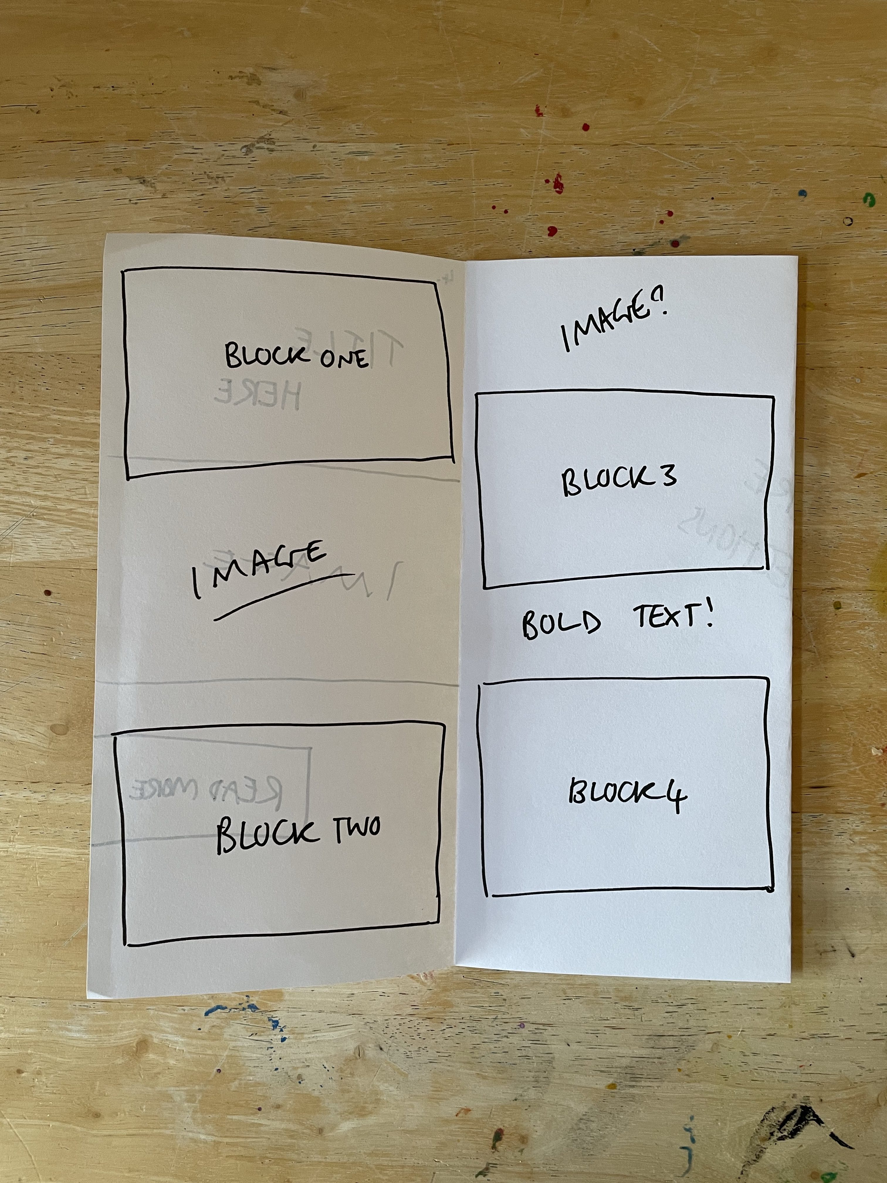
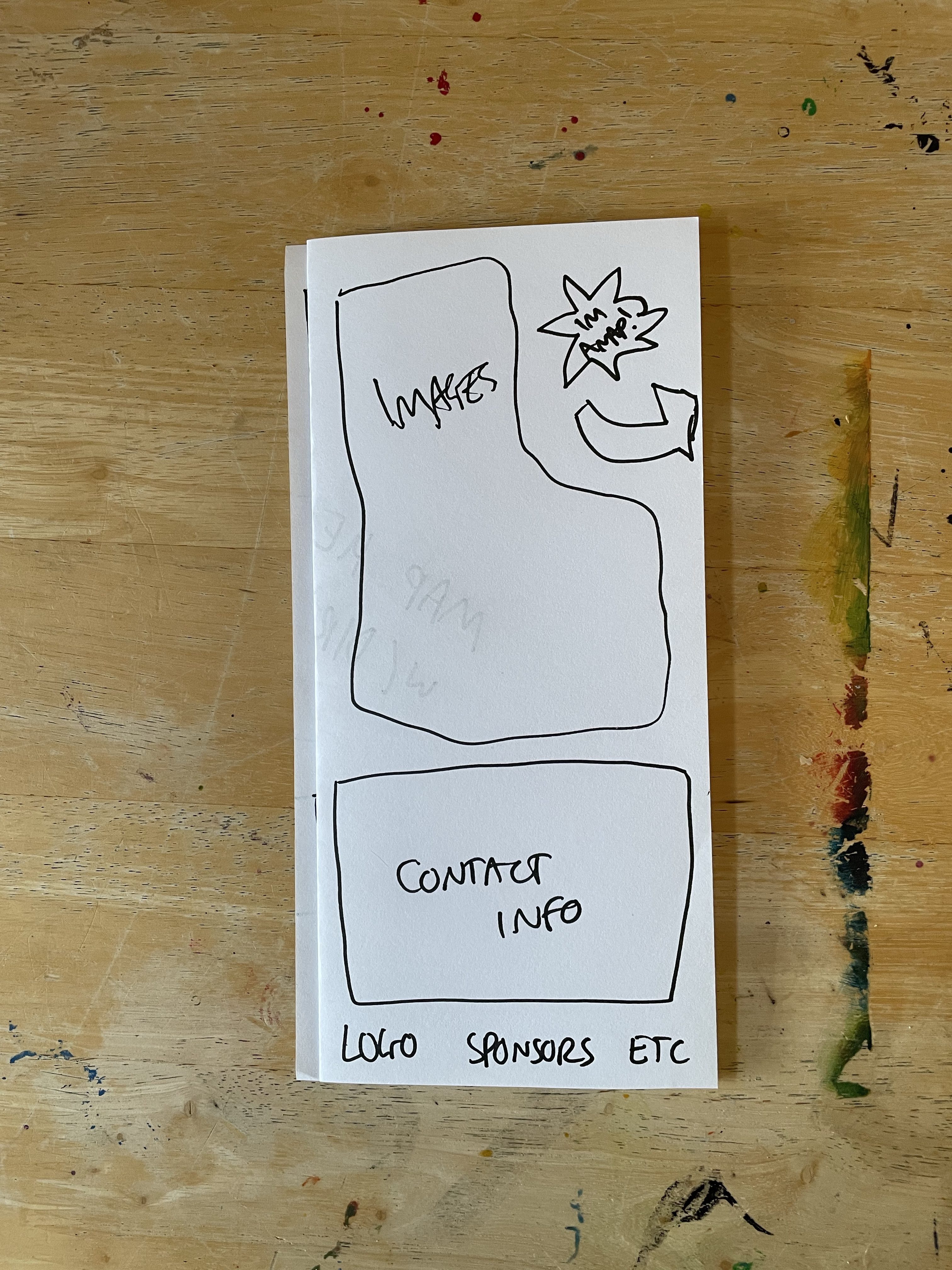
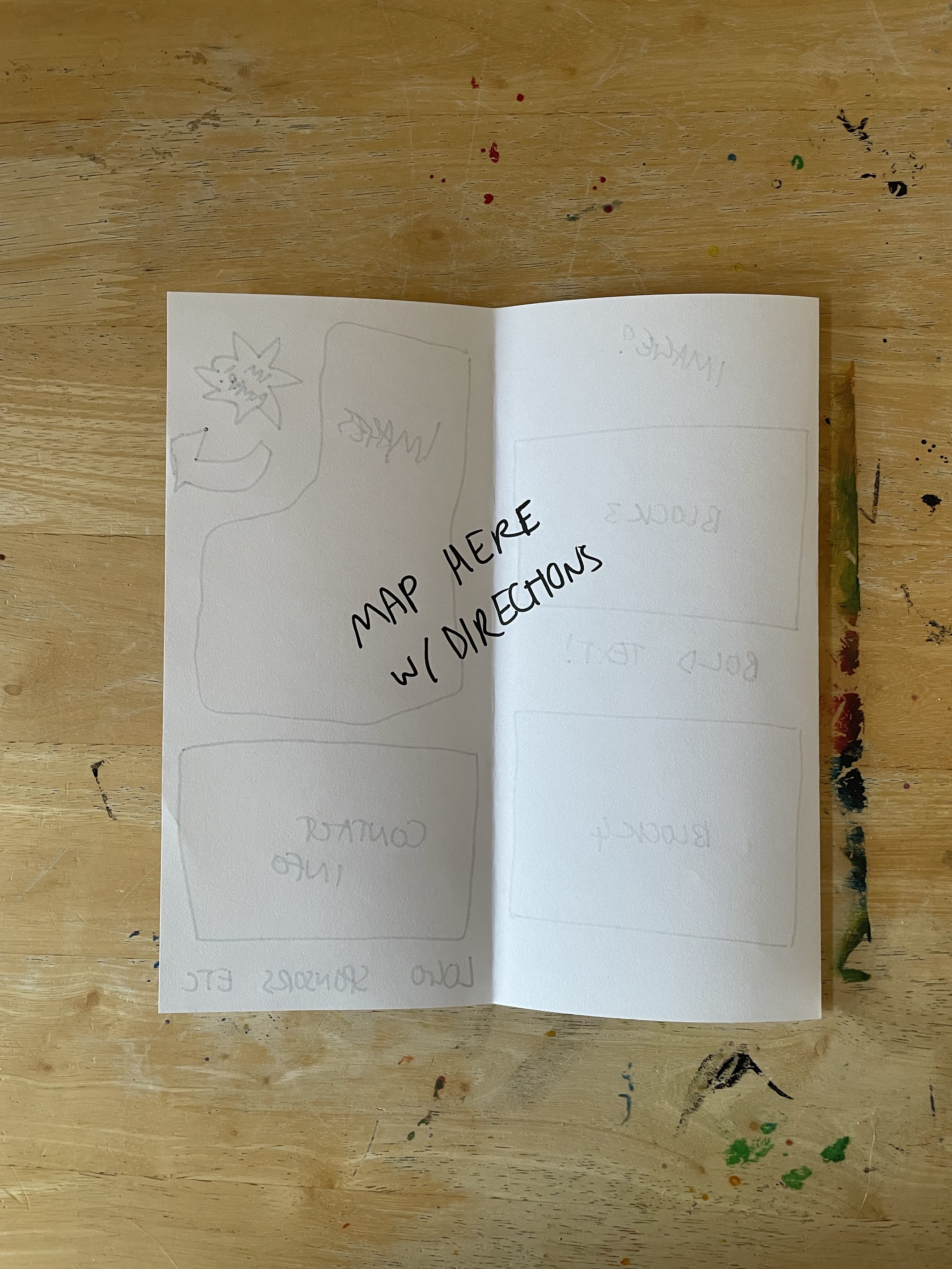
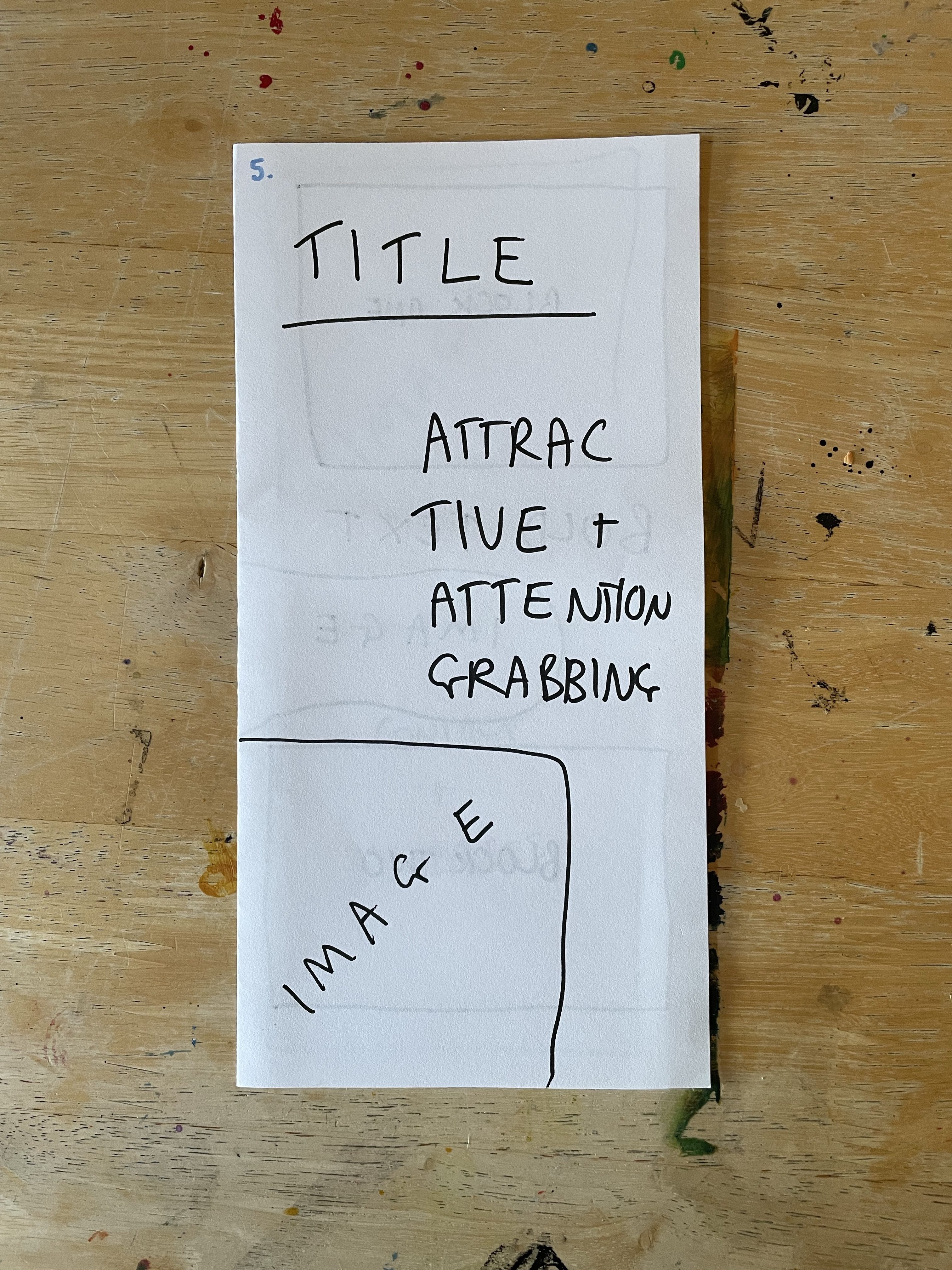
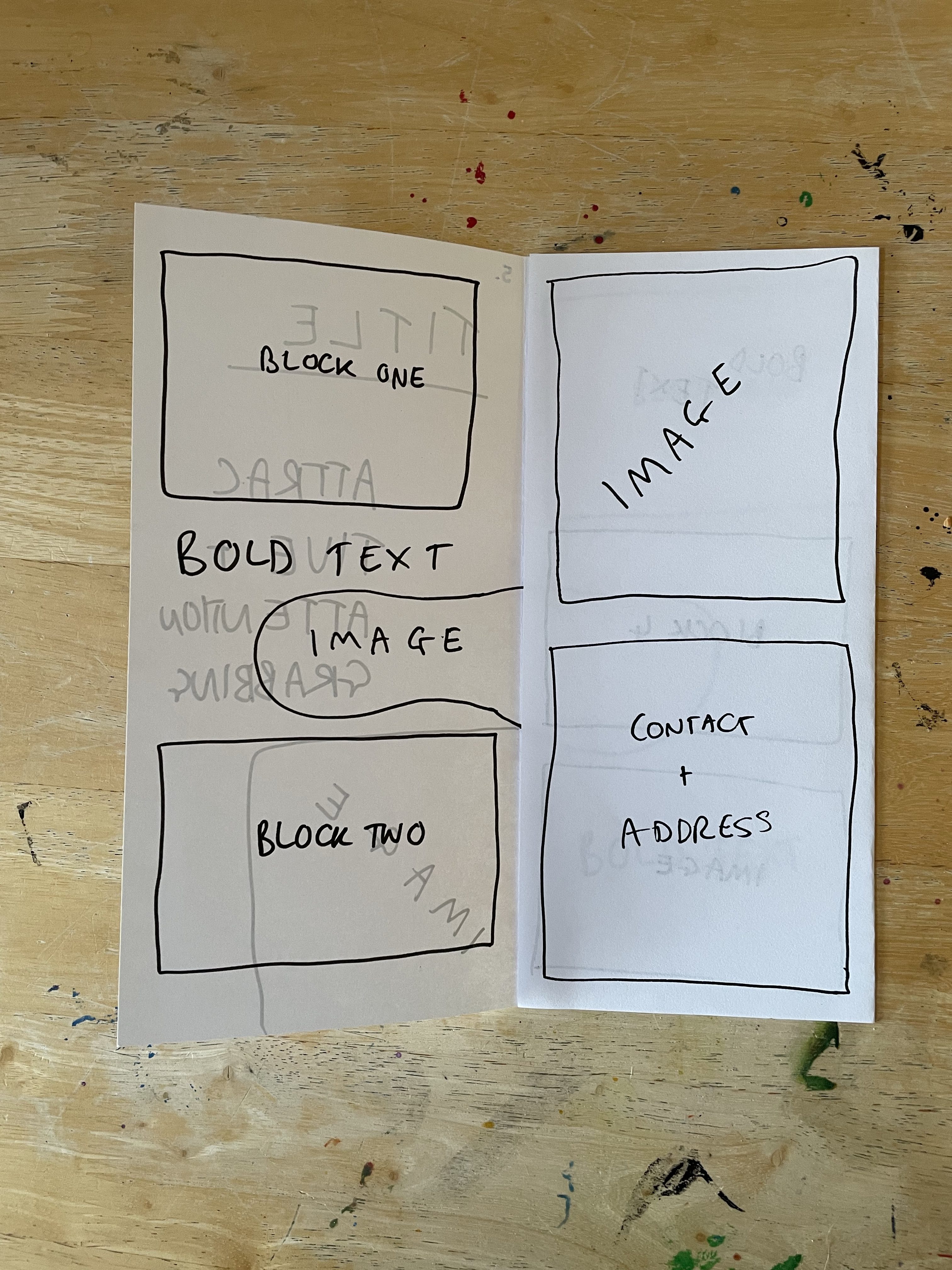
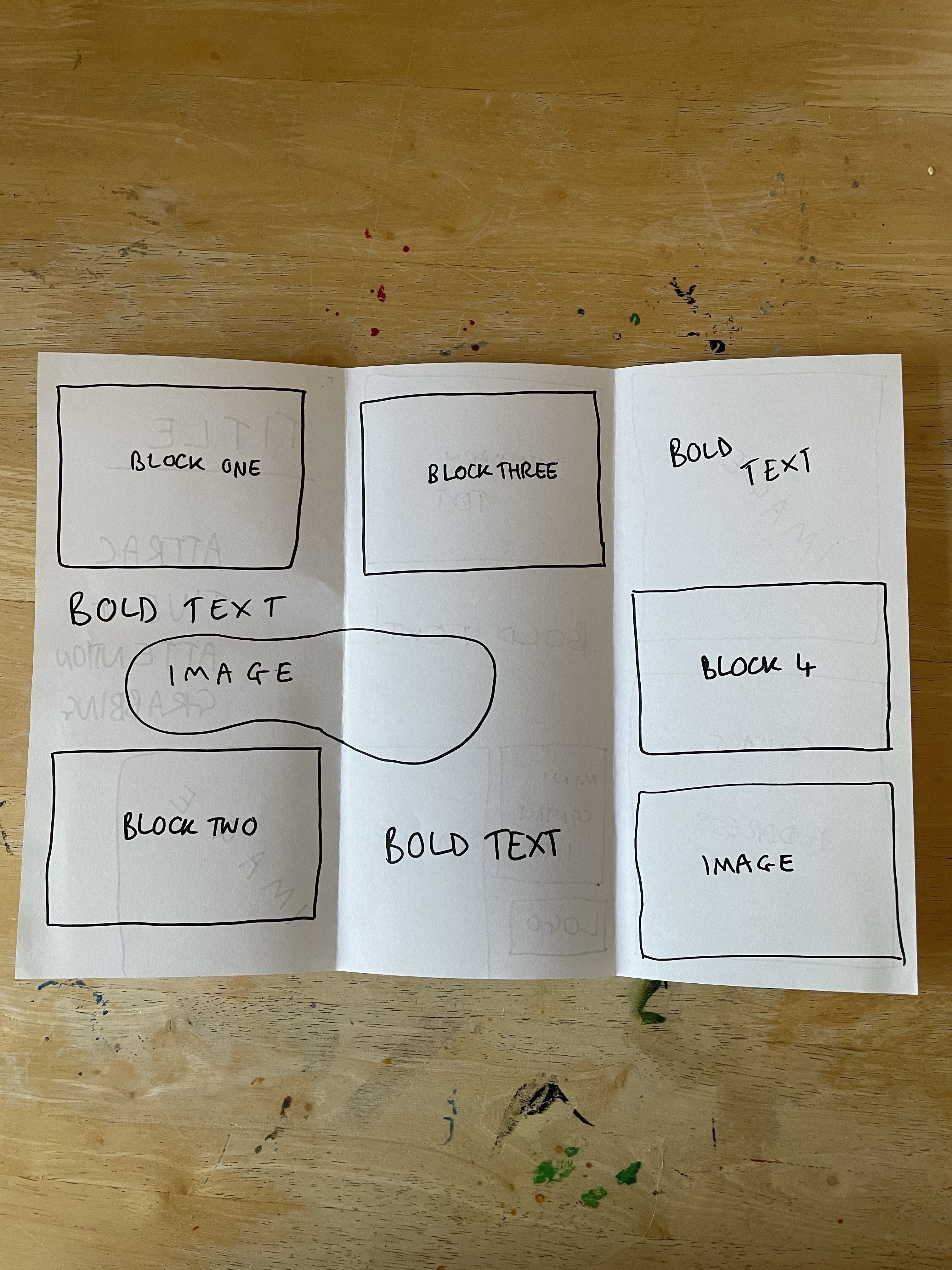
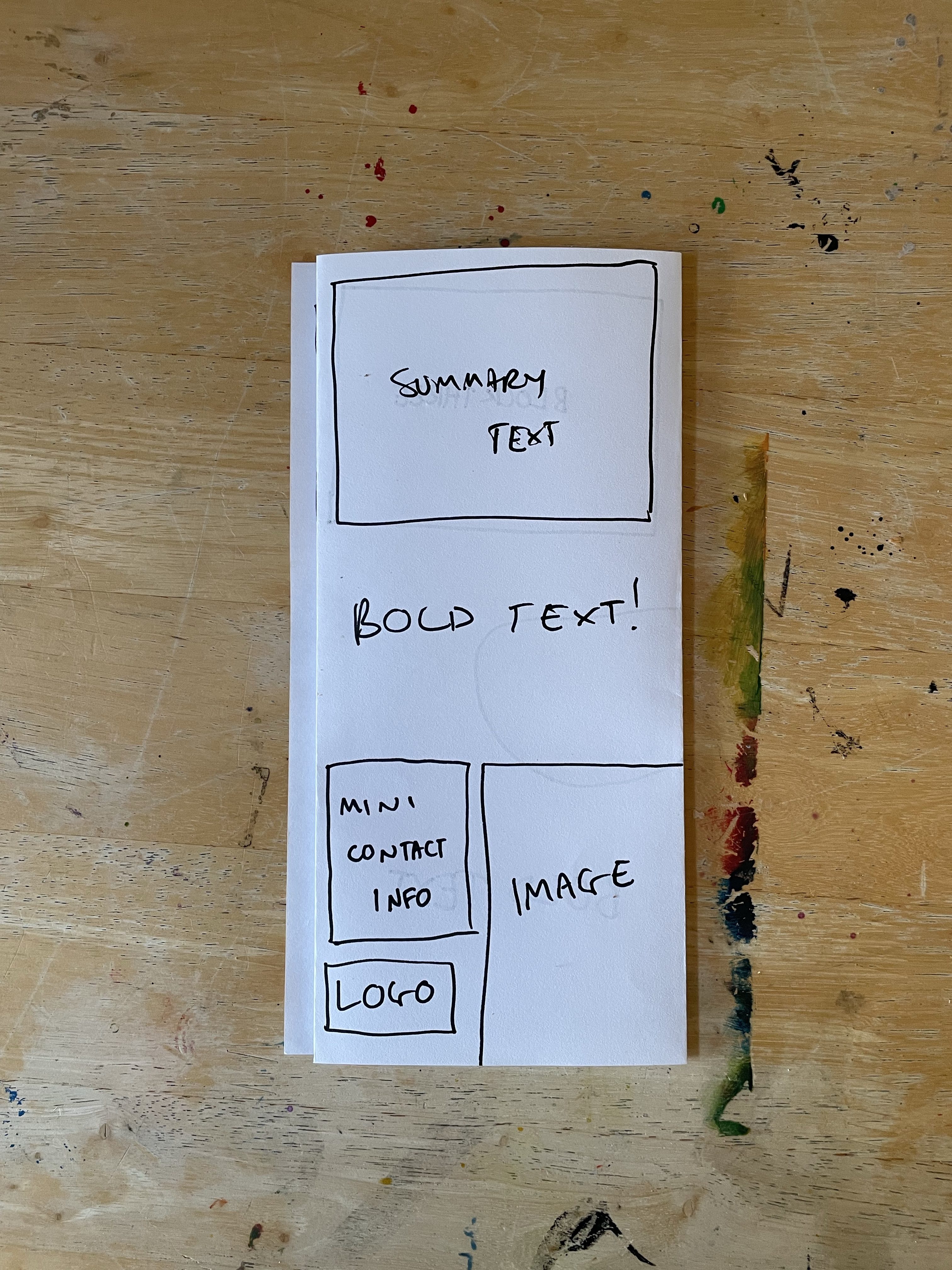
I felt the biggest issue was that four blocks of text, a title, and contact details wasn’t a lot of content for an A4 leaflet. There would be a lot of empty space – which could be used for photographs and illustrative elements – but it really would be a lot for some of the folds. Fold number 1 is probably my favourite of the five, as it feels snappy, eye-catching, and fun. I was envisioning it being at the counter in a local business or similar. The other folds are more suitable for postage or for putting in a stand, similar to those I encountered as a child.
At this point, I felt like my ideas were pretty boring and uninventive, but I couldn’t think of any more folds. I started researching printing companies to see what folds they have to offer. I first found this website that listed several paper folds, most of which I had already tried, and two I hadn’t considered but that still felt like they had the same problem with there being too much space to fill. I also looked at this page on the website, which showed example leaflets, and helped me to see how to organise information in the different folds. These examples seemed to back up my thoughts about space – as a lot of information was used on each.
I then looked at the Printing for Less website, which had a detailed page showing different folds, giving their names, and describing how they can be used. These still felt pretty boring and massive as leaflets. I started specifically trying to find a website that provided interesting and experimental folds and found the Fold Factory. The founder of the Fold Factory has spent her entire career fascinated with various kinds of brochure and leaflet folds – in fact, her thesis at university was focused on documenting all of the possible folds that exist. She realised it was a never-ending journey and is still today researching folding techniques and ways to create memorable marketing.
I spent a good while scrolling through all of the folds on her website. It fascinated me to see how many options there were, and also to think about how cool it is that someone has found a passion in this niche. I particularly liked the uniqueness of the Turkey Iron Cross and the Holiday Cards. The website as a whole, and these two folds especially, really got me thinking about how various folds could work for different designs, different organisations, and various projects. Volunteering for a food bank, for example, could have a milk bottle-styled accordion fold, much like this Wine Bottle Fold. Or, this fold could be perfect for a grassroots football team.
This exercise got me thinking about how I approach my designs and layouts. I rarely think outside of the box when it comes to how the product will look in the 3D, but I’m usually pretty comfortable thinking outside the box with the literal design elements. I’ve always felt pretty terrible at 3D design – I hated sculpting and all that went along with it at art college. Even building houses in The Sims is something I shy away from! I’d quite like to push myself further to think of creative ways to present my design work in the world – and research this further where possible.
