For this exercise, I was asked to create two posters for a local event. The first poster had to have as many details as possible featured on it, and the second, as few as possible to an extreme. This was a lesson in using Occam’s Razor to sort through information and figure out what is essential. I then had to ask other people which of the designs work best, and create a third poster using the feedback.
Having been a Visual Communications student for almost 3 years now, I am extremely familiar with this exercise! I was pretty excited to give it a go myself and see how I could explore it. I started as always by writing out a plan for the exercise and analysing the brief. I also reflected on previous projects where I created posters, such as Exercise 23 and Assignment 3 – both from Key Steps in Illustration. I read through the learning logs for both and re-familiarised myself with the research I had undergone. This was a great starting point to build from, and it was helpful seeing so many different posters from various contexts.
Before I could begin the design process, I had to choose an event to design for. I looked on the NewcastleGateshead website, which lists local events and things to do in the region. Due to the time of year, almost all of the events are Christmas-related, and it took me a while to find one I felt excited about. I came across a Christmas Fair due to be held at Belsay Hall in Northumberland and decided to go forward with that. Belsay Hall is an English Heritage site that I frequently visited with my family when I was younger – so it’s pretty close to my heart. I think I visited the Christmas Fair one year, too!
Unfortunately, at the time of writing this, the fair has since passed and the website links no longer exist. This is a lesson in screenshotting anything time-sensitive!
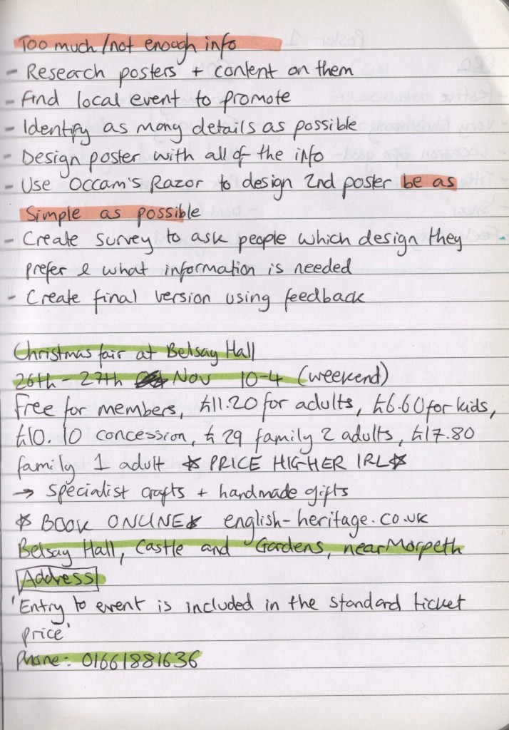
I visited the English Heritage website to get more information about the event. I took notes on as much as possible – which was a lot of information! I made sure I had contact info, the address, information about what the event consisted of, and ticket prices. Then I did some research into Christmas posters specifically, as this was a new area for me to be designing for. I saved several to Pinterest to reference and started to consider how my poster would look. As English Heritage is a slightly more middle-class organisation, with an expensive yearly membership, and Belsay Hall once being owned by British aristocracy – it felt appropriate that my poster design would emulate a similar vibe.
Alongside a Christmassy colour palette, I considered featuring photographs, classy sketches of the hall, maybe a stag or two, and smart festive fonts. Ordinarily, I don’t use photos in my work, preferring to work with illustrative content where possible. Using photos also feels like an ‘easy’ way out sometimes, although it’s a staple part of design work, so I want to get to grips with it a bit more. I scrolled through Unsplash to find some appropriate images to work with, then I started exploring how I could use them and various design concepts.


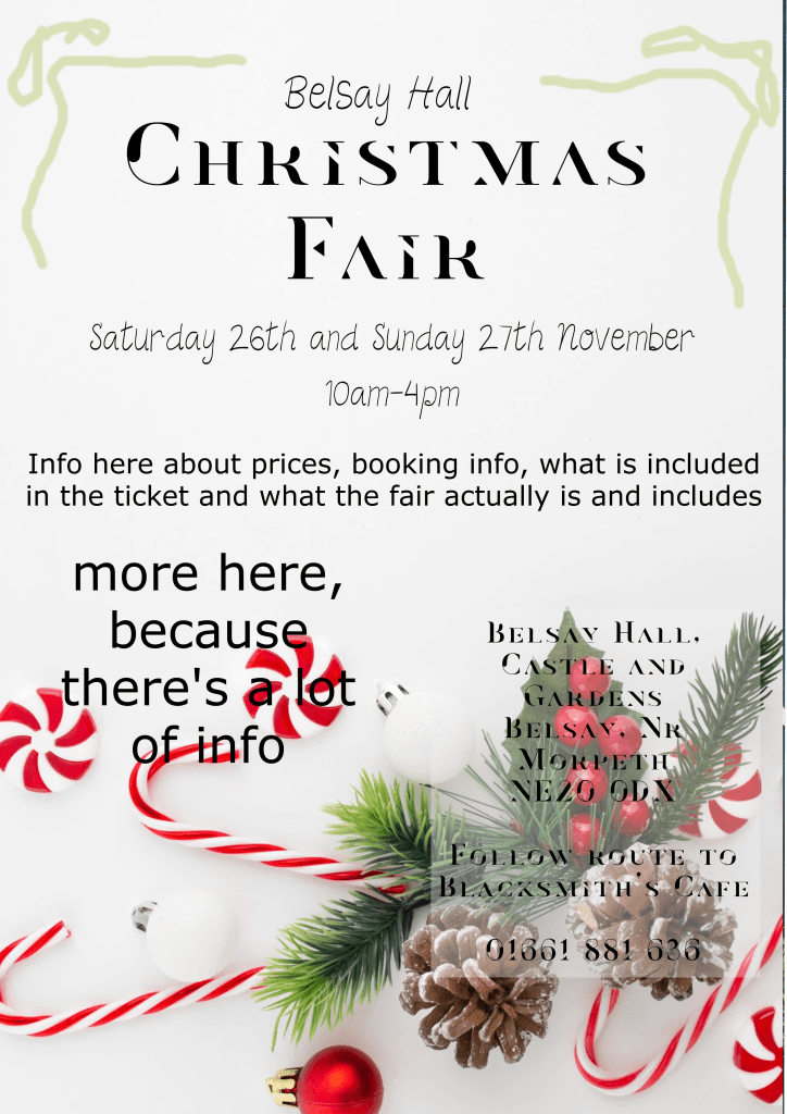
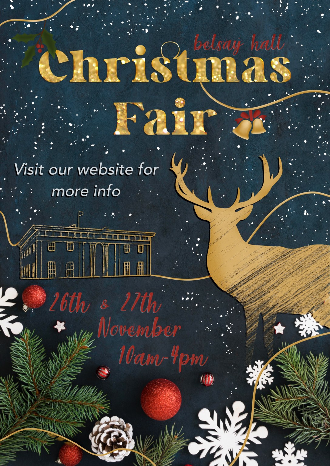
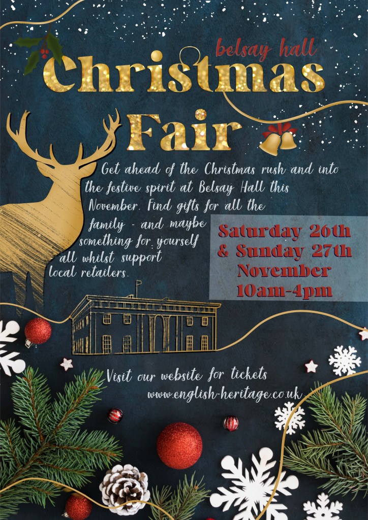
I ended up with three ideas that I felt could possibly work, and I put them side by side on my laptop screen to assess which fit my theming best. I decided the blue background was the strongest of the three, so downloaded the image files to my iPad and got to work on the first poster in Procreate. I thought it would be easy to design the ‘Too Much’ poster – how hard can it be to simply include everything? But when it came to it, I found myself subconsciously wanting to rewrite things, pare back on how much was included and remove unnecessary information. I felt myself cringing at having to resist that, knowing fine well this would look awful when finished. It was also really hard to figure out how to fit all of the information onto one poster in a way that looked good and read well. I had to keep reminding myself that this is the whole point of the exercise – to learn the sweet spot of included content when designing.
Whilst creating the poster I continuously referenced my Pinterest board of research to see how other designers had tackled certain issues. This is why I like to collect my research on Pinterest – having it open on my laptop whilst I work is so useful. I found choosing fonts and ensuring they were readable especially difficult. I know having too many fonts looks terrible, but the Christmassy fonts are so difficult to read. This was a tough poster to create, and I was very glad to be finished!
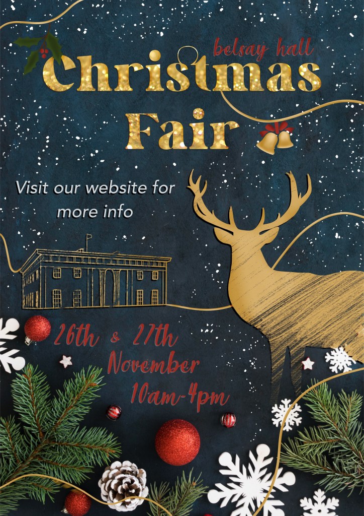
Moving on to the ‘Not Enough’ poster – I began by removing almost all information from the poster and just leaving the absolute essentials. The exercise says to ‘be extreme’, so, I was. It definitely felt less horrifying to do this than it did to add too much information, but I knew it wasn’t going to be enough. It was a little bit easier to design this as there was less emphasis on text legibility and more on making it look nice. I thought the sketchy stag and Belsay Hall elements looked great, and I felt a lot better about the result of this poster.
Asking friends, family, fellow students, and sometimes my entire Twitter following for their feedback on my work is extremely normal for me. I routinely send out half-finished sketches and ask if anyone has thoughts on how I could proceed. In fact, I find it quite hard to make decisions without input from other people! So, I wanted to try something a bit different for this exercise. I made a survey using Google Forms asking questions about each poster and how effective they are. I didn’t specify why I was asking these questions or what the goal of the exercise was, and then I sent it out to everyone I know. You can find the survey and questions here: https://forms.gle/aSL97J8jcmcpENBw6.
In total, I received 23 responses, which I was super excited about. I got a lot of extremely useful feedback, too. I sorted all of the data into a spreadsheet for easier sharing – it can be viewed here (note – you can only view this if you are logged into your OCA account. If you’re not an OCA student and interested in seeing the data, please get in touch!) A lot of the responses said the same sort of things. I decided to go through them and write up the pros and cons for each poster – adding anything that was new to the list as I got to it. Here’s what I ended up with:
Poster One (Too Much)
Pros
– Festive
– Very Christmassy
– Location information good to have
– Title and illustrations are appealing
– The ‘snow/stars’ were well liked
– It ‘feels cosy’
Cons
– Too many fonts
– Too wordy
– Hard to read
– Poor colour contrast
– People didn’t know where to look first
– Unorganised
– Too much text
Poster Two (Not Enough)
Pros
– Festive
– Sophisticated
– Eye-catching
– The illustrations were a huge hit!
– Easy to read
Cons
– Lacklustre
– Contrast also bad
– No information
– The order of the information is weird
– It’s too vague
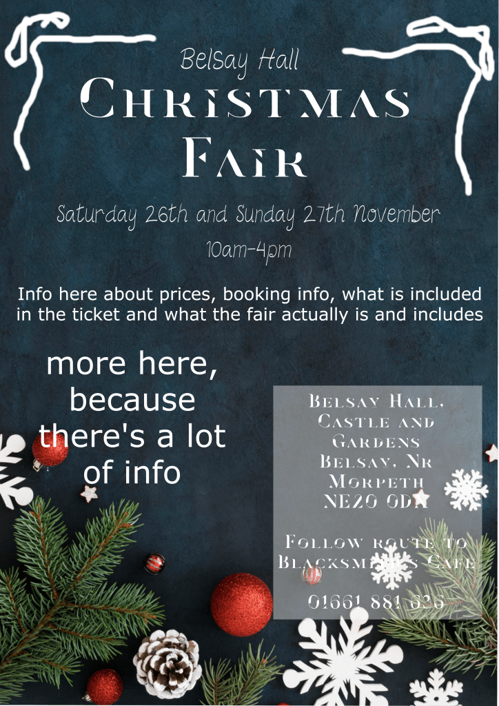
It was also clear from the responses that the third poster needed to include:
– The website, alongside the existing contact information and address
– A short statement saying what to expect from the event
– A big change to the colours used to change the contrast and aid readability, plus a deeper look at the fonts used
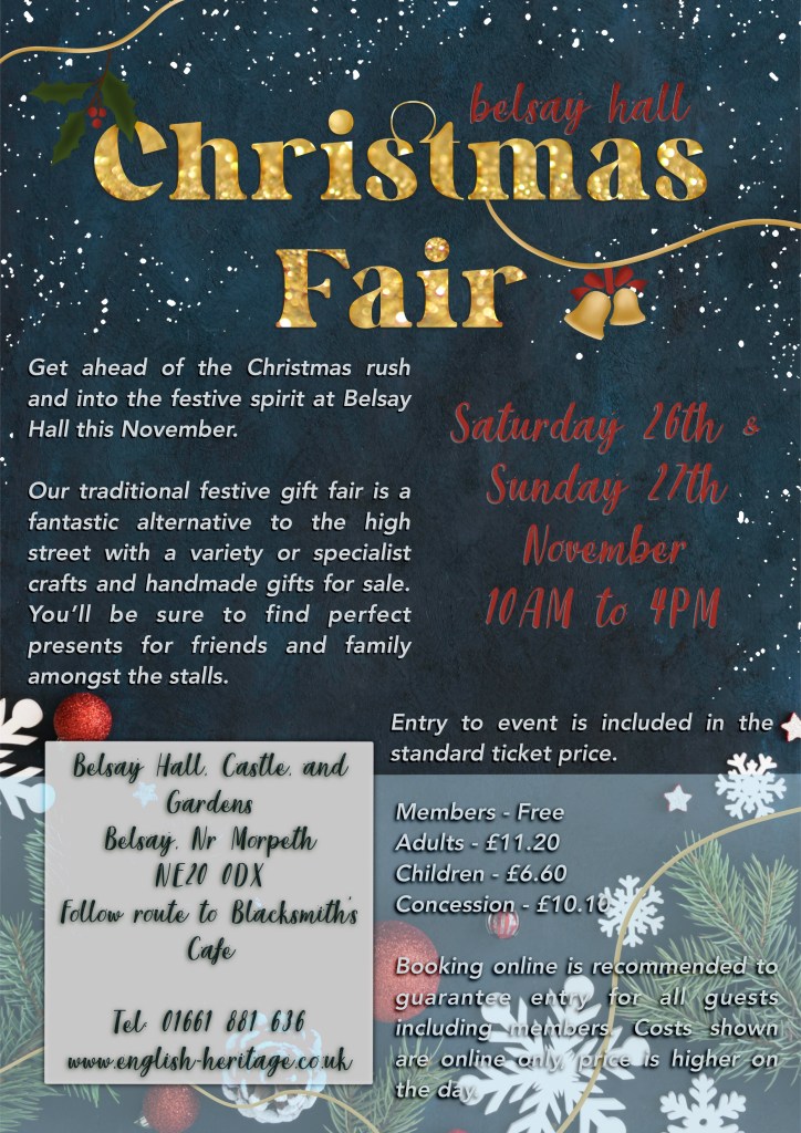
I made another copy of the poster and got to work adding in the missing information and changing the layout to accommodate it. I also looked at the fonts used, and how to make the colours easier to read. This was extremely difficult for me, and I don’t understand why! The red shade is already in the image, so it made sense to me that it would contrast nicely, and it just doesn’t. Any brighter, and it no longer fits the ‘cosy’ theme, and any other colour loses the Christmassy feel to the poster. I ended up with something that sort of works, but that is absolutely unfinished. I decided to submit this unfinished poster to ask my tutor for feedback on it and any thoughts on how it could be improved.
This was a really enjoyable project despite the challenges I faced. I enjoyed experimenting and problem solving – trying to get the ‘too much’ poster to look good and trying to fill the space on the ‘not enough’ poster. I also got a lot out of making a survey and reading all the feedback. I have since reflected on my approach to this, and have wondered how it could have been done differently. For instance, every person saw the ‘too much’ poster before the ‘not enough’ poster. I’m interested in seeing if this influenced or changed how responders felt about each one – the second poster got a lot of great feedback – is that because it was better than the first, or does it work well as a stand-alone poster?
I also wonder if the feedback would have been different had the posters had improved design elements – for example, the font and contrast issues seemed to be a frequent talking point in the responses. Would the ‘too much’ poster be more appealing if it was easier to read? What if the ‘not enough’ poster had a better flow of information and organisation? It’s hard to be able to tell which was truly more effective with all of these variables. However, based on gut feeling, and on the necessity of making the third poster, I think a middle ground will always work well.
Prior to this exercise, I had never heard of Occam’s Razor, despite unknowingly using it whenever working. It was great to be able to properly put it into practice here, and also to explore exactly why ‘too much’ information is not great visually. I feel like I got a lot out of this exercise, even if I wasn’t able to solve my design problems just yet. Hopefully, I will come back to this once I have received tutor feedback and make some changes to my final poster.
