Part 2 took me through each stage of the design process and helped me explore it in its entirety. Assignment 2 asked me to take this information and apply it in full to a brief. The brief asked me to create three greetings cards for events that are not currently catered for in the market. I was asked to design both the outside and inside of each card.
To start with, I very thoroughly analysed the brief and what was expected of me, writing out a plan for what I intended to achieve, and exploring each stage of the design process in depth. As I’ve mentioned in previous learning logs, I already am pretty familiar with the design process and have spent a lot of time figuring out how to make it work for me. I felt a bit unsure about following the process in such a linear way – I find it much easier to blend each stage, and separating them out feels counterproductive. But, it’s always useful to have a clear idea of what is needed at each step of the process.
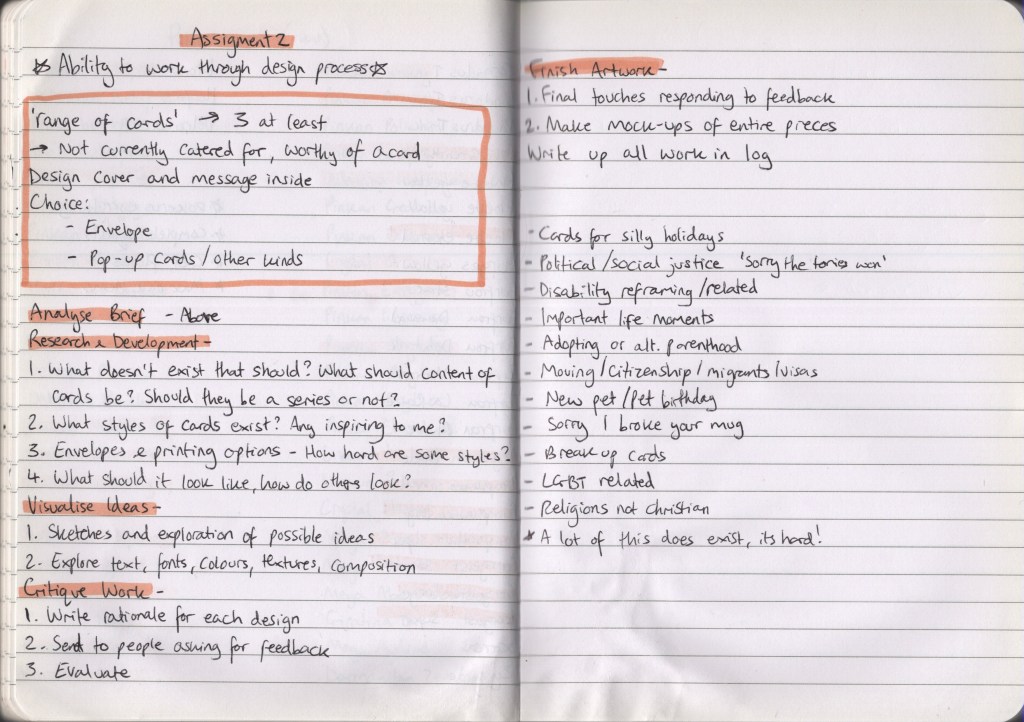
I only have a small amount of experience making greetings cards – I have designed them for friends and family for various occasions, and I roughly designed one for Exercise 26 of Key Steps in Illustration. This is a new area of design for me all things considered, so quite a lot of research was required. Before looking at what was already out there – I wanted to think about areas that might not be catered for currently. I began by making a list in my notebook and quickly realised it made more sense to use a spider diagram to explore each idea fully.
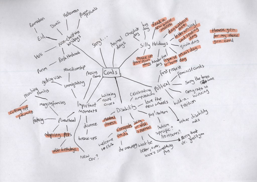
Initially, I was most drawn to my ‘family’ related ideas. I can imagine having a non-normative family set-up is not typically catered for, and it likely feels quite lonely not receiving the same attention as your peers with standard families. I was also very keen on exploring the idea of disability and how we talk about the topic. The only time I have received greetings cards in relation to my health is when I was diagnosed with cancer, however, I have been disabled my entire life and continue to be. There are a lot of milestones in disabled life that we feel are worth celebrating – such as finally getting the diagnosis you needed, or buying a new mobility aid. I felt it was unlikely there was a market for these things, as ablebodied people often don’t see disability as something to celebrate.
I decided to look at what was out there already in these areas – focussing mainly on families, and a little on disability – and found that most of my ideas do have at least a handful of existing cards on the market. I looked back at the spider diagram to reassess what I felt excited about, and the ‘silly holidays’ concepts kept making me smile. I had a lot of ideas for possible designs, and it felt like a really fun thing to explore. I had used ‘checkiday’ – a website that lists every single obscure holiday for each day of the year – to collect some holidays that definitely were not currently catered for. I grabbed another piece of paper and began sketching out the ideas I was having.
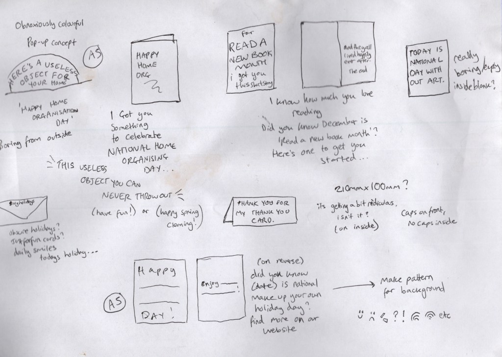
I had 5 concepts that felt pretty strong. The first was a pop-up card for national home organisation day that said ‘here’s a useless object for your home’ or something similar. When I saw national home organisation day on checkiday I laughed as I know I have far too many old birthday and Christmas cards taking up space in my home. What’s one more, to celebrate the day? The second was a card celebrating read a new book month – the card would joke that it itself was a new book, with the inside saying ‘and they all lived happily ever after, the end’. The third was for national day without art, where I wanted to strip the design back to be the most boring thing anyone had ever seen. Truly, no art!
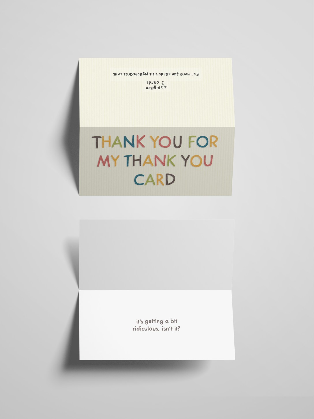
The fourth card wasn’t for a holiday but was one I had come up with when thinking about the idea of fun and silly cards. Pretty simple, it’s a thank you card to give to someone who gave you a thank you card. I felt it fit the theme, and I really enjoyed it. The final idea was to celebrate national make-up-your-own holiday day and featured a write-in section on the front and inside of the card, allowing the person to celebrate whichever holiday they invented for the day. I felt they were all really strong concepts and was struggling to pick which to advance with. I called a friend to discuss the ideas and see what they thought – and together we narrowed it down to three: the home organisation card, the thank you card, and the make-up-your-own holiday card.
Next, I began researching greetings cards from a design perspective. I used Moonpig, Thortful, and Paperchase to explore existing cards and themes. I specifically wanted to explore thank you cards as I felt like my designs were all text-heavy and I wanted to explore how that had been approached in interesting ways. I created a Pinterest board to store all of the examples I had found and to reference later. Alongside adding examples of text-based cards, I added any cards that inspired me or made me feel excited. Next, I researched standard card sizes. I used this page on The Paper Box as it had some really great visual diagrams showing how each card looks. I decided both the home organisation and make-up-your-own holiday cards would be A5, and the thank you card 210x100mm.
There was a lot more research I wanted to do for the home organisation card and some experimentation with how to create a pop-up card. I decided to focus on the other two cards first, as they’d be easier to get finished and come back to this at the end. I began with the thank you card. I started by opening a canvas at the size of the card and exploring font options. I quickly realised none of them would work, and hand-drawn text was most appropriate. I used Futura as a guideline for my text and tried to keep it neat, but still obviously hand-drawn. I then explored several colour options, unsure of which to go with.

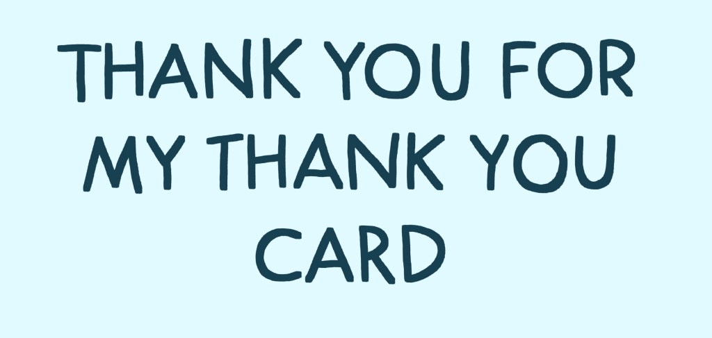
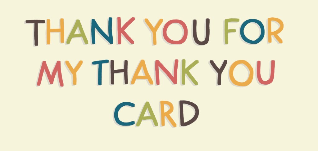
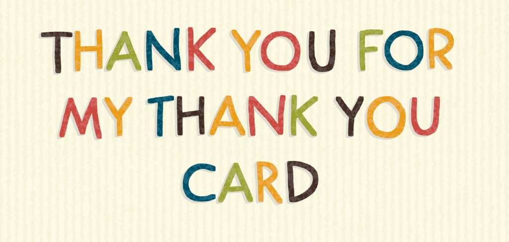
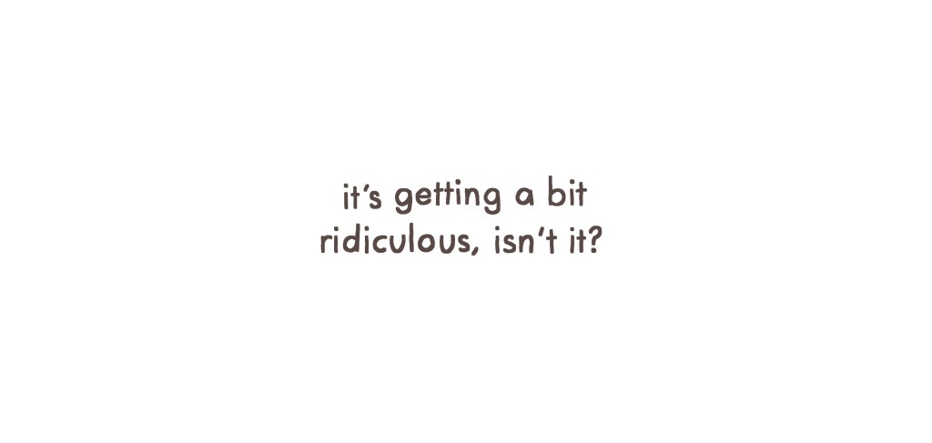
Inspired by one of the cards I had found when researching, I experimented with changing each letter to a different colour. I used my ‘go-to’ colour palette for this, and I really enjoyed the look. I added a grey shadow on the text to help it stand out better. It felt a bit plain, but I wasn’t sure how to add to it without overtaking the text. I hoped I’d get some feedback which would help me find a direction, and moved on to the inside. The inside was pretty simple for this card, I drew over Futura again, and used the same shade of brown as on the outside. I left the background white.
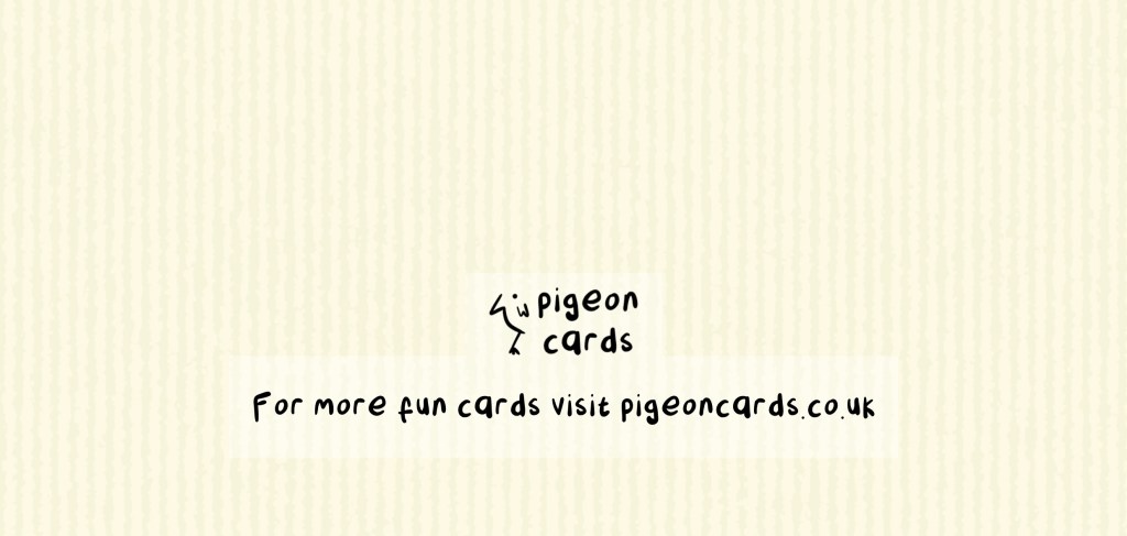
I then sent the outside to some friends for feedback. One pointed out I was missing my usual textures from the piece, which I hadn’t even considered using. I added some to the background and the text, and I felt this pulled it together really nicely. Then, I created a back for the card. I used the same colour and texture as the background on the front and added a logo and tagline. The logo wasn’t given much thought, as I wanted to focus more on other areas of the assignment. The idea came from the font I used – one I designed for Assignment 4 of Illustration Sketchbooks which I named Pigeon.
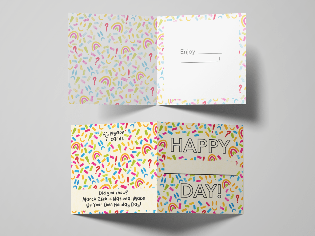
Once I felt I was finished with the thank you card, I moved on to the make-up-your-own holiday card. My idea for this card was to develop a repeating pattern to use across the card that communicated that the card could be for almost anything. I started by drawing out the design elements I wanted to use, then picking a colour palette for the pattern and applying the colours to each element. Then I slowly built up a repeating pattern using the elements. This took a lot longer than I anticipated, and especially towards the end, it felt like I was dedicating my time to the wrong things. I decided to use the parts of the pattern I had already, without it necessarily being a seamless repeat.
I created a new canvas at A5 to use for the card and inserted a PNG of my pattern. I really wasn’t sure how to navigate the text. Once again, I felt a hand-drawn font would be best, but I was uncertain of how I wanted it to look. It was also tricky figuring out how to have the font stand out against such a busy pattern in the background, and choosing a colour for the text felt like a nightmare. I spent a lot of time going back and forth on different ideas, then reached out for some advice from the Visual Communications Discord server. I also stepped away from the assignment, feeling like I was stuck in tunnel vision somewhat, and some space would help me make better decisions.


After some time away, instead of looking at my design, I looked first at my research. I realised I hadn’t tried a simple font yet, so with a very dark grey – almost black – I wrote out my text in Avenir. I made the text hollow and planned to remove the pattern from inside each letter, leaving it on the rest of the card, hoping that would help it pop. I felt a lot better about how this looked and realised it would look even better if I changed the dimensions of the card to square. I sent this for further feedback and was advised to remove the pattern around each letter. I was reluctant, as I felt this would require a lot more work, but I agreed this was the best thing to do.
I then moved on to the inside and reverse of the card. For the inside, I used the same font and dark grey shade to write ‘Enjoy _____!’ and used the same pattern as a border. On the reverse, I continued the pattern, added the logo, and some information about the holiday itself. I felt this was necessary, as it wouldn’t be clear what the card was for otherwise.
Unfortunately, during this assignment, I have been very pressed for time. I was aware at this stage that it was unlikely I would be able to complete my third card design, as I needed to write up every learning log from part 2. This is my usual tactic and normally works out okay. However, time seems to have just flown by since my last submission and I’m finishing everything last minute. I decided to make mock-ups for the two cards I have finished so I can see them in all their glory, before focusing on all the writing work.

I was really impressed with the mock-up files I was able to find, it’s often tricky to get good ones! I think the cards look brilliant too. I’m quite proud of how I was able to problem-solve the issues I came across in both processes. I feel very disappointed that I have only completed two of the three cards. The third card required prototype mock-ups, physical testing, deeper research into pop-up cards, figuring out what software to use and how to build the card together, and generally a lot more beyond just illustrating and design work. Had I have had more time, this would have been possible.
I have mixed feelings about part 2. I enjoyed the briefs, and I like the work I produced for them. I have loved being able to get back into design work in this way and to feel connected to all of the work I do. But, it felt very slow, and a little too easy at times. I have felt like a lot of it is re-learning things I already know, which made me feel bored and uninterested in engaging. I’ve had a lot of other life stuff on my plate alongside studying these past few months, and I think I found it increasingly harder to engage with something I didn’t feel I was getting much out of. Having looked ahead, I’m extremely excited for parts 3 and 4, which both explore areas I am very passionate about in design. But first, I think I need a break.
I have studied near constantly for almost 3 years now without stopping. When I have had breaks, they’ve been short, and usually a necessity as I have had other responsibilities that took precedence. I haven’t had a break where I have been able to actually rest, recharge, and come back refreshed. I hope that after taking some time off, I will return to part 3 with energy, motivation, and time to invest in the subjects I love. I feel like the work I have produced in part 2 is far from my best, and it feels pretty subpar. I can’t tell if that’s because I’m exhausted and unable to see the worth in my work, or if it’s because I’m exhausted and not able to perform how I want. Either way, I’m exhausted.
Once I have my tutor’s feedback – and feel refreshed – I will be revisiting Exercise ?? to finish the third poster, and hopefully, I will be able to revisit this assignment and give the third card all of the time it deserves. I think the concept is brilliant, so I definitely want to give it a shot at least!
