
This research task asked me to reflect on the work of artists who inspire me and consider their use of visual language, what exactly I admire about their work, and how I can take from their work and learn to implement similar things in my own pieces.
At the very beginning of part one, I decided to do some introductory research into graphic design in order to identify what areas I am drawn to and which artists I like – so I would have an easy-to-reference list if I ever needed one. I came up with a wide range of historical and contemporary designers, and identified movements and time periods that excited me. I didn’t document this at the time – other than in my notebook – and thought this was a good opportunity to do so.
Art Movements
- Futurism
- Dadaism
- Constructivism
- Avant Garde
- Bauhaus & Modernism
- Counter culture
- Postmodernism
- Swiss design
- Art deco
- International style & pop-art
- Modern Japanese design
Historical Designers
- Saul Bass
- Massimo Vignelli
- Paul Rand
- Alan Fletcher
- Abram Games
- Armin Hofmann
- Josef Muller-Brockmann
- April Greiman
- Ladislav Sutnar
- Murial Cooper
- Otl Aicher
- Bradbury Thompson
Contemporary Designers
- Aries Moross
- Marta Veludo
- Gabby Lord
- Leta Sobierajski
- Annie atkins
- Will Bryant
- Morag Myerscough
- Llew Mejia
- Elena Schlenker
- Timothy Goodman
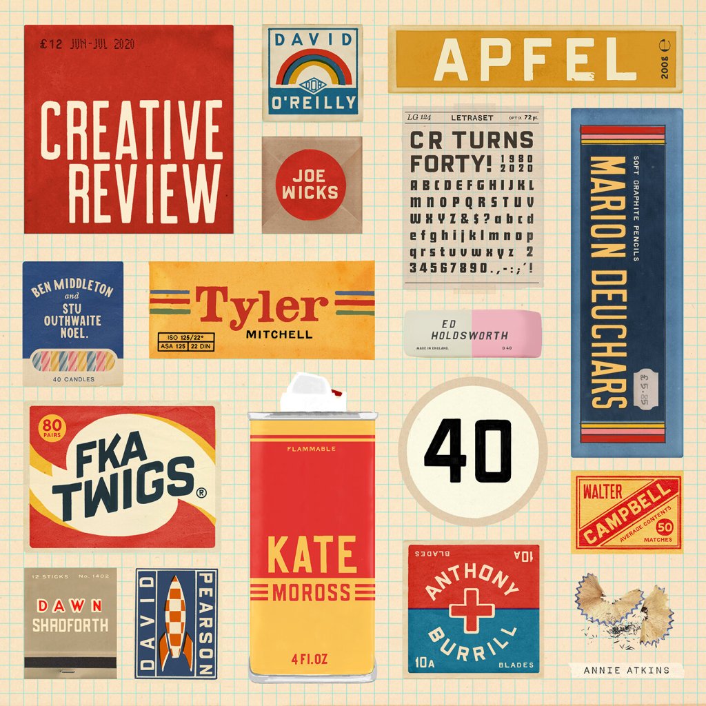
My tutor has also provided a number of suggestions on books, films, and artists to research. Some I already had in my above lists, and some were new to me. I have briefly looked into everything and will add Pushpin Studios, Marion Deuchars, Nina Chakrabarti, Matisse, and Leo Lionni to my lists.
As I have many designers here to explore, alongside entire cultural movements, I figured I would pick a few to dive deeper into for this task. The next exercise will continue this research in a broader way, hopefully allowing for further research into design movements and other artists.
Paul Rand
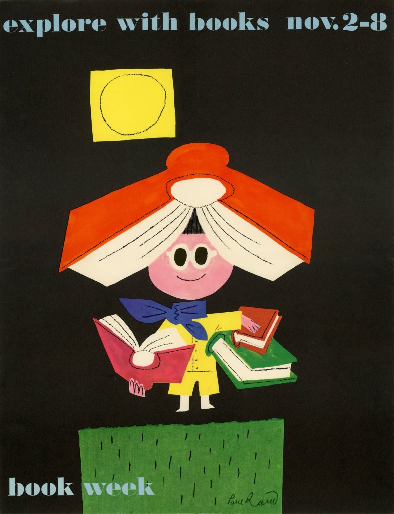
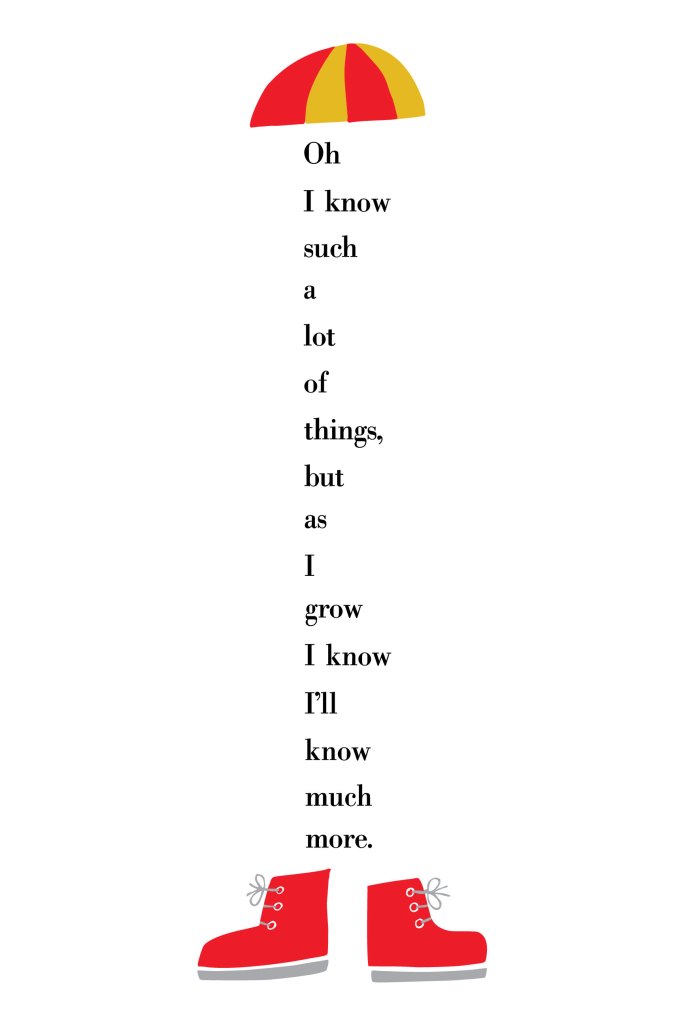
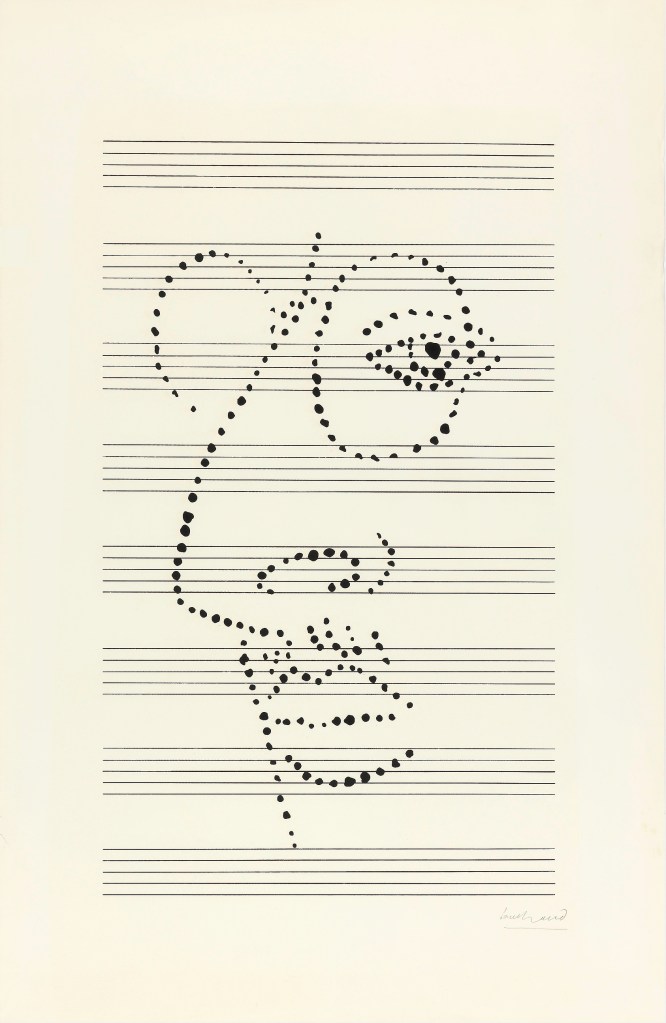
Paul Rand was one of the first American graphic designers to implement the Swiss style of design in his work. He is most famous for the logos he designed – such as those for IBM and ABC – however I personally most admire his posters, book covers, and paintings. I feel the four posters above capture the visual language used throughout his work very well – bold contrasting colours, playful illustrative text, and very intentional and impactful minimalism.
His work feels simple yet clever, and I love that viewing his work feels like viewing the thought processes behind each piece, and seeing exactly how he got to the final design. The Ivor Stravinsky piece above is a perfect example of this. Simple, yet genius, and extremely effective. I can imagine his process of experimenting with materials, papers, concepts, angles of the composer’s face, and how to perfectly capture the feeling he was going for. Or, maybe it was easier, and this fell into his hands without effort. Either way, I have a deep appreciation for the design process and final image.
Each poster here tells a story using graphical elements. The playful markmaking and shapes used in the Book Week poster tell the story of an excited child exploring books and having fun with them. Rand’s usage of such bright colours against a black background draws the eye in and furthers this excitement. In contrast, the use of bright colours against a white background in the I Know poster helps draw the eye in to the text, the shapes and colours are simply used as framing tools. The text here also tells a story, not in the words themselves, but in the way Rand has manipulated the text – it seems it is ‘growing’.
I really admire Rand’s ability to embrace minimalism in such a beautiful way. I’m also impressed by the way he combines playful and more ‘free’ linework and drawing into this minimalistic style. I’d like to learn how to do this, and how to get less caught up in things looking clean and tidy. I also love how creative he is with text, and hope I can become more creative with my own, too.
Josef Muller-Brockmann
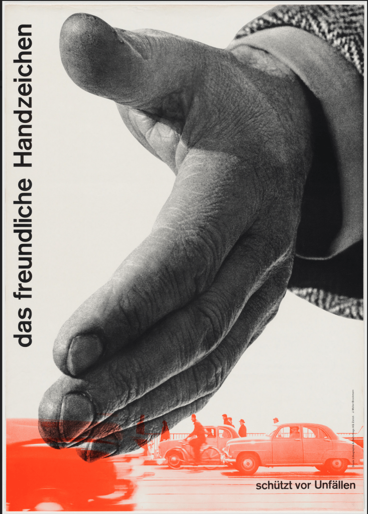
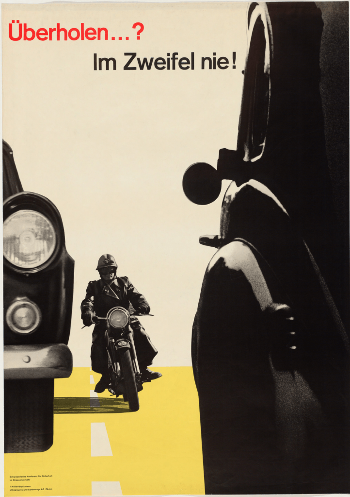
Josef Muller-Brockmann was a Swiss designer and editor of New Graphic Design, the publication that spearheaded the Swiss style and revolutionised modern graphic design. He also wrote Grid Systems in Graphic Design, introducing a method of organising design layouts which has now become standard practice worldwide. Without his work, graphic design as we know it today would likely not look the same.
Muller-Brockmann’s usage of visual language, like Rand’s, is minimalistic and simple. Rand was likely inspired directly by Muller-Brockmann, so this makes sense. Muller-Brockmann’s work is less playful, however, and feels very clean. The usage of colour is limited and very intentional, and the combination is visually gorgeous. Colours are still bold and follow a primary palette, which seems to be a key factor in Swiss design work.
I am intrigued by the ‘cut-out’ images used in the first two posters above and I’m keen on exploring this for my own work. I really like the effect it has on the overall piece and how the images interact with each other. I also find Muller-Brockmann’s usage of space inspiring – it is so striking. The third poster above is a great example of a brilliant usage of space and text placement. I find the Swiss style preference for sans-serif fonts very attractive, and Muller-Brockmann’s consistent usage of Akzidenz-Grotesk creates a recognisable personal visual language. Interestingly, in the fourth poster above, he chose to write all information in lowercase. The German language grammatically requires every noun to be capitalised, so this is a noticeable design choice. It also makes the paragraph quite difficult to read, so it’s a curious decision.
I’m sure as I continue with this unit, I will learn more about Muller-Brockmann’s design style and it will naturally influence my own work – as it seems to for every modern designer. However, I specifically would like to align my work more with the Swiss style – as well as other schools of design from the mid-20th Century – but hopefully with my own personal spin.
Aries Moross
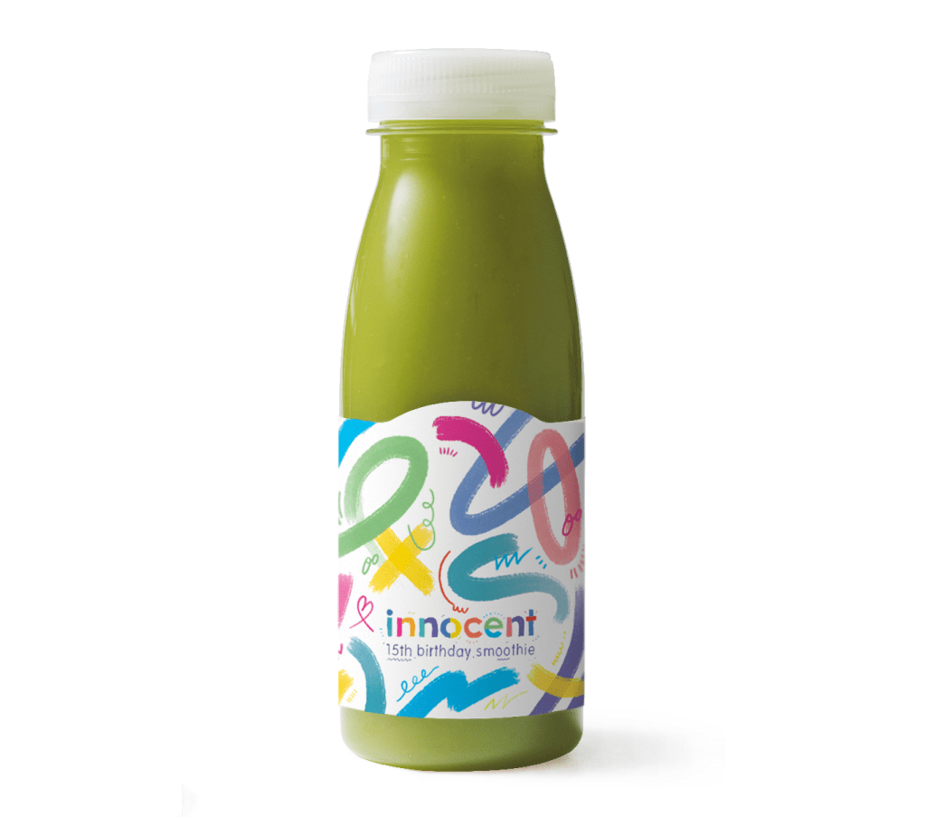
I discovered Aries Moross independently during my initial research in part one, and my tutor has also recommended I look at their work. They are an award-winning graphic designer and illustrator who mostly focuses on hand-drawn typography in their work. I am especially drawn to their pattern designs and non-typographical work, as it’s more inspiring to me. Moross also runs a studio in London which has directed and designed for major brands such as MTV, Spotify, and Nike.
Throughout all of their work, Moross has a clear and consistent visual identity. They use bright colours, geometric shapes, messy and playful linework and detailing, and hand-drawn illustrative text. Their work is very fun and bold. In contrast to the previous two designers, Moross takes a more maximalist approach to design, filling all the space in a page, and mixing several design approaches in each piece. It’s extremely effective and provides a unique and recognisable set of imagery across their body of work.
I very much admire playful and fun work, especially when it manages to cross the boundaries of expectation and be used in a commercial setting. Abstract patterns and scribbly designs are things I keep to my own private sketchbooks and feel hesitant about allowing the ‘mess’ into my more polished work – which I touched on earlier when discussing Paul Rand’s playful approach. The above images are all from commercial campaigns, however, and that inspires me a great deal. Seeing this work used for Innocent and on a magazine cover is especially inspiring for me, as these are industries I would love to work in.
I’d love to explore pattern design further and try to be a bit more experimental with my colour usage. Whilst I love the minimalism of Swiss design, I wonder how much I’m just playing it safe. Maybe I could try to take risks with maximalism and explore the boundaries between the two. Is it possible to incorporate the themes of Swiss design into a more maximalist and abstract piece of work? Perhaps in exploring this further, I will learn to be more comfortable with less polished work.
Annie Atkins
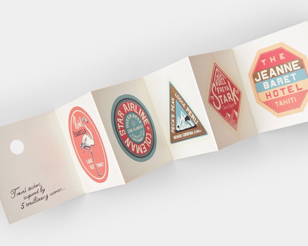
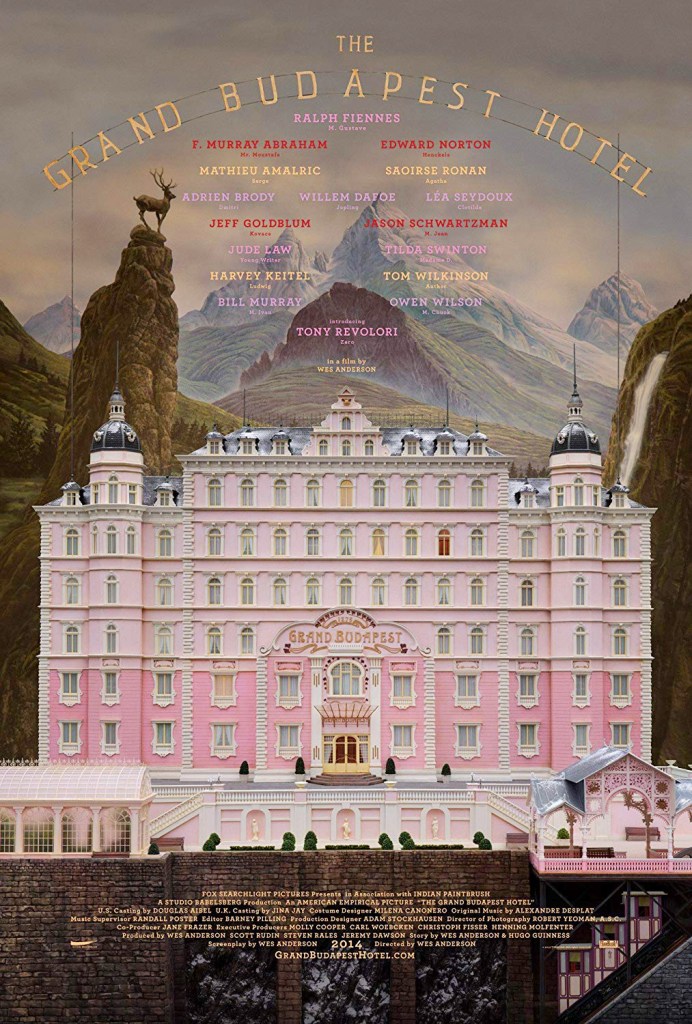
Annie Atkins designs graphic props for filmmaking and runs workshops to help educate budding designers on this field and provide a framework to build a portfolio within. She is a huge inspiration of mine – the idea of designing for film or TV is absolutely a dream job for me. I would love to do this. Hearing her talk about her experiences, the films she has worked for, and the non-film projects she has continued alongside is so exciting for me.
The historical influence in Atkins’ work is clear – with elements from the 1900s-1930s showing up repeatedly throughout her designs. She also consistently uses warm, soft tones of colours, which evoke a ‘vintage’ feel to her work. In contrast to the all-lowercase poster Muller-Brockmann designed, Atkins has a preference for all-uppercase, which again is likely inspired by the typesetting of early printing machines and the capacity of design in the early 20th Century. She also has a preference for serif fonts, although she does occasionally use sans-serif, as seen in the second image above.
Atkins’ use of space is just as visually enticing as Muller-Brockmann’s – which is potentially due to using the grid that Muller-Brockmann popularised. The organisation of elements in the second image above, and the placement of text in the Grand Budapest Hotel poster, are both examples of this. It’s really cool to see how she maintains her own personal style across different films, working with different directors and in different fictional universes.
I find it hard to pick one period of design that inspires me most – and I’ve previously spent a lot of time researching and illustrating imagery that is inspired by the early 20th Century, such as Assignment 5 of Key Steps in Illustration. One of my long-term goals is to figure out my favourite elements from each design movement and combine them to create my own visual identity, rather than picking one that already exists and following it closely. The four artists I chose to research for this task show off the different areas that inspire me, and I hope I can get closer to my goal throughout this unit.
The biggest takeaway from this, which I feel is something I am consistently saying, is to be more playful in my designs. I hope I can internalise this and implement it in the work throughout part three!
