
This exercise asked me to explore the concept of semiotics, and then try my hand at designing an original symbol for an abstract concept. I was asked to research existing representations for one of four concepts: Danger, Movement, Love, or Here – drawing from colour usage, similes, metaphors, and symbols that have already been designed. Using this research, I was then asked to develop a concept for a new symbol.
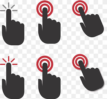
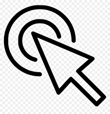
I decided to look further into the concept ‘Here’ as I felt it was the most interesting and had the least imagery conjure up in my mind when I thought about it. I used Google initially and searched to see what sort of designs were already out there. Pins, arrows, flags, pointing, and buttons were very commonly used throughout the images I found. The colour red was also most often used, with either no colour or blue second most common. Red makes sense, as it draws the eye in to the symbol, making it clear where ‘here’ is.


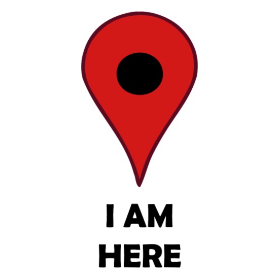

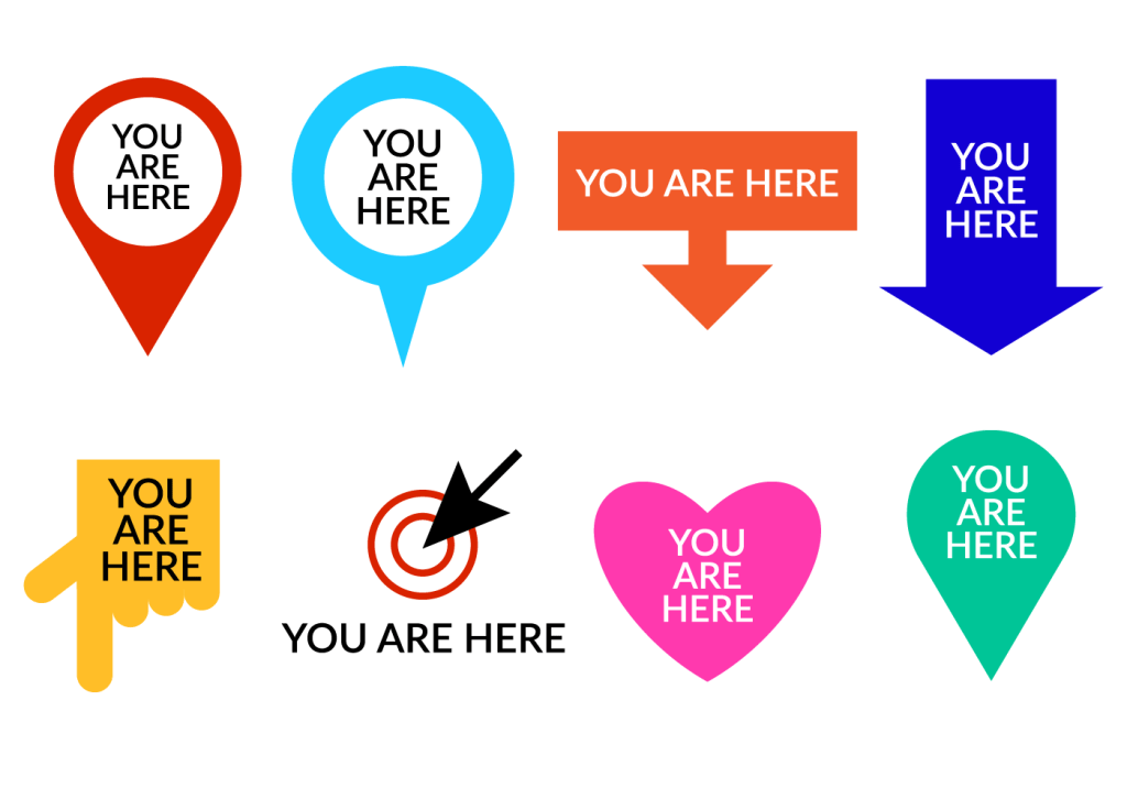

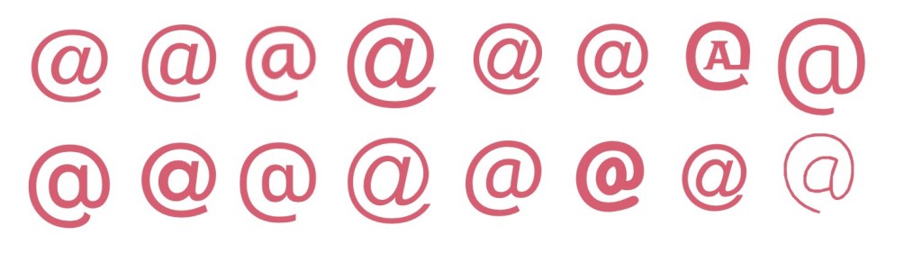
Examples of symbols used for ‘here’ – taken from Google
As pins and flags of various kinds were popping up so much, I was curious about the history of map pins and their transition to graphic design. I found this fascinating website on the history of map pins, which includes technical drawings of various styles of pins available for purchase. Graphic designers seem to have taken this centuries-old process of using pins, flags, and even buttons as map markers and translated them into digital-friendly, modernised versions.
The most famous of these is perhaps the Google Maps map marker. It’s recognisable globally and is widely seen as the norm now for digital map markers – with many other companies using the design in their own maps, and often just to represent the concept of ‘here’ or ‘a location’. Jens Eilstrup Rasmussen, a software engineer, designed the map pin for Google in 2005. He was inspired by these original map markers and wanted to ensure that the digital marker had a similar effect – showing the location clearly without obscuring any of the map.
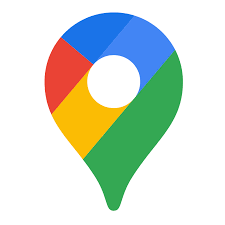

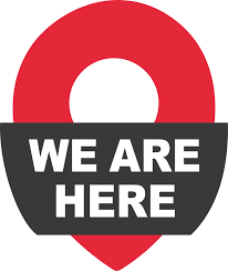
The current version of the Google Map Marker featuring the Google brand colours, and the original design from 2005.
In 2014, the map marker was added to the MoMA permanent collection, which as a designer makes me feel pretty excited. I often don’t consider design to be ‘real’ art, so hearing that an institution like MoMA values the work that fellow designers do is pretty awesome. Learning this has also made me increasingly aware of how symbols and iconography we engage with on a day-to-day basis – without really thinking about it – are all parts of modern art history.
Following on from researching existing imagery, I began to consider similes and metaphors. I struggled to find any for ‘here’, as I think it’s more of a practical and tangible concept – so whilst being abstract, it isn’t really discussed in an abstract way. I ended up looking at a thesaurus to find synonyms for the word, something I learned to do in Key Steps in Illustration to help with idea generating – and wrote a few words down, as well as sketching out some initial concepts that came to mind.
I then asked a few friends what they thought of when they heard the word ‘here’. One friend discussed the less literal concept of ‘here’, ‘I’m here for you’, ‘here’ meaning support and comfort. I hadn’t considered this perspective and explored a few ideas for this too.
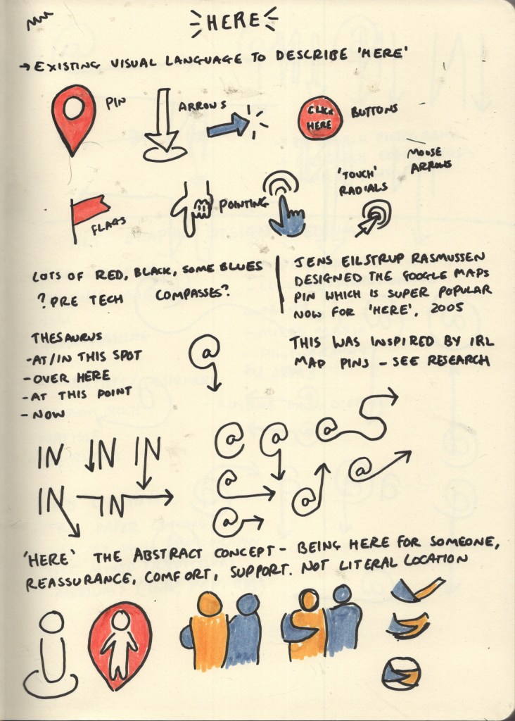
Sketchbook page showing initial research and ideas
My three favourite designs from my initial research page were the At symbol with an arrow, the word ‘IN’ with an arrow, and the circular design with the two arms linked. After some deliberating, I realised the circular design was too vague as a general symbol for ‘here’, and it wasn’t clear what was actually happening in the image. It could work well as a logo, but maybe not as a more universal symbol. I further explored variations of the At and IN symbols and decided the At symbol was my favourite.

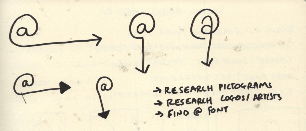
Sketchbook pages exploring design options for symbol
I decided to take an existing At symbol and add to it using Procreate. I began by exploring various fonts to see what sort of At symbol I wanted as a basis for my design. Many of the At symbols had italicised A’s in the centre of the symbol, which I didn’t like the look of. They also seemed to frequently be designed so that the tail of the loop is thinner than the start, which I wanted to avoid too, as the tail would end up becoming the arrow. I also found through my initial sketches that I preferred the A to be without a stem. None of the fonts I had quite fit this combination – but Fugue came pretty close. I just needed to remove the stem from the A.
Exploring various fonts to find an At symbol
Designing the symbol using Procreate was hard. I had anticipated this would be the case, and that I would need to use a vector software instead, but I was reluctant to do so as it’s very new to me and I felt it would take more time than it was worth. I gave it a good shot in Procreate, but getting equally sized, proportioned, and smooth lines is quite tough within the app. My first attempt ended up serving as a basis for my vector design, which was helpful!
Timelapse footage showing my first attempt at designing my symbol in Procreate
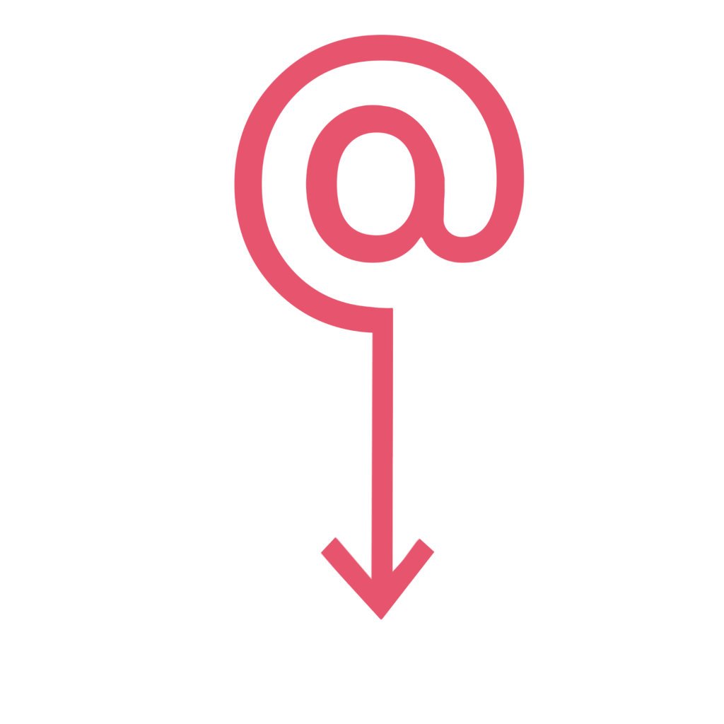
My first attempt at the symbol – designed in Procreate
My vector app of choice is Affinity Designer – I have the iPad version which I much prefer to using my laptop and mouse, and you own it for life rather than Adobe software which must be paid on a subscription basis. I have a Udemy course explaining the ins and outs of the software and an in-depth guide to using vectors, but I just keep putting it off. Learning a whole new software is daunting, especially when you have an option that works 90% of the time already. Unfortunately, Affinity doesn’t automatically screen record like Procreate does, so I don’t have a timelapse of the design process. I’m glad I know this for the future and can make more of a conscious effort to take screenshots!
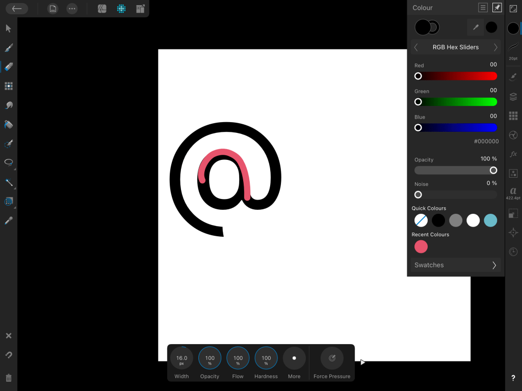
The only screenshot I managed to take using Affinity Designer – oops!
Despite being quite tricky and taking twice as long as it probably should have, I managed to produce two final designs. I felt the arrow pointing downwards would only be useful in some contexts, and there needed to be an alternative, so I also created one with the arrow pointing to the right. I tried the arrow filled in and also empty, and I prefer the arrow empty. Whilst I used the Procreate image as a starting point – I actually ended up starting from scratch, as the stem had been erased in such a way that made it pretty impossible to round out the A.
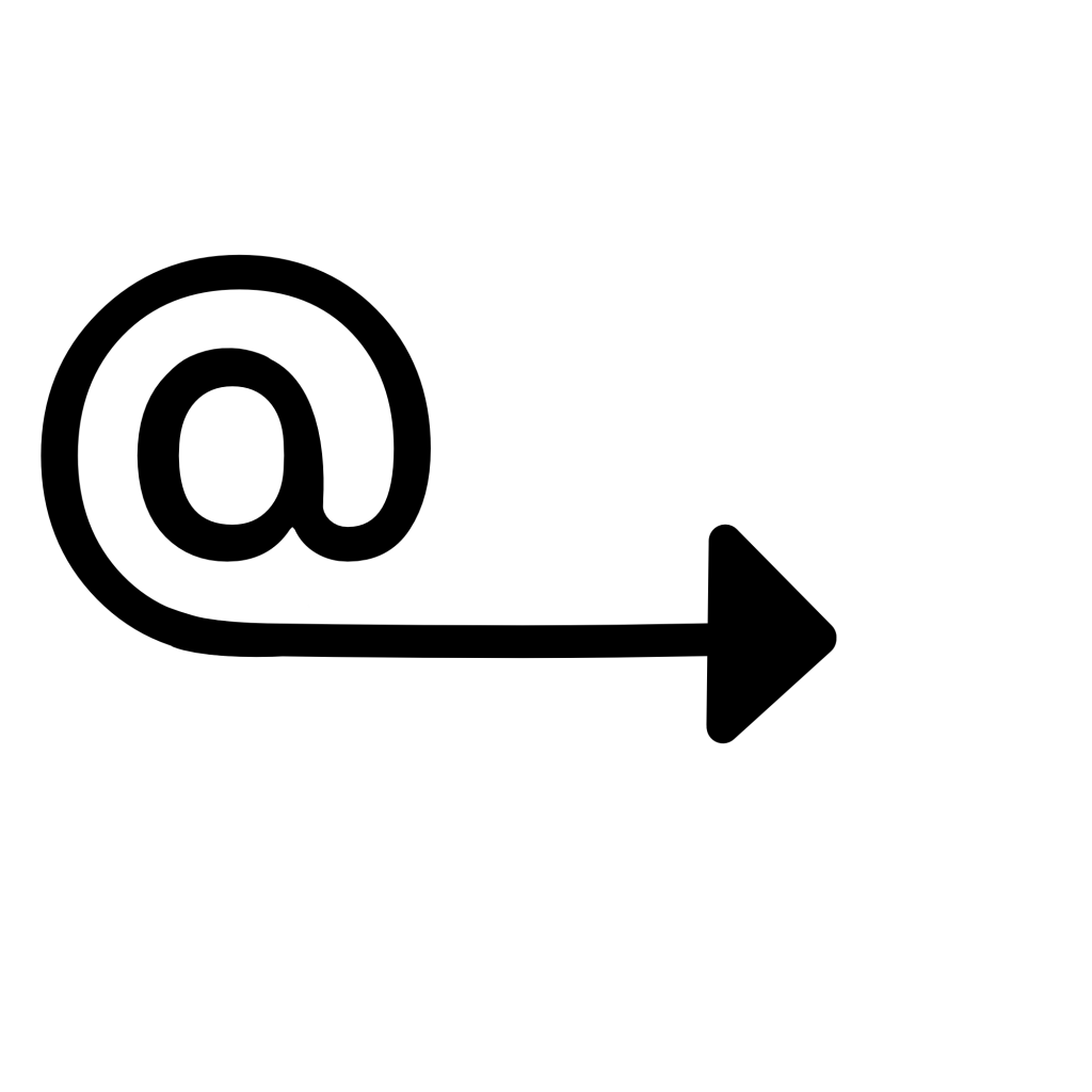
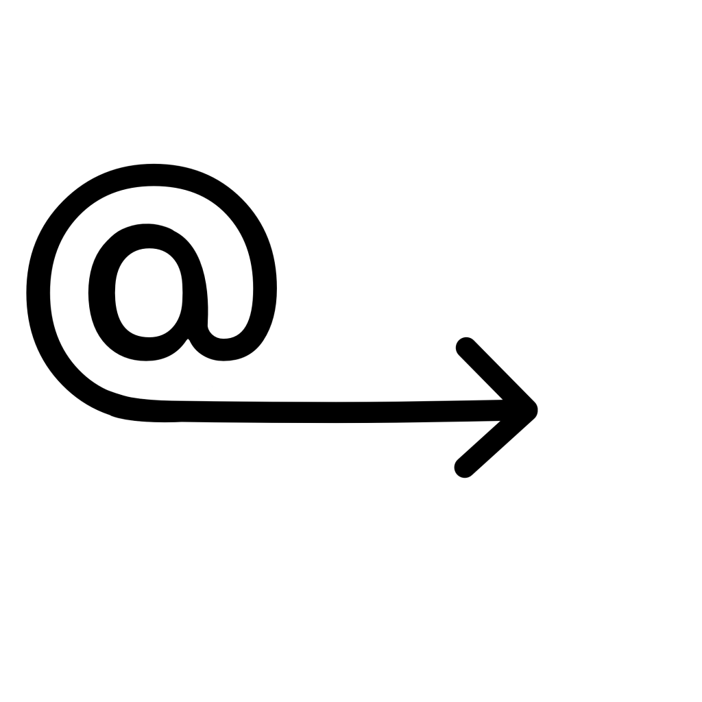
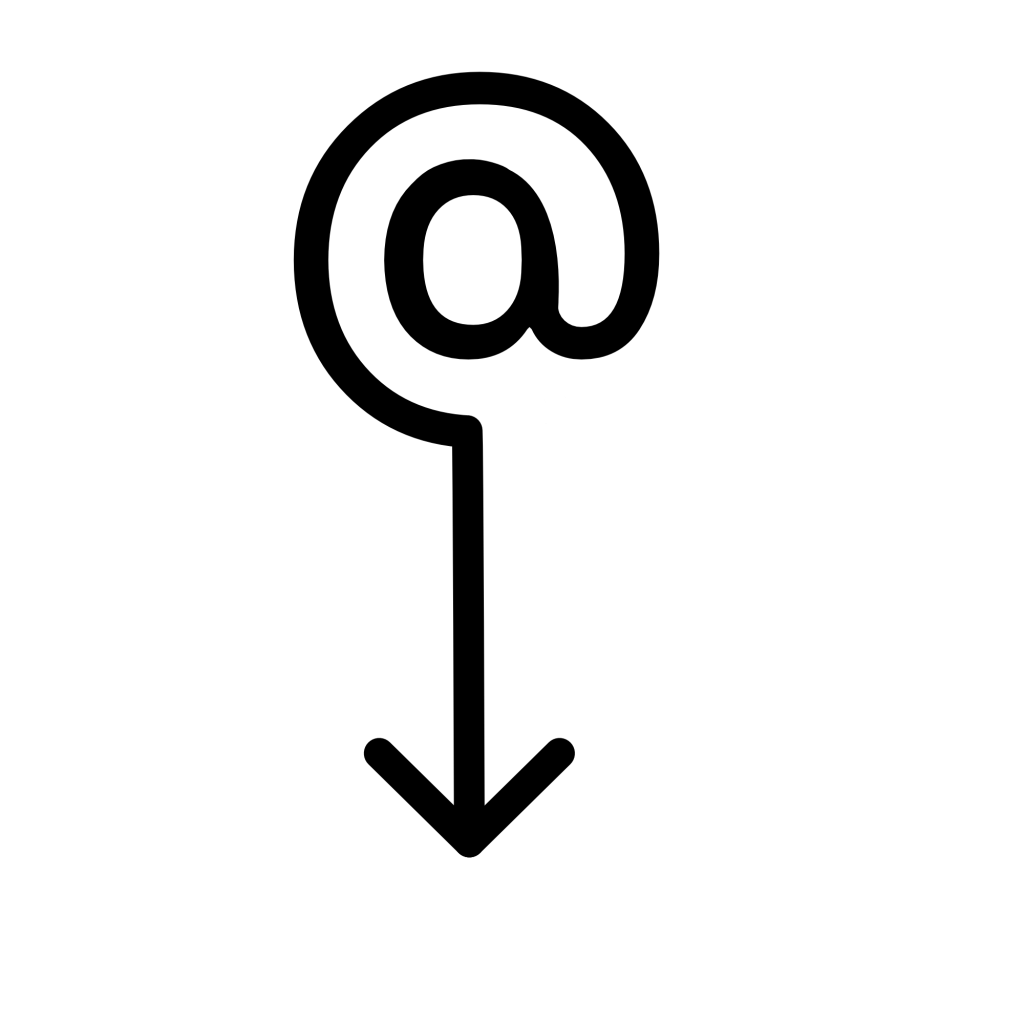
My final designs from Affinity Designer
I feel really happy with these two designs and I’m glad I pushed myself to use Affinity Designer rather than Procreate. Vectors help a lot with producing polished and professional-looking design work – especially when it comes to things like signs, symbols, logos, emotes, or anything that needs to work at multiple sizes. I hope I can find the time to complete my Affinity course, as it would be very useful for later in the unit when I have to design a font. Vectors would also generally be a good asset to have in my design toolkit.
As for the concept behind the design and how it represents ‘here’ – I feel very proud. When I was initially researching existing symbols I felt a bit lost on how I would possibly represent the concept in a new way, as I felt everything had already been done. I think the design is clear in meaning and in how it relates to ‘here’, and it isn’t something I’ve found anything like in existence. Simultaneously, it’s in line with existing symbology in that it is simple, clear, and can be widely used.
This exercise was a great challenge for my idea-generating skills, and for my creative abilities. I had a lot of fun with it!
