For this research exercise, I was asked to go back to my visual diary and consider how I perceive the visual dynamics in the pieces I had collected. I was asked what I look at first, where things contrasted in the pieces, and to focus on how the image is ‘read’. As I didn’t quite create a visual diary, I decided to instead look through one of the design books I have and try out this exercise with the images within.
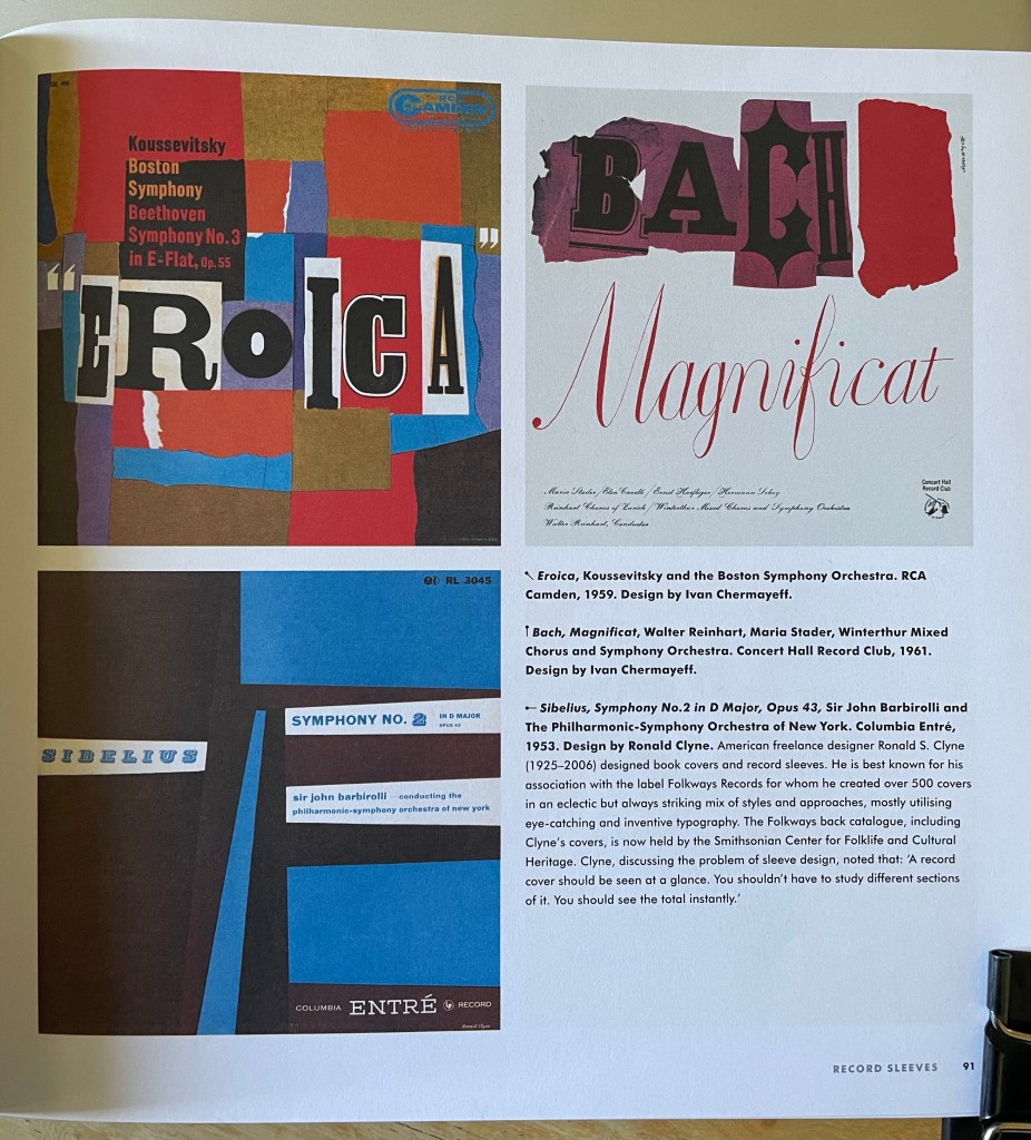
I chose to use Mid-Century Modern Graphic Design by Theo Inglis. This book is a collection of book covers, record sleeves, posters, magazine covers, and illustrated books from around the mid-century period. It’s one of my favourites to reference when working as I find it really inspiring. I opened it to a random page and took note of my initial responses – my eyes were immediately drawn to the top left design, a record cover for Eroica, especially the word itself. The bold, upper-case text is extremely eye-catching. The white background and newspaper-clipping effect highlights this too. My eyes were then led to the red areas of the design, which made me aware of the rest of the text, and the logo in the top right corner. The usage of colour and font choice is clever!
The style of the record cover tells a story, too. The positioning of the colours and the collage effect that has been used makes me think this symphony is upbeat, jaunty, and fun. Out of curiosity, I listened to the symphony, and I feel it was captured very well. The design reminds me a little of an Exercise in Key Steps in Illustration where I was asked to listen to a song on repeat and create an abstract piece of work that represented it.
I flipped forwards to a new page and once again took note of my reactions. I was immediately drawn to the yellow, then the blue, then the green, and then finally the red. I think the yellow is the most vibrant and contrasting of the four, and the red is the least noticeable as its only use is in small text. The composition of these pages is really interesting to consider, and how my eyes went from poster to poster, rather than looking at the details of each poster.
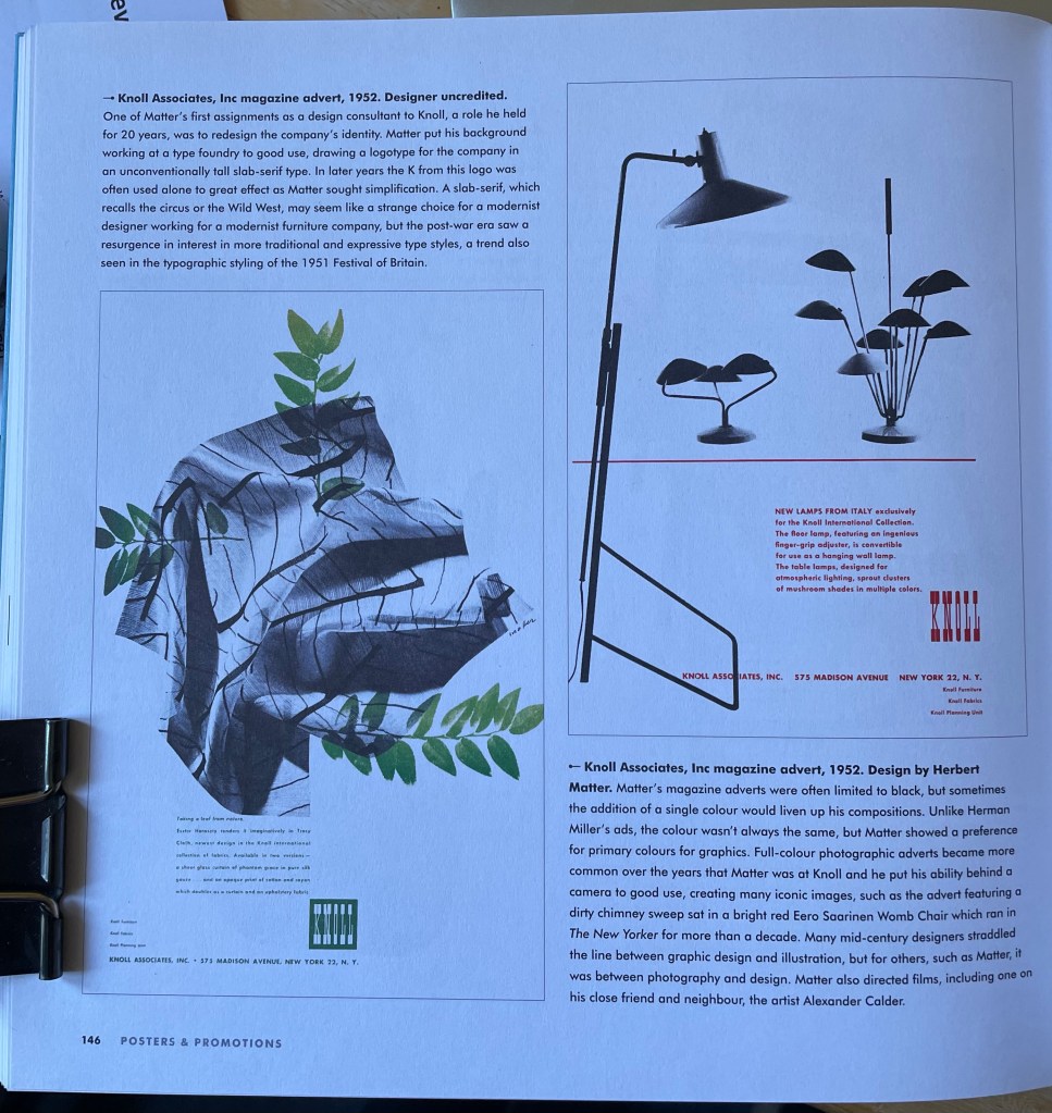
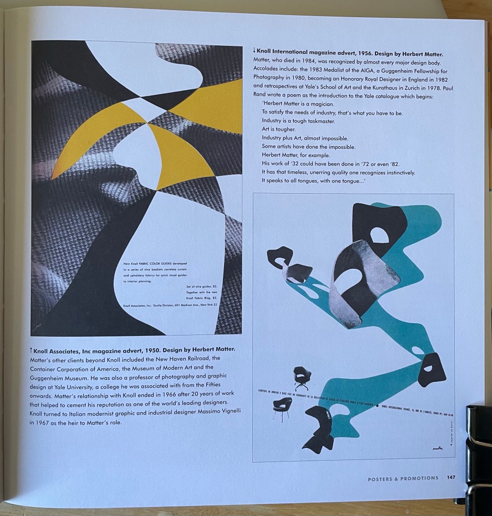
The contrast of black and white imagery with blocks of colour in all four of these posters is really effective. Your eyes see the colour first, then the imagery when focusing. It’s interesting how the text within the designs seems least important, using relatively small point sizes and the placement almost ‘hiding’ the text. It’s the last thing your eyes notice in each piece – even where the red text is the only colour, my eyes saw the logo first, then the lamps, then the smaller text.
I enjoyed this exercise and considering how these designs have been created to capture attention in different ways. Exploring composition, contrast, and colour usage in my work – as well as testing out various typographical formatting – would help me to have better visual conversations with viewers. Mid-Century design especially is good at high contrast and bold imagery, which I hope to take on board more in my own work.
