
For this research task, I was asked to explore the different non-alphanumeric characters that exist within typefaces. I was advised to use my keyboard and explore the options. Then, I was asked to choose a magazine and use the identifont website to figure out what fonts had been used throughout.
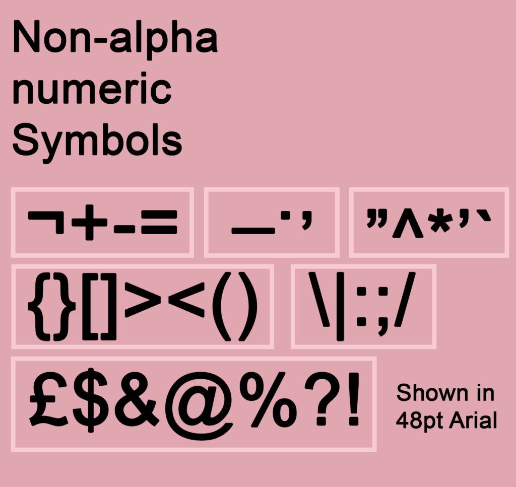
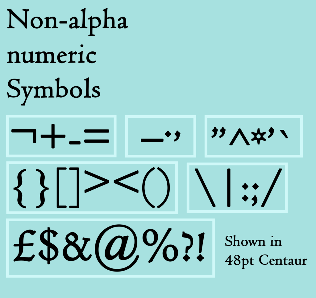
To start, I designed two graphics showcasing the non-alphanumeric symbols that I could find just using my keyboard. I chose a serif and a sans serif font for each, showing how they change between two very different typefaces. I really enjoyed this exercise, grouping each character based on similarities such as where it sits (on the baseline, above, below) or what sort of element it has, and then designing the layout. I enjoy working in space in this way very much!
Next, I grabbed two magazines I had to hand – Private Eye and World of Interiors. They have very different markets and purposes, so I thought they’d be quite different in terms of design too. I was honestly quite hesitant about this part of the research task, I felt it would be really boring and tedious and identifying the font wouldn’t serve any purpose other than ticking a box to say I did it. I reluctantly began starting with the cover of Private Eye, trying to identify the logo font.
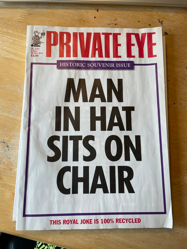
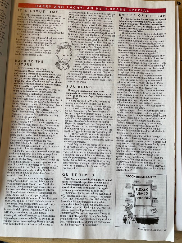
This was not easy, as the identifont system requires you to have much more than a handful of letters to pick from. I decided to try again using the fonts inside, trying to identify both the header font and the main body of text. Once in the swing of this, to my surprise, I was really enjoying myself! Looking for each letter and identifying its qualities was like a puzzle, and it was also teaching me quite a lot about what different letters could potentially look like, even if not used in the Private Eye font. I identified the body typeface first as Times New Roman – which honestly made me feel a bit silly as it’s such a famous font and I didn’t recognise it. I then identified the headers as Univers Bold, which I then realised was also used in the logo I was trying to identify originally.
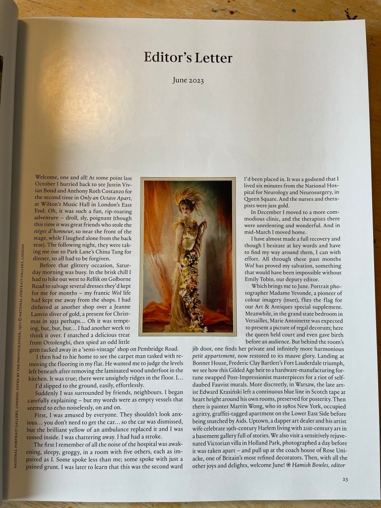
Next, I tried to identify the body text from World of Interiors. Immediately I noticed this text was way easier to read than Times New Roman, especially at such a small size. I often find it harder to read serif typefaces – which might have something to do with my neurodivergence – and was shocked to learn it was designed specifically to be easier to read. The font used here was a pleasant surprise in this regard, and I had to strain a lot less when looking for each letter. I couldn’t pin down exactly what font this was, but figured out it was in the Garamond family.
This research task ended up being very enjoyable and teaching me a lot about typefaces in an unexpected way. I always think that I already have been appreciating something, but then throughout the exercises, I learn that it could be appreciated so much more. This exercise helped me to look a lot closer at each individual letter and really see the differences between them. I do wish I had a sans serif font to try this out with, to see the differences there! Maybe I’ll play around more in my spare time for fun.
