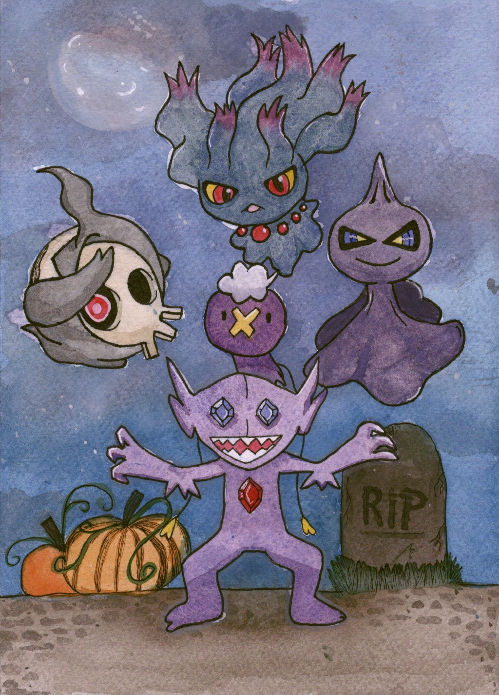
This months OCA Visual Communications Discord server art challenge was Halloween themed. The brief was very open ended and the content submitted just had to be somewhat related to the Halloween season.
I knew almost immediately that I wanted to illustrate some Pokémon. There are a lot of ghost-type Pokémon which I thought would fit the theme perfectly! I also decided to do this challenge with watercolours, rather than digitally as I usually do. I’ve been exploring watercolour more and more and getting comfortable enough with it to complete finished illustrations!
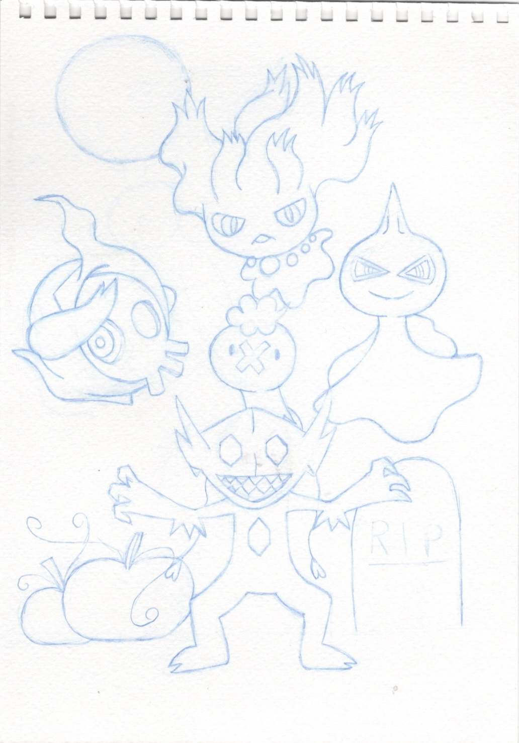
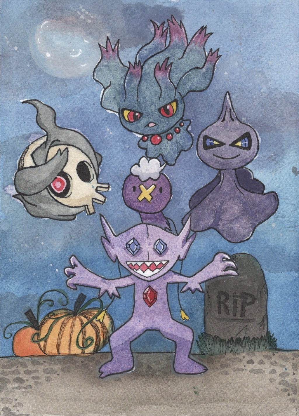
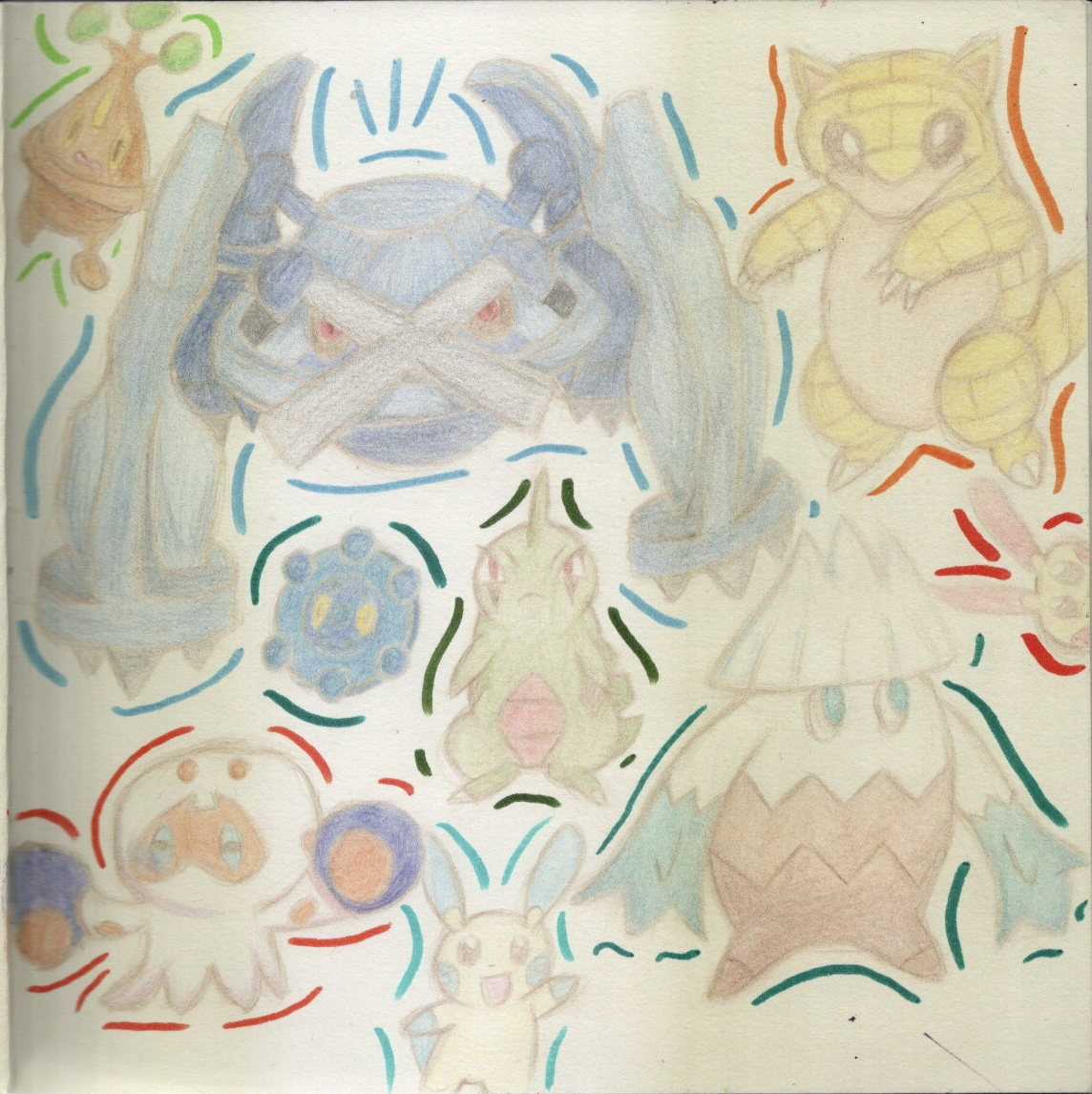
I picked the Pokémon Misdreavus (top), Duskull (left), Shuppet (right), Drifloon (centre), and Sableye (in front). I wanted to illustrate them in a graveyard setting and tried sketching out some ideas for how this could look. Originally I decided to illustrate this piece in landscape but realised when sketching that the piece would look much better if done in portrait. The Pokémon were quite small in the landscape version, and I really wanted them to stand out.
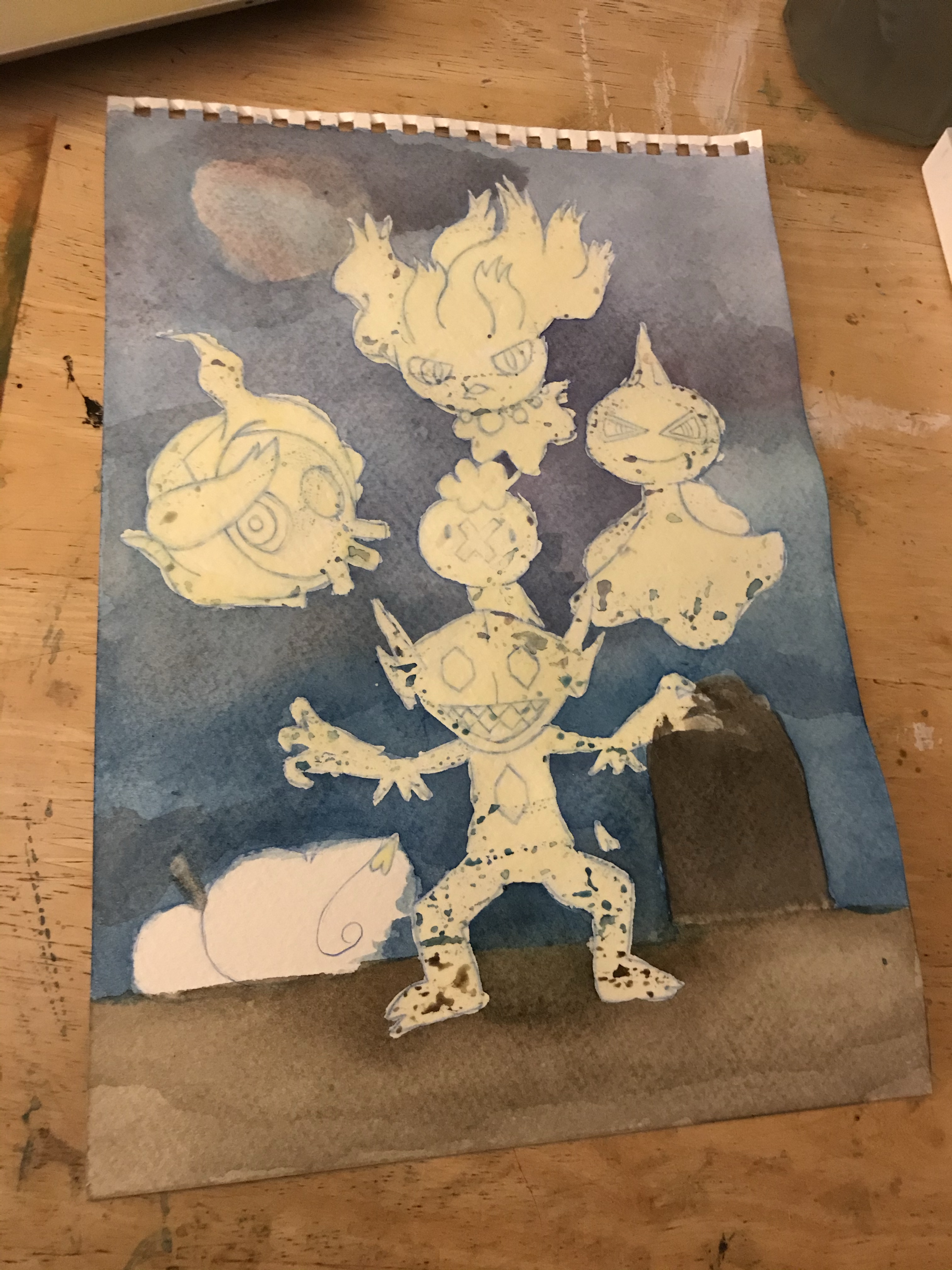
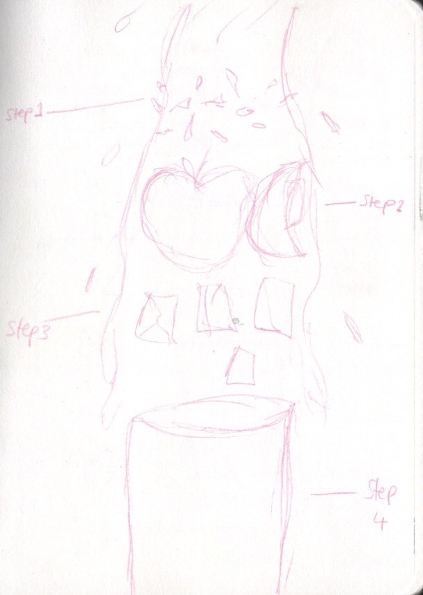
I reduced the idea of a graveyard scene down to just one single gravestone and some pumpkins. I wanted to focus on illustrating the Pokémon and showing a ‘spooky’ vibe. I sketched out the final illustration and scanned it so that I had a copy just in case something went wrong. I then added masking fluid to the Pokémon areas and began painting the sky. Unfortunately, when removing the masking fluid some of the paper got torn off, which is quite a common issue with masking fluid. Thankfully it wasn’t too much and I was able to fix it.
Stages of the illustration process
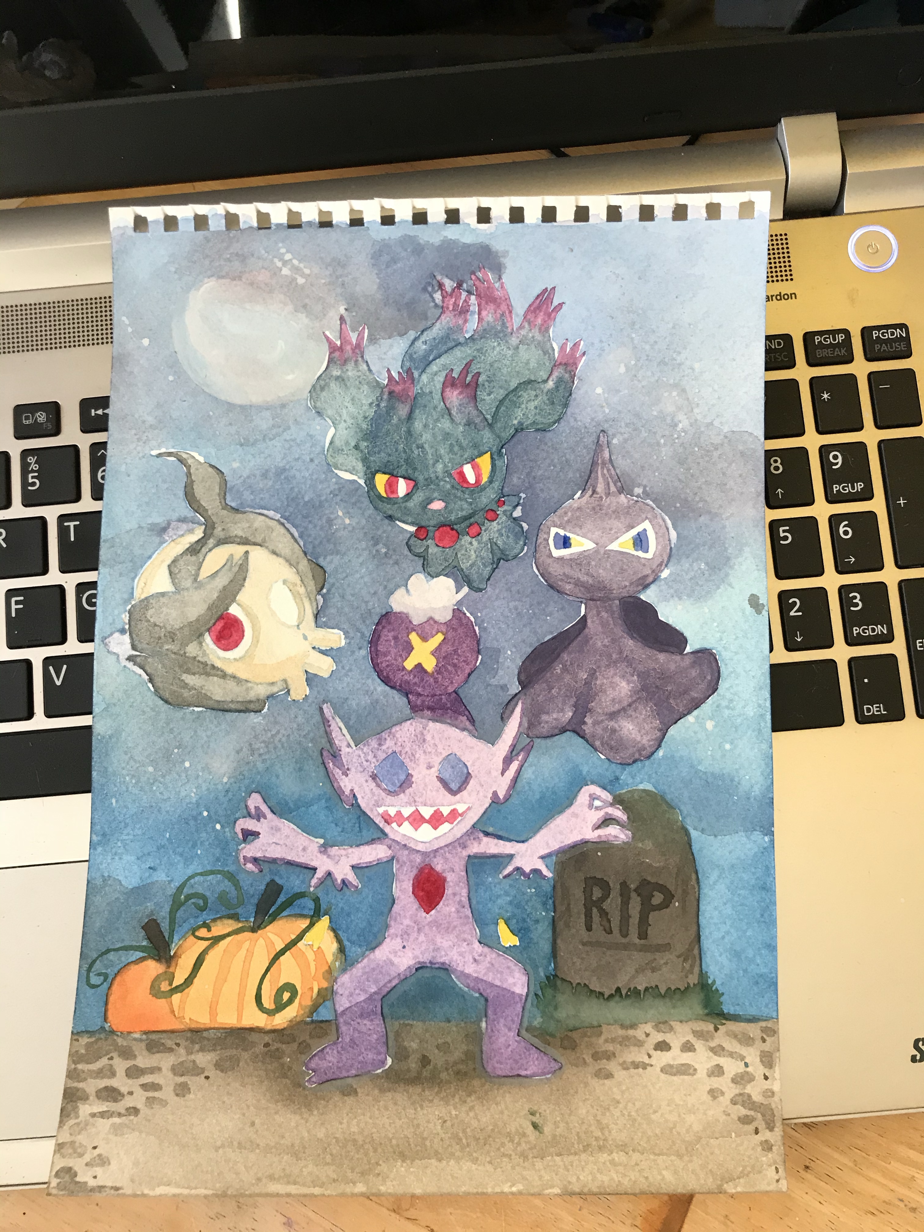
I then painted the Pokémon, added some shading, and finally added line art and highlights with a white gel pen. I scanned in the piece and altered the colours slightly to help them pop a little more, and the illustration was complete! I am so so happy with this, it was so much fun to illustrate and has sparked creative energy in me that I’m looking forward to taking on to future projects.
Final illustration, original scan and colour edited version
This exercise was about diagrammatic illustration. I was asked to design an illustration giving instructions on one of three areas: ‘making a cup of tea’, ‘getting to my house’, or ‘playing a tune on an instrument’. I had to try to use as few words as possible and let the imagery in the illustration explain a narrative, in this case an instructional narrative. I then had to show my finished work to other people to check that it works both as an attractive illustration and as a diagrammatic illustration that gives clear instructions.
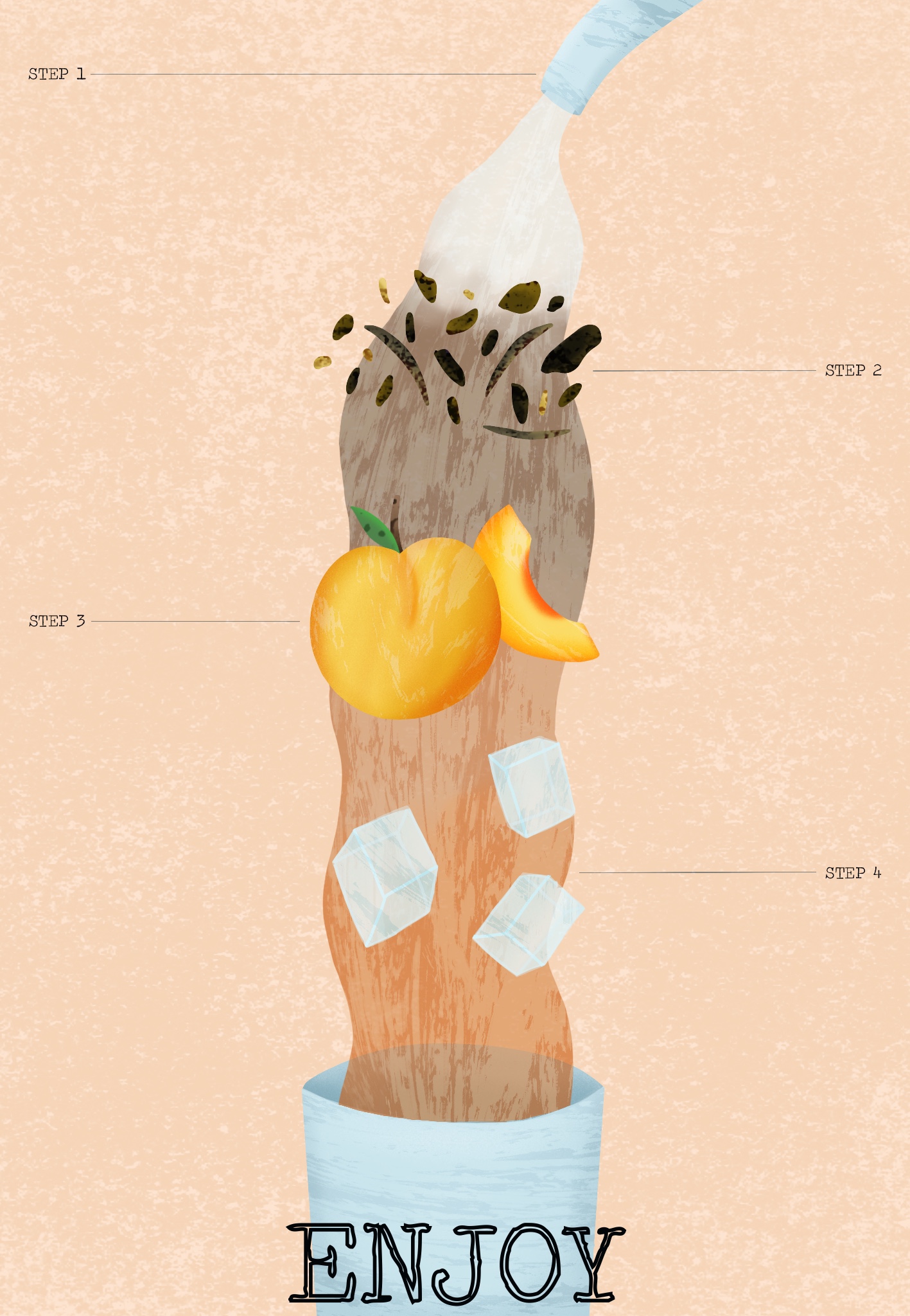
I decided to pick ‘making a cup of tea’ and chose to put a twist on this. Instead of my instructions showing how to make a regular cup of tea, I would be showing how to make iced tea instead. I love iced tea and drink it more than regular hot tea, and I think the process is pretty interesting too. I started by researching diagrammatic illustration on Behance and Pinterest, looking at how other illustrators had portrayed similar things. I really liked the dissection portrayal that was quite common in illustrations I found, showing each individual layer/item separated but still in order of how they would combine in the finished product.
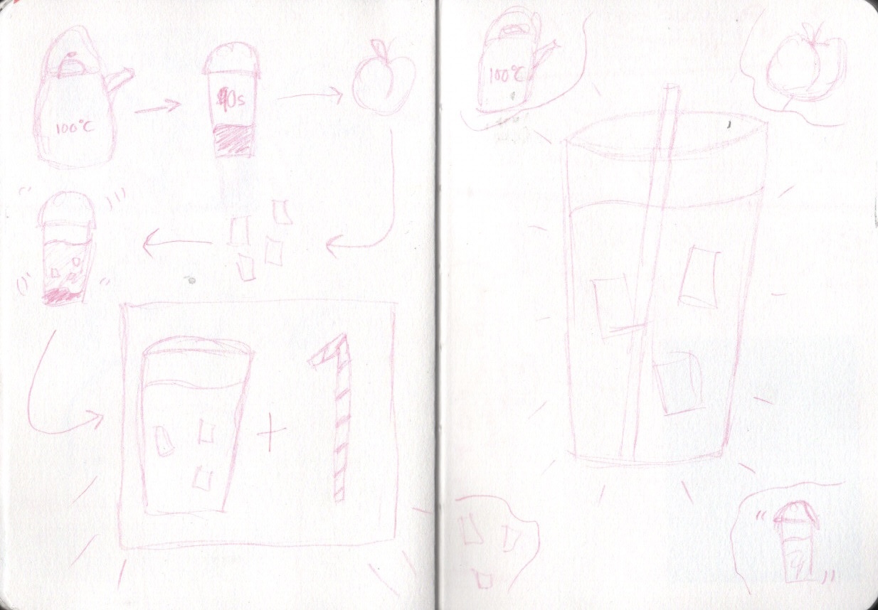
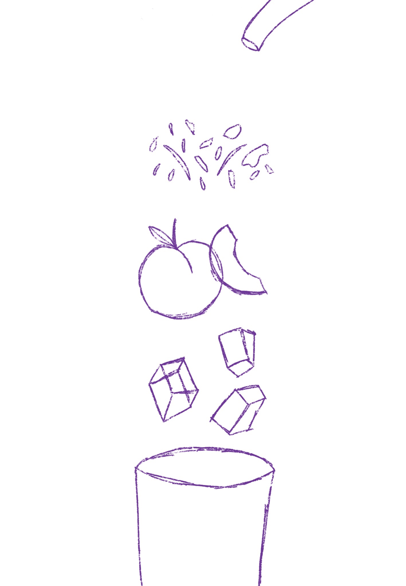
Inspired by what I’d found, I started sketching out some ideas. My first idea was to dissect the drink and place the elements in order of when they’re used in the making process, and have water flowing over them. My second idea was to draw each individual element and have arrows pointing to the next step. My third idea was to have a finished cup of iced tea in the centre of the page with elements circling around it showing the order in which you complete each step. My fourth idea was to do some sort of maths equation, having each element laid out and showing how they add up to equal iced tea. I felt my first and third ideas were strongest, but my first idea was my favourite overall. I did develop my third idea a little further to make sure I was confident on the first one, however.
My ideas
I really enjoyed this idea generating process and found that after getting inspiration from other illustrations my ideas flowed quickly and easily. I could’ve quite happily turned any of these ideas into finished illustrations. I was confident I would be able to communicate the instructions well and I was looking forward to seeing if I could achieve the illustration I had in mind. During this part of the idea development process I pieced together a colour palette in my mind of soft tones and pastel colours, hoping for a sort of vintage look with textures and text.
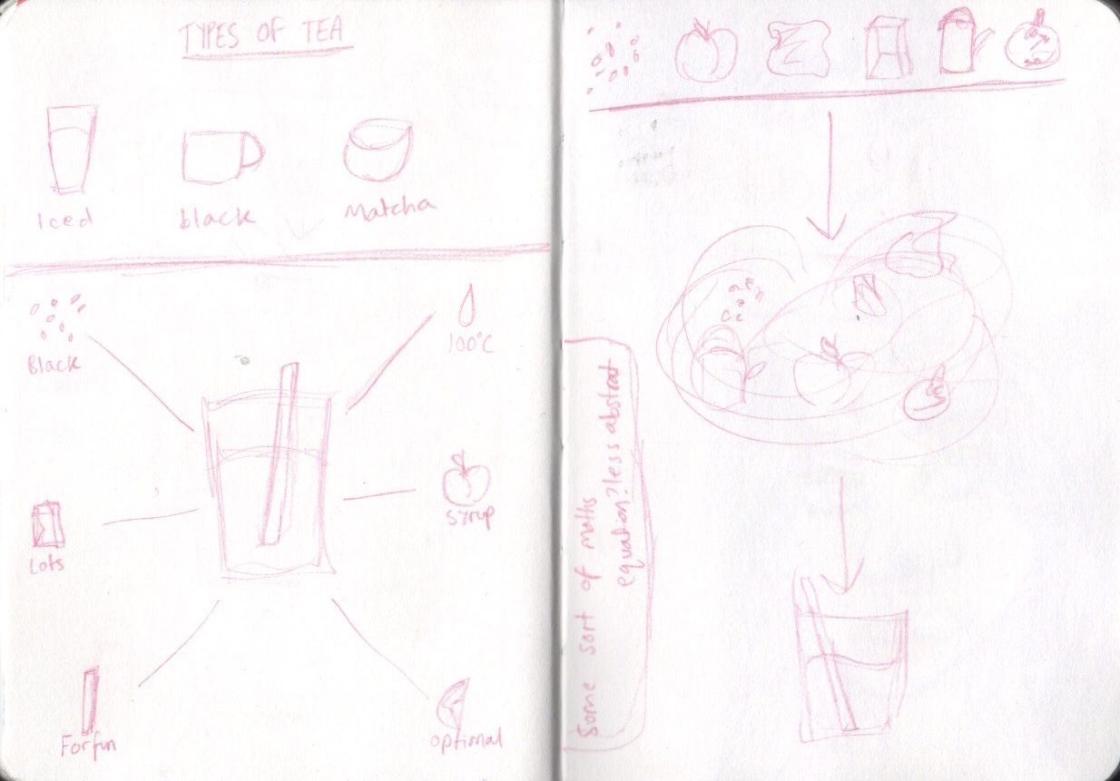
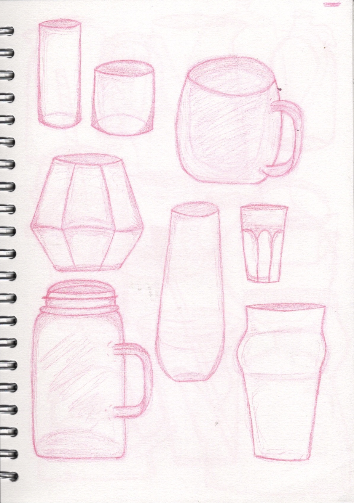
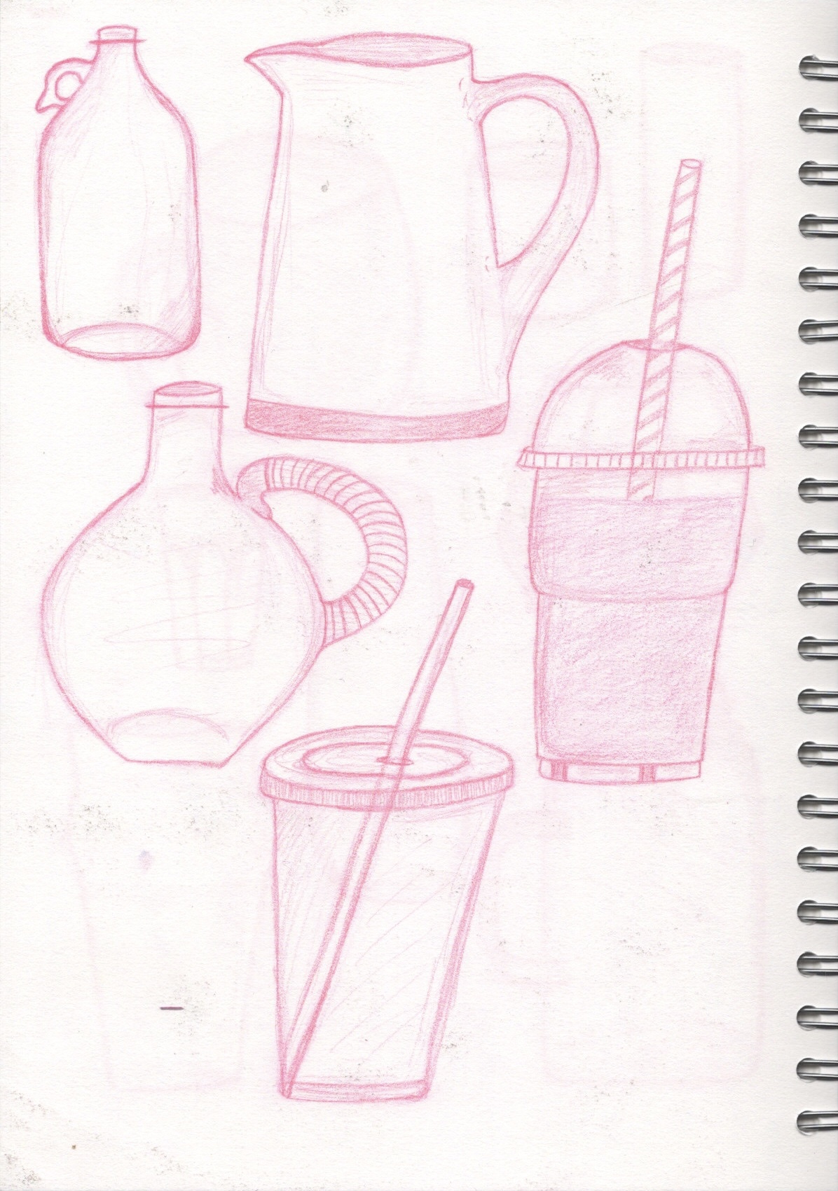
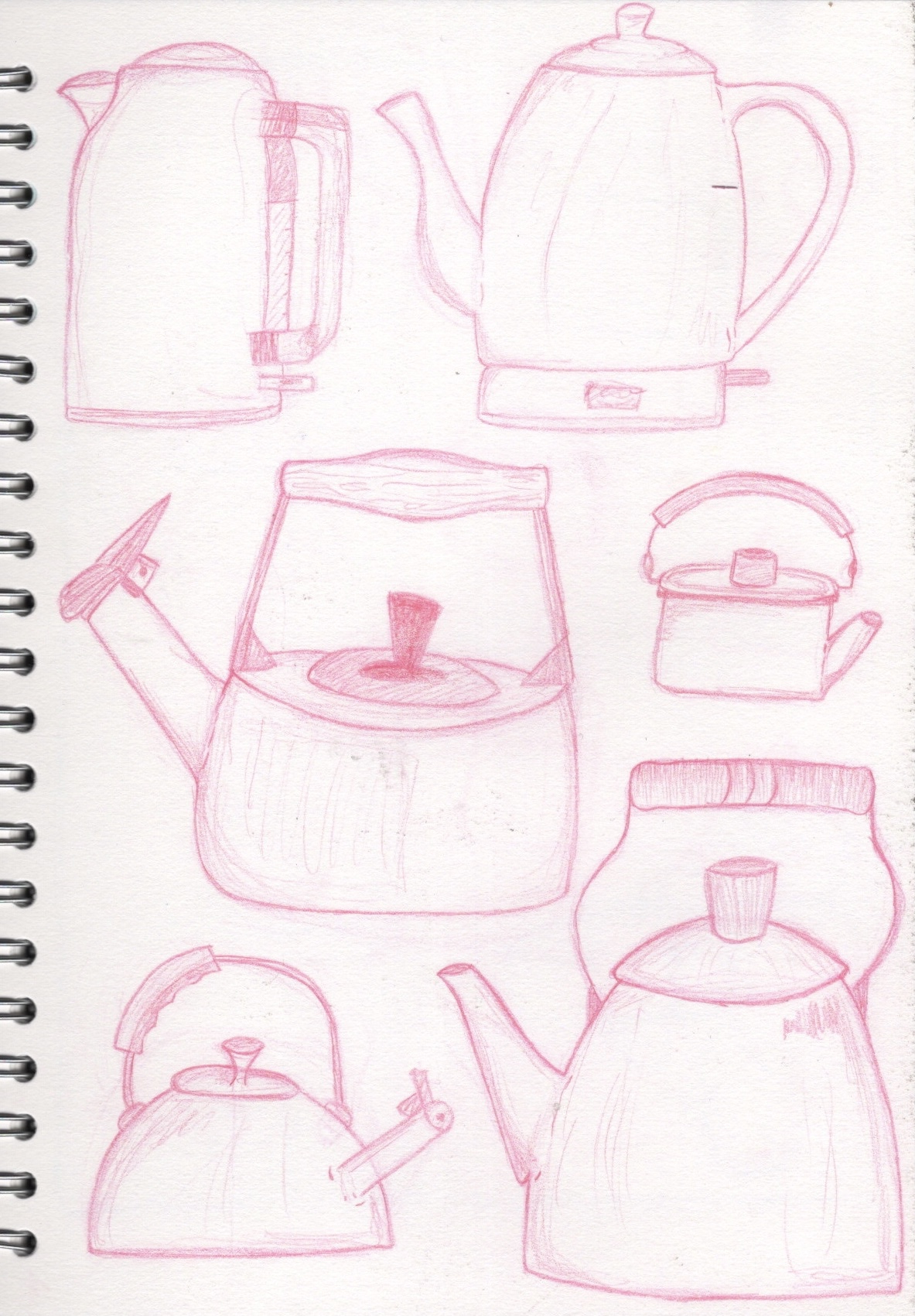
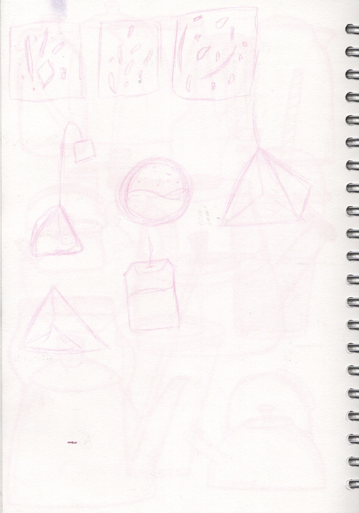
I knew that in my final piece I would have: a kettle or jug, tea in some form, peaches, ice cubes, and a glass or container for the tea. I wasn’t sure how to draw these or what shapes I wanted to include, so I made another pinterest board filled with references and options for what I could draw. I also included some illustrations by other artists to inspire me. I then sketched out variations of glasses, take-away cups, kettles, jugs, and tea bags, in an attempt to get a feel for the different objects and see what my preferred styles were. I really enjoyed this sort of observational drawing, and it helped me design the final piece.
Sketches of elements
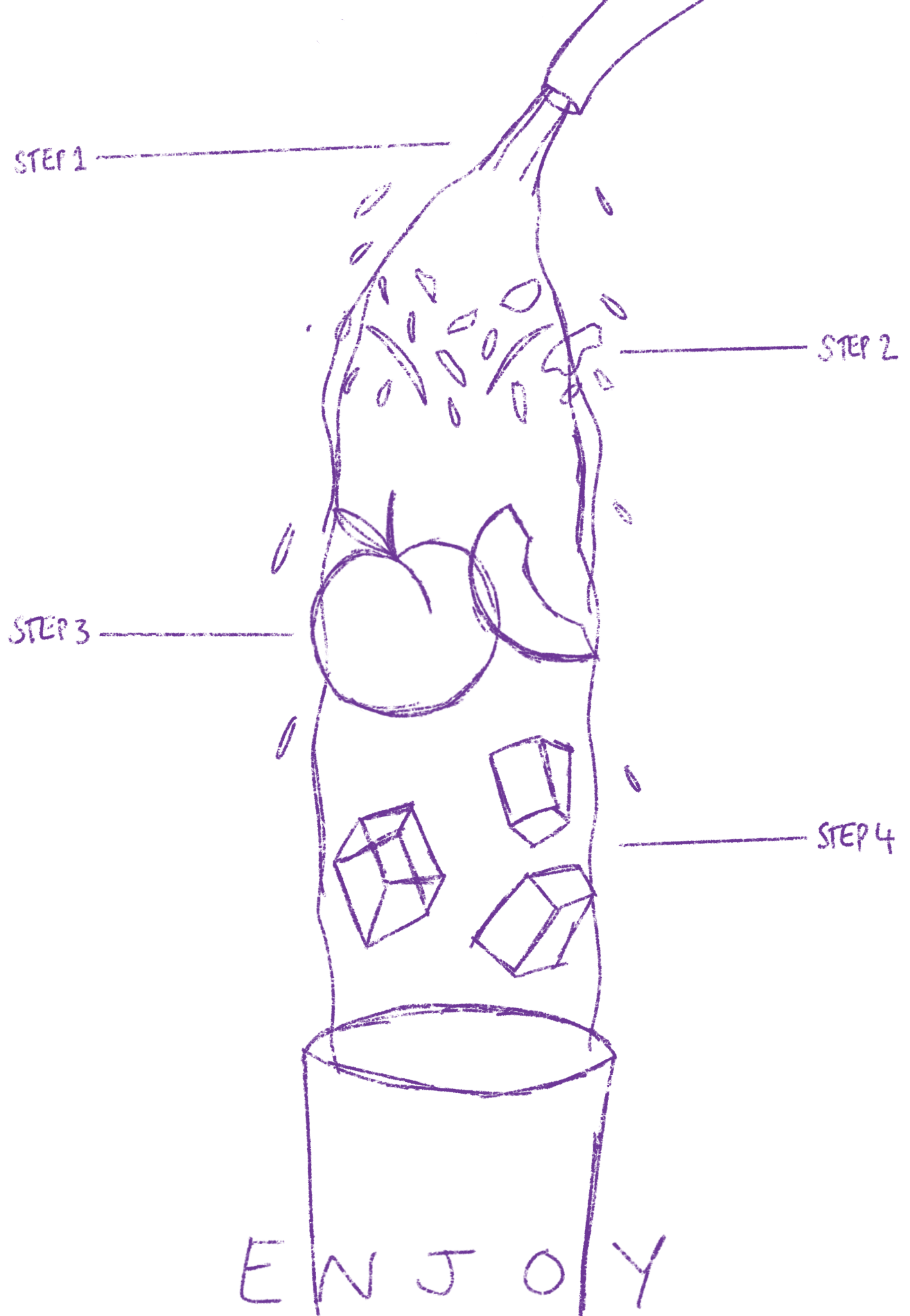
Taking my cues from my previous exercises – where I learned that sketching out my work on paper then scanning it in digitally makes a big difference – I sketched out my final illustration on a large piece of paper. I thought I would spend longer perfecting the sketch before scanning it in, but I was quite happy with having just the rough loose guidelines in place. I was also starting to get stressed about the positioning of different elements and knew it would be easier to move them around when working on my iPad.
Final sketch on paper
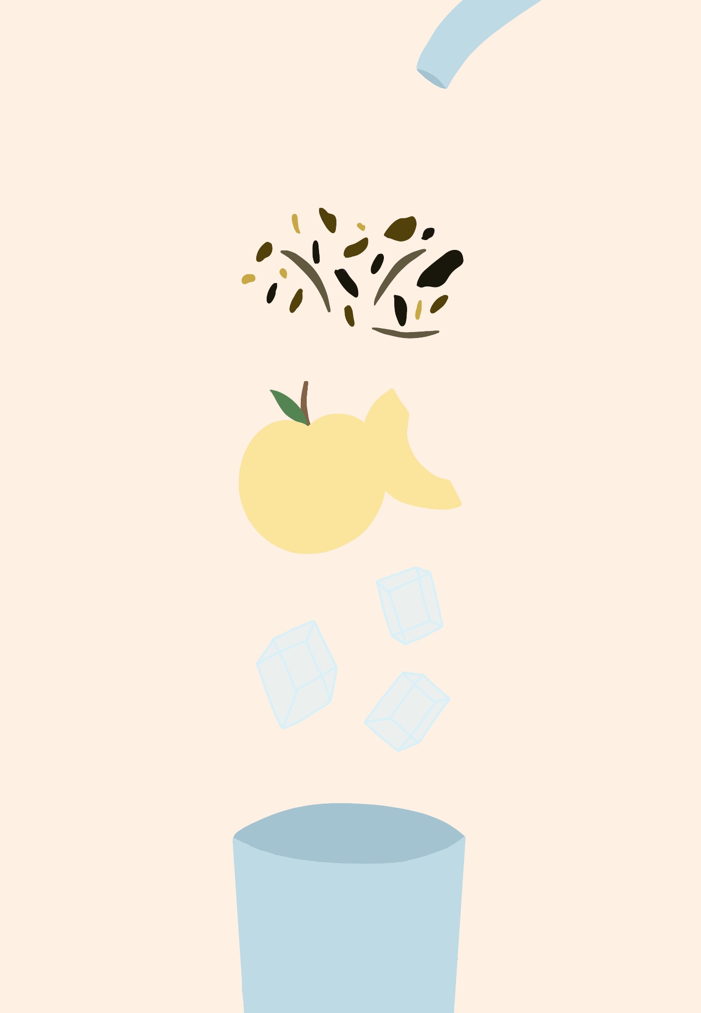
I opened the sketch in Procreate and began sketching over it digitally. This was definitely less stressful, and I think I didn’t even need to base sketch to begin with. I think sketching my work on paper is a good step to take as it helps me finalise my ideas, so I’ll continue doing it, but in some cases a digital sketch can work fine as a base. I then began outlining the elements in preparation for colour. This was pretty easy because I’d already drawn most of the elements repeatedly, so my hand almost knew where to go without much effort.
Digital sketch
Time lapse video of my illustration process
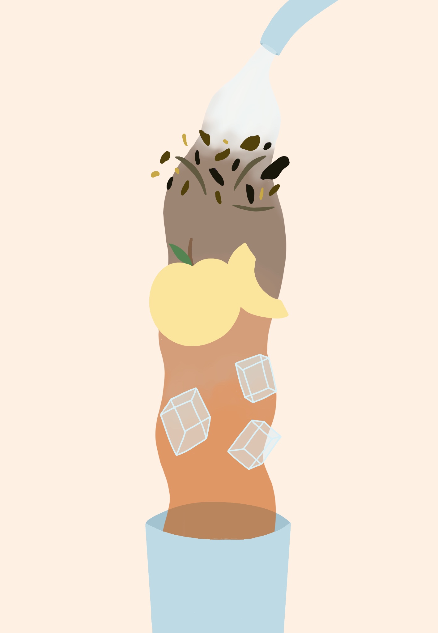
I utilised the hue/saturation/brightness tool a lot in this illustration. This was so helpful – being able to see exactly how the colours will look when already placed in the illustration helped me to ensure the piece worked coherently. However, I really struggled with drawing the water. I wanted it to appear as if the water was flowing over each element, rather than behind everything, and that the colour changed as it interacted with each next step. I got the colours down okay, but the positioning was really tough. I tried looking at other illustrations of water and googling how to draw this sort of flowing water, but just couldn’t wrap my head around it. I decided ultimately to leave it be and learn how to do this later on if necessary. It doesn’t look bad the way it is, just not how I pictured it in my head.
Stages of my illustration
I also initially had some issues with texturing this illustration. I wanted to add textured line art and have a messy faded sort of look to the elements. I was struggling at first with figuring out how to successfully achieve this, and ended up going a slightly different route. I really love how the texturing has ended up looking, especially the water and peach textures.
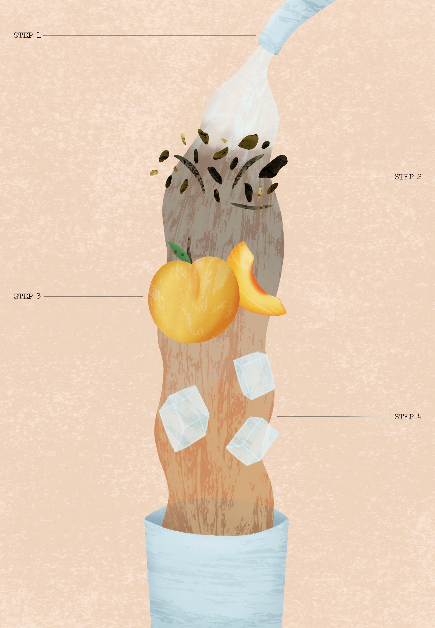
As for the text, I downloaded some free typewriter fonts to achieve the vintage look I was going for. I just wanted to highlight each step so as to make it clearer that this is an instructional diagram, not just an illustration of tea. I also texted the word ‘Enjoy’ at the base of the illustration – which I would’ve put more work into if I chose to add it to the image – but I thought it wasn’t needed. I also saved a second copy of the final piece with less saturation in the colours. I wanted to see if it looked better this way and fit the original feel of the illustration I was aiming for, but I preferred the saturated version.
Finished illustration with text and with reduced saturation
I then sent the finished illustration to the OCA Visual Communications Discord server, and also to some friends, asking their thoughts on it and if it was a clear instructional illustration. The general consensus was that the concept was great, easy to understand, and unique. One criticism was that the loose tea leaves aren’t obviously tea, and that if it was a teabag instead it would be clearer. I can definitely see this and didn’t consider it during the illustration process as I’m personally very familiar with loose leaf tea. I’m glad that it reads well as instructions, however.
Final illustration
I’m very happy with my final illustration. It’s not quite what I had in mind when I initially began this exercise, but I’m not disappointed with that. I feel like I fulfilled both the brief that the exercise laid out, and my own personal brief of having a vintage feel, using interesting textures, and creating a dissected diagram. This exercise was a lot of fun for me to do and the ease in which I found myself generating ideas and solving problems, plus being okay with the mistakes I was making, has made me really excited for what’s to come. I can really feel myself developing and making progress, which feels so rewarding.
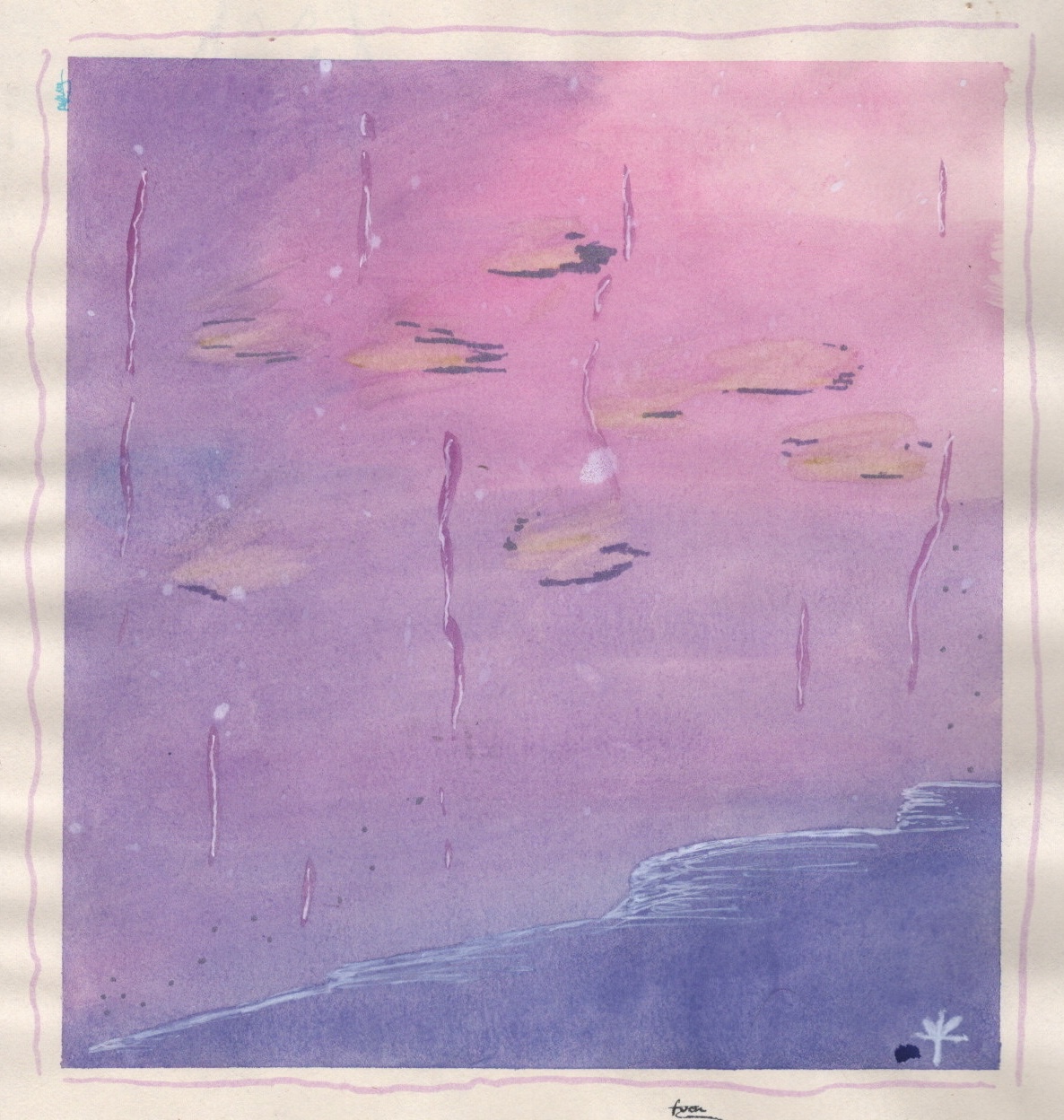
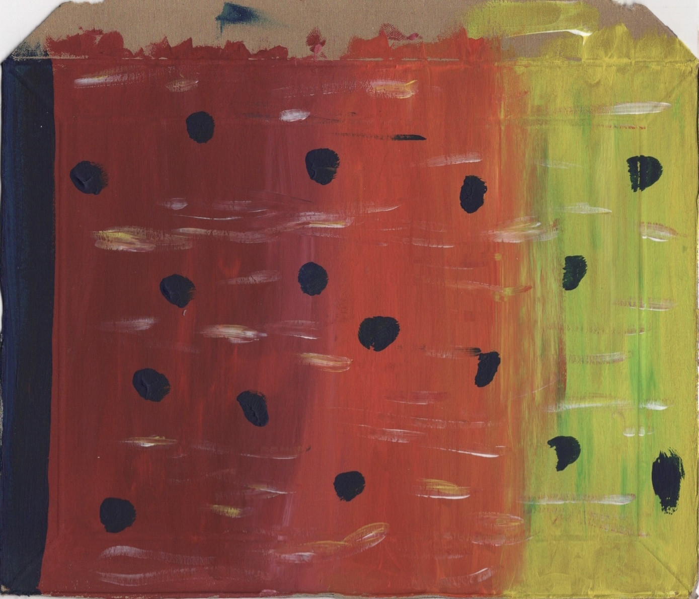
This exercise was focused on experimenting with abstract illustration. I was first asked to listen to a piece of instrumental music and quickly create marks that convey my interpretation of the mood of the piece. I then had to select an adjective or word that I felt described the tone of the piece and choose a square area of my work that communicates the word best. In this square format, I then had to reproduce the selected area focusing on the word I picked, introducing relevant textures, colours, and shapes. The exercise then asked whether the illustration I had created would work as a CD cover, prompting me to create a mock-up for the song I was listening to.
This exercise was really exciting for me as I feel like abstract art is ‘home’. This sort of playful, messy, spontaneous mark making is something I have done for a very long time, whether to communicate certain emotions, as a response to poetry or other media, or just because I like pretty colours and want to put them on paper! I enjoy the freedom given with this art style and the ability to create truly interpretive art. This exercise – listening to a song and drawing how it ‘feels’ – is one I have repeated several times already. Sometimes I use it as a quick exercise to loosen up my hand (as seen in my Sketchbook Circle book) and sometimes I spend hours focusing on capturing the essence.
Some of my previous abstract art pieces
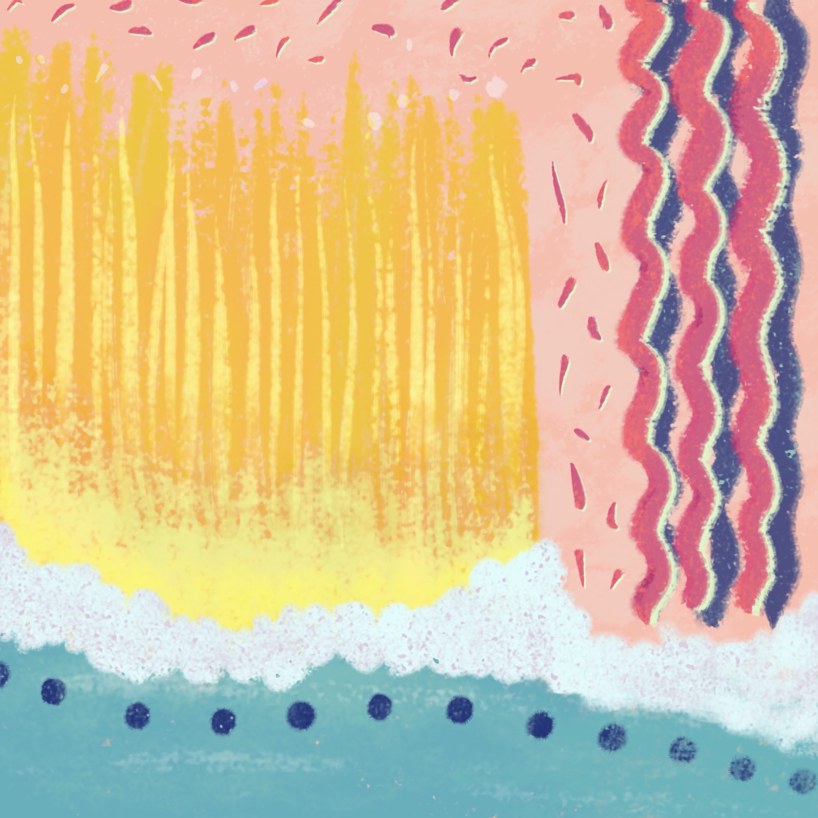
Because of my experience with this exercise I probably could’ve selected any song to work with, however I understand the importance of lyrics and how they can sway interpretations of music. I listen to a fair bit of instrumental music already so selecting an artist was easy, but I wanted to pick a song I hadn’t heard before to ensure I had no previous emotional connection to it that could influence my hand. I selected ‘Strawberry Light’ by Blackbird Blackbird, an artist who produces a lot of fairly upbeat, lighthearted music which I was drawn to for this exercise as I felt it would aid my creativity best.
As for materials, for a task like this I prefer things that ‘flow’ very easily, mediums that are unforgiving and intentional but that can be easily manipulated and ‘played’ with, so to speak. I typically go for acrylic paint, coloured pencils, or biro, but for this exercise I opted for chalk pastels. I haven’t used them in this context before and I thought it would be fun to see how they held up and what I could do with them.
The song I picked is quite layered and is separated into several somewhat defined parts depending on which layers are involved and to what capacity. The first time I listened through to the song, I didn’t draw, I just focused on hearing these layers and figuring out how they worked together. I also paid attention to how the song made me feel. The second time I listened, I began mark making, focusing on just one layer of sound. I then repeated this process again, focusing on a different layer of sound each time. Once I felt I had captured what I wanted to, I closed my eyes and listened to the song once more, then went back to the piece and added hints of colour in places I felt they were needed.
My completed drawing
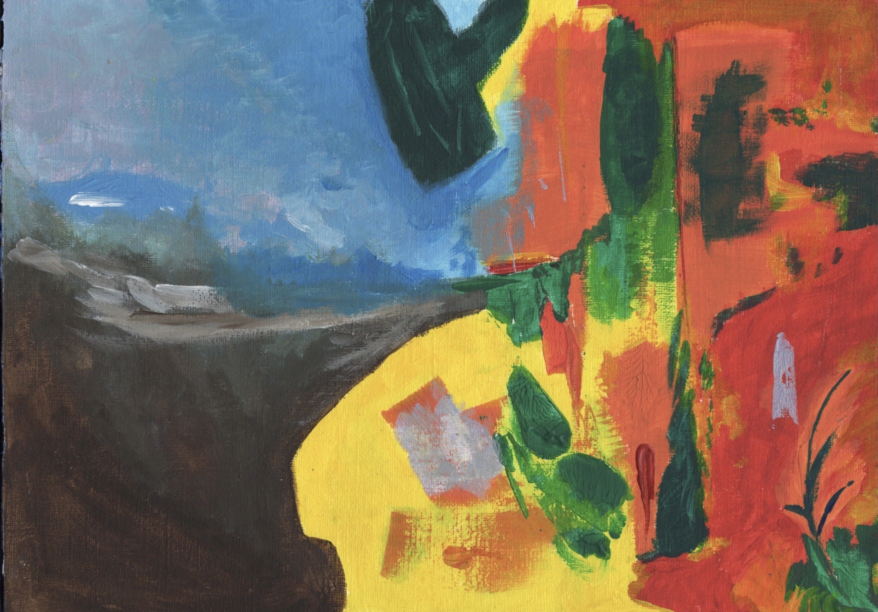
I stepped back from the piece and considered my feelings towards it and towards the song. The word that was extremely clear to me was ‘playful’. I felt it communicated the shapes, colours, and overall vibe of the song perfectly. I decided to scan the drawing and pick a square using the crop tool, then work on reproducing it in Procreate, as I have a wide range of texture options and blending modes to work with which I felt would enhance the piece. The square I picked featured snippets of all the elements in the piece, and felt very ‘playful’.
The square I chose to reproduce
I opened the square in Procreate to use as a baseline reference for my reproduction. Then, using pastel brushes, I recreated all the elements of the piece. I extended the blue at the bottom of the square to fill the entirety of the bottom edge, added texture and some more colour to the piece, and changed the background colour. The pink I chose fit so much better in this piece than the brown of the pastel paper. It feels more playful, complements the colours perfectly, and ties in to the title of the song.
A timelapse video of my reproduction process
I love Procreate and other digital design software for abstract work. The ability to play around with blending modes and colour changes makes it so much easier to achieve a specific look. Changing the hue, saturation, and brightness of colours helped me achieve a super cohesive final illustration, and the ability to layer colours over each other without fearing that the work beneath will be destroyed creates even more freedom. I do naturally tend towards traditional mediums for my abstract work, but this exercise has made me realise what I might be missing out on by not using digital software in this way.
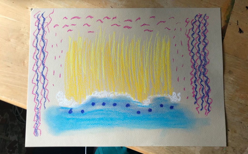
My finished illustration, with and without text
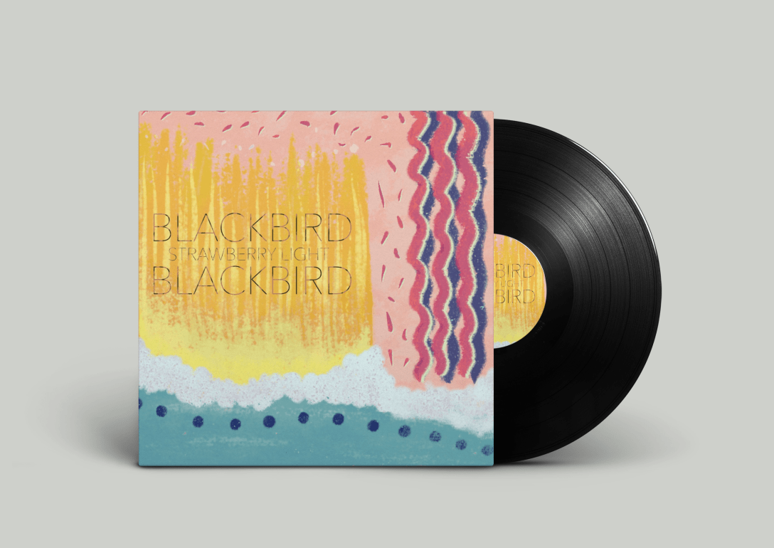
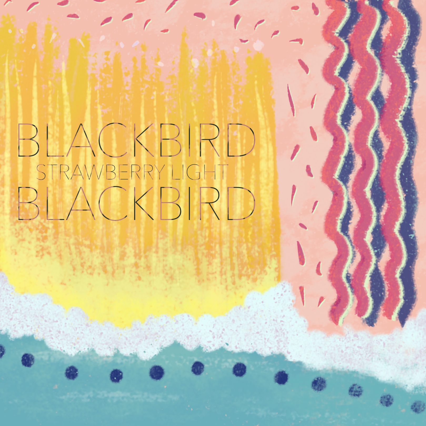
Whilst it was not required, I decided to add text to my illustration to see how it would look as an album cover. I picked a font that I thought was playful but still in line with the band’s general style and theming, and that fitted the song and image too. I then added some texture to it to help it blend into the illustration a little better. I then chose to do a mock-up of a vinyl cover rather than a CD cover, as I feel CDs are a little outdated now and vinyls are more likely to be released, especially by an artist likeBlackbird Blackbird. I had to do this on my laptop as I don’t have compatible software on my iPad, and transferring the image to my laptop caused it to lose some quality.
Vinyl cover mock-up
I actually love how it turned out. The desaturation makes the vinyl cover look as though it’s matte, rather than gloss, which enhances the pastel textures. I think the text is readable but not too bold, and generally the illustration is cohesive. I really do think this illustration works as a vinyl cover, which shocked me as going into this exercise I was in total denial that any sort of random abstract art would look good foran album cover. There are certainly styles of abstract art that lend themselves to album covers, but I had never considered this to be one of them.
Personally I love abstract art, surrealism, and modern art movements. I love it when a piece of art could mean literally anything depending on how the person viewing it perceives it. Before COVID-19, one of my favourite things to do was visit modern art galleries and spend hours considering the art and how it made me feel, and figure out what interpretations of it I could apply. Realism has always disappointed me and I’ve always felt a pull towards the freedom of abstraction. This exercise was so much fun as it felt natural and within my comfort zone. I try to put this love of modern art movements into my illustrative work, particularly in my stylised drawings, but I think I need to consider more deeply how I can connect the two. I look forward to continuing to express this love of modern and interpretive art, and exploring the limitations of illustrative work.
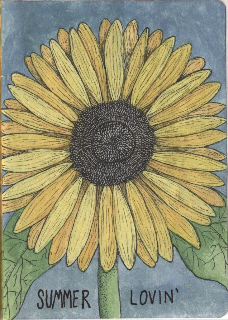
The third sketchbook I recieved was themed around seasons. Niki, who started the sketchbook, had began with a winter theme. Beth, who next recieved the book, decided to continue onto a spring theme. This meant when I recieved it, I got to explore the theme of ‘summer’. I love summer, it’s my favourite season of all, and with it being September it was still fresh on my mind, which helped a lot! Beth had introduced her section of the sketchbook with a sort of cover page for spring, and ended on a typography page. I wanted to keep up this theming, so began my 10 pages with a giant sunflower watercolour and the words ‘Summer Lovin” at the bottom.
My first page
The sketchbook was an Artway Doodle journal and the paper was soooo beautiful to work on. I loved filling this book so much that I’ve even added it to my wishlist!! It was so easy to sketch, took paint really nicely, and allowed for a lot of layers. My only issue is how the paper reacted to erasers, as it would tear up on contact pretty easily, but this may encourage me to erase less and accept my mistakes more!
Pages 2 & 3
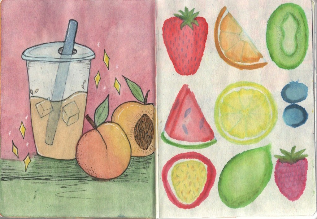
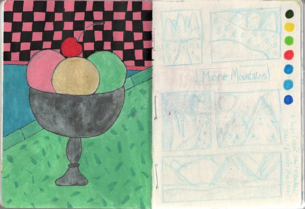
My next page I chose to do another watercolour illustration of my favourite year-round (but especially summer) drink – peach iced tea. This was fun but still just sketchy. It really showed me how great this paper is. I decided to illustrate some summer fruits on the next page and used water based markers for this, adding water to them to create some cool effects. This is a new technique I’ve not yet used, and I think I’ll experiment some more with it. I then really wanted to do a page of ice cream, and decided to work on an idea I’d considered for Inktober (which I ended up not participating in). I’m not super happy with the outcome of this page, but again it was a great learning experience.
Pages 4 & 5
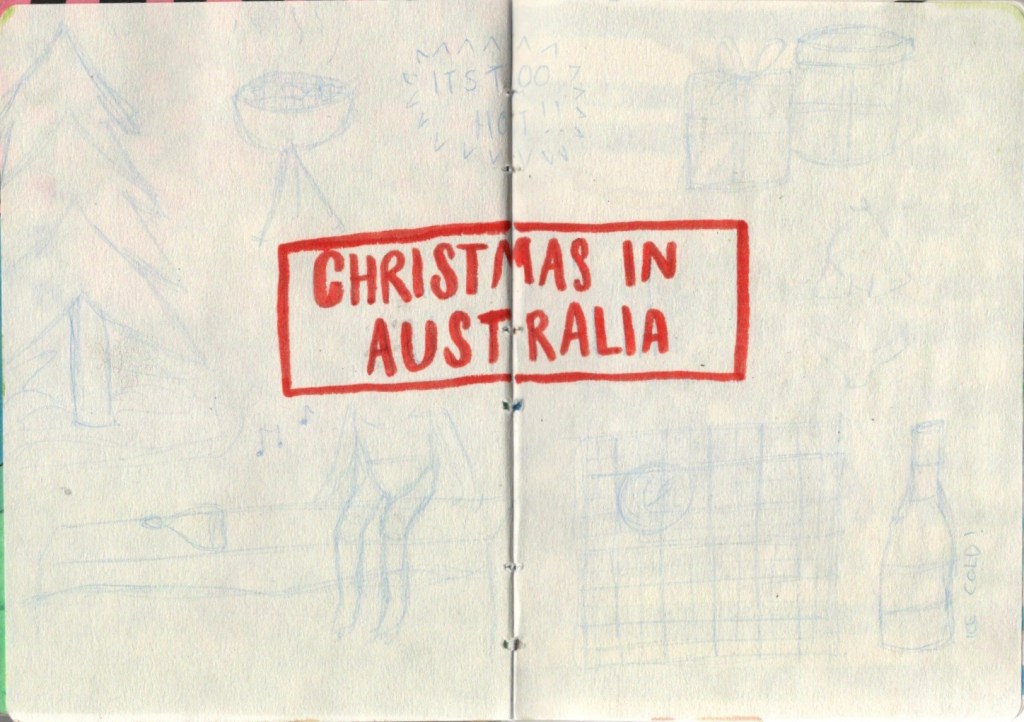
Niki had drawn some rough sketches of wintery mountain scenes in her section of the sketchbook and Beth had continued these and drawn some springtime mountains. I wanted to keep to the theme so sketched some summer mountain thumbnails too. They don’t show up great on the scan, unfortunately. I then did I two page spread on ‘Christmas in Australia’ taking inspiration from Beth’s ‘Spring in the Southern Hemisphere’ spread. I did intend to put more work into this but left it as sketches to focus on other work instead.
Pages 6 & 7Pages 8 & 9
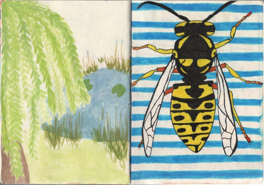
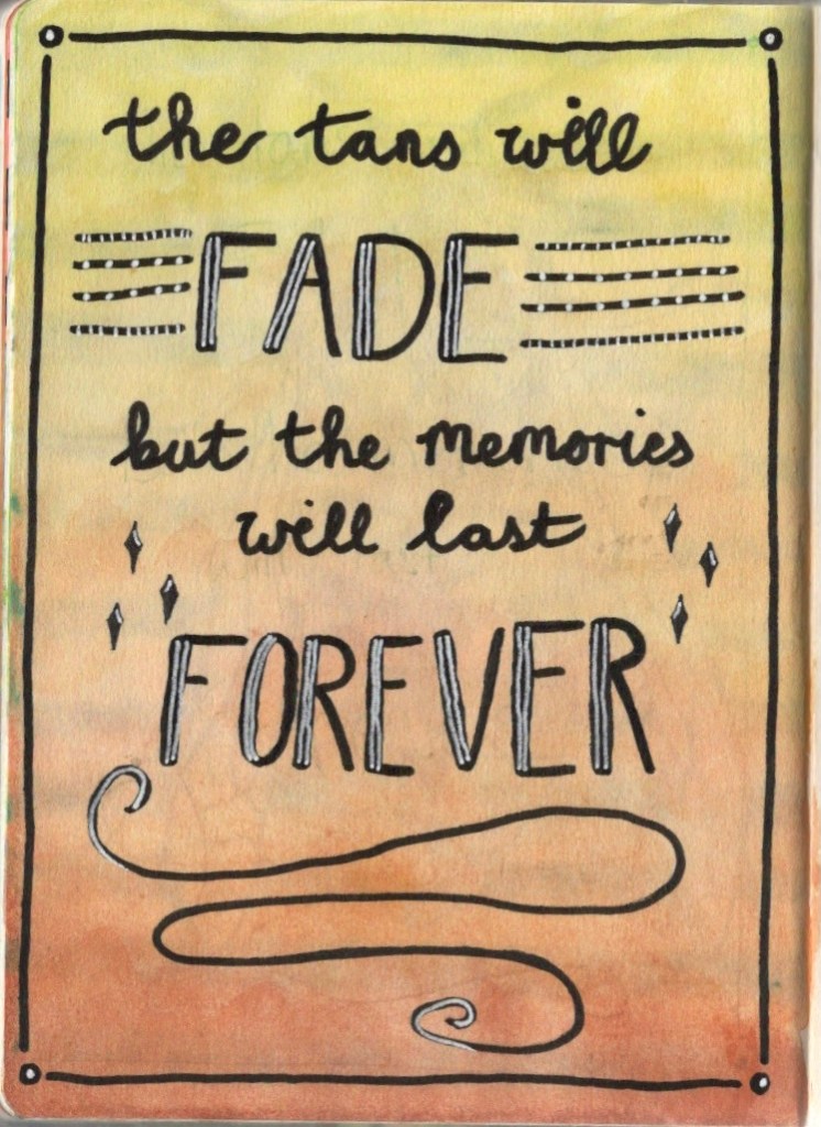
My next two pages were a lot of fun! For the first page I took inspiration from my travel sketchbook which I took to York this summer. I painted a willow tree in my travel sketchbook and wanted to include something similar in this book, too. The pond felt like a natural addition adding to the summery theme and sort of connecting to the wasp on the next page (I definitely associate bugs with ponds!). The wasp was a nice technical challenge. I enjoy drawing insects as I find them quite easy to get ‘right’. I want to do more studies of them, I think! My final page was my typography page, as I include one in every sketchbook. It’s a cute quote, and I like how it fades from sunny yellow into autumnal reds and browns. It was a hard one to settle on though as I wanted something that would add closure to the season of summer and introduce the season of autumn, which meant a lengthy bit of writing!
Page 10
I had so much fun in this sketchbook, which was refreshing after the art block I had in the last one. I think the paper being so enjoyable to work on, a theme that suited me well, and a little bit less pressure on myself combined to make it a nicer process. I also think I prefer working in smaller sketchbooks, which I’m slowly learning. I’m looking forward to seeing what the next sketchbook holds!
This month’s art challenge set by the OCA Visual Communications Discord server was to draw something from a prompt in your own style. We each suggested prompts, and the one chosen at random was ‘talisman’.
I began by brainstorming and trying to generate ideas for this prompt. It was quite difficult for me to find something I wanted to draw. I tried out several ideas, such as an altar containing candles and crystals, a girl floating through space clutching her necklace, and simply just a ring on a table, before deciding to put some space between me and the challenge. I had started developing one of the ideas – the girl floating through space – and was really dissatisfied with it. I hoped that time away from the project would help me consider different possibilities.
An initial rough thumbnail of one of my ideas
Thankfully, whilst thinking about the prompt and what ‘talisman’ could mean, I had an idea that I’m so excited about and happy I was able to produce. A rabbit’s foot is often considered lucky and used as a talisman, so I thought: ‘what if rabbits carried human hands?’.
My finished illustration for this challenge
I really wanted a simple pastel colour scheme for this illustration to emphasise the childlike, cutesy nature that rabbits have. I envisioned a little rabbit world all in pastel where they lived just like humans do. I’m not super happy with the outcome, honestly – this is not my favourite piece of work. The concept is great, but something about the finished piece doesn’t sit well with me, although I can’t quite figure out what. Maybe it’s because I don’t have a ton of experience working with these colours, maybe it’s the textures I chose, I don’t know. It seemed to be received well though!
My illustration process and trying to figure out textures
I definitely felt quite stuck with this challenge. ‘Talisman’ was a hard prompt for me to work from, and I found myself frustrated with my finished piece no matter what I did. It’s the sort of illustration I would go back to later and redraw when I maybe have a stronger sense of my own style, I think. Right now I feel like I’m bouncing around different techniques and styles, trying to see what feels most comfortable and like ‘my art’. These challenges are a great way to experiment with this, though, and are a fun outlet to put what I’ve learned from this unit to use!
This exercise asked me to find an image with a range of content, then crop it repeatedly to create different formats and compositions, exploring how the focus of the image changes. I then had to choose a word for each image that describes it in some way, then use one of the images as the basis for an illustration. The illustration was to be a poster and use colours and textures that emphasise the message behind the word.
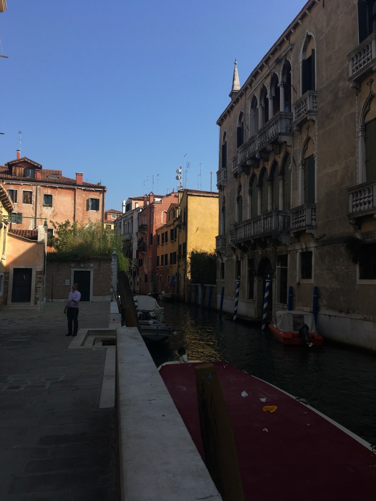
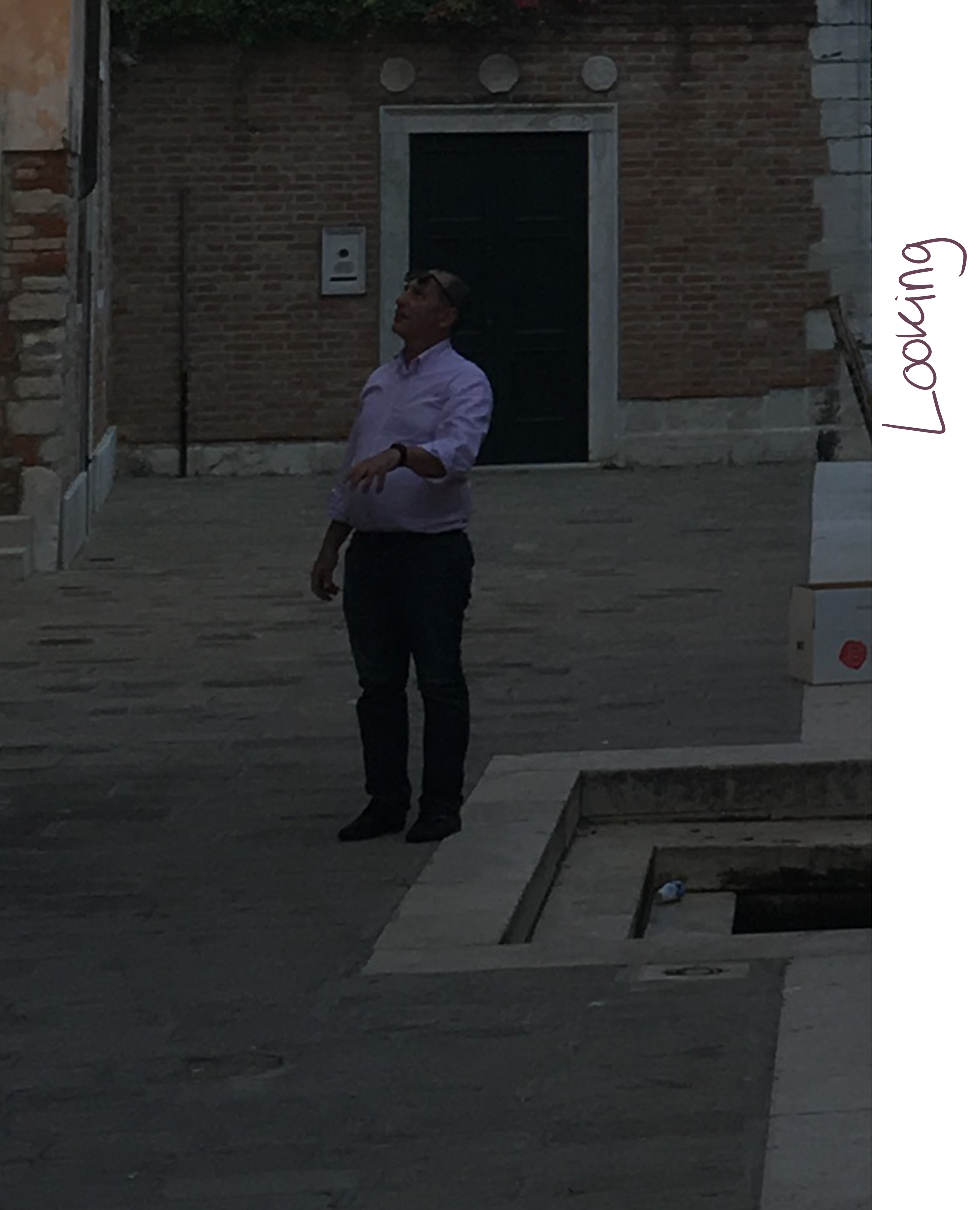
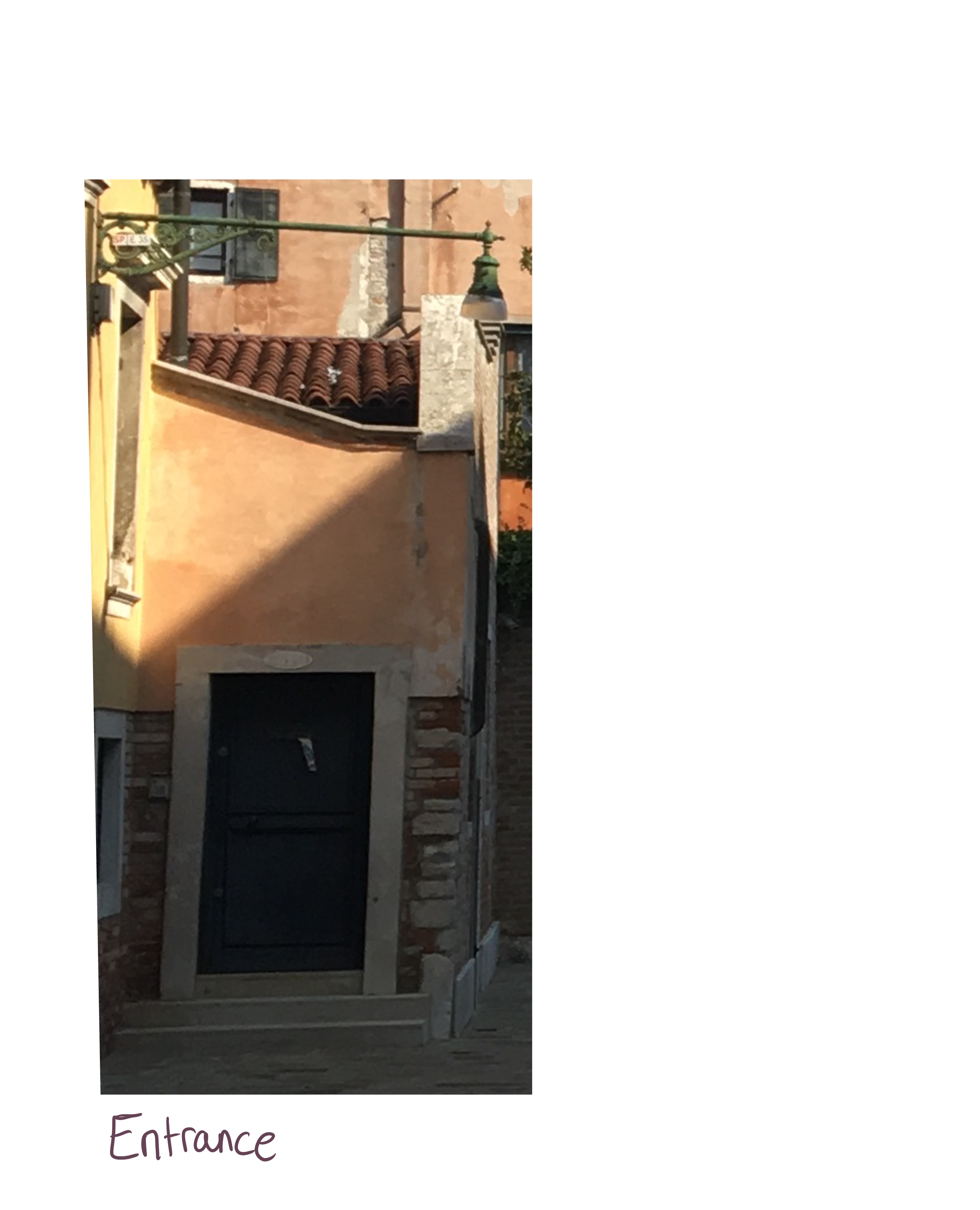
I struggled finding an image I could use for this, as most the images I found were already composed in a very specific way. I looked through my own photos, asked friends to look through theirs, and searched Pinterest for relevant images. I was looking for an image that contained a lot of content but wasn’t too framed, as this would make the exercise almost impossible. Eventually I came across an photo I took on a trip to Venice that isn’t super framed or set up – it’s just a photo of a back street.
The original image I chose
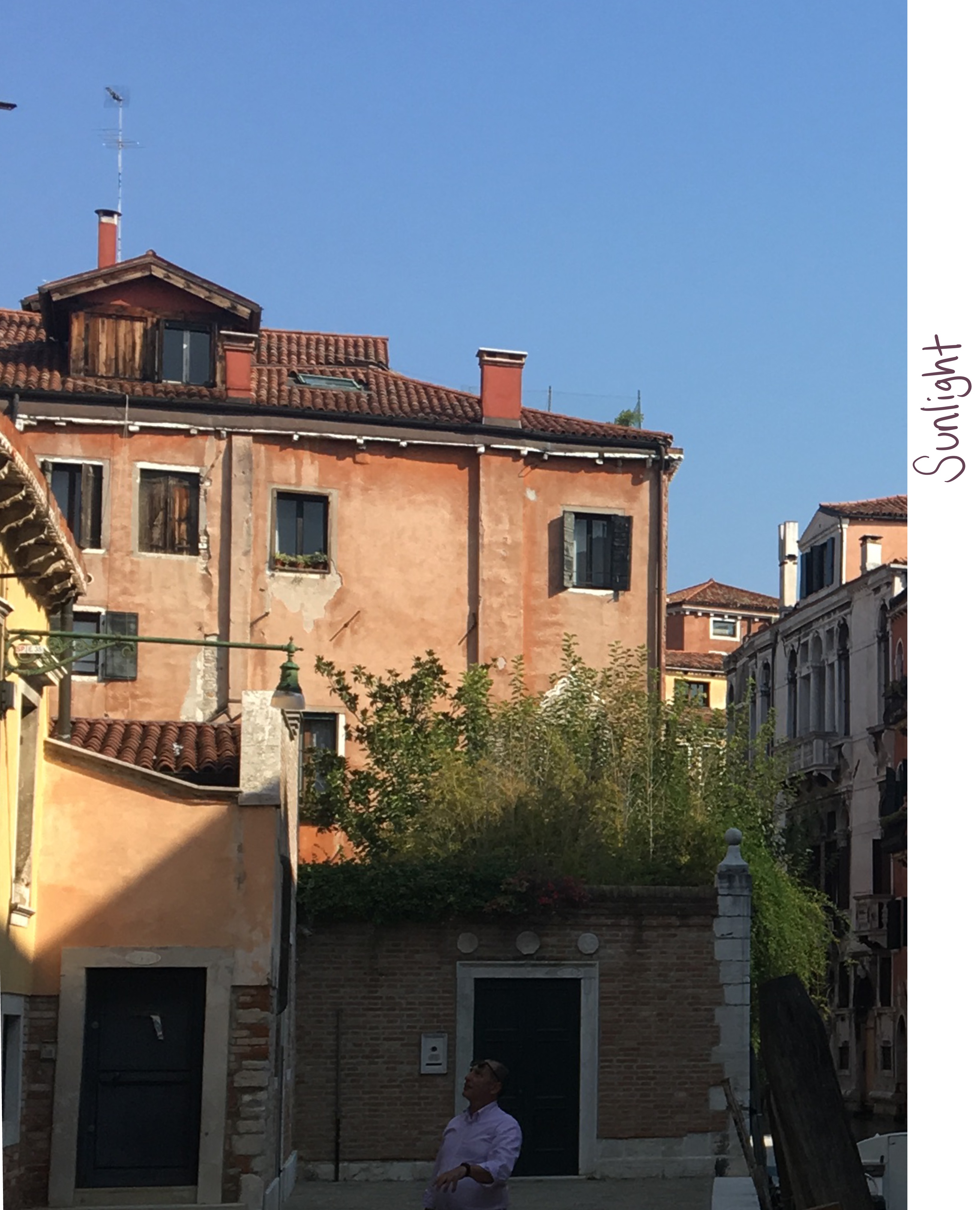
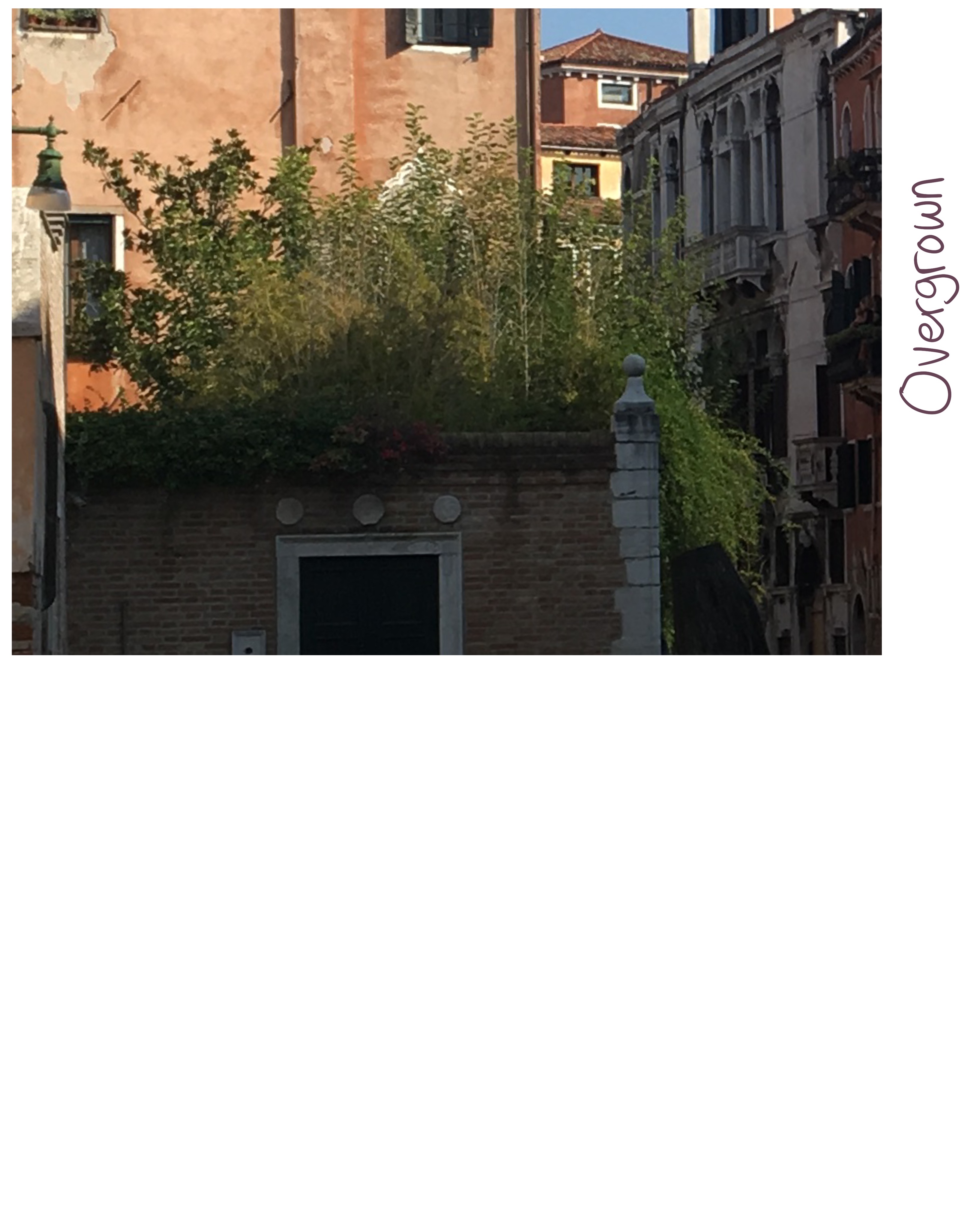
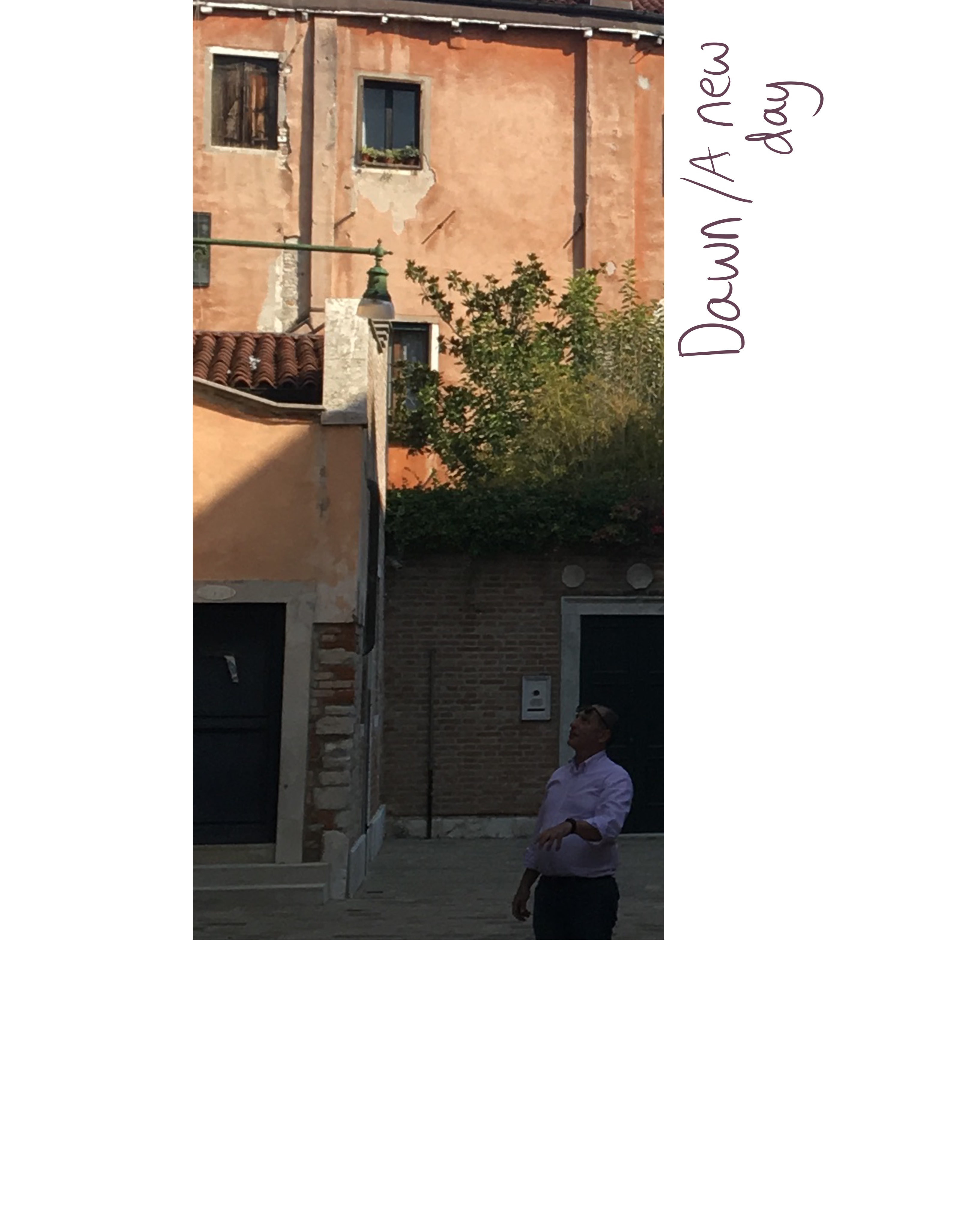
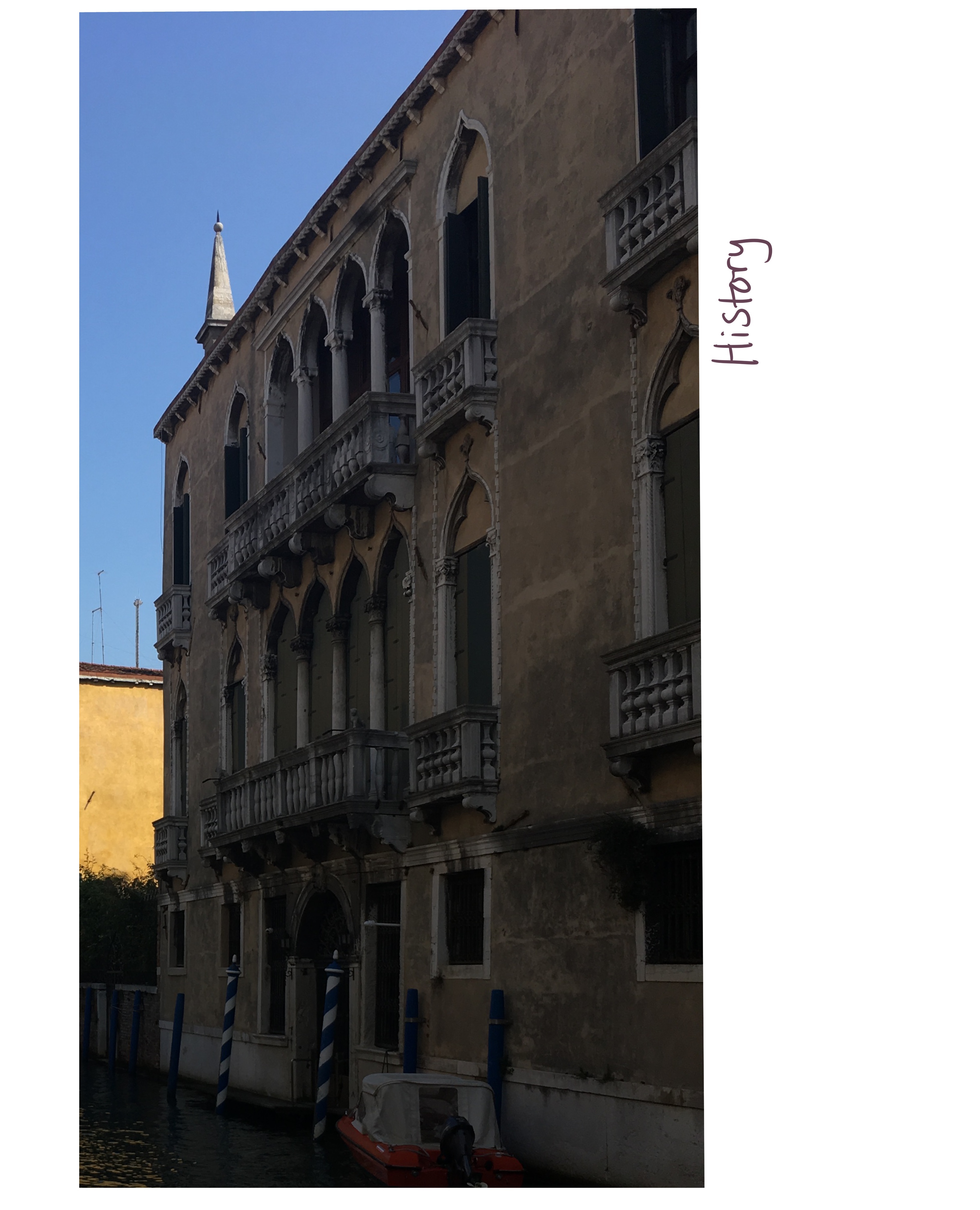
Maybe I went at this the wrong way, as I was cropping the image where I felt I could add narrative rather than cropping the image and adding narrative after. I still found this useful as it helped me to dissect the image and discover potential stories hidden within. The content shown in the cropped images changes the focus of the image hugely and was interesting to look at from a poster POV. What was interesting about working with this image is the lighting. There’s a lot of shadow and darkened areas, which meant I could use the change in lighting to my advantage. Sometimes I would be left with just dark areas which emphasised the mood of the image, or contrast that altered the narrative.
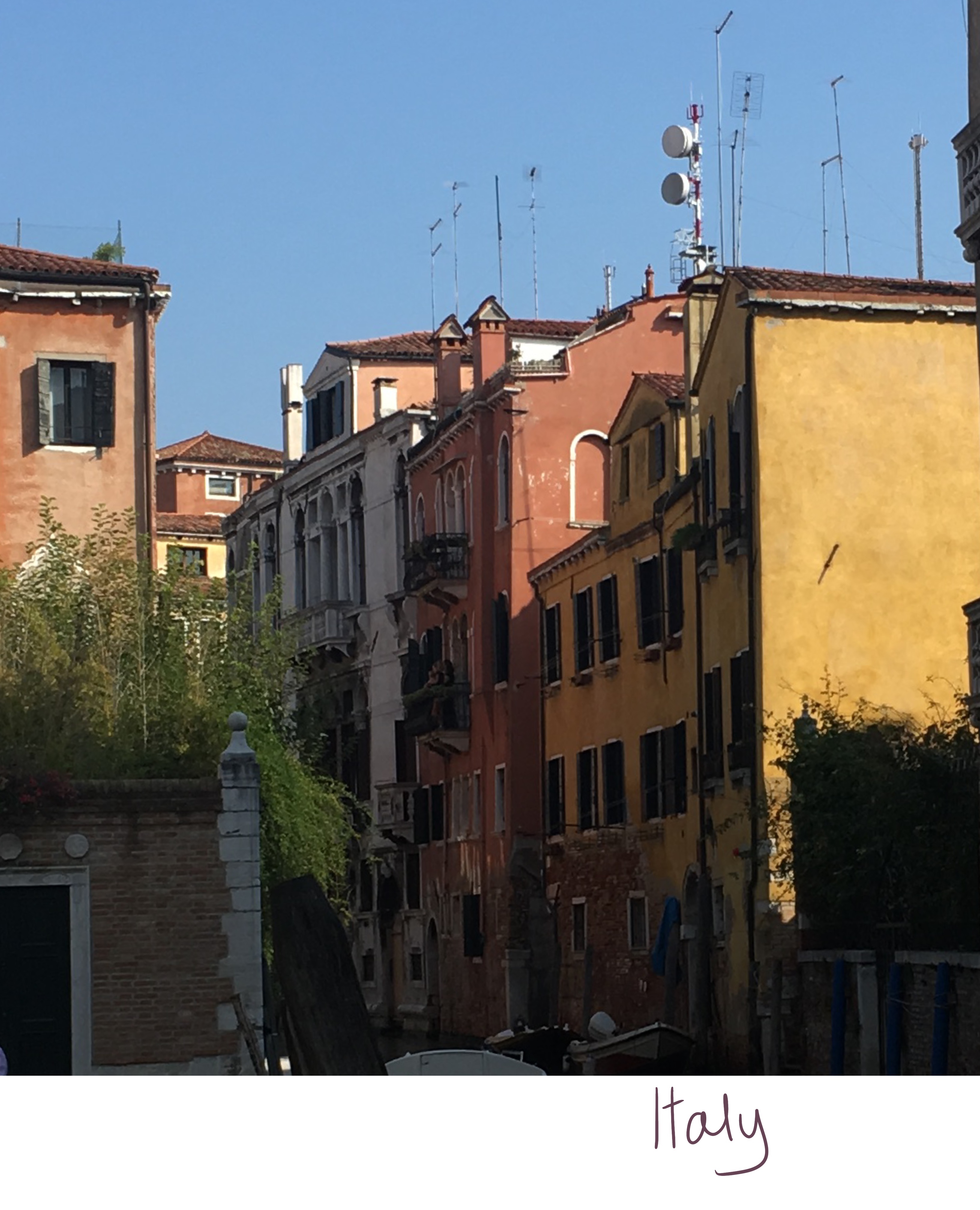
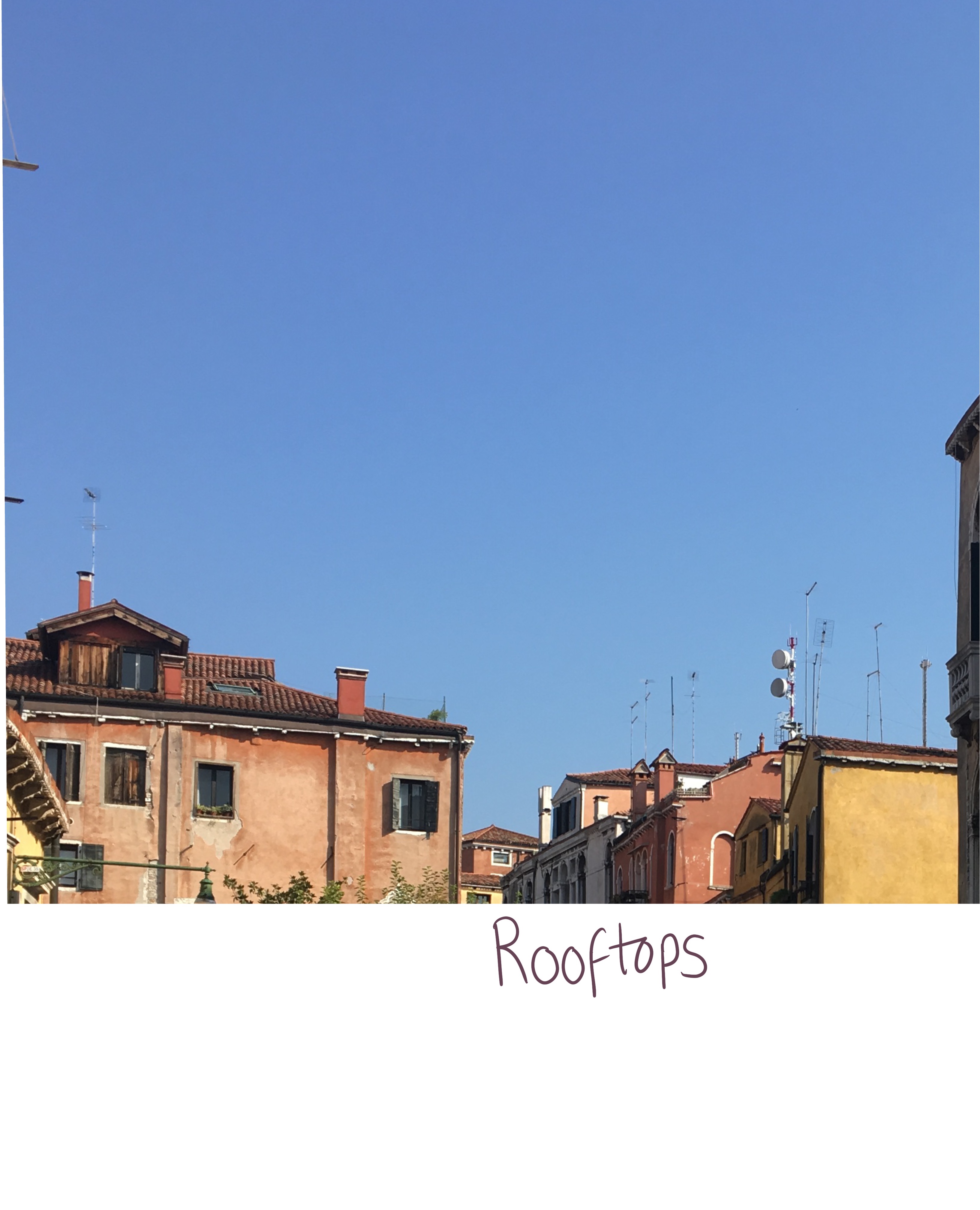
The cropped images alongside the words chosen to describe them
Initially, I wanted to use the ‘Italy’ image as a basis for my poster, combining it with the ‘rooftops’ image and having the placement of the buildings quite low in the frame with the word ‘Italy’ above. I tried to sketch out some ideas and wasn’t very happy with them. I looked back again at my images and the words tied to them, and how the colours in them and potential textures relate to the chosen words, and realised ‘History’ was a much stronger piece.
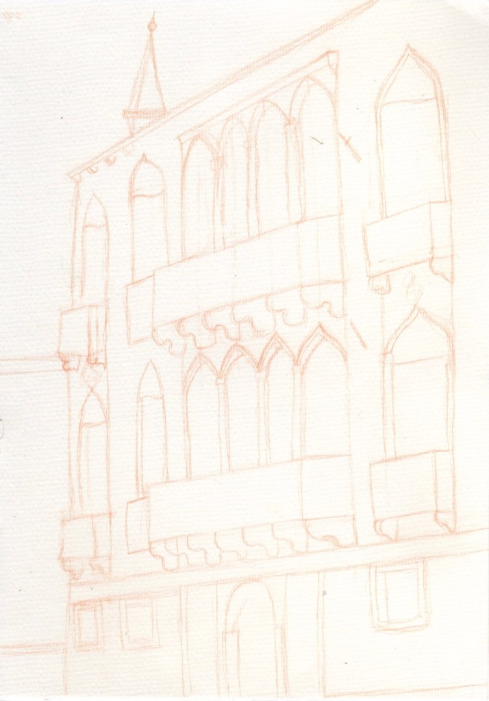
I began my usual process of sketching out digitally, planning to complete the piece using Procreate. I really wasn’t happy with it. I’ve been sketching a lot more on paper and I am slowly realising I prefer this to sketching digitally. In artwork I am developing outside of coursework, I now begin with a physical sketch that is scanned into Procreate, and work from there. I decided to use this method for this illustration too. I chose to sketch on pastel paper as I really love the texture and enjoy working with it as I learned in Exercise 8. At this point I was considering scanning the sketch in digitally once completed, or redrawing it on watercolour paper.
Completed sketch on pastel paper
Sketching out this piece was an enjoyable and challenging process. Working with the angle I was at and trying to convey that the building is three-dimensional was difficult but a great learning experience. As I was sketching I was considering the different textures, colours, and mediums that could work for this piece to emphasise the ‘historical’ attributes. I felt very comfortable working with physical materials as opposed to digitally, so I wanted to continue doing so. I would either have to transfer the sketch onto watercolour paper using a lightbox, or I could continue the piece on the original pastel paper I had sketched on.
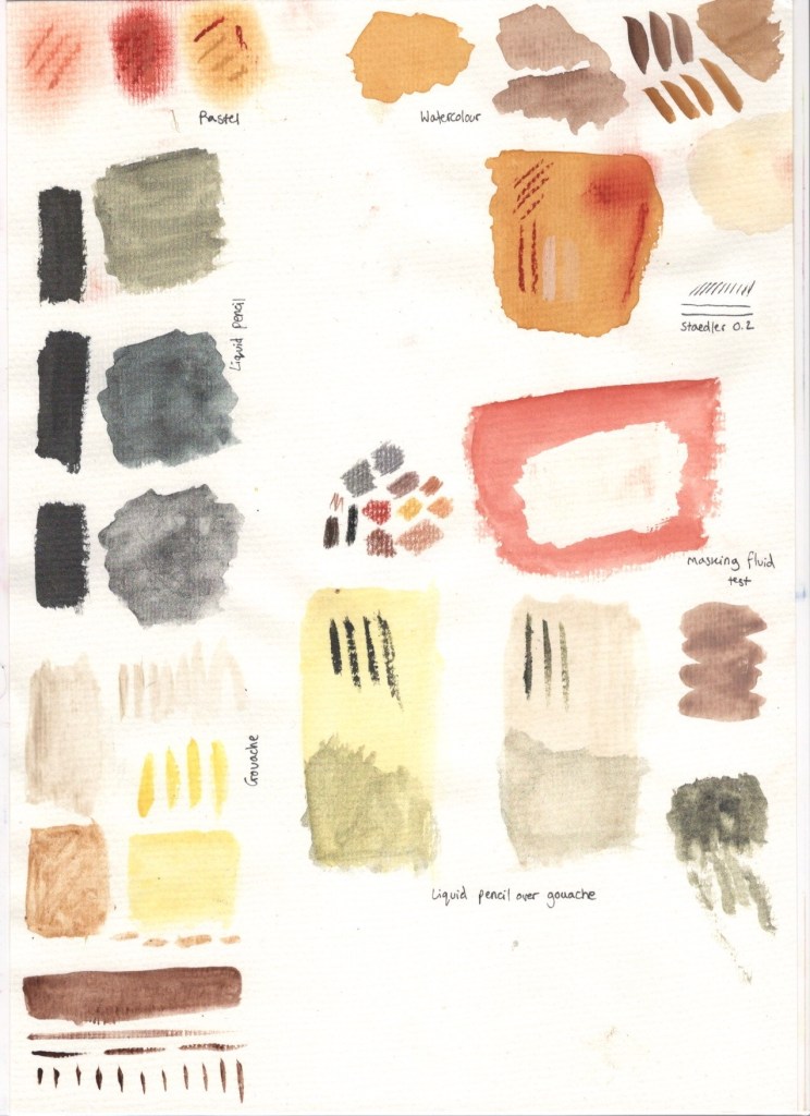
Experiment reference sheet
I decided to try out various materials and colourings to see how they interacted with the pastel paper and ensure I could achieve the effects I wanted to. This stage of the process was also a lot of fun, and taught me about the importance of experimenting before working on a final piece. It was great being able to reference this sheet as I continued with the illustration, and to use it to experiment further if I was curious about what to do next or how something would look on top of my previous layers.
I first tried out some pastels and watercolour. I knew pastels would work with the paper as that is what it’s designed for, but I wasn’t sure on the texture and colour for this particular piece. I also wanted to see how well the paper held up when used with water – it reacted exceptionally well and showed the colours beautifully too. I also experimented with layering pastel over watercolour to create different textures and colours. At this point I felt confident that I could continue working on my original sketch sheet, and I wanted to use mixed media. I wasn’t sure on how to involve pastels, and initially wanted to use them to add contrasting highlights and shadows over the base layers of watercolour. Later I changed by mind and used coloured pencils instead, as I felt I had more control with them.
I then decided to try out masking fluid on the pastel paper, as it can often destroy paper and paintings when used. It also worked very well, though I didn’t end up needing any. I then moved on to trying some different shades of gouache, with varying amounts of water, and ‘liquid pencil’, a rewettable liquid graphite paint I discovered recently. I loved how this looked especially in the context of ‘history’, and the effect it had on the gouache. I was satisfied with my reference sheet and the materials I had chosen at this point, so began working on completing the illustration.
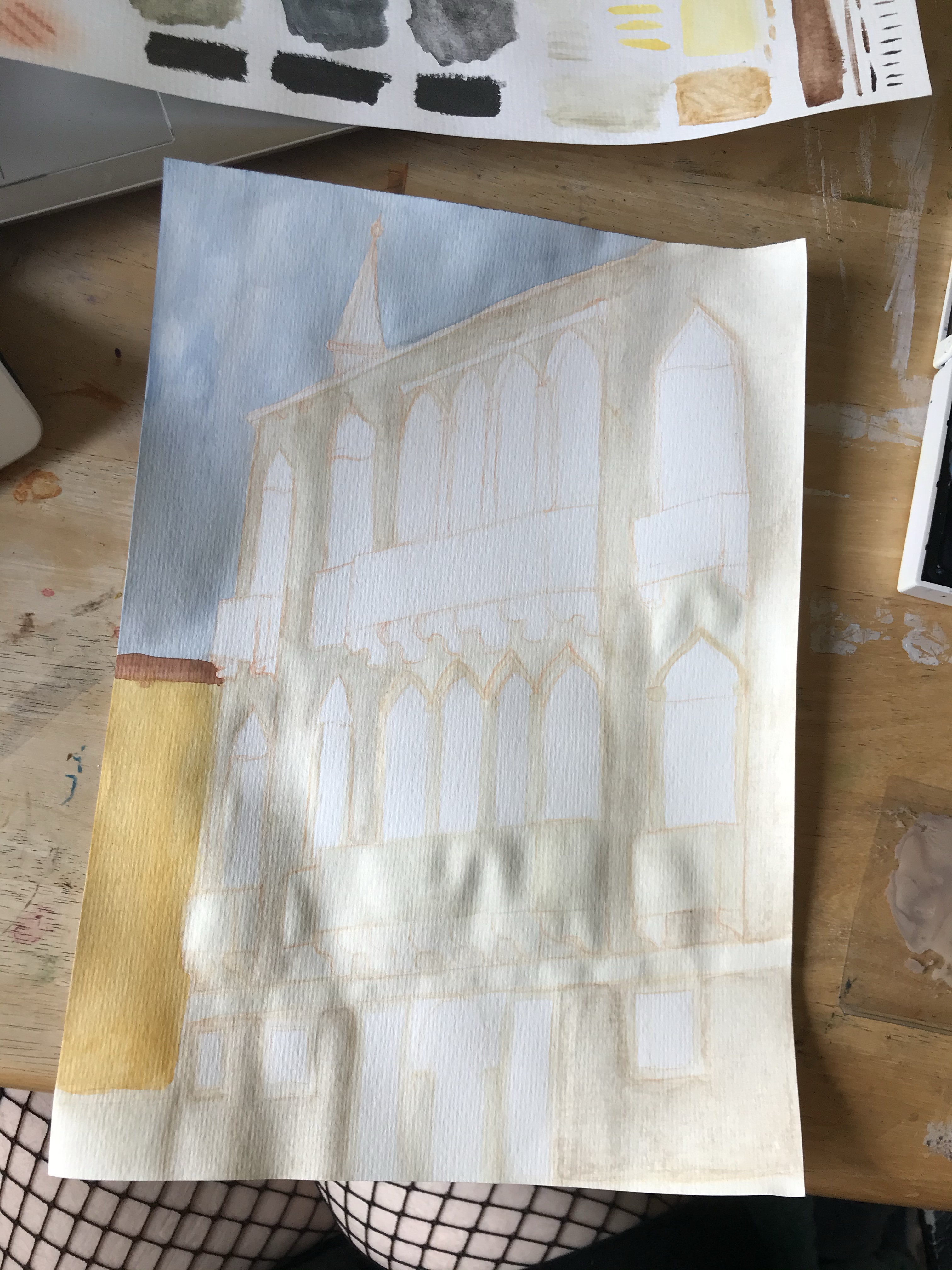
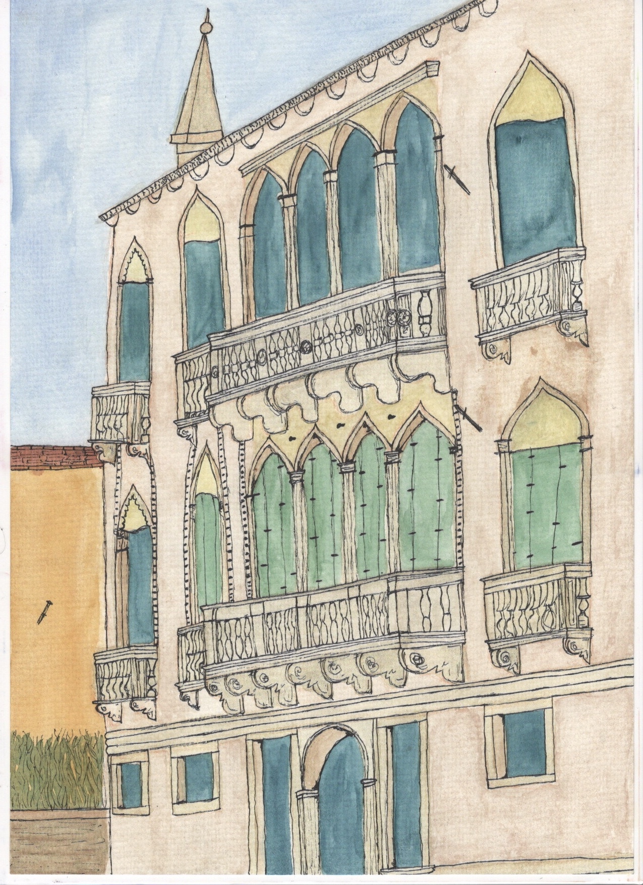
Base layer of colour
To start with I used gouache and watercolour to form a base for my illustration. I layered various colours to create texture and a rustic look. At this stage I was focused on building colour and texture aiming for duller grey tones. I was inspired by the idea of old parchment, historical documents, and lost artefacts, and the washed out, weathered feel they have to them. I used kitchen roll to remove darker watercolour from the light gouache base and create a tea-stained look. I then used the liquid pencil over the gouache on the marble railings as I felt this mimicked the old, greying, washed out marble look. I chose a deep teal for the open doors as I felt the contrast was really beautiful whilst still communicating an empty depth.
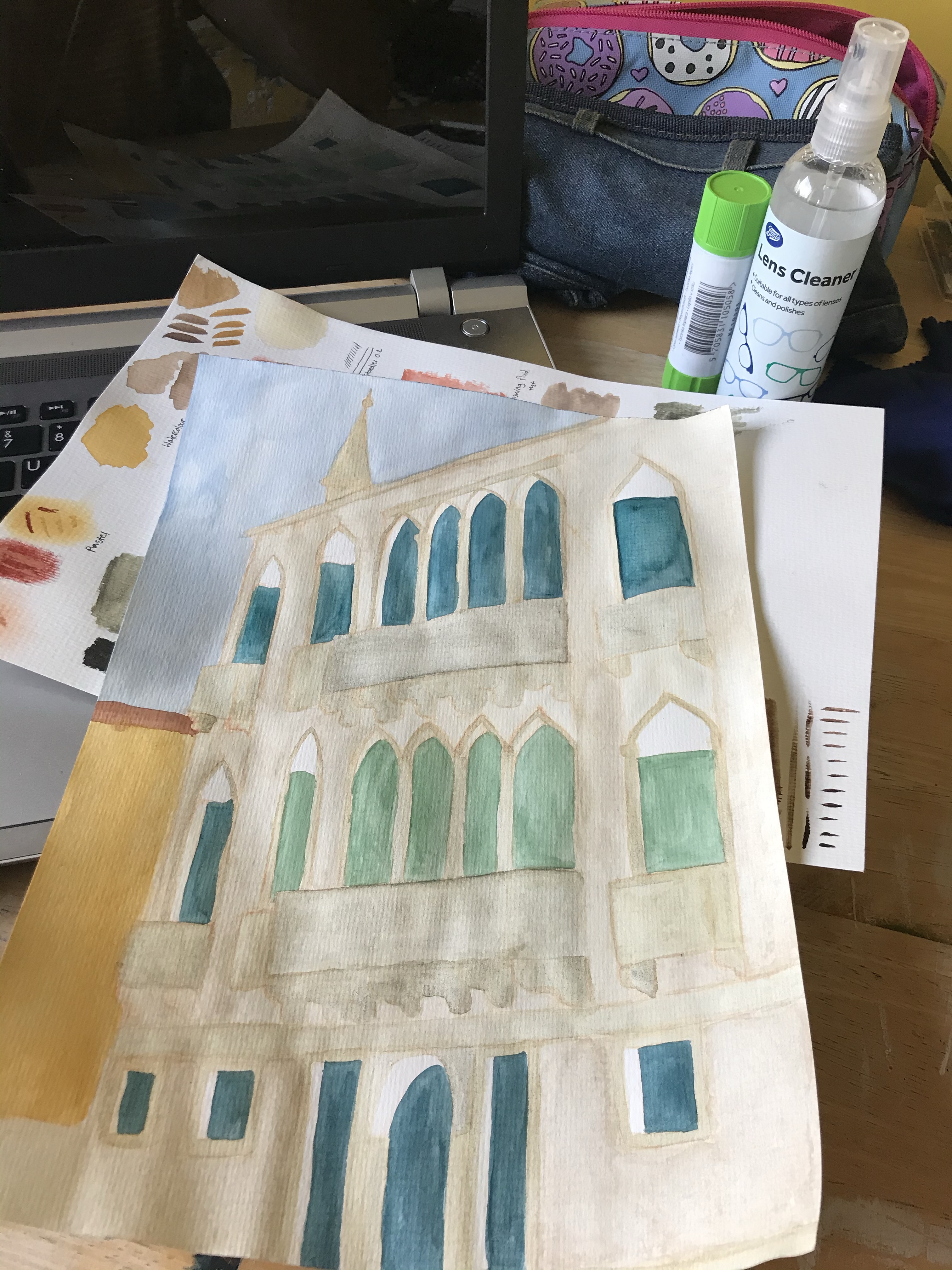
I then moved on to adding lineart and detail with fineliners. This took the illustration in a whole new direction as it really emphasised the building and the angle it’s at. Adding the detail brought it to life and transformed it from the flat image it was before – I enjoyed this step a lot. Next, I began shading and adding some extra texture and contrast using coloured pencils. This further emphasised the angle of the building and gave it a lot more depth. The pencil brings out the texture of the paper so much more than the paint, which added to the aged/historical look of the piece.
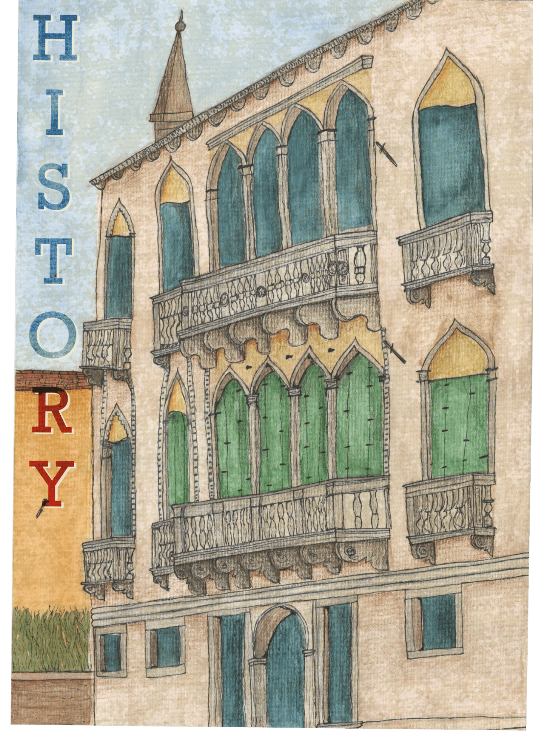
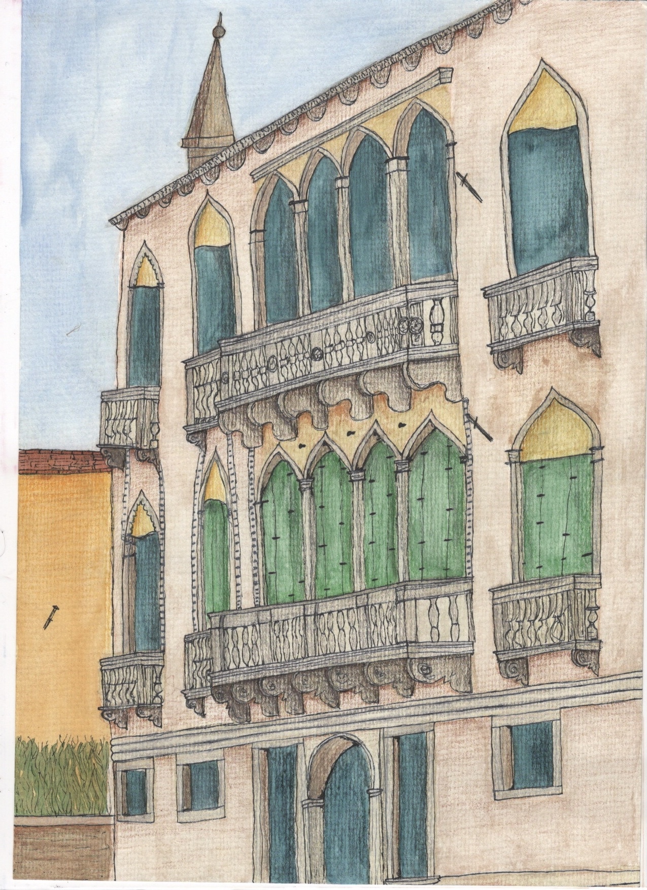
Line art and shading added to the illustrationVarious fonts I tried out
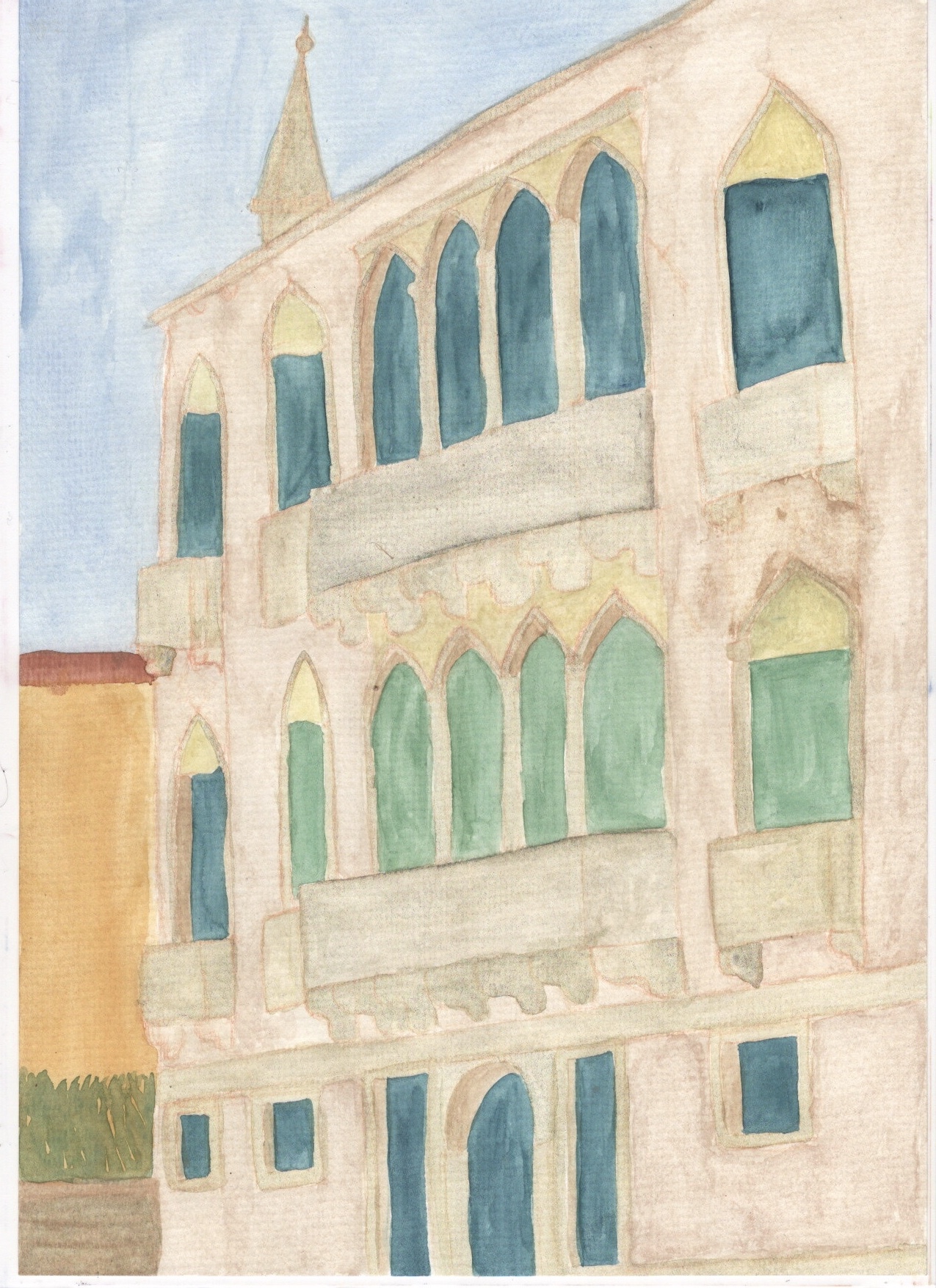
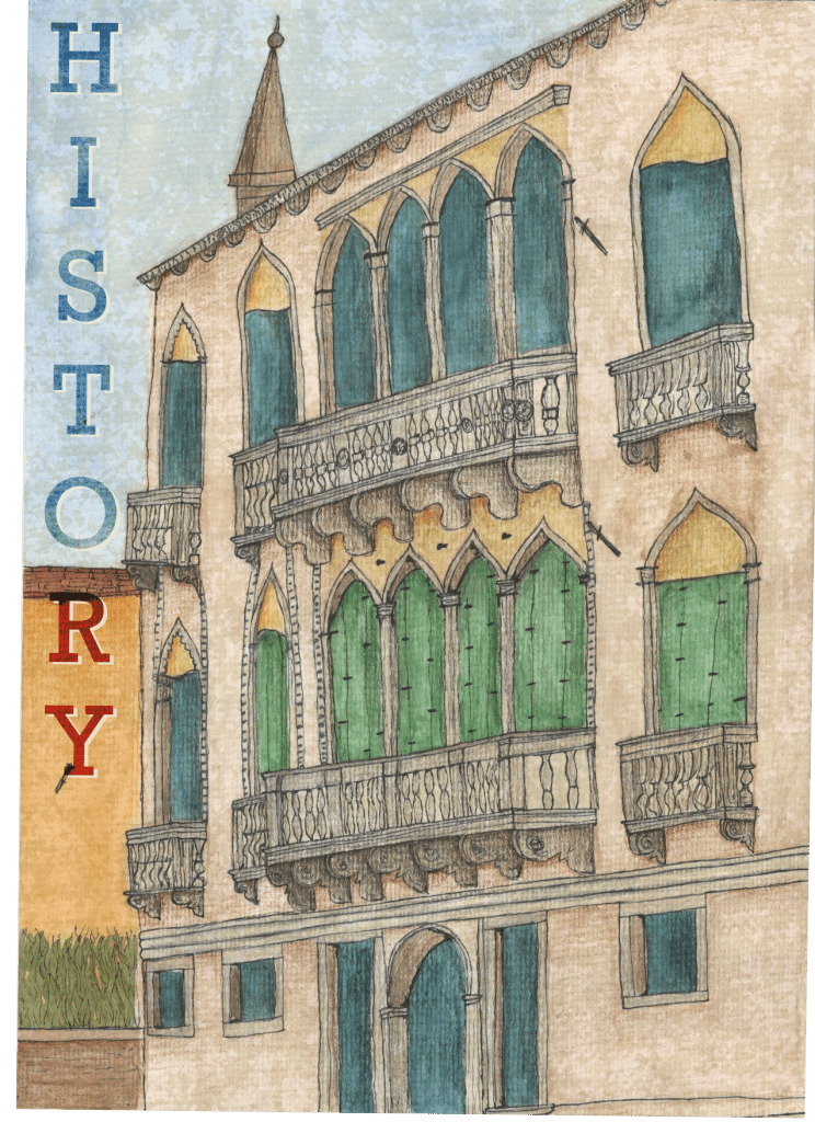
In order to add text to this piece I scanned it in to work digitally. I also tweaked the piece slightly, adding one final texture layer over it to truly capture the weathering of the building, and to desaturate the colours somewhat as I felt they were a bit too bright. I then tried out several different font options that I felt represented the word ‘history’ best. I ended up choosing a serif font that is bold and commanding. It’s a modernised serif font so it could be used in a contemporary poster but still looks historical and ‘old’ so relates to the theme of the image/word. I placed the word horizontally in the empty space alongside the building and applied a blending mode to it in order to ensure it maintained the feeling I was going for. I then duplicated the layer and added a drop shadow to help the text stand out. I did this with a lighter colour rather than a darker one as the dark shadow brought the mood of the piece down significantly.
My finished Illustration with text
I really loved this exercise and I am so happy with my final piece. Every step of the process was exciting and inspiring and helped me develop ideas and learn about new things. I am so impressed with my final piece and feel it’s almost exactly what I envisioned going into it. I love drawing architecture and cityscapes and definitely want to do this more. I’m also learning how much I enjoy traditional mediums of art and my skill in these areas is developing.
The process of sketching out my work physically and scanning it in to work with digitally, or even completing work physically and altering digitally, and generally combining the two mediums, is something I want to incorporate more often if not always. I am however unsure of whether the final illustration really looks like a poster. I am uncertain of the context it would be used in, maybe in an advertising campaign to attract tourists to Venice, alongside several other posters describing other attractions the city has to offer. Nonetheless I feel I achieved my goal of creating a historical looking image, and I’m proud of it.
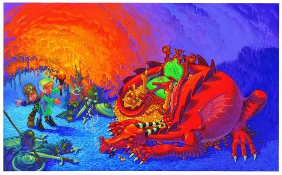
This exercise required me to analyse an image and answer some questions on the hierarchy within it.
The content of this image can be broken down into: – A dragon – The dragon’s treasure – Armour and weaponry – Fire, and a torch emitting it – Two characters – A cave
What is the image about? What is it saying? The image depicts two young people coming across a sleeping dragon in a cave. It appears they are not prepared for such an encounter, as one is pointing back to where they have come from, and neither of them have weapons or armour. There is armour on the floor near the dragon, but its colouring implies it is old and rusted. This tells us that several unsuccessful attempts at slaying the dragon have been made. The dragon is sleeping curled up on its stash of gold, and hasn’t yet noticed the two people.
Work out the narrative and identify the story I think the narrative is clear – two young kids went exploring in a cave and happened upon a dragon. One is slightly braver, holding the torch and standing in front, pointing to the dragon excitedly, whereas the other is fearful and wants to turn back. The dragon is definitely a threat, and as the two are unprepared to fight it they are stood unmoving waiting on what to do next.
Describe the palette and tonal range which has been used This image uses a mix of hot and cold colours to show contrast in the areas of the image and create a hierarchy. The palette is quite simple, using only a few colours and their shades. The hot colours are used to represent the dragon, stereotypically portrayed as being able to breathe fire, and the flames and light emitted by the torch. The usage of red in these instances tie the two together and remind the viewer that dragons breathe fire.
The cold blue and green colours have been used for the cave, armour, and outfits of the two children. The cave looks vast and empty because of the usage of blue tones, and the armour is noticeably rusted and ‘cold’ – untouched for quite some time. The cool tones being used for the children’s outfits shows that they are intruders, contrasting against the warm tones of the dragon and highlighting how out of place they are in the dragon’s habitat. The ‘braver’ character notably has brighter colours, which makes them appear bolder and more confident. The light from the torch shows the texture of the cave, and the colouration makes it appear like lava, again evocative of the dragons fiery breath.
Is there any connection between hot colour and the importance of the element in telling the story? Although the dragon and the two characters seem to be the focal points of the image, the eye is initially drawn to the contrast of the neon green cushioning of the chair against the red of the dragon. The bright red of the dragon and the orange heat of the torch contrasted against the cold blue of the walls and floor of the cave cleverly tells a narrative, and shows where the danger within the image is. The cave is safe, the dragon is not. It uses the green to draw your eye to the dragon, and from there, the hot colour takes you on a journey around the image.
Begin to identify the hierarchy within the image. Which are the most important elements in terms of carrying the narrative or conveying the ideas and how have these been treated? The dragon is occupying almost a third of the space in the image, and appears more powerful as a result. The positioning of the dragon closer to the viewer supplements this, and makes the two characters appear smaller. The dragon is positioned facing in the direction of the two characters, which suggests opposition or conflict even though the dragon is passive and asleep. The treasure pile beneath the dragon is highlighted somewhat less than the dragon itself – as the yellow gold is caught between the red of the dragon and the orange of the torchlight it doesn’t stand out as much as either of the other two elements. This suggests that it is less important than the dragon itself, and also suggests that the characters aren’t there for the treasure – this portrays them as more heroic explorers, rather than as greedy or opportunistic.
Reflection
Having studied this image in close detail, I’m not sure that it’s the hot colours of certain elements that are most critical to conveying the hierarchy. It is the green of the chair which initially catches the eye so that the hot colours of the dragon and the torchlight can lead the eye around the image. To me, the most important usage of colour is the cold colours, and I feel they inform the narrative much more than the hot colours. The hot colours are so intense they overwhelm the image, and in some places force you to look away to the cool colours.
This exercise definitely helped me think more about how I utilise space and colour in my illustrations in order to tell a story. I think I would find it more beneficial to look at illustrations closer to my own style and apply a similar analysis, which I would like to do more when researching or finding inspiration.
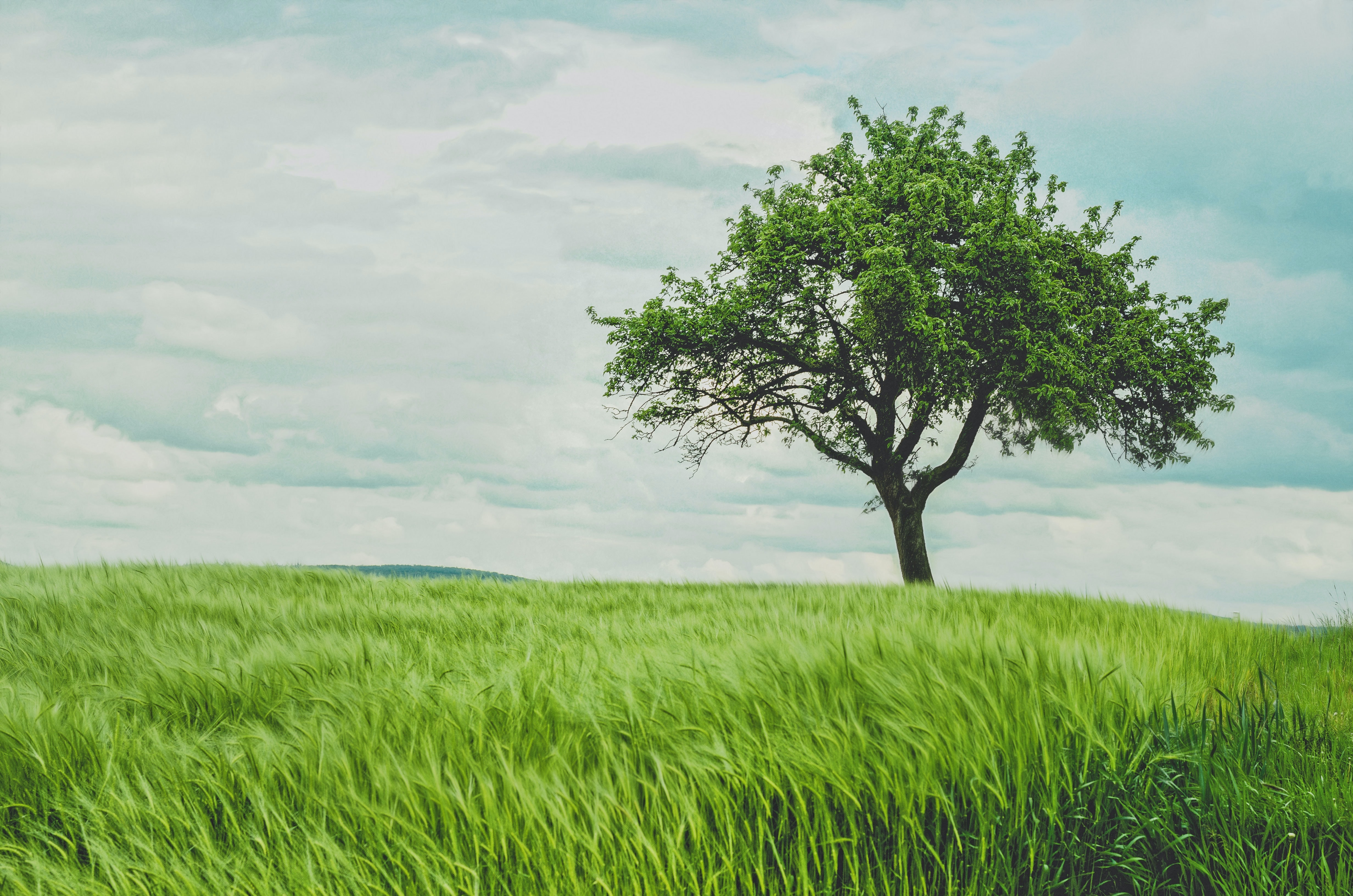
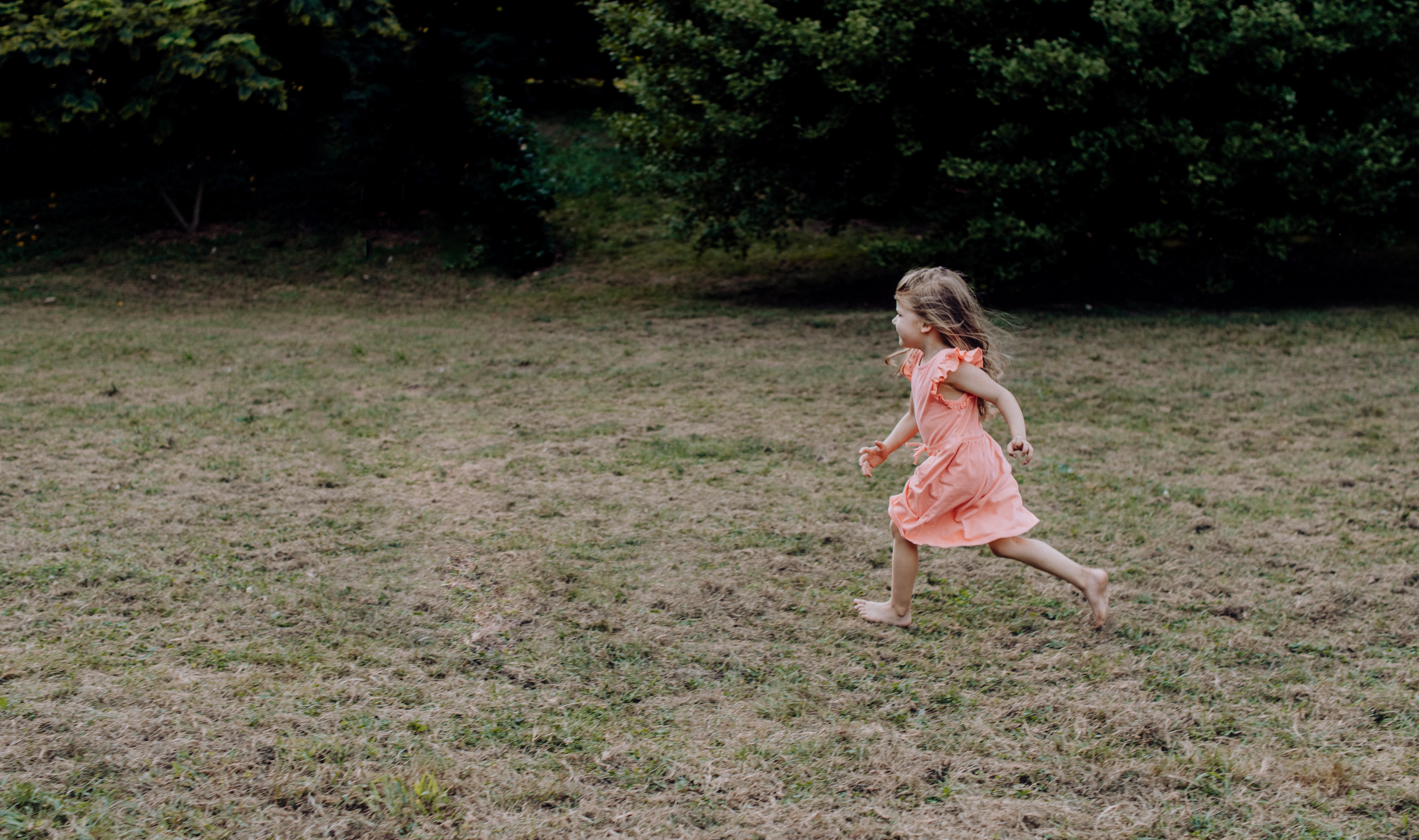
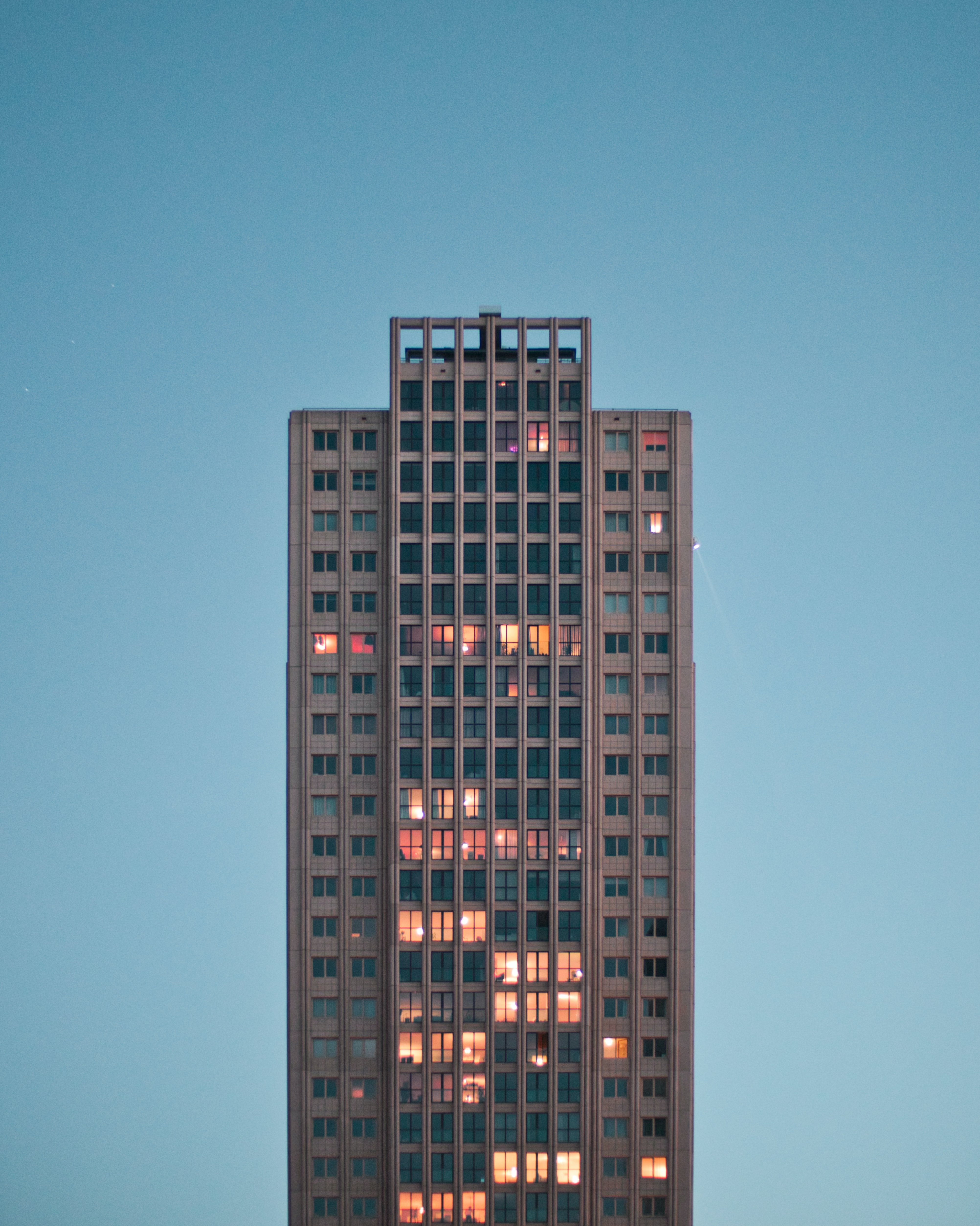
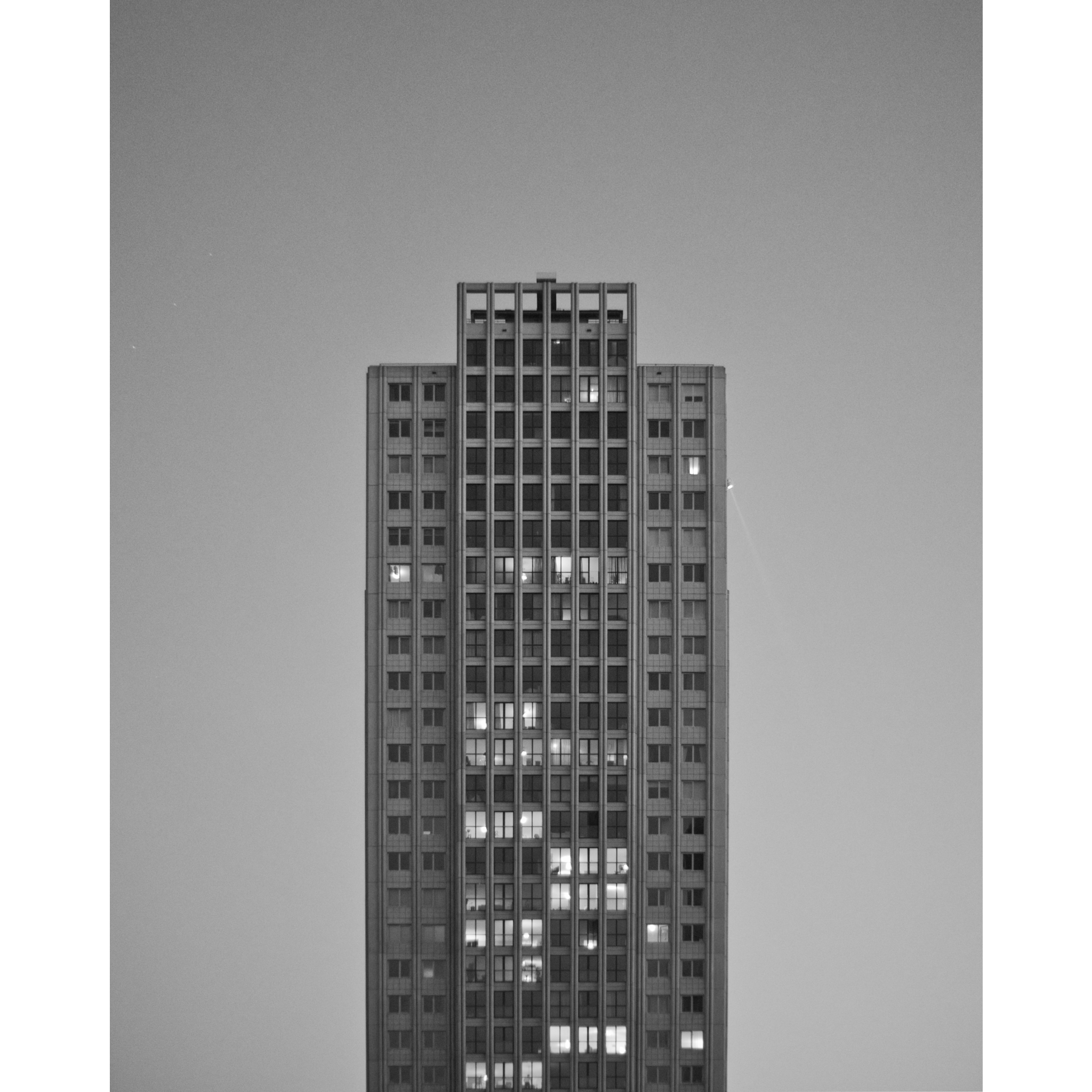
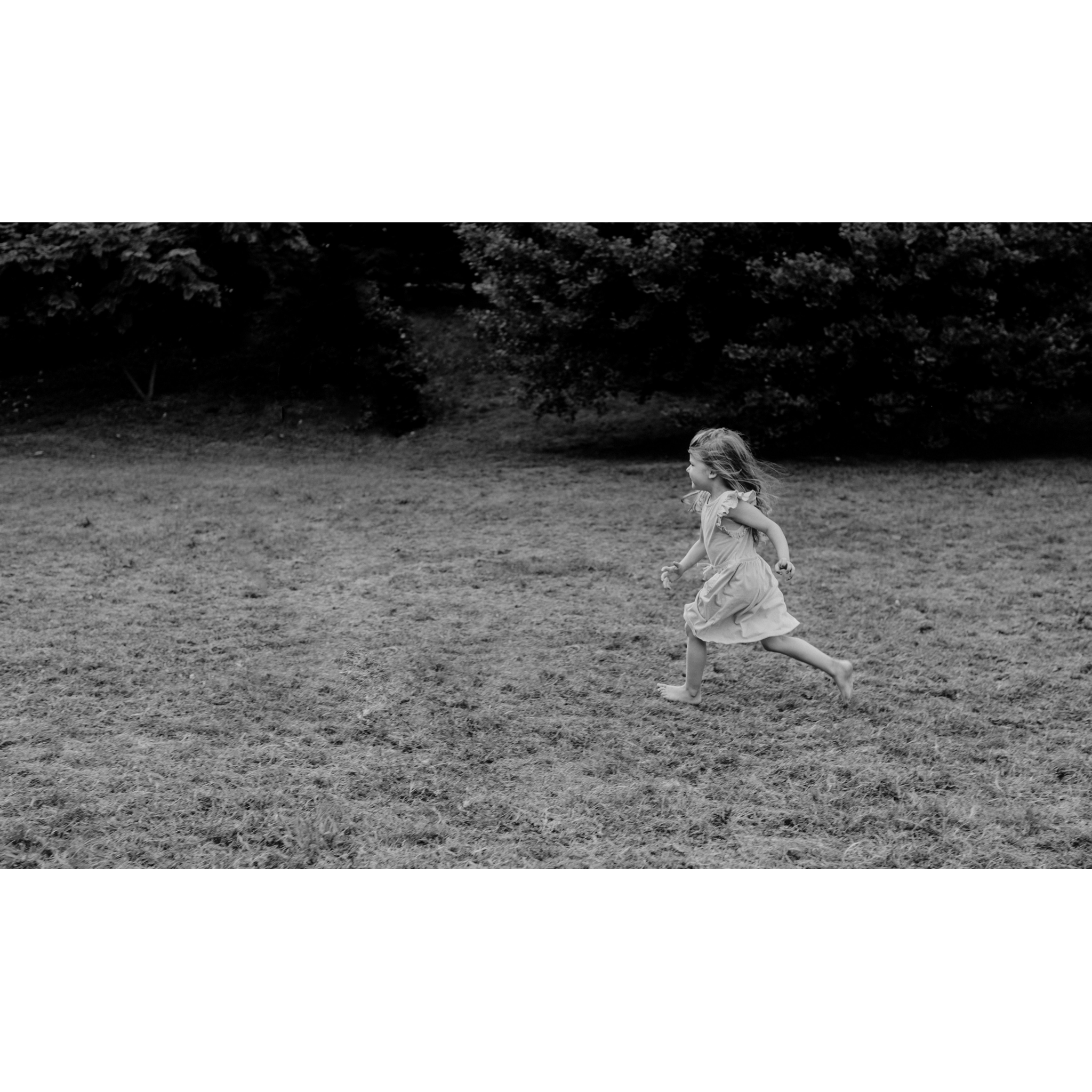
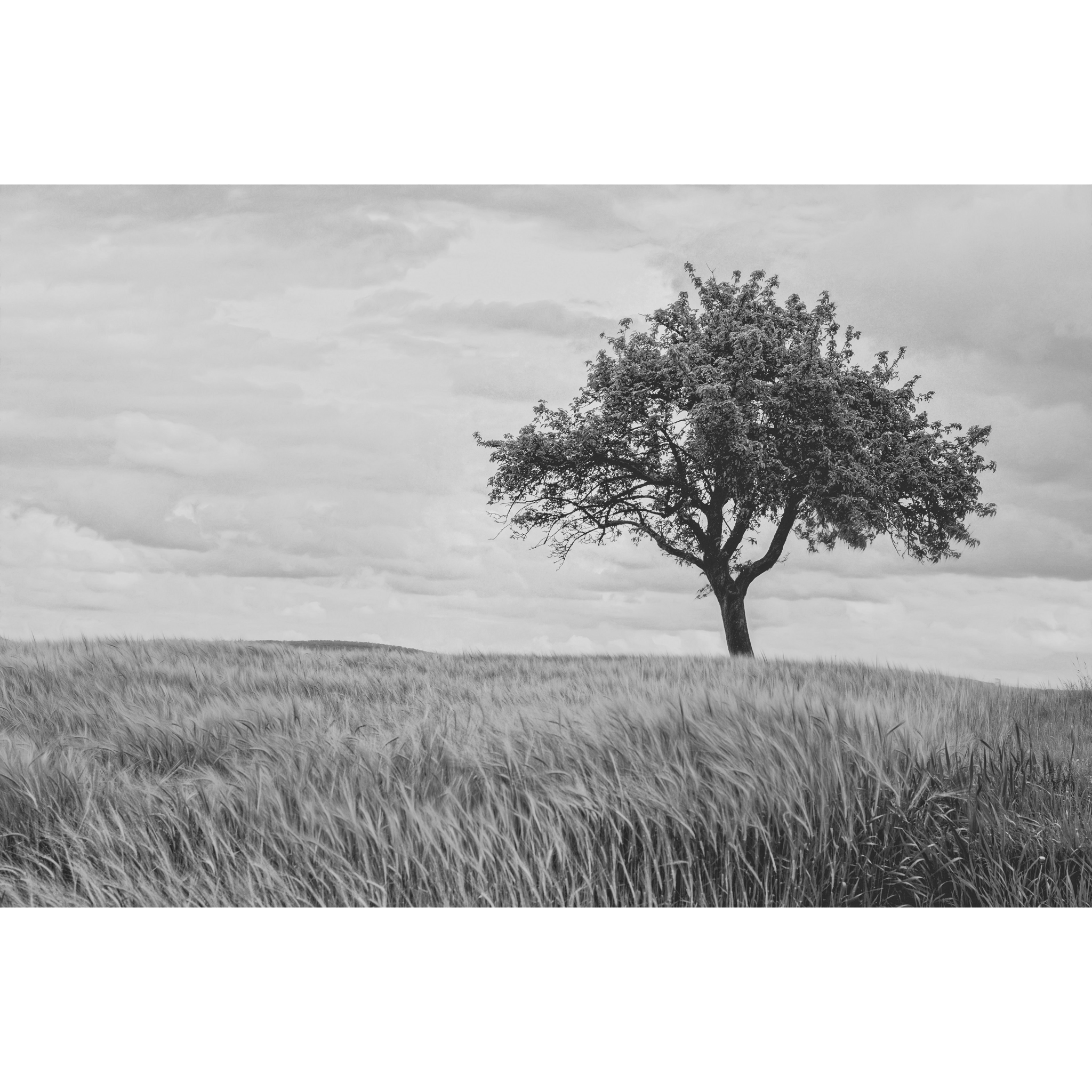
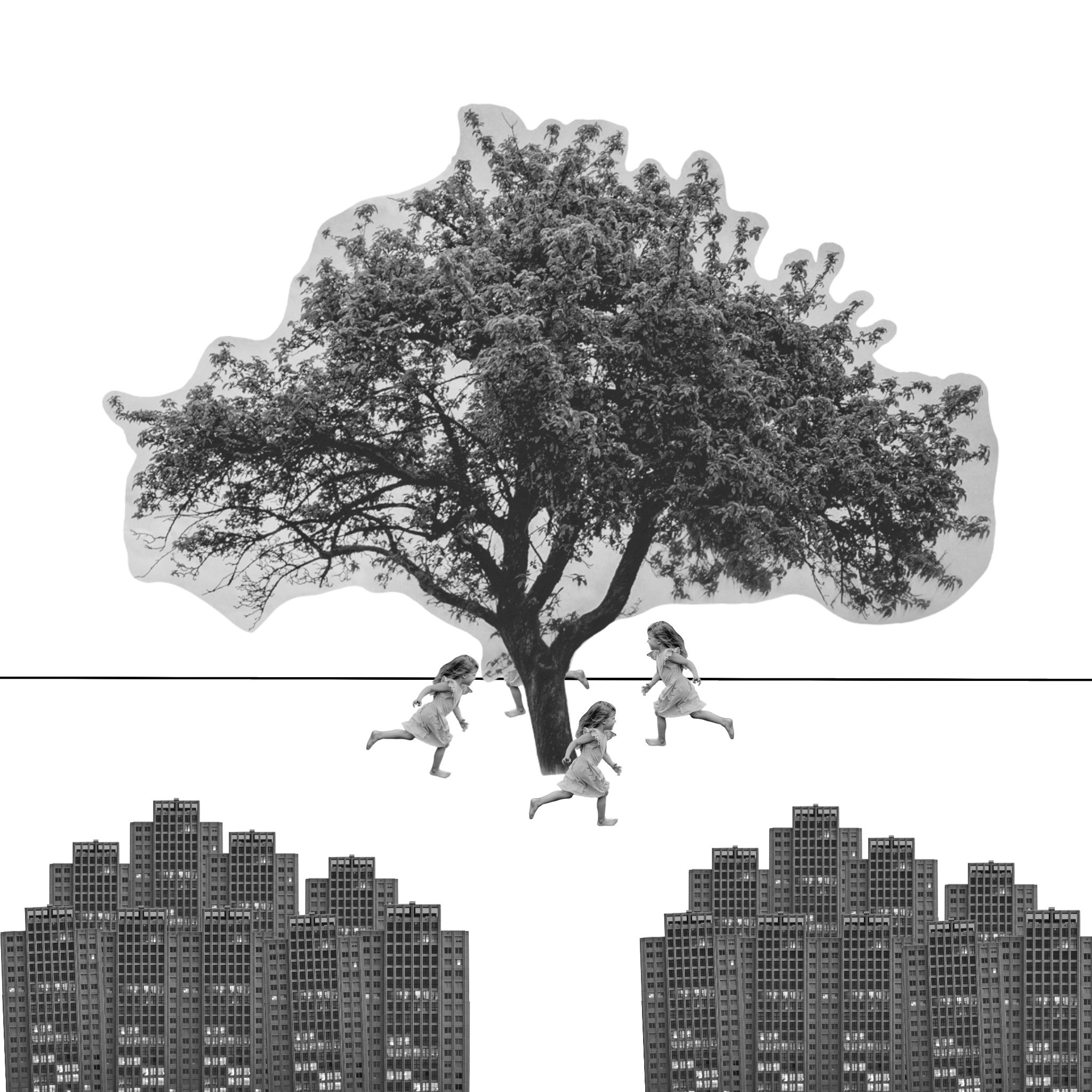
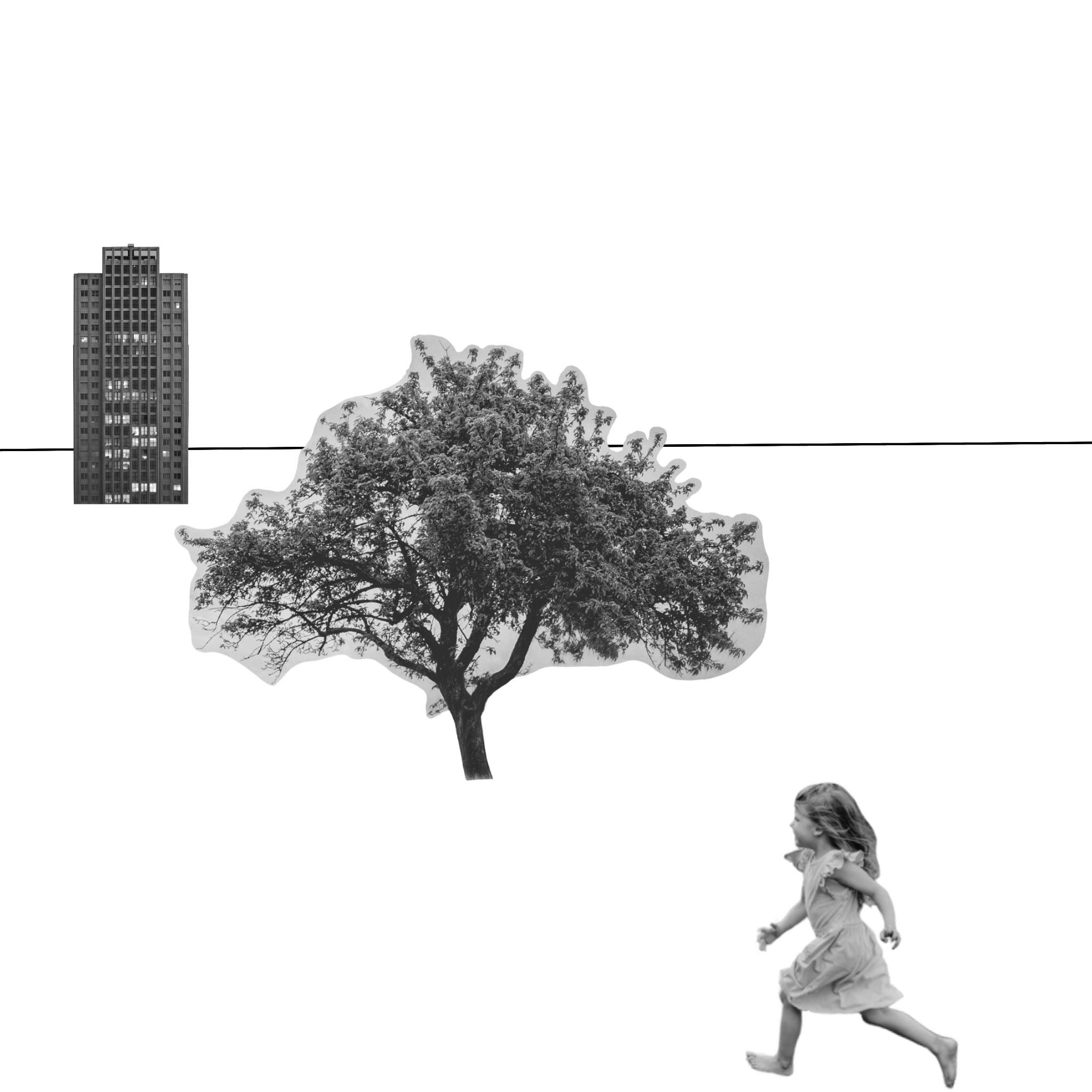
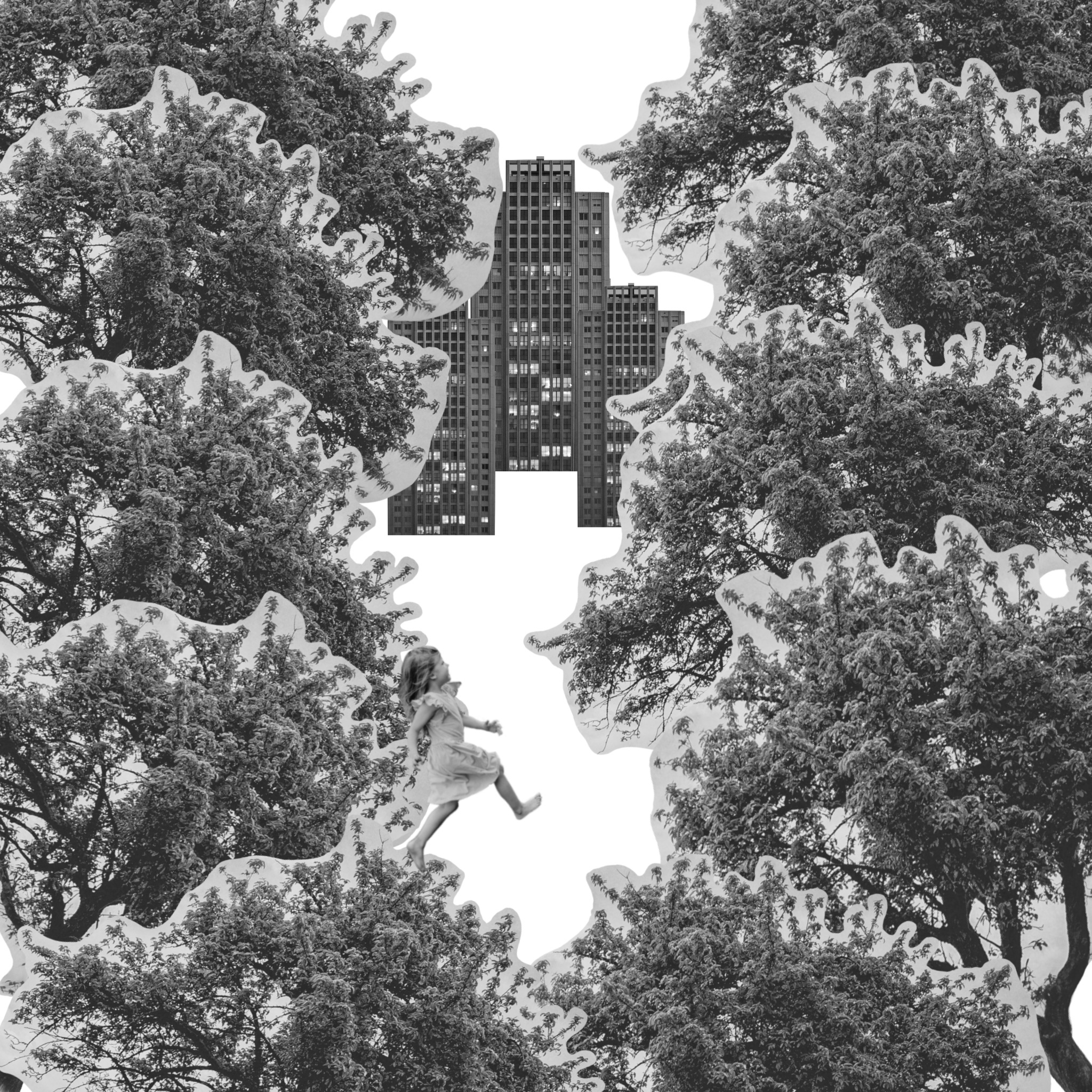
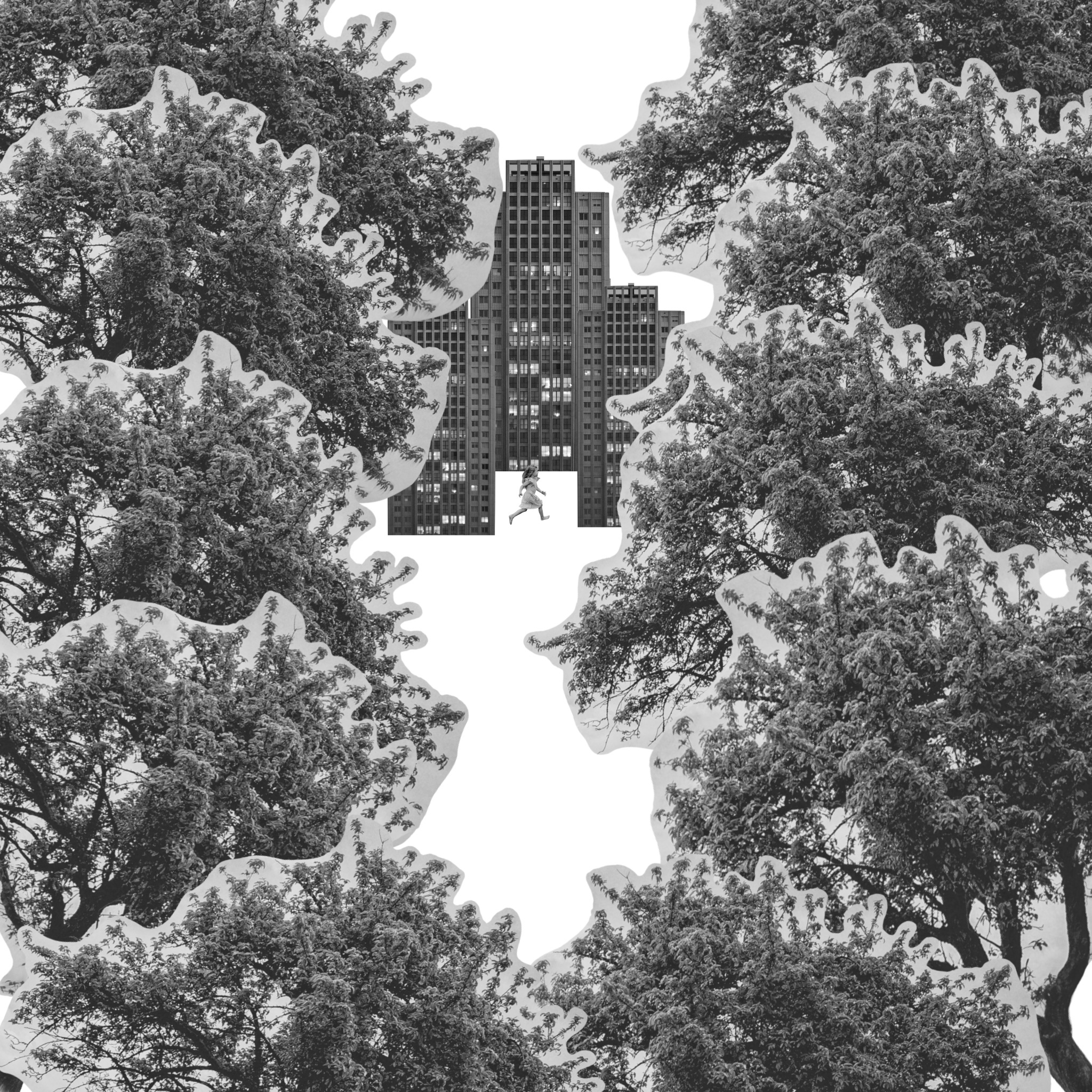
The first exercise of part 3 focuses on composition and viewpoint. I was asked to find an image of a tree, a child running or walking, and a building, and combine them into a representational image. The goal was to play with visual space and see the different ways you can draw attention to certain elements of an illustration in order to tell a story. I decided to work digitally in order to save paper.
My chosen images
I started by going to Unsplash and finding the images I wanted to work with, then reducing the saturation to make them black and white. I picked these three as I thought they would be simple yet versatile and could offer a lot of options for layouts. I then cut any backgrounds out so that I was left with three standalone elements.
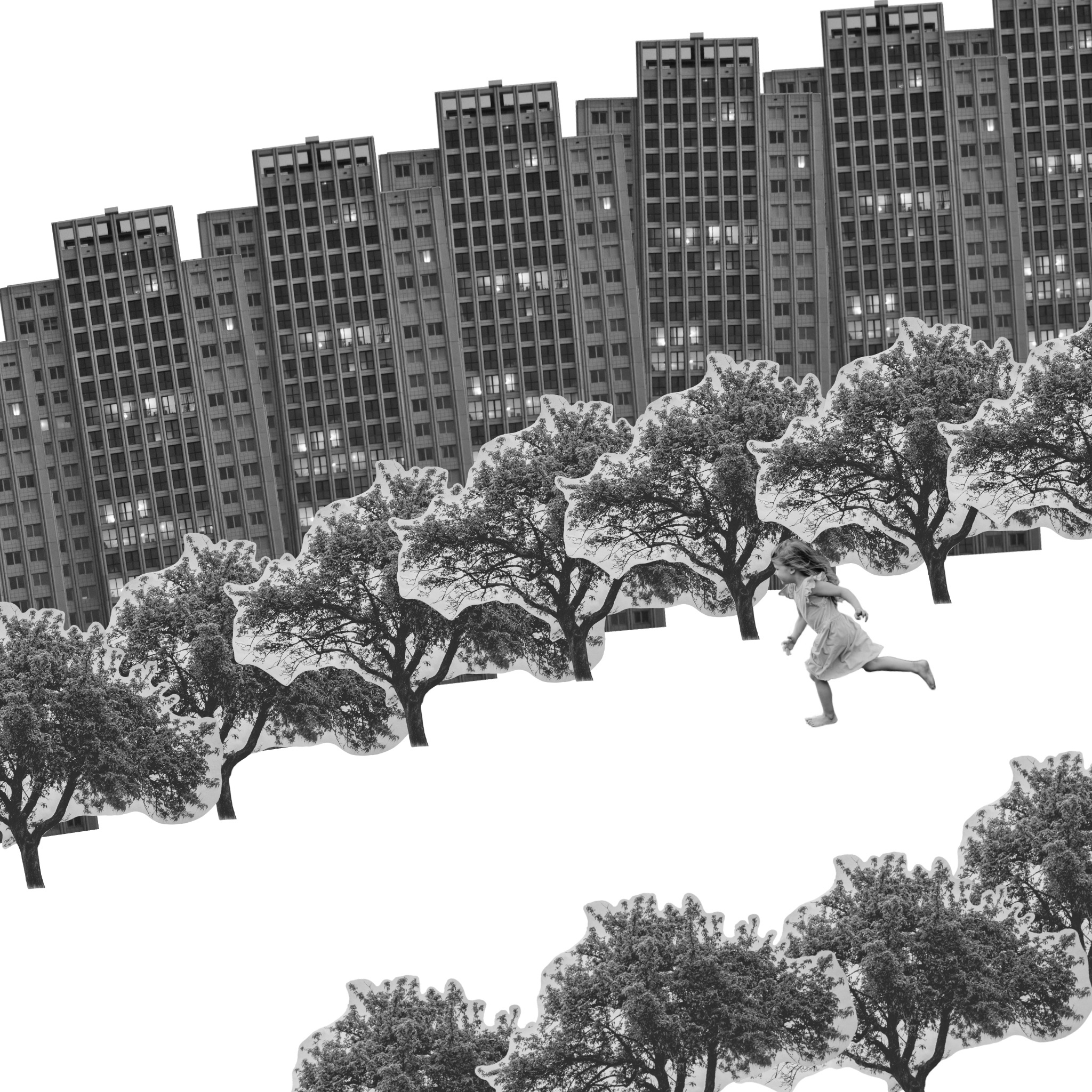
I spent some time arranging the elements in different ways, duplicating and resizing them, changing the angle of them, and adding horizons. I was mostly trying to work with a narrative and see where it led me. I was trying to tell a story through the lens of the girl, almost like a children’s book, being inspired by children’s imaginations. This also helped me feel able to ‘play’ more with the elements instead of being confined to what’s ‘normal’ or ‘real’, as the perspective of the imaginative child gave me more freedom to experiment with.
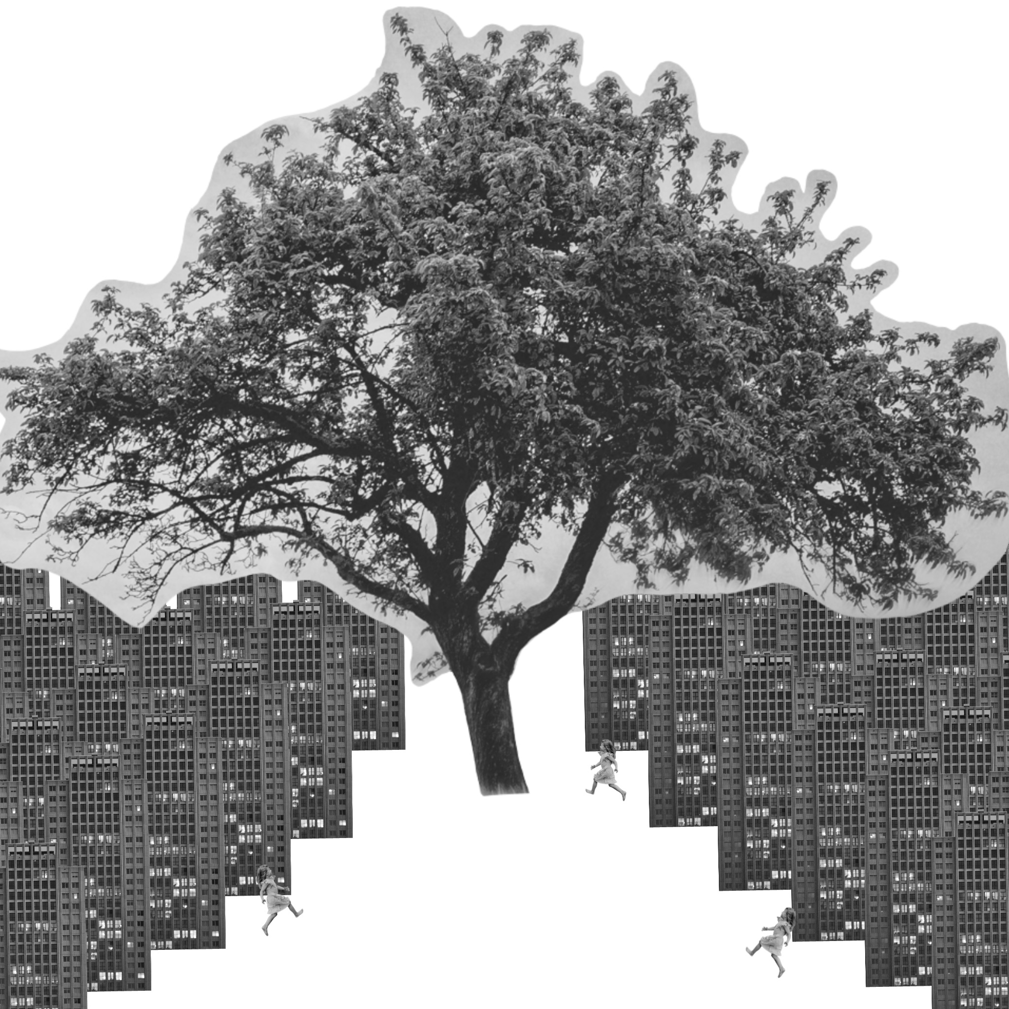
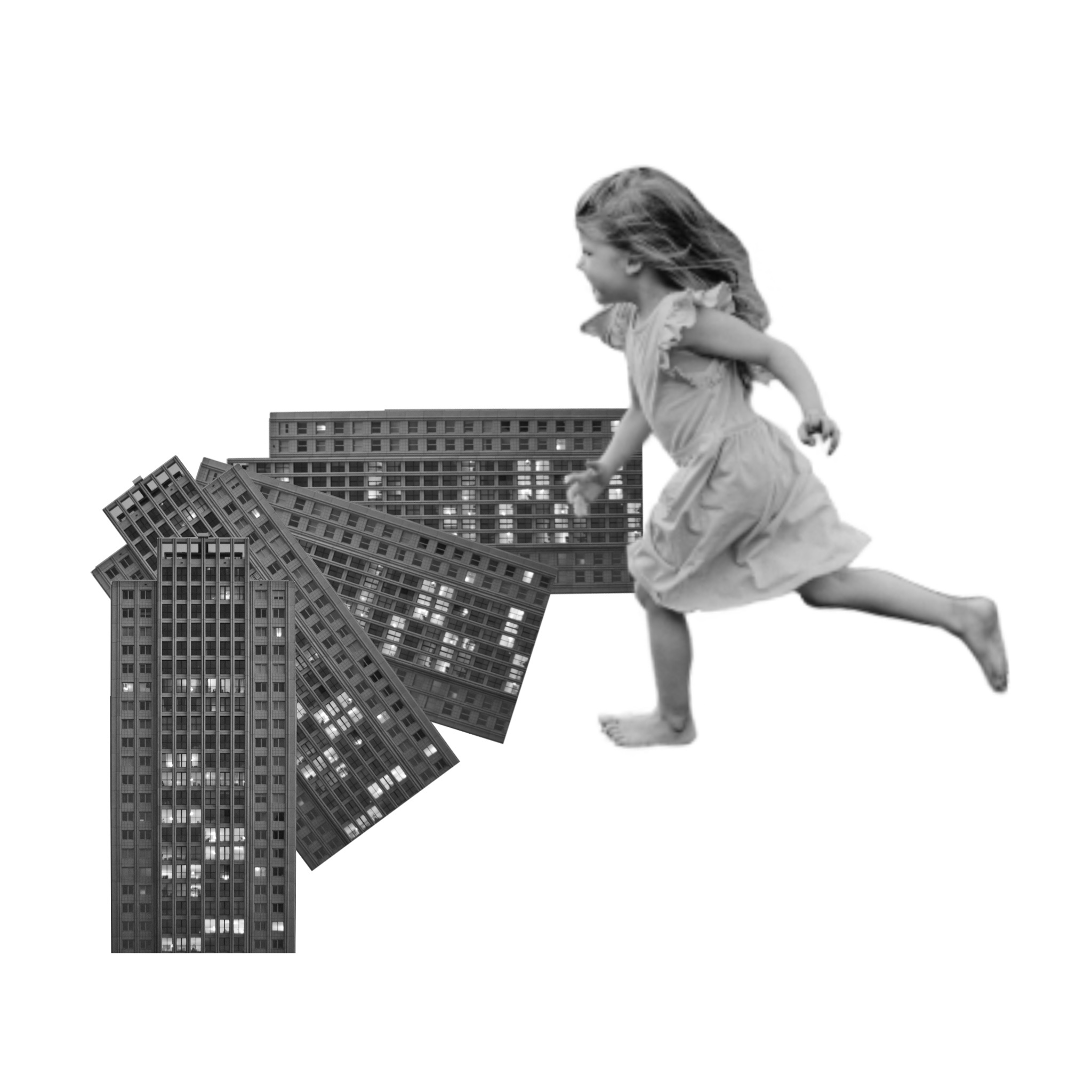
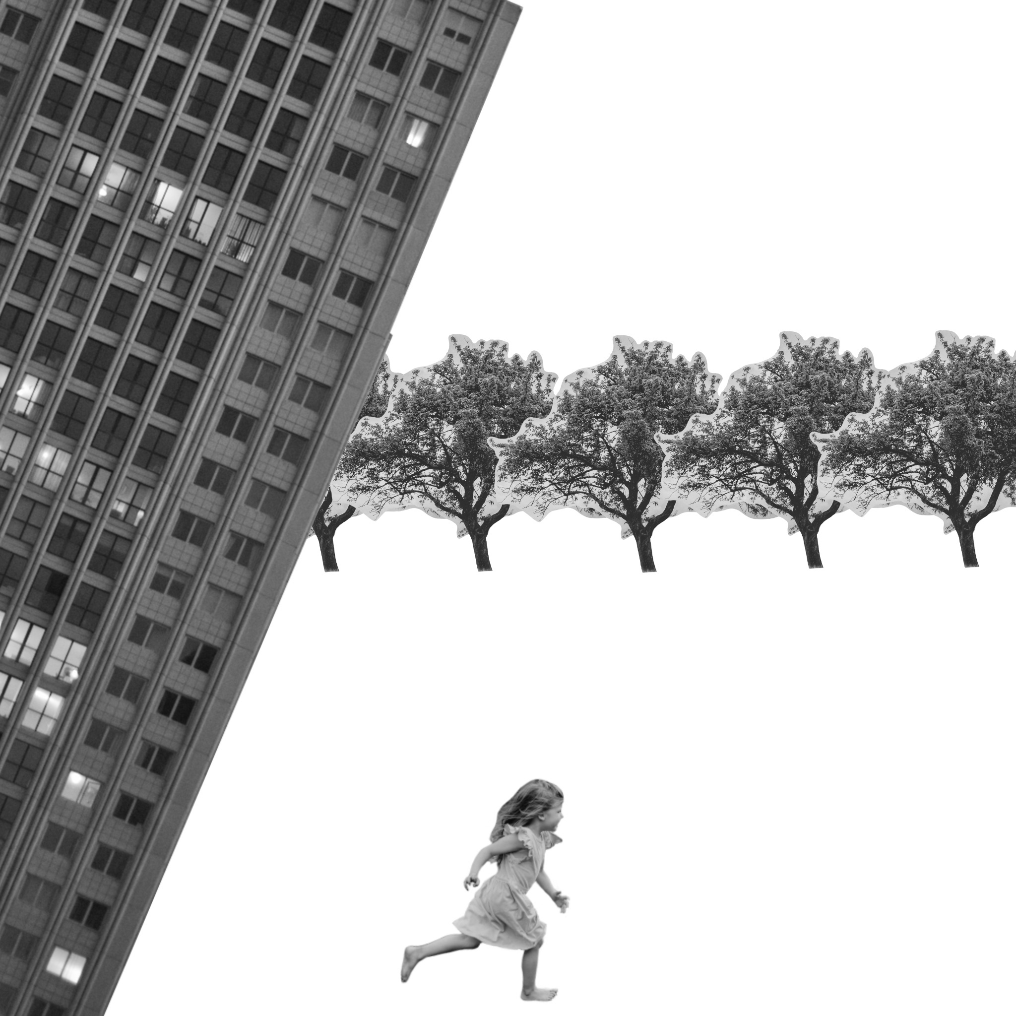
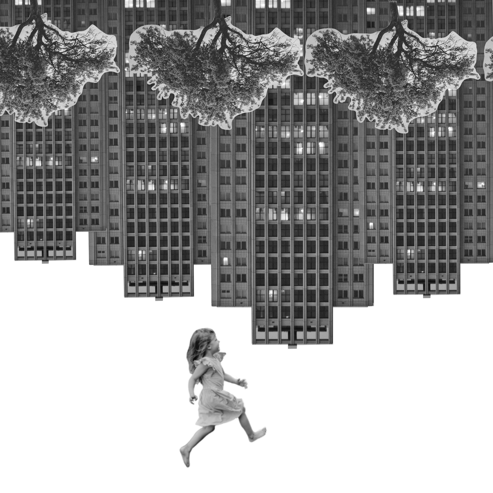
Some of the images would work better with altered elements, for example one looks like you’re looking through trees at a city or village. A different view of a child would be better for this, like seeing them from behind as if they are looking in. I also attempted to show the world turned upside down with the girl hanging from the buildings, but it didn’t quite work. Flipping it, however, did work as it looks like she’s falling.
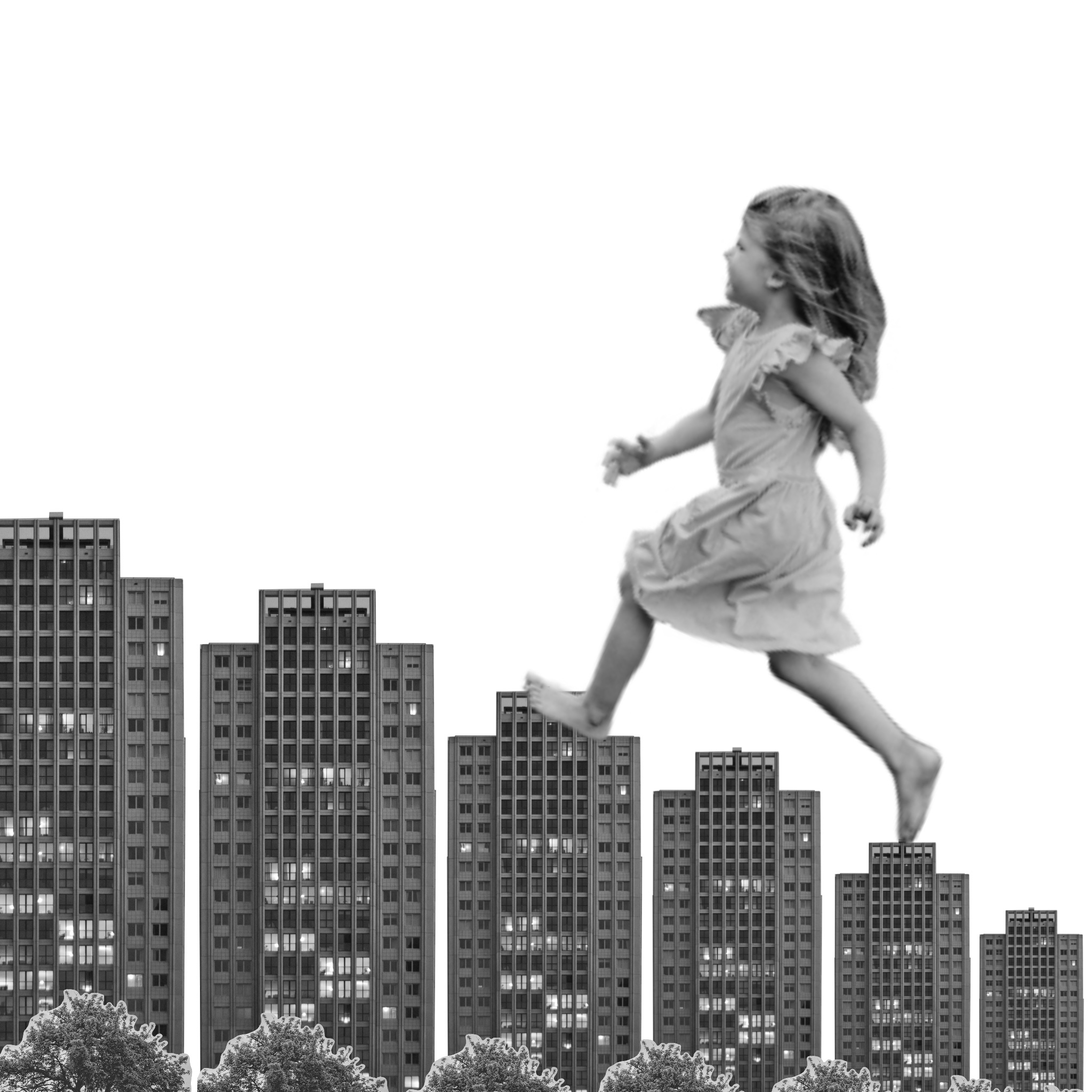
Changing the size of the elements show very different narratives and meanings. For example, when I made the child very large in comparison to the buildings and trees, it looked as if she is climbing the buildings like stairs. Making the child very small shows the magnitude of the elements around her, or the distance the viewer is from her and the other elements. In one image, the larger child in the foreground and the smaller building in the background shows distance between the two. In the image where you are ‘looking through’ the trees, the size of the child shows the relativity of the buildings and the fact they are far away, but the trees are close.
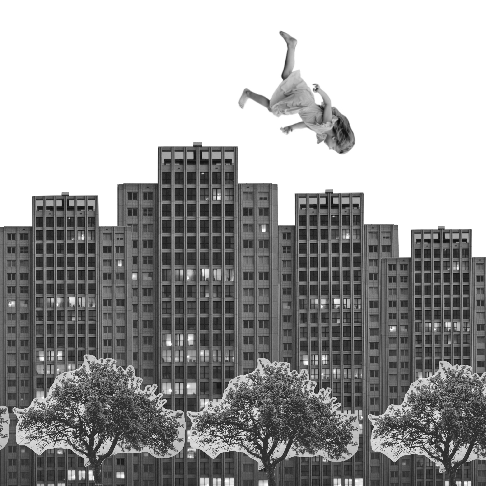
When angling the elements, several stories can be told. In the first image the angle of the buildings show an incline in the road they are on. In another, the angle and size of the building make it look as though it is falling. Angling the trees makes it appear as though there are many all around the viewer. Alternatively, when all the elements are completely horizontal and vertical to the frame, it creates a sense of order and normality. If you remove the girl from the image in which she is falling, it seems like a very simple and plain street. Adding the falling girl alters the dynamic completely, and creates disorder.
My favourite composition is probably the one where it appears the child is walking up the ‘stairs’ made out of buildings. I love the concept of a child being lost in a daydream about being a giant, and what they would do for the day. Using the buildings as stairs to get around is an amusing thought and definitely very childlike. I feel like the composition is playful and fun, and tells a clear story.
I enjoyed this exercise and the way it got me to think about how I use space. Trying to communicate specific narratives whilst only using three images was challenging but fun.
The second sketchbook to arrive with me was themed around hobbies and interests. I found it hard to think up things to draw for this but managed to get into the swing of things after a while. I struggled with art block a lot this month, and ended up rushing a lot of the pages as I had to finish it in order to send it on. This sketchbook, however, contained a lot of work that I want to develop further, and it has provided me with insight on how to utilise my sketchbooks in this way.
My 10 sketchbook pages
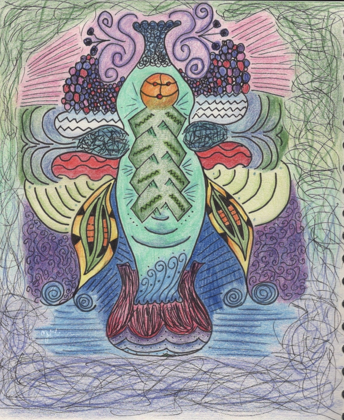
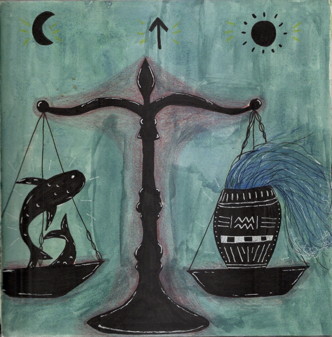
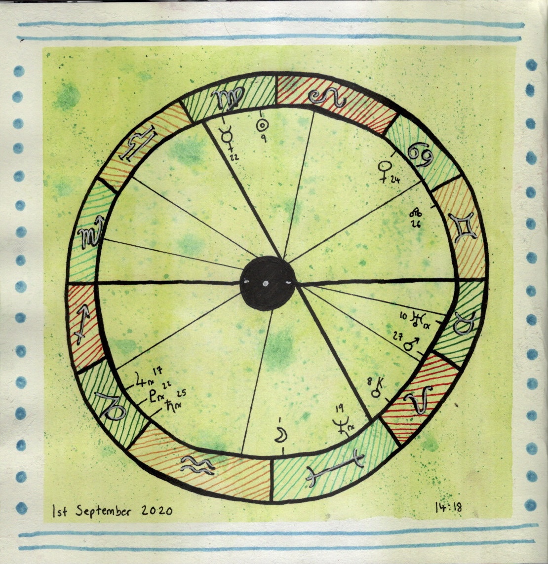
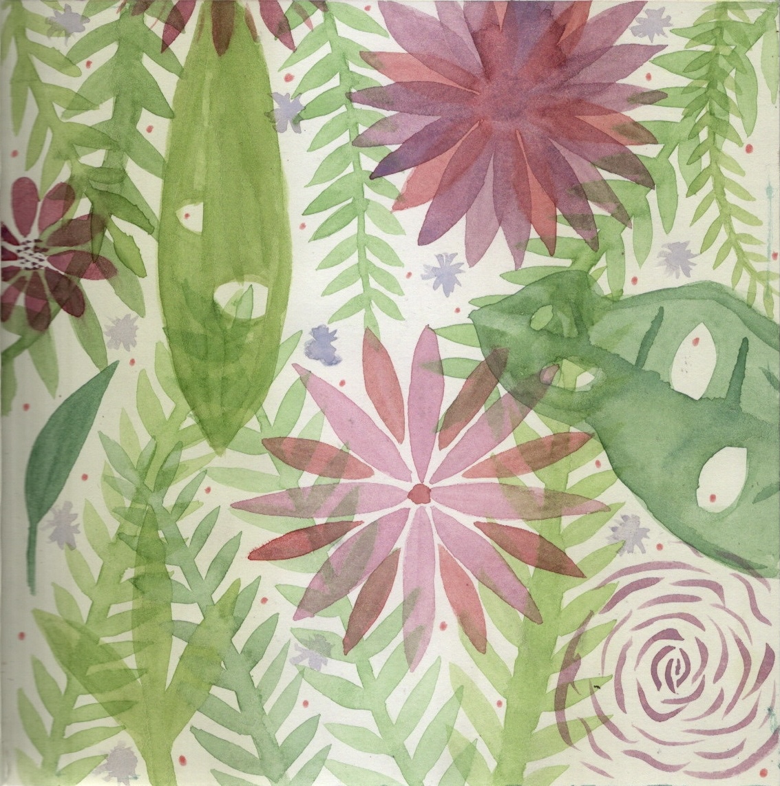
The first two pages I did were astrology-based. Beth, who owns the sketchbook, had included some astrology pages too, and I felt it flowed well. I really want to re-do the first page and add more detail to it, maybe digitally. It was great to get the idea down on paper though. The second page is a chart of the moment for the exact moment I was drawing it. I like how I did the background, but I think my circle drawing skills could do with improving! I then decided to fill a page with watercolour leaves and flowers as they are some of my favourite things to draw/paint.
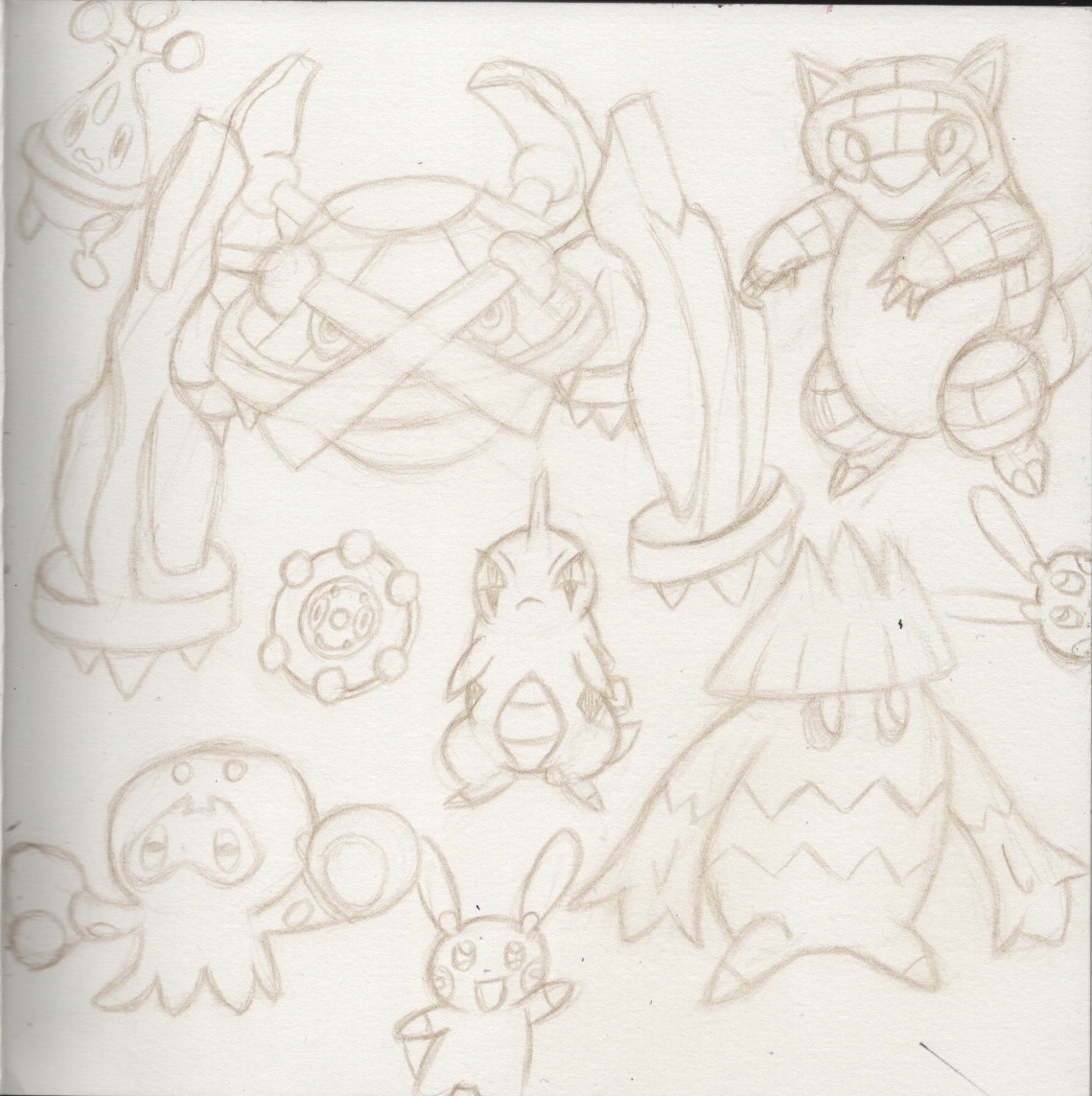
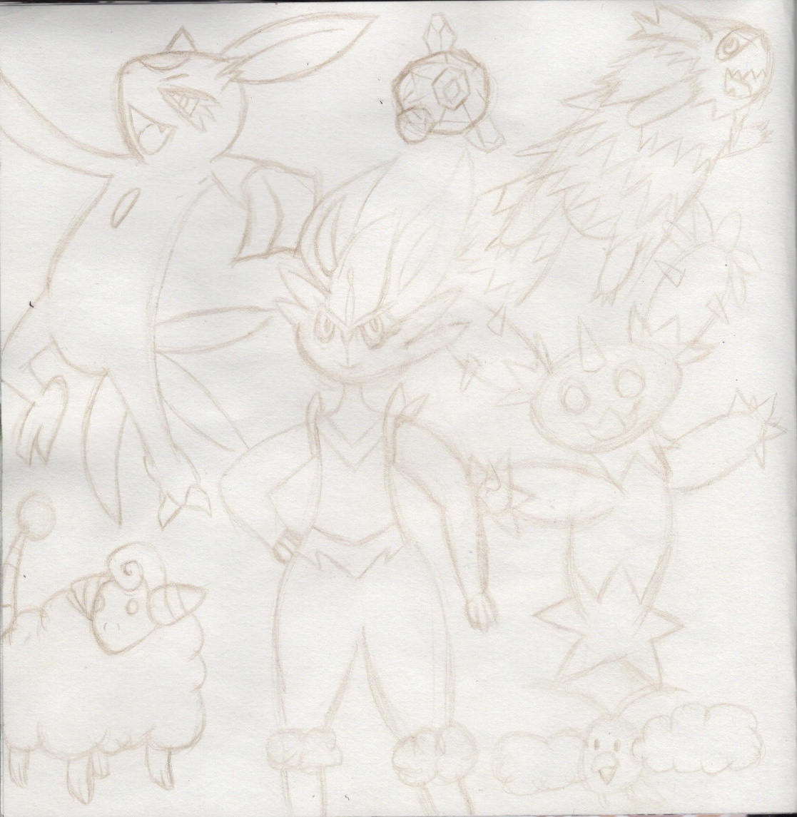
For the next two pages I drew out some of my favourite Pokémon. The first page was fairly rough and inaccurate, but when drawing the second page something suddenly clicked in my mind and I realised how to accurately draw what I wanted to. This was amazing, and the quality of the sketches on the second page outweighed the first page massively. I scanned the original sketches in so I could work on them digitally. I then coloured the second page, which I now regret, as I feel it looked so much sharper and fresher without colour.
I was struggling to think of what to draw for the next two pages, and I decided to fill them with quick sketches of animals. Beth had filled two pages with quick sketches of her cat, so it still felt on-theme. I am doing more and more quick sketches at the minute and finding it very helpful in developing my art.
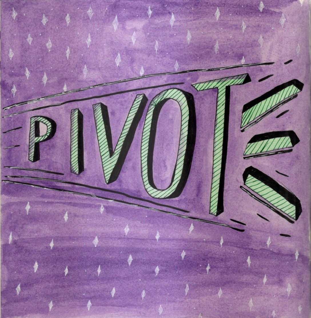
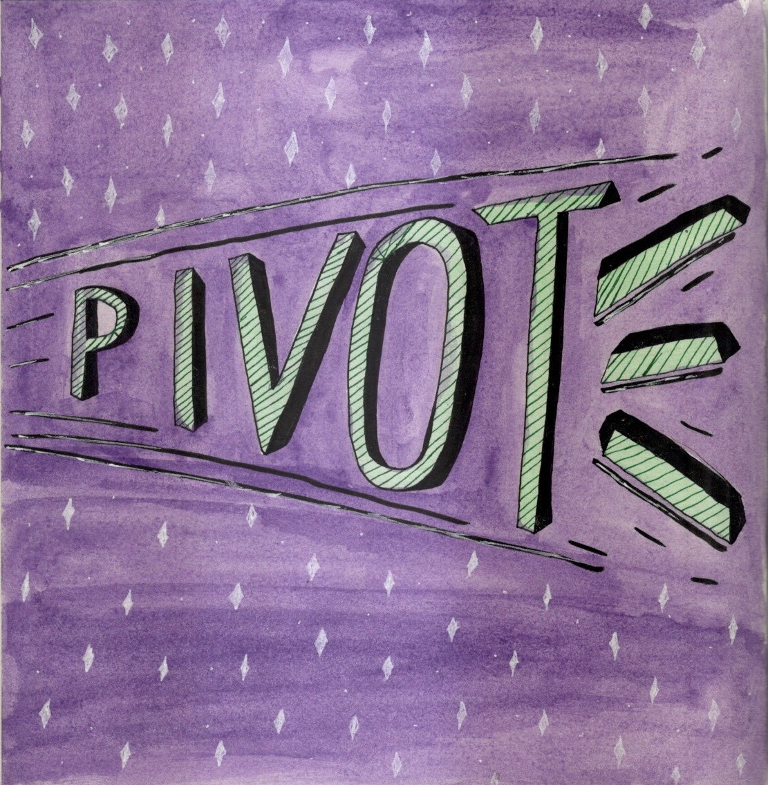
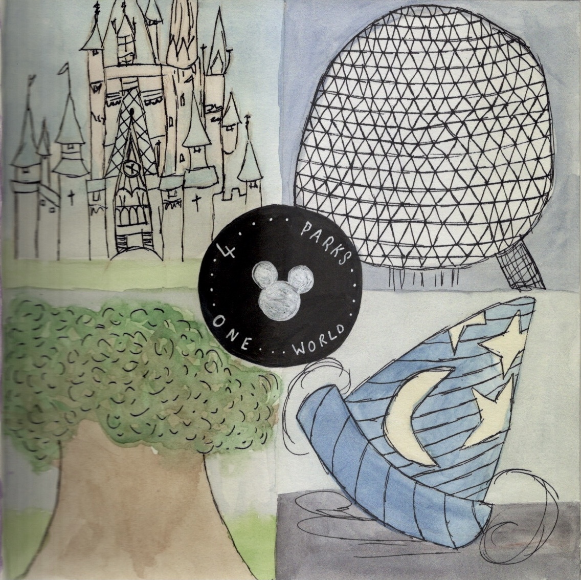
Typography is something I really enjoy and I would like to include a page of this in every sketchbook during this circle. For my typography page, I designed the word ‘pivot’, a reference to the TV show Friends. I then drew the four park mascots for the Walt Disney World theme parks, filling them with watercolour and loose ink outlines. This piece was rushed and could do with some TLC. I like the concept though, and may revisit it.
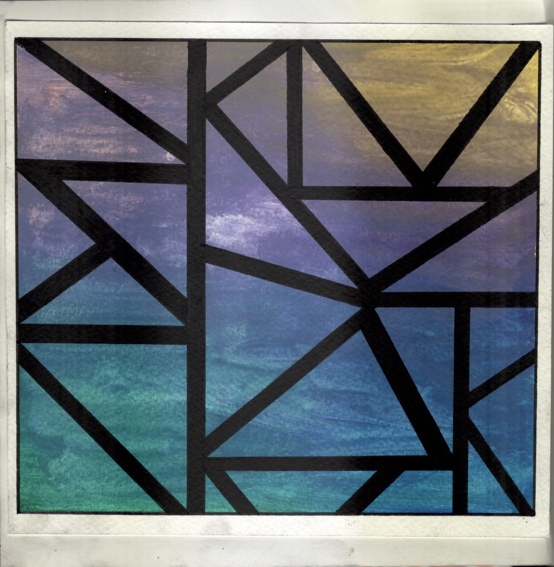
For my final page, I wanted to express my love of colour. I chose some watercolour paper and random gouache paints and dolloped them onto the page. I messily blended them hoping to create a fun, colourful, and expressive page, but accidentally made it look like a sunset over the sea. I wanted a more abstract page, so I chose to add the triangles and make it look a little more random.
I’m a little disappointed in the quality of my work in this sketchbook. I don’t think I did it justice and I was having a really hard time with it. I do feel like I learned a lot from filling it, such as how to draw more accurately and freely, and I have several pieces of work I want to develop further. I’m looking forward to the rest of the sketchbooks and trying out more themes.
The OCA Visual Communications Discord server have began organising monthly art challenges. The theme of the challenge is chosen at random each month from a list anyone can add ideas to. We then all have to guess who drew each piece, which helps us learn about each others styles better. These challenges are a lot of fun and are really helpful with developing our art styles.
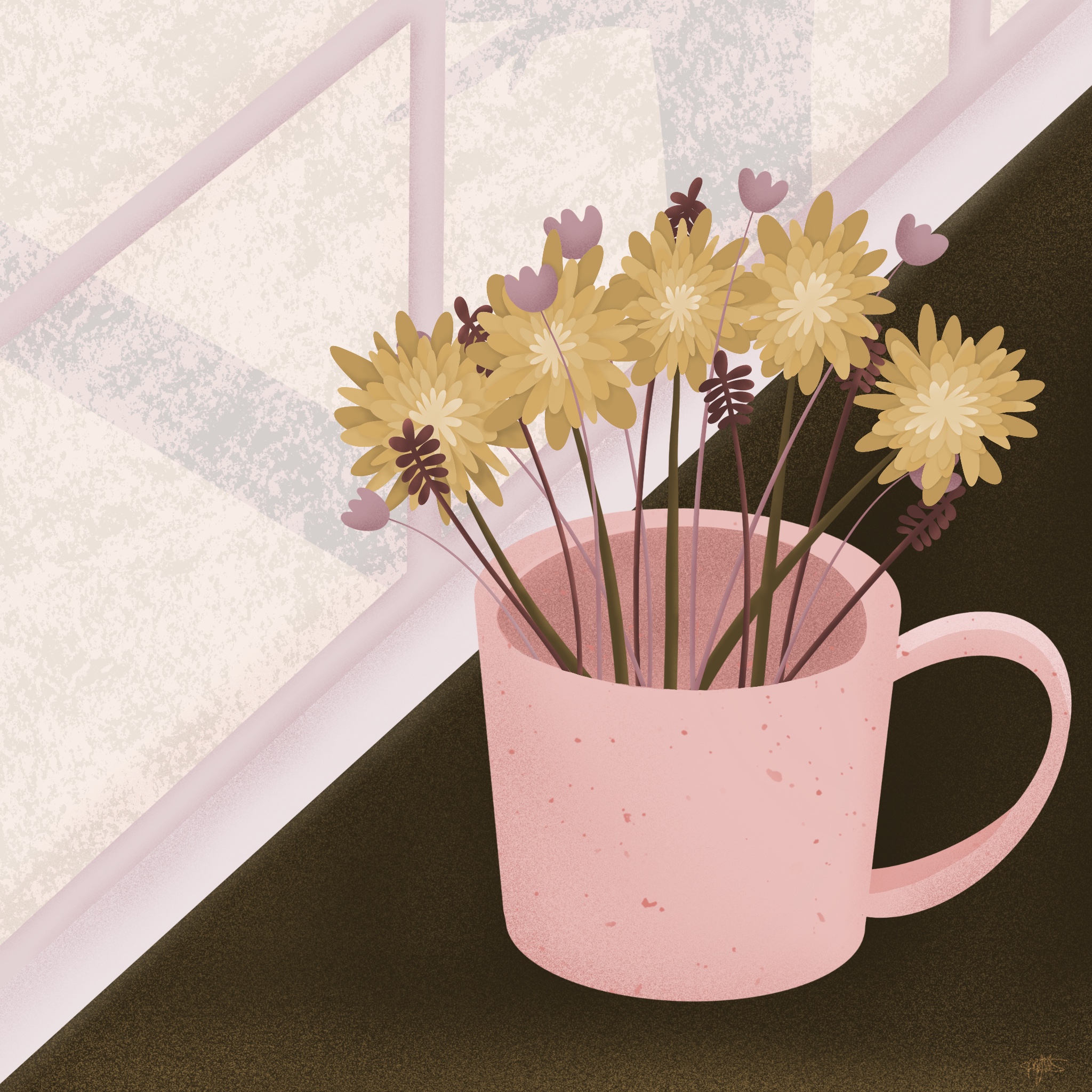
This month the challenge was to create a piece of art using only three colours. We all had to use the same three colours, but the content was completely up to us. We could also use black, white, and shades of the same colours.
We were provided with three hex codes – #a26b73, #d68078, and #d4ab66. These were a shade of pink, and shade of purple, and a sort of yellowy gold. I liked the colours and was relieved that they were the ones chosen, as it could’ve been a lot worse and a lot harder to create something with.
I chose to draw a mug on a windowsill filled with flowers. Below you can see a video of my process and the final piece. I thoroughly enjoyed this and it’s one of my favourite pieces of work to date. I think I will work more with limited colour palettes, as I really love how it looks. I enjoyed having the creative freedom to draw whatever I wanted, and I definitely want to work more on my personal projects.