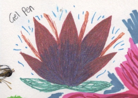
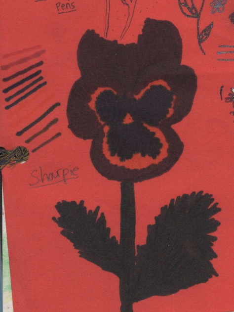
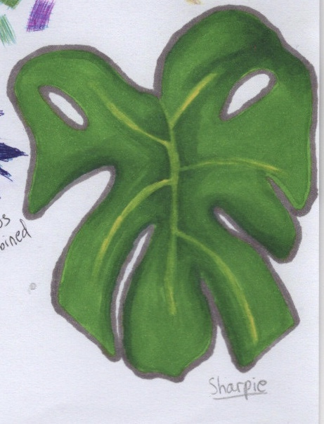
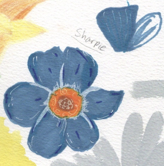
In my tutors feedback for Part 1 he said ‘more freehand drawing is required, try to do 20 fast sketches every day, I have used this for many students and after a week there is improvement, very quick sketches no longer than 5 minutes for all 20.‘. I wasn’t too surprised at this comment, as I knew coming into this unit that drawing was my weak point. I’ve always been very afraid of it and felt that I could never be good at it. This is something I’ve wanted to improve on prior to this course, so despite being nervous about the concept, I dove right in.
I have mentioned several times in the learning logs I have written for Part 2 that I struggle with being a perfectionist. This blocks my creative flow when it comes to drawing, experimenting, and generally getting things wrong. It doesn’t feel safe to just start drawing as I feel it has to look photorealistic and picture perfect. Over the course of Part 2, however, I have learned how untrue this is. Drawing is a form of expression no different to any other artistic style, and is a key feature in developing other mediums.
My tutor recommended I draw 20 quick sketches a day, taking no less than 5 minutes on all 20, and that I look at the book Drawing the Line. I ordered the book, hoping it would help me learn how to draw, and tried to start drawing the 20 sketches a day. I found this really difficult. At this point, I had no idea how to draw quickly. I did draw as fast as possible, using references and focusing on capturing the shape and lines, rather than shading and detail, but still found myself producing half the required sketches in 20 minutes.
I was also disappointed upon receiving Drawing the Line as it didn’t contain any secrets on how to draw better. It was filled with art by other artists, mostly looser and freer drawings and paintings. I thought maybe at some point I could do some studies of the work in the book, and that might help me. In the mean time, I went back to the 20 quick sketches.
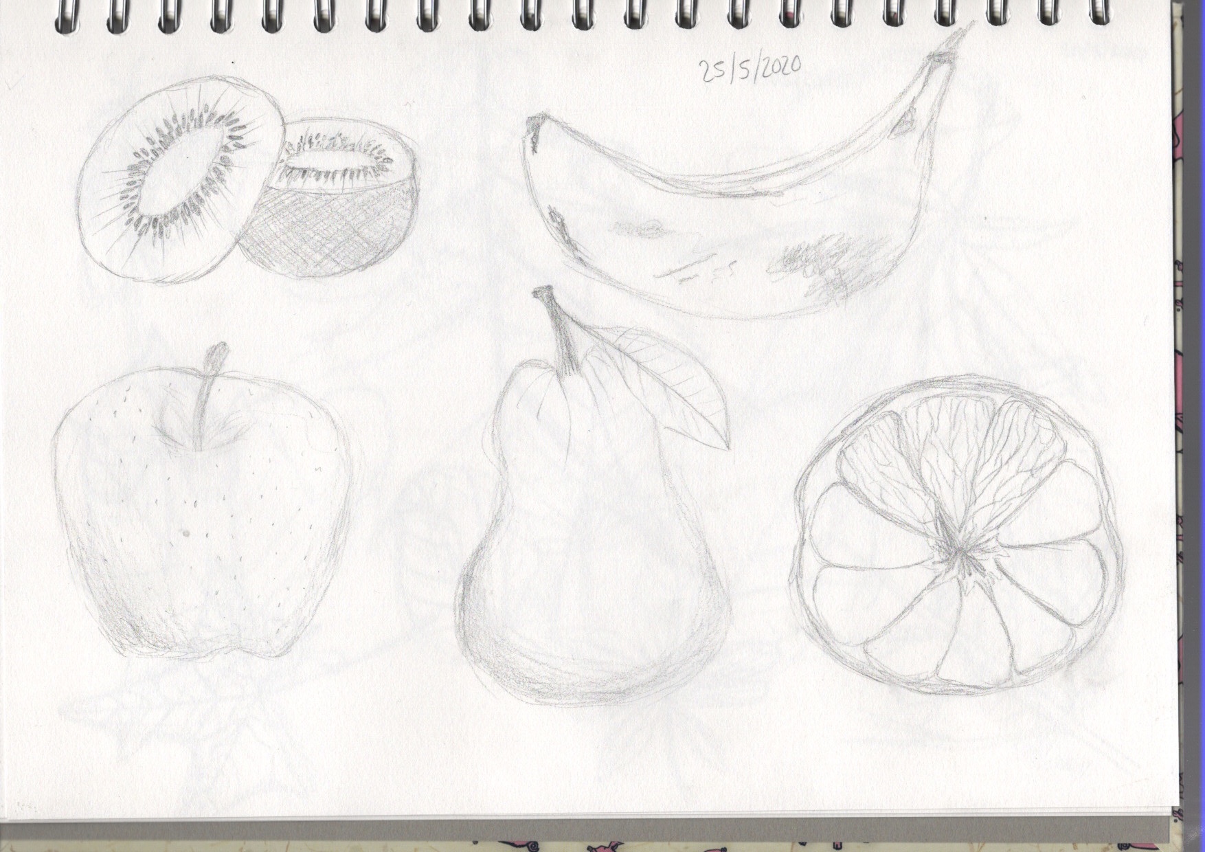
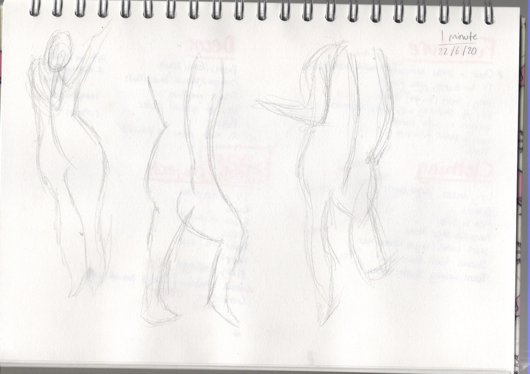
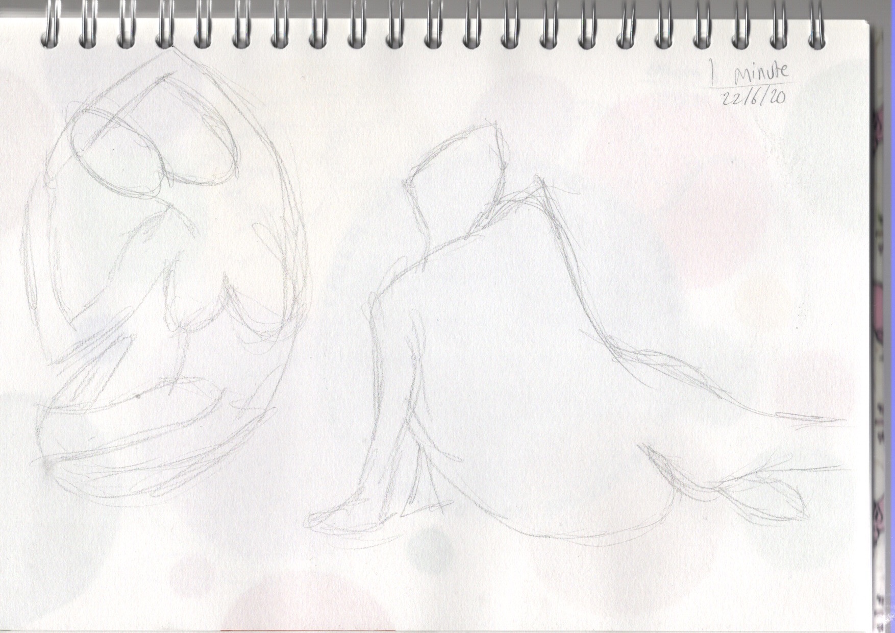
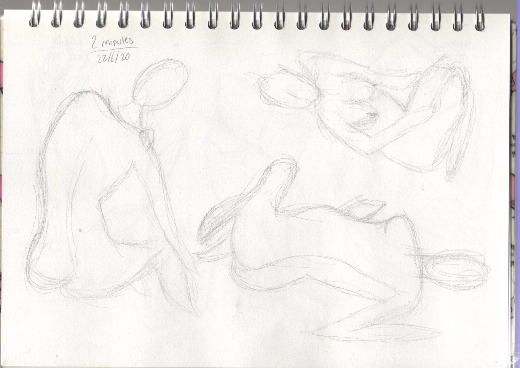
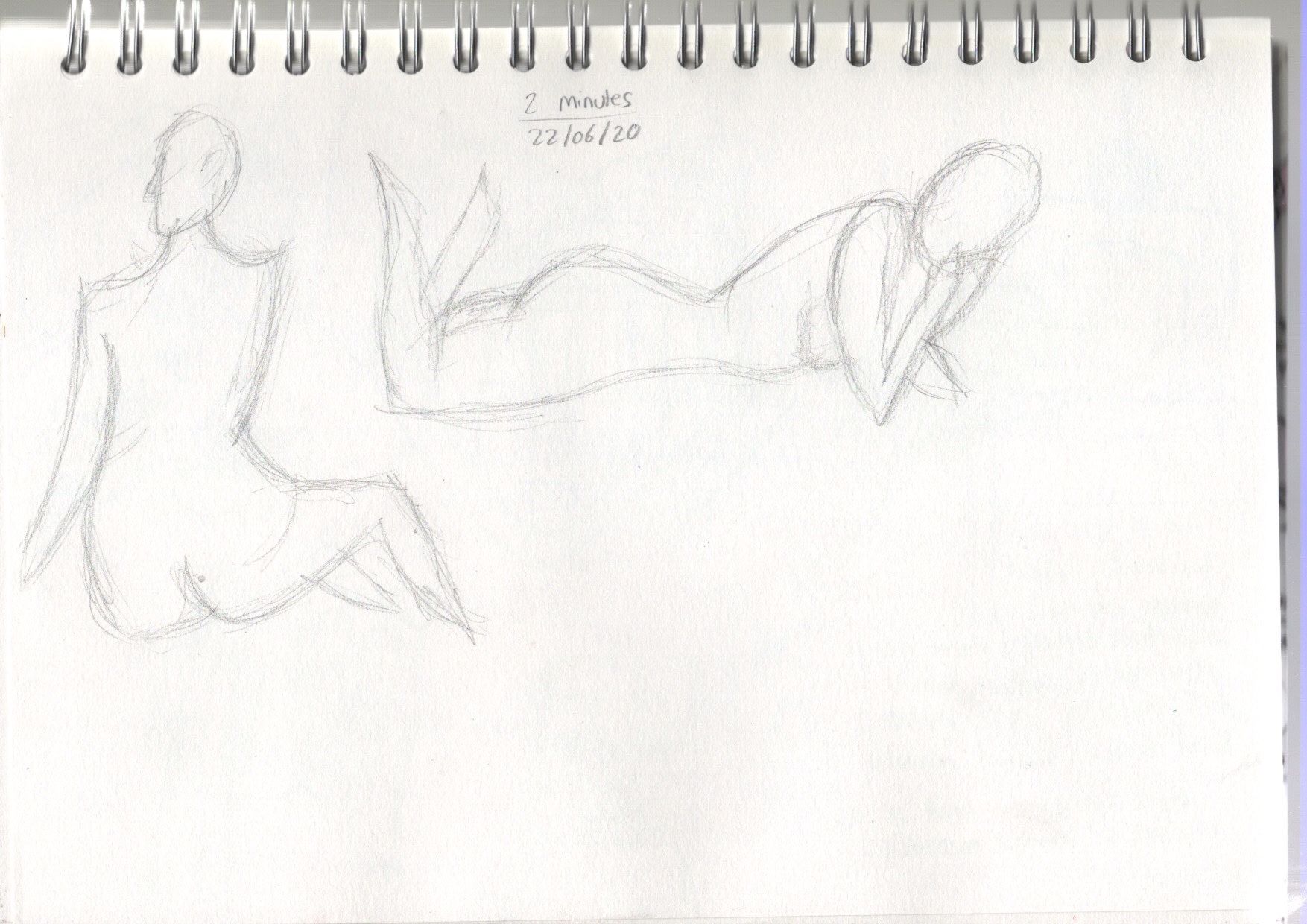
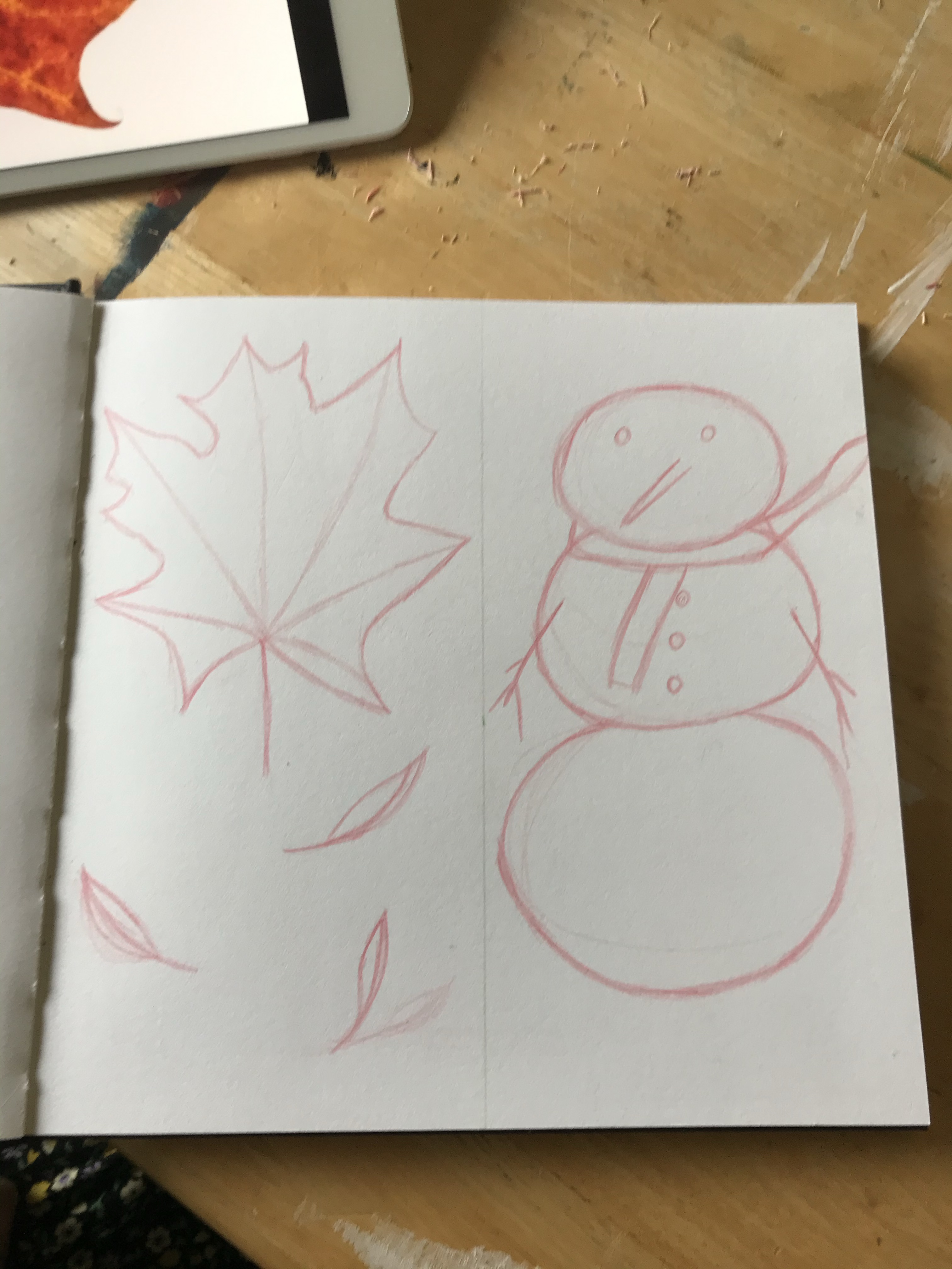
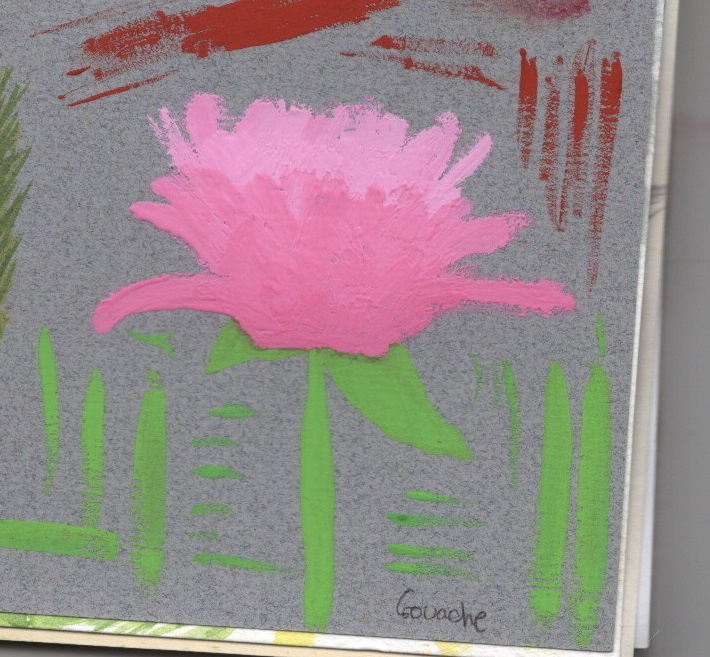
My first attempts at quick sketches
I pretty quickly gave up on them. I was focused on coursework and felt I didn’t have time to get stressed over tying to draw fast but produce something good. This changed when I began the sketchbook circle. I started researching how other people used their sketchbooks, and specifically looked at instances where people made mistakes, but still confidently shared their results. I bought two sketchbooks for myself – one for the circle, and one to take everywhere with me. I also bought some drawing pencils that were coloured, as I felt this would make me more interested in drawing. I was correct, and I found drawing so much easier with these pencils.
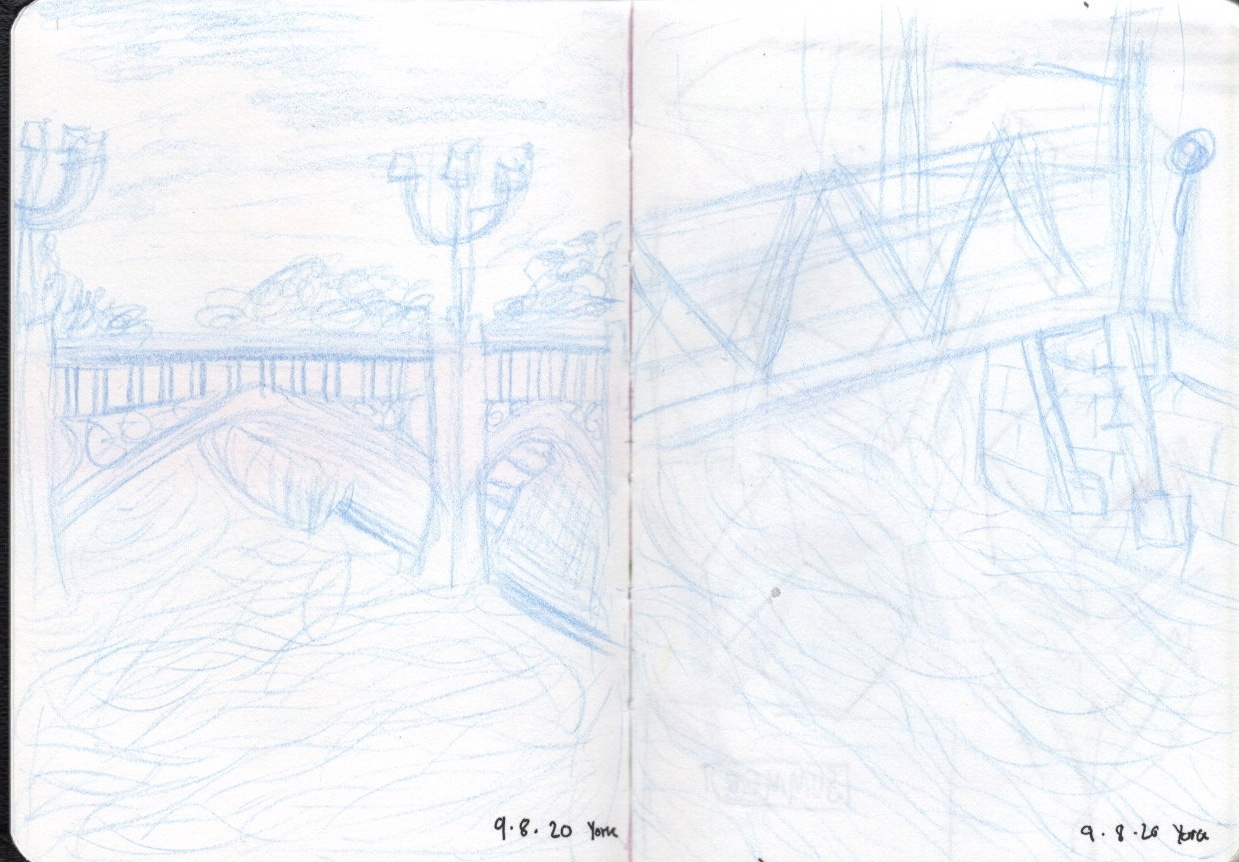
Despite my new sketchbook being intended for travel and taking out with me, I started filling it at home. I drew what I could see around me and from pictures I had taken or from ones I found online. I also used it just for doodling and drawing whilst I was paying attention to other things. I then brought it with me on a trip to York, sketching the city around me and filling it with various things. I then went back once I was home and added various things to the pages, either colour or more detail using other tools. I found a lot of freedom and joy from using this sketchbook and I’m looking forward to continuing filling it.
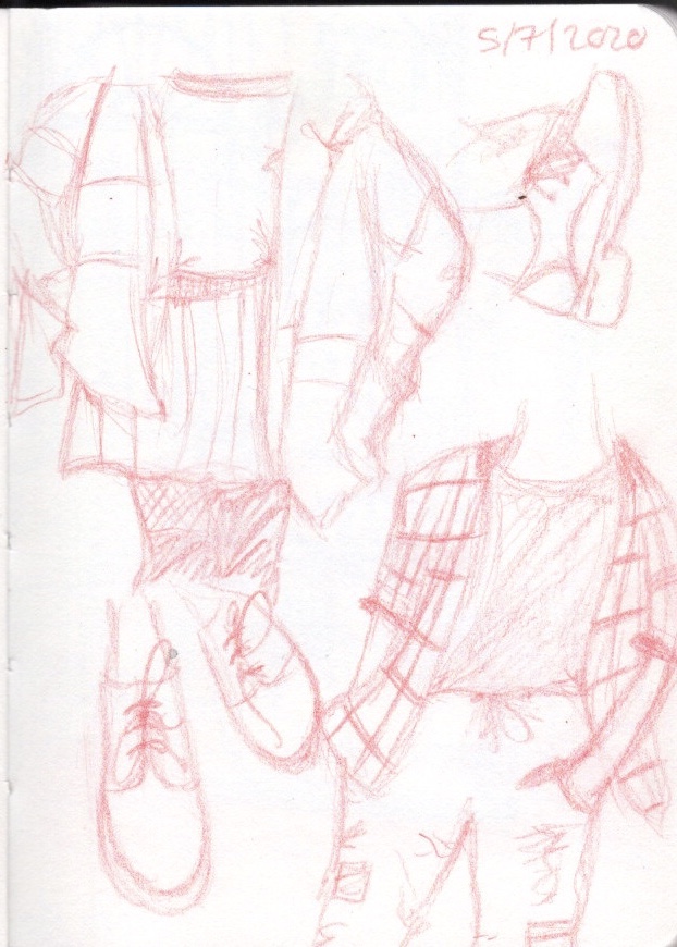
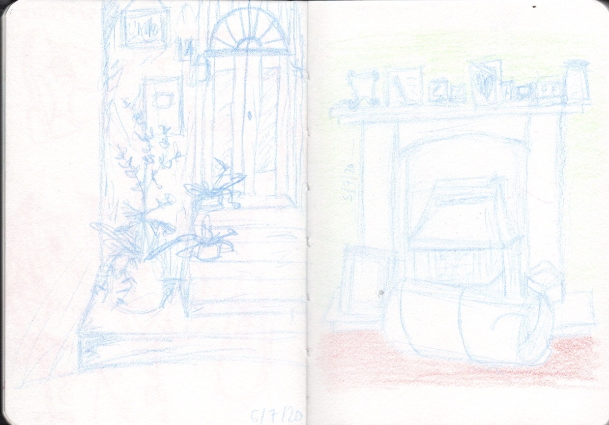
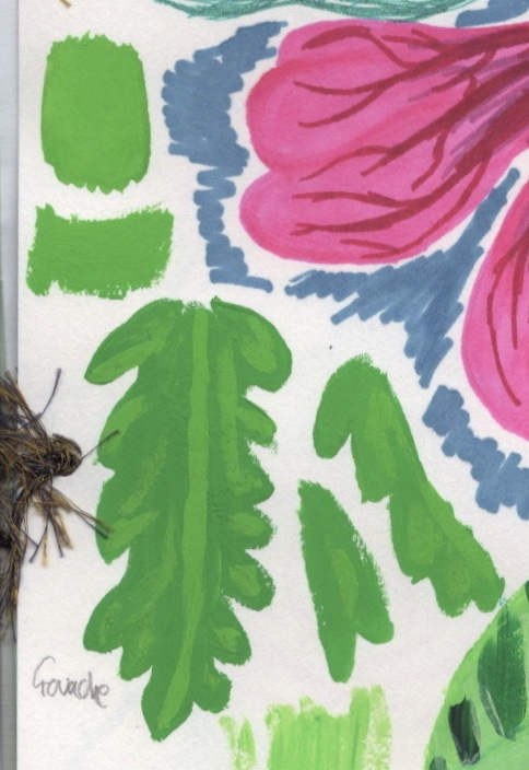
My sketchbook pages
I also watched a lot of videos on how other artists sketch and use their own books. This was very inspiring and helped me feel more confident in my mistakes. Acknowledging that sketchbooks are not meant to be perfect pieces of finished art took my drawing abilities even further. After the 50s illustration exercise, I did some quick sketches from still life drawing classes on YouTube, which really helped with my ability to draw human form. Later, when I did the choosing content illustration, I found it much easier to draw the portrait of the man.
Some still life quick sketches, focusing mainly on form
The drawing I have had to do throughout part 2 in various exercises has also aided my skills. It is no longer as daunting to begin drawing as it was when I first started, and I take a lot more time figuring out how to draw what I want to. I’m not afraid to experiment and make mistakes, as I’m learning that’s a part of the process. I also think a lot differently now when I view the world around me. I’m starting to see shapes as how they could be drawn, recognise photographs or spaces around me that would be fun to sketch, and see shadow and light in the objects I engage with. Viewing things in this way has also helped me enjoy drawing, as I actually want to document what I see.
Going forward, there are definitely more exercises I want to undertake. For a start, I would like to engage more with Drawing the Line, and do studies from it as I mentioned earlier. I also would like to make a list of all of the different drawing materials I could use in my sketchbook, and challenge myself to use them in different ways. The sketchbook exercise helped me identify which materials I would enjoy using in this way, which I appreciate. In addition, I would like to attempt some other drawing exercises, such as drawing without looking, continuous line drawings, drawing the same thing for different lengths of time, and creating drawings from random shapes on the page. Filling my sketchbook is an ongoing project that I am really looking forward to.
Overall, I would say my attitude towards drawing is now overwhelmingly positive. I can’t wait to start sketching, and always have my sketchbook and some drawing materials on me. I hope that over the course of this unit my love of drawing deepens and my ability to draw accurately, and perhaps even more freely, will increase.
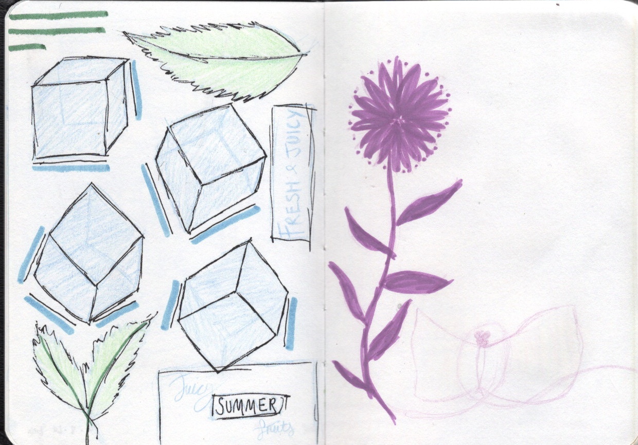
The brief for Assignment 2 asked me to ‘create images which will be used within a campaign for a supermarket, to package and promote a range of seasonal foods. The supermarket is respected for the quality of food they supply. They want to promote this notion of quality in their design and packaging. The finished images will be a ‘point of sale’ display sited in a store near to the fruit and vegetables. The final reproduction size will be 12 x12 inches. Your artwork can be same size or in scale.‘
I had to create an illustration of fruit or vegetables, one for each of two ranges: Summer and Autumn. My images were to be objective and based upon direct observation. They had to include both the produce I had selected, and aspects of the season itself. I could include any content I wanted, so long as the focus was the produce.
To start this assignment, I dissected the brief and wrote key points to focus on. I then made a list of research to undertake and various exercises I could complete to develop ideas and ensure my illustrations fitted. The final illustrations will be used as a point of sale display, but the brief also mentions they will be used for packaging too. I wanted to make sure the designs I created could seamlessly transition between the display and any packaging they would be used on.
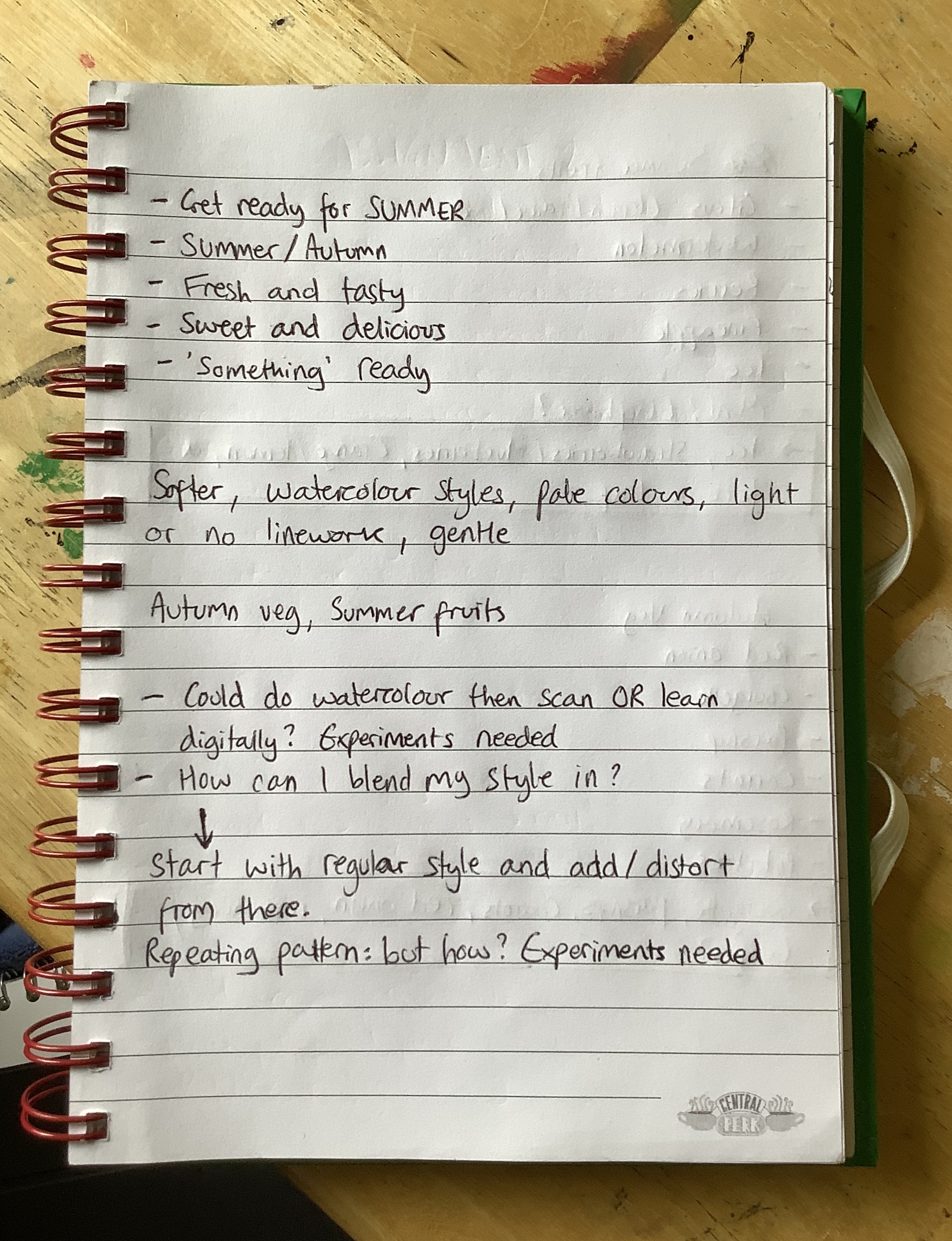
Dissecting the brief
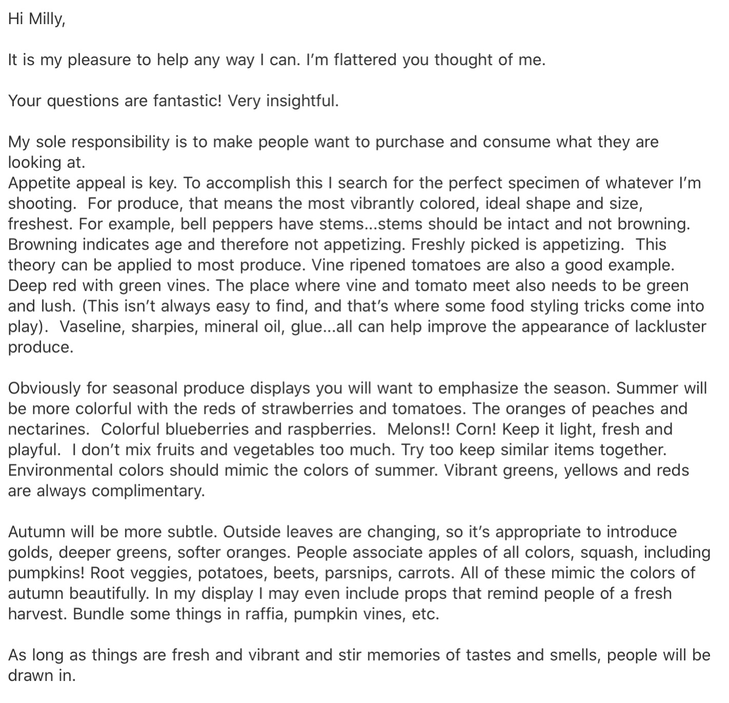
I was very focused on representing the quality of the produce I was illustrating, and ensuring my food looked appetising and edible. I wanted to find out what qualities make food look good, so I reached out to Kimberly Tabor, a food stylist at Lights Camera Food, to ask her about her process and her experiences working with clients. From our exchange, I learned that the bolder and brighter the colours, and the fresher they appear, the better. She remarked that often the food you see displayed in advertisements isn’t all that it seems, with tricks of the trade including using vaseline, super glue, and a fresh spritz of water right before photographing. I found our interaction incredibly helpful, and it informed a lot of the decisions I made later on when developing my final piece.
My response from Kimberly Tabor detailing her process as a food stylist
Whilst waiting to hear back from Kimberly, I started researching existing point of sale displays in supermarkets. Due to COVID-19, I am limited in how I can achieve this. Visiting various supermarkets is not possible, so I can only use the internet. I looked on several websites for supermarkets to see what imagery they had, and found very little. Online shopping is meant to be streamlined, so less visual clutter is generally appealing. The majority of the imagery I found was photographic, too, so it wasn’t very helpful for an illustration exercise. It did help me understand the framing of point of sale displays, however, and the importance of the text used. I also tried searching ‘point of sale displays’, but most of the image results were from other OCA learning logs, and I didn’t want to use anyone else’s work.
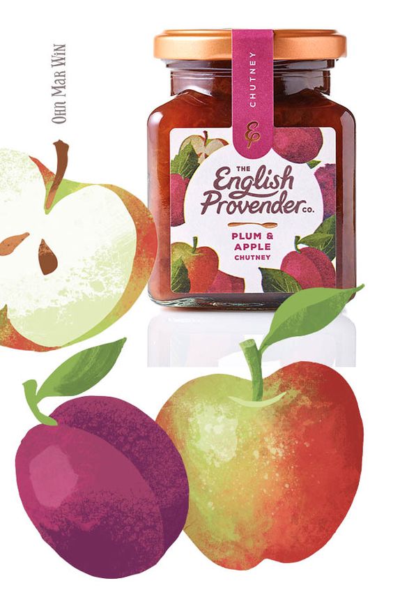
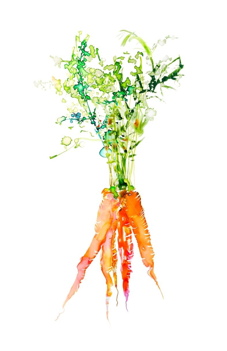
Bearing in mind that my final piece wouldn’t be solely for packaging, and would primarily function as promotion for the produce, I started researching pre-existing packaging. This was a lot easier to find examples for and it helped me find patterns in how illustrations of fruit and vegetables are typically produced. I noticed very quickly that softer styles of art are favoured, using either limited line work or purely line work, pale colours, and gentle textures. The designs are quite simple, with just 2-3 items taking centre stage, and using a fair amount of white space.
Packaging containing illustrations of fruit and vegetables
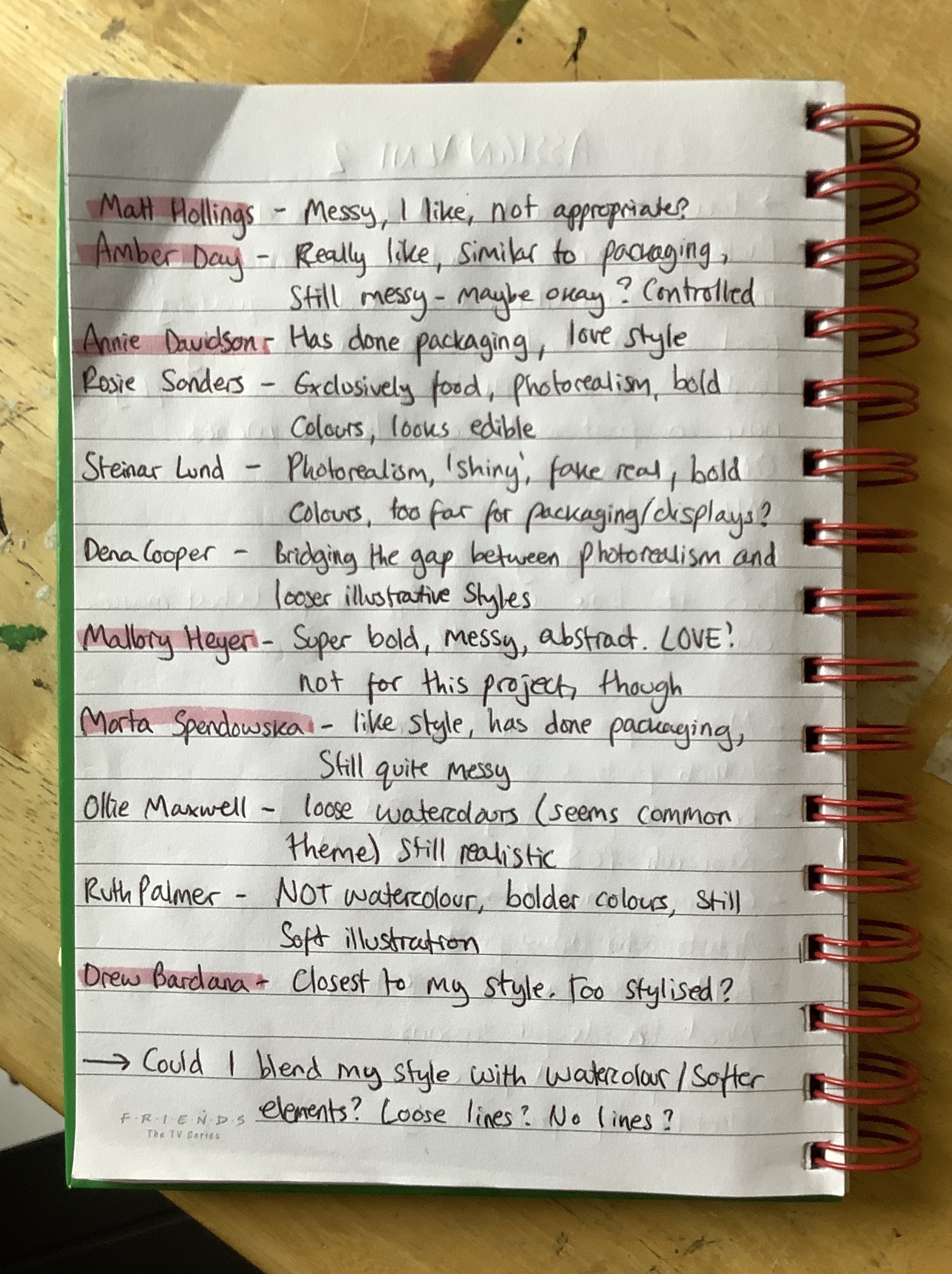
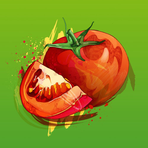
Next, I decided to research illustrators who have either designed packaging or have experience illustrating food. I felt this was important as I could see a wider range of styles and could also begin figuring out what makes food look appealing to a customer. I jotted down some notes whilst I looked through many different artist portfolios, hoping to find commonalities and begin to develop my own ideas. The content produced by these artists varied from exact photorealism to messy expressionism. Despite this, watercolour effects and softer tones were still the most common thing I found.
Notes from research
I highlighted my favourite artists – Matt Hollings, Amber Day, Annie Davidson, Mallory Heyer, Marta Spendowska, and Drew Bardana. Throughout part 2 I have learned that I really enjoy messy work, visible brush strokes, and obvious textures. Hollings, Day, Heyer, and Spendowska all depicted this in their art styles. Hollings’ and Heyer’s work however did not seem appropriate for this exercise. I felt Hollings’ illustrations lost the ‘appetising and fresh’ look I was trying to aim for, and Heyer’s work was too abstract and subjective. Day and Spendowska have art styles similar to those I found when researching packaging, and their work is still loose and messy.
Illustrations by Matt Hollings (top left), Mallory Heyer (top right), Marta Spendowska (bottom left), and Amber Day (bottom right)
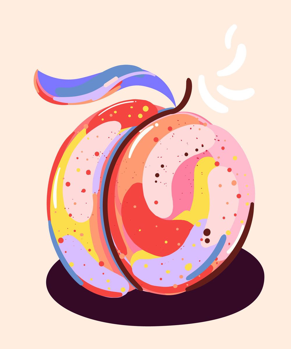
Whilst researching, I was very conscious that ‘light, soft, and gentle’ is not my typical go-to illustration style. I was thinking a lot about how I could combine my stylised, bold illustrations with the delicate style so commonly used. I then found Drew Bardana, who’s work I feel is closest to mine, with exaggerated shapes and simple colours. I see my own style in his usage of texture and layering. Seeing this made me think maybe my style would work just fine. However, with the overwhelming amount of watercolour-esque style in this area, I did want to try to merge the two.
Illustrations by Drew Bardana
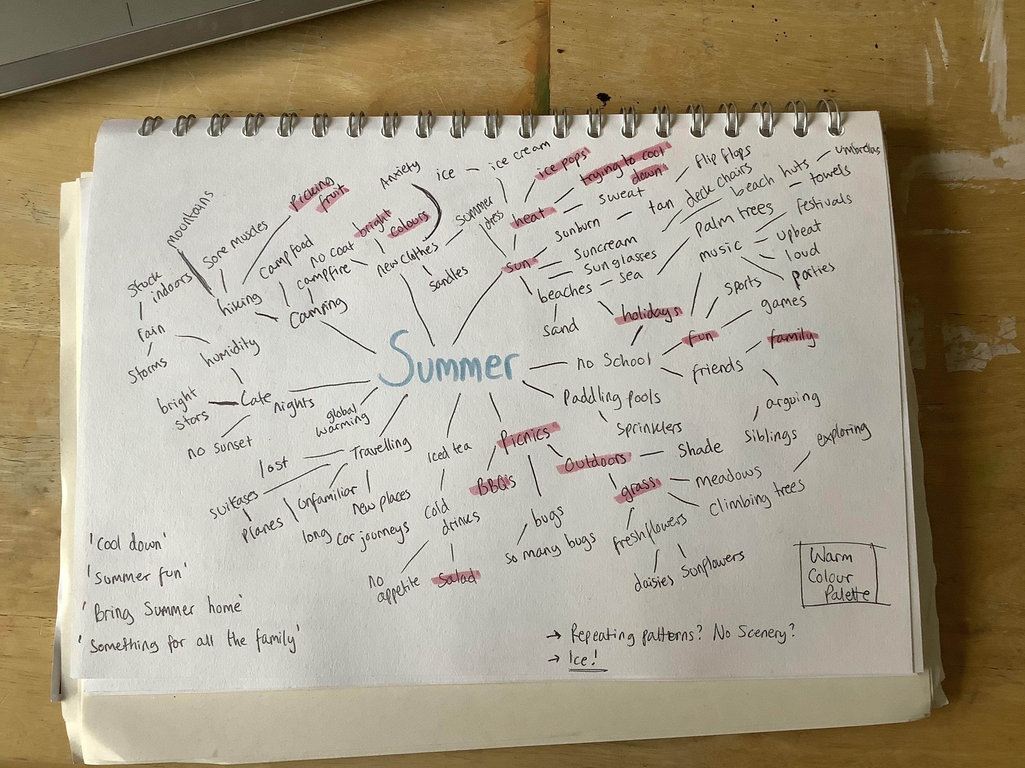
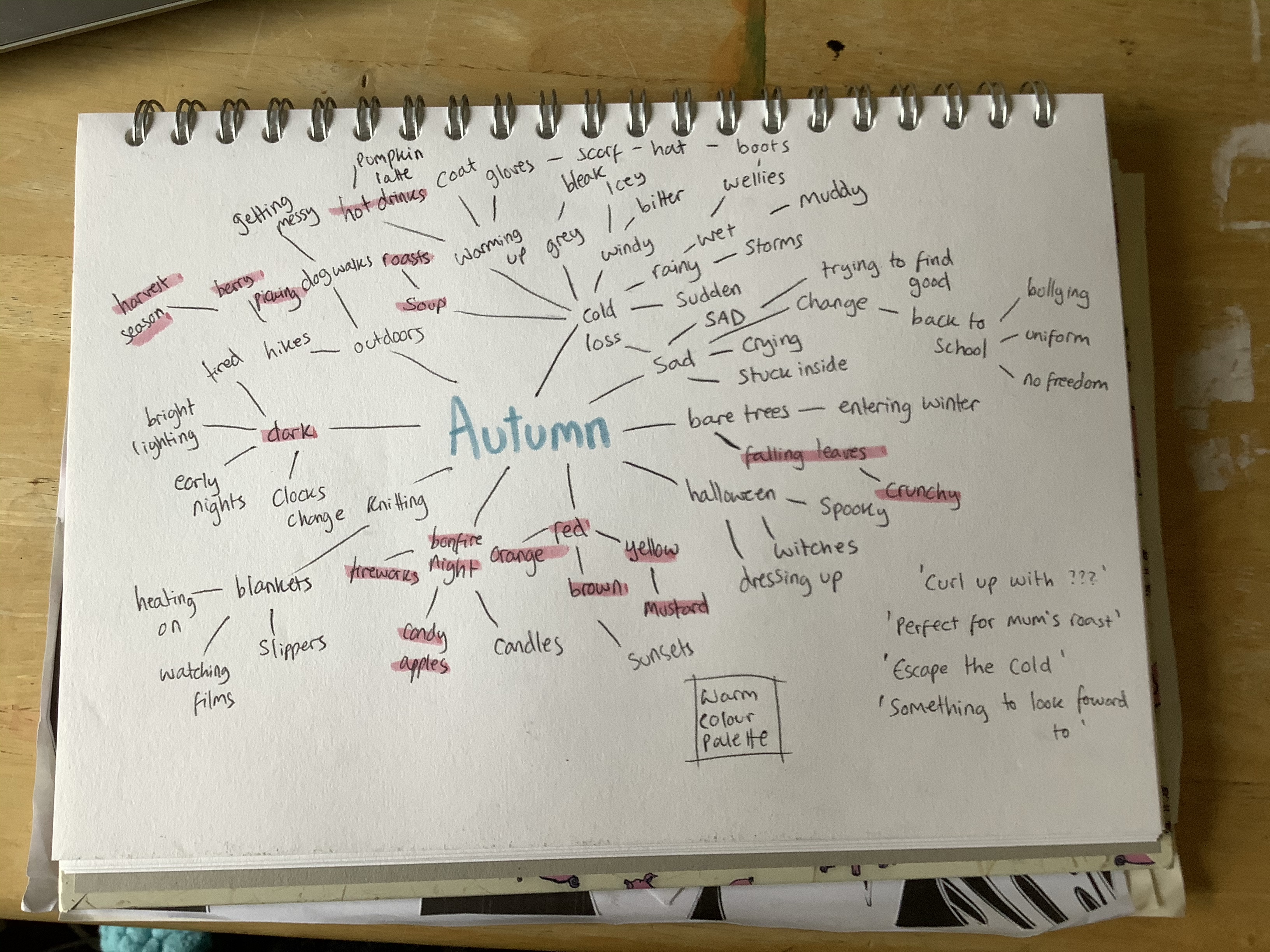
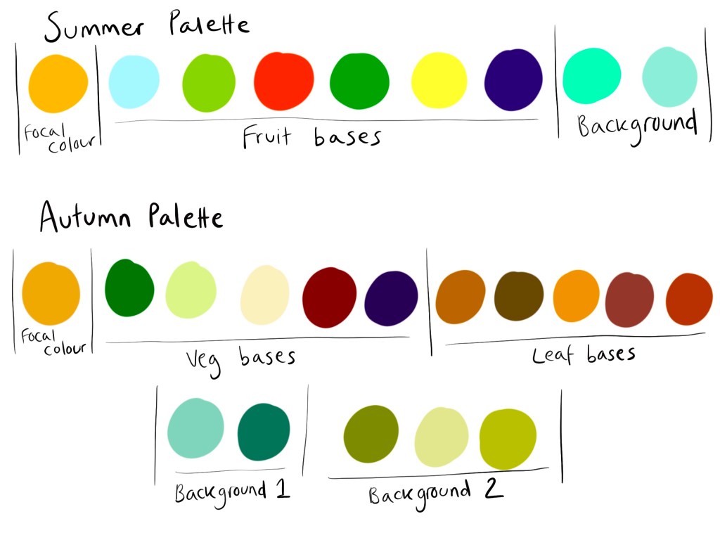
Keeping this in mind, my next step was to begin mind mapping and choosing content for my illustrations. I started with mind maps for both summer and autumn, writing any word that came to mind even if it seemed too far fetched for this assignment. I then highlighted the words that jumped out at me and related best to the brief, avoiding things that were negative or overly complex. Then I took some notes on ideas I was having, and colour palettes I had in mind. I wanted both pieces to use warm colour palettes as I felt these are the most inviting and appealing. Summer would be bright, and autumn would be muted, but both would be bold.
Mind maps for the seasons
Throughout my researching process, I had already jotted down some notes on ideas – some phrases I could incorporate into my designs, the word ‘herbs’ as I had seen them in several illustrations and thought they would be a great addition, and some notes on how I could blend my style with the one most frequently used in the illustrations I had researched. I considered doing watercolour illustrations of produce and then scanning them and altering them digitally, but ruled this out pretty quick as I have very limited experience with the medium and I wanted to avoid muddying my colours. I decided to undergo some experimentation digitally with brushes, textures, and layering, beginning with an illustration just like any of my others, and slowly transforming it into a mix of the two styles.
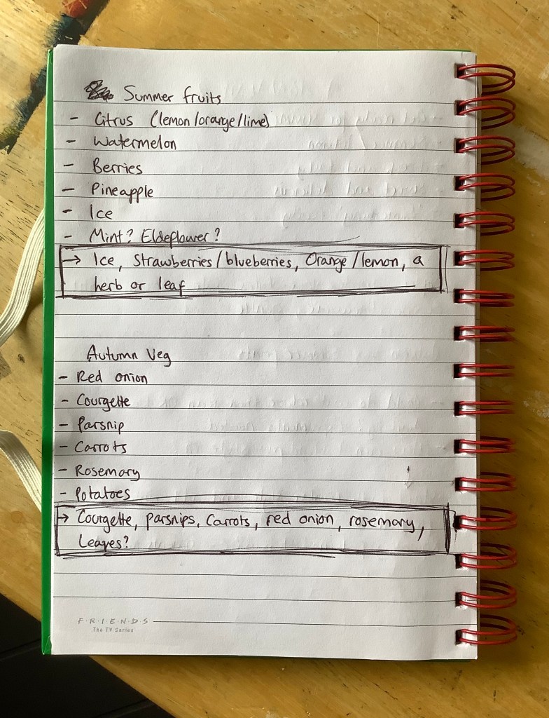
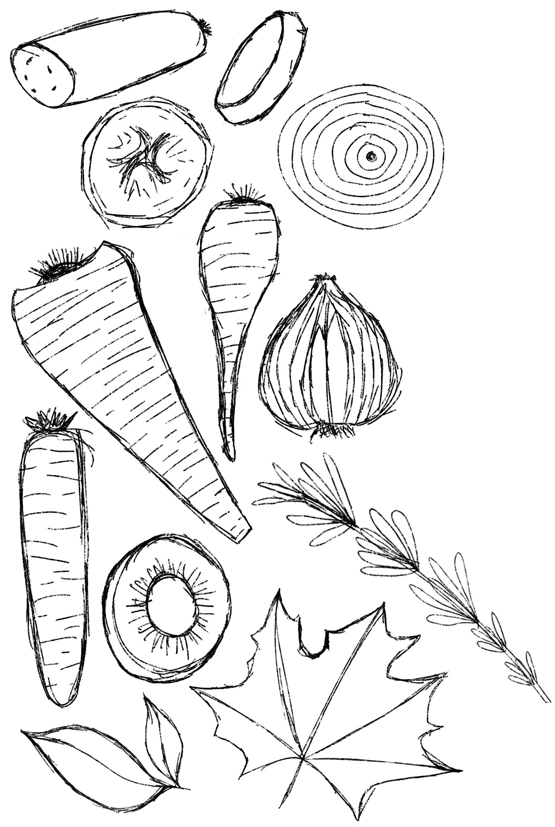
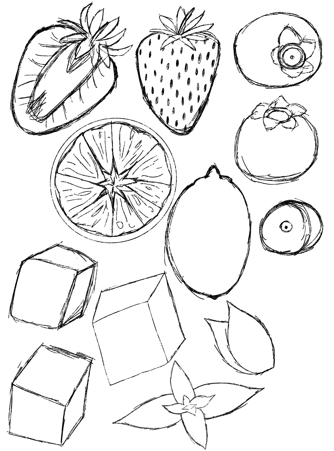
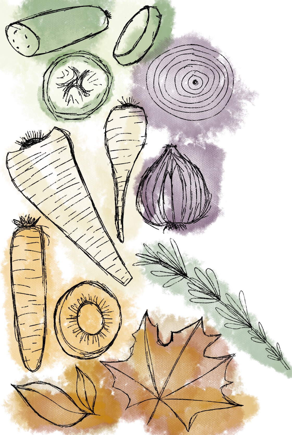
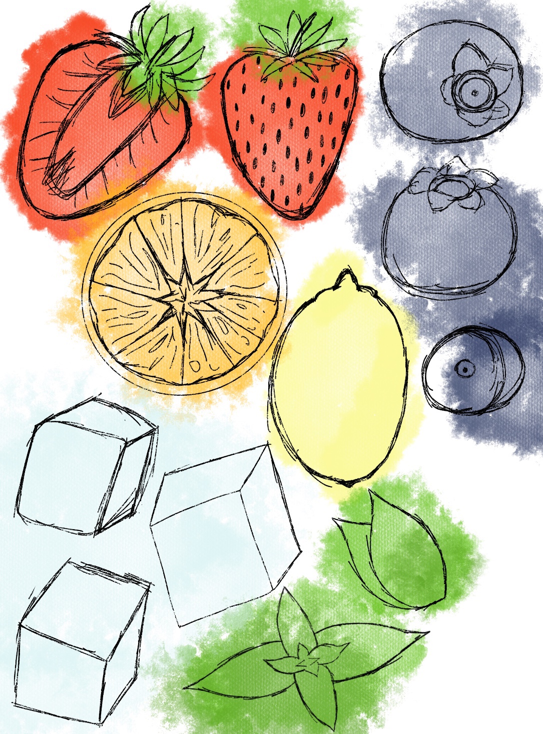
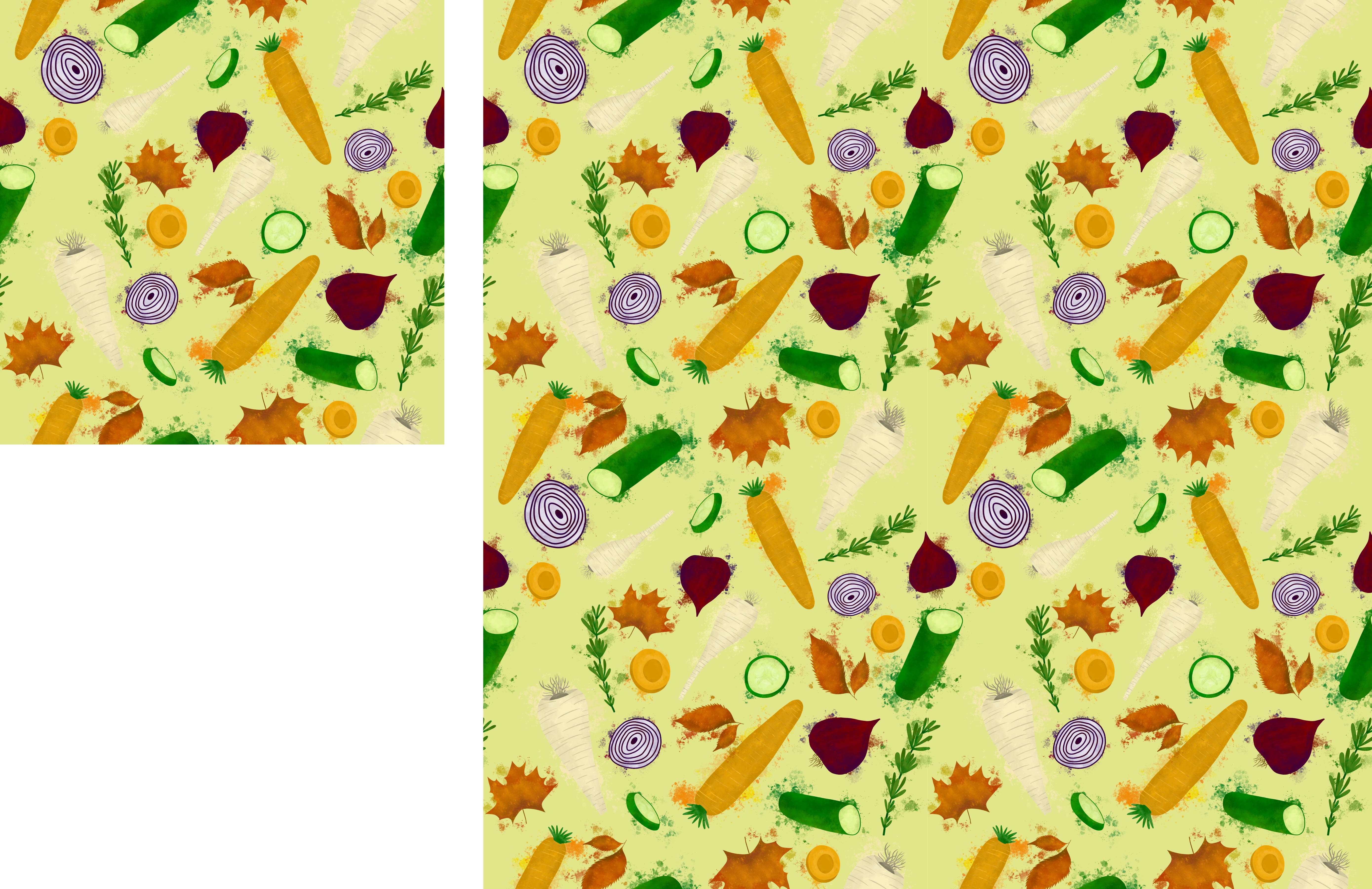
By this point I knew I wanted to end up with a seamless repeating pattern as my final piece, as that seemed like a great illustration to use for both packaging and a point of sale display. I saw it frequently when researching, and I feel it matches my style well. I needed to choose what elements to include in the pattern, so I began listing fruits and vegetables. I felt ‘summer’ was more of a fruit season, and ‘autumn’ more of a vegetable one, and I decided to pick one herb for each season, and one element that represented the season specifically.
Notes on choosing content
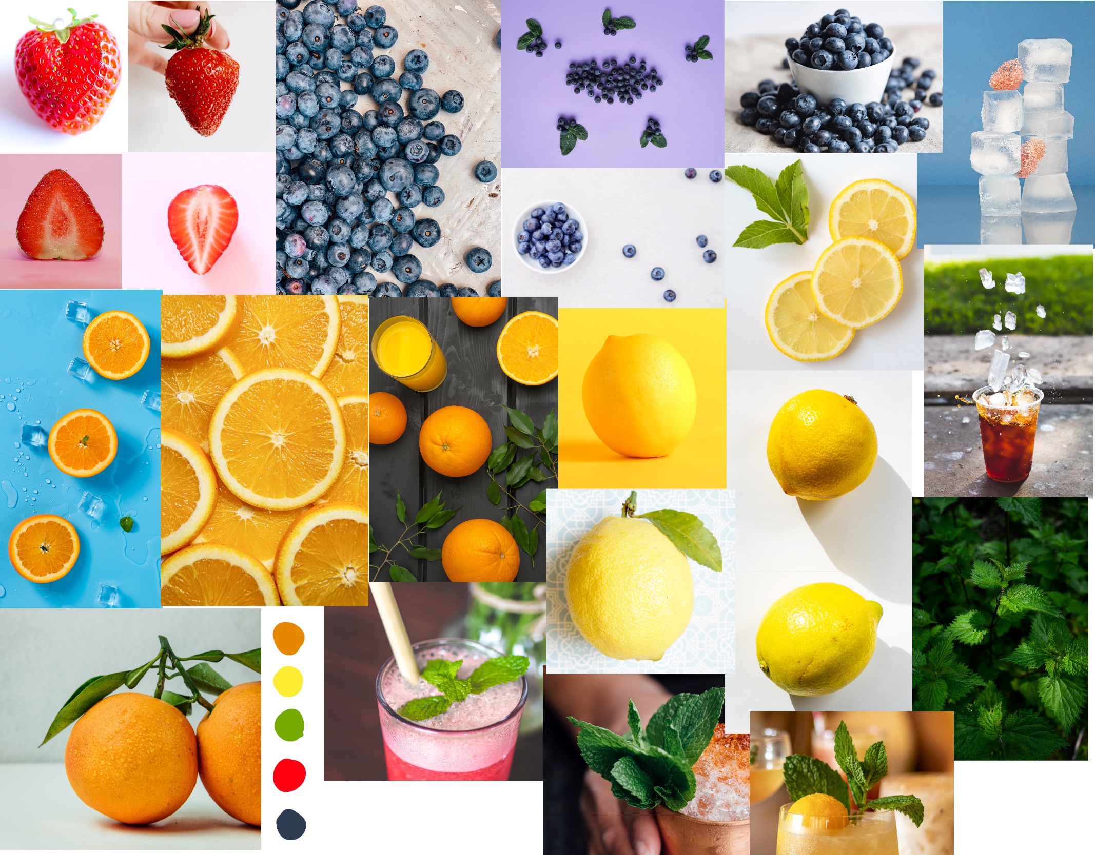
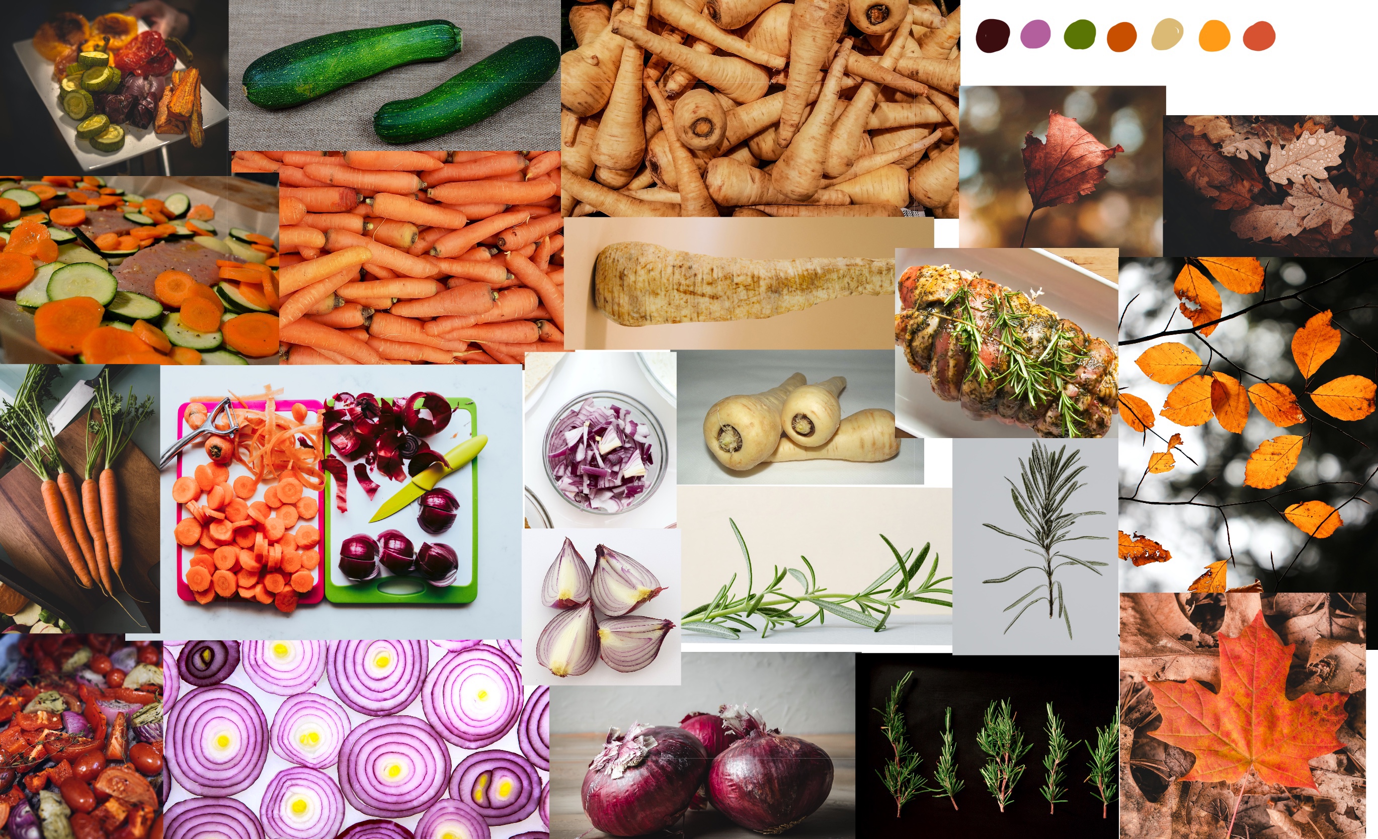
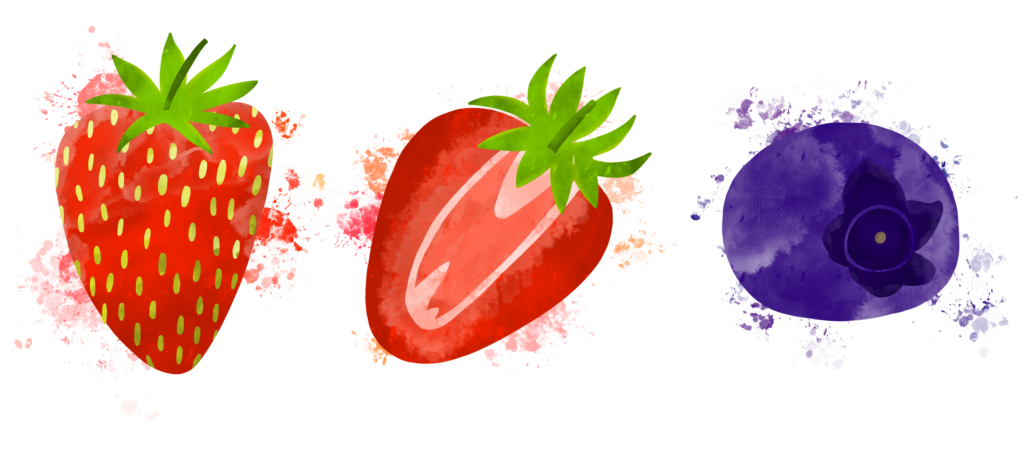
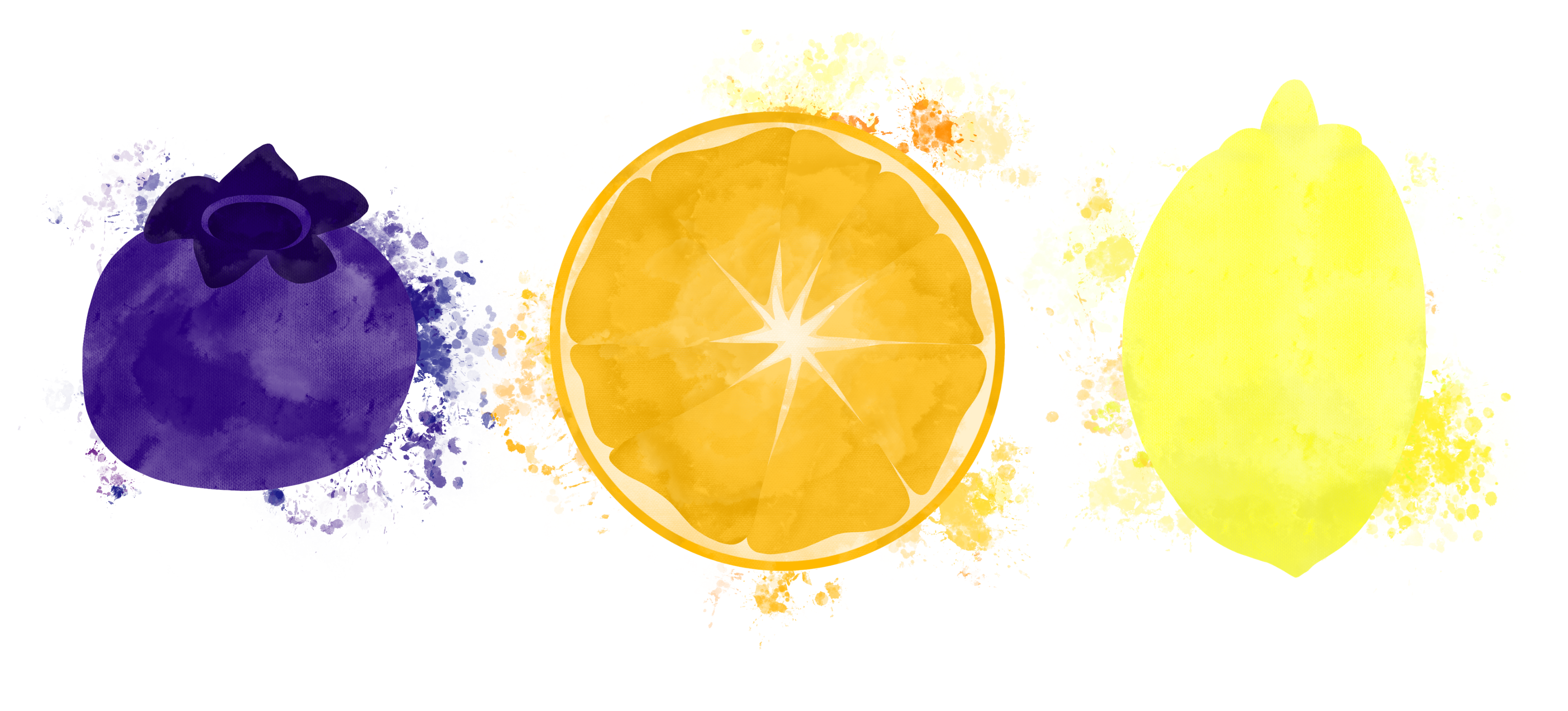
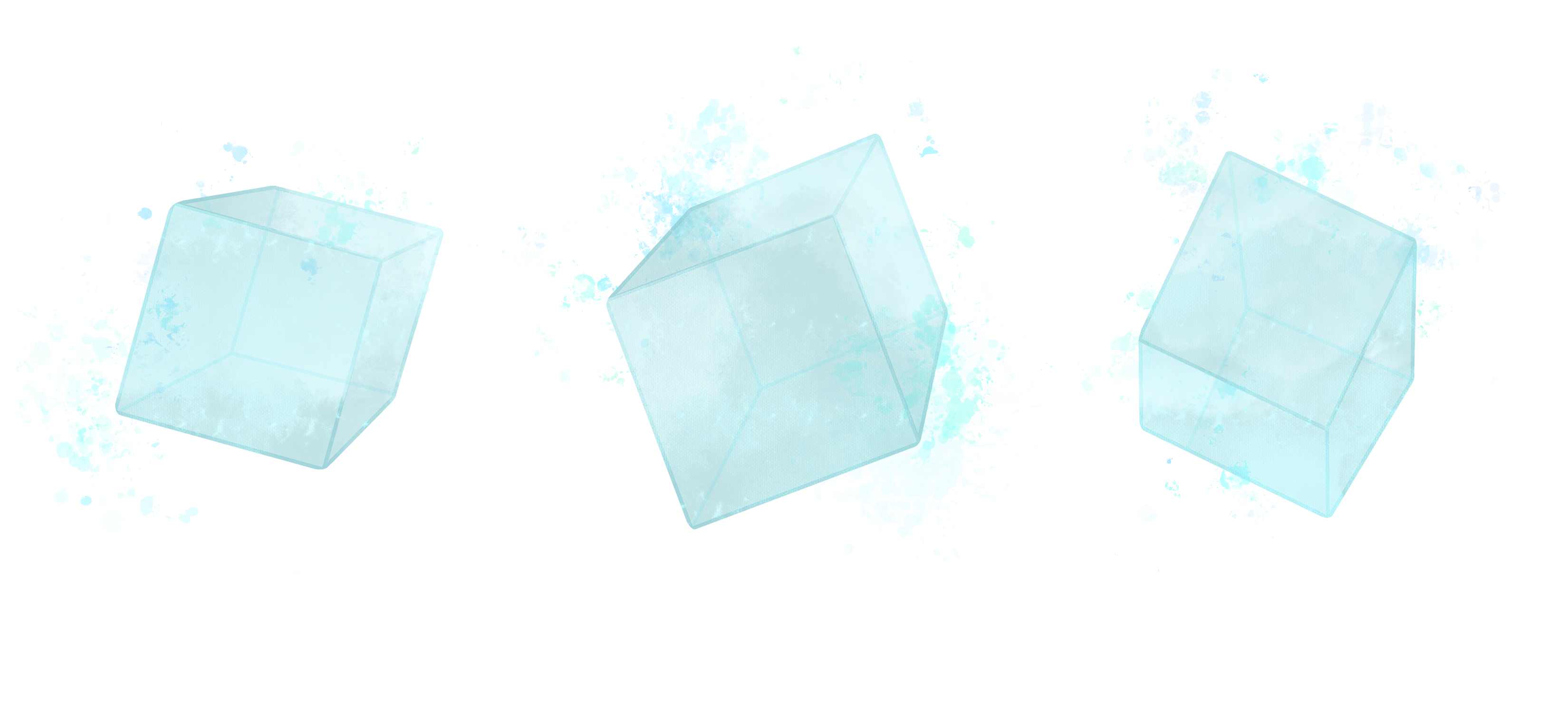
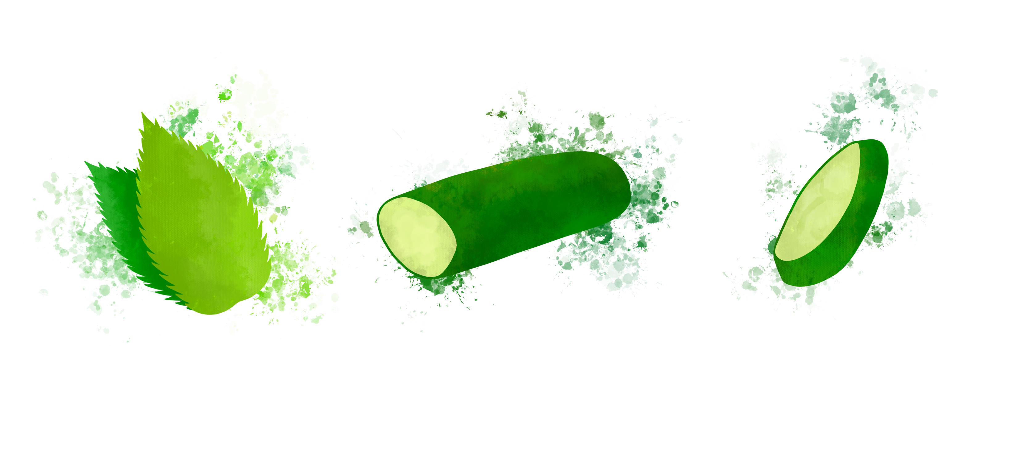
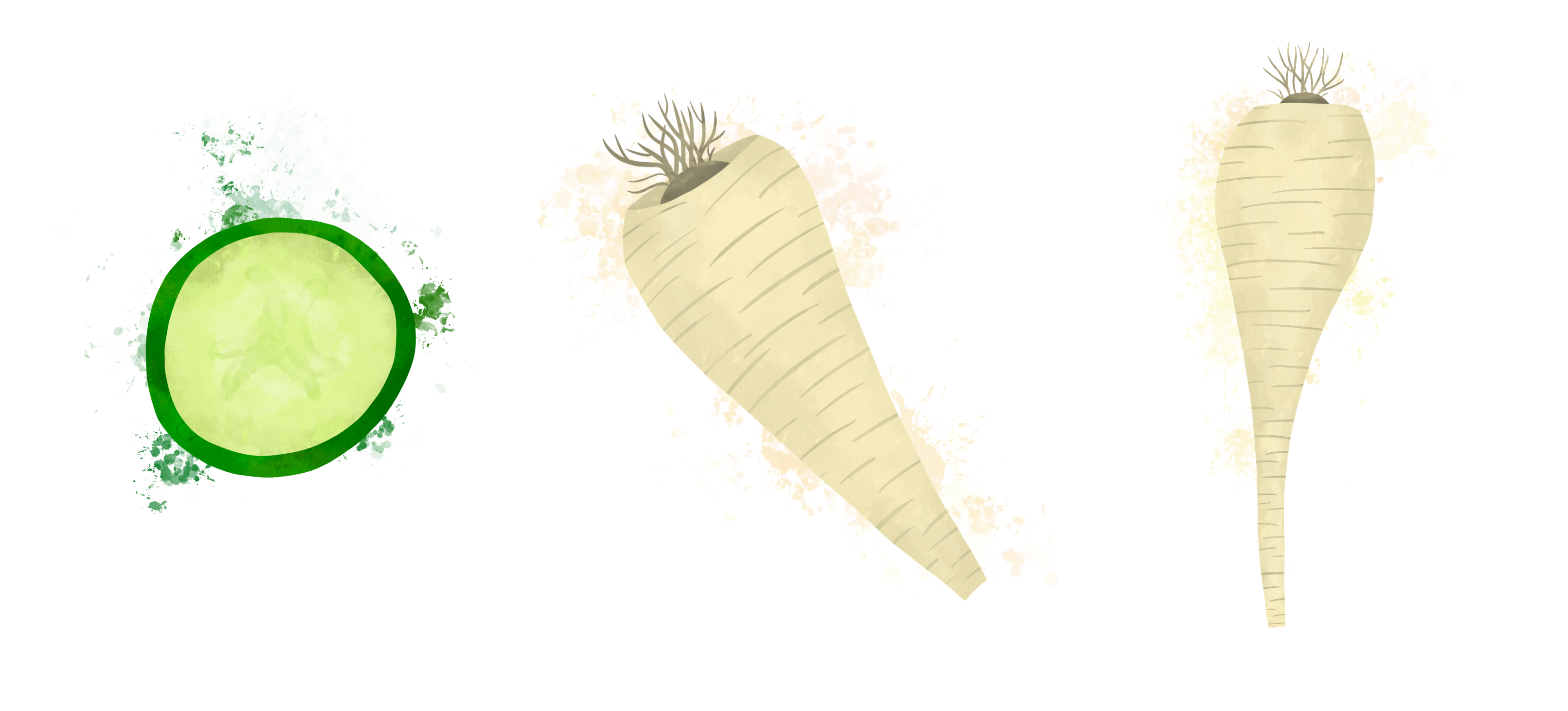
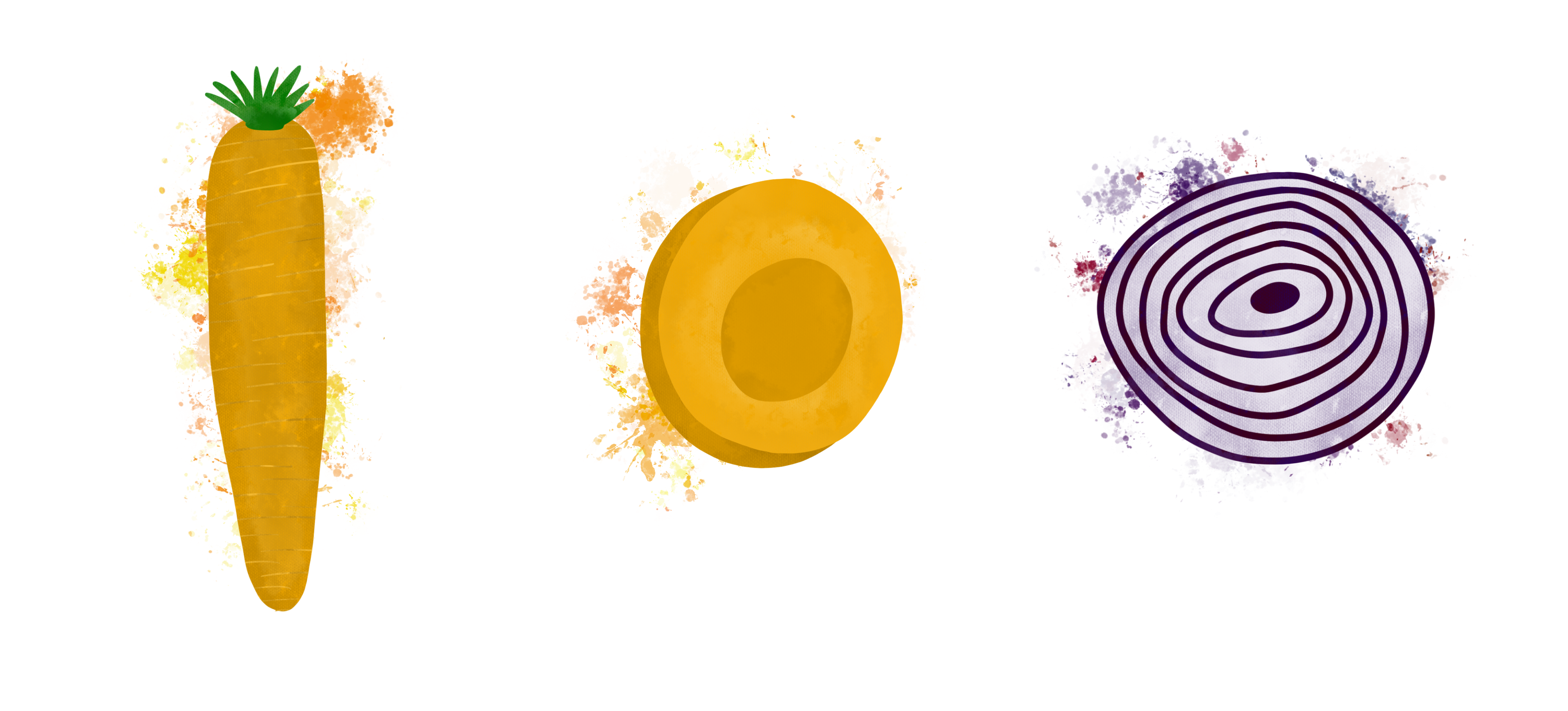
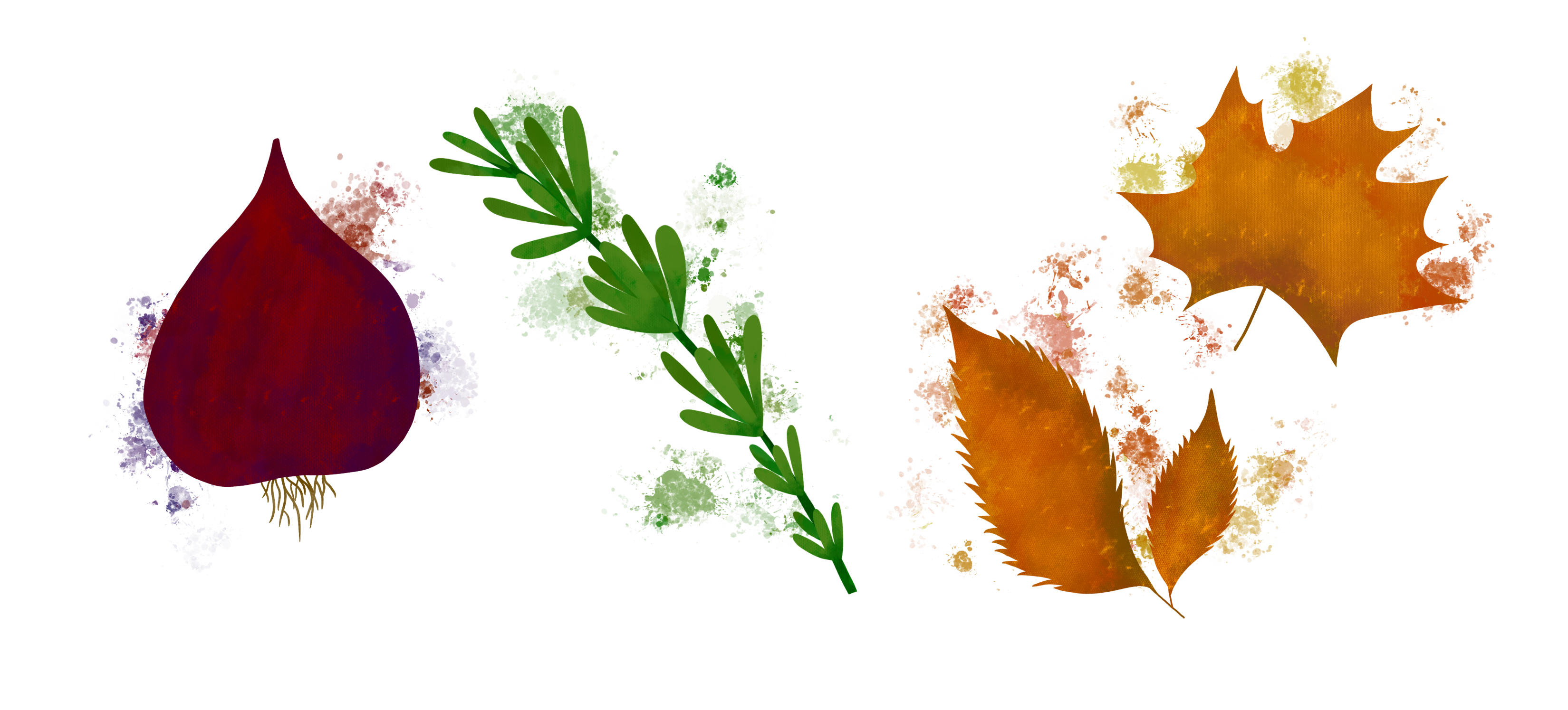
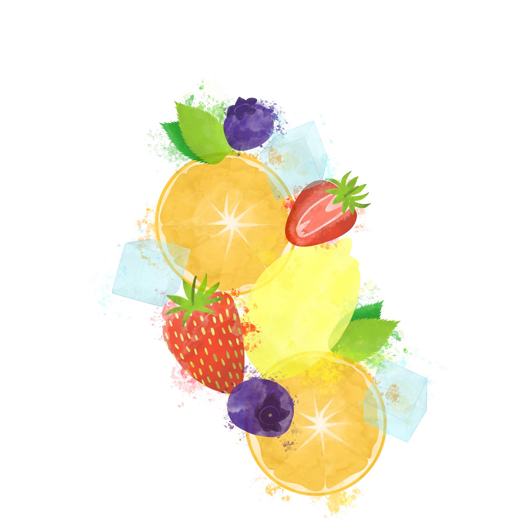
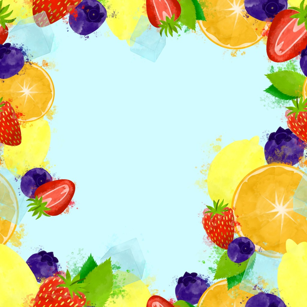
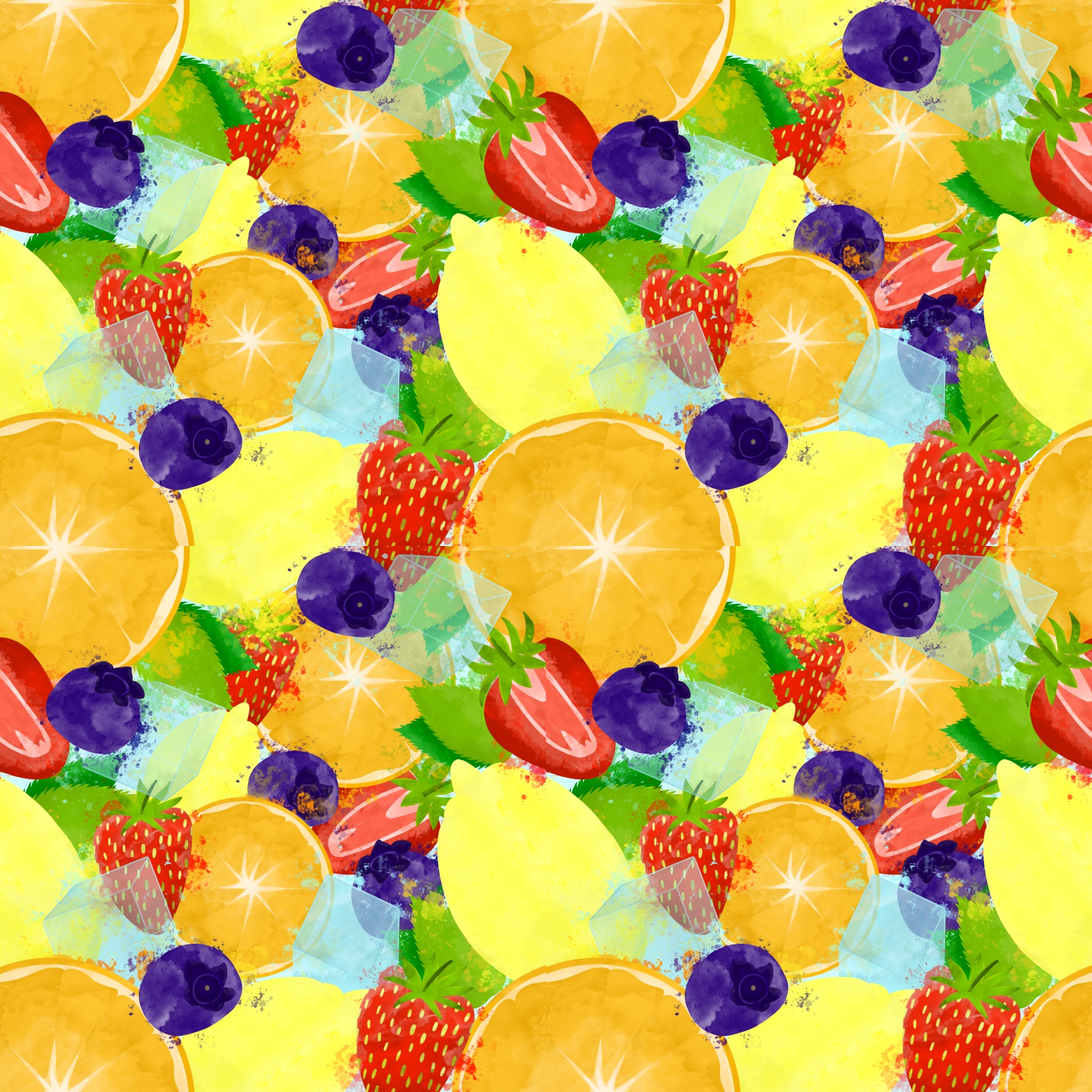
For summer I chose strawberries, blueberries, oranges, lemons, a sprig of mint, and ice cubes. For autumn I chose courgette, parsnips, carrots, red onion, rosemary, and fallen leaves. I was cautious to make sure I wasn’t picking too many different elements, and that there would be colours that complemented each other without overwhelming the piece. For example, for autumn I opted for red onions over potatoes as the deep purple from the onions would fit nicely in the spread.
I wanted to do a quick mood board for referencing, one for each piece, consisting of the elements chosen to illustrate. I intended on using this to pick colours for a colour palette, and to reference later when doing my initial sketches. Whilst collecting content for my mood boards, I realised I didn’t know whether to draw my fruit and vegetable elements as whole or as segments. I made sure to include imagery of both where possible so I could decide later whilst sketching.
Mood boards for each season
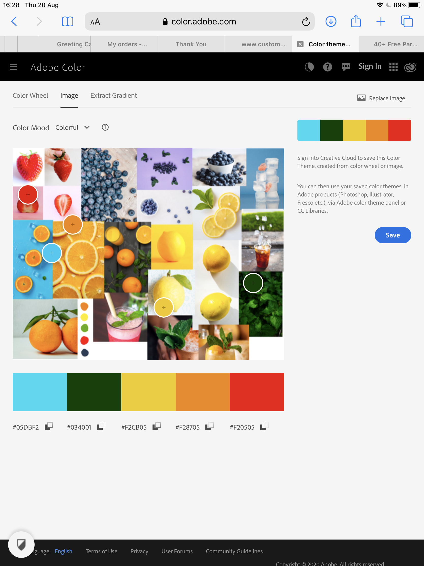
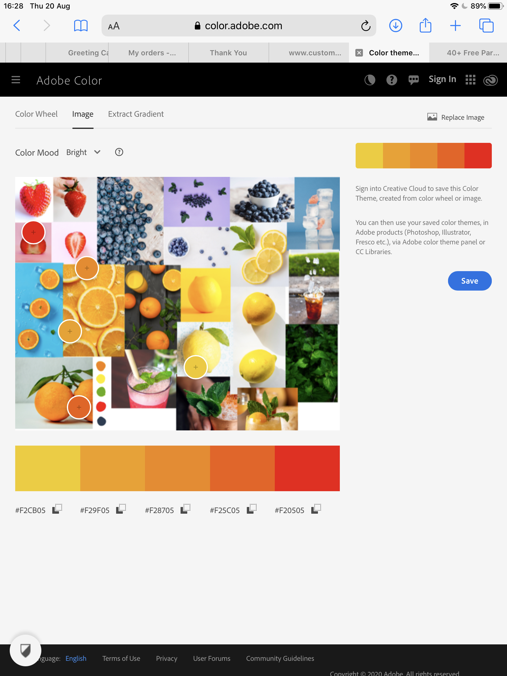
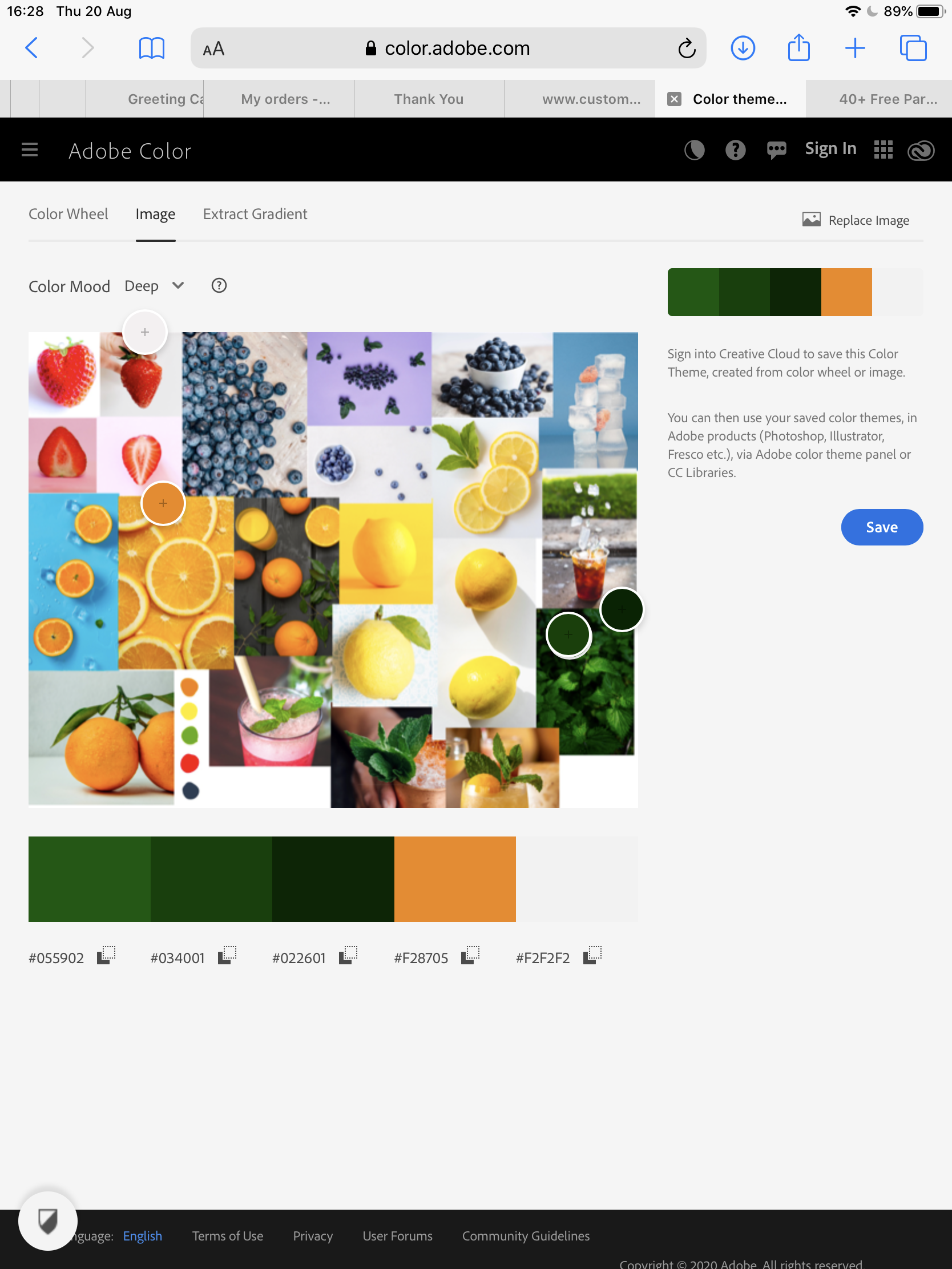
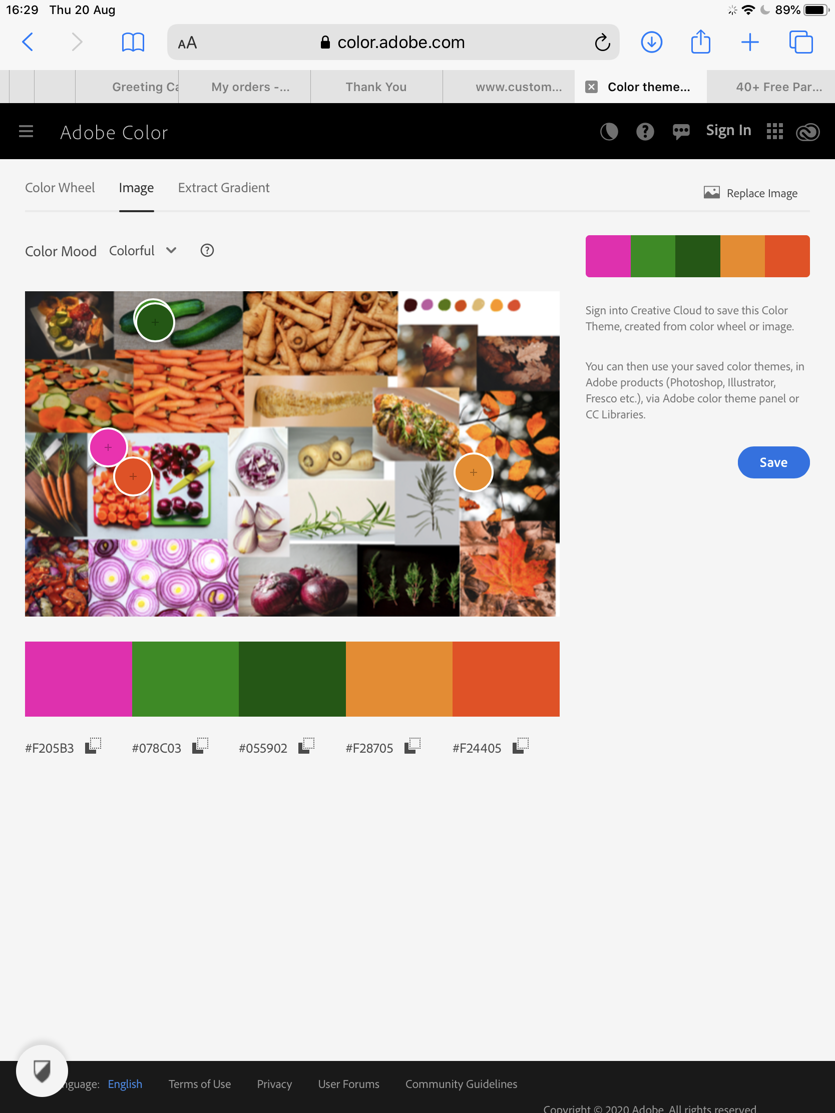
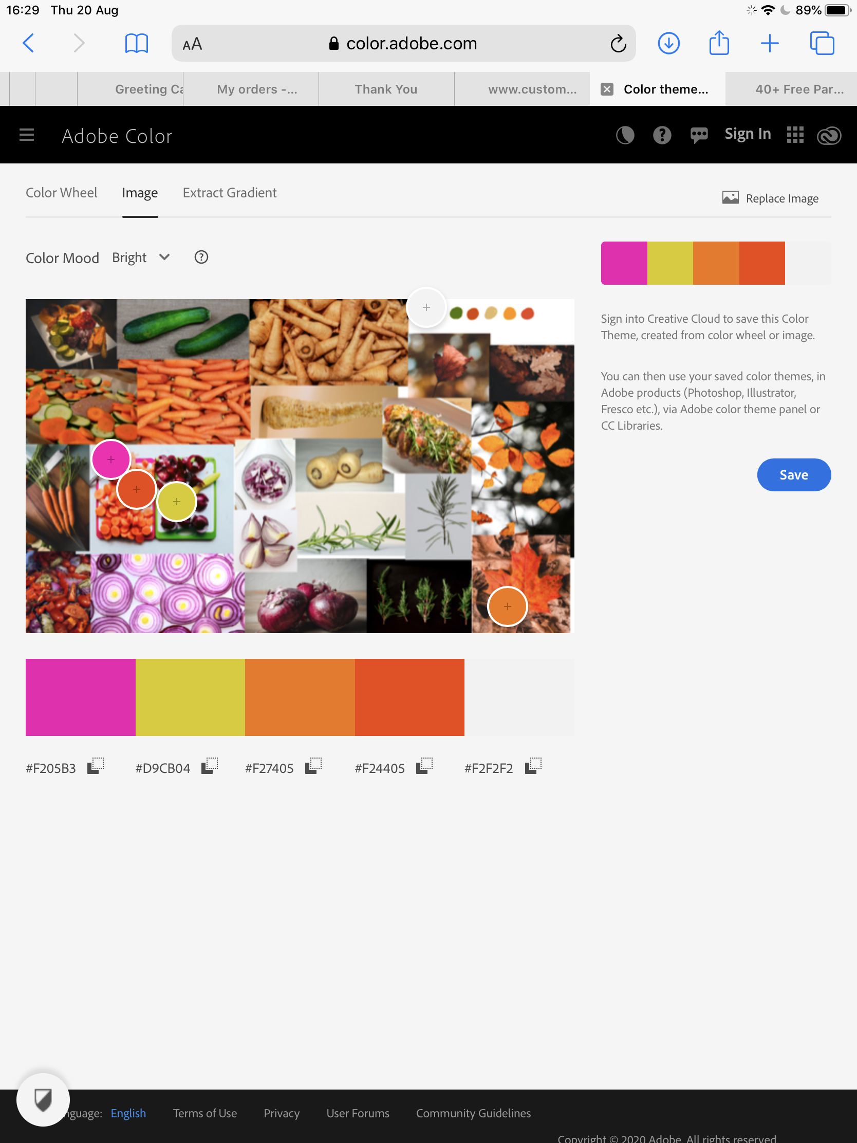
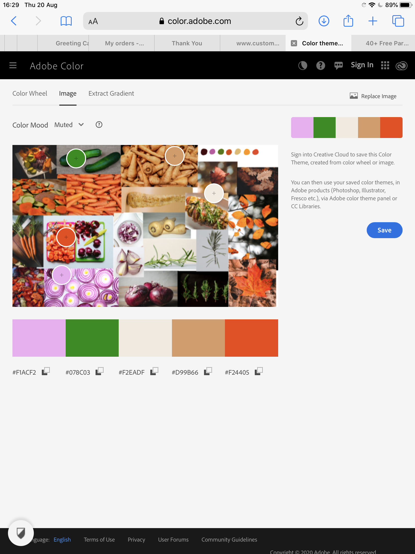
Once my mood boards were completed, I swatched a few colours from each and added them. I then used Adobe Color to try to pick some colour palettes to build from. This didn’t work so well, as the app was picking out colours from the backgrounds of individual images in my mood boards. I decided to rethink my approach and pick a central colour for each piece to build around. As both pieces would contain orange elements I decided to use this as my base colour, which I thought worked especially well as a ‘summer’ orange and an ‘autumn’ orange are both very different. I then picked harmonious base colours for my elements and potential background colours, remembering the advice Kimberly had given me around what colours are least appealing.
Screenshots from Adobe ColorFinal colour palette choicesBrush swatches
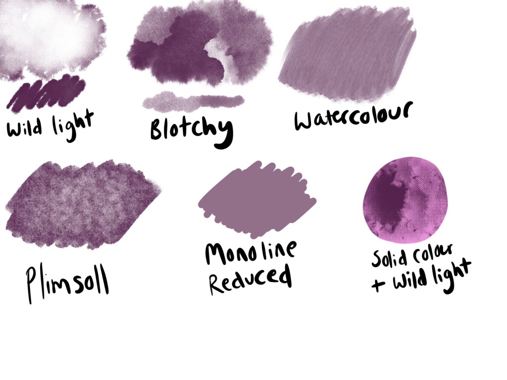
I also decided to do another swatch sheet of texture brushes, like I did in Exercise 12, as I found it really useful to have something to reference whilst I worked. This also meant I could experiment a little with how the brushes performed, and have a rough idea of how I was going to use them going forward. I then began roughly sketching out each element of my final designs, testing the angles they would be placed at, and trying to figure out how much to include. I also used this as an opportunity to experiment with sliced and whole produce, trying to ensure the elements would be recognisable but still flow nicely together. Once I was settled on some final sketch designs, I put them together in a single document, and added some rough colour swatches in the background for fun.
Final rough sketches with and without colour
I decided to have a mix of whole and dissected produce in each of my designs. I thought the variation in elements would give more visual interest, and some produce leaned more naturally to being sliced. I still didn’t have a plan for exactly how my elements would fit together, or how I would incorporate text, but my focus for now was on ensuring the elements looked fresh, appetising, and fitted the softer vibe that was found in my research.
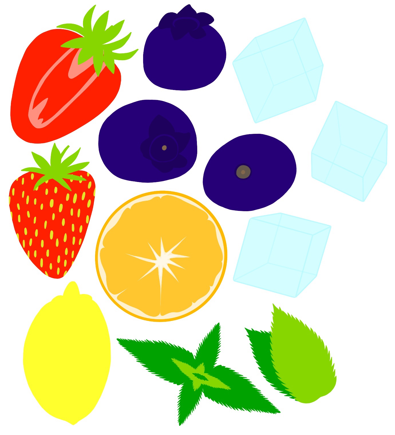
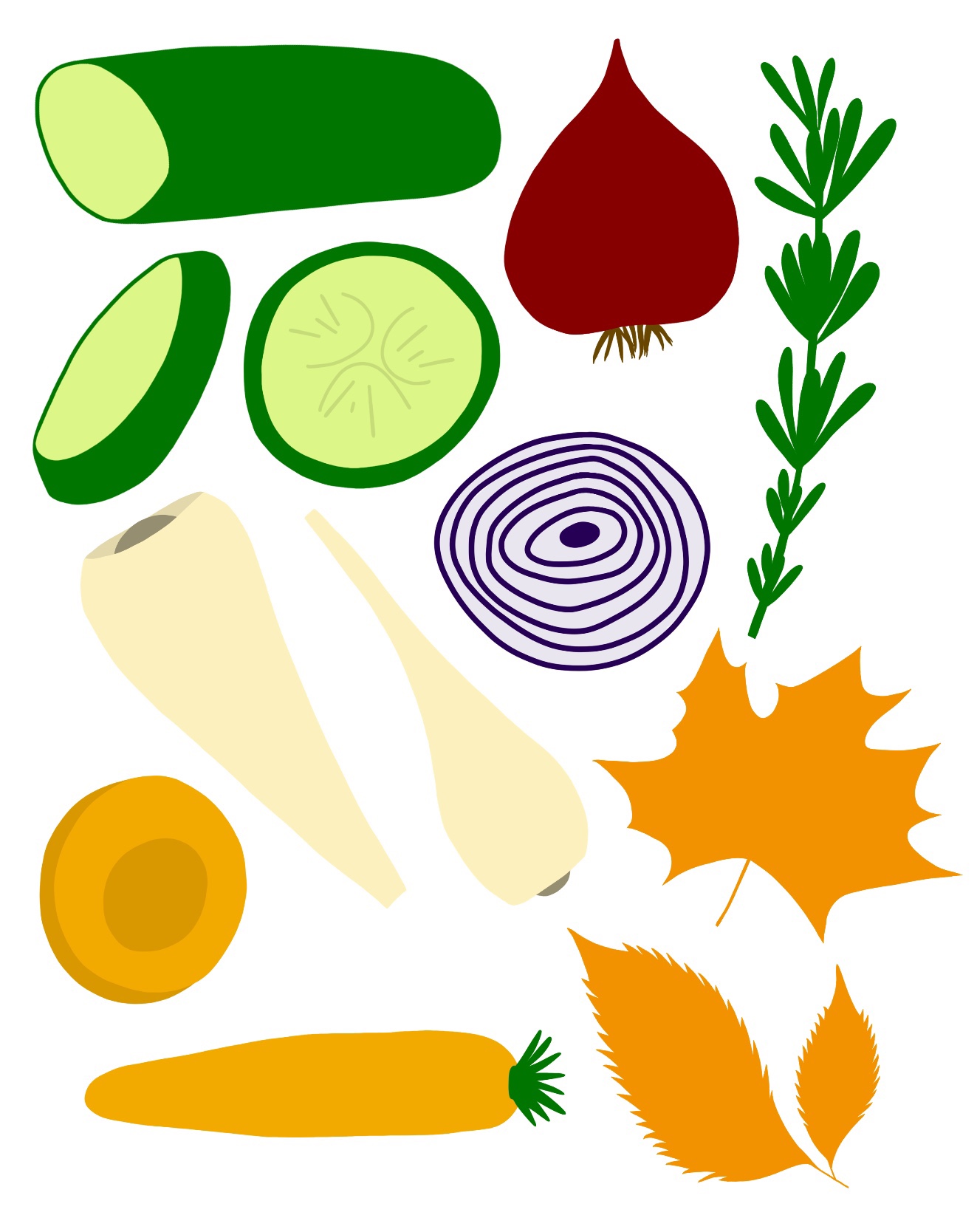
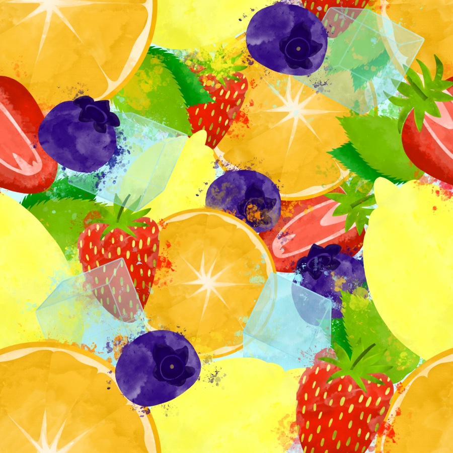
My next step was to begin adding colour and texture to each element. I started by blocking in colour on separate layers in the general areas which I wanted filled. I wasn’t too focused on adding shading or detail, as I knew that would come later. Then, I began adding texture layers. My favourite brush out of my swatches was ‘wild light’. I liked how it interacted with the colour behind it and how it interacted with itself. It was a lot like using watercolour, and applying varying amounts of pressure created differing opacity. I started using this to shade and soften the look of my elements, using color-hex to ensure the shades and highlights were within the same colour palette.
Base colours for elements
Completed individual elements
Alongside using the wild light brush, I added some missing detail – and fixed the roots on the onion – using the ‘studio pen’ brush. Old habits die hard, as they say, so in some places I did resort to my usual brushes for shading as it’s what I know best. I made sure, however, that wherever I did this, the watercolour texture was still prominent. Once I had sufficiently added texture and shading, I used a splatter brush to further the watercolour look I was going for. I thought this was a great addition as not only does it appear to be watercolour, it also evokes thoughts of ‘juice’, which fruits and vegetables are full of. A juicy fruit or vegetable means it’s ripe, which is most appealing.
I showed some of these elements to friends, and posted them in the OCA Visual Communications Discord server, and multiple people remarked how the image made them ‘want to eat fruit’, ‘thirsty’, or ‘crave a Sunday lunch’. This was very reassuring and showed me that I was on the right track with what I was doing.
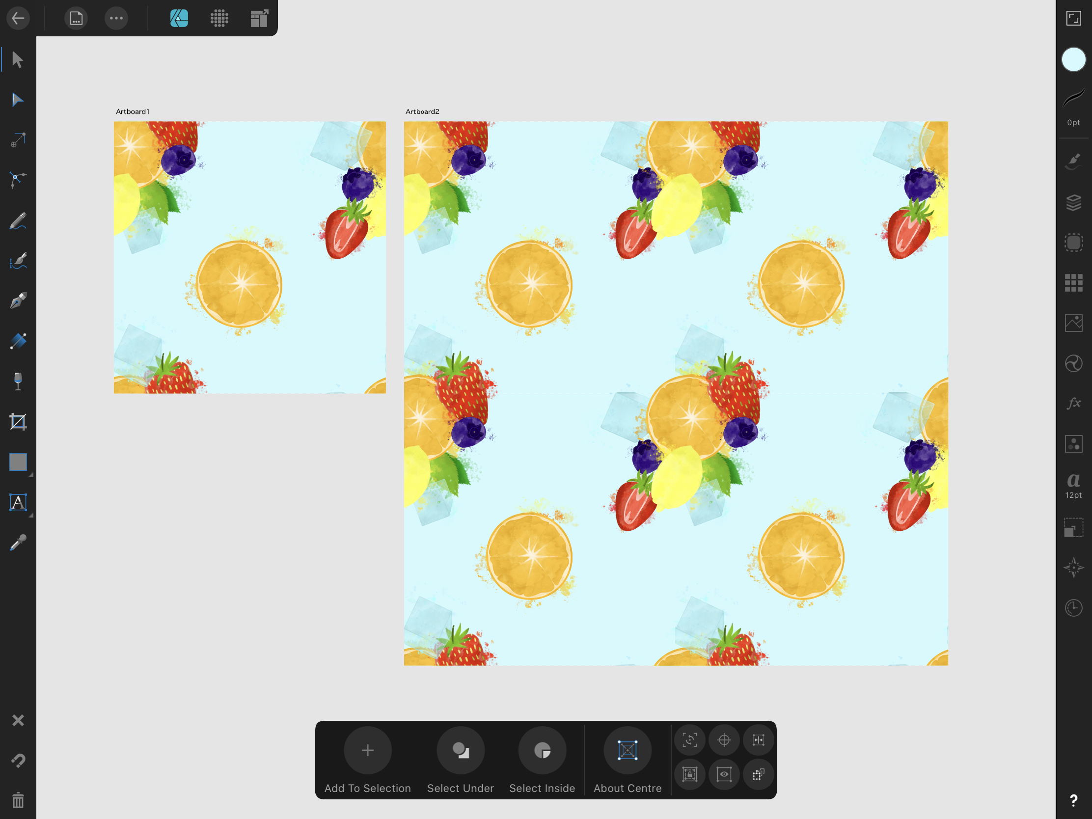
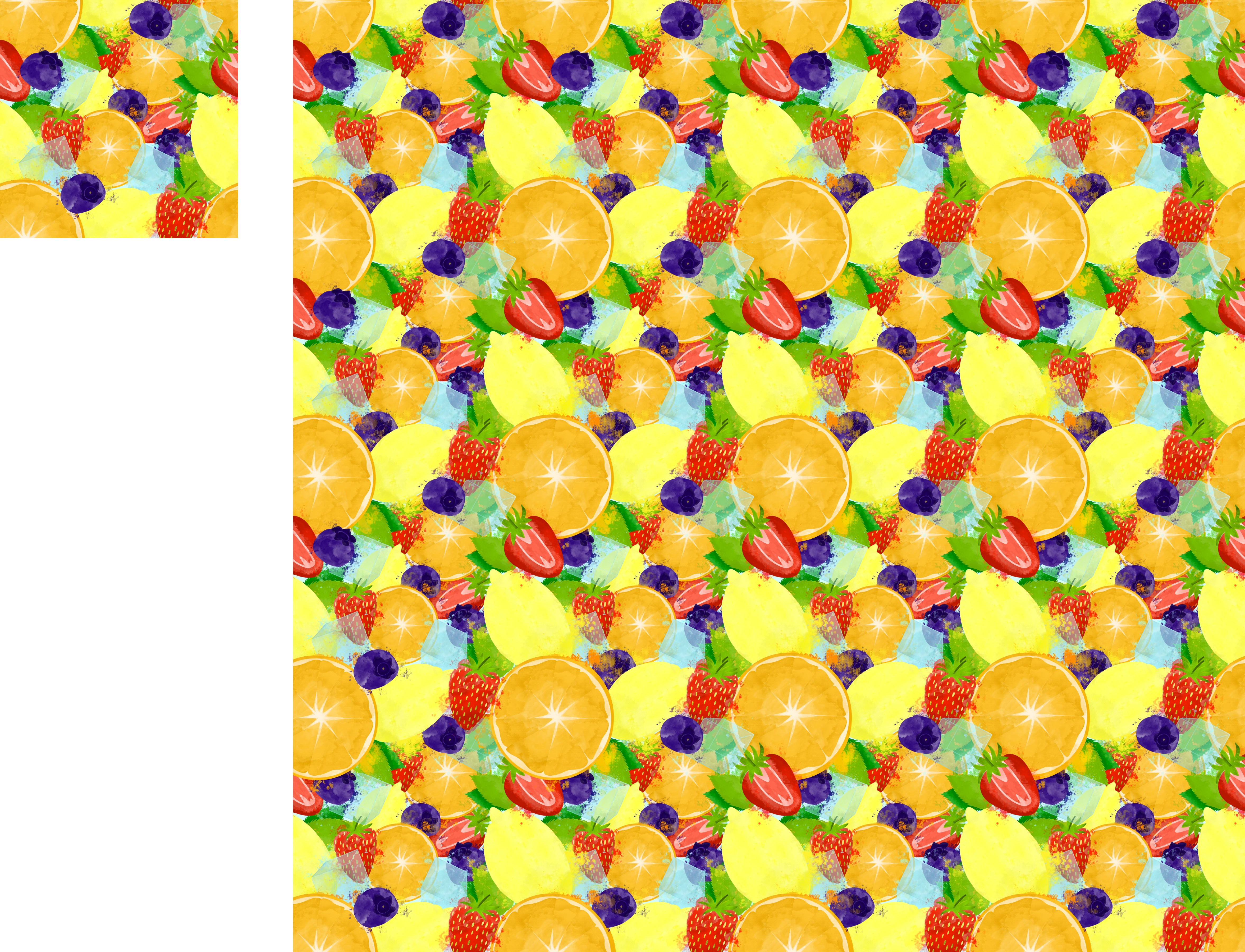
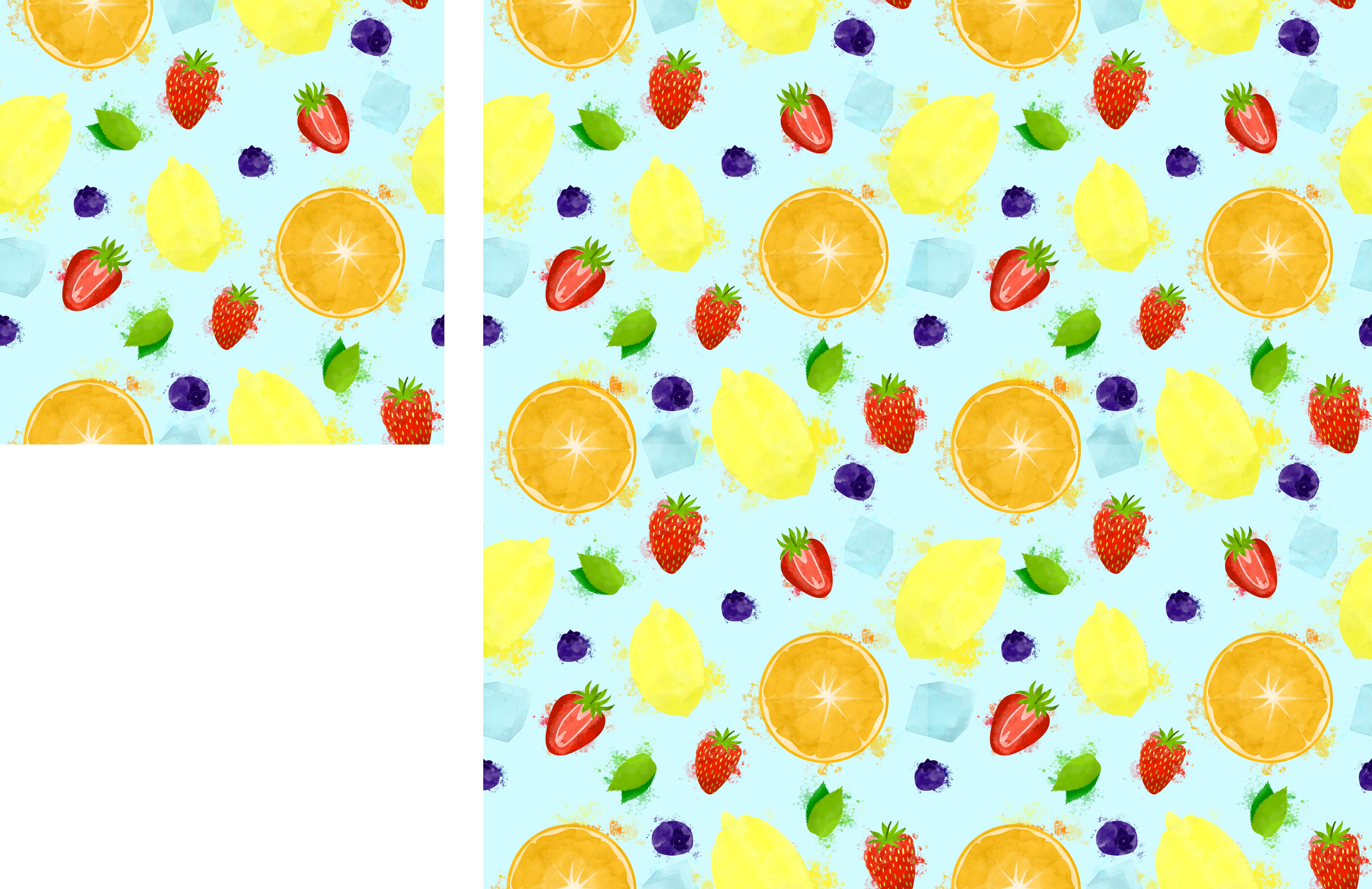
After completing each element, I began creating a seamless pattern. I have experience doing this, and typically I use both Procreate and Affinity Designer to do so. I arrange the elements in Procreate, switch over to Affinity to create the repeat, then go back into Procreate to add the final touches. I started by arranging the elements in the centre of the canvas, as this is where the repeat is formed. I also tested changing the opacity of the elements, as watercolour is typically less solid, but I preferred the solid look. I then took my design over into Affinity to begin my repeat.
First attempt at pattern using Procreate
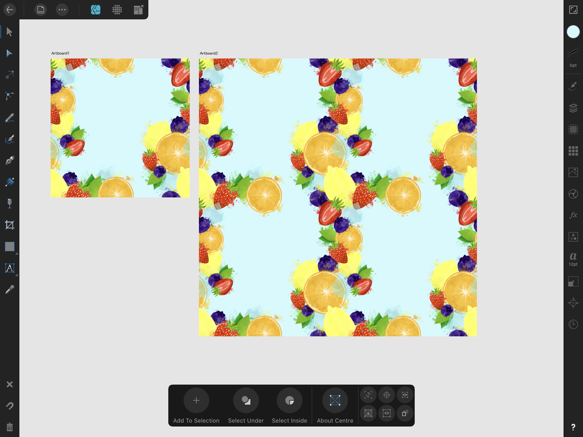
This, however, was proving difficult for this piece. It generally is an inefficient way to create repeats, but it’s easy for beginners. Taking an already positioned design into Affinity and cutting it as a repeat, then moving it back into Procreate, means you cannot alter the elements once they have been positioned. Sometimes that’s fine, but with a big overlapping pattern like this, the ability to move elements freely is necessary. I knew that it was possible to create patterns directly in Affinity Designer, but hadn’t learned how to as it felt quite advanced.
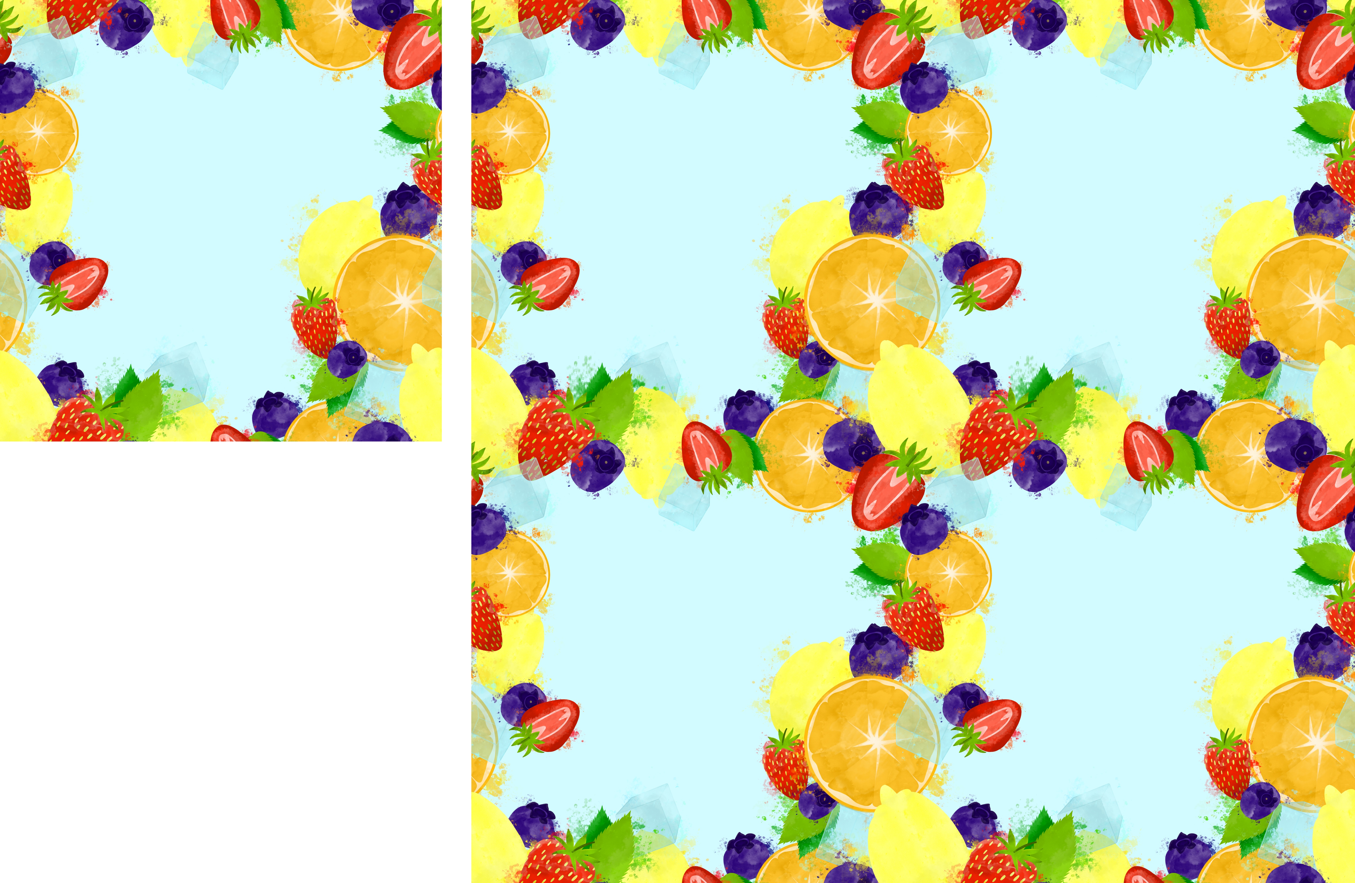
First attempt at creating a pattern using Affinity DesignerMy first ‘border’ piece
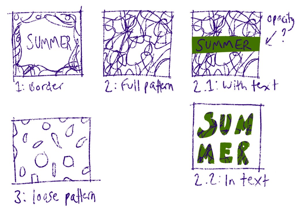
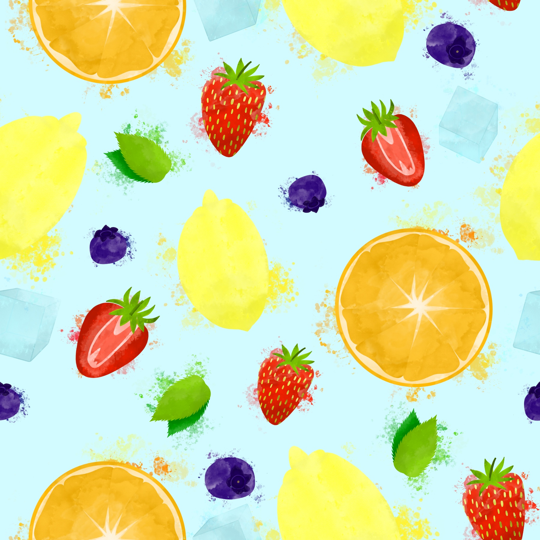
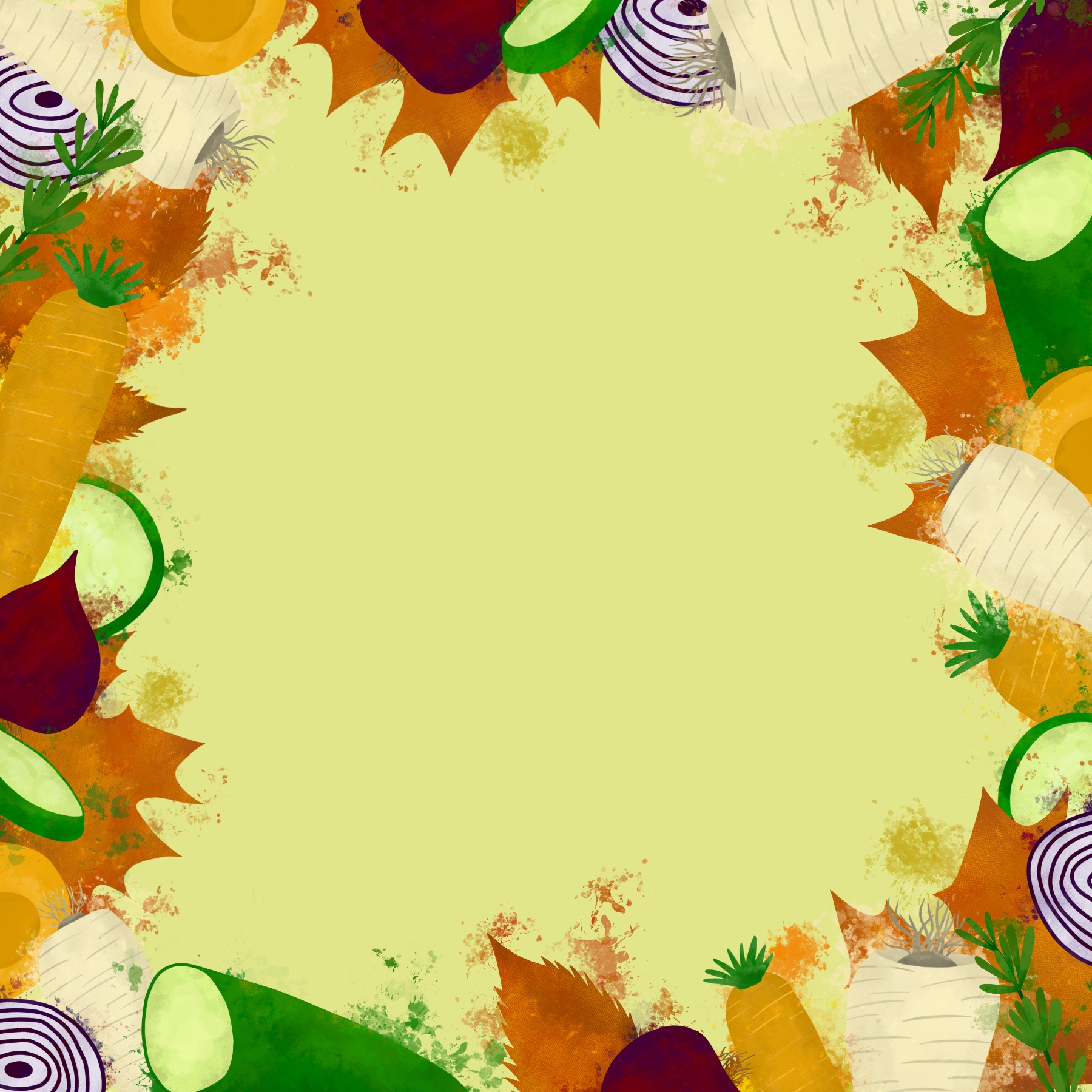
I transferred all of my elements to Affinity, and began watching Liz Kohler Brown’s Skillshare class on seamless repeating patterns in Affinity Designer. This class was super helpful, but I was still finding it very difficult to get going. After several hours of struggling and not fully understanding why, I took a step back from my piece. At this point, I had a sort of border frame with my elements, rather than a coherent pattern, and I really liked how it looked. I also, upon reflection, had figured out that I was working at too big of a size for what I was attempting. My canvas was 6×6 inches, and I wondered if 3×3 would be easier. Through working, I now had three solid ideas for a final piece: a border, a busy overlapping pattern like my original goal, or a looser, less busy pattern, much like the ones I found whilst researching.
My ideas sketched out with text
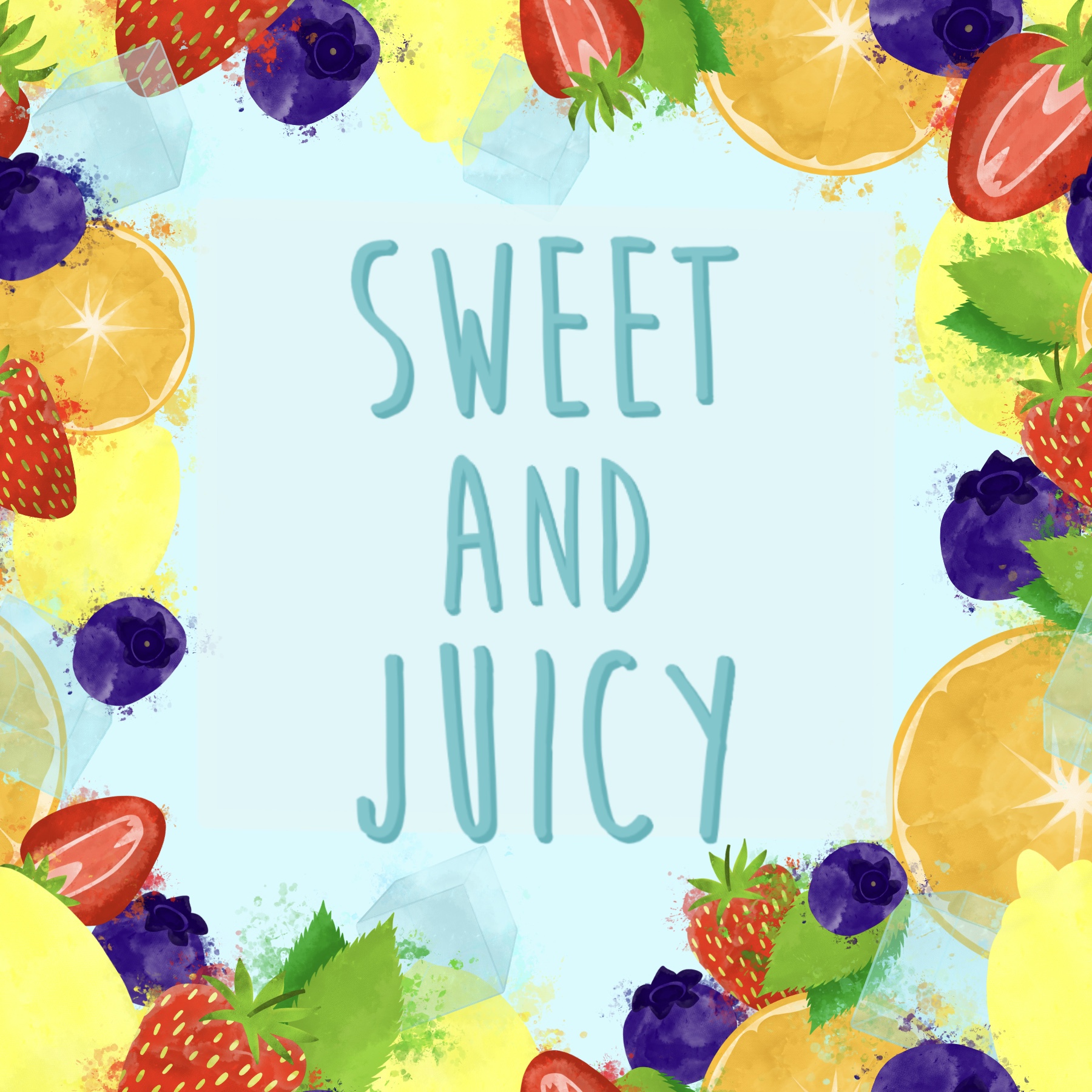
I sketched out my three ideas so I had them to hand, and also sketched out some possibilities for text addition. I altered the border design, as it originally was meant to be a pattern and so several elements were in awkward places. I then changed my canvas size to 3×3 inches and began developing the two pattern ideas. The smaller canvas size made it so much easier to work with, and I found I was way less overwhelmed. I think at this point I also had a better idea of how to create patterns using just Affinity Designer.
My 3 ideas completed
Once I had all three of my designs ready, I attempted to pick one to take forwards and work with. I wasn’t keen on the idea of creating three more designs for ‘autumn’. I added text to the designs to help this decision process, but I was really stuck. Thankfully, the pattern overlay on the text didn’t work so well, so that got rid of an idea. I could see use for all three of the designs, both as a point of sale display and as packaging and promotion. I feel like at this point in a design process, I would show my client the three options, and ask them for feedback. They would be choosing which they wanted, and if they wanted all of them.
Design options with text
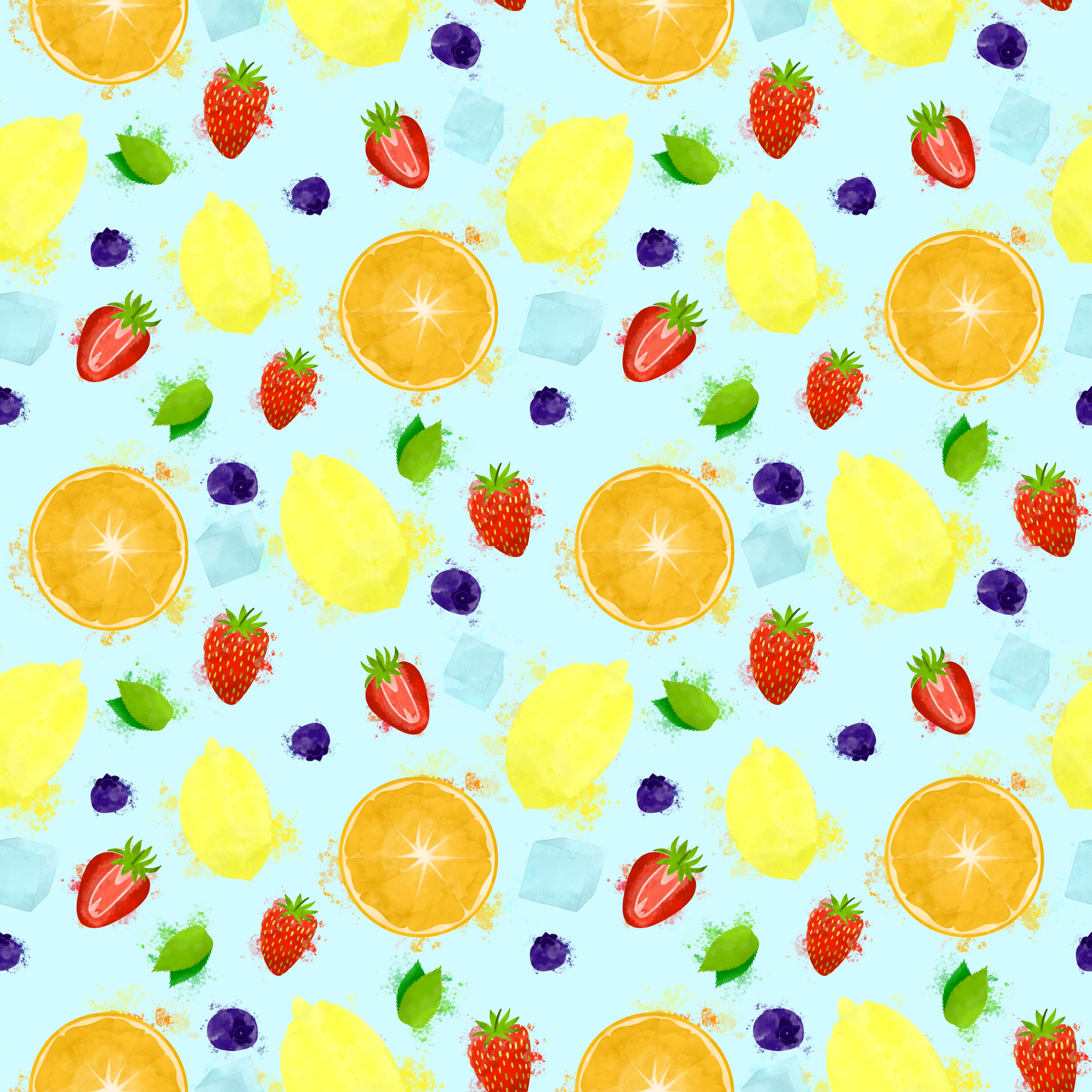
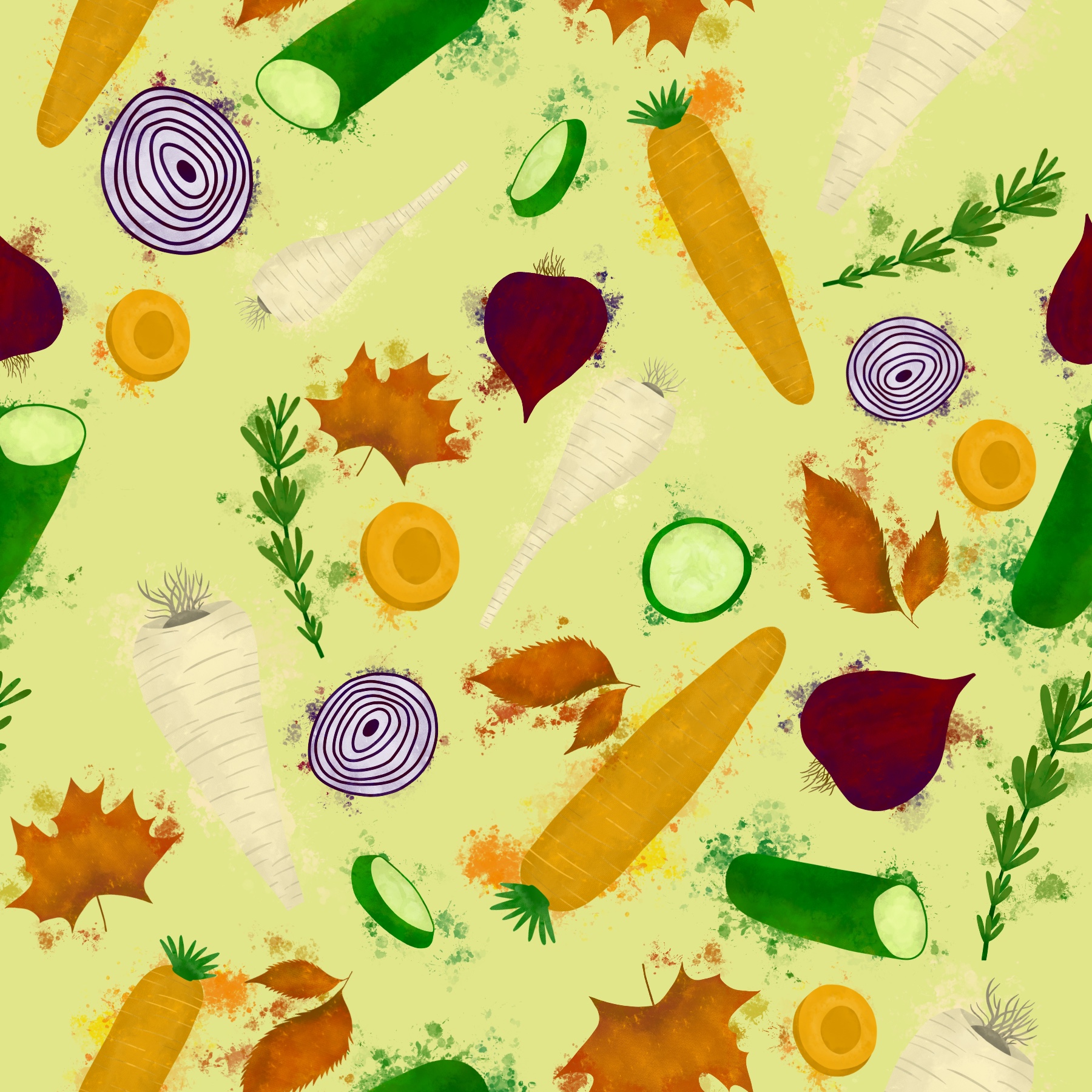
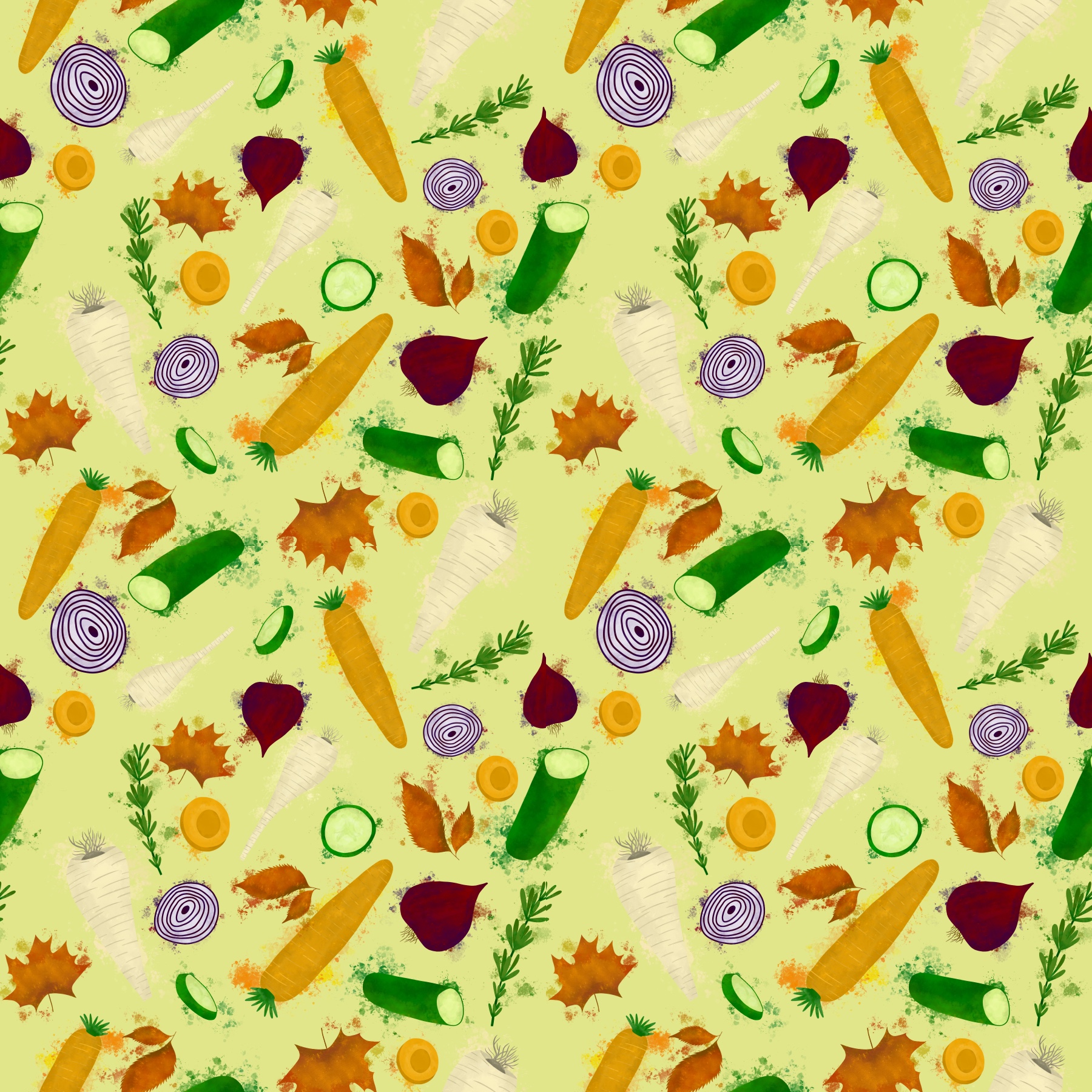
I decided to go ahead with making the same three designs for autumn, and hoped that seeing them side by side as cohesive pieces would help me pick one for the point of sale display. The process was easy now that I had figured it all out, and just required me fitting the elements together. I did have a slight issue with some incorrect seams in the busy pattern that I just couldn’t seem to fix no matter what I did. Otherwise, this was a straightforward process.
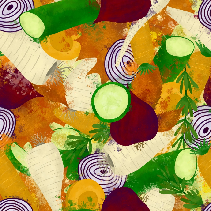
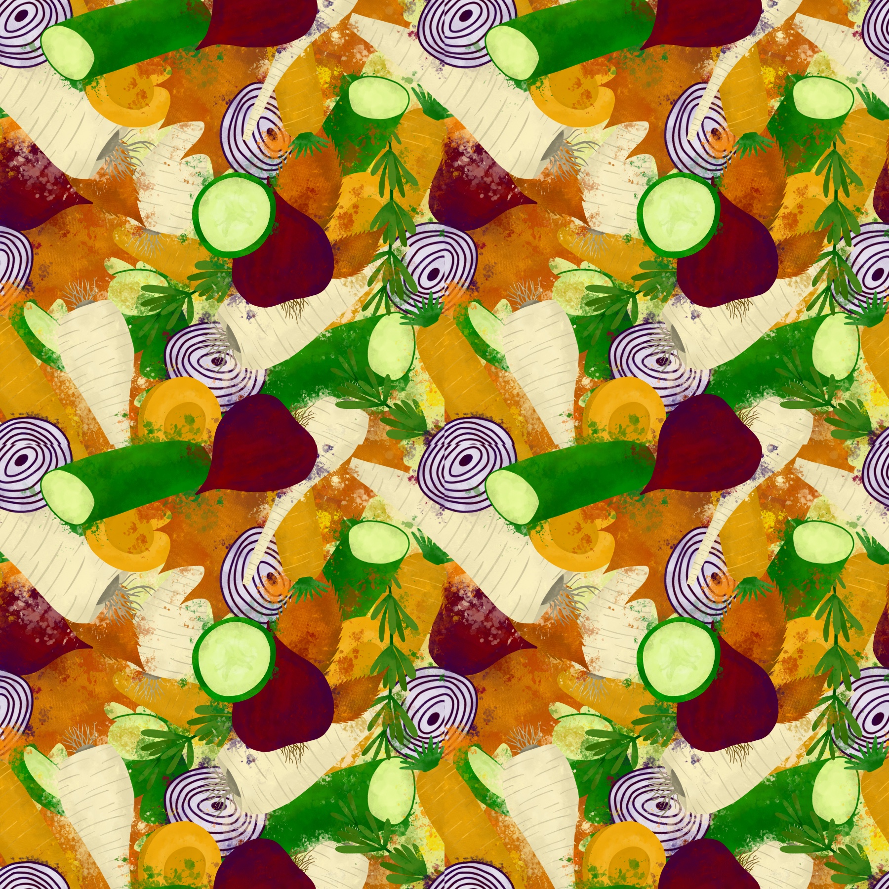
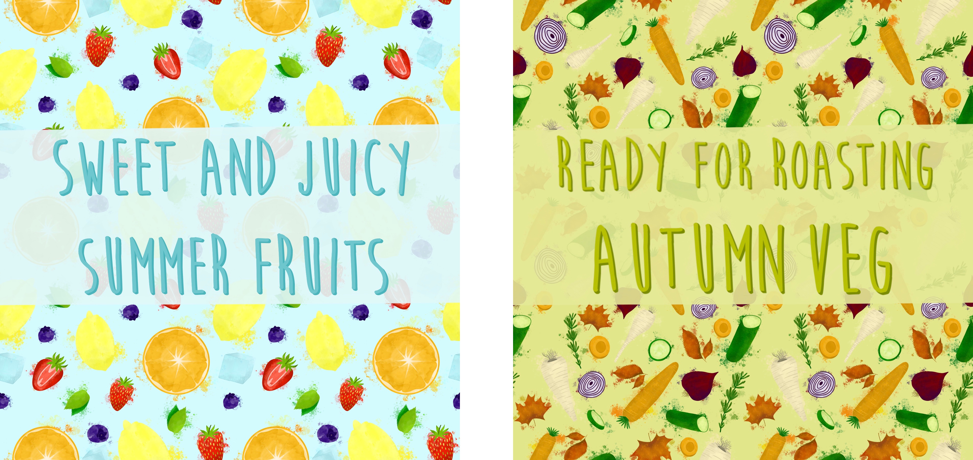
Autumn design options completed
After adding text, I displayed all three options side by side. Unfortunately, this got me no further in my decision making process. I could very easily see all three designs as point of sale displays. I decided to post the three options on several different social media platforms, asking my friends, followers, and fellow students which was their favourite and which they could see being in a supermarket.
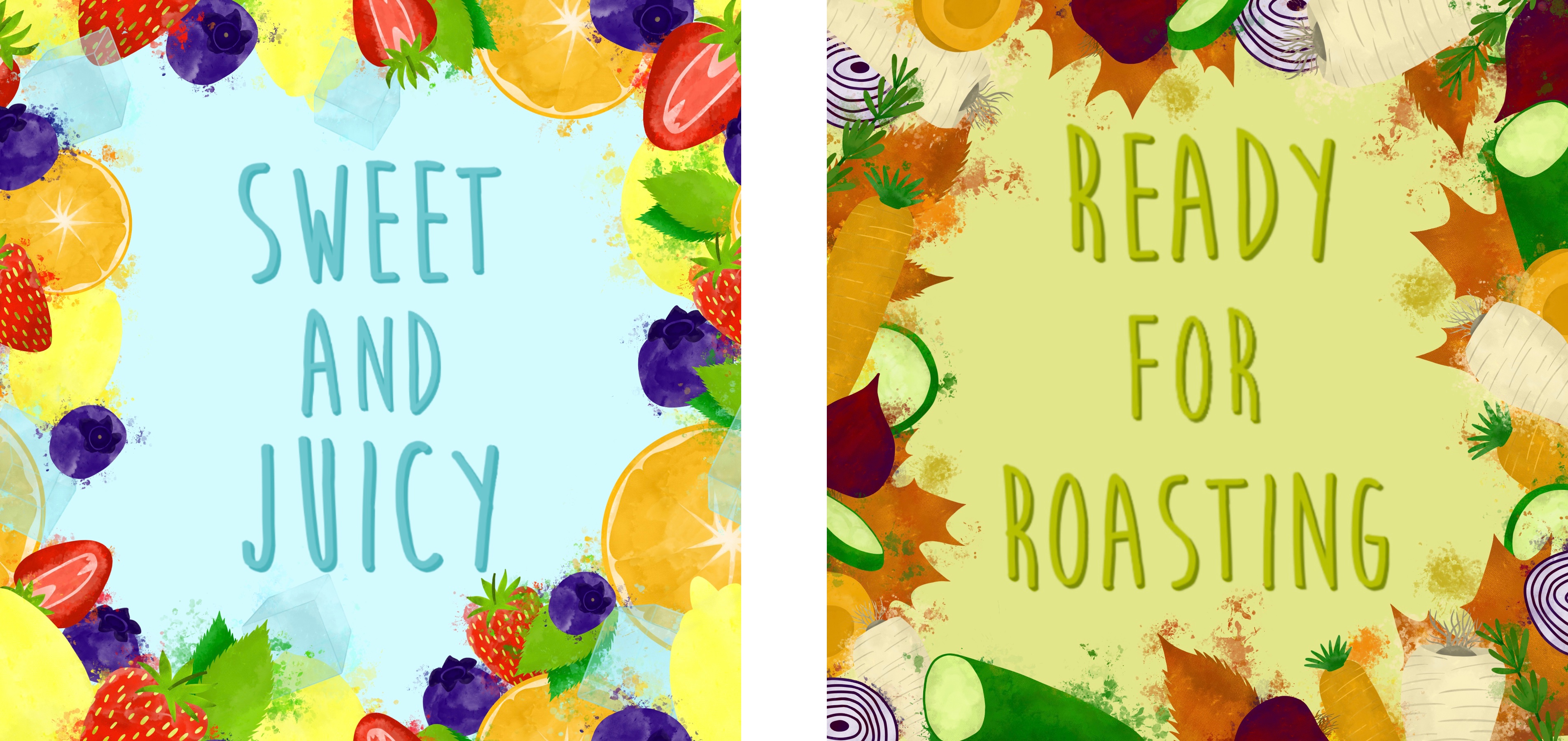
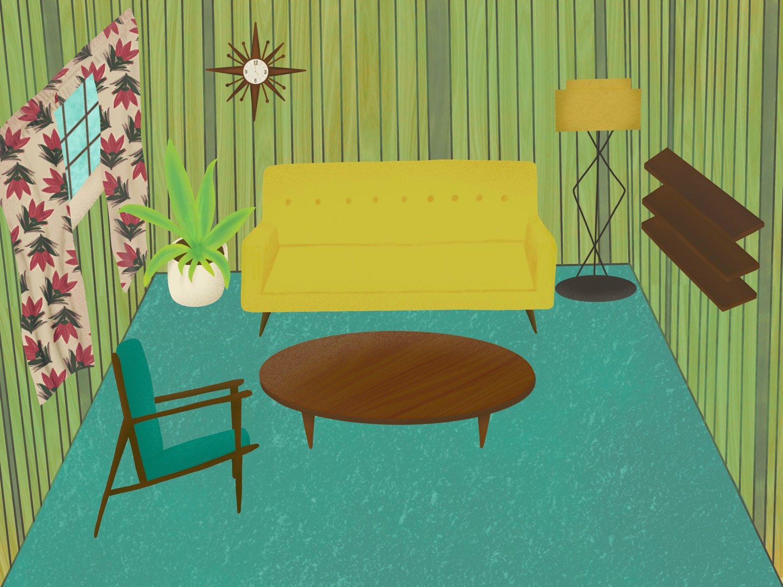
Finished designs with text side by side
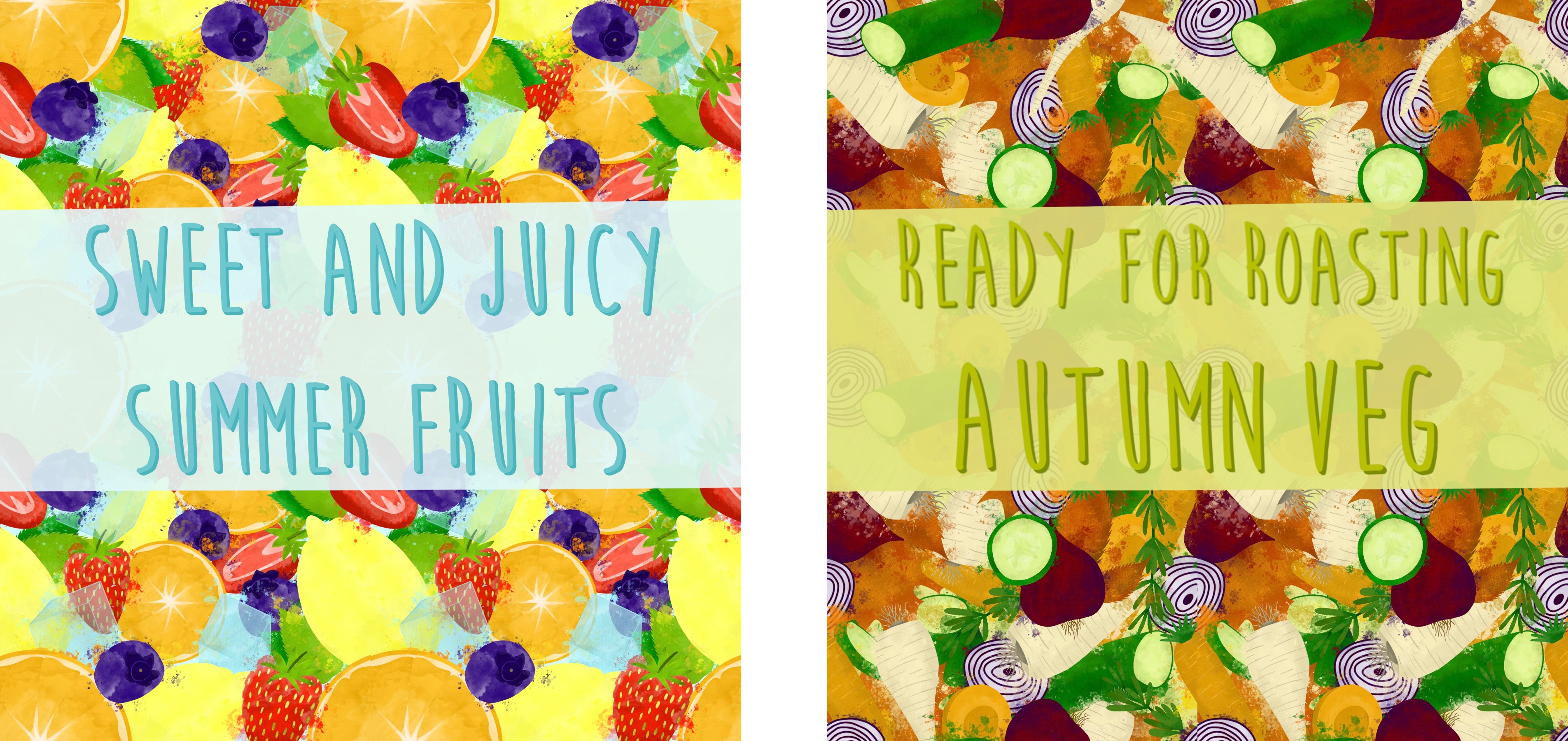
The overwhelming response was that option one – the border display – was the best. Several people picked the busy pattern, and a couple picked the looser pattern, but even then, they commented on the border display. This was not my goal going into this assignment, and I really like how the patterns look, but I agree that a border is likely to be used for a point of sale display. I went back and edited the pieces slightly as I feel an opaque background behind the text helps it pop more. With that, I was finished.
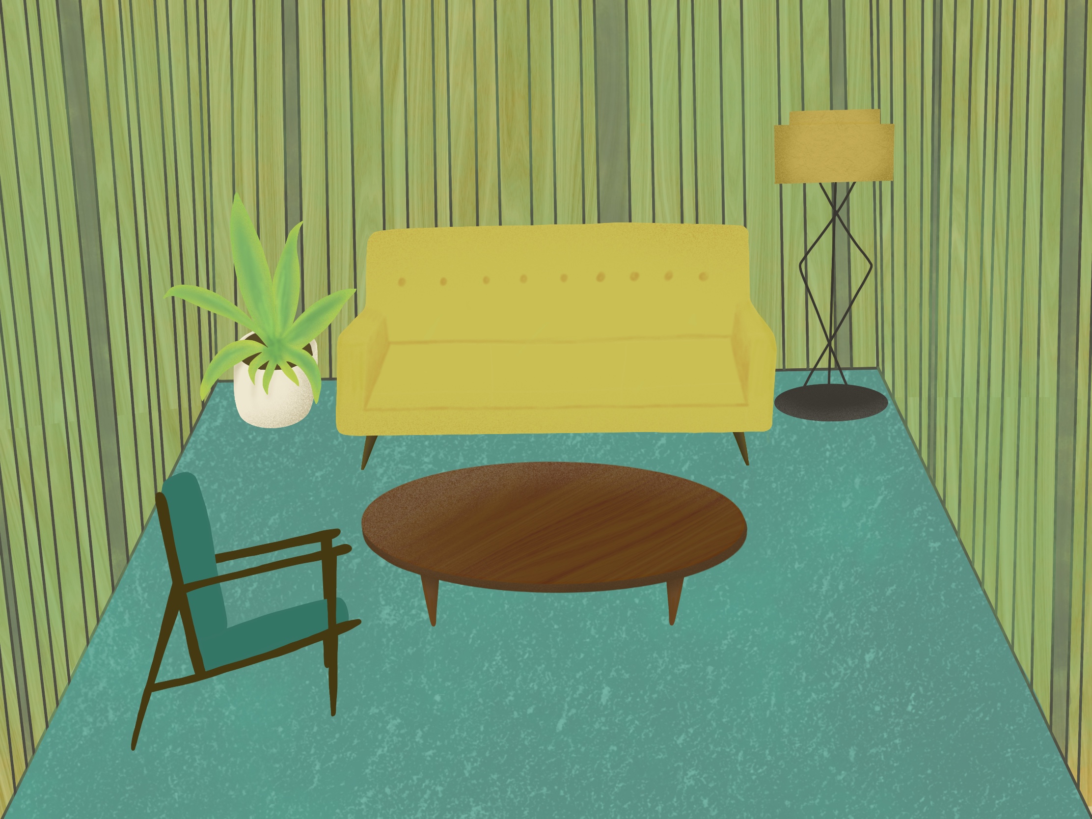
Final point of sale displays
As I said earlier, I feel like at this stage my client would decide which they preferred and which they want to take forward. I’m glad I have the other pieces as options, and that I designed each element separately so they can be used again or easily altered going forwards. This is useful when working with clients as you can produce a whole new design whilst still keeping it thematic. I really like how the colours in each of my designs complement each other when side by side, and that the two designs work cohesively together. You can tell that they are for the same supermarket, and that they are meant to go together. I was very intentional about tying the two designs together and I think my attempts have worked.
I do think I could’ve been a bit more decisive in this process. I wanted to experiment with different possibilities before considering ideas for my final piece, which ended up leading to me producing multiple options for a final piece instead. I don’t think the process I have used was bad, and it worked very well for this assignment, but maybe for future assignments a different approach will be needed. Regardless, I’m very happy with my final pieces and with how I used my research and experiments to inform my process.
This exercise was quite a challenge for me. I am autistic, so I see the world differently to neurotypical people. Something that most autistic people struggle with is things meaning something other than what they are. In communicating with other people, we can struggle as we don’t get context and ‘hidden meanings’ behind words, often feeling confused as we say exactly what we mean and expect others to do the same. It’s no different in other areas of life. I understand the concept of a metaphor – that something is being described and isn’t actually that descriptor. For example, depression is often described as a dark cloud following you around. I know there isn’t literally a dark cloud following people around, it’s just a way to describe the feeling depression gives, a storm looming on the horizon bringing you down and hiding the ‘sun’ (happiness).
So I understand this. And I can understand the process of creating visual metaphors. You take these verbal descriptions of feelings/concepts/objects, and depict them visually. Simple enough. You could draw someone who looks sad, or pained, with a giant black cloud floating above their head everywhere they go. This would be a visual metaphor for depression. In theory, this means I understand the concept of visual metaphors and how they can be used in illustration, right?
But I really struggled. Not so much with creating my own visual metaphors, but with finding examples of them in other art. I felt like there was something I just wasn’t getting, and it took me days of frustration and feeling like I was attempting the impossible to realise why. I had asked for help from several people, and wasn’t getting much further. I looked at the learning logs of fellow students to see what they had chosen as examples and just felt completely lost. I didn’t understand how people could see a piece of art and instinctively know it was a visual metaphor. I couldn’t understand what made something specifically a visual metaphor, versus just a regular piece of art.
I ended up speaking to someone who understands autism very well, and understands how I work as an autistic person, in a final attempt to piece together what I was looking for in an illustration that made it a visual metaphor. They suggested that I take an art history approach, and look at artists who have been known to use metaphorical imagery in their work. This was brilliant advice, and almost instantly I started thinking of various artists and art styles who I could attribute this to. But the more we talked, the more we unearthed the difficulty I was having when approaching this exercise. Isn’t all art metaphorical?
For me, all art is subject to interpretation – any piece of art can have a hidden meaning. We can engage with art technically and observe the usage of colour, texture, material, and the context in which it is situated, to gain an understanding of it. Or,we can engage with art emotionally and subjectively, translating it into something vague – a feeling, a concept, an idea, or just point blank what it is. Both of these ways of engaging with art, however, are ways of interpreting it and what it means – this is exactly what you’re doing when you engage with a metaphor.
So I couldn’t understand what the difference was between a ‘visual metaphor’ andregular art. I suppose you can have very overt depictions of metaphors, like the cloud following a person around, or less obvious depictions such as a simple grey sky. But to me, these are the same. They are both covert and require analysing and deep thought to understand. It isn’t natural to me to use metaphors, or to see things as things they’re not. It’s an active conscious choice. I see no difference between a painting of dull, dark clouds, representing depression and pain, and an illustration of a man with a cloud above his head. They are both representative of depression, but also of so much else the more you think about it.
Using metaphors both in imagery and in every day conversation is like a game to me. It’s fun, trying to come up with the best descriptors and explanations. Sometimes people will exclaim how good a metaphor I’ve used is, and I’m not even aware that’s what I’m doing because I’m just trying to play the game of communication like everyone else. But everyone else isn’t playing a game, this sorta stuff just comes naturally. Narrowing down which pieces of art are metaphorical and which aren’t felt like such an enormous task, because it’s simply all metaphoricalto me.
I feel like I can’t grasp the understanding of visual metaphors expected of me here, as I can’t categorise easily the differences between the overt and covert metaphors. I assume the concept of visual metaphors is referring to the overt ones, but there isn’t even a blurry line between the two for me. That line doesn’t exist. Living in a world where everything seems to mean something else, and I can’t understand what it is that it’s meant to mean most of the time, has given me an advantage when it comes to interpreting art. I’ve learned how to make a skill out of interpreting the world around me.But also I have a disadvantage, as I might fail to see the immediacies that other people do.
The artist who immediately sprung to mind when art history was mentioned to me was Banksy. I feel like his work is a great example of metaphorical art. His work clearly means something deeper, and it’s often used as a response to social and political actions. Art movements that I feel are filled with visual metaphors are Surrealism and the modern art movement. The imagery in Surrealist art is meant to be read into. To take it at face value would be to miss the point of the artwork entirely. The bit I think I’m missing is that this is incredibly open to interpretation, whereas I suppose metaphors are a lot more blunt.
After thinking about this in depth for several days, I decided to just start with the second part of the exercise – drawing your own visual metaphors. I feel like this is something I might find easier than specifically picking them out in art.
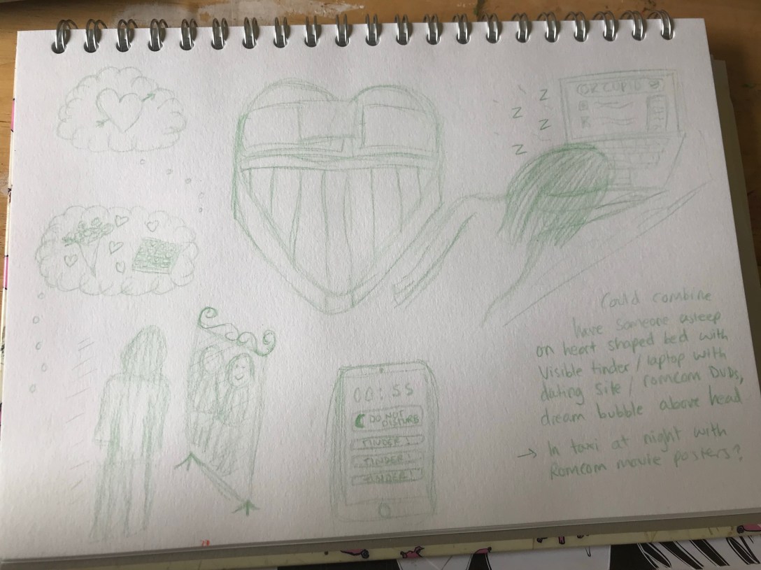
I picked the phrase ‘dreaming of romance’. I found drawing my ideas out in visual shorthand not too dissimilar to exercise 5, however I noticed that I was finding it a lot easier this time. I think my ability to think visually and generate ideas in this way has developed over part 2 and it made it much more enjoyable. I was able to quickly sketch out thoughts and they lead me onto new ideas with little issue. I even ended up producing an idea for a fully worked illustration that could communicate the phrase using several metaphors in one.
I was focused on tying together the concept of ‘dreaming’ with ‘searching for romance’. The ‘dream’ bubbles filled with traditional representations of romance, the heart-shaped bed, falling asleep at a laptop whilst scrolling dating sites, looking into the mirror and imagining yourself with a lover, and so on. My idea for a finished illustration tied these all together, having someone asleep on a heart-shaped bed, their phone showing notifications from the dating app Tinder, laptop still open on a dating site, a dream bubble coming from them showing love hearts or maybe a wedding, magazines on love and romance scattered around them, and DVDs of romantic comedies on their desk. I also considered someone gazing out the window of a car at night, showing advertisements of romcoms and their phone lighting up with notifications.
Sketch development
I showed these sketches to a friend and asked what she felt they communicated. She said ‘someone who’s lonely/seeking romance’. I think that’s pretty close to what I was trying to convey – if you’re dreaming of romance you’re usually looking for it.
Overall this exercise was hard. However I feel it showed me how much progress I’ve made in part 2. I found idea generation much easier and didn’t struggle as much with using visual shorthand. I was excited and slightly shocked by how quickly I developed a fully fledged idea, with ideas for a colour palette and textures too. I feel like I’ve overcome a lot of fears relating to perfectionism that I had when I first began this unit,and that makes it easier to just start drawing. I also feel like I’m better equipped to solve problems artistically and try to understand the meaning in art. Whilst I may not ever be able to fully grasp the concept of a metaphor, or learn how to instinctively see one in art, this exercise has given me a deeper appreciation of my own ability to communicate obscure concepts.
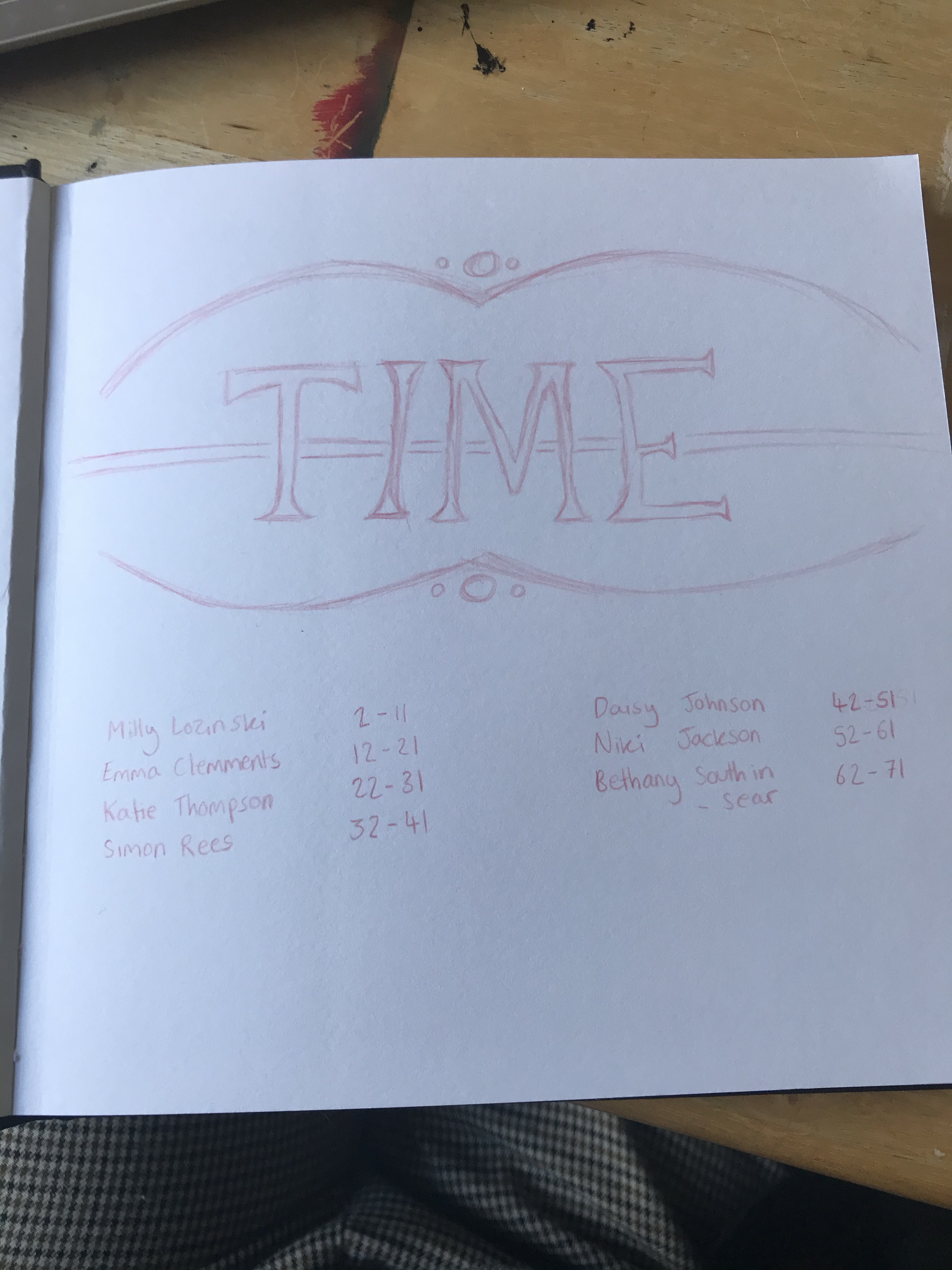
This month I joined a sketchbook circle with the OCA Visual Communications Discord server. There are 7 of us participating, and the idea is that we all create a sketchbook with a theme connected to ‘the everyday’, fill in the first 10 pages, and send it to the next person on the list. They then fill the next 10 pages, and so on and so forth.
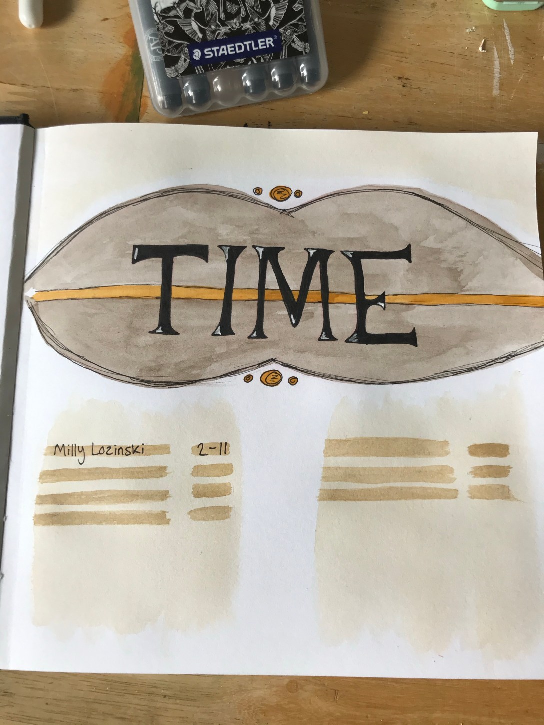
Because this is the first month of the sketchbook circle, it meant I was working on my own book. I decided to pick the theme ‘time’. I felt this connected to ‘the everyday’ very nicely and it gave me a lot of ideas for things to include. I used this sketchbook to explore ideas, experiment with new techniques, and just generally draw out whatever I was feeling like drawing.
Here is a video flip through of my 10 pages:
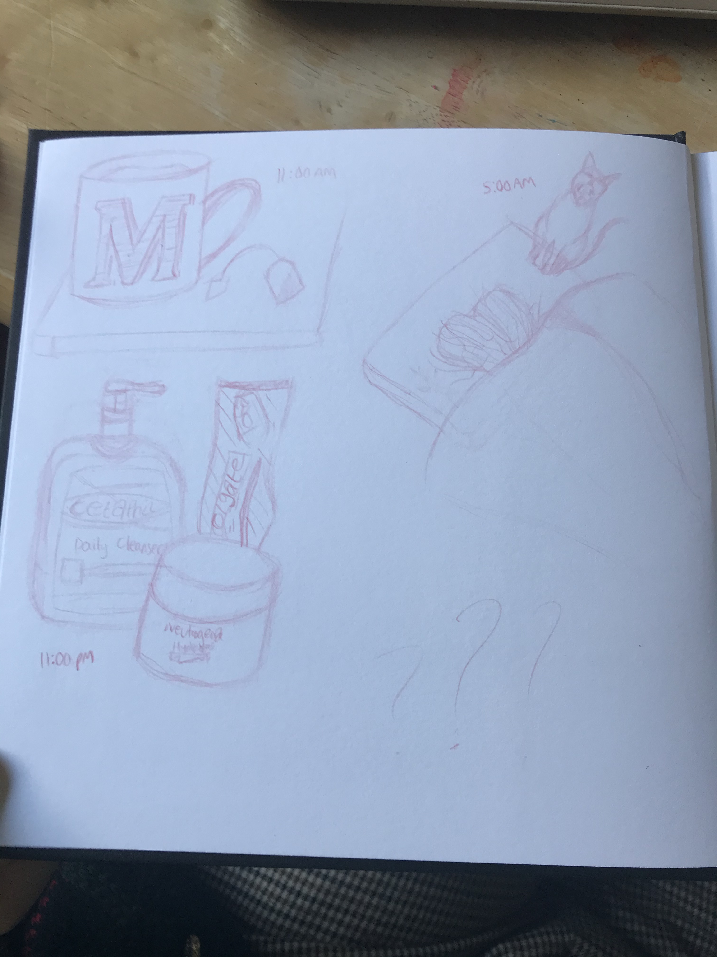
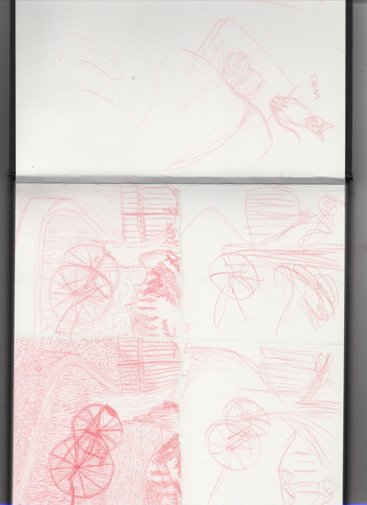
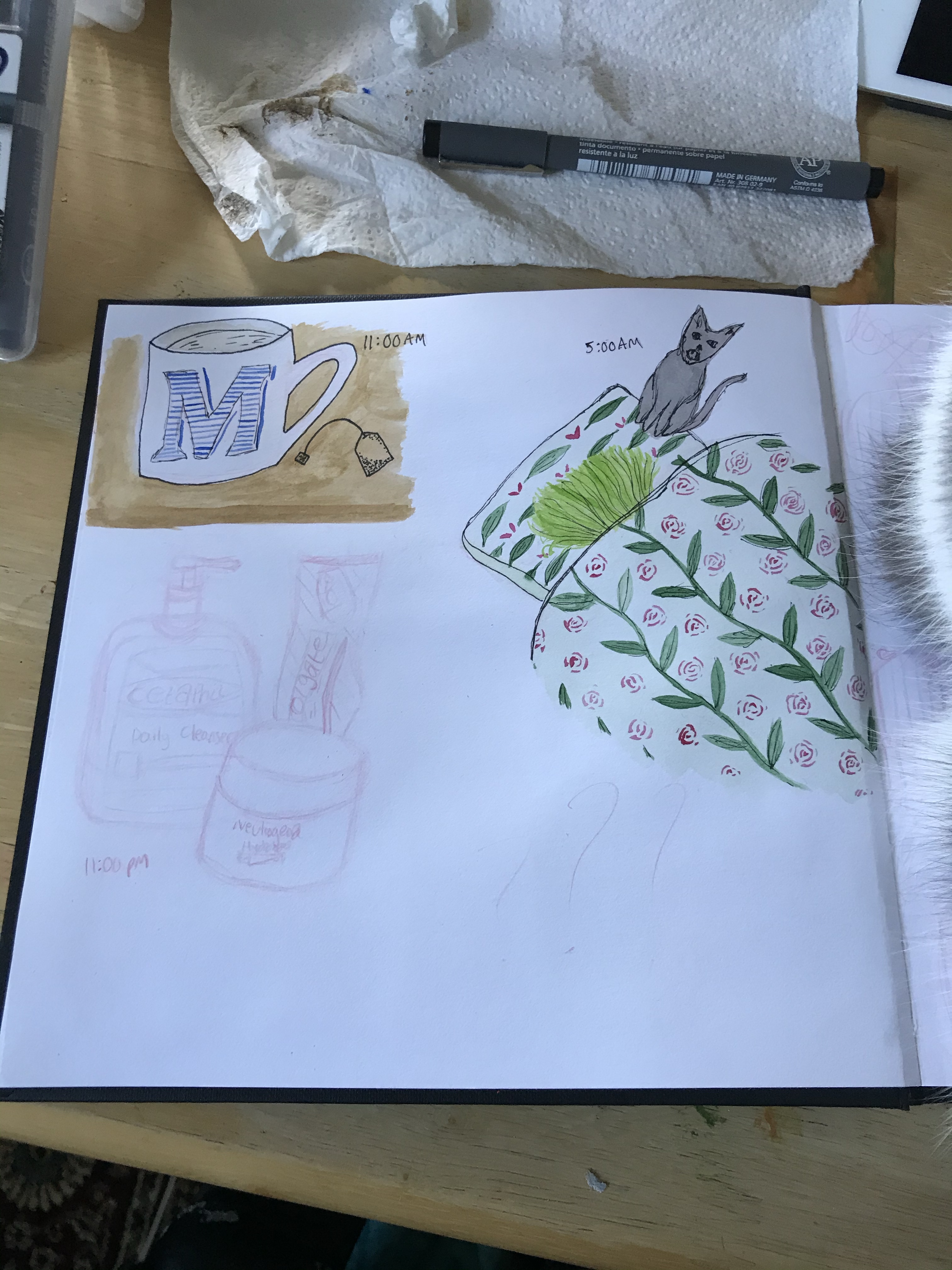
I started by designing a cover page introducing the theme and providing space for everyone to write their names. On my first official page, I drew out some routine things that happen every day at the same time. I used watercolour to paint these, and went over the drawing with ink pens. I then chose an image from Pinterest that I really enjoyed, and drew it 4 times. Once for 30 seconds, once for 1 minute, once for 10 minutes, and once for 30 minutes. This was a great exercise and one I would really like to repeat. It helped me focus on getting as much information down as possible and cutting back on detail.
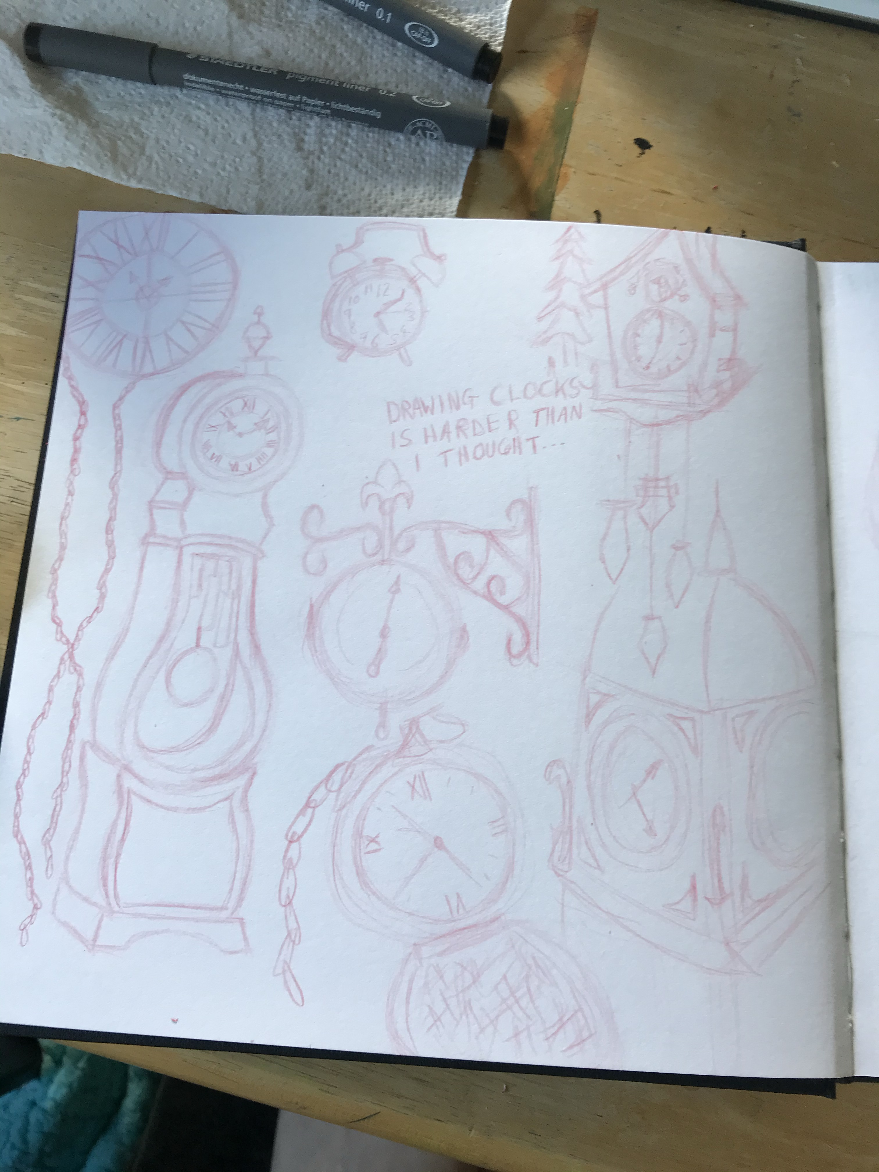
I then filled a page with clocks, drawing different ones over and over. I ended up writing ‘drawing clocks is hard’ in the centre of the page, because I was really struggling. I highlighted some of the clocks with watercolour and ink. My next page was supposed to be character development, the same character from birth to death. It didn’t quite go to plan, and I ended up leaving it. I went back at the end and experimented with some brushwork lettering, as I was interested in the concept after my final sketchbook page.
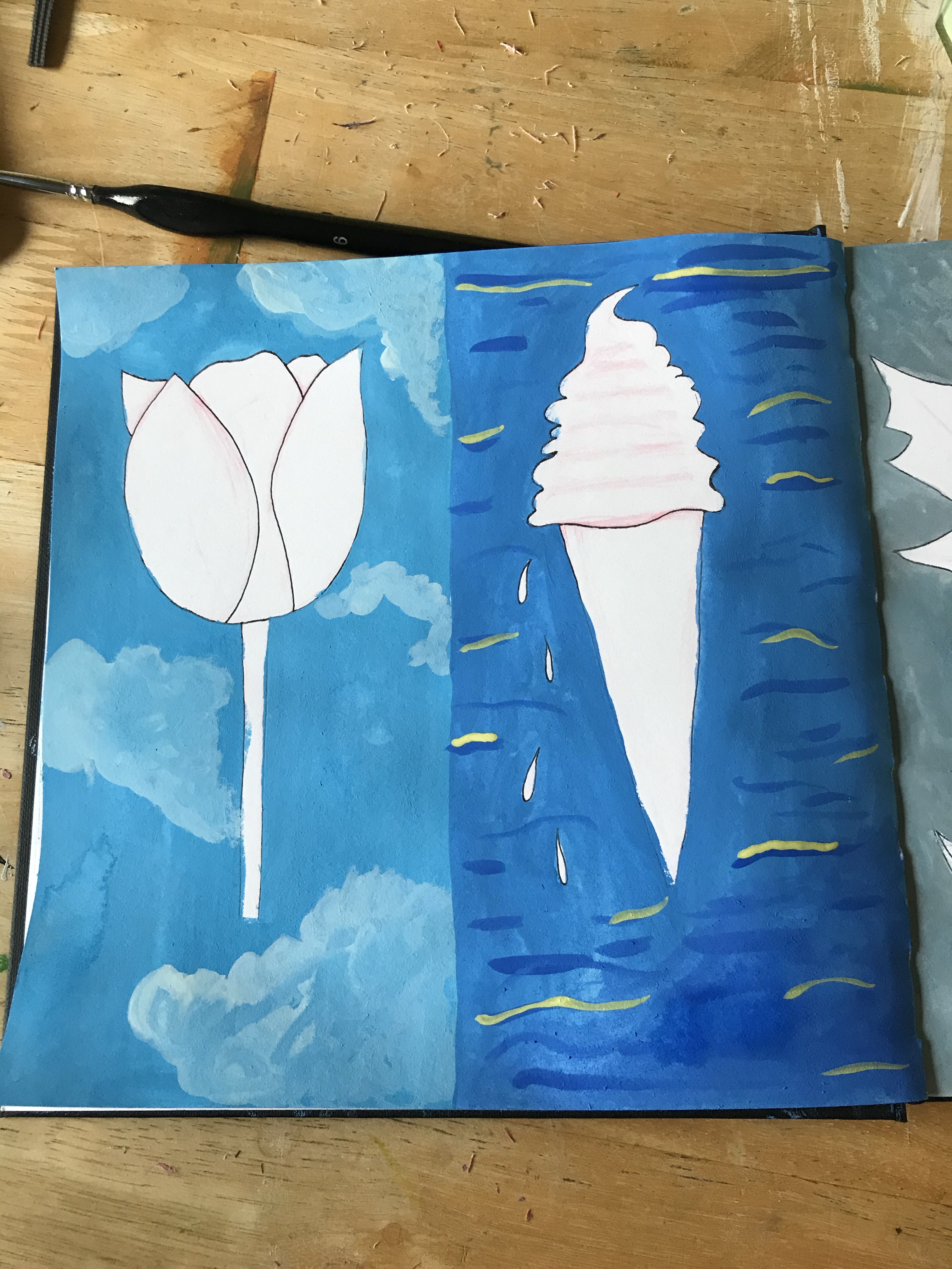
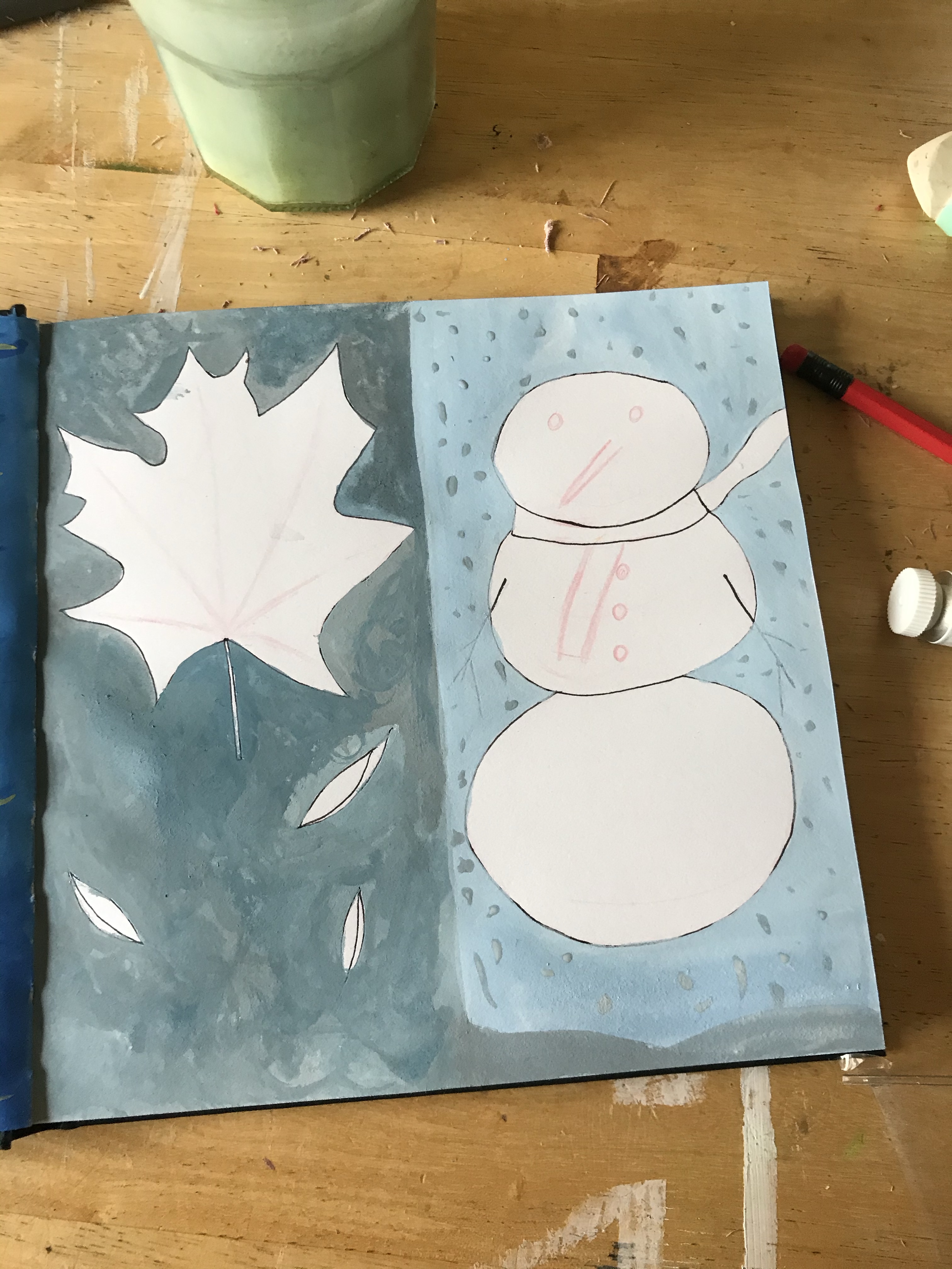
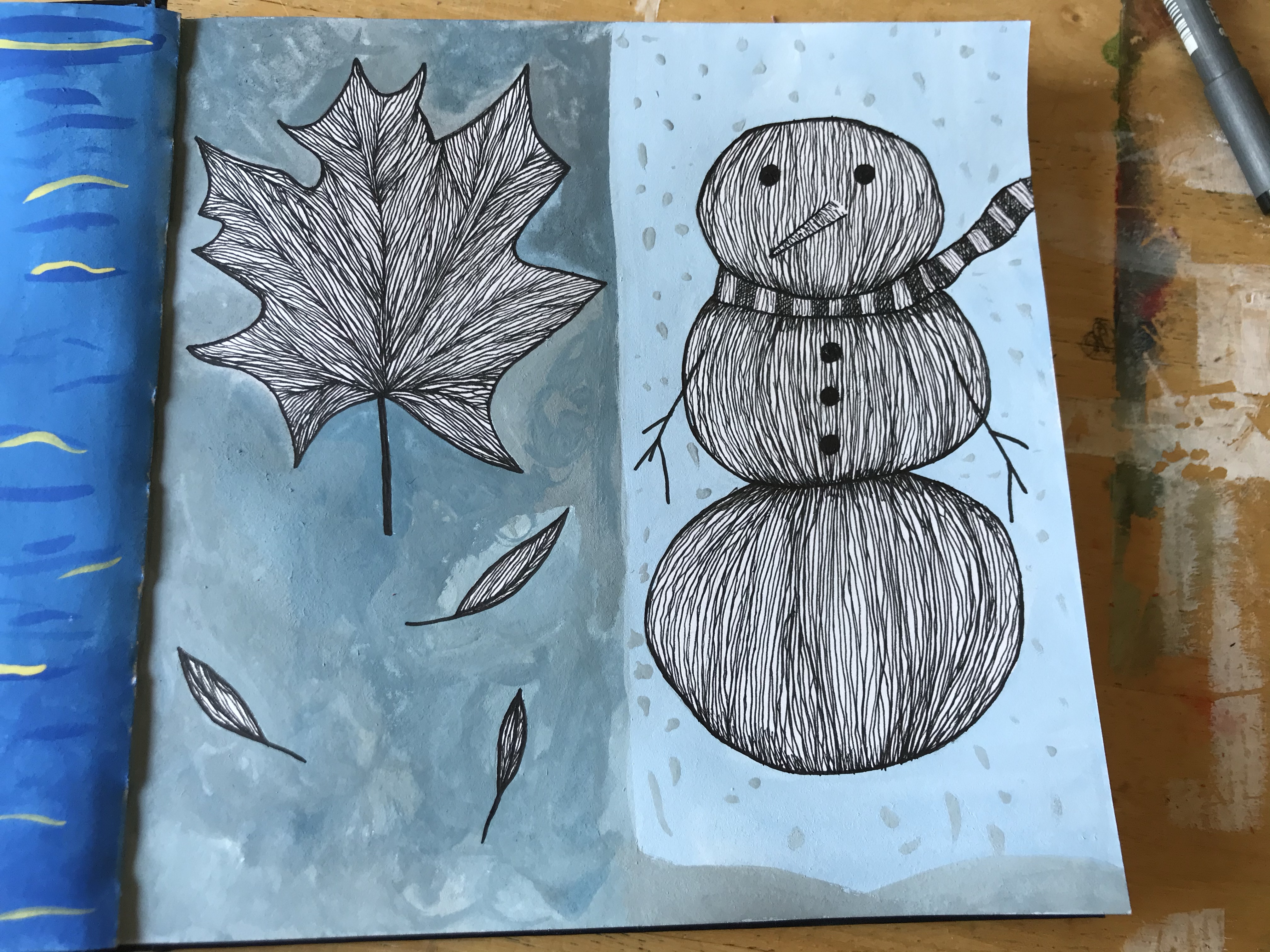
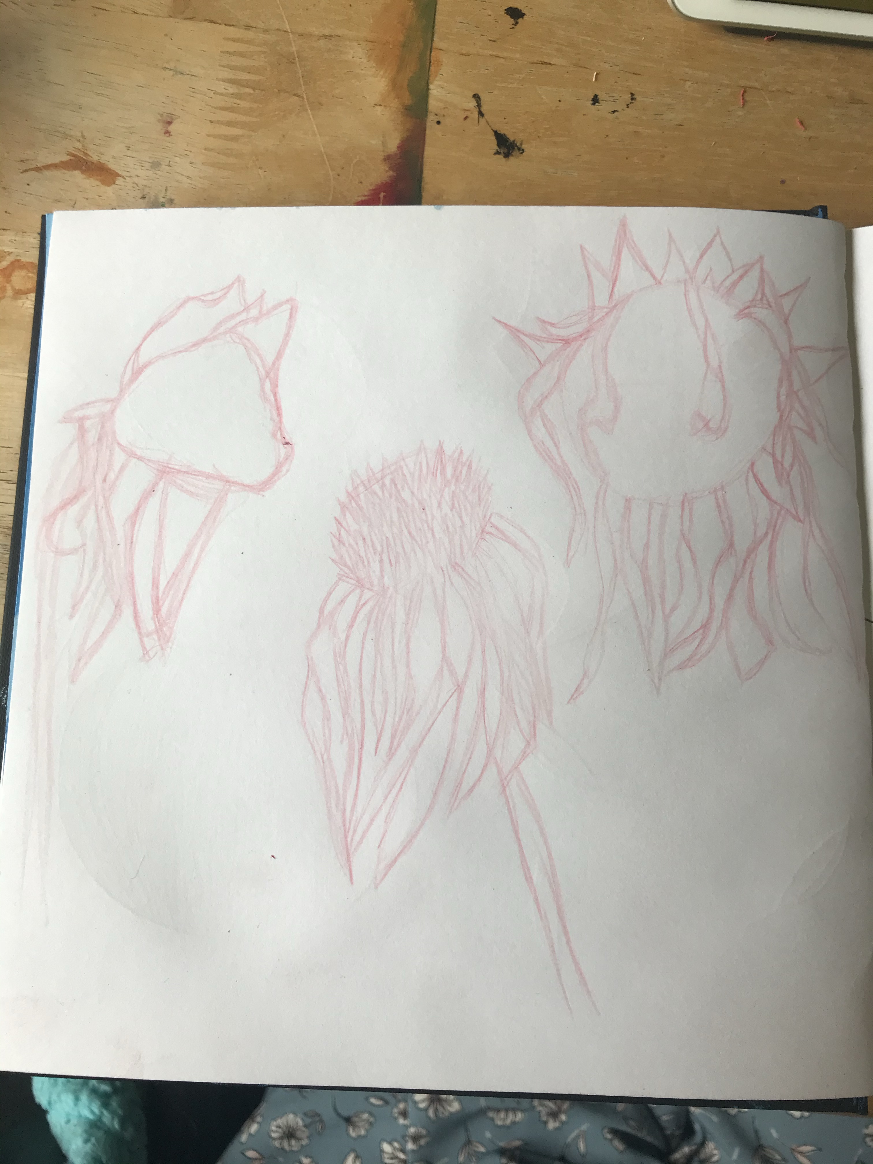
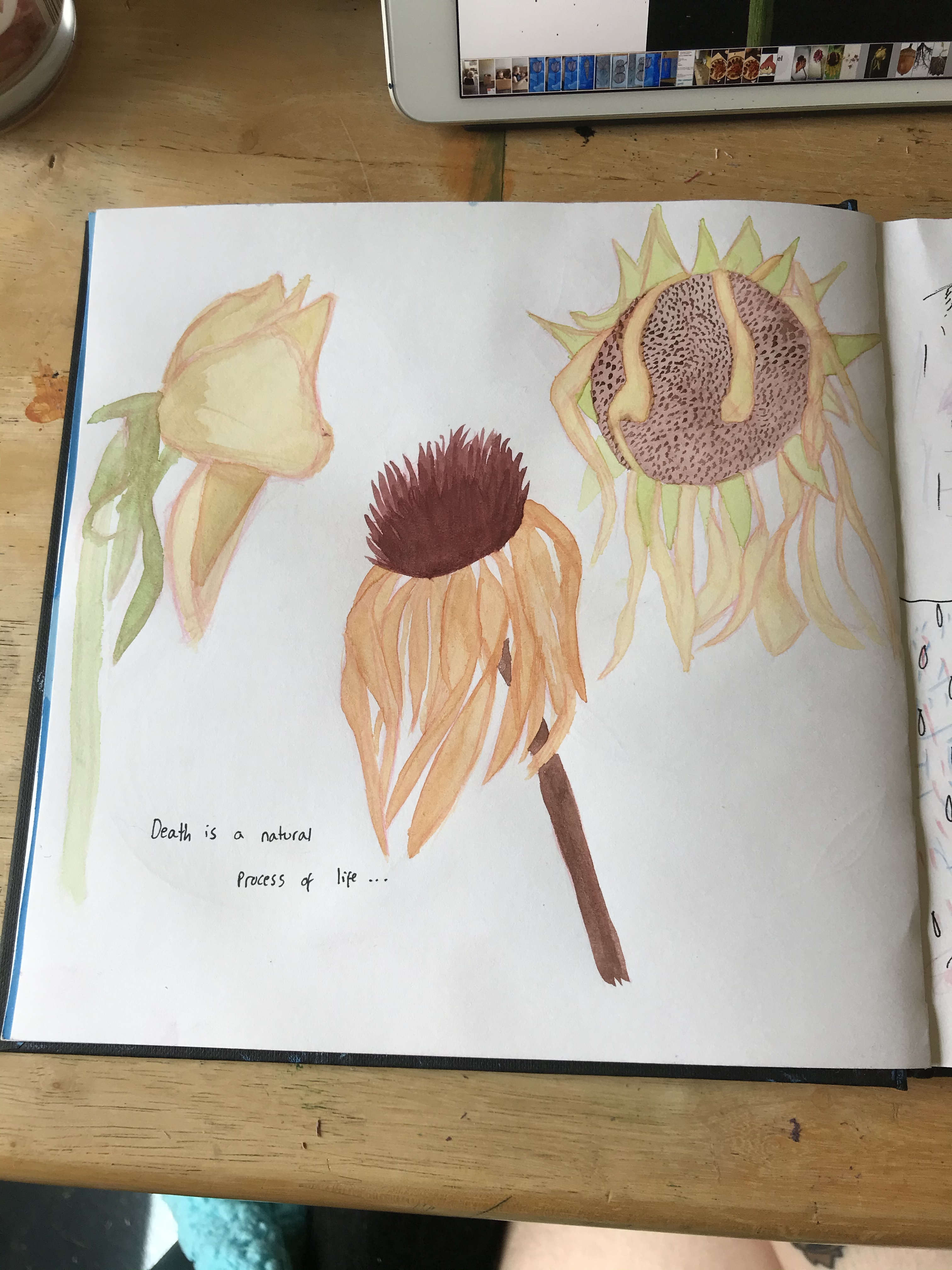
My next piece was a two page spread. I wanted to touch on the seasons, so I did four illustrations – one representing each season – using ink pens for detail. I had never tried this before, and I really love how it looks. I filled the background with gouache, also a new paint to me, and tried to feature 4 distinct seasonal skies. Next, I painted some dead flowers, as I feel death is a product of time. I then listened to 3 different songs of varying lengths and sketched/doodled as the song played, keeping my strokes and movement in line with the track. I love this way of drawing, especially going back and creating characters from the lines I have made.
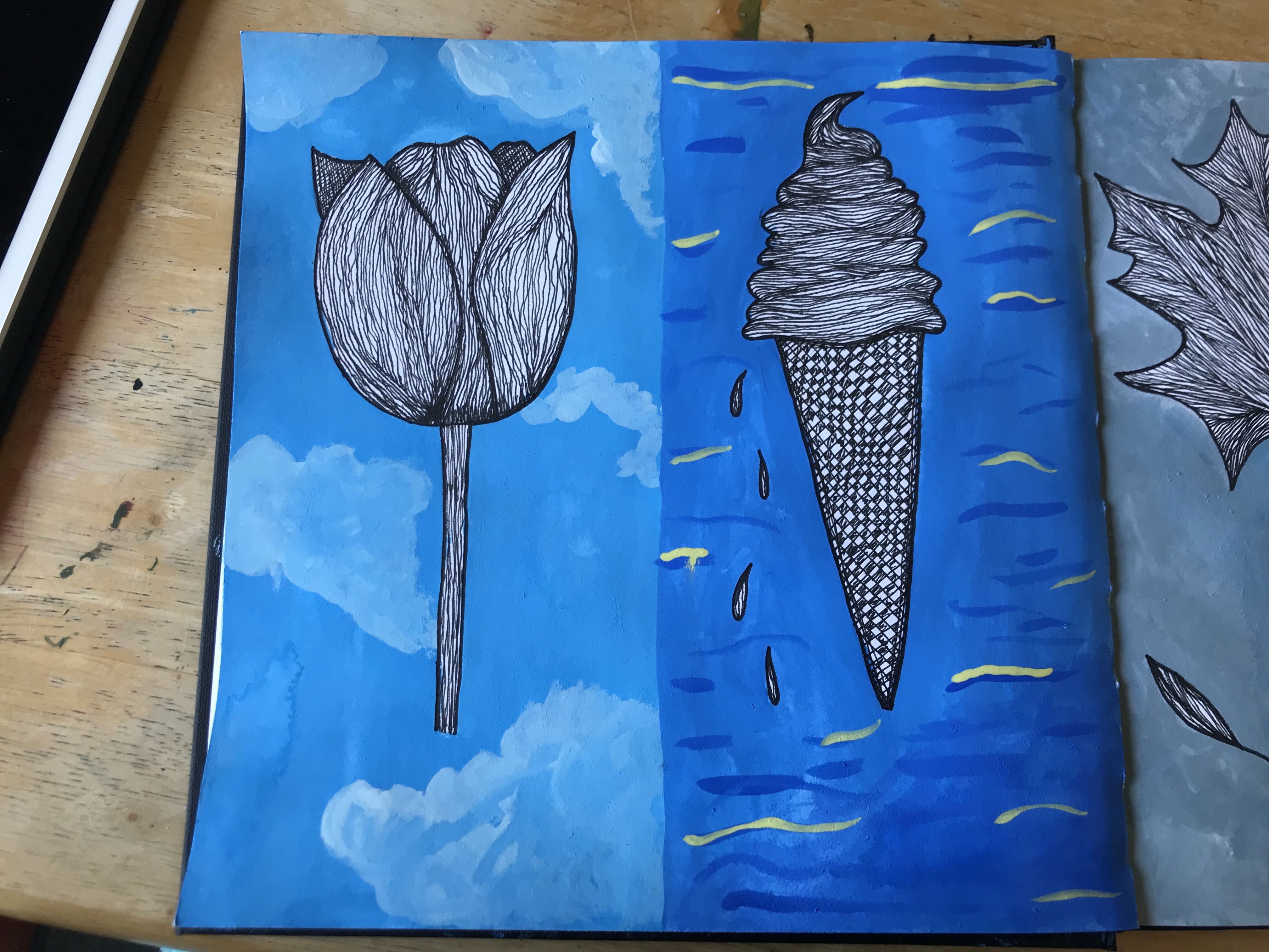
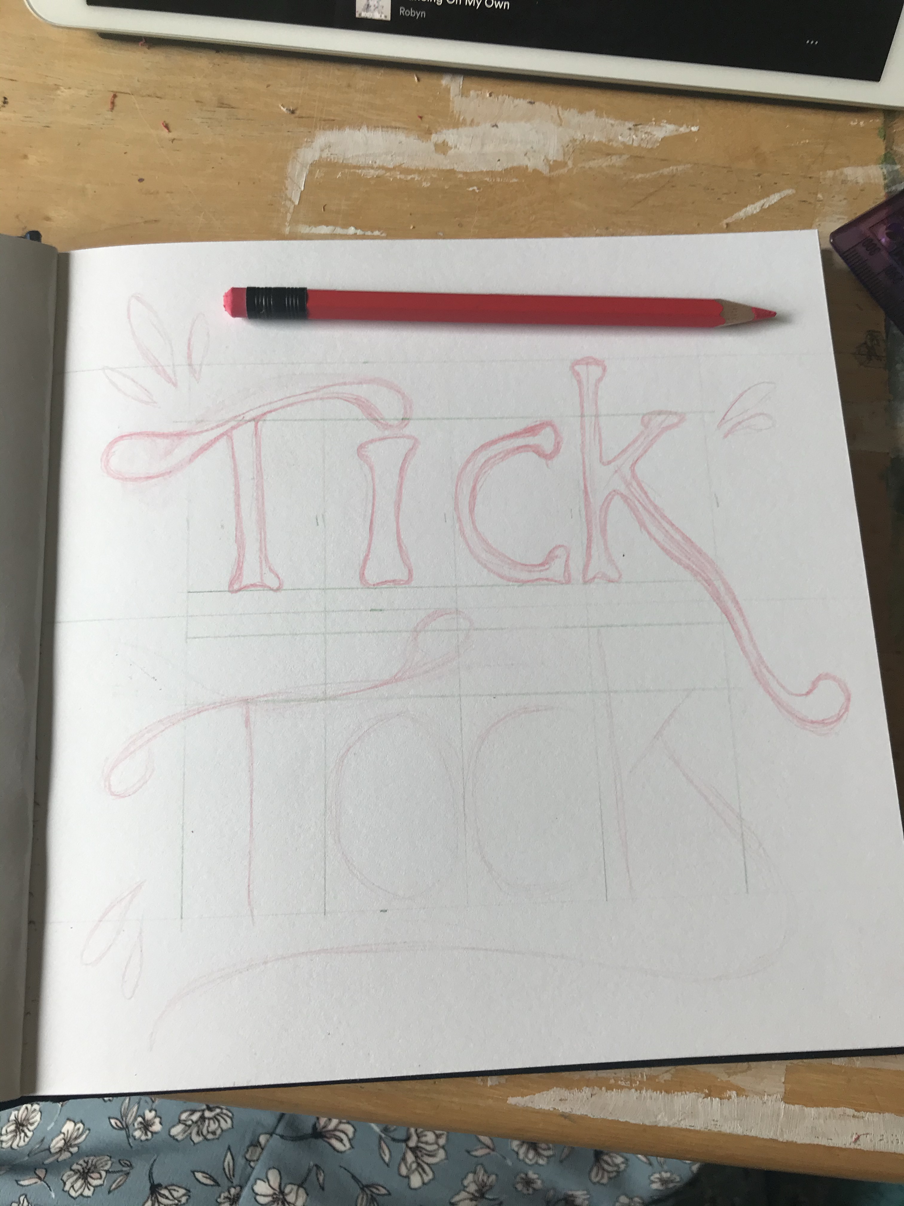
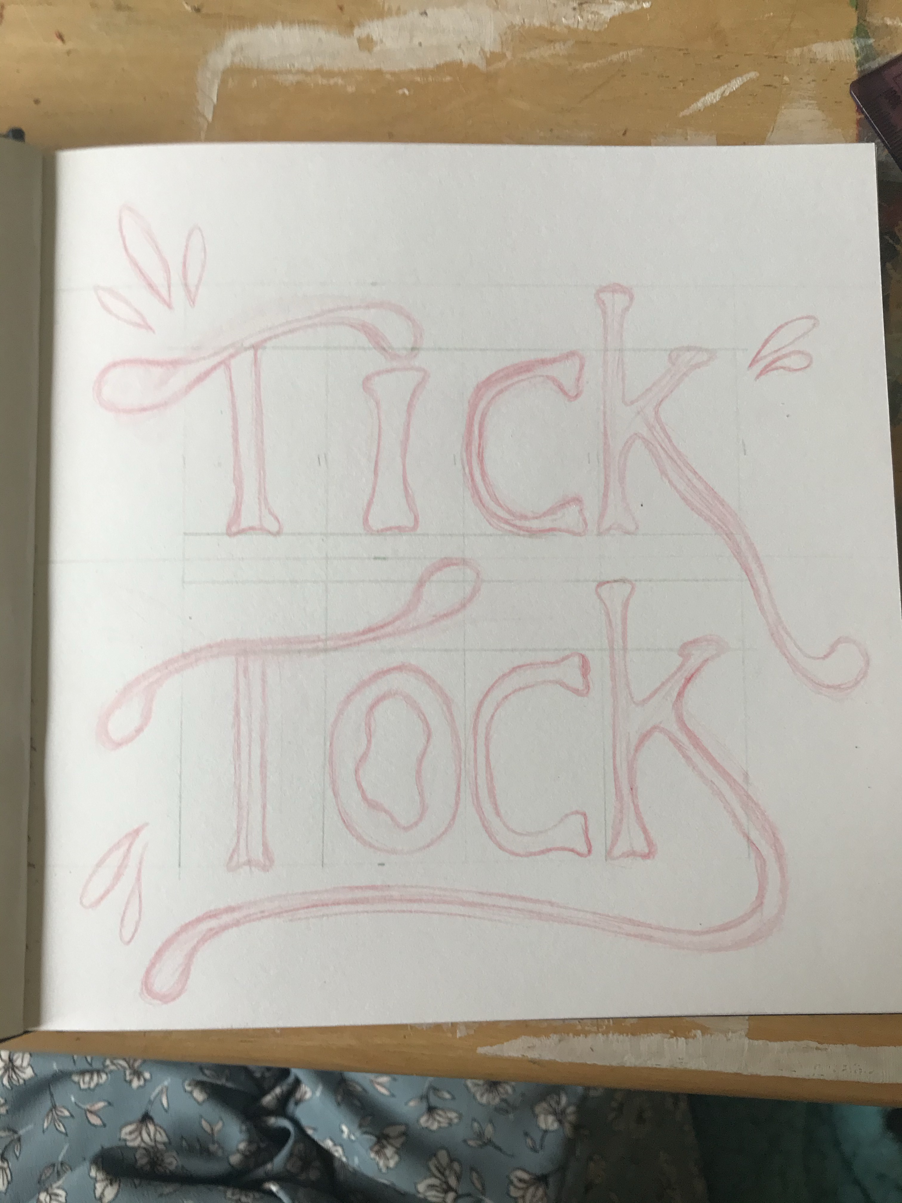
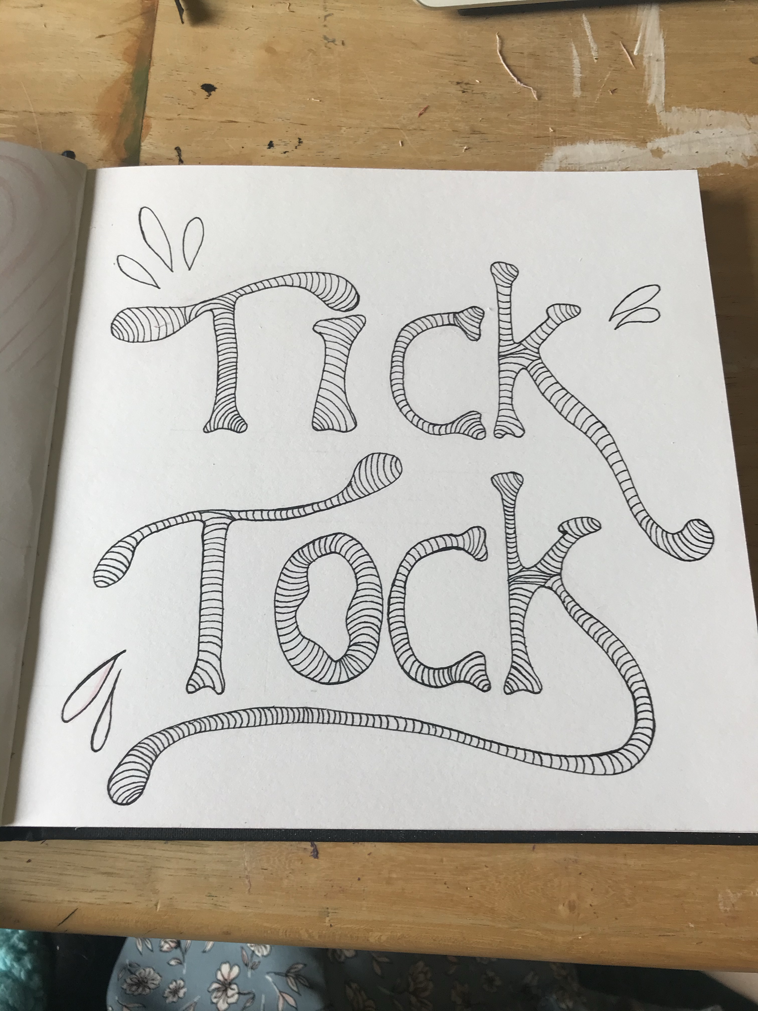
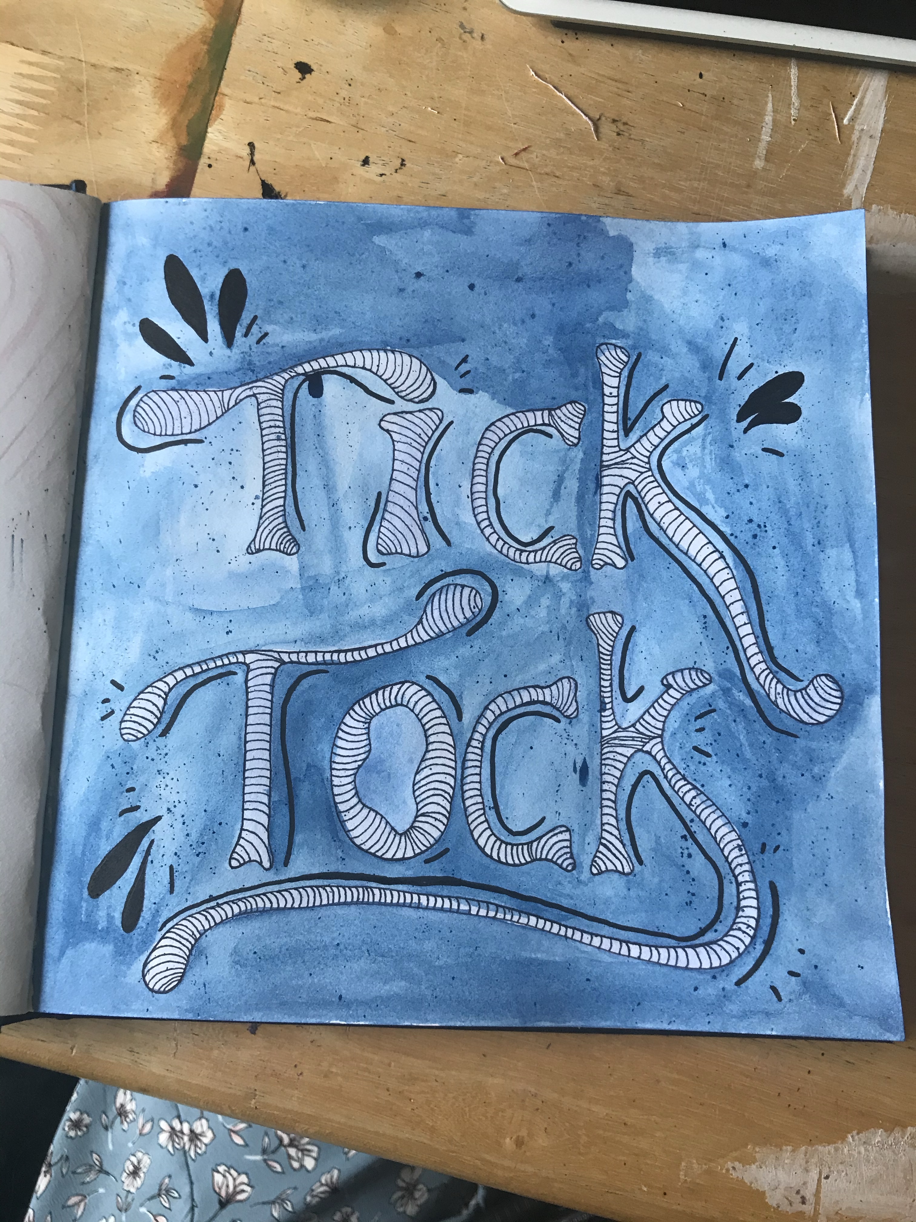
I then wanted to draw a page of ‘things that grow’. The heart is meant to be representational of love growing, and I tried a new watercolour technique here. I then drew vegetables growing out of the ground, and an acorn with deep roots. The acorn looked a bit like a character, so I gave it a face. My last page simply said ‘tick tock’ and was just for a bit of fun and relaxation. I love lettering, and I really enjoyed using watercolour here too.
I’m very excited to see where the sketchbook circle takes me, and I’m grateful for it as its conception is what started pushing me to leave my comfort zone and begin being freer with my art. Doing these 10 pages has encouraged me to sketch more, and shown me that sketchbooks can be fun.
This exercise was split up into several parts. The first part was to read an extract from The Daffodil Affair by Michael Innes, and answer the following questions: – If this were to be made into a film, what would the main character be like? – What clothes would the character be wearing? – What furniture is in the main area in which the action takes place?
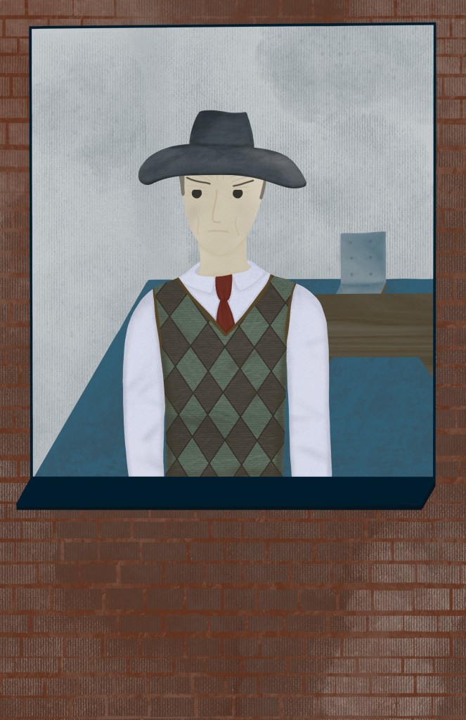
I feel like the main character would be in his late 40s/early 50s. He’s disillusioned, bleak, and emotionally hardened by the life he’s lived. He’s quite disengaged and settled in his anger, which makes him appear almost robotic. Towards others, he is stern, direct, firm, and intimidating. He seems traumatised from war and his experiences as a detective. He carries his anger everywhere he goes, wearing it on his face and in how he holds himself. He would be dressed appropriately for his job and the time he’s in, most likely wearing a suit and tie with suspenders. He doesn’t relax often, and wears a suit even out of work.
There is very little furniture in the scene – The only items that are mentioned are a large desk in the centre of the room with a chair at it, paired with tall uncurtained windows. It’s also mentioned that this is intentional, as the man in question does not want to feel comfortable. There may be a few items on the desk, such as a typewriter or lamp, but they aren’t mentioned in the text.
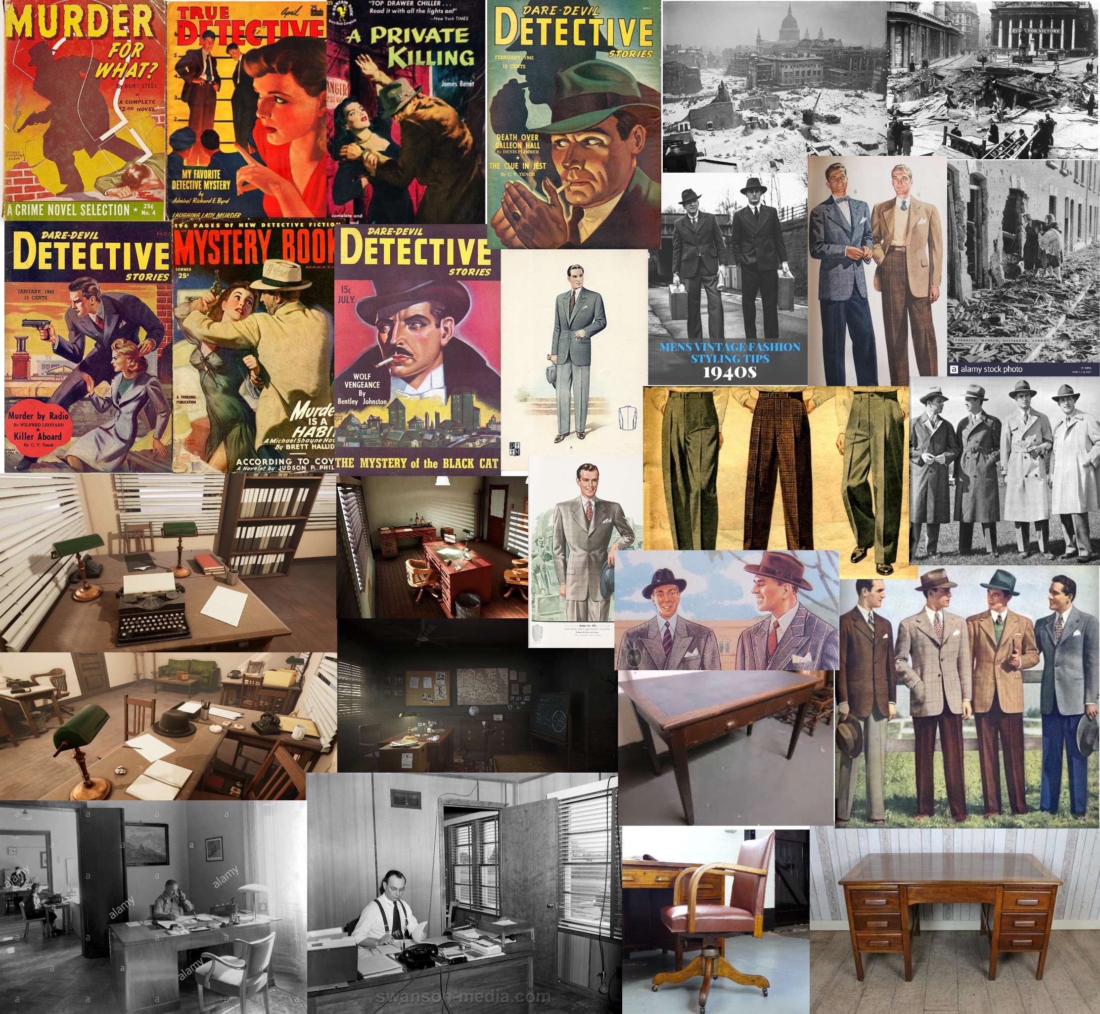
The next part of the exercise was to collect visual reference for the scene. I used Google, and searched thoroughly to find images that reflected what I felt was in this scene. The book was published in 1942, so I focused on World War 2 era images.
Research board
I collected images of war-torn London, typical clothing men wore at the time, the type of desks and furniture used in offices, and several covers of detective novels published during that period. I wanted to reference these to see how detectives were typically depicted.
Next, the exercise asked me to choose a word that captured the mood I wanted to convey and to create mood boards for textures and colours I associated with that word. I picked the word ‘bleak’, which is quite vague and proved difficult to instinctively find textures for. I started writing a list of all the things that I thought were bleak, especially in reference to the portrait I would be drawing. My list was:
Writing this list gave me a better idea of what I wanted to look for to add to a mood board. I also picked some colours I felt were bleak – blues/greys and cool toned colours – and swatched them on a canvas. I then searched for imagery that fitted my idea of ‘bleak’ texturally. I organised them together into categories and put them onto individual mood boards. Because one of my focuses was a de-saturated colour palette, I then added a cool toned blue overlay to each mood board. I felt very inspired by how dull this made each one look, and it gave me a clearer idea of what I wanted to create. Finally, I looked through my texture brushes on Procreate and swatched ones that I felt fitted the tone of the image, so I could revisit this to use them in my illustration.
Mood boards for the word ‘bleak’
Colour and brush swatches
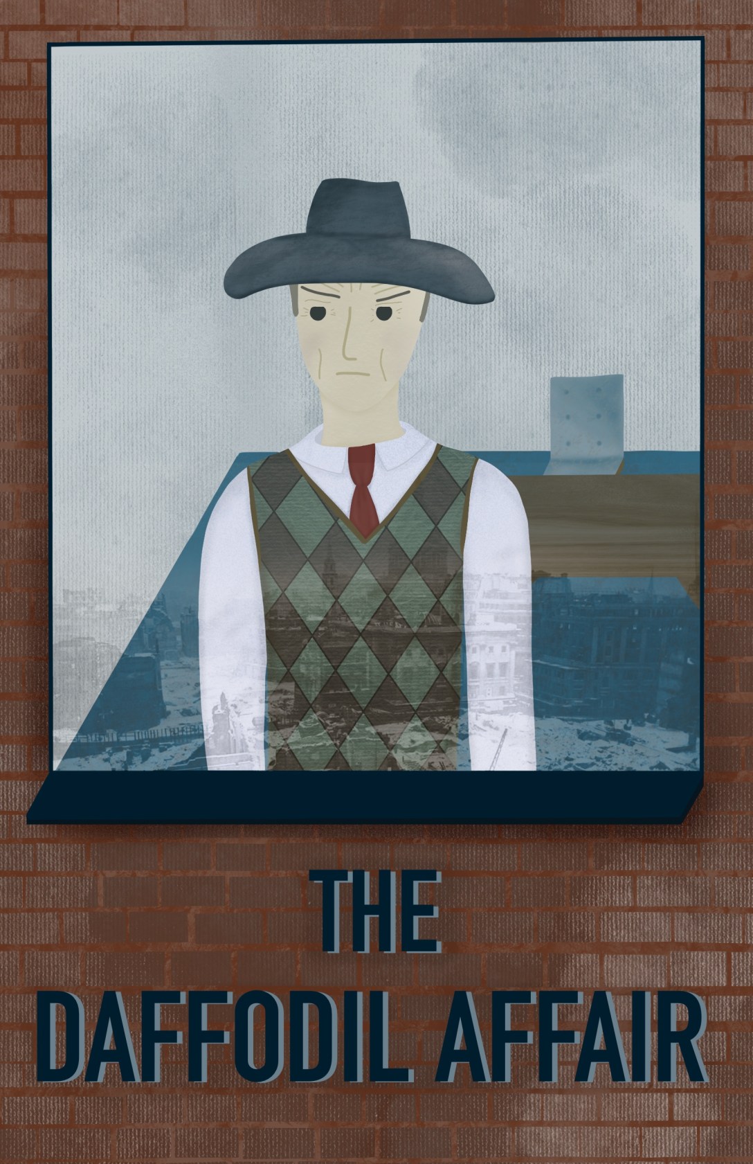
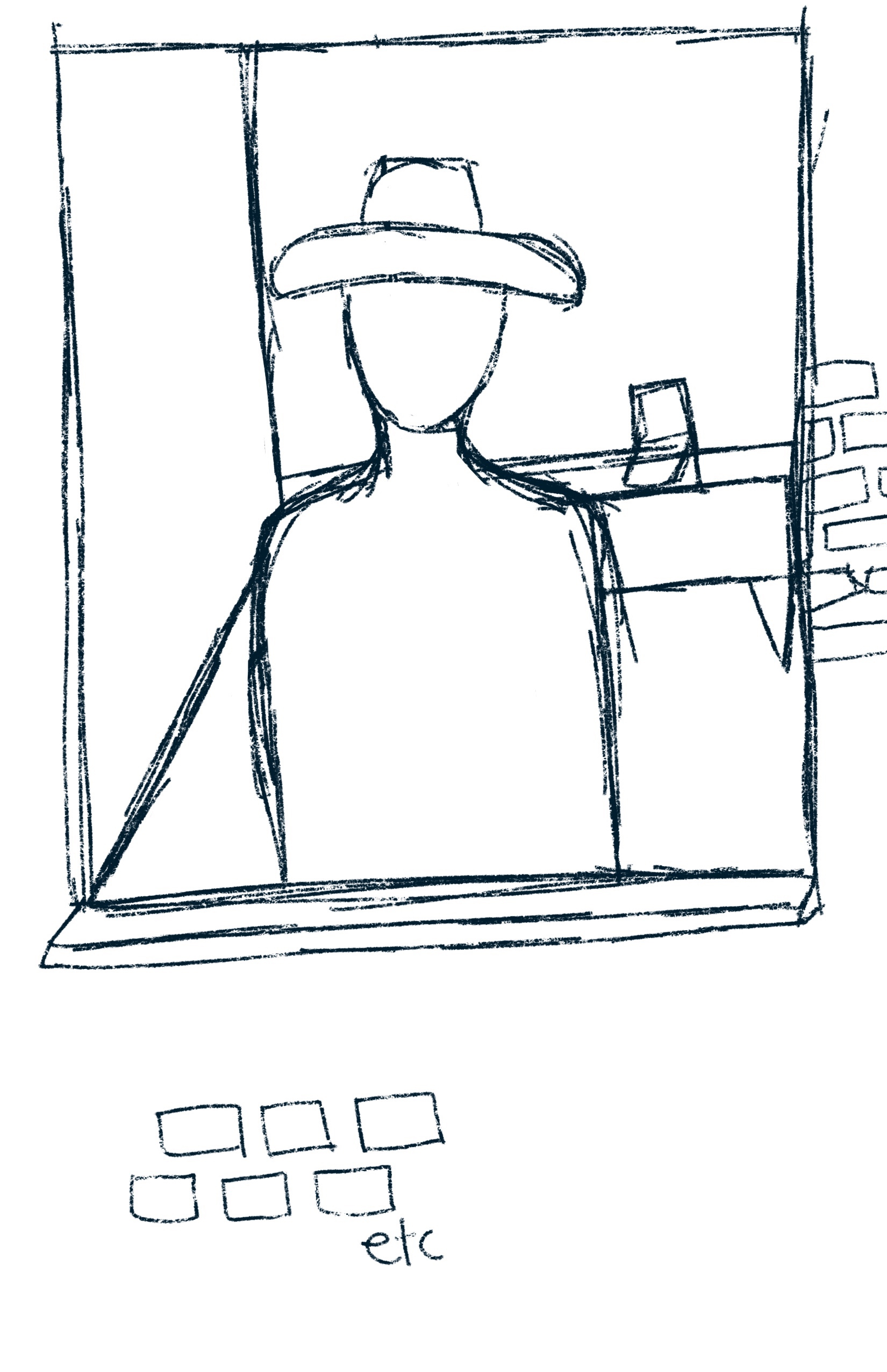
The final step for this exercise was to create a simple portrait of the character using the reference I had gathered. I started by thinking about how I wanted to portray the man. How would he be standing? Where would he be standing? I sketched out a few ideas for the layout of the piece. I really wanted to capture the fact he was looking out at London during World War 2. My first sketch was from behind, and I figured I could draw out the scenes of London through the window and have emphasis on the emptiness of the room. The second sketch showed him from outside of the window. I thought this would work well as I could focus on showing his anger and still capture the bare room and have the reflections of London in the window. My third idea was to show the room at an angle, with the man standing at the window looking over London. I roughly sketched a fourth idea but gave up on it almost instantly, as I just felt the perspective was too tricky. Reading over the brief, I decided to go with my second idea for the final illustration, as it fit it best and could convey the most information. I would also be able to include many of my ‘bleak’ textures and concepts.
Sketch development
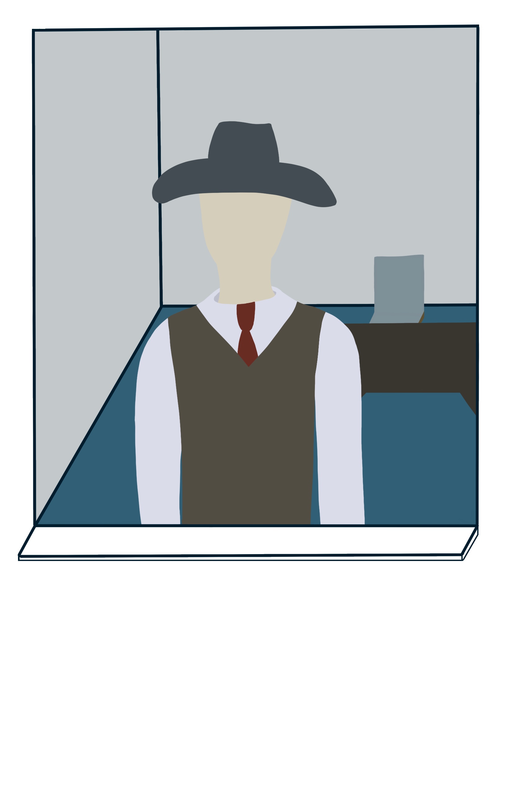
I wanted to illustrate this digitally, so I sketched out the same concept on Procreate. I had a colour palette picked already and brushes I knew would work for the tone I wanted to convey, so it was a seamless transition. I began adding block colour to the piece, and drew out the bricks around the window. Then I started adding texture and shading. I tried to only use the texture brushes I had picked out in my swatch sheet, along with my regular shading brushes. I found the reference I had gathered was very useful when colouring and texturing the clothing, but had to dig around a little more for how a sweater vest would look. I thought it made more sense for him to not be wearing his jacket as he is indoors.
Progress on illustration
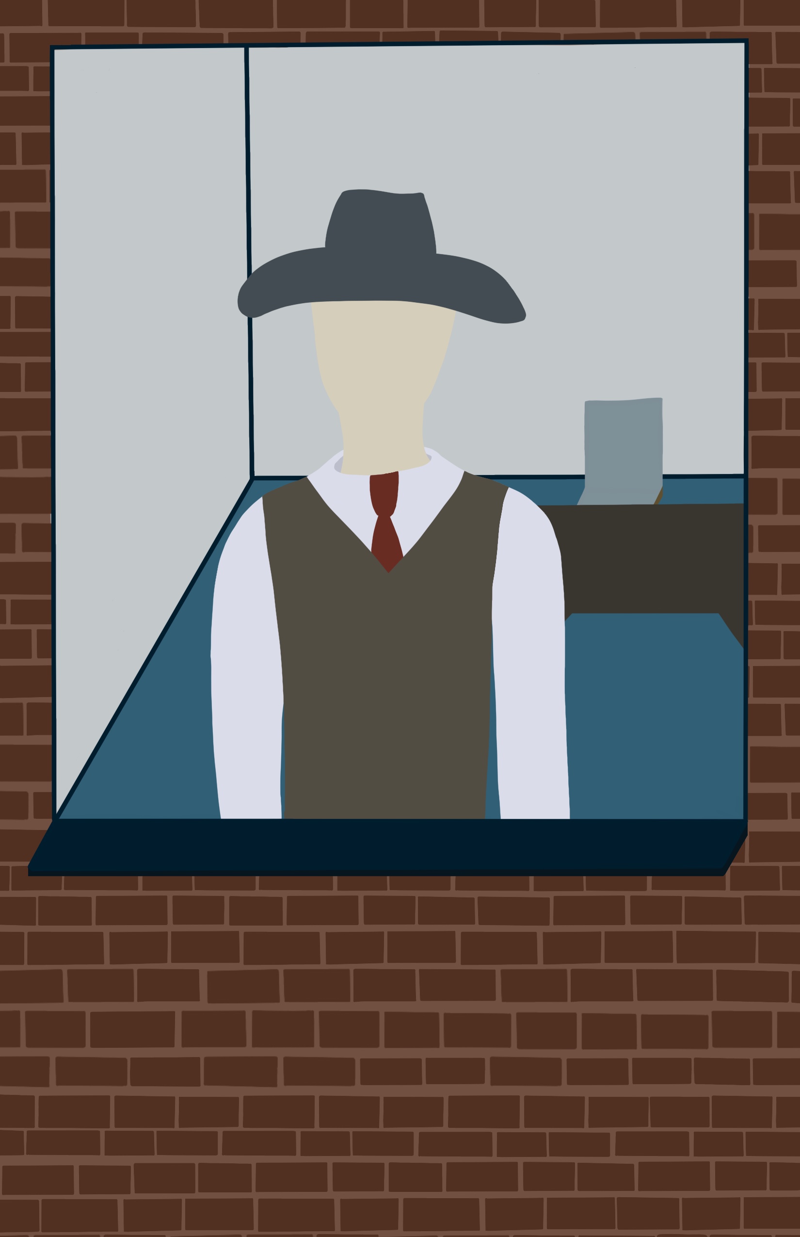
I saved the face for last as it was the bit I was most dreading. I have talked before about not enjoying drawing people and faces, as I struggle with it. It’s one area I find it really hard to let go of my perfectionism with. I also feel I haven’t quite found a ‘style’ for my faces. I do have a consistent go-to for how I draw them, but it doesn’t feel right. I was pretty impressed with how it came out, however, and how I was able to convey his anger. I added wrinkles and frown lines to show his constant disappointment and age. Usually I do full circles for eyes, but I opted to trim the tops off, which I thought helps convey his annoyance. Rather than going for the rosy blushed cheeks I normally would, I shaded them with a darker greyish brown, as I was trying to keep it bleak.
Addition of the facial features
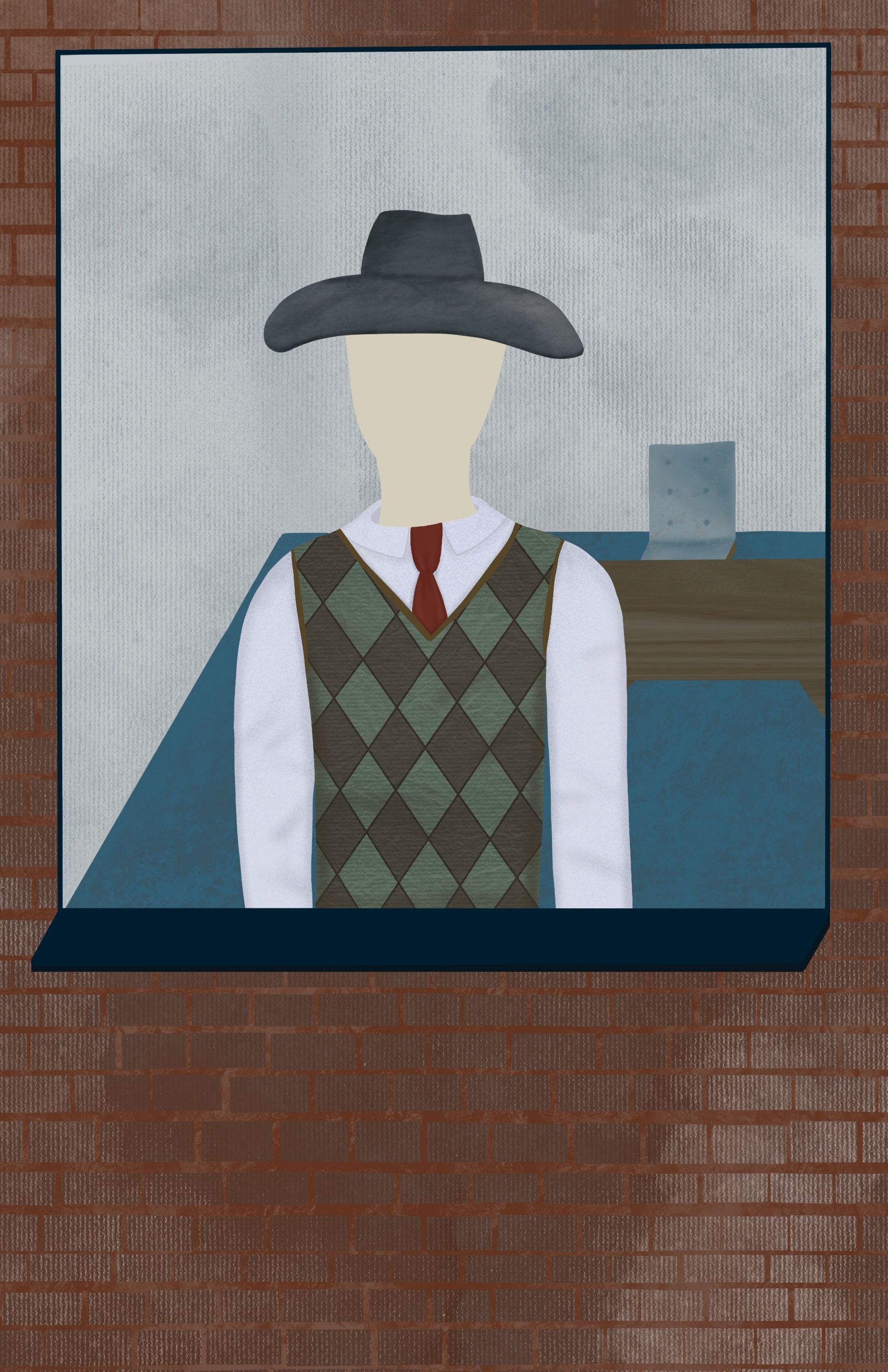
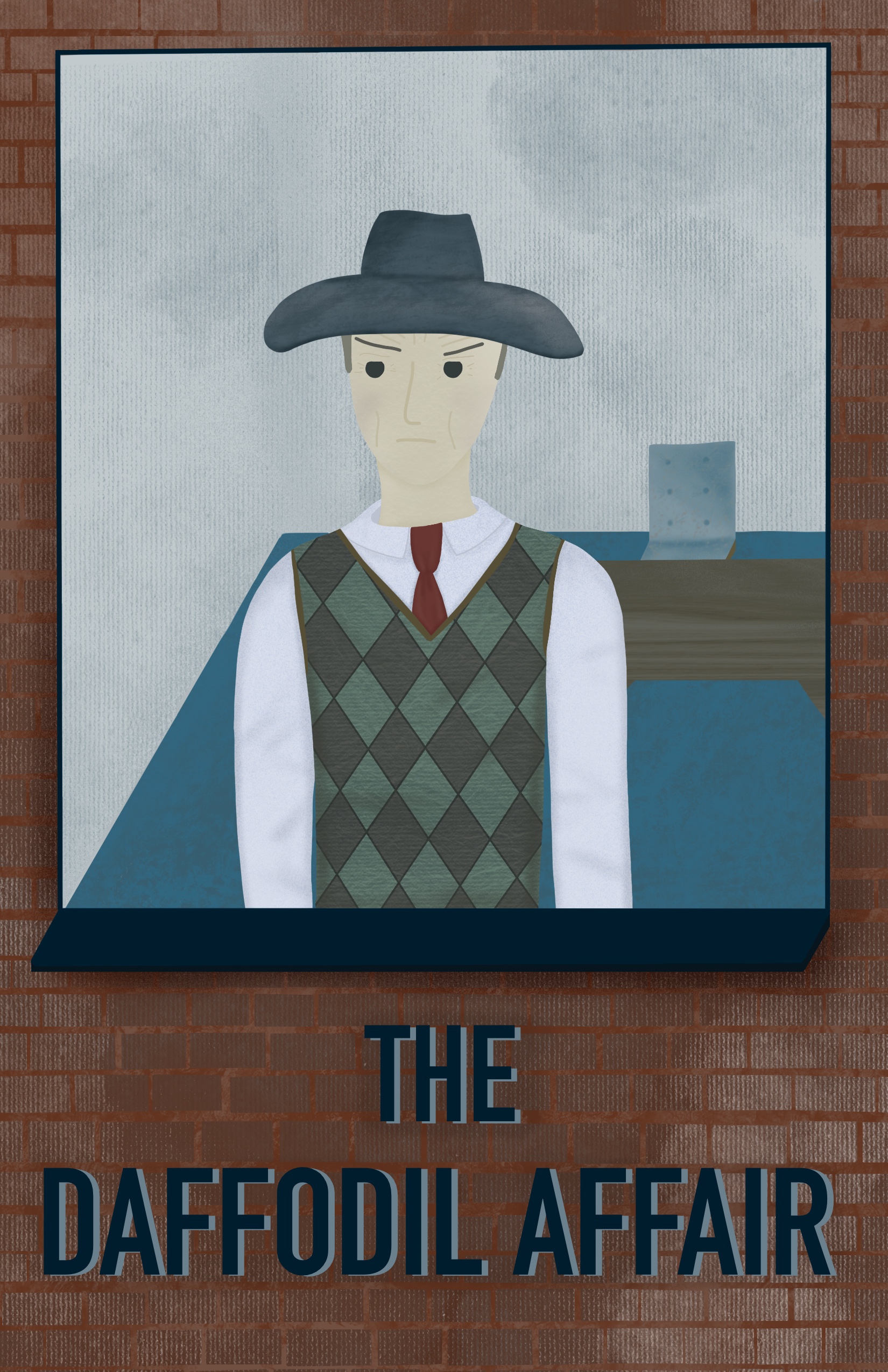
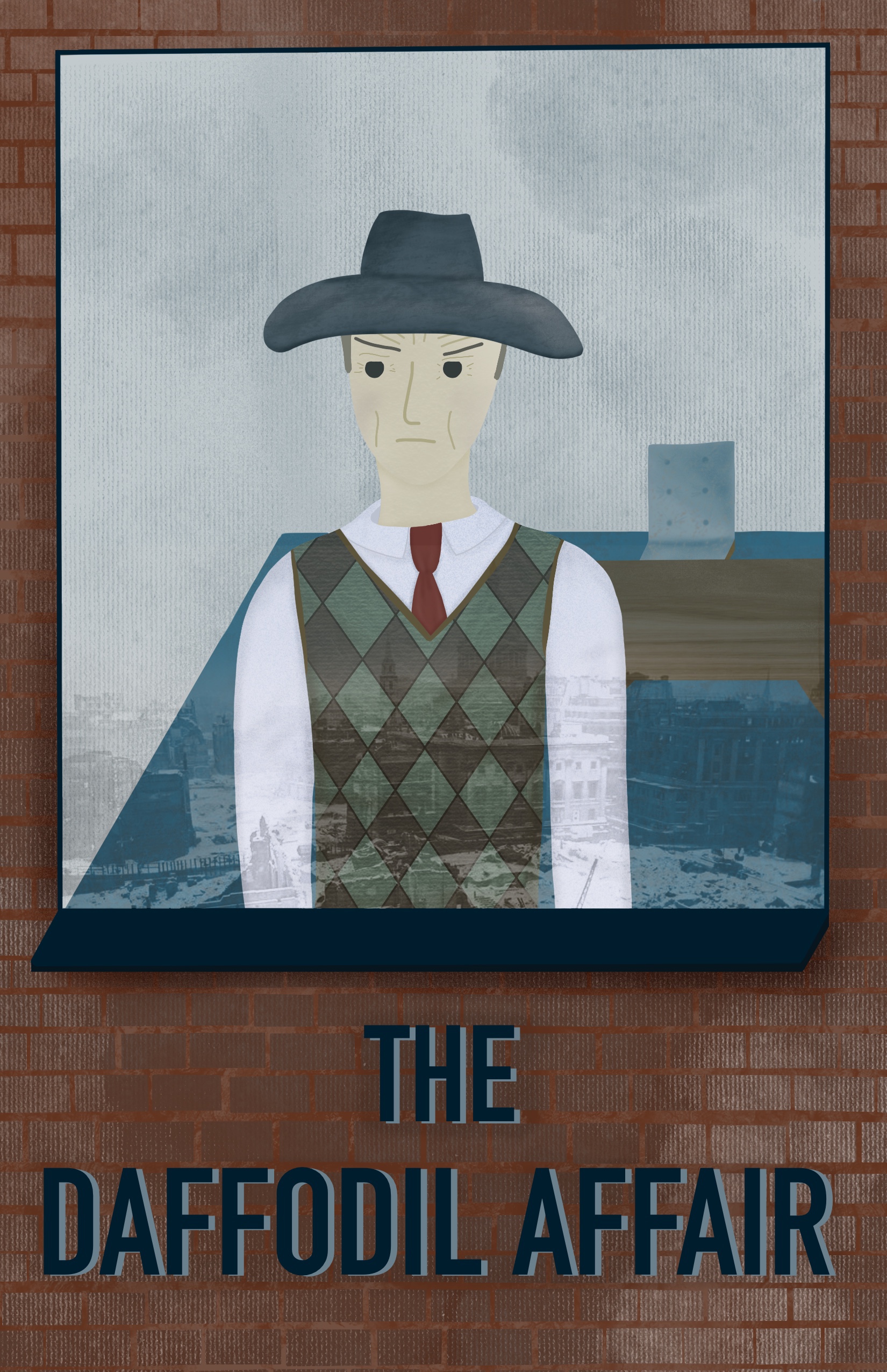
I decided to overlay an image I found when collecting reference onto the window as a reflection of the city outside. Normally I would attempt to draw this myself, but as I’m trying to notgive myself more work than necessary and get hung up on being perfect, I chose this method instead. I really like how it looks, but I’m still not too sure of it. I have shown the illustration both with and without below. To finish up, I added some text so it would appear like a book cover – despite that not being required – as I felt the empty space was perfect for it. I think the text could probably use work, but I can’t quite figure out what it needs.
Finished illustration with and without overlay of buildings
I sent this piece to the OCA Visual Communications student Discord server and asked for feedback. Someone commented that the contrast on the facial features wasn’t high enough, and that,at a small scale, they aren’t visible. I altered the contrast a little, which I agree makes a huge difference.
Finished piece with altered contrast
I really enjoyed this exercise and the process it required. I found that despite avoiding drawing people, having to do it repeatedly is improving my ability and I didn’t struggle as much as I did last time. It brought me comfort to see such improvement and made me consider drawing more people and expanding on that. I also love working with texture and colour, so focusing on that and how to apply it to certain contexts was a lot of fun. I definitely think this illustration could be better, and with more practice at drawing people I could create much stronger portrait illustrations. As I mentioned, I do think the text is a little jarring, but I’m unsure on how to fix that at this point.
This was quite a complicated exercise that took some time for me to fully get my head around. I had to produce a line visual around a suggested word – either ‘sea’, ‘extraordinary’, ‘building’, or ‘journey’. Then I had to print the image at A3, before inverting it and printing another, and finally using the inverted image to colour block the original line drawing. The final outcome would be a graphic drawing using black and white cutouts layered over each other.
I decided to choose the word ‘extraordinary’ for my inspiration, as I felt it was the most vague and open ended word. I wanted to really explore what I could make with this exercise, and create something that felt true to my style and interests. I began by mind mapping all the things I could think of in relation to the word, which I really enjoyed. I made a lot of connections that excited me and gave me several ideas on what to draw. Once I felt I couldn’t produce any more ideas, I highlighted the words that stuck out to me,the ones that I felt screamed ‘extraordinary’.
Mind map for ‘extraordinary’
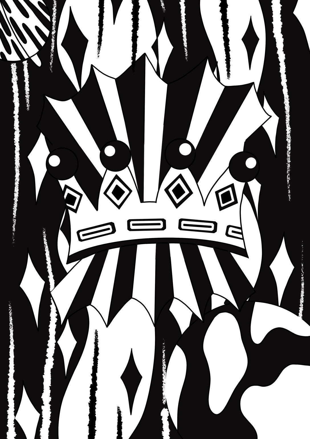
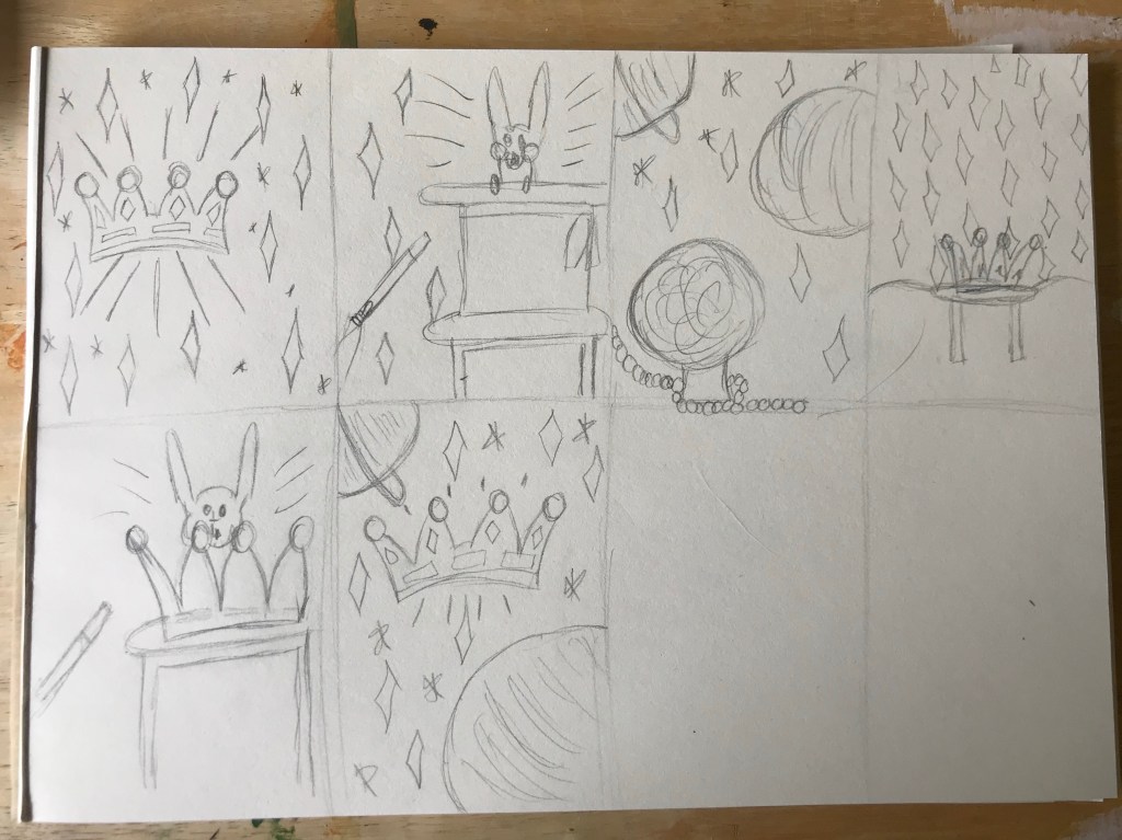
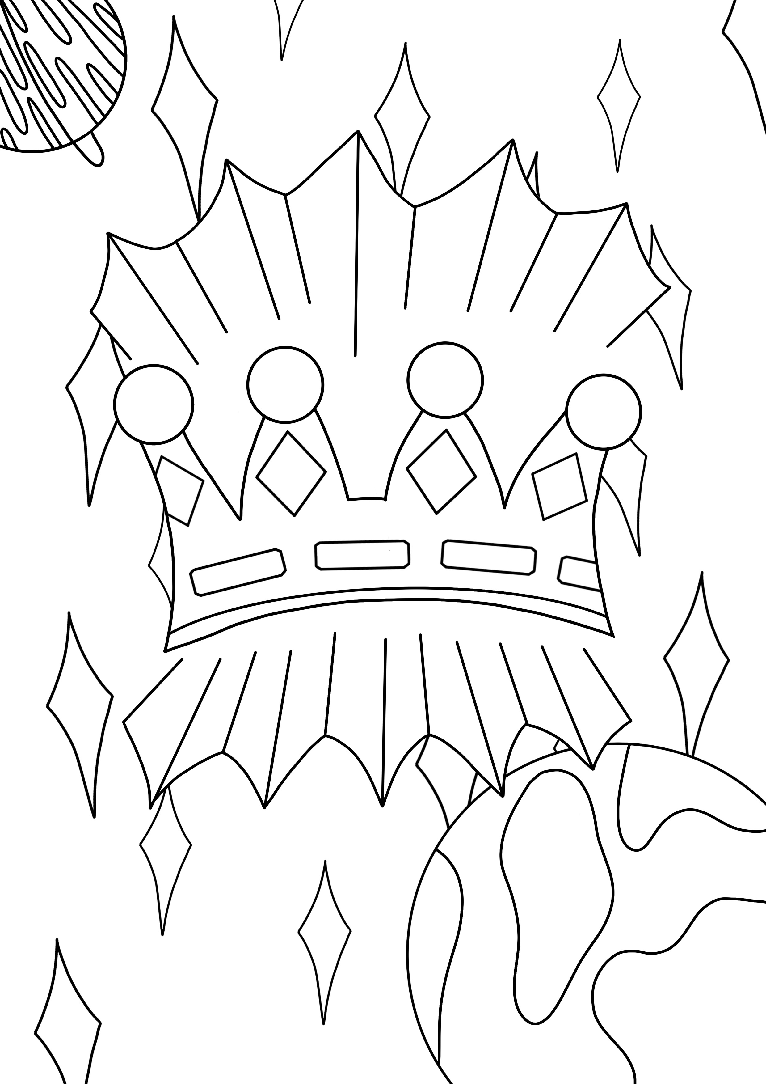
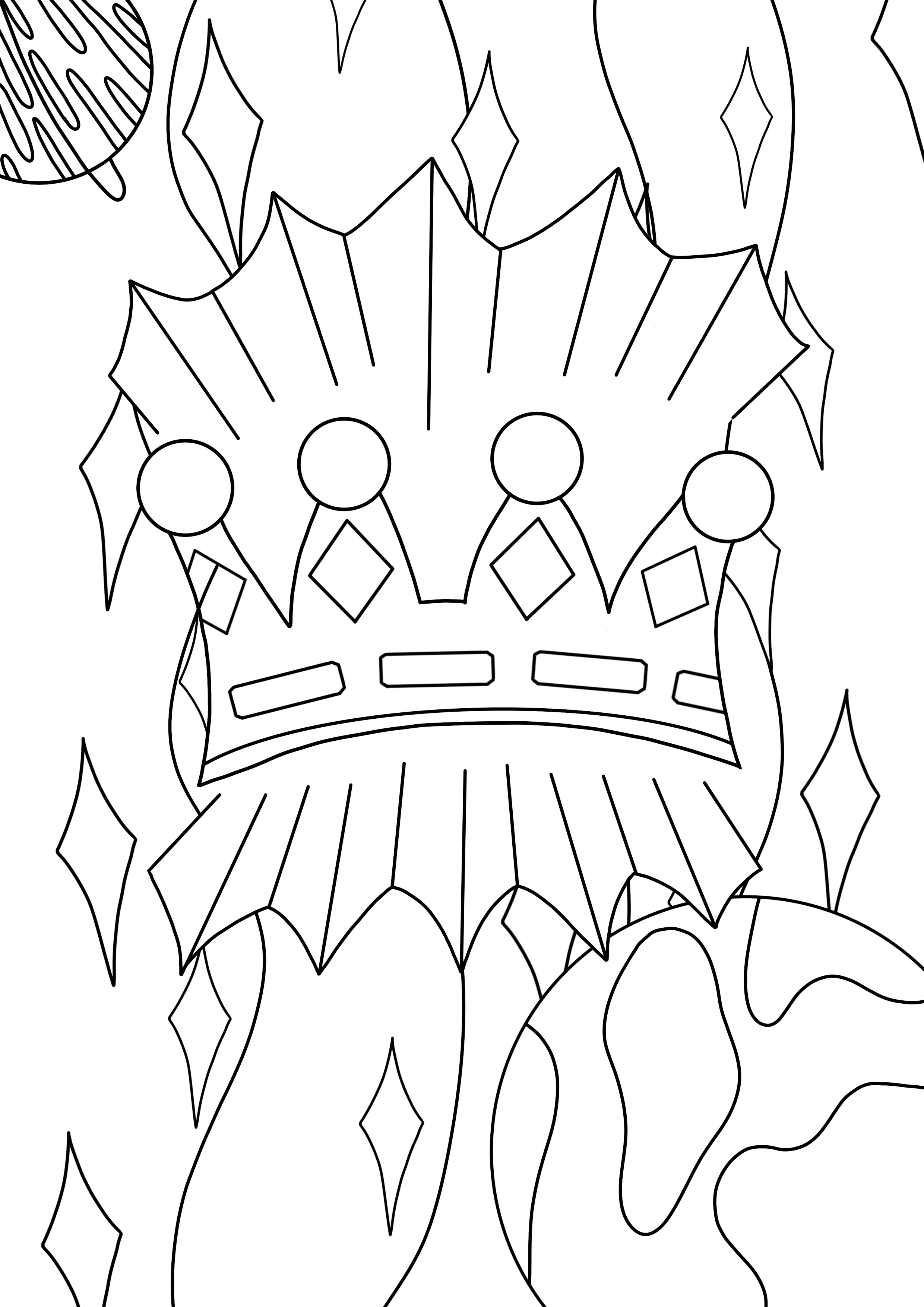
In my sketchbook I then began drawing several small thumbnail sketches, building on previous ideas as I went. My first idea was to have a crown in the centre of the drawing, surrounded by stars and sparkles. My second was to have a rabbit coming out of a hat as if in a magic show. I loved the sparkles I used in the first idea, so I carried them across to most ofmy other ones. My third idea was for there to be a crystal ball with a space background, with it almost looking like the crystal ball is a planet itself. I liked this idea a lot, but I wasn’t sure how I would communicate the difference between the ball and the planets using only black and white.
I loved the crown, as I felt it truly fit the theme, and magic to me is also extraordinary, so I tried combining the two. First I drew a crown on a stool in front of a curtain with sparkles on, sort of like a typical party magicians cloak. It felt too busy, though, so I tried replacing the top hat with a crown and having a rabbit coming out of that. I still didn’t feel like I had what I wanted – something glorious and striking. I decided to combine the space/planets idea with the first drawing, and bam –I had my sketch. I felt it was magical, surreal, and definitely extraordinary. It also didn’t have too much going on and could easily be made into a line drawing.
Sketch development
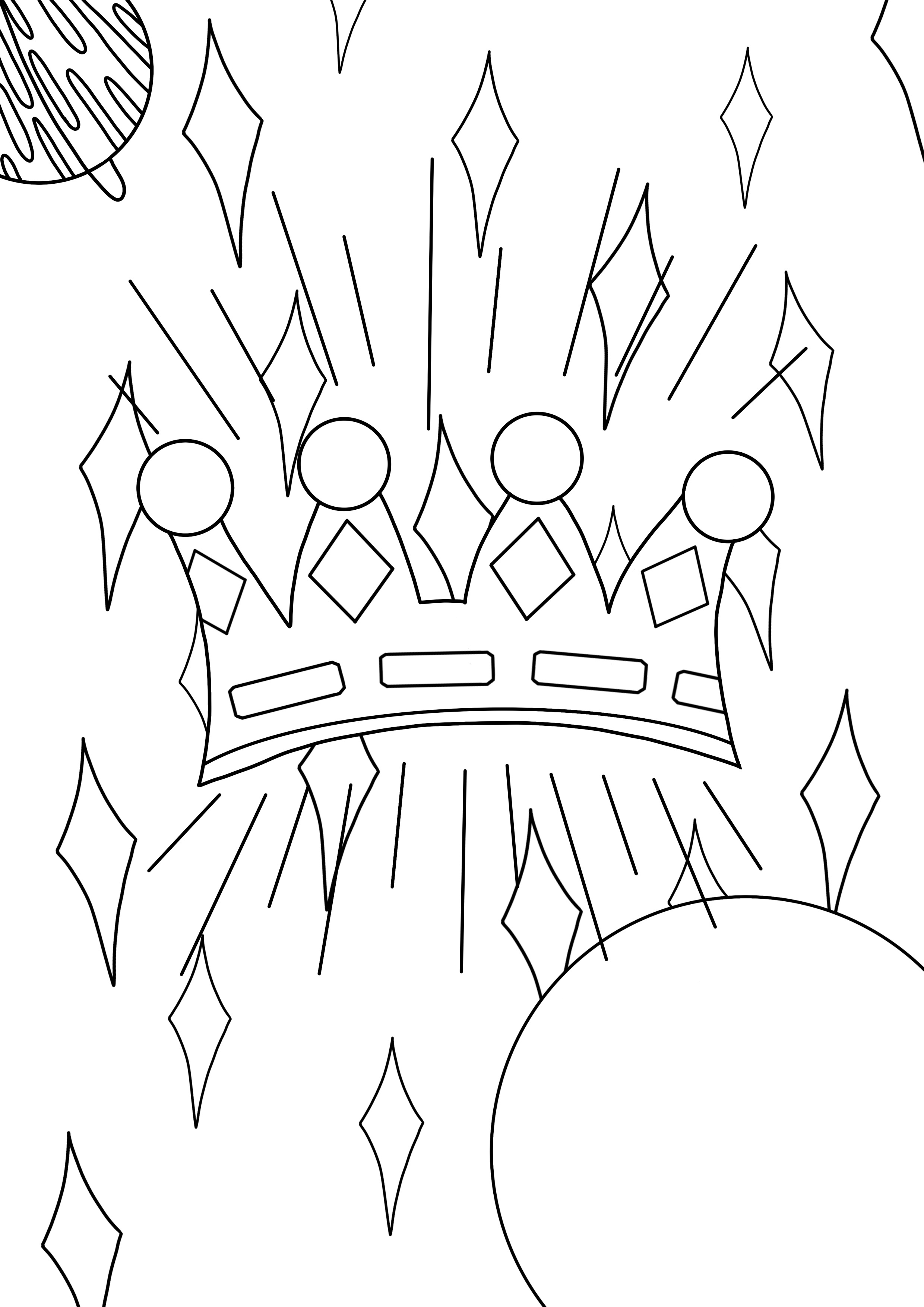
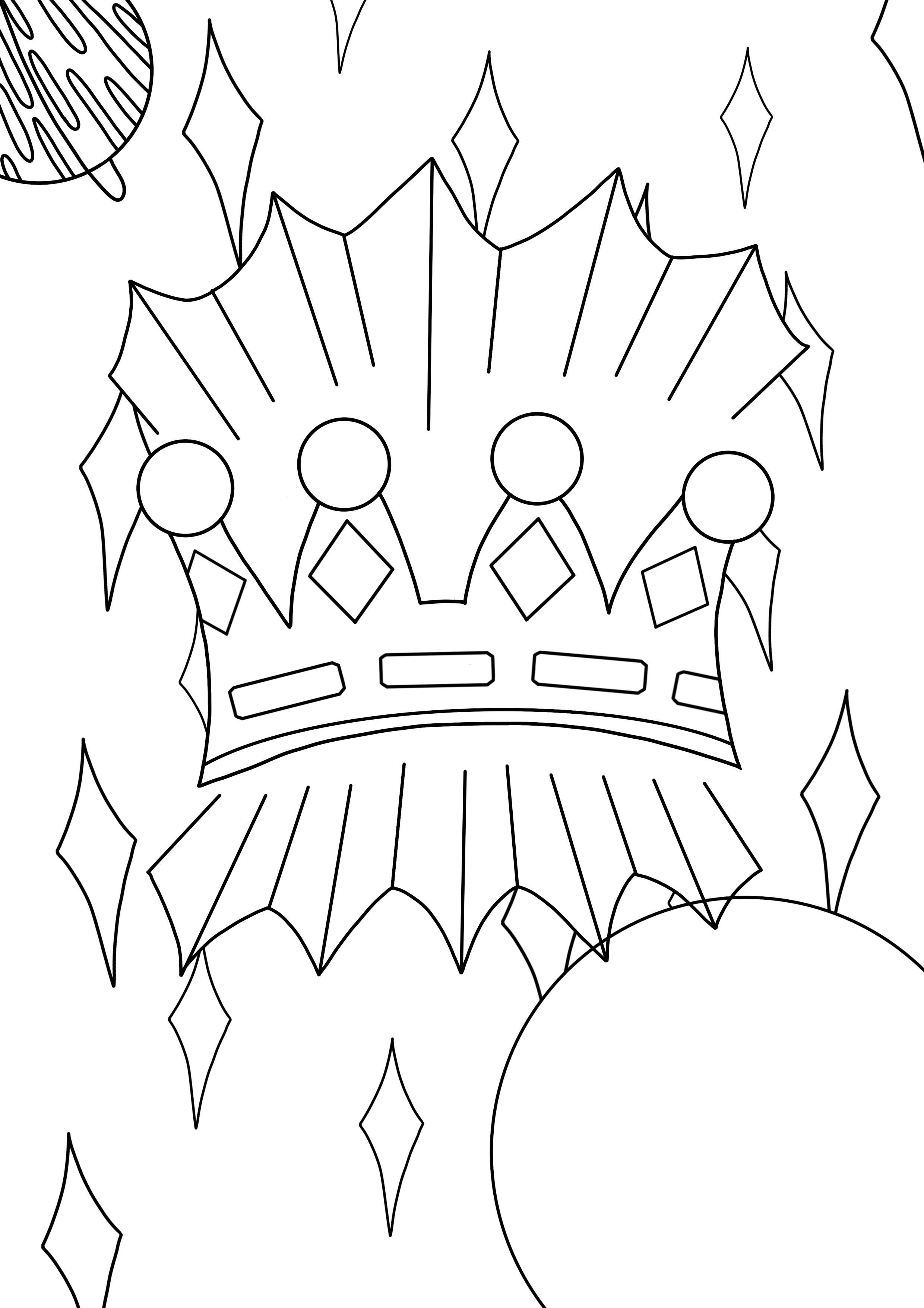
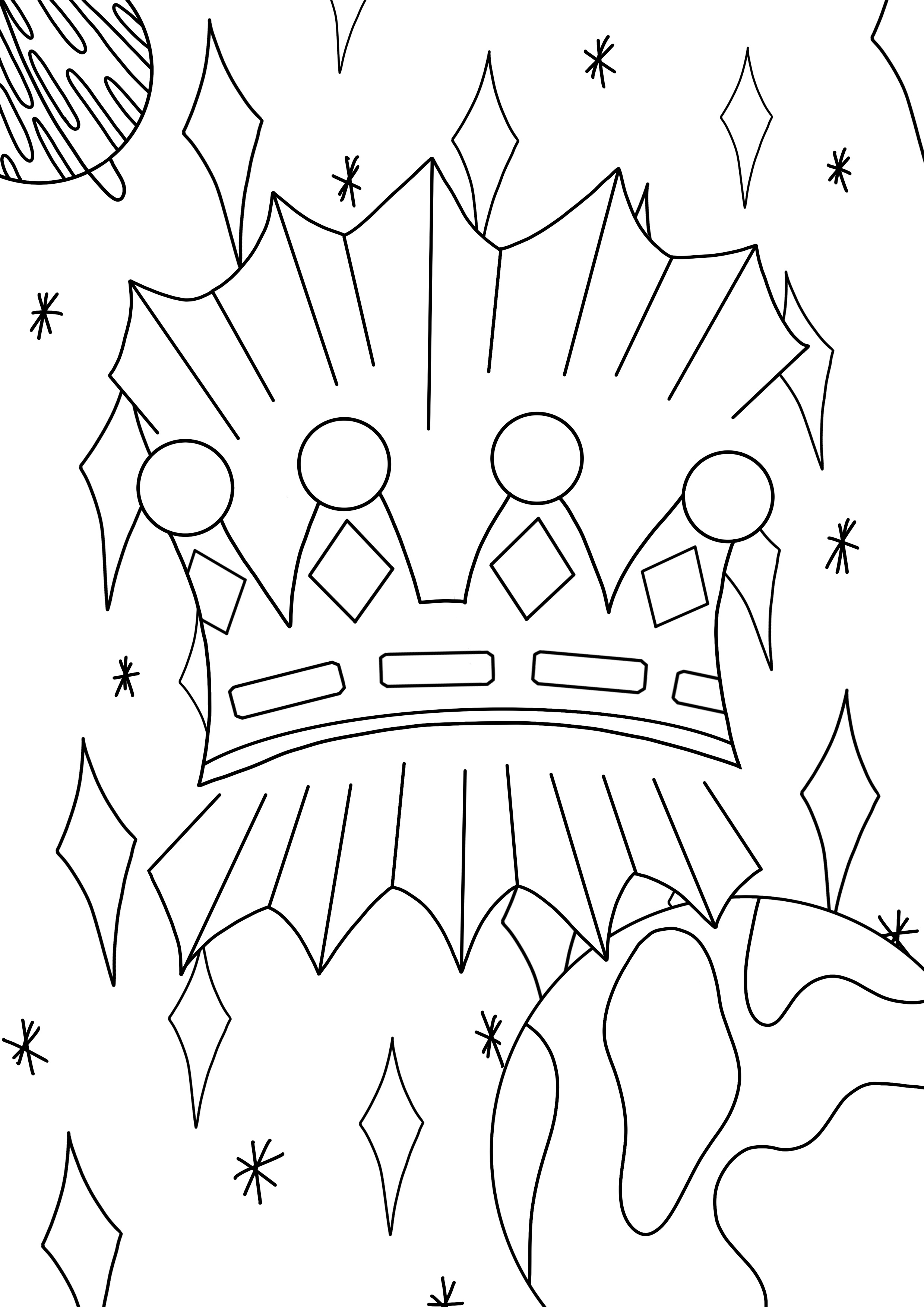
I drew my line art digitally as I wanted really bold lines to work with. To start with, I copied the thumbnail I drew initially, making a few slight changes here and there. The result was too cluttered, and didn’t have much visual hierarchy. I felt it would be difficult to fill in once printed. I decided to connect the lines around the crown, as they were meant to be rays of light, and having the space connected meant I could fill it to show that. I also added some detail to the planet on the right, as it was quite empty and plain. I considered adding smaller stars like my original idea, but ultimately decided against it as I wasn’t sure how to include them in the rest of the project.
Line art development
I then printed the image onto two A4 sheets and sellotaped them together to make it A3. I inverted the image and did the same. I began by filling the areas I knew I wanted to stand out – the rays of light around the crown, the crown itself, and the planets. Whilst doing this, I was thinking ahead about where colour would go, where I would add white later, and what to do with the background. I realised I couldn’t just leave it empty, so I needed to print more black to fill it. I went back to my digital line art and filled in where I wanted the black to be in the background, along with the areas I had already filled in. This was helpful as it meant I could form a plan for where I would be placing colour and see if it works in advance. It also meant I could cut exactly what I needed from the page.
Filling in my printed work
Adding background line work
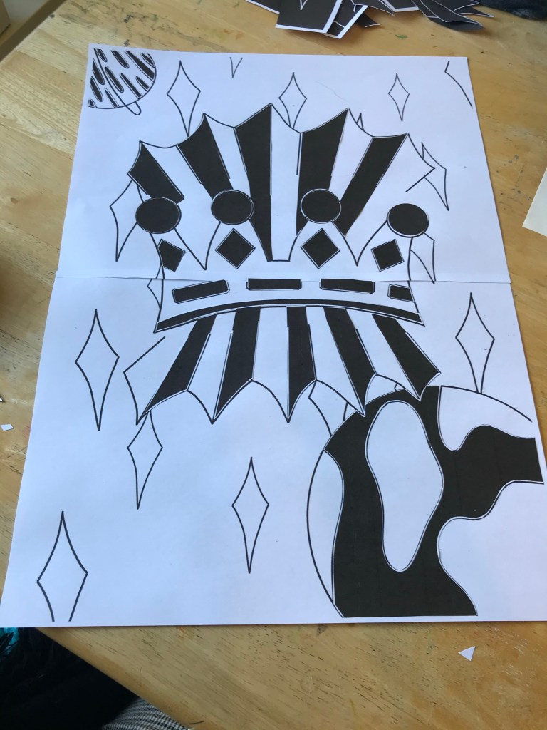
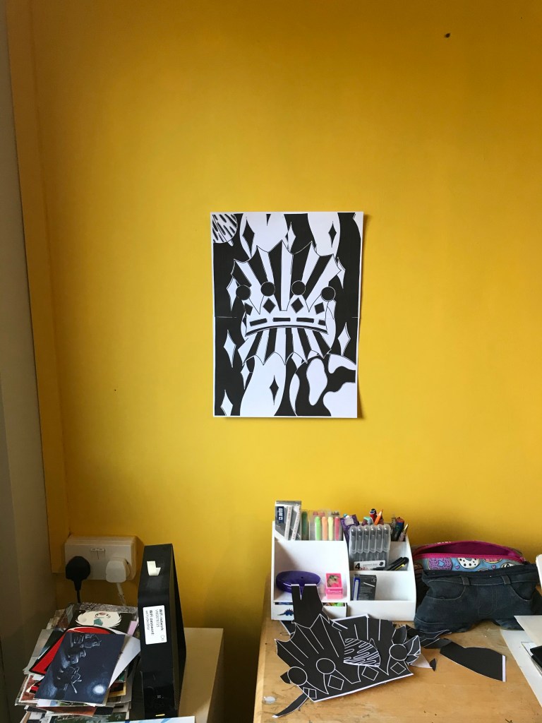
Once I finished adding the background, I decided to leave the piece overnight before adding the white details. I feel like stepping away from a piece of art helps me gain perspective on it and see things I missed before. I took several photos of the piece from different distances, and stuck it up on my wall so I could puzzle over it and try to really see what was missing. I knew I wanted to add white highlights in certain places, but seeing it hung up from a distance made me realise the background wasn’t broken up enough. There was too much black going right intoblack, and white right into white.
The piece hanging on my wall
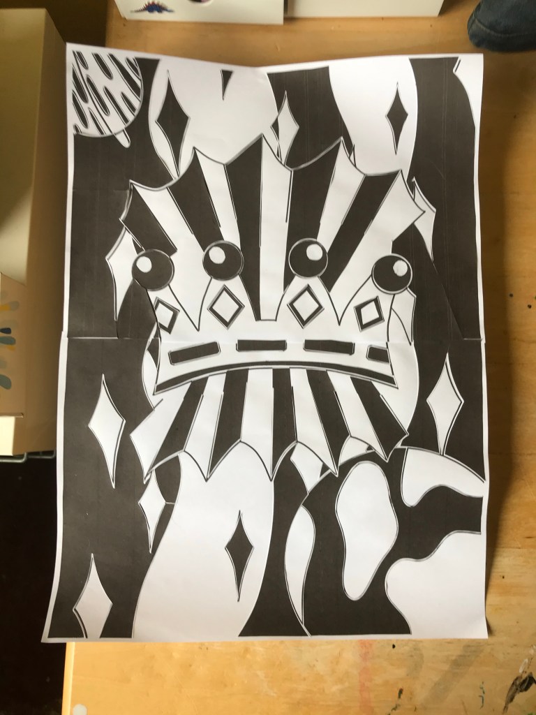
The next day, I began adding white where I knew I wanted it. This was pretty difficult – I don’t have a cutting board and knife, so I was using scissors, which are difficult to attain accuracy with. I managed to add a few bits of highlighting, so moved on to the background. I really wanted to tear up thin strips of paper and use them to break up the space. I thought the ripped paper effect would look like shooting stars/stardust. The paper however, was not behaving. I couldn’t get it to rip in thin enough lines, or even enough, and I just felt like I was wasting enormous amounts of paper and getting nowhere. Stressed and frustrated that I couldn’t fulfill my ideas, I decided to return to my digital line art and complete it from there.
Unfinished printed piece, with some white additions
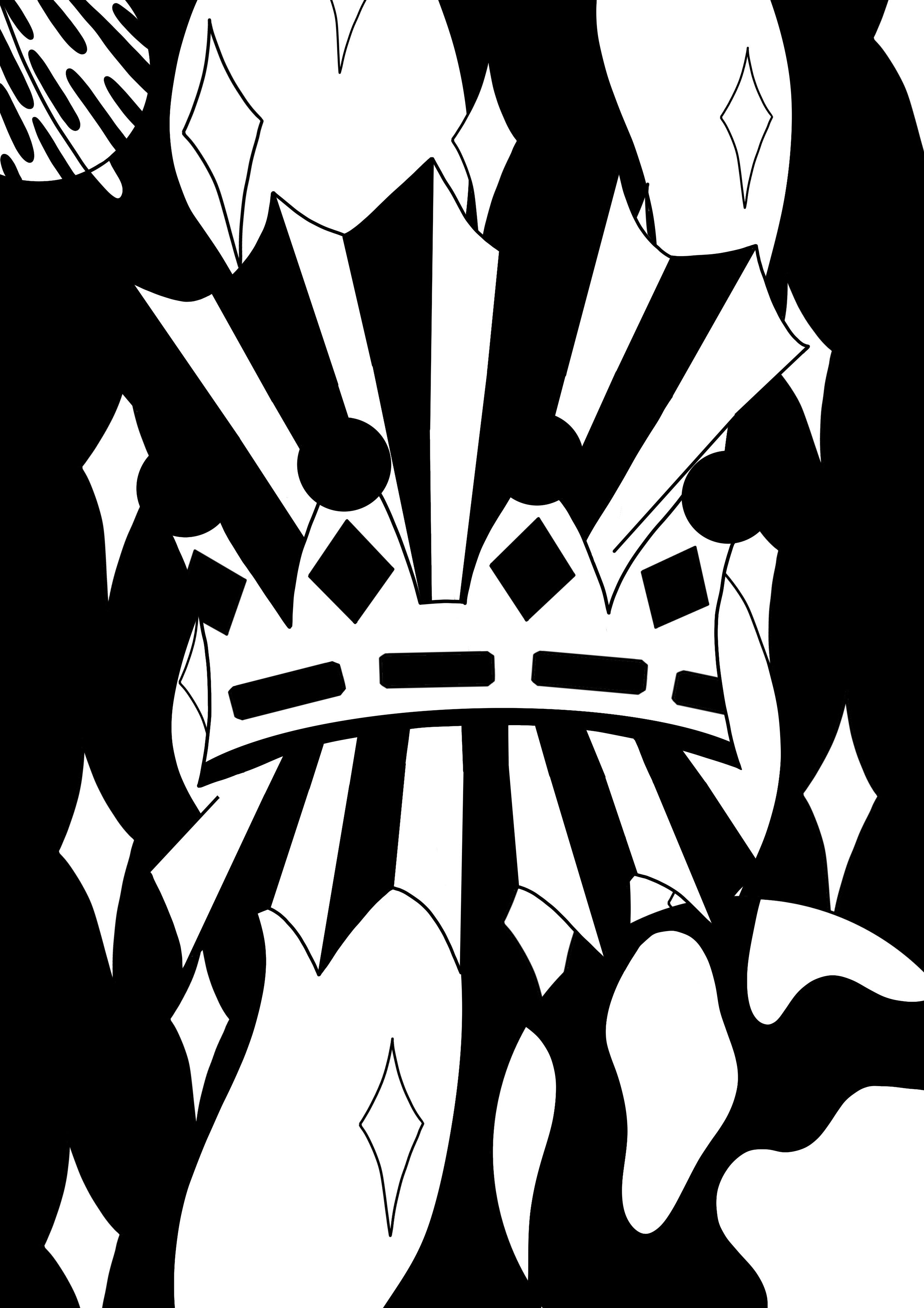
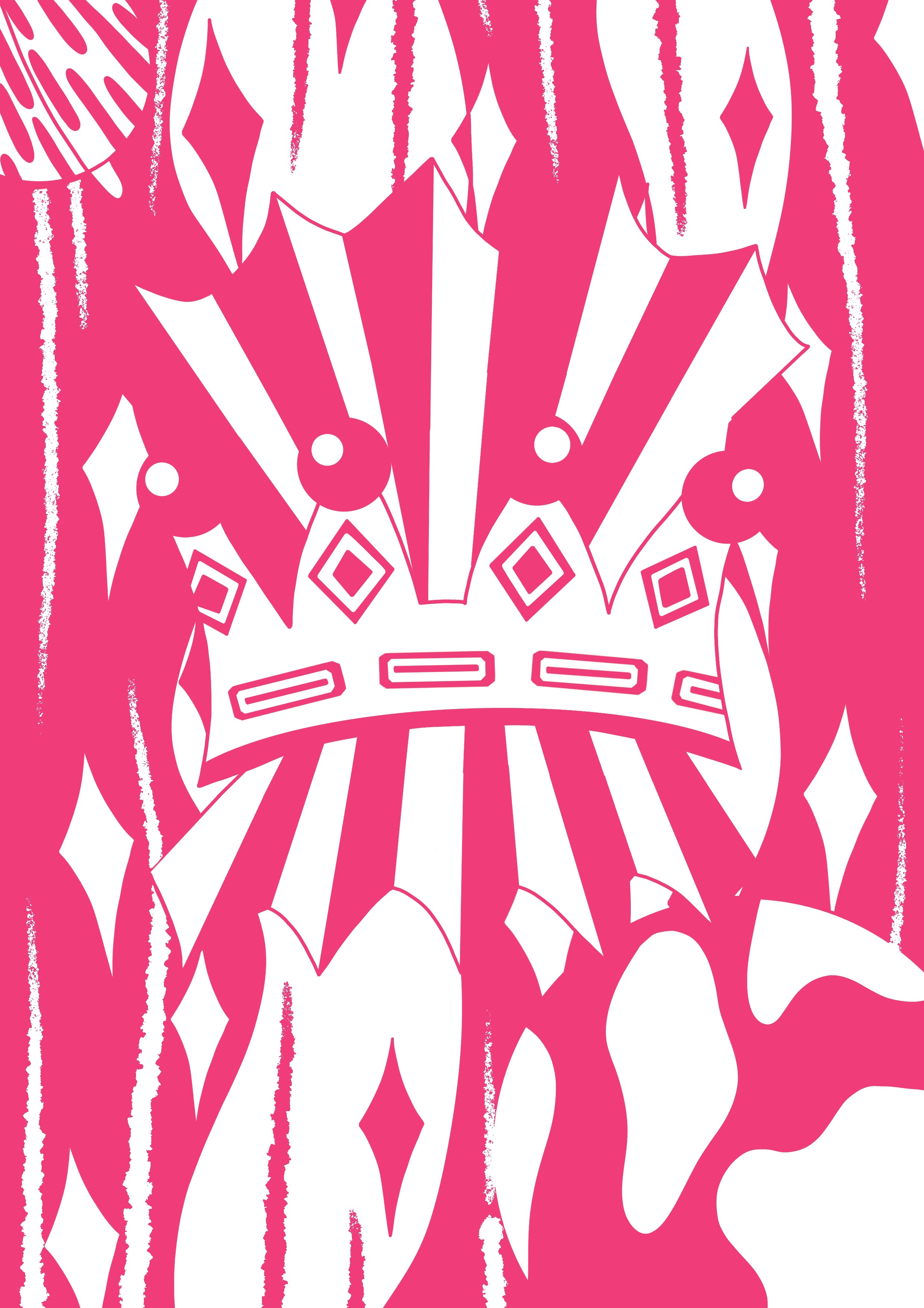
I filled in all the spaces already filled on my printed work, then started adding white. I mainly used it to highlight the jewels, layering black on top to attempt to show that they’re encrusted. I found a brush that looked just like ripped paper, and drew in what I was originally hoping to do. I also added black ‘stardust’ on the white spaces in the background. Once completed, I thought I would try a few different colour versions, just to see how it would look. I tried white with a second colour, black with a second colour, and changing both colours altogether. I love how this piece looks both in the original black and white, and with several different colours. Creating a piece in this manner makes it very versatile and opens up a lot of possibilities for colour options.
Finished piece
Varying colour options
Comparing my original line art to the finished piece, I feel like the black and white have helped exaggerate the concept of ‘extraordinary’ even further. The stark contrast between the empty space and black blocking shows clearly what’s being communicated. The illustration is still abstract and therefore not completely clear on meaning, but what is clear is that it’s extraordinary. The focus is definitely on the crown, but also on the fact it’s floating in space, which I think is made clearer by the ‘torn paper’ effect. I feel like the line art is quite soft, whereas the addition of black and white has made it incredibly striking and bold. It’s now very powerful as an image. It’s commanding and eye catching, and immediately pulls your focus into the centre.
This process reminds me of a lot of the art I’m inspired by, as most of it uses limited colour palettes and simple shapes. However, I wasn’t sure what could be quantified as ‘graphic illustration’. I searched for an explanation and found this article, which was really helpful. My understanding is that a graphic illustration is a simple image that moves away from fine art principles and is used to communicate a specific meaning. It’s less focused on expression and more on being easy to understand. So, in theory, simplistic colour palettes and shapes could be graphic illustrations, so long as they’re easy to understand or infermeaning from.
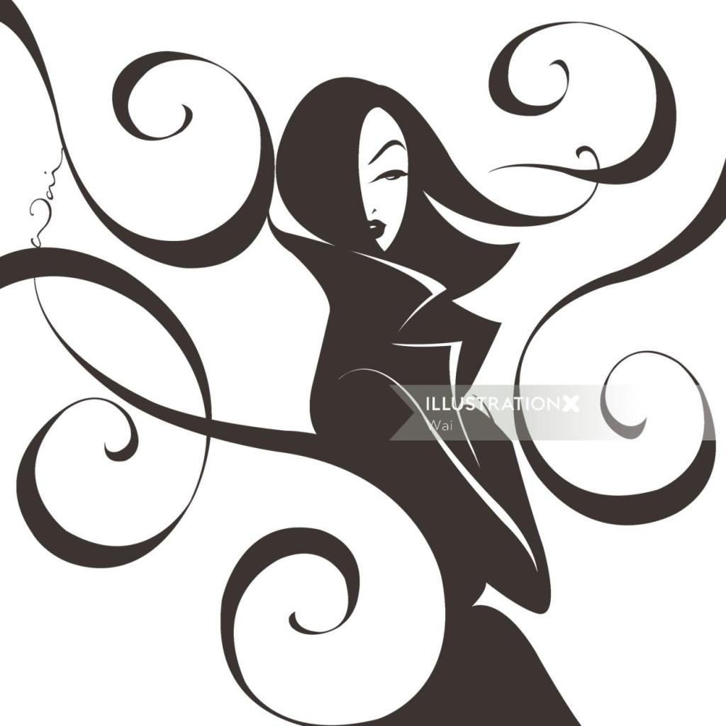
I also looked at the graphic illustration section on IllustrationX to find specific artists who classify their art in this way. There are a lot of different art styles shown here, and not all of them related to this exercise. A few artists however stood out to me – Quincy Sutton, Darruda, Vince Ray, Silke Bachmann, Fabio Lyra, and Wai. Their art styles are all very different, but could all be described as graphic in the same way as the black and white illustration I produced. Both Quincy Sutton and Wai use very simple and exaggerated shapes and colours to create portraits, however their choice of colour palette and shapes communicate very different meanings and feelings.
Illustrations by Quincy Sutton (left) and Wai (right)
Similarly, Fabio Lyra and Silke Bachmann draw comic style illustrations, using one or two colours to show highlights and contrast. Lyra’s work however uses a more modernised style of comic illustration, whereas Bachmann opts for traditional political comics and pop art styles.
Illustrations by Fabio Lyra (right) and Silke Bachmann (left)
Reflections
Overall, I had a lot of fun with this exercise. I love the final outcome and process taken to achieve it. Having more creative freedom over the artwork I produced made me excited to engage and enjoy the work I was creating. I also really love the graphic art style – simplistic colour palettes have always appealed to me and trying to create visual interest and contrast with a handful of options is always something I enjoy. Looking at examples of graphic illustration makes me see my own piece in a different light. There’s definitely a lot more I could do with it, more areas I could highlight and take further. Ultimately, I’m really happy with this piece and feel I have gained a deeper understanding of using negative space.
This exercise, like the one before, was to understand the differences between objective and subjective drawing. It asked me to pick another object, and this time draw it subjectively. The Key Steps in Illustration book defines ‘subjective’ as ‘based on or influenced by personal feelings, tastes, or opinions’. Picking an object that could be easily translated in this way was difficult! I decided to pick one from the list originally given, as picking any object was just too open.
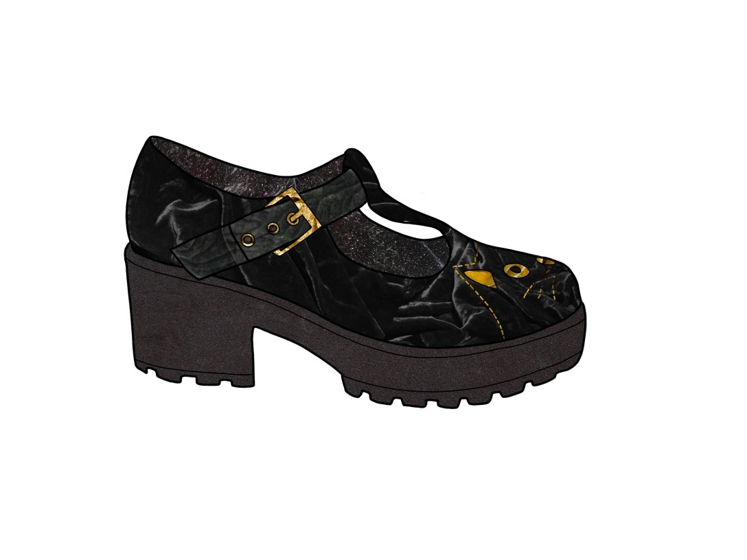
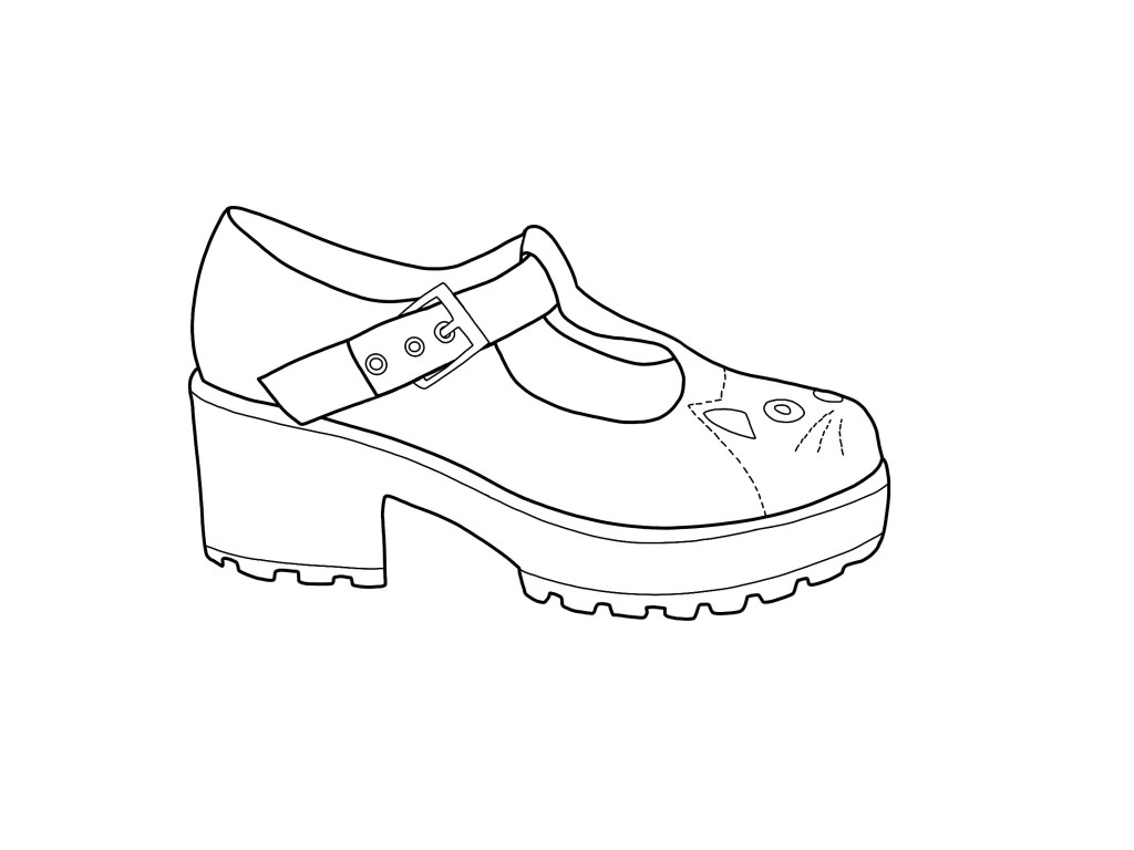
The shoe I picked to draw
I picked this shoe. It’s one of my favourites – I love cats, and nobody seems to own ones like it. The first step in the exercise was to write a list of words to describe the shoe. My list was:
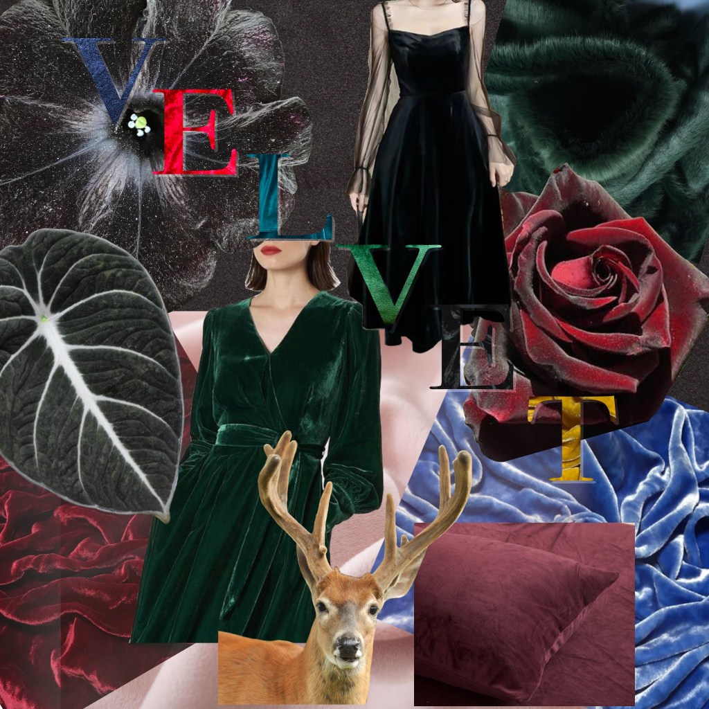
I then had to pick a word from the list to base my drawing around. I decided to pick ‘velvet’, as I felt the fact the shoe is velvet is an important thing that I wanted to communicate. The exercise then asks you to make a mood board exploring the word visually. It does ask you to do this physically, using collage, found materials, and cutting from magazines. However, due to COVID-19 I am currently shielding, and I am very limited on what I can use for this. I completed the mood board digitally, as I did in my mood board exercise, but I still attempted to find materials and use a wide range of resources.
Mood board for the word ‘velvet’
I loved the mood board and the feelings it evoked. It alone felt like it communicated my feelings and views towards the shoe. The next step was to create a line drawing, which I decided to do digitally too as I was already there. I was then asked to print it and complete the drawing physically, but as I wanted to use collage I opted to remain digital. I did however choose paper and materials that I felt would communicate the shoe non-digitally.
My shoe line drawing
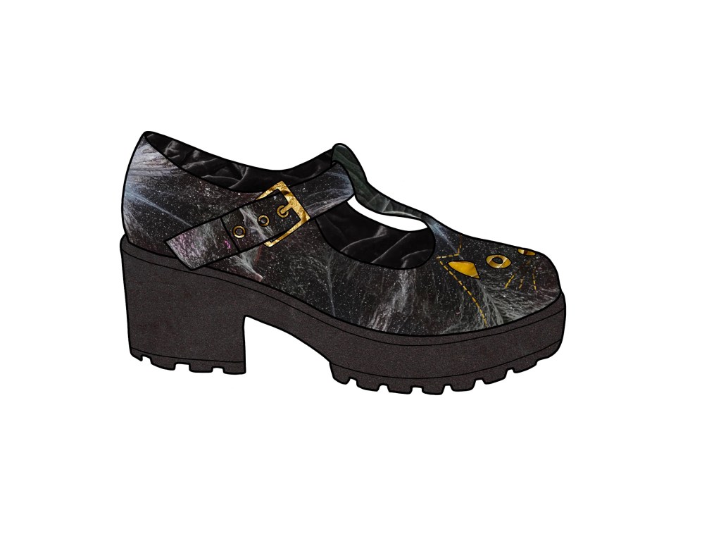
I found a velvet flower [needs name] whilst creating my mood board, and I really wanted to use this for the main part of my shoe. This is because the white specks on the petals looked like the dust and cat hair that the shoes are covered in – velvet has a tendency to attract small debris like this. I was really excited about the fact I could communicate this texture. I also decided to use the velvet leaf for part of the strap, to indicate that it’s a different part of the shoe. I reduced the saturation on a photo of red velvet I found for the inside of the shoe, and I used a picture of taut crushed velvet for the sole. For the cat detailing, I used a photo of gold velvet, and I used an image of gold rocks for the buckle. I was very happy with my finished piece and what it communicated.
My first subjective illustration
I showed it to a friend and asked if she felt it communicated ‘velvet’. She said yes, but also said her first thought was ‘space’. I agree that the flower used for the main body of the shoe creates a very galaxy/constellation type look. I decided to edit it so it was clearly velvet, even if it meant losing the cat fur/dust effect. I swapped the flower and desaturated red velvet, making the flower the inside of the shoe and the velvet the outside. I kept everything else the same, except this time I used the velvet leaf on the main strap. I felt it made it even clearer that it was a different part of the shoe. I’m happy with this outcome, and I agree it communicated velvet clearer, but I preferred my original collage.
My second subjective illustration
Had I completed this physically too, I would have used grey pastel paper. The texture and graininess of the paper would work well for velvet. I would have also experimented with tissue paper, seeing if I could recreate the way velvet looks. If I could visit craft stores, I would have tried to find some velvet wool or similar, and collaged with it. I also would have used gouache, as the sticky non-watered down paint becomes very textured and sort of sticks up like velvet does. I may have also used oil pastel, and acrylic, as they show the texture of the paper hugely, and also could appear like velvet does. I referenced my sketchbook created for exercise 8 whilst thinking about how I could communicate velvet physically, and it was helpful to have. Finally, if possible, I would’ve loved to have stitched into the paper using gold thread to create the cat.
I think maybe after the sketchbook exercise I feel a sense of artistic fatigue towards physical art. I love digital work, and I spent so long being frustrated and bored with physical work that returning to it is almost exhausting. I was very confused and a little overwhelmed with this exercise, and I struggled to understand what I was trying to achieve. Doing it digitally though, I felt like I did achieve an understanding of subjectivity. I feel like my pieces communicate velvet well, and it is also clear that it’s a shoe.
This exercise was paired with exercise 10 to show an understanding of objective vs subjective drawing. The Key Steps in Illustration book defines ‘objective’ as ‘not influenced by personal feelings or opinions’. Exercise 9 asked me to take an item from a list and explore it visually, then draw it objectively using a pencil or fine liner. I was aiming for a high degree of visual accuracy and to be technically controlled. The purpose of this drawing was to clearly convey visual information.
Having spent the past few months working on getting out of my head, being more free and subjective, and letting go of the restraints I placed on myself to create ‘perfect’ art, this task was quite daunting. I was nervous about doing it for all the same reasons I have been in the past, and felt like if I couldn’t draw it perfectly I would fail. So I took a step back and assessed what I really needed to get out of this task.
The purpose is to understand objectivity and how to create imagery that is totally impersonal. This is hard, because a lot of the items listed are personal. But the task was simple when reduced to this – draw what you see. No fancy lines or colours, no texture or style, just plain and simple: what is in front of you.
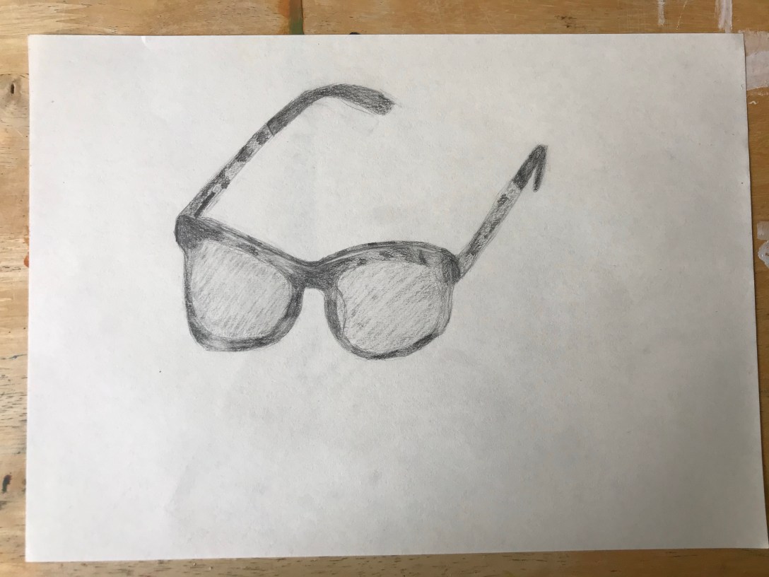
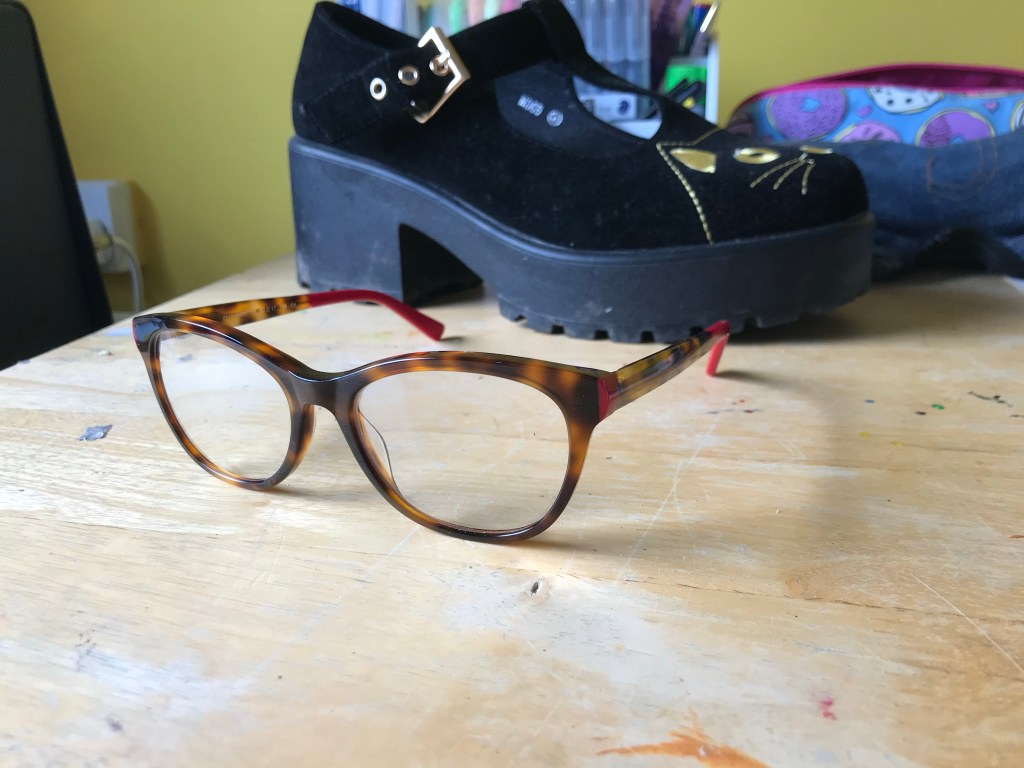
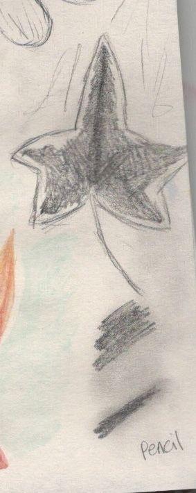
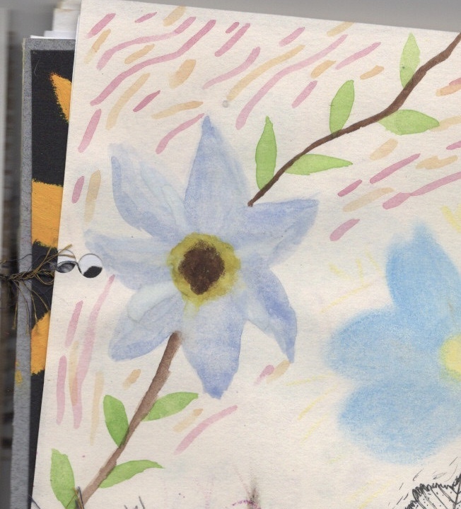
I decided to draw a pair of glasses, specifically because in assignment one I panicked about drawing my own glasses ‘correctly’ and instead traced them. I thought it would be good to learn how to draw them, and how to get a feel for them.
The glasses I chose to draw
I used a black drawing pencil and some sketchbook paper for this. My experiments in exercise 8 made me realise how much I liked this thinner paper, and I’ve been drawing with the coloured drawing pencils happily for a few weeks now. I began by drawing an outline of the glasses frame and lenses, then slowly starting to shade it. The glasses are tortoiseshell and I tried to show this by shading very dark areas and very light areas in a similar pattern. The red detailing I simply darkened the most, to show it was one bold block of colour. I was quite happy with how I showed the glass on the lenses. I very lightly shaded the entire lens, then smudged it slightly with an eraser. Then I used a thinner, stronger eraser to erase lines to show the glare.
My observational drawing
I feel as though my drawing does communicate a pair of glasses objectively. It is however quite sketchy and not as technically controlled. Once finishing, I considered redrawing it using a mechanical pencil then fine liners, as they would be closer to ‘perfect’. However, I am very aware that I keep doubling my workload by attempting to reach perfection. If I have missed the point of this exercise, and I should’ve redrawn it, then I will revisit this task.
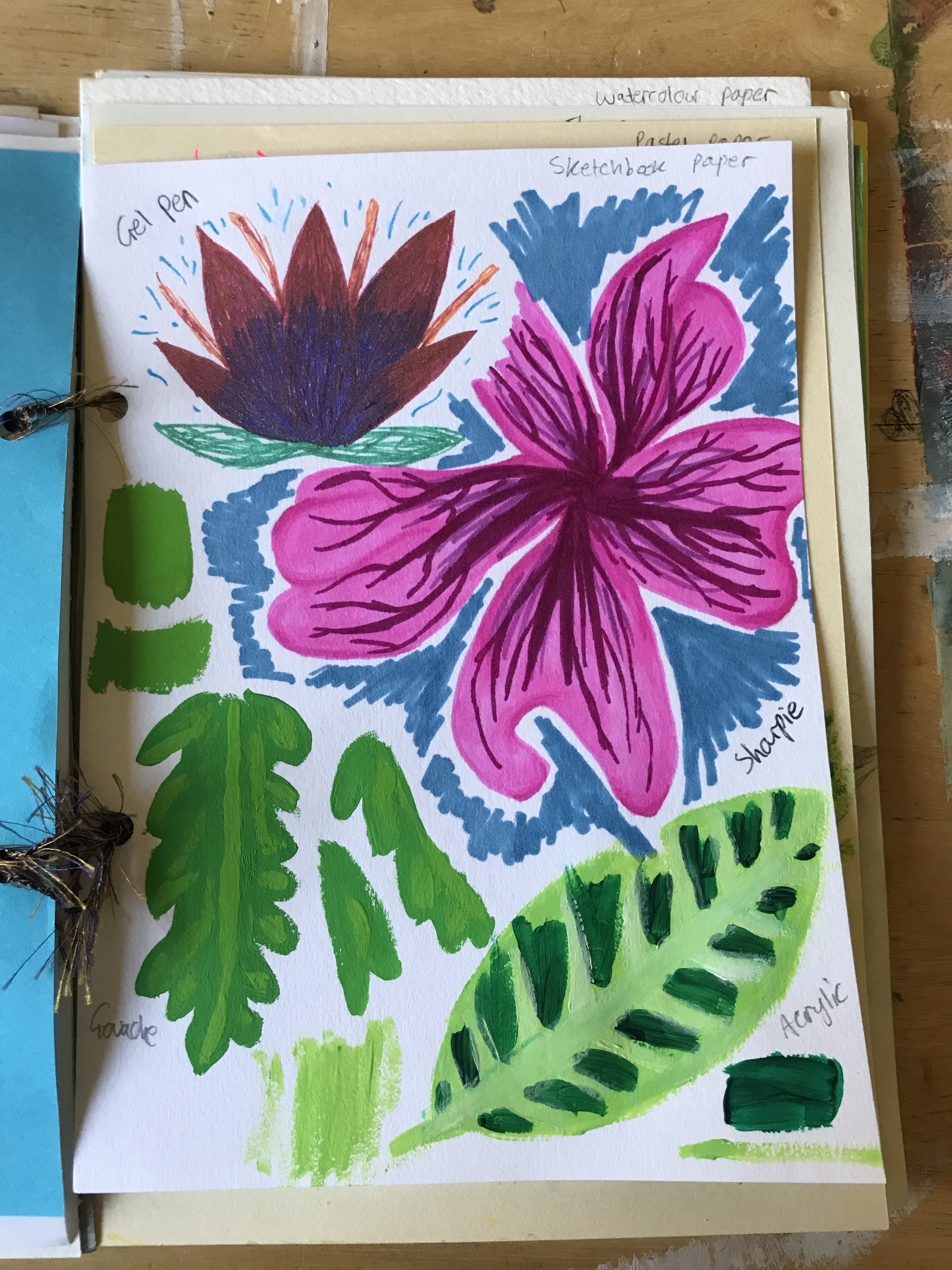
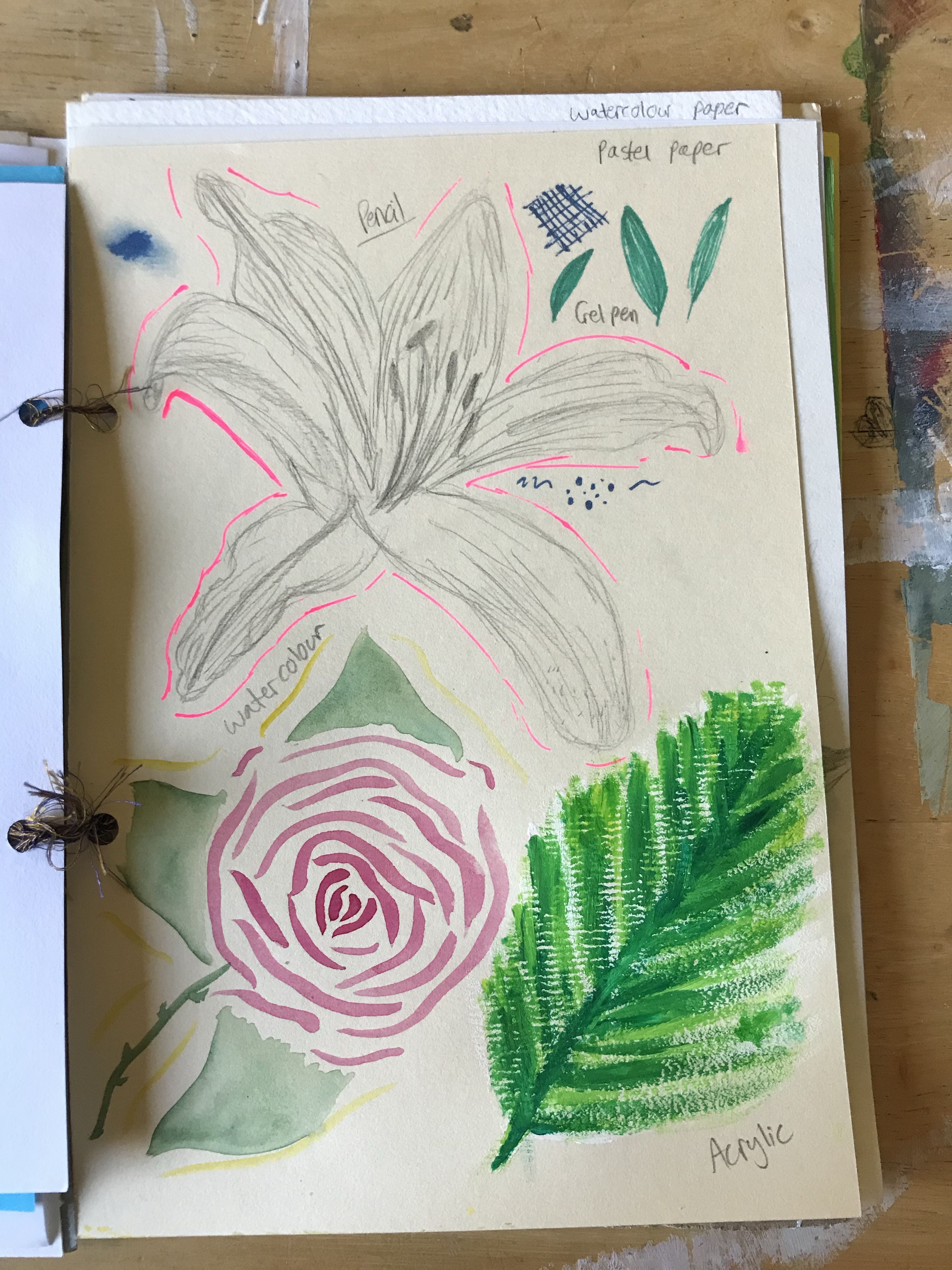
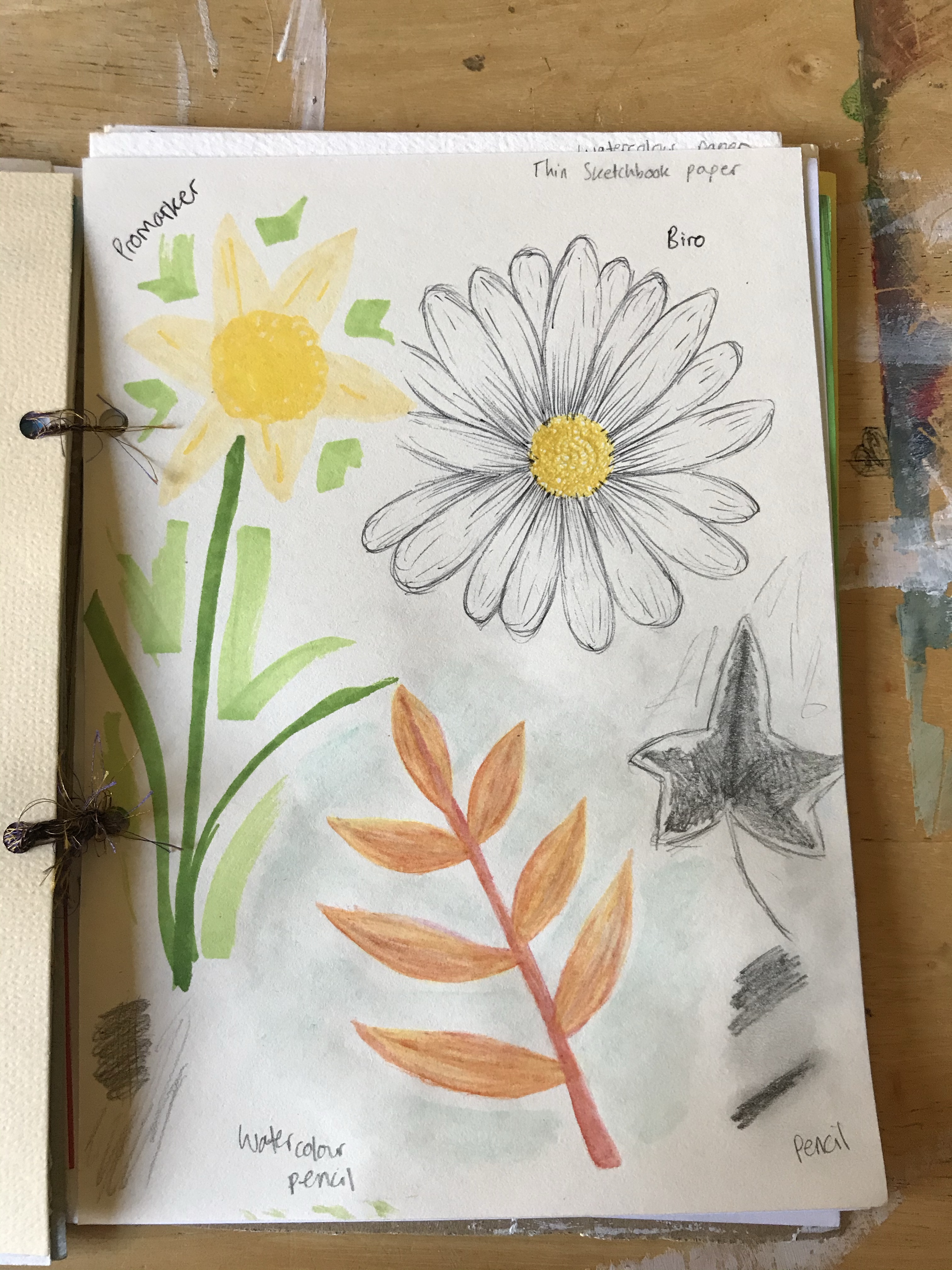
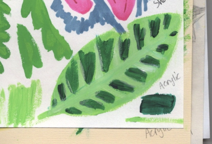
This exercise was about experimenting with different materials and papers. I was asked to create a sketchbook with different kinds of paper using a variety of surfaces and textures. I then had to pick an object, and draw it on all the different sheets in my sketchbook, using a wide range of different media to do so. I had to practice using the media in different ways, and explore how each one worked with the different papers.
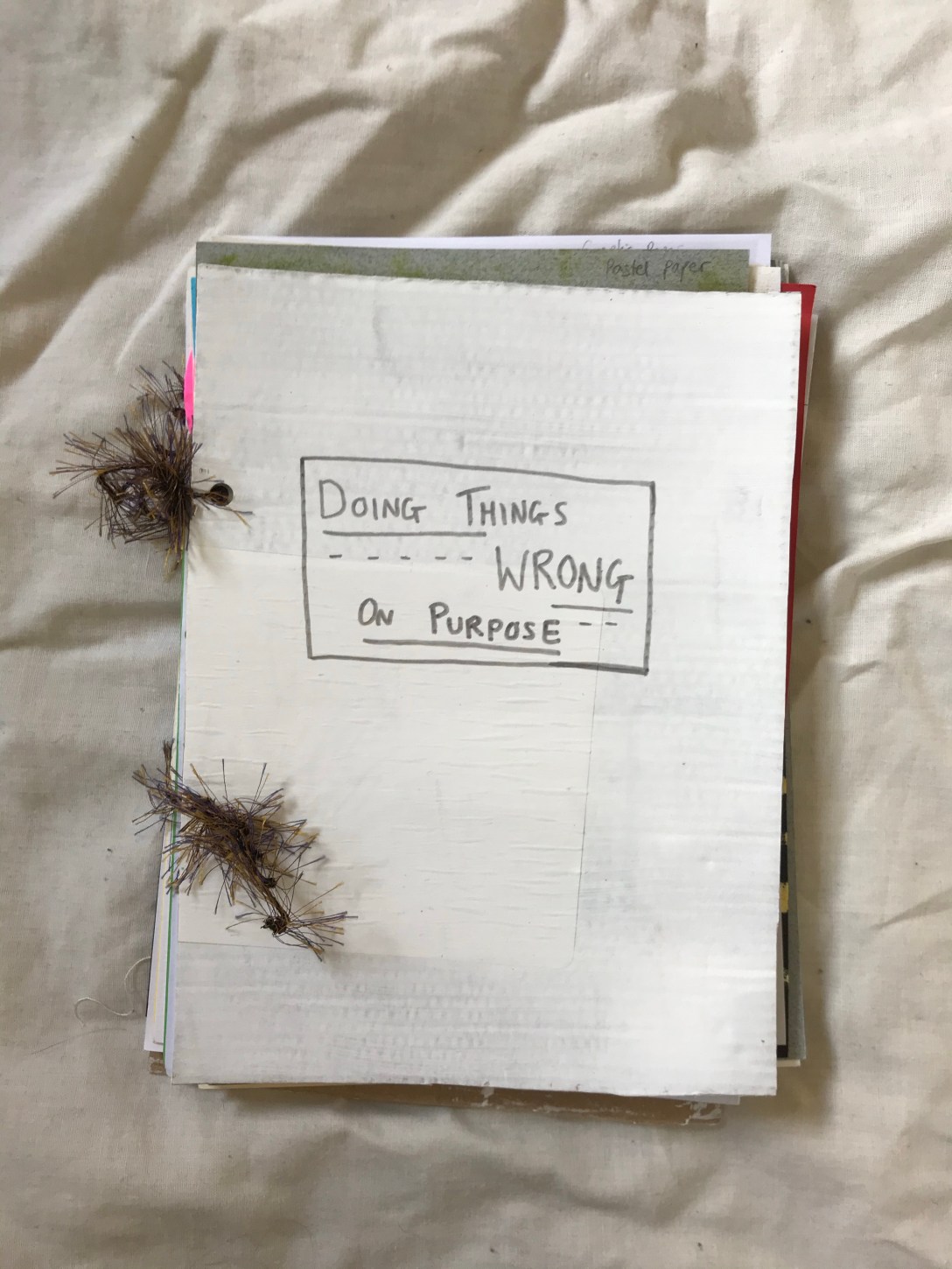
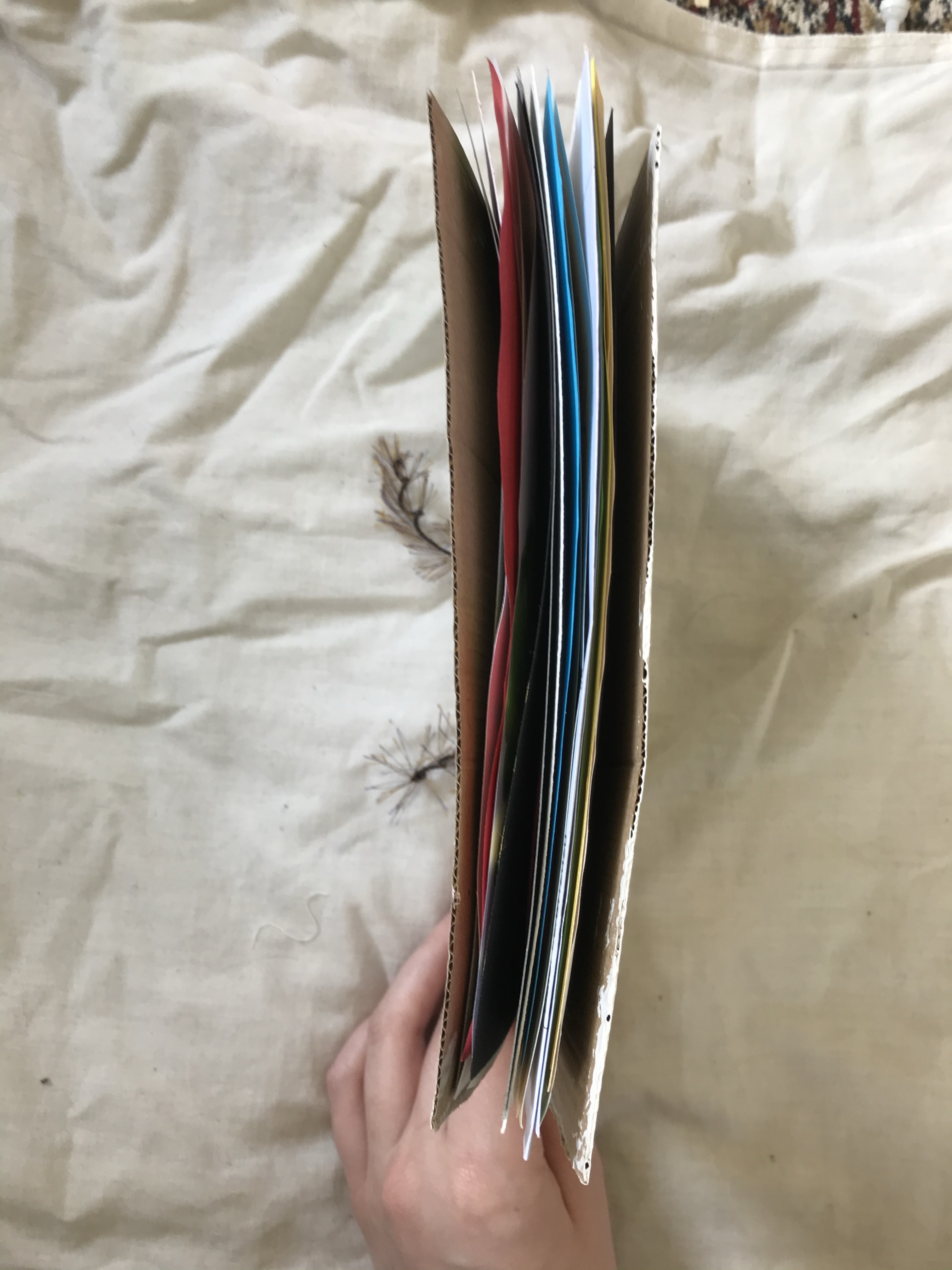
To start, I collected paper for my sketchbook. I decided to make an A5 sized book, and as most of the paper I collected was A4, I wanted to have two pages of each paper type. I ended up with 22 pages, and a cover I made out of cardboard. I painted the cover white using acrylic, and decided to name the book ‘Making Mistakes on Purpose’. I find naming my sketchbooks useful as they help me stay focused to a theme, if I pick one. Finally, I punched holes in each page and strung them together with some wool I found and liked. I did want to use string originally, but didn’t have any.
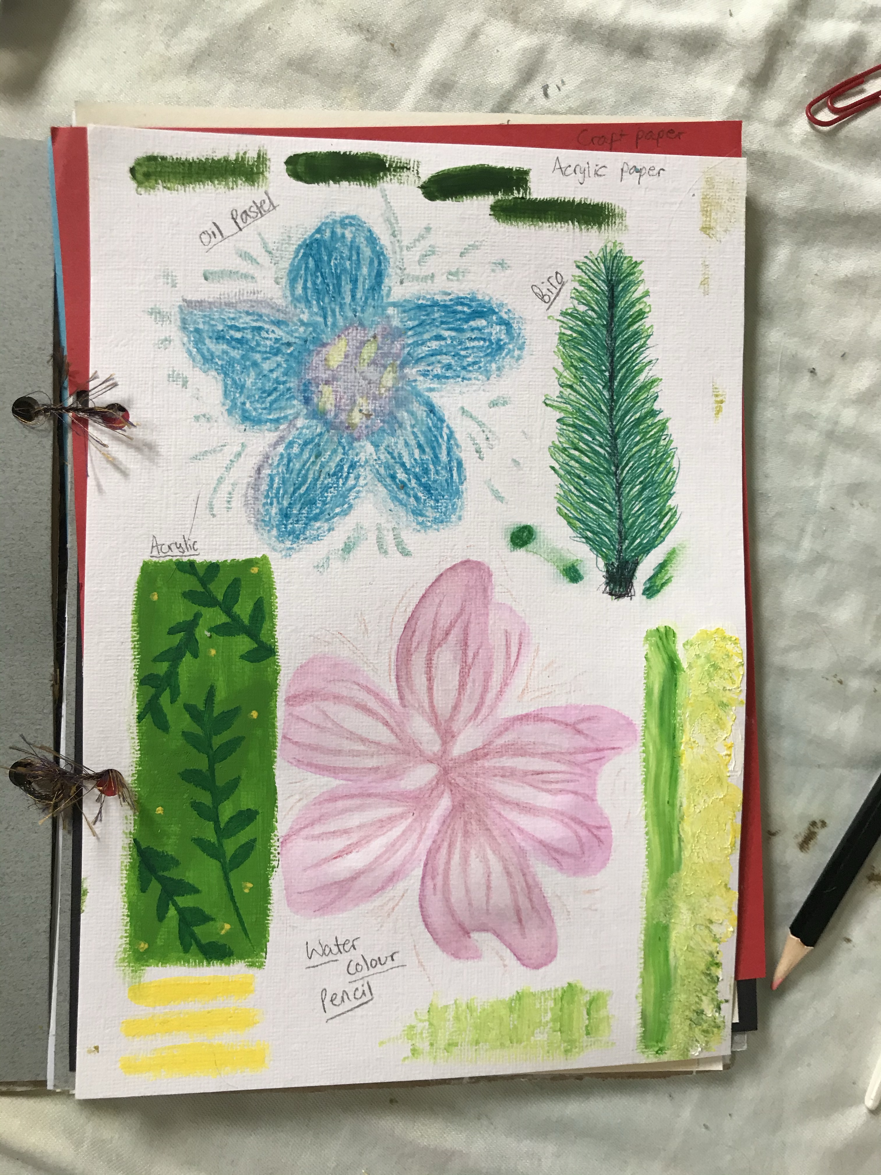
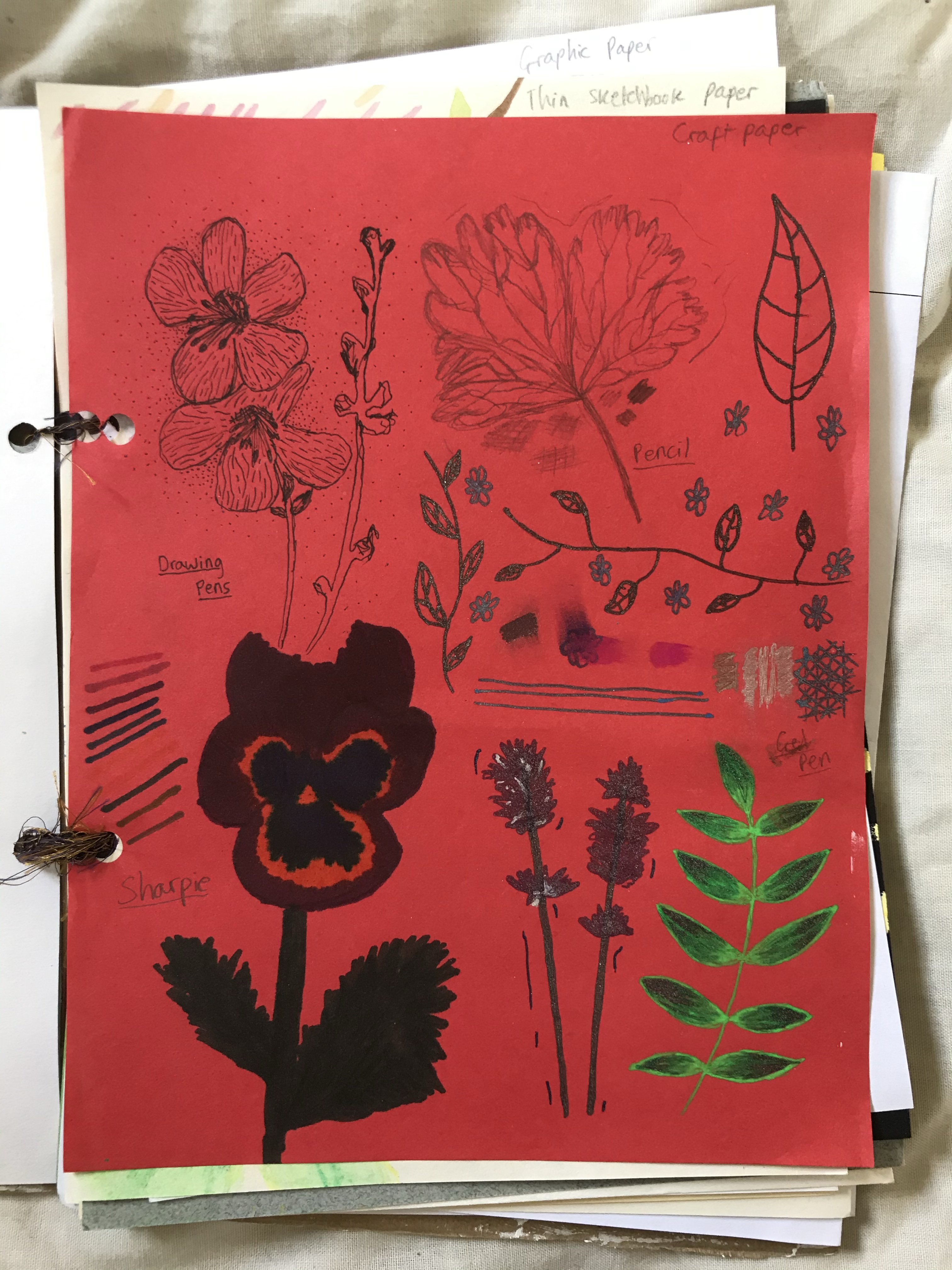
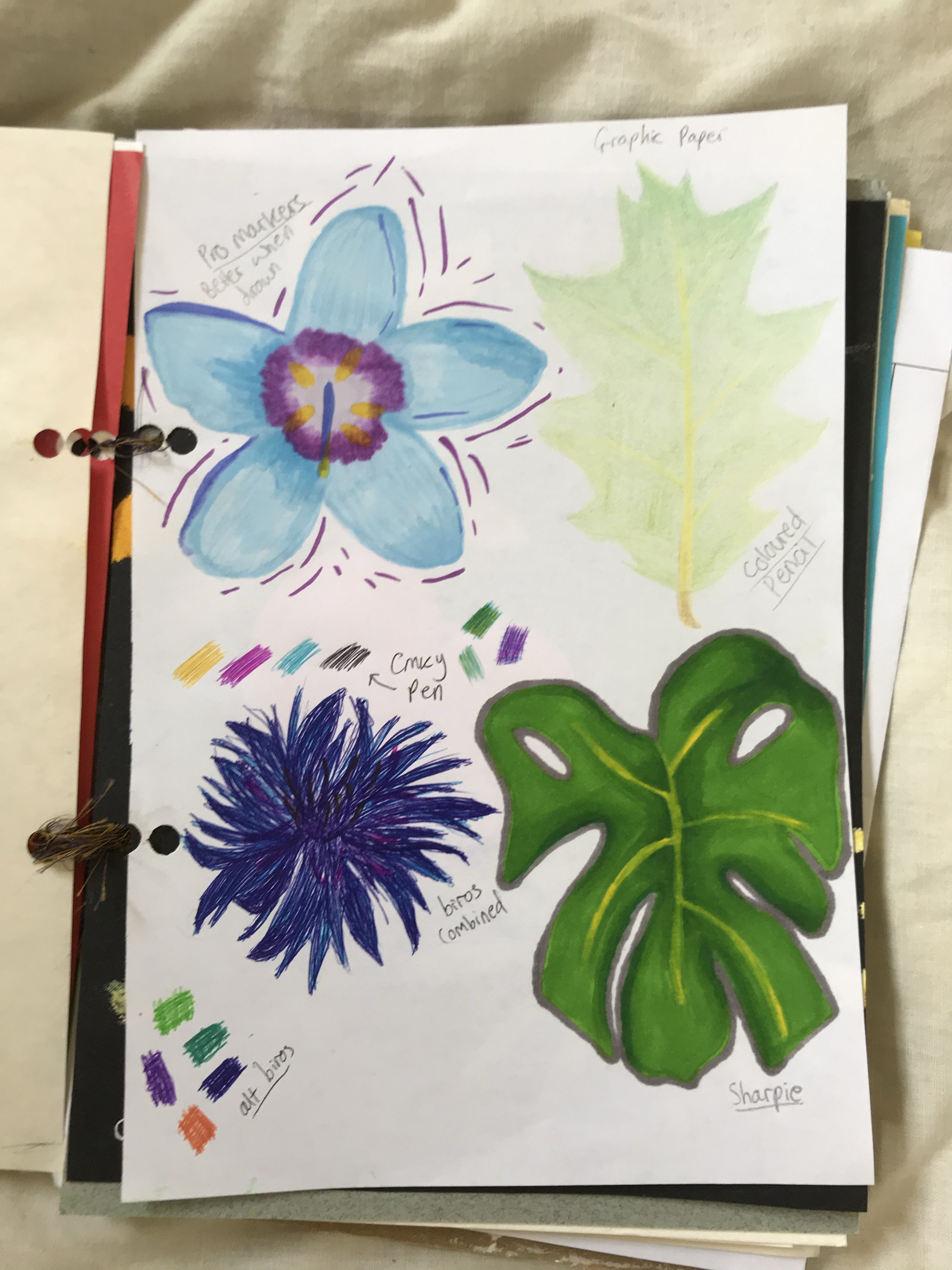
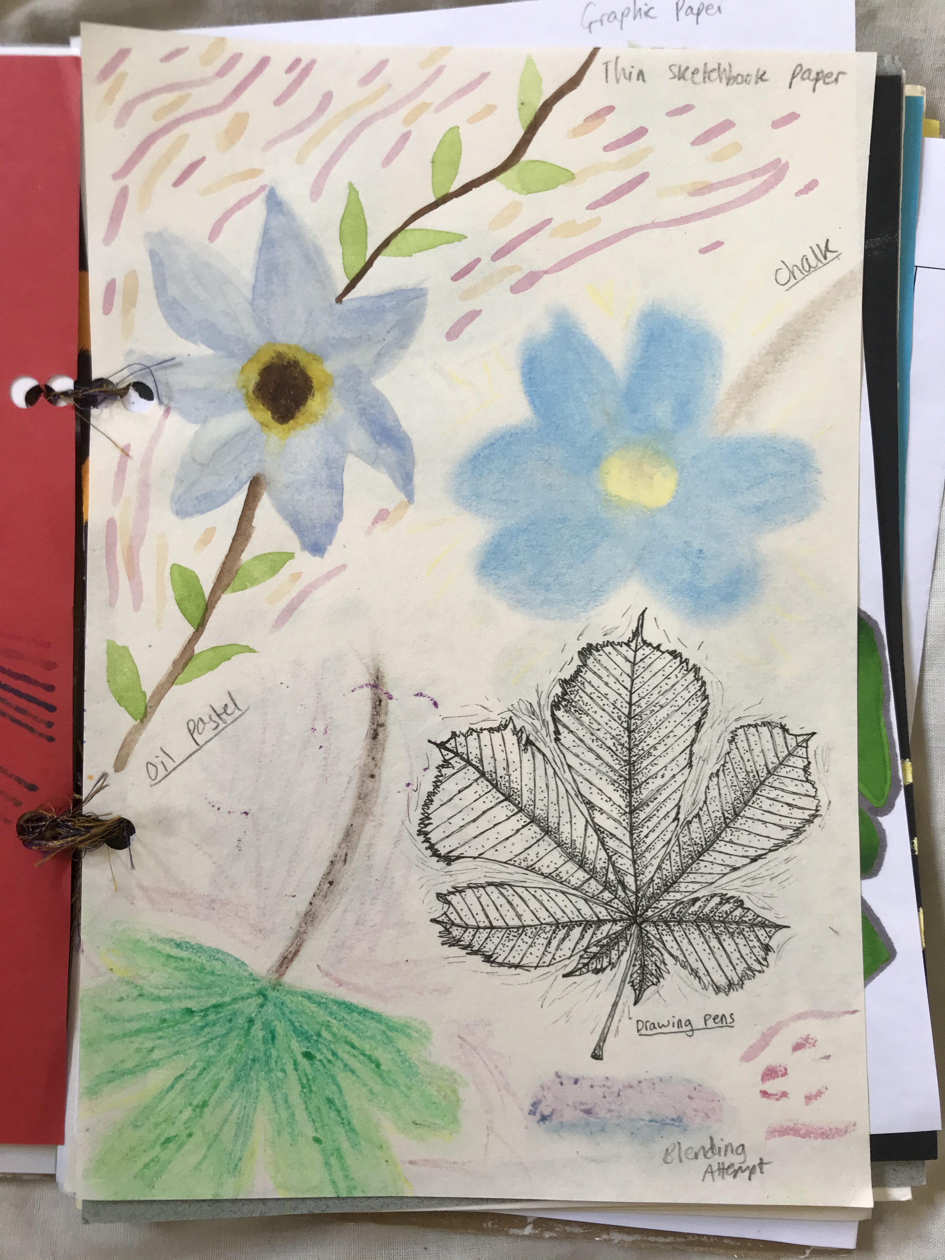
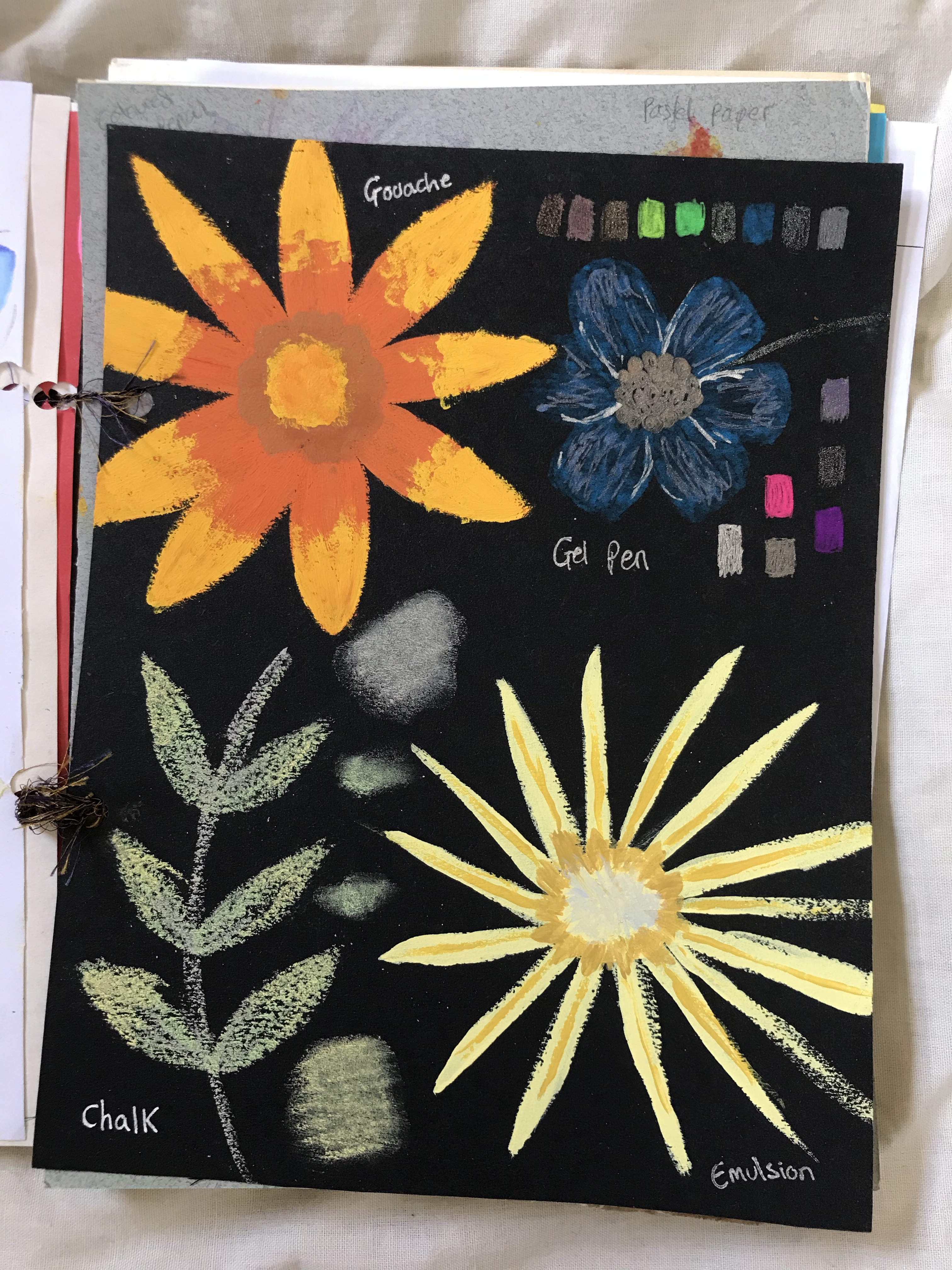
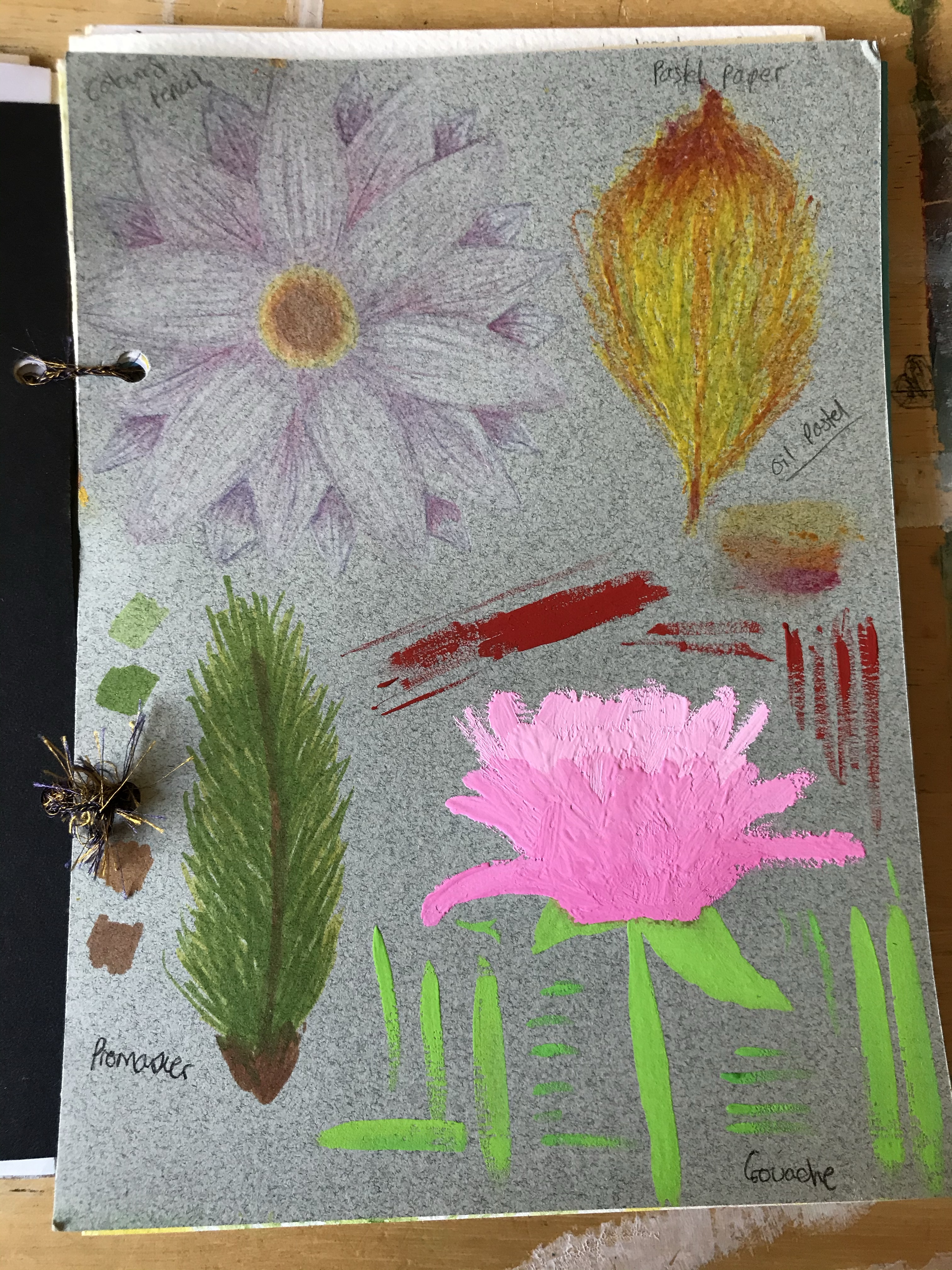
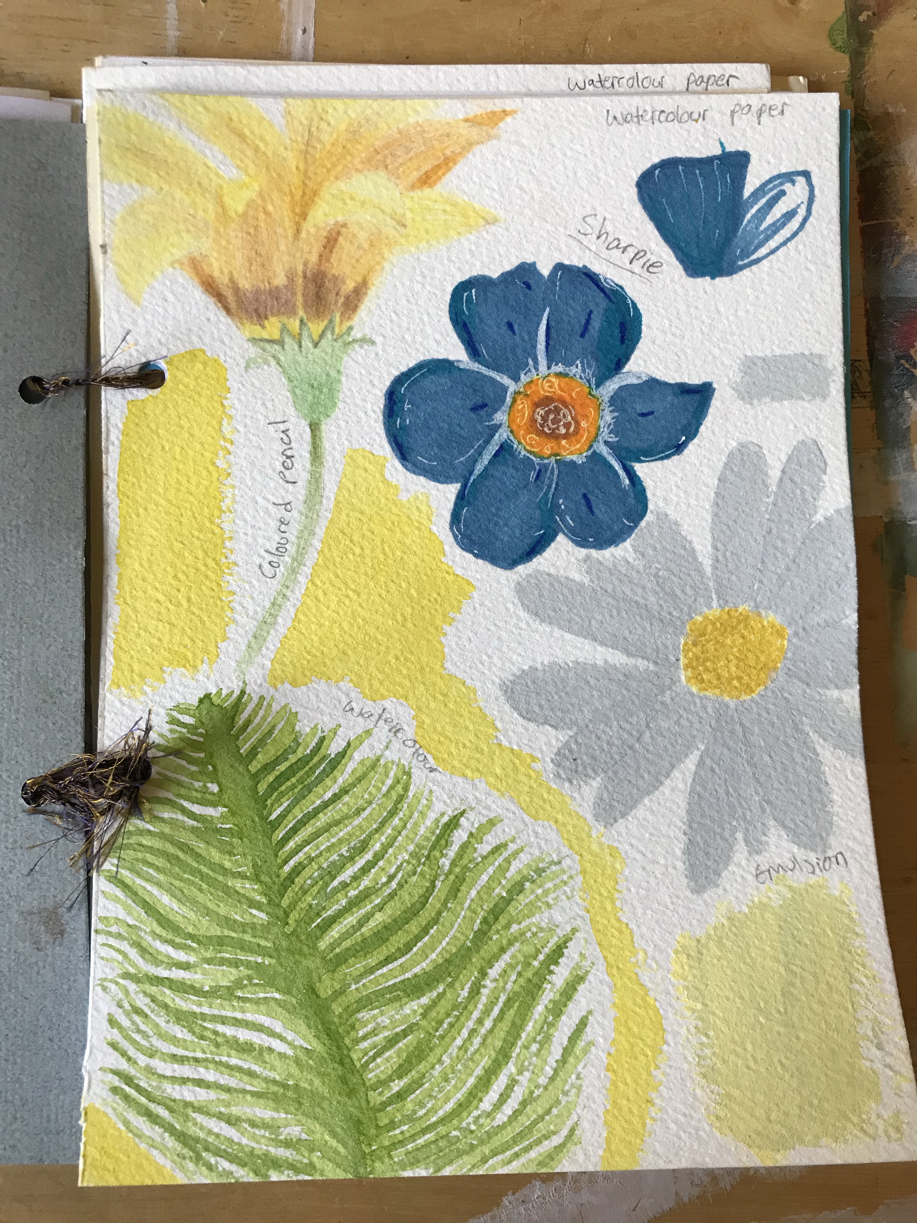
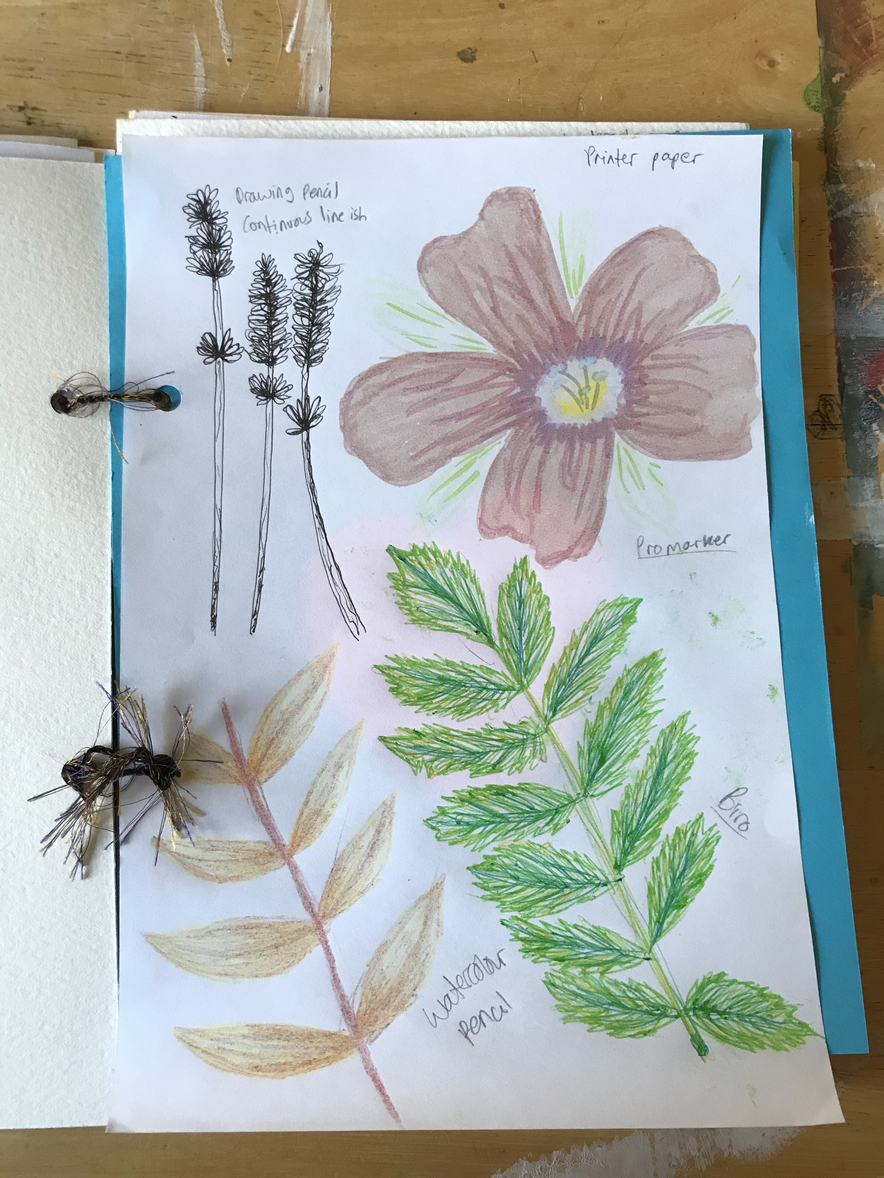
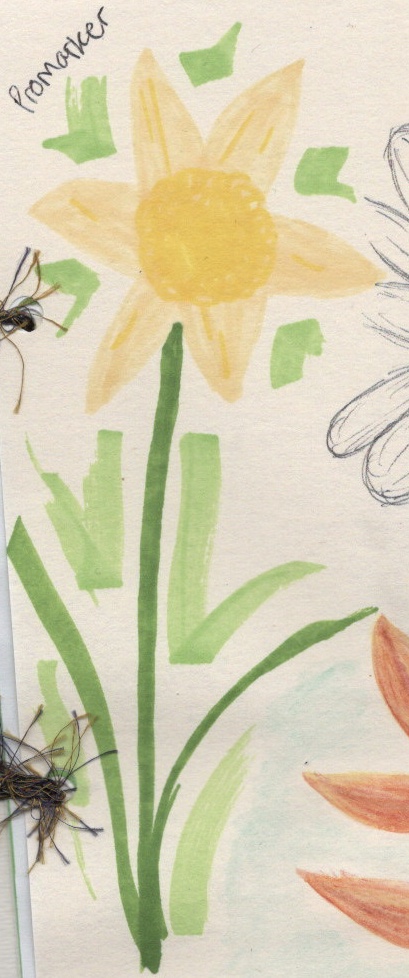
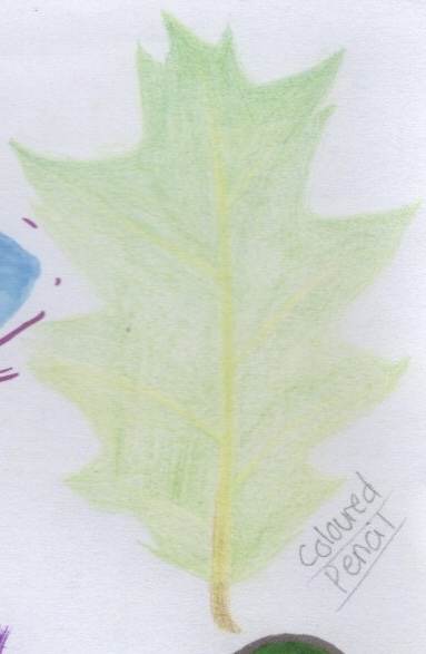
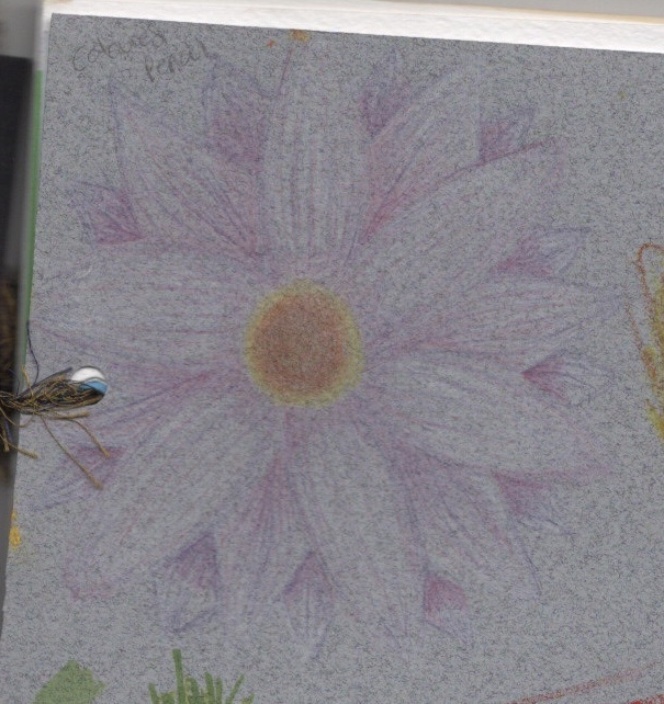
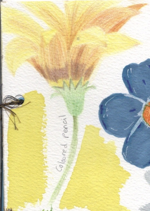
My sketchbook is made of: – Pastel paper, in shades of grey and sand – Acrylic paper – Four colours of craft paper; Red, Blue, Green, Yellow – Thin, cheap sketchbook paper – Promarker graphic paper – Black card – Watercolour paper – Printer paper – Heavier, higher quality sketchbook paper
I organised the paper randomly, so that each page is different from the last with no consistent order. This was both for visual appeal, and to ensure I didn’t get too comfortable. I felt that if I knew which page was coming, I would plan accordingly, and try to line up which materials I used and stay ‘safe’. At first, I also picked the materials randomly. I drew up a numbered list of all the materials I was using, then got friends to suggest numbers without knowing what they were picking or why. This made it challenging for sure! Later on in my process I started choosing my materials myself, as I wanted to ensure each one got enough usage.
I raided my art supply cupboards for these, and made sure I picked things I hated using, that I was unfamiliar with, or that I felt were ‘bad’. The oil pastels for example are very cheap and old, and I very rarely use them as the quality is poor. The gouache was brand new and unopened, and was a material I was entirely unfamiliar with. Some of the papers were new, too, and I hadn’t used some (like the graphic paper) for quite a while. Aside from the odd piece of physical work, I have spent the last few years working digitally. I was really excited to get stuck in and to start exploring each of the materials I had picked.
Pages 1-4
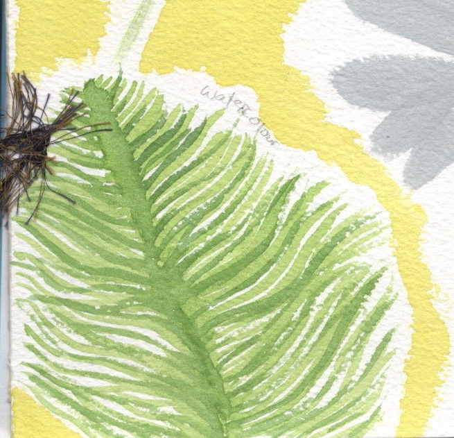
Choosing an object was easy. I love drawing florals, so I went with flowers and leaves. I thought it would give some change in content (so I wasn’t drawing exactly the same flower on repeat) but also similarity enough to see consistency and differences in the materials. It also would allow me to use a range of colours and tones. My plan was to fill each page with 4 flowers/leaves, each with a different medium. I’ve done a lot of mixed media in the past, but rarely experimented with singular mediums, so I wanted to use each medium alone. No sketches, no planning, no additions, just plain and on paper. I was going to fill one side of the book, then flip it, and fill the backs of each page, introducing mixed media at that point once I had a better understanding of my canvases.
My first page was a joy. I loved getting messy with the paints and using new paper. I felt like I was learning already! On my second page, however, I hit a wall. The materials weren’t working how I wanted them to, I had spent 45 minutes on the first page, and I was starting to get stressed and tired. Creating a beautiful sketchbook filled with experiments felt unlikely, and I was crushed. I took a step back from the work, intending to return to it the next day, and instead came back weeks later.
I was very, very in my head. I wanted it to look good. I wanted to be proud of it, and to feel a sense of achievement. But I was dreading it. I didn’t want to use materials I was unfamiliar with, and I couldn’t stop finding mistakes in my work. When I was working on the pieces, I was getting so frustrated by my inability to create exactly what I wanted that I was giving up. I procrastinated and put off each new page for weeks, filling my time with other art instead.
Pages 5-8
In a way, this was actually a super helpful experience. While putting off these experiments, I joined a sketchbook circle, bought a travel sketchbook, invested in new sketching pencils and chalk pastels, researched how other artists use their sketchbooks and specifically watched sketchbook ‘fails’. I followed many new illustrators and artists on Instagram, and saw their raw work and processes. I experimented in my own ways with style and worked through a great deal of stress through these books. It wasn’t intentional, it just fell into place at the right time. I felt so much freer and able to make mistakes and be imperfect. I think this is visible in the progression of this sketchbook. The later pages are a lot less pretty and careful.
The experimental sketchbook, however, was still haunting me. I knew I could be freer and easier on myself, but actually doing the pages was a huge trial. Part of this was boredom, I was sorta sick of seeing the same things all the time. Another reason was the sheer massiveness of the task. If I completed the entire sketchbook including mixed media on the reverse sides of the pages, I would have 184 individual illustrations. Even half of this, at 92, felt really extreme. I decided to only fill the first half of the book, 46 individual drawings, and leave the rest as an option for an ongoing project. I love drawing flowers and leaves, and it’s something I will always want to do. Having space to play and mess around whilst doing this is something I think I will value.
Pages 9-12
Material Analysis
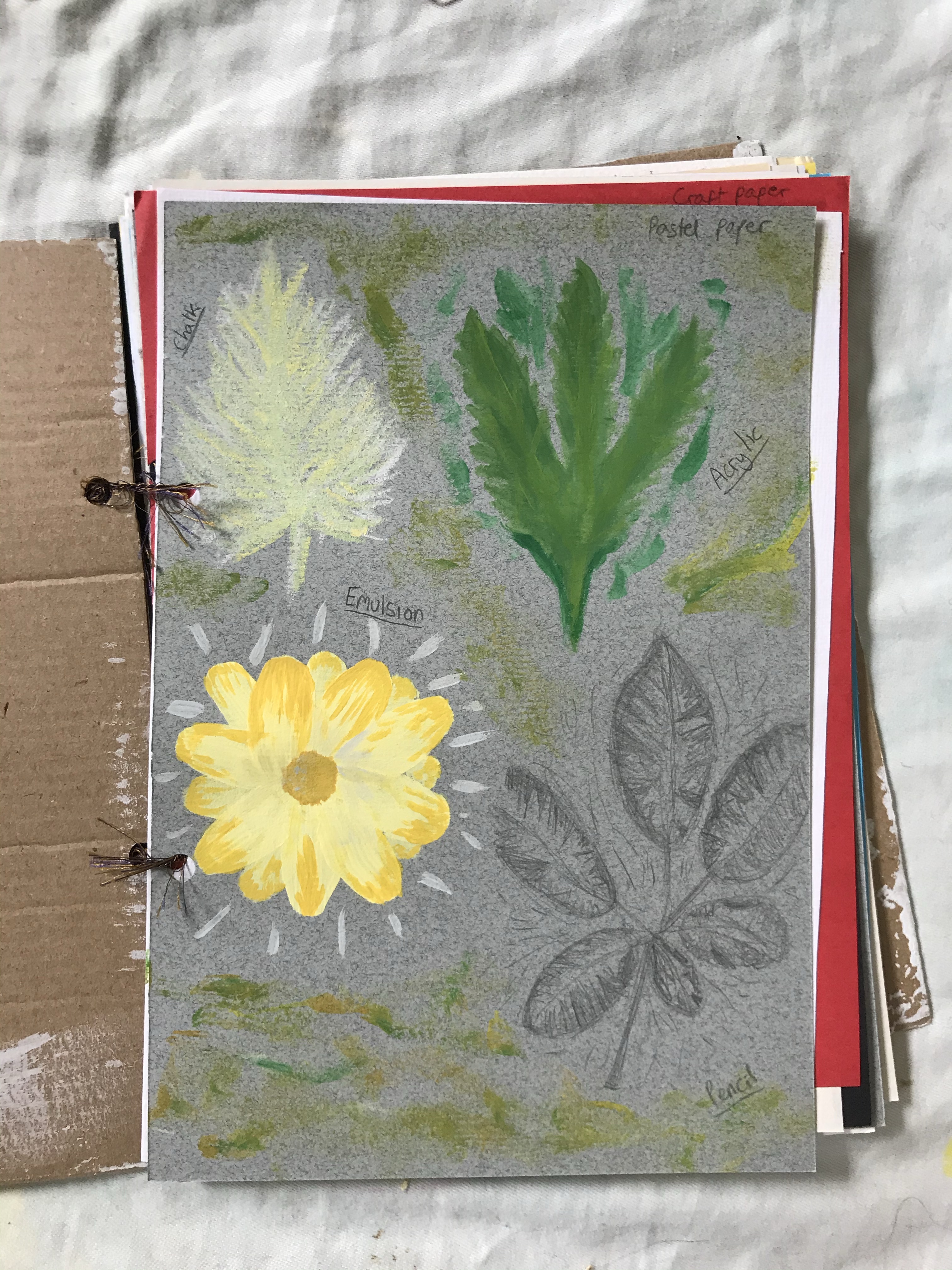
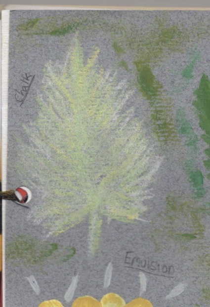
Chalk
For this, I used a bag of basic street chalk I’ve had lying around since I was a child. It’s a material I haven’t used before in this sense, but I wasn’t too nervous as I have experience with chalk pastels which are of a similar consistency. The first paper I used it on was pastel paper, which is designed for chalk and oil pastels. It has a textured side and a non-textured side. I used the textured side here, and found it easy. I liked the ability to have different colours clearly shown but still blending.
The second chalk drawing was on thin, poor quality sketchbook paper. The lines lost their definition, and the chalk smudged very easily, creating a wispy cloud-like look which I liked. It was difficult, though, to communicate harsh lines. The last chalk drawing I did was on black card. This was intentional, as I felt the contrast would look amazing – and it did. I drew the leaves, which were really fun in contrast to the soft smudged flower I had done previously. Then I experimented with some smudging as I wanted to see the variation between that and the harsh untouched lines. I love the way chalk looks when it isn’t blended – the clear and distinct lines of colour that can seem like one solid colour if you unfocus your eyes.
I may use chalk in future, but add it to pieces rather than use it on it’s own. If I were to want a full piece I may use chalk pastels, as they have a wider range of colours, but still allow for the incorporation of chalk.
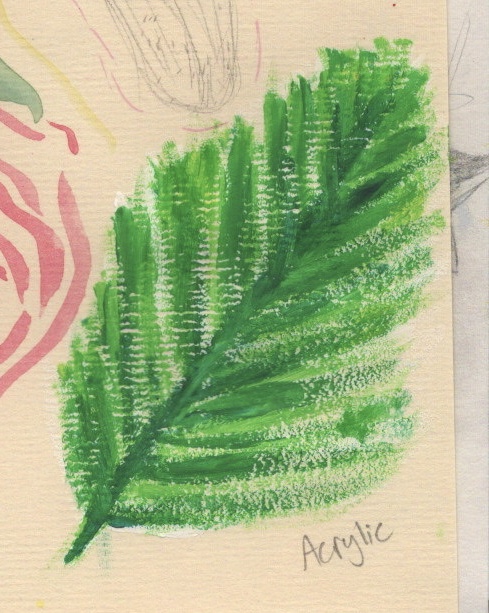
Acrylic
I have worked with acrylic quite a lot in the past. However, in my acrylic paintings I’ve found a niche and sorta stuck with it. I typically paint onto cardboard in a very messy and chaotic style, overlapping colours and with an emphasis on texture. I haven’t much experience using acrylic for observational art or on other surfaces. I found it really difficult, actually, to use this medium for precision. I thought I had bad paintbrushes so bought some new, smaller ones, and it didn’t really help. I don’t think I want to change how I use this medium – but I definitely want to experiment with other surfaces and textures.
The first acrylic experiment was on pastel paper. The way the two interacted was fascinating. Acrylic usually dries glossy and thick, but this paper almost absorbed it, and it dried very quickly and very matte. I tried to add more layers but they just sorta blended in and faded into the background. The pastel paper also has some dry brush acrylic detailing which I used the leftover paint for. I actually love the finish on this and how the texture of the paper comes through the acrylic.
The next painting was on acrylic paper, which to my surprise I hated working on! Accuracy disappears with this paper. The texture of it causes the paint to bleed, which infuriated me. I ended up trying to work around it by layering the paint over my mistakes which sort of worked. I also did more experiments with dry brushes/smudging/texturing the paint. Again, I’m a big fan of this. I think the paper needs priming before using for accurate paintings, though, as it’ll prevent the bleeding of the paint.
I then used acrylic on sketchbook paper. By this point in the sketchbook I had gotten over my need for perfection, so started leaning into the messy and inaccurate nature of the paint. The paper wasn’t particularly interesting. I preferred it to acrylic paper, but it was just paper – nothing to write home about. I was experimenting with adding too much vs too little paint to my brush, and seeing the impact it had on the outcome. I also did a couple of testers on the page, one with too much paint and one with too little. The results of this – the brush strokes showing when too much paint is used, and the texture of the paper coming through when too little is used – were very cool.
The last acrylic piece was on pastel paper. The texture of the paper was similar to acrylic paper but it had a wider tooth grain. Originally I started with a normal amount of paint on my brush, but once I discovered the way the texture impacted the paint, I started using less paint so the texture would be even more visible. I love the way the piece looks. The layers of paint and texture combined create a really interesting effect.
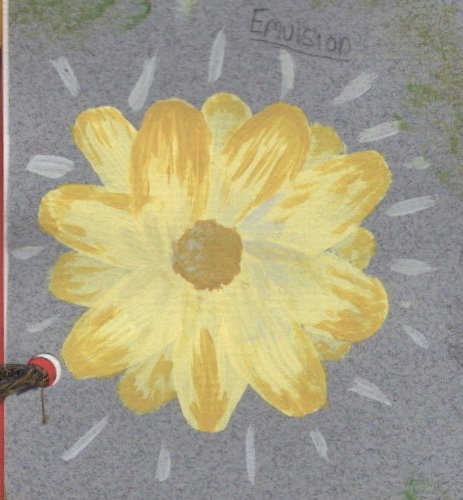
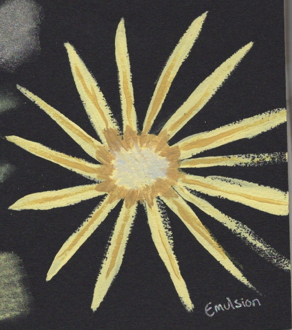
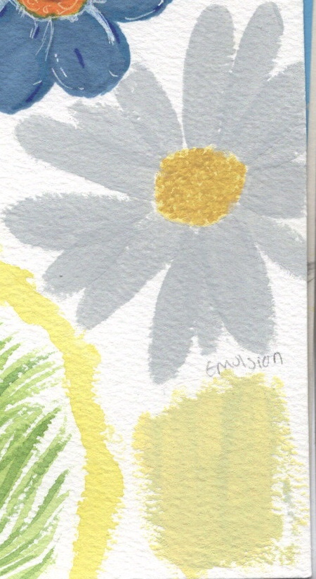
Emulsion
I had kept tester pots of emulsion for using in my paintings for a while, but not yet had the opportunity to do so. My first piece was on pastel paper. I knew the paint was thin and would dry fast, so I picked a flower that I could layer. I really enjoyed this piece and it was interesting to see how the paper interacted differently with the emulsion vs the acrylic. It wasn’t absorbed by the paper, but still looked very matte. Because of the opacity of emulsion, I decided to also use it on the black card. I was using new brushes that are thin and meant for detail work. They didn’t pick up the emulsion very well, and in turn the detail was lost. The card is also quite textured, so keeping the edges smooth was tricky. I found the paint dries fast which meant the texture of the layers quickly became visible.
For the final drawing, I used watercolour paper, and returned to my original technique of layering petals for the flowers. I picked a daisy for this, and used the fine detail brushes for the centre. This paper was sort of like a midway between the pastel paper and card. It’s textured, so the lines are less sharp and the layers dry quite solidly, but the almost cotton-like feel of the paper means the paint is absorbed somewhat and dries matte. I like how the petals look and how they stand out from each other. I also attempted to mix the paints on the page, something I do a lot with acrylic, but in drying the colours separated and began to look more like different layers.
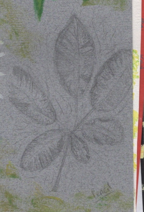
Pencil
I doubt there’s an artist out there who hasn’t used a pencil before. They’re very basic tools. I’ve never ever been a fan of them. I find them incredibly dull and boring, and feel they communicate very little. I use them for outlines and sketches, and that’s it. I feel I could’ve pushed myself harder with my pencil experiments for this piece. I don’t actually own a sketching pencil set, which restricts me somewhat. During my brief hiatus from this project, I acquired some coloured sketching pencils, which I love and have been a lot more experimental with. I didn’t want to add them to this project, though, as I felt already overwhelmed by my 14 mediums.
The first two sketches I have nothing much to say about. I wasn’t comfortable, nor was I pushing or challenging that. I was just trying to make something happen. I was happy with the outcomes, but I don’t feel they serve the purpose they needed to. The third drawing, however, I tried to explore a little. I wanted to see how I could communicate tone, and use the colour of the paper to show the pale yellow areas of the leaf. I also attempted some smudging, and I regret not taking it further with a larger piece of pencil work. I’m happy, though, that in my other sketchbooks I am exploring pencil as a medium and becoming much more comfortable with it and with pushing the boundaries.
Oil Pastel
As I mentioned before, I avoid using the oil pastels I own. The reason I haven’t replaced them is because I really don’t enjoy using them and haven’t even wanted to explore what I can do with them. In the first drawing I used acrylic paper, and I began with some attempts at blending. It was difficult, which could be due to the quality of my pastels or maybe the paper. I wasn’t happy with the outcome, so decided against blending in the petals. Personally, I don’t like how this looks, but I can see that it can serve a purpose. I took part in a Zoom tutorial and someone commented on how they loved the texture in the petals. This really showed me that my own ideas of perfect/good are subjective, and that the texture could be used for a specific design.
The second drawing was done on thin sketchbook paper. I managed to blend easier on this, and ended up with quite a smooth texture. Looking back, I now wonder what would happen if I scraped off the residue from the pastels, leaving just the blended bits. For the third piece I opted for an autumn leaf on pastel paper. I was more comfortable making mistakes and being messy by this point, so I just experimented with rough outlines and layering colours. The colours show up best on this paper, presumably because it’s made for pastels specifically. I also attempted some blending, but definitely prefer the look of the unblended leaf.
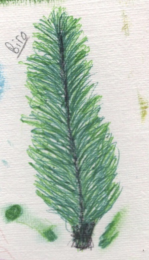
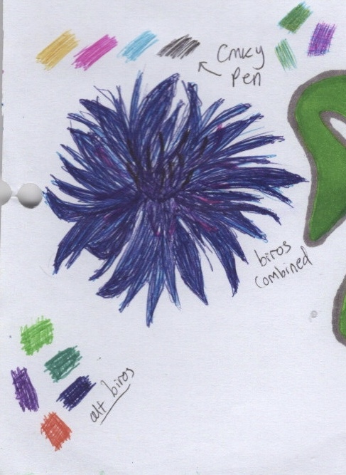
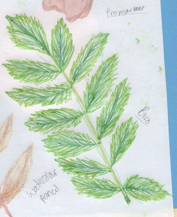
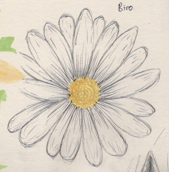
Biro
I have many different colours of biro that I have collected over the years, used primarily for notetaking and occasionally for adding flair or doodles to my lists/notebooks. I haven’t ever used them for creating ‘proper’ artwork, so this was new to me. I loved using them and I definitely want to use them more. The layering and blending of the ink is unique and I appreciate it in ways similar to the chalk. I didn’t find too much difference between the papers I used – acrylic being textured meant the texture was slightly visible in the drawing, however the graphic paper and printer paper were very similar.
I experimented with layering, smudging, blending, and using the ‘wrong’ colour to communicate the same ideas, as with the black in the first drawing as a replacement for brown. I also swatched my various biros and tested a CMYK biro pen I have on the graphic paper. I love the scratchy, intentional lines, and how the colours mix on the page. Before these experiments, I would never have thought to use biro for drawing, but now I want to take one everywhere with me to try it. In my final drawing, I used empty space to show white petals, and tried lots of tiny circles to show the texture of the centre. I definitely want to use more of this.
Watercolour Pencils
I have always been fascinated by watercolour and wanted to use it more, but found myself afraid to try. Watercolour pencils always felt like a safe option, as I have experience with coloured pencils, and they bridge the gap. Still, I have very little experience with using them as actual watercolour, and found in this exercise I preferred watercolour pans to the pencils. The first drawing is on acrylic paper, and I was surprised at how well it held up both the colour and the water. I suppose it’s not too dissimilar to watercolour paper in texture. I layered different shades of pink for the petals, then used water to blend them together and incorporate some white space. I then added detail with the pencils and left it dry.
The next piece, I skipped water entirely. I hadn’t planned this originally, but the pencils were really difficult to use on the printer paper. The paper is quite glossy, and not a great deal of pigment was being used. I feared adding water would destroy the paper, so left it without. I drew the same thing again on thin sketchbook paper, and this time added water. I do really like how it looks, and how you can still see the original pencil markings through the blending. I think watercolour pencils are a good asset to have, but I would like to use them alongside pans or perhaps other mediums.
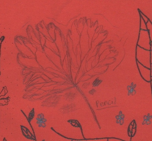
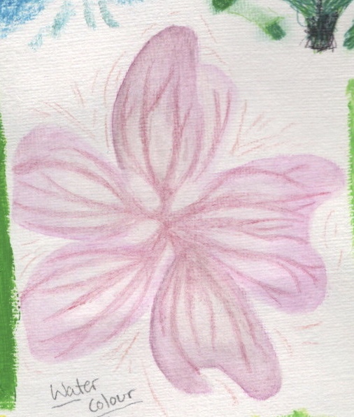
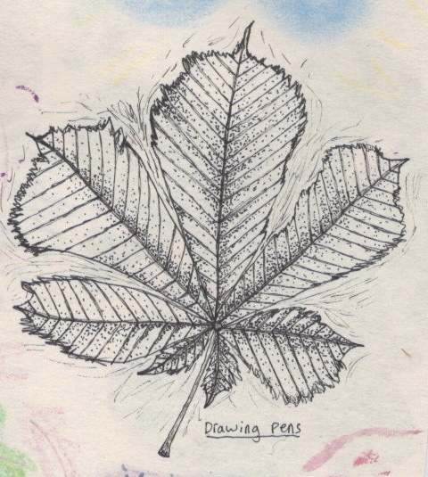
Drawing Pens
I use drawing pens nearly daily in my bullet journal – a type of planner/organisation tool crossed with an art journal. I rarely however do very creative drawings. Typically my journal is very neat, technical, and rigid. I used my drawing pens in part 1 for the first exercise and I enjoyed it, so I was looking forward to using them for this exercise too. The first drawing I did was on red craft paper. I didn’t think about how I could utilise the paper prior to drawing, and I regret that now. I wish I had picked a poppy as my flower, or a rose, and had the paper show the colour of the petals. I used stippling to draw attention to the illustration, and experimented with line work in the petals. It’s interesting seeing how straight lines vs curved lines show direction and relationship to other things.
The next drawing was on thin sketchbook paper, which didn’t impact the drawing too much. I again experimented with stippling, trying to show shading and darker areas, as well as messy thinner lines to draw attention to the piece. I was also experimenting with how hard/soft I could be with the pens and what impact that would have. The last drawing I did was on printer paper, which made the pens seem duller and greyer, rather than intensely black as on the other surfaces. I drew three sprigs of lavender, the first one not deviating much from my regular style. I started the second in the same way, but half way through began adding elements of continuous line drawing. The third sprig was almost entirely continuous line. I felt like the nature of lavender lent itself to this type of drawing style. I definitely want to use this more, either alone or as a supplement to watercolour or marker work.
Gel Pen
Gel Pens were one of the mediums I was most excited to work with when starting out. I used them a lot as a child, and sorta grew detached from them as I explored more ‘grown up’ mediums such as Promarkers and digital design. Recently I have seen them being used more and more in art, and I have been inspired to use them myself. Unfortunately, they ended up being one of the mediums I hated using. I think they have a place in mixed media, but I definitely don’t plan on using them as standalone medium anytime soon!
The first experiments with them were done on red craft paper. The colour of the paper meant the gel pens discoloured. I only had one sheet of red craft paper – the one in my sketchbook – so I ended up testing out a lot of the colours just to see how they looked. I also tried smudging them, drawing over other colours, and seeing how I could manipulate the wet ink. I then drew two sprigs of lavender and some leaves, trying out some of the colours I had confidence in. I really like how these drawings look. I tried blending the wet ink on the leaves, but as it dried the colours almost separated. They do look blended still, but they were better when wet. I added some highlights with silver gel pen on one of the sprigs, and I like the effect that has too. Maybe I will use gel pens for highlighting in other work.
I then used gel pen on the black card, hoping it would stand out starkly against the dark background. I drew the flower to start with, and when wet, it was barely visible. I wasn’t particularly happy about it. I decided to swatch all the colours I had, though, so I could come back to it as a reference. It’s interesting that when wet the gel pens look different to when dry. This makes it a hard medium to work with. The consistency of the ink and pressure from the nib of the pen also makes it difficult to achieve smooth lines and block colour. I tried to lean into this on my last drawing, intentionally being scratchy and messy, trying to see how I could layer the pens and make it work.
Sharpie
I have used graphic markers in artwork since I was studying at college, however I rarely used Sharpies specifically. I love how bold the colour is and have wanted to incorporate them more. As the first drawing I did was on red paper, I tested the pens to see what they would show up as, knowing they would change with the background. The flower was difficult to draw. I wasn’t used to blending with Sharpies and they dry very fast on paper. They also bled a lot.
I thought I would be happier with my results on graphic paper. I found I had a lot more control and could blend easier. I worked with layering colour and also creating texture. However, I was still focused on making things look ‘perfect’, and found myself disappointed. The last two Sharpie drawings I did felt a lot more experimental. The third drawing was on watercolour paper, which absorbed the ink really well and made the colour really bold. I tried to draw block colour and focus less on blending perfectly. I also added some white highlights using a white Gellyroll gel pen. The last Sharpie drawing I did used similar techniques. I started with some blending and softer edges, then went kinda crazy with block colour for the veining. I love how this flower looks, and I’m glad I pushed out of my comfort zone to experiment in this way.
Promarkers
Promarkers were my first graphic marker and they have remained a favourite of mine ever since. I love doodling with them and find them very playful. The first paper I tried them on was graphic paper – designed for alcohol based ink markers like these – and surprisingly I had an incredibly hard time with it. I haven’t used them for ‘proper’ artwork for years, mostly filling doodles or patterns, and so struggled. I also realised that filling in the colour was difficult without guidelines. I wrote ‘better when drawn’ after I finished the piece – meaning ‘better when I sketch an idea out first’.
When I got onto the other papers, I had a much easier time. I’m not sure if this is because it coincided with me feeling more comfortable about experimenting, or if it was better paper to be working on, but either way I started to enjoy the process more. I like the way the pastel paper made the pens look matte, and enjoyed seeing the layering of colours take effect. The printer paper almost rejected the alcohol in the markers, making for a really interesting texture and pattern in the petals on that drawing. In the last piece, I tried using only the chisel side of the marker. It was interesting the shapes I was able to create doing this. I’d like to do more work with my Promarkers outside of doodling, and hopefully I can think of the right project to fit this into.
Coloured Pencils
Surprisingly, despite being an avid lover of colour, I have always had beef with colouring pencils. I never liked them as a child as I couldn’t make them look neat. As an adult I have felt they don’t provide a strong enough colour – they’re too pastel, too pale, too light on the page. I do own multiple sets however, and have frequently tried to make friends with them. Prior to this exercise I would say I was ambivalent towards them. Something I do really appreciate about them is their ability to blend, and also to not blend! You can definitely create magic with them.
My first drawing was on graphic paper, and it did definitely have that pallor to it. I tried endlessly to make the colour richer, to no avail. I do really like how the yellow of the veins stands out against the green, though. My second drawing was on pastel paper, and I was so proud of it. I drew the entire thing out in white and then shaded it with pinks and purples. The white is now barely visible. Using this paper, and the watercolour paper, completely changed my relationship with these pencils. I felt way less constricted and like I could move more freely. I experimented with depth using different tones and tried to create shadow. The pencils showed up so bright on the watercolour paper – I was in awe! I tried layering as many colours as I could, and experimented with dull vs sharp pencils, seeing how the accuracy changed and how the pigment did too. I now feel like I was just using them wrong all these years, and I definitely want to play with them some more – maybe on other textured paper, or even just alongside watercolour.
Watercolour
Watercolour has always enchanted me but I have always felt that I’m not very good at it. Clinging to perfectionism has not served me well in this pursuit. I love how it looks and how delicate it can be. My first piece was on thin sketchbook paper, and I felt incredibly frustrated. The flower itself I was disappointed with, but interestingly looking back I love the details around it. It almost looks like confetti or blossom. That was experimenting, just filling the page and seeing how it looked. I tried a similar technique on watercolour paper, layering colours to look like separate fronds on the leaf. I also did a wash in yellow, which I love, and I think it really ties the page together.
The last watercolour piece I did was on pastel paper. I tried a similar technique again, with separate broken strokes, but this time to create petals on a rose. I also filled block space for the leaves. I think this style works well and I enjoyed using it. I found I could be more expressive and creative, almost like I was doodling but with paint. I want to continue using and experimenting with watercolour, probably in sketchbooks and maybe in projects too.
Gouache
My gouache paints were unopened and unused when I began this project. I tested them on some watercolour paper to see how the colours looked, then I began in my sketchbook. I had no idea what I was doing, and through experimenting I have slowly started to learn how the paint works. The paint seems to be growing in popularity, and as a midway point for watercolour and acrylic, it seems pretty up my street. In a way I’m glad that I had the opportunity to experiment with it without knowing what I was meant to be doing, as it showed me unconventional ways I could use the paint and helped me understand the dynamics of it so much more.
The first painting I did was on black card, which I picked because gouache is known for its boldness and for the strength of it’s colour. I struggled. I did not add water to it at all, which made it dry super quickly and the texture was very tacky. Still, I plodded on, layering it up and trying to create texture with various brushes and adding more/less paint to my brush. By the second piece, I felt I had an idea of what I was doing. I still did not add water, and just layered the paint over itself, trying to create depth and texture. The paint was really hard to work with. Adding water was a complete accident, my brush was still wet from having been cleaned, and wow! The difference it made. The stem and leaf were done using water and the colour feels so much more vivid and smooth. It clicked in my head that I should try adding water, so I experimented a little around it with adding various amounts.
The last painting I decided to add water too, and was excited by the control and surface area covered. I wasn’t really trying to make it look like anything at this point, I was just excited about how the paint could be used! If I had decided to fill the rest of this sketchbook before moving on, I would’ve done so much more with gouache. Now I know vaguely how to use it, I want to experiment a lot more. I also would like to take a class or watch some tutorials online about the paint so I can understand it better.
Reflections
This exercise was an extremely hard one for me in so many ways. I had to overcome a lot of personal hurdles that have always plagued me, and learn to embrace the chaos that art can be. Doing this has been a great benefit to me. I learned so much about my own style, what I enjoy within art, and how to be kinder to myself when creating.
My favourite papers from this exercise were watercolour, pastel, and the thinner sketchbook paper. I definitely want to use these more and maybe experiment with some bigger mixed media pieces on them. Going forwards, I want to continue to experiment with materials and try out new styles.
I am really grateful for the challenges in this exercise and for how I managed to face them and begin to overcome them. I’m really proud of the work I produced, especially in the later pages when I was allowing myself to make more mistakes. It’s shown me that looking back at work often gives you a different perspective and that my own thoughts on my work aren’t necessarily shared by those viewing it. I’m also glad I have a reference book to look back on now throughout my studies, and to continue filling with more floral studies.
The next part of this exercise asked me to make an illustration of someone sitting in a chair surrounded by typical artifacts to give a teenager an idea of the 1950s.
The first thing I decided to do was to do a spider diagram, using the reference material I had collected, to determine what were ‘typical artifacts’ from the 1950s and what I wanted to include in my illustration. I was struggling to make progress with this, so tried a different technique instead. I wrote headers for the areas I would need to reference in my illustration, and then looked through my reference images and wrote what I could see that connected to these themes.
Then, I sketched out some initial thumbnails of ideas I had. I definitely had more ideas than this, but I was really eager to get started. I used references of living rooms I had found whilst researching the 1950s era, and created my own versions of living rooms. My first thumbnail I felt didn’t give much attention to the artifacts from the 50s, and focused more on the person. The second however could include both easily.
I then opened a new file, and sketched out the second thumbnail with a bit more detail. I started illustrating the walls and floor to start with, building the image up from the ground like I did with Assignment 1. However, as I learned in this assignment, the level of detail I was putting in was not necessary. This time around, I went for a softer, less detailed, more stylised approach. For the walls, and the coffee table, I found a wood texture from myfreetextures.com and overlayed it onto both. I found it difficult to create a wood effect in my assignment, so this was a great discovery.
Beginning with the walls, I tried to emulate the wooden nordic style commonly seen in interior decor at the time. I then added a classic sofa, coffee table, and arm chair, wanting to really accentuate how low to the floor these things were, and the sharp angles the legs had. I loved the shading technique I used on the sofa, and was so happy with how it came out. I also really like how clean the overall illustration feels without linework. The colour palette for the piece was centered around the walls and sofa, as I felt yellow was very appropriate for the time. Interiors, especially living rooms, all look quite dark too. There was little natural light, and a lot of dark colours consistently used.
Next I added some decor elements; a large houseplant, a floor lamp, a clock on the wall, some shelving, and finally curtains. I used a paper texture on the lampshade which really added to the design of it. The clock was a style I had seen repeatedly when researching interior decor in the 50s, so I knew I had to include it. It also fit the nordic style I was aiming for. Shelves were commonly used for displaying ornaments, and curtains were almost used as wallpaper. In many of the images I referenced, the entire wall was ceiling to floor curtains. I opted for slightly smaller ones. I also added a window, but kept it small and mostly covered, to show that there was less natural light at the time.
For the curtains, I created my own seamless repeating pattern which was inspired by pages 42, 80, 84, and 131 of The Pattern Sourcebook by Drusilla Cole. The dry brush style and loose, messy florals populated curtain and tablecloth designs. I think my design is a little too minimalist for the time, as denser, more busy patterns were favoured, but I felt detail was lost in the smaller repeats. Maybe I could’ve added something in the gaps between the flowers.
I then attempted to draw someone sitting on the couch. I really hated it, and felt so demotivated. I was so proud of the rest of my work and I felt this was just completely destroying it. Whilst it was just an outline, it was so disproportionate and I realised I didn’t know enough about drawing human form. I decided to take some time to do some sketchbook studies of still life videos and tutorials on drawing people, before coming back to it and trying again.
I began doing daily sketches from still life videos, but my chronic illness worsened and I had to take some time off of my art. After a couple of weeks I returned, and decided to pick up where I left off with this piece. I had spent a while deliberating how I would finish it. The brief asks for a person sitting in a chair, and I was missing that key feature. I considered turning it in without a person, and coming back to it in a few months when I have more practice drawing people. But either way, there was some detail missing from the piece that needed to be added.
I began drawing the books and objects displayed on the shelves. I included another plant, a radio, and some vases and plates. I also drew a TV which I am less than impressed with. It had been so long since I had drawn on this piece, I felt completely unfamiliar with the perspective I was drawing at. I was demotivated and frustrated. Leaving such a big gap between the points I was working on this illustration had made it really difficult to continue. I had already spent 9 hours on the piece, and didn’t want to start again, as the work that was already there was great.
I left the TV (after several redraws) and drew out the magazines. They were fun and reminded me of the process I used in Assignment 1. Again, I feel like I learned a lot there, and it was a lot easier this time around to create what I wanted. Next was to try to tackle the person again. When drawing people for past exercises (and in Assignment 1), I found it motivating to watch other artists draw similarly stylised people, and to discuss my thoughts with my peers. I did this, and it filled me with confidence! However… once again, I felt like I was failing.
I think a combination of boredom, having spent almost a month looking at the same illustration, and frustration with not being able to create exactly how I want to, has made fulfilling this brief really hard. The purpose of the brief was to learn how to use reference, which I think I achieved. But, leaving a brief partially complete is not ideal. At this point, I think I will go crazy if I try to do any more with this piece. That said I will definitely come back to it and either completely redraw it, or simply fill in the blanks. My skills around illustrating people need work. I’m going to make a conscious effort to draw more of them!
I often colour layers in stark contrast so it’s clearer which I am working on before I get to shading etc. Due to this being an unfinished piece, those layers are still discoloured. I was not intending on grey skin!
References
Pages 42, 80, 84, and 131 of The Pattern Sourcebook (2015)