Exercise 7: Using Reference – Research

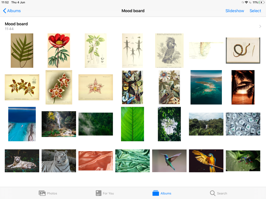
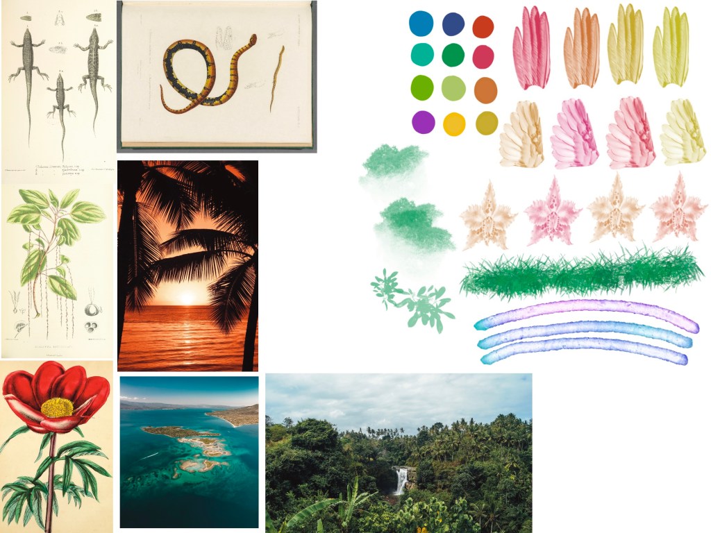
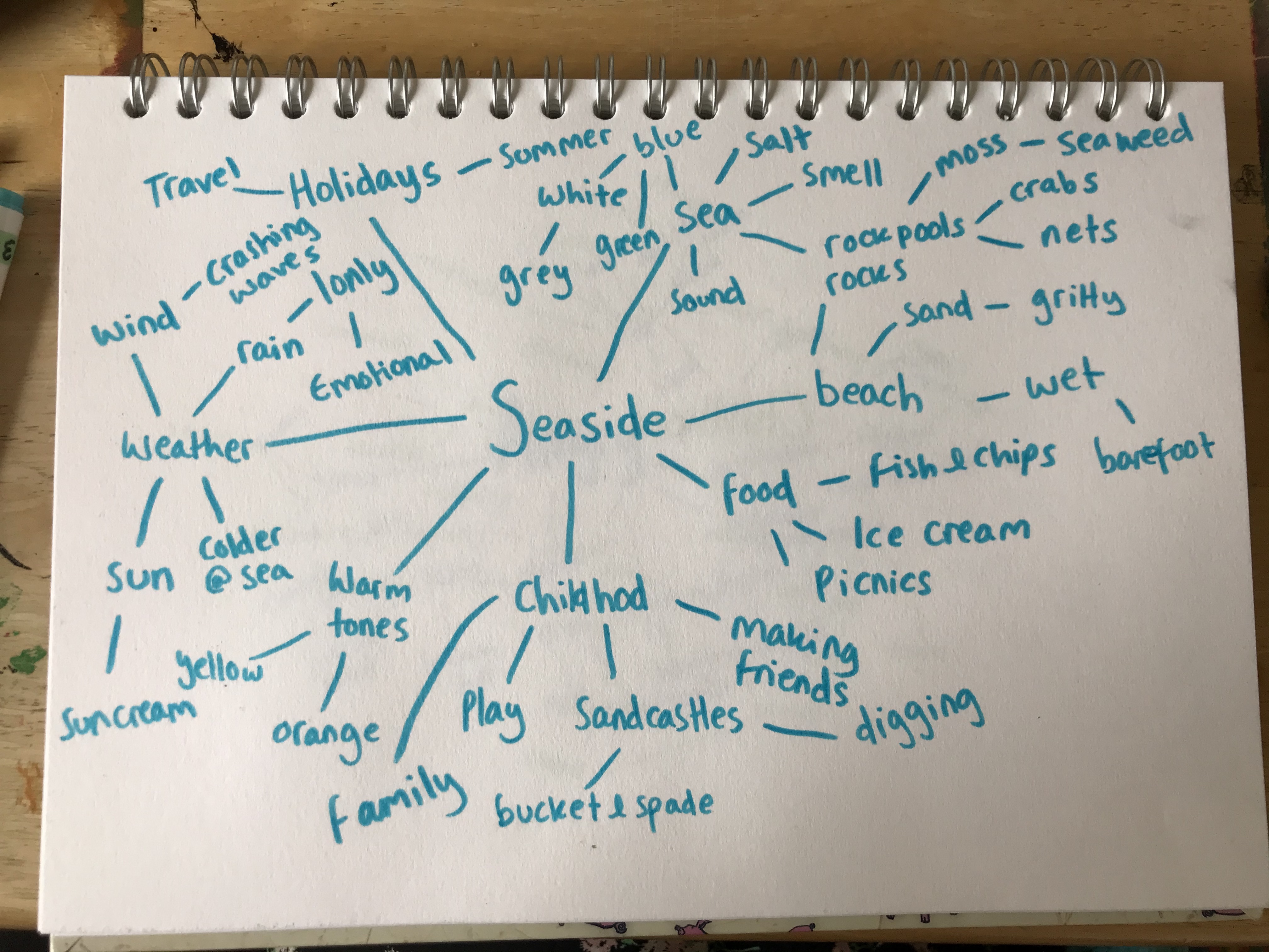
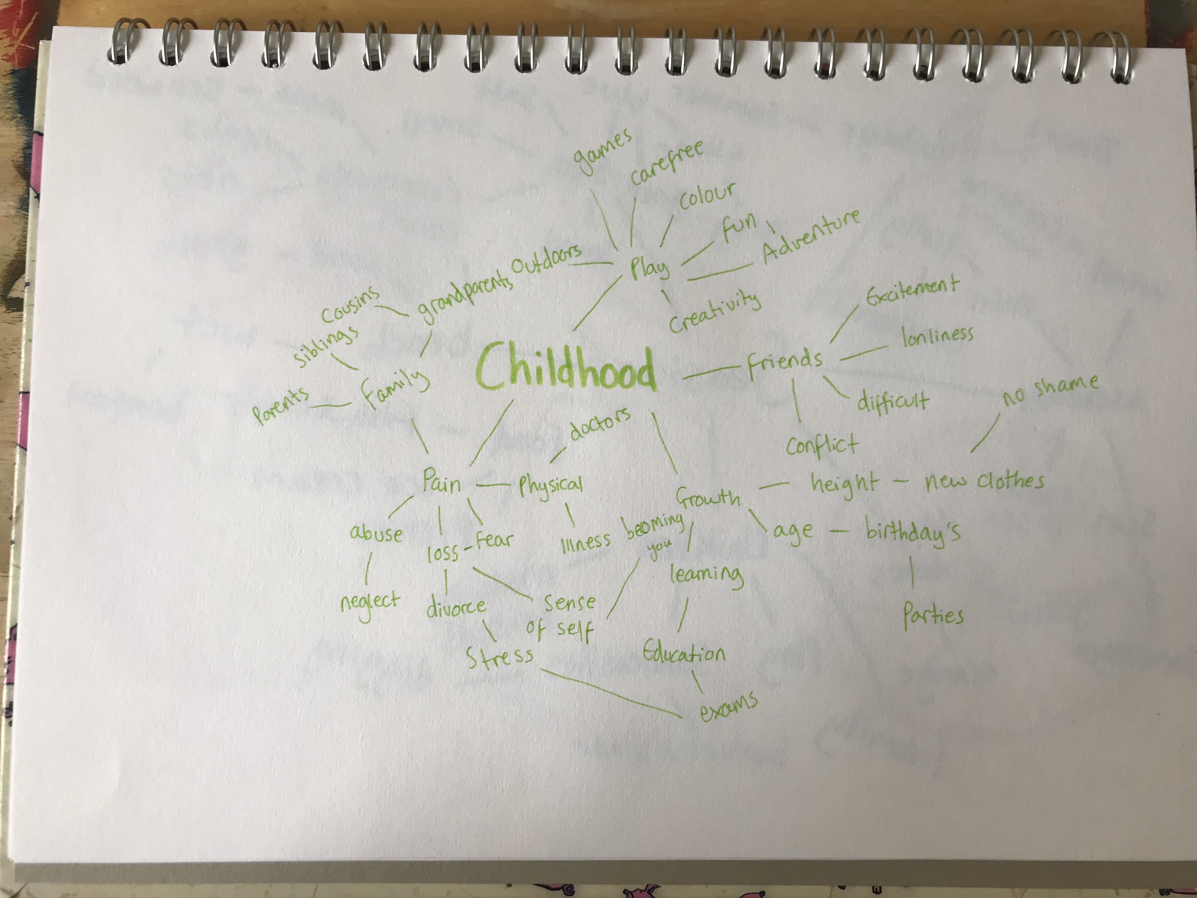
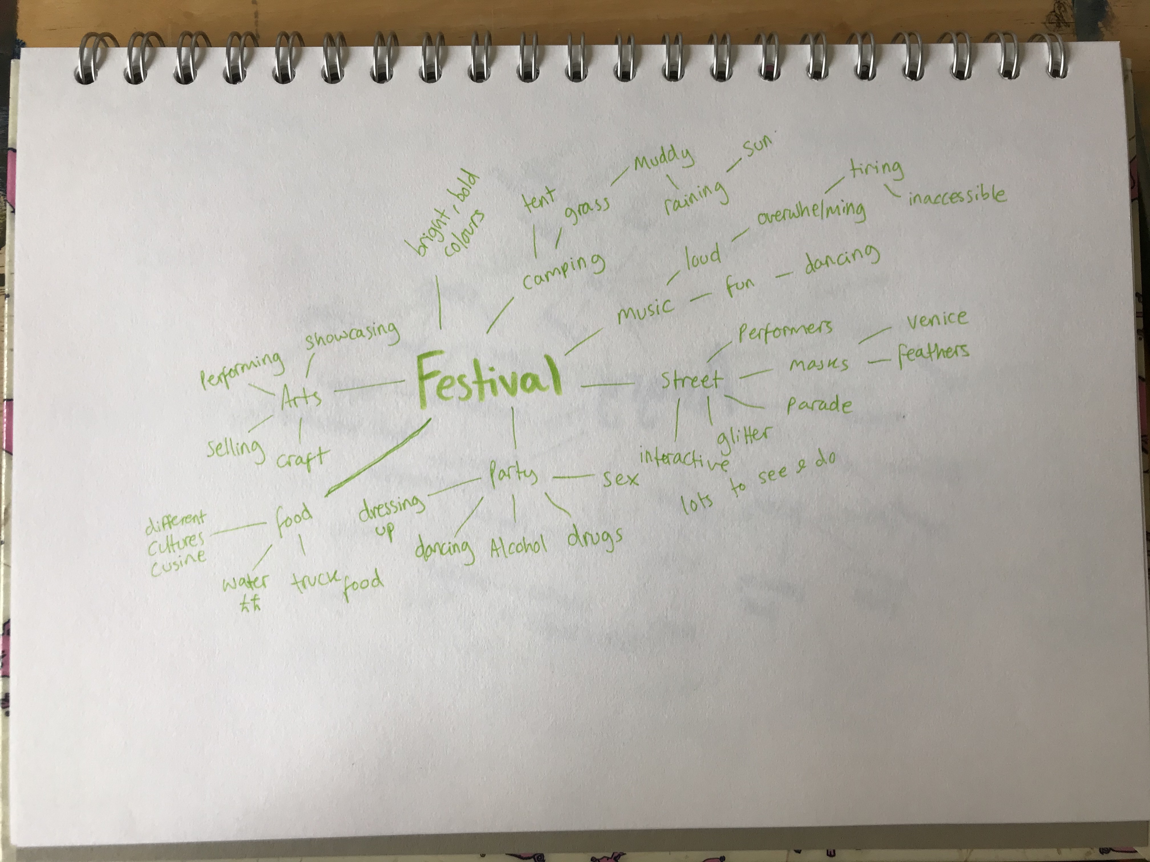
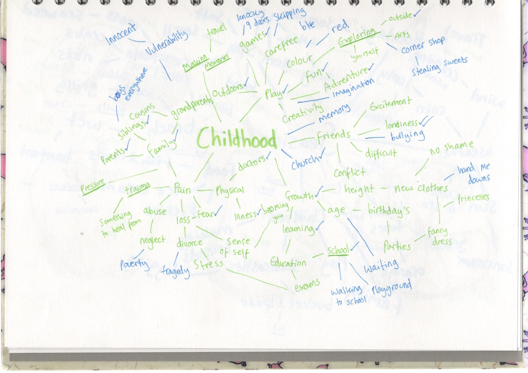
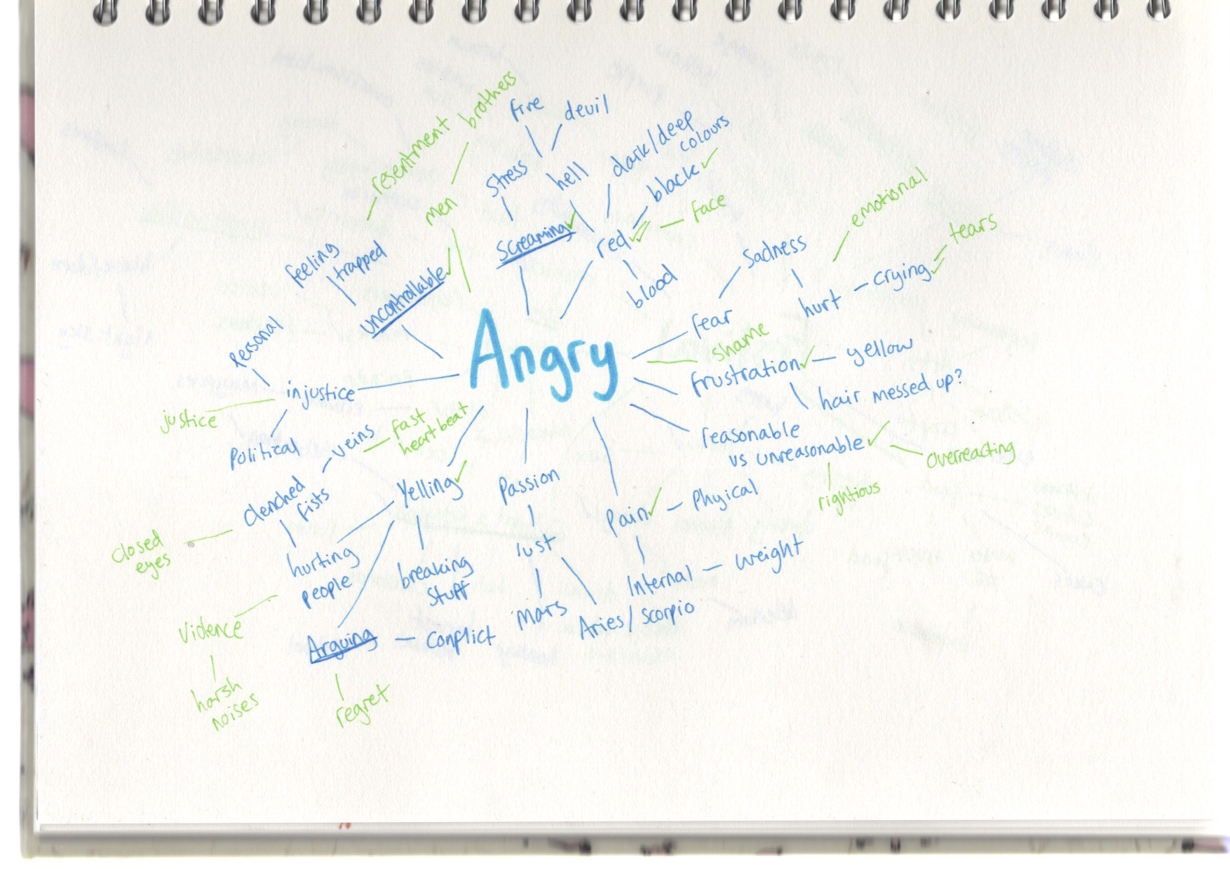
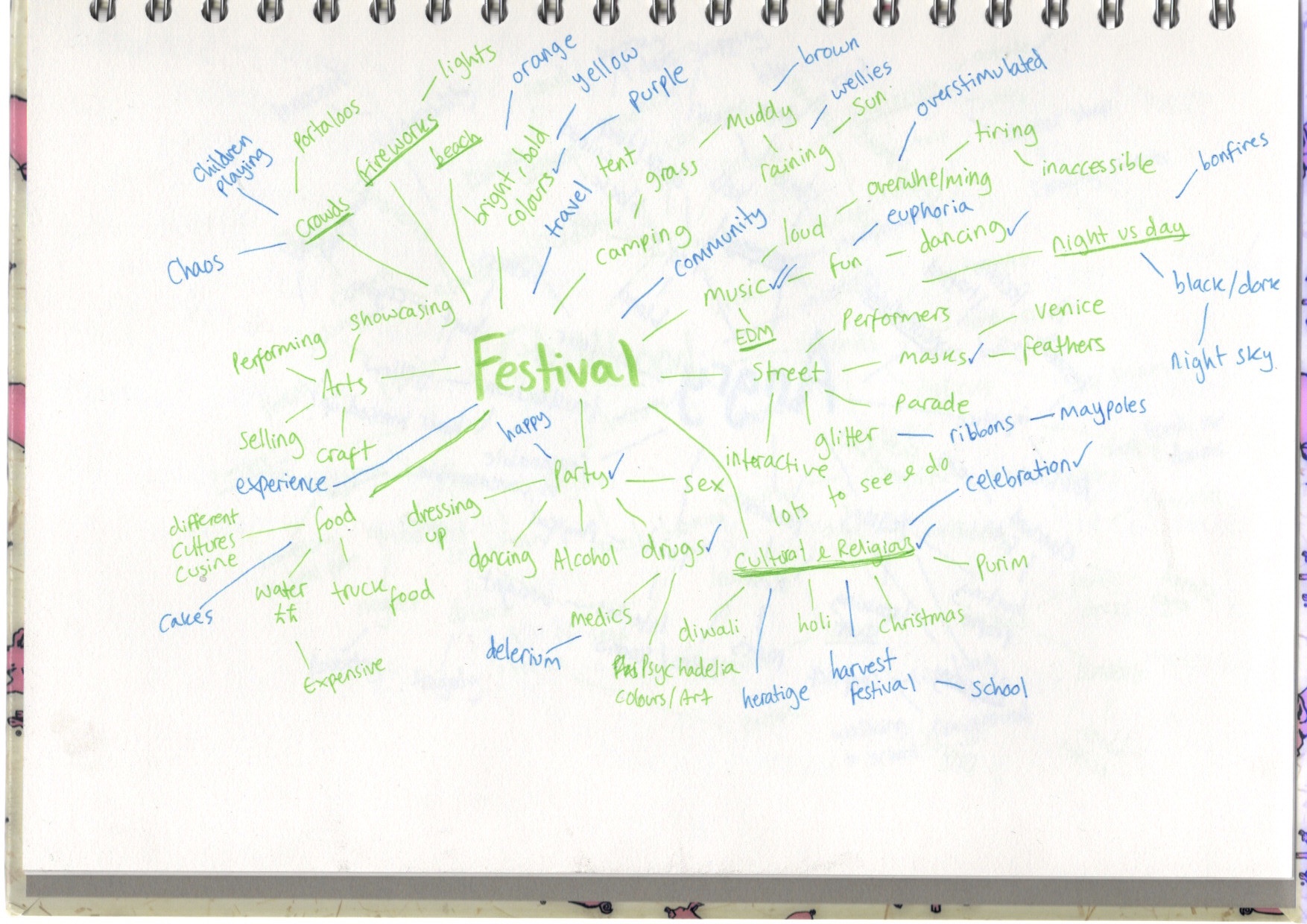
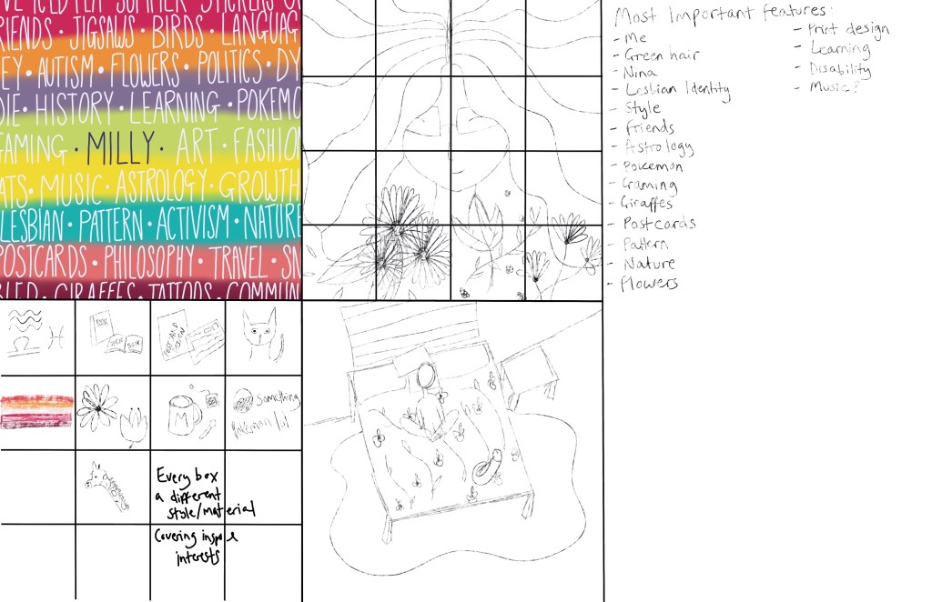
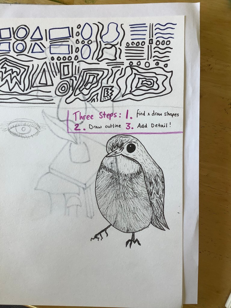
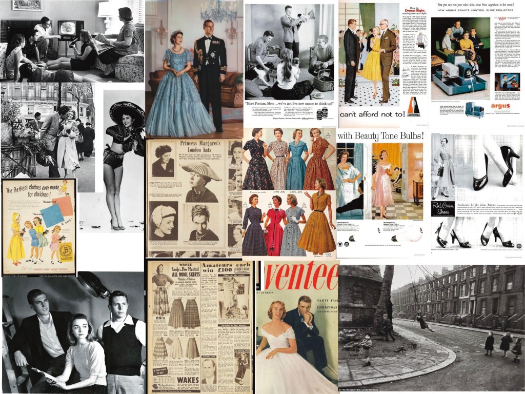
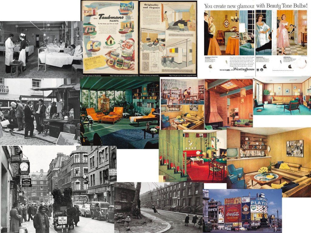
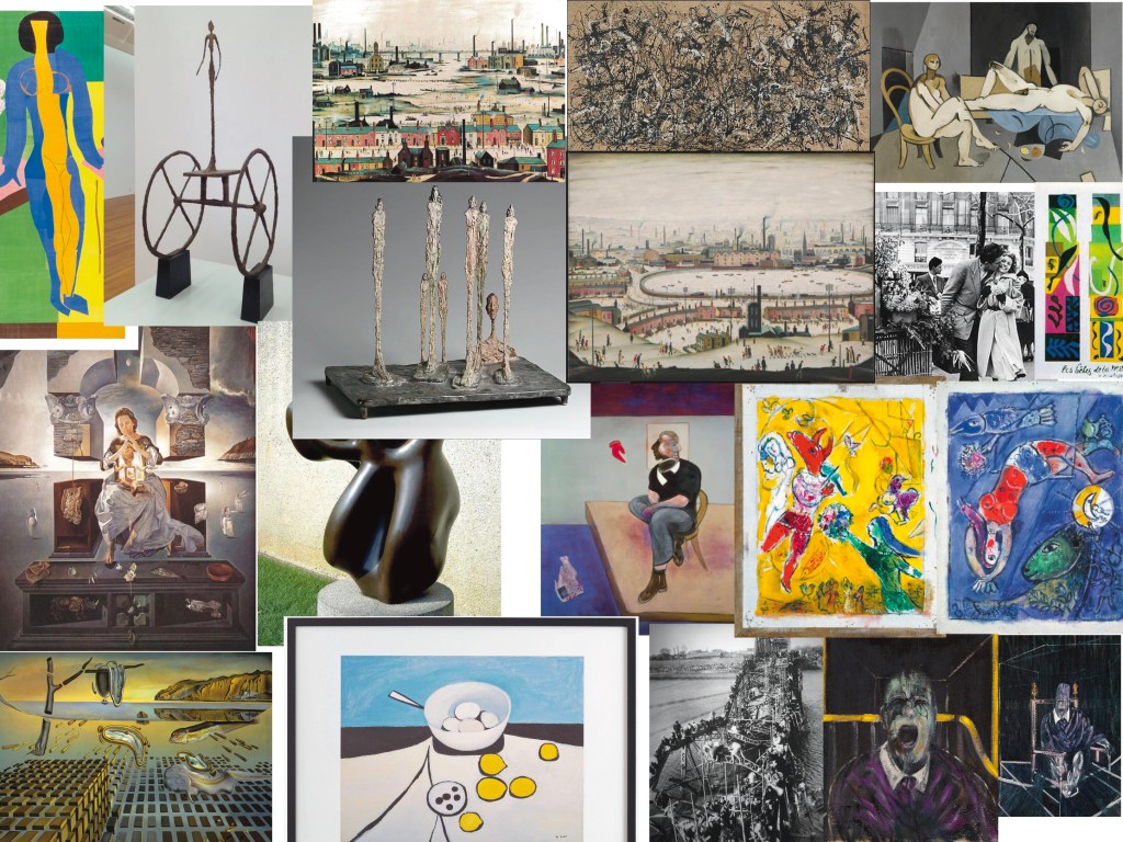
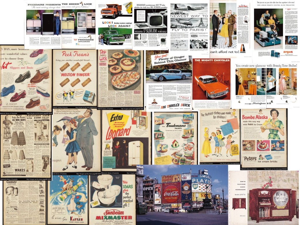
The first step in this exercise was to collect as much reference as I could find for the 1950s period, and catalogue it into 8 categories. Usually, for a task like this, I would visit libraries and archiving centres local to me, however due to COVID-19 I am unable to do this. My inability to leave the house left me with only the internet to collect reference from.

However, I did not want to just google ‘1950s’ and save every image I found. A lot of the imagery online for the 1950s is modern takes on the time period, rather than directly from the period itself. Whilst this isn’t necessarily bad for research, reference images from 2020 are not the same as images from 1950. I chose to begin by exploring archiving websites, mostly magazine archives, and fill in the gaps from there.

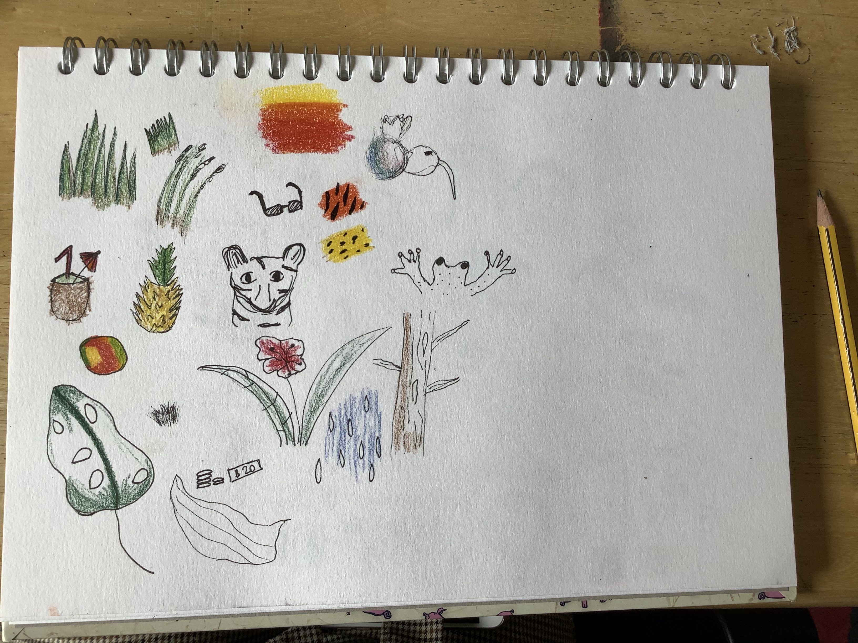
I collected around 100 different images, and then organised them. Some images crossed over into multiple categories, so I included them multiple times. I then decided to display the images in a rough collage so I had a wider reference I could just glance at to get ideas from. If I wanted to draw from a specific image, I could then look at it closer.

People and Costume
Architecture and Interiors
Art
Advertising
Transport
TV and Film
Surface design
Graphic Design

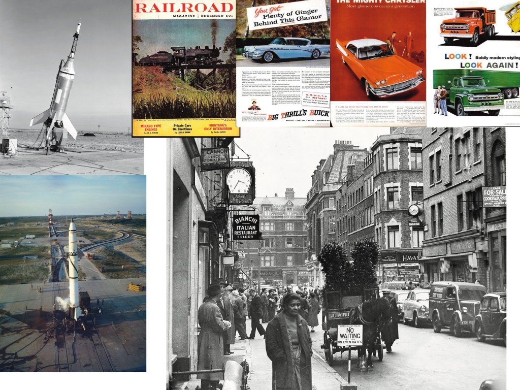
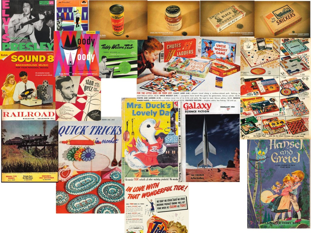
There were some areas that were lacking in resources, like TV and film and transport, which I think is explained by the resources I used. I did try to fill these gaps, however struggled to find places online that had these images. If I were to do this again, I would hopefully be able to visit a library, and maybe look at a book on the history of film.

A review of the 1950s

The 1950s was all about the future. A world war had just ended, devastating societies, and people felt like a revival was needed; turning away from the old, traditional ways of life, and looking into the new, happy, war-free future. The development of spacecraft was accelerating and science fiction was gaining more and more traction, leaving every day people wondering: what is the future, and how can we get there?

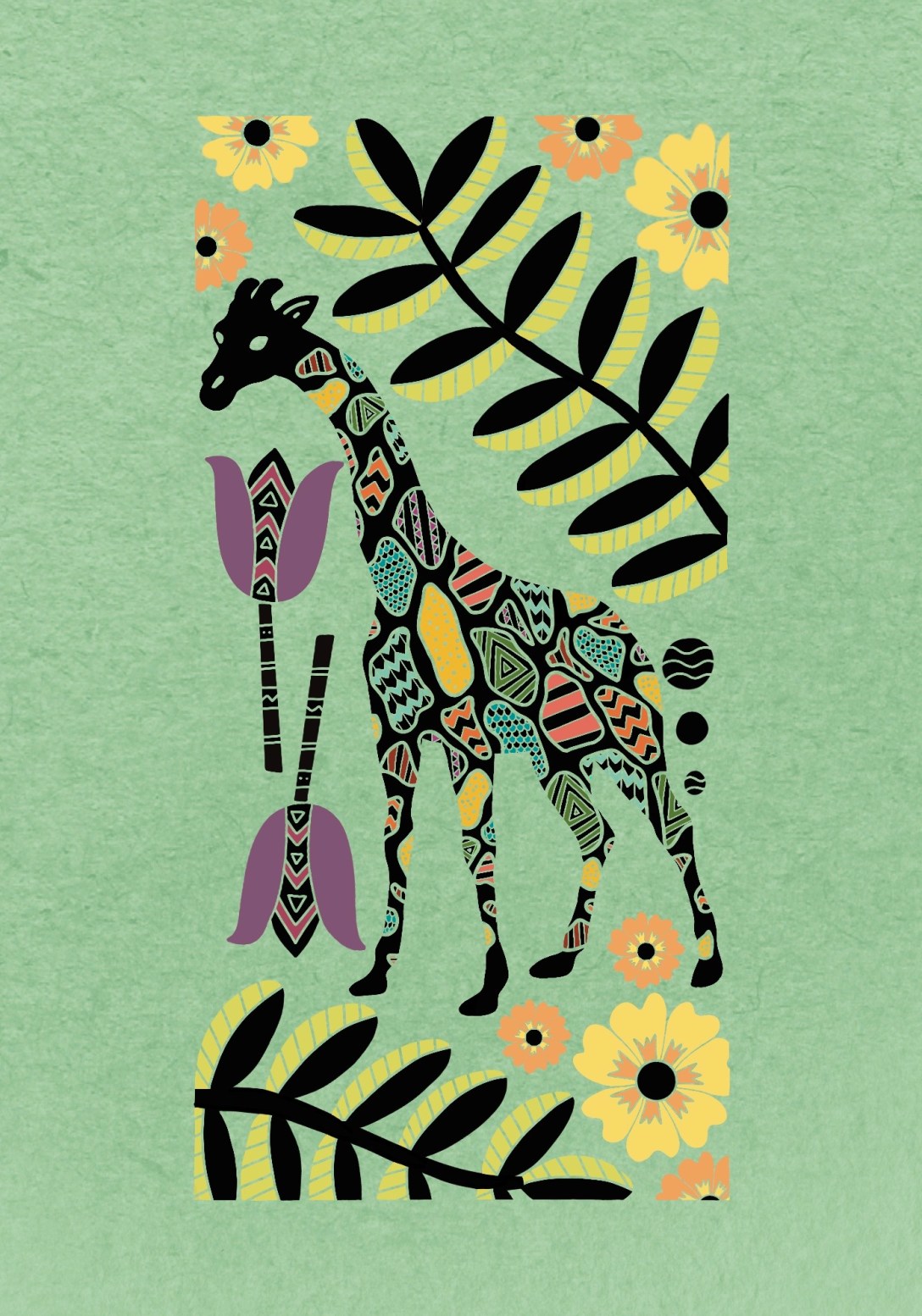
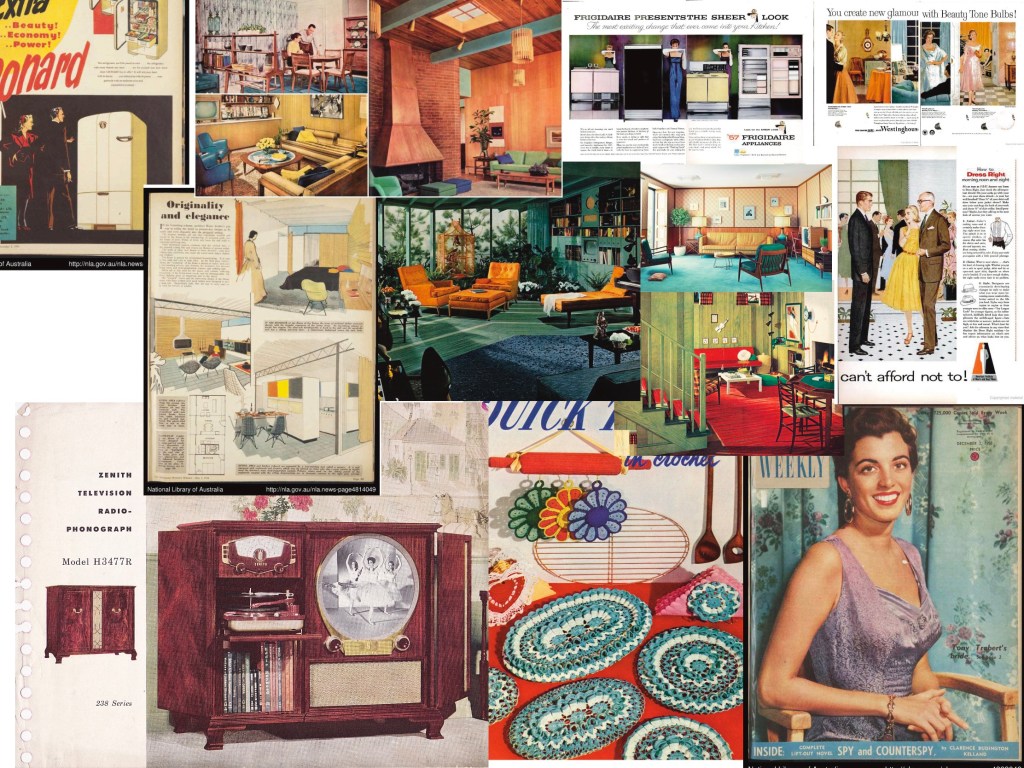
This can be seen in all aspects of life in the 50s. From professional artists, to home decor, to the hobbies and interests of children. People were rejecting the things they had always known, and aspiring to create permanent change. Abstract expressionism, surrealism, pop-art, and avant-garde spread through the creative world like wildfire. ‘What if this looked completely different?’ seemed to be the question on everyone’s mind. Exaggerated shapes, patterns, and colours dominated interior design. The boundaries of pre-war expectations – being uniform, orderly, and toned-down – were being explored. People were trying to see how far they could take it. This then lead on to the wild and liberated visual characteristics of the 1960s.

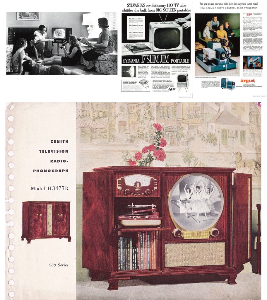
Traditionalism was not entirely lost, however, with a new Queen captivating the world. Despite this, even she seemed to break the rules and do things a little bit differently. Nonetheless, the appeal of royalty and glamour remained unchanged. Hollywood was high on this trend. Lights, glitter, and glam characterised the scenes of the time. Technology was significantly advanced by the war, and having home technology and electronics was becoming popularised. With this, TVs slowly became a household staple for many – and picture houses were opening in every local town. The film industry was growing rapidly. Actors and actresses were now setting cultural expectations for fashion and design. Copying what you see in the movies was new and it wasn’t long before brands started catching on.

With the background of the cold war and the fight against communism, capitalism was pushing to assert dominance. Disposable income was a new and luxurious thing to most, having spent the war in poverty, and people were looking to invest in their lifestyles. They could now afford to buy into the glamorous and rich culture they saw portrayed. Advertisements were now able to be shown in more ways than ever before, and the culture around them was revolutionised. The graphics were more intrusive and manipulative, trying to prey on those willing to throw away money in exchange for status.

These adverts became integrated in every-day life. Magazines were full of adverts, mainly addressing women, who had a new role post war. Billboards, posters, and street advertisements continued, and TV adverts began to develop. The same exaggeration of colour, pattern, and even context, was used in these adverts, but delicately balanced with the ideals of glamour, royalty, and fame.

In modern day, adverts being this integrated into our life has become normality. The invasive nature and eye catching colours have not been lost. People continue to question and push the boundaries of fashion, interior design, and fine art. Modern art is somewhat of a buzzword and debated rather heavily. In contrast, within wider society, there is more of a visual appeal to minimalism and simplicity. There’s a great deal of talk around buying less and shedding the things we don’t need. The goal for many is to own less. Less clothing, less objects in the home, less visual clutter. The consumerist culture that began in the 50s still very much exists, however with visual culture, it is as if we have cycled back to those pre-war expectations of uniformity. Cultural phenomena run in cycles, so this doesn’t come as a surprise.

Perhaps, following this cycle, we will have a similar revival in visual culture, where we once again reject all our current ideals, and create entirely new ones. Art and culture will always move forward, even if the inspiration is looking back. With technology further permeating our lives and homes, we will see further advancement in our visual interests and abilities to create.

Exercise 6: Making a Mood Board

This exercise asked me to expand on the themes and ideas I had identified in the previous exercise, relating to the word(s) I picked. I decided to go with ‘exotic’, as I felt I didn’t really get a chance to see the full potential of this word with the previous exercise, and I had a lot of ideas I wanted to convey.

I decided to complete this digitally, as I don’t have access to a lot of physical resources, and I enjoy creating digital collages. I have experience creating mood boards, as seen in Exercise 1 where I created a mood board for my Mel Baxter recreation piece. My previous mood boards, however, are very organised, and focus less on idea generation and more on collating the final ideas I actually want to work with, in order to compose a piece of work. As this is focused on idea generation, I decided to do a more eclectic collage style piece.

To start, I began collecting imagery to use in my collage. I used the following websites to find these images, as they are free for personal and commercial use.
Flickr Commons
British Library
– Biodiversity Heratige Museum
Unsplash
Pixabay

The images I collected for my mood board

I searched ‘exotic’ to start with, and saved any images I felt connected to my previous ideas of the word. Then I started searching for specific elements I hadn’t found yet, like wealth, tigers, rainforests, and South America. I then opened a large canvas in Procreate and added all the images I had found. From there, I started cutting out the animals from their backgrounds, swatching colours, and examining textures. I created 3 new brushes, 2 from the feathers of the parrot, and one of a flower I found. I felt the feather brushes worked especially well as a texture.

I then began organising and placing the various images in a collage style, with linked ideas near each other. I had wanted to use the map and the money as overlays, rather than standalone images, however in doing this I became too focused on making this a piece of its own, rather than just ideas. I decided to leave them as they were. I finished by finding images of newspaper headlines on google, and clipping the letters to spell ‘exotic’. I wanted that realistic mood board vibe, which I feel I achieved.

The exercise says to ‘collect swatches of colour and texture or create your own to establish a palette of colours and repertoire of marks.’ Whilst this was my aim with creating custom brushes, and generally by including plenty of bold colour, I feel I could expand this and show it more clearly. The definition of the brushes is lost somewhat in the collage format, and the colour swatches blend into the background. I decided to do a slightly more ordered, straight forward mood board, closer to ones I have done in the past. I feel this would be a natural next step, regardless, as it would help form an actual final image, rather than just sporadic ideas.

I think the next step here for me would be to begin studies of the different elements, and drawing out specific shapes to get a feel for them. I would then start to compile my ideas into an illustration, and work with composition. For idea development, I thought this was incredibly useful. Creating a collage rather than going straight to the orderly mood board helped me see the possibilities for an illustration. It helped connect ideas visually and notice how these ideas engage with each other. For idea development in future, I think I will begin with a spider diagram, then a collage mood board, then finalise my ideas with a structured mood board.

Exercise 5: Words into Pictures

The next exercise was focused on building ideas in a different way. I had to pick from a list of words, and instead of writing all the ideas I had in a spider diagram, I had to draw the things that came to mind. The exercise wasn’t about accuracy or whether the drawings look good or not, but creating a visual shorthand of ideas. I had to use different materials, and add swatches of colour and texture. I also had to be aware of the steps I was taking mentally to arrive at the drawings I was creating.

At the end of the exercise, it says ‘Note how your drawing evolves when repeating this exercise. Can you see a flavour in the way that you are beginning to document through these little drawings?‘. Because of this, I knew immediately I wanted to repeat this exercise at least once, to see how my process changes and perhaps improves.

When beginning this exercise, I was very hopeful. I had a lot of ideas immediately for many of the words listed. I decided to pick ‘Exotic’ as my word, as it brought up a lot of colour and diversity in my mind. I also decided, as it says to not focus on accuracy or prettiness, to use drawing pens rather than pencil, as it forces me to just draw and not constantly edit how things look. I got a set of intense coloured pencils to add colour, and started drawing.

I almost immediately hit a roadblock. Not focusing on whether things look ‘good’ meant I was struggling to look at my own work without being critical and disappointed. I regretted starting out using pens, and felt maybe it was too harsh for ‘visual shorthand’. I continued drawing, and then hit another block.

As I mentioned in my previous log about the spider diagram exercise, I am not a visual thinker. I think entirely in words, and struggle to picture things in my mind. After drawing a few things that seemed ‘easy’ to translate, I found myself just wanting to write. I got frustrated with the exercise, wondering what I was achieving by straining to put my words into purely images. I took a break from the exercise, hoping I could come back to it with a fresh mind and more ideas.

I considered writing the words and illustrating them, but felt it missed the point. I also considered attempting it digitally, as I have more control and options for design, but again felt it missed the point of quickly sketching out ideas. I also considered beginning with a spider diagram, and then working from there, illustrating the words I had written, thinking maybe the process of writing the words would help me ‘see’ what I could be drawing better.

I decided to just try again, this time using pencil, and focusing on just getting the ideas down without adding colour or texture. I picked a different word for this, as I wanted fresh ideas. This time I picked ‘Travel’.

I found it so much easier this time. I’m not sure why, whether using pencil and focusing on drawing rather than colour/texture simplified the task, or if my approach had changed making idea generation quicker. I tried to look at it like a spider diagram, drawing anything I could think of that related to the previous thing I drew. Then when I couldn’t think of anything else, I looked at the bigger picture again to find more ideas. This process was still very words-based for me, though. I consciously named what I was drawing/looking at and thought of the words that connected to it, and tried to translate it into pictures.

After drawing most of what I could think of, I did add some colour swatches. Red and blue to represent the London Underground, greens near the map, and various shades of brown/cream/yellow that I felt connected to the general concept of ‘travel’.

It was helpful drawing everything out, and it helped me unlock ideas I perhaps wouldn’t have otherwise. I like the idea of ‘deconstructing a scene’ as discussed in this exercise, and will use that in future when generating ideas. However, I think a combination of words and images is necessary, and I found it difficult focusing on just imagery. I may repeat this exercise in future, to see how my creative process has evolved.

Exercise 4: Spider Diagrams

For this exercise, I had to create a spider diagram for four words: seaside, childhood, angry, and festival. I had to use different ways of generating ideas for it, including asking at least one other person.

I started by doing each spider diagram and just referencing my memory, and the thoughts/ideas that I thought of without external input. I realised after the first diagram that I was using too big of a pen for the amount of ideas I was generating, hence the change after that.

Next, I searched each word on Google and looked through the images it brought up. I then wrote anything I thought of that I hadn’t written yet, and underlined them to show they were influenced by this search. Anything I thought of that connects to the underlines words, I didn’t underline, but they were still relevant to the Google search.

Then, I called my girlfriend and my mum and asked them both to tell me anything that came to mind when I said each word. I wrote anything that I hadn’t yet written in a different colour, and ticked the words that they said that I had already written. Anything that is ticked twice, they both said.

It was really interesting hearing their thoughts and the words that were prompted. My mum grew up at the beach, and I spent part of my childhood there too, so to us both ‘seaside’ prompted similar words. Childhood, family, growing up, home, rain and bad weather, processing emotions by the sea, and a general sense of familiarity. Whereas my girlfriend grew up in London, pretty far from the beach, and her responses were mostly holiday themed, summer, sunshine, going away, and escaping the bustle of the city.

Seeing how different people may have different responses based on their experiences was really eye opening. It made me realise how we can’t rely too much on our own experiences when working with clients. We can have our own spin on things, and our experiences offer unique perspectives, but there could also be perspectives we’re missing by limiting our ideas to those experiences.

I found anger to be the hardest word to do this for, and also childhood. I think that’s because both things are so subjective and can be quite vague. They’re experiences rather than tangible things. Seaside and festival were very easy and words just kept flowing to me, but I found myself quite stumped with the others. Googling the words helped a lot, however, and I think I’d do more of that in future.

Overall, I enjoyed this exercise, and found it a useful way to generate ideas. I do struggle with spider diagrams, as I’m actually not a very visual thinker, so looking at the final diagram and trying to make sense of it and actually develop an idea is difficult. But I think as a starting point, it’s good.

Exercise 3: Writing a Brief

The first exercise in part 2 asks you to work backwards, finding an illustration you have some connection with and writing the brief that could have been for it. To find my illustration, I started searching the list of artists I saved from IllustrationX in part 1. It was hard to find something I had a connection to that I also thought could be worked with for this exercise, as many of the illustrations don’t seem obviously for any purpose.

I ended up picking an illustation by Paul Daviz. I love the flat colours and style, and the texture overlay that makes the image seem like its straight from the 60s, despite it being from 2019.

The chosen illustration

The brief

I am looking for an artist to create a book cover for a children’s book entitled ‘The race to space’. The cover must include the title text, and the text ‘From Sputnik to the Moon landing and beyond…’. The authors name, and the name of the artist, will also be featured. The book is educational and aims to teach children about the history of space travel and the rivalry between the USA and Soviet union in the 1960s. It is being released to commemorate the 50th anniversary of the US moon landing. The book should look historical, dated, and of the time it is celebrating. Inspiration from 1960s space propaganda is required and encouraged.

The cover must include illustrations of the moon, multiple different space shuttles/stations/satellites, at least one rocket (used in the space race), and at least one astronaut. Use space technology from both sides of the space race. Moon and astronaut illustrations should be a focal point, as the book is about the moon landing and what got us there. The text should also be a focal point, and easily readable. It should be understood from the image what the book is about and what it contains.

Please use eye catching colours, especially bold ones, with a similar colour palette to NASA/Soviet space developments. Cartoonish and stylised designs are desired, much like those in early space propaganda. A hand drawn, photocopied effect would suit this well. Flat colour, and block shading.

Reflection

I found this to be a challenging exercise, and actually put it off for a while as I was quite overwhelmed. Working backwards was difficult and daunting. I felt like by choosing something that is obviously a book cover I was almost giving myself the easy way out. However, I ended up enjoying analysing it and thinking like a client rather than an artist. I feel like I understand how to get the most out of a brief too, now.

Assignment 1: Say Hello

For my first assignment, I had to create a greetings card to introduce myself to my tutor. I had to use it to communicate my interests, inspirations, the materials I feel happy working with, and maybe what I want to get out of the course. I could produce it in any form an size, using any materials.

I started by splitting a page of my sketchbook into 4 and jotting down anything that came to mind in relation to the 4 areas I needed to communicate.

My sketchbook page

Then, I started drawing out ideas, trying to figure out what it was I wanted to say. I reduced down my initial list to the key things that I felt were important. Me: my name or myself, my green hair, my identity as a lesbian and as a disabled person, my cat, my dress sense. My interests: the TV show Friends, astrology, pokemon, gaming, art, postcards, my love of learning. My inspirations: colour, nature, the world around me, and specifically patterns on anything and everything I see. Materials: I’m most comfortable using my iPad and creating digital art. I do enjoy physical art too, but digital is where I feel best suited.

Initial ideas

My first idea was to paint a background using acrylics, something I’m less comfortable with but use quite a bit, and then simply write the things that are important to me over it in white pen/ink, with my name being in a darker bolder colour in the centre. This felt like a greetings card, but it also felt a bit too simple and basic. It included a lot of information about me, and touched on some of my artistic tastes, but I didn’t feel it expressed enough.

The second and third ideas were similar. The basic idea was to split the card into 16 squares, every square being drawn in a different style or with a different material. I don’t feel like I’ve found a specific style that I can call mine yet, and I’m still exploring a experimenting with that. I have a lot of different inspirations and interests artistically and I wanted to express that. The second idea was to have one drawing, of myself, with various flowers and leaves surrounding me, and split that into different styles. The third was the have 16 different drawings of the different things relating to me, again split into the different styles.

The fourth idea was one I suddenly had when I wasn’t actually working on the assignment. It seemed really simple and like it connected to me, but was also disconnected enough to seem like a greetings card. It would be me, sitting on my bed, surrounded by things that hint at my various hobbies and identities. I decided to go with this one, as I had a good idea of how to produce it, and I felt confident in it as a final piece.

I decided to add a video of the design process here, so it can be referenced whilst I discuss it. I began by writing a list of the elements I felt needed to be included in the piece. Then, I drew up a rough draft of what would be included and where it would go. I had a top down view of a fantasy bedroom, with me sitting cross legged on the bed. I added tables to display books and had several items on the bed around me.

Starting the piece was hard. I didn’t know where to begin, it was a lot to do and it felt quite overwhelming. I tried drawing some outlines and colour blocking but it just didn’t feel right. I decided to strip everything back and work from the ground up, starting with the floor and wall, and adding each element individually as if it were a real life room.

This was a slow going piece at first. I didn’t know exactly what I was doing or how to create the look I was going for. However, about half way into the piece, I had a solid idea of what I was doing, and that sped up my process hugely. Hopefully if I create work like this again, it’ll be even faster, because I know how to create the textures and styles I want to.

Whilst working on the piece I made several changes from my original sketch. I moved the table at the front of the piece to the left as I felt it filled the space better, and I removed the door. I decided to draw myself lying down rather than cross-legged, as it worked better with the top-down view. I moved the elements from my bed to the tables as the pattern on the bed made it difficult to see anything on it, leaving only my phone in my hand. I also decided to not draw a rug, as I really liked the flooring, and felt the rug made the piece too busy.

I loved designing the prints for the bedding, my dress, and the post cards. This is the sort of thing I would like to do with my illustrations, so getting to do it on a micro level was so enjoyable. The prints are similar to ones I would buy and also ones I would create. I also felt it showed my style really clearly.

On the table on my right, I have a Nintendo Switch, a Pokemon game, a mug, and some medication packets. The Pokemon game replaced the Pokemon plush I was originally going to draw on the bed. I also drew a standard Switch, as the one I own is a limited edition Pokemon themed one, and I wanted it to be recognisable. The mug is one of my favourites, and it was really fun to recreate it. I also included the medication packets as a nod to my experiences being disabled.

As this piece progressed, I realised that music was such a huge part of my life I had completely bypassed when working on ideas. To have me lying on my bed listening to a record seemed brilliant, and fitting to how I spend my time. So the record player and vinyls took centre stage. It worked well as I was looking for something to include in the bottom right space. I had thought a plant would work, but I feel the floral decorations point to my nature inspired style enough. The vinyls are two albums I love, Lonerism by Tame Impala, and Hospice by The Antlers.

The table also has three postcards, an astrology book, and a Friends DVD case. They all had their own challenges. The Friends case was hard to do on such a small scale, the astrology book seemed really plain, and the postcards, again, were difficult to scale. I had to go simple to keep the detail, which I learned quickly with the Friends case.

I did trace a few elements of this piece. First was my glasses. I wanted to maintain the shape, but as I need them to see, I struggled using them as a reference. It felt easiest to just outline them and create the texture myself. Then I traced the pictures of the Friends cast, just to colour block roughly where things were meant to be, so I could shrink it down and it still be recognisable. I also edited an image of the New York skyline to use on the DVD cover. Then, I traced a rough outline of Zacian (the Pokemon on the game box), and the Pokemon logo. Lastly I traced an outline of the hands for The Antlers vinyl cover. For all of these elements, I wanted them to be recognisable for what they are at a small scale, and tracing them was the best way I could think to do that.

The last thing I did for this piece was add in some rays of light. I tried a few different blend modes and techniques, and ended up with day and night versions. I don’t know if I prefer the piece without the light, and I think as the intention was to have it in daylight, the night version could do with some more work.

On reflection, I think I bit off a little more than I could chew with this piece. I loved doing it, but found myself having to scale back repeatedly on what would be in the final piece. I wanted to include as much as possible, but found it getting busy and cluttered, and that I was taking lot of time on tiny individual elements. Despite that, I am really proud of the finished image. I love the way it looks and how everything fits together. The only thing I would change is my cat, Nina. I wanted to add a fur texture to her, and as a standalone I think it works well, however it looks out of place with the rest of the image. I think redrawing her, maybe stretching by the bed, would look better.

I learned so much whilst doing this piece, and I have a lot of areas I would like to develop and explore. I want to experiment with what exactly my style is, to learn how to use more bold and striking colour palettes, and I would love to develop my Procreate skills even further.

Exercise 2: Getting the gist

For this exercise, I had to choose an article from a newspaper or magazine and create an illustration to go alongside it. It took some effort finding an article I wanted to do this with, as currently the COVID-19 pandemic is dominating the news, and it’s a rather miserable topic to be reading about. I decided to go with an article titled What will Pride mean this year?. I read over it several times, following the instructions of the exercise and highlighting the key words, getting a feel for the article and what it was trying to communicate.

I then jotted down the key points I took away from the article, and what I felt summarised the text. The core themes were that Pride would exist online rather than in real life spaces, that there was fear and concern – around homophobic and transphobic abuse online and around how to support smaller communities – and that the purpose of Pride may be lost, either to protestors, or to the thing protestors are protesting.

I sketched out 3 initial ideas for an illustration. The first shows a regular Pride parade in the street, and someone sat at home watching Pride on their laptop. I used a jagged line to separate the two as I felt it showed the striking difference. The second has a confused and worried person surrounded by question marks and various ‘fears’; online harassment, Pride online, fundraisers lacking traction, and protestors. The third simply shows a laptop with a Pride online website open. It has adverts over most the page from anti-LGBT corporations, homophobic and transphobic abuse in a chatbox, and a very tiny barely readable ‘donate to LGBT charities’ link, showing the priority given to corporations rather than community resources.

My initial sketches

I really liked my third idea, I felt it was clever and showed the potential for what Pride online could look like. However, I felt my second idea communicated the underlying worry, concern, and general sense of unknowingness that the article was discussing. The headline begins with a question, ‘What’, and that isn’t answered in the text. We don’t know, and that’s a key point. Whilst I would’ve liked to develop the third idea further, I decided to develop my second instead.

I began by roughly drawing out the elements I wanted to include and positioning them around the person in the center. Then, I worked on each element individually at a large scale before sizing it down to fit. I wanted to ensure it was detailed, but not too detailed, as it wouldn’t be visible at a smaller size, so that was tricky. Once I positioned the elements, I changed the background to a blue colour that complemented the yellow of the question marks.

The brief outlines
The developed elements and original background colour

Quickly however, I realised this blue was just too much. It was harsh, and the colours in general weren’t complementing eachother. I changed it again, to a softer blue, which was easier to look at. I then set to work on the person in the center of my illustration. I took a completely different approach to this, with minimal outlines and soft shading and textures. I loved the outcome, and after viewing it with the other elements, decided I wanted to edit everything to match.

Updated background and completed person

I also moved the elements slightly, and made the question marks larger. Then, to finish up, I added some background shading and highlighting. I’m quite proud of this piece, I wasn’t sure where I was going to end up when I began, and I was worried about placement of the various elements. I feel like I could potentially add more, like some indication of COVID-19, or maybe a more obvious nod to corporations profiting off of Pride. I didn’t want to overwhelm the piece with too many elements however, and felt simple was best.

The dead space at the bottom of the piece is somewhat of a conflict to me, too. I tried cropping it out to make a more rectangular image, as that’s most often used in articles, and I don’t know if it looks better. I keep going back and forth over it.

Finished illustration
Cropped illustration

I feel like this piece communicates the message of the article well, and suits the audience. The readers of the article are most likely going to be members of the LGBT community who recognise the imagery from their own experiences. The themes of fear, concern, and uncertainty feel clear in the illustration. There’s definitely areas I could improve, as mentioned above, and maybe in future I will develop and explore my other ideas.

It was really exciting reading the article and starting to develop ideas. Being able to take text and carry the message through to an illustration, and actually see it come together, was a lot of fun.

Exercise 1: The History of Illustration – Artwork

The next task in this exercise was to draw an illustration in the style of my two chosen artists, selecting similar subject matter and media.

I chose E H Shephard’s work first. To start, I wrote out the subject matter of his illustrations, and the media he used. Then I jotted down some ideas of what I could illustrate, and the media I would use. I sketched out two of these ideas, using stuffed animals and my pets as inspiration. I wrote a few more notes whilst thinking about which sketch I could elaborate, and decided to go with my first idea. This was because using stuffed animals as a reference fitted Shephard’s work very well, and I felt the colour palette was subtler, so more appropriate for watercolour.

Sketch book page for E H Shephard

I knew I would be using pen and ink for this illustration, so before starting the draft sketch, I tested out some of my pens. I also tested some india ink with a dip pen, which I don’t have much experience using. I loved the way it looked, and felt the bolder lines were more suited to this piece. My original plan was to draw the piece using drawing pens, then add colour. However, india ink is not waterproof, so I changed my method slightly.

Final draft sketch

After drawing out a final draft, I attached it to my lightboard with some watercolour paper. I then filled in the spaces with watercolour, with a light, wash-type effect. I then used my dip pen and some India ink to fill in the line work and add detail. As I mentioned before, I have very little experience with this medium, and that meant I struggled quite a lot. I couldn’t achieve consistency in my line work, and kept making noticeable mistakes.

I wasn’t happy with the final outcome. Looking at Shephard’s illustrations, then at my own work, I was struggling to see a resemblance. I love colour, and I desperately wanted to keep that in the image, however few of Shephard’s illustrations actually contained colour. Plus, with having less experience using the dip pen, I just wasn’t able to achieve the same look. I decided to try again, using the same draft sketch, except this time using my drawing pens and leaving out the colour.

Final piece

This piece looks a lot more like Shephard’s work, and I’m quite proud of it. I’m glad I tried again and I’d actually like to work with these characters again in future.

For my Mel Baxter inspired piece, I began with a similar method. I wrote the subject matter she illustrates, the media she uses, and ideas on what I could draw. Baxter uses her environment as inspiration for her subject matter. So, I looked into my garden, and wrote some of the plants and birds I could see. I decided to do a bird focused piece, like her Pink Galahs piece. Baxter does draft sketches on paper and then finalises her work using her iPad. I did all of my work on my iPad, as I find it easier to work on.

Mood board for Baxter piece

I began by collating images of the subject matter I was going to draw, and sketching them out onto a mood board. I also took a colour palette from an array of her illustrations, as it says in her artists bio on illustrationx that Baxter uses the same 30 colours throughout all her work. Then, I started working on composition. I frequently referenced her work with birds to ensure my composition was similar, then, when I was happy with my sketch, I got to work.

Rough draft

The first thing I did was add colour. Her work is incredibly bold and the colour seems to be the focal point, line work coming second. I added a background, and roughly filled in the different elements of the illustration. I also redrew the leaves, and removed the blackberries. It was my intention to redraw them, but this piece ended up taking a lot more of my time than I had intended, and I felt it was better to leave them out.

Rough colour fills

Then, I added in some detail and extra line work. This was time consuming and quite tedious, involving a lot of repetitive motions. I ended up spending around 9 hours total on this piece, which half of was spent adding detail.

I like my final piece, and I’m happy with how it compares to Baxter’s work. I found it difficult to produce incredibly true to life work like she does. I also struggled with how to add texture to the bird, for a while it felt very plain and blank, and now it feels a little too busy. I also think the colours don’t match up to Baxter’s work as well. I think that has a lot to do with the subject matter. Living in Australia, Baxter’s environment is naturally bright and bold, whereas here in England, colours are more muted. Whilst I used a colour palette right from Baxter’s work, my subject matter lended more to toned down colours.

I enjoyed the challenge of this exercise, being forced to really look at the art of other illustrators to attempt to replicate it was new to me and helped me learn about different techniques I could use in my own work. I did find it difficult having to draw in other people’s styles, however, as I felt very pressured to perfectly emulate it. I had to keep reminding myself that I have my own style, that isn’t this style, and that it won’t ever be perfectly another person’s style.

In future, I would like to reference more work by other illustrators to shape my style progression. It was fun stepping into someone else’s shoes, and helped me to expand my own.

Exercise 1: The History of Illustration – Research

Exploring the past

This exercise asked me to pick from a list of illustrators who are famous in illustration history, and a contemporary illustrator whose work I like, and research the two together.

I started by briefly looking through the art produced by each of the 6 illustrators on the list. I then decided to research E H Shephard as, upon seeing that he illustrated Winnie the Pooh, I audibly gasped in excitement. Winnie the Pooh was a meaningful book in my childhood, and I wanted to understand more about the artist who brought it to life.

E H Shephard illustrated for books from early on in his career, having produced work for versions of Aesop’s Fables, David Copperfield, and Tom Brown’s Schooldays by 1906. It wasn’t until 1923, however, that A. A. Milne considered Shephard’s work. Milne did not originally think Shephard’s style fitted Winnie the Pooh, but after a huge success illustrating When We Were Very Young, a book of poems by Milne, he insisted Shephard illustrate Pooh.

An extract from ‘The Art of Winnie the Pooh’ (Campbell, 2018)

Shephard’s depictions of Winnie the Pooh are cherished by many. The simple pen and ink drawings are so familiar and represent a beloved childhood character. Milne arranged for Shephard to receive a portion of his royalties, as he knew the illustrations made the books a success.

‘My Village, I Think?’ – E H Shephard 1917, published in Punch

Whilst most remembered for his Pooh illustrations, Shephard’s real passion was his work with the satirical magazine Punch. He contributed pieces to the magazine from the early 1900s. When World War I broke out, he continued to contribute to the magazine from the trenches, and was hired as a regular staff cartoonist in 1921. He was made lead cartoonist in 1945, and continued to work there until 1953 when a change in editors meant he lost his position. He once said that he felt his Pooh illustrations overshadowed his other work, and he came to resent them.

Shephard’s wartime experience definitely impacted his creative journey. During the war, he kept sketchbooks and art journals, which were recently displayed in an exhibition at The House of Illustration in London. His preference for his work with a political satire magazine may have also been influenced by war. I agree that his Pooh illustrations overshadow his other work, which could offer a wonderful commentary on the experience of soldiers. But, then again, having just faced a very deadly world war, and sliding right into another one, it’s no surprise that the general public fell in love with a wholesome book about a stuffed bear and his friends.

Comparing the contemporary

Next, I had to pick a contemporary illustrator. I am pretty out of my depth here, as whilst I love looking at art and finding inspiration, there are no illustrators that immediately spring to mind. This is something I am hoping to change over the course of this unit, as I would love to find people who consistently inspire me.

I visited http://illustrationx.com and browsed the illustrators that the agency represent. I took note of any who stood out to me or who’s work I especially enjoyed. Then, I viewed their work one by one until deciding to pick Mel Baxter.

Initially, her work stood out to me because of the bold and rich colour palette. I was stunned by the usage, and loved how the line work complemented it. I thought her work would be good to compare with Shephard’s, as both use simple line drawings but achieve very different things.

Mel Baxter’s ‘Millen Harvest’

Baxter is an Australian illustrator and designer. She is also known by ‘Moonshine Madness’, the name of her online site where she sells her work as prints, on various items of clothing, and on tea towels, which she herself is inspired by. Each of her prints honour places that are local to her, and the inspiration for each piece is written up on the website. She also works on commission and has illustrated for brands such as Ivy & Wood.

The restricted and vibrant colour palette she uses is a stark contrast to Shephard’s colourless ink drawings. Where Shephard does use colour, he uses soft watercolour washes, the emphasis given to the outlines themselves. Baxter’s work almost seems to do the opposite, the colour being the focal point and the ink lines merely adding detail.

‘Baby Koala’ by Mel Baxter

Shephard’s work is either inspired by his own experiences, or drawn to accompany text. Baxter, however, takes inspiration from the world around her, drawing mostly fruits, plants, and birds. Shephard utilised the medium of his time by illustrating books and magazines. Baxter is doing the same, by producing prints that can be easily transformed to sell as almost anything.

Technology has revived many traditional art techniques, ink drawings included. Whilst Shephard had to hand draw all of his work, Baxter uses an iPad to enhance and finalise her pieces. She begins by sketching out her ideas on paper, and then completing them digitally. This enables the colours to be so much stronger, something that wasn’t possible in Shephard’s time.

Baxter’s work clearly shows how the illustration industry has changed over time. Because of the nature of her work, finding information on her was rather difficult. There’s not a lot out there in comparison to Shephard, as succeeding with an online business often requires an amount of anonymity. Her usage of technology and the purpose of her illustrations also show how different the industry now is.

I enjoy both styles of illustration, however different they may be, and I am looking forward to recreating them.

Preparing to study

For as long as I can remember, art has been central to my life and experiences. My family are creatives, so I was raised in a home filled with creativity. The decision to home educate me and my brother only enhanced this, and meant at every opportunity I was able to develop an artistic mindset. I always had a passion for learning and creating, and felt the two often conflicted. My love for the humanities, and my love for the arts, have been difficult to compromise on.

I decided quite young to pursue Graphic Design, as I believed it would lead to more job opportunities. However, after becoming unwell in 2015, I accepted traditional university education was not likely. After months of boredom and wishing I could be learning, I began a History and Politics degree with the Open University. My health deteriorated dramatically and in 2017 I was diagnosed with stage 4 cancer. I withdrew from my degree, and focused on recovery.

In January this year, I was thinking back to my degree and wondering what I could do now. I wished I could return to the arts, but my experiences with home education showed distance learning with art is difficult to come by. I originally set out to find a fashion history course, nothing serious, just something short term, and was lead to OCA. I was shocked I hadn’t found it before, as it seemed to be everything I’d wanted for years.

Then came a lot of research. What would I even study? Am I well enough? Is this something I actually want to commit to? How will I manage every day life whilst studying?

I reviewed my experiences when studying with the Open University and ensured I would be able to deal with the obstacles that made it hard. I set aside a space for learning and creating, I altered my schedule to free up time, and I began doing art every single day. I wanted to figure out all of the hurdles and difficulties prior to starting, so that I could focus on creating and growing.

Then, I applied for the Visual Communications degree.

Whilst waiting for student finance issues to be resolved, I started using skillshare to develop my various skills (or lack of) and to continue the practice of creating every day. The classes included:

You can draw anything! In 3 simple steps – A class that taught me about visualizing objects and spaces as just shapes, rather than what they actually are, to improve proportions and drawing ability
Fundamentals of DSLR photography – This class explained lighting, camera functions, and how to set up the shot you want to capture
Intro to coloured pencils: watercolour pencil techniques – A class that explained how to get the most out of using water colour pencils, what materials to use alongside them, and the best techniques for creating different styles
Procreate for beginners – A beginner level class focusing on handlettering and simple designs in procreate
Folk Illustrations on your iPad – A slightly more advanced class introducing folk illustrations and showing how to develop your own folk art style

From these classes, I learned how much I love using my iPad for art. The folk illustrations class is the most fun I’ve had out of all the classes. However, I enjoyed each one individually, and will probably use all of these skills going forward. I enjoy mixed media work a lot, and hope to have the opportunity to explore that.

I am looking forward to finally starting with a degree in something I’m so passionate about, and that I enjoy so much. I hope that over the course of studying I learn so much more about myself as an artist and designer, and about the world of illustration and graphic design too.