This exercise asked me to document the visual world either digitally or in a physical sketchbook. I was asked to focus on things that I find visually stimulating and enjoyable to look at, and then to reflect on what I find.
The focus of this exercise was to get a feel for my visual interests and tastes and to start getting curious about the world around me and notice where design is used in practice. When I initially read the brief, I felt pretty overwhelmed and stressed by what was being asked. I figured this was because I was trying to overachieve and was viewing the task as ‘too big’ to accomplish, and tried to set some more reasonable goals for the visual diary.
I began by reflecting on some research I completed in part two – where I was asked to consider what sort of items I already collect and why. At the time I had made a list of all the places I go to be inspired and how I engage with visual communication and design on a day-to-day basis. I intended to use this as a starting point for creating a visual diary and began working my way through it, collecting things to photograph or add.
First, I went through my studio at home and collected all the books, artwork, and visually inspiring things that I have there. I ended up with a huge stack of stuff and felt like I’d barely scratched the surface. Again I began to feel overwhelmed, so I moved into a different room in my house to photograph things there. Overwhelm, again. I couldn’t figure out why and thought maybe I was just tired and would revisit this the next day.
As I thought more about this exercise, I felt more and more resistance to completing it. I tried to dig deep and understand why it was so hard for me, and I realised that it was because the exercise is aimed at someone who is brand new to design and thinking visually. I was in this place three years ago when I began my degree, and something I commented on throughout my first unit was that I was amazed at how much I didn’t see in the world around me previously – that now, I notice visual design everywhere. I see it first when I look at things around me – even nature I view from a design perspective, taking inspiration from it very easily.
I have a very good idea of my visual interests and tastes. I think it’s obvious in my design work and in my research choices, too. And, in the last three years, I have shifted in how I consume content and how I make purchasing decisions. My social media platforms are full of other artists and inspiring media, I watch TV shows and movies just because they look nice even if I’m not interested in the storyline, I even deleted Twitter and replaced it with Pinterest on my phone just to scroll through visually enjoyable content. I own so many art books and educational books about design, I have magazine subscriptions to inspiring and beautiful magazines, and I have slowly decorated my home with art. Even my clothing and tattoo choices have been in line with my overall visual interests.
The overwhelm I feel in approaching this exercise stems from the fact I don’t know how to document all of this. There is simply so, so much. My life is now completely filled with art, creativity, and things that inspire me. I have actively worked on this in the first year of my degree, and now it is a natural and subconscious part of my everyday life. To document that feels really huge and I don’t know where to start or how to do it without missing out vital things or taking weeks upon weeks photographing and scanning everything. It also feels unnatural to me to document things in this very linear way – I do keep a hold of things that inspire me and that are visually interesting to me, I just don’t necessarily store them in a specific sketchbook, folder, or blog. Whenever I have tried to do this I end up feeling very stressed.
I was asked three questions in this exercise, which I feel I am confidently able to answer without needing to navigate the overwhelm of trying to collate everything in my life to represent my design interests.
Firstly – I was asked if there were dominant themes that emerge in the things I collected. I have explored this question thoroughly in the previous two units. Experimental, abstract, and ambitious design work is appealing to me – be it extremely minimalist or overly maximalist. I like bold colours and clever usage of colour – and clean, functional fonts. Hand-drawn and illustrative typography just doesn’t connect to me in the same way. I’m very heavily inspired by vintage aesthetics – taking various elements from throughout the 1920s-60s and combining them in my own work. I appreciate design most when it’s functional and simultaneously beautiful.
In terms of areas of interest, the areas I am inspired by and the areas I want to work in myself aren’t necessarily always aligned. I find myself inspired by absolutely anything and everything, but I specifically want to progress into advertising/branding, or editorial work. I seem to be drawn to photography and posters often, as well as books and interior design. I don’t really have any desire to work directly in these industries (maybe designing posters!), but I get a lot of my inspiration from the work done within them.
Content-wise, I really enjoy nature, geometric shapes, and silly, nonhuman, minimalist character designs. I also deeply appreciate pattern and surface design, and this was my original goal when I began this degree. My interests have shifted since, but my love still remains. I also really enjoy heavy textures used in design. I often feel like design work without textures feels naked!
Secondly, I was asked What does this tell you about your own visual language and cultural awareness? I think that my own understanding of visual language and my cultural awareness are very developed. I can recall the process of developing this awareness throughout Key Steps in Illustration and my fascination with noticing how almost everything around me is designed by someone at some point. I may not find it easy to organise all of this and display it together – but it definitely is there.
I’m not sure if the visual language used in my own design work is consistent with my inspiration. Sometimes I feel like when I approach a brief, I get stuck in designing what is ‘supposed’ to look good, rather than what I’m actually drawn to and interested in. I’m trying more and more to push myself towards my inspiration and be a little more expressive in my work. I also often feel like I don’t have a consistent style across my work, but other people tell me it’s very recognisable. I just feel I have a lot more to explore and room to grow in establishing a consistent visual style.
Sometimes exercises are not compatible with my brain and way of working, and this happened to be one of them. The underlying goal of establishing my own visual interests and learning how to see the world through the lens of design I feel I already have met – I just do so in a different way. Forcing myself to complete this task would not have inspired me, but would have made me feel reluctant to work.
This research task asked me to reflect on the work of artists who inspire me and consider their use of visual language, what exactly I admire about their work, and how I can take from their work and learn to implement similar things in my own pieces.
At the very beginning of part one, I decided to do some introductory research into graphic design in order to identify what areas I am drawn to and which artists I like – so I would have an easy-to-reference list if I ever needed one. I came up with a wide range of historical and contemporary designers, and identified movements and time periods that excited me. I didn’t document this at the time – other than in my notebook – and thought this was a good opportunity to do so.
Art Movements
Futurism
Dadaism
Constructivism
Avant Garde
Bauhaus & Modernism
Counter culture
Postmodernism
Swiss design
Art deco
International style & pop-art
Modern Japanese design
Historical Designers
Saul Bass
Massimo Vignelli
Paul Rand
Alan Fletcher
Abram Games
Armin Hofmann
Josef Muller-Brockmann
April Greiman
Ladislav Sutnar
Murial Cooper
Otl Aicher
Bradbury Thompson
Contemporary Designers
Aries Moross
Marta Veludo
Gabby Lord
Leta Sobierajski
Annie atkins
Will Bryant
Morag Myerscough
Llew Mejia
Elena Schlenker
Timothy Goodman
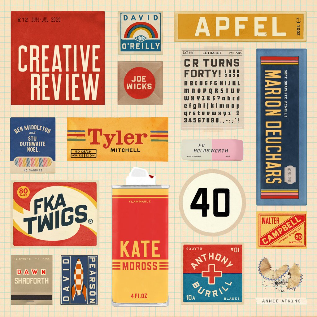
My tutor has also provided a number of suggestions on books, films, and artists to research. Some I already had in my above lists, and some were new to me. I have briefly looked into everything and will add Pushpin Studios, Marion Deuchars, Nina Chakrabarti, Matisse, and Leo Lionni to my lists.
As I have many designers here to explore, alongside entire cultural movements, I figured I would pick a few to dive deeper into for this task. The next exercise will continue this research in a broader way, hopefully allowing for further research into design movements and other artists.
Paul Rand
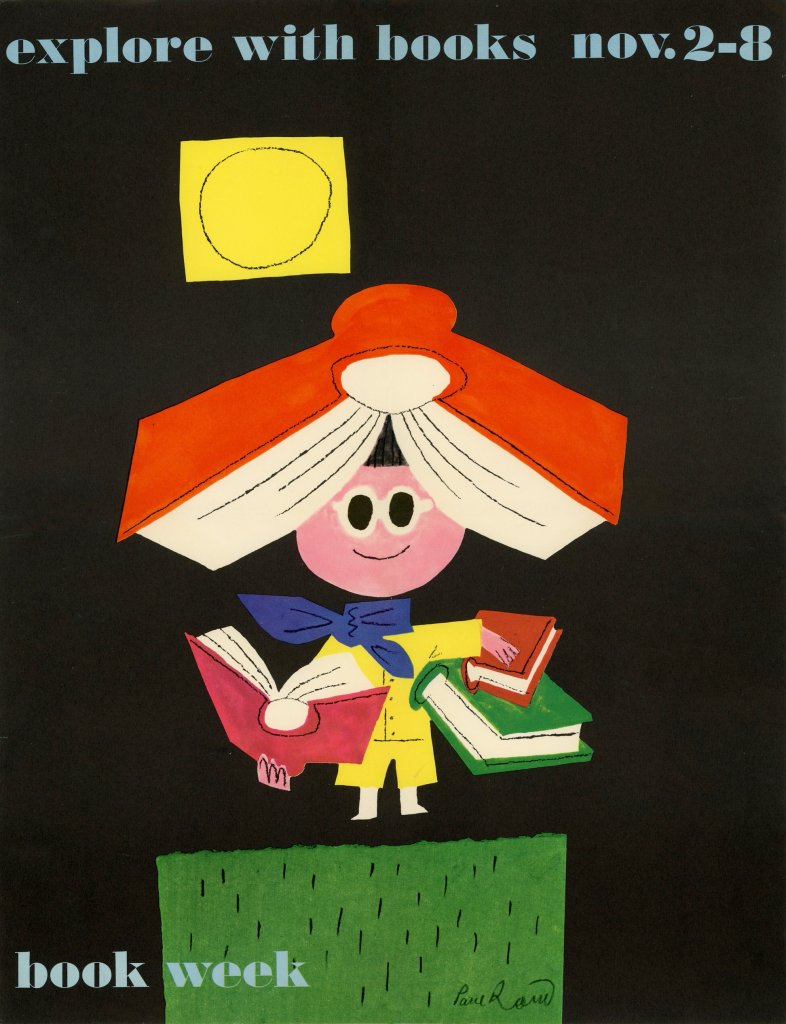
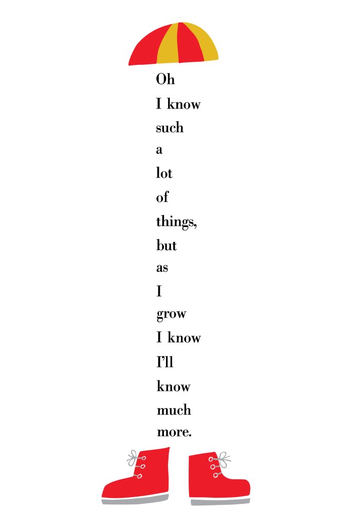
Paul Rand was one of the first American graphic designers to implement the Swiss style of design in his work. He is most famous for the logos he designed – such as those for IBM and ABC – however I personally most admire his posters, book covers, and paintings. I feel the four posters above capture the visual language used throughout his work very well – bold contrasting colours, playful illustrative text, and very intentional and impactful minimalism.
His work feels simple yet clever, and I love that viewing his work feels like viewing the thought processes behind each piece, and seeing exactly how he got to the final design. The Ivor Stravinsky piece above is a perfect example of this. Simple, yet genius, and extremely effective. I can imagine his process of experimenting with materials, papers, concepts, angles of the composer’s face, and how to perfectly capture the feeling he was going for. Or, maybe it was easier, and this fell into his hands without effort. Either way, I have a deep appreciation for the design process and final image.
Each poster here tells a story using graphical elements. The playful markmaking and shapes used in the Book Week poster tell the story of an excited child exploring books and having fun with them. Rand’s usage of such bright colours against a black background draws the eye in and furthers this excitement. In contrast, the use of bright colours against a white background in the I Know poster helps draw the eye in to the text, the shapes and colours are simply used as framing tools. The text here also tells a story, not in the words themselves, but in the way Rand has manipulated the text – it seems it is ‘growing’.
I really admire Rand’s ability to embrace minimalism in such a beautiful way. I’m also impressed by the way he combines playful and more ‘free’ linework and drawing into this minimalistic style. I’d like to learn how to do this, and how to get less caught up in things looking clean and tidy. I also love how creative he is with text, and hope I can become more creative with my own, too.
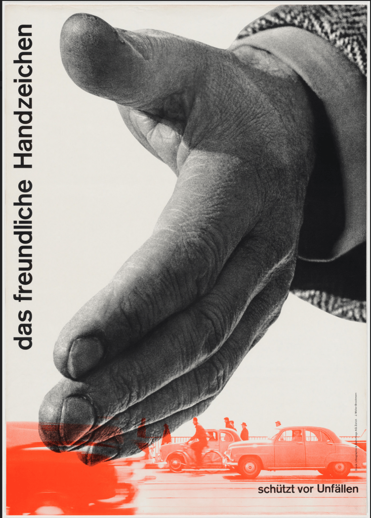
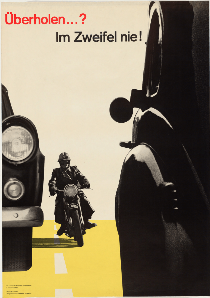
Josef Muller-Brockmann
Josef Muller-Brockmann was a Swiss designer and editor of New Graphic Design, the publication that spearheaded the Swiss style and revolutionised modern graphic design. He also wrote Grid Systems in Graphic Design, introducing a method of organising design layouts which has now become standard practice worldwide. Without his work, graphic design as we know it today would likely not look the same.
Muller-Brockmann’s usage of visual language, like Rand’s, is minimalistic and simple. Rand was likely inspired directly by Muller-Brockmann, so this makes sense. Muller-Brockmann’s work is less playful, however, and feels very clean. The usage of colour is limited and very intentional, and the combination is visually gorgeous. Colours are still bold and follow a primary palette, which seems to be a key factor in Swiss design work.
I am intrigued by the ‘cut-out’ images used in the first two posters above and I’m keen on exploring this for my own work. I really like the effect it has on the overall piece and how the images interact with each other. I also find Muller-Brockmann’s usage of space inspiring – it is so striking. The third poster above is a great example of a brilliant usage of space and text placement. I find the Swiss style preference for sans-serif fonts very attractive, and Muller-Brockmann’s consistent usage of Akzidenz-Grotesk creates a recognisable personal visual language. Interestingly, in the fourth poster above, he chose to write all information in lowercase. The German language grammatically requires every noun to be capitalised, so this is a noticeable design choice. It also makes the paragraph quite difficult to read, so it’s a curious decision.
I’m sure as I continue with this unit, I will learn more about Muller-Brockmann’s design style and it will naturally influence my own work – as it seems to for every modern designer. However, I specifically would like to align my work more with the Swiss style – as well as other schools of design from the mid-20th Century – but hopefully with my own personal spin.
Aries Moross
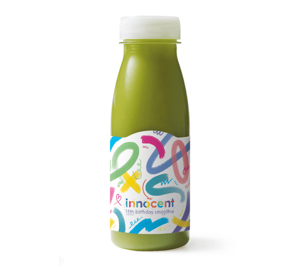
I discovered Aries Moross independently during my initial research in part one, and my tutor has also recommended I look at their work. They are an award-winning graphic designer and illustrator who mostly focuses on hand-drawn typography in their work. I am especially drawn to their pattern designs and non-typographical work, as it’s more inspiring to me. Moross also runs a studio in London which has directed and designed for major brands such as MTV, Spotify, and Nike.
Throughout all of their work, Moross has a clear and consistent visual identity. They use bright colours, geometric shapes, messy and playful linework and detailing, and hand-drawn illustrative text. Their work is very fun and bold. In contrast to the previous two designers, Moross takes a more maximalist approach to design, filling all the space in a page, and mixing several design approaches in each piece. It’s extremely effective and provides a unique and recognisable set of imagery across their body of work.
I very much admire playful and fun work, especially when it manages to cross the boundaries of expectation and be used in a commercial setting. Abstract patterns and scribbly designs are things I keep to my own private sketchbooks and feel hesitant about allowing the ‘mess’ into my more polished work – which I touched on earlier when discussing Paul Rand’s playful approach. The above images are all from commercial campaigns, however, and that inspires me a great deal. Seeing this work used for Innocent and on a magazine cover is especially inspiring for me, as these are industries I would love to work in.
I’d love to explore pattern design further and try to be a bit more experimental with my colour usage. Whilst I love the minimalism of Swiss design, I wonder how much I’m just playing it safe. Maybe I could try to take risks with maximalism and explore the boundaries between the two. Is it possible to incorporate the themes of Swiss design into a more maximalist and abstract piece of work? Perhaps in exploring this further, I will learn to be more comfortable with less polished work.
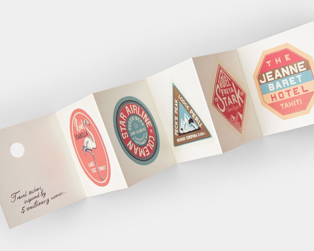
Annie Atkins
Annie Atkins designs graphic props for filmmaking and runs workshops to help educate budding designers on this field and provide a framework to build a portfolio within. She is a huge inspiration of mine – the idea of designing for film or TV is absolutely a dream job for me. I would love to do this. Hearing her talk about her experiences, the films she has worked for, and the non-film projects she has continued alongside is so exciting for me.
The historical influence in Atkins’ work is clear – with elements from the 1900s-1930s showing up repeatedly throughout her designs. She also consistently uses warm, soft tones of colours, which evoke a ‘vintage’ feel to her work. In contrast to the all-lowercase poster Muller-Brockmann designed, Atkins has a preference for all-uppercase, which again is likely inspired by the typesetting of early printing machines and the capacity of design in the early 20th Century. She also has a preference for serif fonts, although she does occasionally use sans-serif, as seen in the second image above.
Atkins’ use of space is just as visually enticing as Muller-Brockmann’s – which is potentially due to using the grid that Muller-Brockmann popularised. The organisation of elements in the second image above, and the placement of text in the Grand Budapest Hotel poster, are both examples of this. It’s really cool to see how she maintains her own personal style across different films, working with different directors and in different fictional universes.
I find it hard to pick one period of design that inspires me most – and I’ve previously spent a lot of time researching and illustrating imagery that is inspired by the early 20th Century, such as Assignment 5 of Key Steps in Illustration. One of my long-term goals is to figure out my favourite elements from each design movement and combine them to create my own visual identity, rather than picking one that already exists and following it closely. The four artists I chose to research for this task show off the different areas that inspire me, and I hope I can get closer to my goal throughout this unit.
The biggest takeaway from this, which I feel is something I am consistently saying, is to be more playful in my designs. I hope I can internalise this and implement it in the work throughout part three!
After completing part two, I took 8 weeks off to recover from burnout. This was really needed, and my poor mental and physical state was impacting my design work hugely. I felt very negatively towards my work, and the quality of my work was slipping too. Thankfully, after this time off, I am feeling much happier and able to work in a way I enjoy again.
My tutor’s feedback for part two was mostly positive, and the guidance on where to go next was extremely constructive and useful. Two areas need more work – my research, and my sketchbook usage. Both of these critiques make a lot of sense to me. In previous units, my research has been described as my strongest area and hearing that it’s weaker now was initially disheartening. There are a few reasons I think this has happened.
Firstly, I have been too exhausted to write up any ‘extra’ work, and this meant that despite engaging in each research point in part two, I didn’t add any of it to my learning log. Secondly, after nearly three years of writing up every single thought and explaining each step for every exercise, I think I’ve become a bit lazy and apathetic towards it. It’s become tedious and ‘showing my work’ has become less of a priority – just doing it has been my focus.
Finally, my previous units have been a bit more hands-on with research suggestions and direct pointers for what to cover for each exercise. You can see the difference in my research for Exercise 3 and Exercise 5 – in one, I was directly asked to research, and in the other, I included it as a natural step in my design process. As discussing research wasn’t specifically required for Exercise 5, my apathetic brain declared it ‘extra’ work and dismissed the need for it.
Knowing this is really helpful for tackling the issue, and I think the much-needed break will help energise me to feel able to write my research up again. My tutor has also given really clear pointers to what is missing, which I needed! She has recommended I include more contemporary designers in my research, and that I provide commentary on specific pieces rather than just a general overview. Having looked ahead over part three, I feel I have plenty of opportunity to do this.
As for my sketchbook – I was very conscious of my usage slipping, and in some ways this was intentional. With graphic design work, there can be countless iterations of a single piece tested before I reach a conclusion, and it feels silly to do this on paper when I could be testing it out digitally. I also feel like my current sketchbook doesn’t give me adequate space to test out lots of different ideas and explore compositions, as on one hand, it’s literally too small, and on the other hand, I have a mental block where my sketchbook is for ‘fun’ work. In response, I have bought an A4 sketchbook that is purely for uni work, which hopefully, I will use more carelessly!
It was also recommended that I explore alternative materials in my sketchbook. I have a basic understanding of how to do graphic design without digital tools – as that was my first introduction to the discipline. However, I’m not sure how this would look, or what other materials to look into. I’d like to do some research on this, which hopefully I can tie into other research projects throughout part three.
My tutor gave brilliant feedback on Exercise 5, where I was struggling to create a third poster. I will revisit this over the next few weeks to finalise my design following her advice. She also asked whether the size of the typeface was equal on both my final designs for Exercise 6. Rather frustratingly, I have rasterised the text layers and can no longer check this. I recall checking this before rasterising, but clearly, they don’t look equal! I will remember this for the future (and keep a spare text layer so I can check!)
I feel I have a good grasp of what I need to improve on throughout part three, and I’m very much looking forward to the work ahead. There are some exercises I feel I will thoroughly enjoy exploring! I am also trying to do more art/design work ‘just for me’, which is helping me feel a bit less stressed about only ever doing uni work, and hopefully, this will also positively influence my uni work.
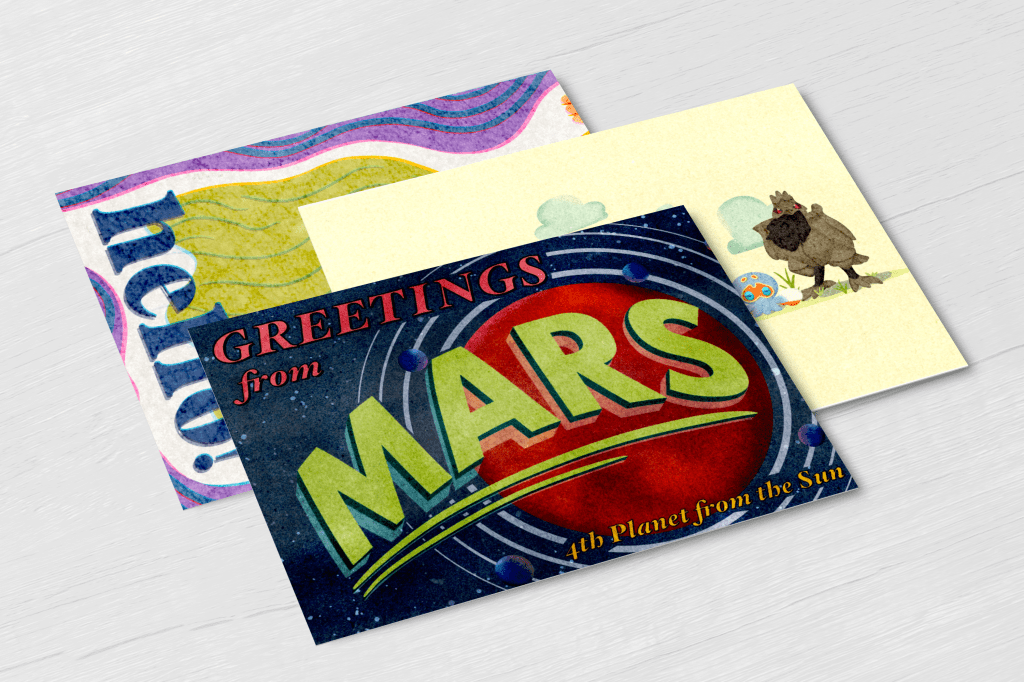
Part 2 took me through each stage of the design process and helped me explore it in its entirety. Assignment 2 asked me to take this information and apply it in full to a brief. The brief asked me to create three greetings cards for events that are not currently catered for in the market. I was asked to design both the outside and inside of each card.
To start with, I very thoroughly analysed the brief and what was expected of me, writing out a plan for what I intended to achieve, and exploring each stage of the design process in depth. As I’ve mentioned in previous learning logs, I already am pretty familiar with the design process and have spent a lot of time figuring out how to make it work for me. I felt a bit unsure about following the process in such a linear way – I find it much easier to blend each stage, and separating them out feels counterproductive. But, it’s always useful to have a clear idea of what is needed at each step of the process.
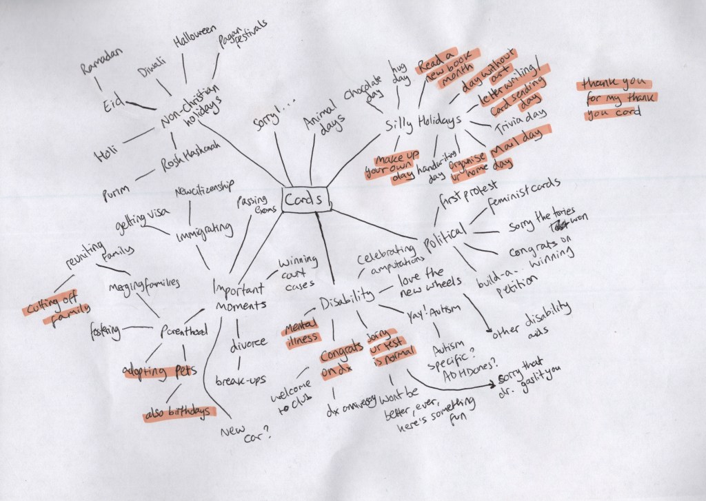
I only have a small amount of experience making greetings cards – I have designed them for friends and family for various occasions, and I roughly designed one for Exercise 26 of Key Steps in Illustration. This is a new area of design for me all things considered, so quite a lot of research was required. Before looking at what was already out there – I wanted to think about areas that might not be catered for currently. I began by making a list in my notebook and quickly realised it made more sense to use a spider diagram to explore each idea fully.
Initially, I was most drawn to my ‘family’ related ideas. I can imagine having a non-normative family set-up is not typically catered for, and it likely feels quite lonely not receiving the same attention as your peers with standard families. I was also very keen on exploring the idea of disability and how we talk about the topic. The only time I have received greetings cards in relation to my health is when I was diagnosed with cancer, however, I have been disabled my entire life and continue to be. There are a lot of milestones in disabled life that we feel are worth celebrating – such as finally getting the diagnosis you needed, or buying a new mobility aid. I felt it was unlikely there was a market for these things, as ablebodied people often don’t see disability as something to celebrate.
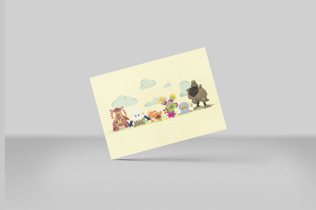
I decided to look at what was out there already in these areas – focussing mainly on families, and a little on disability – and found that most of my ideas do have at least a handful of existing cards on the market. I looked back at the spider diagram to reassess what I felt excited about, and the ‘silly holidays’ concepts kept making me smile. I had a lot of ideas for possible designs, and it felt like a really fun thing to explore. I had used ‘checkiday’ – a website that lists every single obscure holiday for each day of the year – to collect some holidays that definitely were not currently catered for. I grabbed another piece of paper and began sketching out the ideas I was having.
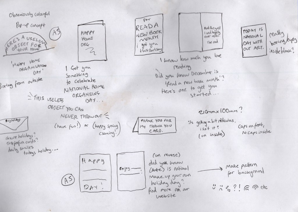
I had 5 concepts that felt pretty strong. The first was a pop-up card for national home organisation day that said ‘here’s a useless object for your home’ or something similar. When I saw national home organisation day on checkiday I laughed as I know I have far too many old birthday and Christmas cards taking up space in my home. What’s one more, to celebrate the day? The second was a card celebrating read a new book month – the card would joke that it itself was a new book, with the inside saying ‘and they all lived happily ever after, the end’. The third was for national day without art, where I wanted to strip the design back to be the most boring thing anyone had ever seen. Truly, no art!
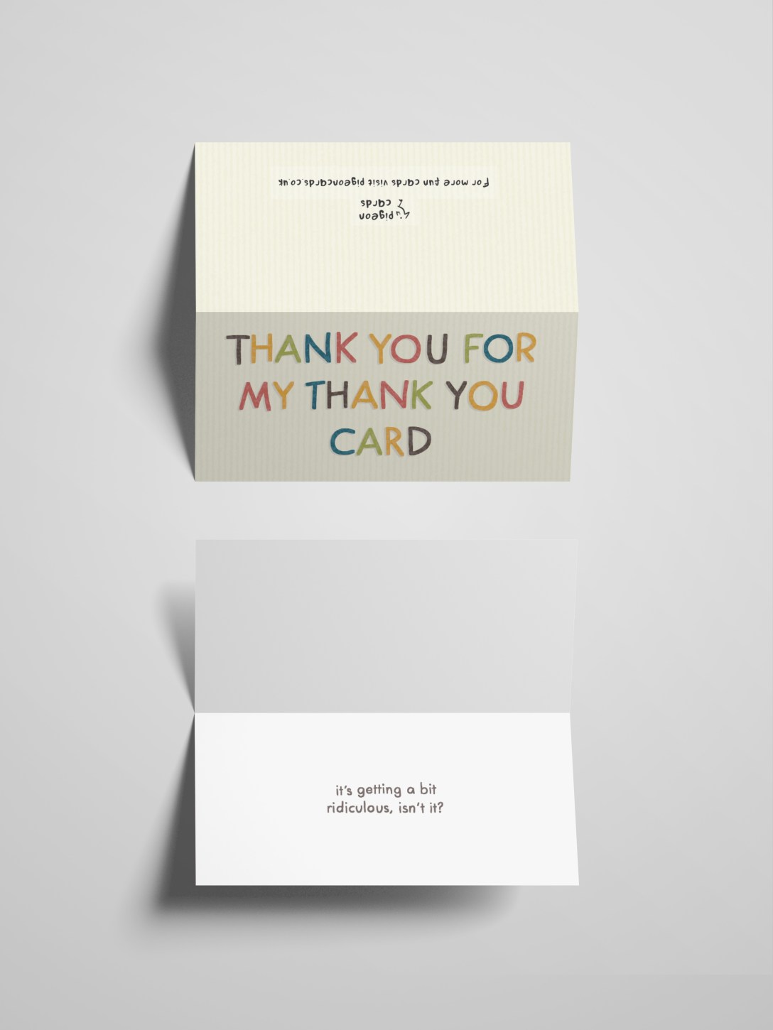
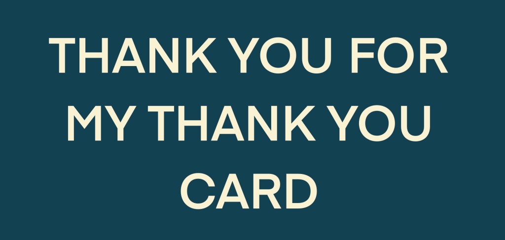
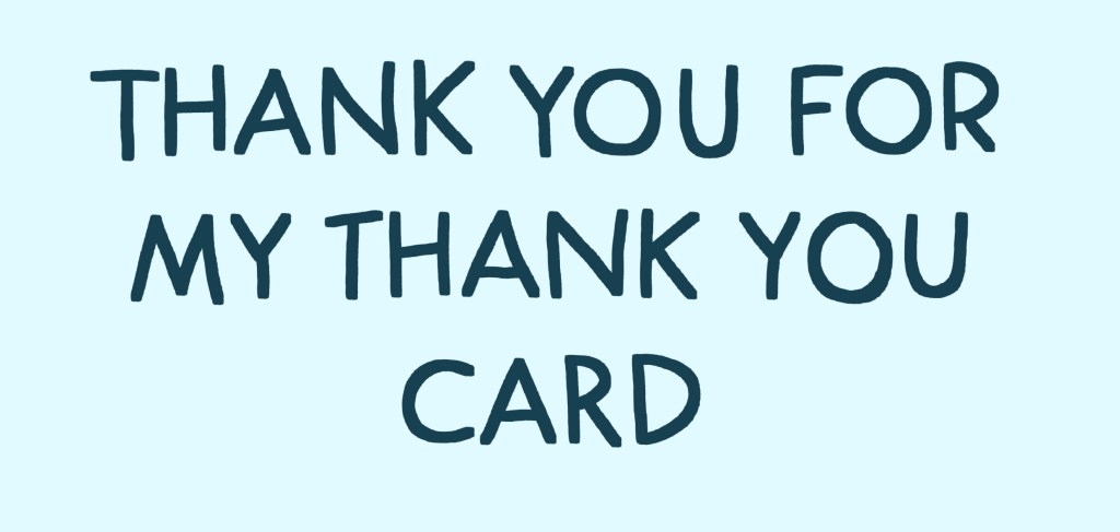
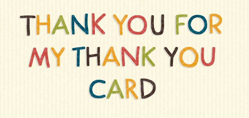
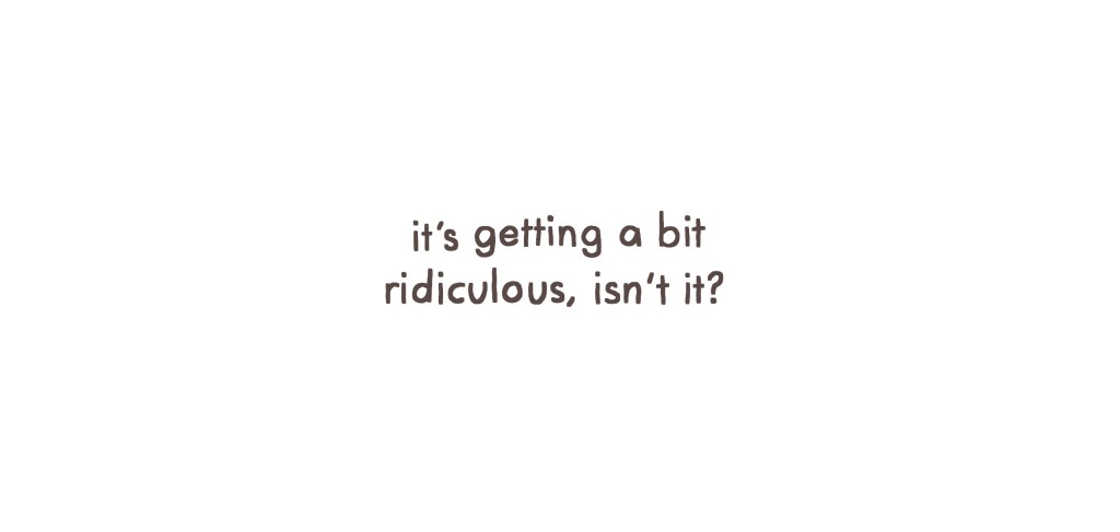
The fourth card wasn’t for a holiday but was one I had come up with when thinking about the idea of fun and silly cards. Pretty simple, it’s a thank you card to give to someone who gave you a thank you card. I felt it fit the theme, and I really enjoyed it. The final idea was to celebrate national make-up-your-own holiday day and featured a write-in section on the front and inside of the card, allowing the person to celebrate whichever holiday they invented for the day. I felt they were all really strong concepts and was struggling to pick which to advance with. I called a friend to discuss the ideas and see what they thought – and together we narrowed it down to three: the home organisation card, the thank you card, and the make-up-your-own holiday card.
Next, I began researching greetings cards from a design perspective. I used Moonpig, Thortful, and Paperchase to explore existing cards and themes. I specifically wanted to explore thank you cards as I felt like my designs were all text-heavy and I wanted to explore how that had been approached in interesting ways. I created a Pinterest board to store all of the examples I had found and to reference later. Alongside adding examples of text-based cards, I added any cards that inspired me or made me feel excited. Next, I researched standard card sizes. I used this page on The Paper Box as it had some really great visual diagrams showing how each card looks. I decided both the home organisation and make-up-your-own holiday cards would be A5, and the thank you card 210x100mm.
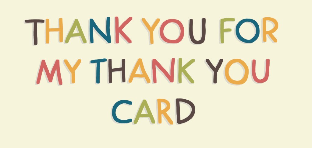
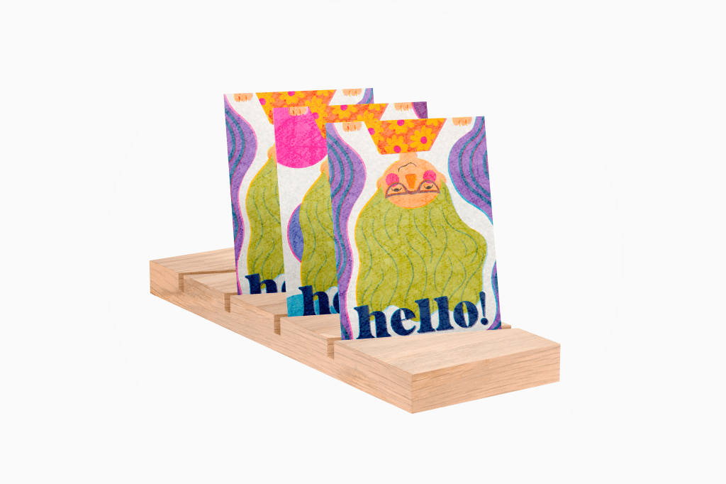
There was a lot more research I wanted to do for the home organisation card and some experimentation with how to create a pop-up card. I decided to focus on the other two cards first, as they’d be easier to get finished and come back to this at the end. I began with the thank you card. I started by opening a canvas at the size of the card and exploring font options. I quickly realised none of them would work, and hand-drawn text was most appropriate. I used Futura as a guideline for my text and tried to keep it neat, but still obviously hand-drawn. I then explored several colour options, unsure of which to go with.
Exploring font and colour options
Inspired by one of the cards I had found when researching, I experimented with changing each letter to a different colour. I used my ‘go-to’ colour palette for this, and I really enjoyed the look. I added a grey shadow on the text to help it stand out better. It felt a bit plain, but I wasn’t sure how to add to it without overtaking the text. I hoped I’d get some feedback which would help me find a direction, and moved on to the inside. The inside was pretty simple for this card, I drew over Futura again, and used the same shade of brown as on the outside. I left the background white.
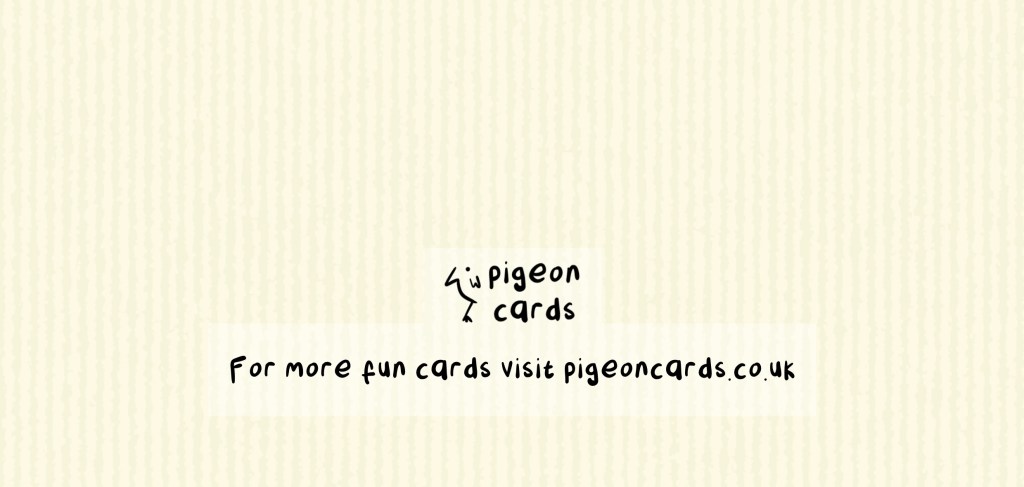
I then sent the outside to some friends for feedback. One pointed out I was missing my usual textures from the piece, which I hadn’t even considered using. I added some to the background and the text, and I felt this pulled it together really nicely. Then, I created a back for the card. I used the same colour and texture as the background on the front and added a logo and tagline. The logo wasn’t given much thought, as I wanted to focus more on other areas of the assignment. The idea came from the font I used – one I designed for Assignment 4 of Illustration Sketchbooks which I named Pigeon.
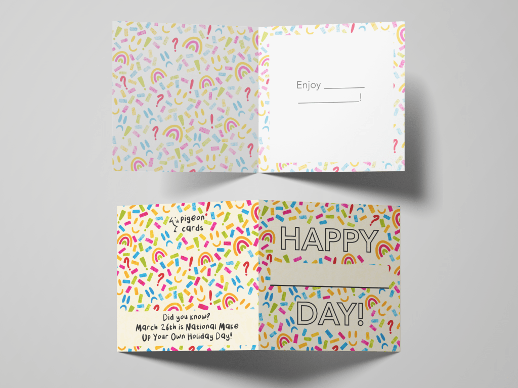
Once I felt I was finished with the thank you card, I moved on to the make-up-your-own holiday card. My idea for this card was to develop a repeating pattern to use across the card that communicated that the card could be for almost anything. I started by drawing out the design elements I wanted to use, then picking a colour palette for the pattern and applying the colours to each element. Then I slowly built up a repeating pattern using the elements. This took a lot longer than I anticipated, and especially towards the end, it felt like I was dedicating my time to the wrong things. I decided to use the parts of the pattern I had already, without it necessarily being a seamless repeat.
I created a new canvas at A5 to use for the card and inserted a PNG of my pattern. I really wasn’t sure how to navigate the text. Once again, I felt a hand-drawn font would be best, but I was uncertain of how I wanted it to look. It was also tricky figuring out how to have the font stand out against such a busy pattern in the background, and choosing a colour for the text felt like a nightmare. I spent a lot of time going back and forth on different ideas, then reached out for some advice from the Visual Communications Discord server. I also stepped away from the assignment, feeling like I was stuck in tunnel vision somewhat, and some space would help me make better decisions.
Images sent to the Discord server for feedback
After some time away, instead of looking at my design, I looked first at my research. I realised I hadn’t tried a simple font yet, so with a very dark grey – almost black – I wrote out my text in Avenir. I made the text hollow and planned to remove the pattern from inside each letter, leaving it on the rest of the card, hoping that would help it pop. I felt a lot better about how this looked and realised it would look even better if I changed the dimensions of the card to square. I sent this for further feedback and was advised to remove the pattern around each letter. I was reluctant, as I felt this would require a lot more work, but I agreed this was the best thing to do.
I then moved on to the inside and reverse of the card. For the inside, I used the same font and dark grey shade to write ‘Enjoy _____!’ and used the same pattern as a border. On the reverse, I continued the pattern, added the logo, and some information about the holiday itself. I felt this was necessary, as it wouldn’t be clear what the card was for otherwise.
Unfortunately, during this assignment, I have been very pressed for time. I was aware at this stage that it was unlikely I would be able to complete my third card design, as I needed to write up every learning log from part 2. This is my usual tactic and normally works out okay. However, time seems to have just flown by since my last submission and I’m finishing everything last minute. I decided to make mock-ups for the two cards I have finished so I can see them in all their glory, before focusing on all the writing work.
I was really impressed with the mock-up files I was able to find, it’s often tricky to get good ones! I think the cards look brilliant too. I’m quite proud of how I was able to problem-solve the issues I came across in both processes. I feel very disappointed that I have only completed two of the three cards. The third card required prototype mock-ups, physical testing, deeper research into pop-up cards, figuring out what software to use and how to build the card together, and generally a lot more beyond just illustrating and design work. Had I have had more time, this would have been possible.
I have mixed feelings about part 2. I enjoyed the briefs, and I like the work I produced for them. I have loved being able to get back into design work in this way and to feel connected to all of the work I do. But, it felt very slow, and a little too easy at times. I have felt like a lot of it is re-learning things I already know, which made me feel bored and uninterested in engaging. I’ve had a lot of other life stuff on my plate alongside studying these past few months, and I think I found it increasingly harder to engage with something I didn’t feel I was getting much out of. Having looked ahead, I’m extremely excited for parts 3 and 4, which both explore areas I am very passionate about in design. But first, I think I need a break.
I have studied near constantly for almost 3 years now without stopping. When I have had breaks, they’ve been short, and usually a necessity as I have had other responsibilities that took precedence. I haven’t had a break where I have been able to actually rest, recharge, and come back refreshed. I hope that after taking some time off, I will return to part 3 with energy, motivation, and time to invest in the subjects I love. I feel like the work I have produced in part 2 is far from my best, and it feels pretty subpar. I can’t tell if that’s because I’m exhausted and unable to see the worth in my work, or if it’s because I’m exhausted and not able to perform how I want. Either way, I’m exhausted.
Once I have my tutor’s feedback – and feel refreshed – I will be revisiting Exercise ?? to finish the third poster, and hopefully, I will be able to revisit this assignment and give the third card all of the time it deserves. I think the concept is brilliant, so I definitely want to give it a shot at least!
This exercise presented me with a brief I am already pretty familiar with, as it is near-identical to the one for Assignment 2 of Key Steps in Illustration. A local greengrocer has asked me to produce a point-of-sale display to go above the fruit and vegetables in their shop. The display will be sized at A1 landscape, and the greengrocer wants two images – one for the fruit, and one for the veg.
My immediate reaction when I read this exercise was frustration. I typically go through each part before starting to see what I might need to prepare for and to organise my time, and I rolled my eyes pretty hard when I got to this one. I was so utterly disinterested in the thought of repeating a project – especially one that I really went above and beyond for when I did it the first time. I’ve already done all of the research, all of the problem-solving and question-asking, and it isn’t even an area I’m interested in going into as a designer. I knew some exercises in this unit would be repeats and was prepared for that, but this one was really hitting a nerve.
I asked in the Visual Communications Discord server how other students approached doing their repeat of this exercise – whether in Key Steps or Core Concepts – and got some really useful feedback. One student suggested I view it as the client from Key Steps coming back two years later and asking for an updated version of my work. I could rewrite the brief to work from this angle, and design something slightly different to work for a new branding campaign. Another student said they focused on photographic and graphic elements for this exercise, and illustrative elements for the other, to try to explore both sides of the coin.
This made me feel a bit less stressed about the brief, and I put it to the back of my mind whilst I cracked on with the rest of part 2. When I actually reached this exercise, I realised the brief was pretty different to the previous one. I was being asked for point-of-sale displays that would attract customers from the street. The greengrocer wanted to boost their trade, and the posters would be reproduced at a pretty huge size for this. In the previous brief, the designs were used to package and promote a range of foods, the focus was on showing how delicious the food is, and the reproduction size was 12x12in, much smaller than A1. I realised my initial reaction was a bit misplaced, and I wouldn’t be exactly repeating a previous exercise.
I began by analysing the brief and writing out a plan, as always. I still wanted to play with the idea of this being the same client asking for more work for a different campaign, and I was very interested in exploring the photographic options out there. Even at this stage, with barely any research down, I had some ideas for the sort of images I wanted to create. In my previous work, I had used a lot of splatter/splash elements, and I wanted to explore how I could carry this over and mix illustrative elements with photographic work. But, first, I wanted to explore existing point-of-sale displays, and revisit my research from my previous project.
I looked through my research from Assignment 2 to refresh myself and establish a starting point for any research that was missing. It wasn’t completely relevant, as most of the work I had collected was packaging and didn’t quite fit the theming of this brief. I realised I needed to look at the point-of-sale displays specifically and see how supermarkets advertised within their stores. Unfortunately, due to my health issues, it isn’t possible for me to visit a supermarket in person to do this. I have to rely a lot on secondary research. Thankfully, I found two very thorough existing Pinterest boards that showed a range of point-of-sale designs.
These collections showed a lot more than just posters, showing how entire aisles and shelving can be transformed to show off the products in various ways. I had never even considered that this was a part of graphic design, and it’s so interesting to see how point-of-sale displays can be expanded. I love it when I see these large in-store advertising campaigns. They’re very enticing and make a big difference to the mundane day-to-day experience of the rest of the store.
I had a basic concept for what I wanted to do for the display I was creating, but no real ideas generated. I decided to scroll through the food photography section of Unsplash and save any photos that jumped out at me or that I felt I could work with. This was a little tricky, as the usable fruit images way outweighed the vegetables. I guess vegetables aren’t considered as attractive, appealing, or beautiful as fruits are. They definitely don’t seem to trend in the same ways as fruits do in photography. If I found a good fruit image, it was hard to find a vegetable one to pair it with, and vice versa. I saved a whole bunch anyway, and then opened them in procreate to experiment with and explore ideas.
Images from unsplash
The first idea I explored came to me when I was looking at photo options. I thought of taking an image of lots of fruit or vegetables and sketching over one or two of them, adding some illustrative elements, and then maybe text – or having a third poster with text on it. I explored this concept over 6 different images, considering how each fruit/vegetable worked with this style, what sort of illustrations would work, and how I would incorporate text. The brief does specify only two images should be produced, and whilst I might be able to convince a client to go with three instead, I should try to work within the initial guidelines. I decided to move on to the next idea, thinking I’d come back and play with text afterwards.
My first idea roughly explored
My next idea was very text-heavy, so required some research into the sorts of fonts used in supermarket advertising and displays. Thankfully I had my two Pinterest boards to reference, and, plenty of images on supermarket websites that tie into in-store campaigns. I looked at Tesco, Sainsbury’s, Morrisons, and Asda, and all used very similar classic sans serif fonts. Bold, easy to read, and recognisable as each company’s signature font. They’re all eye-catching, and the taglines used are equally so, with a focus on price and why you may want the product.
Font examples from online supermarkets
I looked through my collection of sans serif fonts and, whilst I was initially drawn to Futura as I always am, I thought Eina 01 SemiBold had that perfect supermarket feel to it. It’s simple, bold, eye-catching, and looks gorgeous against the black background I had picked out for this next idea. I mocked up four images for the concept, picking taglines I felt related to the images and were in line with what I’d found when researching, and featuring prices found on the Tesco website for each. I added some rough guidelines for the illustrative elements I wanted to include, then went back to my collection of stock photos to consider any more ideas I might have.
My second idea roughly explored
I had several images of salad that I really wanted to do something with, and a gorgeous shot of bananas on a table that screamed ‘supermarket advert’ to me. I started by mocking up an idea for the bananas, then went back to Unsplash to see if I could find a vegetable or salad image to pair with it – as the ones I had just didn’t feel quite right. Unfortunately, after searching for quite some time, nothing really matched the banana image well enough to be used alongside it. This is the frustration of not being a photographer or having a food photographer on hand to help!
Stepping back and looking at all of my designs together, it felt really clear to me which to move forwards with. I was initially the most excited by my first idea, and with how I could use it across multiple parts of a campaign – like on reusable bags or packaging – but the white-on-black images were so bold and eye-catching. They totally drew me in. If I was walking on a street and passed a store with these hanging near the window, I absolutely would look. Even the rough mock-ups are so gorgeous, I’m in disbelief a little at how realistic they are!
Working with photography in this way definitely has its perks, as once I’ve mocked up and explored multiple concepts, all that really needs to be done beyond this is editing and refining the work until it’s finished. I began by working into the cherries image, editing the font to ensure it reads well, fixing up the illustrative elements, and adding texture to them. I wasn’t super keen on how the polished outline looked, so I tried a version without the outline leaving just the ‘splash’ elements. I then sent both versions to a few friends, and the Visual Communications Discord server, and asked which people preferred.
One friend pointed out that at a quick glance, the white outline looked like the image was bad quality, rather than intentionally drawn on. I think this would be less of an issue when the image is blown up to A1, however, it made me concerned. Feedback was generally good other than that one comment, so it fell down to my preference. Several people, much to my surprise, suggested I change the font to something handwritten to match the ‘chalkboard’ feel of the images. I very much did not agree with this but thought I would give it a try anyway. I flicked through a few different font options and only one seemed to fit – and I still did not think it looked better than Eina 01 did. I tried adding the same texture to the font to see if that helped it at all and sent it to a friend to check if I was wrong about it looking worse.
Exploring fonts and illustrative elements
They pointed out that, yes, Eina 01 is a better font, but using the texture in the lettering really pulls the whole piece together. So, I went back and added the texture to Eina 01, and loved how it looked. Despite not wanting to change the font, going through this process helped me discover new options for the design and I’m glad I did. I added a slight border to the text, and to the illustrative elements, to help them pop a bit more, especially conscious of the size they would be at upon print. Then, I did the exact same to my tomato image and sent the ‘final’ images back to a friend to see if there was anything more I was missing.
She said they looked great, but maybe I should explore the sizes of my fonts a bit more, as there wasn’t enough hierarchy between the different elements. I had pushed this further from the mockup but agreed it wasn’t enough. So, for the final time, I returned to the images and played around with the sizing until I felt happy.
I felt really excited about these images and wanted to find a good supermarket display mockup to put them in. Unfortunately, I struggled to find one that had the right dimensions. I feel pretty disappointed by that because seeing them in a real-world context would make me feel like I’d definitely nailed this exercise. I do feel like I did well, though. A lot of this exercise felt like pulling from all of the knowledge and skills I have developed over the last three years and intuitively applying them to a brief, which is amazing to be able to do. There are likely ways I could improve on these designs, but I also feel they’re some of my most ‘real-life’ work to date.
Final designs
Comparing the designs I did for Assignment 2 in 2020 to the ones produced here is almost amusing. They are so stark in contrast, and for such different purposes, despite being intended for the exact same location and market. Having an opportunity to revisit the concept has shown me how much easier I find designing now, and how much more I have learned. I think I also felt initially overwhelmed by the idea of re-doing all of the research I had already done – and what I have learned is that research goes into an ever-developing knowledge bank in your brain. I already have a good sense of how to design for food, as I’ve done it so much now. It doesn’t necessarily require starting from scratch each time, just filling in the blanks.
I feel good about this exercise, which is definitely not what I anticipated! I’m still not sure I’d want to do it a third time…but now at least I have a decent portfolio started for if Tesco ever want to hire me.
For this exercise, I was asked to create two posters for a local event. The first poster had to have as many details as possible featured on it, and the second, as few as possible to an extreme. This was a lesson in using Occam’s Razor to sort through information and figure out what is essential. I then had to ask other people which of the designs work best, and create a third poster using the feedback.
Having been a Visual Communications student for almost 3 years now, I am extremely familiar with this exercise! I was pretty excited to give it a go myself and see how I could explore it. I started as always by writing out a plan for the exercise and analysing the brief. I also reflected on previous projects where I created posters, such as Exercise 23 and Assignment 3 – both from Key Steps in Illustration. I read through the learning logs for both and re-familiarised myself with the research I had undergone. This was a great starting point to build from, and it was helpful seeing so many different posters from various contexts.
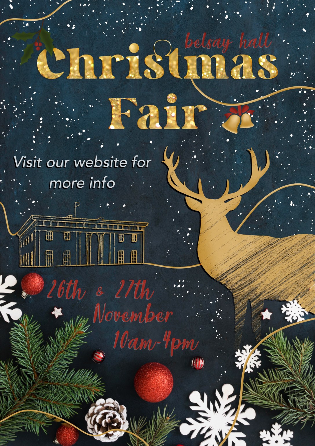
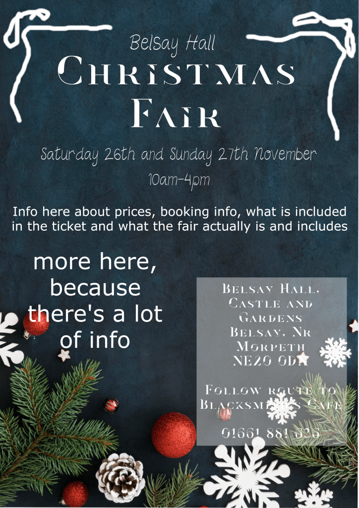
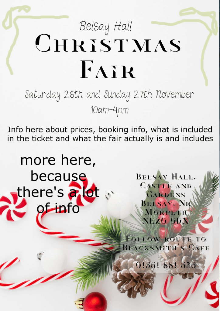
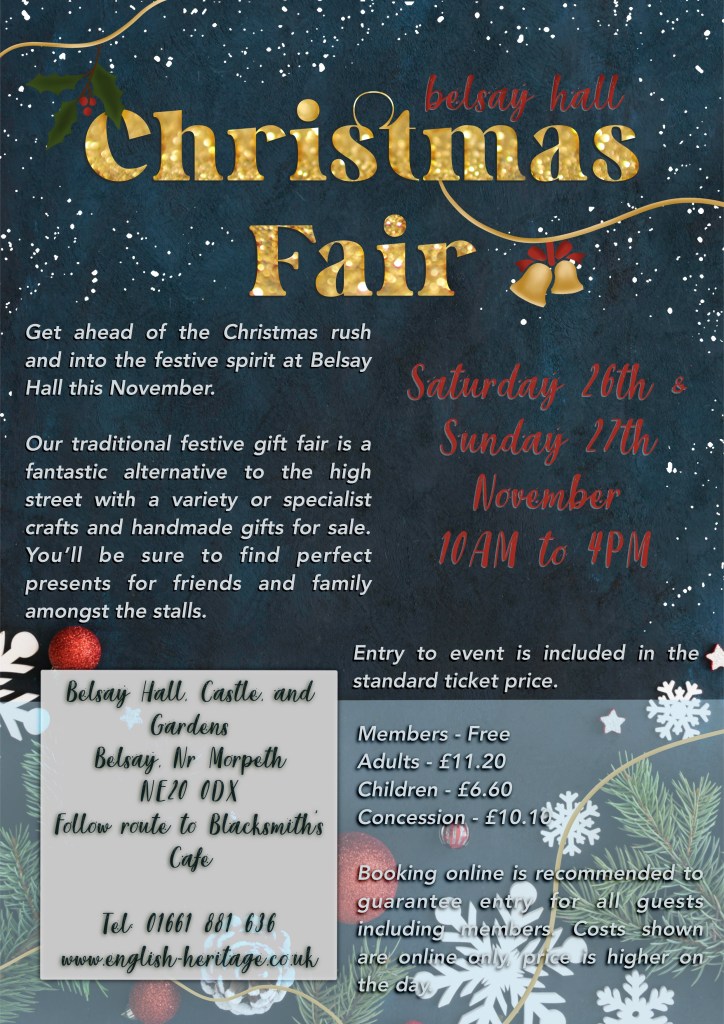
Before I could begin the design process, I had to choose an event to design for. I looked on the NewcastleGateshead website, which lists local events and things to do in the region. Due to the time of year, almost all of the events are Christmas-related, and it took me a while to find one I felt excited about. I came across a Christmas Fair due to be held at Belsay Hall in Northumberland and decided to go forward with that. Belsay Hall is an English Heritage site that I frequently visited with my family when I was younger – so it’s pretty close to my heart. I think I visited the Christmas Fair one year, too!
Unfortunately, at the time of writing this, the fair has since passed and the website links no longer exist. This is a lesson in screenshotting anything time-sensitive!
I visited the English Heritage website to get more information about the event. I took notes on as much as possible – which was a lot of information! I made sure I had contact info, the address, information about what the event consisted of, and ticket prices. Then I did some research into Christmas posters specifically, as this was a new area for me to be designing for. I saved several to Pinterest to reference and started to consider how my poster would look. As English Heritage is a slightly more middle-class organisation, with an expensive yearly membership, and Belsay Hall once being owned by British aristocracy – it felt appropriate that my poster design would emulate a similar vibe.
Alongside a Christmassy colour palette, I considered featuring photographs, classy sketches of the hall, maybe a stag or two, and smart festive fonts. Ordinarily, I don’t use photos in my work, preferring to work with illustrative content where possible. Using photos also feels like an ‘easy’ way out sometimes, although it’s a staple part of design work, so I want to get to grips with it a bit more. I scrolled through Unsplash to find some appropriate images to work with, then I started exploring how I could use them and various design concepts.
Images found on UnsplashInitial design ideas/concepts
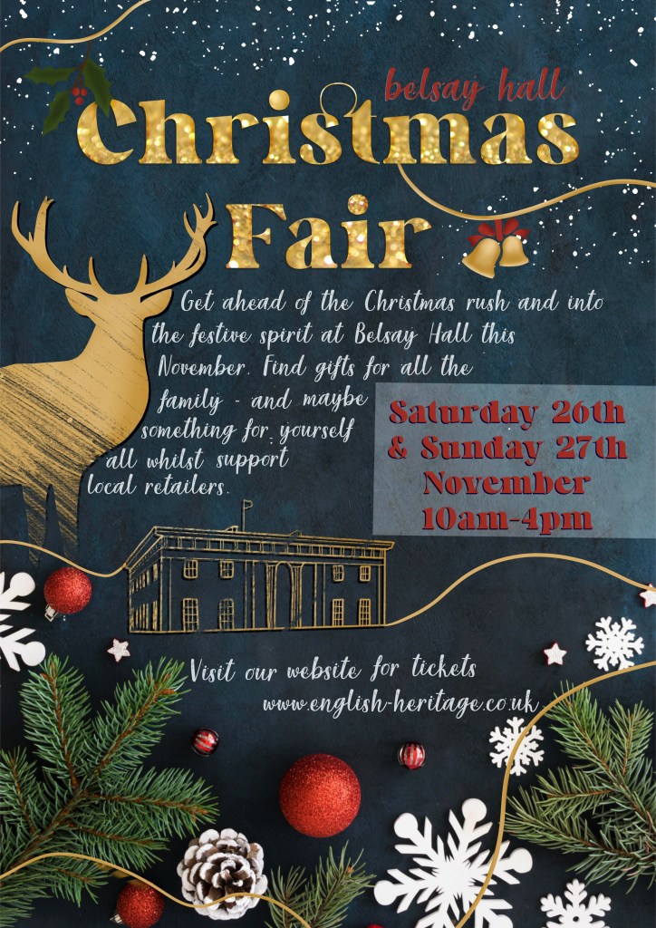
I ended up with three ideas that I felt could possibly work, and I put them side by side on my laptop screen to assess which fit my theming best. I decided the blue background was the strongest of the three, so downloaded the image files to my iPad and got to work on the first poster in Procreate. I thought it would be easy to design the ‘Too Much’ poster – how hard can it be to simply include everything? But when it came to it, I found myself subconsciously wanting to rewrite things, pare back on how much was included and remove unnecessary information. I felt myself cringing at having to resist that, knowing fine well this would look awful when finished. It was also really hard to figure out how to fit all of the information onto one poster in a way that looked good and read well. I had to keep reminding myself that this is the whole point of the exercise – to learn the sweet spot of included content when designing.
Whilst creating the poster I continuously referenced my Pinterest board of research to see how other designers had tackled certain issues. This is why I like to collect my research on Pinterest – having it open on my laptop whilst I work is so useful. I found choosing fonts and ensuring they were readable especially difficult. I know having too many fonts looks terrible, but the Christmassy fonts are so difficult to read. This was a tough poster to create, and I was very glad to be finished!
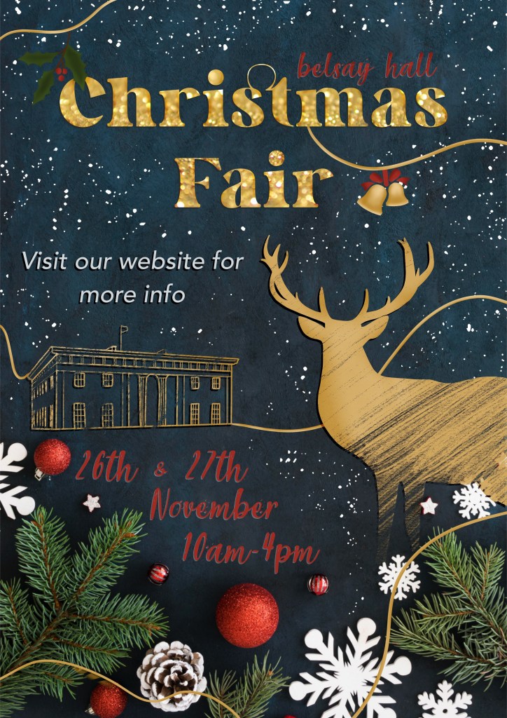
Moving on to the ‘Not Enough’ poster – I began by removing almost all information from the poster and just leaving the absolute essentials. The exercise says to ‘be extreme’, so, I was. It definitely felt less horrifying to do this than it did to add too much information, but I knew it wasn’t going to be enough. It was a little bit easier to design this as there was less emphasis on text legibility and more on making it look nice. I thought the sketchy stag and Belsay Hall elements looked great, and I felt a lot better about the result of this poster.
The posters side by side
Asking friends, family, fellow students, and sometimes my entire Twitter following for their feedback on my work is extremely normal for me. I routinely send out half-finished sketches and ask if anyone has thoughts on how I could proceed. In fact, I find it quite hard to make decisions without input from other people! So, I wanted to try something a bit different for this exercise. I made a survey using Google Forms asking questions about each poster and how effective they are. I didn’t specify why I was asking these questions or what the goal of the exercise was, and then I sent it out to everyone I know. You can find the survey and questions here: https://forms.gle/aSL97J8jcmcpENBw6.
In total, I received 23 responses, which I was super excited about. I got a lot of extremely useful feedback, too. I sorted all of the data into a spreadsheet for easier sharing – it can be viewed here (note – you can only view this if you are logged into your OCA account. If you’re not an OCA student and interested in seeing the data, please get in touch!) A lot of the responses said the same sort of things. I decided to go through them and write up the pros and cons for each poster – adding anything that was new to the list as I got to it. Here’s what I ended up with:
Poster One (Too Much)
Pros – Festive – Very Christmassy – Location information good to have – Title and illustrations are appealing – The ‘snow/stars’ were well liked – It ‘feels cosy’
Cons – Too many fonts – Too wordy – Hard to read – Poor colour contrast – People didn’t know where to look first – Unorganised – Too much text
Poster Two (Not Enough)
Pros – Festive – Sophisticated – Eye-catching – The illustrations were a huge hit! – Easy to read
Cons – Lacklustre – Contrast also bad – No information – The order of the information is weird – It’s too vague
It was also clear from the responses that the third poster needed to include: – The website, alongside the existing contact information and address – A short statement saying what to expect from the event – A big change to the colours used to change the contrast and aid readability, plus a deeper look at the fonts used
I made another copy of the poster and got to work adding in the missing information and changing the layout to accommodate it. I also looked at the fonts used, and how to make the colours easier to read. This was extremely difficult for me, and I don’t understand why! The red shade is already in the image, so it made sense to me that it would contrast nicely, and it just doesn’t. Any brighter, and it no longer fits the ‘cosy’ theme, and any other colour loses the Christmassy feel to the poster. I ended up with something that sort of works, but that is absolutely unfinished. I decided to submit this unfinished poster to ask my tutor for feedback on it and any thoughts on how it could be improved.
This was a really enjoyable project despite the challenges I faced. I enjoyed experimenting and problem solving – trying to get the ‘too much’ poster to look good and trying to fill the space on the ‘not enough’ poster. I also got a lot out of making a survey and reading all the feedback. I have since reflected on my approach to this, and have wondered how it could have been done differently. For instance, every person saw the ‘too much’ poster before the ‘not enough’ poster. I’m interested in seeing if this influenced or changed how responders felt about each one – the second poster got a lot of great feedback – is that because it was better than the first, or does it work well as a stand-alone poster?
I also wonder if the feedback would have been different had the posters had improved design elements – for example, the font and contrast issues seemed to be a frequent talking point in the responses. Would the ‘too much’ poster be more appealing if it was easier to read? What if the ‘not enough’ poster had a better flow of information and organisation? It’s hard to be able to tell which was truly more effective with all of these variables. However, based on gut feeling, and on the necessity of making the third poster, I think a middle ground will always work well.
Prior to this exercise, I had never heard of Occam’s Razor, despite unknowingly using it whenever working. It was great to be able to properly put it into practice here, and also to explore exactly why ‘too much’ information is not great visually. I feel like I got a lot out of this exercise, even if I wasn’t able to solve my design problems just yet. Hopefully, I will come back to this once I have received tutor feedback and make some changes to my final poster.
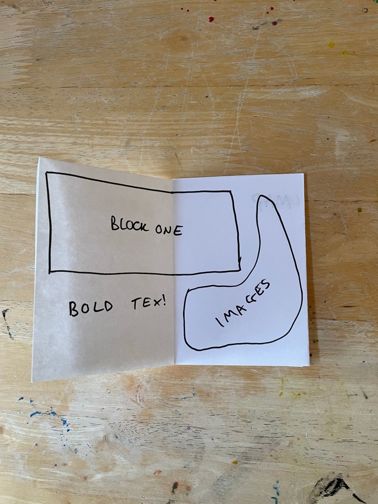
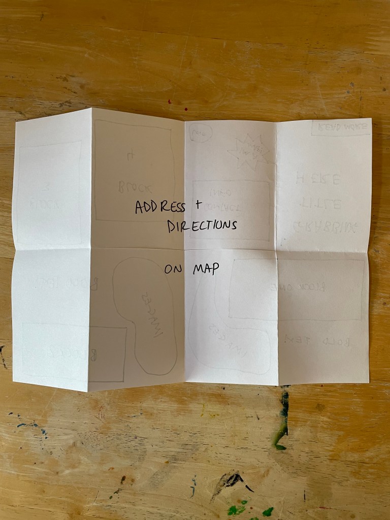
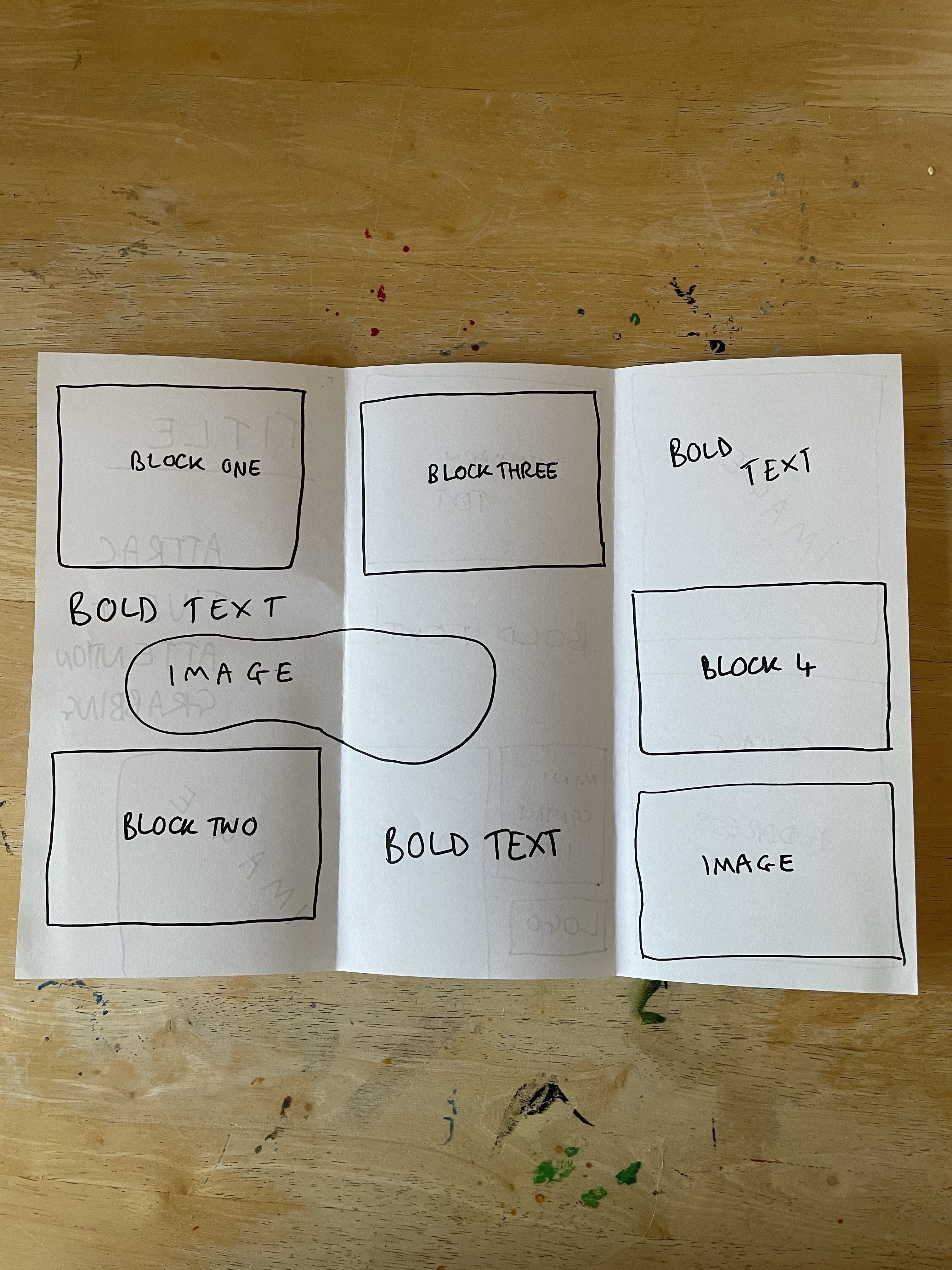
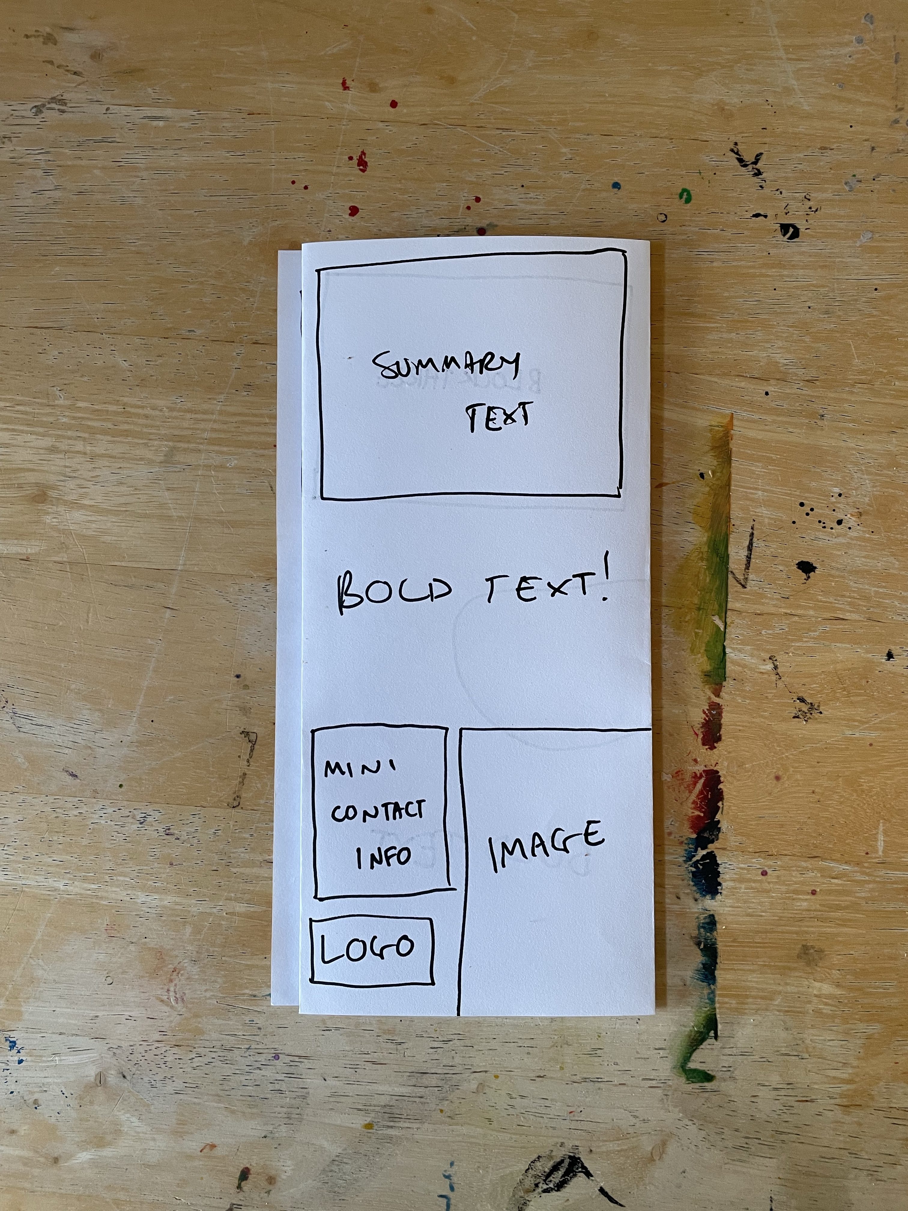
The aim of this exercise was to explore some of the different ways to fold paper to make interesting and engaging leaflets. I was asked to imagine I was designing a leaflet for an organisation inviting people to volunteer for a task – and to experiment with different formats considering size, types of paper, and how the content would be displayed within the leaflet. I had to identify what sort of folds would be successful at making people want to pick up the leaflet and get involved with the organisation.
As the title of Part 2 might suggest, the exercises in this section explore the different steps in the design process and how they’re used to solve creative problems. The process of visualising my ideas is usually one I embark on late in my design process, creating mock-ups of finished pieces – rather than before I begin designing. I have on a few occasions made prototypes or real-world mock-ups prior to designing, like in Assignment 4 of Illustration Sketchbooks, or for Exercise 33 of Key Steps in Illustration. I think this is mostly down to the type of work I have done previously – I don’t feel I have ever had to create a visual representation of my idea before finalising it. However, it’s a very useful step to take to ensure you aren’t making any major mistakes.
I felt hesitant about this exercise as it felt like wasting a lot of paper. I much prefer wherever possible to explore digital alternatives for exercises as, firstly, I don’t want to unnecessarily use a lot of ink/paper as it harms the environment, and secondly, I don’t ever know what to do with all of the physical pieces of paper I now have lying around my studio. It creates mess, clutter, and harms the environment, so it just doesn’t make sense for me to do. I recognise the value in exploring things in the physical world, however, especially if a product is going to exist in this form. So, I got to work writing out the requirements for this exercise.
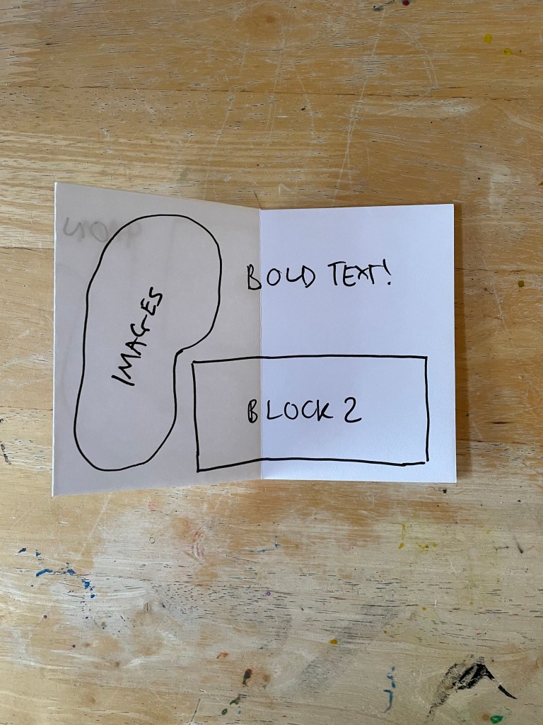
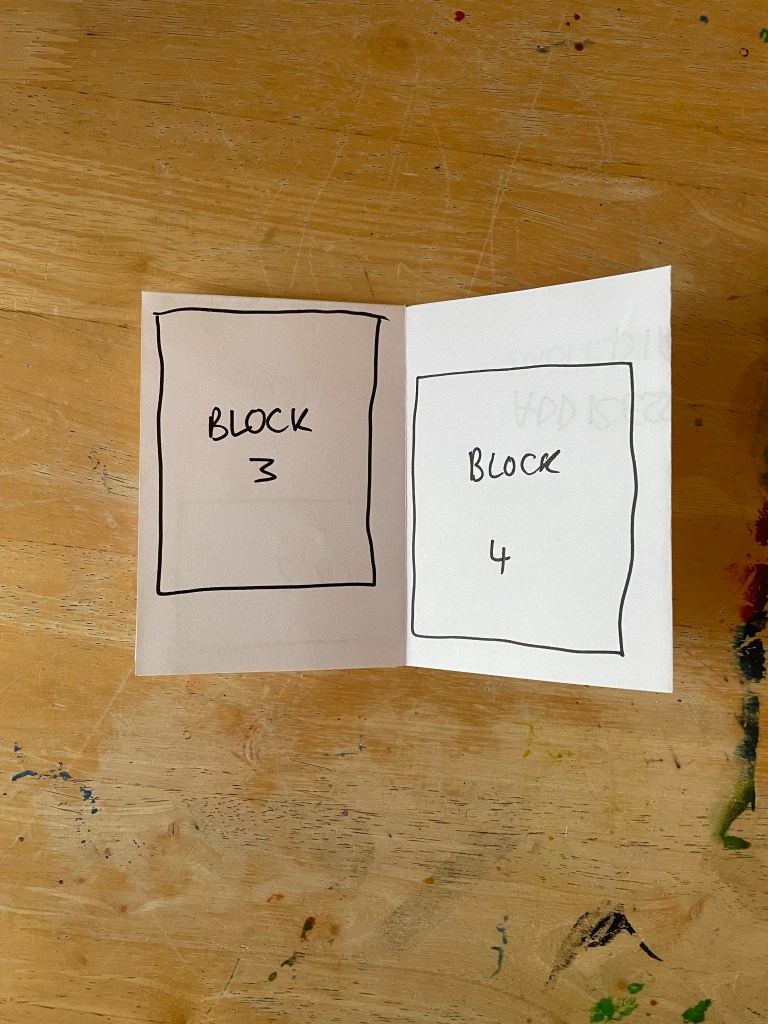
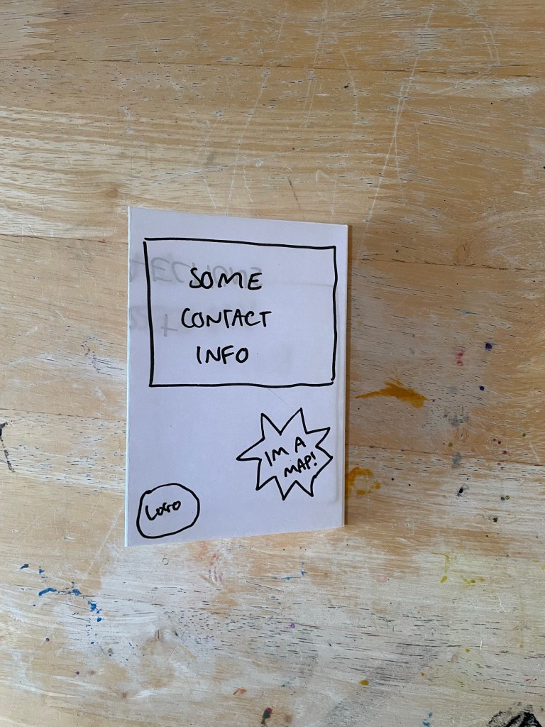
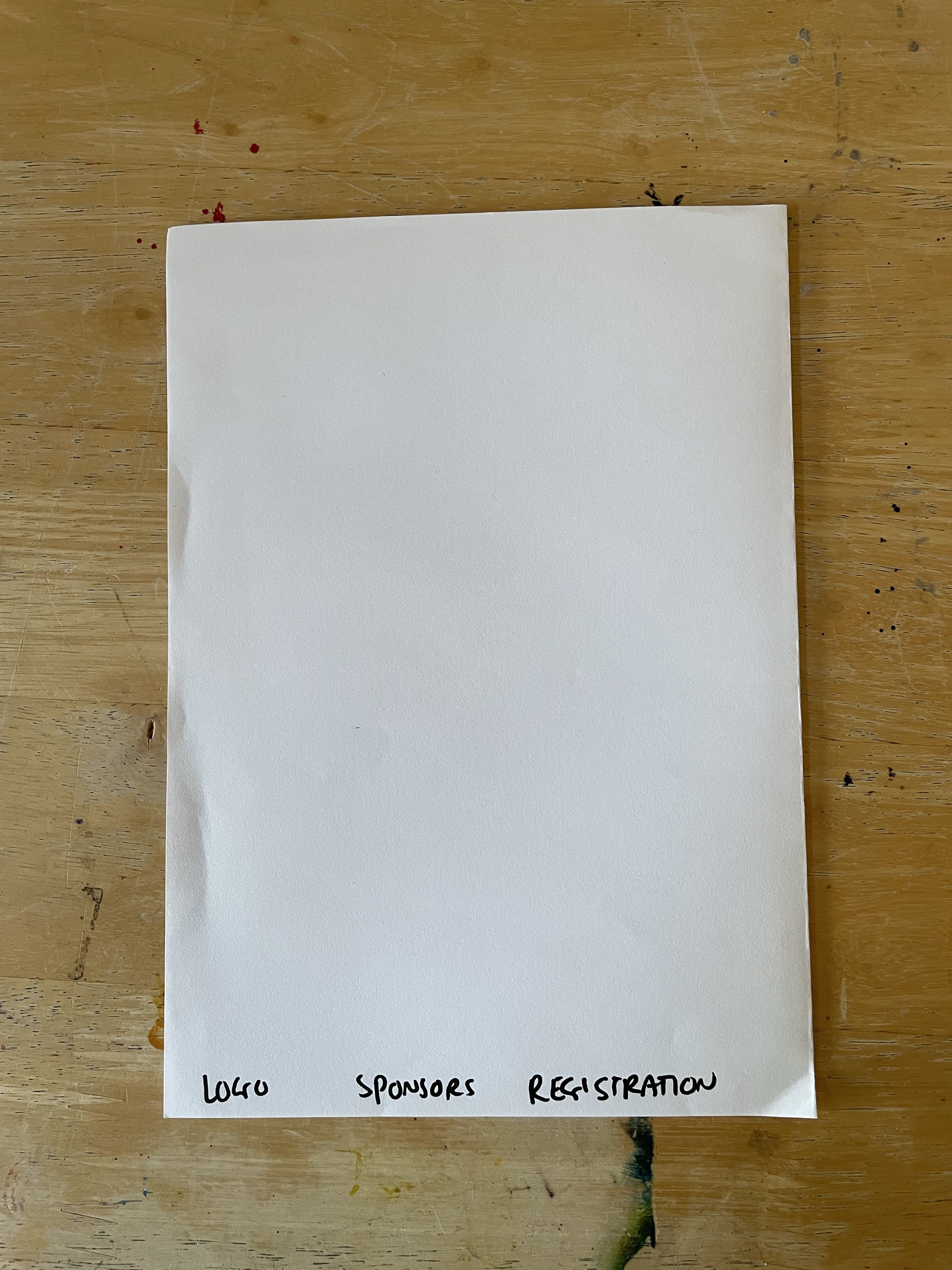
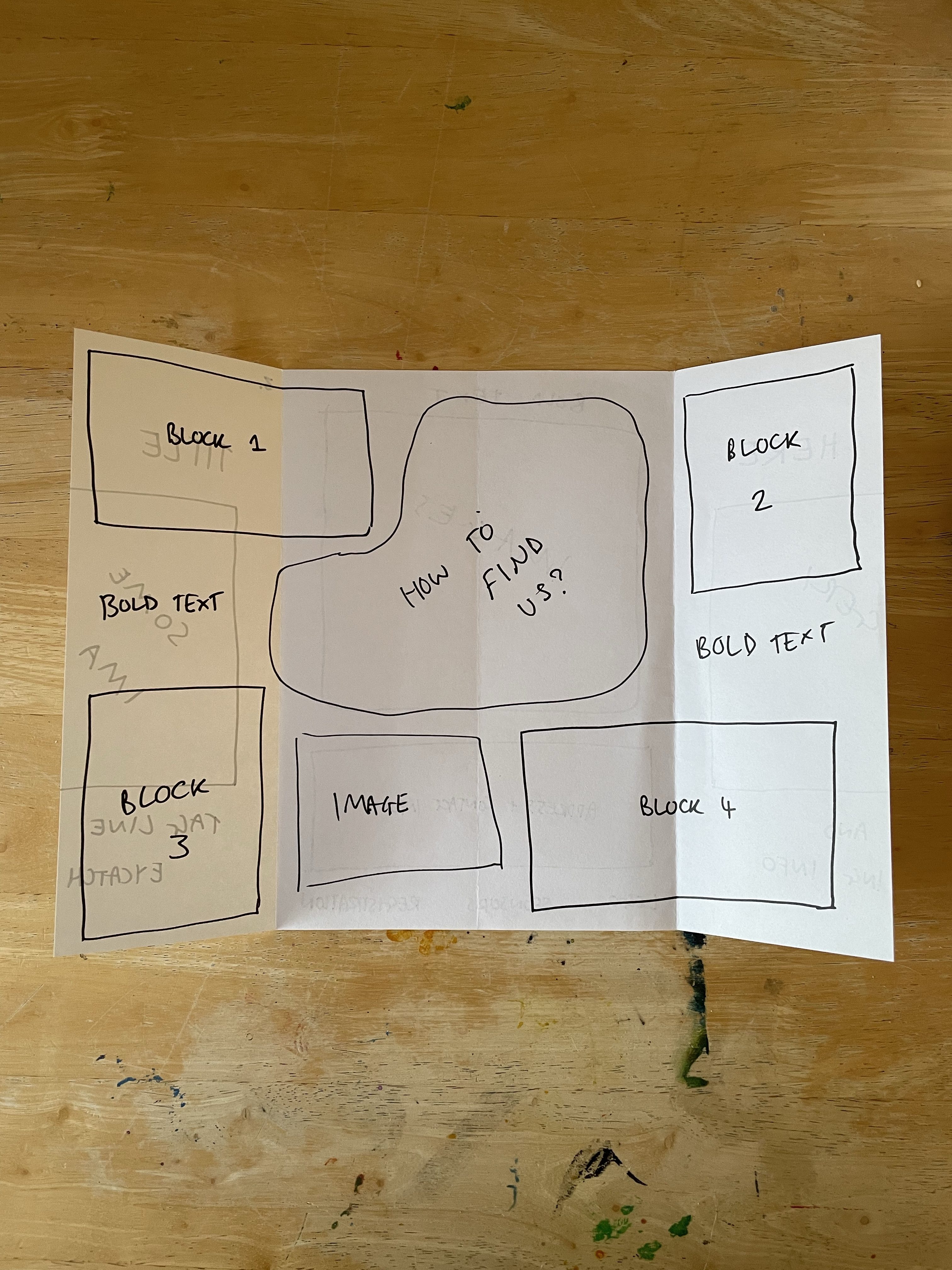
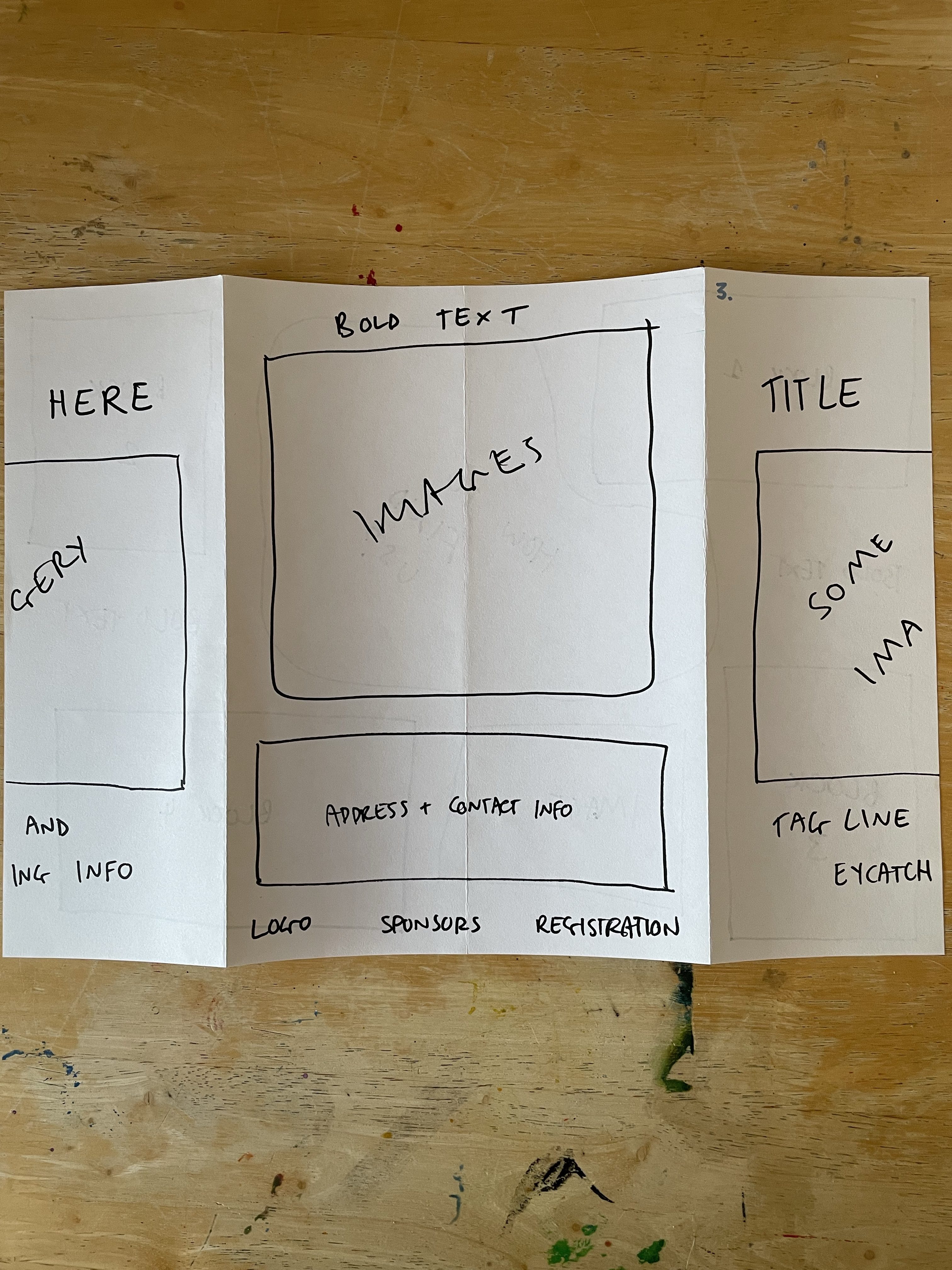
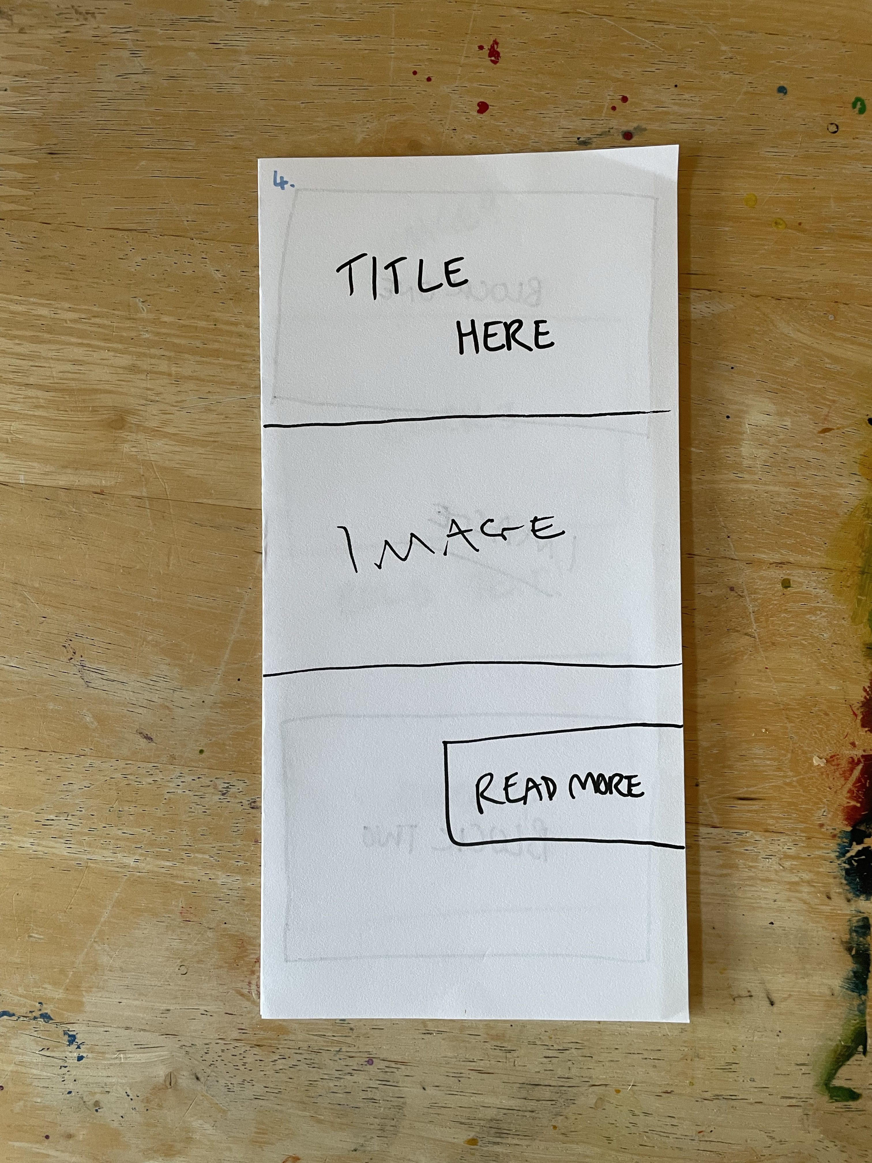
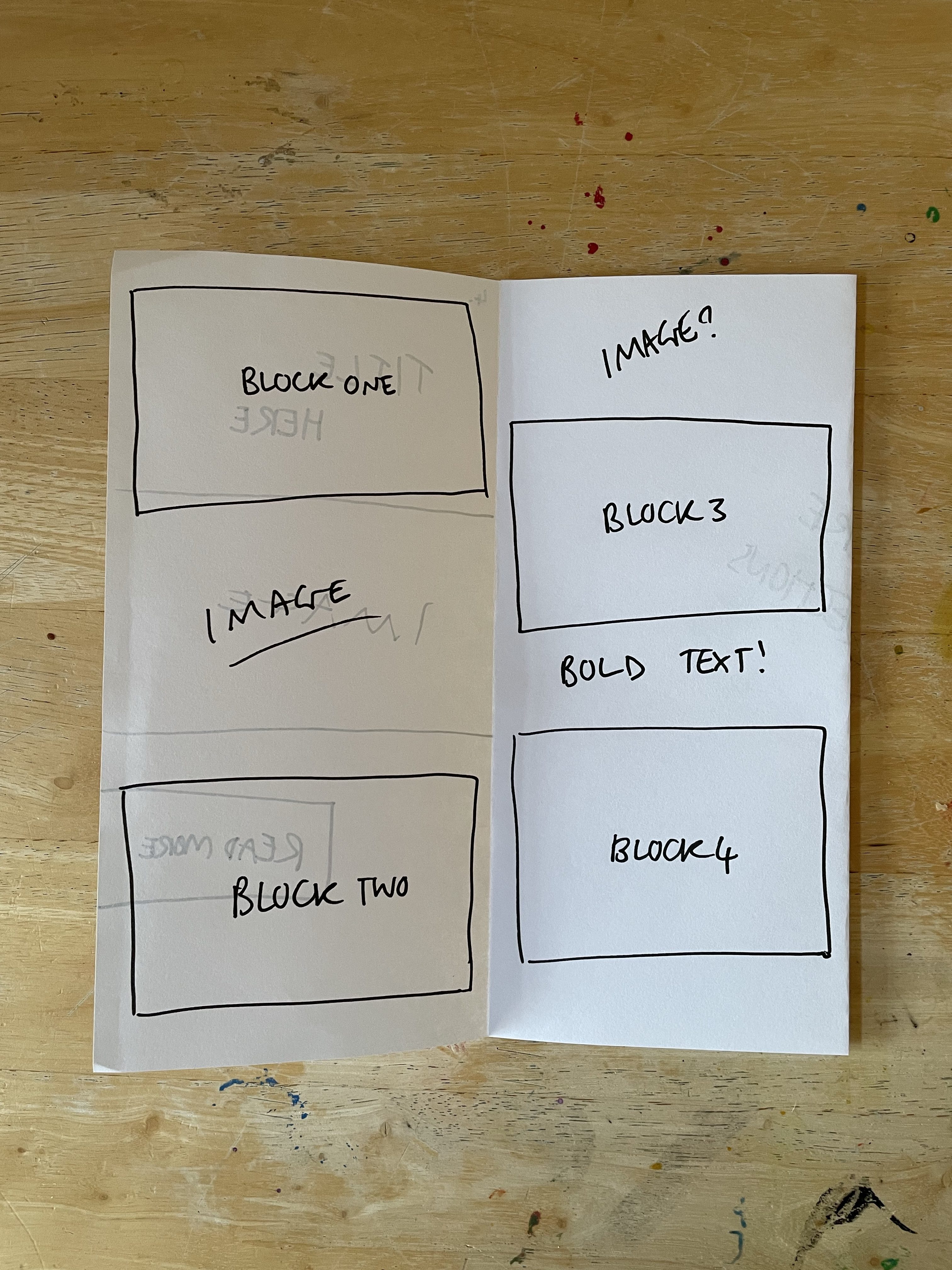
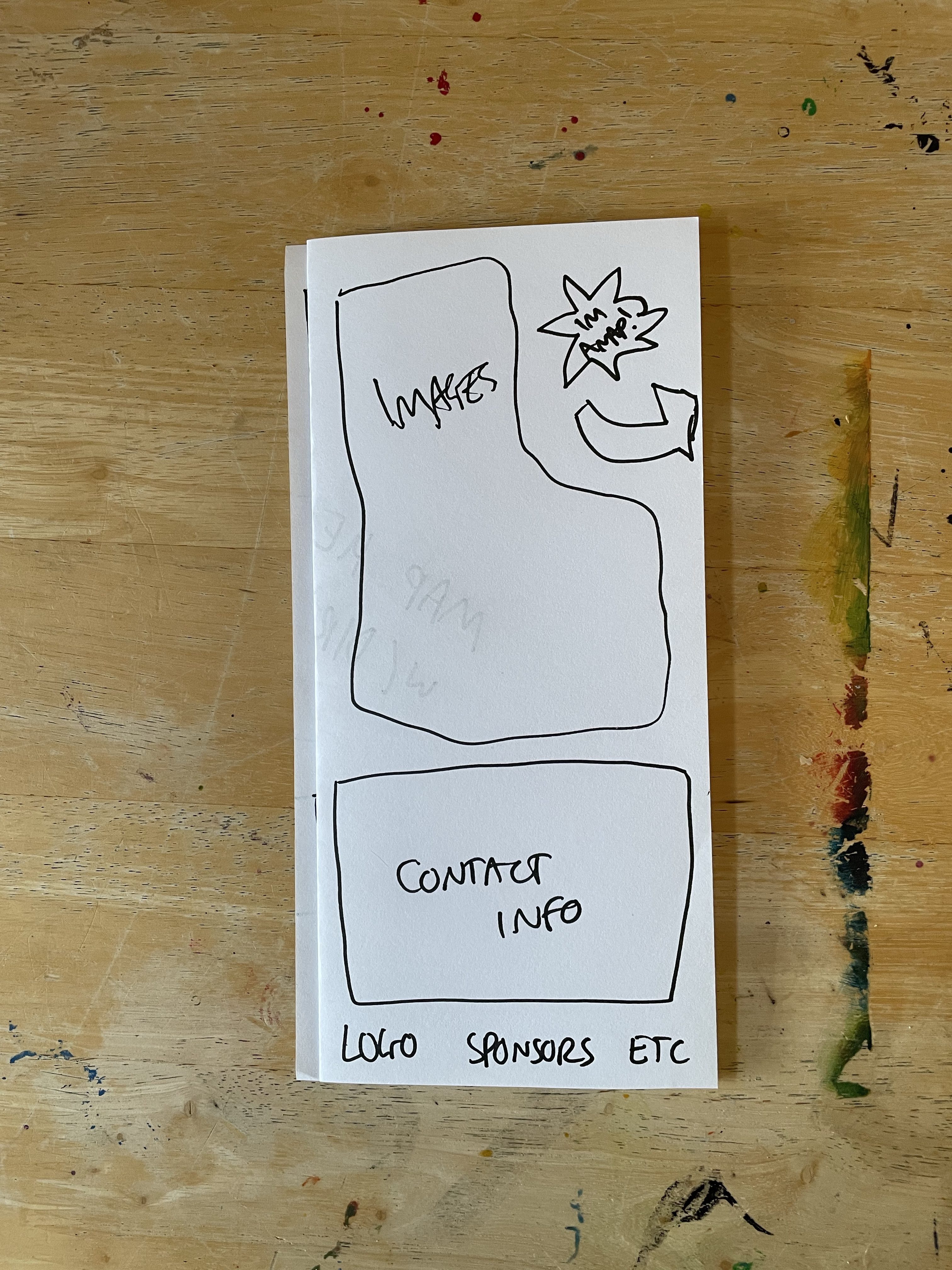
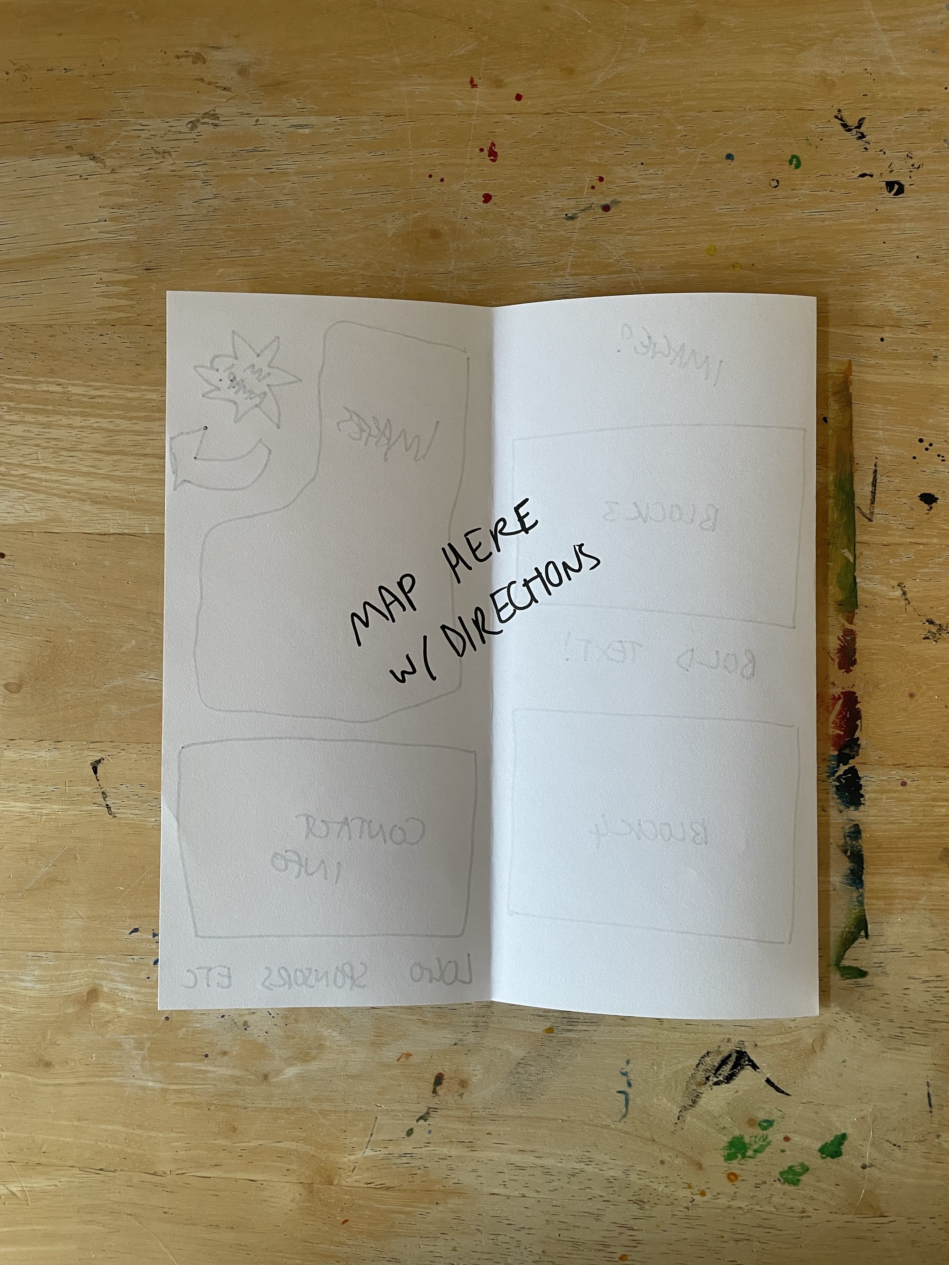
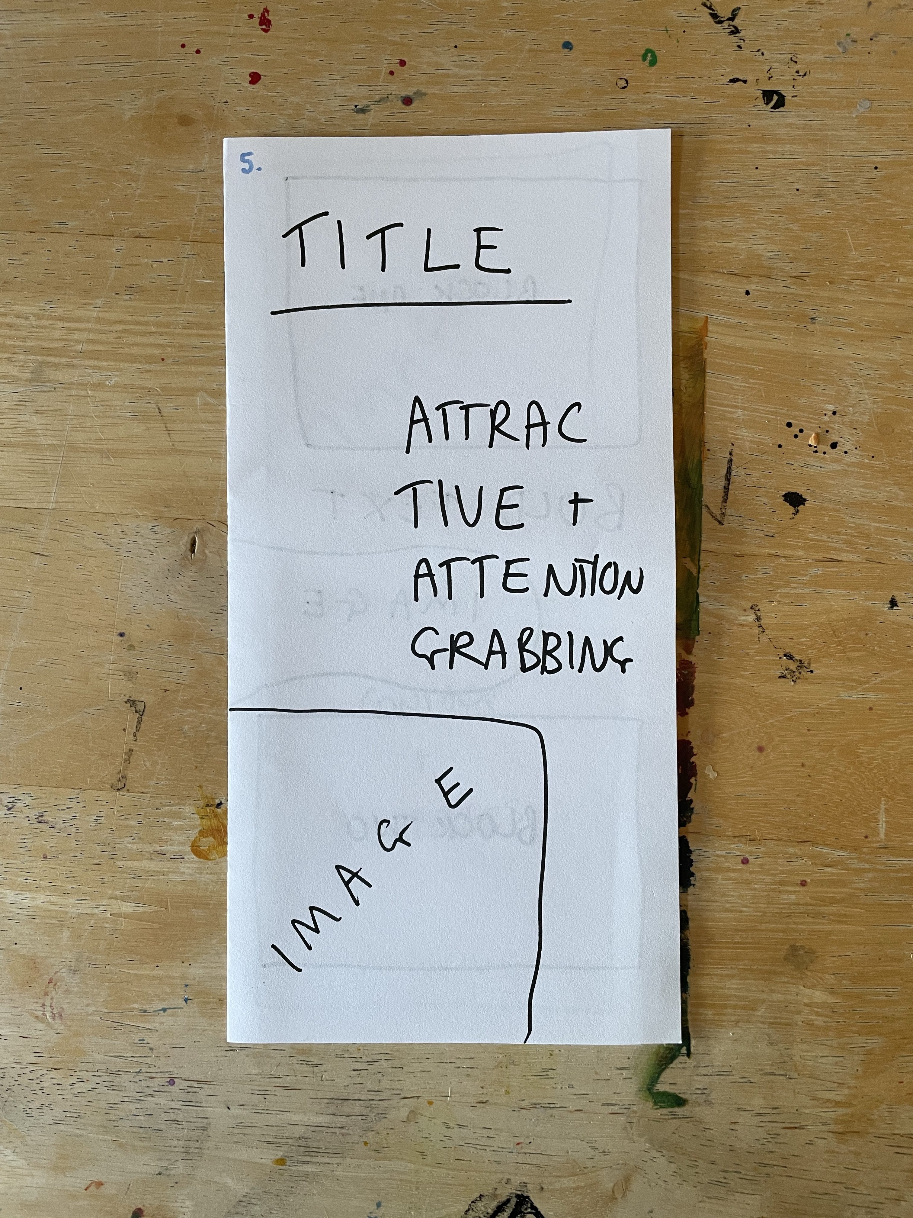
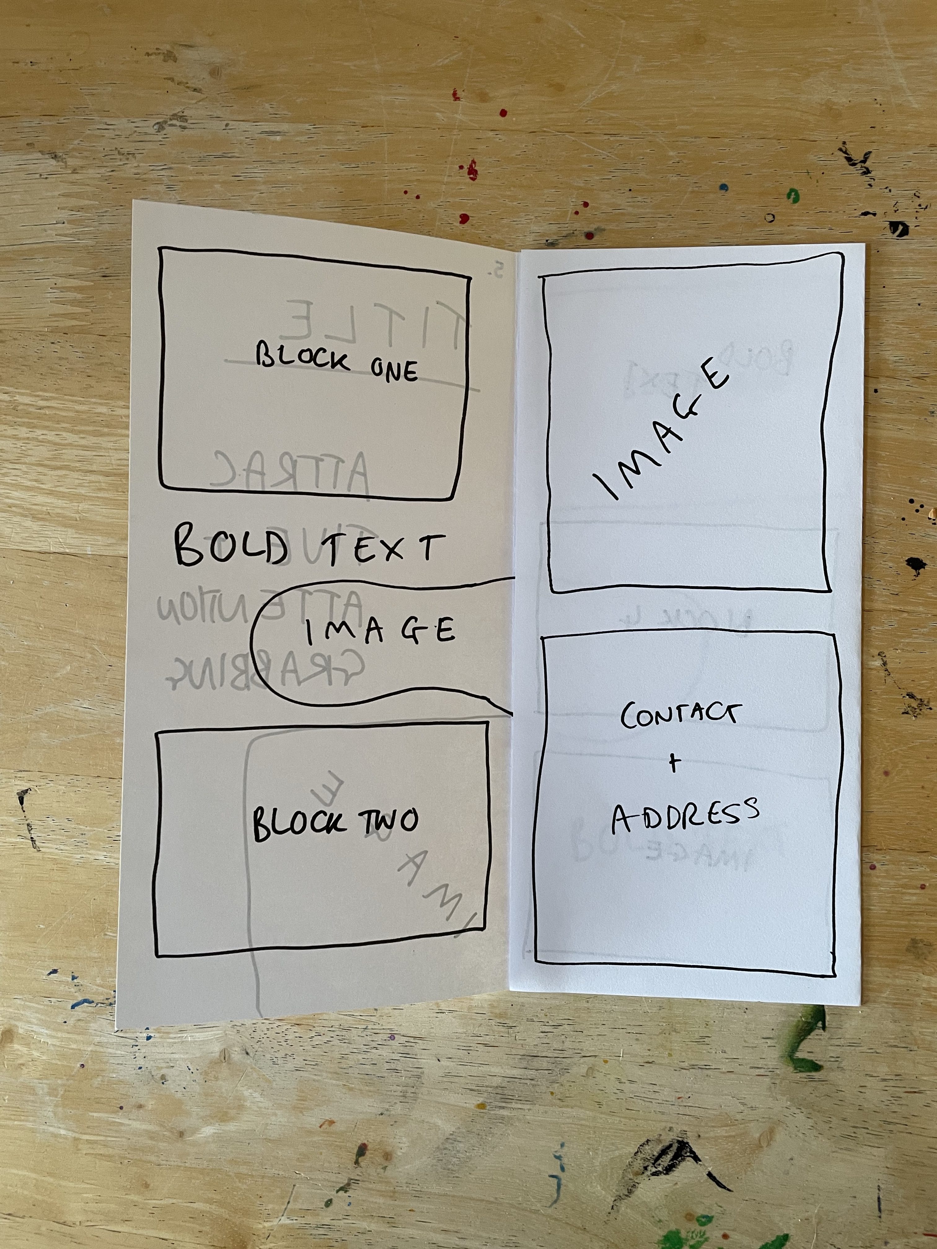
The exercise says to not think too much about the content of the leaflet – but it does specify what is expected to be included. The organisation has provided a title, four 120-word chunks of text, and has requested that their contact details and address are also featured on the leaflet in an easy-to-find way. I was asked to work with an A4 piece of paper for this, so I grabbed a stack of printer paper to play around with.
When I was a kid, every time I was in a supermarket, service station, information centre, library, you name it – I made a beeline for the leaflet stands. I remember standing surveying all of the available leaflets, trying to find ones I hadn’t seen yet to add to my collection. My parents would set limits – ‘you can only take 3 this time!’ – and I would ponder which 3 were the best ones. I would spend hours reading and re-reading them. I don’t really understand why, other than I am autistic and the thought of collecting things was exciting to me, but it thankfully created a database of existing leaflets in my mind for life. Maybe I was just destined to be a designer.
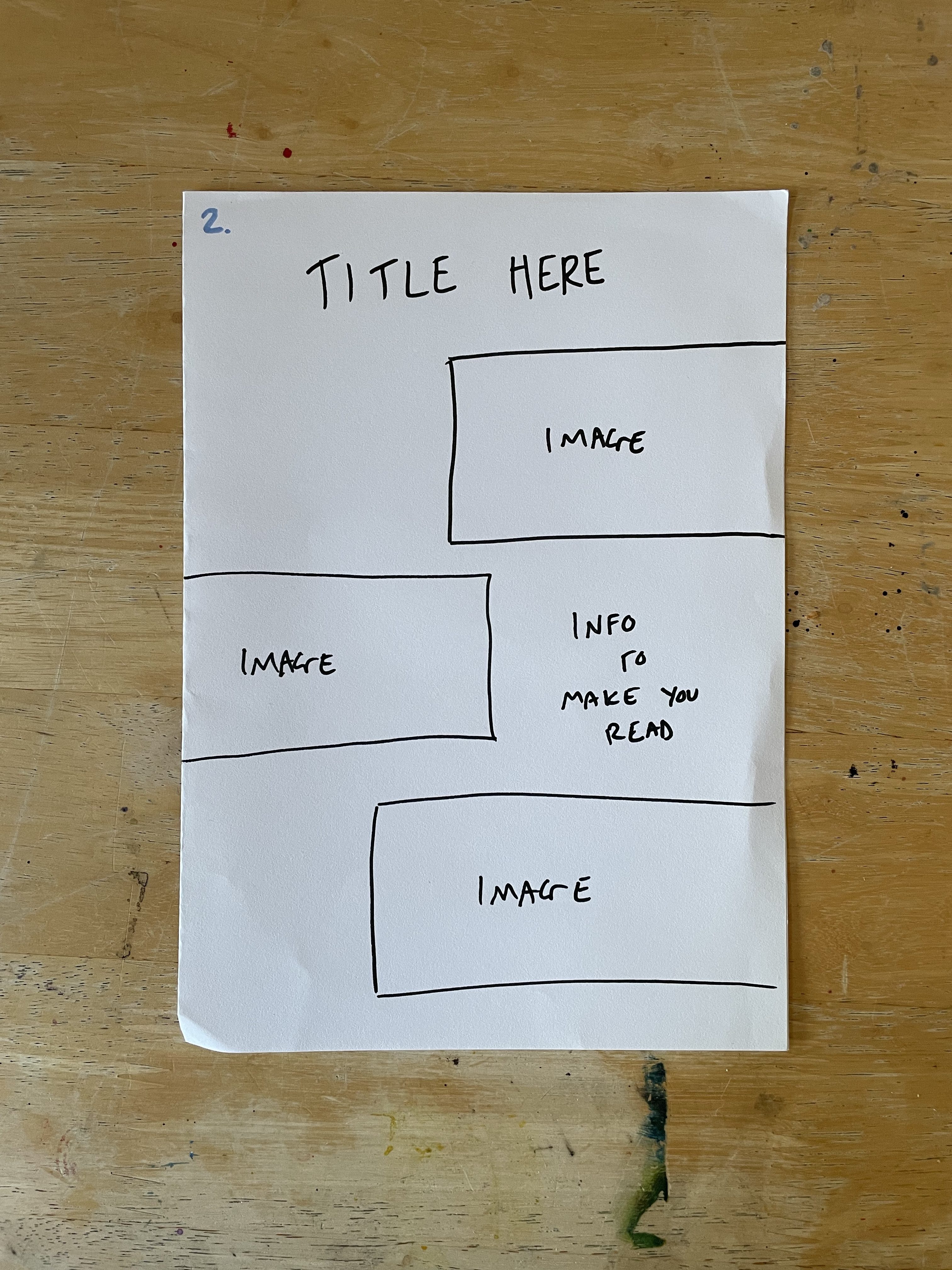
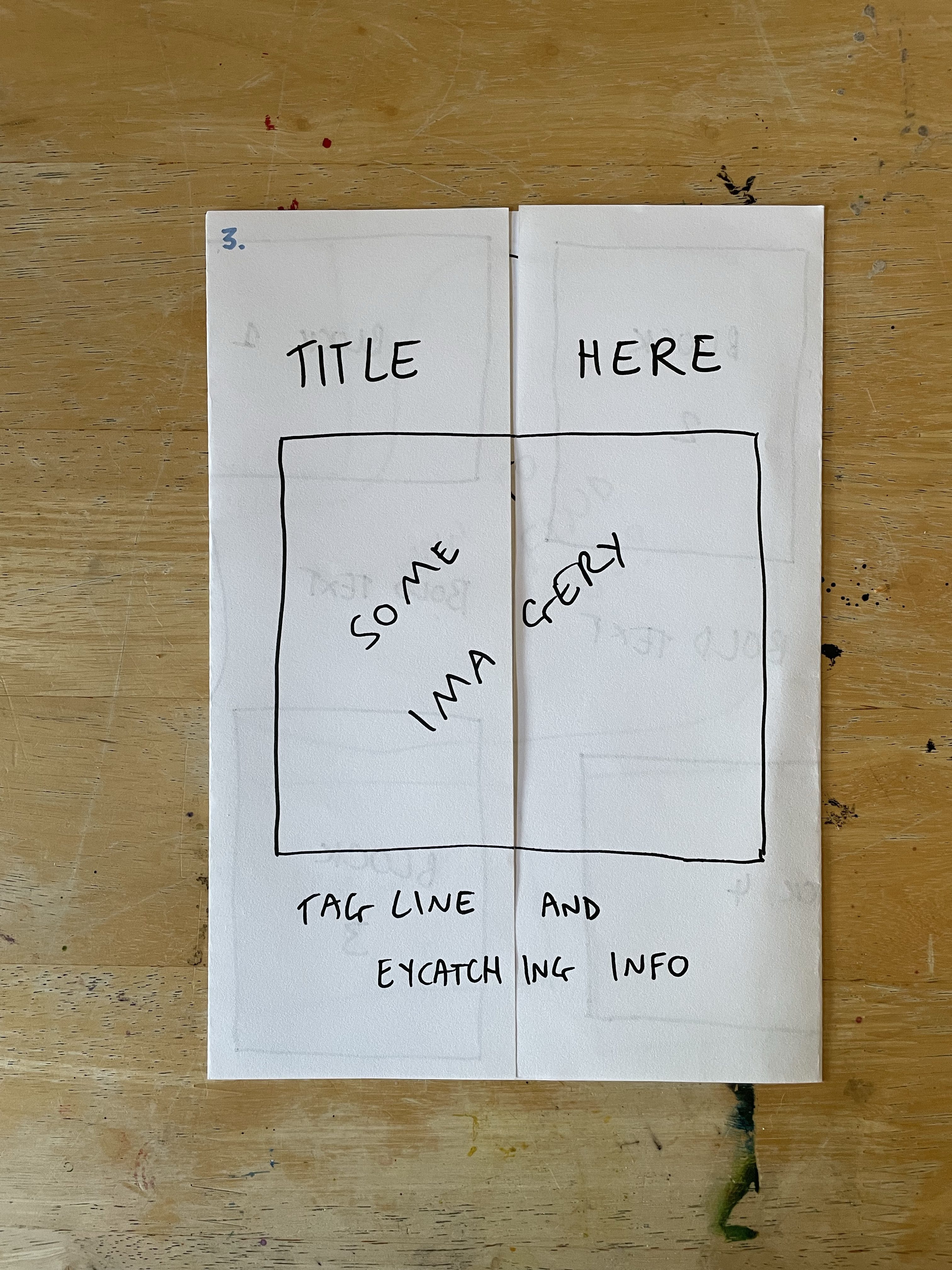
So I decided to start by folding the paper in as many ways as I could think of off the top of my head with no research or experimenting. Just, here are some folds I know for leaflets from my experiences. This gave me five mock-ups to work with. I went through each one and blocked out where I felt content would be best going based on each fold. Then I assessed each one and whether I felt they worked, and how they could be better.
Fold number oneFold number twoFold number threeFold number fourFold number five
I felt the biggest issue was that four blocks of text, a title, and contact details wasn’t a lot of content for an A4 leaflet. There would be a lot of empty space – which could be used for photographs and illustrative elements – but it really would be a lot for some of the folds. Fold number 1 is probably my favourite of the five, as it feels snappy, eye-catching, and fun. I was envisioning it being at the counter in a local business or similar. The other folds are more suitable for postage or for putting in a stand, similar to those I encountered as a child.
At this point, I felt like my ideas were pretty boring and uninventive, but I couldn’t think of any more folds. I started researching printing companies to see what folds they have to offer. I first found this website that listed several paper folds, most of which I had already tried, and two I hadn’t considered but that still felt like they had the same problem with there being too much space to fill. I also looked at this page on the website, which showed example leaflets, and helped me to see how to organise information in the different folds. These examples seemed to back up my thoughts about space – as a lot of information was used on each.
I then looked at the Printing for Less website, which had a detailed page showing different folds, giving their names, and describing how they can be used. These still felt pretty boring and massive as leaflets. I started specifically trying to find a website that provided interesting and experimental folds and found the Fold Factory. The founder of the Fold Factory has spent her entire career fascinated with various kinds of brochure and leaflet folds – in fact, her thesis at university was focused on documenting all of the possible folds that exist. She realised it was a never-ending journey and is still today researching folding techniques and ways to create memorable marketing.
I spent a good while scrolling through all of the folds on her website. It fascinated me to see how many options there were, and also to think about how cool it is that someone has found a passion in this niche. I particularly liked the uniqueness of the Turkey Iron Cross and the Holiday Cards. The website as a whole, and these two folds especially, really got me thinking about how various folds could work for different designs, different organisations, and various projects. Volunteering for a food bank, for example, could have a milk bottle-styled accordion fold, much like this Wine Bottle Fold. Or, this fold could be perfect for a grassroots football team.
This exercise got me thinking about how I approach my designs and layouts. I rarely think outside of the box when it comes to how the product will look in the 3D, but I’m usually pretty comfortable thinking outside the box with the literal design elements. I’ve always felt pretty terrible at 3D design – I hated sculpting and all that went along with it at art college. Even building houses in The Sims is something I shy away from! I’d quite like to push myself further to think of creative ways to present my design work in the world – and research this further where possible.
For this exercise, I was asked to design three book covers for any of H.G. Wells’s novels. I could pick any three books to design for, bearing in mind that they would be sold together as a set. The designs were expected to ‘establish the books as timeless fiction’ and needed to work together. I had to include the title, author’s name, and publishing information, and design the spine of each too.
I began by dissecting the brief using the ‘who/what/where/when/why’ approach from Exercise 2, as well as identifying keywords. I then wrote out a plan for approaching the exercise.
My first task was to identify which books I was going to be designing for. I have some awareness of H.G. Wells’s work, as I’m very interested in dystopian and early science fiction, however, I have not actually read any of them. My goal was to pick three books that worked as a set and made sense to sell together. I also wanted to pick ones that were popular so that there was enough information out there for me to research the plot of each book without having to actually read all three. I began by googling the author and writing down the most popular of his novels, alongside the genre google classified each by. I then considered how I could mix and match his most popular novels to create a ‘timeless’ set.
Three of the books – The War of the Worlds, The Island of Dr. Moreau, and The First Men in the Moon, had ‘sci-fi/romance’ as their genre listed on google. I felt torn between matching these together as they had the same genre and picking Wells’s most known novels. I decided to look further into the plot of these three books, checking to see just how ‘romantic’ they are. My research led me to the term ‘scientific romance’, which it turns out does not actually mean ‘a science fiction novel that has romance themes within’, but ‘a romancing of the sciences’ – and it’s an outdated term replaced by the now widely known ‘sci-fi’.
Upon learning this, I realised it made a lot more sense to choose Wells’s most popular work, especially as this would fit the ‘timeless’ requirement very well. A quick look at some of the existing H.G. Wells collections out there showed me that ‘The War of the Worlds’ and ‘The Time Machine’ are very often sold together. These books both explore new concepts for the first time – surviving an alien invasion and time travel. Picking the third novel to go alongside them was tricky, but I felt that ‘The First Men in the Moon’ fit very well – as it was the first novel that explored the idea of space travel. I decided to proceed with researching and designing for these three books.
I wanted to make sure I had a good understanding of the plot of each book before I began designing covers for them. I’ve seen so many stories of designers not doing this and just designing based on the title alone, or the ‘vibes’ the book gives off, and the cover having nothing to do with the actual content of the book. I started by looking for plot summary videos on youtube, and managed to find one for both The War of the Worlds, and The Time Machine, but not for The First Men in the Moon. I took notes from these videos, and then started to look elsewhere for written plot summaries. I used these Britannica articles (1,2), and the Wikipedia article for The First Men in the Moon, and took some more notes on the themes and major plot points.
My next step was to research book covers. I decided to start by researching existing book covers for my chosen books to get an idea of the kind of content, colour palettes, and font choices that are popular for them. I then broadened my research to include all science fiction novels and looked into some existing sets of books to explore how other designers had worked to create collections that fit well together. I created a Pinterest board to house all of my research, which you can see below.
Looking through the various existing book covers got me thinking about the concept of ‘timeless’ and ‘contemporary’ and how I could express this through my designs. It felt hard to imagine how something could be both relevant to modern times, whilst maintaining this relevance for decades to come. I looked up the definitions of the two words in the hope it would give me some direction. Timeless is defined as ‘not affected by the passage of time or changes in fashion’. Contemporary is defined as ‘following modern ideas in style or design’. I figured it would be a good idea, then, to research what the modern ideas in style and design are – and what design elements are never changing consistencies.
I began by reading this article on timeless design. The focus of the article is on UX design, which isn’t totally relevant to this project. It still gave me a good representation of the kind of concepts considered ‘timeless’ in the industry. ‘Simplicity’ especially was a word repeated throughout. Something simple, easy to look at, easy to use – that was guaranteed to stand the test of time. The article made me consider whether timeless design was a specific style to adhere to, or whether it was simply about making something that would look iconic still in 20 years. The second article I read once again mentioned simplicity as one of its 5 timeless design features – but it also brought up Swiss design. With its bold sans-serif fonts, crisp outlines, and strong geometric elements, Swiss design screams timeless, easy, minimalistic – simple.
Luckily for me – contemporary graphic design is very focused on these same ideals. Minimalism is all the rage right now, much to the horror of some UX designers (what happened to the firefox fox?), and has been for about a decade. Recent years have shown some pushback and a desire to bring the colours, patterns, textures, and experimental design from the alternative scenes of the 60s, 70s, and 80s into the modern day – however, minimalism seems to be prevailing even there. Sans-serif fonts are featured with smooth, bold geometric designs, it’s just this time they’re neon pink.
It was pretty clear that, for my work to be stunning, contemporary, and established as timeless, I would need it to be simple. I had some ideas bouncing around in my mind at this point, but I had one more research point to tackle: which publisher will be publishing these books? It was a requirement to have the publisher’s name and trademark on the book, and I’m somewhat aware that different publishing companies have different expectations stylistically. The books I was most drawn to when researching were Penguin books, and as the aim is to be timeless, that felt like the perfect choice.
I spent some time looking on the Penguin website at their book covers specifically – especially their collections – and trying to get some inspiration. I was particularly drawn to the ‘Green Ideas’ collection – the simple designs, gorgeous colour choices, and how the books matched and flowed together – it’s truly a stunning piece of work. I had so many ideas at this point and I really wanted to get them down on paper. I began by exploring the most simple concept I could think of, and then a more ‘radical’ approach. I felt very excited by the radical approach, so developed it further.
I wanted to reference specific extracts from each of the books to build up the imagery and ensure they were connected to the content. For The War of the Worlds, I took the sentence ‘[a] monstrous tripod, higher than many houses, striding over the young pine-trees, and smashing them aside in its career.’ and tried to visualise this, referencing existing media depicting this ‘tripod’ creature.
For The Time Machine, I referenced two extracts: ‘Parts were of nickel, parts of ivory, parts had certainly been filed or sawn out of rock crystal. The thing was generally complete, but the twisted crystalline bars lay unfinished upon the bench beside some sheets of drawings, and I took one up for a better look at it. Quartz it seemed to be.’ and ‘I saw great and splendid architecture rising about me, more massive than any buildings of our own time, and yet, as it seemed, built of glimmer and mist. I saw a richer green flow up the hillside, and remain there, without any wintry intermission. […] As the columns of hail grew thinner, I saw the white figure more distinctly. It was very large, for a silver birch-tree touched its shoulder. It was of white marble, in shape something like a winged sphinx, but the wings, instead of being carried vertically at the sides, were spread so that it seemed to hover. The pedestal, it appeared to me, was of bronze, and was thick with verdigris‘. These descriptions of the future and of the time machine itself were useful to draw from.
The First Men in the Moon is a tougher book to find extracts from, so I based my concept on this sentence found in the Wikipedia plot summary: Cavor hits upon the idea of a spherical spaceship made of “steel, lined with glass”, and with sliding “windows or blinds” made of cavorite by which it can be steered, and persuades a reluctant Bedford to undertake a voyage to the Moon.
According to the Penguin Collectors Society, Penguin paperback books are 129mm x 198mm. I opened up a procreate canvas in this size and began exploring colour and texture options. I wanted to work with a simple two-tone colour scheme for each book, similar to the Green Ideas covers, with one consistent colour across all three. I played around with some different colour schemes – variations between pastel tones and richer colours, and tried out various shades of cream to complement them. I was able to choose the shade of cream easily and narrowed down my colour choices to two palettes. I then sent them to a friend for some feedback, asking which was more ‘timeless yet contemporary’. They said the bold colours worked best, and I agreed they have a ‘vintage vibe’ to them.
Next, I selected a Bardot Brush Magic Paper texture overlay for the piece. I wanted the texture to evoke a ‘freshly printed in the 1920s’ feeling, like the woven covers of hardback books from that time period. I felt the overlay called ‘linen’ did this job spectacularly and made my colours pop beautifully too. Next, I experimented with different brushes. Sticking with the ‘right out the 1920s’ vibe, I wanted my illustrations to look almost as if they were woodcut prints. I ended up choosing three brushes that felt they could make this vision come to life, however, I would need to see them on the final illustration to make a decision on which to use.
My final big piece of research for this project was to explore and decide on a font to use. This process took a while, and I had a lot of fun trying to emulate Penguin’s classic style. I began by researching what exactly that is, starting of course with Jan Tschichold, who revolutionised Penguin’s book covers in 1947. Penguin Composition Rules was the name he gave the guidelines he wrote for Penguin typography and design, which specified everything from the shade of orange used on penguin books still today, down to the kerning of the font used inside the book itself. These guidelines are considered Tschichold’s legacy in many ways, and he is often referred to as one of the most influential graphic designers in history.
Tschichold’s fonts of choice for Penguin included Gill Sans, Monotype Bembo, Monotype Centaur, and Gill’s Perpetua. The latter of the three are serif fonts, which I felt went against the ‘simplicity’ message I had internalised when researching how I would approach this exercise. So I began to look elsewhere for font ideas, as I wanted to ensure I explored all the options out there. I ended up finding Fonts In Use, a website that self-describes as ‘an independent archive of typography’. Their page on Penguin books was immensely useful to scroll through and gave me two more fonts to play with: Futura and Fugue.
I downloaded all three fonts and went back to my procreate file to begin exploring how I could use them. I also downloaded the official Penguin logo from the D&AD Young Blood Awards brief assets, to ensure I could use it in my design. I wanted to capture the ‘Penguin Classics’ font perfectly, and feel I did a good job of it. Identifying the title font was a little harder, and I explored several different options, before deciding it would be better to come back at the end of the process and re-evaluate.
Finally, I felt able to begin illustrating the first book cover. I began by sketching it out, then I filled in the shapes with block colour. Ever since doing Exercise 11 in Key Steps in Illustration, I have been enamoured by the ‘graphic illustration’ style and using negative space to show detail. I wanted to use this same approach here, as it felt like it fit the brief well. I began to carve out my negative space and add in the detail by erasing the colour that was there. I then edited the logo slightly to include it in the colour scheme for the book. Once the illustration felt complete, I began trying out my different texture brushes as overlays to see which I felt fit best. I ended up choosing the Bardot Brush ‘Dry Grainy’ brush.
Before moving on to editing the text, I wanted to make sure my colour choices were correct. I experimented with inverting the colours so that the illustration was cream on a red background, and I sent a copy of each option to the Visual Communications Discord server. The response was overwhelmingly clear – the red background looked better. I agreed, so kept it in place, and moved on to fixing my font and making the logo stand out better.
I felt extremely happy with how this cover had turned out – it was exactly as I envisioned and I couldn’t believe it. It’s not often that happens! I attended a Visual Communications Crit session hosted by Emma Powell a few days after completing the first book cover, and I decided to present my work at the stage I was at and ask for feedback. I had mocked up the other two covers with a bit more detail and some rough linework to show the concept better. It was a really useful session and got me thinking about how I could alter the other two designs.
The work I presented to the crit session
How I was using negative space and exploring size differences was discussed – and how I could make it more obvious that there was a person in the illustration for the The Time Machine cover – were especially hot topics. I felt the The Time Machine cover wasn’t quite as eye-catching, and the The First Men in the Moon cover felt pretty lacklustre. The attendants of the session did not agree, but I was advised to change the illustration somewhat so that the author’s name would be fully within the Moon. I hadn’t considered this, so it was good to have a 2nd pair of eyes on my work for this reason especially!
After the crit session, I was looking forward to continuing with the illustrations and seeing how the final pieces looked. My favourite thing about designing sets or collections of products is that once you have the first one done – you’ve figured out the majority of the problems that need to be explored. The rest are easier going, and a lot of cut-and-paste is used. I knew everything already for the second illustration except how it would look. I spent a long time going back and forth on this and trying out a lot of different patterns, shapes, and techniques, in an attempt to get the cover to stand out more. After a while, I just accepted that this is what it looks like and without starting from scratch, I was going to have a hard time making it any better.
I felt pretty disappointed in the second cover, and as I already felt the third cover was lacklustre, I wasn’t really looking forward to it. I knew I needed to get this exercise finished though, as I had spent a long time on it already. I followed the same process as for the previous two covers and tried not to think too much about how I didn’t like what I was producing. The main difference for this cover is that I intentionally did the brushstrokes for the woodcut effect in the same direction to try to emulate movement through space. I’m not sure that now, looking at the three covers together, this was a good idea, as it sticks out a bit.
I feel that how proud I was of my first cover and how excited I was with how I had achieved my goal set me up for greater disappointment when I felt my second two covers did not quite live up to that standard. I don’t think they’re bad covers, they’re just not as strong as the first one. I feel frustrated about that.
The three completed book covers
I briefly touched on what I wanted to do for the spine back when sketching out my initial ideas. The spine would be simple, carrying over design features from the front cover. This was pretty easy to carry out, I just copied and rearranged the different elements. I then found some book mock-up files to add my designs to, hoping that seeing them laid out like this would make me feel a bit better about the overall final designs.
Mock-ups of the book covers
This exercise was so much fun. It’s been a while since I had a proper design brief to sink my teeth into and I got a lot out of it. It felt like sharpening a pencil that hasn’t been used in a while – but that falls into my hand so comfortably. I think I can be too hard on myself sometimes and I definitely hold myself to way too high of a standard. The mock-ups look great, and I’m really proud of the work I did here. I thought I would find this exercise pretty boring, as book design isn’t really an area that interests me. I felt like I learned a lot – especially about fonts!
This exercise provided three hypothetical briefs and asked me to read and analyse them. I had to identify how the client will judge a successful outcome, the keywords of the brief, and any questions I would want to ask the client. I was then asked to consider which I would want to tackle, and why.
Prior to the exercise, the unit guide presented me with the concept of ‘The Design Process’. This is the process you undertake every time you approach a new project, from receiving (or creating) the brief, to finalising your work. Whilst working through Key Steps in Illustration, I developed my own design process, based on trial and error, figuring out what does and doesn’t work for me, and learning how my brain functions when approaching briefs. I’m thankfully very familiar with tackling brief-based projects now, and very comfortable with the steps involved.
The unit guide also explained how briefs should tell you ‘who, what, where, when, how, and why’. This is the first time I have seen direct advice to write out these questions and answer them when reading through the brief – but it’s something I’ve been doing for most of my life, especially when researching. I learned this when essay writing for my GCSEs, and it’s a great way to make sure you have all of the information summarised. Now, I mostly use this method when approaching big research tasks, and less so when approaching briefs, but I wanted to give it a go in this exercise to see how it changed my process.
I began by reading each of the briefs just to get a sense of the exercise and what it was I was being asked to do. Then, I wrote out each of the questions the exercise set out to answer, and began analysing.
Brief 1
Create packaging for Quaker’s new ‘Chilled Creamy Oats’ product for young women looking for a truly delicious healthy snack. The target audience is young women juggling many jobs and priorities everyday. They like to eat well but also love treats and hate feeling hungry. They like the idea of oats for their natural goodness but find the idea of eating them bland and unappealing.
What are you being asked to do? Create packaging for a new product made by Quaker – ‘chilled creamy oats’.
How will the client judge a successful outcome to the brief? The package will be successful if it attracts the target market for the product – busy young women who might not find oats appealing. The packaging must showcase the product as both a tasty treat, and something that is filling. It should also highlight the natural health benefits of oats.
What are the keywords? ‘truly delicious healthy snack’, ‘young women juggling many jobs and priorities’, ‘love treats and hate feeling hungry’, ‘natural goodness’.
Any questions for the client? What is the product? It sounds like a drink, but I’m not sure, I’d want to know what it actually is. More info is also needed on the content of the product – ingredients, calories, nutritional value etc. Where is the product going to be sold – supermarkets/drugstores/corner shops? Where in the supermarket – grab and go or main aisle? What is the budget and when does the client want visuals/final images etc? What size will the images be, what will they be printed on, are there colour limitations, etc etc. – this could be answered somewhat by knowing exactly what the product is. It’s a really limited brief – so much info is needed still.
Brief 2
Most of us have experienced a long rail journey – we witness the dramatic contrasts of the changing landscape, the inter-connections at various points along the way; various people embark and disembark; the dynamic is ever- changing… finally we reach our destination. This brief challenges you to take a metaphorical journey on the theme of connections. Explore the theme as broadly as possible and take us on a journey that might link, amongst other things – people, events, philosophies, theories, objects, movements, inventions, history, literature, etc. Your journey is only limited by your own imagination and the quality of your research – surprise us with the juxtaposition of your selected themes but be sure to communicate to the viewer the ‘connectedness’ of the thinking within your design. Define your market, and how you will target it.
What are you being asked to do? Design something that broadly explores the theme of ‘journeys’ in abstract and creative ways, whilst still showing ‘connectedness’ within the design.
How will the client judge a successful outcome to the brief? The outcome will be successful if the brief shows connectedness, surprises the client in how the themes interact and how the conclusions are reached, and if a self-defined market has been succesffully targeted. It feels like the more abstract and creative the better.
What are the keywords? ‘dramatic contrasts’, ‘inter-connections’, ’embark and disembark’, ‘dynamic is ever-changing’, ‘metaphorical journey’, ‘as broadly as possible’, ‘limited by your own imagination and research’, ‘suprise us’, ‘connectedness’.
Any questions for the client? I have so many questions for this brief! It is so vague. What is this design for? Who is the brand? What is the purpose? What is actually wanted – yes, a design, but for what? Where will it be put in the world? Is it advertisement, decorative, packaging, branding, what? Who is the client? I assume it’s a rail network and this is an advertisement telling stories of how trains can connect more than just literal locations, but that’s a lot of guesswork. I also need to know what size the images will be/what the work will be printed on etc, the budget and deadline…I feel like none of the ‘who/what/where/when/why/how’ questions have actually been answered. It’s an interesting brief and I’m intrguied, but its way, way too vague.
Brief 3
To raise awareness of the risks of underage drinking and contribute towards a cultural change in society’s attitude towards alcohol. The purpose of the Department for Children, Schools and Families is to make this the best place in the world for children and young people to grow up… to make children and young people happy and healthy and help them stay on track. With a core proposition of ‘Alcohol leaves you (or your children) vulnerable’, the campaign will urge parents to talk to their children before they consider drinking, to help avoid vulnerable situations. The messages to young people will get them to think about the effects of drinking. Creative ideas should use the campaign identity ‘Why let drink decide?’ to extend the campaign’s reach and specifically target young people aged between 13 and 16. We are open to ideas about the media or format you think is most appropriate to reach the target audience
What are you being asked to do? Create imagery for a campaign encouraging young people aged 13-16 to think about alcohol. The campaign should also encourage parents to have conversations with their children about the risks of alcohol.
How will the client judge a successful outcome? The campaign will be successful if the imagery helps reach their goal of ‘raising awareness of the risks of underage drinking and contributing towards a cultural change in societys attitude towards alcohol.’ as well as expanding their campaign to younger people.
What are the keywords? ‘raise awareness’, ‘risks’, ‘cultural change’, ‘happy and healthy and stay on track’, ‘alcohol leaves you or your children vulnerable’, ‘urge parents’, ‘think about the effects’, ‘why let drink decide?’.
Any questions for the client? This is a thorough brief. The only missing things are details such as cost, timeline, and where exactly campaign will be used – it specifies that the designer can pick the format, but client may have intentions for where the campaing is displayed. I would be interested in seeing any existing campaigns they have made for similar projects, and as it’s a large governmental organisation, I’d want to know if they have branding guidelines that should be adhered to.
After analysing all three briefs, it’s quite clear to me that the Quaker packaging design brief – brief 1 – is the most appealing to me. This is purely because it’s the market I’m interested in as a designer and would enjoy working within. I’m very intreguied by brief 2, but it feels like there’s not enough information for me to make a decision on whether I would take it as a brief. I would defintiely want to know more first. Brief 3 is someting I could do, but I don’t think I would enjoy it as much as brief 1. It isn’t particularly inspiring to me in the same way.
It’s interesting to me that as a designer you expect to be given well written briefs, but that actually the problem solving part of designing starts from the moment you first read it. There’s a lot you have to figure out for yourself, and a lot of communication with the client required to find more information. Some clients might have less experience with hiring designers, or they might just not be great at writing a brief, so it feels important to know what you as a designer need to know in order to undertake a project. Identifying the work you need to do includes identifying the communication required from the client.
The unit guide says ‘clients don’t always know best’, which is similar to something my tutor said in Key Steps. I spend a lot of time worrying that I’m going to have to design things I don’t personally like or enjoy, and that I know look bad – just because that’s what the client wants. I’d like to learn how to gently challenge a clients expectations or requirements, or how to strategically inform a client that the design will look bad if it’s done how they want it to look. The ‘customer is always right!’ culture of the USA is starting to bleed into the UK industry – largely because of the global access to designers – and it’s a tough thing to battle with.
Approaching these briefs with these questions was helpful, and identifying what information was missing was an extremely useful exercise. The briefs in the unit guide are hard to approach in this way – as typically all info is already there. It’s given me a lot to think about, especially for my future as a designer.
The first assignment of Graphic Design: Core Concepts focuses on introducing you, your interests, and your work to your tutor. I was asked to design three postcards that show who I am, my graphic design interests, and my wider cultural influences. The final size of the designs would be A6. I was able to use any medium or materials I wanted to and could do my initial designs in any size as long as they were reduced down for the final image.
I had read the unit guidance for this assignment months before I began the unit – so it had already been brewing in my mind for some time. This meant that upon starting, I already had a pretty good idea of three areas I wanted to focus on for my designs. I’d spent the months prior really thinking about what my interests are, what I’m inspired and influenced by, and what makes me excited about design. I didn’t know exactly what I wanted on each card, but a vague idea was in the works.
Despite this, I approached the brief as I would any, and began by writing out key points. It was important to me to make sure I was doing it properly and not getting caught up in the ideas I’d had whilst removed from the unit itself. I broke down each postcard into ‘you’, ‘your interests’ and ‘your work’. Each one would showcase my influences and inspiration, and hopefully my design interests too. My three initial ideas were a postcard with a portrait of myself on (you), one focused on the Pokémon franchise (your interests), and one centred around typography (your work). I then started to consider what my graphic design interests and influences are, to ensure I would represent them in my images.
My initial planning and response to the brief
Advertising, packaging, and editorial design are three areas of design that excite me and that I’d like to get into more. I’d like to merge illustration with my graphic design and create a quirky, out-there feel to my work. I’m hugely inspired by history and the past in general – especially the early and mid-20th century. I want to capture a ‘vintage meets modern’ vibe in my work, and I’m fascinated by ‘placeless’ aesthetics, where the merging of a range of popular design elements from various eras creates something new. Colour-wise, I prefer to stray away from blacks, whites, and greys, and love to be bold and bright in my choices. Even when working in my sketchbook – I can’t bear a colourless page.
Identifying my design interests, influences, and style in this way was helpful and got me thinking about what I needed to express in my postcards. I wrote out a plan for what to do next and then started thinking about how much my persona as an artist has changed since I first started this degree.
Whilst reviewing the brief, I remembered how my first assignment for Key Steps in Illustration was a very similar theme. I was asked to design a greetings card that introduced myself to my tutor, much in the same way as this brief asks. This was my first-ever assignment for my degree, and before I continued with this assignment, I wanted to take a minute to reflect on it and on how my work has grown since. The full assignment can be found here.
My final piece for Assignment 1 of Key Steps in Illustration – drawn in April 2020
I feel like I have a much stronger idea of my interests and influences now. I know my style and feel confident in it too. I wrote at the end of Key Steps in Illustration that I finally felt like a ‘real artist’ – and that feeling has only grown. Through research and experimentation, I have learned technical skills and also figured myself out as a designer, which is awesome. Looking at this image, I can’t help but consider how it would look if I re-created it now, with my new skills, and new interests.
Reviewing my previous work made me feel nostalgic and excited, as my growth is so noticeable. I was looking forward to seeing how my work for this assignment would compare. I got back to my sketchbook and started planning out my postcards. I drew some boxes to thumbnail my ideas in and wrote some notes alongside. I started with the Pokémon postcard concept, as I felt it would be easiest to nail down. I began by choosing 6 of my favourite Pokémon – the size of a team in the game. I then started playing around with composition, content, and layout.
I had three initial ideas, but I was finding it quite hard to visualise them, so I decided to create some prototype designs using existing imagery. I find this to be a very helpful process, as I have aphantasia (meaning I can’t see images in my head) and struggle to know if something ‘looks good’ without literally seeing it.
Initial planning and thumbnails for my first postcard
Not only did this help me to get a better view of the designs I’d already come up with it also helped me with creating new concepts. I ended up with more than I started with, and with no idea which was the best one. I loved them all equally and they all felt well suited to a postcard. I asked for feedback from some friends and fellow OCA students, but the reception was mixed, and I felt no better off than prior. I managed to narrow it down to two concepts – the 6 faces shown as portraits, and the lineup including myself.
I didn’t want to give up the pattern concept, however, as it felt like a good way of showing my design interests. Initially, when I began my degree I wanted to work in surface design, and whilst I’ve strayed from that somewhat, pattern creation is a staple part of my creative identity. I decided to design a pattern concept for each postcard which I could use on the back, or as a secondary postcard that complements the first. This would not be a priority, though, and only a concept to work through if I have time spare.
Prototypes exploring the postcard ideas further
I decided to move on to developing my other postcards further in the hopes that I would have a better idea of which option I preferred after some time away. For the second postcard, I wanted the focus to be ‘My Work’. I’d considered designing something typography focused but had no idea what to write or which parts of my work to showcase. I decided to do some research to try to get some inspiration.
I started by looking through the book ‘Mid-Century Modern Graphic Design’ by Theo Inglis. The book contains examples of graphic design from the 1950s and is organised into categories based on how the designs were used. There is not a postcard section, so I decided to look through the poster chapter as it felt like the closest thing. Unfortunately not much was capturing my interest for this postcard design – however, I did find some colour palettes that I felt would fit well for my third design.
Pages from Mid-Century Modern Graphic Design that inspired the 6-colour palette created for my third postcard (shown below)
I then googled ‘typographic postcards’ and looked through some pre-existing designs. I didn’t feel that inspired by these, either. I began to reconsider my goal with this postcard and started to think some more about what I enjoy drawing and designing. Abstract and whimsical creations are always something I find fun and that I come back to. I also love to draw birds and to have some kind of space theme in my work. I wrote down ‘whimsical abstract birds/space theming’, and decided to continue onto my third concept whilst I thought more about where to go next.
My third postcard concept had been sitting in my mind for many months. It randomly popped into my head as a design and I scribbled it down in my notebook so I couldn’t forget. I wanted a bold, stylised, colourful drawing of myself, peeping around the ‘corner’ of the postcard, saying ‘hello!’. I knew I needed to figure out the exact posing and play around with typefaces and composition, but I was very set on the idea. For good measure, I thumbnailed a second concept, just in case. I also figured out the accompanying pattern for the design – lots of fun and random shapes in the same colour palette picked for the postcard.
Initial planning and thumbnailing for my third postcard design
I thought some more about my whimsical space idea and the idea of a ‘postcard from mars’ came to me. I didn’t have any ideas on how this would look, but it felt fun and like a good representation of my style and interests. I played around with some thumbnails, pondered the idea of a risograph-esque style, and worked out an accompanying pattern. I was aiming for some sort of OS map of space with text overlaying it. I decided to create some prototypes for this concept, too, to get a better idea of how the text would interact with other elements.
Initial planning and thumbnailing for my second postcard design Prototype designs for my second postcard design
I felt like I had a good idea of how two of my postcards would look, so I revisited my Pokémon postcard. The time away from it had, as expected, helped me to figure out which design I wanted to develop as my final design. I chose the line-up design, as it felt more like a real Pokémon team. I got started drawing out some rough outlines of each Pokémon – and a sketch of myself. I then began to re-draw and add detail to the far left character. At this point, I was feeling a bit unhappy with my work and starting to get demotivated. I wondered if I’d chosen the right design, or if I should scrap what I’d done and try the other one. I was unsure, and the thought of giving up the hours of work I’d already done was frustrating. I stopped for the day and decided I’d rethink in the morning.
Despite my hesitation, I continued with the design the next day. I changed my approach slightly, and this helped a lot. It’s been a while since I illustrated or designed something in full – as my previous unit was focused on sketchbook work which was largely unfinished and experimental. I had forgotten that there’s a feeling at the start of most projects where it doesn’t really look great – or how you anticipate it to. You have to push through this feeling for it to start looking good. The middle part is always the hardest for me, and my time away had amplified these feelings. So I pushed through – and started to feel good about my work again.
A timelapse video showing my design process in Procreate – Postcard one
For this project, I am using Bardot Brush’s ‘Magic Paper’ on my postcards. These are texture overlays that give the appearance of paper or traditional mediums whilst designing digitally. I love how they interact with my work and have become a huge fan of them. For the Pokémon postcard, I used the ‘Cork Board’ overlay. I had to turn the layers off regularly in order to ensure I was picking the right colours, as they impact how they look. I chose the alternate ‘shiny’ colouration for all 6 Pokémon, as I am a shiny hunter and this relates most to my hobbies.
Once I had drawn each Pokémon, I realised it looked a lot better without the ‘me’ character. I’d also spent a lot of time on the piece already, and felt it wasn’t efficient to figure out how to fit my character in. I rearranged the Pokémon a little, added some shading to the grass, and some clouds in the sky, and then I was finished.
The final image for my first postcard
Before starting my next postcard, I did a little more research. I googled ‘1950’s postcards’ and ‘greetings from… postcards’ and found a few examples of the style that I had in mind. I realised that my designs were portrait in orientation and that wouldn’t work, I’d have to make changes. I selected the portrait design I felt worked best and began altering it to look more like the reference imagery I had. Taking a second to grab some reference images was really helpful to my design process and gave me much more direction than I’d had prior.
A selection of 1950s postcards that I collected to use as reference material
I struggled a lot with the colour palette for this postcard. I didn’t have one in mind at all when I started, and I had to experiment quite a bit whilst designing the piece before I felt I had a good fit. I’m not usually one for using darker backgrounds, so it was harder for me to pick colours I felt worked. In the end, I feel really good about my colour choices. The magic paper overlay used for this piece is ‘Vintage Print’ and I really love how it interacts with the colours and textures I used in the design. Working on this piece was a lot easier and went a lot smoother than the Pokémon postcard, which could be due to the fact I was back into the swing of things, or it could just be because I’m more comfortable with this sort of content.
A timelapse video showing my design process in Procreate – Postcard twoMy final image for my second postcard
I’ve been pretty interested in risograph prints for some time now. The colours, style, and vintage look of the technique is really appealing to me. I wanted to create something that captured this same feel, as I had noted when trying to work out my design for my second postcard. Given the colour palette I had in mind for my third postcard, I felt I could apply it to this perfectly. I have never designed anything in this way before, nor have I printed anything using risograph techniques, but I’ve spent a lot of time looking at others’ work and felt I could give it a go. I started by collecting some reference imagery so I could ensure I wasn’t going completely off-piste. I managed to find a few colour guides which were helpful too!
A selection of risograph prints and risograph-style digital designs that I gathered to use as reference material
I then opened my canvas in Procreate. I began to sketch out the character and figure out where it would be positioned exactly. I was struggling to get a feel for it, so I blocked in some colours, intending to edit it from there. It still didn’t feel right. I was quite disappointed, as this was the design I had held onto for so long excitedly waiting to create. I decided to give my other concept a go and see if it worked better. It did, and it felt like a much more playful concept than my first one.
I added the ‘Subtle Scribble’ magic paper overlay to the canvas and began blocking in the first layer of colours. I reduced the opacity of my layers and stuck to my 6-colour palette to build up colours in a similar way to risograph printing. I also offset each layer to add a ‘misprint’ effect.
A timelapse video showing my design process in Procreate – Postcard three
I had so much fun with this process, figuring out the perfect opacity of each layer and which colour combinations created which colours. I felt so pleased with my design and the effect I had created. I decided to use the font ‘Fimlen’ for my ‘hello!’ as the curved serif design felt well suited to the shapes in the piece, and my historical inspiration.
I struggled to decide on a background for the piece. Initially, I planned to leave it empty, but it felt too empty. I played around with a few options and ended up torn between two – the polka dots and the purple waves. I asked some friends and other OCA students for their feedback, and almost everybody agreed that the polka dots were the stronger image. I still felt drawn to the waves, though, and couldn’t seem to agree.
My final image for my third postcard – shown with two background options, polka dots (left) and waves (right)
I attended a ‘show your work’ session for Visual Communications students hosted by Emma Powell on the 20th of September, where I showed all three of my designs. When I got to my final design, I showed both background options and explained that I wasn’t sure which to choose as my ‘final final’ design. I felt like the polka dot background was more postcard-y, whereas the waves felt more suitable for a magazine cover or spread. There was some really interesting discussion around how each background impacted the piece. It was noted that the text stands out clearer and that your eyes are drawn down to it in the waves background, but that the polka dot background complements the dots on my cheeks and dress very well.
Emma then said it was almost like camouflage, however, and that it depends on what my goal is. Do I want to stand out in the image, or do I want to blend in? I was also reminded of some feedback I received from my tutor in Key Steps in Illustration – that asking for feedback is useful and can help with decision making, but that at the end of the day I am the designer, and I get to make the choices on what I feel looks best. I want to stand out in this image, I want to be jumping into the frame, hanging upside down, surprising the viewer with ‘hello!’. So, I chose the wave design as my final piece.
During the workshop, I was asked about the backs of the postcards and what I was going to do with them. I realised I hadn’t actually considered this much at all – beyond maybe using the patterns I had designed at the start. I didn’t have enough time left to fully explore this concept, but it did get me thinking about how I could add motifs to the backs of the postcards to connect the designs on the front. I considered adding a ‘shiny charm’ – an item used in Pokémon games that increases your chances of obtaining shiny Pokémon – and some clouds to the back of the Pokémon card. I could add more wave decals to the back of the ‘hello!’ piece, and a planet or two along with more solar system lines on the back of the ‘Greetings from Mars’ card. I would like to come back and explore these options further and see how I could create a more ‘complete’ piece ready for printing.
Having finished all three postcards, I looked into some postcard mockups on Freepik to see how they’d look in the real world. It was a little tricky to find something I could fit all three cards onto, as one is portrait and the other two landscape, but I made do with what I had access to. My favourite are the 3 ‘hello!’ postcards in the holder, and the angled floating postcard for both landscape designs.
A selection of mock-ups I created with my designs
I feel so happy with my work for this assignment. I am shocked at my own abilities and the quality of my work – it is beyond what I expected. I feel an odd sense of imposter syndrome looking at the final pieces as if there’s no way that came from me! I think I’ve made a really good start to the unit, and whilst I’m a little bit out of practice following briefs and documenting my process, it feels natural to me to be working like this again.