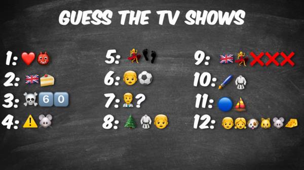
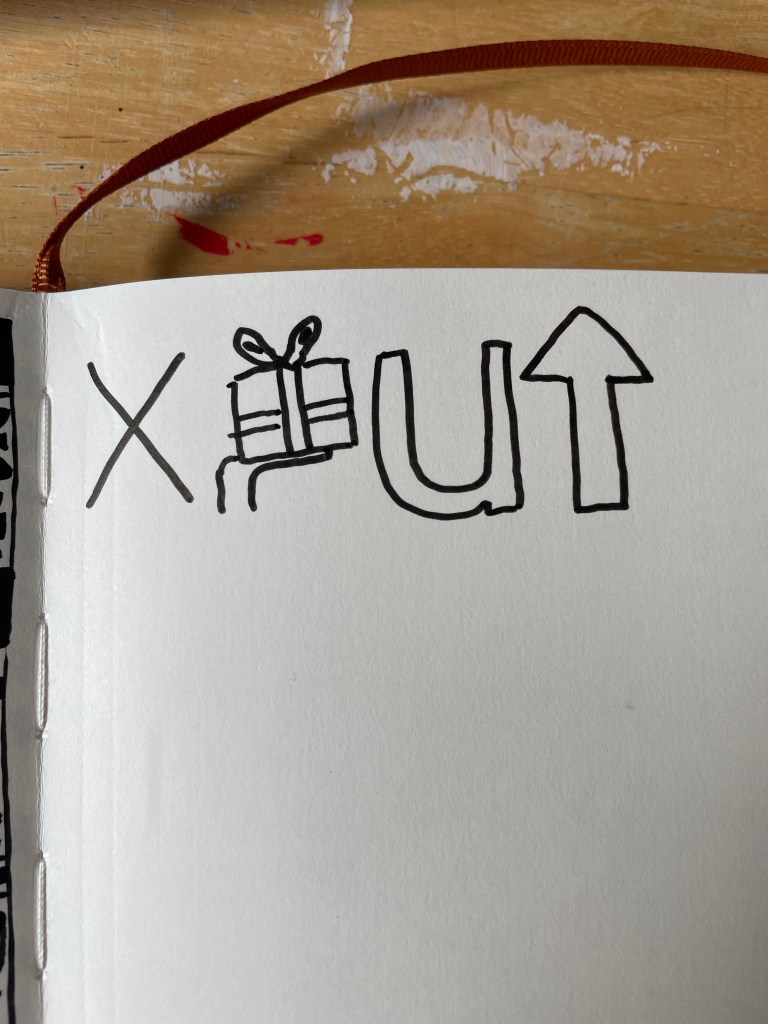
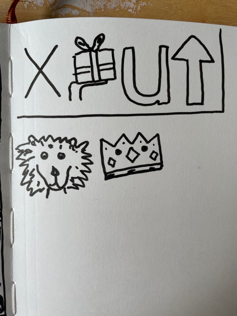
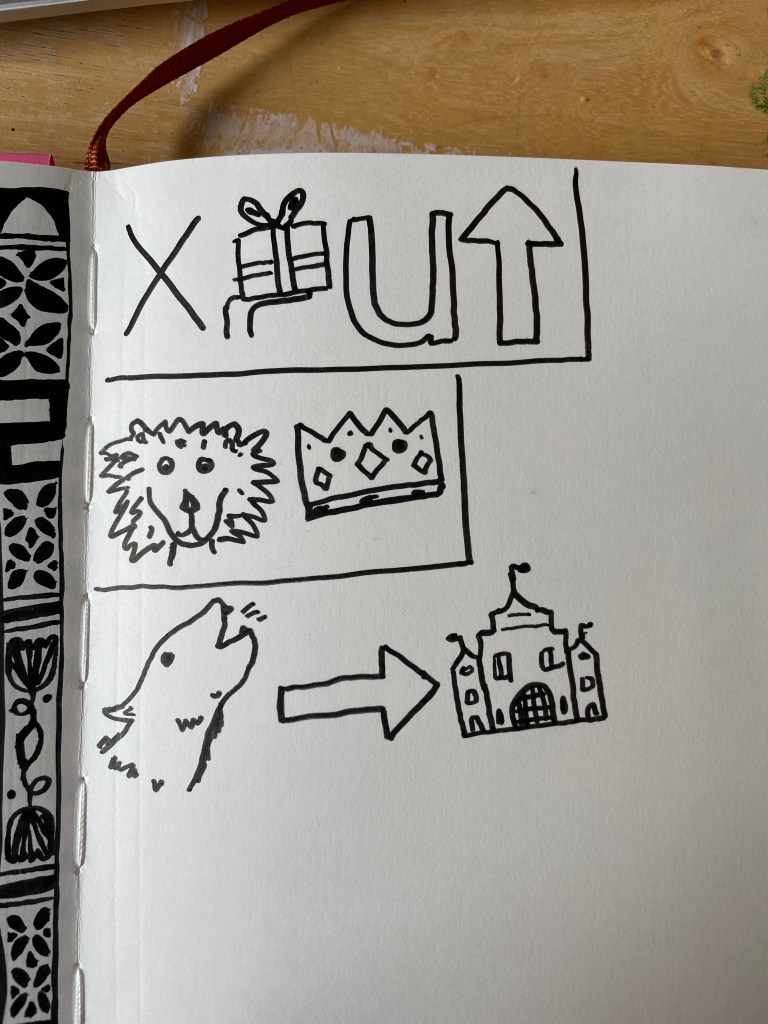
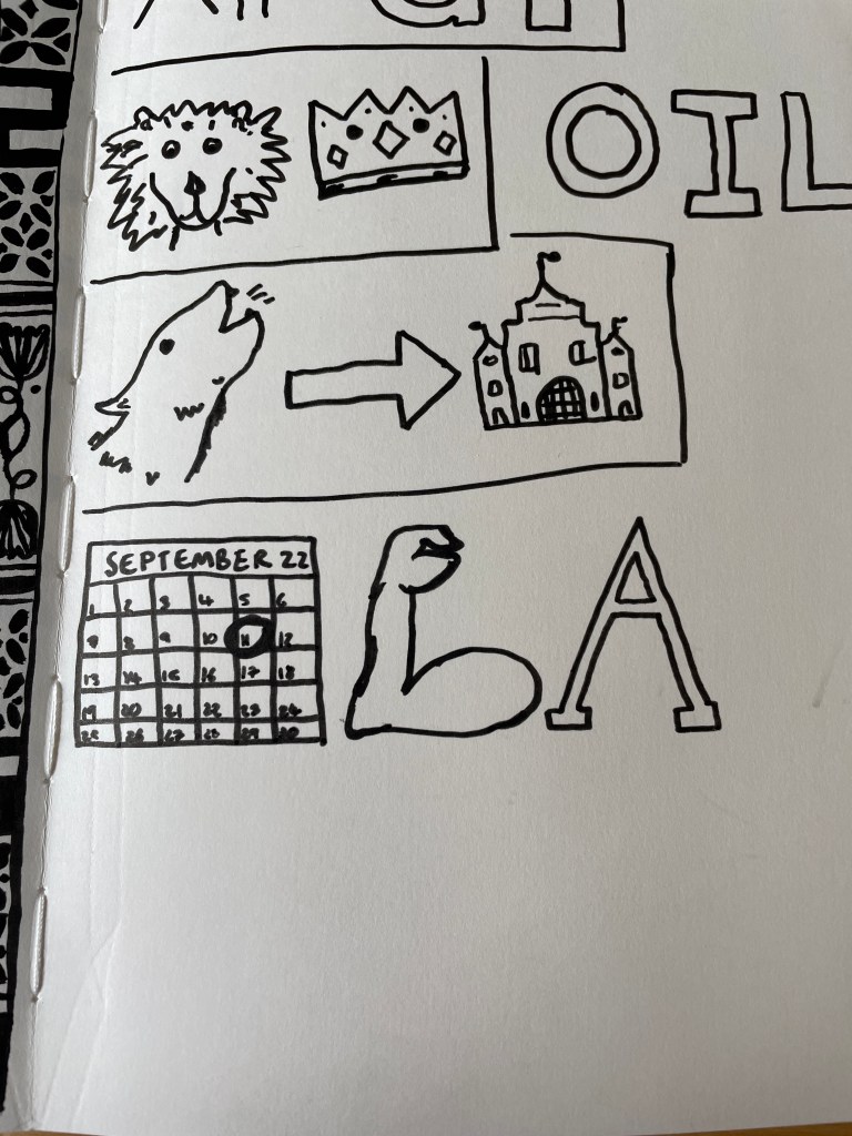
The first exercise for this unit gave me space to practice how to distil an image down to something simple, but still effective at communicating. I was asked to play a game of charades where I communicated the name of an existing media (TV show, film, book, etc) using only drawing. I was not allowed to write and had to use pictures only.
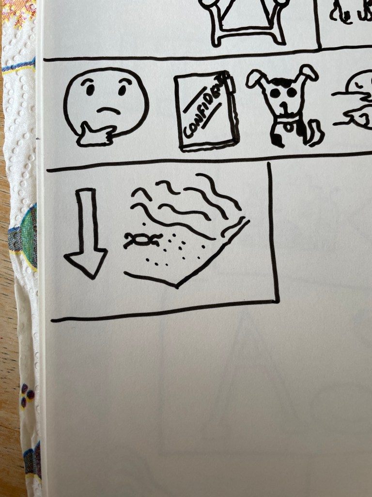
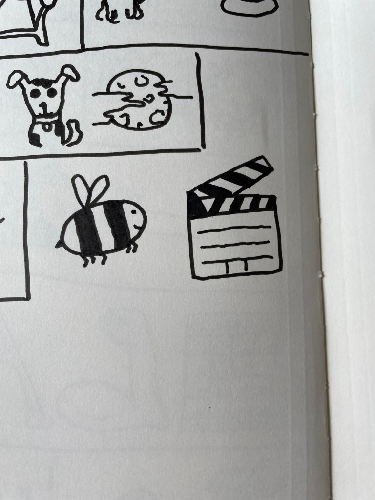
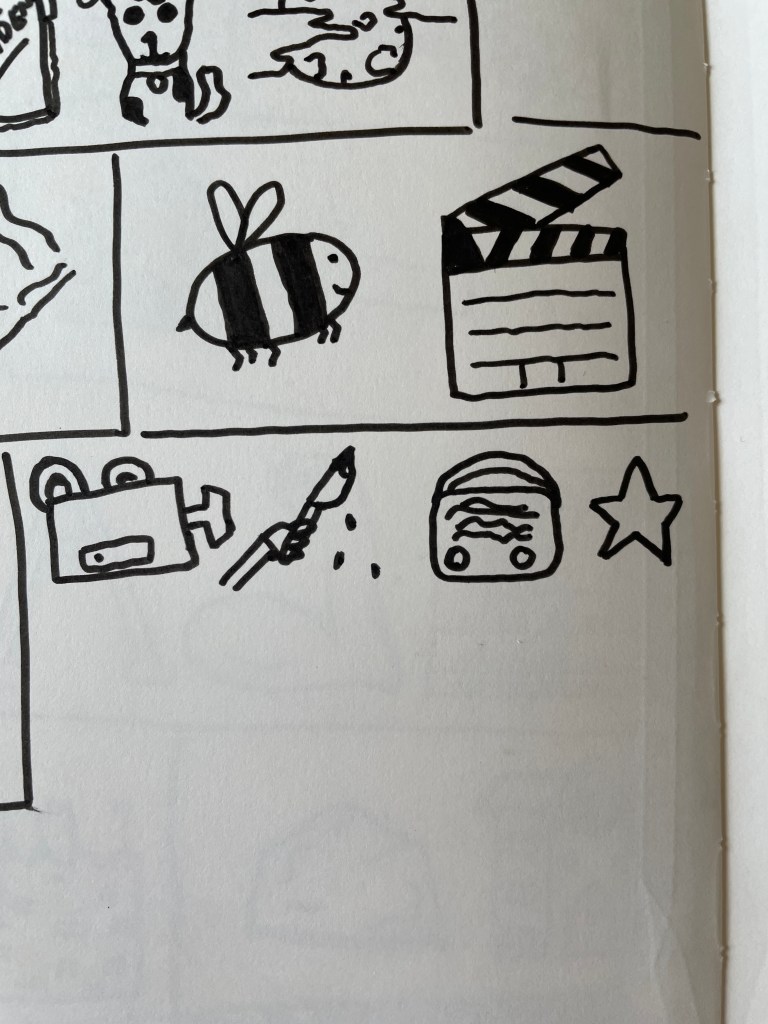
When I read this exercise I was reminded of the emoji riddles that were very popular a few years ago. Each one had a series of clues written in emojis that depicted the title of films, books, TV shows, and more obscure and niche things like the dog breed one below. I had a lot of fun with them at the time and loved seeing how people had figured out how to depict more difficult things – especially with something limited like emojis. Some were more straightforwards – like number 9 of the dog breed image below ‘German Pointer’ – and some were more abstract, like number 2 of the book image, ‘Alice in Wonderland’.
Emoji riddles – found on the BBC website
I didn’t have anyone around to play a more ‘Pictionary’ type version of this game, where I drew whilst being watched and changed what I was doing in response to real-time feedback, so I took a similar approach to the emoji riddles and then sent the images to my friends online. I used a charades generator to suggest media to depict as when faced with all media ever to pick from, I got a bit stuck. I also didn’t always have ideas for things to draw in order to depict the media and wasn’t always certain my friends would have heard of it.
Here are all of the images I drew – can you guess what they are?
My friends largely understood what was being drawn and didn’t have much feedback on what should be changed. I did have it suggested that I should state how many words were in the title of each thing – and whether it’s a TV show, film, book, etc. I started doing this and from there almost all my images were correctly guessed. I really enjoyed figuring out ways to simplify the drawings and get across what I wanted to. It was a good, fun exercise to get started with, as it got me thinking about shape and expression again, and helped loosen me up a bit. I also think it’s just a fun party game, and I’d like to repeat it!
The images above depict (from left to right): – Never Gonna Give You Up (song) – The Lion King (film) – Howl’s Moving Castle (film) – Futurama (TV show) – School of Rock (film) – Game of Thrones (TV show) – The Curious Incident of the Dog in the Nighttime (book) – Cat in the Hat (book) – Under the Sea (song) – Bee movie (film) – Don’t Worry, Be Happy (song) – Video Killed the Radio Star (song)
For the final assignment of Illustration Sketchbooks, I was given a choice between three different briefs. I was asked to generate a new sketchbook based on one of the themes, and to produce a final reflective statement. In the introduction to the assignment, it was made clear that the focus was not on making resolved or finished drawings, but on investigating the illustrative potential of my drawings and sketchbook work. I was asked to look back at my action plan throughout the assignment, using it as an opportunity to show a heightened development of my creative voice. I was encouraged to also try a wide range of approaches, materials, and exercises throughout to realise my goal.
I began by reading through each of the three briefs. I was instantly drawn to option three: Everyday Stories. Option one had an appealing outcome – using previous illustrations in a new context – however, the content itself didn’t appeal to me much. I feel like I’ve spent a lot of time drawing kitchen-related items and foods, and it’s not super exciting for me. Option two was very unappealing as I have realised throughout this unit that reportage is not for me at all. It also, once again, required me to go out into a public place, which isn’t very accessible to me. Option three felt like a broad brief that I could easily work within, considering narrative contexts within my work whilst also exploring the concept of ‘the everyday’ one last time.
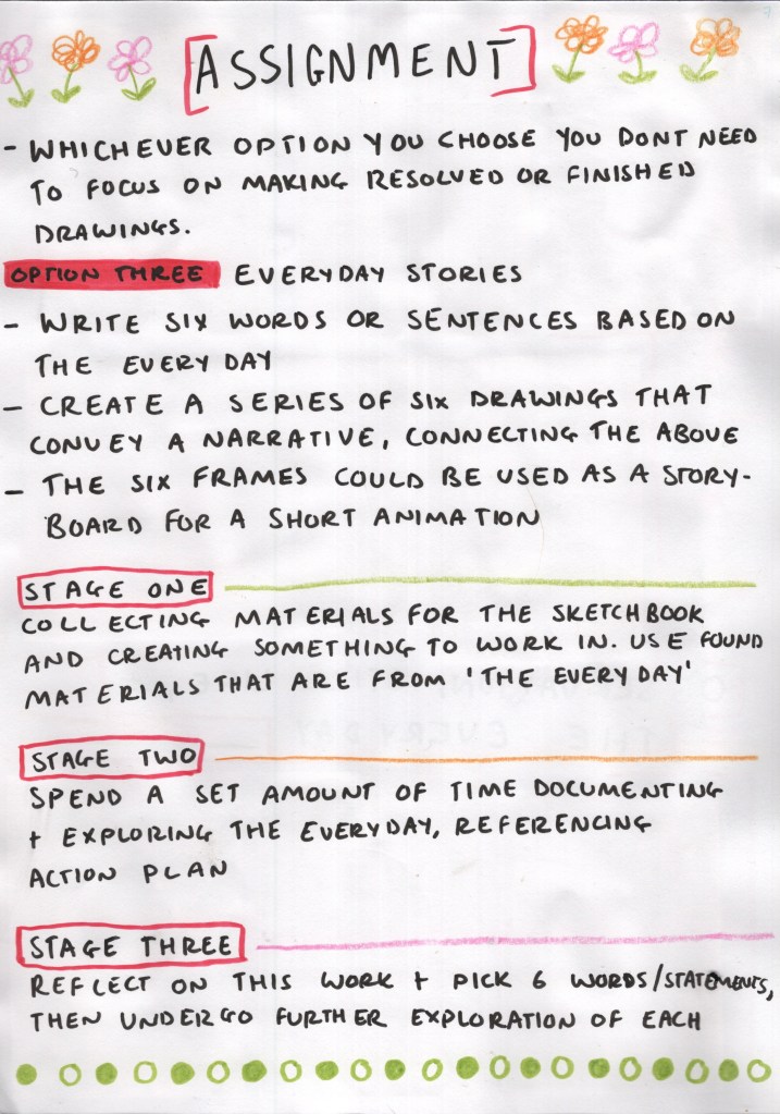
This brief asked me to write six words or sentences based on the everyday, then to create a series of six drawings that convey a narrative by connecting the content from my exploration, or ideas based on one of these phrases. I had to conceptualise these six drawings as if they were ‘key frames’ in a short trailer, video, or animation. I felt this all fit in well with my action plan and goals as an illustrator, as well as what I have enjoyed throughout this unit.
My plan for Assignment 5
I considered how I would approach this brief and wrote out a preliminary plan. I didn’t want to dive straight in with my six words, and instead wanted some time to document some everyday experiences, which I could then reflect on and pick words that I felt resonated with the theme. From there, I would then be able to create the six drawings. The plan had five stages to it:
Stage One – I would collect materials for my sketchbook as my action plan stated I want to make my own for this project. These materials would be ‘everyday’ items that I could create something visually engaging with.
Stage Two – I would spend a set amount of time documenting and exploring the everyday whilst referencing my action plan, approaching it almost like a visual diary.
Stage Three – I would pause, reflect on the work made so far, and consider 6 words or statements to undergo further exploration of.
Stage Four – I would revisit previous work, consider how to make use of it in my final illustrations, and start planning and designing the final images.
Stage Five – I would complete six drawings, either fully illustrated or mock-up/thumbnailed.
I felt confident and happy with my plan and was excited to get started with making my sketchbook.
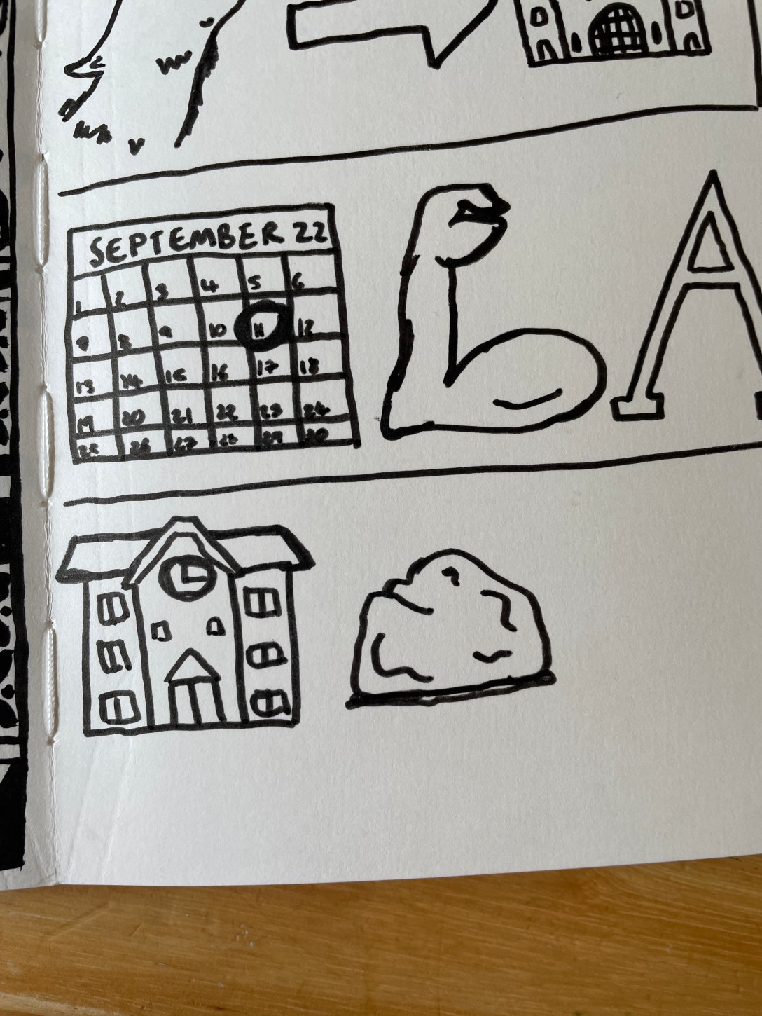
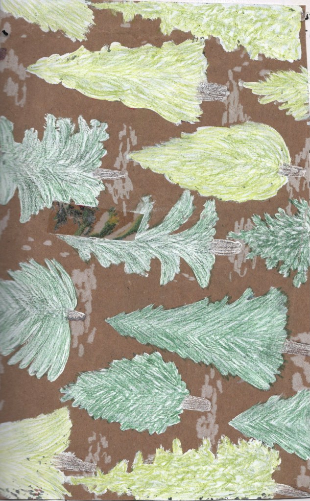
Stage One – Making a Sketchbook
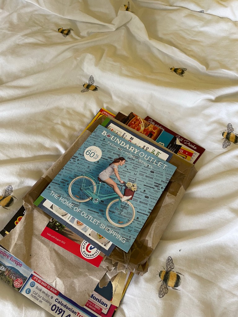
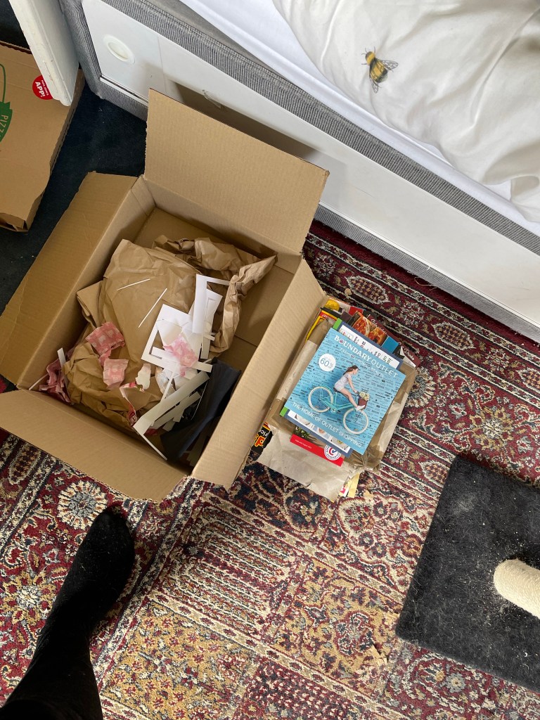
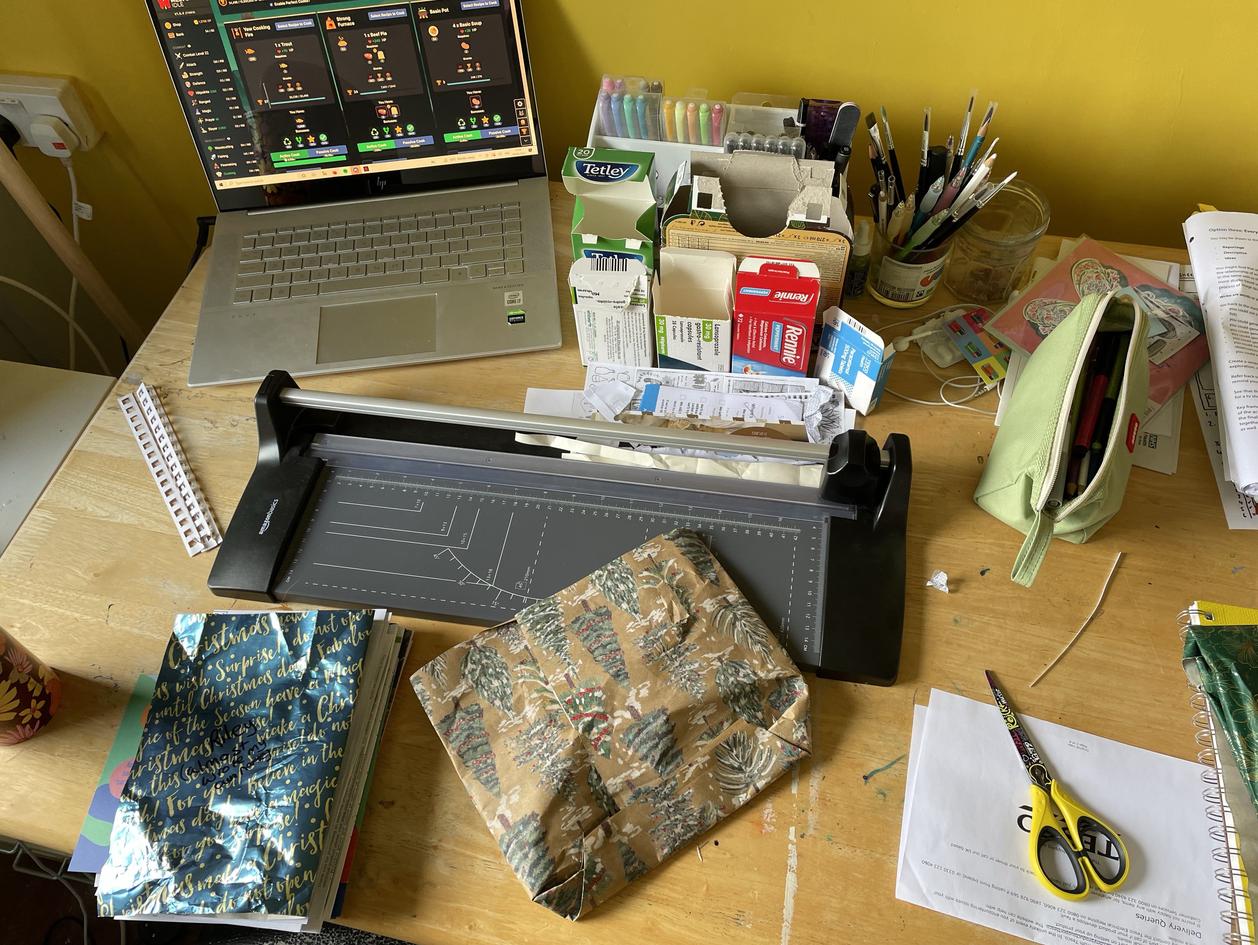
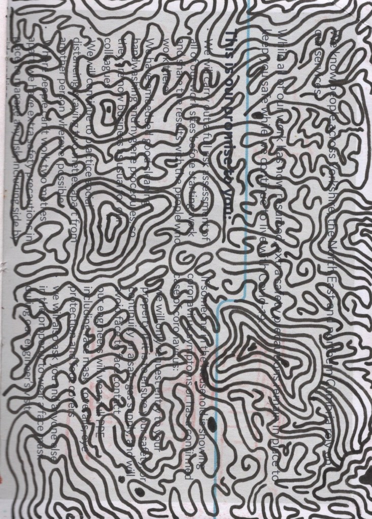
I wanted my sketchbook to show snippets of my everyday life and to be almost a collage of pages from throughout. I began by going into each room in my home and looking for pieces of paper that I could include – advertisements, bills, envelopes, wrapping paper, newspaper, anything that I could possibly draw on. I then brought all of it into my studio to sift through. My focus initially was on paper quality, being mindful of the materials I wanted to use throughout the assignment. If the paper was too glossy, too thin, or too crinkled, I discarded it. I then started considering the content of the paper – is it too busy? Could I actually add to it? Anything that felt cluttered or impossible to work on got discarded, too.
Collecting, sorting, and organising papers
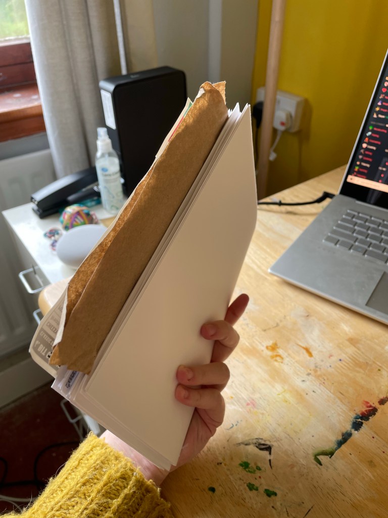
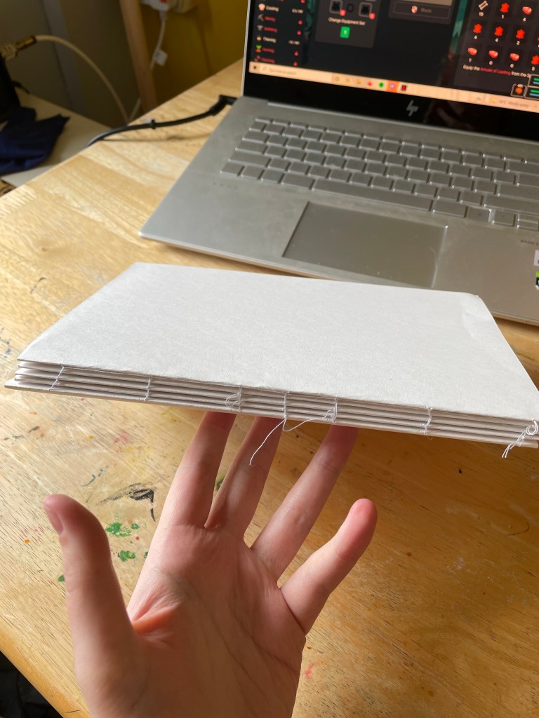
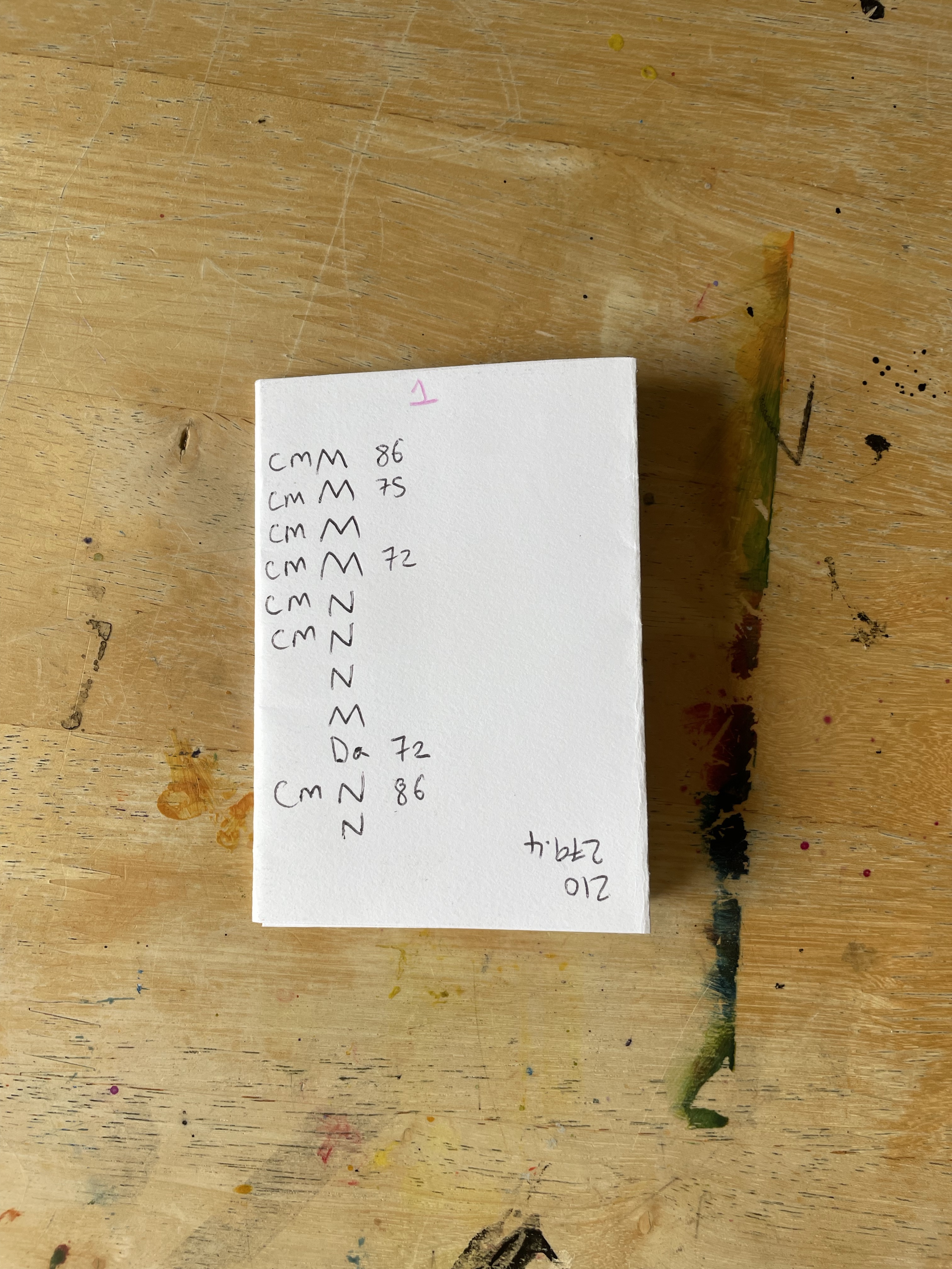
Next, I began cutting all of the paper to size. I added some plain mixed media paper to my stack, as I felt it would be important to have alongside the recycled found materials. This acted as a guide for the rest of my pages. Once all of the paper was folded and cut, I began sorting it into signatures. Each signature had one large piece of mixed media paper holding the rest, followed by a mix of recycled paper and smaller mixed media paper. There were a total of 48 pages across 4 signatures. I then decided to add a signature of just mixed media paper at the back of the book, conscious of the fact I will be going back over my work and redoing it, which I will likely want plain paper for.
I then marked guidelines for stitching on each page and began to sew my signatures together. This was harder than previous bookmaking experiences, as all of the paper was slightly different sizes, in different places, and organised in a slightly chaotic manner. However, its natural imperfection was also helpful, as it made me feel less pressured to get it right. It didn’t really matter if the stitching and binding were messed up – the whole sketchbook already felt like a hodgepodge of stuff. Once stitched, I applied glue to the spine and added paper to secure it. I left it in a press overnight to let the glue set, and I began working on the cover.
Organising paper into signatures, then stitching
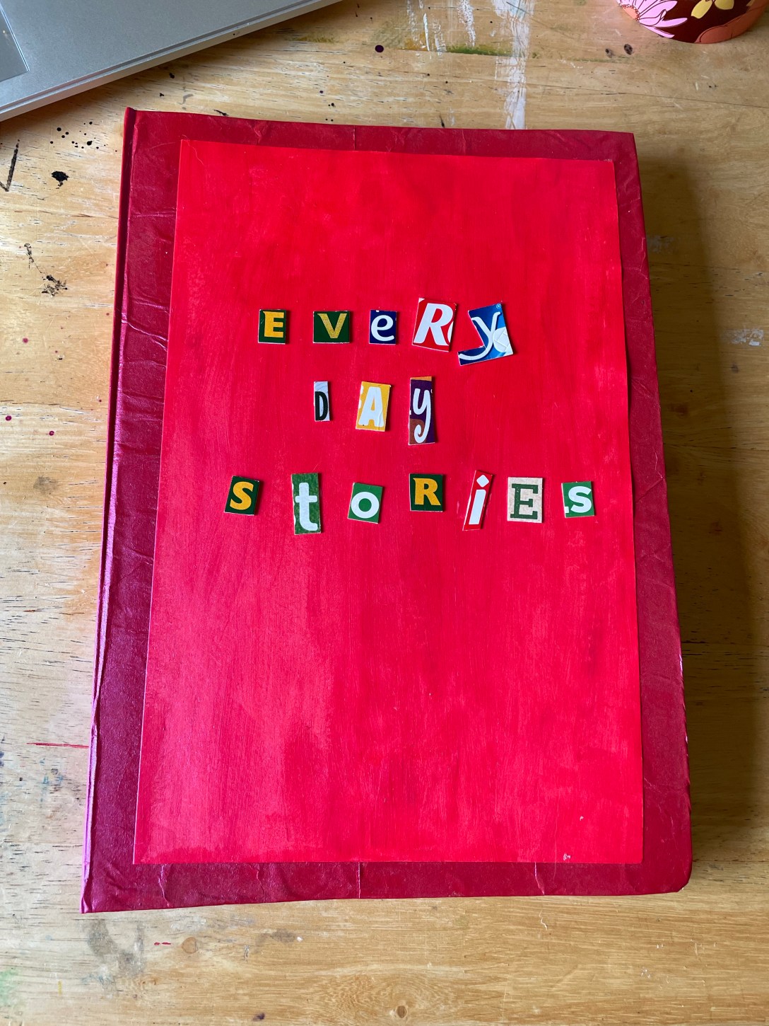
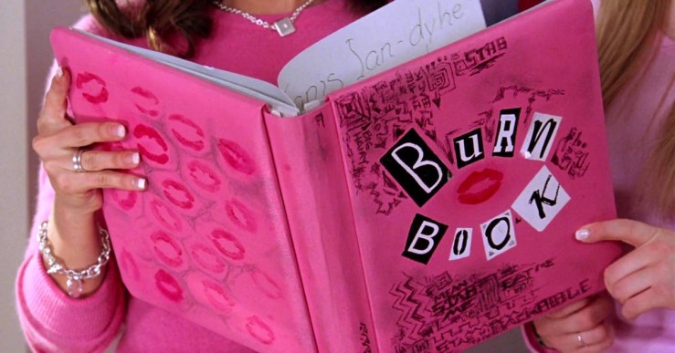
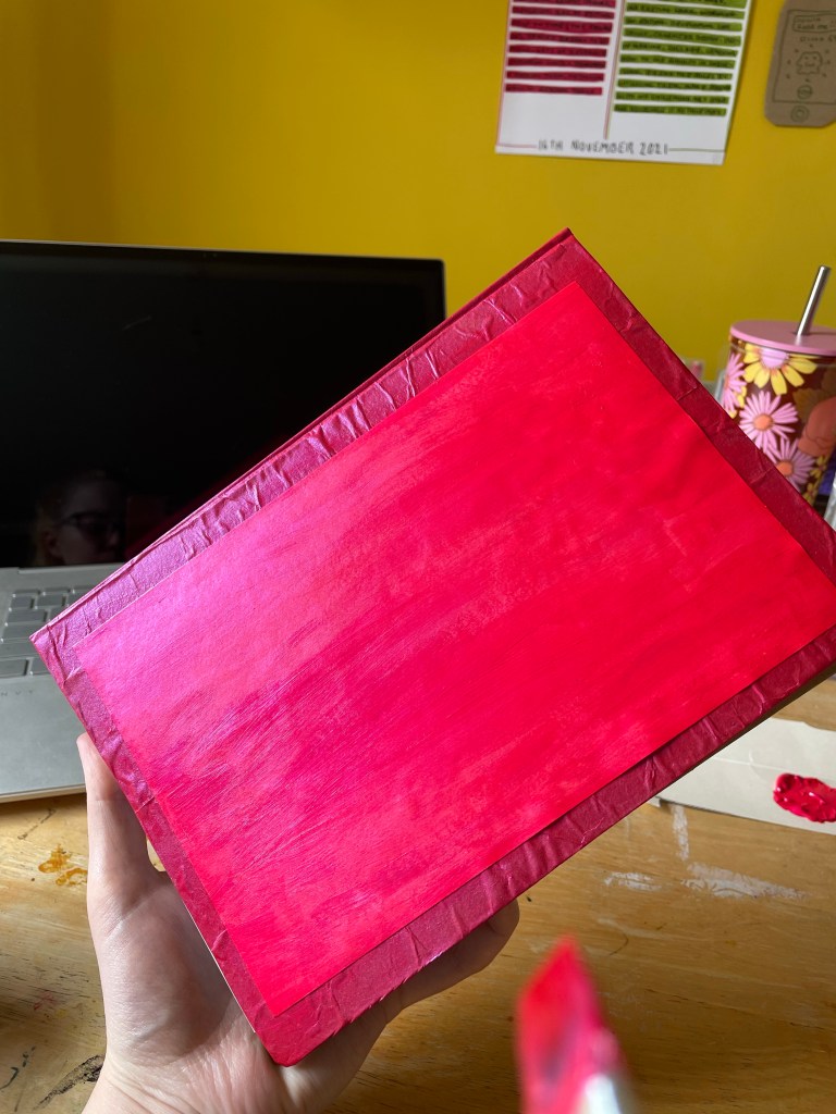
I used a weaker cardboard than I usually would to make the cover, as I wanted something a little less bulky. I was already making quite a large and eclectic sketchbook, adding to this with weight felt like a mistake. I cut two panels for the front and back, and a panel for the spine. I then wrapped them in a layer of brown paper I had lying around from a package I received, and left it to dry overnight. The next morning, I painted the cover with neon metallic acrylic paint. There was no reason for this other than ‘I felt like it was right’. I was just drawn to the paint and colour for this sketchbook. When I was painting it, I was reminded of the ‘burn book’ from the movie Mean Girls and decided it would be fun to continue leaning in that direction.
The Mean Girls ‘Burn Book’
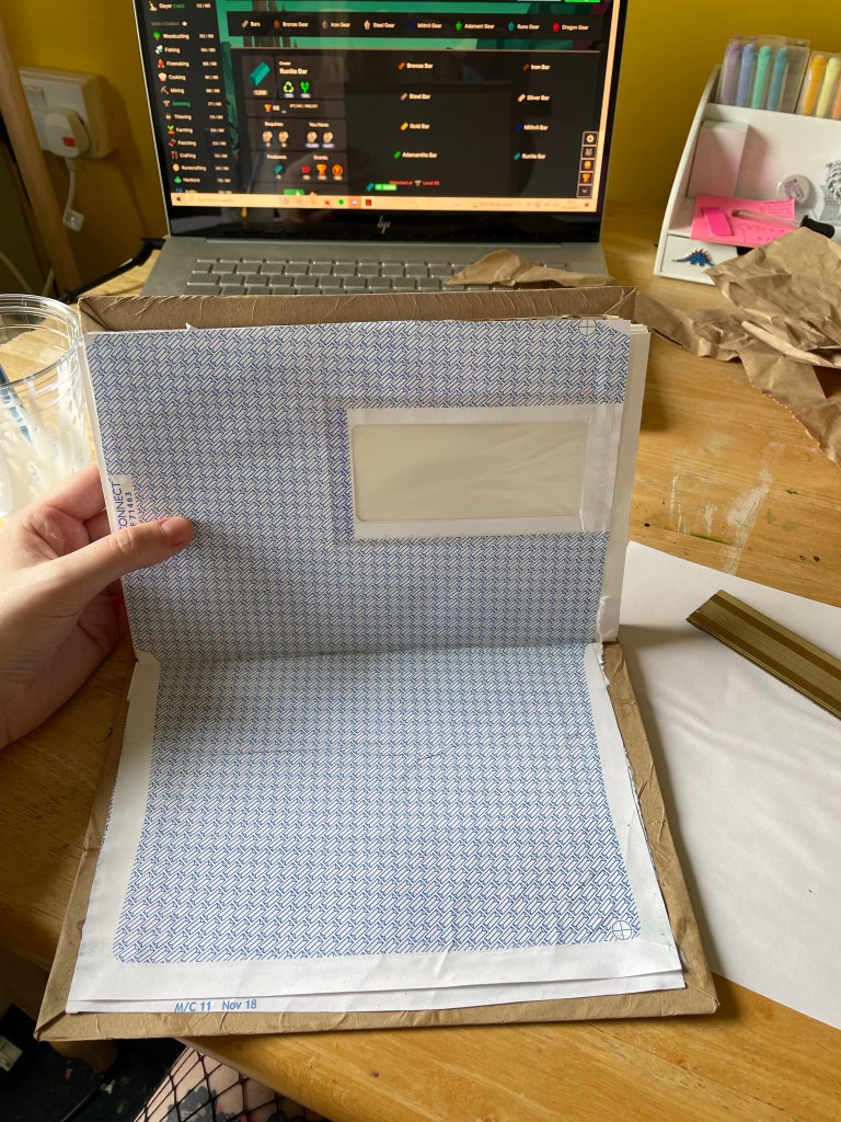
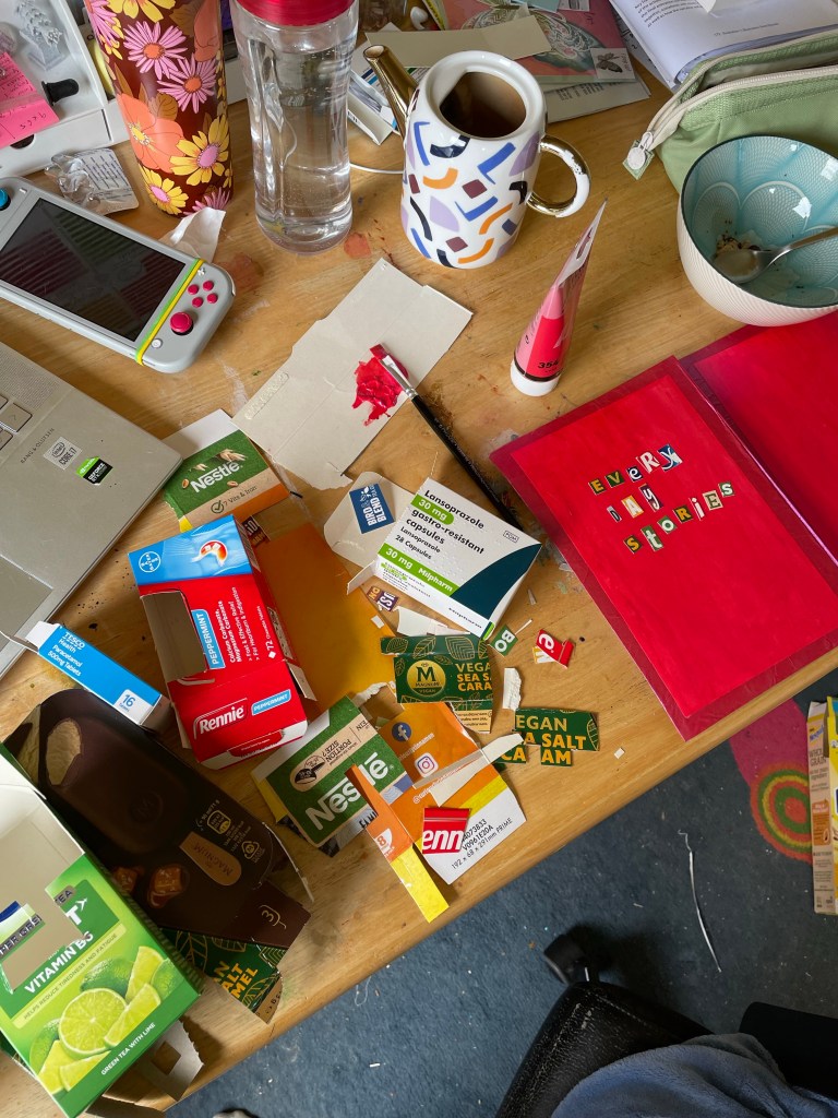
I used two envelopes to attach the book to the cover – one on each end of the book. There are envelopes scattered all over my house as I keep them around for when I just need to scribble something down that isn’t important enough for a notebook, requires speed, or for doodling. This is such a big part of my everyday, I had to include them throughout my sketchbook in staple ways!
Decorating the cover and attaching it to the book
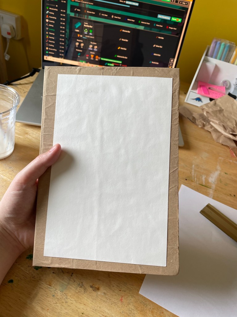
The book then went back into a press overnight, and once dry I added some text on the front cover. This isn’t something I normally am drawn to doing, however it was in keeping with my ‘burn book’ theme. I went through all of the cardboard I had gathered in my initial collection of potential pages and cut out all of the letters. I am so happy with how this looks – and so excited about the sketchbook as a whole. Everything about it from the pages used to make it, to the colour and lettering on the front. I had so much fun making the sketchbook!
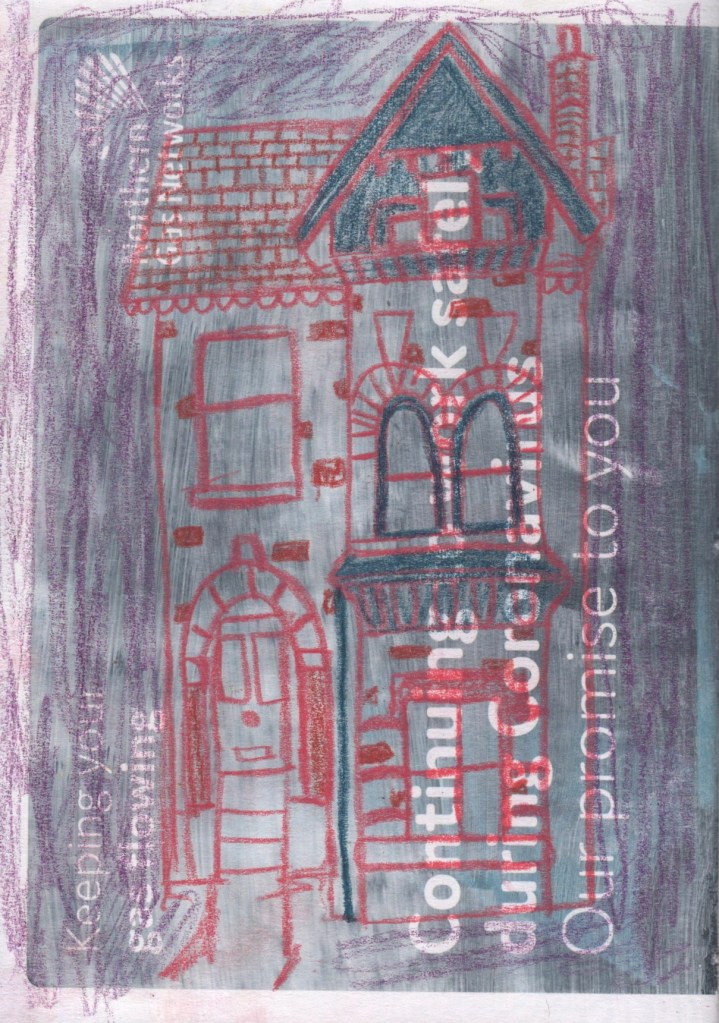
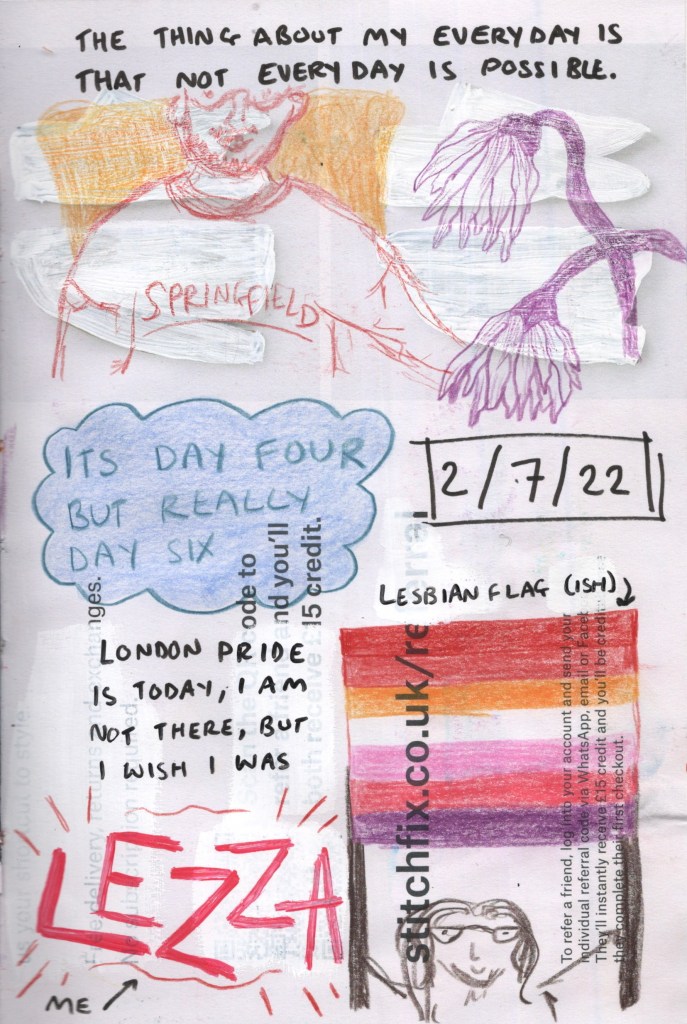
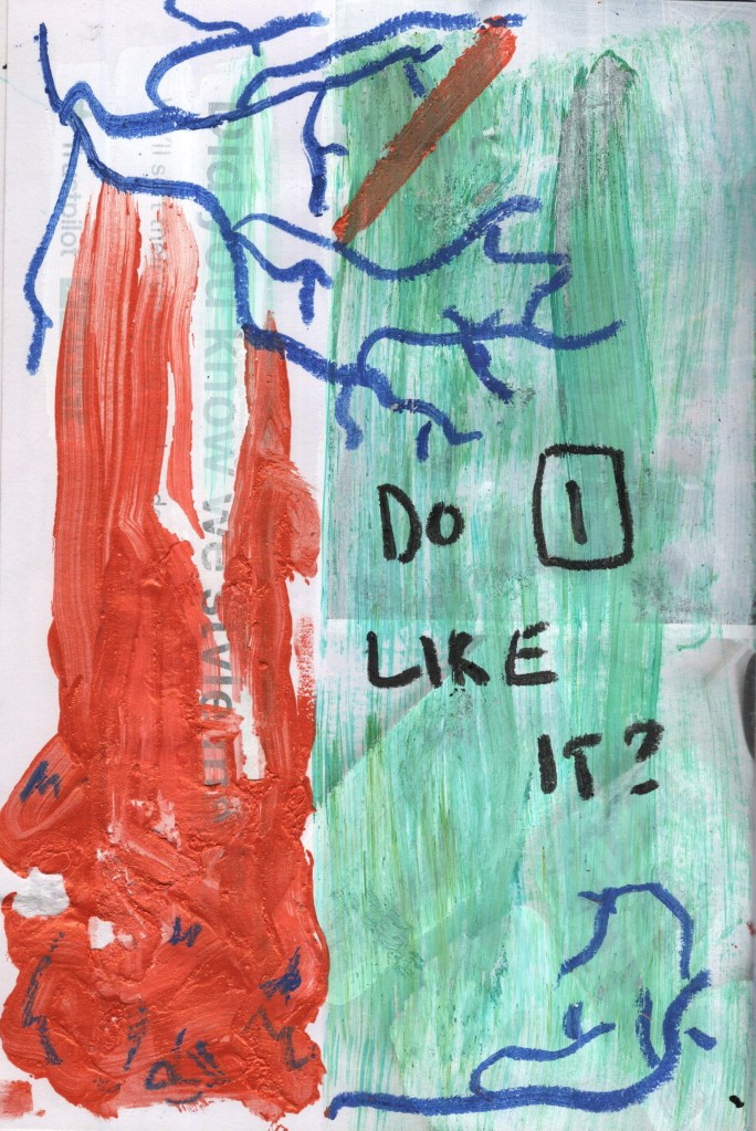
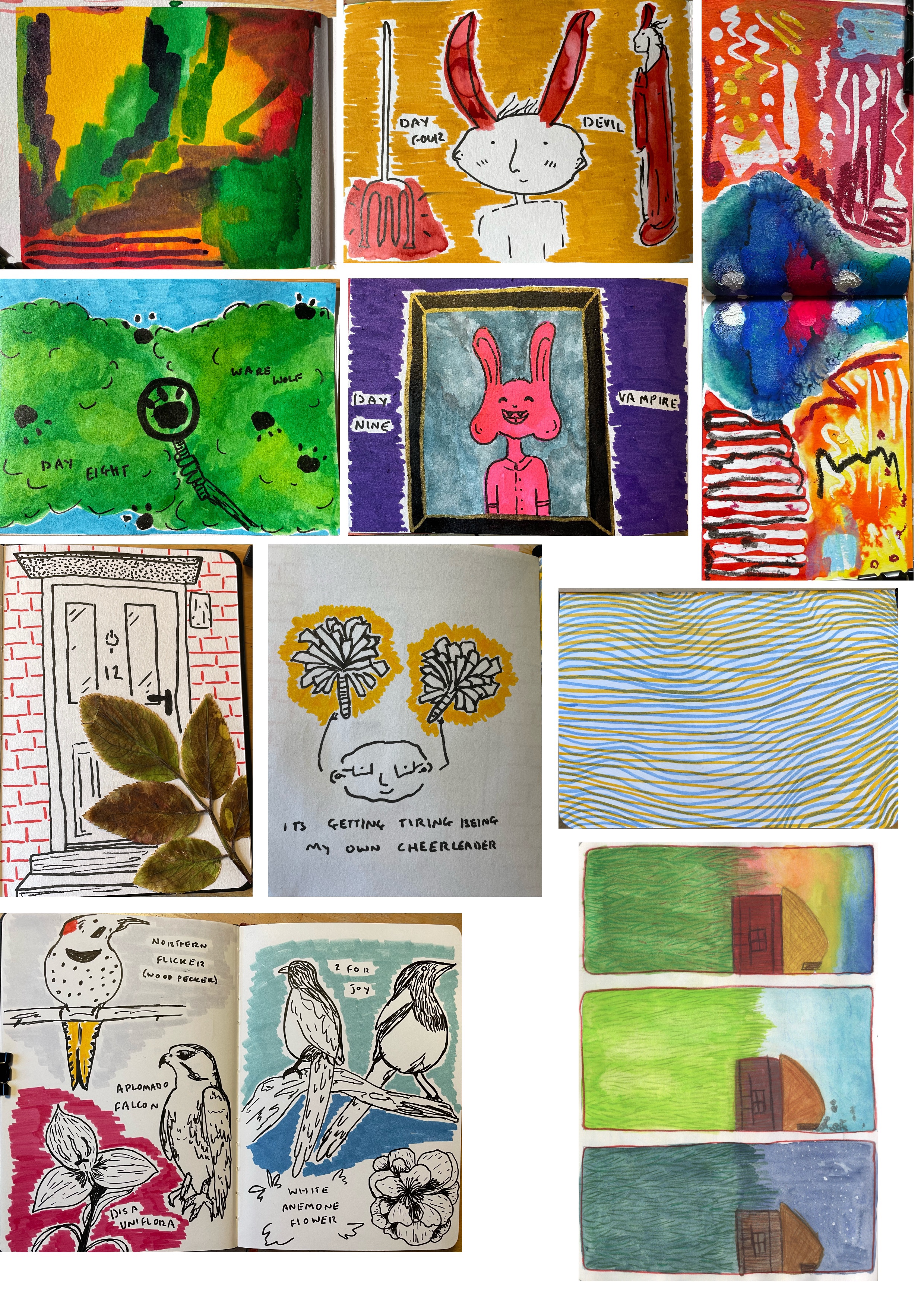
Stage Two – Visual Diary
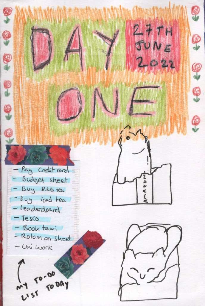
Now that my sketchbook was complete, I could begin with stage two of my plan. I decided to spend 10 days working on my visual diary, planning to fill at least one page every day in that time frame. This ended up being a big struggle. My health is very unpredictable at the minute, and it got in the way of my ability to make art on several days. This started to impact my process and my attitude towards the project.
I started out by doing a page each day introducing the day itself. As time went on, I stopped doing this, as it was making me feel demotivated seeing that I wasn’t able to keep up with my intentions. I also felt it was ‘showing’ that I was ‘failing’. I started to feel quite demotivated as time progressed, as trying to engage with my sketchbook felt like a reminder of how unwell I am and all of the difficult feelings I have concerning that.
Pages from my visual diary
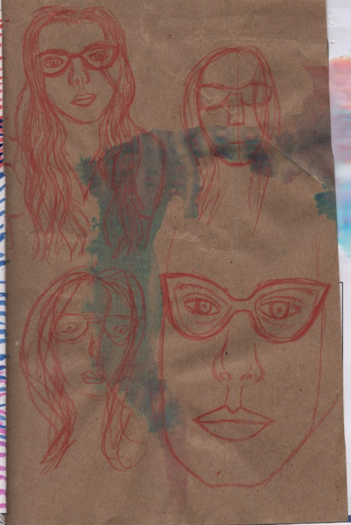
Despite the difficulties, I had a lot of fun with this part of the assignment. Finding ways to interact with the different papers was very interesting and often the paper itself inspired me to create. I found that some of the papers weren’t great to work on, though, mostly because there was too much writing or pictures on the page already. On some pages, I painted over these areas with white ink or acrylic paint, but for others, I just skipped the page as trying to find a way to work with what was already there felt stressful. The skipped pages still add a lot to the sketchbook and communicate things about my everyday, which is a bonus of making a book like this.
I tried to work through my action plan, using a wide range of materials and exploring different approaches. I studied some artists – Cy Twombly and Ed Ruscha, as well as being inspired by Michel Majerus. This also helped me achieve the goal of ‘having fun, letting go, and being loose’. I don’t feel like I achieved ‘drawing happy things’ as much as I would’ve liked, but I was still happy with my drawings. I practised some rapid still-life sketching, and managed to use all of my target mediums.
There were a few exercises I didn’t repeat – such as drawing from movies and setting timers to draw when they go off. I also didn’t feel like my output was ‘enough’ for the 10 days I had worked within. I felt a little bit directionless, hopeless, and frustrated at the end of stage two. One goal I achieved consistently was expressing my thoughts more, and on one of the last pages I opened up about these feelings, and about my relationship with my sketchbook.
I feel a little bit like I’m swimming upstream at the minute, and this was made clear in my assignment approach. I just felt so disengaged. It’s hard when you’re exploring something excitedly and then have to stop for two days because you aren’t well enough to sit upright. Coming back to it just felt daunting, and like a reminder of all I can’t achieve. It was a difficult process.
Towards the end of my visual diary, I began thinking about stage three and the context of my work, the theme of the everyday, and how I could turn this into something tangible. I was reflecting on the year I’ve had, the experiences I’ve been through, and how they’ve shaped my abilities as an artist and my approach to both sketchbooking and illustration in general. I wrote some of my thoughts down one night whilst struggling with where I would go next and, once again, feeling like I just hate this unit.
Stage Three – Reflection
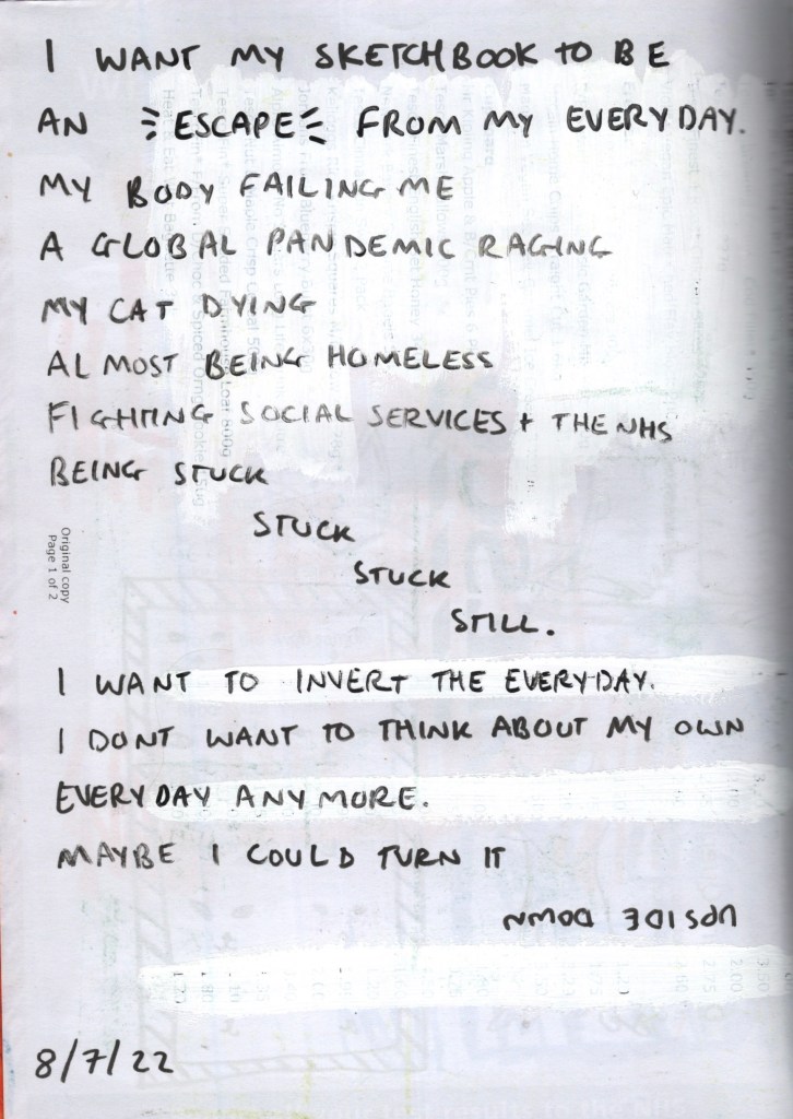
This naturally led me into stage three, as I was already reflecting and processing where I wanted to go next. The writing I had done at the end of my visual diary was really helpful for summing up and contextualising my issue with the assignment, the unit, and having to focus so much on my day-to-day life. It helped me see what I actually want my sketchbook to be in a much clearer way – an escape from the slightly depressing experiences in my every day, and a place I can let go.
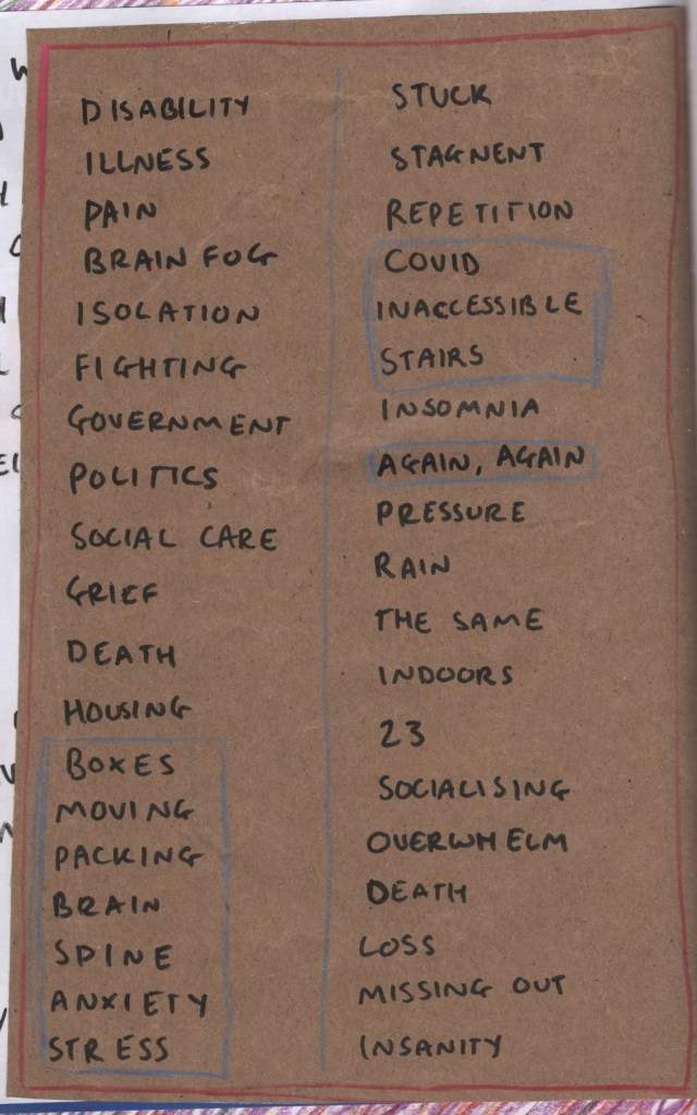
I decided to write down all of the words I could think of that were connected to the way I was feeling – the dread, emptiness, and negativity. I try hard to avoid this in my artwork, and especially in uni work, as I feel it’s somewhat taboo or inappropriate. I try to be positive as much as I possibly can, but with such self-focussed projects, it’s hard to keep it up. Even just putting this on paper was helpful, it felt like I was being honest and owning up to where I was at. It was also helping me figure out what I could do for my final images.
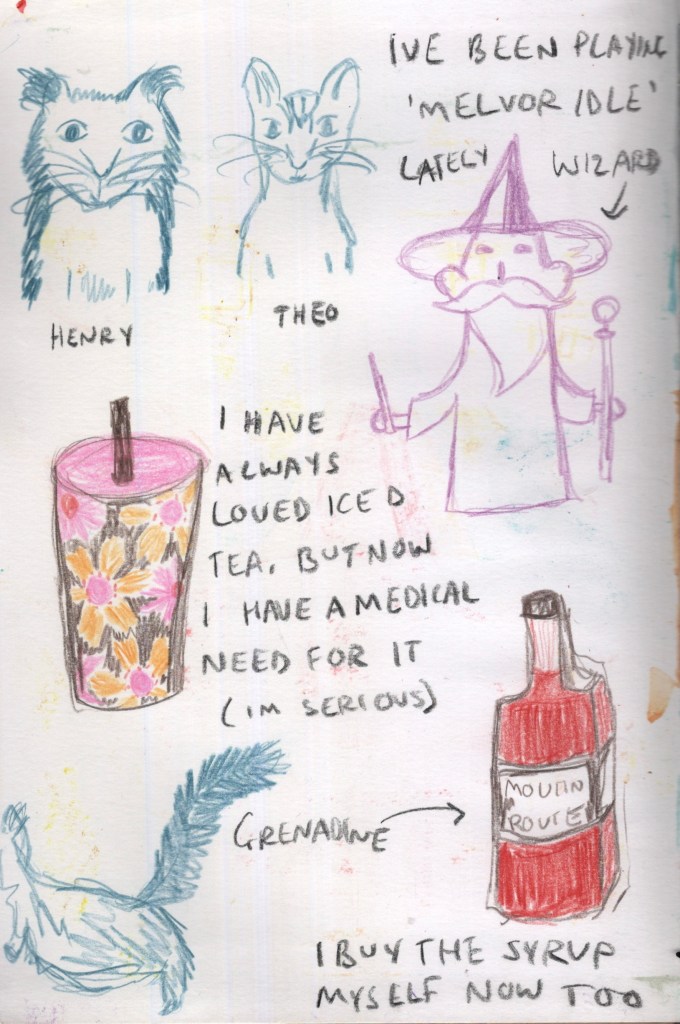
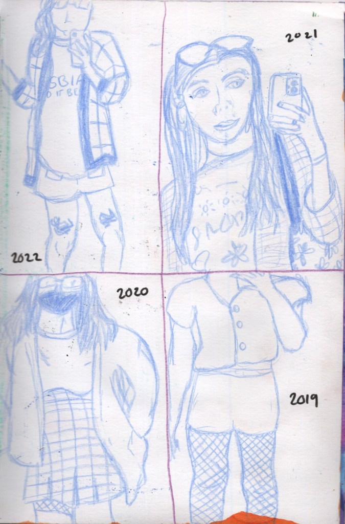
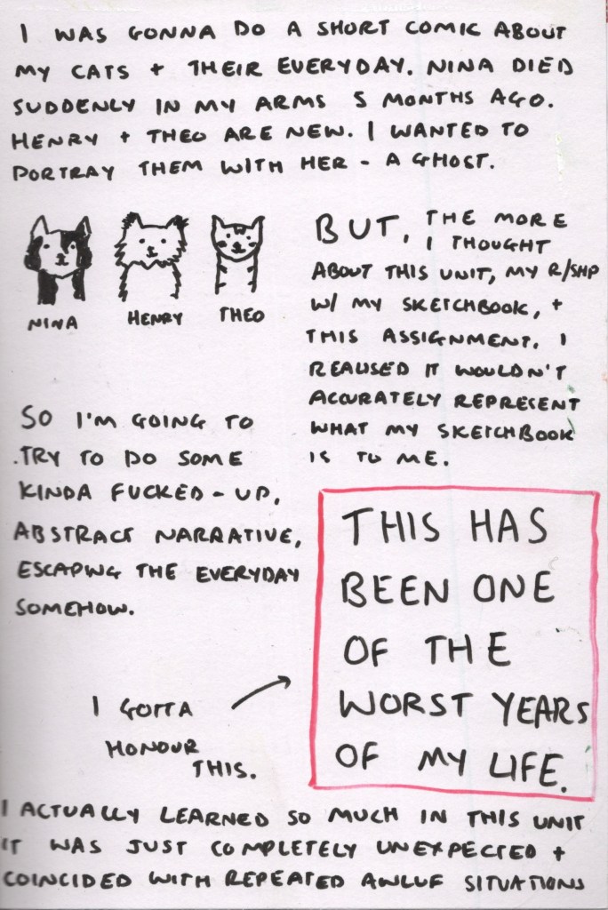
The idea I had originally when I started reflecting on the work produced so far and the assignment theme was focused on the routines I have in my life and how my cats are involved in them. My cat, Nina, unexpectedly died in February, and I have since adopted two new cats – Henry and Theo. I feel somehow their lives are woven together despite them never crossing paths, and I wanted to illustrate a short comic showing areas of our routine with Nina still there as a ghost-like creature. However, after having thought more about it, my relationship with my sketchbook, and the whole purpose of this final assignment, I changed my mind.
My ‘everyday’ words, and some thoughts on the project
After getting everything out, and thinking about how I can utilise the work created in my sketchbook, I went back to my list of words. I stared at the page for quite some time, seeing which words could be paired together, which ones jumped out at me, and which felt meaningful. I then circled groups that were inspiring me, ready for the final stages of the assignment. I had three groups: ‘Boxes, Moving, Packing, Brain, Spine, Anxiety, Stress’, ‘COVID, Inaccessible, Stairs’, and ‘Again, Again’.
Stage Four – Ideas and Planning
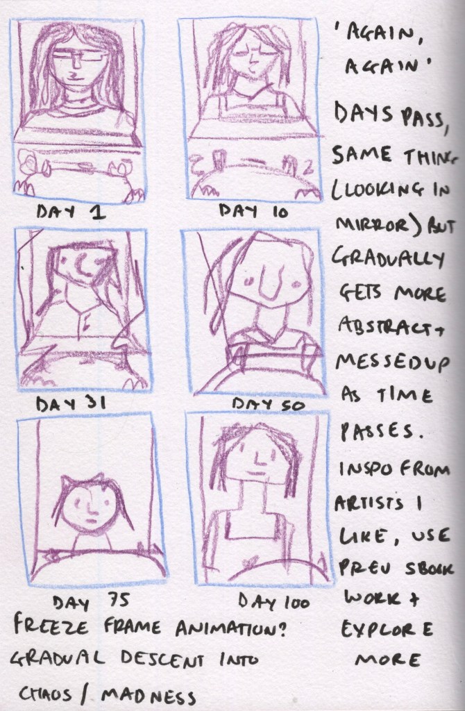
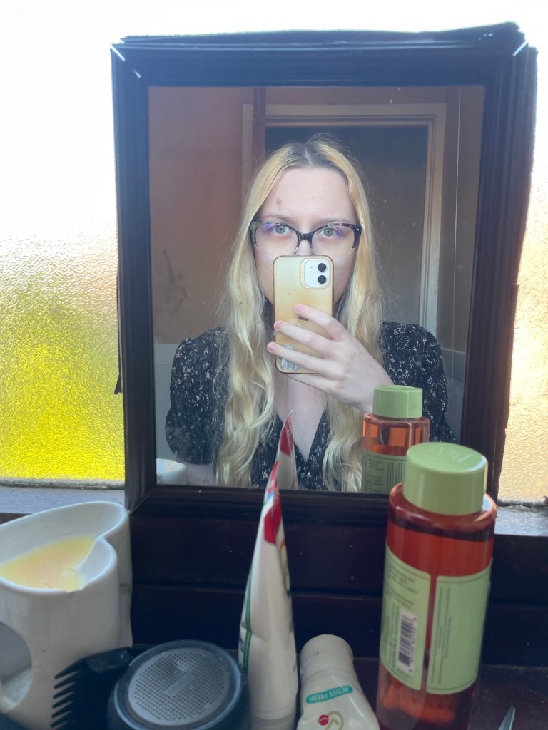
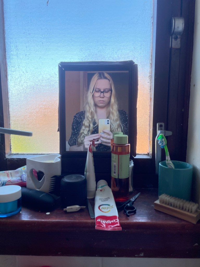
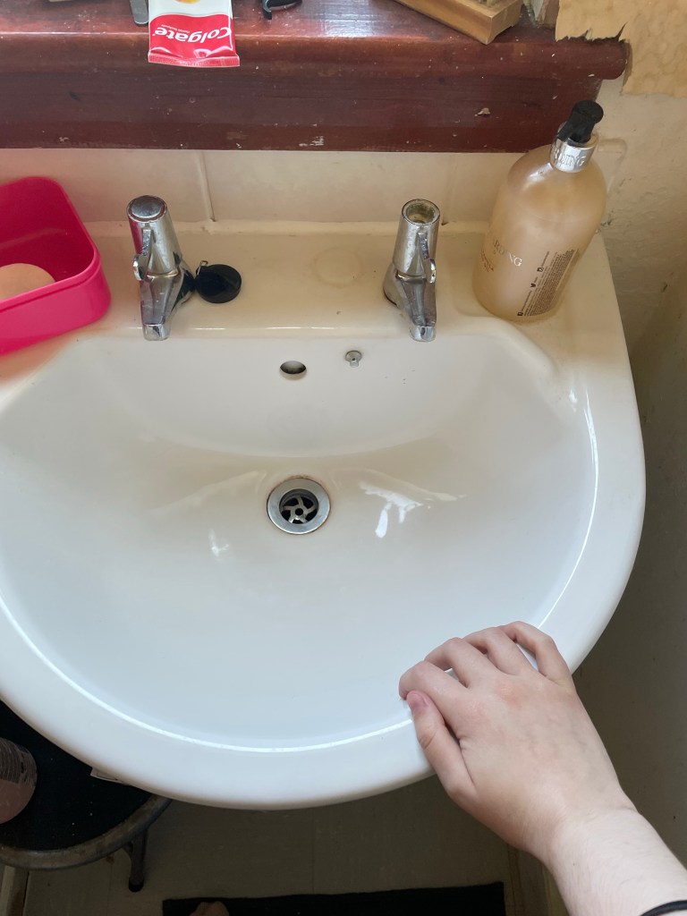
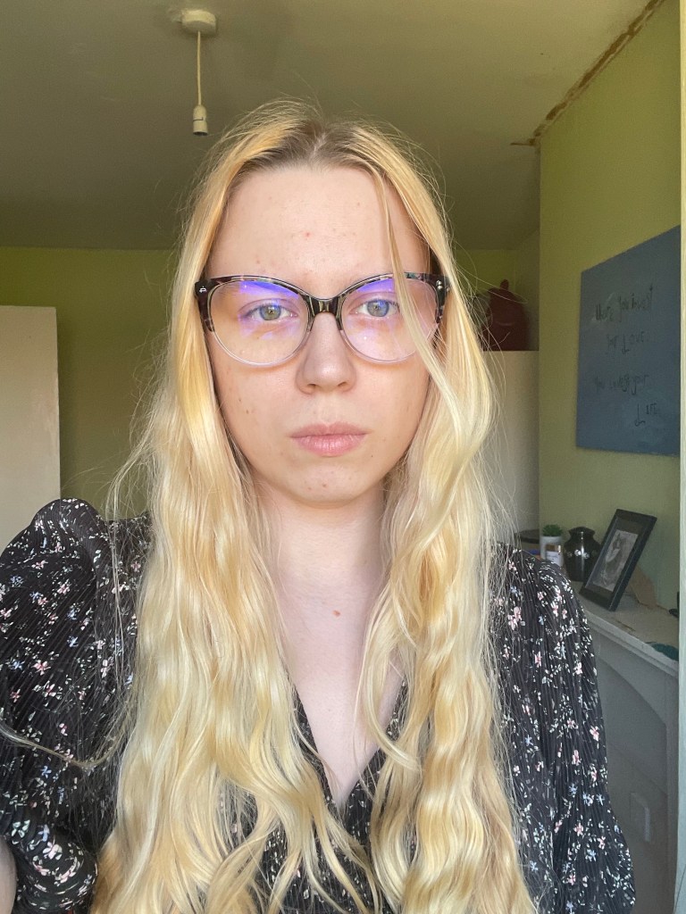
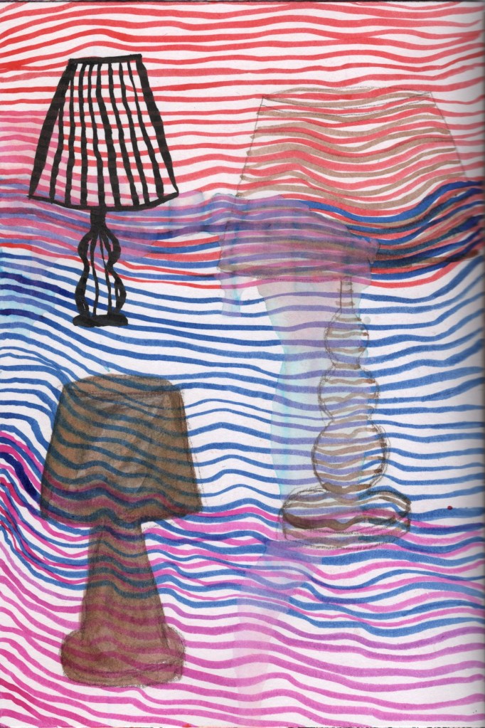
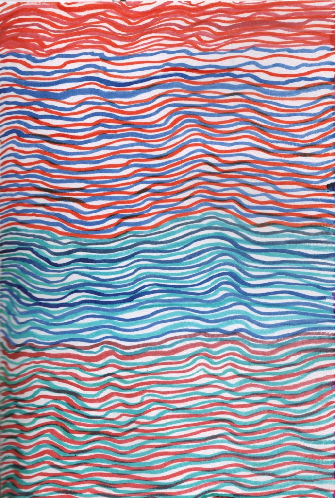
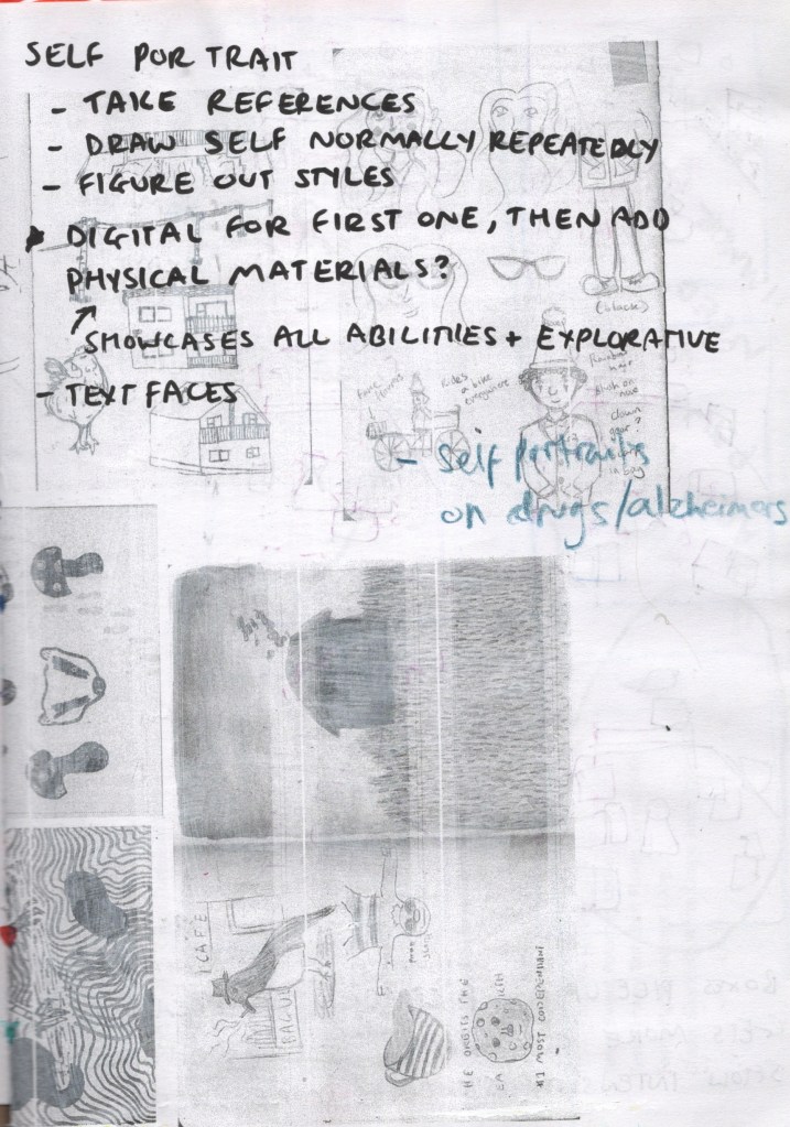
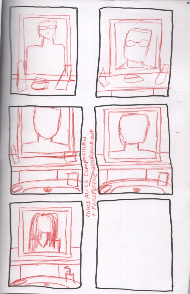
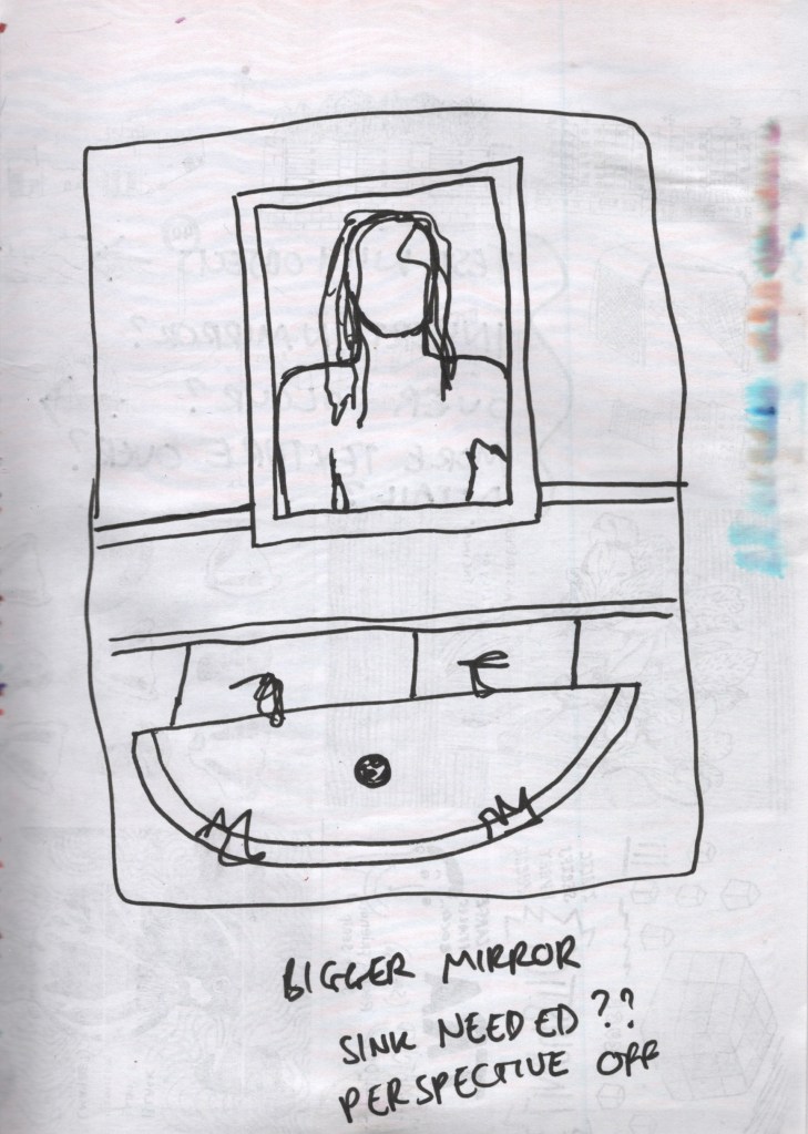
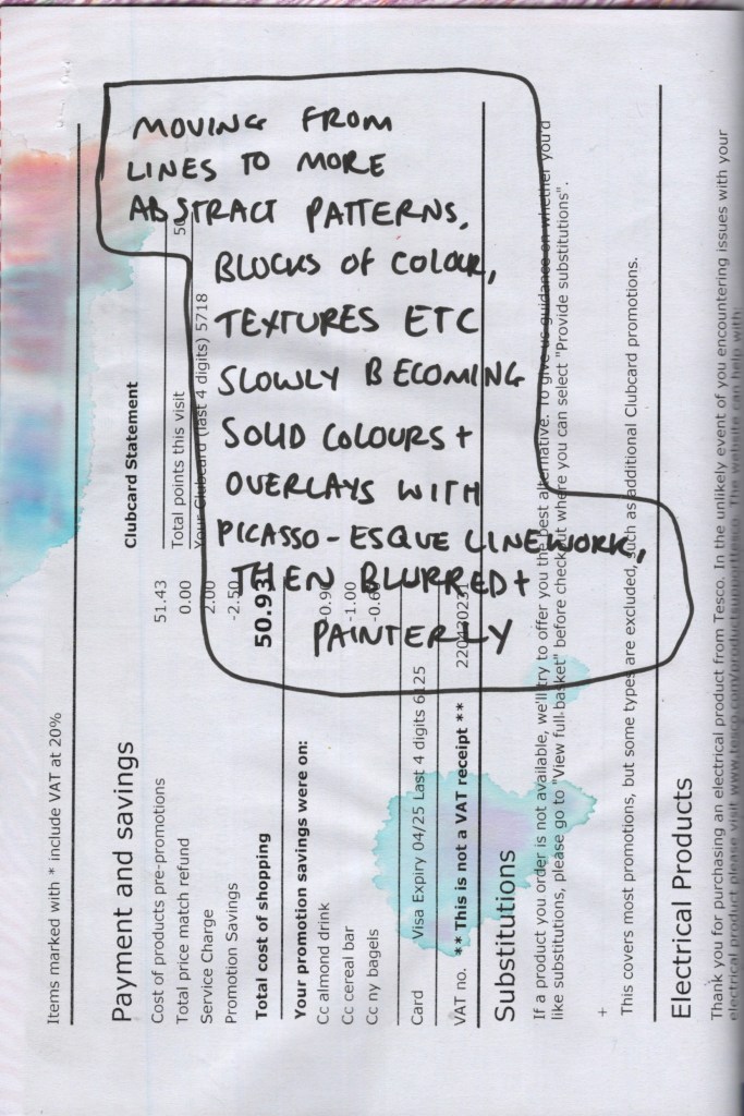
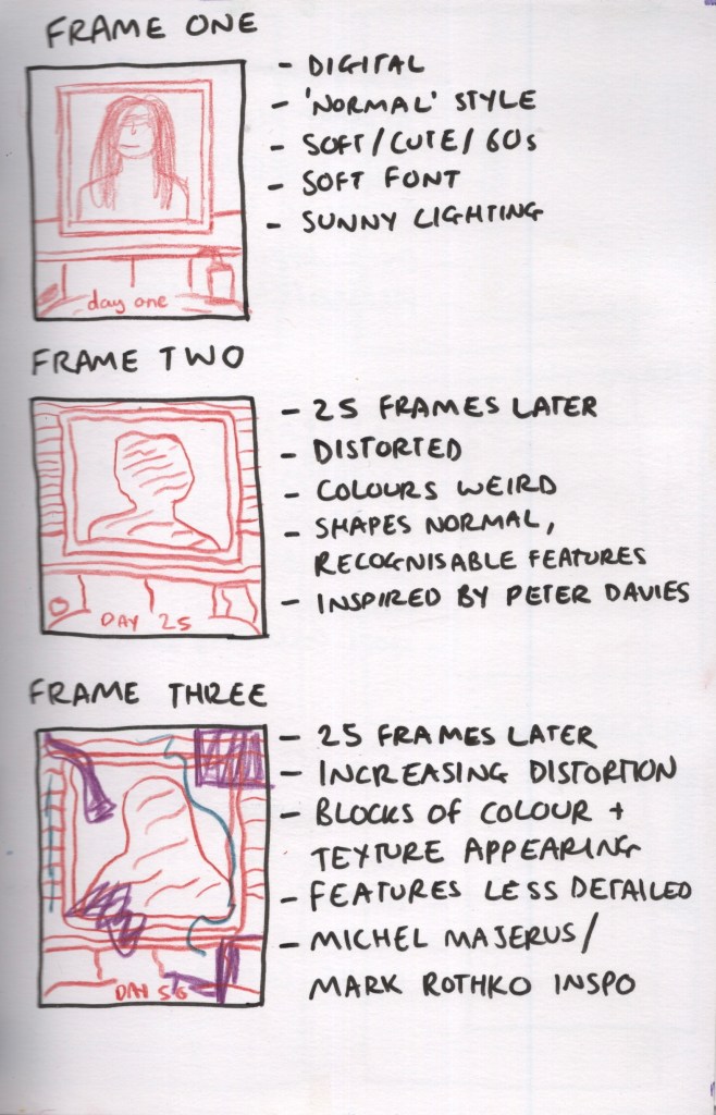
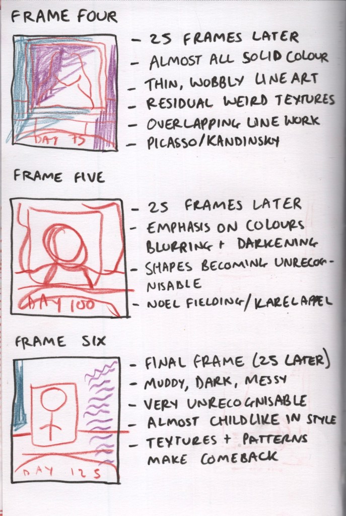
I began exploring each of these groups as concepts and how I could create something more abstract and connected to my sketchbook work. My first idea – based on the phrase ‘again, again’ – was inspired by the feelings I’ve had being stuck shielding from COVID alone in my house in an endless loop of the same thing all of the time. Each frame would show the same image – me, looking in my bathroom mirror each morning – however as time progressed the style would become more abstract, distorted, and blurred.
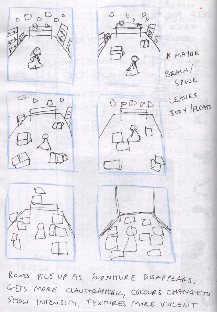
The second idea was based on the words ‘Boxes, Moving, Packing, Brain, Spine, Anxiety, Stress’. In November 2021 I was due to move house and packed up the majority of my belongings. The move fell through, and my health suddenly worsened, and as a result, most of my things are still in boxes around my home. The concept here featured me sitting in the centre of my studio as everything is slowly replaced by boxes of things. Each frame showed more boxes, furniture disappearing, and the colours shifting to show how stressful it was. I also played with the idea of my brain or spine floating outside of my body as the frames progressed.
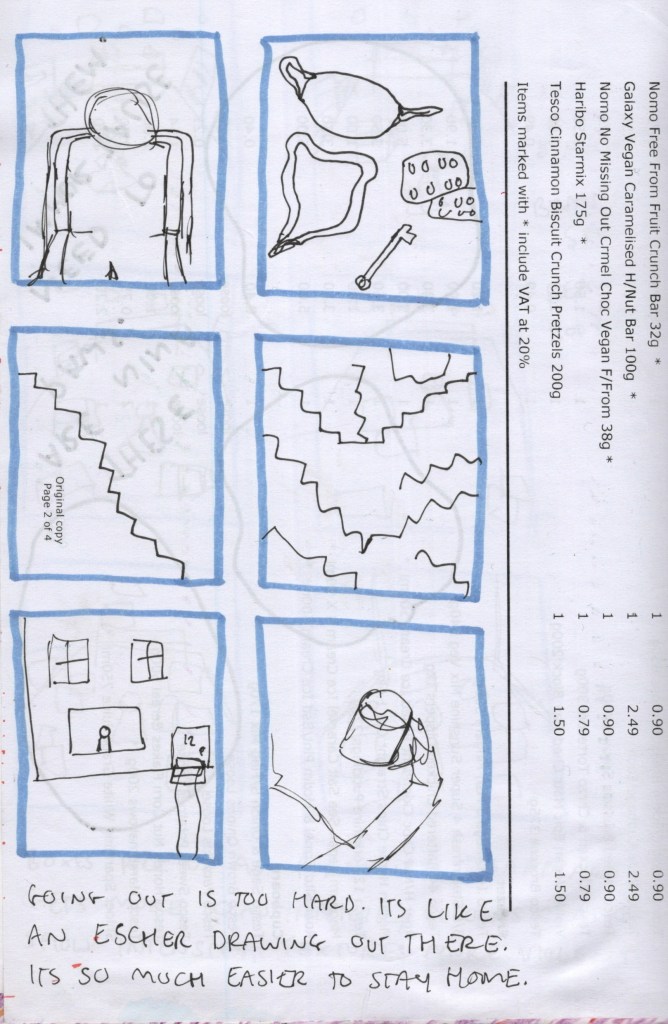
My third and final idea was based on the words ‘COVID, Inaccessible, Stairs’. The animation concept was about how hard it is to access the outside world, and the frames demonstrated this by showing me in my wheelchair, all of the things I have to take out just to be safe, all of the stairs in an M.C. Escher inspired illustration, and how much easier it is to just stay at home. This felt like a very raw way of expressing how I felt, and a little too direct. It was my least favourite of the three concepts.
My three ideas thumbnailed
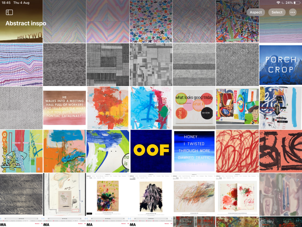
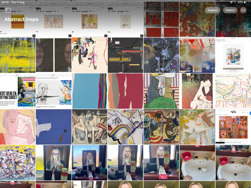
My favourite idea was ‘again, again’. I felt really excited by it, connected to it, and like it truly represented how I felt. It would also utilise my sketchbook work and approaches in a way that is new and refreshing for my illustrative style. In order to explore the idea further, I decided to undertake some more research on the abstract artists I am inspired by, so I began collecting some imagery to reference. Once I had a folder full of work, I began further experimenting and exploring different ways that I could use the patterns, shapes, and textures I was inspired by. I also took some reference pictures of myself and my bathroom to draw from.
Some reference photos, and my collected art from abstract and experimental artistsExperiments and drawing from references
I then began considering different compositions and layouts for each frame. As it would be the same image slowly becoming more and more distorted, I only really needed one composition to work with. Once I was happy with my composition, I began planning out how I would approach each frame, where in the overall animation sequence they were, and which artists would be inspiring each piece. I envisioned each frame being 25 frames apart so that the abstraction was noticeable in them. I made sure to consider how easy it would be to get from one style to the next, and if it was possible to do it slowly over 25 frames.
Exploring composition and ideas
At this point, I was starting to get frustrated with my sketchbook itself. I hadn’t used as much as I expected to in my visual diary stage, and the paper I was working with wasn’t appropriate for planning out clear imagery. I was skipping a lot of pages in order to find the blank paper. I was also starting to struggle with where to go next and how to use my sketchbook to further my designs and plans. I sectioned off an area of the sketchbook with a bulldog clip so that I could skip to the end where all of the blank paper was, but even still I felt stuck.
At this point in my illustrative process usually, I would begin making the final illustrations. I would then refer back to my sketchbook as and when needed to experiment or explore something further, to test out colours and linework, text options, and more. I had some thoughts on more I could plan and develop, such as linework of the final composition on a full A5 page, preliminary text exploration, and transitions between frames. However, this felt very forced and like I was trying to tick boxes rather than working how I naturally work.
Stage Five – Completion
I felt stuck. I was ready to move on to final illustrations, but I also did not feel equipped to fully illustrate all six frames. As I said, my health is very unstable currently, and it was a big task to complete in a short timeframe. Finishing the assignment at this stage felt like giving up, though. I decided to reach out to my tutor for some guidance on where to go next.
My tutor recommended we call and chat about the project, what I’ve done so far, and what I’m struggling with. I expressed how I felt I had two sides to my artistic approach – a more creative side where I let go and have fun, and a more serious side with which I approach design briefs. I discussed wanting my sketchbook to be an external self-contained place for me to let go and be loose when not focused on design work.
She empathised and said she too has a ‘designers brain’ not a ‘fine artists brain’, which helped me again feel less alone in my approach. I am ultimately a designer, and trying to force myself to work like a fine artist isn’t helping me to learn. My tutor discussed the purpose of this unit and how I have achieved finding out how I want to use sketchbooks, and that part of level one units is figuring out what is for you. What I have learned, is that this isn’t for me, and isn’t necessarily how I work. I do love to use my sketchbook, and I have a better relationship with it now, but spending weeks exploring a concept in my sketchbook just doesn’t help me in my process.
I also reflected on my initial plan and notes for the assignment. I had highlighted the sentence in the introduction which said ‘Whichever option you choose you don’t need to focus on making resolved or finished drawings.’ I guess I knew I would end up stressing out about this! I had also written for stage five that thumbnailing the final frames counted as ‘completing’ them. This, alongside my discussion with my tutor, reassured me that I wasn’t completely failing.
I do want to create these illustrations and feel very connected to the concept and idea. Not doing so feels harder for this reason. I also feel like after making such a huge sketchbook, it didn’t get to fully live up to its purpose. I seem to keep making this mistake, but I worry if I make a smaller one I’ll run out of space. Having had some more time to reflect on everything since making the decision to end the assignment work, I feel I did what I set out to do. I also really love the work I produced in this sketchbook and looking at my earlier work in part five, I have a good sense of what I want out of it.
One of the things my tutor said when we called was that thinking time is such a big part of the process. It’s hard, as there’s nothing to show for thinking time, and a lot of this unit has been spent sitting thinking about my sketchbook, ideas, and what I could do. I’ve been working through problems, addressing complications, and exploring ways I could engage, but so much of it has happened in my head, not on paper. Maybe I could write more of these thoughts in my sketchbook – which I did start doing a lot more of towards the end of the unit, but I still don’t feel this represents the hours spent working without actually working.
A project like this one needs more time for me. I feel I could spend a whole year filling this sketchbook and working towards a final goal. I think that’s okay, and that’s where I’m at right now. I don’t feel bad about the work I’ve put into this, the quality of it, or the quantity. I feel inspired seeing the video above, and excited about what I might be able to create in the future.
Final Reflective Statement
This unit has shown me a lot about myself, my artistic process, my likes and dislikes, and how I want to use sketchbooks. I feel like what I’ve learned can be summed up into three points.
Firstly, I have learned that I want my sketchbook to exist as an escape from everything else in my world. I’d like for it to be a fun, explorative, and self-contained world in which I can study other artists, experiment with mediums, and let go a little. The sketchbook itself acts as the boundaries in which my inner creativity can go wild. I’d like to undertake specific projects, such as Inktober, drawing 100 faces, studying 20 artists, or painting every day for a week. I’d also like to open it when faced with art block and splurge out what I can to get myself motivated. Using my sketchbook often and engaging with my creativity in this way is highly desired and a part of my routine now, but my brain can’t merge it with my more structured design work.
However, I found throughout part five that creating a visual journal and documenting my thoughts in this way was extremely helpful, which is my second point. I began this unit knowing I liked to have ‘research sheets’ where I could lay out all of my thoughts when approaching a brief. I’d like to have an A4 sketchbook that I can use just for this, whilst still adding in some creativity as seen in part five.
The final thing I learned is that for some artists their sketchbook is a core integral part of their creative process. It comes with them everywhere and it’s where the magic happens. However, for other artists, it’s simply a tool that can be used when needed. I fall into the latter camp, and I feel okay with that now. My sketchbook engagement dips when my energy does and increases when I have a burst of creativity. It’s inconsistent, but always there. I used to really struggle with this and feel like I should try harder and fill sketchbooks faster. I don’t feel as much pressure anymore to make myself engage with my sketchbook in this way.
This year, and unit, has been hard. I’ve been forced to confront many challenges emotionally and physically. I am ending it relieved that it’s over, but grateful for the lessons I have learned. Sometimes you have to be dragged through the mud to realise what you want. As I’ve noted several times in this log, looking back at everything and what I have achieved and realised is helpful in framing my experiences as more positive.
I have a clearer sense of direction now, which I feel all level one units will leave me with. Key Steps in Illustration taught me how my illustrative process works, what briefs I enjoy, and areas of design I want to work in. Now, having finished Illustration Sketchbooks, I know how to utilise a major tool in accomplishing that. It feels like fitting puzzle pieces together, and it’s really nice.
For this research task I was asked to investigate one of five listed illustrators, considering their visual language, how they make work, and what connections exist between their sketchbooks and illustrative style.
I don’t typically present my research in my sketchbook, preferring to make rough notes in a notebook and then type up more coherent thoughts to my learning log. In keeping with the approach to Part 5, though, I decided to lay out my thoughts on an A4 sheet of paper, using the same design style as in Exercise 5.0. I began by writing out bullet points for what I needed to do for this task. Then, I briefly looked at each of the five illustrators before deciding to investigate Lisk Feng further. Whilst looking through her website and a handful of interviews found online, I took some notes, then listed some key words I felt reflected the visual language in her work.
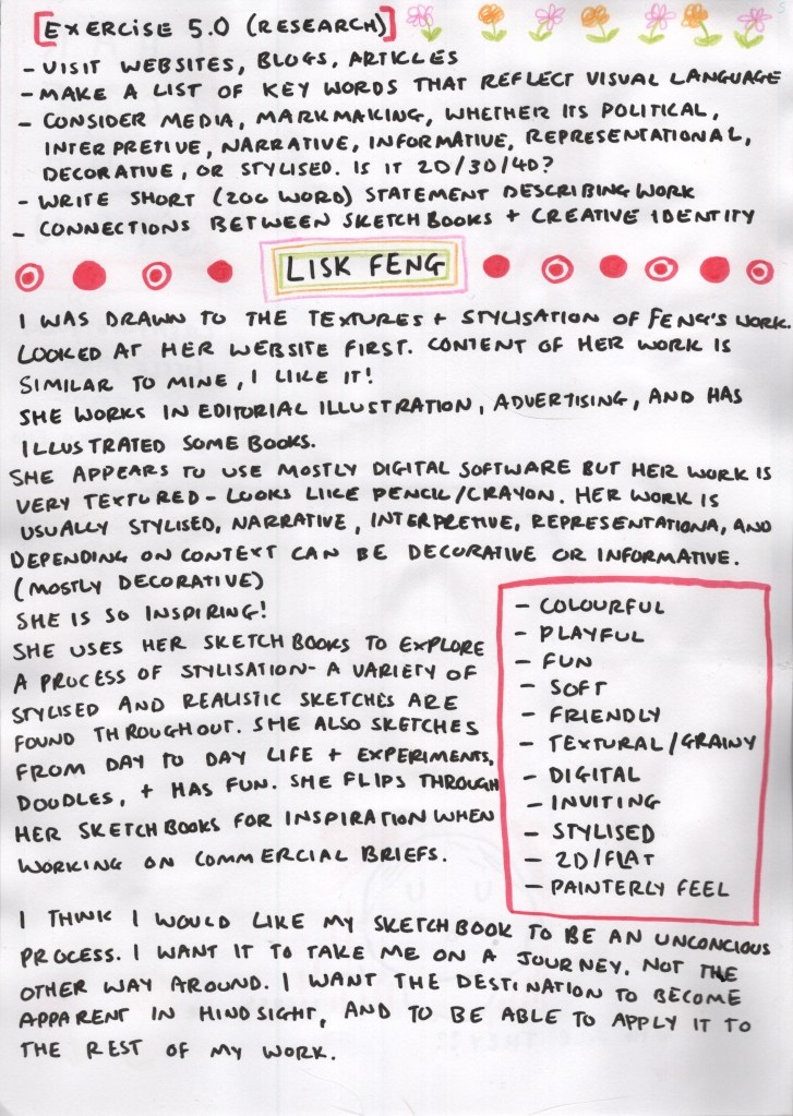
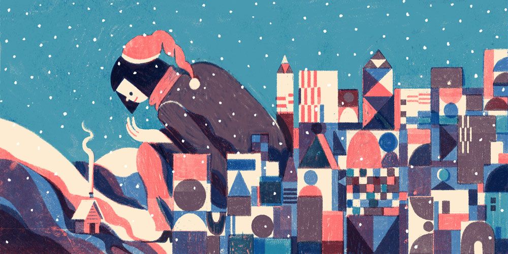
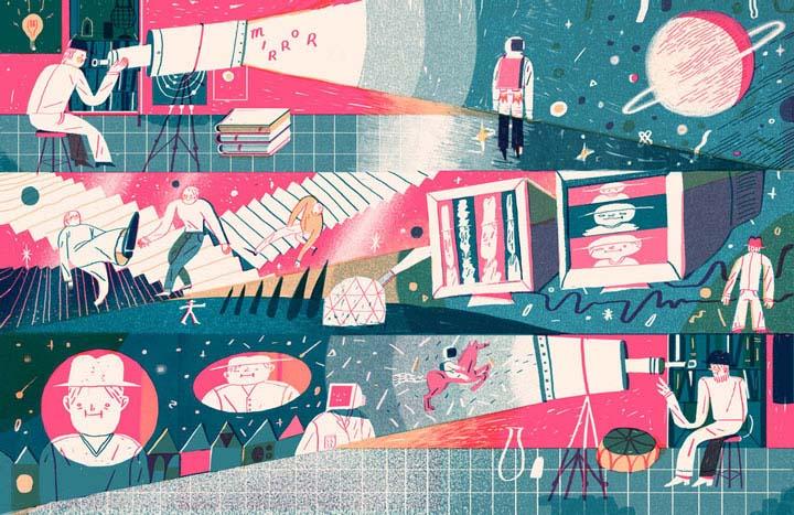
I found Feng’s work very inspiring. She has worked in many different areas of illustration, some of which I am interested in working in myself – such as advertising and editorial. She has a very playful, childlike style, and places emphasis on using textures throughout her work. Whilst her style is somewhat different to mine, this aligns with how I want to work, and seeing her success makes me feel like I could easily head in a similar direction. She has a very distinctive artistic voice in all of her work, which can be seen in the colours she chooses to use, how the same or similar textures are brought into pieces, and the consistency in her characterisation.
I listed some key words to describe Feng’s visual language:
Colourful
Playful
Fun
Soft
Friendly
Textural/Grainy
Digital
Inviting
Stylised
2D/Flat
Painterly feel
Feng’s work is inviting and homely – it feels like a familiar world which you have been welcomed into, even if it’s brand new to the viewer. Her usage of softer colours and gentle textures enhances this, and her simplistic friendly characters could be anyone you know.
Some examples of Lisk Feng’s work
From reviewing Feng’s portfolio, and reading a handful of interviews about her use of sketchbooks, I was able to identify something I want from my own sketchbook experience – ‘I think I would like my sketchbook to be an unconscious process. I want it to take me on a journey, not the other way around. I want the destination to become apparent in hindsight, and to be able to apply it to the rest of my work.’
Looking at accomplished illustrators and designers brings me a lot of comfort, especially when I see them engaging in mediums in similar ways to how I do. I feel on the ‘outside’ of everything often, and like I can’t possibly be successful due to that. I worry that my interests are too varied or weird and that means I won’t be able to work with big clients, or maybe I just won’t be well enough to. I feel inspired after researching for this task, and every exercise is leading me closer to knowing how I want to use my sketchbook as a designer.
For the culminating exercise, I was asked to put all of the work from Part 5 together in a visual journal.
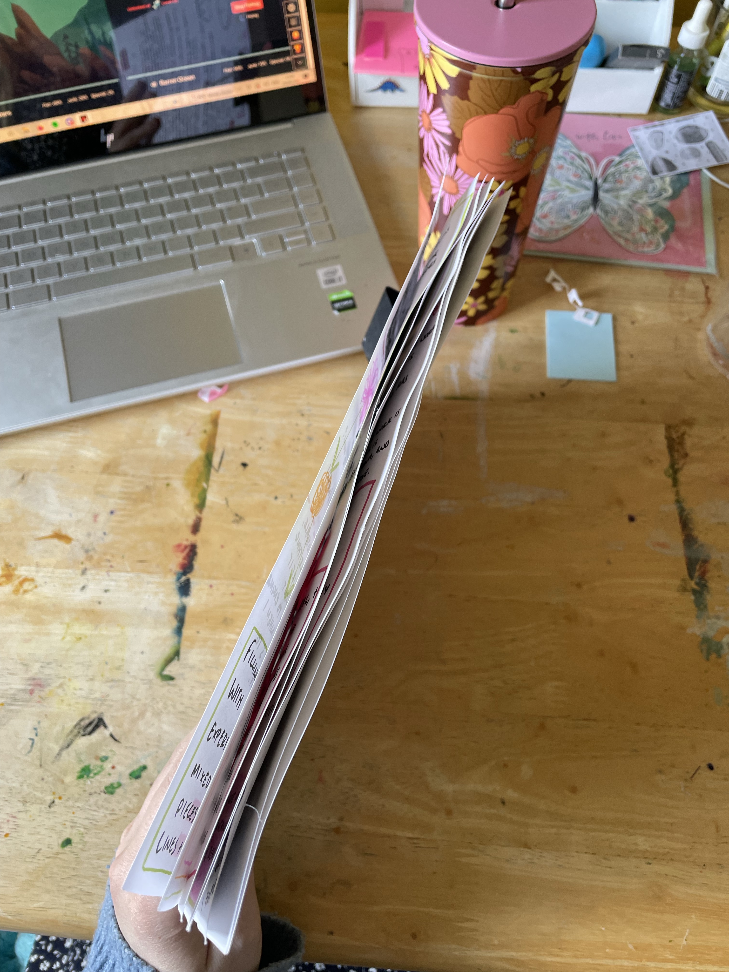
I typically read ahead to plan my time for each part of a unit, so I was aware of this exercise back when I started part 5. Throughout, I have been considering how I present my work and use my ‘sketchbook’ in order to create a visual journal. I don’t feel there is much work left to be done, as I have been mindful of it throughout. I did consider different ways I could bind the pages, however, I settled on using a single bulldog clip to keep it all together. I like being able to sift through the pages, spread them out, and look at them all together. This also allows room for expansion, so I can add to my journal whilst planning and carrying out Assignment 5.
My visual journal
I love what I have created here and how my journal has come together. I’d really like to keep creating things in this way – not just because it looks visually interesting, but because having the ability to write out my thoughts and revisit them whilst writing my learning log has been a huge help. I may buy an A4 sketchbook for my next unit purely for this sort of work – no sketching or playing, just documentation, planning, and a little bit of decoration. Or, I may try to incorporate this into my ‘regular’ sketchbook. It’ll take some trial and error!
Knowing that I would need to conclude this part with a visual diary forced me to consider how I was presenting and exploring each exercise, which I really value. I feel in a good place to being Assignment 5 and to continue with this approach, taking into account the work I have already produced for my journal, and seeing where I end up.
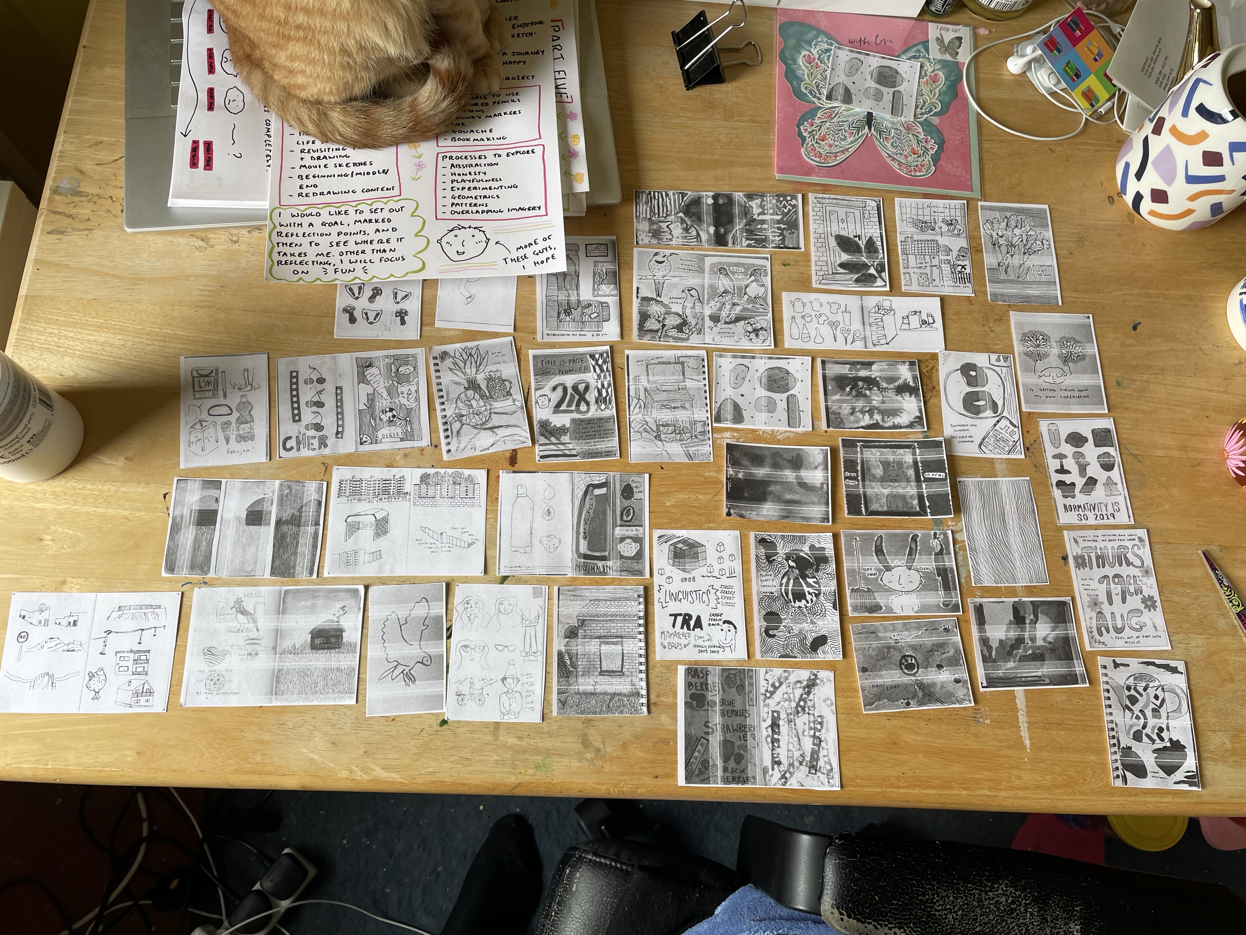
The goal of this exercise was to revisit the work produced through the unit and to consider new approaches, then to establish ‘collections’ of work. I was asked to print off images that I felt a connection to and combine selected elements, figuring out ways I could use the work again in the future. I then was asked to look at all of the images together and create connections between them in order to form collections of work. There was no ‘right’ or ‘wrong’ way to approach this, as long as the collections meant something to me.
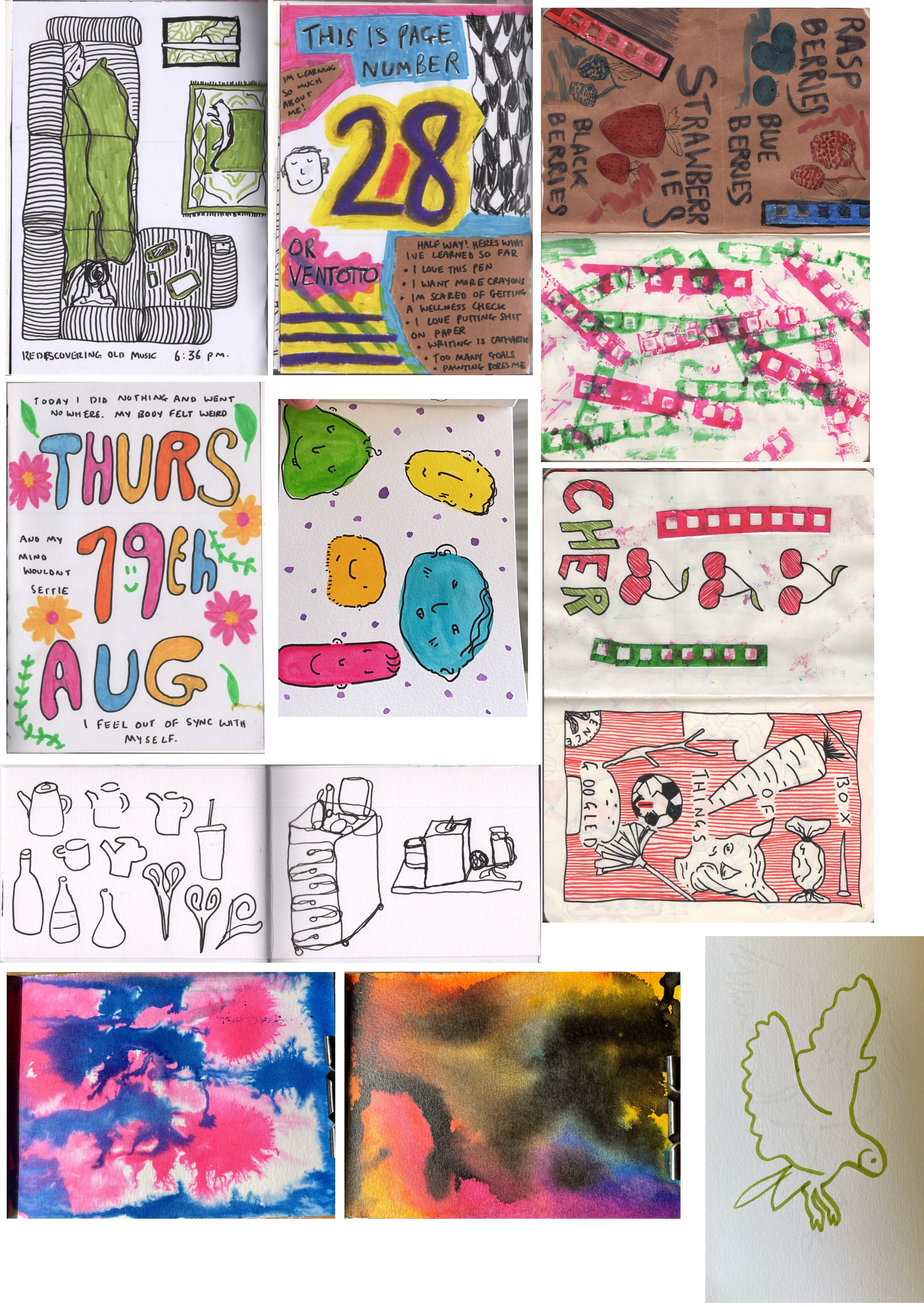
Throughout this unit, I have been adding all of my work to a folder on my iPad so that it can easily be located and revisited. I went through this album and created a new album for this exercise, adding anything that jumped out to me or that I felt strongly about to that. I chose anything that made me feel happy, captured what I felt was my style, or that I want to do more of. I then put all of the images into Procreate so I could easily print them.
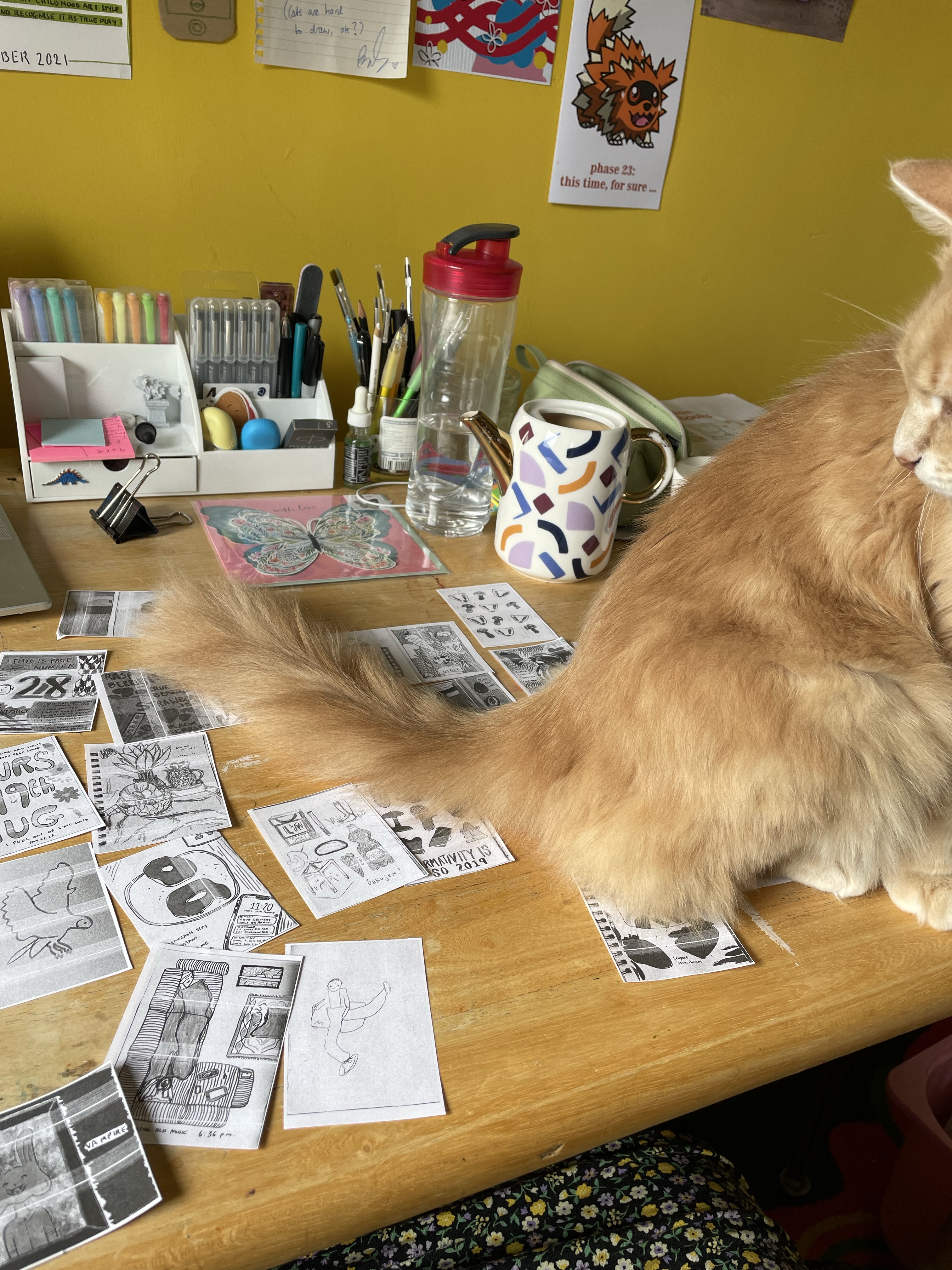
My favourite pieces from this unit, laid out to print
Seeing all of my ‘best’ work laid out like this is quite moving. I have quite a negative perception of this unit and of my experiences, but actually, this is exactly where I want to be and how I want to be developing my style, and I have masses of work to show for it! That feels incredible. I love how I have developed my approach to sketchbooking, documenting things, and exploring mediums. If every one of my sketchbooks forever looked like the above images I think I would always be happy.
Revisiting my favourite pieces of work also shows me how much I want to re-do a lot of it, exploring new approaches and new concepts within concepts. This is the way I want to use my sketchbooks in my practice – getting space and distance from them, then going back and reconsidering when it feels ‘fresh’. If I could fill a sketchbook across 4 or 5 months, then come back a year later and expand on it, I think that would help me enormously. Sometimes time and space work magic. I never want to stop creating though, and will try to always have a sketchbook on the go.
Next, I printed everything off and cut it all out. I then laid each piece out on my desk so that everything was visible simultaneously, and started considering connections and new things to explore. I found a few things that I’d love to try – combining my love of drawing birds and flowers with actual plants and found materials, drawing bold line drawings then filling in the space with abstract and experimental techniques, creating accidental and explorative backgrounds then adding still life drawings to them, and giving inanimate objects faces and personas. The last one especially would be very useful for character development and exploring narratives.
Laying everything out – which my cats were extremely fascinated by!
I then cut out all of the missing pieces and went back to assessing everything simultaneously. I started creating ‘collections’ of work, things I felt fit together and categories that I felt described my style and interests. I ended up with six categories, and one ‘everything else that doesn’t fit’ category, which is bound to happen! I think maybe someday that category can be better named or split off into several categories as it grows. I feel like each category describes the things I enjoy using my sketchbook for, and areas I fit into as a designer. The categories are:
Experiments, Explorations, and Mistakes
Pattern Design
Expressing Thoughts and Feelings
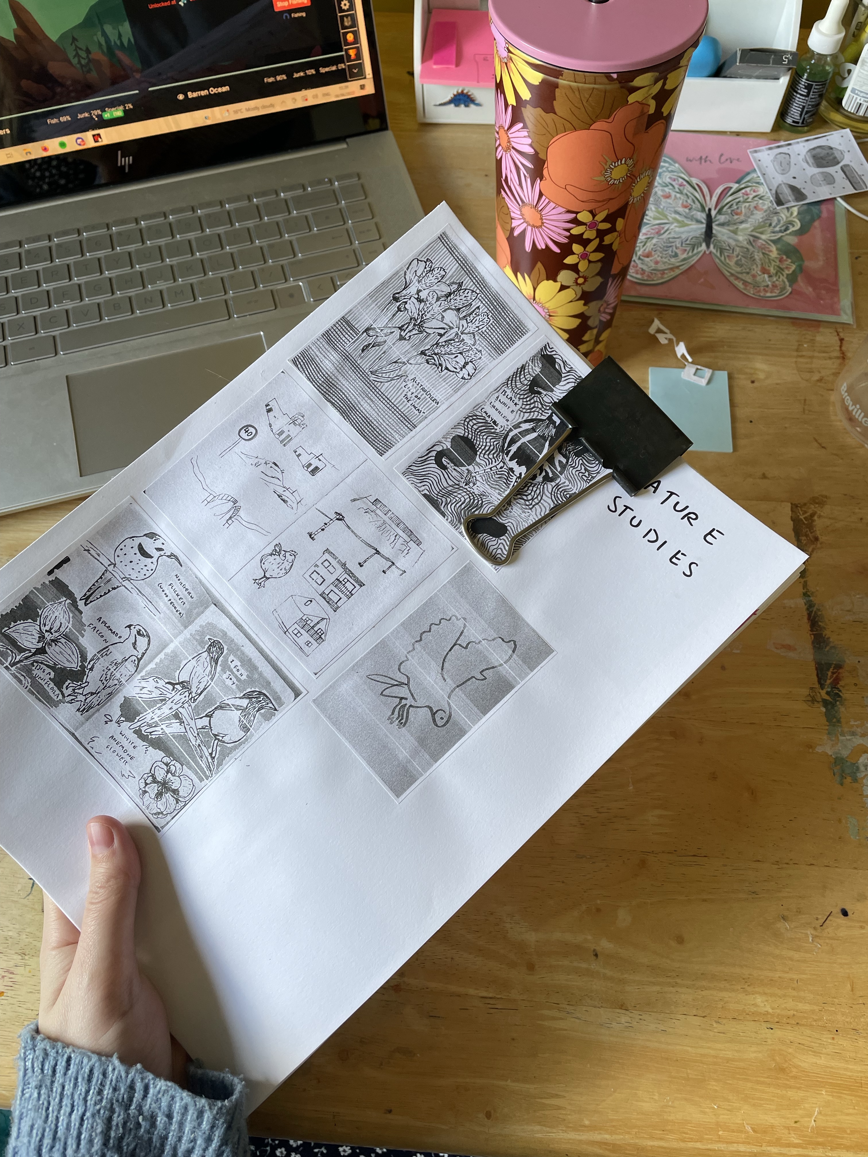
Nature Studies
Observation, Still Life, and the Everyday
Character Design
I’m not surprised by most of the categories, but realising that ‘Observation, Still Life, and the Everyday’ is a category not just of work I have produced because I have to, but of work I actively enjoy and want to make more of, is a shock. It turns out I really, really enjoy drawing objects. I love drawing still-life setups, buildings, trinkets, and ‘stuff’. It’s fun, playful, and meaningless. I’m also a little surprised at how much I enjoy drawing nature, and hopefully, I can expand this beyond birds and plants. This review of my work has also helped me to contextualise what I enjoy about character design – the playfulness of it. Removing the serious and stressful elements and just drawing silly faces and little people makes me happy.
Once I had sorted and organised all of the work, I went through and stuck everything down on the backs of the paper I had already used for the previous exercises, thinking ahead to Exercise 5.3. I added some illustrations, notes, and decorations to the pages, and it was great fun. I now have a gorgeous portfolio of my sketchbook work and illustrative likes and dislikes which I am able to refer back to whenever I please! I feel so much more grounded in who I am as an artist and what my goals are, both in sketchbooking and in general.
This exercise was enormously useful for me. Ordinarily, I avoid cutting and sticking and prefer to do everything digitally. Actually getting my hands dirty and seeing my work spread out as it was helped me find contexts I don’t think I would have otherwise. I feel very happy with my work from this exercise.
For this exercise I was asked to make an ‘action list’ for the final assignment, considering the work I had done in Exercise 5.0. The exercise posed several questions to me, prompting me to consider media skills I want to develop, approaches to drawing I enjoy, and my own questions I might want to find answers to. It recommended I make a list in response to the statement ‘I would like to use the final assignment to….’, and then go through that list and highlight which are most important to me.
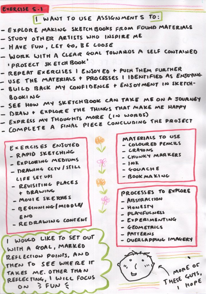
I continued using the A4 paper and design style that I had developed in Exercise 5.0, and began by responding to the suggested statement. This was a really helpful way to take what I discovered about myself and my interests and find a way to apply it to a specific project. My answers included:
Explore making sketchbooks from found materials
Study other artists who inspire me
Have fun, let go, be loose
Work with a clear goal towards a self-contained ‘project sketchbook’
Repeat exercises I enjoyed and push them further
Use the materials and processes I identified as enjoying
Build back my confidence and enjoyment in sketchbooking
See how my sketchbook can take me on a journey
Draw and explore the things that make me happy
Express my thoughts more (in words)
Complete a final piece concluding the project
Figuring out my action plan
As a few of these are quite vague, I decided to elaborate and clarify what they meant, so I could reference them easier and have them clear within my plan. I wrote the exercises I enjoyed, the materials I want to use, and the processes I want to explore. Then I summed up my plan with a short statement:
I would like to set out with a goal, marked reflection points, and then to see where it takes me. Other than reflecting, I will focus on fun.
I feel really excited seeing my action plan laid out like this. I think this is a great task to undergo every so often to figure out what your creative goals are in general and to see how you’re progressing with them. Whilst this is an action plan for Assignment 5, it also is an action plan for my creative journey in general, a direction for it to go in, and some structure to focus on. It feels almost like a personal statement evaluating where I am right now.
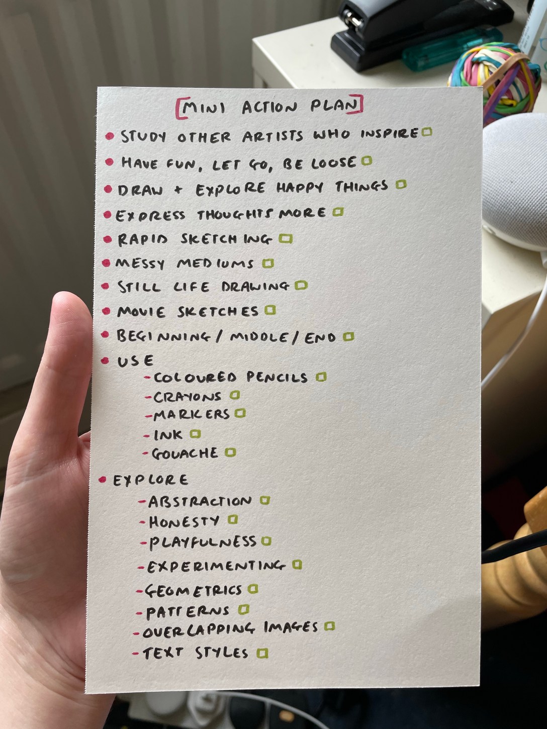
My mini action plan
I want to make an A5 sketchbook for this assignment, and I want to be able to quickly and easily reference this plan. So, to finish off the exercise, I wrote a ‘mini action plan’ summarising and bullet pointing all I hope to achieve in my sketchbook. I aim to use this almost as a bookmark to revisit and get inspiration from when stuck. I added tick boxes, but I’m not going to strive to achieve every single thing very strictly, as part of my goal is to just let go and see where the journey takes me.
Reflecting on my work in this way is wonderful, and planning my own project in such a detailed and interrogative manner is bringing me a lot of joy. I am excited to see how Assignment 5 ends up and how I progress through it.
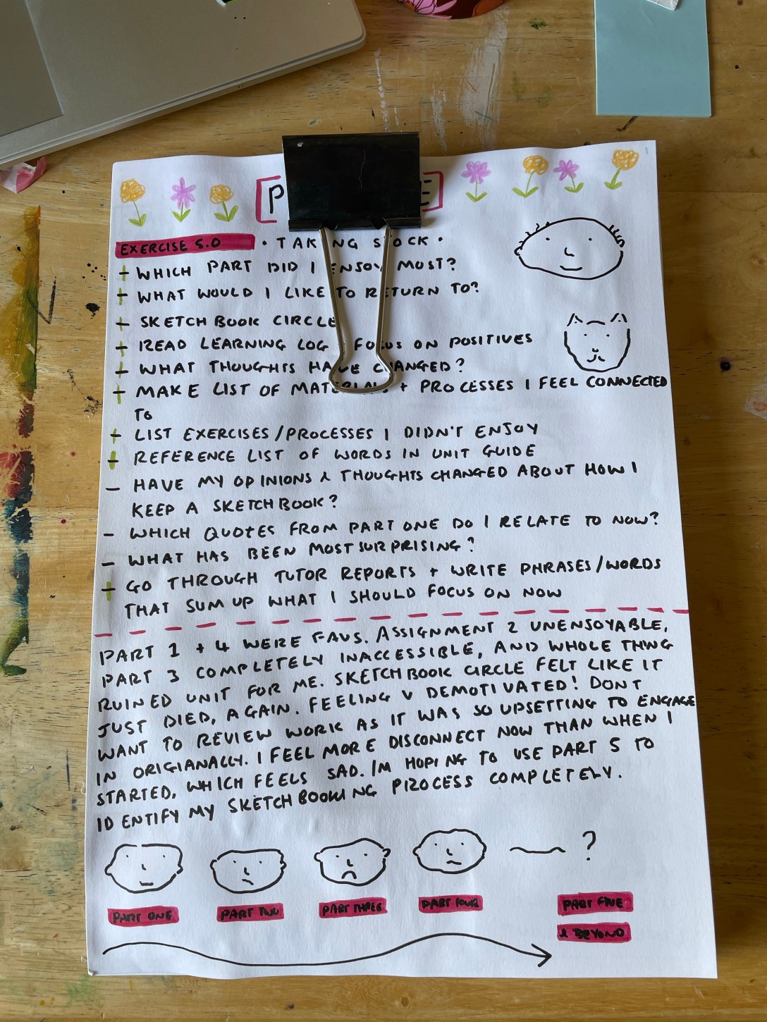
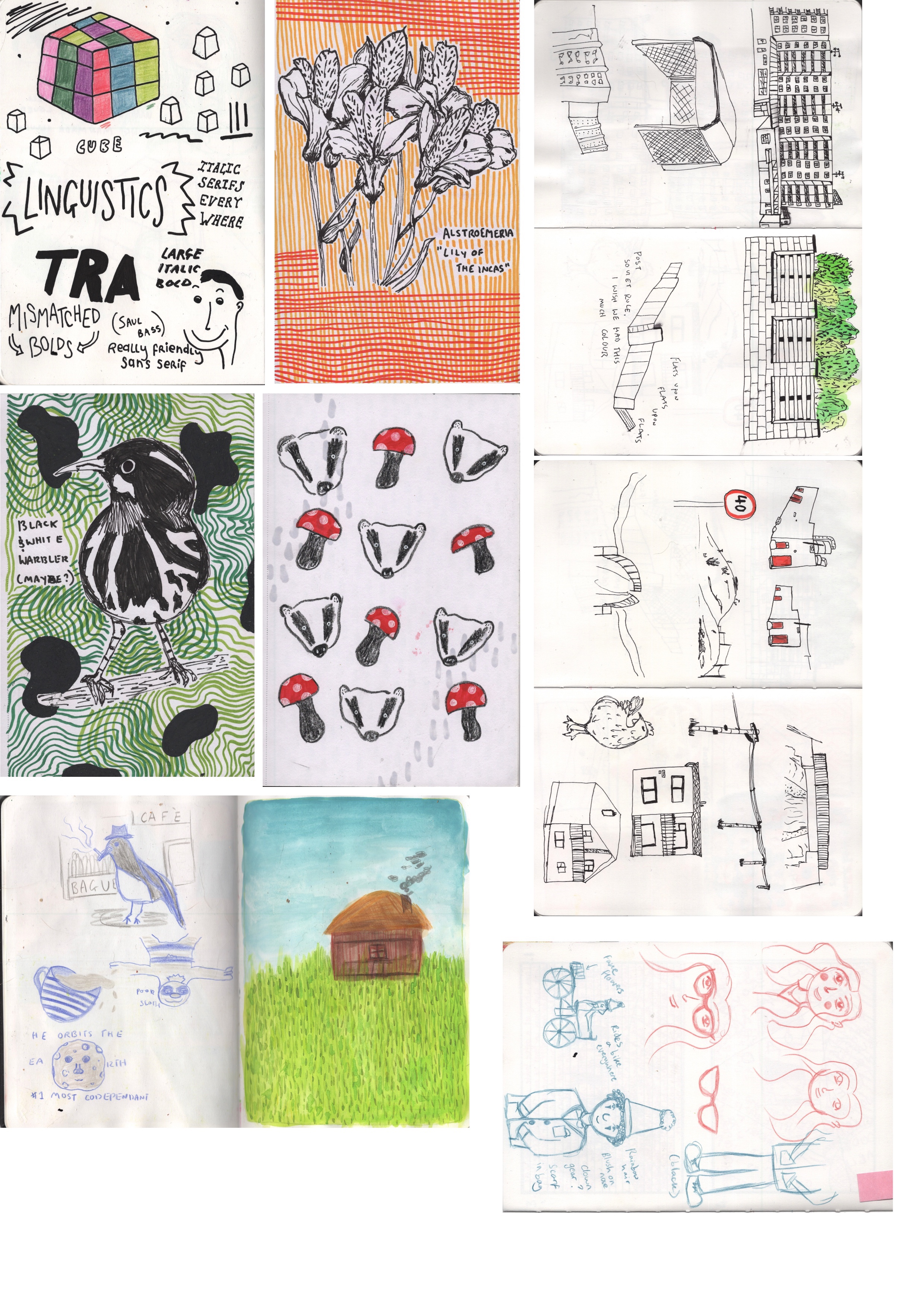
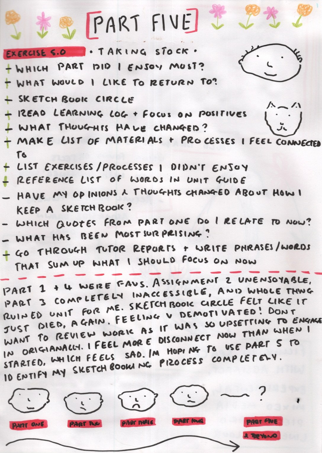
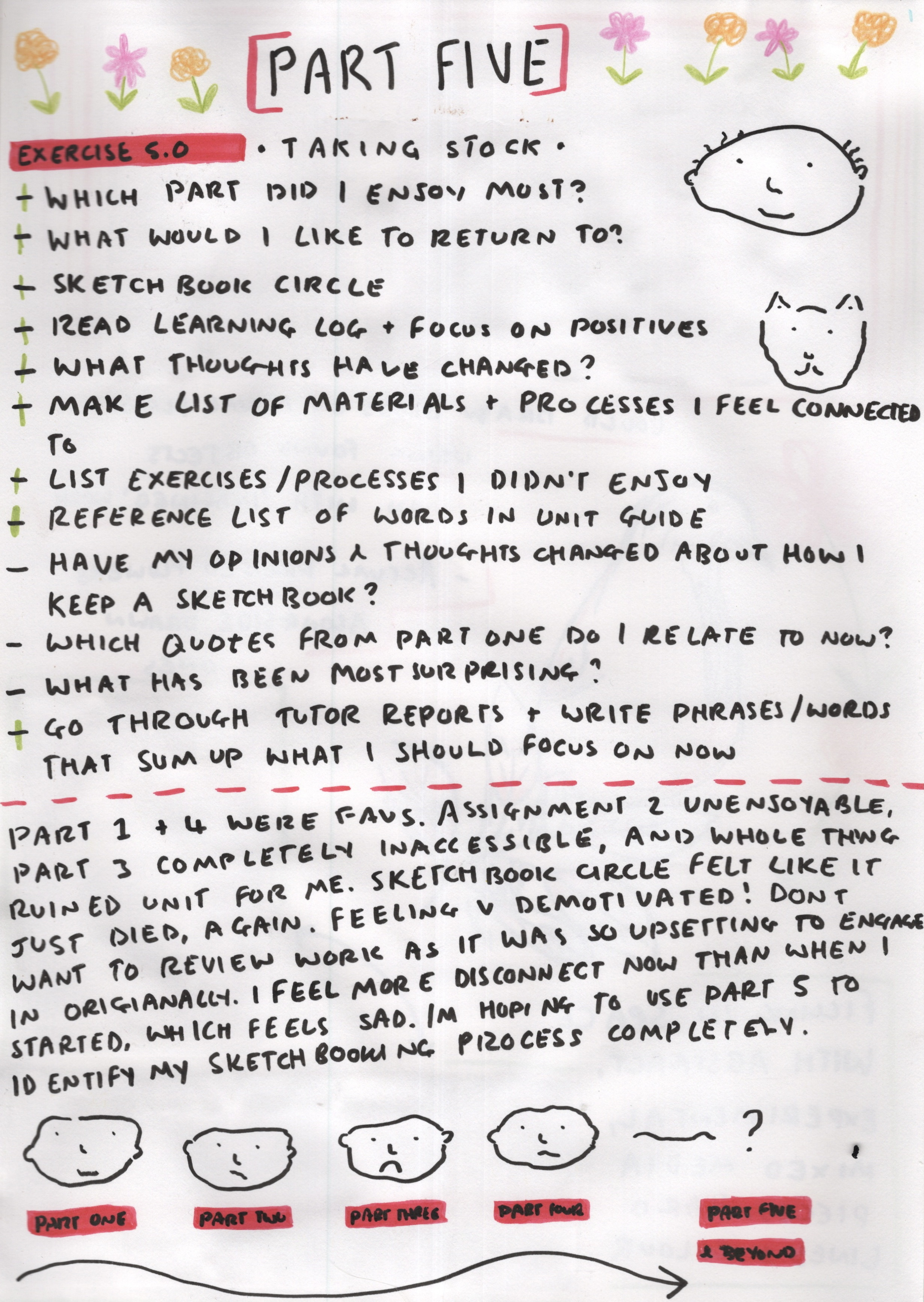
This exercise asked me to go through all of the work created for this unit so far and reflect on my progress, interests, and what I want to do more of. I was asked to look at my sketchbook work (both for the unit and the sketchbook circle), my learning logs, and my tutor feedback – focusing on the most positive aspects of my reflections throughout.
As the introduction for Part 5 says to ‘Start the exercises on pieces of paper or in a new book and make sure that you progress them through towards the assignment work, to construct one bursting, hybrid sketchbook that is a cumulative visual diary.’ I chose to start this exercise on a sheet of A4 cartridge paper. I chose some of my favourite pens and pencils and set them aside, aiming to make visually interesting pages which would then come together as almost a portfolio of my thoughts, feelings, and work in this unit.
I read over the exercise a few times and then started by writing a guideline of things to consider, look back on, and questions to answer. I then went through each point one by one and explored them – mostly referencing my learning log as this features images and videos of my sketchbook work. Underneath this list, I wrote out a brief summary of the unit and how I felt about each part, paired with a small illustration. Part 1 and 4 have been my favourites, and I felt Part 3 almost ruined the unit for me. At this point in my journey, I feel pretty demotivated because of this, and the thought of looking back through my work is daunting. I don’t feel I have produced a body of work that I am proud of, and a lot of the unit has been difficult or upsetting to engage in.
Page one and two
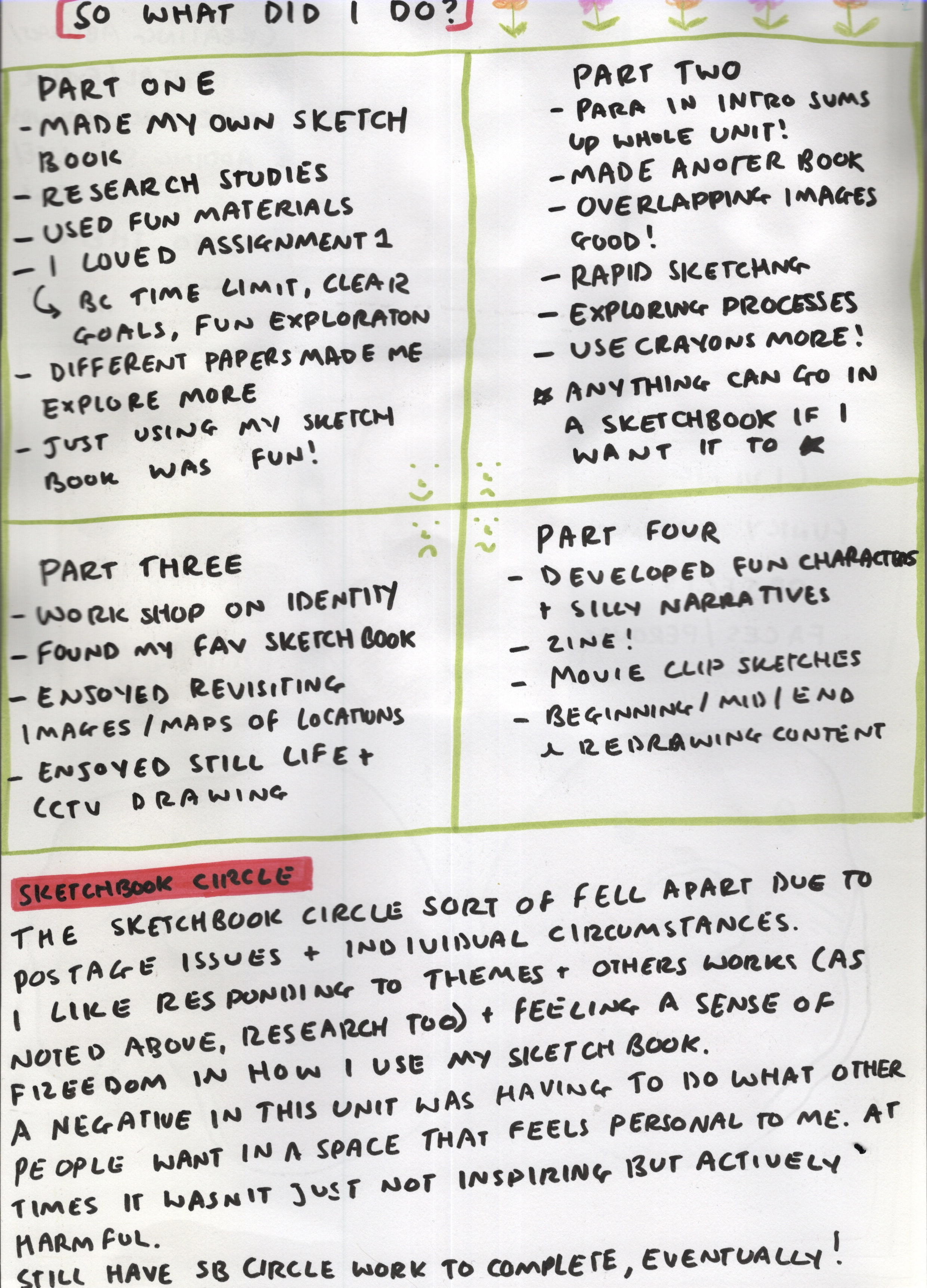
On a new page, I began to identify what I enjoyed in each part of the unit. In Part 1 I enjoyed making my own sketchbook, studying other artists, exploring materials, and found that just using my sketchbook was fun. I particularly enjoyed the assignment, which I reasoned was because it had a time limit, clear goals, and I got to have fun. In Part 2, I made another sketchbook, and I found I enjoyed creating overlapping images, rapid sketching, and exploring new processes. I also repeated in my learning logs throughout Part 2 that ‘anything can go in a sketchbook if I want it to go in’ and I felt that was something I needed reminding of. Often I get caught up in what I’m ‘supposed’ to be putting in my sketchbook, and it stifles my creativity.
Whilst reviewing my learning logs from Part 2, I read a paragraph in my introduction which I felt represented a lot of how I was feeling throughout this unit;
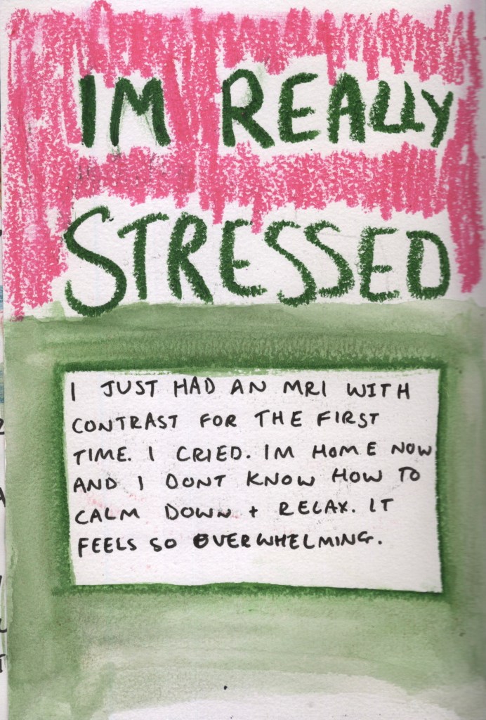
‘My relationship with my sketchbook and the manner in which I use it is always going to be influenced by my mental and physical health, as I’m sure it is for anyone. Because I am not mentally or physically healthy, nor neurotypical, I most likely will not be using my sketchbook in a typical way, nor will I feel comfortable using it in other ways. This isn’t out of an unwillingness to learn, experiment, or grow, but out of a necessity to protect my mental and physical health. There is, for example, a section in the introduction to part 2 which discusses using every snippet of spare time to draw. However, this would be actively dangerous for me. I don’t have ‘spare’ time – all of my days are extremely calculated to ensure I don’t become unwell. What to an ablebodied person is a free moment waiting for the bus is a moment I am grateful to be conserving energy, so I have more later.’
I felt the need to repeat this, and to highlight it. So much of this unit has felt like trying to shove myself into a box I do not fit into, rather than learning ways to create my own box. It has been a real challenge for me, and whilst I feel like I have learned how it is that I want to use my sketchbook and what I want to do going forwards, I feel a hesitation and an unfortunately greater awareness that I don’t ‘fit’.
Part 3 was the biggest contributor to these feelings, as most of it was inaccessible to me. However, I did find things I enjoyed among this. During Part 3 I undertook a workshop with Emma Powell on creative identity, which I found hugely helpful and motivating. I still have the graphic I created on my wall in my studio, and I read over it from time to time. I also discovered my favourite sketchbook, the Shoreditch Sketcher, and had fun revisiting places I have been in person via google maps and my own photographic library. I jotted down that I love still life drawing, too, as I always enjoy finding opportunities to do this.
During Part 4 I got to develop characters and narratives that I really enjoyed, create a whole zine from scratch, draw from my favourite movies, and discovered the joy of redrawing and recreating content that I may not have considered prior. Part 4 was really fun for me, and working towards a brief was something I had missed very much.
Page three and four
At the bottom of the second page, I wrote some thoughts on the sketchbook circle. This is my second sketchbook circle, and unfortunately it went similarly to my first, where due to timing, postage, and individual circumstances, it sort of just fell apart halfway through. Nonetheless, I really enjoy responding to themes and others’ work – it sort of feels similar to when I respond to research – and feeling more free in how I use my sketchbook. Seeing how much more I preferred the sketchbook circle helped me identify why I struggled with a lot of this unit: that doing what other people want in a space that feels personal to me is really hard, and at times it was actively harmful. I didn’t want to put things that were so upsetting in a place I felt I should feel joy and connection with.
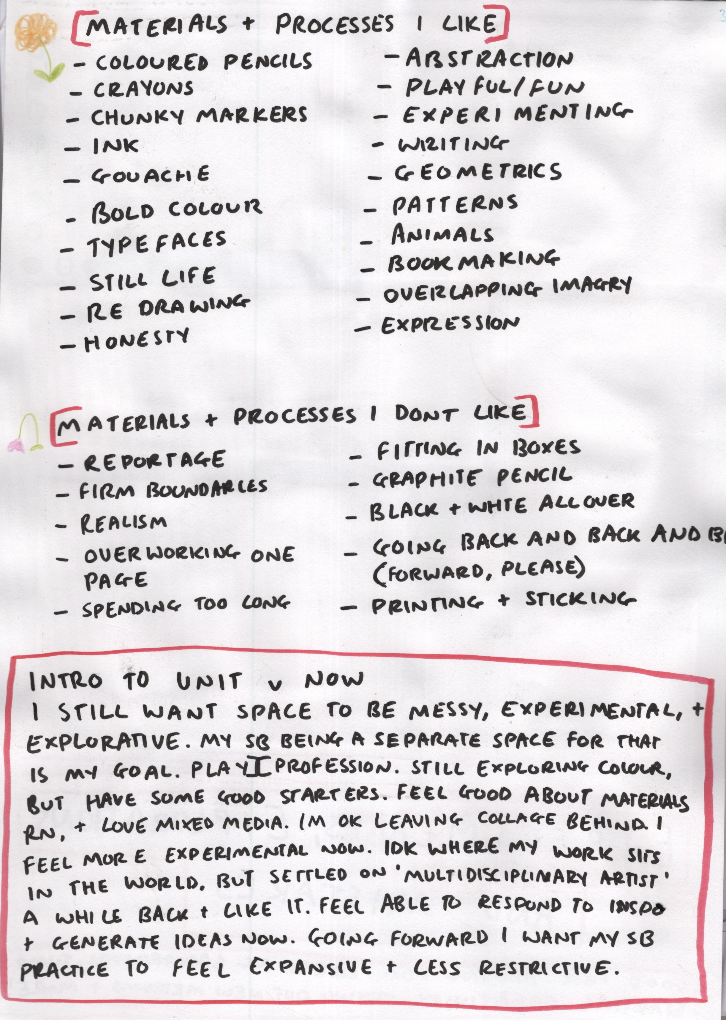
On page 3 I started thinking about the materials and processes I like and dislike. I found that I lean towards bold colour, playful and experimental work, abstraction, patterns and typography, and expressing myself honestly. I don’t enjoy firm boundaries, spending too long on one thing at a time, going back over my work constantly, and using ‘boring’ materials even just to sketch. Having this list is really useful not just for my sketchbook development, but also in considering my other work as a designer.
I then went back to my introduction to the unit that I wrote a year ago. I wrote this from a very excited and optimistic place – detailing my hopes and dreams for this unit. I thought it would be interesting to see what I did accomplish, how my thoughts have changed, and what I want to do still from that log. At this point, it was becoming clear to me that I want my sketchbook to be a separate space for my messy, explorative, and experimental side. I want it to be somewhere I can ‘splurge’ my thoughts and creative energy, hoping to channel it so I can better use it when approaching briefs.
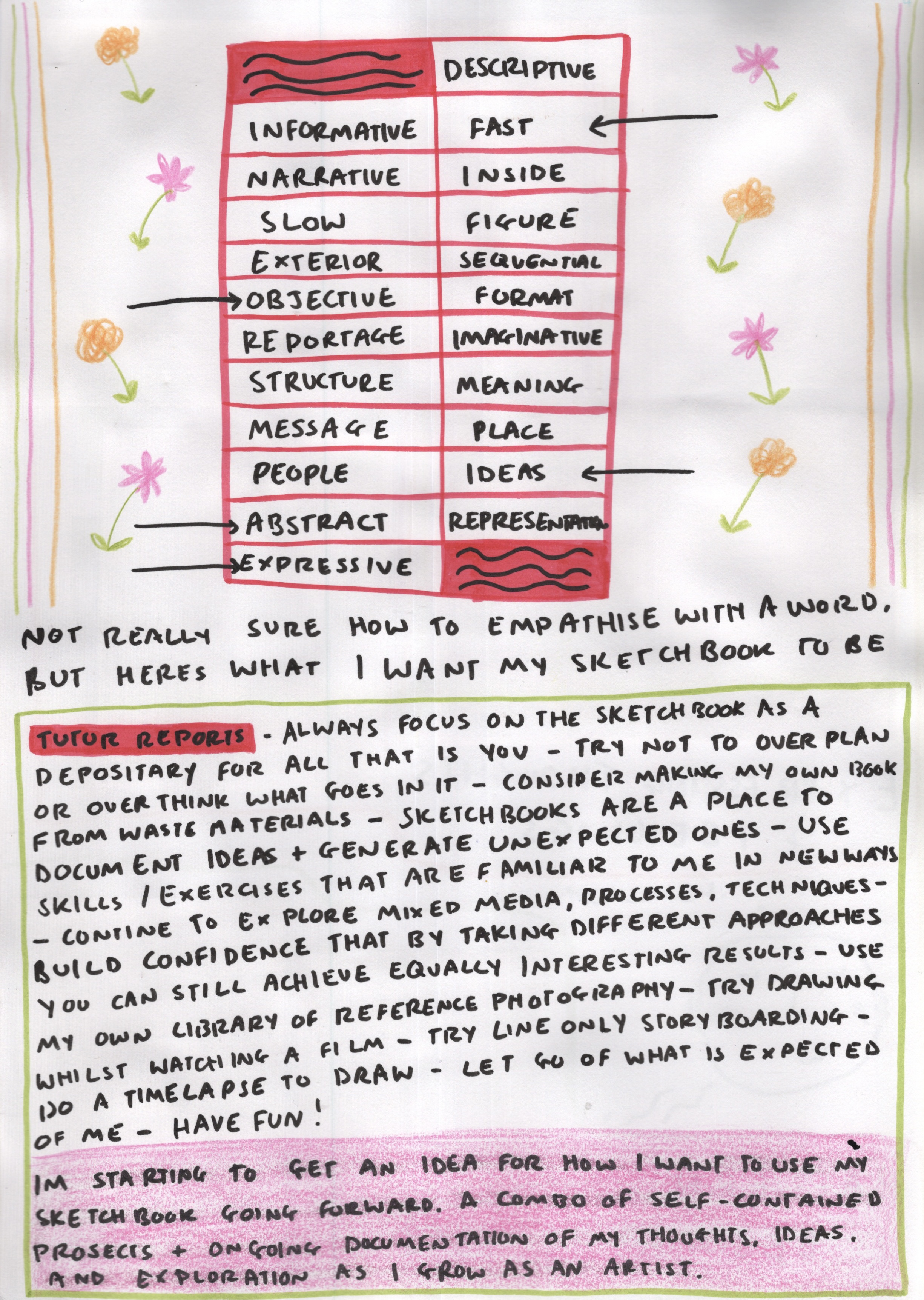
This exercise provided a list of descriptors and asked me to identify which I empathised with. I began page 4 with this, but I found the concept of ‘empathising with a word’ hard to get my head around. I picked words I felt related to how I want to use my sketchbook: objective, abstract, expressive, fast, and ideas. I like how these words sort of sum up my feelings and attitude to my sketchbook.
Next, I went through my tutor reports and wrote down phrases I felt I wanted to act on or otherwise take forwards. I felt that many of these phrases pointed towards a need to build confidence and let go a little in my sketchbook. I feel disappointed that I haven’t been able to achieve this, but as my experience with the sketchbook circle shows, I’m not sure if this is an issue with my approach or if it’s that I have found the exercises and assignments restrictive. My tutor had a lot of great suggestions which I hope to continue with or come back to later on in my artistic journey.
I felt that at this point I had exhausted my options with reflecting on my work. I summed up my explorations with a short statement: I’m starting to get an idea of how I want to use my sketchbook going forward. A combo of self-contained projects and ongoing documentation of my thoughts, ideas, and exploration as I grow as an artist. One thing stood out to me – I do not want the intention of my sketchbook to be that it directly influences the rest of my work as a designer. I love the ability to be free, creative, and explorative in my sketchbook, and I would like to undergo projects that remain personal and just for me.
The work I want to share with the rest of the world as a Visual Communicator I would rather be self-contained, too. Of course, I will use a sketchbook to explore responses to a brief, but I think this will be in more direct ways, and perhaps in a separate sketchbook. My ‘experimental’ sketchbook will surely impact how I engage with the rest of my work as I learn what my interests are, how I want to draw certain things or figure out how to add abstraction to more professional pieces. But for now, I’m happy with having two sides to my artistic coin, as it were.
At the beginning of this unit, I was asked to draw my relationship with my sketchbook. Reflecting on this illustration, I feel it has changed somewhat. The sketchbook is still in isolation, but not disconnected, and not less interesting than everything else I could be doing. Instead, it’s an escape from reality, and a place to let go.
When I started this exercise I wrote that ‘I feel more disconnect now than when I started, which feels sad. I’m hoping to use Part 5 to identify my sketchbooking process completely’. I feel that I achieved that, and I found this exercise incredibly useful. Going back and thinking about everything I have done has been enjoyable, and focusing on the positives has helped me to see that this unit was not just doom and gloom. I have learned so much, perhaps just not in the ways I expected to. I also had a lot of fun creating my paper ‘sketchbook’. I used it almost as a learning log, which was useful too, as it made writing this entry a lot easier. I may continue doing this in future units – fun notetaking makes for fun studying! I am now looking forward to planning and carrying out my final assignment.
Assignment 4 aimed to bring together all I have learned throughout Part Four regarding developing ideas from pre-existing sketchbook work and turning them into narrative illustrations. I was asked to create a ‘foldy’ style zine which develops a narrative across a minimum of six stages. The story needed to be based on one of the ideas I had already played with in my sketchbook and built around Nigel Watt’s Eight Point Arc structure.
Whilst working through Part Four, there were a few ideas that I felt particularly connected to, such as Charlie Twinkles the secret clown, and the pigeon who sat at the cafe table. I wasn’t sure which of these I wanted to develop further, so I spent some time considering it and thinking about the different stories I could create. In order to help with this, I took some cartridge paper and made a mock zine so I could reference it throughout my process. I found the instructions in Part One quite hard to follow, so used this YouTube video instead. It left me with an 8-page zine, including the front and the back.
This mock zine ended up being incredibly useful, and this image shows it after being used throughout the assignment to take notes on. I have a habit of writing or drawing on anything I can get my hands on!
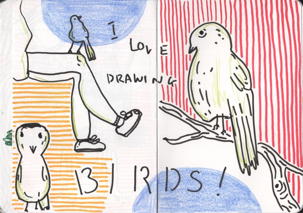
Despite feeling excited about this assignment, I was finding myself stuck on which idea to develop into my zine. I spent some time absent-mindedly drawing in one of my sketchbooks and realised I truly love drawing birds. I think that’s probably obvious to a bystander who has seen how frequently I draw them, but it seems I am only just realising this. I find them fascinating to look at and so fun to capture, especially as silly little characters full of personality. I knew, then, I had to continue with the pigeon concept.
Work in my sketchbook
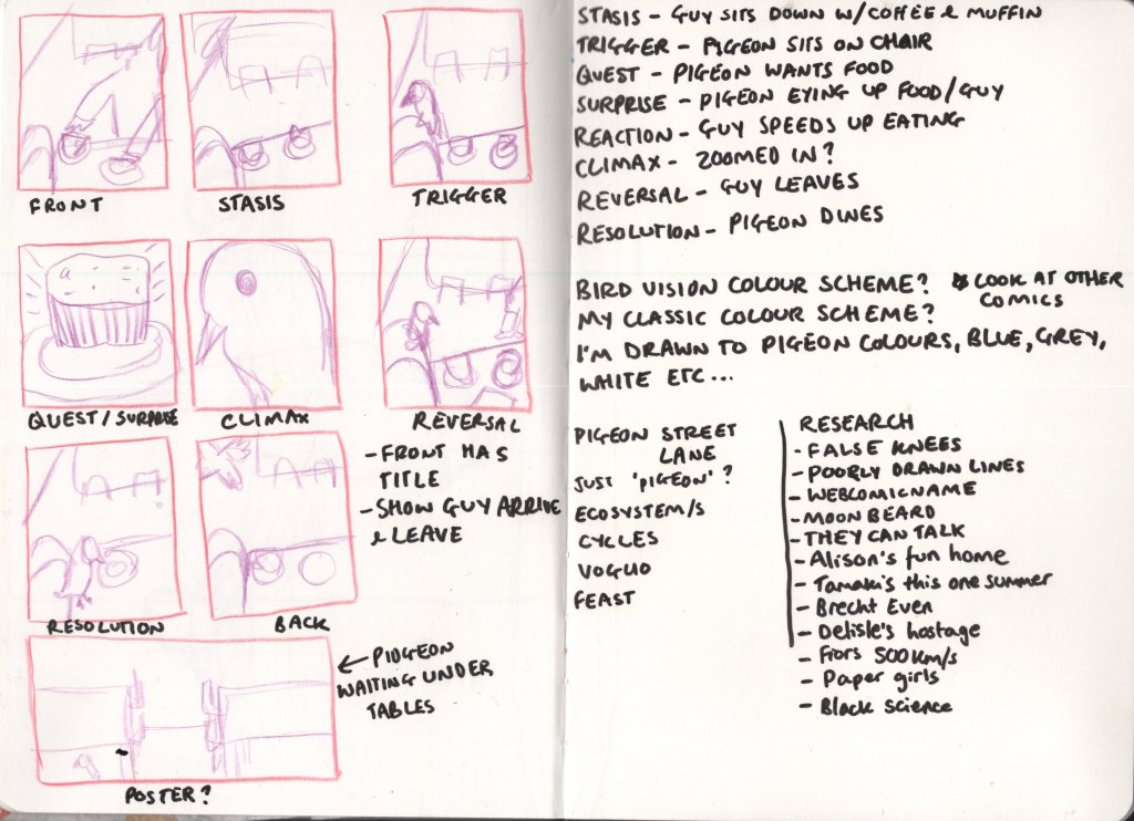
I began thumbnailing and exploring ideas for both the story and how I would illustrate it. I sketched out 8 panels for each page of the zine, and also a 9th panel for the inside of the zine. I thought it would be fun to create a poster that could be seen once the zine was folded back out into an A4 page. I then read through Nigel Watt’s story theory and picked out which elements I wanted in my own story. I wrote them under each panel and then started writing out the story on the page next to it. Finally, I thumbnailed out how I wanted each page to look.
Next, I began considering the colour scheme. I am a huge fan of limited palettes and unique colour schemes and always want to use them in my work. Initially, I was really drawn to having a blue and grey scheme, using the colours of pigeons and nothing more. I then thought about how different animals have different colour cones in their eyes and therefore perceive the world differently. This thought led me to research how pigeons see colour. It turns out they have one more cone than we do and can see ultraviolet light. As there’s no way I can see UV light and create a pigeon-vision colour scheme, I scrapped that idea and moved on. My other option was to use my usual limited 1960s inspired palette. I didn’t feel this would communicate what I wanted, so I chose to rely on my gut instinct and create a pigeon themed colour palette.
Having a colour scheme in mind was helpful, but I still didn’t know how exactly to use it. I started researching comic artists and zines that have limited colour palettes to get some inspiration – such as Fun Home by Alison Bechdel, This One Summer by Mariko Tamaki, Hostage by Guy Delisle, and Paper Girls by Brian K. Vaughan. The palettes used in all but Paper Girls are way more restricted than I wanted to go for, but they still helped me see how the palette could be used. I also looked at Brecht Evens’s webpage featuring his Short Comics. The colour schemes in his work are wonderful and unique, and seeing his short-form narratives helped me to see how I could tell similar stories with my work.
Examples from Fun Home (top left), This One Summer (top middle), Hostage (top right), and Paper Girls (bottom)
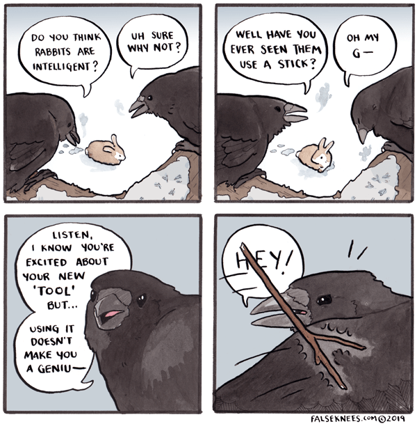
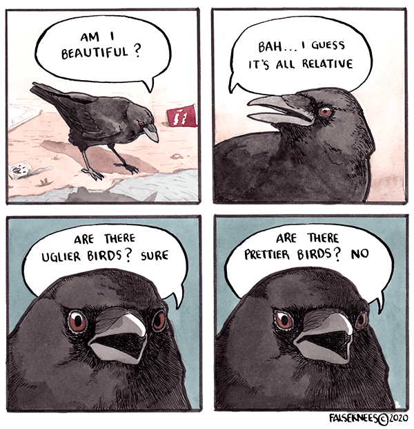
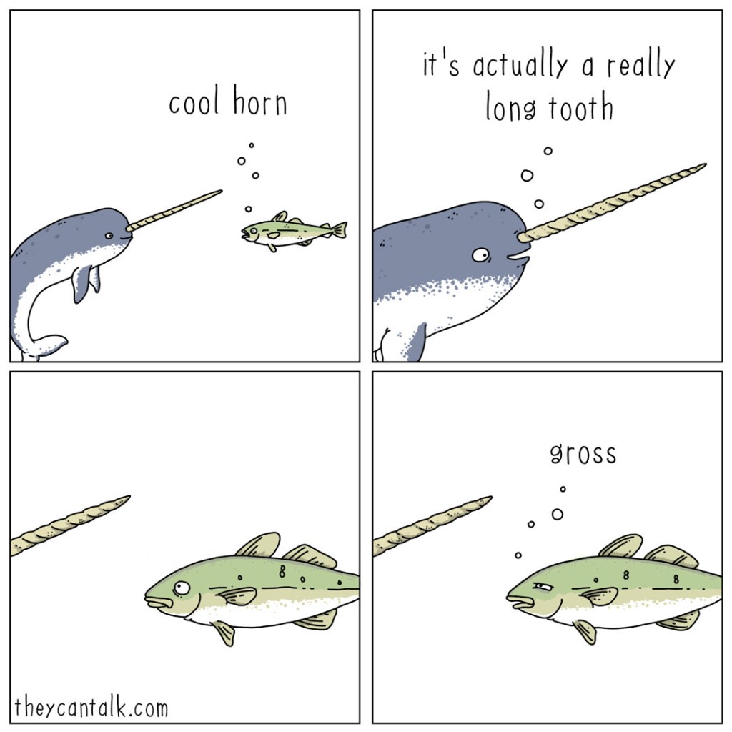
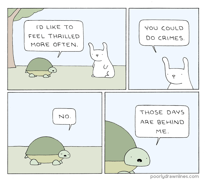
This inspired me to look closer at some short-form comics. I love webcomics, and as most are condensed into a few panels, it’s a perfect genre to help me see how other artists navigate telling a funny, endearing, or relatable story in this format. I looked at some of my favourites that I felt had similar narrative structures and characters to what I was aiming for in my zine. False Knees by Joshua Barkman was a great comic to look through in this context as it focuses specifically on birds and the conversations they might have. Whilst I didn’t want a conversational aspect to my zine, seeing these bird characters helped me when developing my own. Cute, funny, and human-like animal characters such as those also found in They Can Talk and Poorly Drawn Lines appeal to me and the idea of seeing the world from an animal perspective is one I’d like to explore in my work.
Examples from False Knees (top), They Can Talk (bottom left), and Poorly Drawn Lines (bottom right)
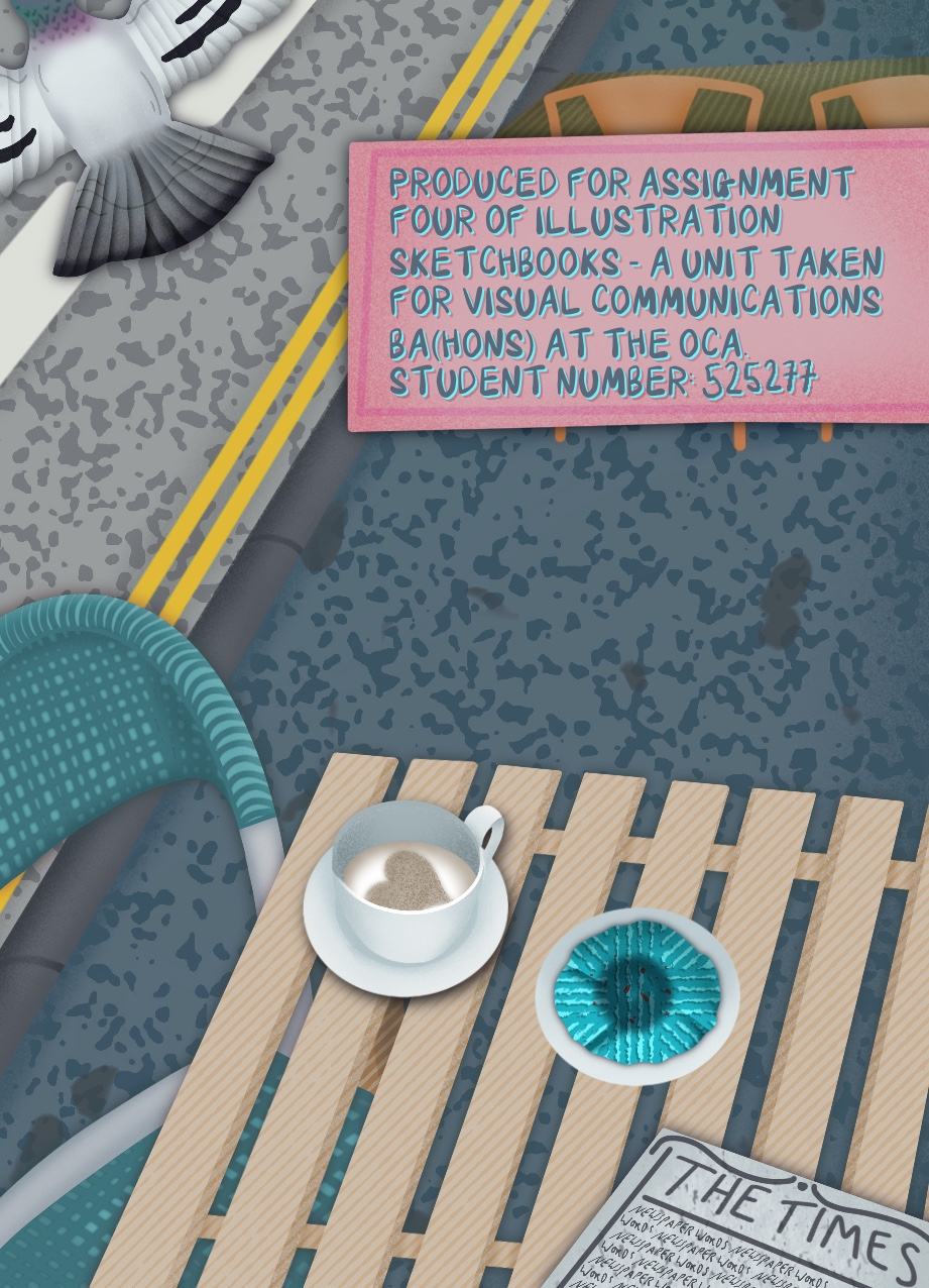
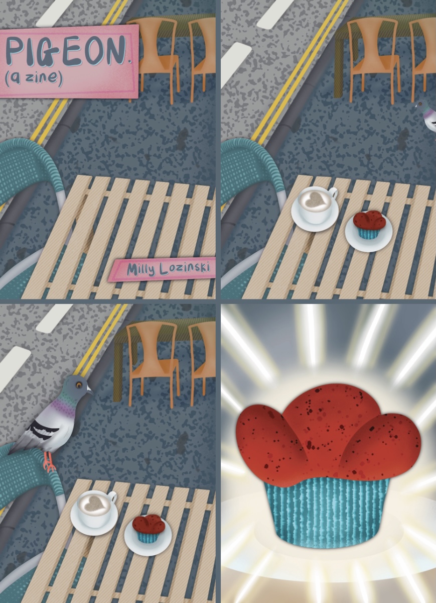
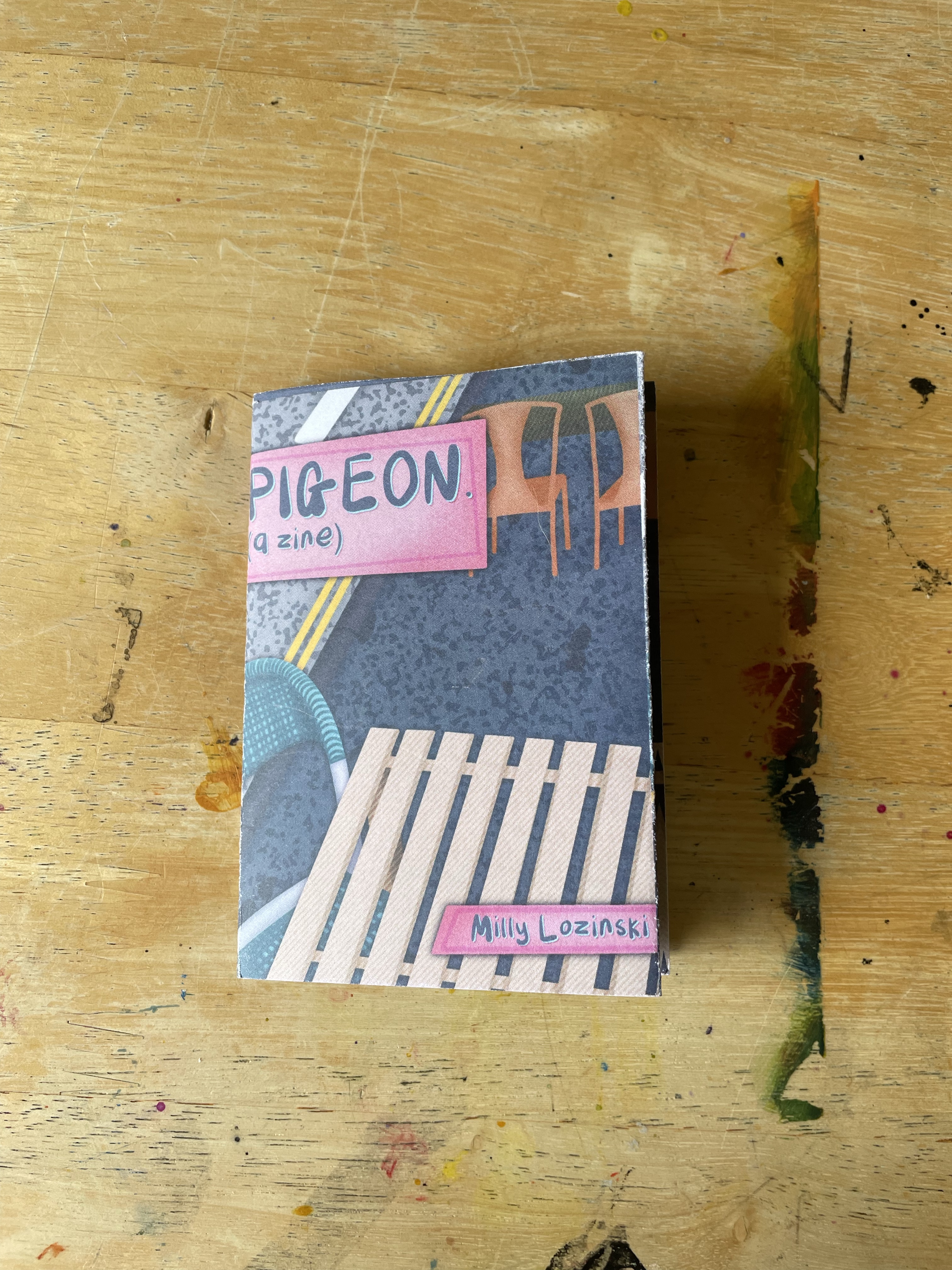
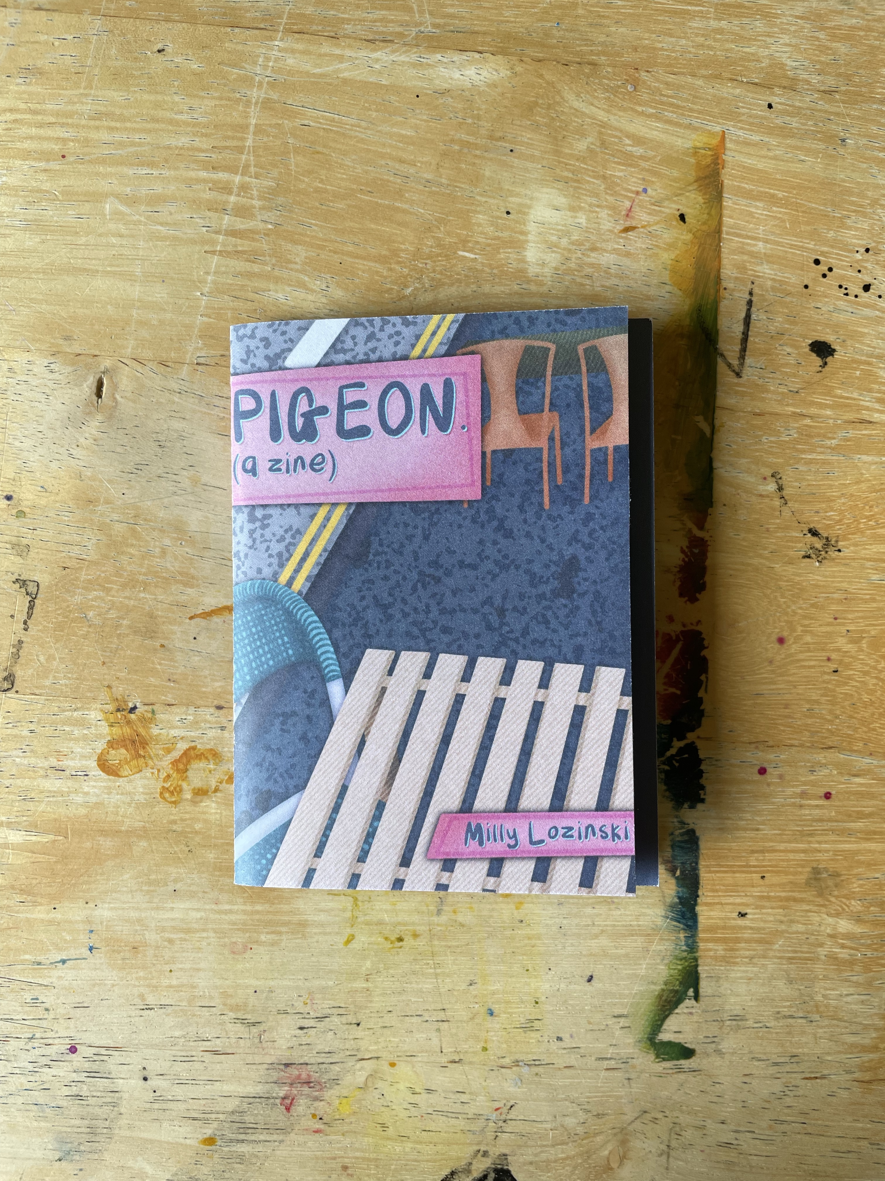
Now that I had a clearer idea of what I wanted the structure of my story to look like, and how I wanted the zine to look visually, I started brainstorming on a name. I liked the idea of the title being stylised ‘Title: A Zine’ so focused on snappy and short names. I thought about how pigeons are a part of the wider ecosystem in our society and considered ‘Cycles’ or ‘Ecosystems’ as the title on that basis. I also considered titles from the pigeon’s perspective such as ‘Voglio’ (Italian for ‘I Want’) or ‘Feast’. After some back and forth and discussions with other people, I decided the simplest and catchiest name was just ‘Pigeon’. At this point, I had all of the components of my zine ready and just needed to start making it. I wanted to design it digitally and then print it to fold. My printer has the capacity for this but it felt too complicated and expensive, so I researched a variation of printing companies and ordered some paper samples for when the time came.
Thumbnailing and planning my zine
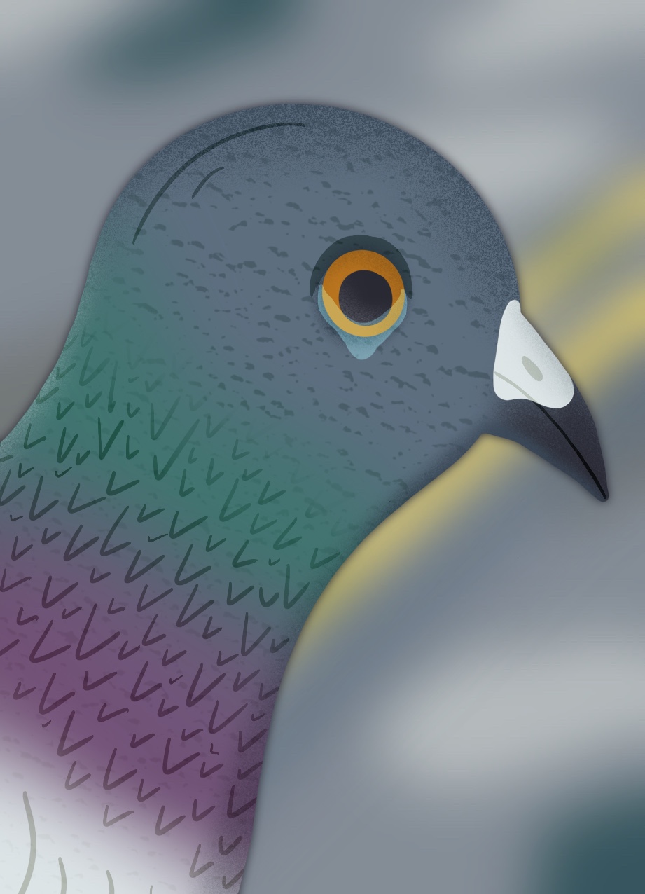
My go-to digital illustration software is Procreate, so I opened up 8 identical canvases sized 10.8cm by 7.8cm. I had measured the pages on my mock zine to get this sizing, then added a 0.3 border to use as a bleed between panels. I then sketched out a rough plan of the background as this would be consistent across most panels. I drew out a line visual to make sure I was happy with the placement of everything, then I was ready to start experimenting with my colours. I used google to find a picture of a pigeon and colour matched a range of colours from the bird to create my palette. Then I began filling in parts of the background with block colour, before adding textures and shading. It took me a while to figure out exactly what colours I wanted and I was worried that I wouldn’t actually be able to align my work with my vision. I used a lot of overlays to change the hues of different areas of the illustration, but ultimately it needed some bigger colour changes. Once I was happy with the background, I duplicated it into the other 5 panels it would feature in and began sketching each page out clearer.
A time lapse video of my process illustrating the background of my zine
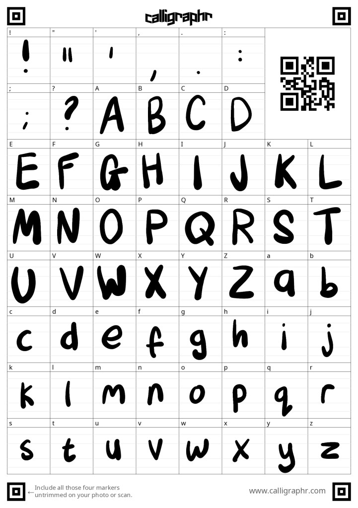
I focused on the front page to start with, figuring out which font I wanted to use for the text. I tried a couple I had saved on my iPad before realising the hand-drawn lettering that I sketched to indicate where the text would go actually captured the feeling I wanted from the font perfectly. I decided to design my own font to use, which was pretty simple and thankfully not time-consuming. I used the Callligraphr website which provides a template and then turns whatever you draw into a font. I wasn’t too careful here as I wanted the hand-drawn and messy look, and I’m so pleased with how it turned out. Having a font rather than drawing out each word myself was a huge benefit as not only did the text look consistent, but working with text layers rather than rasterised pixel layers allowed for more freedom and a better look overall. You can see on the back page where I had to draw the numbers myself how different this layer looks. It isn’t as easy to read, and the pixels really stand out.
The Calligraphr template featuring the font I created
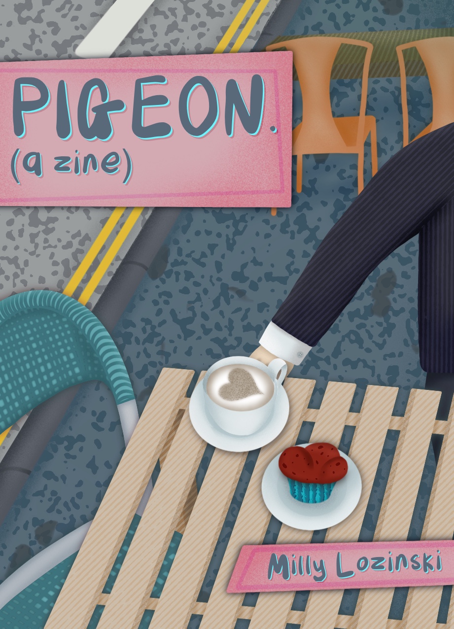
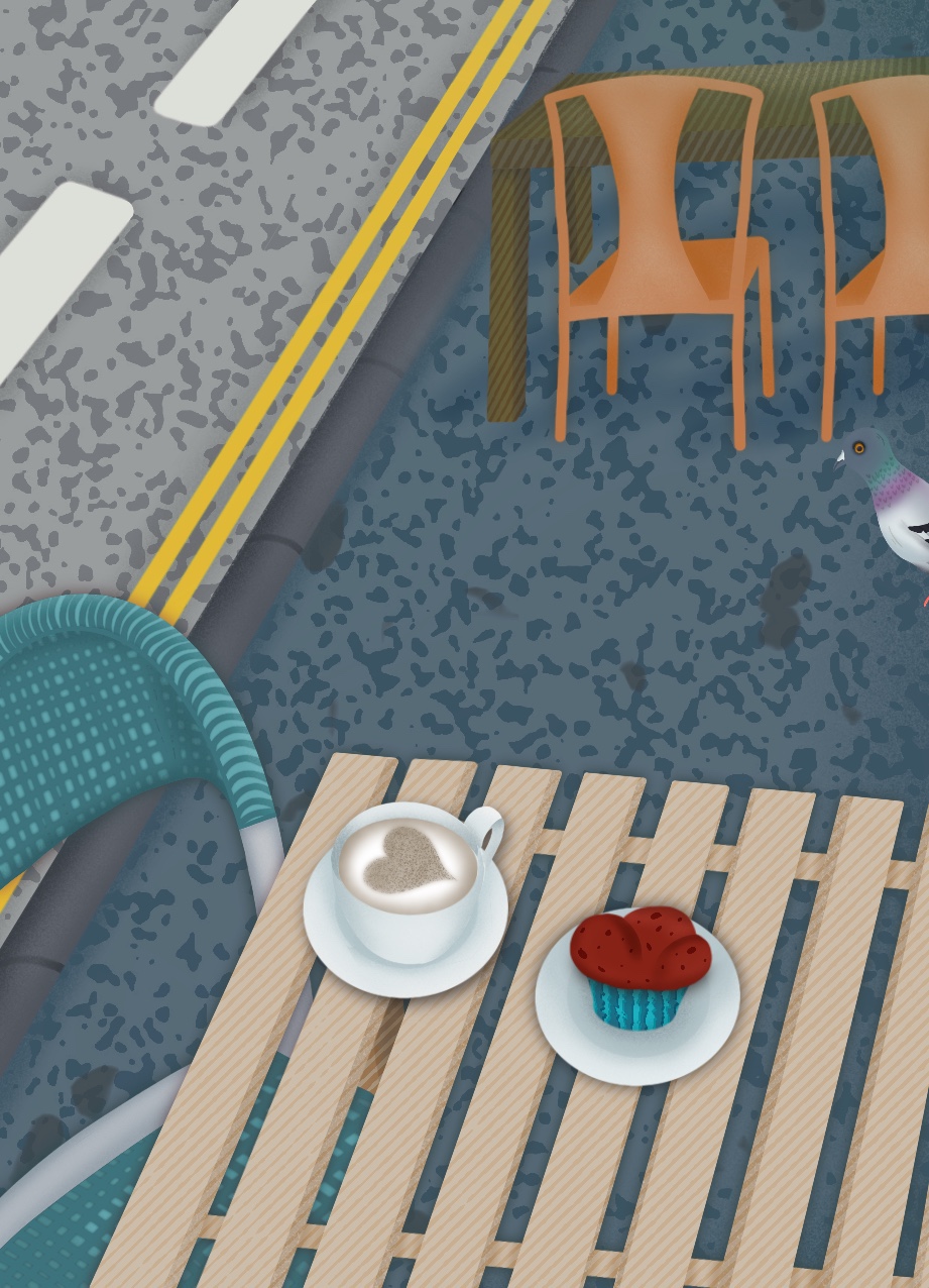
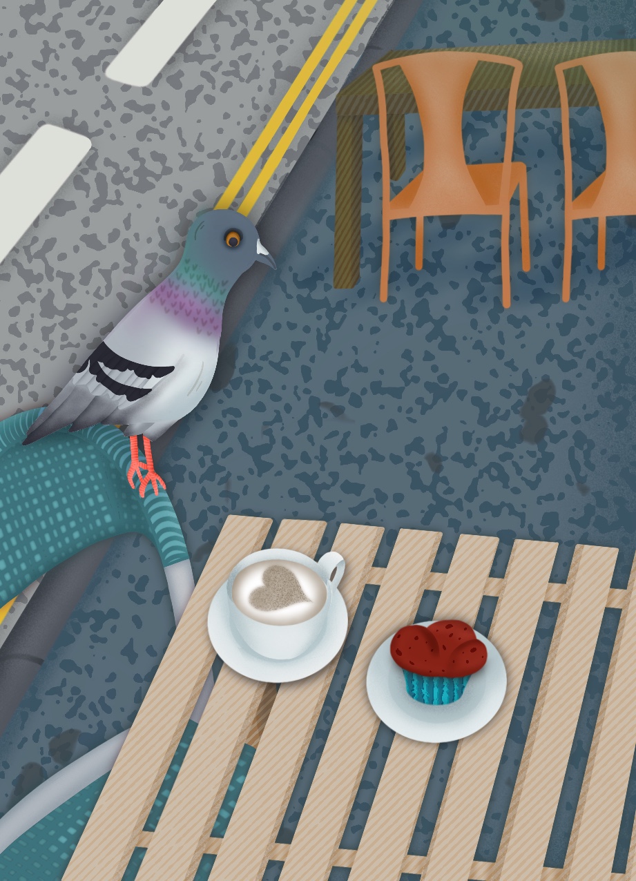
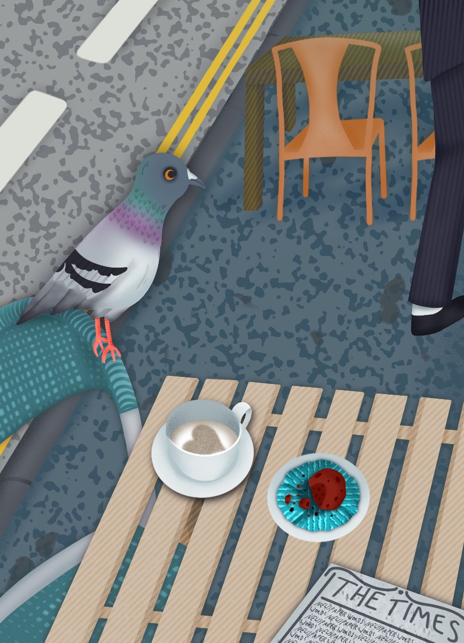
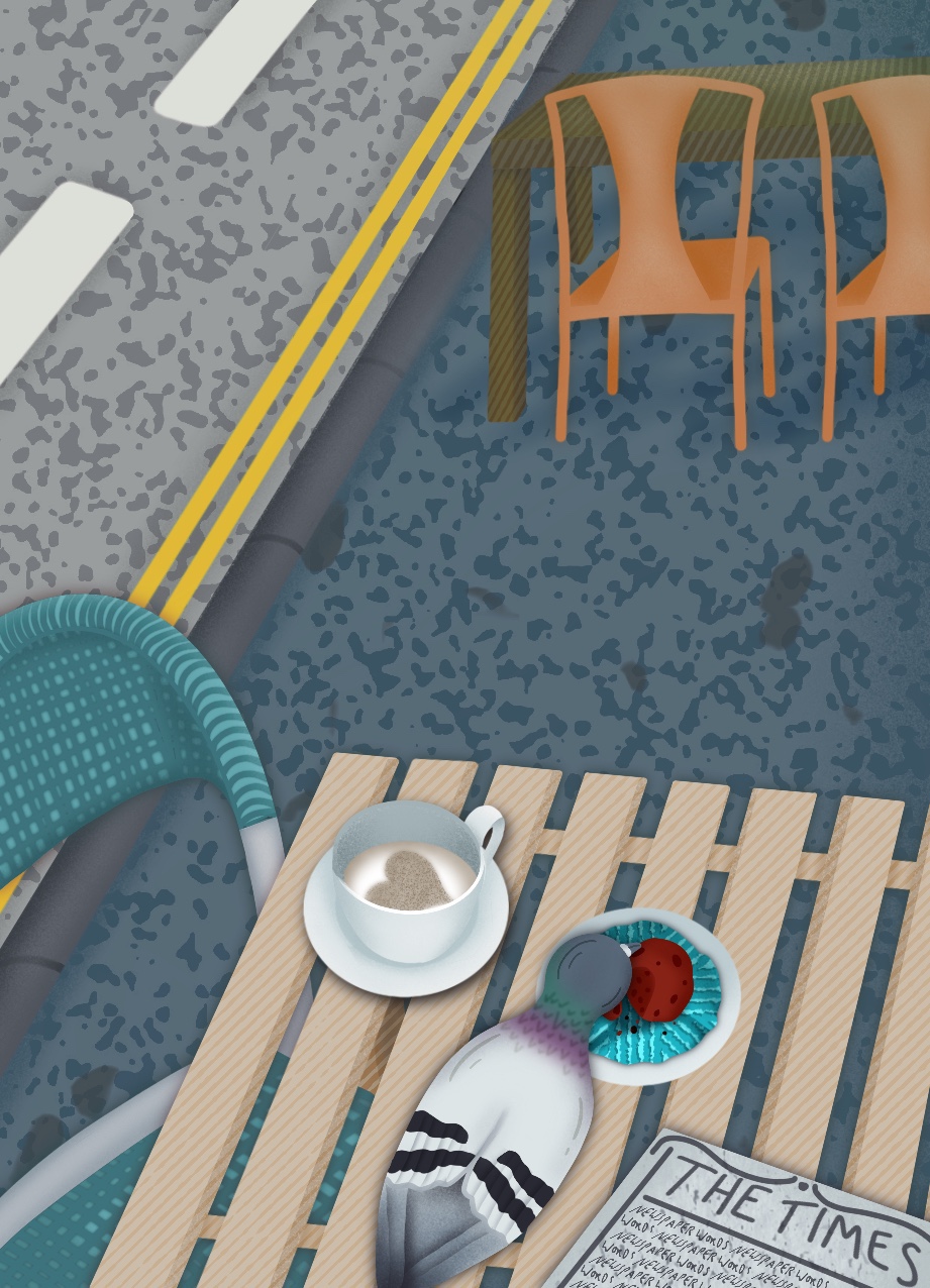
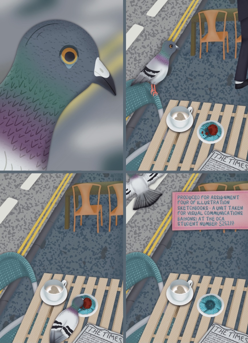
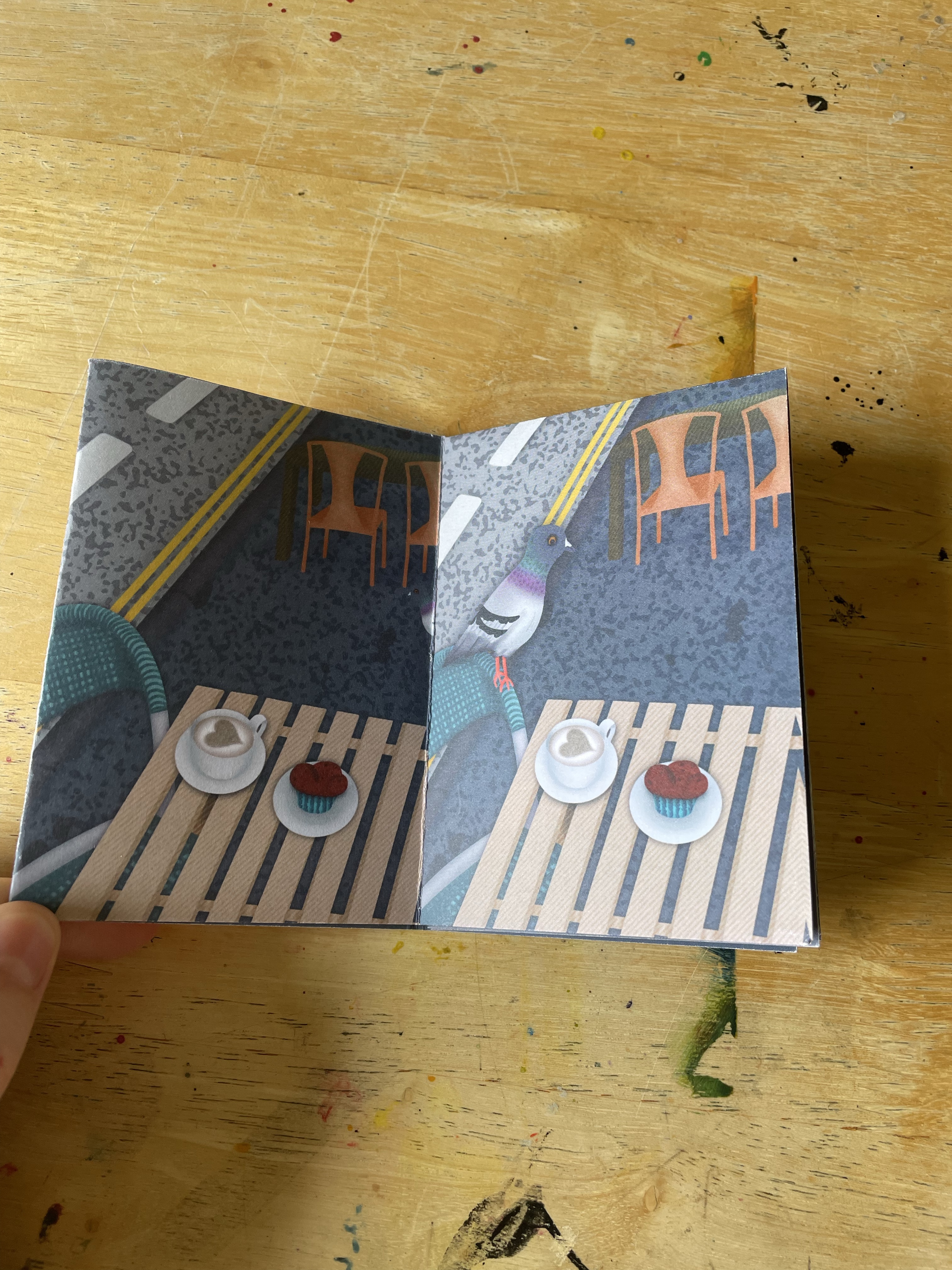
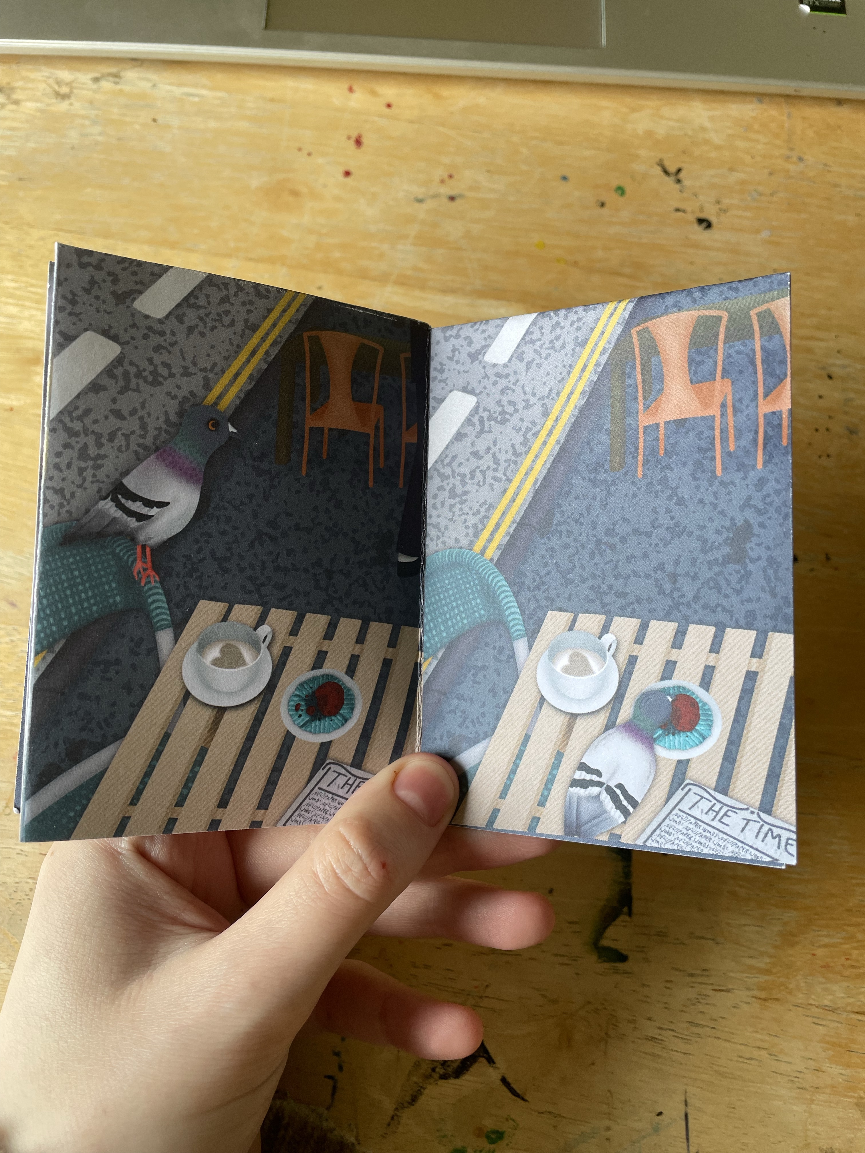
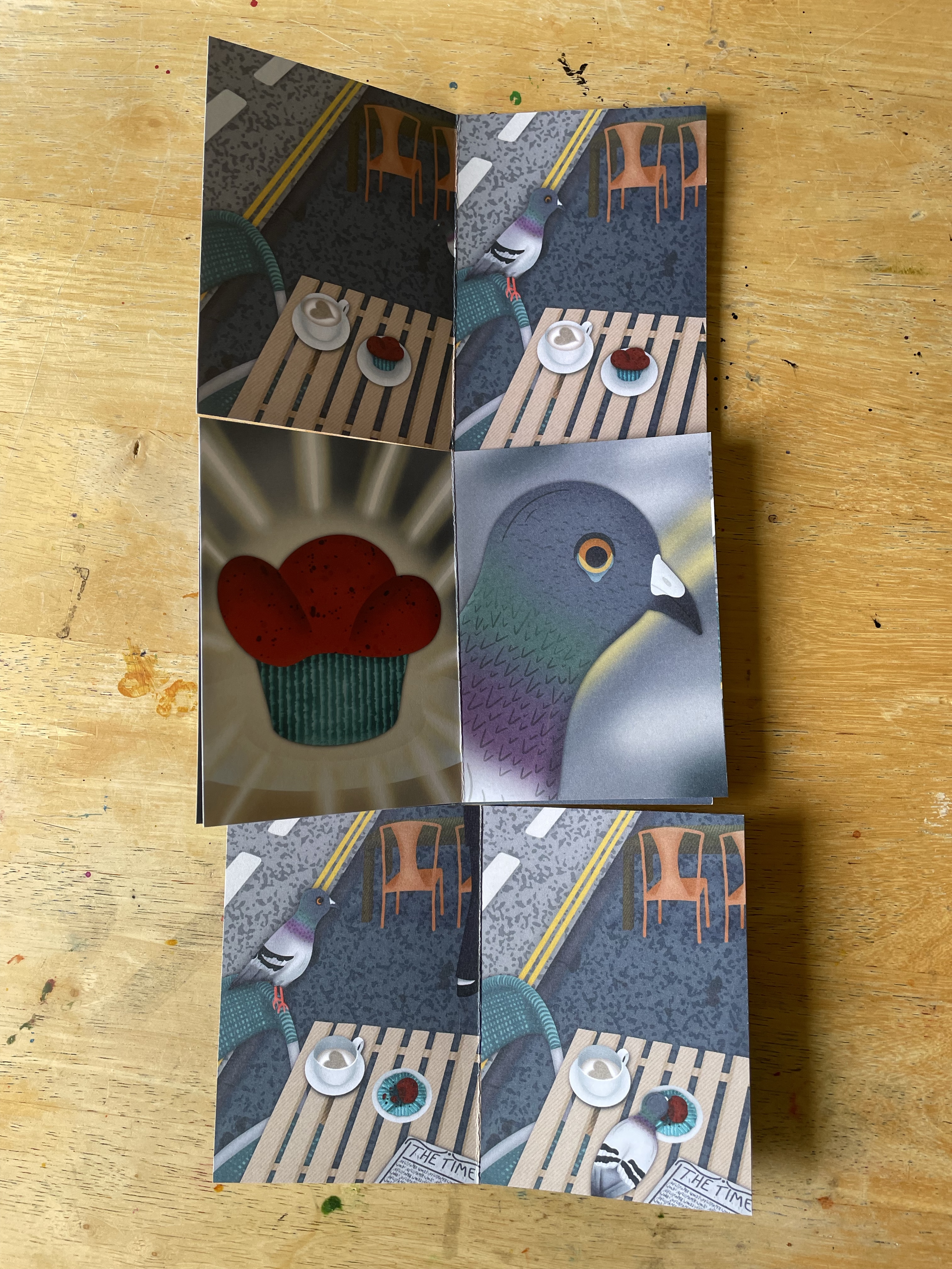
Next, I figured out how I wanted the text placement to look. This involved a lot of trial and error, figuring out which colours worked best and how to frame it. I feel good about the result and I’m glad I tried so many different options. To keep it consistent, I duplicated the text layers and copied them onto the back cover, where I ensured the framing would align to look as though it was wrapped around the zine. The mock zine I made came in handy here, as it helped me figure out where to place the text. After completing the text on the back cover, I finished the illustrations on the front cover. I wanted to add a human character placing the muffin and coffee down on the table. As the pigeon and the food are the stars of the show, not the human, I drew him out of frame.
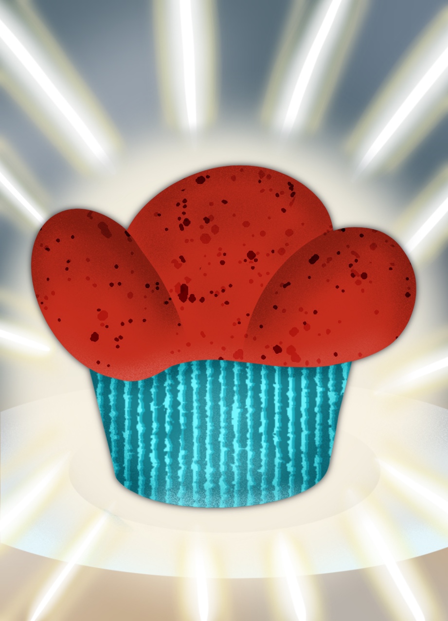
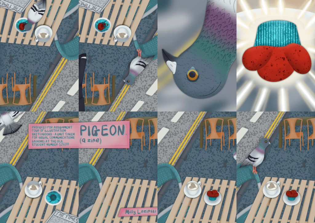
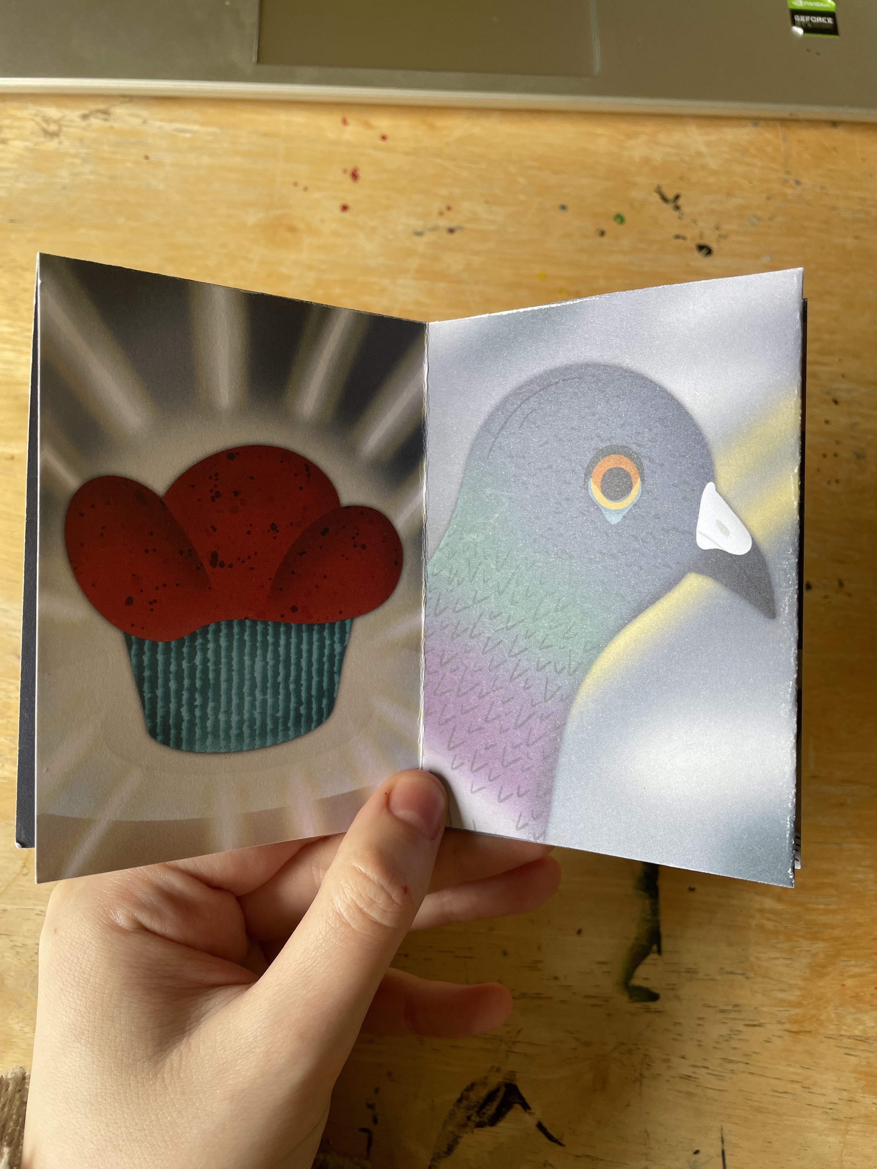
I then began to work on the rest of the pages. It was pretty easy to complete the zine once I had the elements and background drawn, as the same elements were used throughout most of the zine, and it made sense to copy and paste them throughout. I added in what was needed, such as the pigeon and newspaper, and changed elements slightly to show the half-eaten muffin and half-drank coffee. For the centre pages featuring the muffin and close-up of the pigeon, I redrew everything using the original drawings as a template.
A time lapse video showing my process illustrating one of the zine pages
A time lapse video showing my process illustrating one of the zine pages
A time lapse video showing my process illustrating one of the zine pages
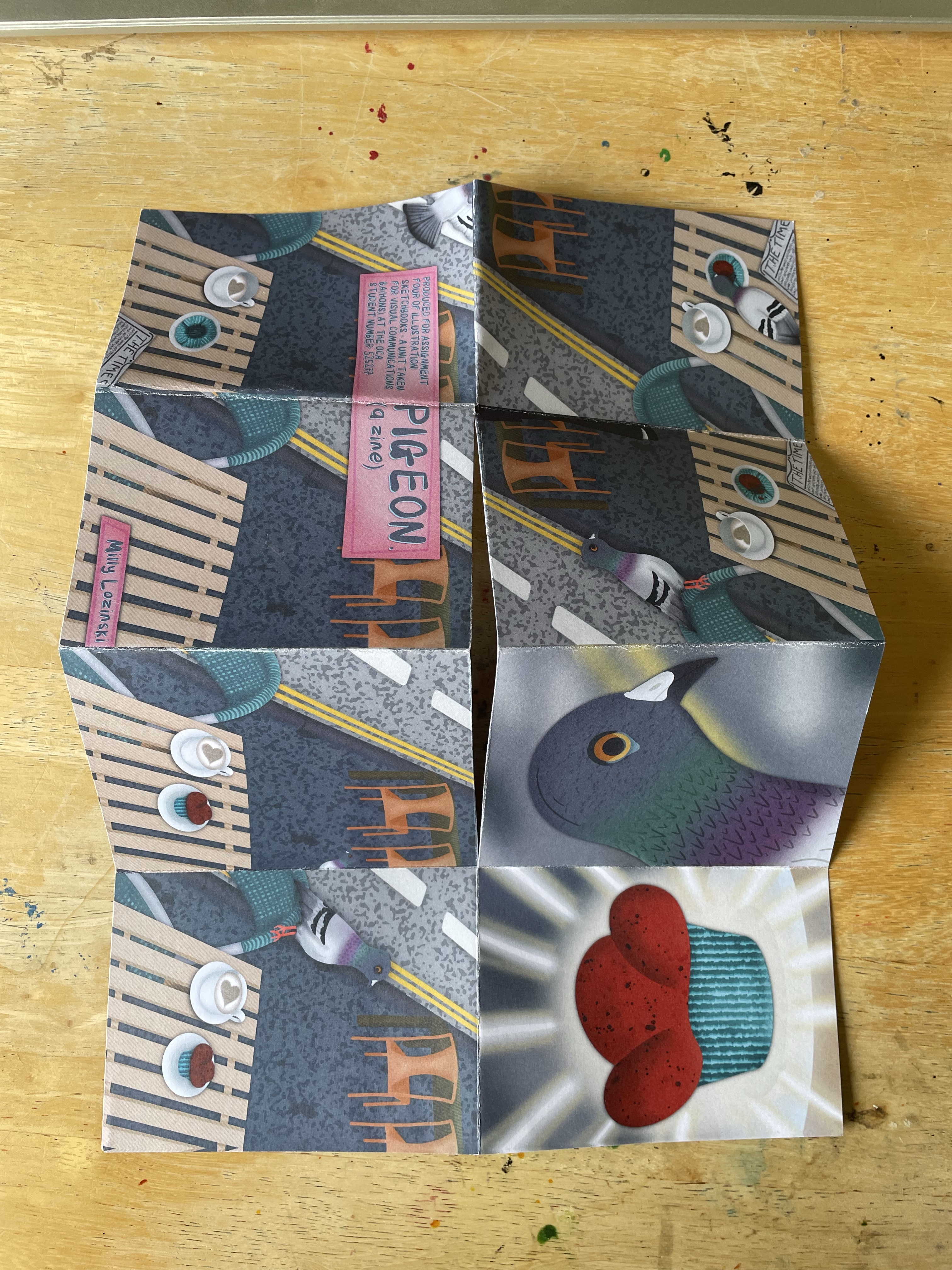
A time lapse video showing my process illustrating one of the zine pagesAll of the completed pages for the zine
Once I was finished with the illustrations, I moved into Affinity Designer to piece together my page for printing. I created a guide for myself to ensure each panel was in the correct location for folding, then inserted each panel into place. I filled the background in with a solid blue-grey colour to cover any potential gaps in between panels and added a 3mm bleed in the same colour. I then duplicated the file and removed the panels, leaving just the blue-grey colour, which ended up being used as the inside of the zine. As originally mentioned, I did want to create a poster, but I felt it was too much extra work and I hadn’t left myself enough time. I printed the zine using Instantprint and then created a web-friendly comic format.
The layout of my zine panels ready for printingThe web-friendly comic format of the zine
Despite triple checking, I didn’t realise until receiving the prints that I had selected an incorrect file for the front cover. The file I selected is missing the man and food elements, which I’m really frustrated about. Thankfully it doesn’t completely ruin the zine, but it does make me feel sad that I put so much work in only for it to be missing. I have learned from this mistake to check each individual file before printing, not just the final copy.
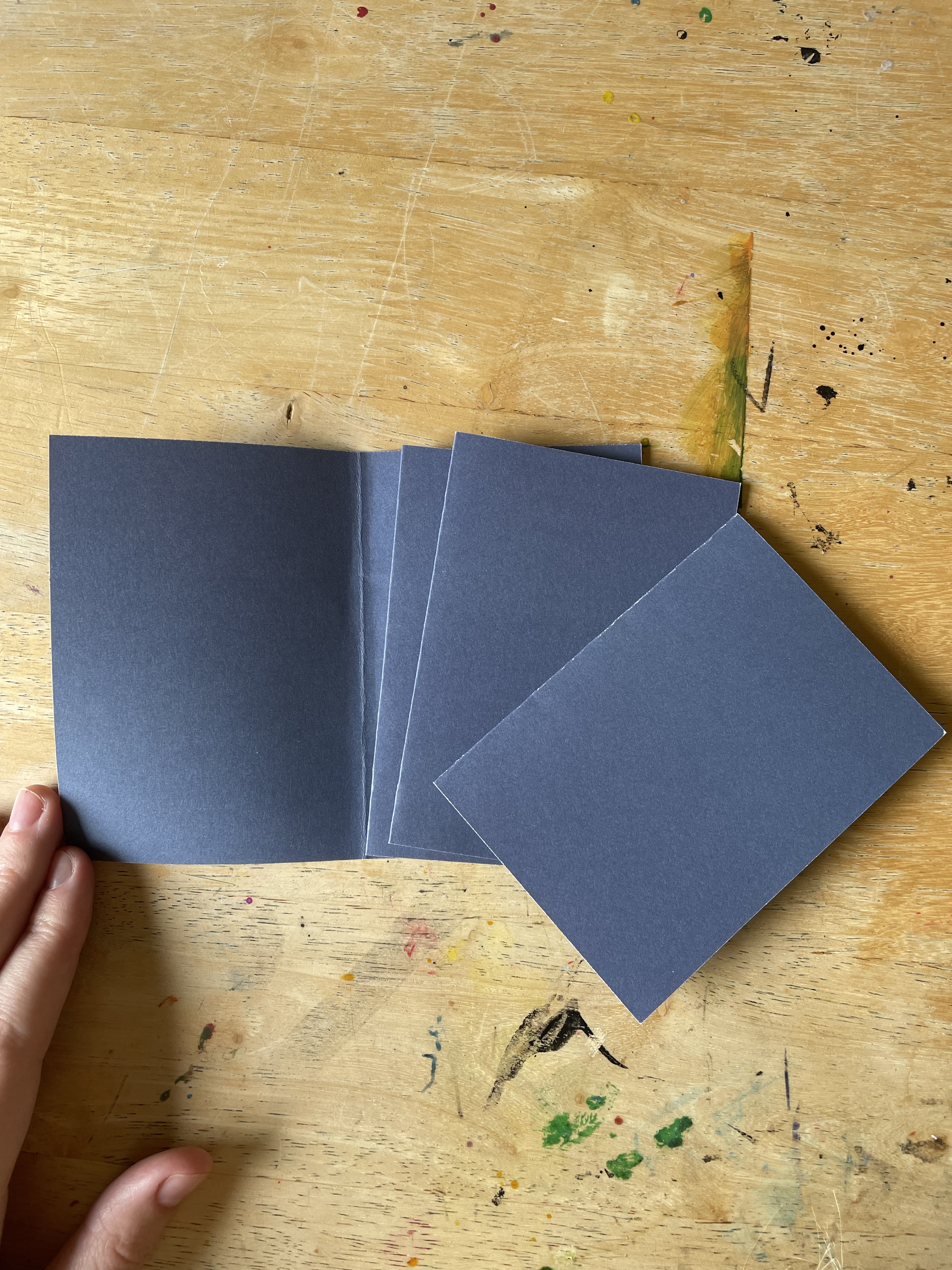
The zine folds well, though is a little bit misshapen. I ordered several copies just in case I made a mistake with the folding, so I was able to try out a slightly different technique, cutting out each set of panels and folding them together. This would work if I glued it back together, but without that, it’s not readable as a zine. Unfortunately, my glue is all packed and inaccessible right now, but I’d like to give it a go sometime.
Although the printing is technically wrong, seeing my zine like this makes me feel enormous pride. It is exactly as I envisioned, if not better, and I’m a little overwhelmed by that. There are a few elements I would change, such as the brightness of the pigeon’s legs, but overall I think it’s fantastic. I also had so much fun illustrating this, picking out textures, navigating my colour choices, and working with such a cute and silly story. I felt back at home illustrating a full project and seeing my ideas come to life.
The zine printed and folded in two different ways – the first four photos show a simple fold, the last three photos show the zine cut into individual pages, showing how glue is needed to make it readable
To round up Part Four, the unit guide asked me some reflective questions.
How did including written description alongside your drawing affect the way you were ‘capturing’ information?
I think I have always been drawn to writing in my sketchbooks, and jotting my thoughts down in written format helps me to explore my ideas better. In my previous unit, I would write ‘research sheets’ which incorporated my thoughts, research points, and some basic thumbnailing, much like my thumbnail pages in this assignment. I find it very helpful to write my thoughts, and extending that to descriptions of what I’m seeing was helpful too. I’ve gotten a bit caught up in the idea that ‘sketchbooks are for drawing’ and that I should be trying to draw what I see, not write it, so it was refreshing to be reminded of this.
How did you find the process of moving from descriptive drawings towards fictional narratives?
I very much enjoyed the process and found it useful to explore exercises and techniques that help in achieving this. Some of the exercises I have done throughout Part Four will remain with me forever, I think. I feel like I have a great grasp on idea development in this way.
We talked about having conversations with previous illustrations, which of the illustrators mentioned in this section’s work did you have the most dialogue with?
Myfanwy Tristram’s work inspired me hugely, and further investigating artists who use visual diary techniques has helped me to see how my own artistic practice could utilise this. I am looking forward to implementing some of the themes I identified in Research Task 4.0.
Part Four has been very enjoyable. I feel I have learned so much about how I can use my sketchbook and the ways it can work for me. I have found much of the course difficult thus far, and Part Four has felt refreshing. I am excited now to move onto Part Five and to reflect on my sketchbook journey.
This exercise elaborated on the previous one and introduced me to a more in-depth story structure: Nigel Watt’s Eight-Point Arc. I find this topic quite hard to engage with. I have always loved to write stories, create worlds, and consider narrative within my art, but the idea of writing out a plot and following it stresses me out. I like the open-ended ‘let’s see where I end up’ approach to storytelling, preferring to go back at the end and tie up loose ends and fill in all of the gaps. It might not be the most efficient way to create stories, but it’s much more enjoyable for me.
When I was a child I would participate yearly in NaNoWriMo, a global challenge for writers to complete a whole 50,000-word novel in one month. I didn’t ever accomplish it, as I was young and easily bored by writing, but I loved the community and the concept. We, as participants, typically sorted ourselves into two groups – plotters and pantsers. I was a pantser, someone who came into the challenge with a vague concept for a story assured that I would figure it out as I went along. I take the same approach now when tackling an assignment or project: I start, and trust I’ll figure it out by the end.
Breaking down the process into great detail and then applying this to my future projects completely disinterests me and puts me off doing them entirely. So as expected, examining story structures and figuring out how to apply them to my own work does much the same. Reading over Nigel Watt’s Eight Point Arc, I notice that it simply expands on the ‘beginning, middle, end’ structure I used in Exercise 4.4, which interestingly didn’t feel restrictive and stressful. Maybe this was because I was simply doing it, rather than overthinking it, I’m not sure, but viewing Watt’s story structure in this way definitely helps.
If I was to approach the development of my work using this structure, I think it would be useful to break it down into several steps. First, undergo the steps in Exercise 4.4, finding a simple ‘beginning, middle and end’ structure. Then, break each of those frames down further, seeing how they could be expanded upon – much like how Watt’s theory expands on the three concepts. If there simply isn’t a way to expand it further, that’s fine, and if there is, that’s great! This approach would likely feel less restrictive for me and more like I was exploring options as I go, rather than trying to plan ahead.
I’m generally more focused on the ‘big picture’ when it comes to everything in life. Breaking things down and hyper-analysing them doesn’t come naturally to me. It’s why I’ve always struggled with the in-between bits of my illustrative process – I have the ideas, research and concepts down, and I know what I want the final piece to look like, but every step along the way feels tedious and finicky. I can see how using a pre-existing narrative structure could help me to ensure my stories are well written and the best they could be, but I think I need to approach them more as inspiration rather than a strict process to follow.
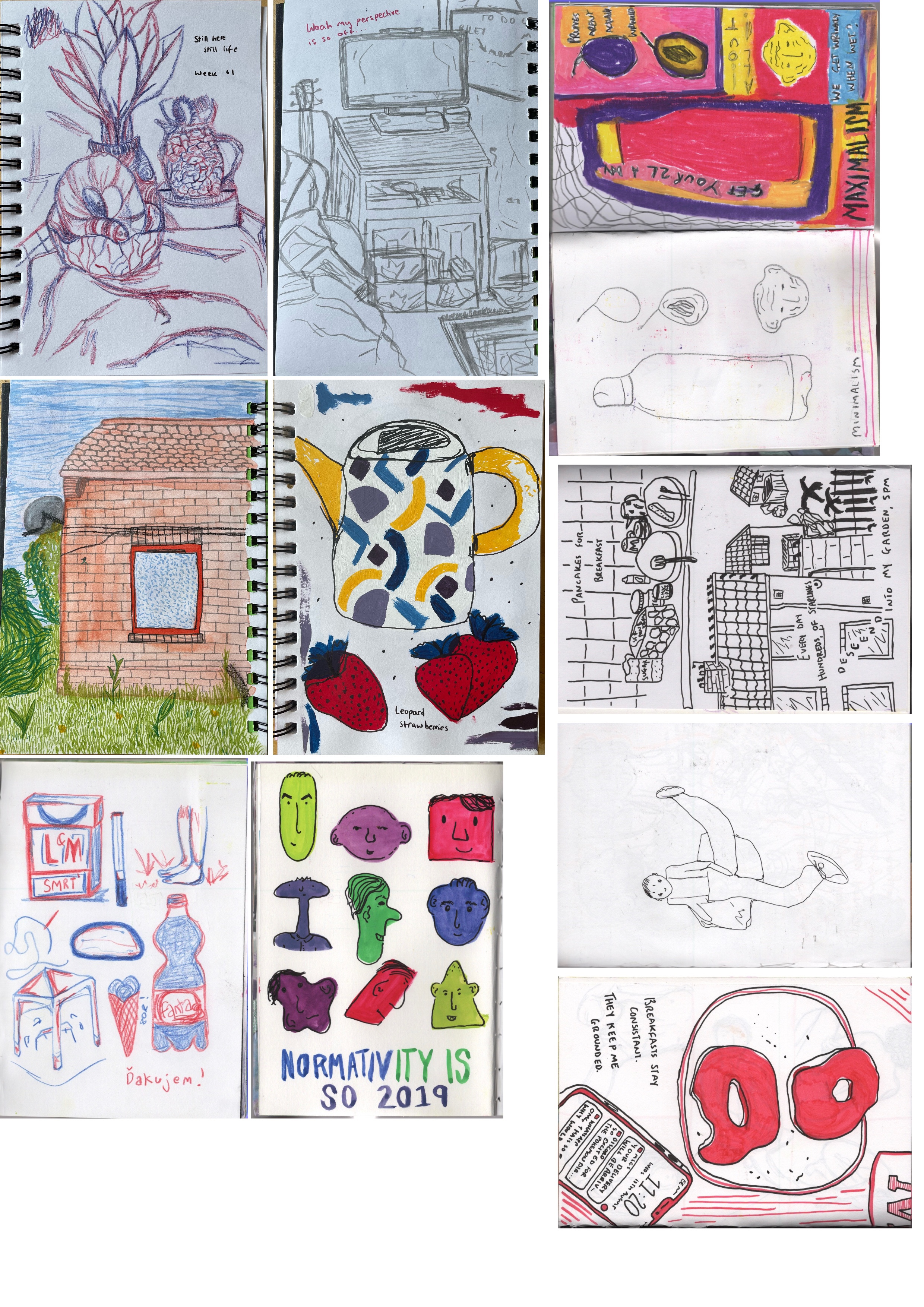
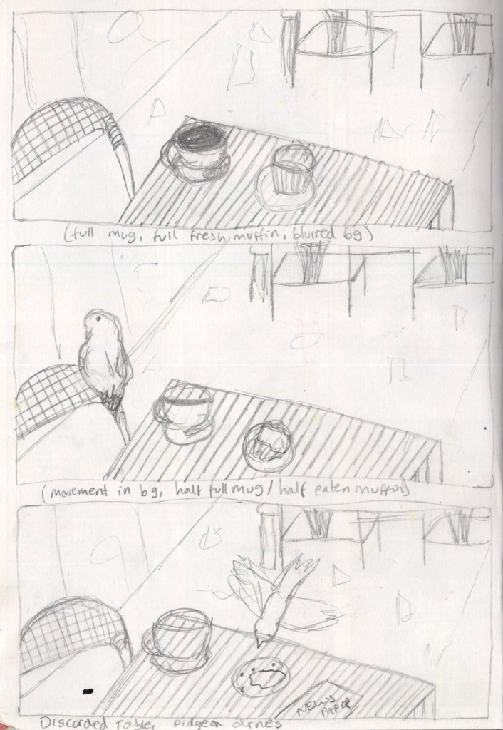
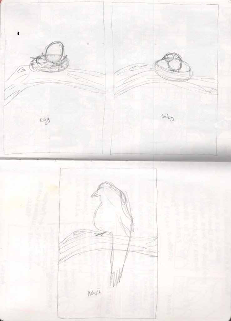
My final exercise for Part 4 asked me to once again look back through my previous sketchbook work, this time choosing three pieces I felt could be developed into brief stories. I had to take each piece and duplicate them three times, then change a part of two of the images to create a ‘beginning, a middle, and an end’ structure. The first piece required only this basic structure, whereas the second and third pieces had to be altered in specific ways – one showing the passage of time, and the other showing how form or shape can change.
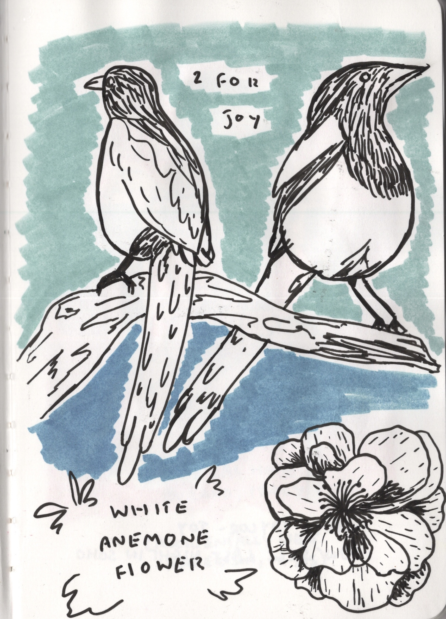
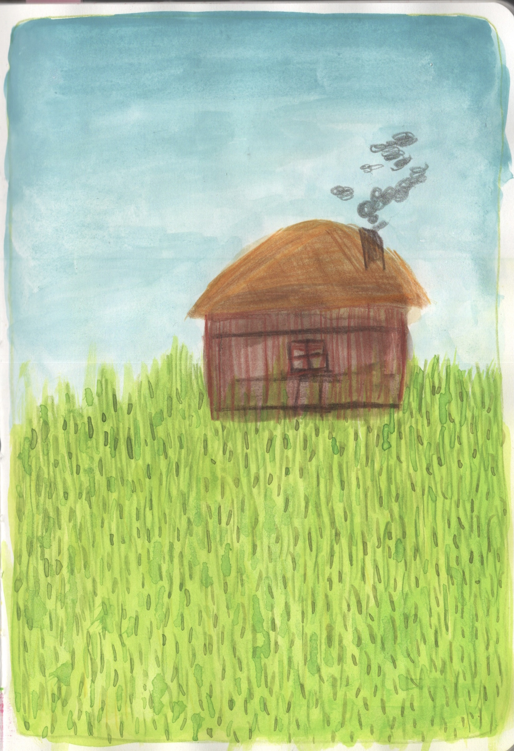
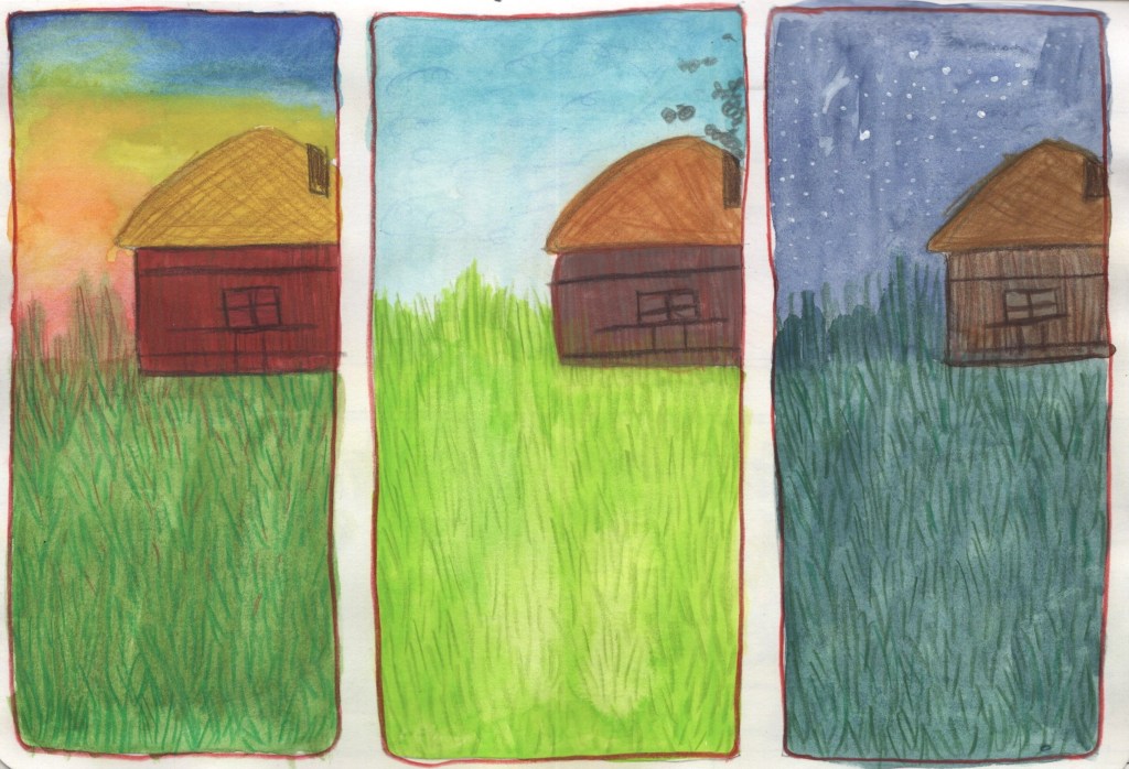
I looked back through my current sketchbook which I have used since the beginning of Part 3, for a combination of uni work and personal work, and reflected on which pieces could be used for this. I settled on the scene from Exercise 4.1 for my first, basic narrative structure, a painting of a house in a field for the piece focused on the passage of time, and a drawing of some magpies on a branch for my form/shape change piece. The house and magpie pieces are personal pieces I did for fun.
The original pages in my sketchbook
I started by drawing out some boxes for each piece to be sketched in, then began duplicating my work. For the first piece, I drew a consistent background but left out any defining features. I then went back in and added these features, showing a beginning (a table with a full mug of coffee and a muffin), a middle (a pigeon lands on the chair, the mug is now half full, and the muffin is half-eaten), and an end (the coffee is finished, the table has been abandoned, and the pigeon steals the remainders of the muffin). Considering how I could alter the situation to add a story to it was an enjoyable process, and it helped change my perspective when viewing my work.
A simple beginning, middle, end structure
My second piece had a slightly different approach. As my original painting is bold and colourful, I wanted to re-paint it and explore how colour can be altered to emphasise the passage of time. I began by loosely sketching out where the horizon and house sit in the space marked out, then I painted the central panel as it was just a matter of copying the original. I wanted a ‘before’ showing the sunrise and an ‘after’ showing the night. I went into Procreate and manipulated the photo I had taken of the piece to reference it, experimenting with how lighting and colours could change. I know that at night, grass looks so much more blue, and early in the morning often can look more red or even white depending on the sunrise. This process helped me figure out what colours to use in my before/after panes.
Despite using Procreate to help figure out my colour choices, I still very much felt like I was experimenting with this piece. At the time of painting, I really disliked the work and had to keep reminding myself that it’s just my sketchbook and I’m supposed to be exploring. Now, upon reflection, I think they look fantastic and my usage of colour really does communicate the passage of time. There’s more I feel I could do to demonstrate this, maybe adding a washing line full of clothes, various animals in the backdrop (such as an owl at night, or blue tits early in the morning), or a character doing time-appropriate things. However, as my focus was exploring colour, I think I achieved my goal.
A beginning, middle, end structure focused on the passage of time
My final piece is comparatively rushed and half-hearted. I didn’t really feel as excited about the concept, and I’m disappointed looking at it alongside the other two. It’s an idea, despite being half thought out, and again I feel the need to remind myself that not everything in my sketchbook needs to be fully explored or concluded. I can go back and work into this further, or take it in a totally different direction if I see fit later in the future. My aim was to show the life cycle of a magpie, from egg to fully grown adult. I think this is obvious from my rough sketches, which is good!
A beginning, middle, end structure focused on objects changing shape or form
As I have already mentioned, this method of idea-generating has really stuck with me and I would like to explore it further. Incorporating this process into my regular illustrative process could benefit me hugely. My perspective has shifted slightly when viewing my own work, I definitely find myself seeing potential in everything I have drawn, rather than seeing all of it as complete and unfinished. I still don’t particularly enjoy going back and working into pre-existing sketches, but taking them to a new page and developing them further is benefitting me greatly.