Exercise 4.3: Conversations With Pictures

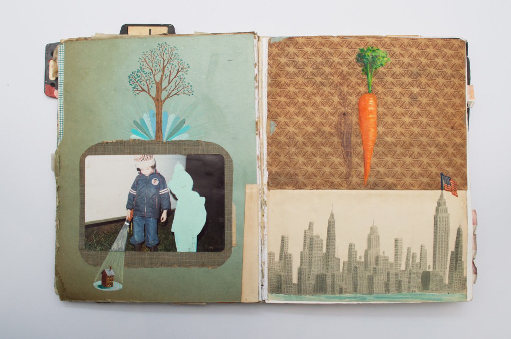
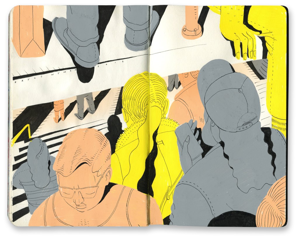
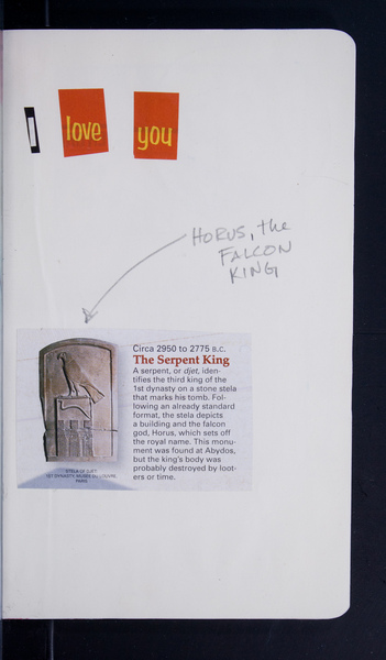
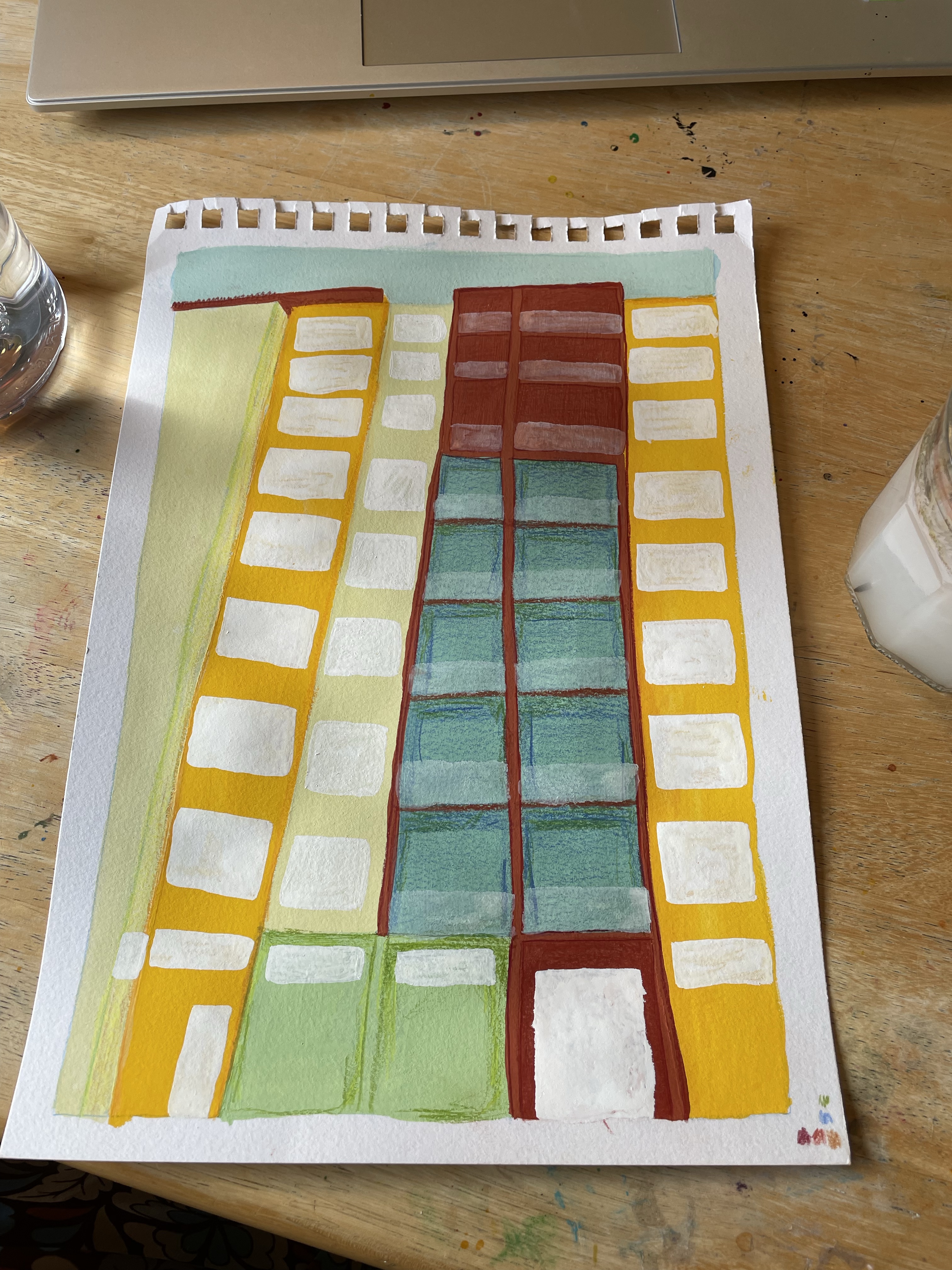
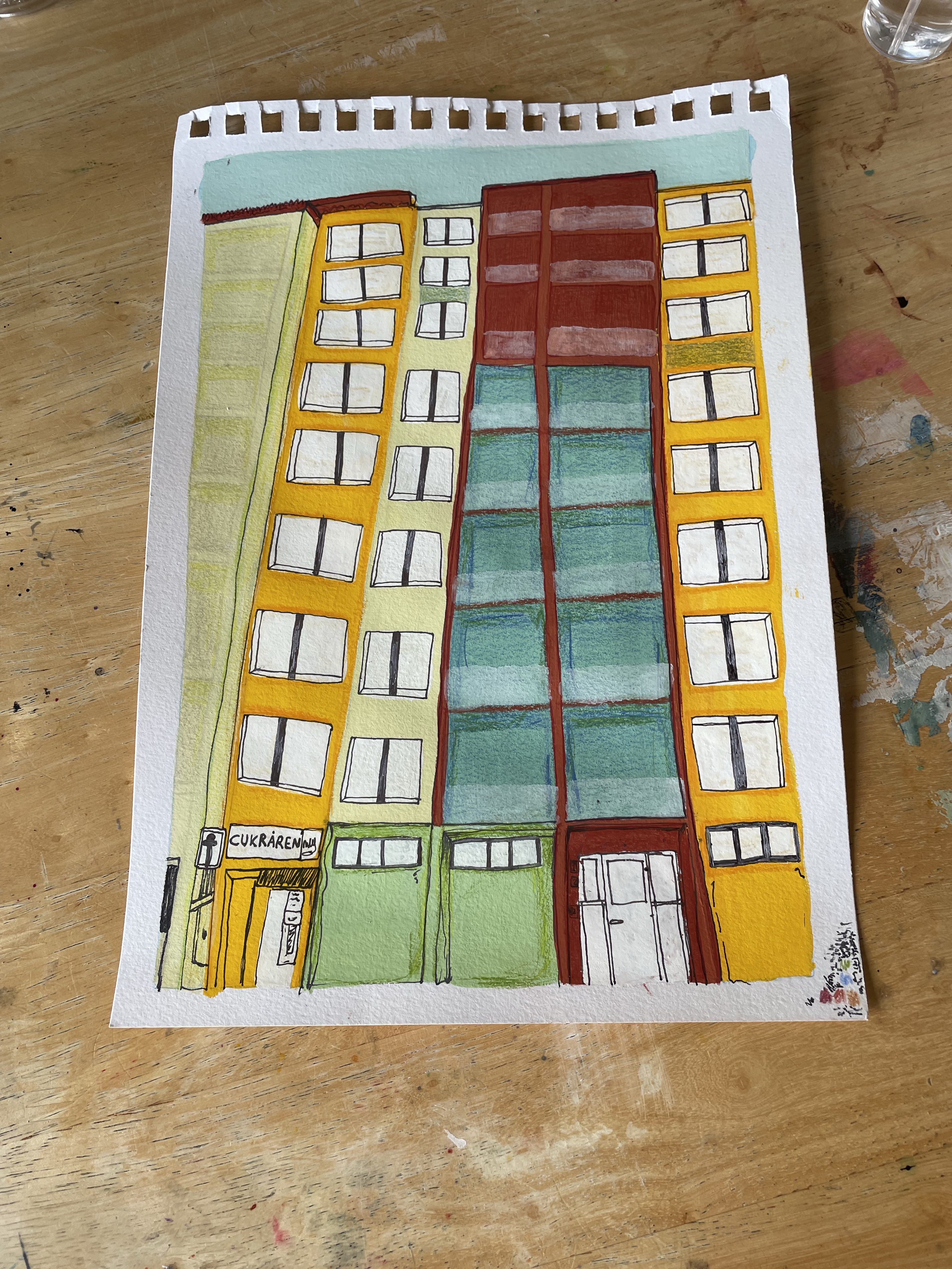
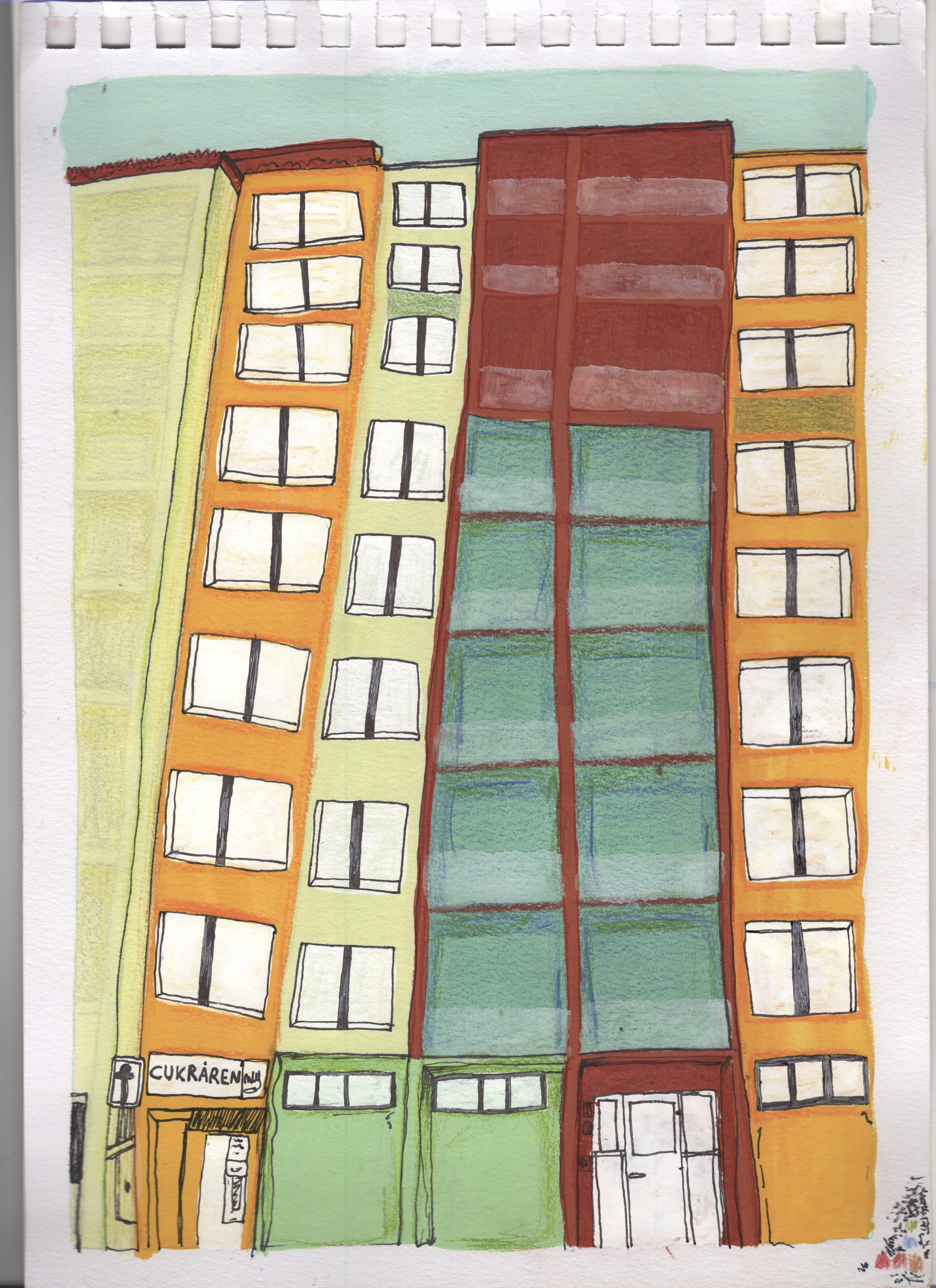
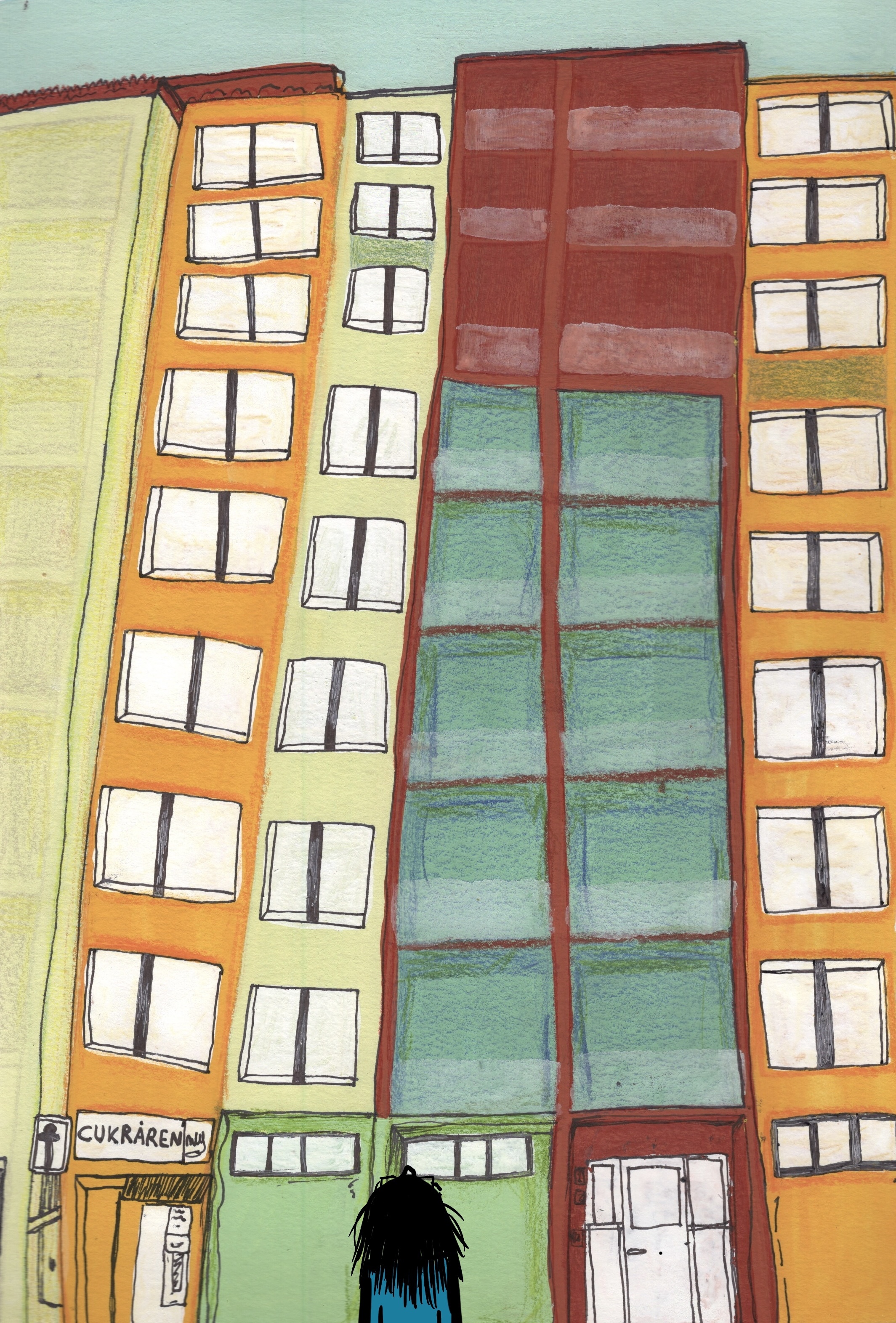
For this exercise, I was asked to revisit the work in my sketchbook and consider new perspectives for my drawings. I first had to add dialogue or thought processes to my figurative drawings, exploring what could be going on in the image. Then I had to redraft the ideas that stood out to me most, developing the characters further. Finally, I had to write a letter to someone from the perspective of one of my characters, considering the format, the paper used, and any additional illustrations, to fully bring the character to life.

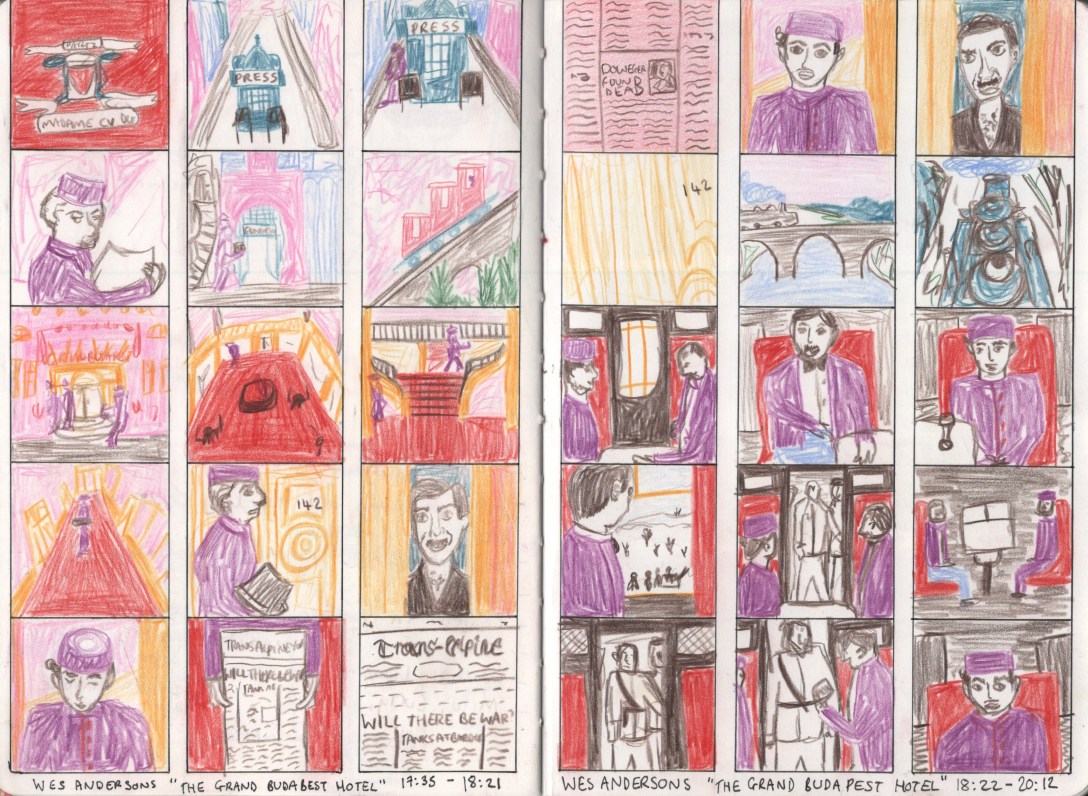
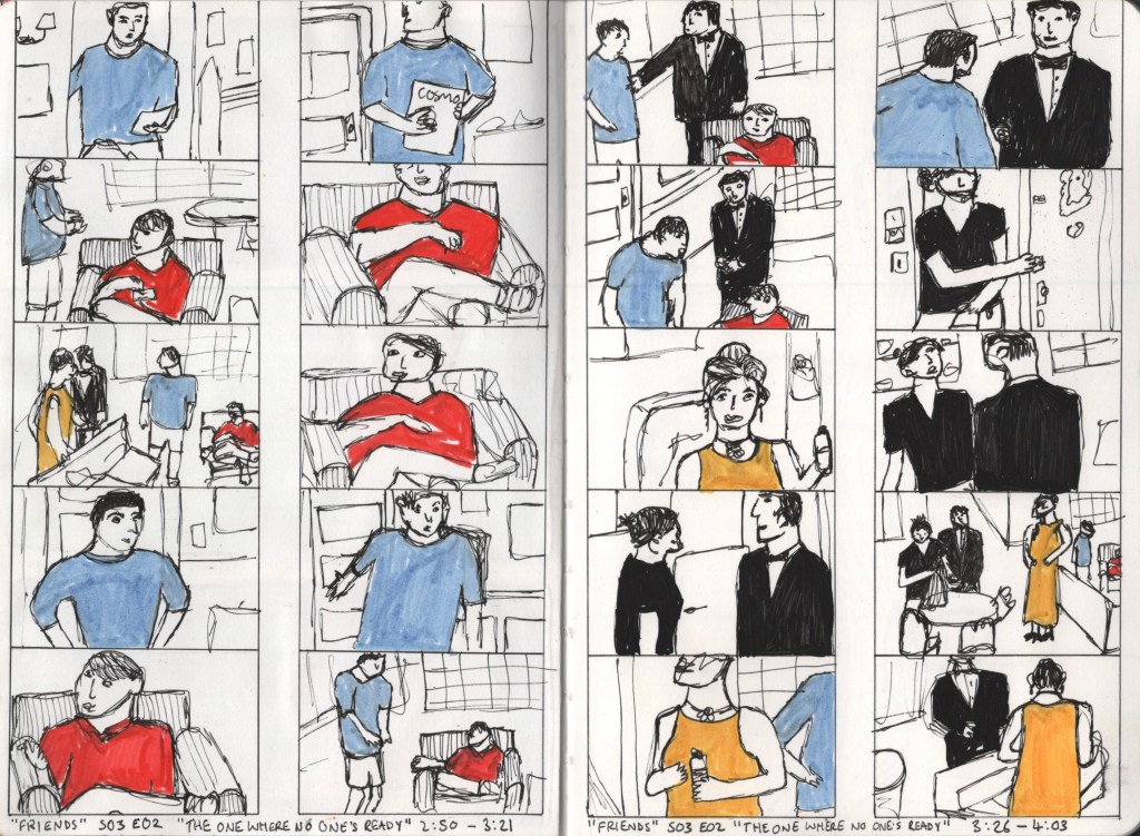
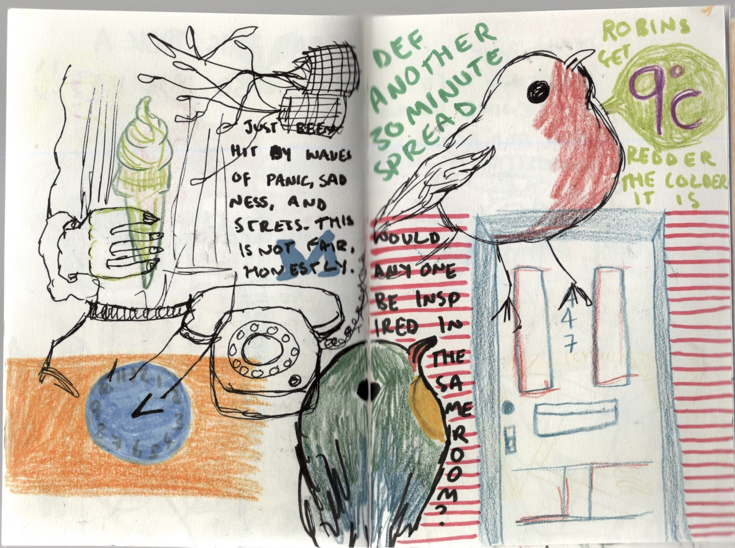
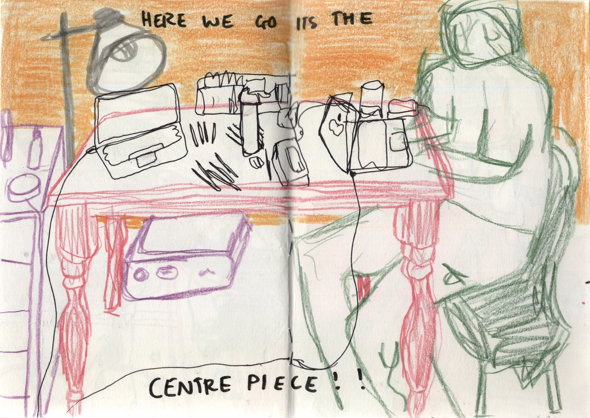
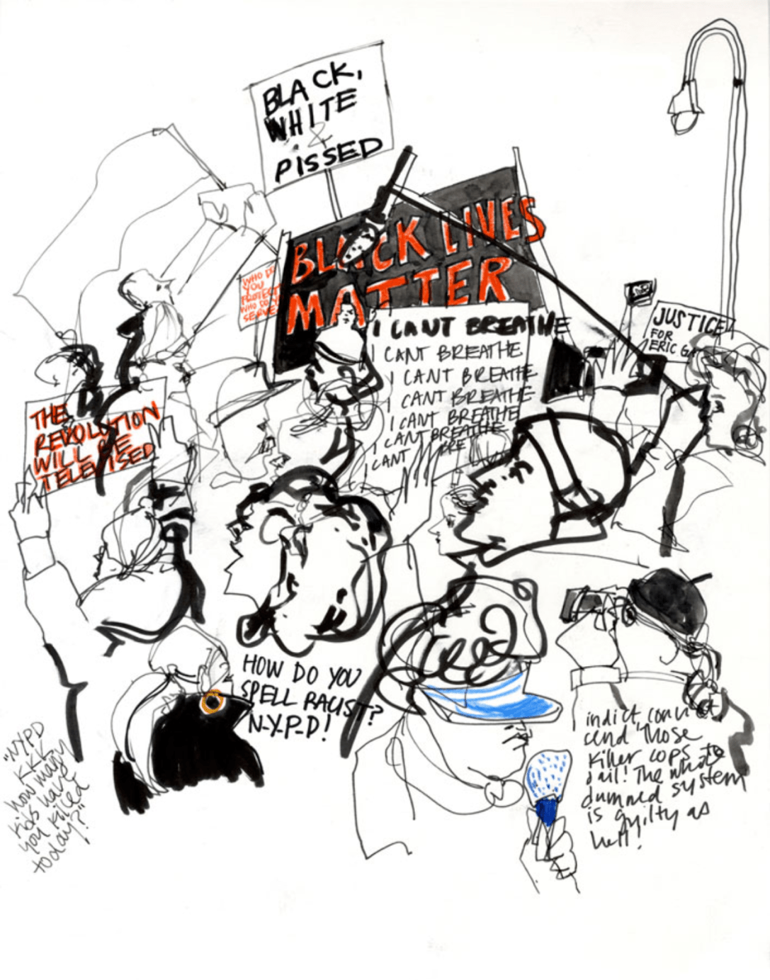
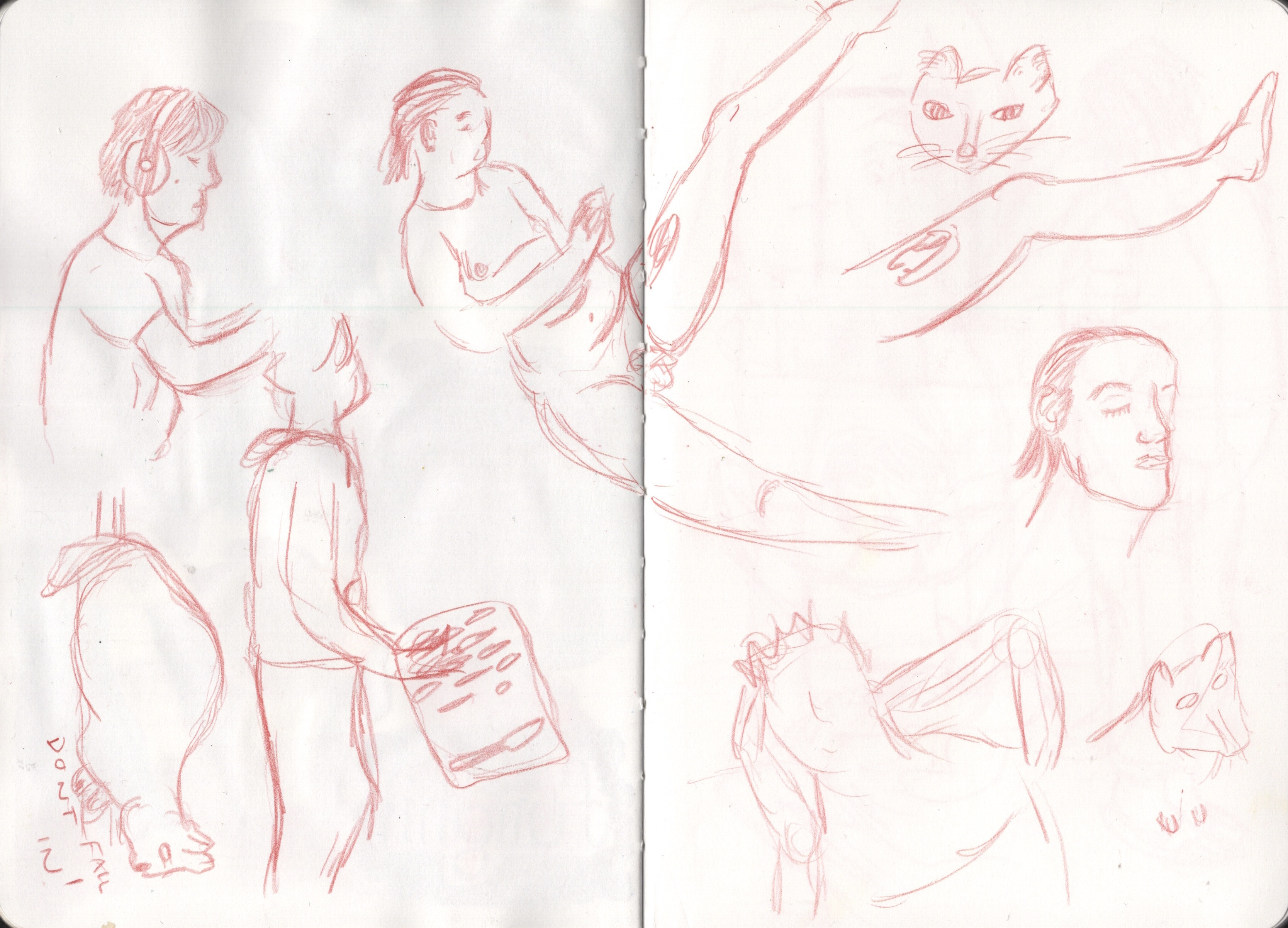
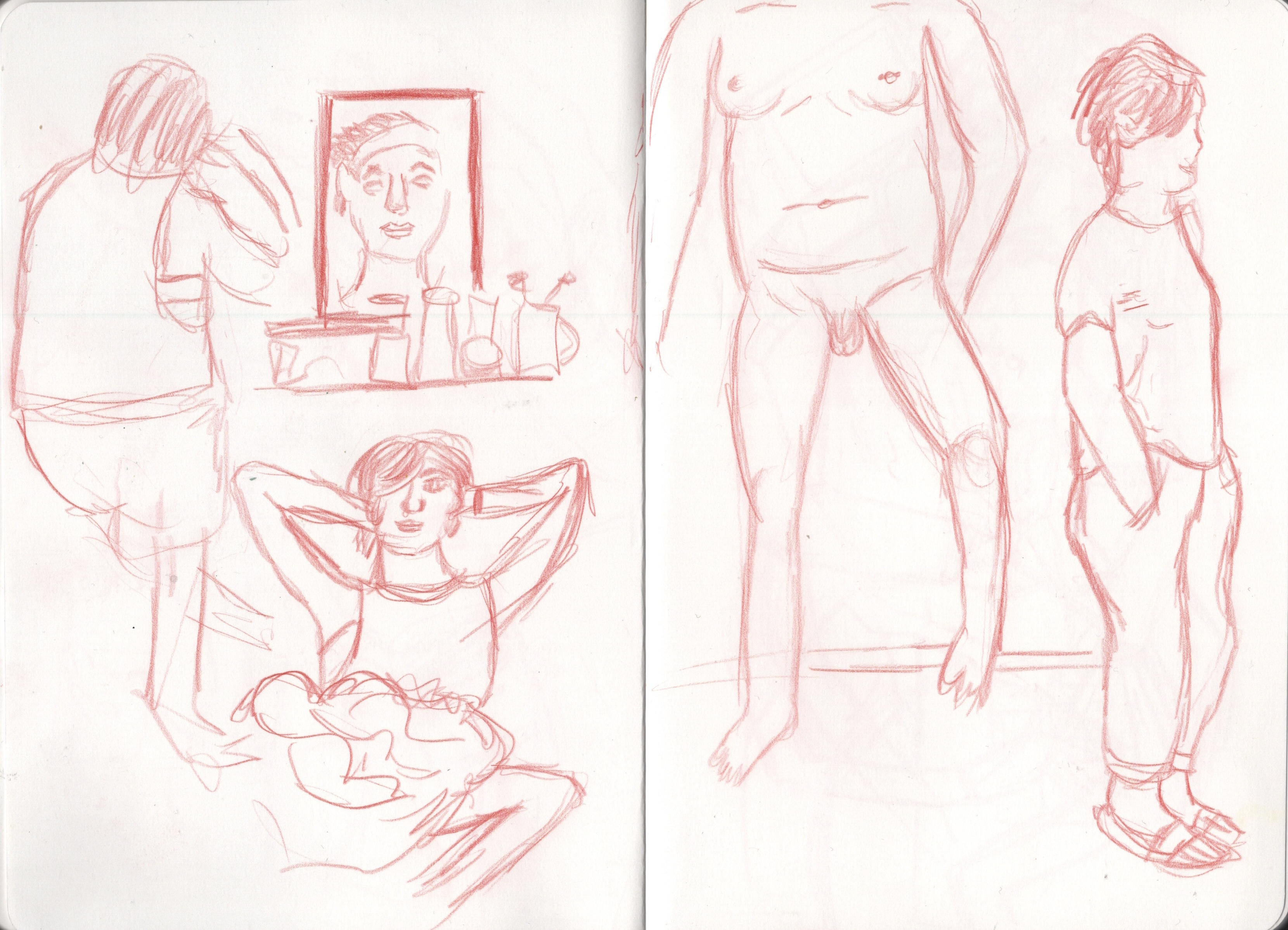
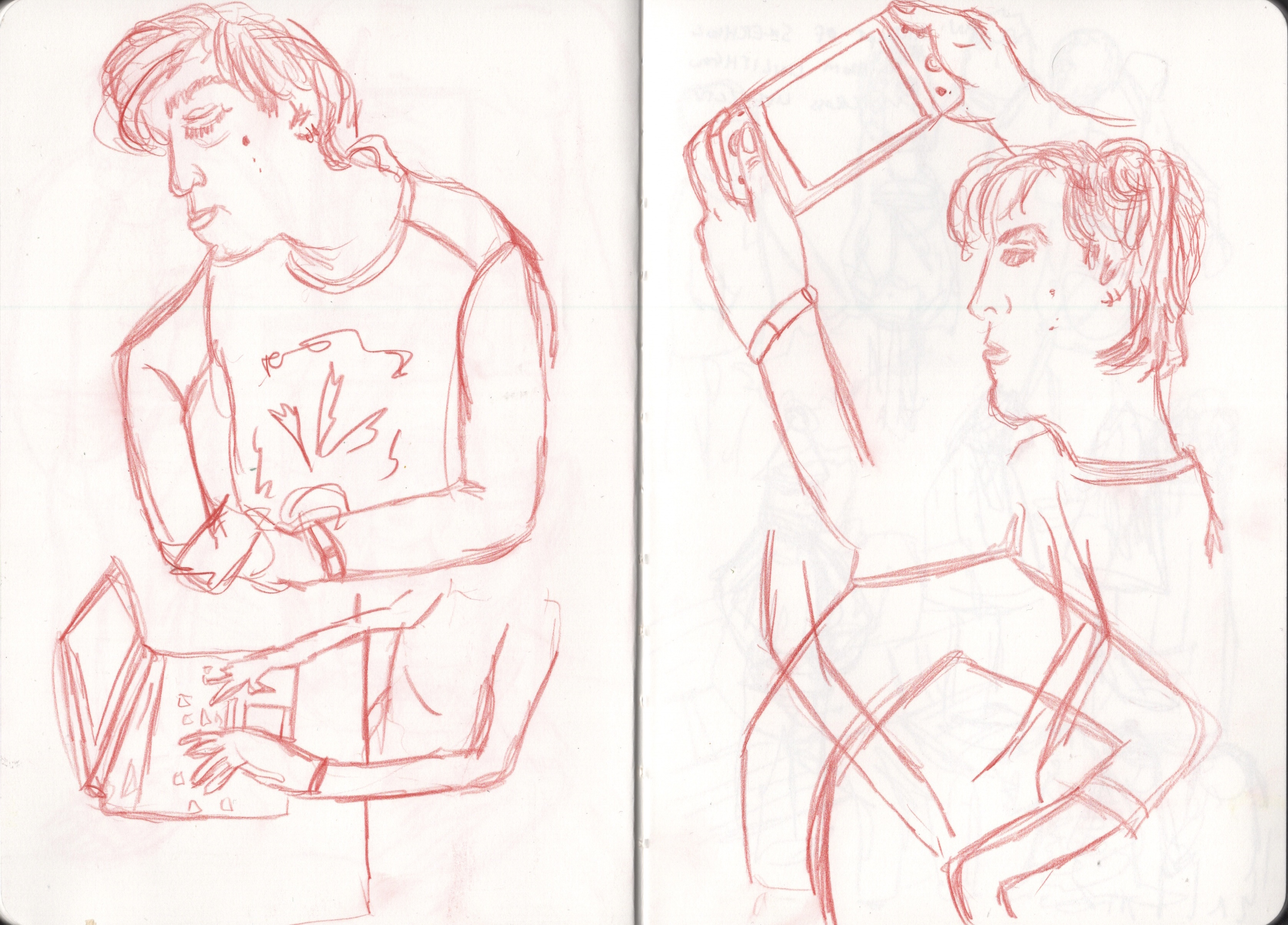
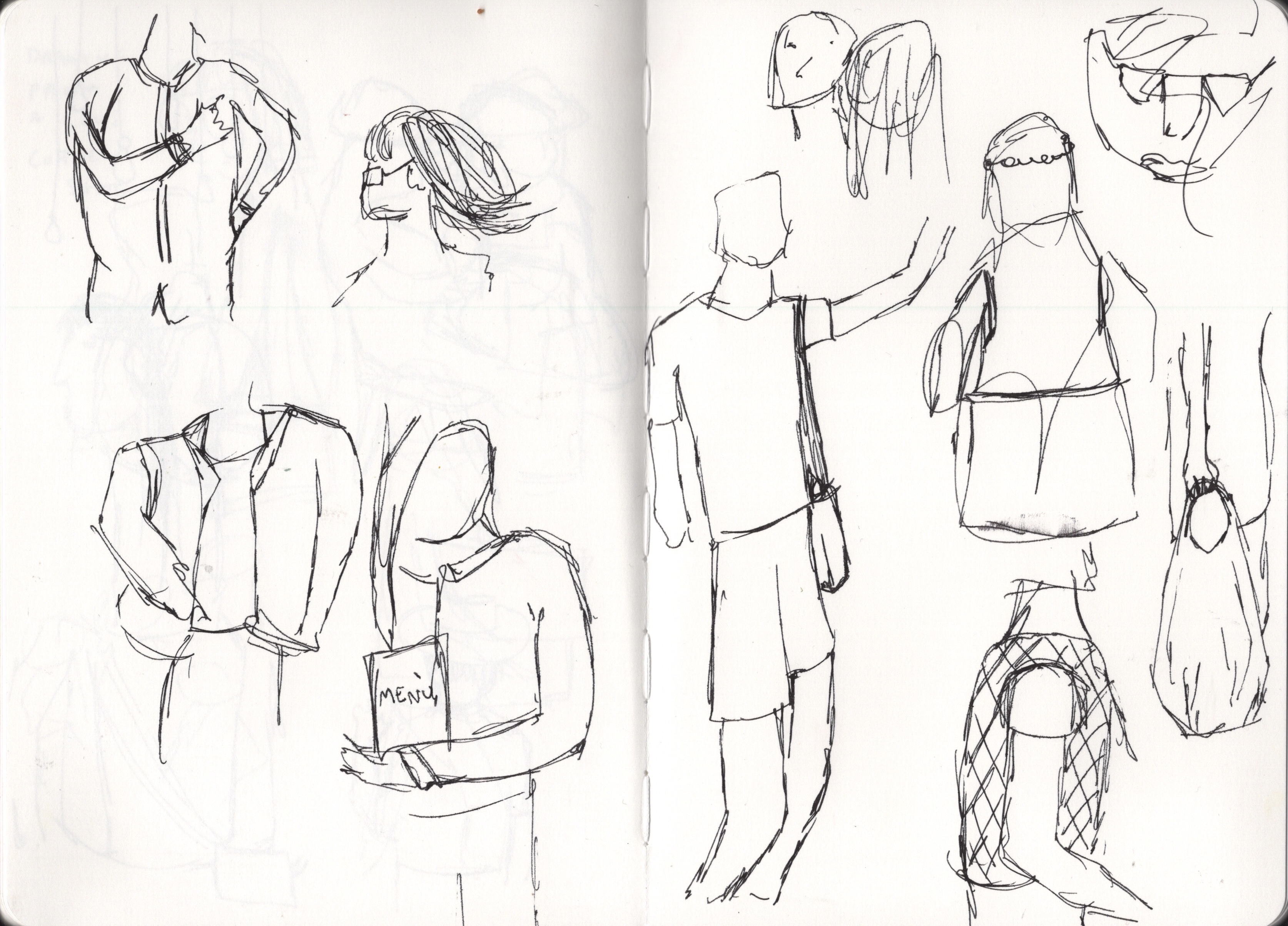
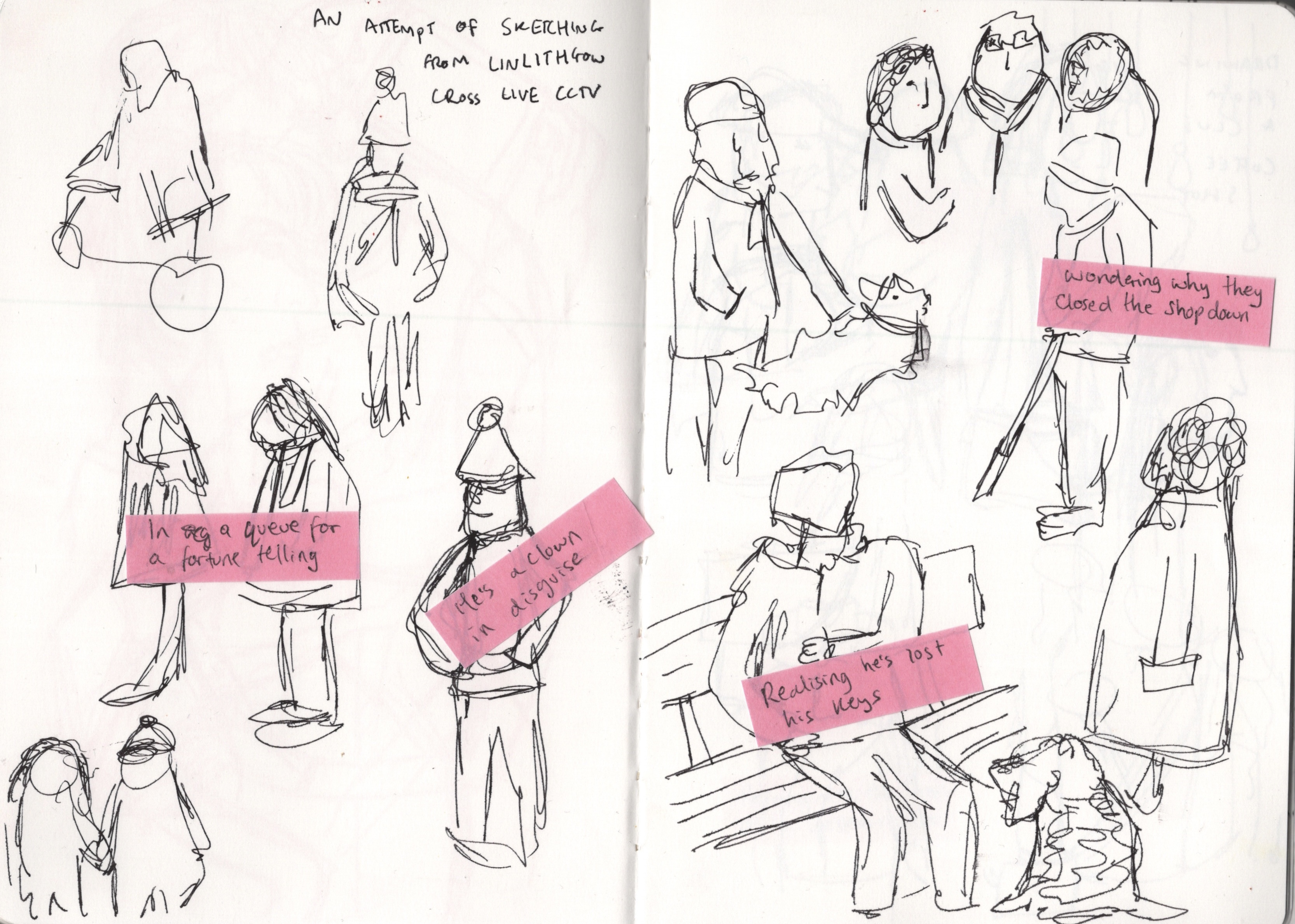
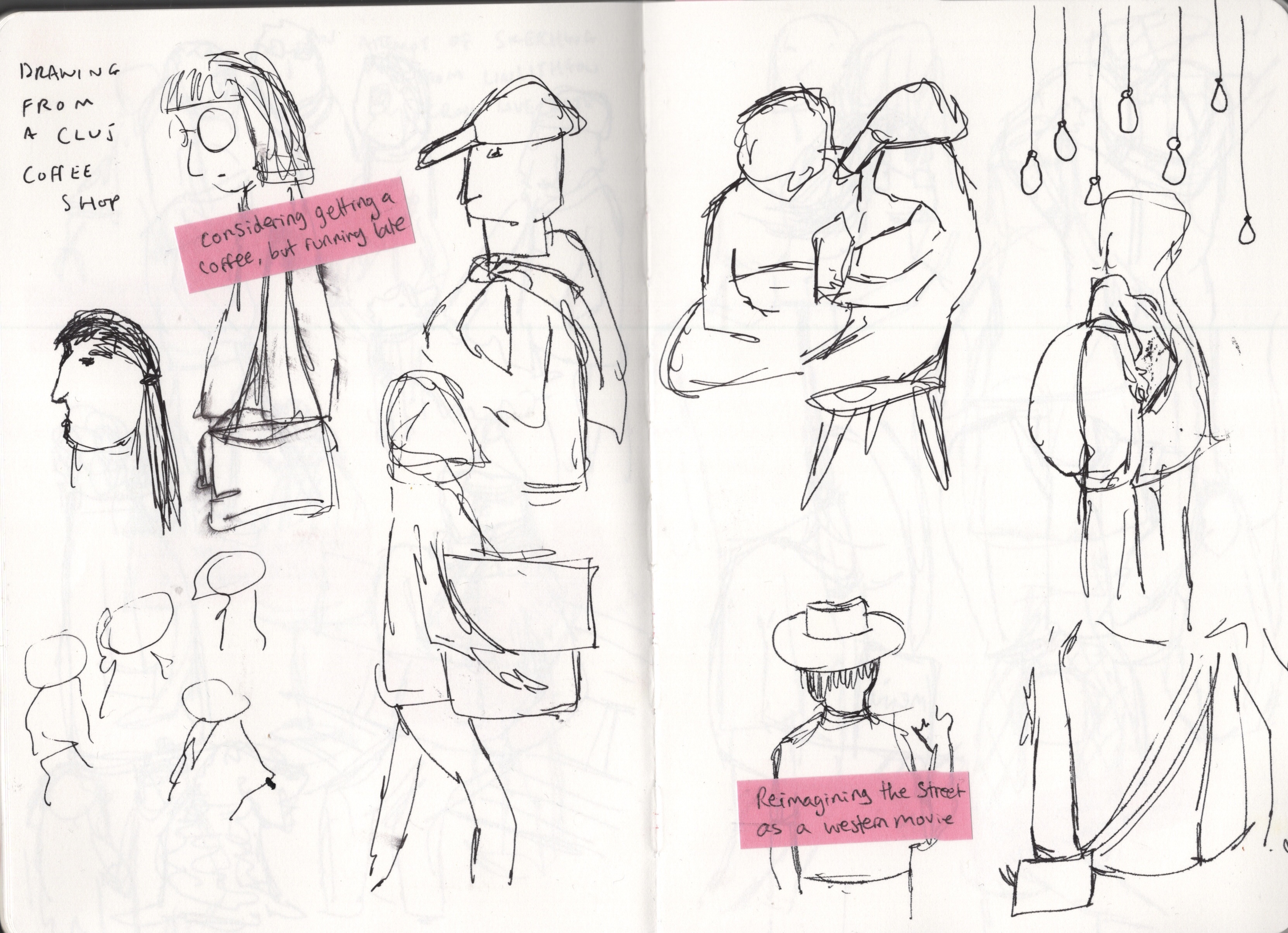
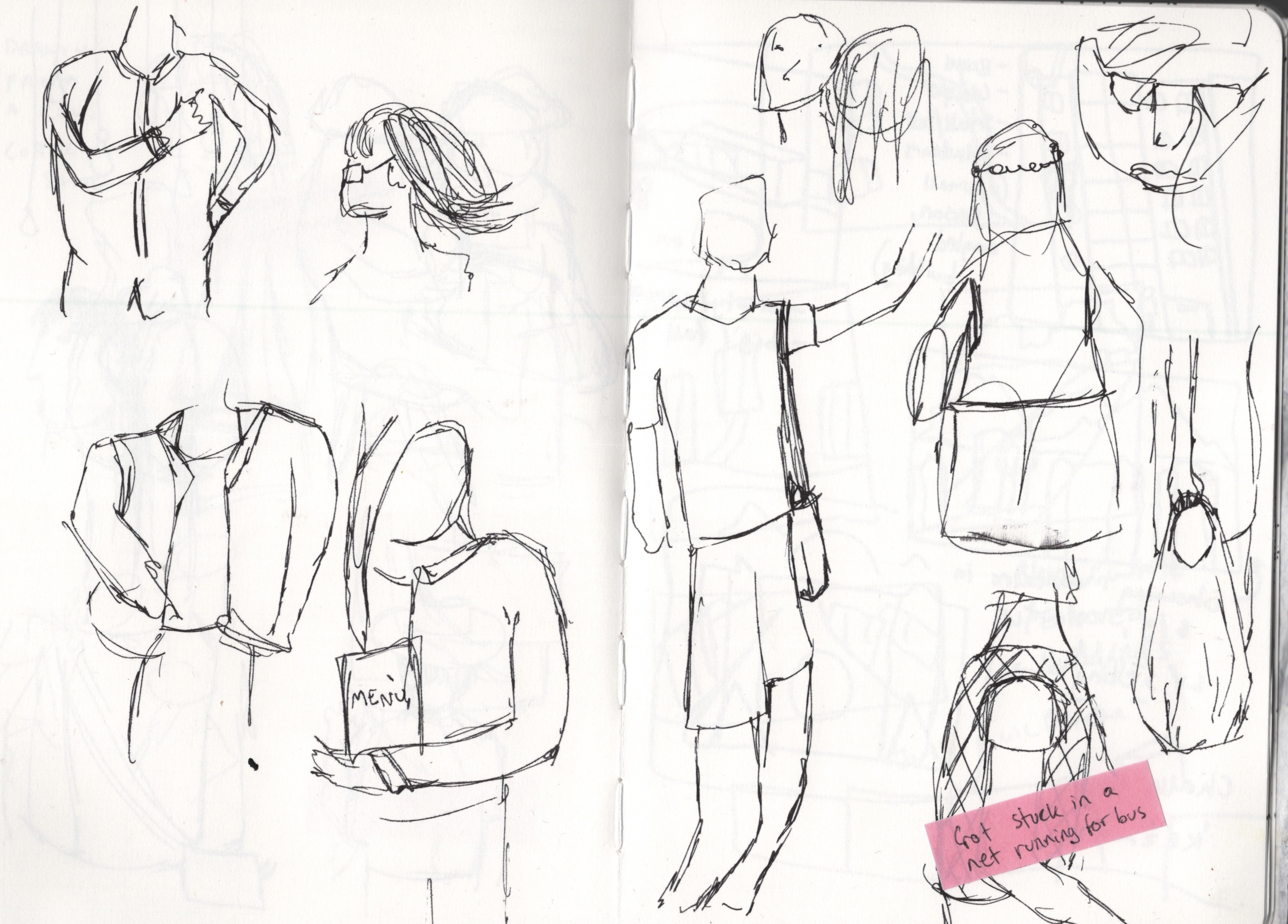
I focused on my work from Part 3 for this, as it’s where I did the majority of my figurative drawings. I used post-it notes and wrote possible scenarios and thought processes on them, then stuck them alongside each sketch. My approach was to totally let go of all expectations and just write the first thing that popped into my head. I had a lot of fun doing this and it led to some exciting results. My three favourite ideas were the old lady ‘staring up at a spaceship’, the man who is secretly a clown in disguise, and the man who is re-imagining his world as a western movie. I decided to develop the latter two further.

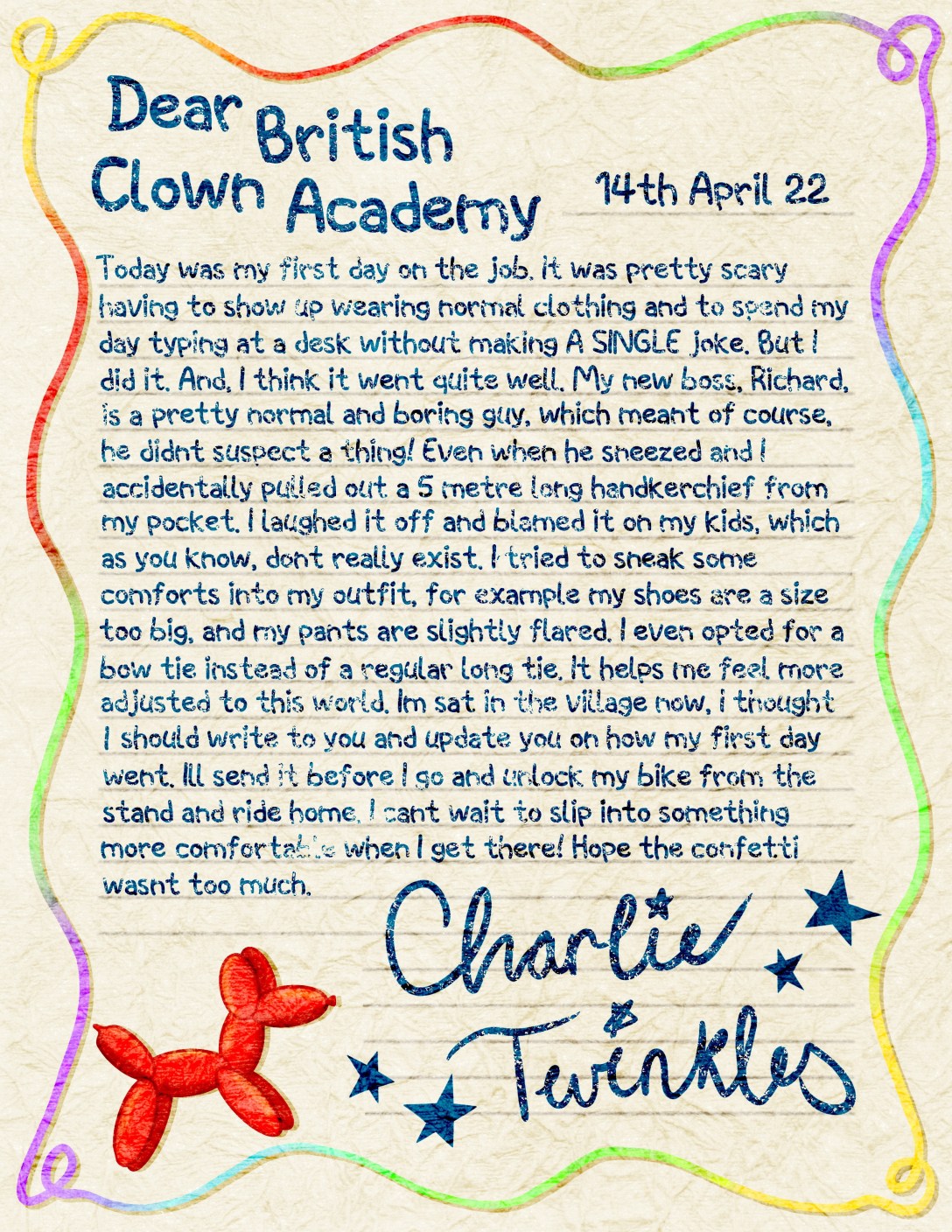
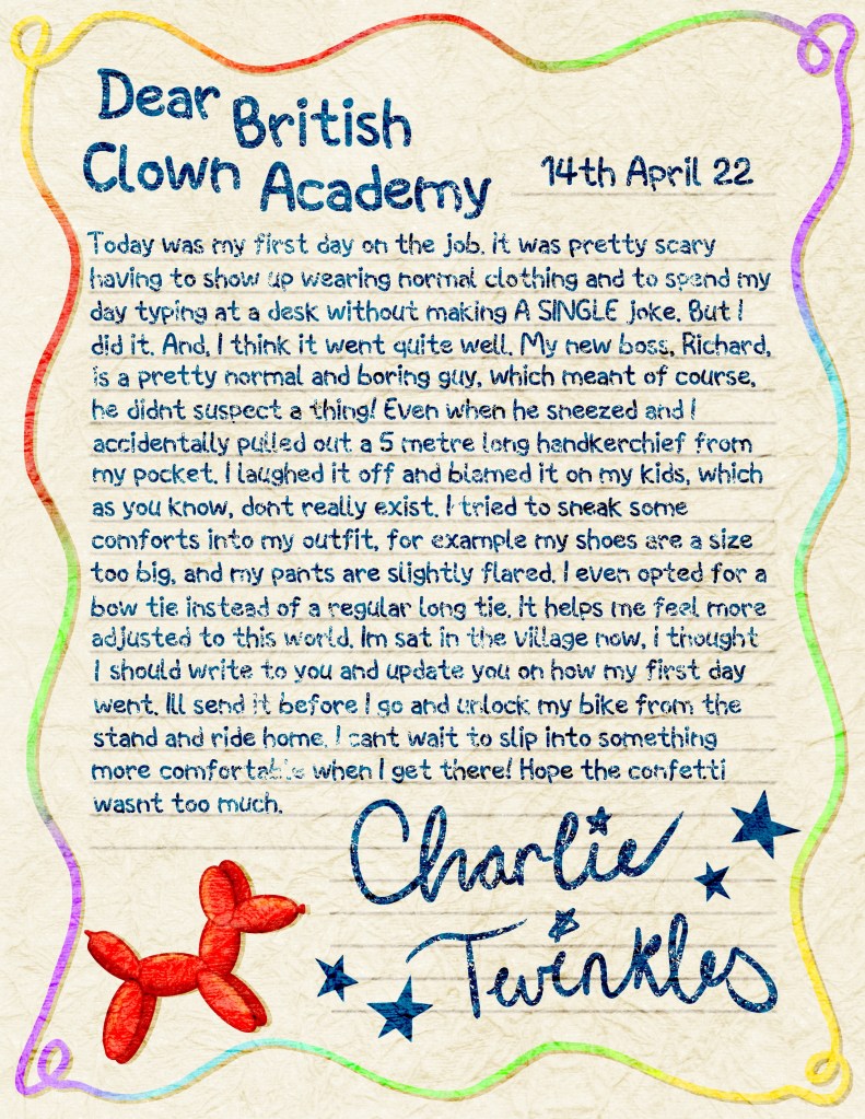
Learning how to better design characters was one of my goals for this unit, and often I find myself feeling frustrated that I am not achieving it. This exercise completely changed my feelings on the matter. I was very excited about all of the characters I had conceptualised and especially happy with my ‘secret clown’ character. I felt so attached to him and like I could invent a whole world around him – maybe even creating children’s stories with him as a central character. On this basis, I decided to write a letter from his perspective, as it would give me an opportunity to fully explore these ideas.

Exploring my characters further

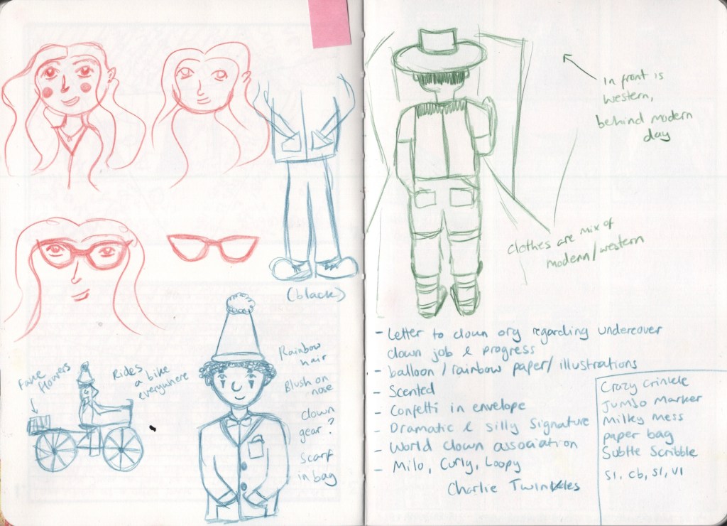
I began by making some notes in my sketchbook on what the letter could be about, what it should include, and what my character should be called. I decided to use procreate for this, as I wanted to use the Bardot Brush ‘Magic Paper’ files – texture overlays which enhance your illustrations. There are some paper overlays included in this set, and I wanted the letter to look authentic. After some testing, I went with the ‘Crazy Crinkle’ overlay file. I then used 1001fonts to search for the perfect font for the letter. Originally I was going to handwrite it, as I wanted it to look as though it was drawn using crayons, but settled on the font ‘Space Kids’, which looked much more uniform. I used a textured brush over it to give that crayon effect I desired.

A time lapse video showing my process illustrating the letter

My aim was to make the paper look like official stationery from the British Clown Academy itself. I briefly researched some letter writing stationery to get an idea of how they tend to look, then settled on a playful rainbow border and balloon dog motif to decorate the paper. I also added faint lines to write on. The signature felt important to me, too, as it says so much about the character. It took me a few tries to perfect it, and I’m so happy with the outcome. The whole piece is better than I ever could’ve imagined, and I can see it being a pull-out feature in the book about Charlie Twinkles, Secret Clown.

My final piece for this exercise

I had so much fun with this exercise and feel so excited about the development of this character. I am seeing myself learn what makes a character good and how to build up all the little background bits that make them, them. I’d love to work with Charlie more and see where I can take him as a character, but I also can’t wait to see what other fun creations I can come up with. The act of going through my pre-existing work and adding motive, thoughts, and context to seemingly meaningless sketches was so helpful, and I want to bear it in mind as a technique going forwards.

Exercise 4.2: Storyboarding

Prior to this exercise, I was asked to look at the work of Brandon J. Wallace, an artist who often explores movie and television scenes through storyboarding in an attempt to better understand narrative and storytelling. Unfortunately, his work seems to have vanished from the internet. Instead of undertaking my own research, I read through some other students learning logs to get an idea of what Wallace does and to prepare me for the tasks ahead.

This exercise asked me to carry out the same studies – storyboarding a pre-existing scene from TV or film, exploring how viewpoint can change narrative structure. I was asked to pick a minimum of 15 minutes of footage to work with and to pause whenever there was a ‘cut’ or change in shot and thumbnail the stills. I had to aim for at least 20 frames, but to limit the time spent to 2 hours to ensure I was truly thumbnailing and not caught up in detail. It was recommended to repeat the task, this time choosing a very different scene or type of media, to compare how the narrative is paced and how viewpoint and compositions are used to demonstrate mood and drama.

One of my all-time favourite directors is Wes Anderson. I love his art direction especially – his usage of colour, fonts, and design enamour me every time I watch his movies. I get lost in the world he creates and he very much inspires me with his merging of vintage and modern inspiration. I decided to thumbnail a scene from his 2014 feature, The Grand Budapest Hotel, in which the main characters learn of the death of a minor character and rush to her home. You can watch the scene here. 

I began by watching the scene a few times – first to make sure it was definitely what I wanted to thumbnail, then again focusing on where the cuts were and where the scenes changed, then once more to figure out which were truly important to the narrative as there were hundreds in the short clip. Jump cuts and sudden, dramatic camera angles are a trademark of Anderson’s, so this was to be expected, and it was hard to narrow down which were of importance. I decided to mark out 30 panes, to begin with, and if I had time for more I could expand. As the film is in a square aspect ratio, my panes are also square.

I was careful when choosing my medium for this – the exercise specifies to draw clear singular lines and blocks of colour, and to focus less on detail, only drawing what is needed to express the scene. As Anderson’s colour palettes are so intrinsic to his films, I knew I had to use colour, so opted for Faber Castel Polychromos coloured pencils. I consciously limited my palette to encourage me to be selective in what I drew. This ended up being a really good choice, and I think the outcome is fantastic.

My thumbnails from Wes Anderson’s ‘The Grand Budapest Hotel’

Whilst sketching out each scene, I tried to think of myself as in the reverse position – creating the film rather than referencing from it. ‘What detail is necessary to communicate ‘my’ vision for this scene?‘ I asked myself repeatedly, and, ‘How can I show the action, feelings, and thoughts of the characters?‘. Reflecting on my approach in this way was enormously helpful. It forced me to refine my sketches and narrow down how many of the ‘cuts’ I was thumbnailing, as, most of them were not necessary to document. I found the process really enjoyable and actually some of the most fun I’ve had making art in a while. In the end, I felt like I had captured the essence of the scene perfectly.

To repeat the exercise I chose another favourite media of mine – the TV show Friends. One of my favourite episodes is Season 3 Episode 2, The One Where No One’s Ready. My reasoning for this is that it’s staged in real-time – a real 20-minute long interaction filmed over one take. It’s a beautiful piece of comedy and hugely relatable to most people. Considering the aim of the exercise, I knew I had to study it in more detail, examining how the scenes progress despite being real-time. Once again I watched the episode through, picked a scene I wanted to draw, watched that a handful of times, and then felt ready to start.

This time I drew 20 panes, as the aspect ratio is rectangular, and I felt it was going to be harder to document in general. I was definitely right there. The focus in Friends is completely different to in The Grand Budapest Hotel, one is comedy and heavily focused on characters and their lines, and one is an abstract drama with a focus on environments and artistic direction. It felt like precision and detail were required to accurately frame the scene – but I was trying to work quickly and focus on vague shapes and outlines. On top of this, Netflix would quickly darken the screen and overlay with the title each time I paused. This meant I had to work even faster, or repeatedly stop to get the image back.

My thumbnails from the TV show Friends

My character proportions were consistently off and I kept drawing too big or too small for the frame. I felt frustrated but persevered, and realised it was better to just capture what I could and show a resemblance of where things were in each scene. I feel like it’s followable as a piece and you can understand what it is, but I don’t think it’s as good as my first attempt. I’d like to repeat this with more sitcom scenes, next time without the constant dimming of the screen, and see how I can improve. Doing this still really helped me to understand how the narrative is structured and how the composition sets the mood, and so much of that comes from thinking critically when watching and studying the scene.

I’m a bit of a film and TV nerd and love good cinematography. This exercise was so exciting for me, to be able to combine my passions, and I realise how easily I could repeat this with more scenes that captivate me. It’s quite a lot of work, though, and time-consuming, so I might alter it to better fit my goals, perhaps only drawing one or two frames. The more I push myself to draw quickly, the more I’m seeing it improve, and this exercise helped me see that clearer. Even the Friends scene is better drawn than I could’ve achieved 6 months ago. I also feel I better understand thumbnailing when it comes to narrative and story structure and will be using that more in future.

Exercise 4.1: Description and Depiction

In this exercise, I was asked to consider how words interact with pictures and enhance the meaning of observational drawing. I had to draw four equally sized boxes in my sketchbook, pick a scene to draw, and approach capturing it in four different ways:

  1. Write about the scene in detail
  2. Use words in place of drawings so that the location of the words is where I would have drawn a picture
  3. Draw the scene simply using only pictures 
  4. Combine both drawing and words

I have commented several times on the usage of text in sketchbooks and how I’d like to get better at incorporating this into my work. During the visual diaries research task, I noticed that I was especially drawn to artists who used a lot of words among drawings in their pages, and I enjoyed experimenting with this in the fill it up fast exercise. I hoped that this exercise focusing on using words would help me open up some options for using text in my sketchbook. I began by drawing out the four boxes, adding some lines for text in the first box, and drawing some simple spatial lines in the other three. I then found a video of a scene from the YouTube channel I found during Exercise 3.2 to work from.

My four drawings

This process felt more like one of refinement than of learning how to use words. By the time I reached the final drawing, I knew what was important to me in the image and what I wanted to capture. I wasn’t sure how to use words to do this, so I just expressed what I was thinking, as I want to do in my sketchbooks in general. I also found it helpful to write the detailed description in the first box as it forced me to really take in everything in the scene and consider things I maybe wouldn’t have considered otherwise. I liked the process of thinking of how I would describe what I was seeing to someone who wasn’t there, and it made me feel more interested in drawing what was around me.

The unit guide asked me some questions about the exercise:

Which approaches did you enjoy, and which will you take forward from this task?

I enjoyed writing the detailed description, but I don’t think I would physically write like this again. I would like to consciously sit and consider what I’m looking at, though, and maybe make some rough notes on what is visually interesting and what I would want to point out if I was describing it. I think this helps with choosing content and figuring out what to draw. I also want to continue writing my thoughts down when working.

What happened when words and images interacted; did they reinforce or play off against each other?

I’m not sure how I feel about their interaction. I think they express more about what I am feeling, thinking, and experiencing than of the space I’m in. At the beginning of this exercise, it was asked, ‘How much of your own presence in the experience do you think comes through in your drawing?’ and I think, ordinarily, not much. My style and visual interests come through, but my experience is missing, and the words add this. This is why I’m keen to add my thoughts to my work – it contextualises pieces.

Did describing the scene using words first affect the way you drew afterwards?

Yes, in that it helped me find what was visually interesting. But I also found myself a little frustrated as what I was drawing was a very small portion of what I had described and what I could see. It could easily have been multiple drawings of different interesting parts of the scene. I think I would’ve felt more satisfied with that.

This exercise didn’t quite help in the ways I had anticipated, nor did it launch me into always writing in my sketchbook alongside drawings. But, I think it has given me a push in that direction – and some encouragement in the worth of doing so. I need to build it into my sketchbooking habits over time. I did, however, get a lot out of the questions posed, and it gave me a lot to think about.

Research Task 4.1: Top Ten Visual Diaries

Following on from Research Task 4.0, which introduced me to Myfanwy Tristram’s visual diaries, I was asked to discover as many illustrators (or other practitioners) who have created artist’s journals or visual diaries. I then had to identify my top ten artists in this area and review what it is I like about their work. The unit guide provided a list of artists as a starting point, alongside a website which unfortunately seems no longer in use.

I began by briefly looking into each artist, looking specifically at their sketchbooks and ignoring their major bodies of work. I was just skimming the content, for now, trying to get a vibe for it and see what jumped out at me. When I reached an artist that would end up on my top ten list, it was immediately apparent. I felt drawn to each of them instantly and inspired by their work. This list provided me with 9, very solid favourite artists, and I was left to search for number 10 on my own.

I began by trying the website listed and, as mentioned, found it is no longer available. Next, I tried a google search for artist’s journals and didn’t find too much that appealed to me. So, I headed to The Sketchbook Project, a project which I have been following for quite some time and am eager to get involved in myself. I used their search function and flicked through the various themes that have been submitted throughout the years, and chose ‘A day in the life as my criteria. I felt the sketchbooks in this theme would be closest to art journals, and I was correct. A lot of the work was inspiring, and I really enjoyed seeing how people approached the theme. I chose Christopher Staples as my 10th artist, and you can see his sketchbook here.

My top 10 visual diary artists, in no particular order, are:

  • Margaret Huber
  • Guilherme Dietrich
  • Oliver Jeffers
  • Bryce Wymer
  • Joohee Yoon
  • Pep Carrio
  • Rose Blake
  • Laurent Moreau
  • Lizzy Stewart
  • Christopher Staples

Once I had identified my favourite artists, I began looking into them further in-depth. I first acknowledged what I liked about each artist, then I moved on to identifying the visual qualities and content in each artist’s work. If possible, I also looked through their larger body of work and tried to see how their creative identity was established in their sketchbooking. Through doing this, I realised that I loved finding artists who have all of their sketchbooks on display on their professional websites alongside their published work. I would like to do something similar, as I feel it’s important to showcase all of you as an artist. It also feels comforting and relatable to see this more ‘private’ side of an artist’s world.

After going through this process with a handful of my chosen artists, I started to notice a pattern. There were distinct overlapping themes in why I liked each artist, as well as the content of the diaries. Words like playful, colourful, fun, messy, loose, and bold kept cropping up, and content was often experimental, abstract, explorative, meaningless, and expanding on ideas or processes. It felt clear to me what I was wanting to take away and use in my own creative practice. 

Looking through all of this work also led me to some interesting ideas about gender and how we are influenced subconsciously by the expectations placed on us in society. I find often that even the abstract and ‘weird’ art that women create sits in a more ‘comfortable’ space, using softer colours, gentler shapes, and pushing less artistic boundaries. Men’s work, on the other hand, often feels like a smack in the face, bolder and brighter and with much more surreal content. Whilst this is just an initial observation without much research into the topic, it’s something I’d be curious to look into further later in my degree. 

Below you can see examples of each artist’s work that I felt particularly spoke to me, alongside the notes I took when reviewing them. 

Margaret Huber

Guilherme Dietrich

Oliver Jeffers

Bryce Wymer

Joohee Yoon

Pep Carrió

Rose Blake

Laurent Moreau

Lizzy Stewart

Christopher Staples

Looking at how other artists approach their sketchbooks, and specifically visual diaries, has inspired me greatly. I have a new apprciation for the concept of a visual diary and I’d like to explore how I could keep something similar in my life. I notice that many people choose to keep individual diaries for specific trips abroad, and that appeals to me. I’d also like to do ‘a week in the life’ or something similar at some point. This research task has given me a lot to consider and to apply to my own work, and makes me feel quite excited about what’s to come.

Exercise 4.0: Fill it up – FAST!

This exercise explored how techniques to fill a page can help overcome being too precious when drawing observationally. I was tasked with filling up an entire sketchbook within a pre-set time frame, which I was allowed to choose. I had to draw multiple images on each page, overlapping and collaging them, using a variety of drawing tools and approaches. It was suggested that I draw a wide range of content, from people to textures and patterns, and to add text where appropriate. On the centre page, I was asked to complete a larger drawing of a scene covering both pages, spending a little longer on it.

The exercise required me to go out into a public space once again to complete it. It suggested indoor spaces such as museums, theatres, or indoor markets. After some consideration and frustration as I didn’t want to be drawing the inside of my house yet again, I settled on using Pinterest as a resource. The home page of Pinterest constantly refreshes, showing 100s of new images. This would provide a range of interesting content to draw and would feel similar to being in a busy public location. I decided to stick to the suggested 2.5 hours of drawing time and then turned my attention to what sketchbook I would use.

I went back and forth a bit on whether to use my current sketchbook – as it is my favourite from all I have tried thus far, and I am keen to fill it up – or whether to make one for the exercise. I am feeling pretty antsy about getting through the exercises that require me to go outside as they cause so much turmoil mentally for me. The idea of stitching a whole book just for this was very unappealing as it’s pretty time-consuming. I considered punching a hole through 10 or so pages in my sketchbook and tying a piece of string through, marking off a section just for this exercise, but eventually, I settled on making a small book using the method in Part One of the unit guide.

The cover for the book prior to being cut down to size

I knew I wouldn’t be using wet media for this exercise, so I chose a simple drawing paper that I ordinarily would use to draft my digital pieces. I cut the paper so that the book’s pages would be A6, as this just felt like the right size. I then decided to make a cover for the book using a sturdier mixed media paper. I painted it using metallic acrylics and then used the mindless drawing technique I learned in Part Three to cover it in a pattern. I then cut it down to size and stapled the book together. It’s a little wonky, but that’s part of the charm! Making this reminded me why I love bookmaking so much. It’s so satisfying to complete each project!

I then sat at my desk and opened Pinterest. I decided to set 30-minute timers rather than a timer for the whole 150 minutes, as they would help me keep track of how far I was and hopefully encourage me to speed up a little with my sketching. Then, I started drawing. On my first page, I drew a tracker for the timers and a brief introduction to the exercise. Then I started slowly getting into trying to fill each page. You can see a huge difference between my first spread and my second – and generally, as the book progresses, I get better at filling as much of the page as possible. I struggled at first with choosing content and knowing what to draw, but as I let go of the idea of ‘achieving the exercise’, it got a lot easier. I ended up really enjoying just playfully drawing with no goal other than to fill the page.

I also found it incredibly difficult at the start from an inaccessibility perspective. There is always a part of me that is aware I’m missing out on some core aspects of these exercises. It’s also very boring to be continually drawing the same or similar things. I wrote on one page, ‘would anyone be inspired by the same room?’. It feels very heavy at times because, no, I don’t think anyone would. Trying to enjoy the exercise even though I felt so miserable about the inaccessible aspects was tough. I took a break for lunch after an hour, and when I came back, it was much easier to let go of that.

The book has 24 pages in total, which ended up being overambitious. Because it’s A6, I thought that I would speed through each page and that 24 full pages was reasonable to expect in 150 minutes. I managed to fill 15 pages, and I probably could have done another two if I wasn’t caught up in my head at the start. I had a lot of fun in this exercise, though and absolutely love the outcome of it. Whilst I was giving some thought to composition, it wasn’t my main focus, and the way the pages are built and how the layers interact looks fantastic. I would like to go back sometime and finish the remaining pages of this book using the same technique so that it can be a ‘complete’ project. I’d also like to attempt this again, but maybe in a different way. Having a small sketchbook with a dedicated purpose is really nice.

Above I have included a video flip-through of this book. I do regret that I couldn’t finish it, but I have a better idea of how much is reasonable to fill in such a small time period. The unit guide asked me to finish this exercise by listing as many points as possible about what I’ll take forward from this task and incorporate into my observational drawing. Looking back at this video is helpful to pick out what techniques I enjoyed most. I want to take forward:

  • The way I have used a range of drawing mediums, specifically how I have used coloured pencils and pens to layer over each other
  • Using pattern and colour to fill space
  • Jotting down whatever thoughts I’m having in the moment, even if they don’t really relate to the sketch
  • Working carelessly and freely
  • Distorting size so that the size of the object isn’t necessarily to scale in relation to the rest of the page
  • Making smaller sketchbooks for individual projects completed over a shorter period of time

I gained a lot from this exercise, both in practical techniques I can take forward to future work, and in simply enjoying the process. I’m impressed, as I was feeling very disgruntled towards the inaccessibility of yet another exercise. I feel like this little book is one of my favourite creations of the unit so far, and I’m excited to apply what I’ve learned.

Research Task 4.0: Visual Diaries

This exercise introduced me to the concept of visual diaries and invited me to investigate the work of Myfanwy Tristram.

Myfanwy Tristram is a comic artist who uses her work to explore political contexts, parenting, and the realities of being middle-aged. She hosts a blog on WordPress where she documents her various artistic endeavours, promotes her comics, and connects with her audience. Alongside her comics, Tristram has dabbled in keeping visual diaries, which she has also uploaded in full to her blog. Her latest visual diary – documenting her trip to Florence, Italy – was the final installation in her collection. She discusses in the last blog post for the diary as well as elsewhere on her blog that, whilst she enjoys the process of making visual diaries, they are too time-consuming, and they don’t further her work in the way she desires.

In talking about the end of this journey with visual diaries, Tristram mentions that the Florence diary took around six months to complete and that she has travelled several times since the trip she is documenting. This implies that the visual diaries she was creating were intentional projects rather than an unknown and spontaneous project as described in the unit guide. Despite this, the diaries communicate a wonderful sense of her experiences, capturing the unique and intimate details of her time away.

Her diaries are detailed, colourful, and packed full of memories. Every page is used in full, featuring writing, drawings, paintings, and ephemera stuck in throughout. It’s synonymous with a scrapbook – a collection of stuff seen each day. She documents both the mundane and the great, from a selection of spreads on the breakfast table to huge landscapes and buildings. Each image is accompanied by writing of some sort, be it a description, a musing, a quote, or a short story explaining the memories behind it. It makes sense that Tristram would be drawn to doing this, given her primary focus on comic art. 

Ladies of the Lakes, one of Tristram’s published comics, could also be described as a visual diary. It explores the experiences of herself and her friend as they attend the Lakes International Comic Art Festival. Rather than a hodge-podge scrapbook-esque style of sketchbooking, Ladies of the Lakes is entirely in sequential illustration. I absolutely loved to see this approach to visual diaries! This is the style I feel connected to in my own work, and reading through the comic, I found myself thinking of how many of my own experiences could easily be illustrated in the same way. Comics are a useful narrative tool, and their use in recording the everyday will always be core to the artform.

Looking through Tristram’s blog was extremely inspiring. A lot of the work she does is relevant to social causes I feel very passionate about, and her approach to these topics is fantastic. I’m very glad that this exercise introduced me to her and to the way she uses her comics and diaries. I would love to create work similar to hers someday.

All of the work referenced in this post can be found on Myfanwy Tristram’s blog – here. 

Exercise 3.3: Illustrative Drawings

Note to tutor: above you can see the start of my process for this exercise. I developed this illustration using images and sketches and focused on the ideas of large towering buildings and feeling very small amongst them, as well as bright colours and contrast. I used traditional mediums and added the character digitally. I intend on developing at least one other illustration for this exercise and exploring more themes. I really enjoyed this exercise and love the outcome I have.

Research Task 3.3: Reporting and Documenting

For this exercise, I was asked to choose a piece of reportage and compare it with a photograph containing similar subject matter. The unit guide provided a series of questions to reflect on and explore further. As recommended in the unit guide, I briefly browsed the University of West England’s Reportager website and settled on Carly Larson’s ‘No justice, No peace’ as my chosen artwork. I then used Google to find a photograph taken during a similar protest. 

Carly Larson’s ‘No justice, No peace’

Carly Larson is an illustrator based in New York City who has a specific interest in reportage as well as surface design and hand-drawn animation. Larson drew the above piece during the 2014 protest for Eric Gardner in New York City. I chose this piece to use for this exercise as the focus on protest signs and the amount of text used in the image stood out to me. The way that Larson has chosen which aspects of her environment to include in the drawing really emphasises how it feels to be within a protest.

Photograph from a protest in response to the George Floyd killing – New York City 2020

Initially, when I was searching for a photograph to compare Larson’s work to, I thought her piece was drawn during the George Floyd protests. I chose the above photo as it is very similar in content to Larson’s piece. The text on each protest sign is aligned with the text in Larson’s drawing, and the protests are for extremely similar events. The murder of George Floyd and Eric Gardener were both racially motivated attacks on Black men from varying police forces in the United States.

What is each image expressing, describing, or communicating?

Both images have been created to show the impact of the deaths in question and the response from the general public. They aim to communicate how protestors were feeling and to show the extent to which protests occurred. Larson’s sketch draws the viewer into the chaos and intensity of a protest and forces us to consider and acknowledge the words spoken (or written) in the protest. Whilst the photograph of the George Floyd protest does focus in on a handful of protest signs – it’s much easier to ignore them and get lost in the crowds. Larson’s use of empty space and selective markmaking is a much more effective tool when communicating emotions.

The photograph communicates some things the drawing doesn’t – such as the heat and the sprawl of the crowds. Larson’s drawing provides an ‘in the moment’ perspective that transports you to the heart of the protest itself, whereas the photo shows a zoomed out and disengaged view. It feels less emotive and more factual.

Which image is most memorable?

In my opinion, Larson’s drawing is more memorable than the photograph. This is due to it being uniquely Larson’s perspective and work. Many photographs are taken of many different protests, and they sort of merge together and become one. Some protest photographs, such as Taking a Stand in Baton Rouge by Jonathan Bachman, stand out and leave a long-lasting impression on the viewer. But, ones similar to the image above are easy to forget. Especially during the age of such aggressive social media consumption – photographs of crowds are sort of meaningless. 

Does one seem more truthful? Why?

I am inclined to say the photograph seems more truthful. Firstly, it being a photograph removes a lot of emotion and presents the situation objectively. Whilst it’s easy to manipulate and edit photos, when they are presented unedited they are generally more accurate than drawings. Secondly, the zoomed-out perspective of the piece provides a bigger picture and shows more of what is happening in the event. This is not to say that Larson’s is not truthful or trustworthy as a piece – it just serves a very different purpose and communicates a more emotional and ‘on the ground’ point of view.

Which image would I be more likely to notice in a magazine or newspaper, and why?

I’m not sure if either piece would stand out to me more than another in a magazine or newspaper. As mentioned above, the photograph is pretty standard for a protest photograph and doesn’t have anything eye-catching in it. But, at the same time, Larson’s work is quite bland colour-wise. I don’t think it would specifically catch my eye or engage me personally as I am very drawn to colours and patterns in imagery. In saying that, it was enough to stand out to me in a sea of other reportage illustrations!

I’m quite surprised by my responses to these questions, as my research so far has led me to believe that photography is usually a stronger medium to use in situations such as these. It has shown me, at least, that there is a good use for reportage, and it can be powerful in the right circumstances. I would be interested in trying this again with a very different piece of reportage and seeing if I feel similarly to how I did in this exercise.

Exercise 3.2: Working With External Visual Impetus – People

This exercise quite succinctly summed up its goal: The aim of this section is to introduce you to observing figures. This was achieved in two parts – first, I was asked to draw someone I see on a regular basis, then I was asked to go into a crowd and attempt to sketch strangers.

Historically I have hated drawing people, especially from memory or imagination – however, I love to do so in a life-drawing context. Rapid sketches of posed models is a warm-up exercise I turn to quite regularly, and I find it relaxing and enjoyable to draw detailed individual body parts or items of clothing. I especially love to draw hair and hands. When it comes to piecing together the whole body, putting some clothes onto it, and creating a person, I seem to crumble. I feel unable to do it and often avoid this where possible. I expected that, because of this, I would end up hating this exercise and feeling it was monotonous and depressing, but surprisingly I wish I didn’t have to stop.

As I live alone and don’t get out of the house much, I waited for my friend to visit me for my birthday. She very kindly offered to let me sketch her in all sorts of contexts and consented for me to post the work on my learning log. The exercise said to draw the person doing what they do every day and gave examples such as when they’re using the computer, reading a book, washing their hair, or eating their dinner. I was asked to do some quick drawings and at least one longer sketch and focus on varying body parts throughout the exercise. I decided to use a coloured pencil for this as I thought I would enjoy looking at the sketches more than if I used my usual pens.

Compared to the latter two, my first page of sketches clearly shows I lacked confidence when I began. I didn’t really know where to start, what to draw, or how to ensure I did it fast enough before my friend moved on to doing something else. By the final page, I felt a lot more certain in my choices and in that it didn’t really matter how the sketch looked or whether it was true to life or not. I feel like it’s hard to draw someone you know as there’s a subconscious fear that you may offend the person. Once I got over this, I really had fun! I also noticed that my drawings became larger in size over the course of the exercise. I think this also shows confidence and demonstrates how I settled into what I was doing. Looking back at these drawings excites me and makes me want to do more like this!

For the second part of the exercise, I had to find a way to put myself ‘in a crowd’ without literally going into a crowd. I started by using this website to view a live CCTV camera in Linlithgow, Scotland. The camera points directly at the centre of the town towards the end of the high street, so it was pretty populated. Frustratingly, the camera moves around a lot and changes viewpoints every 10 seconds or so, but this actually ended up forcing me to draw quicker and focus on capturing the general shapes of people. Then, I watched about half of this video on YouTube filmed from a cafe in Cluj, Romania. This was fantastic as it felt just like I was there in person! Though again, people were generally walking past very quickly, and the stationary viewing point of the video meant I only had brief glimpses to sketch from.

Out of the two, I much preferred sketching from the CCTV footage. I’m not entirely sure why, but I kept wanting to go back to it once I’d moved on to the YouTube video. I also really like the page of sketches I produced during that part of the exercise, whereas only one or two from the YouTube video stand out to me.

I chose to change my drawing tool to a simple ink pen for this part of the exercise, as I can get more precise detail with it, and it feels better to use when drawing very rapidly. There were cons to this, though, as the ink took a while to dry. I kept smudging my work and found waiting between sketches would kill my flow.

While sketching my friend, I started to develop an eye for certain features or objects that I wanted specifically to capture – the way her hands were posed, how her hair was sitting, how her clothes hung off her legs, etc. This was honed further when I began drawing ‘in public’. I would notice a hat, a pair of glasses, the way a bag was slung over a shoulder, and that would be what inspired me to draw the person in question. It was beneficial that this was what was driving me, as it enabled me to make quick choices in the content I drew before the person walked off-screen. 

This skill is one I’d like to continue developing. For example, I am noticing I catch more that I want to sketch when watching TV shows or YouTube videos. I’d like to get to a point where I regularly pick up my sketchbook and draw from these cues. I think it would be especially useful when considering narrative and character development – I would essentially be developing a book full of interesting objects, items of clothing, and bodies. There’s clearly something drawing me to those things, and it would be wonderful to be able to reference this and utilise it. 

Overall this exercise was a really enjoyable one, and it was nice to just get lost in sketching again. I feel I’ve learned some really valuable skills that will help me going forwards, too.