Research Task 3.2: Reporting and Documenting

This research task asked me to look again at reportage illustration and explore different approaches and uses of the artform. First, I was provided with a list of contemporary and historical artists who focus on reportage illustration. I had a brief look through each artist’s work and made notes on what inspired me, how I felt, and what I thought. This led to some interesting topics to consider and reflect on and ultimately helped me solidify my relationship with reportage. Next, I was asked to read a series of articles and reflect on a specific usage of reportage illustration.

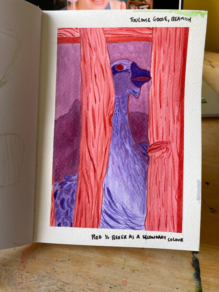
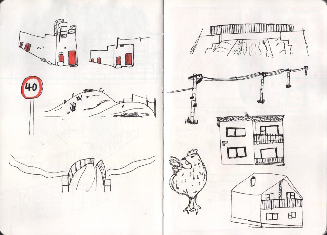
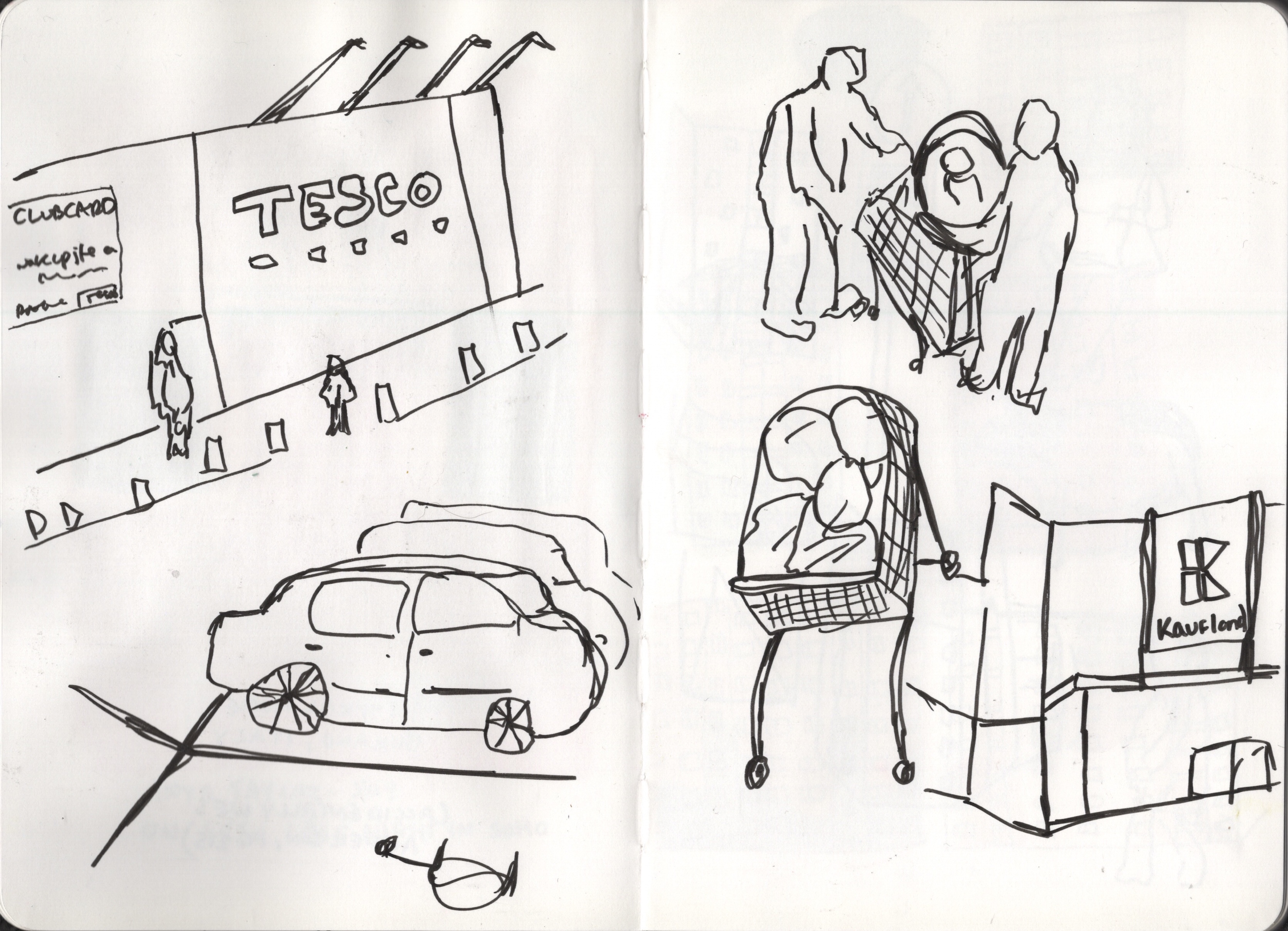
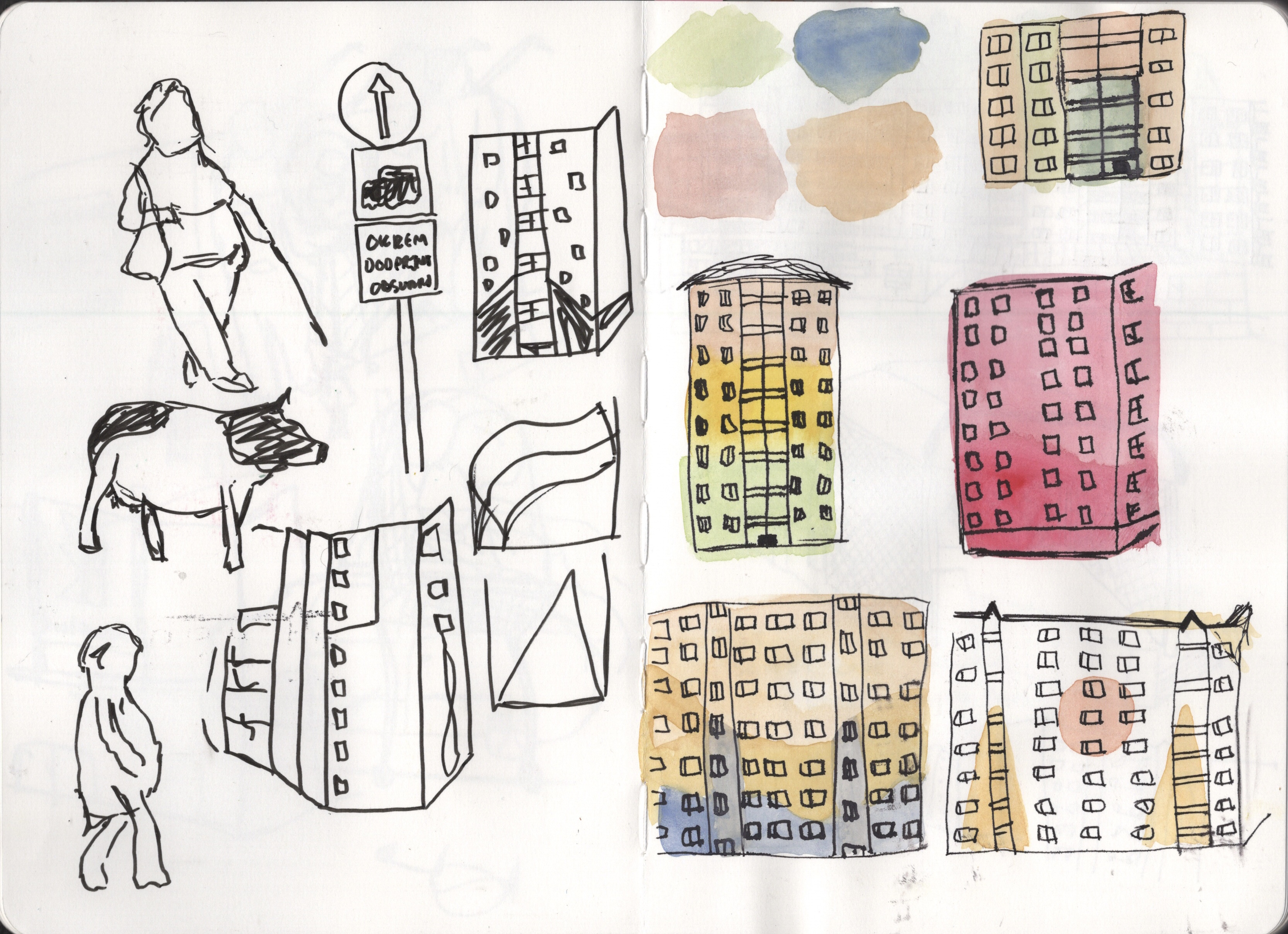
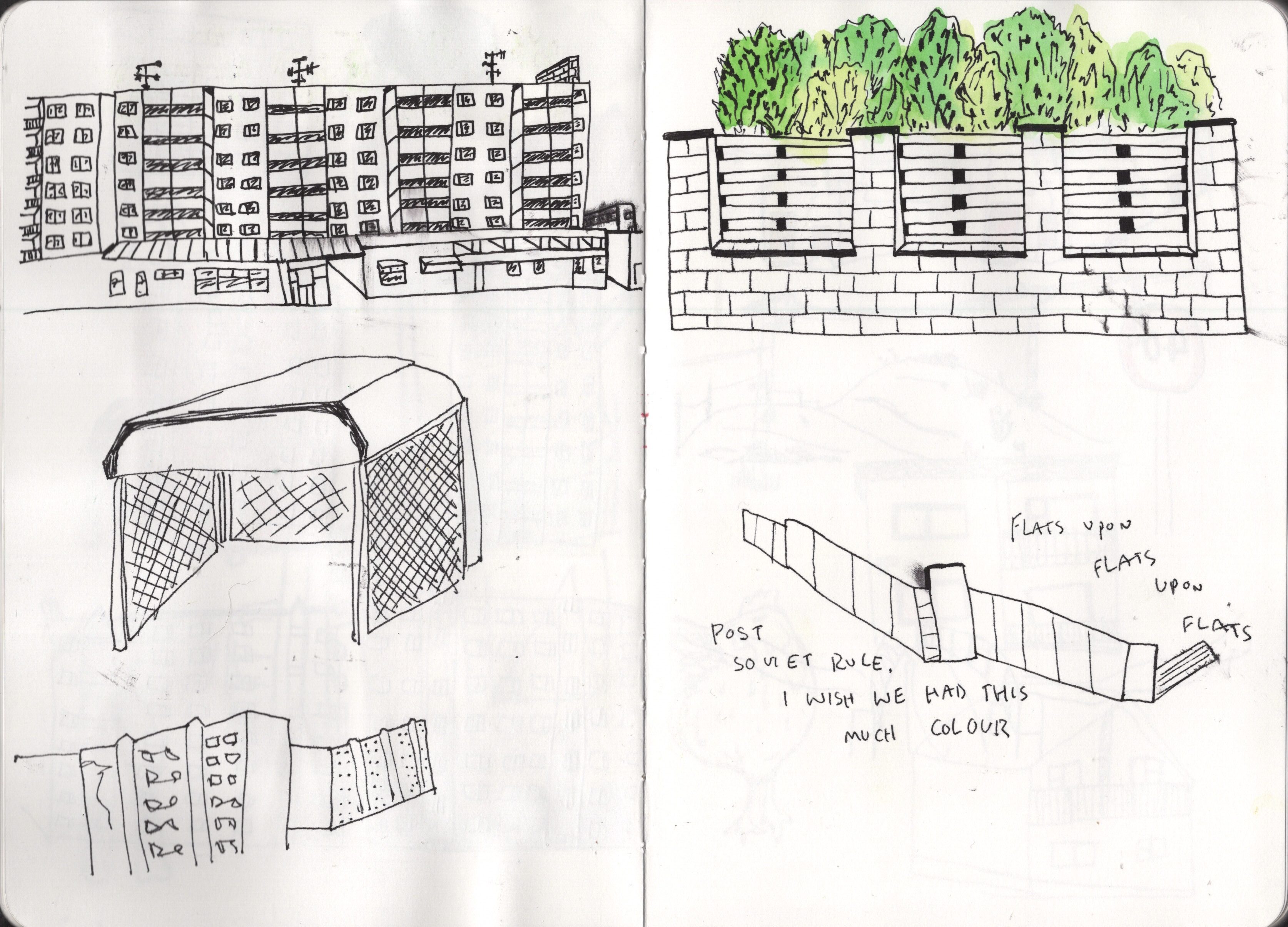
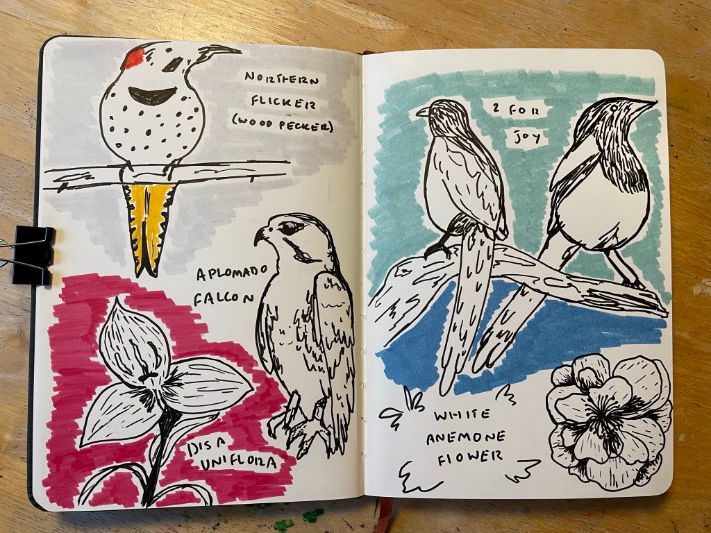
The artists provided in the exercise brief demonstrated a wide range of approaches to reportage illustration and being able to explore this further was very insightful. I noted that I was particularly drawn to playful and expressive styles, such as the work of Laura Carlin and Louis Netter, rather than more accurate and detailed work. I also got to look at some sketchbook work specifically (Lucinda Rogers and David Gentleman), which I am learning to cherish throughout this unit. Seeing how other artists use this space is inspiring and comforting. Of all the content chosen within these pieces of work – the drawings of buildings are the ones that inspire me the most. I love drawing architecture and examining buildings up close. The intricacies of the man-made world are fascinating to me.

By the fifth artist, I was beginning to realise that this just isn’t for me. I can appreciate the skill and method artistically, but I have very little interest in doing it myself. Sure, sketching what you see day to day is useful, but I have no desire to focus on it or develop it further. I noted that despite the variation in mediums, content, and approaches, all reportage illustration artists seem to have a deep passion for capturing the world around them. They all discussed the importance of everyday moments, recording them, and how they enjoy doing this. It’s helpful to know that I don’t want to pursue this avenue. It crosses one thing off the list and allows me to focus on the areas I am interested in.

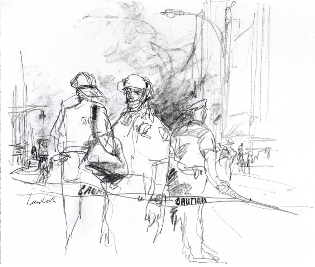
When I reached the work of George Butler, I had to pause to think about the wider conversation around his artwork. I felt it didn’t accurately represent the environments he was drawing in – something I feel is vital if you’re going to try to capture the realities of war. Photography, in my opinion, is a better medium in this circumstance as it lends itself more to expressing the feelings and experiences of the subject matter rather than of the artist. Centring those who are living through war should be the priority. Veronica Lawlor’s work is a good example of this. It contrasts with Butler’s as she was living in New York as a regular citizen when the 9/11 terror attack occurred. Her documentation of this event was a continuation of her documentation of the everyday. It just so happened that a terror attack was her everyday.

Butler, on the other hand, specifically chooses to go into wartorn areas for the sake of sketching them. This feels intrusive and contributes to the concept of ‘white saviourism’. There’s nothing progressive or valuable about a wealthy western white man travelling to impoverished and war-stricken middle eastern countries only to then win awards by showing off his experience of ‘war’. He hasn’t experienced war. His art will always be an outsiders perspective of the events he documents. The glorification of his work is decentring the lived experiences of those in the war. We should be focusing on artists who are creating work whilst living in a city that they know as their home, experiencing air raids and military pressure. These artists do exist, but instead, we focus on people like Butler and reinforce this idea that those in the middle east (and other non-western countries) are helpless and weak.

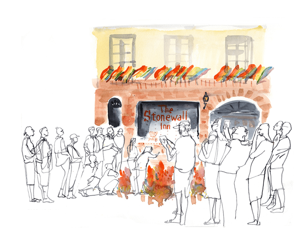
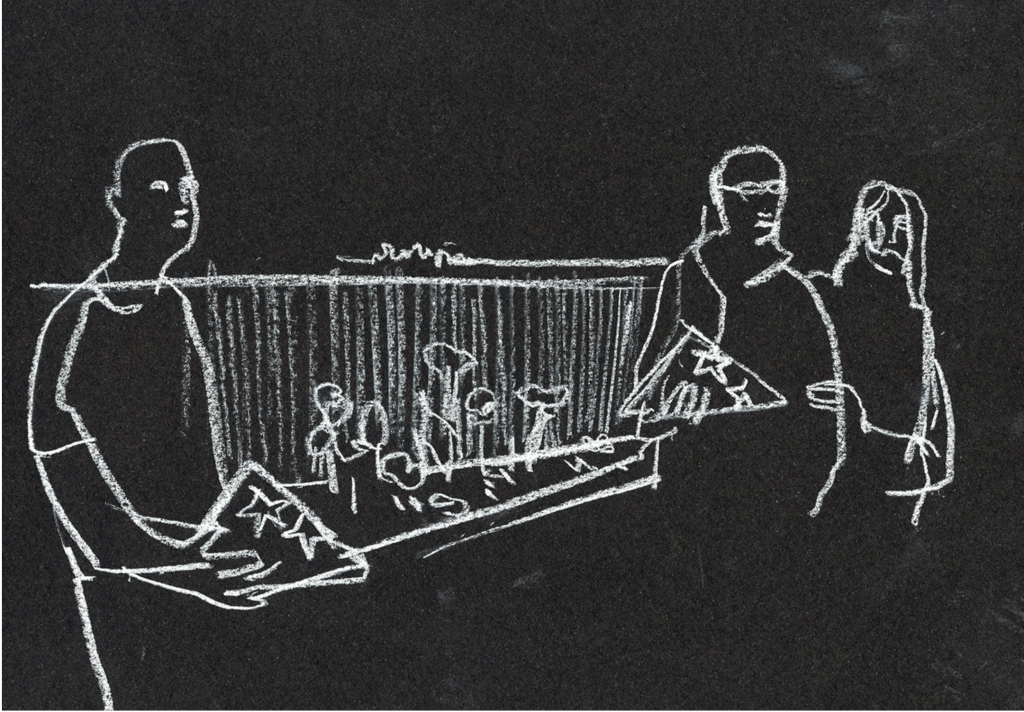
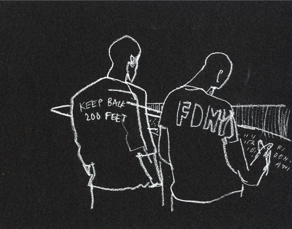
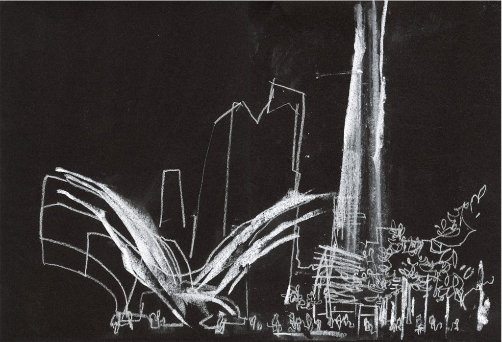
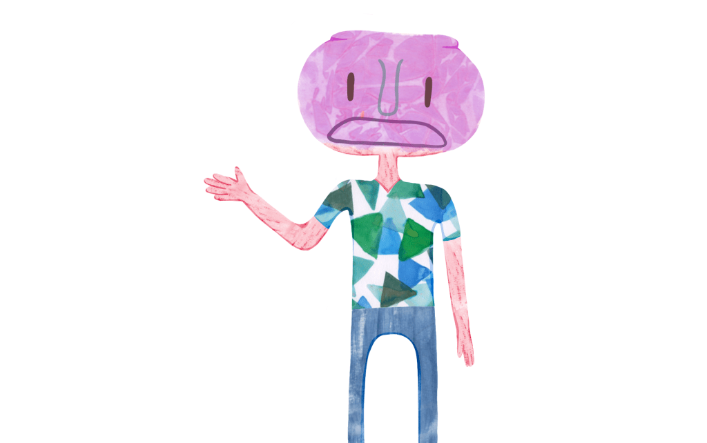
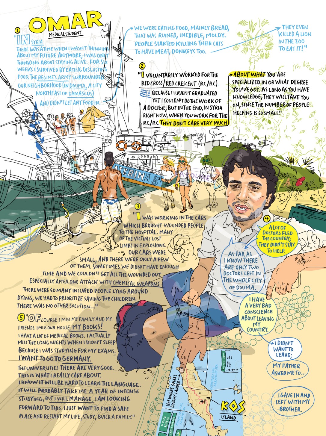
Ultimately the power an artist has is the ability to choose what content to include and to remove from their imagery. An observer of a situation such as war cannot accurately make these decisions in a way that represents the lived experiences of those within the situation. The artist’s opinions, feelings, and biases towards the situation will ultimately prevail. An example of being an observer whilst centring those in the situation is the work of Olivier Kugler, who presents illustrations alongside text in an incredibly matter of fact way. It is clear he tries to represent those in his illustrations accurately. His work almost presents as infographics, describing to the viewer what is happening in these situations and how people feel about it. It is honest and raw and not intended for Kugler’s own gain.

The question I was left with after considering this topic was, ‘Is going into someone else’s everyday for the sake of your creative advancement intrusive?’. I continued looking through the rest of the artists, then, to my surprise, realised that the articles provided in the second part of the brief were about this exact topic. The exercise states that ‘drawing within a war is far removed from the everyday’, and I would have to disagree with this. For many people across the world, this is their everyday. What ‘everyday’ looks like is subjective and unique to everybody. Many of us in the west have enormous privileges, but that doesn’t mean everyone has those privileges. To disregard this reality is the very meaning of privilege.

Upon reading the articles, I was amused to see that Olivier Kugler was one of the focuses [1]. The article’s writer perceived his work similarly to how I did – stating, ‘His illustrative style is subservient to rigorous research and inquiry’. Exploring Kugler’s work in-depth further showed how he actively aims to represent his subject matter in the most accurate ways. His work is not about him – it is about giving a voice to those who most need it, rather than inserting his own. Stacey Clarkson James is quoted in the article as saying, ‘He foregrounds the voices of the refugees’, which eloquently describes Kugler’s processes. In trying to capture the everyday of those in situations we may never be able to imagine, Kugler is a perfect example of an artist using their privilege to centre those who are not afforded the same.

The other two articles focused on the works of Edward Ardizzone [2] and the book The Photographer by Didier Lefèvre, Emmanuel Guibert, and Frédéric Lemercier [3]. Both were insightful reads and provided different contexts to war reportage. Ardizzone documented the Second World War – a moment in time when photography wasn’t widespread nor easy to accomplish in such environments. Of course, in a situation like this, documenting via sketches and drawings is the only way to capture the events happening in the world. He wasn’t gawking or using the experience to further his career – he was performing a necessary service. Recording events such as war isn’t inherently wrong; it just requires a level of nuance. In the modern-day, the appropriateness and focus of your artwork should be considered in relation to the world around you. The ‘why?’ is as important as the ‘what?’.

The Photographer, on the other hand, feels a little out of place in this discussion. The book explores the experiences of Lefèvre, a photojournalist who travelled to many countries in active war. It tells a story of his trip from Pakistan to Afghanistan and features his photographs alongside illustrations and text in a graphic novel format. Rather than a display of Lefèvre’s reportage, it is a detailed account of his experiences. While this also does not centre the voices of those living every day in war, at least it is transparent in doing so. The book, if anything, is about photojournalism and the trials and tribulations it can include – it just so happens to take place within a war. It’s not speculation of how the war might feel to those living in it or how it felt to witness it for a handful of days. It’s plain and clear: Lefevre had this experience, and here is his account. Whilst still showing insight into the realities of war and referencing reportage, this is very different from the work of Kugler, Ardizzone, and Butler. Photojournalism seeks to be informative first and foremost, and as I initially mentioned, it seems the more appropriate medium for war documentation. 

Interestingly, this article was the only one to acknowledge what I am discussing here, referring to it as ‘intrusive and voyeuristic’. The fact this was specifically referencing photojournalism, alongside the lack of acknowledgement in the other two articles and the overall narrative of Part 3 thus far, makes me curious about why photography is still considered to be the lesser of the two mediums. Reportage illustration can be just as harmful and, if anything, considerably more dangerous in its subjective nature. However, the act of ‘doing it yourself’ places it in much higher regard. Photography is viewed as easy – anyone has the capacity to take a picture. But being there, in a war, and drawing something??? That is deserving of praise!

Disregarding the fact that photography is a skill and does, in fact, require more than just pressing a button – this view contributes to the centring of the privileged artist rather than the unheard voices of the war. Looking at the illustrations in awe at the remarkable ability of the artist to go to such a place and draw in such conditions causes the point to be missed quite spectacularly.

Ultimately the cultural context of the work we are creating as illustrators and designers needs to be carefully considered in our practices. If reportage illustration is what speaks to you, and you specifically want to report on situations such as war, you must be sure to be nuanced in your approach. Even in other areas of illustration – depicting an experience that is not your own requires such thought. We must also continue to remember that our western experience of ‘the everyday’ is one of great privilege.


References

Articles quoted sourced from the unit materials: https://www.eyemagazine.com/feature/article/olivier-kugler-bearing-witness [1], https://eyemagazine.com/feature/article/ardizzone-at-peace-and-in-conflict [2], https://eyemagazine.com/opinion/article/framing-the-evidence-of-war [3]

Image by Olivier Kugler, sourced: http://www.olivierkugler.com/

Exercise 3.1: Understanding Viewpoints

For this exercise, I was asked to walk once again along the route chosen in Exercise 3.0, but this time taking photographs of my environment. This, of course, wasn’t possible, as I was already drawing from photographs on Google Maps. However, I thought it would be useful to discuss here how I already use this approach when collecting primary references and research.

As discussed in Excercise 3.0, my disability prevents me from easily using a sketchbook when out of the house. I have mentioned previously in the unit that I struggle to work when I am not at a desk or table, which is a part of it. I also am a wheelchair user and therefore require my hands to navigate my environment. Alongside this, wheelchairs come with a slight storage issue. Carrying a sketchbook and pencil case around with me isn’t always possible. Sometimes, I just am not well enough to possibly draw what I’m looking at. Despite this, as an artist, I naturally feel inspired by my environment and have for years used a combination of photography and the notes app on my phone to keep a record of what it is that has sparked an idea or just looks fun to draw. Later, when in my studio, I reference these photographs and notes when selecting content for my work. Throughout this unit, many pieces in my sketchbooks have come from my own photographic references.

This way of capturing primary references is accessible and hugely useful to me and my creative practice. It allows me to take from my real everyday life and experiences without harming me or causing distress. The longevity of photography also benefits me – these photographs will last for as long as I keep them, and I can reference them over and over again if I wish. There are, of course, cons to this being my usual method of capturing the world around me, but there’s not much I can do to change this. This exercise feels difficult to navigate and, really, just highlights the inaccessible nature of certain artistic practices or beliefs.

Having already looked ahead in the unit, I am aware a later exercise requires me to reference the photographs from this one. For that purpose, I decided to take some screenshots from my route. It doesn’t quite provide me with the same experience, but it will be helpful later on.

This process was really interesting. To my surprise, it felt much more relaxing than sketching. I felt freer – able to snap as many photos as I pleased. I noticed that I was thinking more about what looked visually interesting rather than whether I wanted to (or felt I could) sketch something. It got me thinking about how I documented much of this route photographically when I was there in person and wondering how my sketches and screenshots compare to those photos. I decided to dig them out and include them in this project. They are still primary visual research from this route, after all!

I’m glad I found these photos as I feel they much better capture the things I remember about this route. The mountains, especially, were not visible on Google Maps. However, they’re a core part of this route and are visible almost constantly. Having a slightly different angle and perspective of the environment is useful, too, as that is one limitation of Google. Interestingly, much of the content I chose to draw and take screenshots of is featured in these photographs. My tastes clearly haven’t changed much!

I felt very reluctant to engage with this exercise, and I still feel acutely aware of the distance between myself and a student who doesn’t have the same accessibility requirements. This unit is becoming challenging in this aspect, and it’s hard to continue knowing I can’t give my all. However, I feel very inspired now, having revisited these photos and looked back over the route on Google Maps. I am glad for the opportunity to reflect on my process and to elaborate on why photographic research works for me. Whilst sketching in public regularly is just a distant dream, consciously and mindfully photographing anything that inspires me is something I can put into action right now.

Exercise 3.0: Observation & topography – what to draw, where to draw?

For this exercise, I was asked to choose two locations and walk the route between them, taking my sketchbook along with me. The brief explained that this could be anywhere and involve anything, but it should have visual diversity. It didn’t need to be a long journey, but a variety of architecture, colours, and content was encouraged. As the focal point of this exercise was to walk outdoors along a route whilst drawing, it wasn’t very accessible to me. I discussed how to approach this exercise with James Pyman, head of Visual Communications, and we agreed that following a route using google maps on street view would suffice.

The goal of the exercise was to absorb the environment I was viewing and use my sketchbook to document it using rough visual shorthand. I was asked to try both quick and loose sketches and slower, more sustained work. I spent a few days considering what route I would ‘walk’ using google maps, conscious of the fact I wouldn’t be getting the full sensory experience. I thought about places that were meaningful to me or that I had strong sensory attachments to – places I had been repeatedly or had experienced intense emotions in. I wanted to be able to tap into these feelings and to express that in my sketches somehow.

I settled on the route I walked almost daily when I spent a month in Slovakia in 2015. It’s a simple route, from the house I was staying into the local supermarket, but it is a journey I can remember so vividly. I visited Slovakia on an artist’s Erasmus trip, so I spent the majority of my time being creative – however, I didn’t use nor even own a sketchbook at the time. I was so excited to return to somewhere so meaningful to me and to be able to capture it in a new way. If you’d like to follow along, you can find the route here. Just use Streetview to navigate!

When selecting content to draw, I focused on elements of the journey that I felt were the most interesting or the most memorable from when I was there in person. Looking back, I’m not sure how accurately my sketches portray the route from point A to point B, but I feel it’s apparent where I was. I used a range of materials from my travel tool kit. I began by using my trusty 1.0 fineliner – which is perfect for rapid and thoughtless sketching – then moved on to using a smaller nibbed writing pen in order to accurately draw the details on buildings. When it came to adding colour, I mainly relied on my watercolour palette, but I did use one brush pen right at the end. Waiting for the watercolour to dry was tricky – if I were to do this on-site, I would need to invest in some waterproof ink pens. I’m grateful I was indoors and able to wait in the warmth before adding linework! Switching between rapid sketches and more sustained work came naturally, depending on the subject of my sketch. By the end, I found I had settled into a midpoint that felt comfortable to me. A mix of rapid outlines and detailed elements just felt right. 

Using Google Maps presented some difficulty. Due to the nature of the website, the angles of the photographs and how close you can get to the off-road areas is very limiting – not being able to control what I was seeing and where I was viewing it from frustrated me. It was awkward and tricky choosing content in some ways, as I would attempt to move the camera and be unable to. I was very aware that I was missing out on a key aspect of drawing from life. I’d like in the future to try to build in more sketching of the world around me when out and about, but it’s a distant goal. 

Despite these challenges, I really enjoyed the whole process! I especially liked not having to think too hard about what I was drawing whilst still feeling fulfilled by each sketch. I’m surprised with how much I like the outcome – these sketches have so much character and life to them. I feel it’s a testament to how far I have already come in this unit – some of these unfinished and rough pieces would have previously killed my confidence. Going forward, I would quite like to repeat this exercise with the many other places I have visited worldwide. 

Research Task 3.1: A Reportage Case Study

For this research task, I was asked to look at the work of Veronica Lawlor and to consider her approaches to reportage illustration. In the unit guide, Jo Davies explains that Lawlor is most well known for her drawings of the 9/11 terrorist attack and notes that she is the only illustrator who stopped to document the event. She goes on to describe how Lawlor uses real-world situations as her inspiration, stating that ‘for her, the world is a studio ‘. Davies then discusses Lawlor’s ‘proper’ studio work, explaining how her on-site sketches are used as a reference – brought together with many other forms of reference – to create illustrations that convince the viewer that the event in the image was a real event that took place.

Davies discusses how Lawlor’s work is an example of illustrations simply being a description of what can be seen in any place or time. The drawing of real-life events as they are unfolding contributes to our understanding of the event. I was particularly fascinated by the idea and, thinking back to my days as a history student, how often we reference the arts to understand major historical events. As Davies says, reportage illustration is a form of visual documentary. We can look back as far as the Stone Age and gain a great deal of insight into how people lived, worked, and even felt – just by examining the art they made.

On the one hand, I feel like ascribing meaning to every piece of art in existence is a pointless and pretentious goal. I know that the majority of the art I make is meaningless and just expresses whatever I wanted to do in that moment. However, there are subtilities in these pieces of art that maybe I can’t even see – how the shape of a line might translate a sense of fear or freedom. Even in looking through Lawlor’s work further, I could see how she and others around her were feeling in the moments she was capturing. I suppose she doesn’t intentionally seek to draw the things she does – she just seeks to draw what’s in front of her.

The way we incorporate art into our understanding of history is amazing. Reportage illustration is an obvious example of art capturing history, but I feel like all art tells us something about the era and events taking place at that time. I am very curious to see what is said about the art that is relevant and created right now, in, say, 20 or 30 years. How will we look back and examine our habits and interests? Will we see the strain of the COVID pandemic in how art has been created? What about the pressures of late-stage capitalism and the rise of fascism in media?

Lawlor’s work has not only captured the 9/11 attack but has also captured the many moments of political unrest in the USA throughout the last 20 years. Seeing her sketches of events that I was politically and emotionally invested in moved me somewhat. I felt grateful seeing that someone had so accurately portrayed the anger, passion, and fierce desire for justice that I and so many others feel. Knowing that these pieces of art will outlive her (and me) is somewhat comforting. It brings me hope that maybe in the future, historians will look back at these moments and be sure to not make the same mistakes. Though, if that were the case, maybe we wouldn’t live in the world we do today.

On 11th September 2021, Lawlor revisited the Twin Towers site and sketched the scenes of crowds gathered to pay their respects 20 years since the attack. Any artist could have done this, but Lawlor’s history with the 9/11 attack gave these sketches a whole new level of meaning. She survived the attack, lived through another 20 years, and now is here to remember the experience in the same way she lived it. These sketches are loose, dynamic, and gestural, capturing shapes and the general sense of the place rather than accurately recording details. They very much communicate a sense of freedom and relaxation.

As I looked at the anniversary sketches before the original 9/11 work, I assumed this was just Lawlor’s approach to reportage illustration. However, I was amazed to see the difference in how she captured the 9/11 attack. Both sets of sketches are on-site rapid sketches attempting to capture as much as possible in as little time. The original 9/11 sketches, though, communicate a huge sense of urgency, fear, and chaos. The linework is jagged, rushed, and cluttered. There’s a focus on details, and it feels like Lawlor was unsure of what to document next. They feel tense and overwhelming as sketches when compared to the anniversary work.

This absolutely amazed me. I doubt Lawlor was attempting to communicate fear and chaos whilst sketching on 9/11, and the same goes for the feeling of calm in her anniversary sketches – she was likely just trying to draw what she could see without too much thought. The feeling in the world around her, though, is documented along with the actual people and places that were there. It gives me a whole new perspective on on-site drawing, especially of major events. I can really see the worth of this as a way of documenting emotion and the progression of the social and political climates in the world.

Alongside traditional reportage illustration, Lawlor has ventured into many other areas of the art world, including animation, portraiture, children’s illustration, and fashion illustration. She also uses reportage illustration techniques to document her travel experiences. It was comforting to see this. As an artist, I feel constantly torn between varying industries and mediums. I feel a lot of pressure to pick one and settle into it, to make a name for myself within one specific industry. Answering the question ‘what sort of art do you do?’ is so tough for me as I don’t have one thing. Seeing an artist like Lawlor – who is so well known for her reportage work – branch out into many different industries reminds me that I, too, can have variation in my work.

Her travel documentation has a totally different vibe to it. It’s much more careful, controlled, and accurate. This is likely due to her ability to slow down and appreciate all that she can see a little more when travelling. When compared to her on-site illustrations from intense or violent events, the travel illustrations appear beautiful in an emotional way rather than a technical way. I can imagine it’s difficult facing these events repeatedly, so seeing a snippet of Lawlor’s escape to distant lands or unfamiliar places is wonderful.

Prior to researching Lawlor’s sketches, I felt quite ambivalent towards the concept of reportage illustration. Now, however, I have a huge appreciation for it. It isn’t a form of illustration I myself am interested in exploring or participating in, but I have loved examining Lawlor’s work and would like to see more of the same. Her work, as well as the concept of reportage illustration, has inspired me to sketch more of what I see and what I enjoy looking at, knowing that I’m contributing in some way to its memory. This thought helps me feel like my work has a purpose, which inspires me to keep creating.

All images within this post have been used for educational purposes under the fair use copyright act. Original images can be found here. Featured image is a sketch drawn during the ‘Today I Am a Muslim’ rally to show support for muslims in the USA after President Trump’s travel ban.

Sketchbook Circle 2 – Book 3

By the time I reached the third book in the sketchbook circle I was feeling pretty comfortable in freely sketching and making mistakes. I no longer felt so hung-up on trying to fit the ‘theme’ of the sketchbook and knew that I would be able to take the previous work to a new level. Much of the previous work in the sketchbook was centered around natural objects such as plants and birds. I love drawing these things, so I was eager to dive in!

The paper in this sketchbook was a little frustrating as I felt it limited me once again to using mostly dry mediums. I found I struggled with this quite a bit, as I love using inks and paints. I’m really happy with the body of work I ended up producing, though, in my 10 pages. I feel they reflect the previous additions pretty clearly, but they take the sketchbook in a new direction. Some of the work is inspiring me for future illustrations too!

I love participating in the sketchbook circle as a side project to the rest of my uni work. It’s a great opportunity to try something else, or something completely new. Seeing other student’s work is also really refreshing and often inspiring.

Research Task 3.0: Building a Tool Kit

For this exercise, I was asked to go through my art supplies and figure out what my artist tool kit will be for when I am sketching in public. Of course, I will not be taking this kit outside with me, but I still think a limited tool kit is necessary to have even within a studio or home environment.

As I am in the process of moving house, all of my art supplies are currently packed away. When I was in the process of packing it all, I did exactly what this task is asking of me and created an essentials kit so that I could continue making art even in the throes of the move. I used a pencil case that already had my go-to pens and pencils in it, and I added to it as I worked my way through my cupboard of art supplies. What has been left behind is a combination of essentials, favourites, and the most easily transportable materials.

What’s in my pencil case

Inside my pencil case, I have:

  • Four of my favourite fineliners sized 0.1
  • A 2B pencil and a blue sketching pencil
  • Three Tombow alcohol markers
  • Five coloured pencils (colours that I use often)
  • A white and a black chinagraph pencil
  • A tri-toned coloured pencil
  • Seven coloured brush fineliner pens
  • An acrylic marker pen
  • A white gel pen
  • Two black and one grey drawing pens in assorted sizes
  • Two paintbrushes, one that has water within it
  • Two eraser/pencil sharpener combos
  • A bulldog clip

As I have been using this selection of materials over time, I have come to realise that some of them aren’t as necessary to have as others. Even if I were to use this as a travel kit, I would likely leave it as it is, as the option is nice to have. I have found myself grateful for some of the tools when I felt bored of returning to the same pens over and over again. I likely would end up replacing them as I find new things I’d rather have with me.

I have two travel paint palettes too, a watercolour one and a gouache one. I have experience with taking the watercolour palette out with me as I did some sketchbook paintings during a trip to York last year. I would likely only bring one of these palettes out with me if I were going to take this kit out, though.

This kit is proving very useful despite not taking it out anywhere! I wonder if it’s too big, though. Maybe I can work on reducing the size of it even further, but I enjoy having the option to add colour in many different ways and to create different textures and areas of visual interest. It’s portable, though, and I guess that’s what matters the most.

Introduction to Part 3 & Responding to Feedback

Part 2 was a little bit of a rollercoaster for me. A considerable part of this was down to the overwhelming, tiring, and intense situations in my life, but I also felt quite bored with the unit as time passed. Exercises and tasks took 2x as long as they probably should have, leading the whole of Part 2 to feel like it dragged on and on. I also really did not enjoy Assignment 2. It just didn’t inspire me nor feel like an area of illustration I am interested in working within.

Regardless, I gave it my all, and I’m quite pleased with the results. I learned a lot throughout about my own attitude towards sketchbooks and how I enjoy using them, as well as learning about the various materials I have around me. I also managed to work towards some of the goals I laid out initially in the unit introduction post I made. However, I feel that I could be doing better, and I hope I can be more focused throughout Part 3. My tutor provided me with some really useful feedback and suggestions I would like to try out going forward. 

In response to my blind contour drawings, my tutor suggested I try drawing under the table or in the dark in order to make it harder to see the page. She also commented that my blind contour drawings were very good as I already use this skill on a day to day basis. I want to try to push myself further in this way, so I plan on trying these techniques out. I’m especially intrigued by the idea of drawing in the dark. She also suggested I draw moving images or videos rather than still images, incorporating the different coloured pens to show a sense of movement.

Another recommendation my tutor gave was to use objects in my environment in my sketchbook to draw connections between the real places and the pages within. I did do this somewhat in Exercise 2.5, and I enjoyed figuring out how to make the items I had collected fit into the page. I want to try to do more of this, though it’s not a high priority for me. My tutor also responded to a comment I had made in Exercise 2.4 regarding the scale of my sketchbook and recommended I think about working in different sizes. I have considered this when choosing my sketchbook for Part 3, and I am interested in working at much larger scales, too, though I feel a bigger sketchbook would go to waste. I have used A4 and larger sketchbooks in the past, and I find I discard them quite quickly to go back to my smaller ones. I prefer working at a larger scale for one-off pieces or final illustrations.

A point my tutor returned to several times was using my sketchbook pages repeatedly. Her first recommendation was to use my pages ‘as a ground on which to add further markmaking‘. I struggle with this idea – as, for me, the sketchbook pages are finished. I don’t want to add further markmaking to them – the point of the page was to experiment and explore different techniques, or to make a mess, or whatever it was. So long as that purpose has been fulfilled, the page is ‘complete’ in my eyes. I don’t want to go back and add further markmaking. However, I know I could challenge this feeling and maybe set my intentions differently when working on an experimental page. Yes, this page is for experimenting with a medium, but it also could be a space to continue working into long-term. It’s tricky for my brain to be comfortable with this, but I want to work with it somehow.

Another recommendation she made was to use the pre-existing pages more when building illustrative pieces. I struggled with this at the time, but in going back and finishing Assignment 2, I found it much easier to use the pre-existing material I had in the backgrounds for my characters. I’d like to consider how I do this in the future, whether I can directly use the pre-existing pages in projects, use them as a basis and develop them further, or just use them as inspiration. Part 3 seems to focus a great deal on making something out of your sketchbook material, so hopefully, by the end of this part, I’ll be able to do that with greater ease.

There were some further reading recommendations at the end of my feedback which seem extremely useful for my practice. I intend on writing a separate research post on this where I can comment more extensively on the artists and content I explore. (You can find the research post here!)


Going into Part 3, I feel a mixture of things. Initially, I was very optimistic. The circumstances in my life that made committing to work so difficult in Part 2 have settled down for a while, making me feel more confident in my abilities. I feel a lot more creative energy and passion than I did throughout Part 2, and I’m a lot more excited about Assignment 3. However, unfortunately, the exercises and key goals of Part 3 are completely inaccessible to me as a chronically ill disabled person.

Learning to use my sketchbook in public spaces is likely not ever going to happen. I am a part-time wheelchair user, which makes carrying a sketchbook and pencil case – and the act of stopping to sketch whilst in public – pretty difficult tasks. When I don’t use a wheelchair, all of my energy and attention is focused on walking safely, conserving my energy, and ensuring I don’t make myself too unwell. Every time I leave the house – be it in my wheelchair or not – I use the majority of my energy for that day, 100% of my energy if I am walking. At the minute, my health is not in a place where I can leave the house unless for emergencies or out of absolute necessity. Whilst this is not constant, it is a part of my reality, and even when I do and can leave the house, I can’t casually sketch whilst doing so.

Unfortunately, this makes Part 3 really difficult for me. This is so frustrating, as it’s not like I enjoy not being able to sketch in public or leave my house ever. However, I spent some time chatting with my tutor and James Pyman, the head of Visual Communications, and together we came to some compromises. This means that my responses to the exercises within Part 3 will be quite different from the typical responses, and my capacity to explore what is expected of me will be reduced. Thankfully, I have been assured this will not be an issue in the new Illustration units. It’s a real shame that I have to be excluded from some key exercises here, but onwards we go.

The other goal that Part 3 aims to achieve is the ability to go through your existing sketchbook work and provide narrative structure to it, ultimately resulting in fully fleshed out finished designs. This is pretty much how I intend to use my sketchbooks in the future – as grounds for idea generation and development. I’m looking forward to this aspect of Part 3, and hopefully, the work I am able to produce for the exercises will be inspirational in this way.

Instead of making another sketchbook for Part 3, I chose to buy one I hadn’t yet tried. I wanted a sturdy and solid A5 book that I could fill to the brim without it breaking. I also didn’t have the time to source paper and sew the binding for another book. I chose to buy the Shoreditch Sketcher – an infamous sketchbook used by most urban sketchers. I felt it fit the ‘drawing in public’ requirements quite well, and despite not planning on using it in this way, I wanted to capture the feel of that as much as possible. I spent some time decorating the front cover – which is gorgeous even without decoration – using stickers that made me feel happy. I don’t usually do this, but I have so many stickers in need of using, and I’m so glad I did! I pretty much spent the whole day staring at how pretty the cover was afterwards.

The paper is completely new to me – it is smooth and feels glossy almost, though it is matte. It is also an off-white tone and reasonably thin. I usually opt for toothier paper, some sort of resistance, and a thicker page to ensure it can withstand mixed media. It doesn’t look like it easily holds up inks and other water-based mediums, so I set to work trying out a range of my favourite pens, paints, and pencils. To my amazement, it holds paint BEAUTIFULLY!! It is such a gorgeous paper to work on, and I think I may have been transformed into a long term user of this sketchbook. I have found no issues with it so far, and I have tested out everything that I could possibly use. It even holds up alcohol markers with very minor bleeding.

Whilst disappointed that I can’t approach Part 3 in the way that is asked of me – I am still very much looking forward to it. My sketchbook is wonderful, the plans I have for the exercises excite me, and learning how to use my sketches as a platform for ideas is a goal I wish to achieve. I can’t wait to buckle down and get stuck in with the research and drawing exercises and to hopefully lose myself to the creativity I have bubbling away right now.

Workshop on Identity, Inspiration, and Creative Practices

On Tuesday 16th November, Emma Powell – a tutor at the OCA – ran a workshop for all Visual Communications students to help overcome and explore creative block. I signed up because the topics of identity and inspiration are specifically interesting to me and because I have been feeling an enormous amount of creative strain lately. I knew this was attributed to the things that are going on in my life in general, but I was eager to see how the workshop could help. I also would like to attend more workshops in general, so this was a perfect first opportunity for me.

After everybody had introduced themselves, Emma began asking us a list of questions. They were quick-fire – we were intentionally only given a short amount of time to respond to them. This was so that our answers were the most authentic to how we were feeling, without much overthinking and internal debating. The questions started quite simple: ‘name three things about you’, ‘three colours you like’, and ‘three artists who inspire you’, then they began to get a little more complex. Emma challenged us to think about our inner critic, what it says to us, and how we want to handle it. She asked us to consider what helps us when we’re stuck creatively and what we find ‘recharges our creative batteries’.

There were some questions I had never even considered before, like ‘do you prefer triangles, circles, or squares?’, ‘which part of the creative process do you prefer?’, and, ‘do you prefer 3D, flat, or other?’. I appreciated these questions the most, as they helped me learn things about myself and my approach to art that I had never discovered before. In total, Emma asked 27 questions. Once we had written our answers, we were asked to categorise them in some way that was meaningful to us. Then, we had to make some sort of artistic or visual representation of these answers, picking out the ones that meant the most to us and displaying them somehow.

The purpose of this was to create a reference point for our own development and creative growth. We could look back at this visual piece and use it to help inspire us, to overcome art block, and to remind us of where we wanted to go at one point in time. Emma asked that we include a representation of ‘me’ (ourselves) and of our ‘inner critic’ somewhere on the piece. She recommended that we try to demonstrate what we want to do with/to our inner critic. Other than that, what we decided to create was entirely up to us, and it could look like anything we wanted.

I wanted to create something that I would get a lot of joy from looking at. I felt there was no use in having a visual reference of my own artistic practice if I didn’t like seeing it on a regular basis, plus I wanted to stick it on my wall so I could always see it if needed. I had a vision almost instantly, and with only 20 minutes to put the piece together, I dove straight into it. I began by adding the most important features – myself, my inner critic, and the date. The date was particularly important to me as I wanted it to be a reminder that I am not a static person. I continually grow and learn new things, both about myself and about the world around me. The writing on this piece of work only represents who I am today, not who I am in two months time.

This may seem obvious to most people, but I struggle with trying to fit into my own constraints. I follow the rules to a T, which means if I make a rule, I’m gonna find it hard to break it. Saying ‘this is who I am creatively’ feels constraining and like a rule. Whereas, saying ‘this is who I am right now, and I am going to change later’ feels more freeing. So, I added the date right at the bottom of the page. I also drew what I wanted to do with my inner critic: love it, become friends with it, and comfort it. My inner critic exists as a result of pain and trauma, and pushing it down or yelling at it only makes it grow worse. I want to love every part of me, even the parts that seem mean or upsetting.

Next, I re-read my answers to the questions and tried to figure out four categories they could fit into. I wanted to split the page into quadrants and write them in each one. I came up with: Identity, Inspiration, Artistic Practice, and Aspirations. I then highlighted each of the answers, so I knew which group which one belonged to. I made sure to use bright colours to draw out my quadrants, and then I began writing everything in. This was a little time consuming, as the black pen I was using is not waterproof, which meant I had to do the coloured highlight first, wait for it to dry, then write over with the black.

Once the 20 minutes had run out, we all shared our work with each other. It was really interesting seeing how other people had approached the exercise. Notably, I was the only person who wanted to befriend my inner critic. Everyone else wanted to get rid of it or yell at it. This showed me quite a lot about my own self-development and growth, both personally and as an artist. The other people in the workshop added to-do lists to their pieces, which was cool to see, especially as I hadn’t considered anything of the sort. There were also more illustrations and drawings on the other pieces, which I guess shows my preference for infographics and other forms of graphic design.

I came away from this workshop feeling fantastic. I loved the piece I had created, and I felt passionate about making art in general. I had clear-cut avenues to go down to further my artistic practice, and I was able to ground myself a little bit and see the reality of the situation. I now have this piece on my wall, as intended, and I look at it almost every day. I don’t always read what it says – sometimes I just smile at the bright colours and me, my critic, and our cup of comfort. That alone motivates me to keep going. Throughout this sketchbooks unit, I keep coming back to the same thing: I want to always make art that makes me smile.

Assignment 2: Happy Accidents

For Assignment 2, I was asked to look back over the work created during part 2 and demonstrate how I use experimental drawing techniques to build and inform my illustrative processes. The assignment was split up into three parts, each referencing various exercises carried out in part 2. I was then asked a series of questions prompting me to reflect on my experiences throughout this part of the unit.

The first section of the assignment asked me to revisit the examples of pareidolia I had collected during Exercise 2.6. I was asked to reconsider them and develop them more fully as characters – adding narrative to the pieces and considering their properties and how this could be translated using artistic mediums. How I approached this was my choice: I could be very literal, surreal and abstract, or intentionally subversive.

During Exercise 2.6, I had sketched out some of my favourite ‘faces’ in several different ways already, which was useful when it came to this part of the assignment. I looked through my drawings and picked out three that I felt especially connected to. I found it easy to imagine entire worlds for these characters to live in and stories for their final scenes. I initially began exploring these in my sketchbook but quickly realised I wanted to develop them using Procreate. I drew out lineart for all three of the characters, and once I was happy with how they looked, I started considering how to develop them further.

I began with the ‘ironing board man’. I wanted him to be wearing clothes, and I chose jeans and a t-shirt. I created a texture for the jeans in my sketchbook using a dry brush and gouache. I then created a face texture using cling film and gouache. This texture reminds me of tin foil, and I can’t help but think that because of that, it’s inherently metallic. I wanted that to emulate the metal of the ironing board in some way. I then used ink to paint a pattern inspired by the ironing board cover for his shirt and scribbled out some crayon for the skin texture. I was intentional with my colour selections for the jeans and t-shirt textures, but I didn’t think much about the others as I knew I would be changing them digitally.

Sketchbook pages of textures for the ironing board character

Once they had dried, I scanned in the textures and began digitally manipulating them in order to fully create my character. You can see from my video below how I approached this. I added in some shading once done and drew on the facial features. I was inspired by the sort of whimsical, bright, and fun cartoons that air on Cartoon Network, such as The Amazing World of Gumball and The Regular Show. I love this sort of character creation and the exaggeration of features and proportions. Upon showing this to a friend, she commented that it was obvious that it was inspired by the ironing board picture, which I was glad to hear.

A time-lapse video showing my process creating the ironing board character

Next, I moved on to my character based off of my front door. The facial expression I chose I felt was reminiscent of a daydreaming schoolkid. I followed the same process as for the ironing board character, but I created some new textures for the piece. I used gold gouache to create a texture for the main body of the character, inspired by the gold door knocker and letterbox. I originally wanted to have a white texture with streaks of gold running through it, but I wasn’t sure how to achieve this. I decided to start with gold and then add white on top if I wasn’t happy with it. Once added to the character, though, I felt it worked out well.

Sketchbook pages of textures for the schoolkid character

For the school blazer and shirt, I used the same texture. Initially, I created it with the blazer specifically in mind. I used a variety of blue tones mixed with black ink on a pre-wet patch of my sketchbook. I used the water to create interesting variations in colour and opacity, and I removed some ink in places using kitchen roll. Once in Procreate, I changed the brightness and saturation of the texture in order to use it for the shirt, too. I utilised masking fluid to create stripes for the tie, and for the backpack, I reused the crayon texture I had created earlier.

A time-lapse video showing my process creating the school kid character

Overall, I’m less excited about this character. I’m not sure if that’s because I’m just less invested in it in general or if it’s down to the way I created the textures for it. I feel more attached to the ironing board character and more excited about fleshing out a narrative for him. Still, I moved on to my third character – inspired by a switch found in my kitchen – which I felt a little more positive towards. I envision this character to be a wise, old guardian, blocking the entryway to a cave. Whenever anyone tries to enter the cave, he presents them with riddles and trivia and only allows them to pass if he feels they are worthy. He isn’t mean or rude but stoic and protective.

I reused the texture created for the school blazer here as I felt it was perfect. I did alter it slightly and changed the colour here and there to see how I could achieve a more ‘rock guardian’ type look. I once again used the crayon texture for the hands added and digitally drew facial features. I then used some acrylic paint to create a shiny red texture to use for the shoes and eyes, inspired by the red light on the switch. I thought that acrylic paint always dried glossy, but this time, it dried matte. Frustrated, I added some PVA glue over the paint and also mixed some with a brighter shade of red to try to get that shininess I desired.

Scan of the two acrylic paint options

A Note for Tutor

This is where I had gotten to in writing up my learning log before not being able to continue. I have since

  • Finished the ‘rock guardian’ character lineart and colouring/texturing
  • Created a background for the rock guardian using a variation of experimental and new techniques learned throughout part 2
  • Combined the background with the character
  • Started creating a background for the ‘schoolkid’ character using different techniques

You can find scans and videos of the above below. My plan for the rest of this assignment is

  • To use more experimental techniques to continue building a background for the schoolkid character and to combine them in a similar way to the rock guardian piece
  • To explore a variation of scenes in which I could fit the ironing board man – specifically photographs of real-world scenes with digital drawings over them or combined with other techniques inspired by Christoph Niemann and Saul Stienberg
  • To assess the work completed for all three pieces and look at how effective my approaches have been, and to make changes where necessary
  • To then reflect on this assignment using the prompts in the assignment brief and to reflect on part 2 as a whole

As discussed, these points are currently on hold as I focus on the circumstances in my life right now. I plan on continuing with this assignment and reflecting on the entire process later, once things are a little less chaotic. I will say, however, that I have learned a lot about my approach to using sketchbooks and what I like to do and dislike doing. I also miss doing work digitally now, which is ironic!

A time-lapse video showing how I brought together the rock guardian character and the background

A Note for the Assessor

Unfortunately, when I completed this assignment I was in an extremely stressful life circumstance – almost being made homeless – and despite completing the work I could not write up my learning log in full. I did revisit this assignment a short while later to add to my characters, however I do not feel able to re-write this learning log honestly. My tutor advised me to use existing pages of my sketchbook to create backgrounds for characters, rather than creating new pages, which I experimented with a fair bit in an attempt to create a background for my ‘schoolkid’ character.

I really enjoyed the process of creating charaters in this assignment, and I learned a lot from it. I applied the things I learned here in future exercises and assignments, and it helped shape my ability to see my work as something that could be developed further. The act of revisiting previous sketchbook pages and taking inspiration from them (or, in fact, using them for something new) was extremely helpful. One of my conclusions during Part Five of this unit was that creating fun, silly characters is something I have found great enjoyment in – and this assignment was very much the birth of that.

I hope that despite an in depth learning log, it is clear how this assignment influenced my development as an illustrator.

Exercise 2.6: Pareidolia

For this exercise, I was asked to consider Facial Pareidolia – a phenomenon where our brains perceive faces or other familiar shapes in random and irrelevant objects. This is a common and well-documented experience, and most people are likely to notice it at least once in their life. Many artists working in a wide range of mediums have used this concept to their advantage. I was asked to find as many examples of this concept as possible and create a collection.

I started by photographing the things I already knew fit under this category, mainly marks around my home that have happened naturally over the years it has been lived in. I am quite attuned to pareidolia, and I find myself frequently pointing out how things look like other things, often to other people’s surprise. Because this was at the forefront of my mind, I started looking at other things differently around my house and photographing what I saw. I then got some photos of front doors as they are especially fitting for the concept.

Once I had collected my photos, I decided to draw over them using Procreate to signal where I thought the faces – or creatures – were. I then experimented with alternative styles for a handful of them. This was a lot of fun – I really enjoyed making the characters I could see in front of me come to life. Despite constantly seeing faces/creatures/characters in my environment made up of inanimate objects, I had never considered using that as a basis for an illustration or even drawing what it was I could see.

I enjoyed that this exercise forced me to look at the world differently. Overall, I spent about a week building my collection, considering where I could find faces and how I could use what was around me. I even asked friends to send me pictures of their front doors to see if any of them had exciting faces on them. I love that this unit is teaching me that anything can go into my sketchbook if I want it to. It’s almost like I needed to be told, ‘hey, you can draw everything in your brain if you want!’ – and I’m feeling more and more confident in doing that by the day.