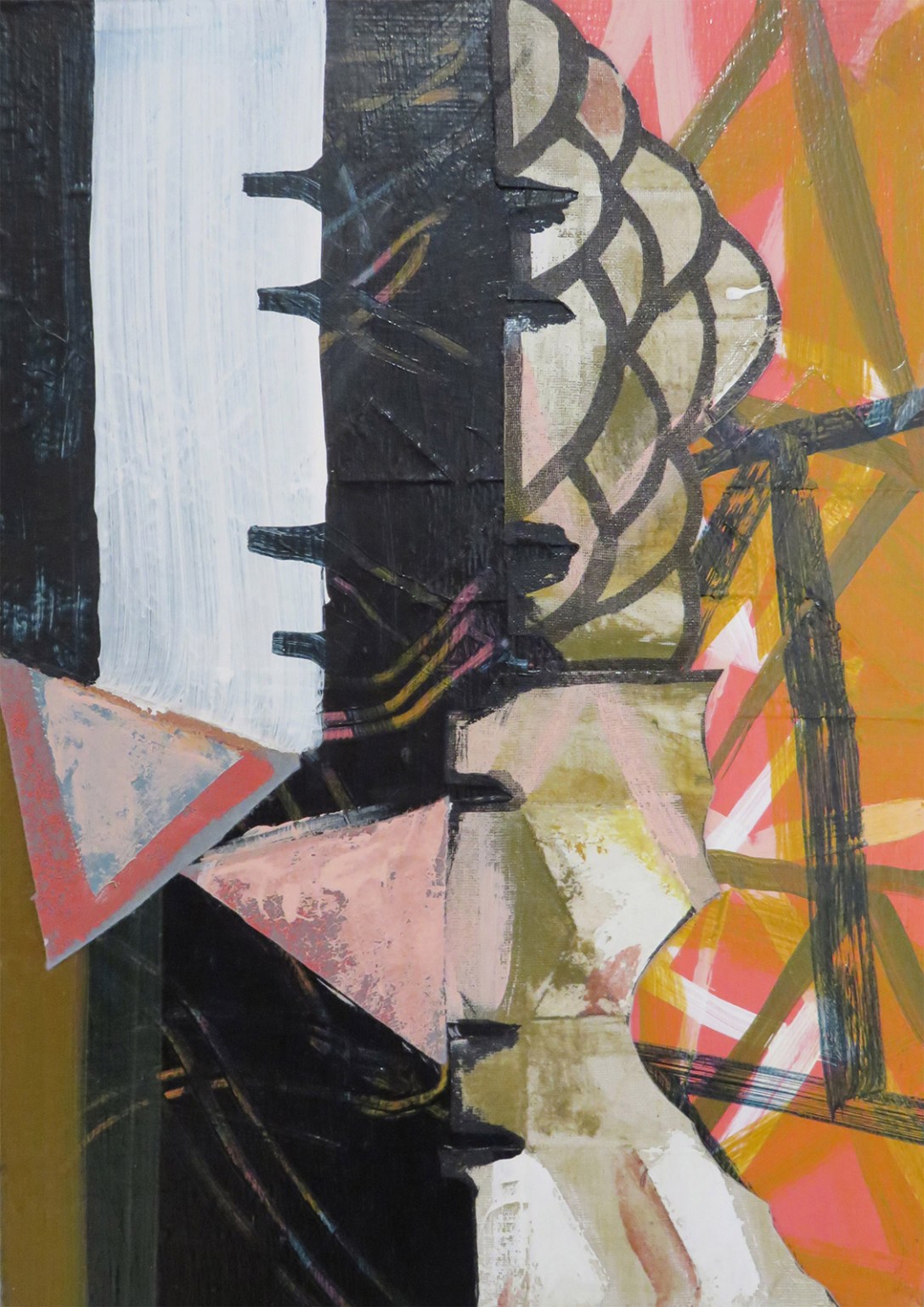
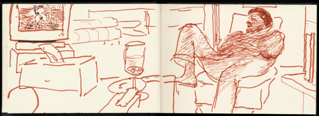
For this exercise, I was asked to shift my focus from drawing objects to incorporating them into my drawings. I had to take my sketchbook on a journey and collect objects as I went, filling my sketchbook with them. This could be a simple journey around the house or a more complex journey involving many different scenes and opportunities to find objects. My incorporation of these objects was to be intentional and thoughtful, using them to specifically reference the place they were found in some way.
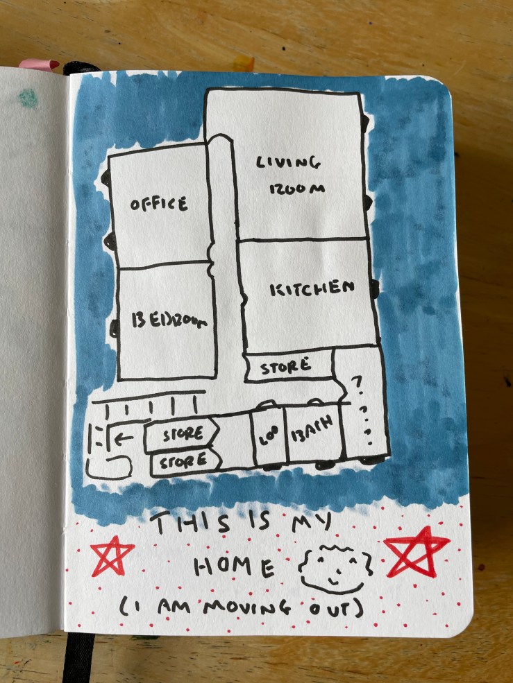
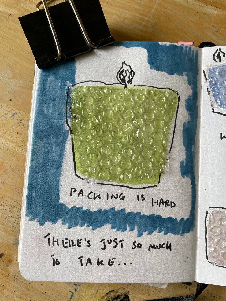
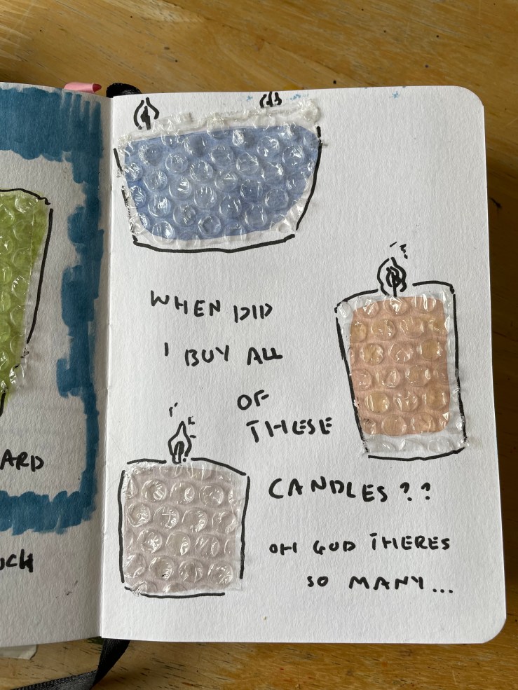
I am in the process of moving house, and I have been thinking for some time about ways in which I could creatively document the place I have lived for the last five years. When considering the journey to go on with my sketchbook for this exercise, I thought it was the perfect opportunity to do this. I began by drawing a rough floorplan of my current house as a ‘title page’ to the exercise. Next, I decided to add a few pages about the packing process. I used bubble wrap to emulate the glass jars that my candles are all in, as I was busy wrapping them and overwhelmed by how many there were. I really liked this usage of the bubblewrap as it has a double meaning.
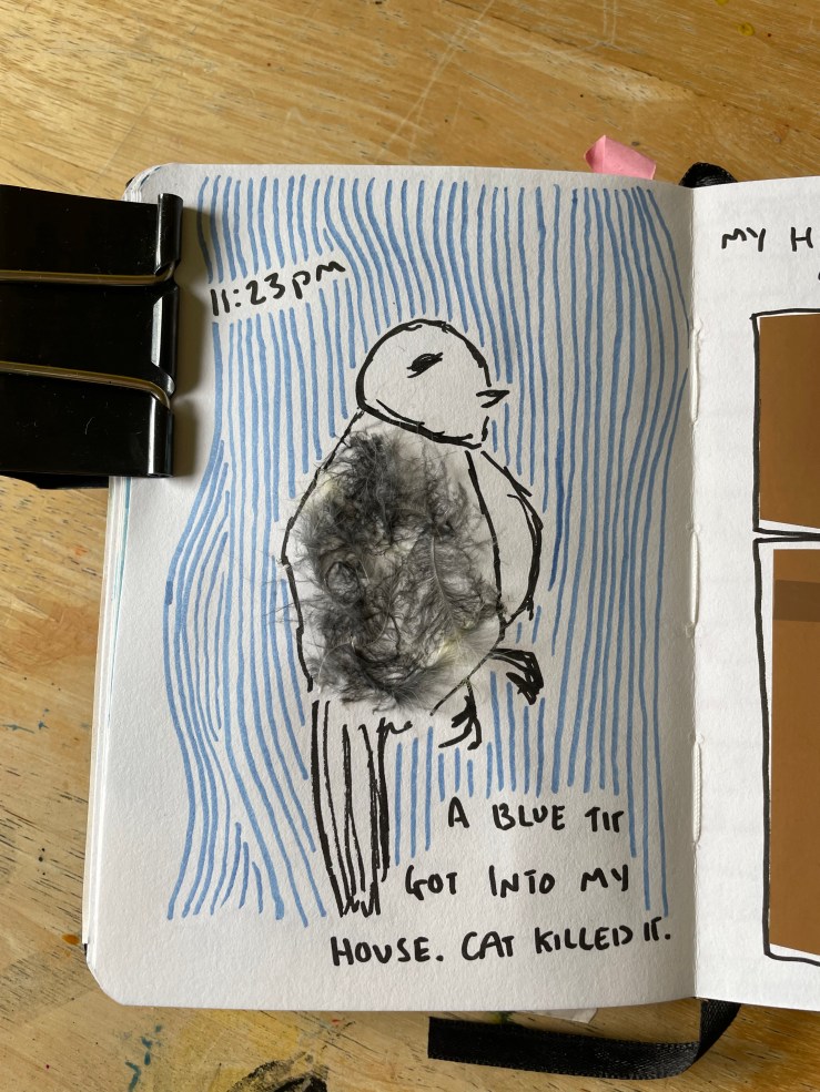
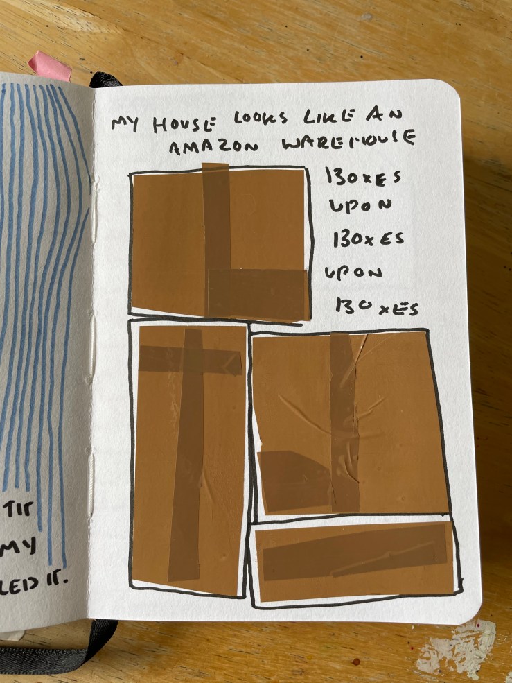
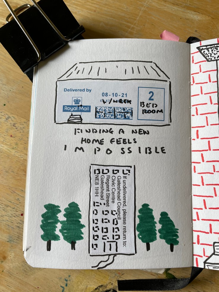
I then used some packing tape to draw some cardboard boxes as they are currently littered around my house. I chose to use the packing tape for this as I use it to close the boxes once they’re full. Unfortunately, in the midst of all of this, a blue tit got into my house, and my cat killed it. It was a really surreal experience as there was no reasonable explanation for how it got into the house. I wanted to add this to my sketchbook in some way, so I used the feathers that were left behind for its body. The next day I received the forms I needed to fill in to end my current tenancy, and I felt I wanted to use the envelope to express how I was feeling about it. I cut bits out and used them to narrate how stressed I am regarding finding a new place to live.
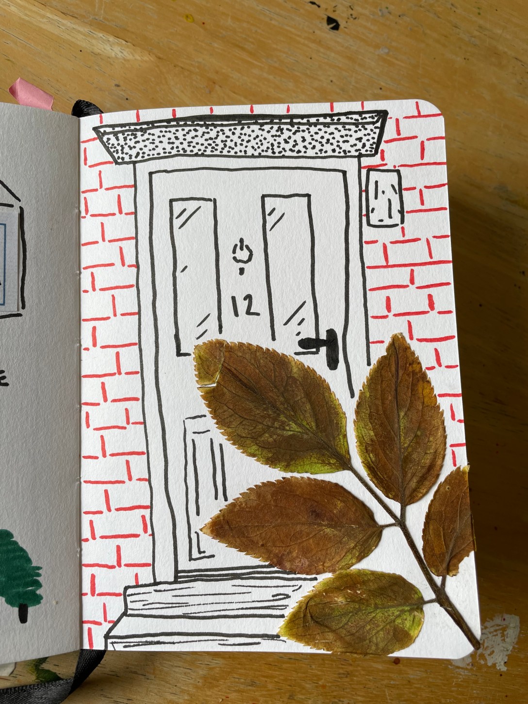
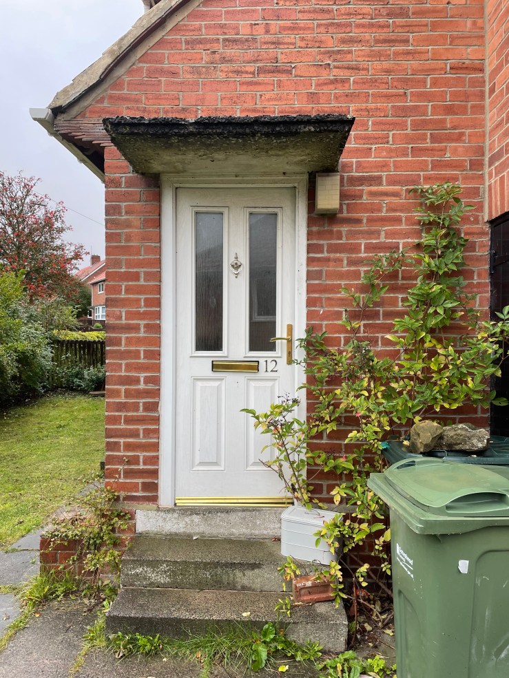
The last page I did was the first one I thought of for this exercise. A few years ago, an elderflower tree planted itself in the cracks between the pavement right outside my front door. Over the years, it has grown into this magnificent tree, somehow managing to do so still in the cracks between paving stones. It is my favourite thing about this house, and I’ll be very sad to leave it behind. I picked a cluster of leaves from the tree and used them in place of the actual tree in a drawing of my front door. I really like that I’ve been able to take a piece of the tree with me whilst immortalising the image of its growth.
I wanted to do more on this exercise, but as is probably clear from the subject matter, I am super overwhelmed by everything else going on in my life right now. I feel consistently burned out and exhausted from managing the move as well as my regular day to day tasks. Looking at the work produced, I don’t feel as though I have actually managed to record the home I live in. I think that makes it clear how much the process of moving is occupying my mind! I love using found objects in my work, and I’ve done it before in my sketchbooks. It’s something I would like to do more of, and I hope I find opportunities to do so.
Christoph Niemann and Saul Steinberg are both illustrators who have worked extensively with the New Yorker magazine in their careers. Steinberg was Niemann’s predecessor, active from 1914 to 1999. Niemann is still active as an illustrator and began his creative career around 1997. Alongside more traditional illustrative work, a notable approach taken by both artists is an incorporation of everyday objects in their work. In this exercise, I was asked to compare both artists, focusing specifically on this integration of found objects.
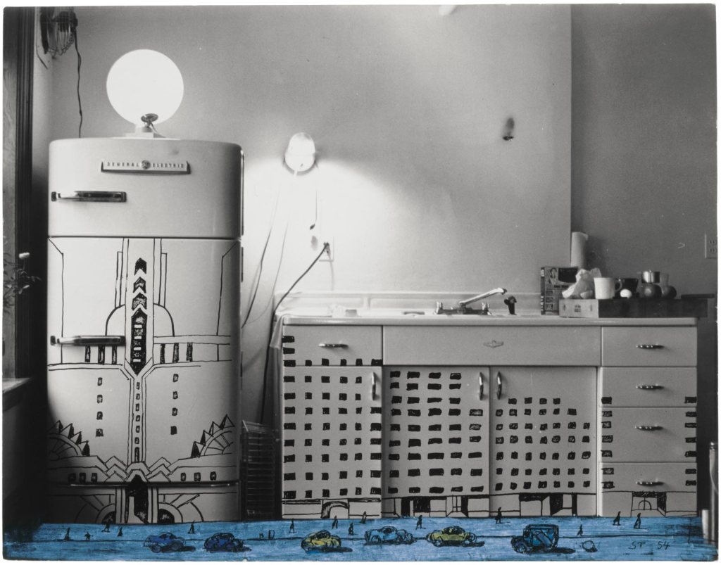
Work from Saul Steinberg’s Photoworks
Before illustrating for the New Yorker, Steinberg’s career began with illustrations for an Italian humour magazine which were similar in style to the comics found at the back of newspapers. He then went on to draw satirical anti-fascist pieces for a range of US magazines throughout World War Two. It is clear that this light-hearted and comedic approach to drawing formed a foundation for Steinberg’s future work, and really, entire career. His New Yorker features are equally playful and humourous, despite the audience shifting and the purpose changing. His personal work carries much of the same undertones, as clearly shown in his series Photoworks.
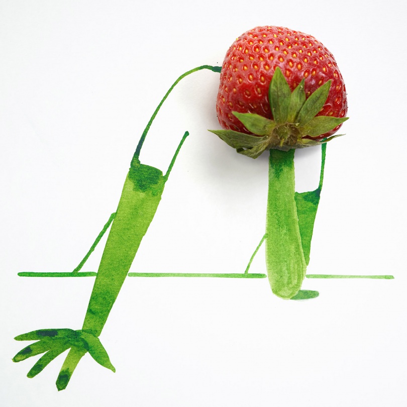
In Photoworks, Steinberg photographs objects, usually in arranged scenes, and adds narrative post-printing by drawing characters, landscapes, and various other elements. The finished result is a fun, playful, and imaginative view of the world. Compared to his illustrations for editorial publication, these pieces have less of a political narrative behind them. They feel fun just for the sake of being fun, not to try to mock anything or encourage the reader to question their beliefs. Well, not politically anyway – the drawn elements of these images bring a whole new meaning to the objects used, which definitely prompts the viewer to think differently about the spaces around them.
After Photoworks, Steinberg continued to use found objects in his personal work. Exhibitions produced throughout 1952-55 incorporated textiles in his drawings, and it is clear much of his inspiration can be tied to work done during Photoworks. Beyond this, his work continued to explore the usage of ‘unusual’ objects, drawing surfaces, and tools – such as illustrations on graph and music paper, using fingerprints and stamps, and intentionally illegible handwriting. Steinberg’s entire career as an artist seemed to be focused on subverting the expected drawing process and exploring alternative possibilities.
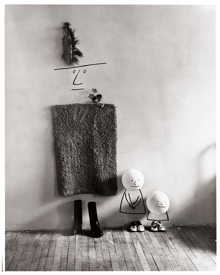
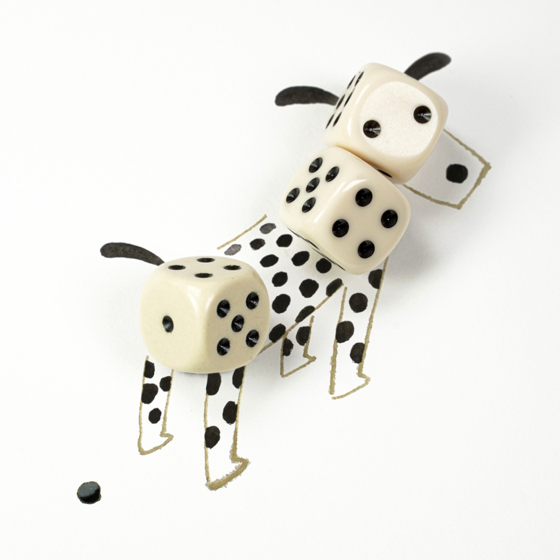
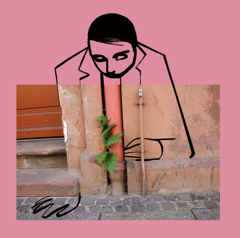
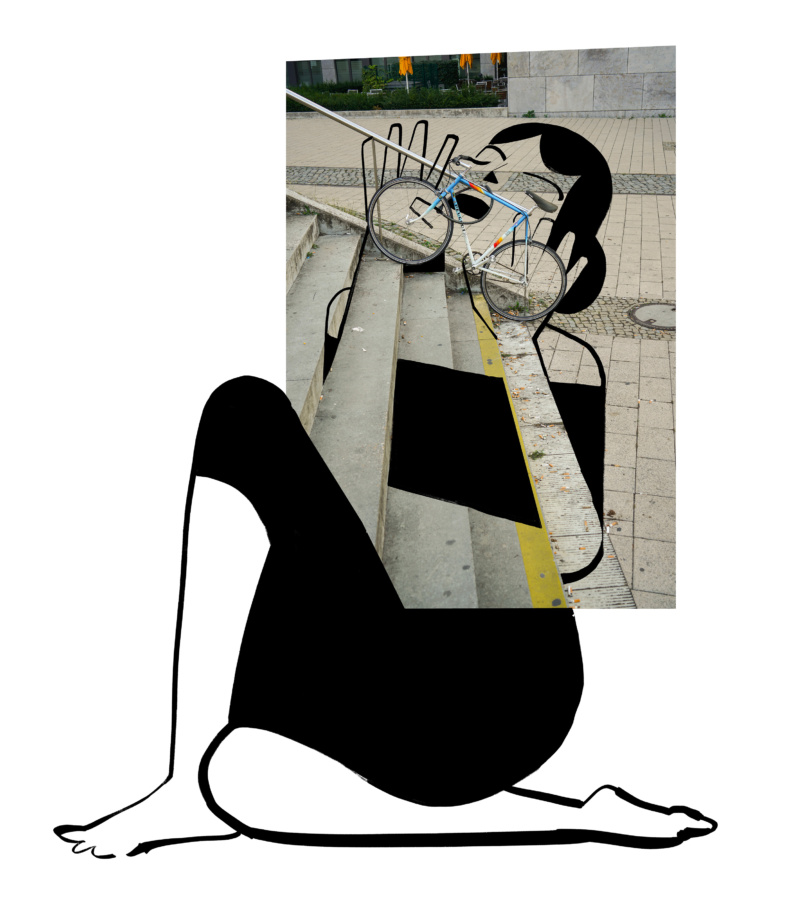
Work from Christoph Niemann’s Sunday Sketches (left) and Deutshche Oper (right)
Christoph Niemann’s work has a great deal in common with Steinberg’s approaches – he is, after all, his successor. Perhaps the most obvious difference between the two artists is that Niemann uses a range of mediums such as various paints and digital mediums alongside the more simplistic drawings that Steinberg produced. Niemann also uses plenty of colour in his illustrations, something that was missing from almost every piece in Steinberg’s body of work. This could be due to the different periods of time both were active in, though it could also be an intentional choice – Steinberg seemed to value the playfulness in simplicity.
Niemann’s incorporation of objects into his work is very similar to Steinberg’s Photoworks. He takes objects and scenes and provides additional narrative by either drawing over a photograph or painting alongside it prior to photographing. The first thing I notice that stands out is that Niemann seems to prefer using one single object and playing with how it could be perceived when a narrative is added. Steinberg, however, plays around with many objects and creates scenes with them, adding narrative post-photographing. Niemann’s style is abstract and fun but doesn’t have the more traditional comic inspiration that Steinberg’s style does. This is noticeable more in his work that doesn’t use found objects.
Steinberg’s creative path led him to question ‘what can I use this for?’ in nearly everything he produced. The more he explored that question, the more interesting his incorporation of found objects became. Niemann, however, seems to have taken a brief detour, experimented with found objects, then moved on to other things. This experimentation does seem to have inspired his later work, though more in how he perceives scenes and objects and less in how they can be used. The question Niemann appears to be asking is ‘what could this be?’.
Overall, Steinberg addresses more serious topics and Niemann the more mundane, everyday experiences we have. Both artists approach these areas in a light-hearted and humorous way. Their seemingly nonchalant and relaxed takes on illustration, in general, is extremely inspiring to me. I have thoroughly enjoyed researching both artists and have spent a great deal of time musing over their work.
The majority of the information in this learning log entry was obtained from the Saul Steinberg foundation website (accessible here), and Christoph Niemann’s personal website (accessible here)
As the title suggests, exercise 2.4 was about exploring new materials, specifically those that aren’t ‘meant’ to be used to create art with. I was asked to collect a range of alternative drawing materials – some that can be used in their natural state and some that can be combined with ink – and produce studies on how they can be used. I then had to choose one I thought had potential as a tool and draw an object or scene using it. The goal of the exercise was to test the boundaries of the material, to learn how it can be manipulated and what properties it exhibits.
I collected a range of items I wanted to explore further – some I had already set aside to test out without prior knowledge of this exercise, and some I found intentionally for this exercise. They consisted of:
Corks
Cotton wool
Cotton earbuds
Make-up sponges
Kitchen towel
A tampon
Coffee grounds
Three different types of teabag
A selection of old make-up
I then set out experimenting with the materials and exploring their properties. I was quite reserved and intentional at this stage as I was conscious of the fact I’m running out of sketchbook space. I sort of regret this, as I don’t feel I fully explored each material. I used India inks (colours chosen at random) and tried to make the most of the space I had. I enjoyed the process, but I felt a little under pressure. Maybe I need to be working on bigger pages when experimenting – I’m not sure. The materials that required ink functioned exactly how I would have expected them to. I’ve never been super comfortable or good at using paintbrushes, so I didn’t feel too far from home using these. They felt no more clumsy or awkward than what I’m used to.
My initial experiments
When I moved onto the tools that produced their own colour, I felt a range of things. I did really enjoy using the make-up, but it’s designed to be easy to use in a manner similar to other art materials, so it didn’t feel too much like the tools were different. I did, however, mix some eye shadow with water to make a paint which I found very fun. Despite this not quite fitting the goal of the exercise, I discovered something I want to explore further. I felt similar when experimenting with the coffee grounds – whilst I could use them directly as a tool, it was more like I was using coffee as a kind of ink. I found working with the teabags difficult, not so much because of the physical tool, more because I couldn’t figure out a way to consistently get enough colour out of them. The fruit teabag was by far the easiest for this.
Interestingly, the fruit teabag dried a completely different colour to how it looked when wet. It was a rich pinkish-red when wet and has dried a cold, greyish-blue. I sort of wish I hadn’t known that and had tried to create a piece of art using the tea bag, only for it to dry so radically different. Now I know, I feel I’d be so conscious of it the whole time I was drawing. The green tea dried virtually invisible, which is a shame. I think the fruit tea was the most fun to play around with, though I could have used another spread to explore further.
It was hard to pick an object that I thought had potential, as I believe all of the items I tested have potential for different purposes, and I would consider using all of them in many different ways. I decided to choose a top three and went ahead with three drawings. I used black India ink as I wanted the tools to speak for themselves without any colour distracting from the process. I then searched for something to draw online and came across this scene of a table in front of a window and thought it was perfect. I had forgotten how much I love drawing interior spaces, and drawing the same space repeatedly has reinvigorated my desire to do it more.
Earbud drawing
The first item I chose was the cotton bud. I thought it would be a gentle ease into the drawings as it’s pretty familiar in that its usage is much like a pen or pencil. I began by outlining the key features of the scene, then I diluted the ink a little and added some detailing. On reflection, I think I should’ve done this the other way around, but it doesn’t exactly look bad. It was a funny experience – I kept instinctively wetting the cotton bud in order to get crisper lines, as that’s how I would achieve that when using a paintbrush. This, of course, made no difference to the lines. It only increased the amount of water in my ink.
Make-up sponges drawing
Up next was the make-up sponges. I hadn’t realised when experimenting that these are actually slightly waterproof. They absorbed around half of the ink I applied, but the other half sat on top. This meant I was frequently adding more ink to the sponges and found that controlling where the ink landed on the page was pretty difficult. I repeated the process of plotting out the key features and adding detail with a lighter shade of ink. I like the shading and texture of this piece. I think these sponges are great for adding interest to a piece – though they’re not as great at drawing.
Cotton wool drawing
For my final drawing, I had saved the most complicated tool to use – cotton wool. I attempted to roll some into a thin, matted point so I could be more direct with my markmaking, but this proved very difficult. This tool was my least favourite to work with as control and precision were practically impossible to achieve. The kinds of marks that can be made with it are fascinating, but like the sponges, they are more suited to texturing and adding detail than they are to clear-cut linework.
The thing I enjoyed most about this exercise was actually rediscovering how much I love to draw interiors. I really enjoyed studying my reference and just drawing without thinking. I feel I probably could’ve pushed my experimentation a bit further, but I’m also feeling quite burned out with forced experiments right now. I think this is teaching me a lot about how I want to use my sketchbooks, and if anything, the thing I’m learning is that I want the freedom to use it in whatever way comes naturally to me in the moment. I like the idea of my sketchbooks being worlds separated from the actual projects I’m doing that I can just let go in.
In this exercise, I was asked to try my hand at blind contour drawings. This, essentially, consists of drawing without looking at the page. It is named as such as drawing in this manner usually means you only draw the outline, or contour, of the scene you are drawing. I had to draw at least three semi-blind contour drawings – where I was allowed to occasionally look at the page – and at least four totally blind contour drawings.
I have run into an issue with the sketchbook I am using for this part of the unit. I miscalculated my pages a little and somehow forgot that two of the exercises existed, so I am close to running out of room. I spent some time deliberating over what to do about this, whether to make a second book, just work on scrap paper and add it in somehow, or use another sketchbook. As the paper in the original sketchbook was specifically chosen to withstand wet media and experimentation, I opted to reserve it for the exercises and tasks that required it. For the other exercises, I decided to use the A6 travel sketchbook I have half-finished, as I want to fill it up completely.
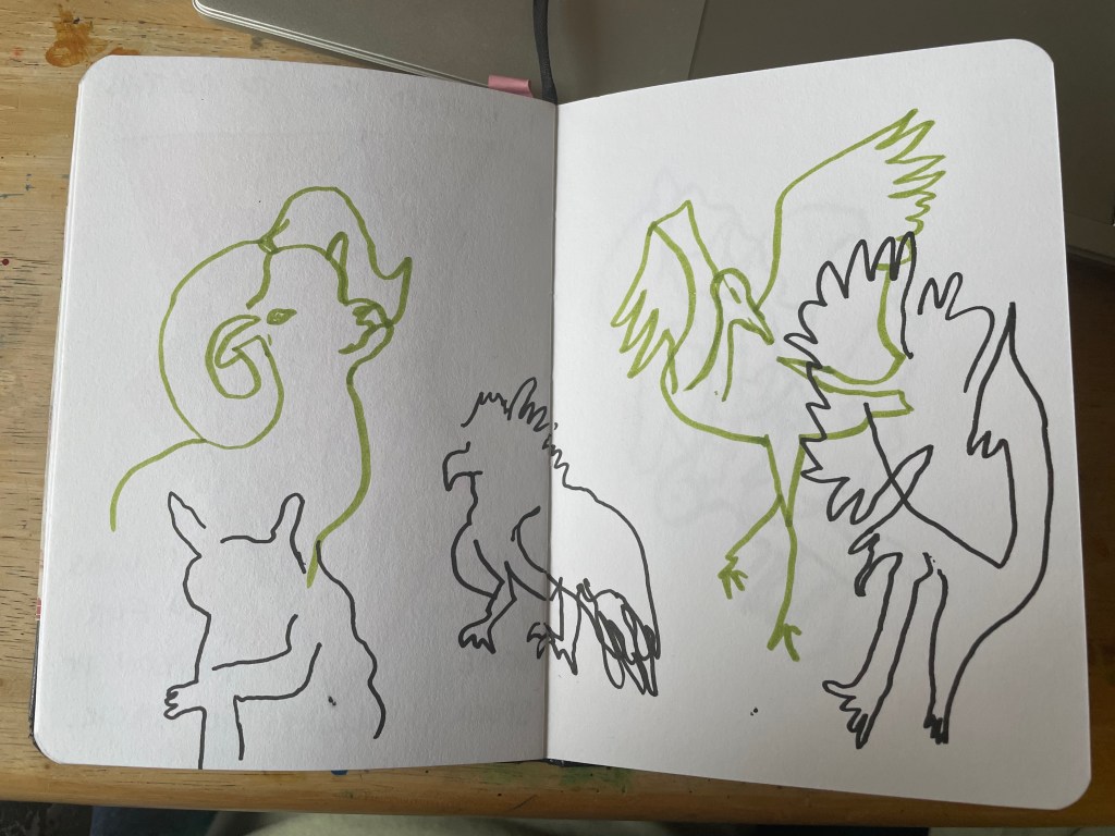
Another issue I am having is figuring out what to draw. I know a lot of these exercises are about exploring processes and not as much about the content you choose to study, and I’m also aware that drawing anything and everything is beneficial. But, I am starting to find myself quite bored with drawing the same things on my desk over and over again. I wanted to use Pinterest for this exercise to find material to reference but was overwhelmed by options. I ended up choosing a range of animals as I enjoy drawing them and haven’t done so in quite a while.
Blind contour drawings are a concept I have been aware of for almost as long as I have been able to draw. As a child, my grandad taught me to never take my eyes off the subject I was drawing. Looking at the paper would simply trick me into thinking I knew better than what my eyes could see. When I draw now, I pretty much always start with a semi-blind contour sketch, then build up from there. This exercise, then, felt a bit like doing something for the sake of saying I had done it, and I wasn’t super excited about that.
My initial 4 semi-blind contour drawings
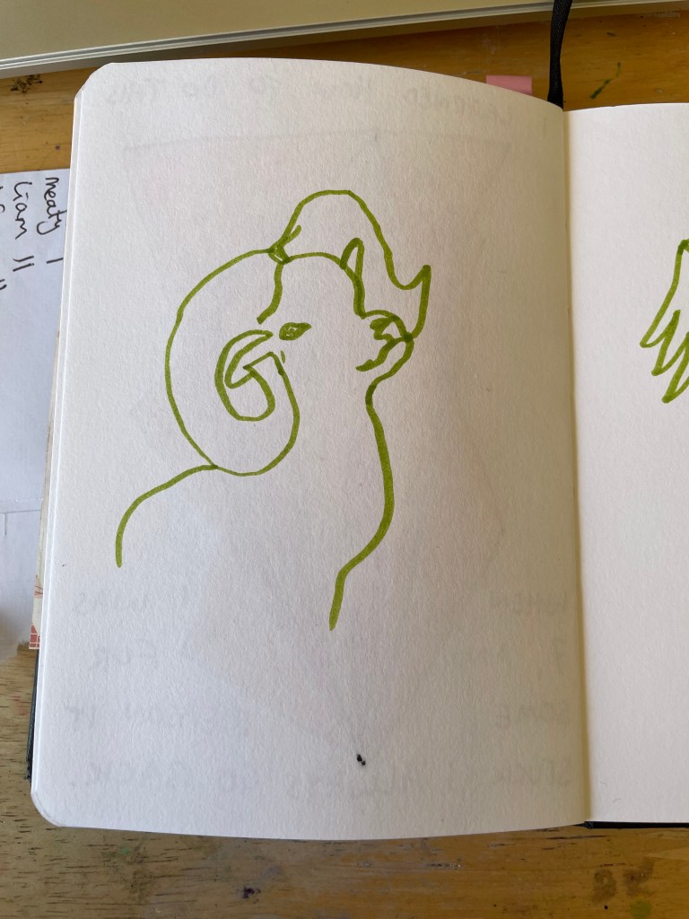
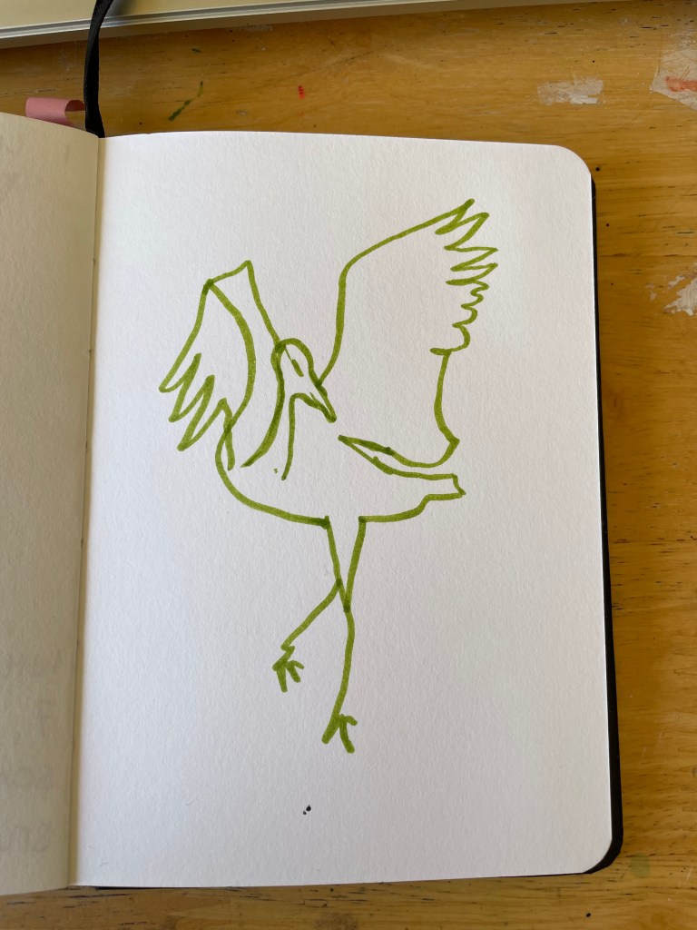
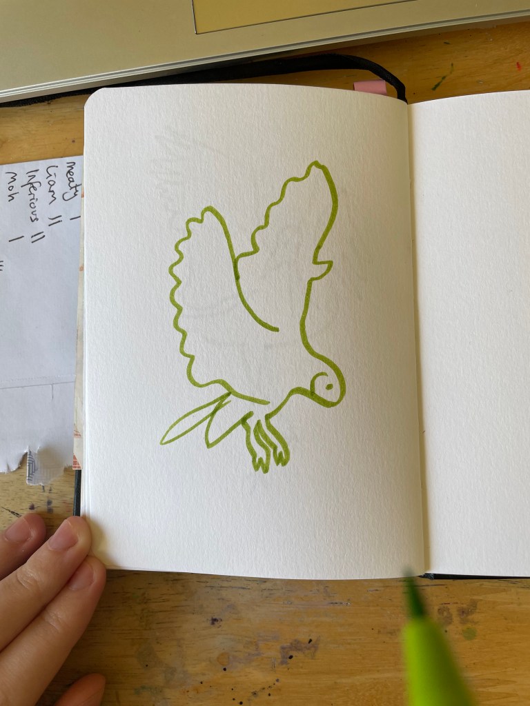
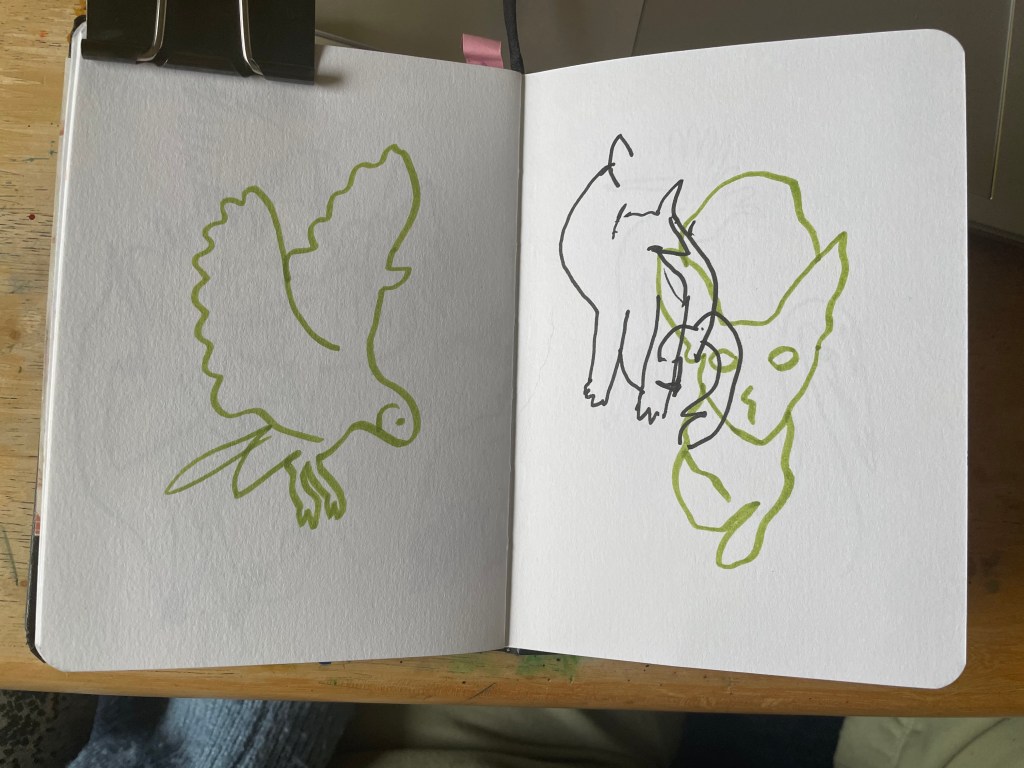
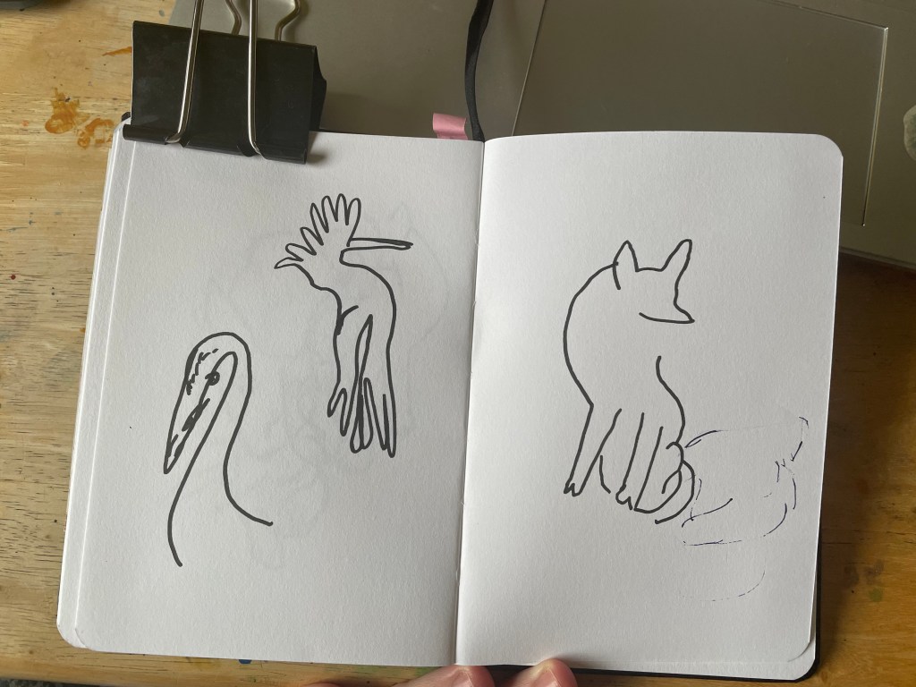
I chose to do my semi-blind contour drawings using a green brush pen and my fully blind contour drawings using a 1.0 black fineliner. This way, I could let them overlap but still be distinct from each other. As recommended in the exercise, I tried not to take my pen off the page as much as possible whilst studying my reference. This was tricky and was almost like combining one-line drawings with blind contour drawings. I really enjoy how all of the drawings turned out, even the messy ones. Choosing animals as my subject matter has allowed room for a lot of character to develop, and I feel I could further develop these sketches to give them even more personality.
My finished pages with the fully-blind drawings added in
Despite my experience, I struggled with the fully blind contour drawings at first, as I am so used to glancing quickly and sporadically at my page. I tried to find a way to actually cover my hand so that I couldn’t see what I was doing, but there wasn’t a practical solution. There were a few times I slipped up and looked at my page, but I still felt like I was appropriately carrying out blind contour drawings.
As I already use this technique when building up my sketches into finished illustrations, I can’t imagine I will ever consciously choose to sit down and complete a page of ‘fully blind contour drawings’. I don’t feel I get a lot out of it as I’m already using the process and have learned a great deal from how it can improve my drawing skills, and I find it much less enjoyable than rapid sketching or single-line drawings. Though I will say, it’s a good way to loosen up your hand before you being ‘properly’ drawing.
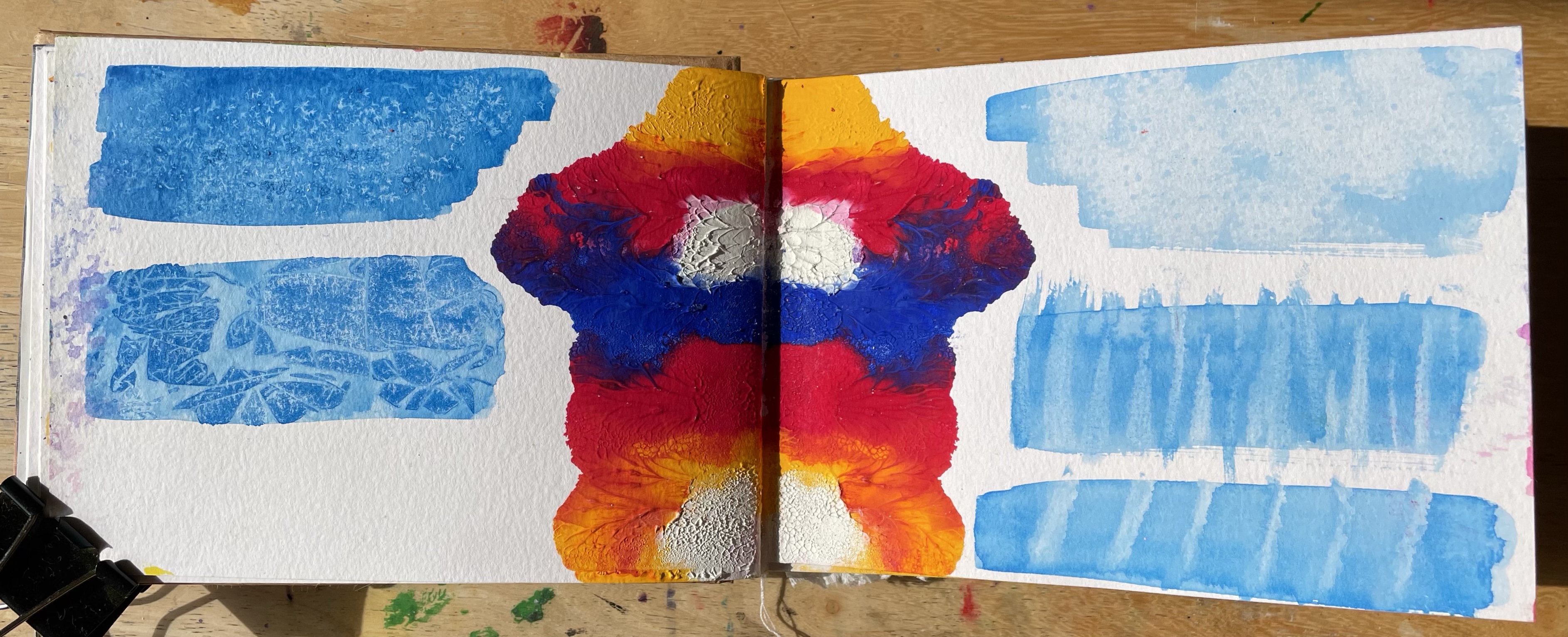
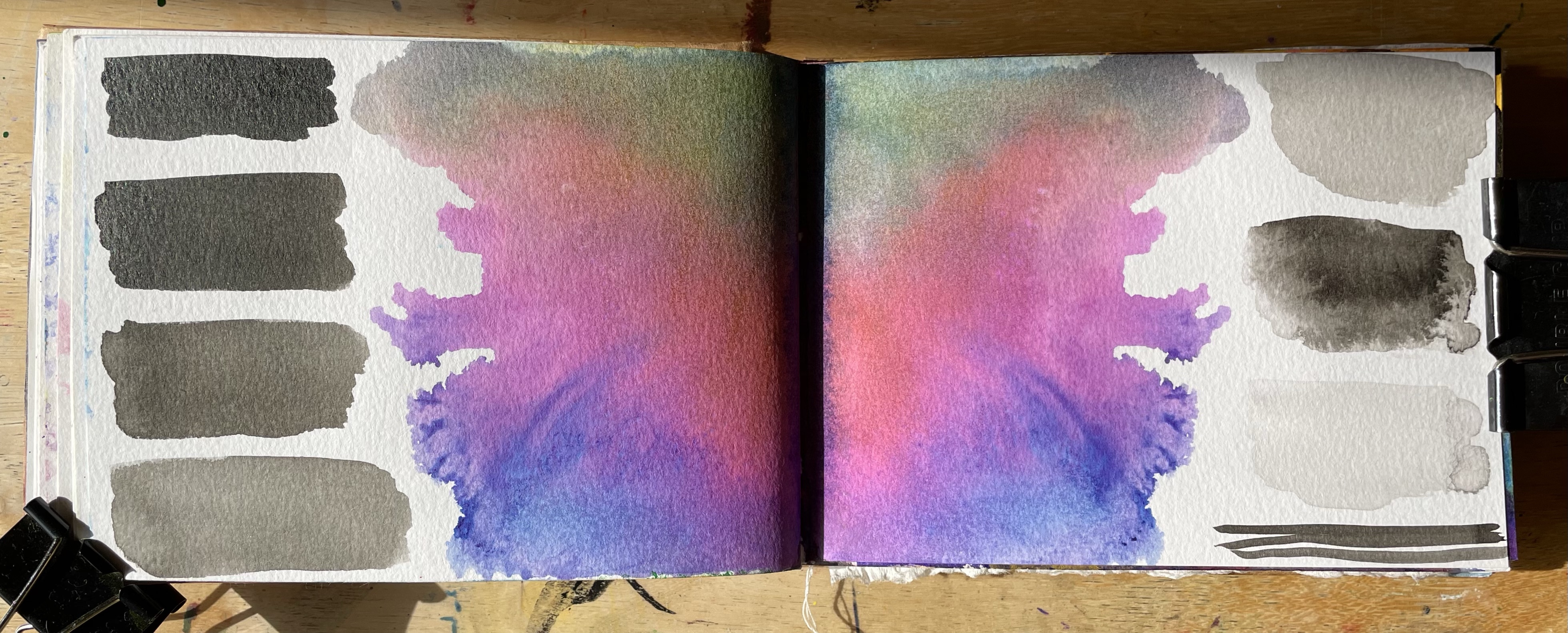
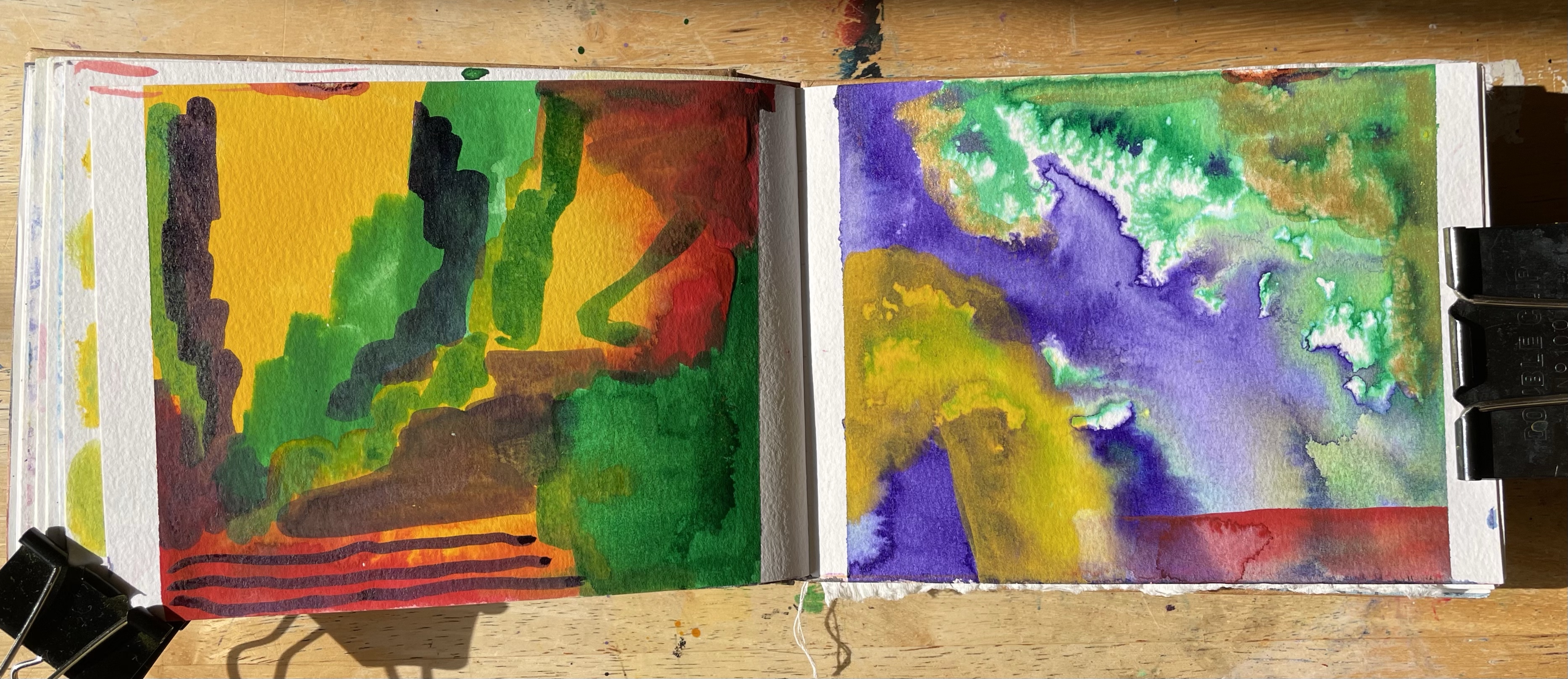
For this exercise, I was asked to undertake studies in order to investigate the physical properties of different materials or processes. I had to pick a set of mediums or ways of working and isolate some sections in my sketchbook to act as ‘chapters’ of work, each containing micro-studies of research into my materials. What I depicted in the studies was up to me, but it was advised I keep it simple and focus on the materials rather than the illustrations.
I was very excited about this exercise as the aim was to be as exploratory as possible, which I was craving. I didn’t put a great deal of thought into my chosen mediums. My first pick was gouache as I have a new palette set up that I’m enjoying using – however, I don’t have much experience with it and want to understand it better as a medium. I then picked India inks as they’re some of my favourites to work with, and they have very different properties to gouache despite also being water-based. Finally, I chose watercolour crayons because I recently bought a whole new set of them and was itching to play.
As the exercise was to reference the work of Lucy Austin – the focus for Research Task 2.1 – and because my tutor had emphasised my need to plan less when working in my sketchbook, my aim was to be as free and ‘thoughtless’ as possible when working through this exercise. I wanted to see where the materials led me and do what I felt came naturally rather than excessively planning each stage. However, I did jot some rough notes down on what I could do to test each medium as a starting point. I also decided that I would do a fourth mixed media chapter to see how all three combined, as that’s how I’d like to use the mediums in practice.
My gouache chapter in full
My first chapter focused on gouache. As mentioned earlier, I recently bought a palette and filled it with gouache so that I could use it in a more accessible way. Dry gouache when rewet is somewhat different in consistency and how it can be used, but I find I prefer it this way. I thought it would be interesting to explore the differences between the two throughout my chapter. The first two pages consist of this: the left is rewetted dried gouache, and the right is wet gouache applied directly onto the page. The left page shows a variation of markmaking, opacities when more water is used, and different brushes. For the right page, I mixed several colours directly on the page with my fingers, then used them as markmaking tools. I like how up close you can see the texture of my fingerprint throughout the mixed paint. It was also really fun to do this!
Using my fingers led me to wonder about other childlike ways of engaging with art, specifically folded paper paintings. On the next spread, I applied paint directly to the centre of each page, shut the book, and used my fingers to move around the paint from the cover. I was so excited when I opened it to see what was there. I love the effect, how the colours have mixed, how the paint has spread, and the texture that has been created. I then painted some quick studies on either side using rewetted gouache and explored lifting/removing the paint. On the right, I used kitchen towel to remove the paint in different ways, and on the left, I used salt and cling film. I don’t feel particularly drawn to any of these, but they are good references to have for the future.
From folding the paper, I had another idea regarding rewetting gouache and how it could move around the page. I chose two colours and applied them directly to the paper, mixing them in the middle. I then let them completely dry. Taking a spray bottle and eyedropper, I then added water to the gouache, holding the sketchbook upright to allow the water to drip down the page. I encouraged the paint to move by continuously rewetting it, blowing on it, and turning the book in different directions to allow gravity to take over. This was really intriguing and definitely a process I would explore further. The idea of wetting gouache once it has already been used is interesting to me. Once it had dried, I filled the rest of the page with yellow gouache from my palette, just because I liked the colour combination.
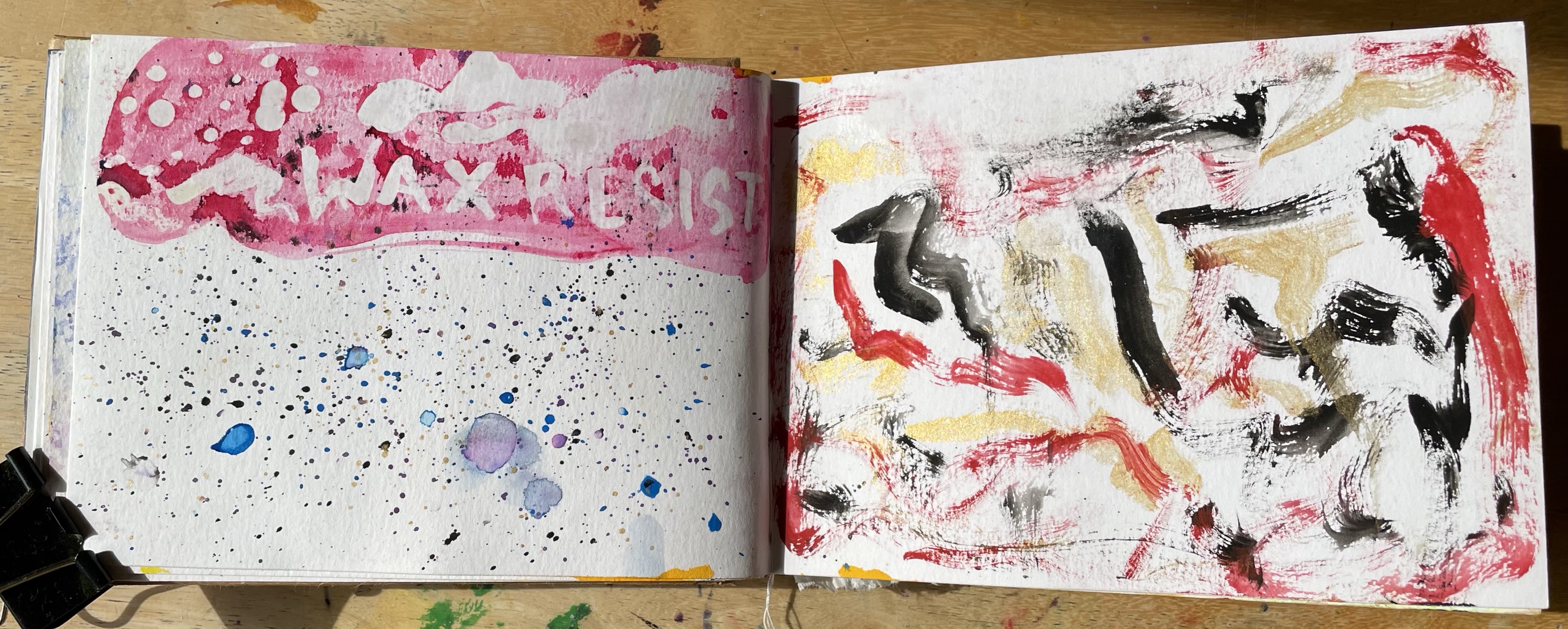
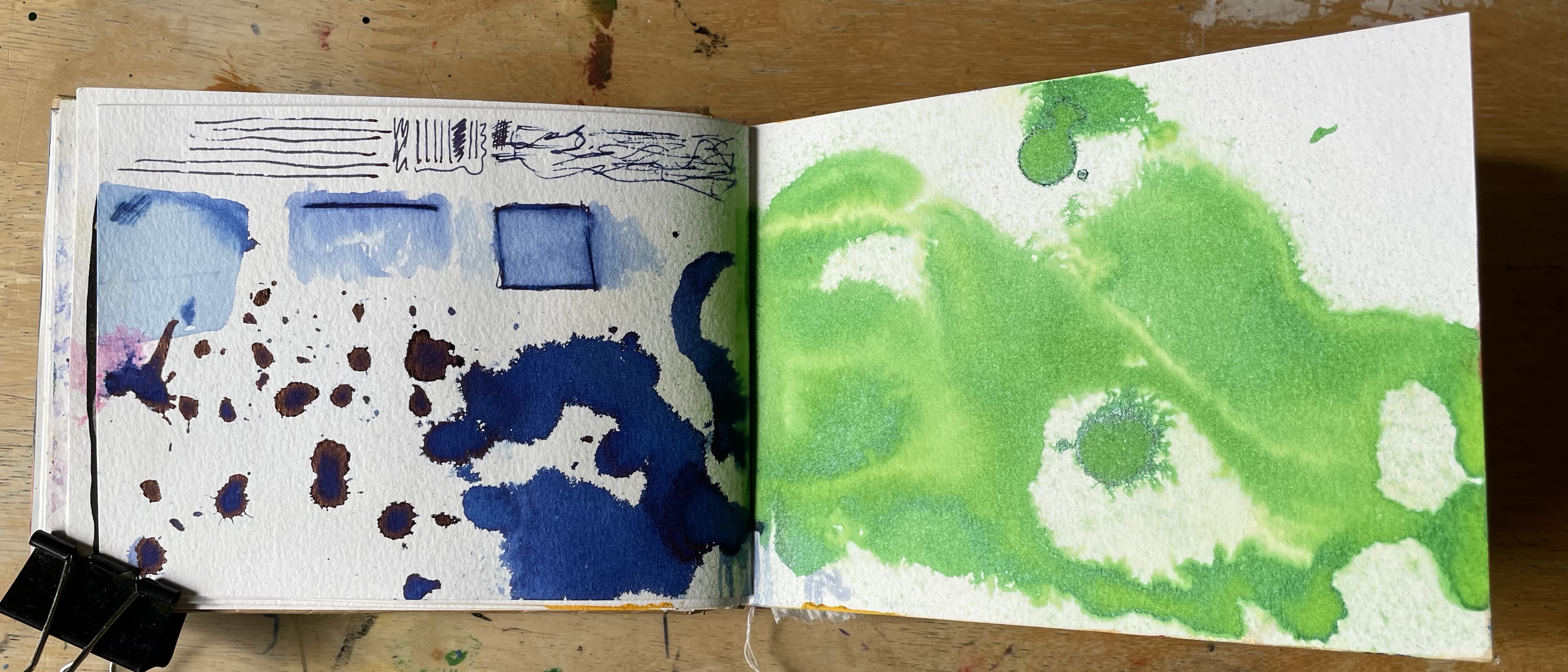
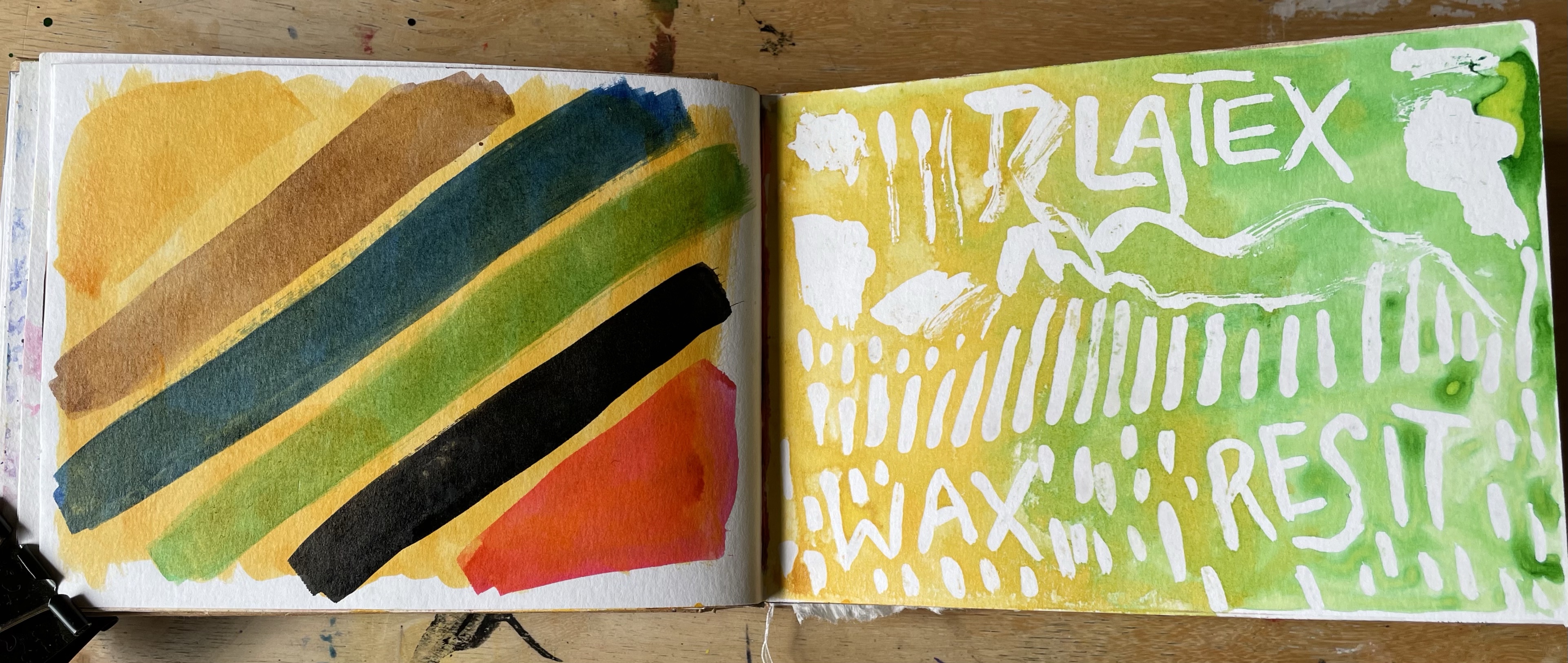
The next three pages were about exploring further markmaking and masking techniques. On the first, I used a liquid latex marker pen to mask the paper before painting over it. I also tried different ways of wetting the page, individual droplets from an eyedropper, spray from a bottle, and lots and lots of water manipulated in specific ways. Then I tried to use wax as a mask, once again painting over it. I think I prefer using wax to the marker pen as it’s more opaque. Alongside it, I tried splattering the page with my brush and using a dry brush to create different textures.
Finally, I took two pages to explore the layering properties of gouache. On the left is a solid black background and on the right a solid yellow one. I picked these colours as they’re contrasting as darker and paler. I then used a range of different colours in different ways to see how they interacted with the background. Was it possible to see them? Did the colour of the background change the colour I was applying? Interestingly, the colours used on the black background seemed bolder and more opaque. This again serves as a good reference for future projects.
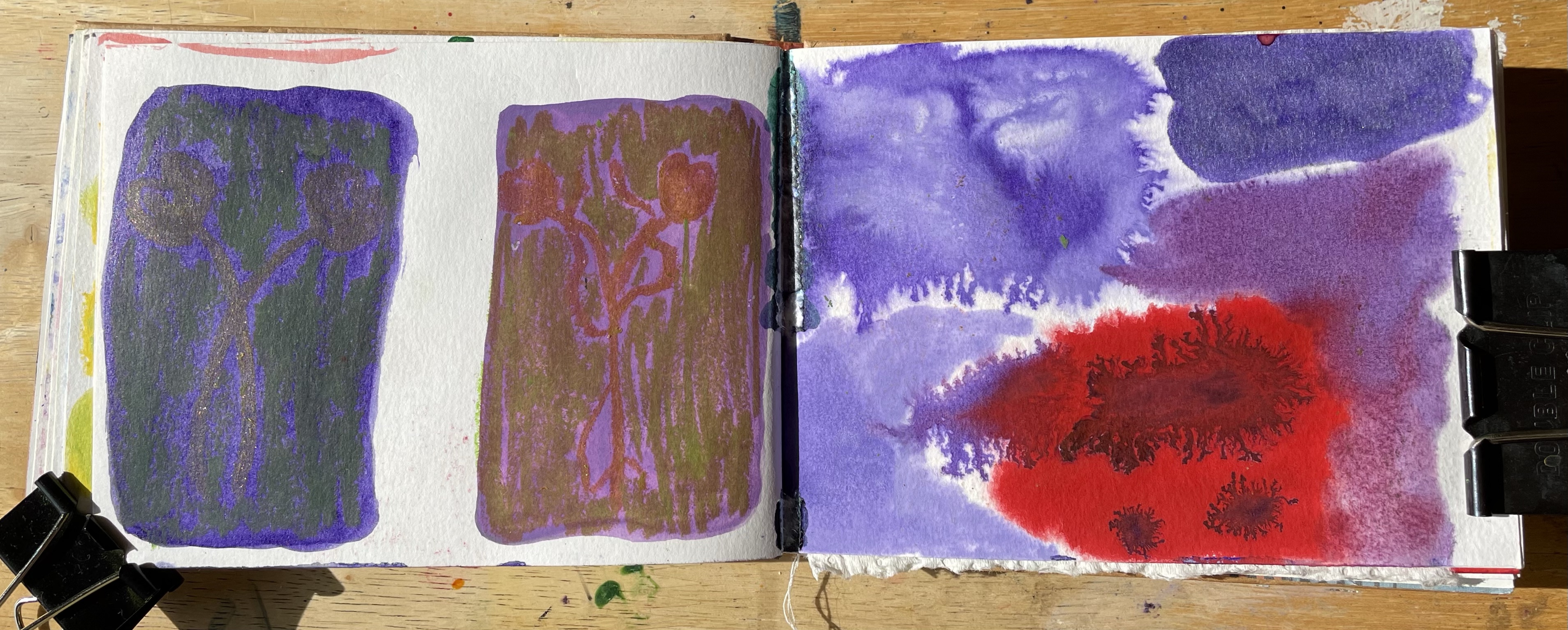
My ink chapter in full
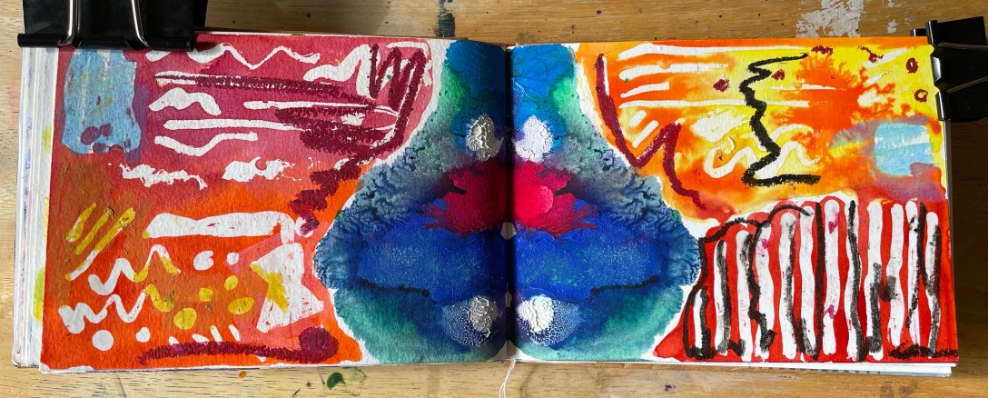
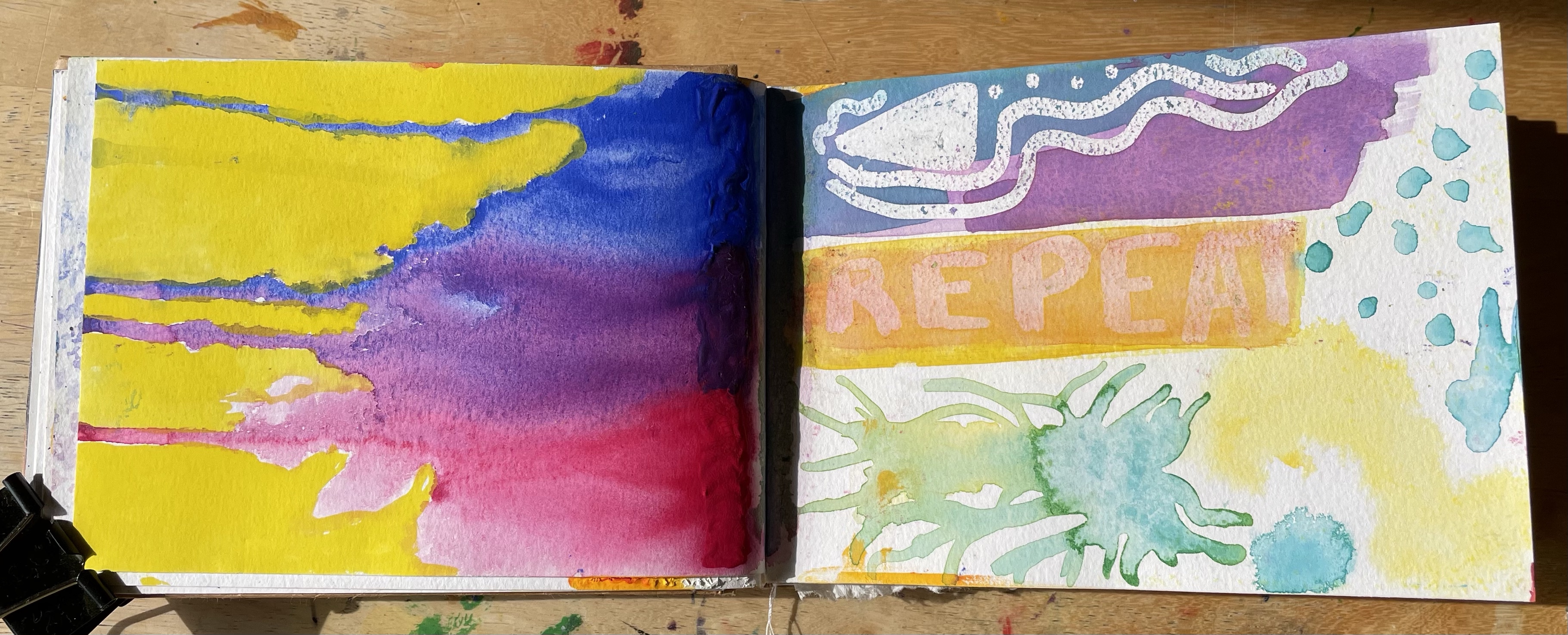
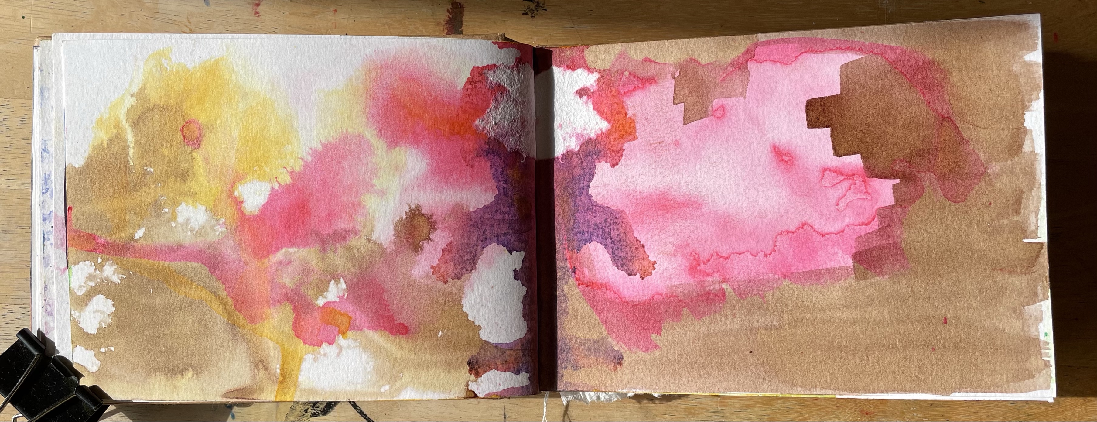
I felt satisfied with the amount I had explored gouache, so I moved on to the next chapter: ink. I wanted to try some of the processes I had explored for gouache to compare them and see how they would interact with the ink, but there were also some ways I wanted to experiment that were unique to the medium. On the first page, I explored a little using a fountain pen and one of the refills I have for it. I don’t often use my fountain pen to draw, mainly because it isn’t waterproof and can smudge quite easily. I tried to play with these qualities specifically on this page, and I explored ways of manipulating the ink. On the second page, I used an eyedropper to drop ink directly onto the paper and used a spray bottle to move the ink around.
I was fascinated by this and by the way the ink dried showing variations of colour and opacity. I explored this further on the next spread, first by repeating my process of using a spray bottle and dropper to manipulate the ink, then allowing the layer to completely dry. I then added layers in different colours over the base layer using the same technique. It was wonderful watching how the ink had a mind of its own and seeing how it engaged with the colours behind it. I then played specifically with opacity by laying down a section of ink and then using water to dilute it on the page, trying to create a cloud-like texture. When dry, I painted alongside and over this using another colour, once again exploring how the layers interacted with each other.
The layering reminded me of the experiments I had produced with the gouache, so I decided to replicate the paler one, as I feel I know from experience that darker colours cannot be painted over. In hindsight, maybe I should’ve explored this further, as I don’t know for sure how the colours interact. This process, however, is similar to one I undertook during an exercise for Key Steps in Illustration when attempting to find the right colour combinations for a painting. I feel experimenting with processes, methods, and colours is a part of the illustrative process that will probably be used in every creative project.
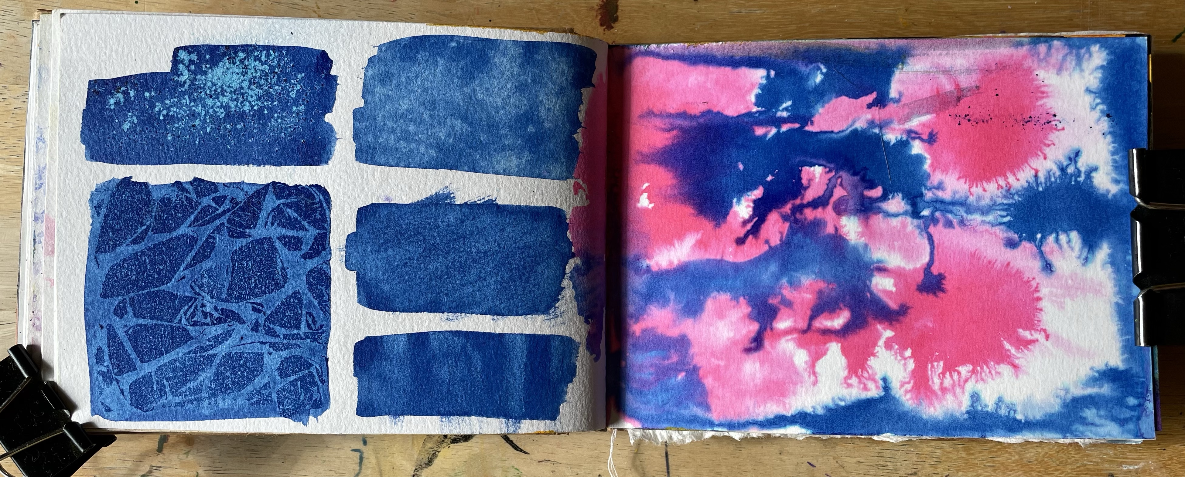
I also repeated my masking experiments, but this time I used liquid latex and a paintbrush rather than a marker. I prefer this to the marker as it was a little easier to control. I especially love the colour combination I used here, and I like how the pooling of ink caused by the resistance of the masking materials creates areas of harsher opacity. Next, I repeated the lifting experiments I had used in the gouache chapter, and alongside it, I explored how ink interacted with an already wet page. This technique is possibly my favourite in terms of the effect it produces. It sparked an idea that I explored later on, and I would like to generally explore it further.
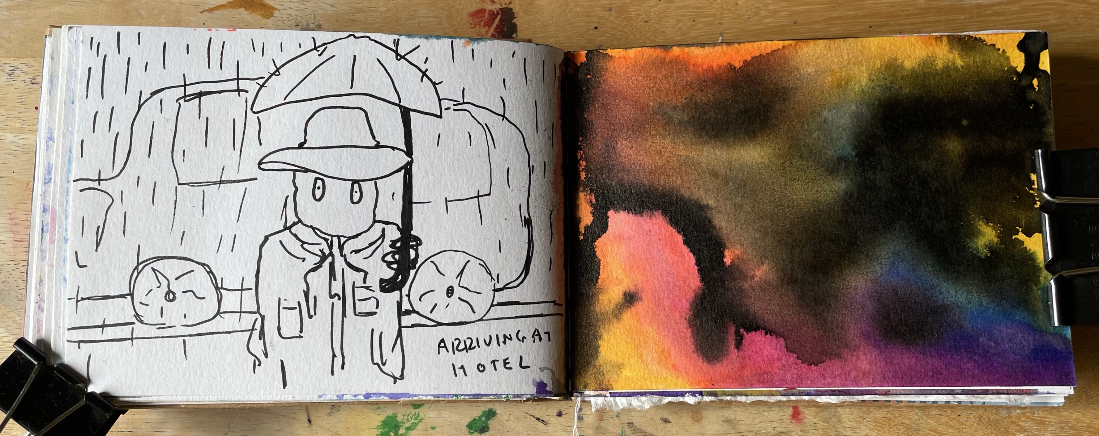
For the next page, I used the same page folding technique as in the gouache chapter. Once again, I am thrilled with the results and the way the ink mixed on the page. I can see myself doing this more regularly. Alongside it, I tried diluting ink to varying degrees to see how it would impact the opacity. The final spread is a little weird. The page on the right followed the idea I mentioned earlier – I painted a background with various bright colours and let it completely dry. Then I soaked the page and added spots of black ink, allowing it to spread throughout the page however it wanted. I didn’t quite get the results I expected, but it was a good first step. The drawing to the left is not really part of the ‘chapter’ at all – it was a character and scene I had thought up out of nowhere that I felt I wanted to document. So there it went, as that’s where I was currently working.
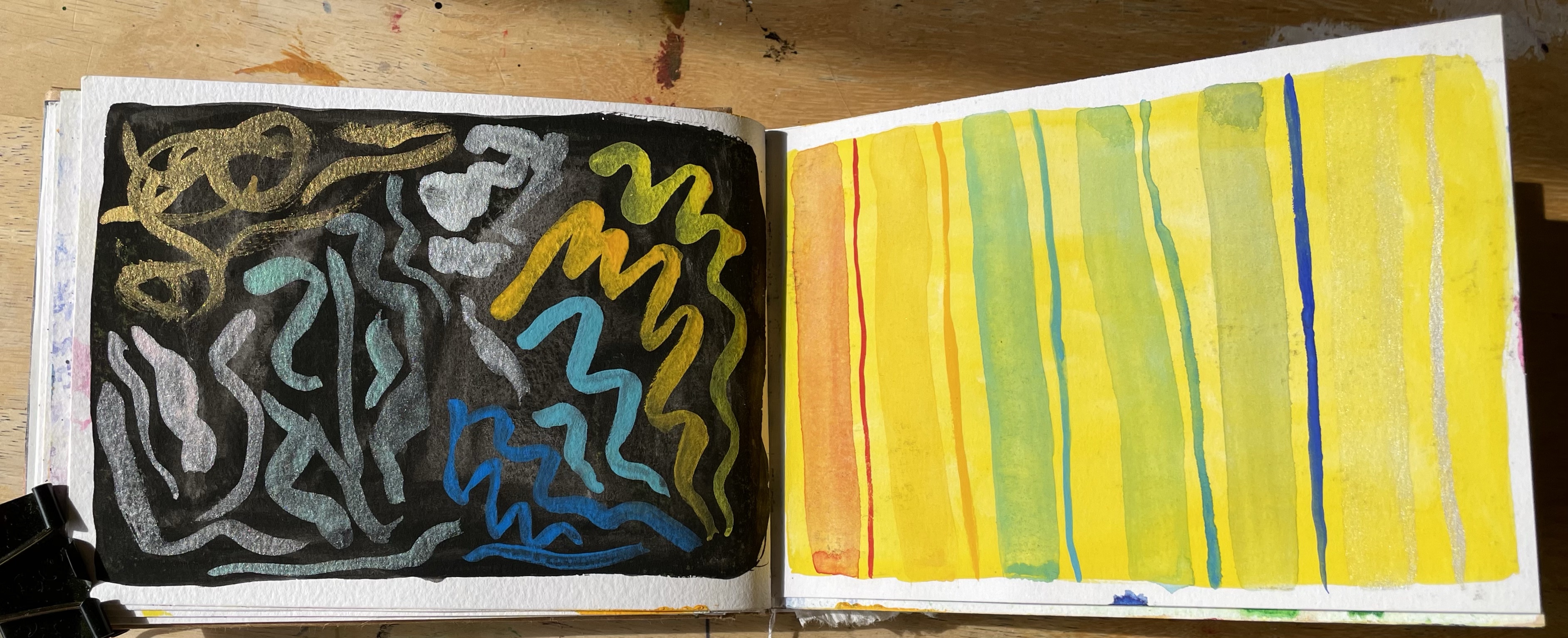
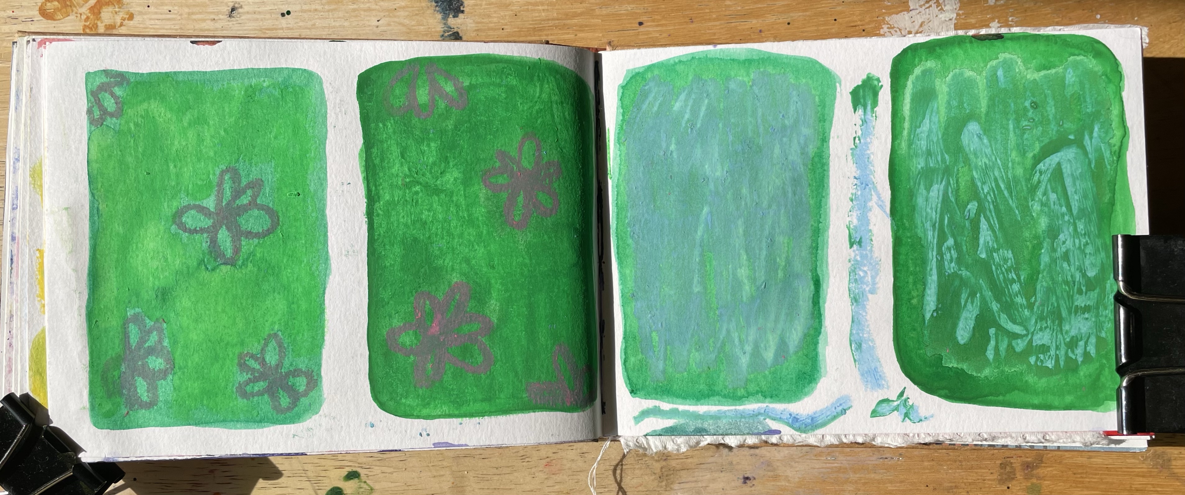
My crayon chapter in full
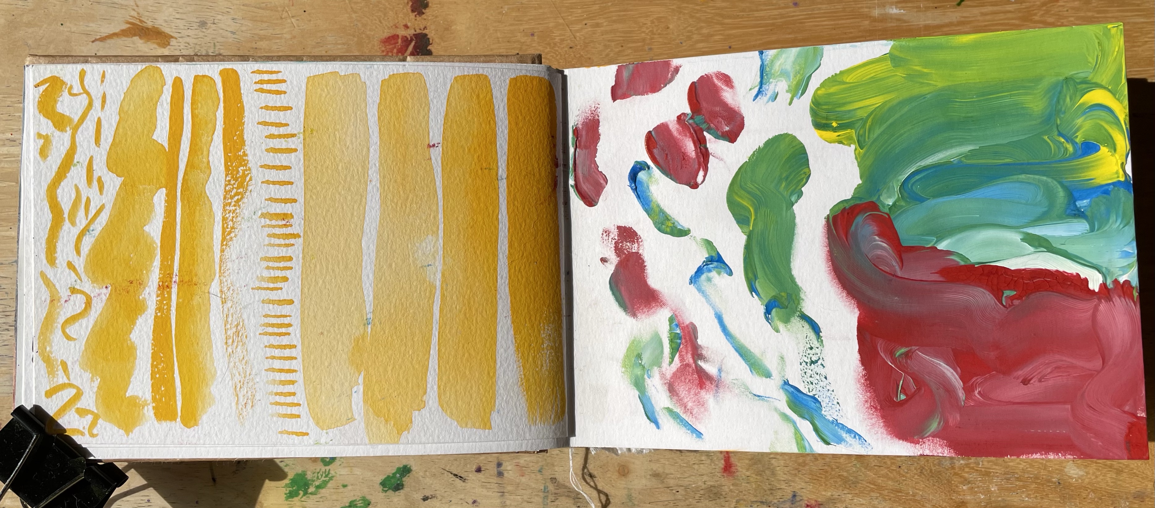
Next up was my crayon chapter. I had three soft watercolour crayons from a Scrawlrbox that I used in Assignment 1, and I fell in love with them as a medium. I ordered a huge case of them in various colours so that I could get really stuck in to using them. I didn’t have much I wanted to do to experiment with them solo – I was more excited and interested in how they interacted with other materials. I still tried them out in as many ways as I could imagine, just to see how they worked.
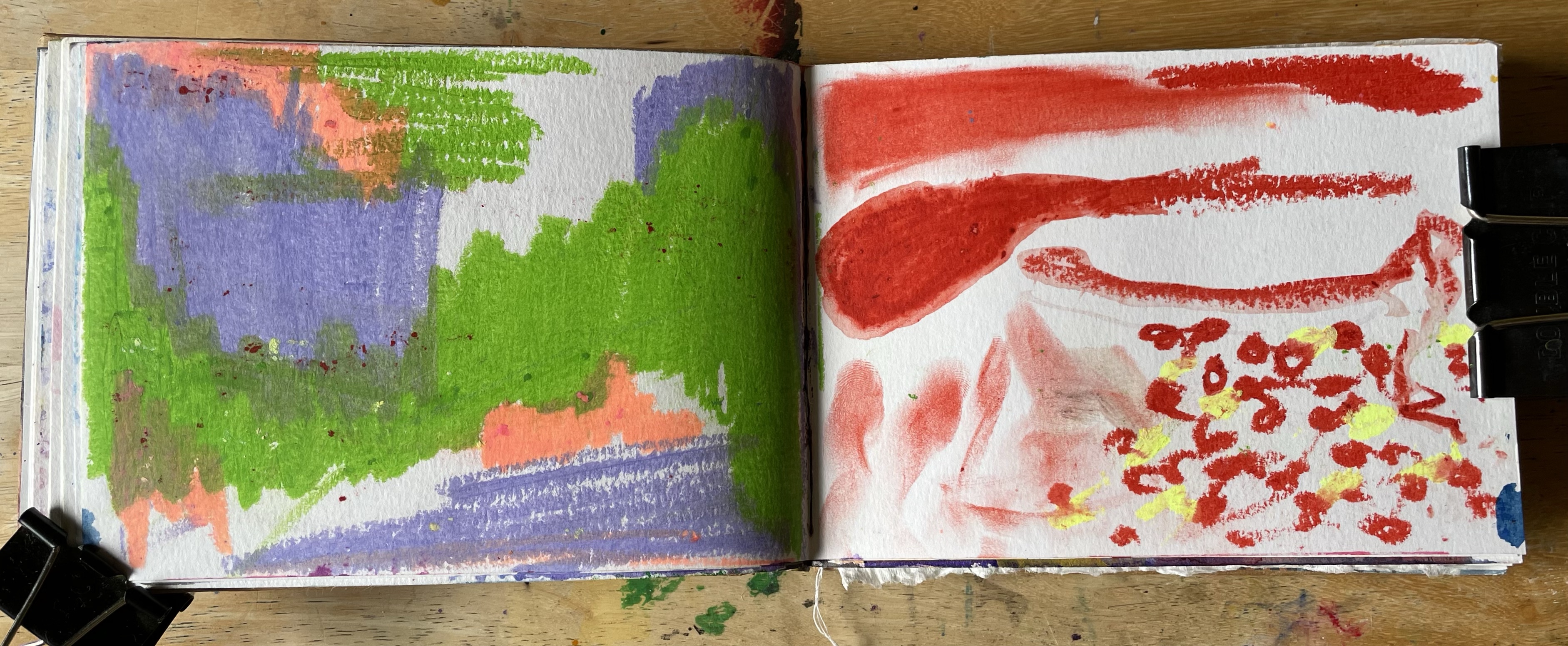
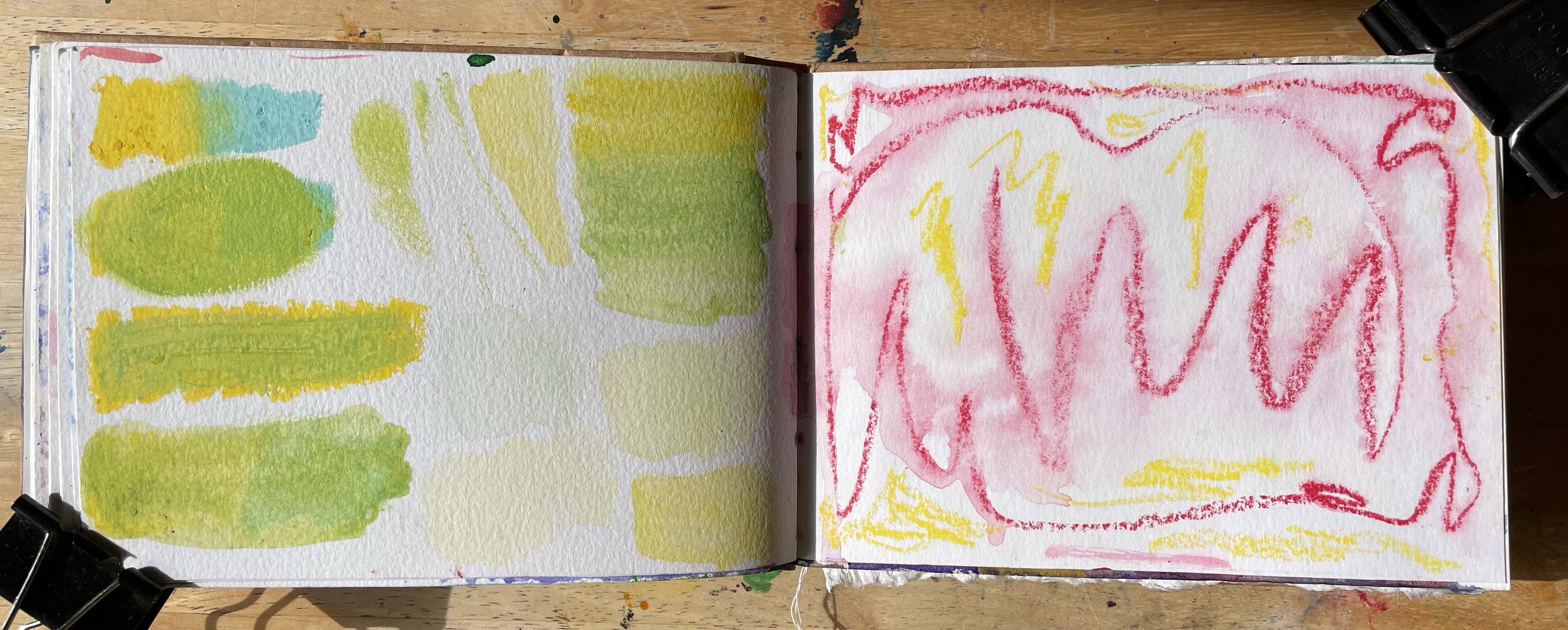
Page one is simply the crayons in their purest form, on paper, overlapping and with varying pressures. The second page experiments with smudging, wetting the crayon before using it, and different forms of markmaking, including fingerpainting. The third page consists of explorations of colour mixing and blending, as well as using the crayons as a ‘paint’ by colouring a section of a palette and wetting it there. Then, for the fourth page, I soaked the paper and tried using the crayons on this.
Whilst the crayons are boasted to be water-soluble and essentially paint in stick form, I would describe them to be partially so. They don’t work as well when wet themselves, but any marks made on paper can be easily manipulated when water is added. Despite only filling four pages for this chapter, I feel I better understand the qualities of the medium and how I enjoy using it. These will be good references for future projects.
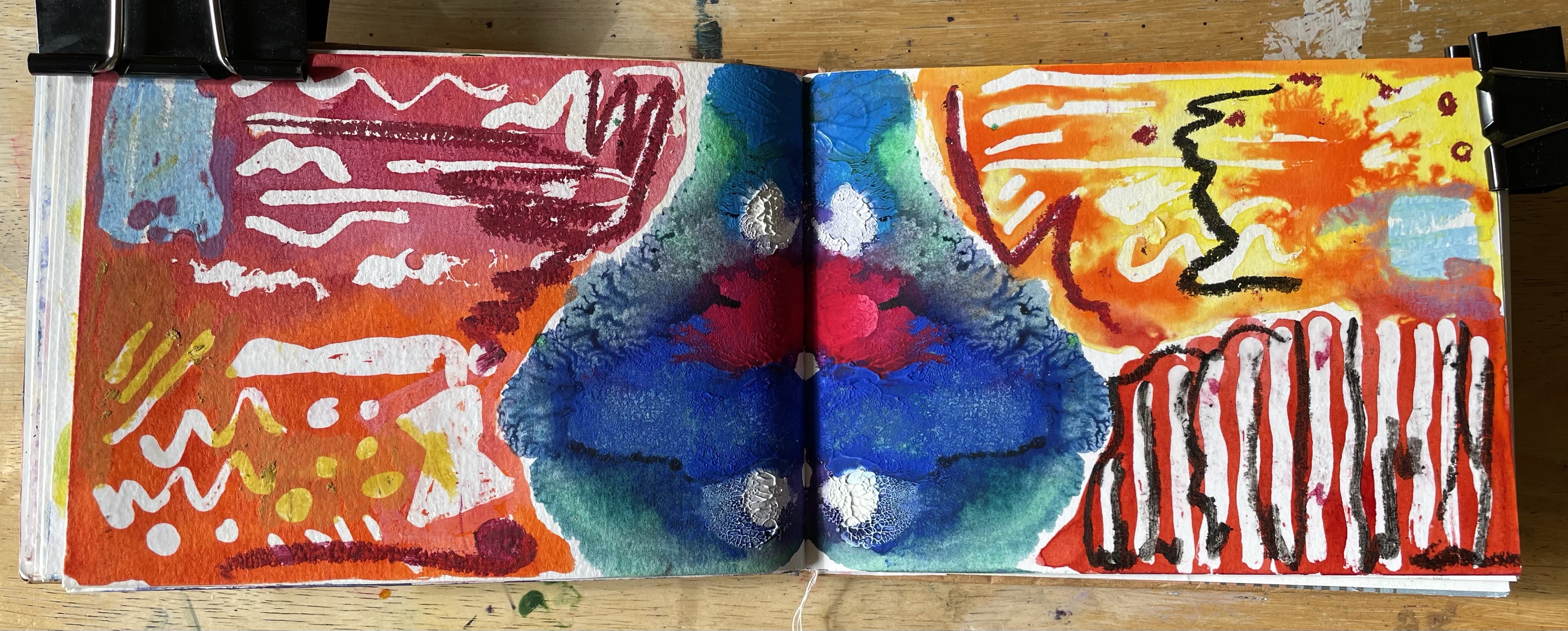
My mixed media chapter in full
After completing each solo exploration, I was excited to venture into combining the materials. I looked through the work I had completed so far and took note of my favourite techniques as well as the various properties I wanted to experiment with. This chapter was by far the most structured and ‘curated’ of all four. My aim was to create not just explorations of mediums but also pieces of work that inspired me to continue working with the new techniques.
On the first two pages, I did the same thing in reverse. First, I filled a page with gouache, blocking in, overlapping, and blending the colours on the page. Next, I filled a page with ink using the ‘wet page’ technique I had experimented with previously. I let both of these pages completely dry, and then I applied the other medium over it – ink over the dry gouache and gouache over the dry ink. I was more deliberate and intentional with my placements of colour than I was in previous chapters, and I feel both pieces work really well.
Next, I wanted to see how the crayons worked with the two mediums. I painted two swatches, one gouache and one ink, and waited until they dried. Using the same crayons on each, I doodled a flower and coloured in the space behind it. It’s really interesting the way the two mediums almost ‘absorb’ the colour from the crayons. When I first applied them, it was much brighter and more intense. Alongside it, I explored how the two wet mediums interacted if I mixed them together whilst wet. As gouache is matte and fairly opaque as a medium, combining it with the transparent qualities of India ink produced some exciting effects.
I continued with some more swatch studies of all three mediums combined. First, I tried the crayons wet over dry gouache and ink, and then I mixed them when all were wet. Once again, this was fascinating to see, especially how the colours altered over time. Finally, I had to revisit possibly my favourite part of this exercise: the page folding. I placed ink and gouache along the centre of two pages, then closed the book and spread the paint as before. Seeing the two mediums interact and spread in such an uncontrolled way is so cool! The textures and colours produced in the fold are very exciting to me. The depth of the piece is fantastic – the gouache almost sits on top of the ink.
To finish off, I masked off areas around the fold using both wax and liquid latex, then painted over them with mixes of ink and gouache, simply playing around and trying to create interesting textures and colours. Once dried, I added in some bits and pieces using the crayons, once again following my intuition and playing with the space. There was no plan or thought here – I just did what came to me. This page is my favourite page from this whole exercise. The colours and markmaking in it make me feel so happy. I love looking at it, and I love how it turned out. It’s a testament to how the process of experimenting led me to find things I enjoy.
This project felt like a dream to me. I could honestly have continued with it until my entire sketchbook was full. I just kept having more and more ideas and wanting to test and push things further. Not only do I have a wealth of inspiration and reference to look back on when needed, but I have also connected with and appreciated new processes of using my favourite mediums, which I am so grateful for. I think I will continue to use some of these techniques in my practice for a while. Experimentation is always needed when approaching projects, and sketchbooks are perfect places for running trial and error projects and making mistakes. However, experimentation as an art process rather than as a means to an end is extremely enjoyable. Letting go and allowing freedom and play into my creative practice makes me feel like a better artist.
As I mentioned earlier in this post, I will always revisit experiments in order to further my projects and achieve my visions. I do also, however, think I need to do more intentionally free explorations. There are many more mediums out there I am intrigued by and want to understand further. I also wish to take classes on the technical properties of the materials that excite me. I hope to engage in more of these micro-studies as I branch out into using other mediums and processes.
This research task focused on Lucy Austin – a painter and printmaker from the UK specialising in abstract imagery and experimental artwork. I was asked in the unit material to find another artist who uses watercolour predominantly in their work, as Austin has previously focused on this medium, and to compare the work of the two. I specifically was asked to focus on how their work differed in the use of the medium, and what the differences are in how they respond to their subject matter.
Alongside using watercolour, Lucy Austin has dabbled in 3D structures, acrylic paint, and incorporating gouache in her watercolour paintings. Contrary to the nature and landscape inspiration for most watercolour artists, she is inspired by the industrial and manmade world around us. She photographs the shapes, objects, and scenes she sees when out and about and uses them as references for her work. She displays some of these images on her website and says, ‘Looking at these, it often seems to me that I haven’t made anything up in my pictures.’
Artwork from Lucy Austin’s Duologues series
Austin’s style is abstract, eclectic, and playful. Her work features many overlapping shapes, objects, and colours, and to the untrained eye, may look like nothing at all. Some who have preconceived ideas about what art should be may find her work purposeless or weird. Quite the contrary, Austin’s purpose in creating is one of exploring. In watching her progress videos, it’s clear that she works freely and without much thought, following her intuition and letting the medium itself guide her process. However, as quoted above, there is clear intention in the shapes and patterns she makes. She is repeating the things she is most inspired by, perhaps subconsciously.
In her series, Duologues, Austin discusses her particular interest in the technical qualities of watercolour and gouache as mediums. She used this project to explore opacity and transparency, using various methods of masking before adding paint to her paper, or instead layering gouache and watercolour over each other. I particularly like the way she refers to her process here as ‘inventing images’. This is a unique way to discuss a creative process, and it really highlights how she is consistently exploring and expanding on how these mediums could be used.
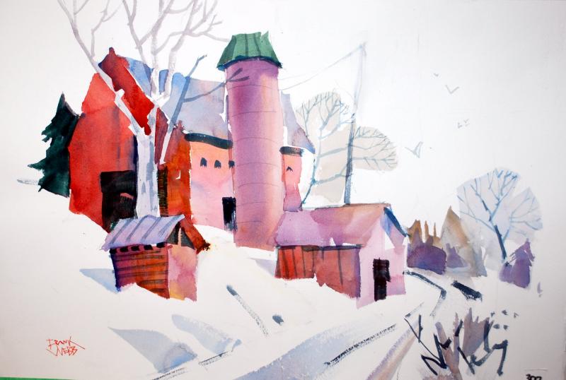
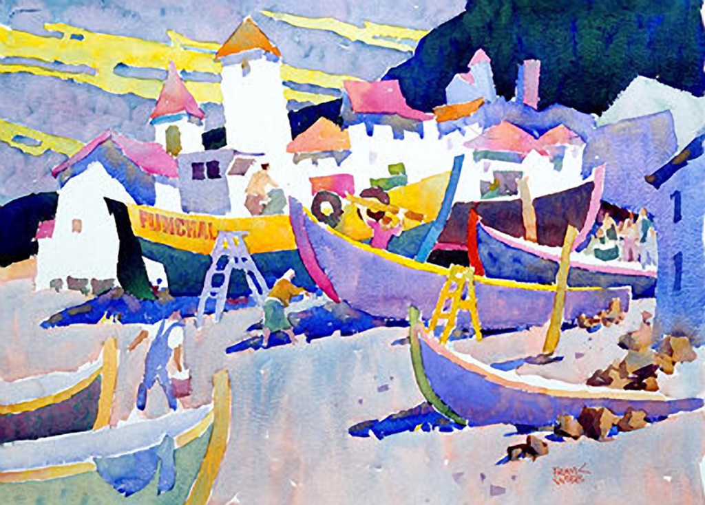
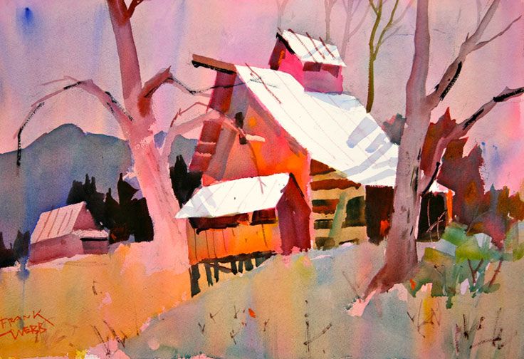
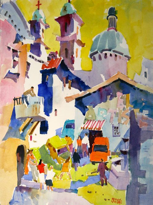
Watercolour is not a medium I am particularly inspired by as I find it can be quite bland. Whilst I admire those who work with it, from experience, I have learned it’s not my first choice as a medium. I could not recall off the top of my head a single artist who uses watercolour predominantly, so I had to do some digging. I spent quite a while trawling through the Tate gallery website, looking for work that I felt connected to that was also watercolour. I ended up with a long list of fantastic artists I am deeply inspired by, many of them with similar art styles to Austin, but none of them favouring watercolour. A little more digging led me to the work of Frank Webb, an American watercolour specialist.
Webb taught watercolour extensively in the 1980s and has released three instructional books on the subject. His Wikipedia page states that he ‘stressed the importance of having a sketch or drawing of your painting before you paint, design, draw, etc.’ This immediately opposes Austin’s style of work in an almost laughable way. In spite of this concrete belief, Webb’s work strays away from traditional realism, which he considered to be ‘boring’. His work, like Austin’s, has a playful and fun feel to it, though it is clearer that he is trying to communicate ‘real’ things.
Various work by Frank Webb
The content in his paintings focuses on buildings and architecture set in natural landscapes. It almost combines the two extremes of ‘traditional’ watercolour inspiration and Austin’s very industrial inspiration. He seems to be more interested in the interaction between manmade and natural landscapes rather than focusing on one or the other. It’s clear when comparing the work side by side that Austin’s work is quite distant from her references, as she figuratively responds to her subject matter.
Webb’s approach to the watercolour medium is much less curious. He uses it very traditionally, even if his colour choices and stylisation are less so. It seems he accepts and embraces the fact that watercolour is inherently transparent and soft as a medium, rather than seeing how far he can push the boundaries of that. By intentionally experimenting with masking and layering, Austin’s shapes are much more defined and robust, whereas Webb’s imagery all seems to blur into each other. Austin’s work appears to have much more depth to it, too, the clear layers of pattern adding almost a 3D effect to the pieces. Webb’s paintings are much flatter. It’s clear the subject matter is three dimensional, but the work itself is less dynamic.
Comparing the work of the two artists and considering their approaches to their practice only encourages me to experiment and explore more with the mediums I use. I can’t help but feel as though Webb’s work is too plain or basic, despite being drawn to it by his fantastic use of colours. Whilst Austin’s style is not exactly like my own, it’s closer in its free and playful approach. Sometimes it feels as though I want the art to show me what it wants to be, rather than for me to make it into something, and Austin’s approach inspires this further. I could learn a lot from both of these artists, however, as the basic underlying principles of a medium are just as important.
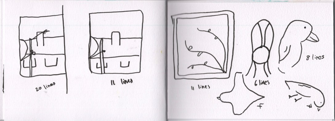
For this exercise, I was asked to experiment with how many lines I could use whilst still capturing the essence of a scene. I had to conduct some quick sketches of an object or scene using a minimal number of marks or shapes, either by allowing myself a set number of lines and reducing it down or by limiting my line usage in some other way. I was challenged to consider how few marks I needed to communicate what I wanted to in the image.
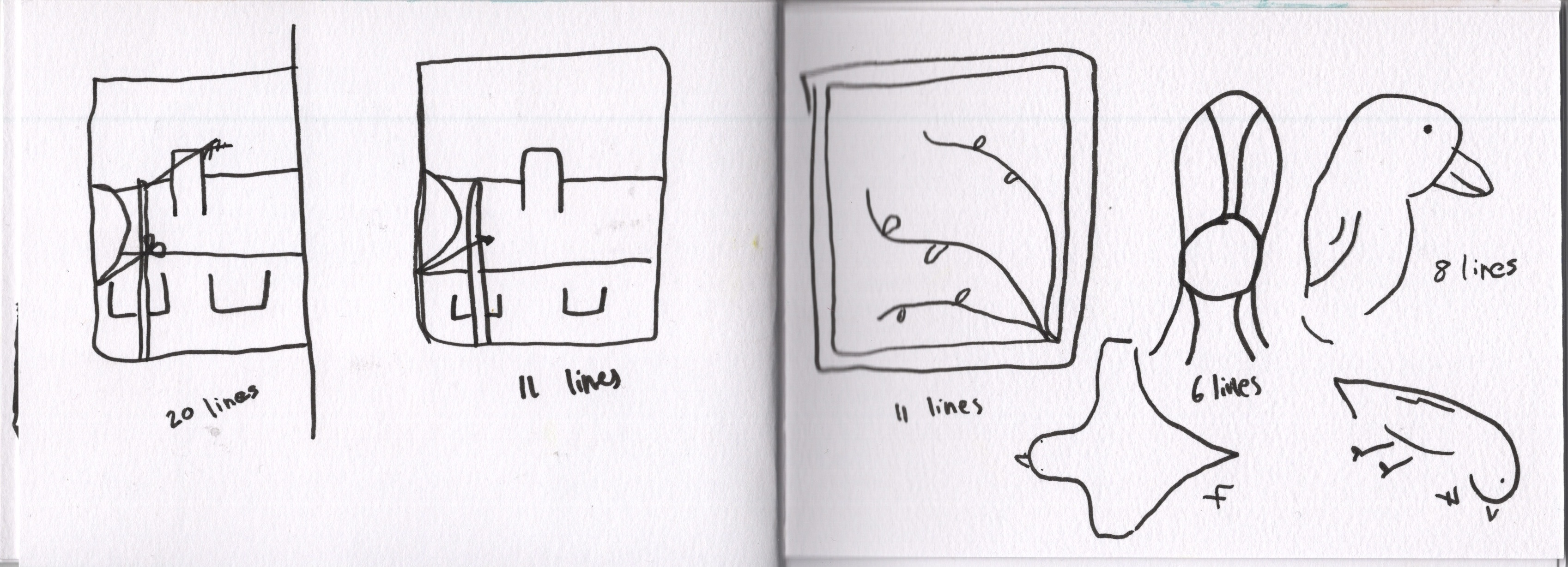
I feel like most of my sketchbook work, whilst not necessarily intentionally, is already utilising this technique. I much prefer the look of and feel to limited line/colour/shape drawings and sketches and have a lot of fun creating them. I struggled a little with this exercise, mostly because it didn’t really feel like I was ‘doing it properly’ as I was just drawing in a very similar way to how I normally do. I started by drawing what I could see outside of my windows, first with 20 lines and then with 11 lines. I tried to use 10 but hadn’t planned it very well. I then started drawing whatever was around me in the room, a chair, a picture of a bird, a teapot, mug, bottles, and a pair of scissors. I tried to challenge myself to not only use a limited number of lines but to push the boundary of how the objects were represented, abstracting the shapes and how they connected.
Some limited line and continuous line drawings
I really liked the page of objects I had developed but still felt like it wasn’t too detached from my normal. I was quite inspired to do some continuous line drawings at this point as it’s something I’ve never really gotten stuck into, but it fits the theme quite well. I did two, one of a set of drawers in my studio with objects on top and one of a section of my windowsill. I like these too, and I enjoy the qualities they have to them.
Exercises in abstraction and ‘less is more’ type techniques feel almost boring to me as it’s theories and techniques that already form a foundation in my creative practice. If I were asked to objectively draw a still life exactly as I saw it, taking time to create detailed drawings and accurate representations, that would be a challenge and maybe more interesting. I don’t feel like I got much from this exercise other than maybe inspiration for future projects, but the usage of limited line isn’t new and will always be a part of my art. I like a heavy dose of extreme maximalism and minimalism, perhaps combinations of the two – maximalist backgrounds and minimalist drawings.
The aim of this exercise was to get familiar with loosening up whilst drawing and getting information down fast. It was to help show how rapid sketching trains your mind to pick out important details and move past being a perfectionist. I had to step up a still life using an assortment of everyday objects and set a timer for 3 minutes. Once the timer went off, I had to stop drawing, rearrange the still life or move to another position, and start again. After a few attempts, I was asked to shorten the length of the timer, making the sketches increasingly rapid.
Rapid sketching is not a concept I am unfamiliar with. After part 1 of Key Steps in Illustration, my tutor advised that I work on my drawing skills and attempt some rapid sketches to do this. I really enjoyed the process and spent a lot of time doing it. In my sketchbook for Assignment 1, you can see that I did some rapid sketches of still life models – something I find useful to learn anatomy. In last year’s sketchbook circle, I also tried to draw from the same reference photo in 30 seconds, 1 minute, 5 minutes, and 10 minutes. Again, this was a fantastic and enjoyable exercise that showed me how to identify the space, lines, and content when drawing.
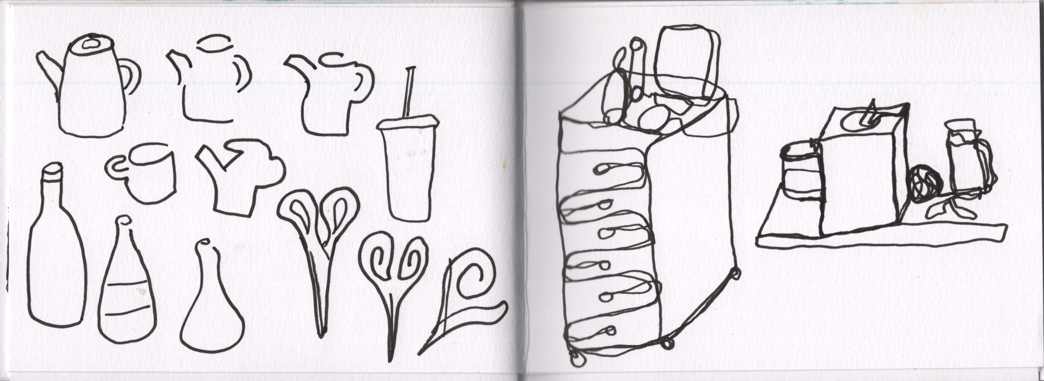
I chose some random items from near or on my desk to set up a still life with. At first, I was worrying about the objects I was using and the positioning of them, but after a few sketches, I stopped caring and started just sticking things wherever they would fit. I made sure I had a range of shapes, angles, and intersecting objects, though, so that I wasn’t making it super easy for myself. I then set a timer for 3 minutes and started my first sketch. Naturally, I ran out of time before finishing the drawing. I left it unfinished, though, and moved on to the next one, which I managed a little easier. I had a better awareness of the timeframe and a stronger sense of urgency.
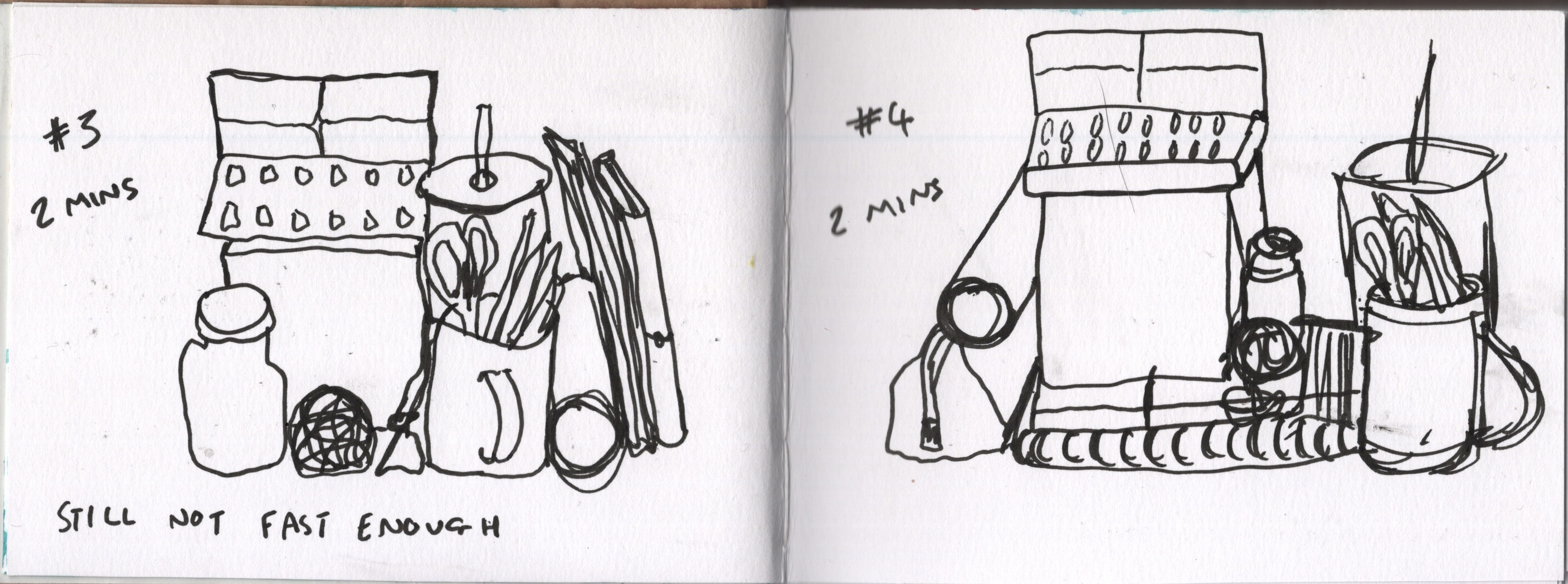
Some of the still life setups I constructed
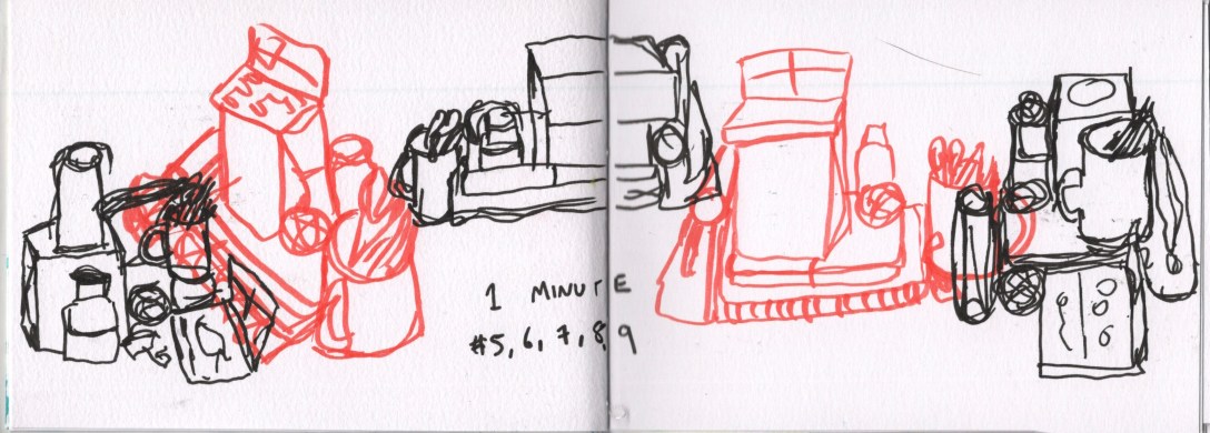
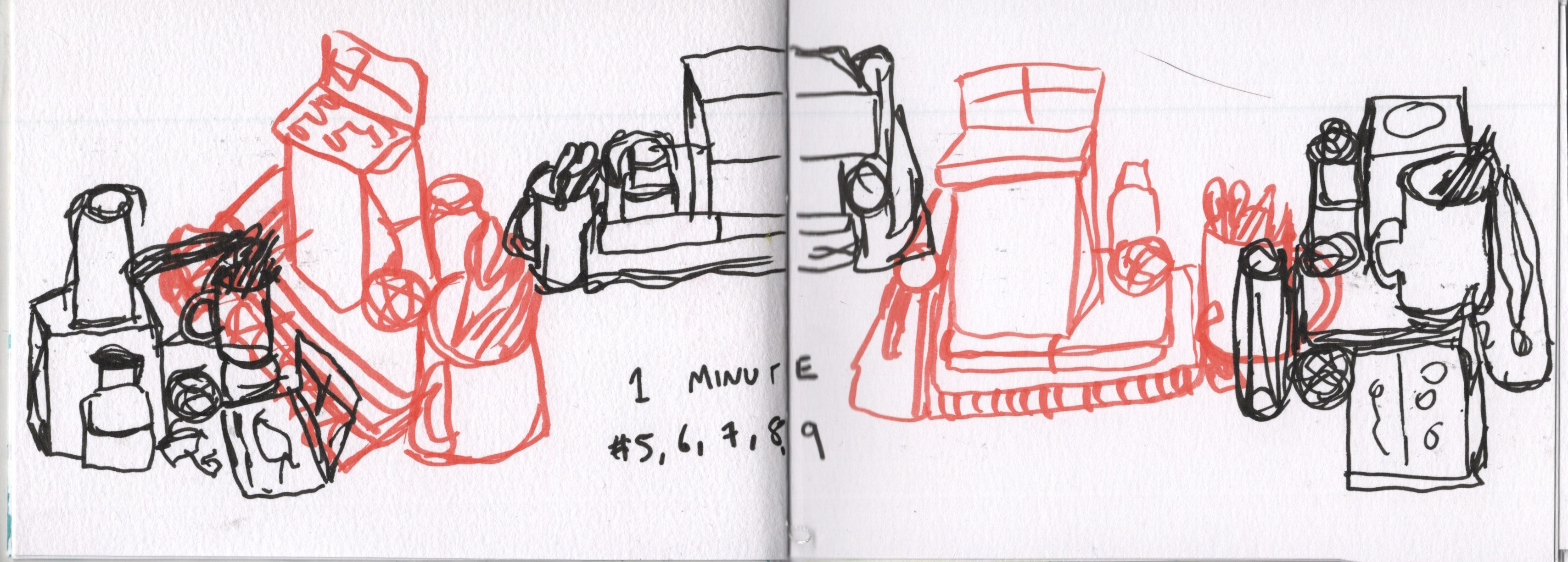
For the next two sketches, I reduced the timer to 2 minutes, which again led me to work too slowly and not quite get everything down. By the fourth sketch, I felt quite used to it and aware of where I was focusing too much attention. I then decided to do a full two-page spread of sketches overlapping each other, first using a red brush pen, then using my regular 1.0 fineliner. The timer for all of these was 1 minute, which weirdly felt more comfortable than 2 or 3 minutes. Maybe I push myself harder as I know how short a minute really is, I’m not sure. I love the composition of this page and the way each sketch interacts.
My rapid sketches
Rapid sketching is a super useful exercise to regularly undertake to explore new drawing techniques, or even just out of necessity. I find myself coming back to it regularly, and there’s something about the feel and look of rapid sketches that I enjoy. I would love to find ways to push it further and experiment with how to make my rapid sketches interact with other mediums or ways of drawing.
For this research task, I was asked to look at the rapid sketching work of Sophie Peanut, comparing her working methods to my own and identifying other artists who work in similar ways. I followed the link provided in the unit materials to Peanut’s page on 5-minute sketches and had a quick click around the rest of her website to see how her methodology influences the rest of her work.
Sophie Peanut’s finished illustrations are playfully messy, abstract, and endearing. Her sketchbook work, as she describes, is much of the same. She speaks of the value of drawing in the waiting space between day to day activities and how doing this repeatedly improves one’s drawing skills. Based on my own experiences with rapid sketching, I would have to agree – it is of huge help. She advises arriving early to events or sticking behind after, making time for sketching, and just drawing whatever is in front of you without thinking.
Examples of Sophie Peanut’s work – taken from her website
I really value and appreciate her outlook on sketchbooks and sketching as a process. I personally find rapid studies much more beneficial than lengthy, accurate portrayals of my references, but then again, I am more abstractly inclined in my creative processes. I especially love the way her sketchbook pages are constructed, overlapping and intertwining with each other and slowly building up into a whole ‘piece’. I feel these pages would provide much inspiration looking back at them in future.
As I haven’t been able to leave the house much in the past year, I feel I’ve been missing out on a lot of these processes, and it’s something I hope to build on more as I am able to go out and about again. The sketchbook pages from when I was able to be more active in 2020 are similar in their builds, rapid and spontaneous sketches and pages that I slowly added to over time. I like going back and adding drawings or colour or patterns in the gaps in pages – I love a maximalist sketchbook absolutely full of stuff from my mind.
Examples of work from David Hockney (top left), Picasso (top right), Edgar Degas (bottom left), and Egon Schiele (bottom right)
Other artists who have similar rapid styles in their sketchbooks include David Hockney, Picasso, Egon Schiele, and Edgar Degas. Hockney’s focus is perhaps most alike Peanut’s as he works to document the world around him and draw everything he sees. Schiele’s rapid sketchbook work has become famous in its own right, and Degas’s sketches of dancers in motion have a similar level of recognition in the art world today. The mediums, styles, and techniques used differ between all five artists, but the loose and free linework is consistent between them.
I believe you could argue that all artists will use rapid sketching in their studies at some point in their lives. Some artists may be more drawn to it as a process and feel it inspires their creative practice more than others, but even those who prefer to take it slow and ensure accuracy in their artwork will see the benefit to making the most of the time they have. I can’t actually find a single downside to the process, and I am definitely curious to see why people may think it’s bad. Ultimately, I believe expanding your brains capacity for drawing will always be useful.
In my previous unit, I reflected on and responded to feedback in a more internal way, taking forward any advice and applying it where necessary, reading any recommended books, and considering my own feelings on how I could improve. My tutor has requested that I respond in my learning log to her feedback for this unit, and as each part of the unit has an in-depth introduction, I think it would be appropriate to combine the two going forward. I also appreciate that this gives me a space to formally reflect on my learning so far and collate my thoughts for the next part.
My feedback for part 1 was overall very positive. It’s great to know that I’m on the right track and doing the right things! I received a lot of encouragement to build on using my sketchbook as a place that is mine, and that can be whatever I want or need it to be, a dynamic that I am slowly developing.
I felt there was a lot of emphasis in my feedback on using my sketchbook in a more sequential order. For example, my tutor suggested leaving empty pages as part of the narrative if I needed to skip them to find a more appropriate page to work on. She also recommended I try to record my responses in the moment, stating, ‘if you have a collection of things in boxes to return to will you always remember exactly the emotion etc felt at the time of collecting the previous week?’. Whilst I agree there is usefulness in using a sketchbook in a sequential order – the more ‘rules’ I apply to my sketchbook, the less I am going to want to use it, and the more unhealthy my attachment to it will become. I become very preoccupied with following rules and structure, and if I have a lot of them in place, it hinders my creativity.
I enjoy dotting back and forth in my sketchbook where necessary and don’t want to feel bound to working in a linear progression. Not only that, but I have OCD, and one of the manifestations of this has been obsessing over wanting to remember everything, keep everything, recall everything, and ensure it is all accessible at all times. It would be very unhealthy for me to start trying to ensure I was documenting exactly how I feel in the moment, and a part of recovery for me has been realising that yes, I can actually remember my emotions and thoughts a week later.
My relationship with my sketchbook and the manner in which I use it is always going to be influenced by my mental and physical health, as I’m sure it is for anyone. Because I am not mentally or physically healthy, nor neurotypical, I most likely will not be using my sketchbook in a typical way, nor will I feel comfortable using it in other ways. This isn’t out of an unwillingness to learn, experiment, or grow, but out of a necessity to protect my mental and physical health. There is, for example, a section in the introduction to part 2 which discusses using every snippet of spare time to draw. However, this would be actively dangerous for me. I don’t have ‘spare’ time – all of my days are extremely calculated to ensure I don’t become unwell. What to an ablebodied person is a free moment waiting for the bus is a moment I am grateful to be conserving energy, so I have more later.
On the topic of being neurodivergent – my tutor pointed out that another way to interpret Exercise 1.3 would be to discover intentional hiding and obscuring of content as a part of the narrative within a piece – something I missed as I was focused on the literal interpretation of the exercise. This is definitely something I would be interested in exploring further, especially as my tutor said, ‘Consider how to create mystery and intrigue, by allowing the reader to discover you.’
My tutor gave me some specific action points based on the unit’s learning outcomes, which is extremely useful for me. These are:
Try not to overthink or over-plan what I am putting in my sketchbook
Try experimenting with many different ways of approaching an idea – trying it over and over again in many different ways
Ensure the artists I research have credibility if I choose to pick less well-known artists
Consider making a sketchbook out of random bits of ‘waste’ paper (newspapers, magazines, cut-offs from print shops, whatever I can get my hands on)
Consider working on loose sheets of assorted types and then binding them together
Attempt to find old books in charity shops to use – considering how the original meaning of the book impacts my usage of it
Ensure I start building a bibliography using Harvard referencing
Going ahead into part 2, I will definitely be cutting back on overthinking and trying to just let my creativity lead me. I hope this leads naturally into the second point of trying different ways of approaching the same thing. I already ensure any artists I research are professionals, and I take anything they say or do with a grain of salt. At this point in my studies, I’m mostly trying to build my own idea of how I approach my practice, so I pick and choose what works for me anyway. However, this would apply to even the most famous artists – I am not them and whilst I might give their advice a try, it won’t necessarily work for me.
I am really excited about bookmaking and enjoying the process of doing it. I like that it’s a little side hobby and addition to my studies. I don’t intend to get totally caught up in it and make it my sole focus – it’s just nice to have it. I love the idea of collecting varying kinds of waste material and making them into a book! It isn’t appropriate for part 2, but it is definitely something I’m considering a project on. The same goes for finding a book to work in – I want to do it, but it isn’t quite appropriate yet. As for referencing – I did not reference habitually throughout Key Steps in Illustration, and I am now at the assessment period and having to go through the selected learning logs and add formal references. I consciously did this as I found referencing was a barrier to getting work done. However, I will re-evaluate how this has worked after submitting for assessment and may change my approach for this unit.
My understanding of part 2 is that I should have a more exploratory and playful relationship with my sketchbook by the end of it. The introduction explains how throughout I will be introduced to experimental mark-making concepts alongside how to work with the ‘mistakes’ I make. I am super excited about this as it’s exactly where my focus in art currently lies and is what I enjoy doing the most. The assignment aims to teach me how to add narrative into my pieces, another thing I am looking forward to getting to grips with. I am very intrigued by the concept of ‘accidental’ mark-making, and I look forward to learning more about how this occurs and how it can be used. I struggle to see how any mark can be accidental, as even randomised markmaking is intentional.
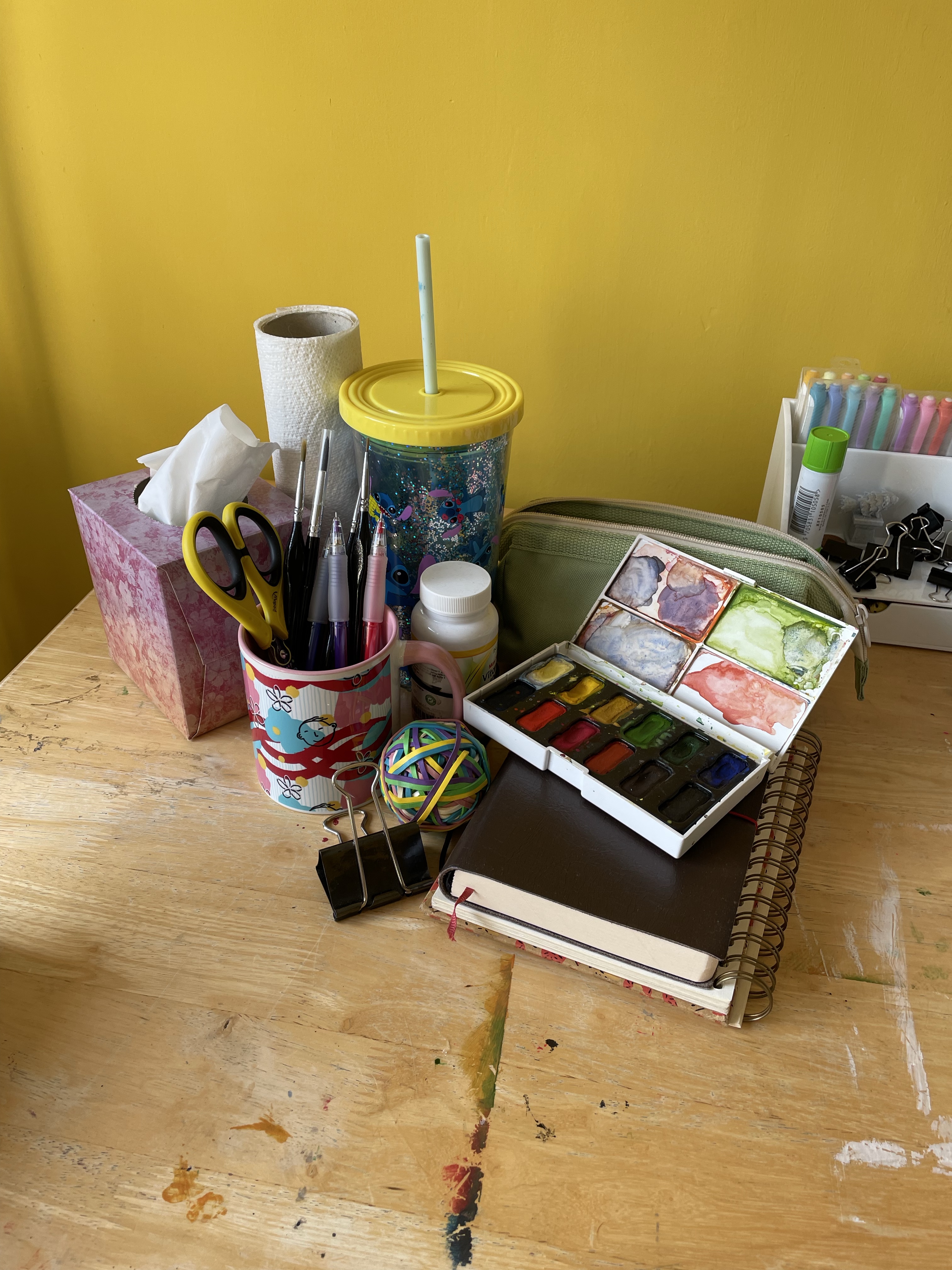
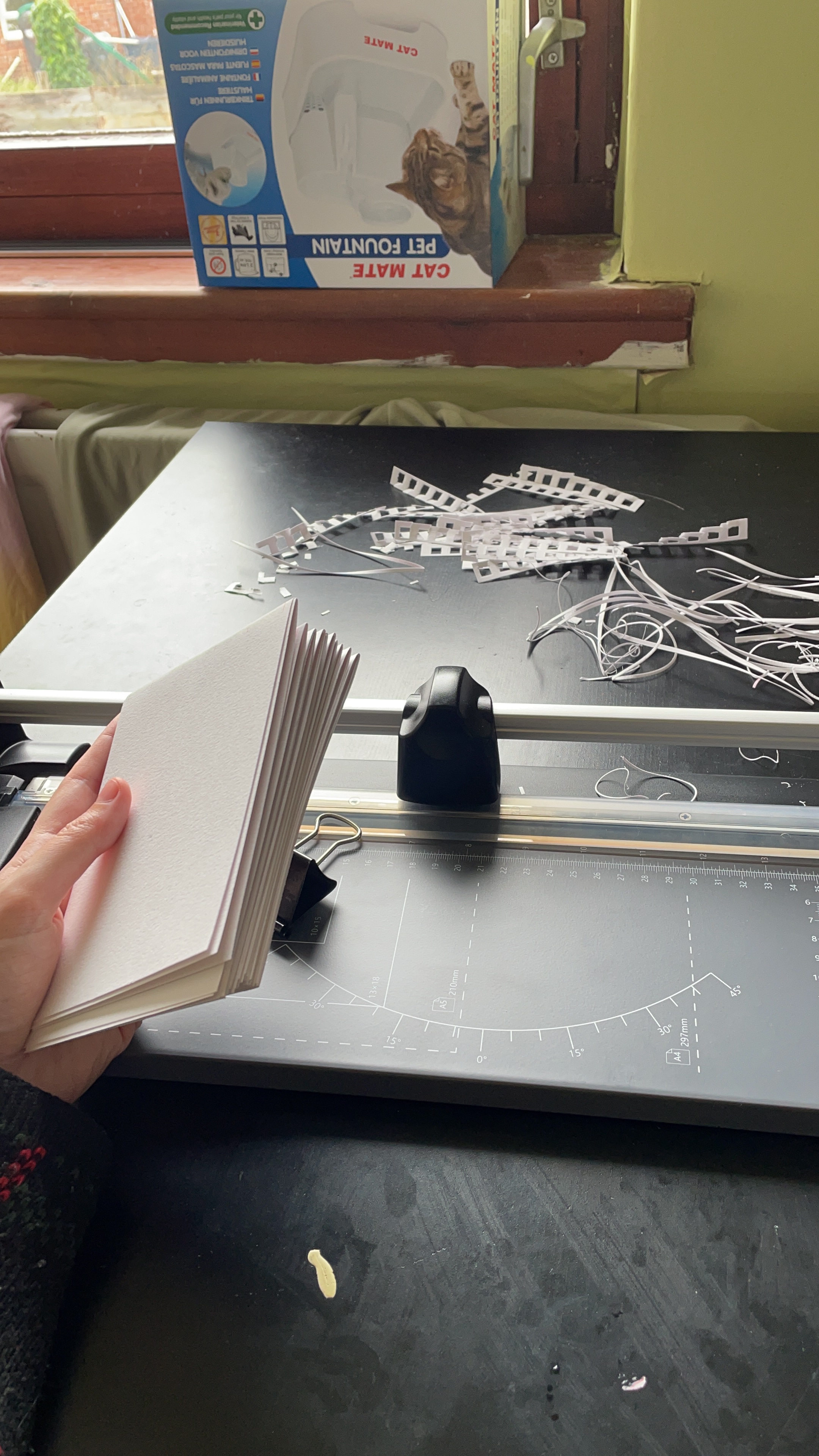
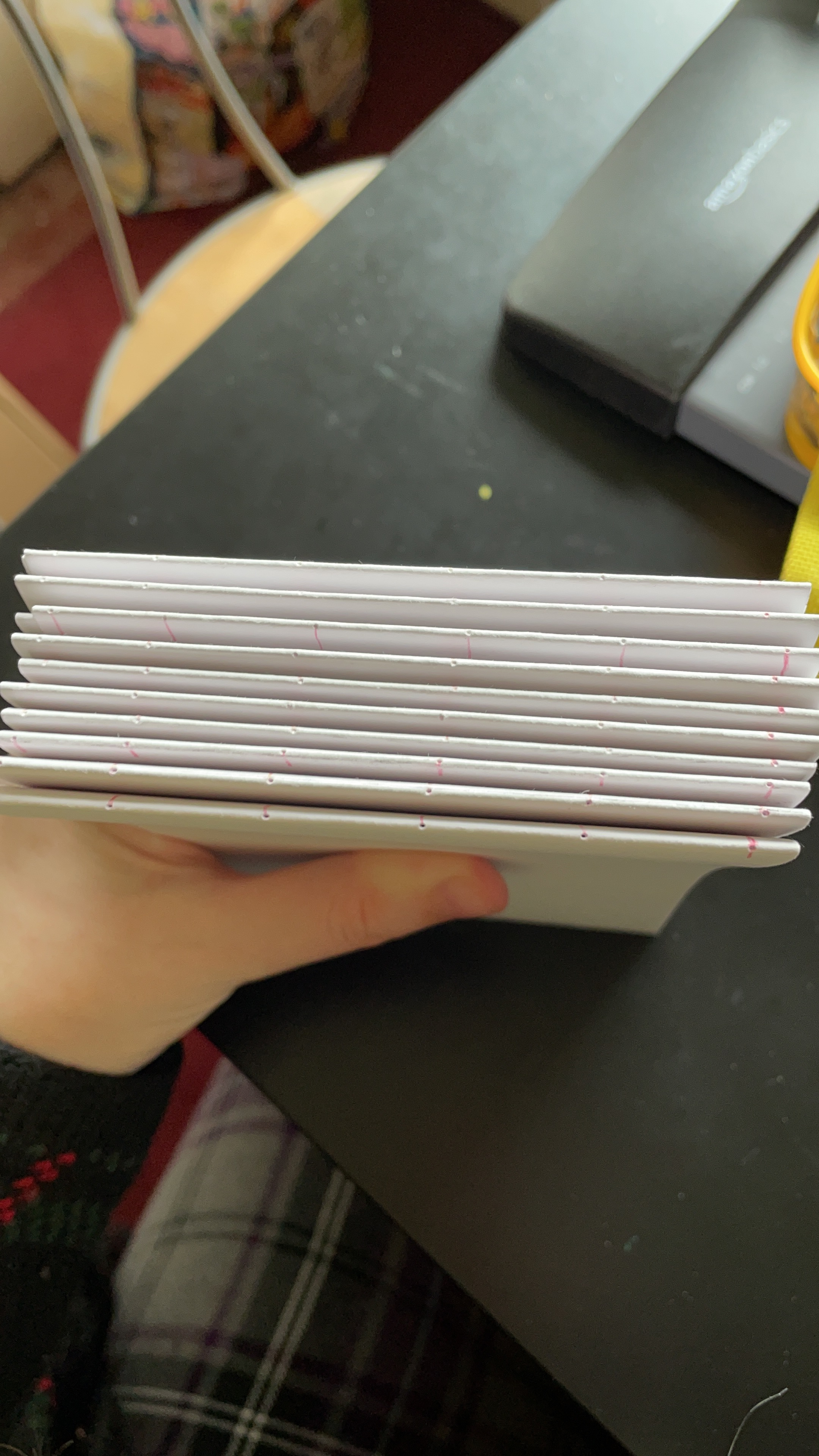
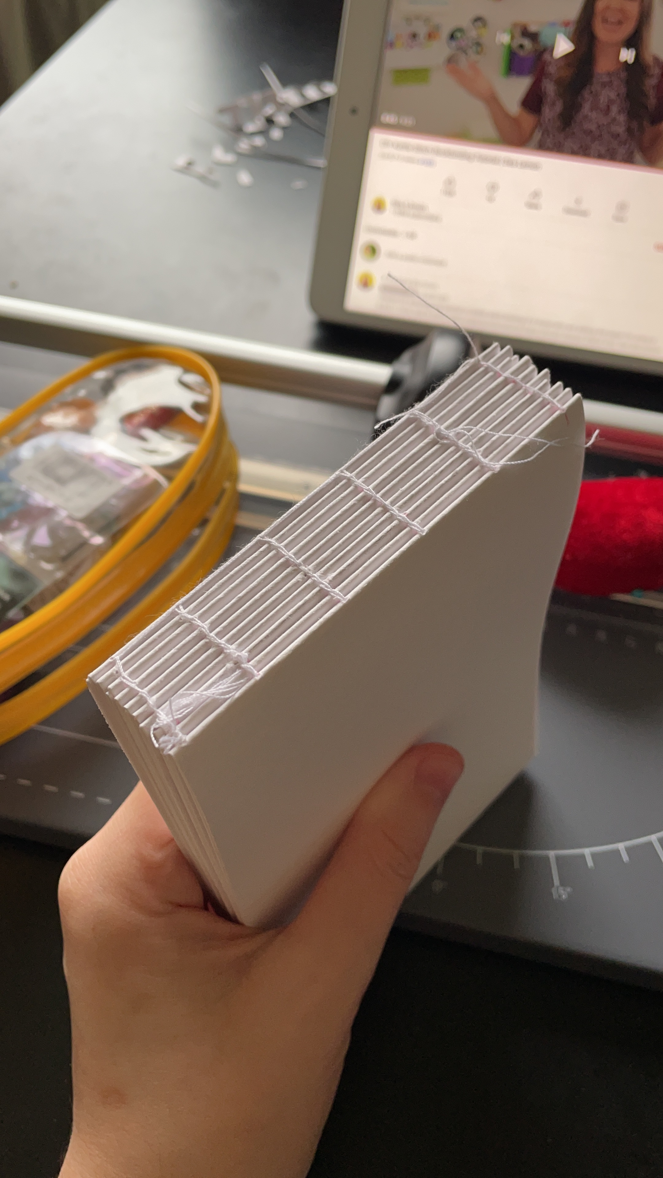
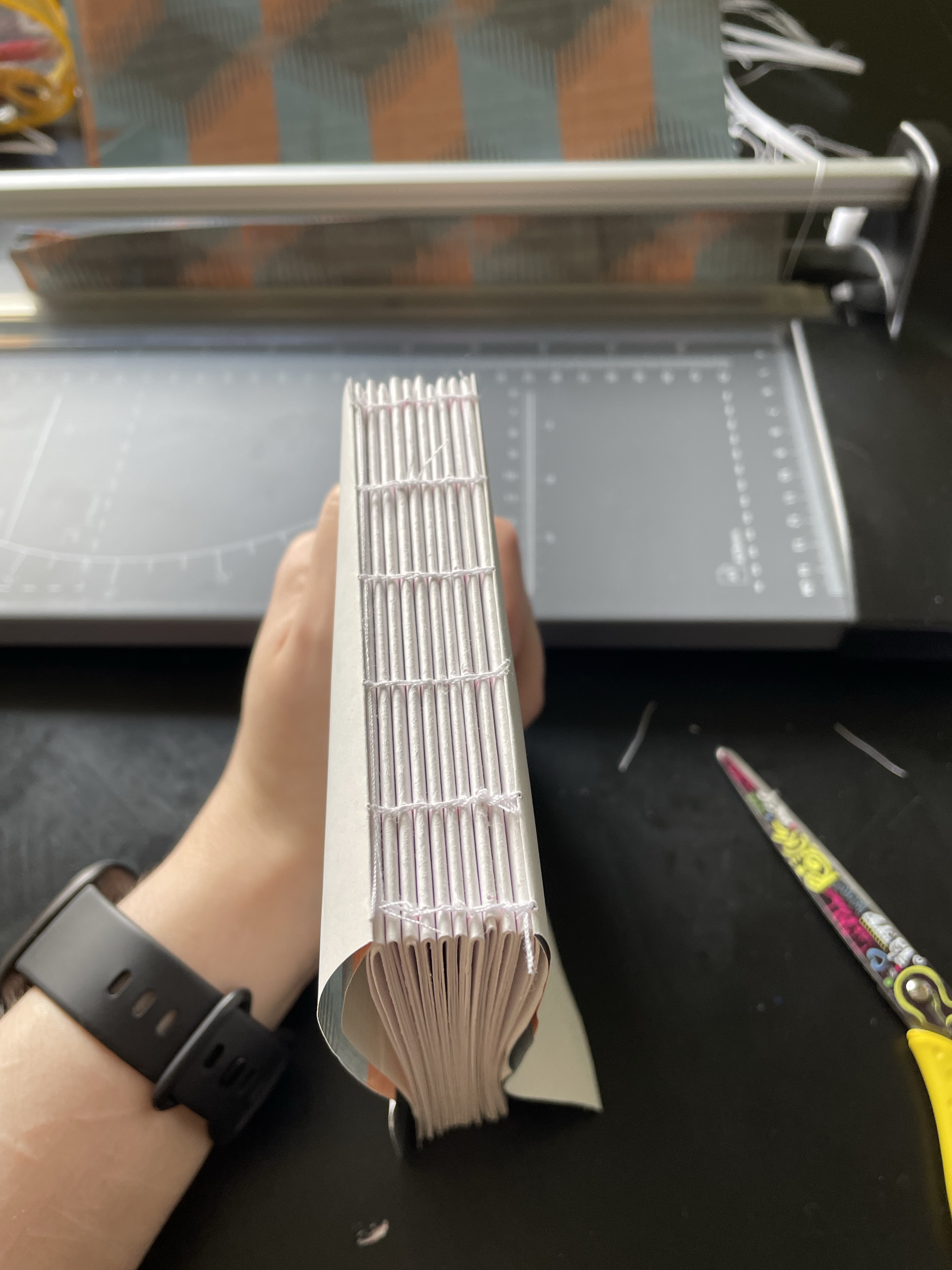
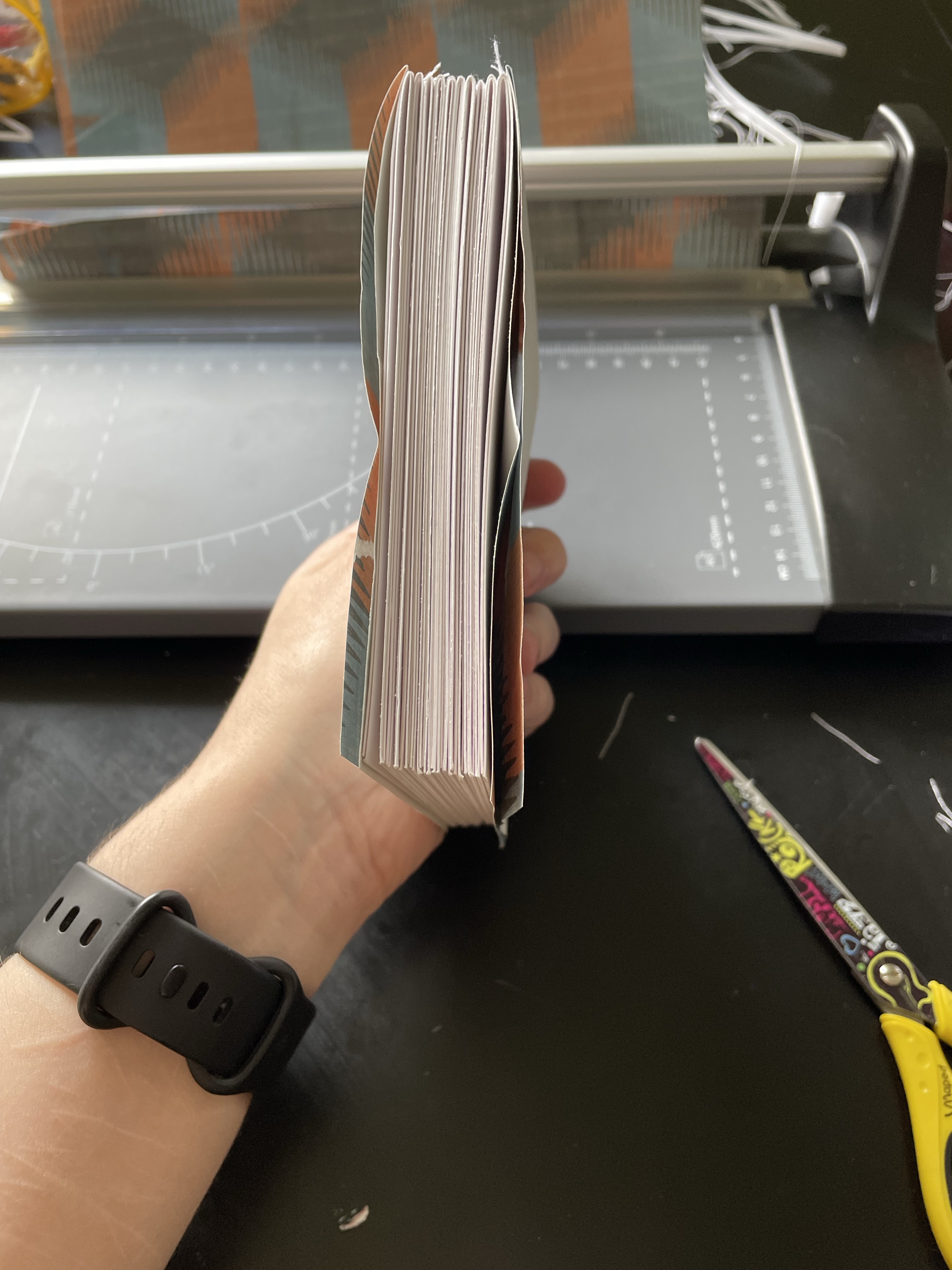
Some photos from my process making my sketchbook for Part 2
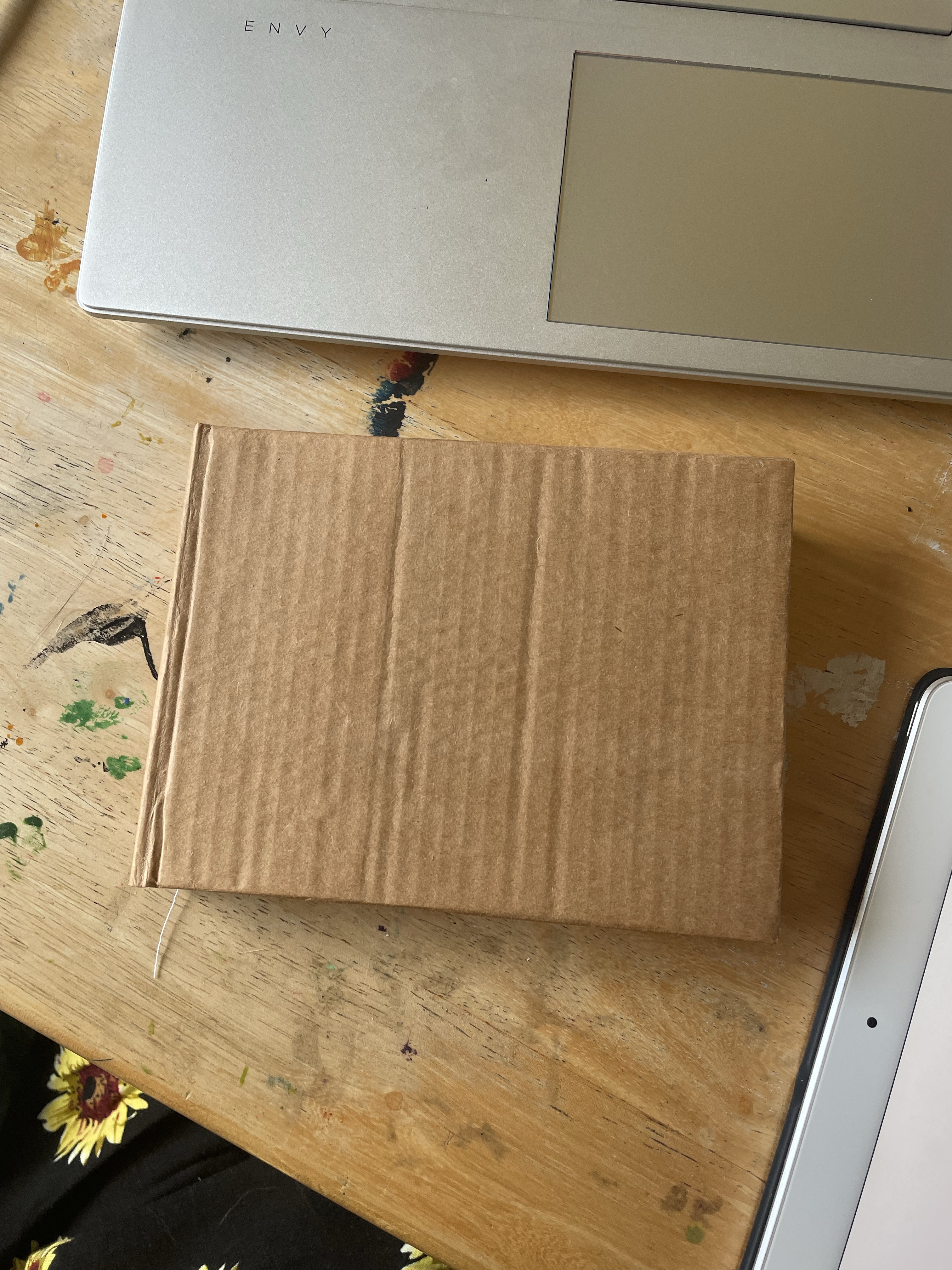
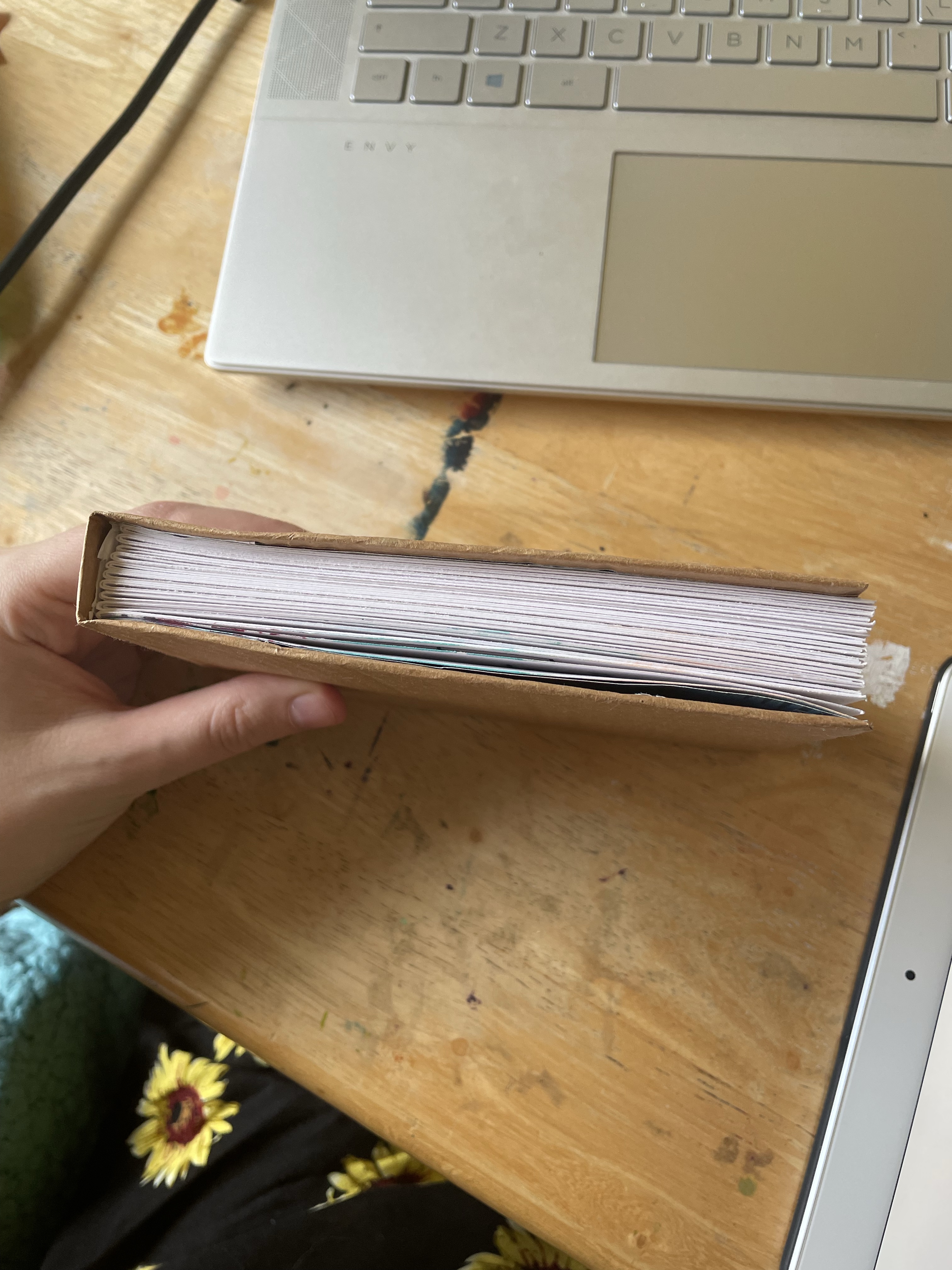
Due to the nature of the exercises in part 2, it is recommended that the sketchbook you choose contains paper that is suitable for a wide range of materials. I decided to make my own sketchbook once again using Daler-Rowney mixed media paper. For no real reason, I was drawn to an atypical size for my book – cutting the A4 sheets in half horizontally and folding these pages in half to create signatures. This book was much easier to make due to its straightforwardness. It still is not perfect, but it’s a big improvement from the last. The cover is a bit more plain than the last one, too, but I hope to decorate it at some point if the inspiration strikes. I’m really happy with this sketchbook and excited to work through it!
My finished sketchbook for part 2
I feel like I’ve already made a great deal of progress in my relationship with my sketchbook. I took a week off from all artwork as I had other things going on that required my focus and I deeply missed drawing every day. It already has become a solidified part of my day-to-day life, and I can’t imagine not using a sketchbook all the time now. I’m also really enjoying the way my art style is growing and developing and the rapid speed with which it is doing so – a year of focused illustrations and learning the technical side of things has lead to an explosion of wonderful creativity and navigation of my personal brand. I can’t wait to see where part 2 takes me and how I feel when starting part 3.