Exercise 2: Getting the gist

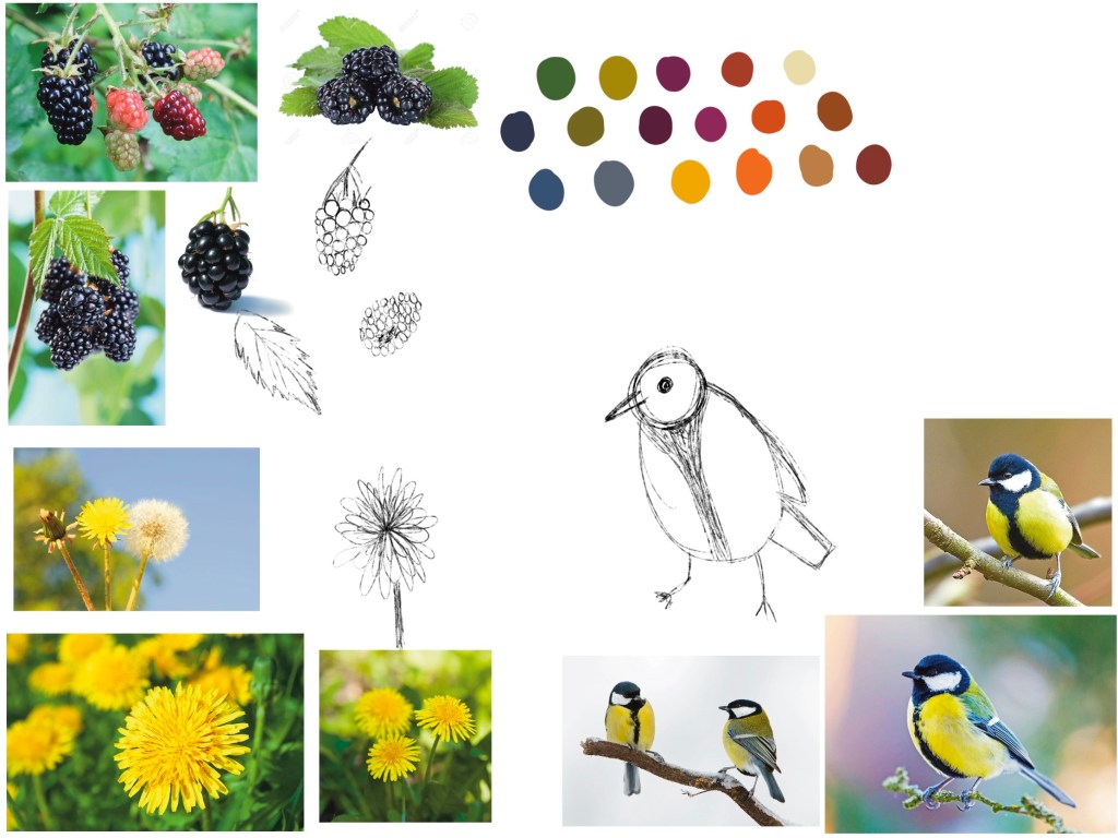
For this exercise, I had to choose an article from a newspaper or magazine and create an illustration to go alongside it. It took some effort finding an article I wanted to do this with, as currently the COVID-19 pandemic is dominating the news, and it’s a rather miserable topic to be reading about. I decided to go with an article titled What will Pride mean this year?. I read over it several times, following the instructions of the exercise and highlighting the key words, getting a feel for the article and what it was trying to communicate.

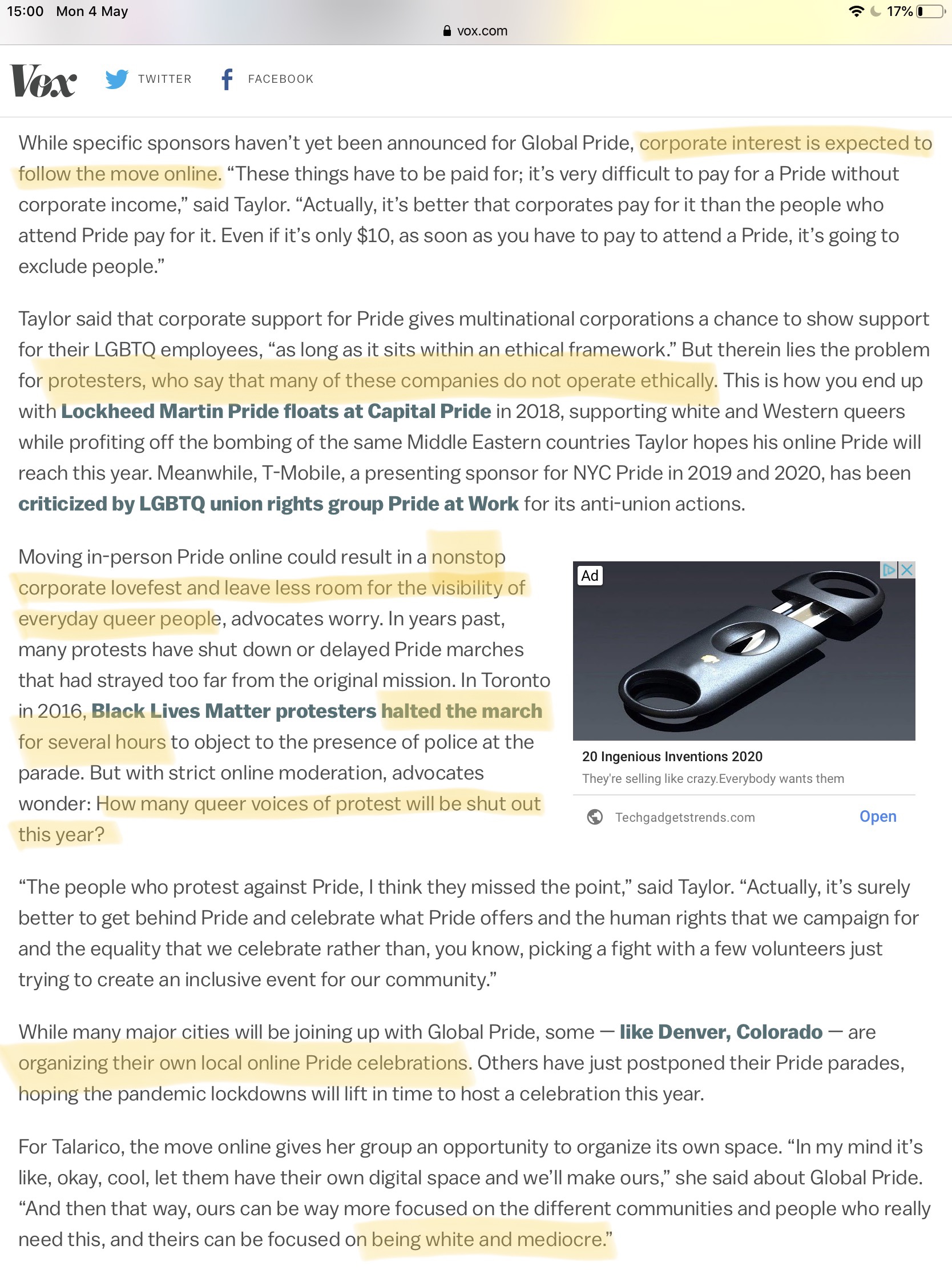
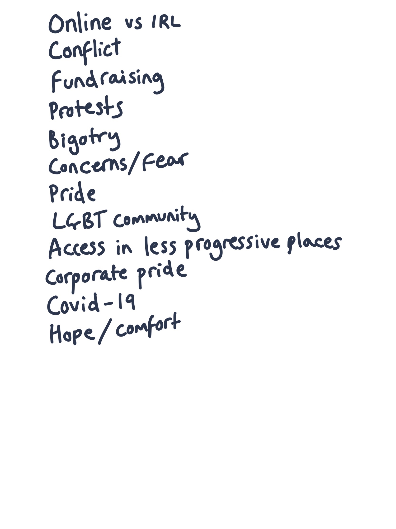
I then jotted down the key points I took away from the article, and what I felt summarised the text. The core themes were that Pride would exist online rather than in real life spaces, that there was fear and concern – around homophobic and transphobic abuse online and around how to support smaller communities – and that the purpose of Pride may be lost, either to protestors, or to the thing protestors are protesting.

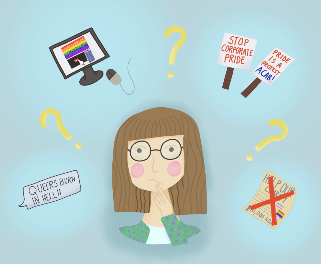
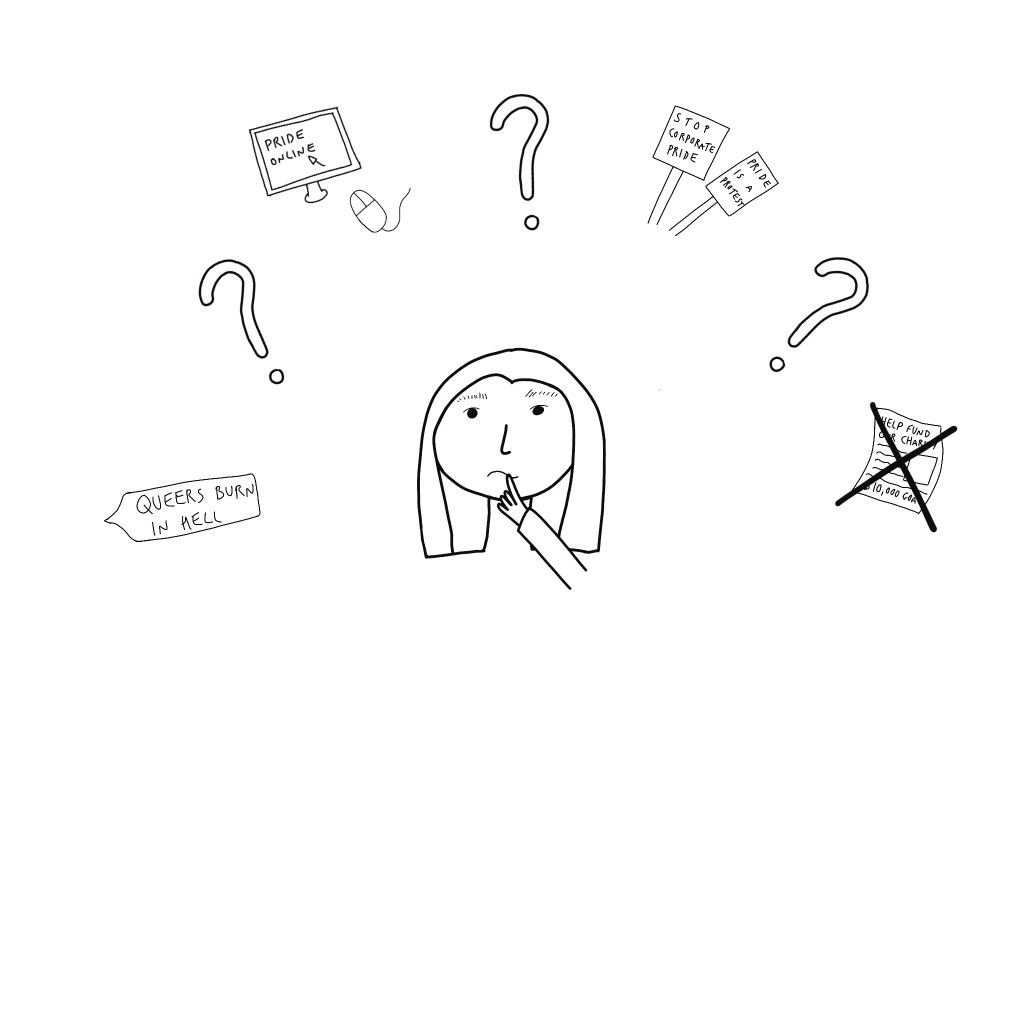
I sketched out 3 initial ideas for an illustration. The first shows a regular Pride parade in the street, and someone sat at home watching Pride on their laptop. I used a jagged line to separate the two as I felt it showed the striking difference. The second has a confused and worried person surrounded by question marks and various ‘fears’; online harassment, Pride online, fundraisers lacking traction, and protestors. The third simply shows a laptop with a Pride online website open. It has adverts over most the page from anti-LGBT corporations, homophobic and transphobic abuse in a chatbox, and a very tiny barely readable ‘donate to LGBT charities’ link, showing the priority given to corporations rather than community resources.

My initial sketches

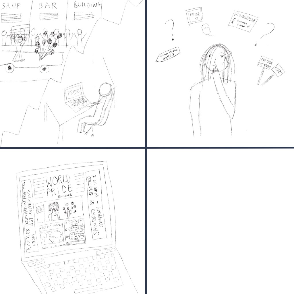
I really liked my third idea, I felt it was clever and showed the potential for what Pride online could look like. However, I felt my second idea communicated the underlying worry, concern, and general sense of unknowingness that the article was discussing. The headline begins with a question, ‘What’, and that isn’t answered in the text. We don’t know, and that’s a key point. Whilst I would’ve liked to develop the third idea further, I decided to develop my second instead.

I began by roughly drawing out the elements I wanted to include and positioning them around the person in the center. Then, I worked on each element individually at a large scale before sizing it down to fit. I wanted to ensure it was detailed, but not too detailed, as it wouldn’t be visible at a smaller size, so that was tricky. Once I positioned the elements, I changed the background to a blue colour that complemented the yellow of the question marks.

The brief outlines
The developed elements and original background colour

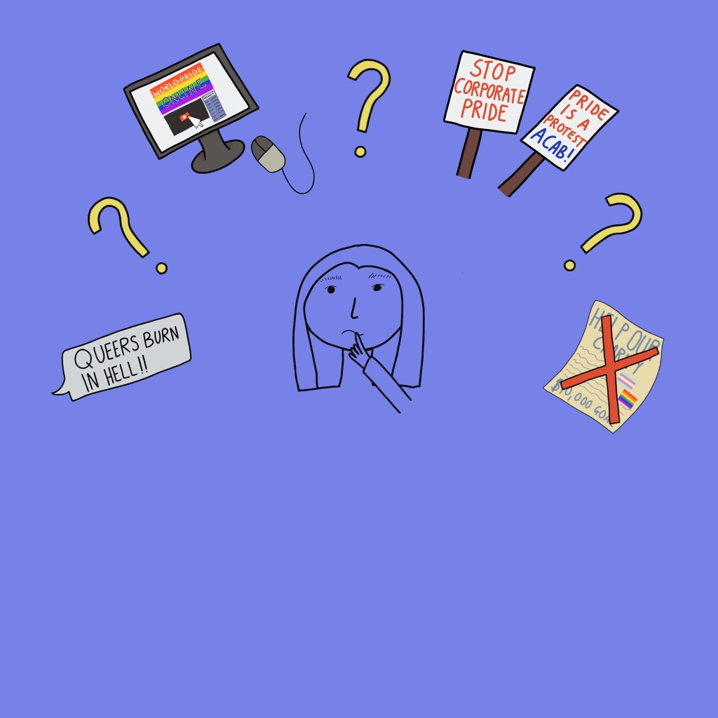
Quickly however, I realised this blue was just too much. It was harsh, and the colours in general weren’t complementing eachother. I changed it again, to a softer blue, which was easier to look at. I then set to work on the person in the center of my illustration. I took a completely different approach to this, with minimal outlines and soft shading and textures. I loved the outcome, and after viewing it with the other elements, decided I wanted to edit everything to match.

Updated background and completed person

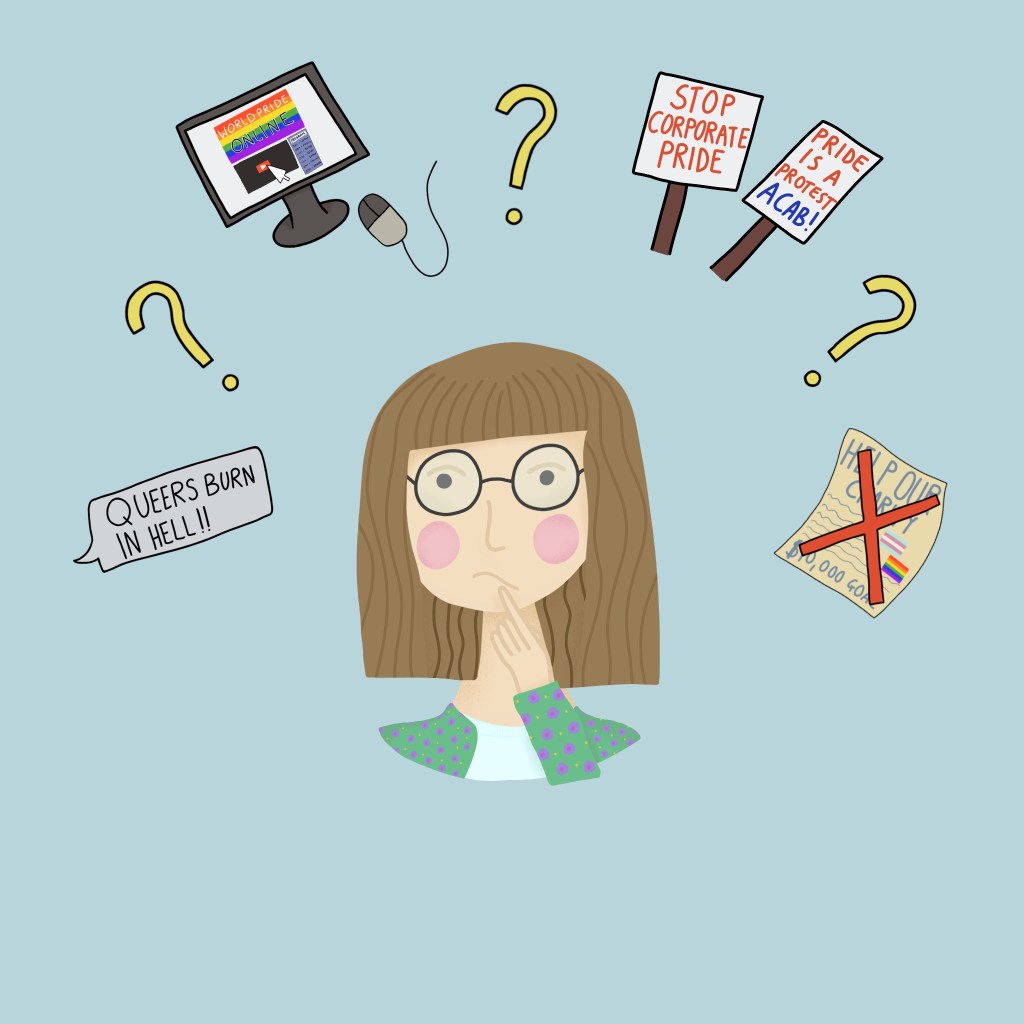
I also moved the elements slightly, and made the question marks larger. Then, to finish up, I added some background shading and highlighting. I’m quite proud of this piece, I wasn’t sure where I was going to end up when I began, and I was worried about placement of the various elements. I feel like I could potentially add more, like some indication of COVID-19, or maybe a more obvious nod to corporations profiting off of Pride. I didn’t want to overwhelm the piece with too many elements however, and felt simple was best.

The dead space at the bottom of the piece is somewhat of a conflict to me, too. I tried cropping it out to make a more rectangular image, as that’s most often used in articles, and I don’t know if it looks better. I keep going back and forth over it.

Finished illustration
Cropped illustration

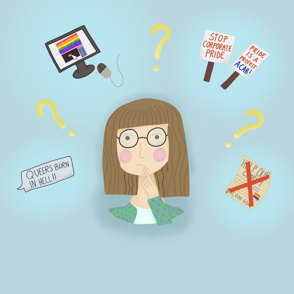
I feel like this piece communicates the message of the article well, and suits the audience. The readers of the article are most likely going to be members of the LGBT community who recognise the imagery from their own experiences. The themes of fear, concern, and uncertainty feel clear in the illustration. There’s definitely areas I could improve, as mentioned above, and maybe in future I will develop and explore my other ideas.

It was really exciting reading the article and starting to develop ideas. Being able to take text and carry the message through to an illustration, and actually see it come together, was a lot of fun.

Exercise 1: The History of Illustration – Artwork

The next task in this exercise was to draw an illustration in the style of my two chosen artists, selecting similar subject matter and media.

I chose E H Shephard’s work first. To start, I wrote out the subject matter of his illustrations, and the media he used. Then I jotted down some ideas of what I could illustrate, and the media I would use. I sketched out two of these ideas, using stuffed animals and my pets as inspiration. I wrote a few more notes whilst thinking about which sketch I could elaborate, and decided to go with my first idea. This was because using stuffed animals as a reference fitted Shephard’s work very well, and I felt the colour palette was subtler, so more appropriate for watercolour.

Sketch book page for E H Shephard

I knew I would be using pen and ink for this illustration, so before starting the draft sketch, I tested out some of my pens. I also tested some india ink with a dip pen, which I don’t have much experience using. I loved the way it looked, and felt the bolder lines were more suited to this piece. My original plan was to draw the piece using drawing pens, then add colour. However, india ink is not waterproof, so I changed my method slightly.

Final draft sketch

After drawing out a final draft, I attached it to my lightboard with some watercolour paper. I then filled in the spaces with watercolour, with a light, wash-type effect. I then used my dip pen and some India ink to fill in the line work and add detail. As I mentioned before, I have very little experience with this medium, and that meant I struggled quite a lot. I couldn’t achieve consistency in my line work, and kept making noticeable mistakes.

I wasn’t happy with the final outcome. Looking at Shephard’s illustrations, then at my own work, I was struggling to see a resemblance. I love colour, and I desperately wanted to keep that in the image, however few of Shephard’s illustrations actually contained colour. Plus, with having less experience using the dip pen, I just wasn’t able to achieve the same look. I decided to try again, using the same draft sketch, except this time using my drawing pens and leaving out the colour.

Final piece

This piece looks a lot more like Shephard’s work, and I’m quite proud of it. I’m glad I tried again and I’d actually like to work with these characters again in future.

For my Mel Baxter inspired piece, I began with a similar method. I wrote the subject matter she illustrates, the media she uses, and ideas on what I could draw. Baxter uses her environment as inspiration for her subject matter. So, I looked into my garden, and wrote some of the plants and birds I could see. I decided to do a bird focused piece, like her Pink Galahs piece. Baxter does draft sketches on paper and then finalises her work using her iPad. I did all of my work on my iPad, as I find it easier to work on.

Mood board for Baxter piece

I began by collating images of the subject matter I was going to draw, and sketching them out onto a mood board. I also took a colour palette from an array of her illustrations, as it says in her artists bio on illustrationx that Baxter uses the same 30 colours throughout all her work. Then, I started working on composition. I frequently referenced her work with birds to ensure my composition was similar, then, when I was happy with my sketch, I got to work.

Rough draft

The first thing I did was add colour. Her work is incredibly bold and the colour seems to be the focal point, line work coming second. I added a background, and roughly filled in the different elements of the illustration. I also redrew the leaves, and removed the blackberries. It was my intention to redraw them, but this piece ended up taking a lot more of my time than I had intended, and I felt it was better to leave them out.

Rough colour fills

Then, I added in some detail and extra line work. This was time consuming and quite tedious, involving a lot of repetitive motions. I ended up spending around 9 hours total on this piece, which half of was spent adding detail.

I like my final piece, and I’m happy with how it compares to Baxter’s work. I found it difficult to produce incredibly true to life work like she does. I also struggled with how to add texture to the bird, for a while it felt very plain and blank, and now it feels a little too busy. I also think the colours don’t match up to Baxter’s work as well. I think that has a lot to do with the subject matter. Living in Australia, Baxter’s environment is naturally bright and bold, whereas here in England, colours are more muted. Whilst I used a colour palette right from Baxter’s work, my subject matter lended more to toned down colours.

I enjoyed the challenge of this exercise, being forced to really look at the art of other illustrators to attempt to replicate it was new to me and helped me learn about different techniques I could use in my own work. I did find it difficult having to draw in other people’s styles, however, as I felt very pressured to perfectly emulate it. I had to keep reminding myself that I have my own style, that isn’t this style, and that it won’t ever be perfectly another person’s style.

In future, I would like to reference more work by other illustrators to shape my style progression. It was fun stepping into someone else’s shoes, and helped me to expand my own.