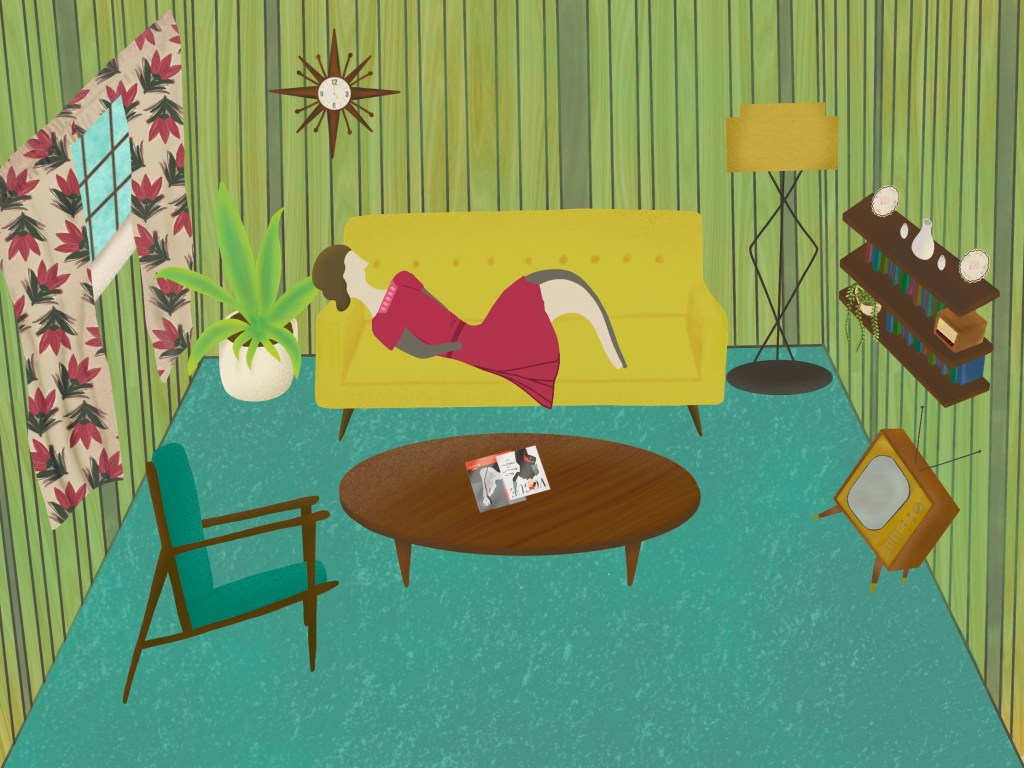
The next part of this exercise asked me to make an illustration of someone sitting in a chair surrounded by typical artifacts to give a teenager an idea of the 1950s.
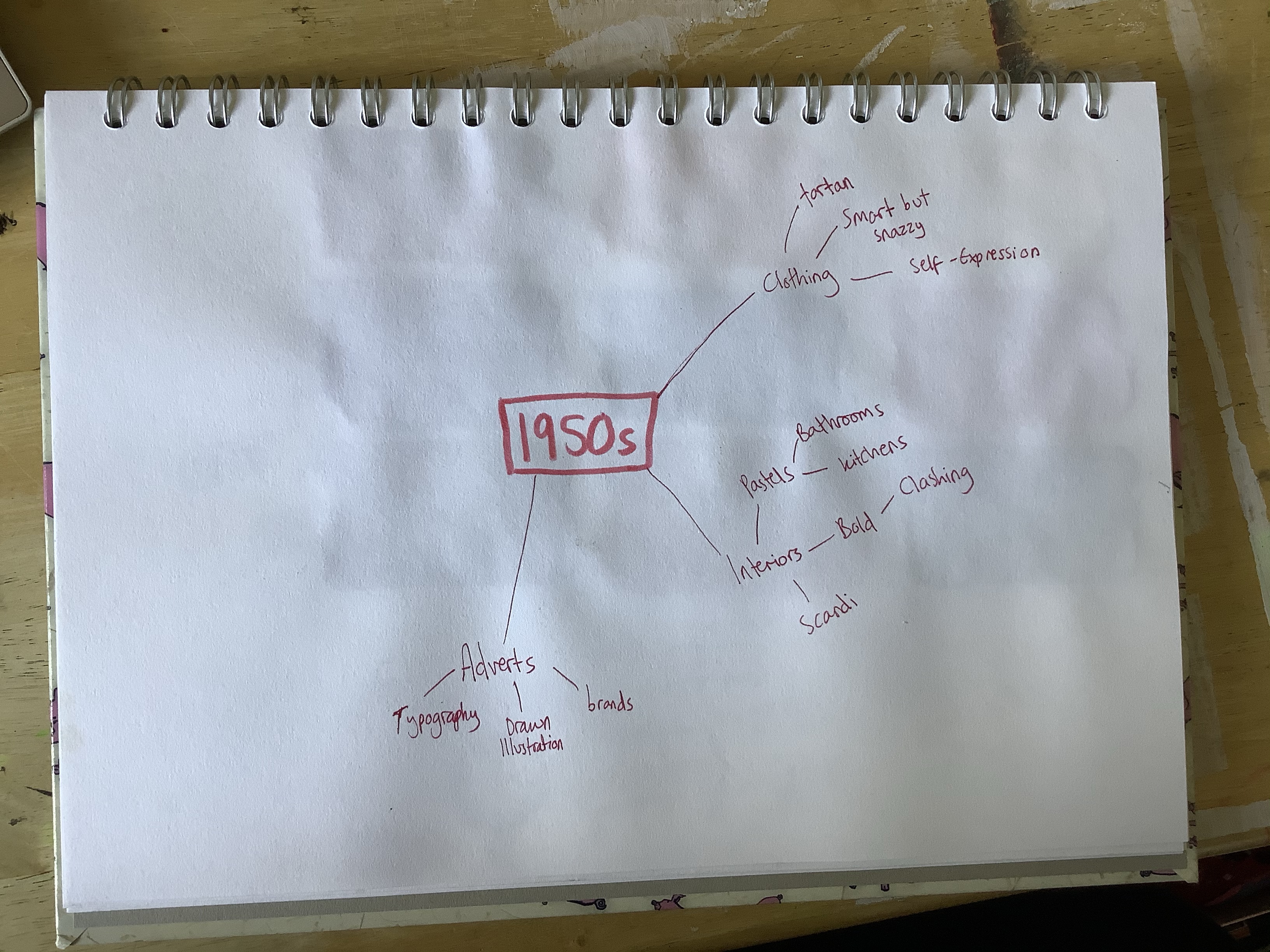
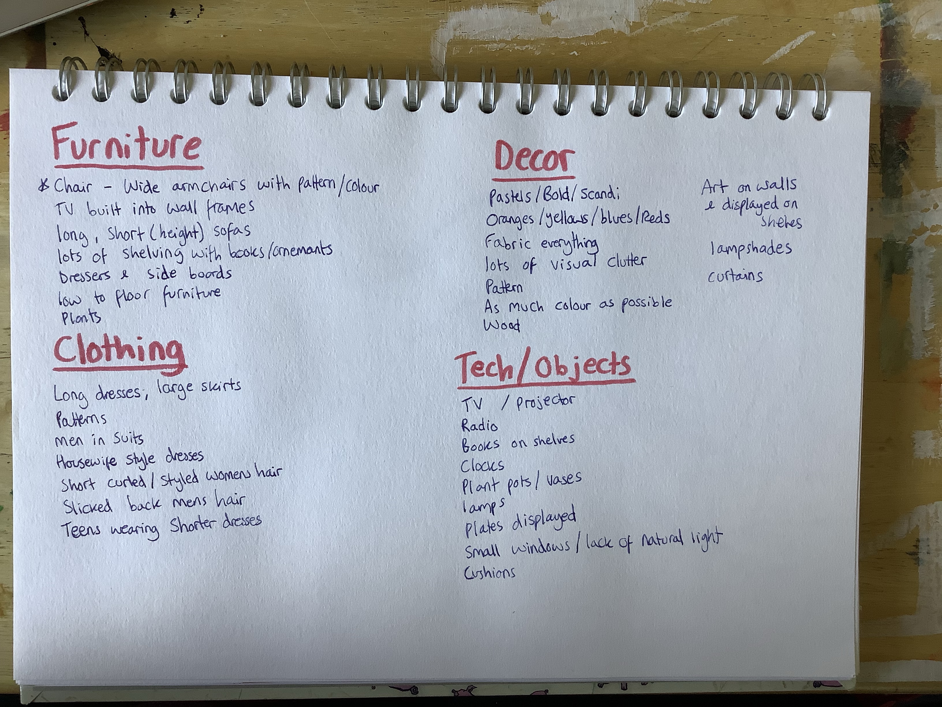
The first thing I decided to do was to do a spider diagram, using the reference material I had collected, to determine what were ‘typical artifacts’ from the 1950s and what I wanted to include in my illustration. I was struggling to make progress with this, so tried a different technique instead. I wrote headers for the areas I would need to reference in my illustration, and then looked through my reference images and wrote what I could see that connected to these themes.
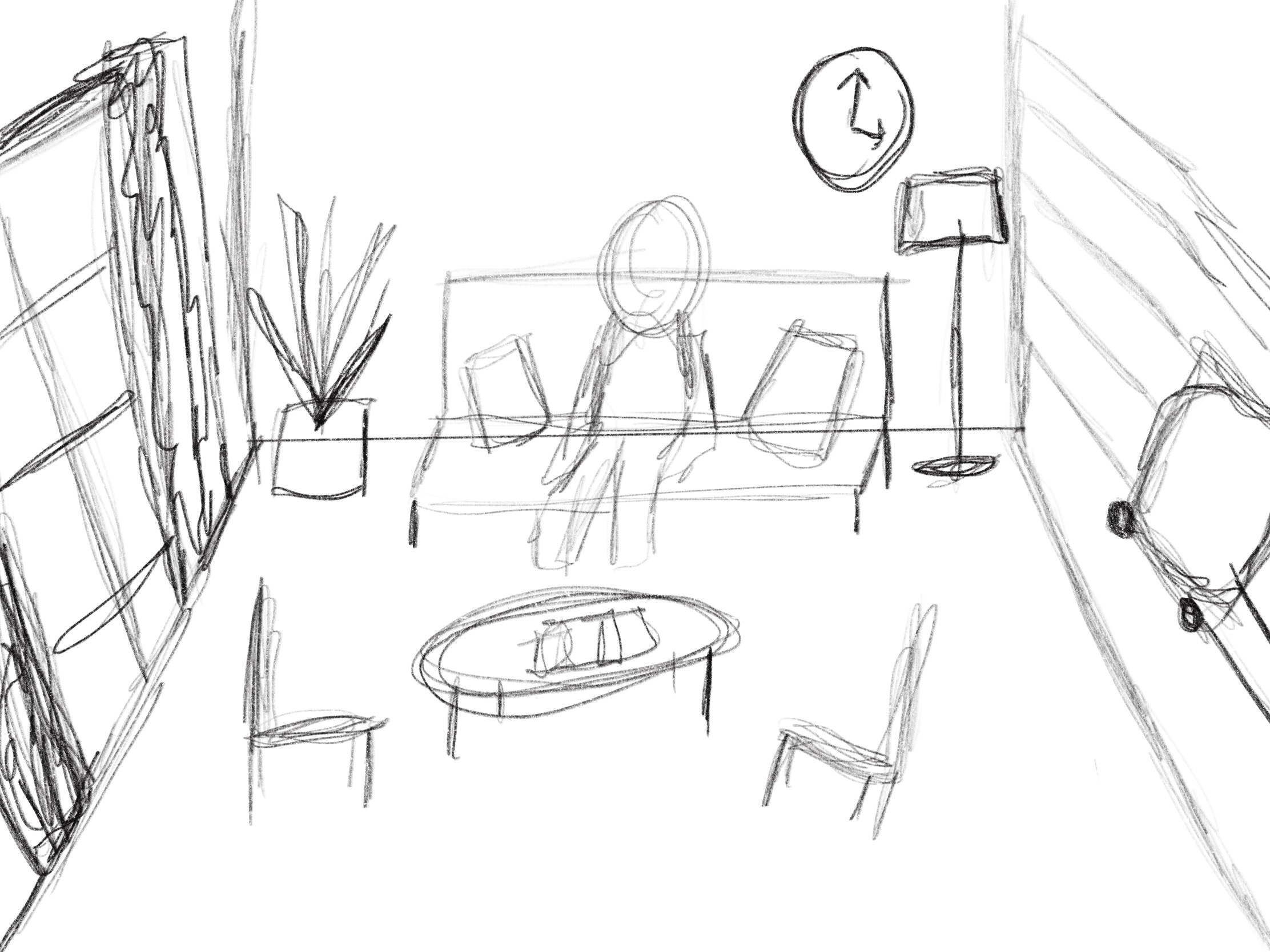
Then, I sketched out some initial thumbnails of ideas I had. I definitely had more ideas than this, but I was really eager to get started. I used references of living rooms I had found whilst researching the 1950s era, and created my own versions of living rooms. My first thumbnail I felt didn’t give much attention to the artifacts from the 50s, and focused more on the person. The second however could include both easily.
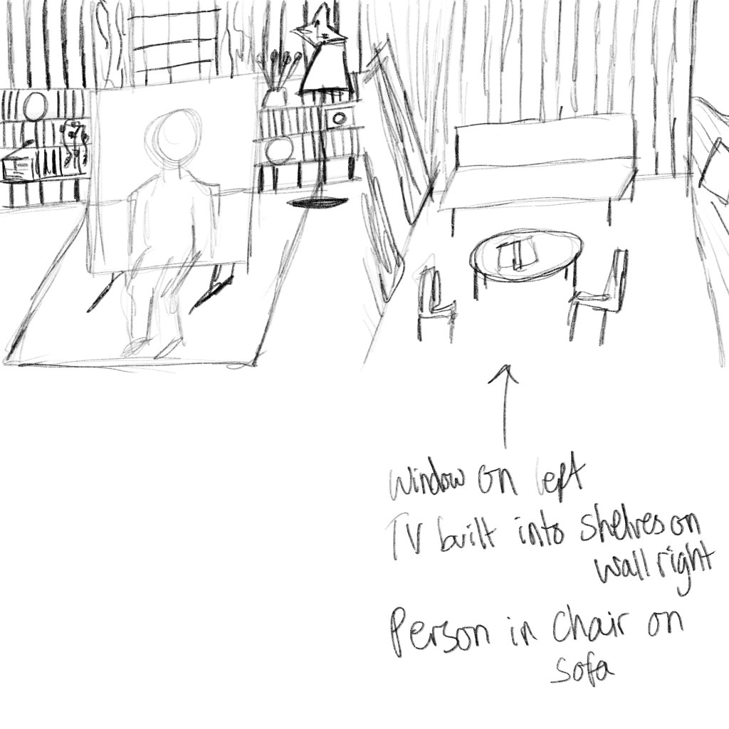
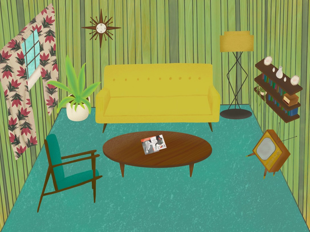
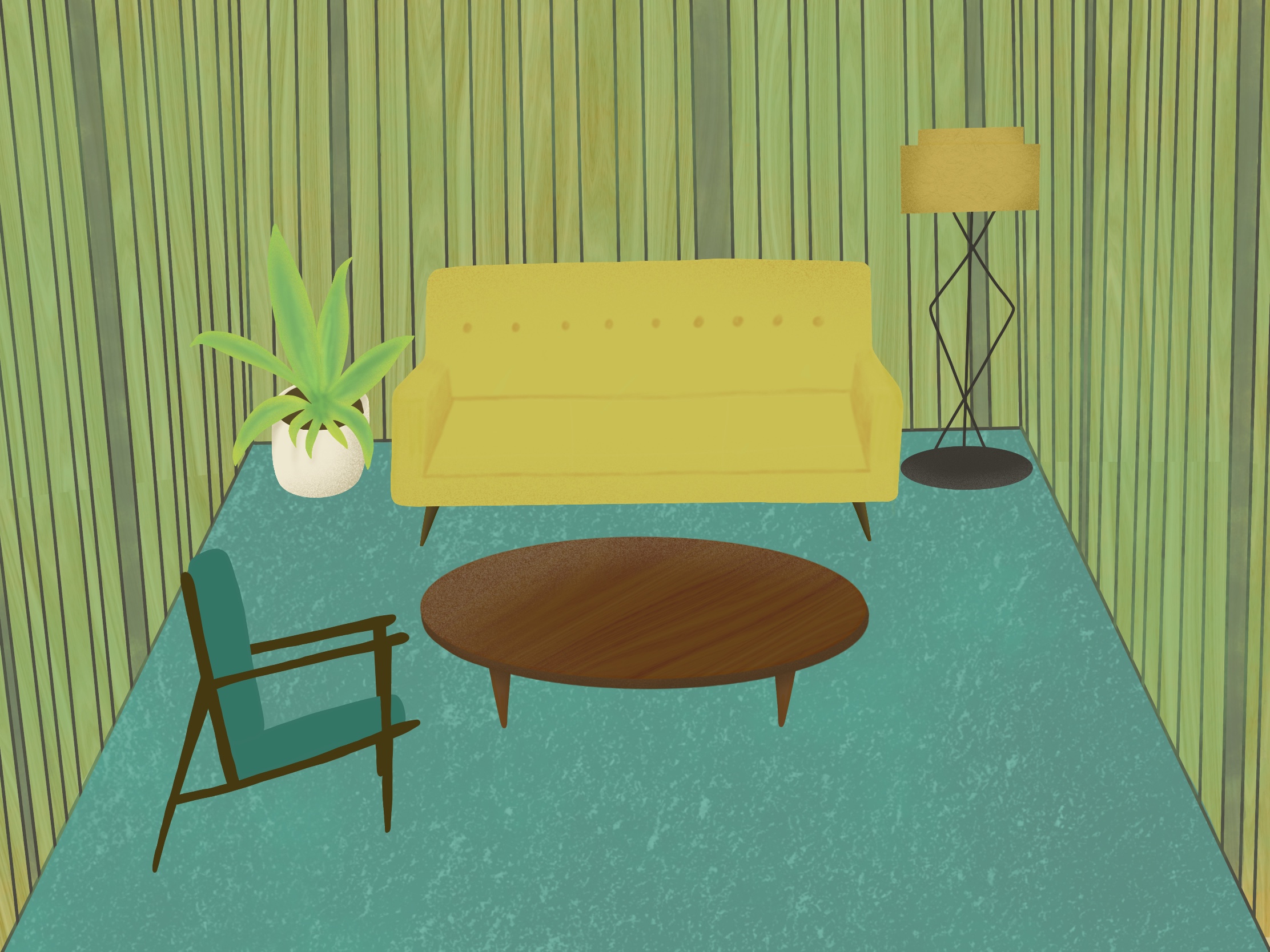
I then opened a new file, and sketched out the second thumbnail with a bit more detail. I started illustrating the walls and floor to start with, building the image up from the ground like I did with Assignment 1. However, as I learned in this assignment, the level of detail I was putting in was not necessary. This time around, I went for a softer, less detailed, more stylised approach. For the walls, and the coffee table, I found a wood texture from myfreetextures.com and overlayed it onto both. I found it difficult to create a wood effect in my assignment, so this was a great discovery.
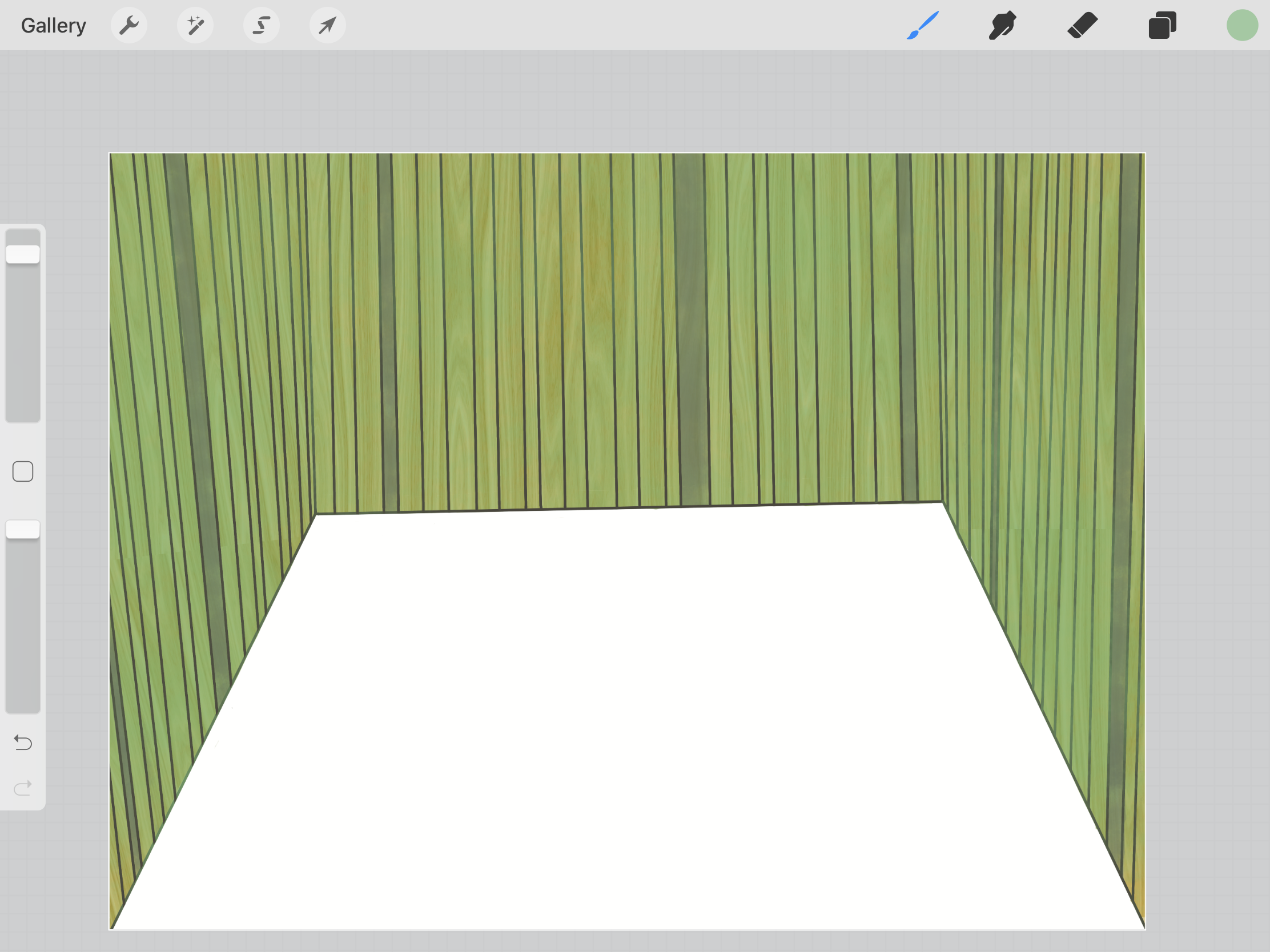
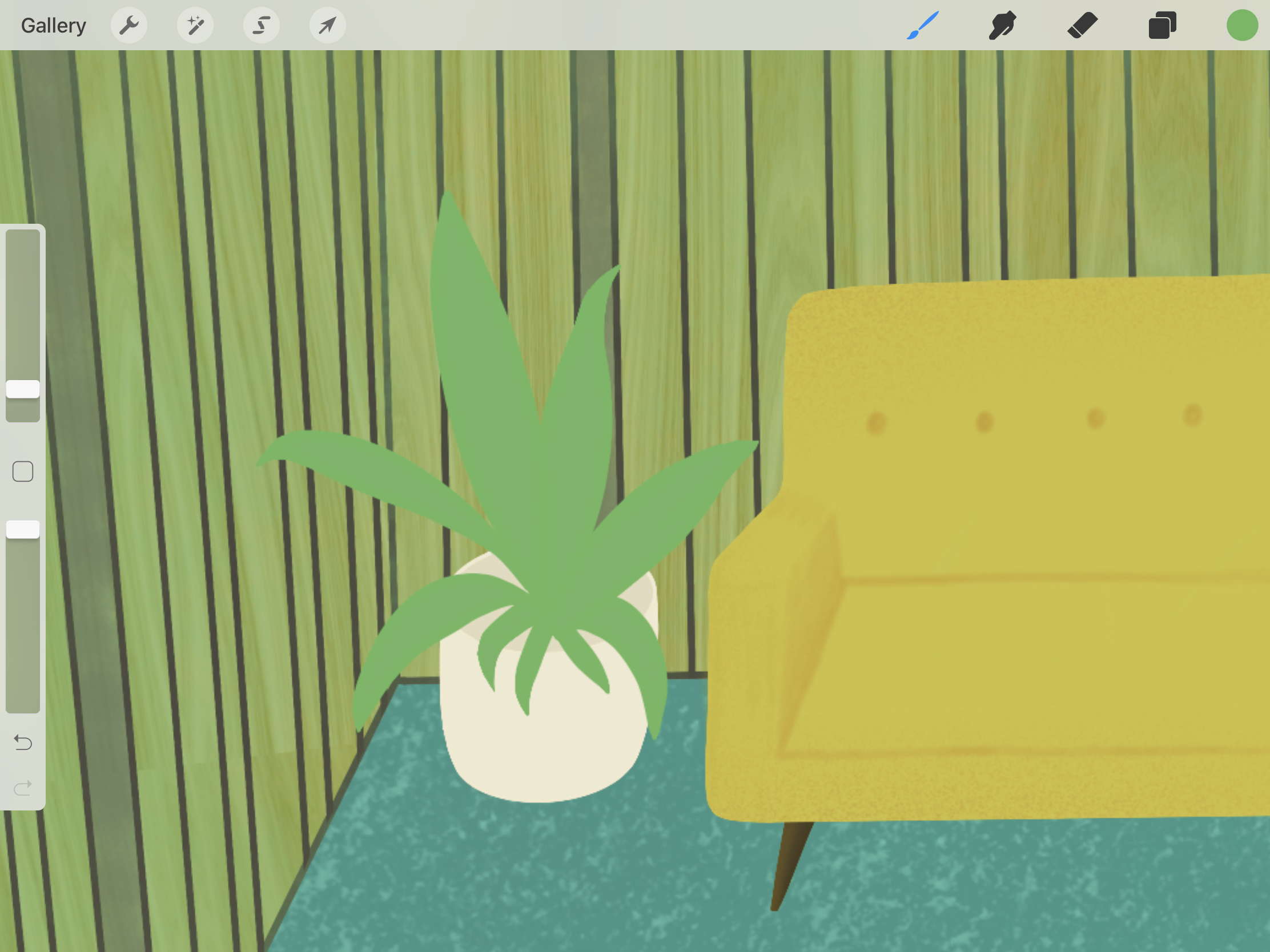
Beginning with the walls, I tried to emulate the wooden nordic style commonly seen in interior decor at the time. I then added a classic sofa, coffee table, and arm chair, wanting to really accentuate how low to the floor these things were, and the sharp angles the legs had. I loved the shading technique I used on the sofa, and was so happy with how it came out. I also really like how clean the overall illustration feels without linework. The colour palette for the piece was centered around the walls and sofa, as I felt yellow was very appropriate for the time. Interiors, especially living rooms, all look quite dark too. There was little natural light, and a lot of dark colours consistently used.
Next I added some decor elements; a large houseplant, a floor lamp, a clock on the wall, some shelving, and finally curtains. I used a paper texture on the lampshade which really added to the design of it. The clock was a style I had seen repeatedly when researching interior decor in the 50s, so I knew I had to include it. It also fit the nordic style I was aiming for. Shelves were commonly used for displaying ornaments, and curtains were almost used as wallpaper. In many of the images I referenced, the entire wall was ceiling to floor curtains. I opted for slightly smaller ones. I also added a window, but kept it small and mostly covered, to show that there was less natural light at the time.
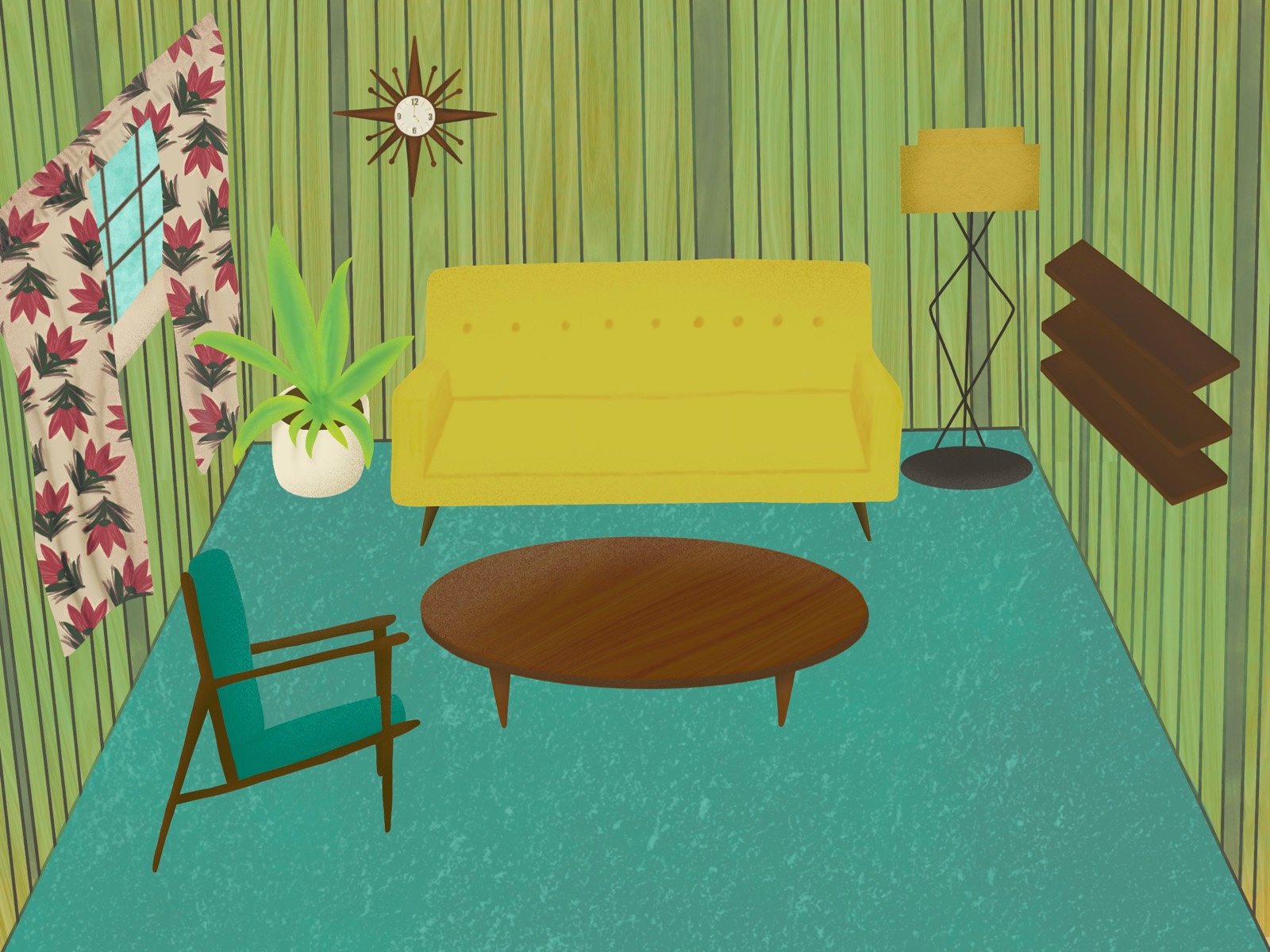

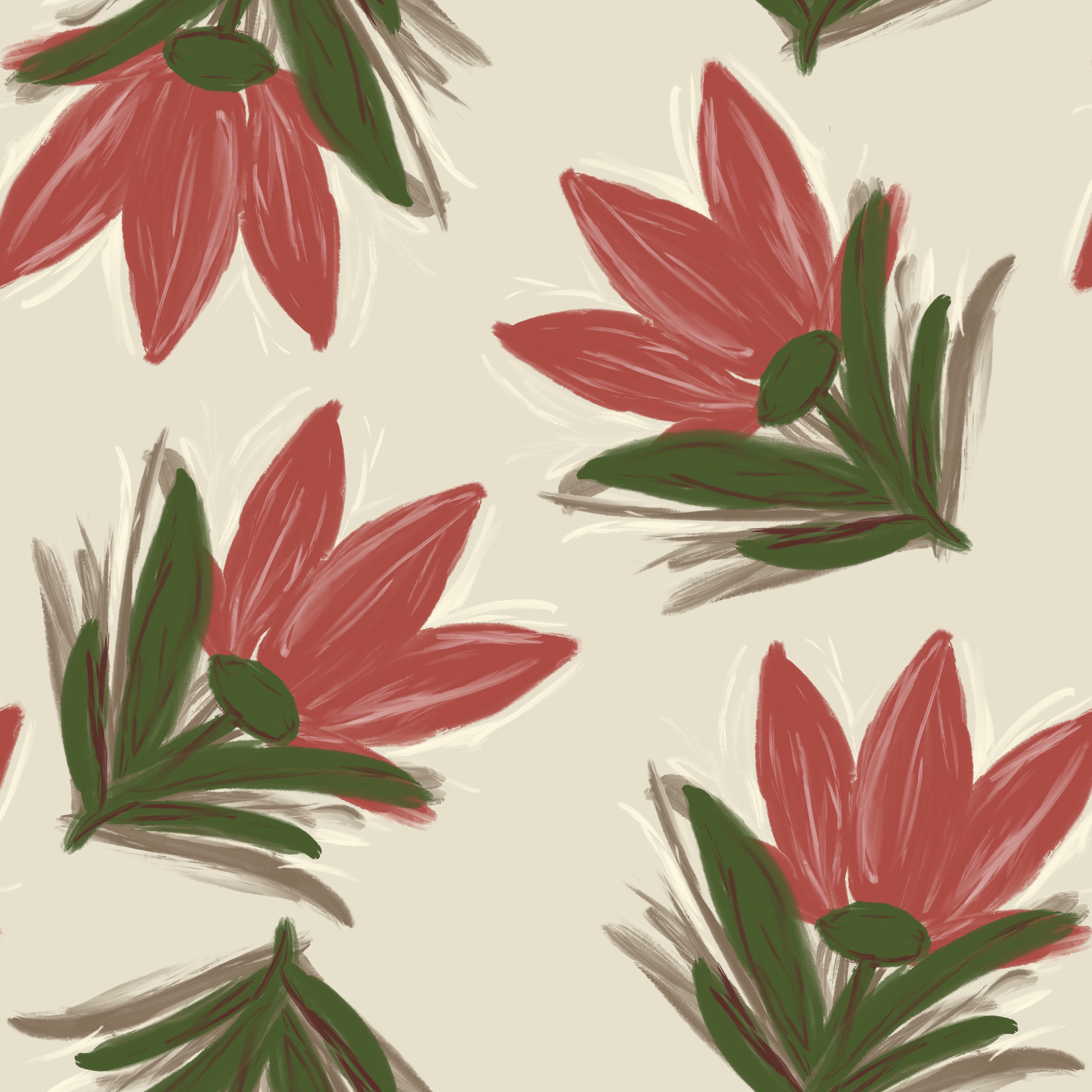
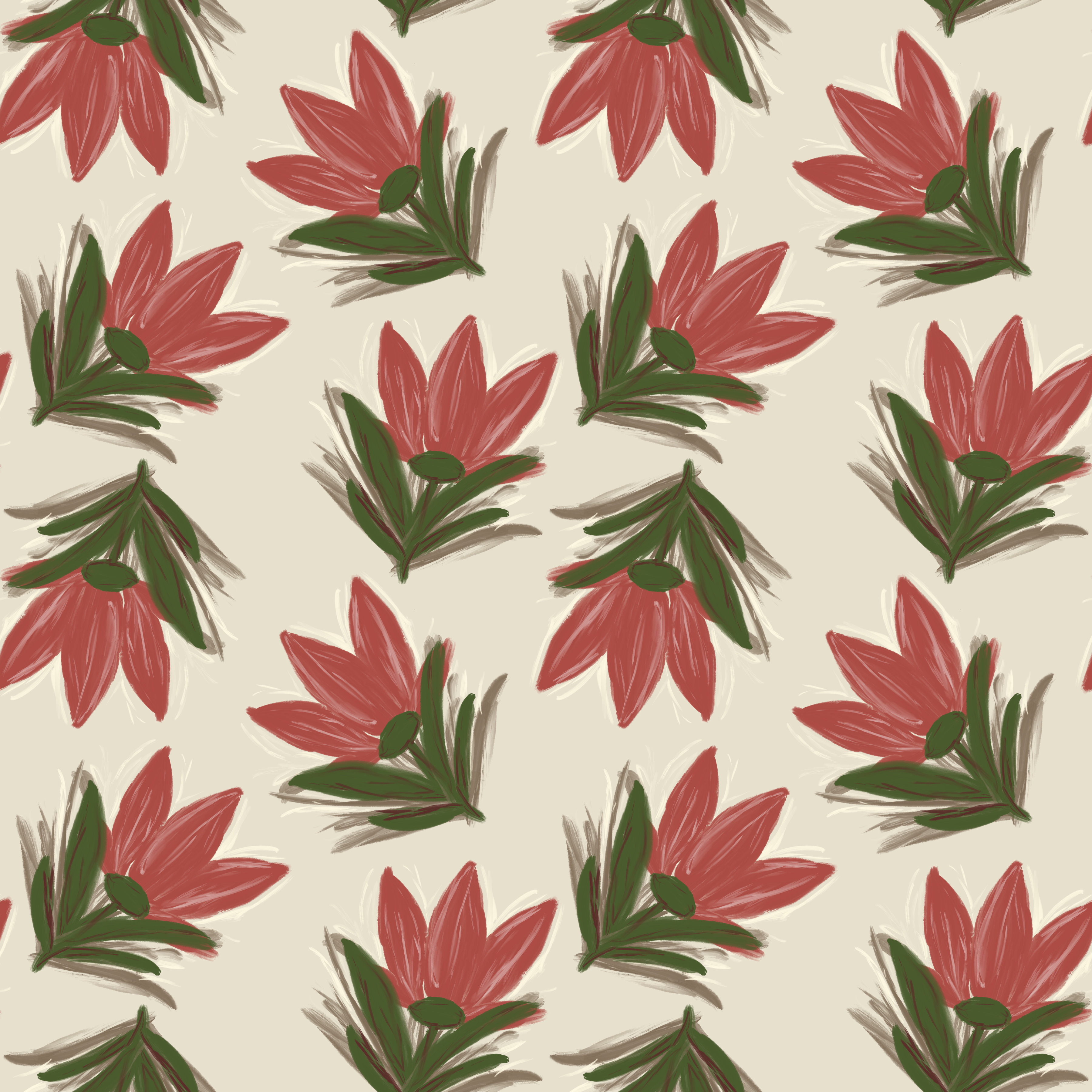
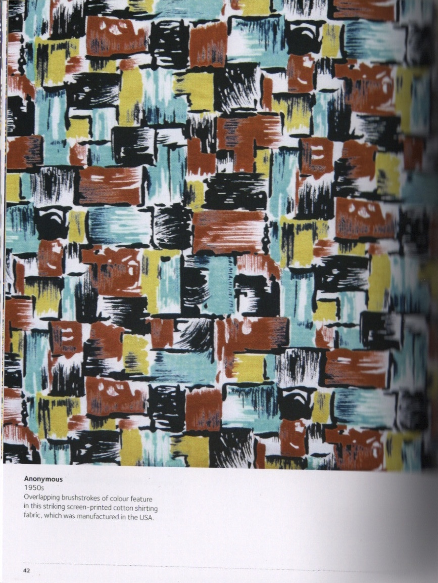
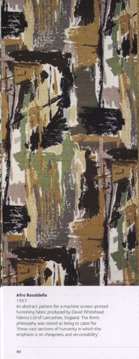
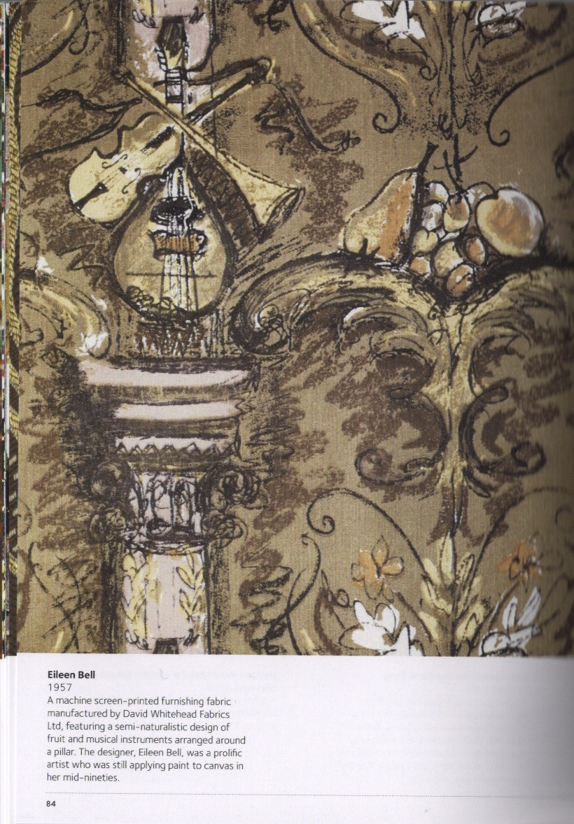
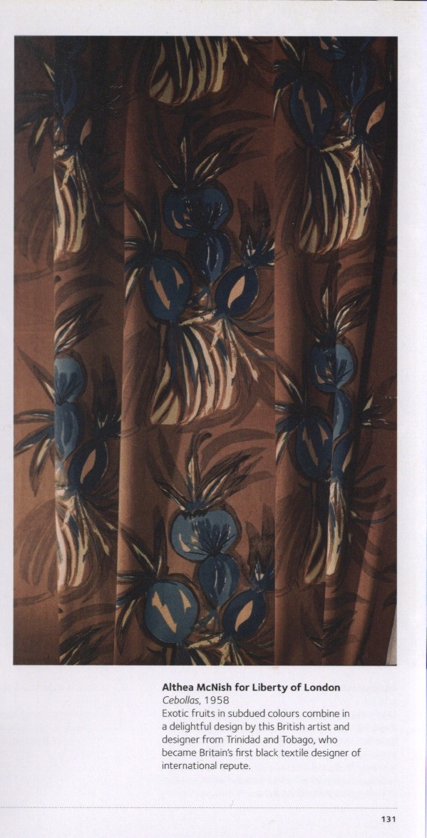
For the curtains, I created my own seamless repeating pattern which was inspired by pages 42, 80, 84, and 131 of The Pattern Sourcebook by Drusilla Cole. The dry brush style and loose, messy florals populated curtain and tablecloth designs. I think my design is a little too minimalist for the time, as denser, more busy patterns were favoured, but I felt detail was lost in the smaller repeats. Maybe I could’ve added something in the gaps between the flowers.
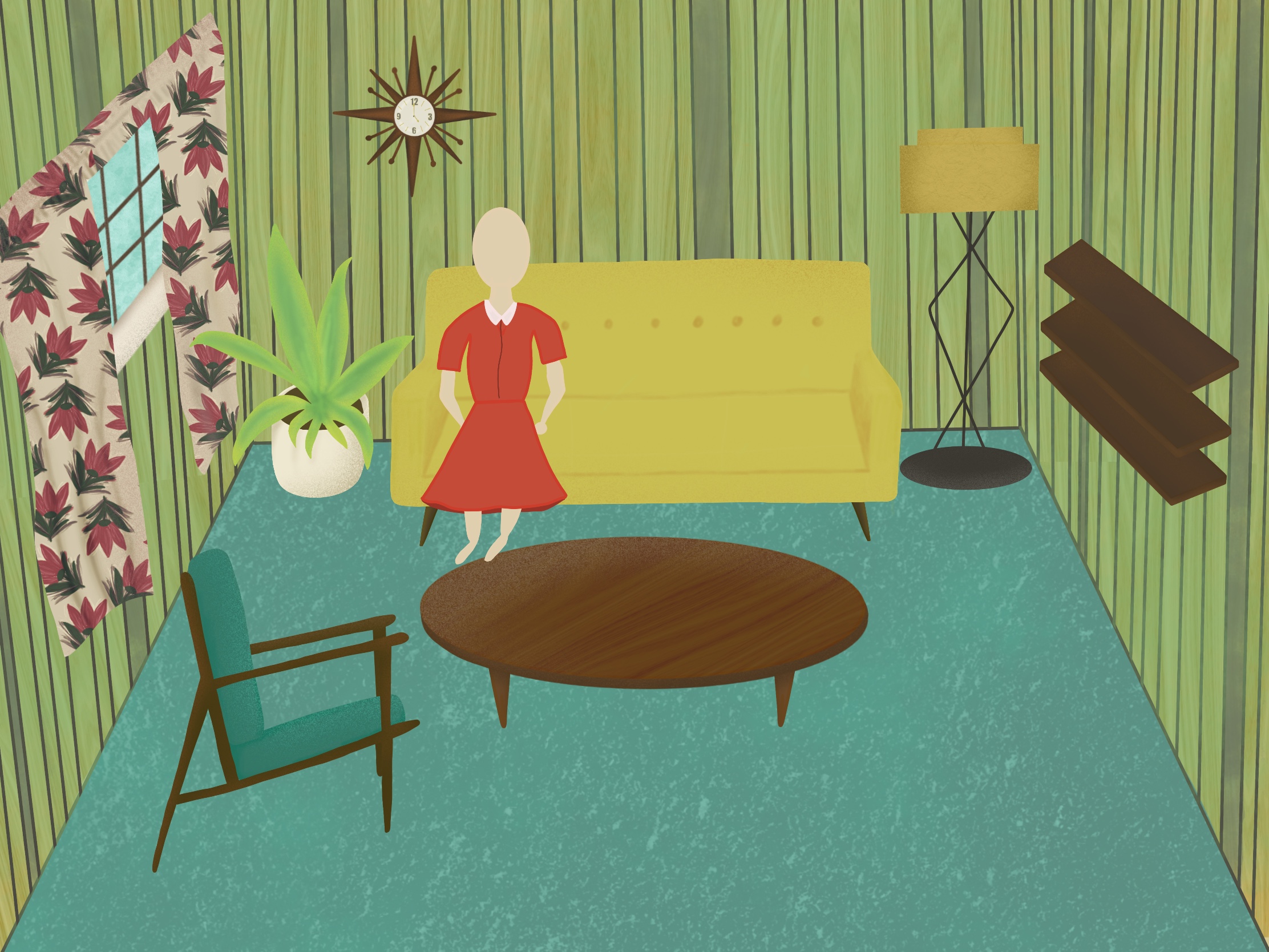
I then attempted to draw someone sitting on the couch. I really hated it, and felt so demotivated. I was so proud of the rest of my work and I felt this was just completely destroying it. Whilst it was just an outline, it was so disproportionate and I realised I didn’t know enough about drawing human form. I decided to take some time to do some sketchbook studies of still life videos and tutorials on drawing people, before coming back to it and trying again.
I began doing daily sketches from still life videos, but my chronic illness worsened and I had to take some time off of my art. After a couple of weeks I returned, and decided to pick up where I left off with this piece. I had spent a while deliberating how I would finish it. The brief asks for a person sitting in a chair, and I was missing that key feature. I considered turning it in without a person, and coming back to it in a few months when I have more practice drawing people. But either way, there was some detail missing from the piece that needed to be added.

I began drawing the books and objects displayed on the shelves. I included another plant, a radio, and some vases and plates. I also drew a TV which I am less than impressed with. It had been so long since I had drawn on this piece, I felt completely unfamiliar with the perspective I was drawing at. I was demotivated and frustrated. Leaving such a big gap between the points I was working on this illustration had made it really difficult to continue. I had already spent 9 hours on the piece, and didn’t want to start again, as the work that was already there was great.
I left the TV (after several redraws) and drew out the magazines. They were fun and reminded me of the process I used in Assignment 1. Again, I feel like I learned a lot there, and it was a lot easier this time around to create what I wanted. Next was to try to tackle the person again. When drawing people for past exercises (and in Assignment 1), I found it motivating to watch other artists draw similarly stylised people, and to discuss my thoughts with my peers. I did this, and it filled me with confidence! However… once again, I felt like I was failing.
I think a combination of boredom, having spent almost a month looking at the same illustration, and frustration with not being able to create exactly how I want to, has made fulfilling this brief really hard. The purpose of the brief was to learn how to use reference, which I think I achieved. But, leaving a brief partially complete is not ideal. At this point, I think I will go crazy if I try to do any more with this piece. That said I will definitely come back to it and either completely redraw it, or simply fill in the blanks. My skills around illustrating people need work. I’m going to make a conscious effort to draw more of them!

[…] of obscure vintage designs in my brief, but I was stumped as to how. I have explored the 1950s in Exercise 7, and the 1960-70s in Assignment 3, which left me wanting to investigate a new era not yet looked […]
LikeLike