This was quite a complicated exercise that took some time for me to fully get my head around. I had to produce a line visual around a suggested word – either ‘sea’, ‘extraordinary’, ‘building’, or ‘journey’. Then I had to print the image at A3, before inverting it and printing another, and finally using the inverted image to colour block the original line drawing. The final outcome would be a graphic drawing using black and white cutouts layered over each other.
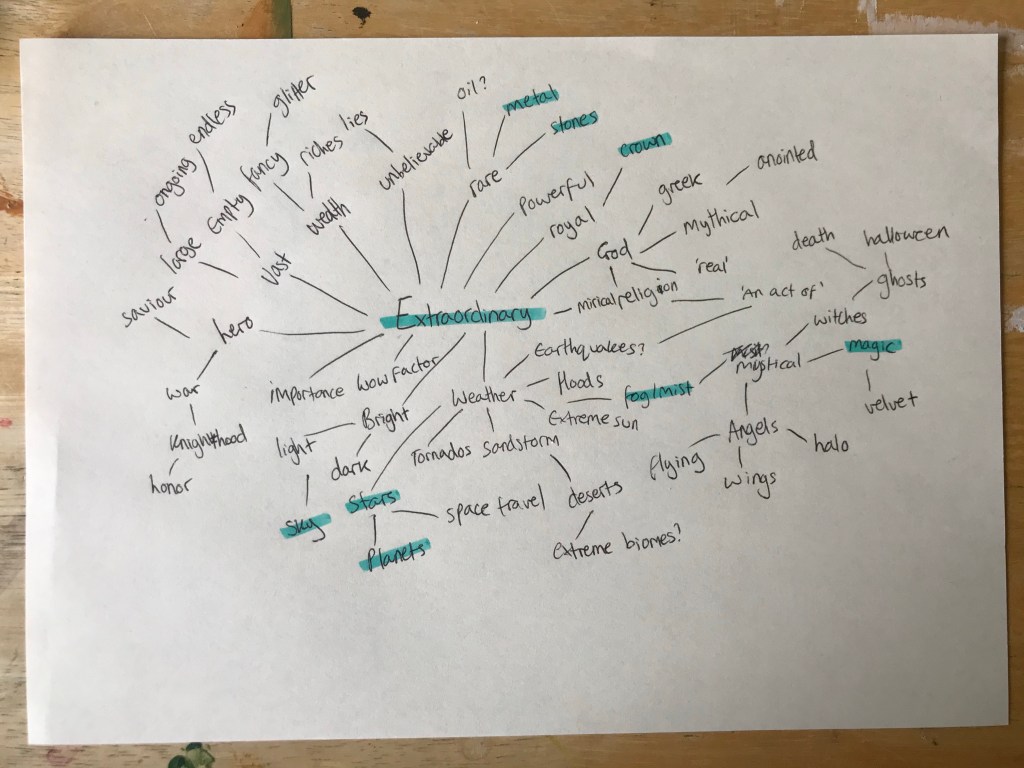
I decided to choose the word ‘extraordinary’ for my inspiration, as I felt it was the most vague and open ended word. I wanted to really explore what I could make with this exercise, and create something that felt true to my style and interests. I began by mind mapping all the things I could think of in relation to the word, which I really enjoyed. I made a lot of connections that excited me and gave me several ideas on what to draw. Once I felt I couldn’t produce any more ideas, I highlighted the words that stuck out to me, the ones that I felt screamed ‘extraordinary’.
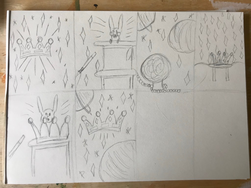
In my sketchbook I then began drawing several small thumbnail sketches, building on previous ideas as I went. My first idea was to have a crown in the centre of the drawing, surrounded by stars and sparkles. My second was to have a rabbit coming out of a hat as if in a magic show. I loved the sparkles I used in the first idea, so I carried them across to most of my other ones. My third idea was for there to be a crystal ball with a space background, with it almost looking like the crystal ball is a planet itself. I liked this idea a lot, but I wasn’t sure how I would communicate the difference between the ball and the planets using only black and white.
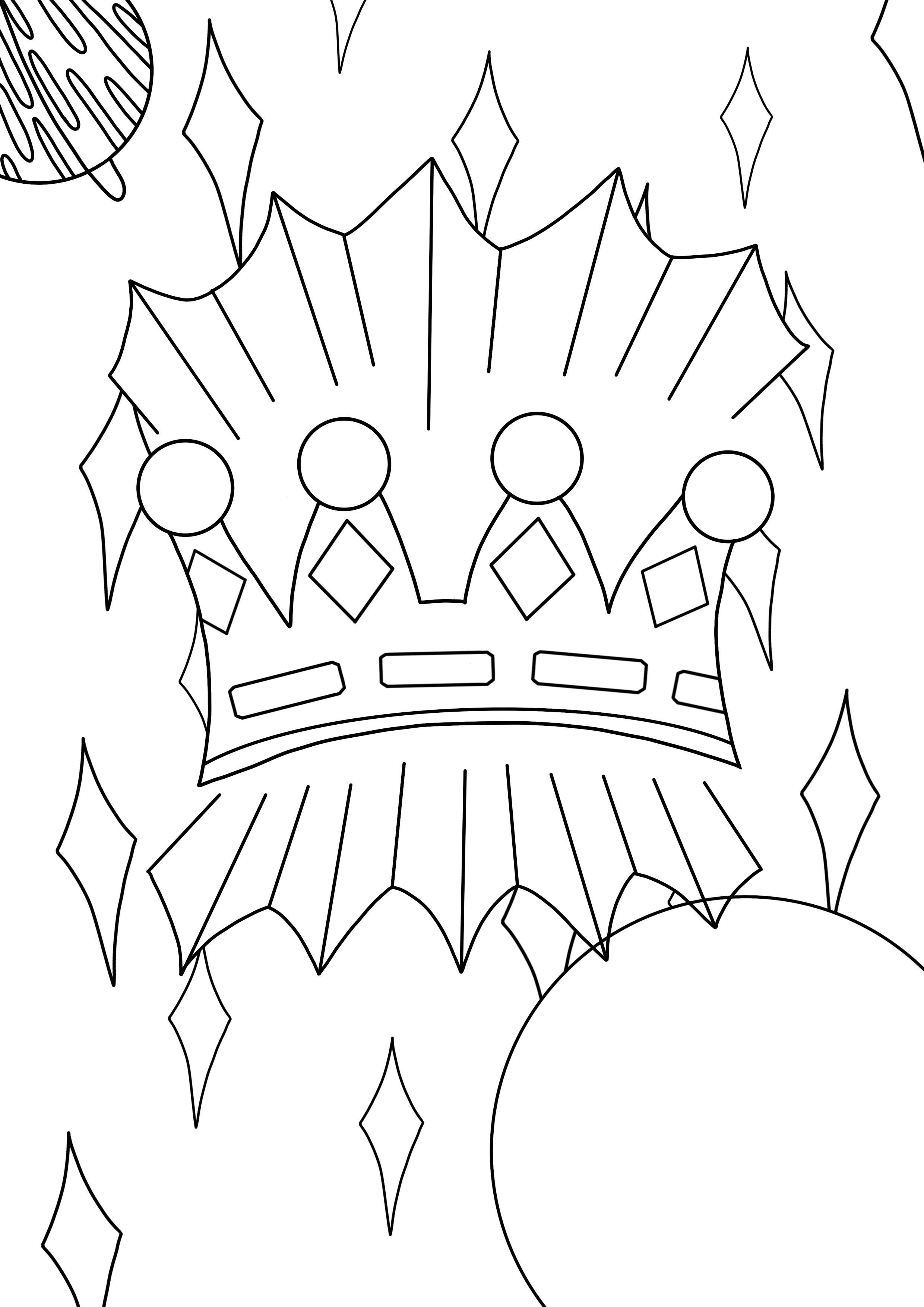
I loved the crown, as I felt it truly fit the theme, and magic to me is also extraordinary, so I tried combining the two. First I drew a crown on a stool in front of a curtain with sparkles on, sort of like a typical party magicians cloak. It felt too busy, though, so I tried replacing the top hat with a crown and having a rabbit coming out of that. I still didn’t feel like I had what I wanted – something glorious and striking. I decided to combine the space/planets idea with the first drawing, and bam – I had my sketch. I felt it was magical, surreal, and definitely extraordinary. It also didn’t have too much going on and could easily be made into a line drawing.
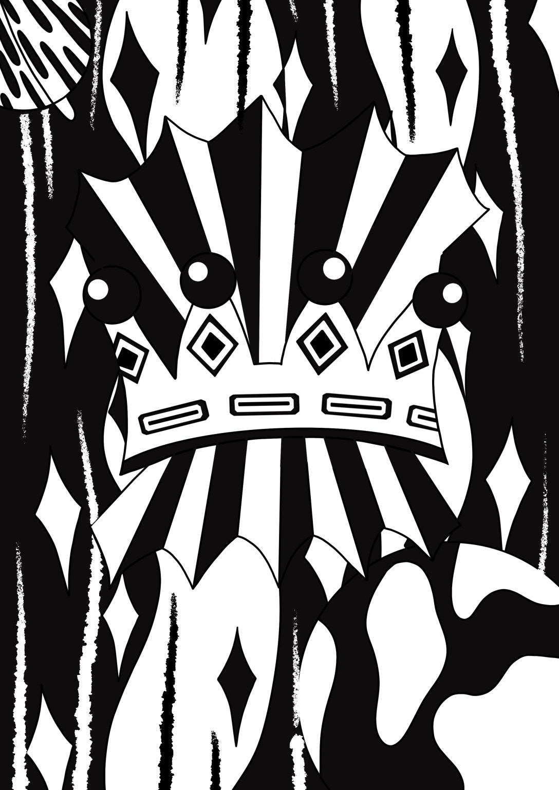
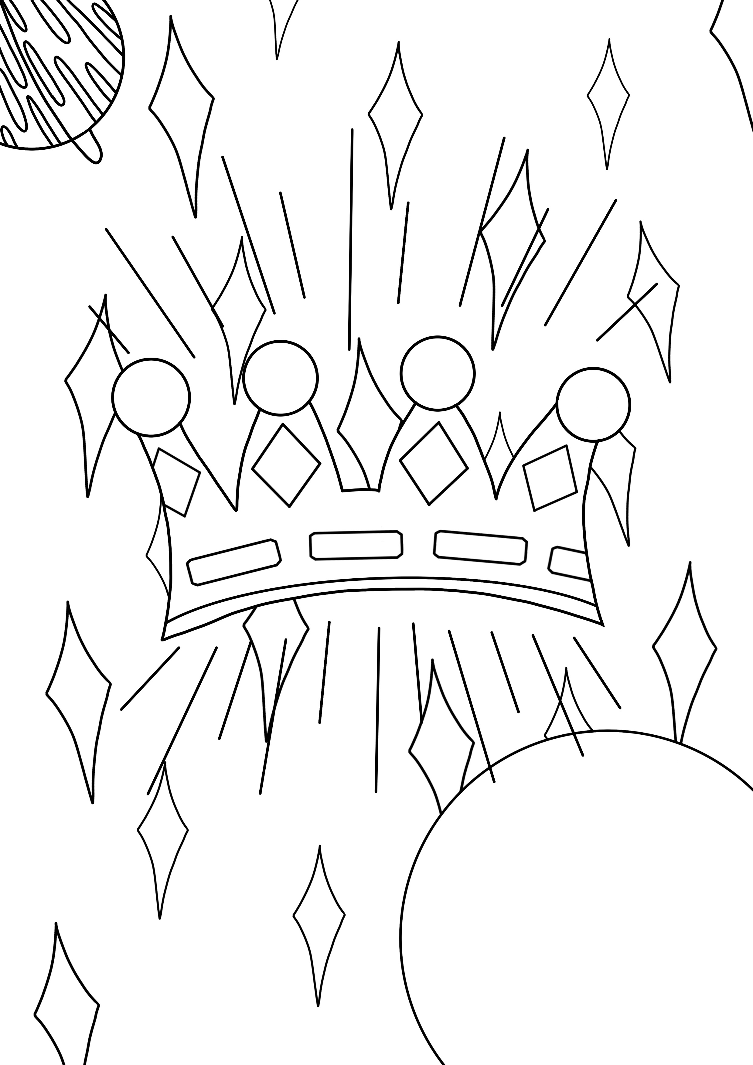
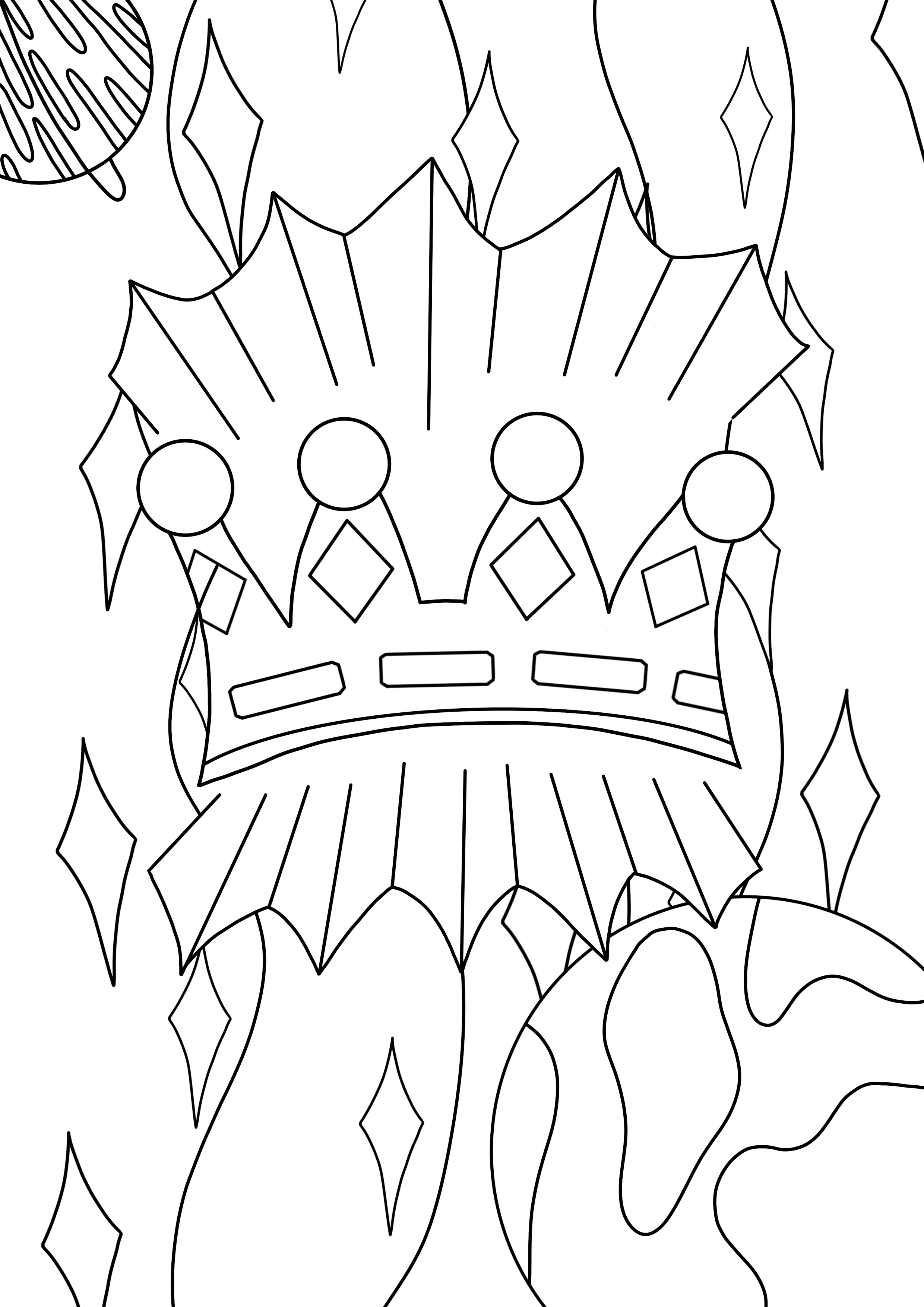
I drew my line art digitally as I wanted really bold lines to work with. To start with, I copied the thumbnail I drew initially, making a few slight changes here and there. The result was too cluttered, and didn’t have much visual hierarchy. I felt it would be difficult to fill in once printed. I decided to connect the lines around the crown, as they were meant to be rays of light, and having the space connected meant I could fill it to show that. I also added some detail to the planet on the right, as it was quite empty and plain. I considered adding smaller stars like my original idea, but ultimately decided against it as I wasn’t sure how to include them in the rest of the project.
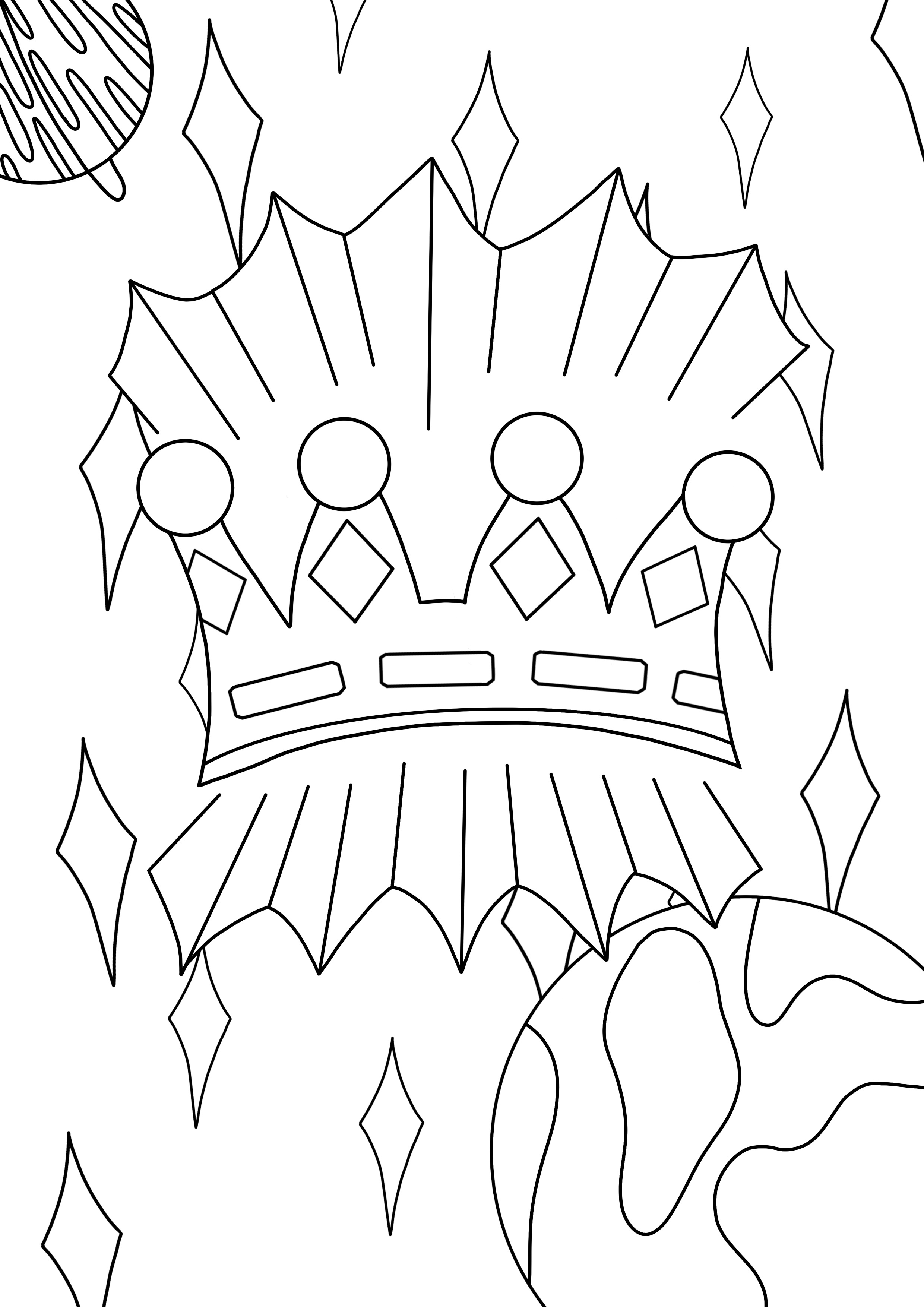
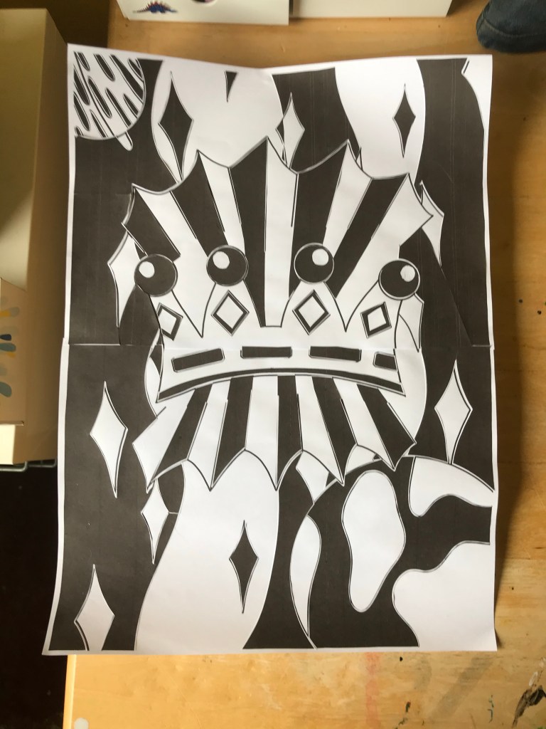
I then printed the image onto two A4 sheets and sellotaped them together to make it A3. I inverted the image and did the same. I began by filling the areas I knew I wanted to stand out – the rays of light around the crown, the crown itself, and the planets. Whilst doing this, I was thinking ahead about where colour would go, where I would add white later, and what to do with the background. I realised I couldn’t just leave it empty, so I needed to print more black to fill it. I went back to my digital line art and filled in where I wanted the black to be in the background, along with the areas I had already filled in. This was helpful as it meant I could form a plan for where I would be placing colour and see if it works in advance. It also meant I could cut exactly what I needed from the page.
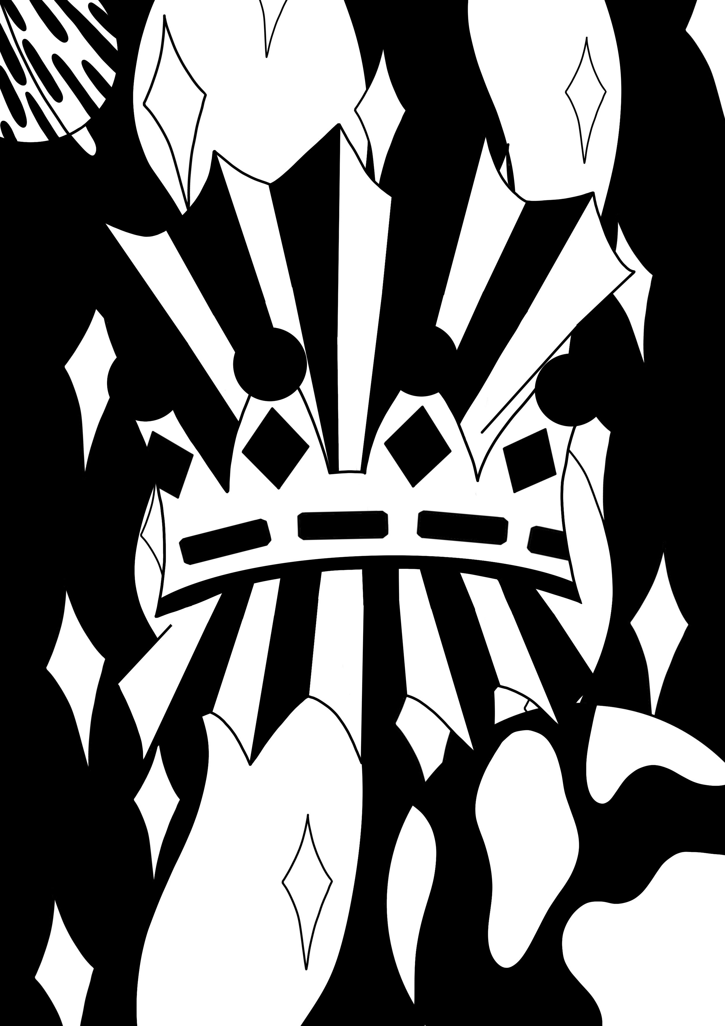
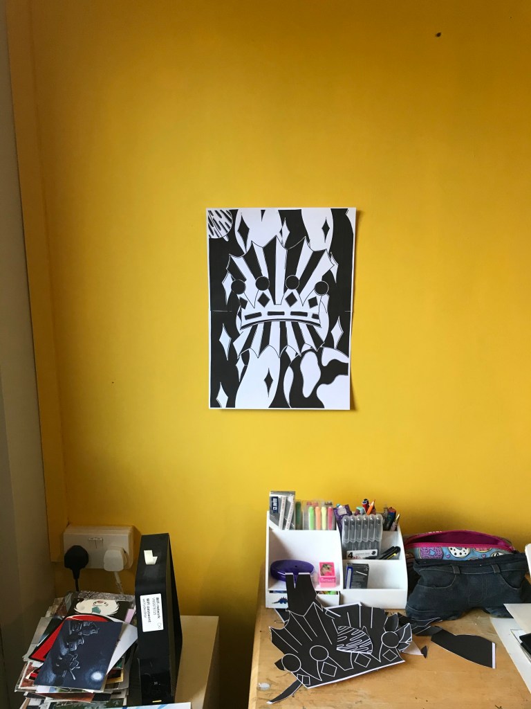
Once I finished adding the background, I decided to leave the piece overnight before adding the white details. I feel like stepping away from a piece of art helps me gain perspective on it and see things I missed before. I took several photos of the piece from different distances, and stuck it up on my wall so I could puzzle over it and try to really see what was missing. I knew I wanted to add white highlights in certain places, but seeing it hung up from a distance made me realise the background wasn’t broken up enough. There was too much black going right into black, and white right into white.
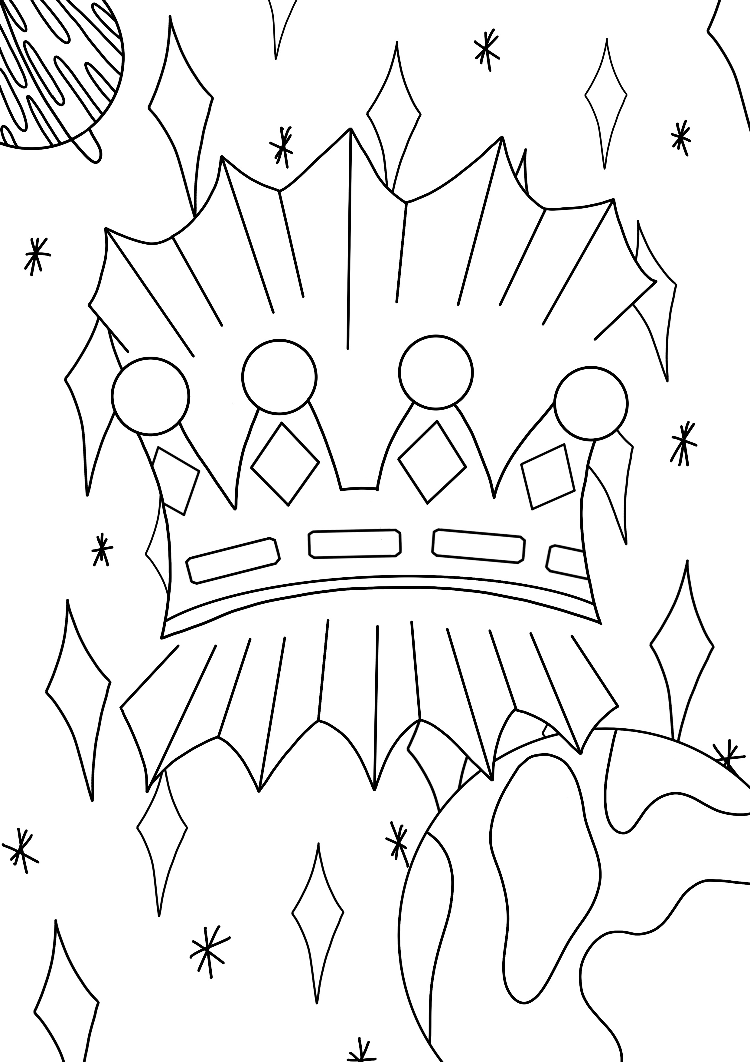
The next day, I began adding white where I knew I wanted it. This was pretty difficult – I don’t have a cutting board and knife, so I was using scissors, which are difficult to attain accuracy with. I managed to add a few bits of highlighting, so moved on to the background. I really wanted to tear up thin strips of paper and use them to break up the space. I thought the ripped paper effect would look like shooting stars/stardust. The paper however, was not behaving. I couldn’t get it to rip in thin enough lines, or even enough, and I just felt like I was wasting enormous amounts of paper and getting nowhere. Stressed and frustrated that I couldn’t fulfill my ideas, I decided to return to my digital line art and complete it from there.
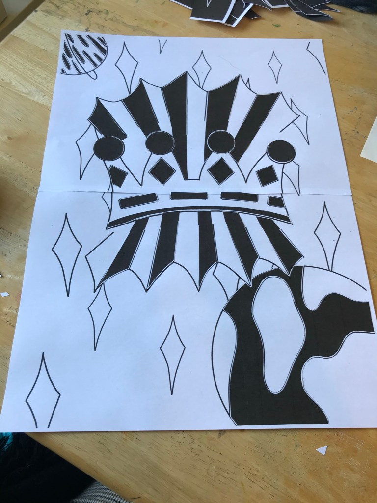
I filled in all the spaces already filled on my printed work, then started adding white. I mainly used it to highlight the jewels, layering black on top to attempt to show that they’re encrusted. I found a brush that looked just like ripped paper, and drew in what I was originally hoping to do. I also added black ‘stardust’ on the white spaces in the background. Once completed, I thought I would try a few different colour versions, just to see how it would look. I tried white with a second colour, black with a second colour, and changing both colours altogether. I love how this piece looks both in the original black and white, and with several different colours. Creating a piece in this manner makes it very versatile and opens up a lot of possibilities for colour options.

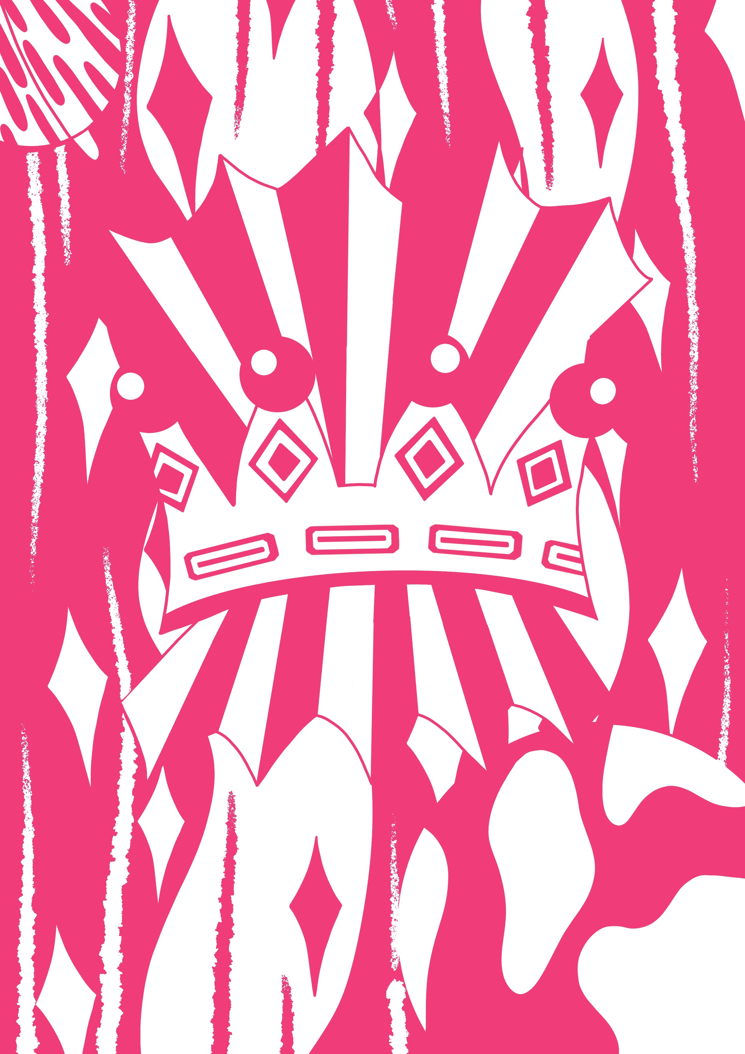
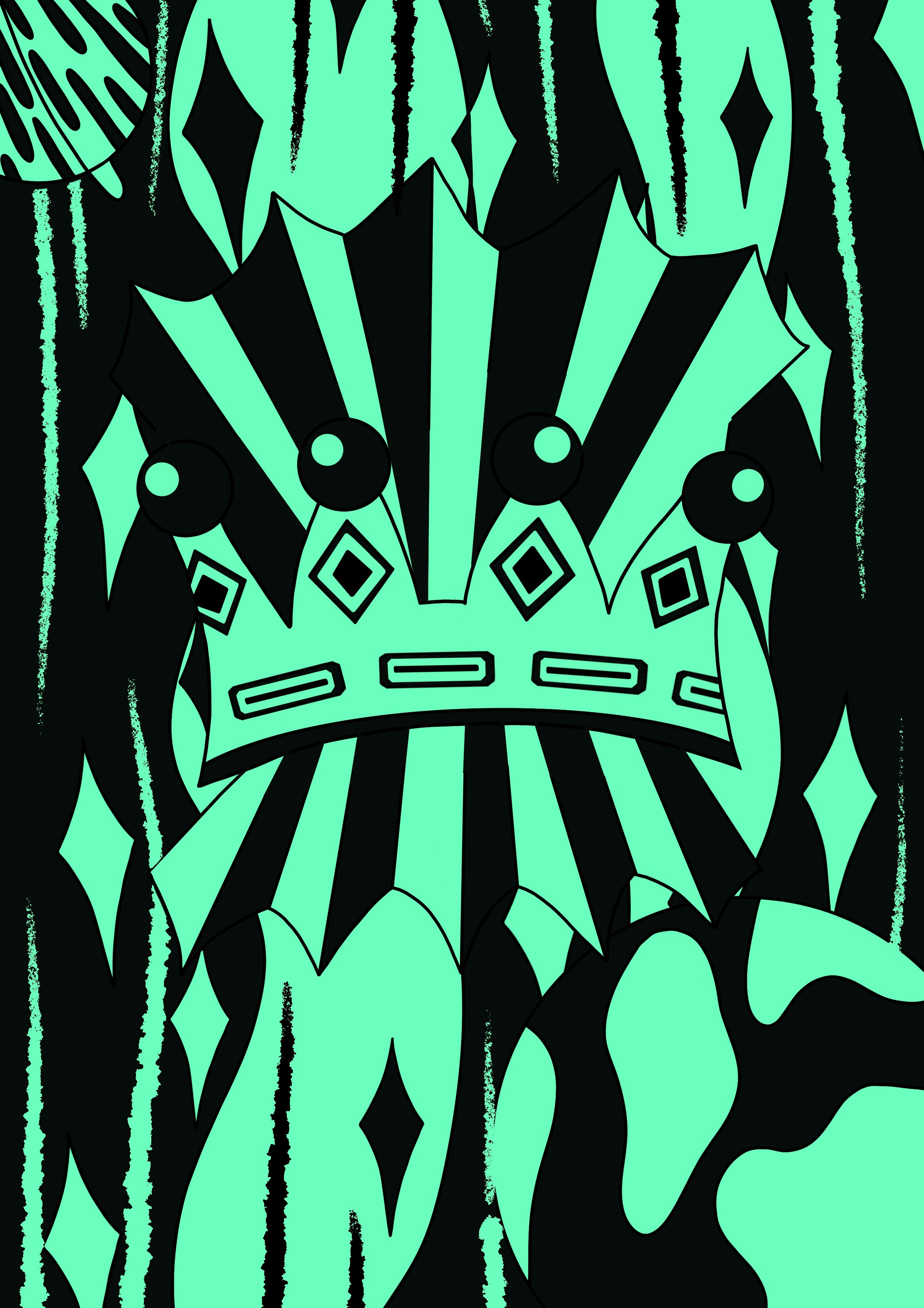
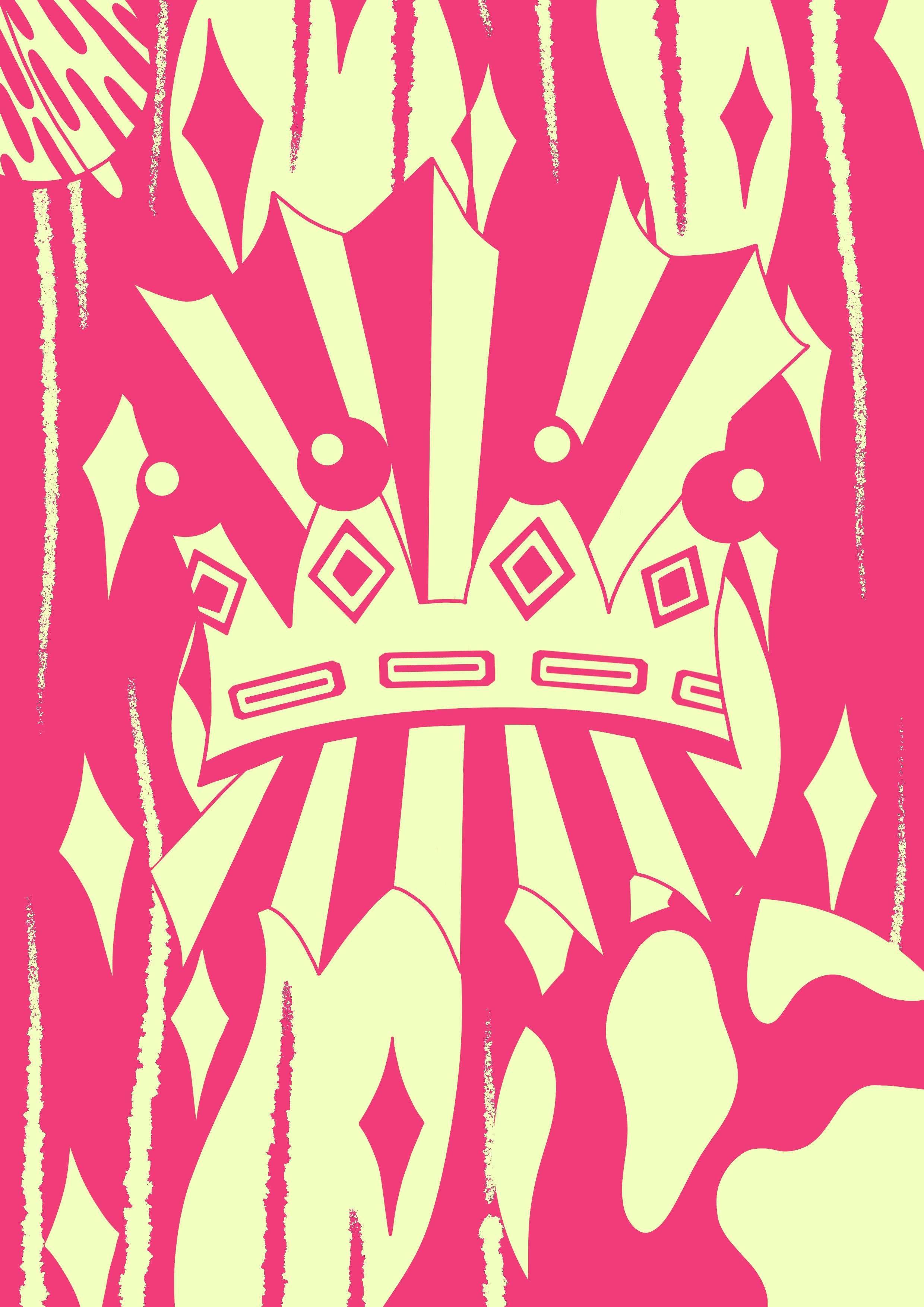

Comparing my original line art to the finished piece, I feel like the black and white have helped exaggerate the concept of ‘extraordinary’ even further. The stark contrast between the empty space and black blocking shows clearly what’s being communicated. The illustration is still abstract and therefore not completely clear on meaning, but what is clear is that it’s extraordinary. The focus is definitely on the crown, but also on the fact it’s floating in space, which I think is made clearer by the ‘torn paper’ effect. I feel like the line art is quite soft, whereas the addition of black and white has made it incredibly striking and bold. It’s now very powerful as an image. It’s commanding and eye catching, and immediately pulls your focus into the centre.
This process reminds me of a lot of the art I’m inspired by, as most of it uses limited colour palettes and simple shapes. However, I wasn’t sure what could be quantified as ‘graphic illustration’. I searched for an explanation and found this article, which was really helpful. My understanding is that a graphic illustration is a simple image that moves away from fine art principles and is used to communicate a specific meaning. It’s less focused on expression and more on being easy to understand. So, in theory, simplistic colour palettes and shapes could be graphic illustrations, so long as they’re easy to understand or infer meaning from.
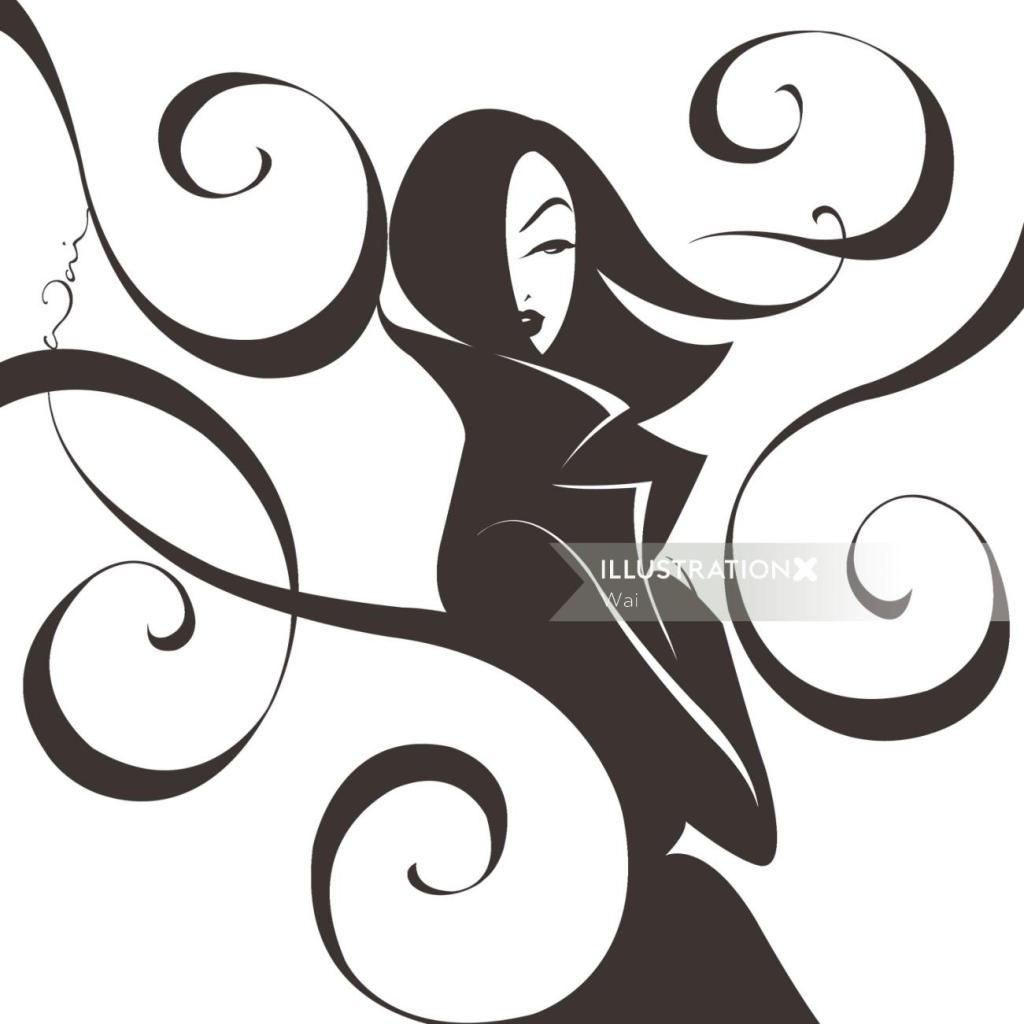
I also looked at the graphic illustration section on IllustrationX to find specific artists who classify their art in this way. There are a lot of different art styles shown here, and not all of them related to this exercise. A few artists however stood out to me – Quincy Sutton, Darruda, Vince Ray, Silke Bachmann, Fabio Lyra, and Wai. Their art styles are all very different, but could all be described as graphic in the same way as the black and white illustration I produced. Both Quincy Sutton and Wai use very simple and exaggerated shapes and colours to create portraits, however their choice of colour palette and shapes communicate very different meanings and feelings.
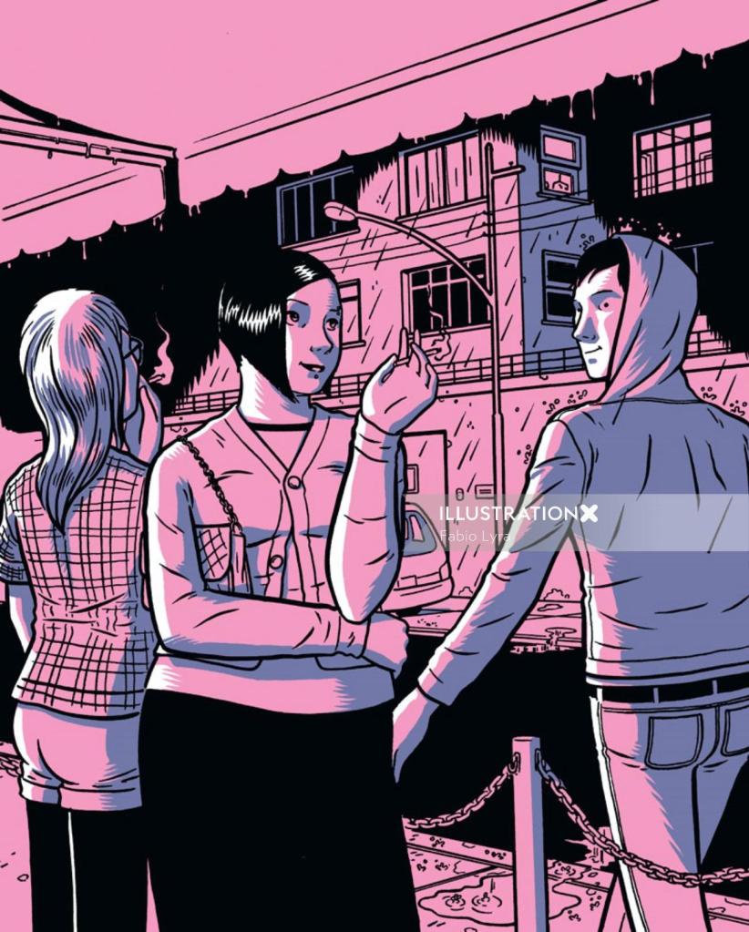
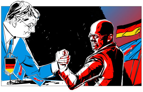
Similarly, Fabio Lyra and Silke Bachmann draw comic style illustrations, using one or two colours to show highlights and contrast. Lyra’s work however uses a more modernised style of comic illustration, whereas Bachmann opts for traditional political comics and pop art styles.
Reflections
Overall, I had a lot of fun with this exercise. I love the final outcome and process taken to achieve it. Having more creative freedom over the artwork I produced made me excited to engage and enjoy the work I was creating. I also really love the graphic art style – simplistic colour palettes have always appealed to me and trying to create visual interest and contrast with a handful of options is always something I enjoy. Looking at examples of graphic illustration makes me see my own piece in a different light. There’s definitely a lot more I could do with it, more areas I could highlight and take further. Ultimately, I’m really happy with this piece and feel I have gained a deeper understanding of using negative space.

[…] by their work. After some consideration I decided to recreate the illustration I produced for Exercise 11, as I felt I didn’t get to explore this piece fully and also that the simplistic black and […]
LikeLike
[…] areas of interest and exploration. My favourite work completed during this unit are the pieces in Exercises 11 & 22. I wanted to understand why, and see how I could push this even further, so I started […]
LikeLike