The brief for Assignment 2 asked me to ‘create images which will be used within a campaign for a supermarket, to package and promote a range of seasonal foods. The supermarket is respected for the quality of food they supply. They want to promote this notion of quality in their design and packaging. The finished images will be a ‘point of sale’ display sited in a store near to the fruit and vegetables. The final reproduction size will be 12 x12 inches. Your artwork can be same size or in scale.‘
I had to create an illustration of fruit or vegetables, one for each of two ranges: Summer and Autumn. My images were to be objective and based upon direct observation. They had to include both the produce I had selected, and aspects of the season itself. I could include any content I wanted, so long as the focus was the produce.
To start this assignment, I dissected the brief and wrote key points to focus on. I then made a list of research to undertake and various exercises I could complete to develop ideas and ensure my illustrations fitted. The final illustrations will be used as a point of sale display, but the brief also mentions they will be used for packaging too. I wanted to make sure the designs I created could seamlessly transition between the display and any packaging they would be used on.

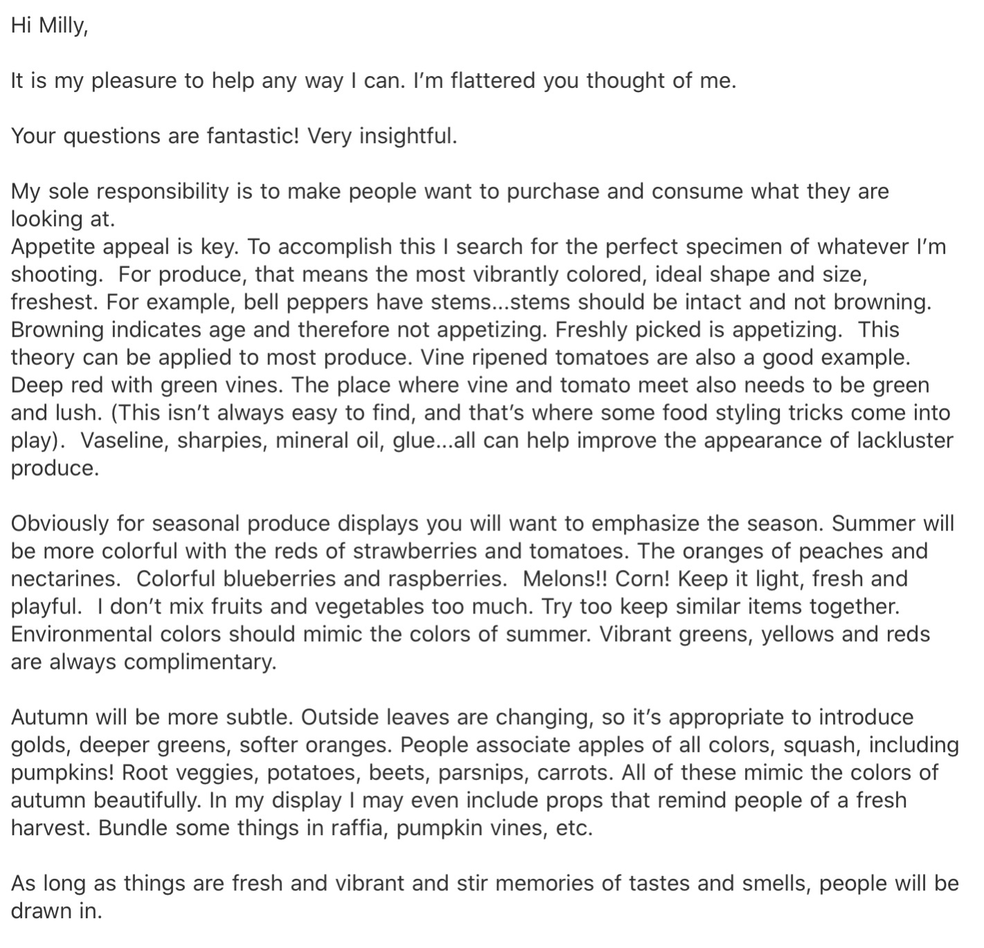
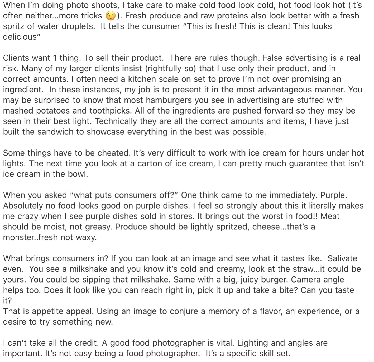
I was very focused on representing the quality of the produce I was illustrating, and ensuring my food looked appetising and edible. I wanted to find out what qualities make food look good, so I reached out to Kimberly Tabor, a food stylist at Lights Camera Food, to ask her about her process and her experiences working with clients. From our exchange, I learned that the bolder and brighter the colours, and the fresher they appear, the better. She remarked that often the food you see displayed in advertisements isn’t all that it seems, with tricks of the trade including using vaseline, super glue, and a fresh spritz of water right before photographing. I found our interaction incredibly helpful, and it informed a lot of the decisions I made later on when developing my final piece.
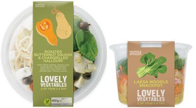
Whilst waiting to hear back from Kimberly, I started researching existing point of sale displays in supermarkets. Due to COVID-19, I am limited in how I can achieve this. Visiting various supermarkets is not possible, so I can only use the internet. I looked on several websites for supermarkets to see what imagery they had, and found very little. Online shopping is meant to be streamlined, so less visual clutter is generally appealing. The majority of the imagery I found was photographic, too, so it wasn’t very helpful for an illustration exercise. It did help me understand the framing of point of sale displays, however, and the importance of the text used. I also tried searching ‘point of sale displays’, but most of the image results were from other OCA learning logs, and I didn’t want to use anyone else’s work.
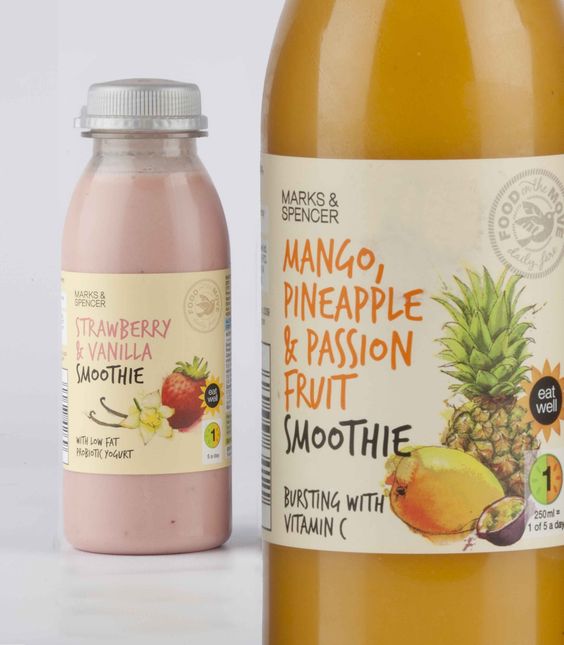
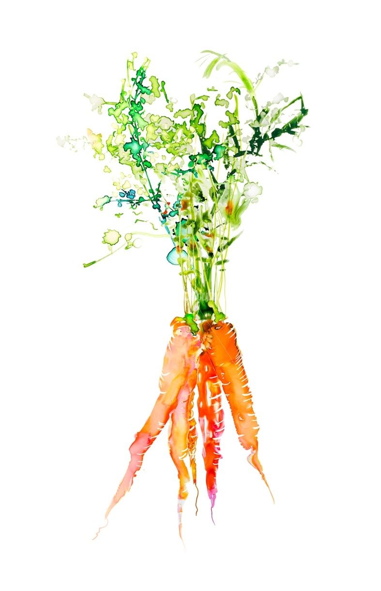
Bearing in mind that my final piece wouldn’t be solely for packaging, and would primarily function as promotion for the produce, I started researching pre-existing packaging. This was a lot easier to find examples for and it helped me find patterns in how illustrations of fruit and vegetables are typically produced. I noticed very quickly that softer styles of art are favoured, using either limited line work or purely line work, pale colours, and gentle textures. The designs are quite simple, with just 2-3 items taking centre stage, and using a fair amount of white space.
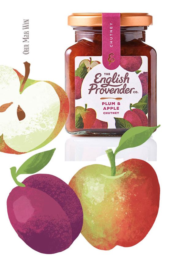
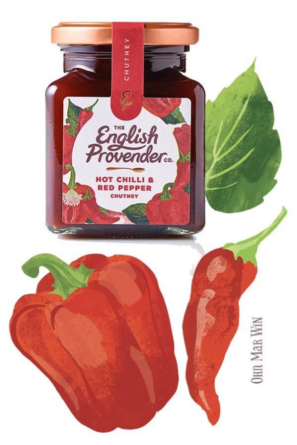
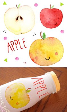
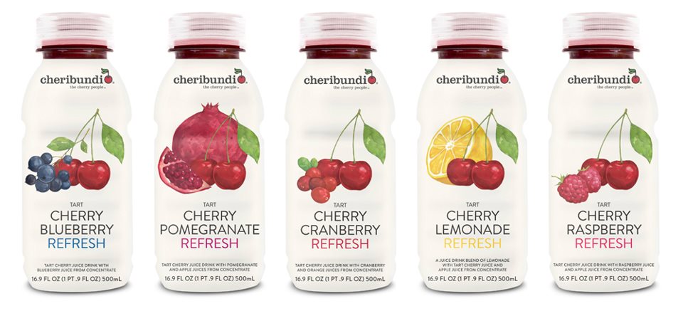
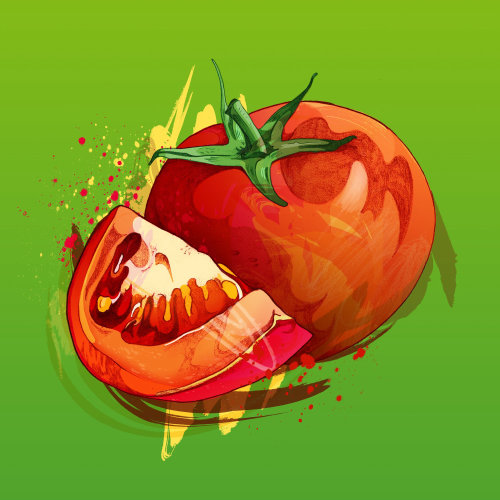
Next, I decided to research illustrators who have either designed packaging or have experience illustrating food. I felt this was important as I could see a wider range of styles and could also begin figuring out what makes food look appealing to a customer. I jotted down some notes whilst I looked through many different artist portfolios, hoping to find commonalities and begin to develop my own ideas. The content produced by these artists varied from exact photorealism to messy expressionism. Despite this, watercolour effects and softer tones were still the most common thing I found.
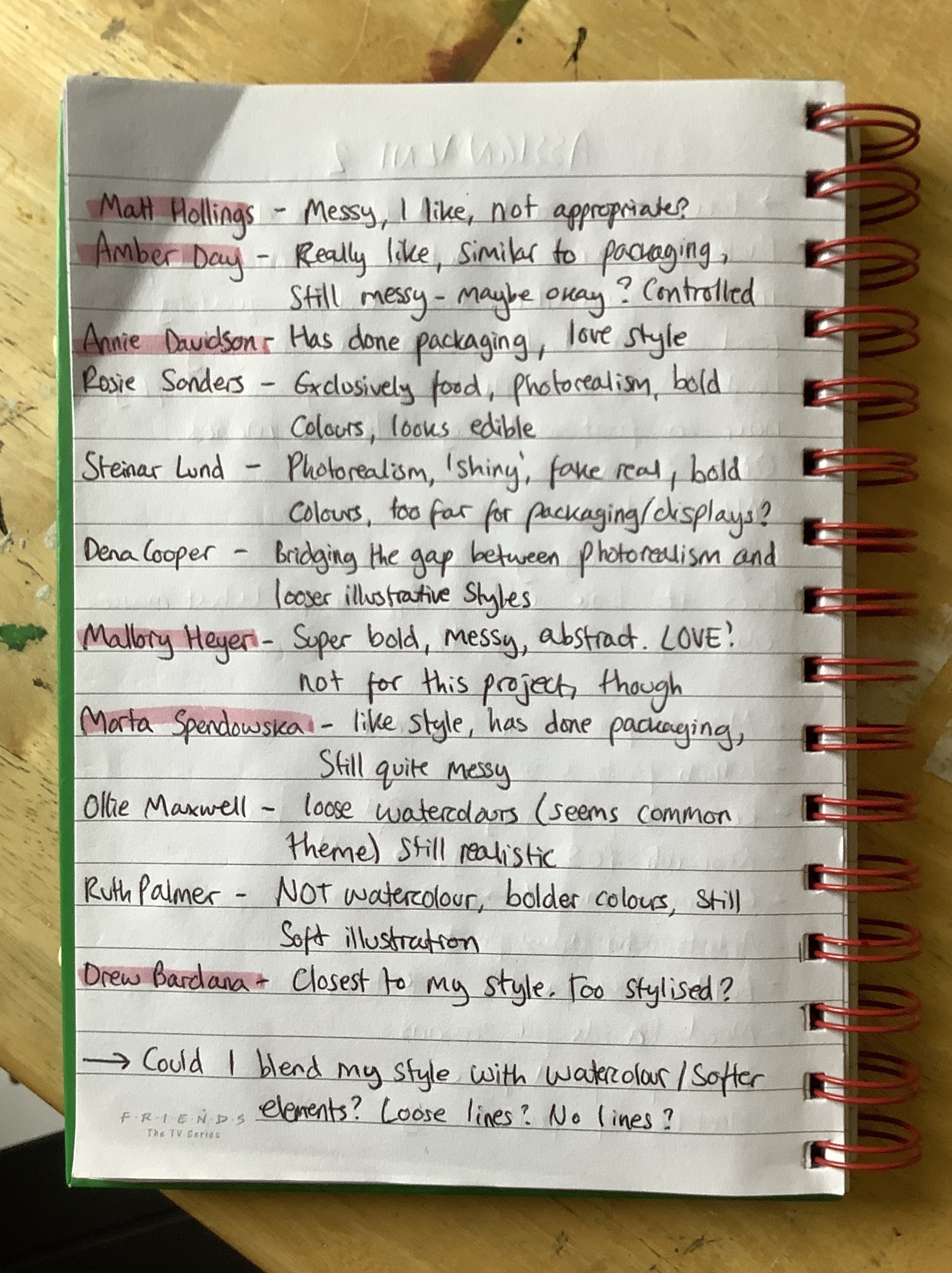
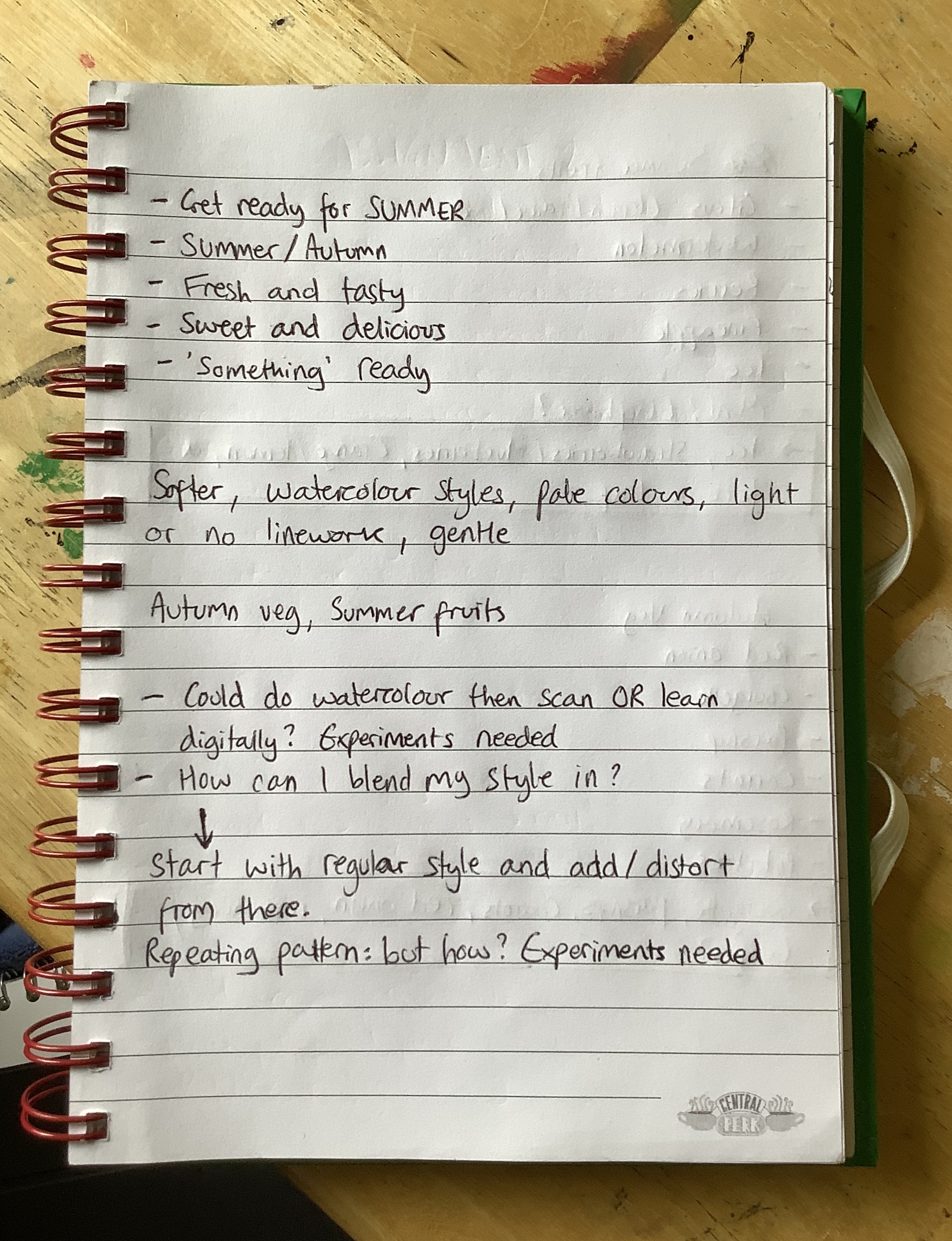
I highlighted my favourite artists – Matt Hollings, Amber Day, Annie Davidson, Mallory Heyer, Marta Spendowska, and Drew Bardana. Throughout part 2 I have learned that I really enjoy messy work, visible brush strokes, and obvious textures. Hollings, Day, Heyer, and Spendowska all depicted this in their art styles. Hollings’ and Heyer’s work however did not seem appropriate for this exercise. I felt Hollings’ illustrations lost the ‘appetising and fresh’ look I was trying to aim for, and Heyer’s work was too abstract and subjective. Day and Spendowska have art styles similar to those I found when researching packaging, and their work is still loose and messy.
Whilst researching, I was very conscious that ‘light, soft, and gentle’ is not my typical go-to illustration style. I was thinking a lot about how I could combine my stylised, bold illustrations with the delicate style so commonly used. I then found Drew Bardana, who’s work I feel is closest to mine, with exaggerated shapes and simple colours. I see my own style in his usage of texture and layering. Seeing this made me think maybe my style would work just fine. However, with the overwhelming amount of watercolour-esque style in this area, I did want to try to merge the two.
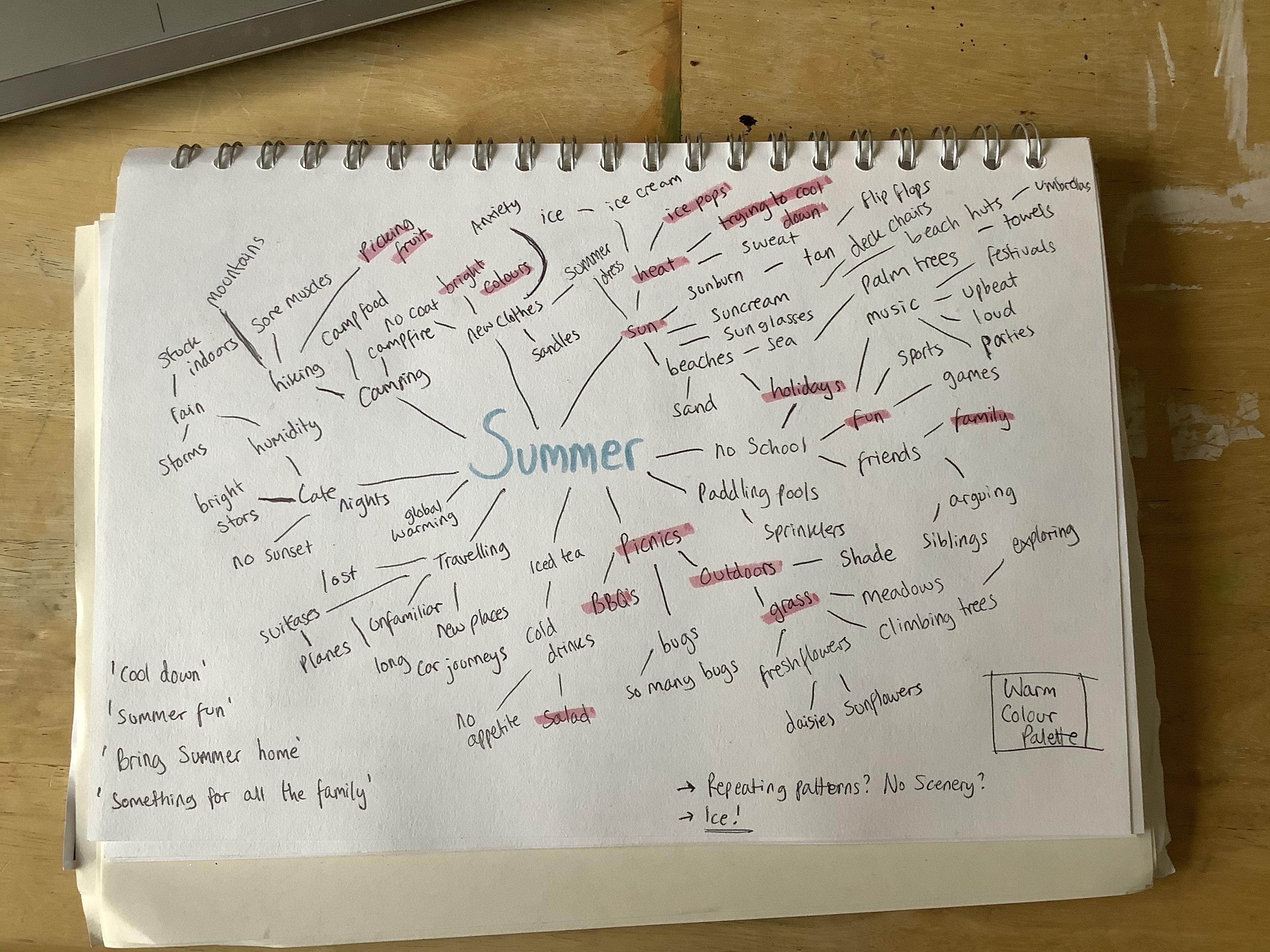
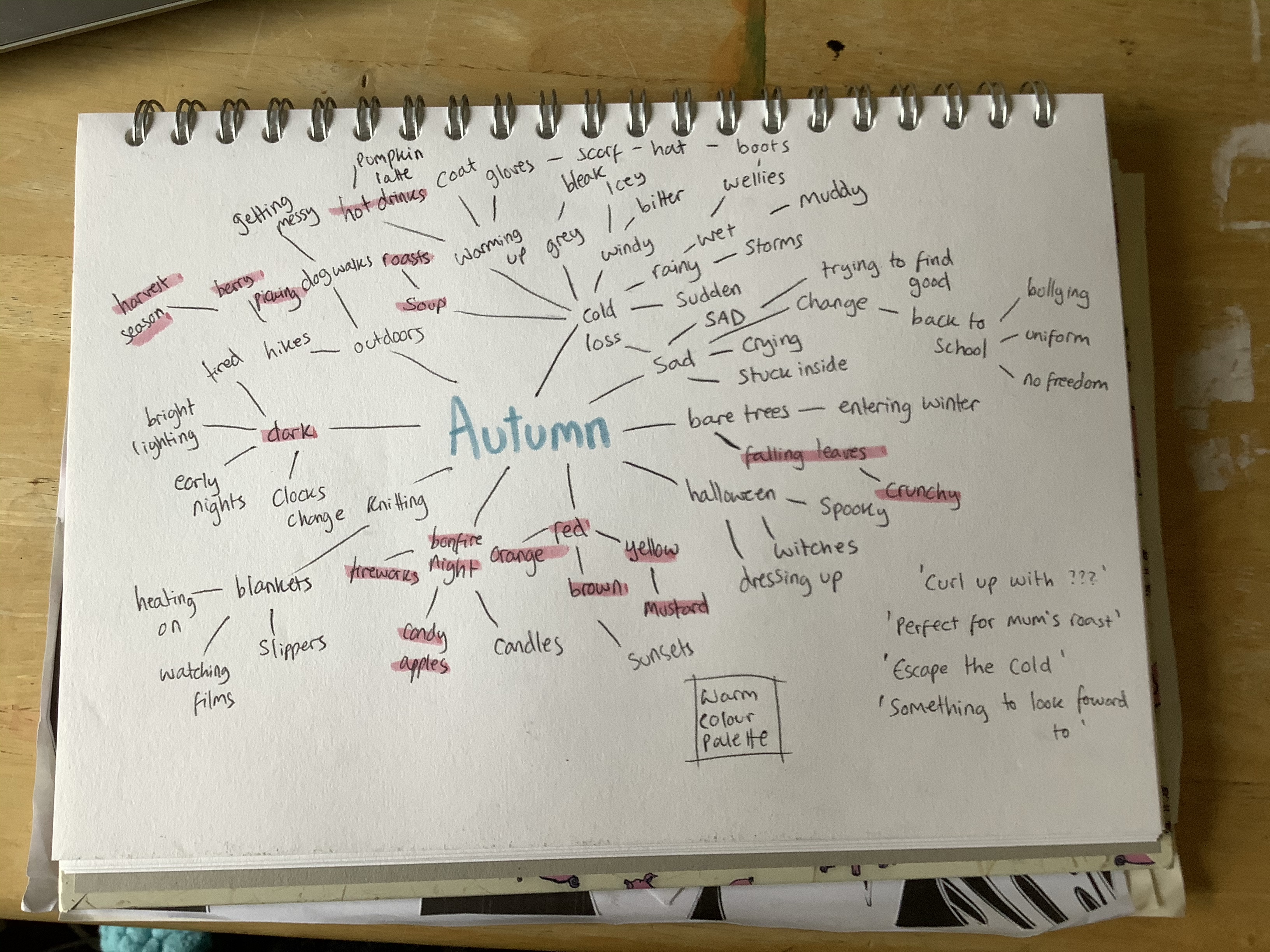
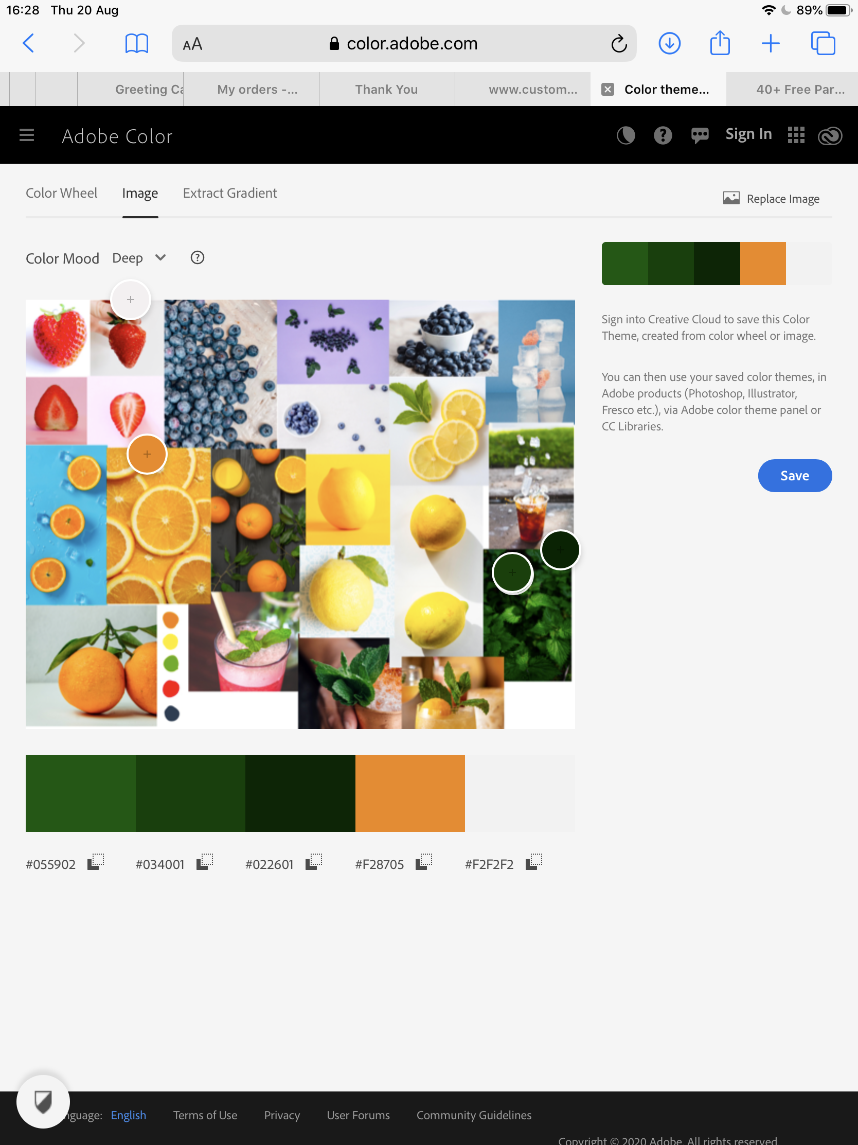
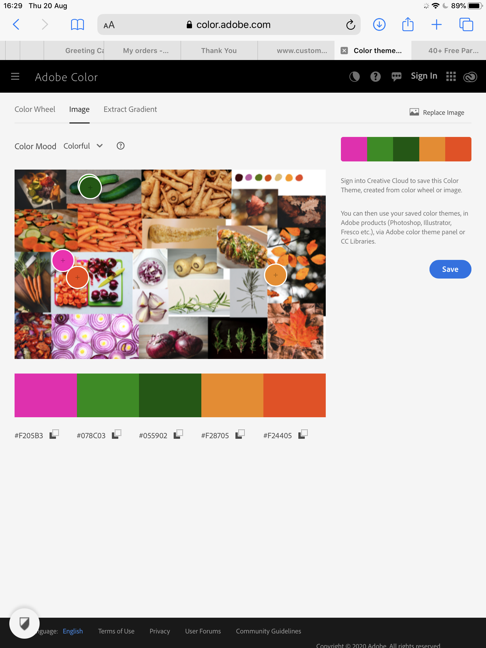
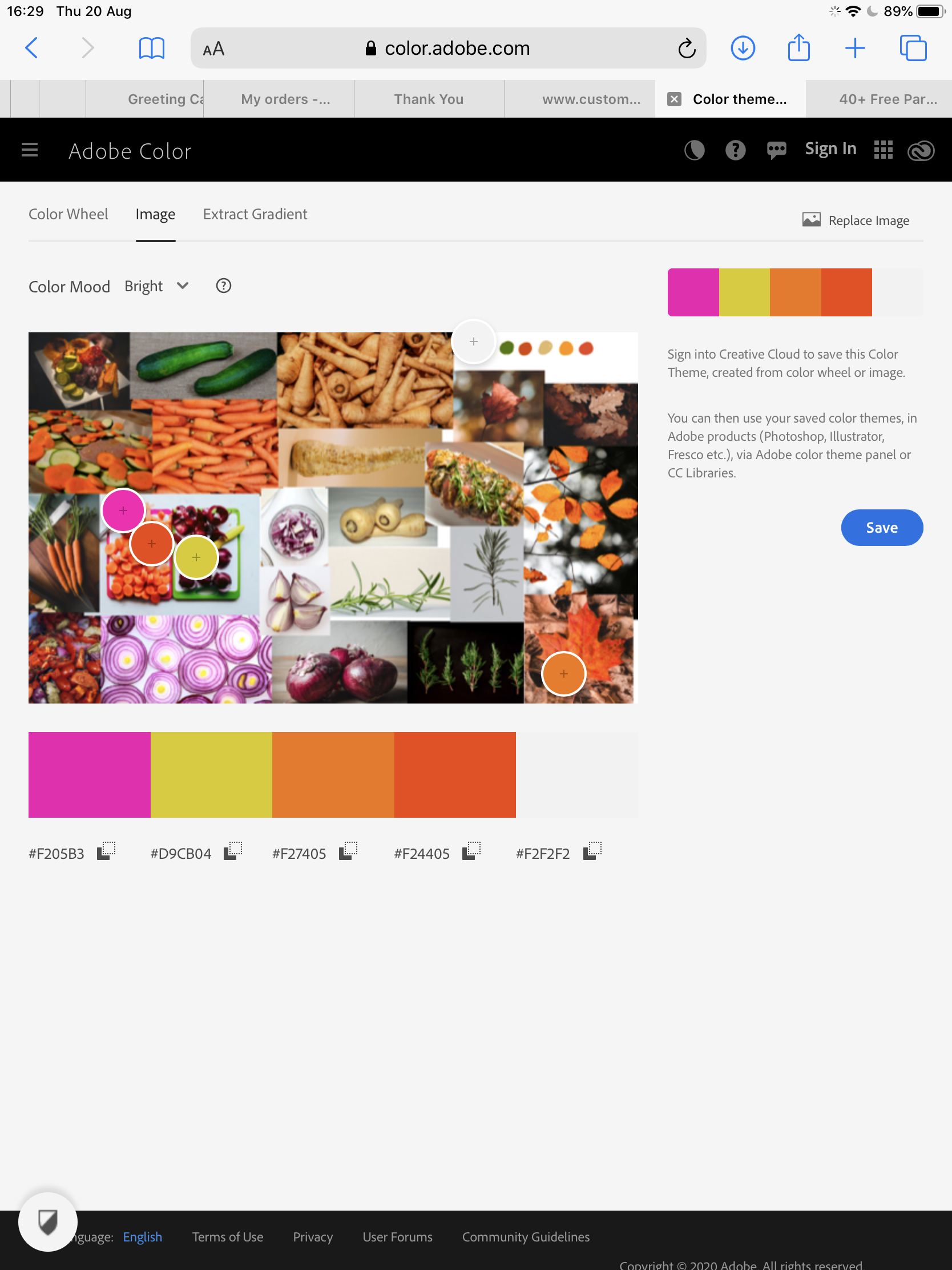
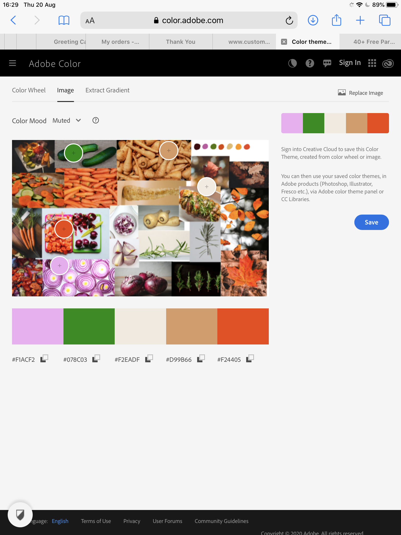
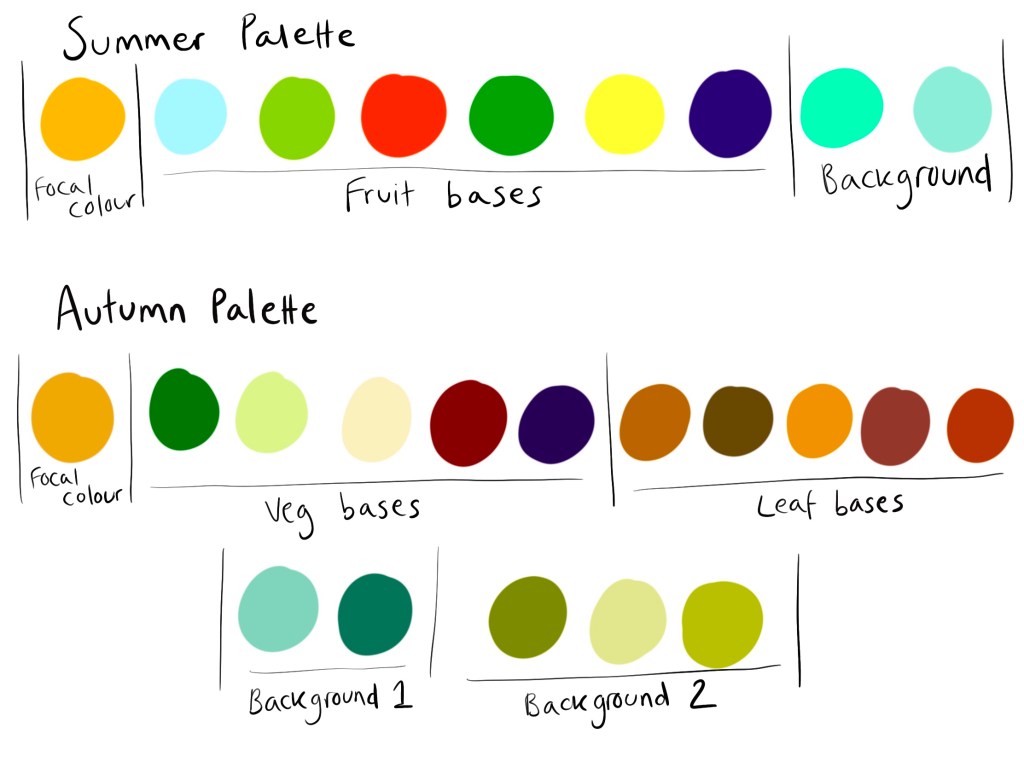
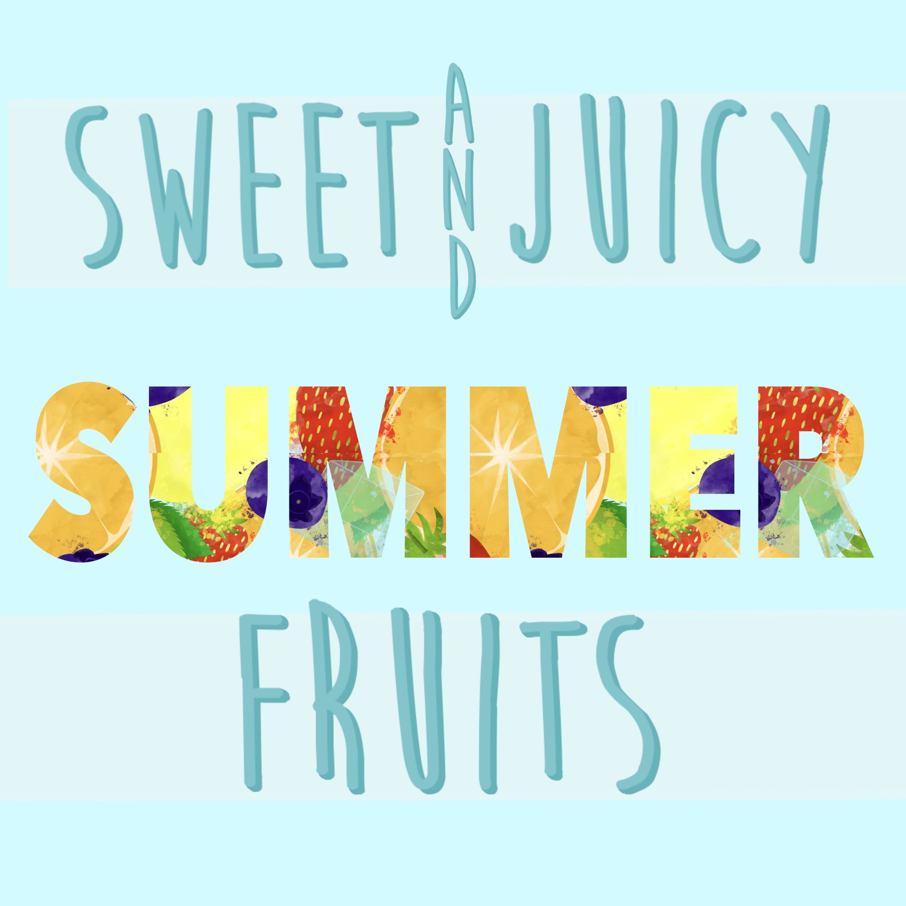
Keeping this in mind, my next step was to begin mind mapping and choosing content for my illustrations. I started with mind maps for both summer and autumn, writing any word that came to mind even if it seemed too far fetched for this assignment. I then highlighted the words that jumped out at me and related best to the brief, avoiding things that were negative or overly complex. Then I took some notes on ideas I was having, and colour palettes I had in mind. I wanted both pieces to use warm colour palettes as I felt these are the most inviting and appealing. Summer would be bright, and autumn would be muted, but both would be bold.
Throughout my researching process, I had already jotted down some notes on ideas – some phrases I could incorporate into my designs, the word ‘herbs’ as I had seen them in several illustrations and thought they would be a great addition, and some notes on how I could blend my style with the one most frequently used in the illustrations I had researched. I considered doing watercolour illustrations of produce and then scanning them and altering them digitally, but ruled this out pretty quick as I have very limited experience with the medium and I wanted to avoid muddying my colours. I decided to undergo some experimentation digitally with brushes, textures, and layering, beginning with an illustration just like any of my others, and slowly transforming it into a mix of the two styles.
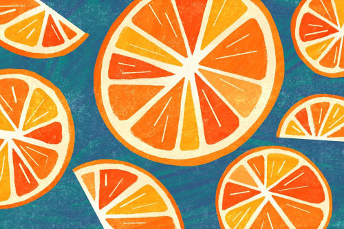
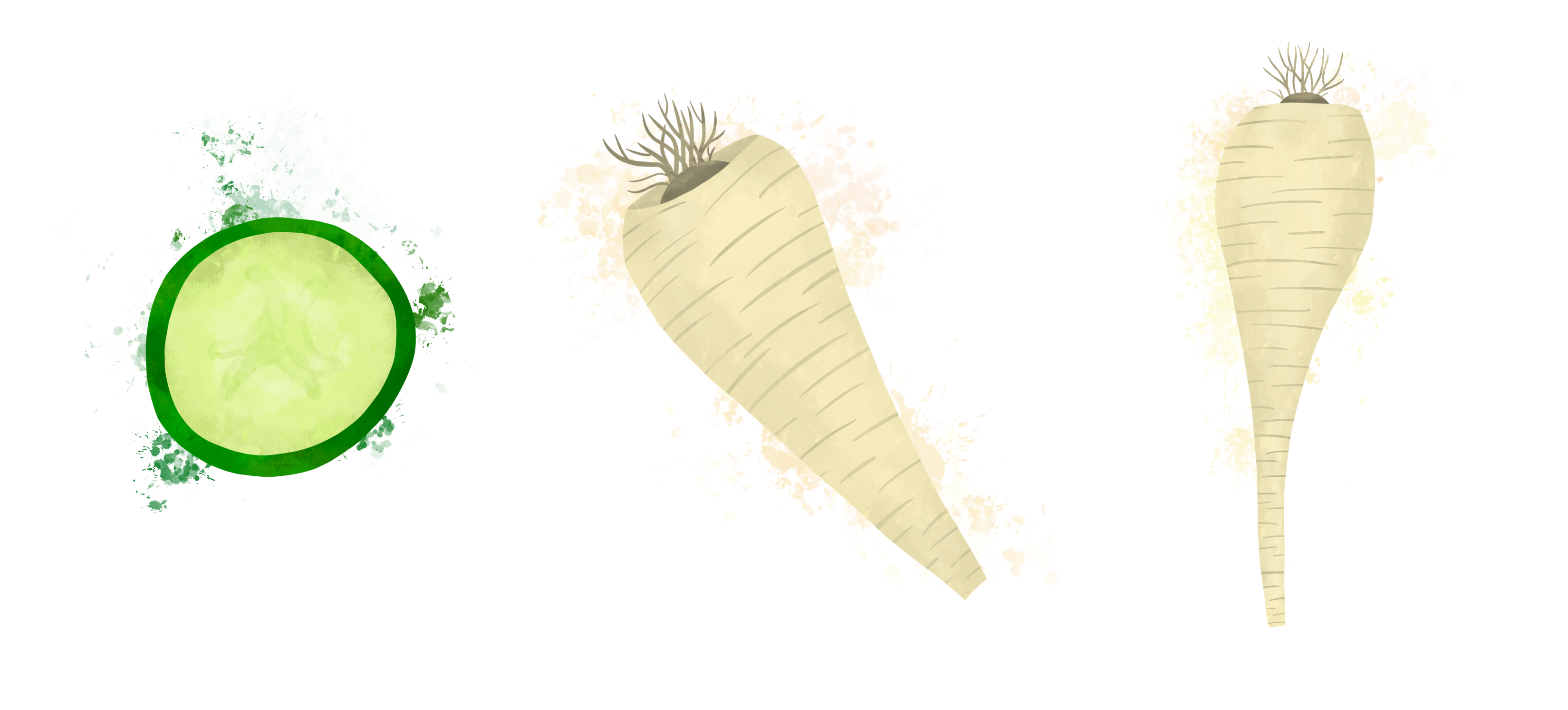
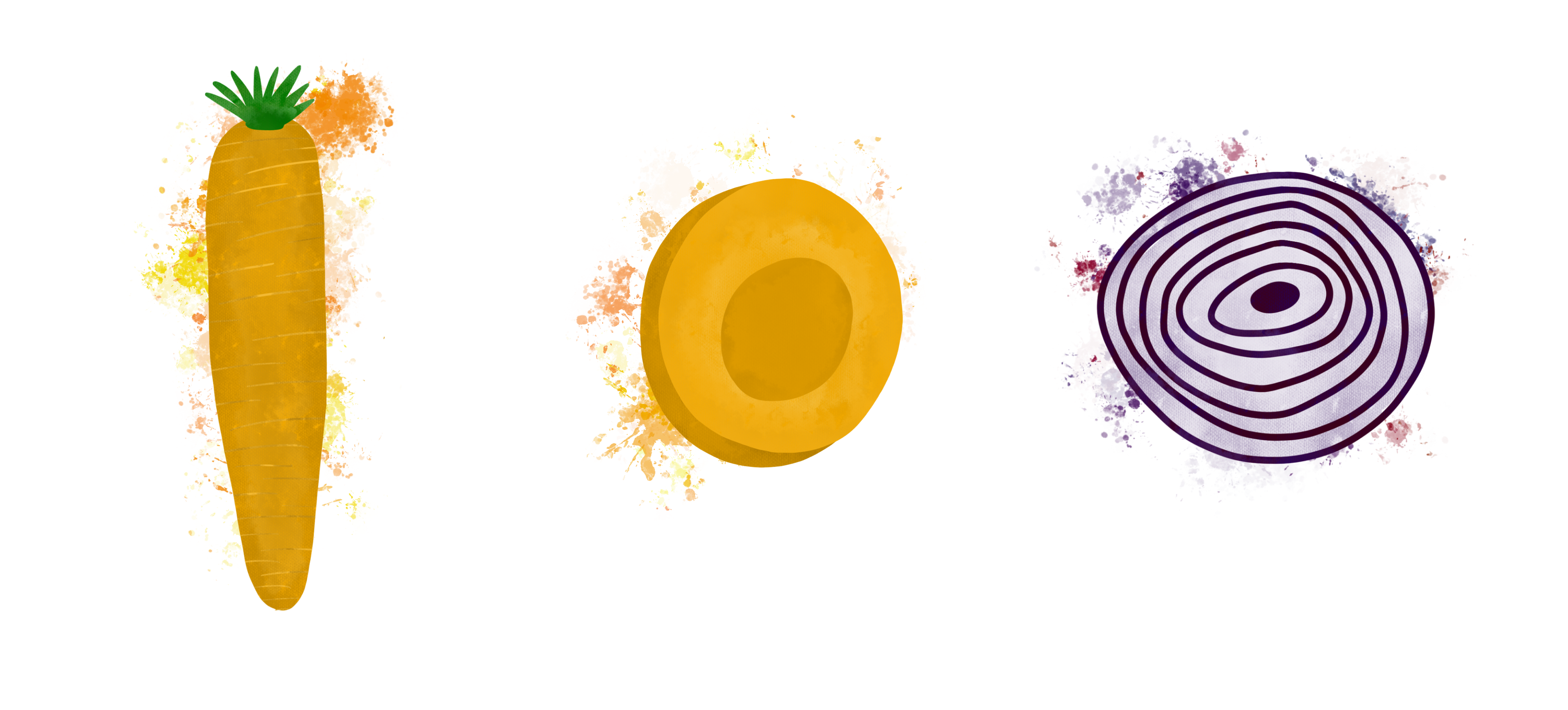
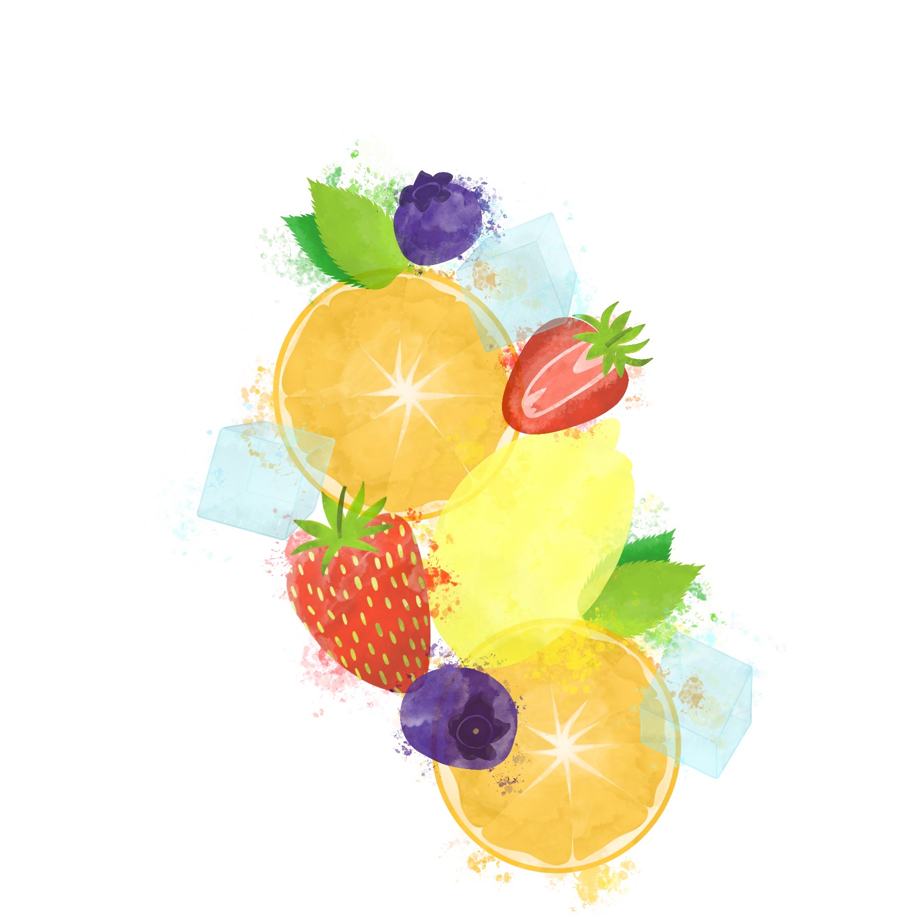
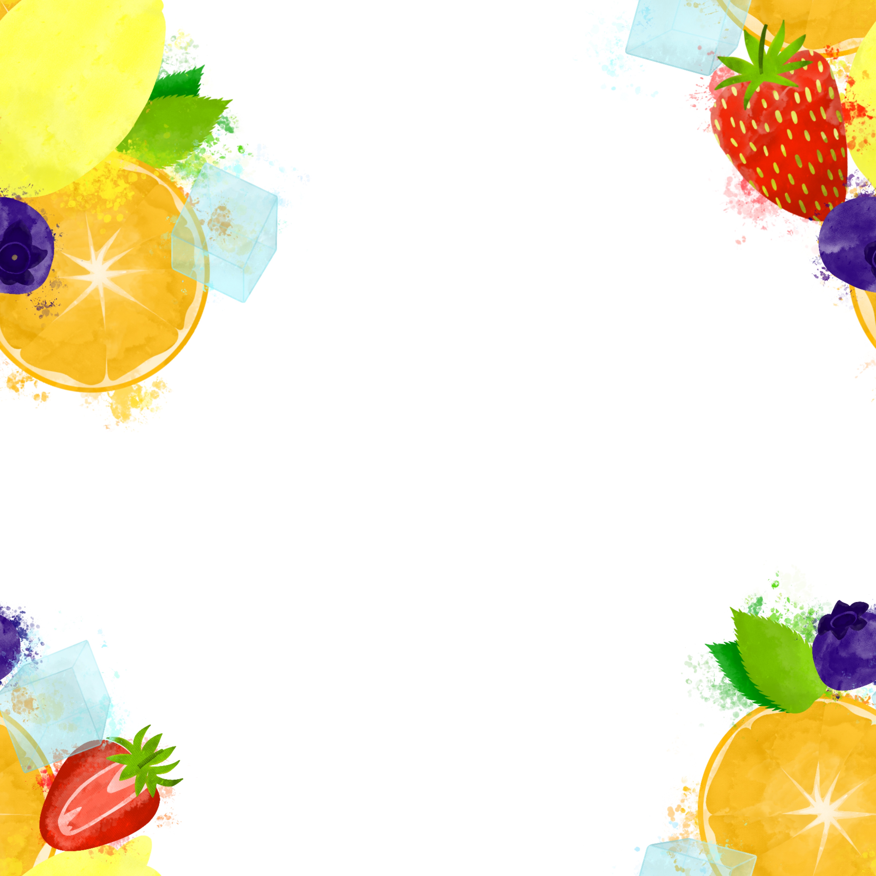
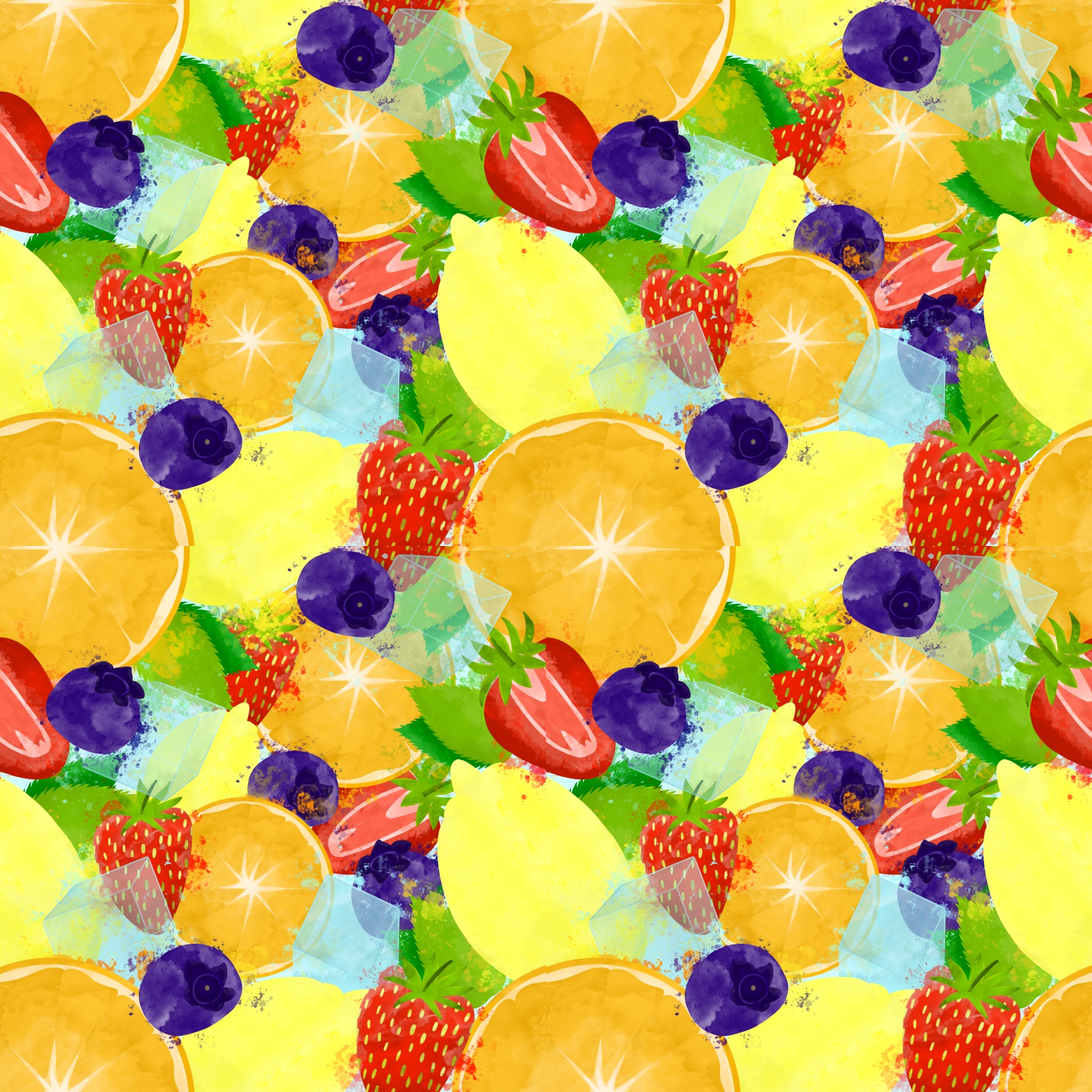
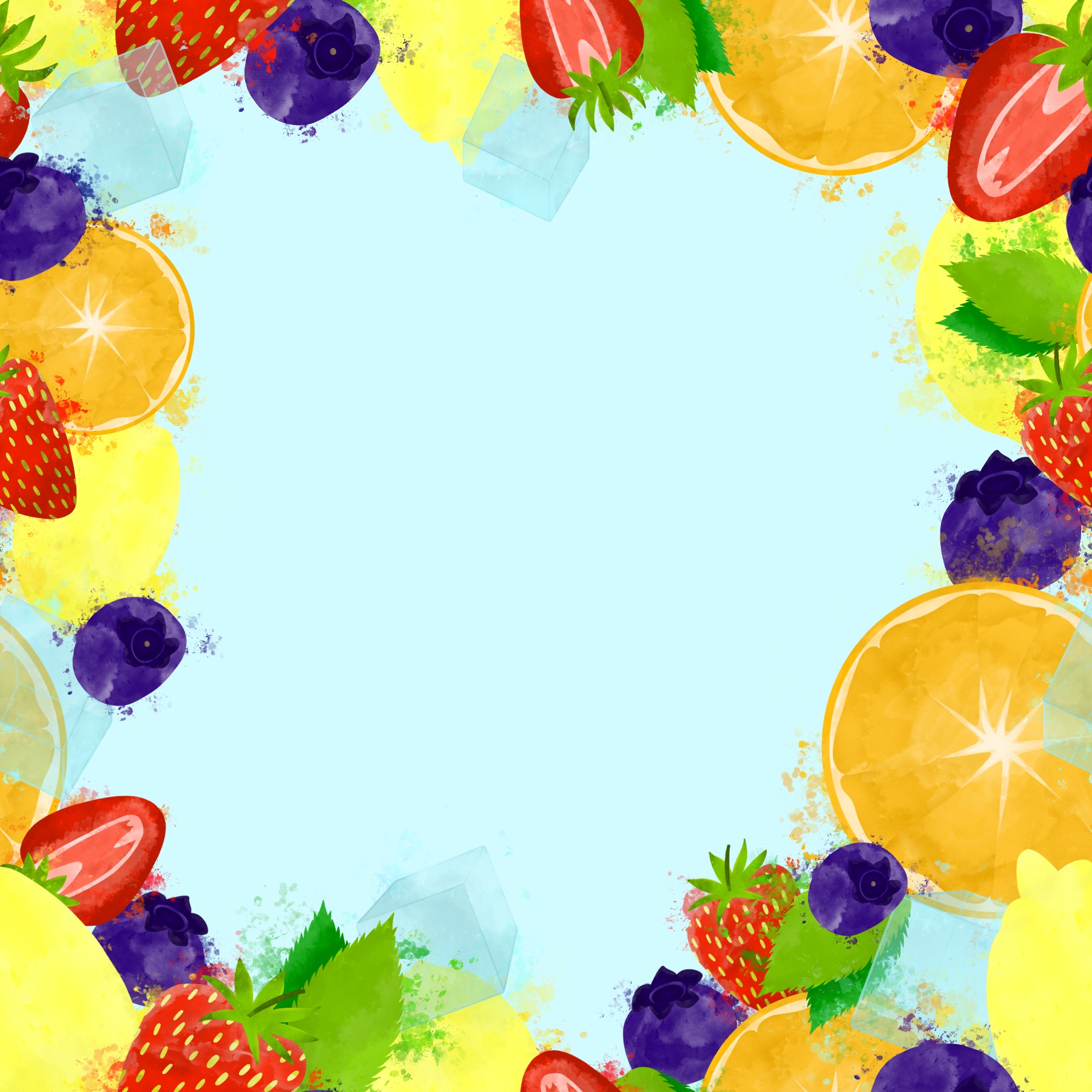
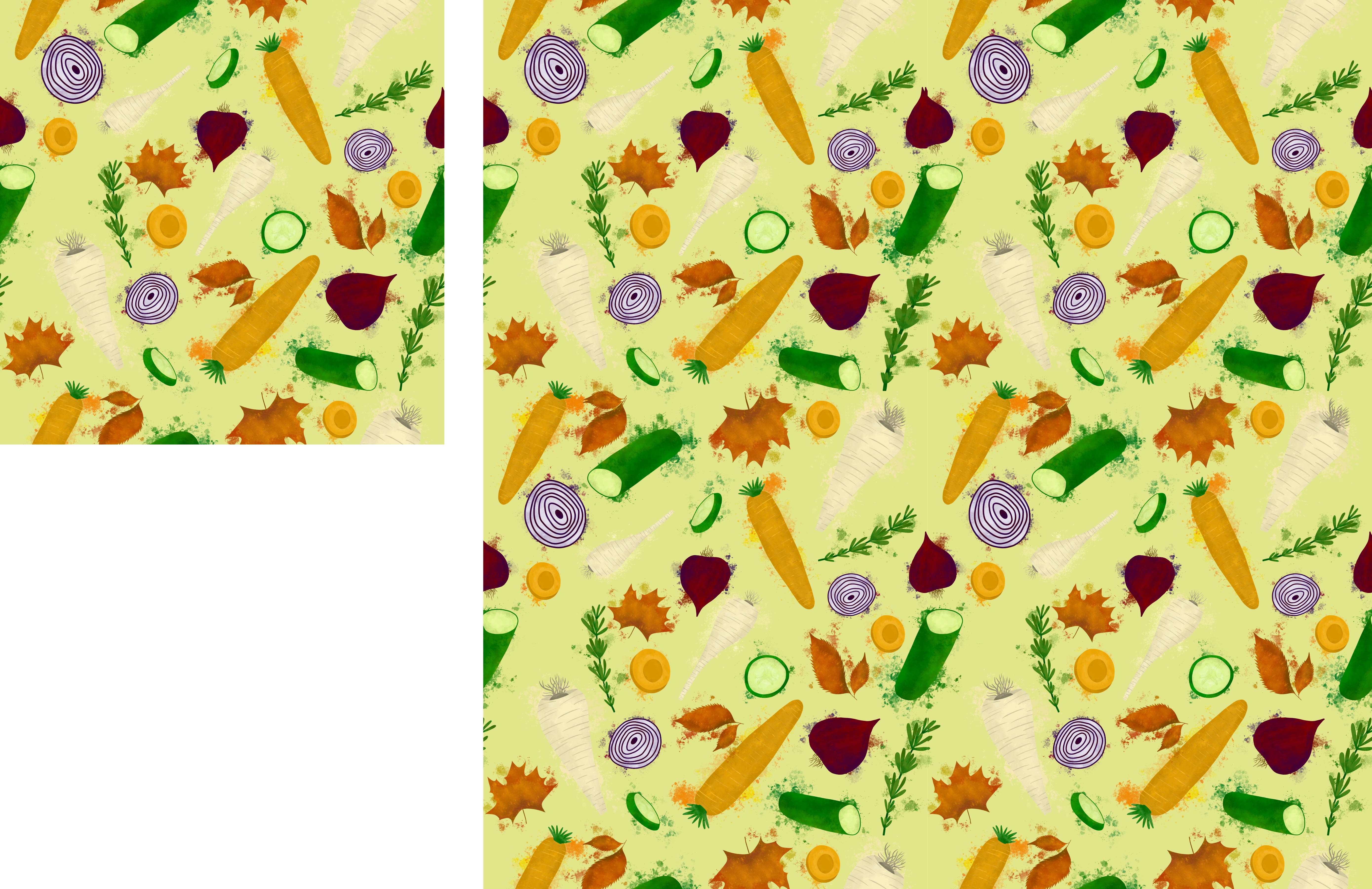
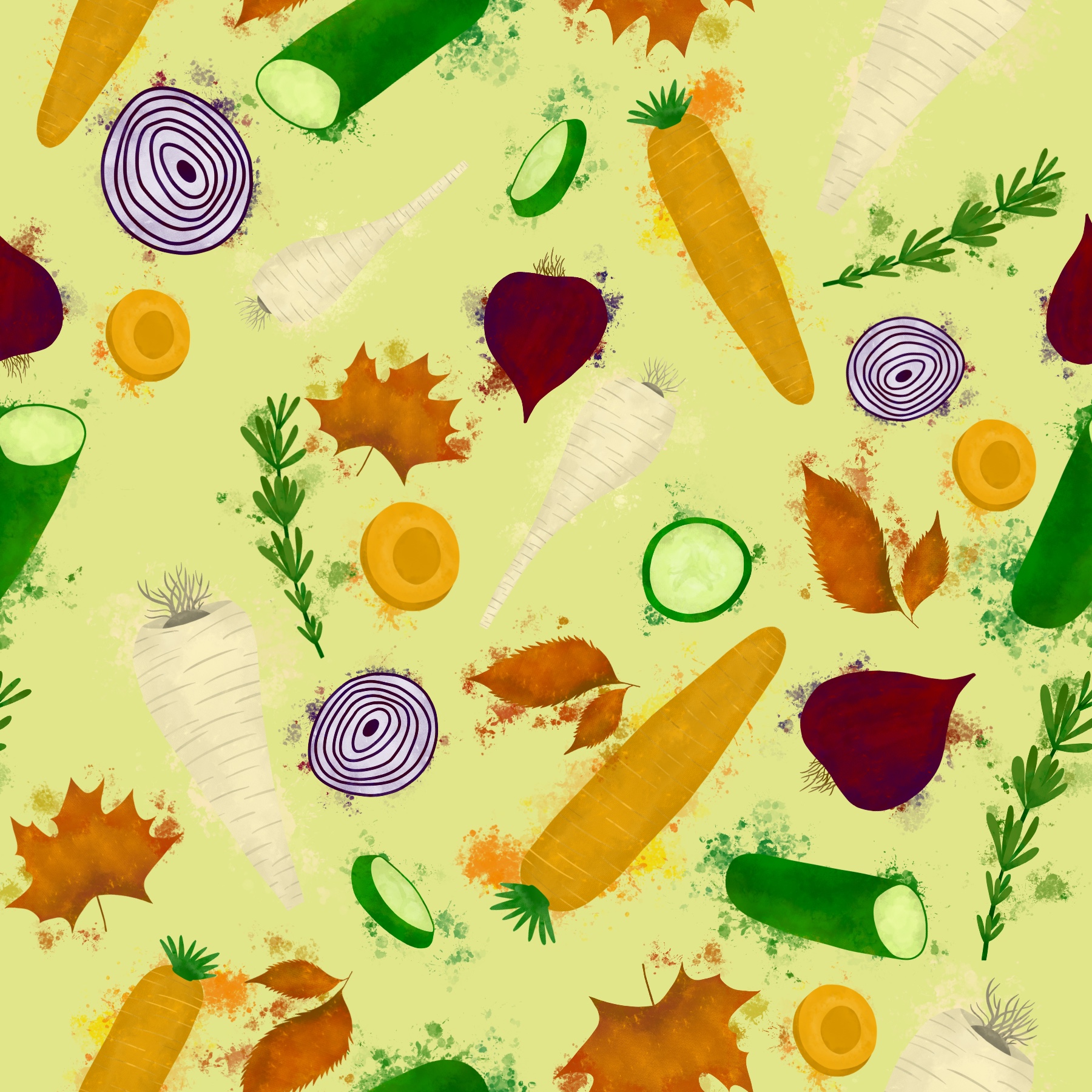
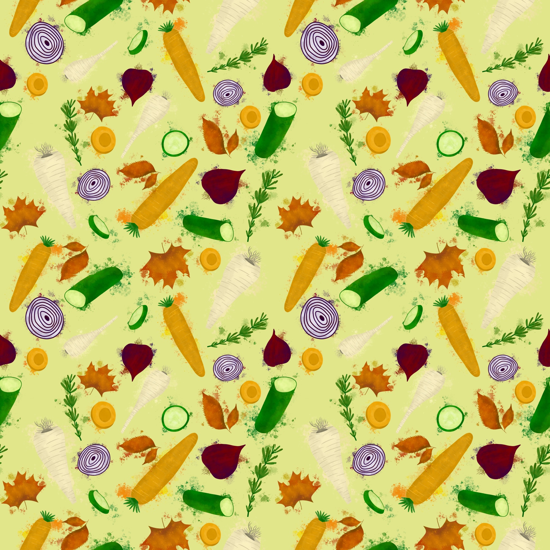
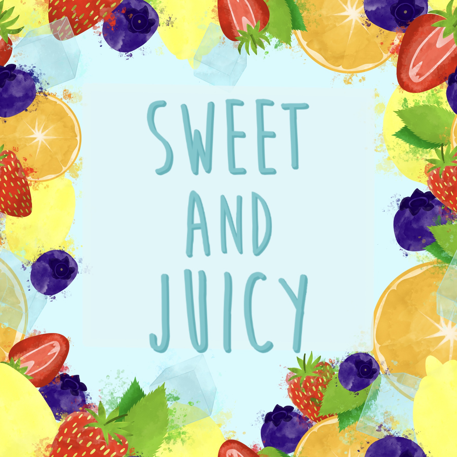
By this point I knew I wanted to end up with a seamless repeating pattern as my final piece, as that seemed like a great illustration to use for both packaging and a point of sale display. I saw it frequently when researching, and I feel it matches my style well. I needed to choose what elements to include in the pattern, so I began listing fruits and vegetables. I felt ‘summer’ was more of a fruit season, and ‘autumn’ more of a vegetable one, and I decided to pick one herb for each season, and one element that represented the season specifically.
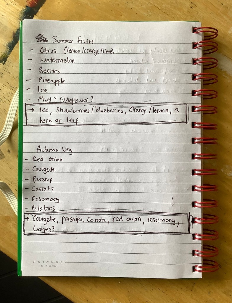
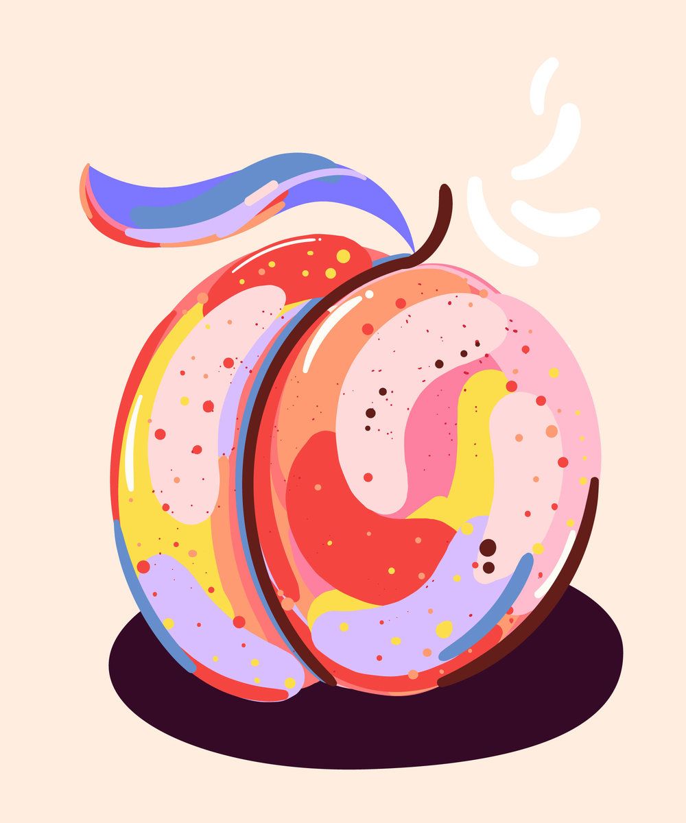
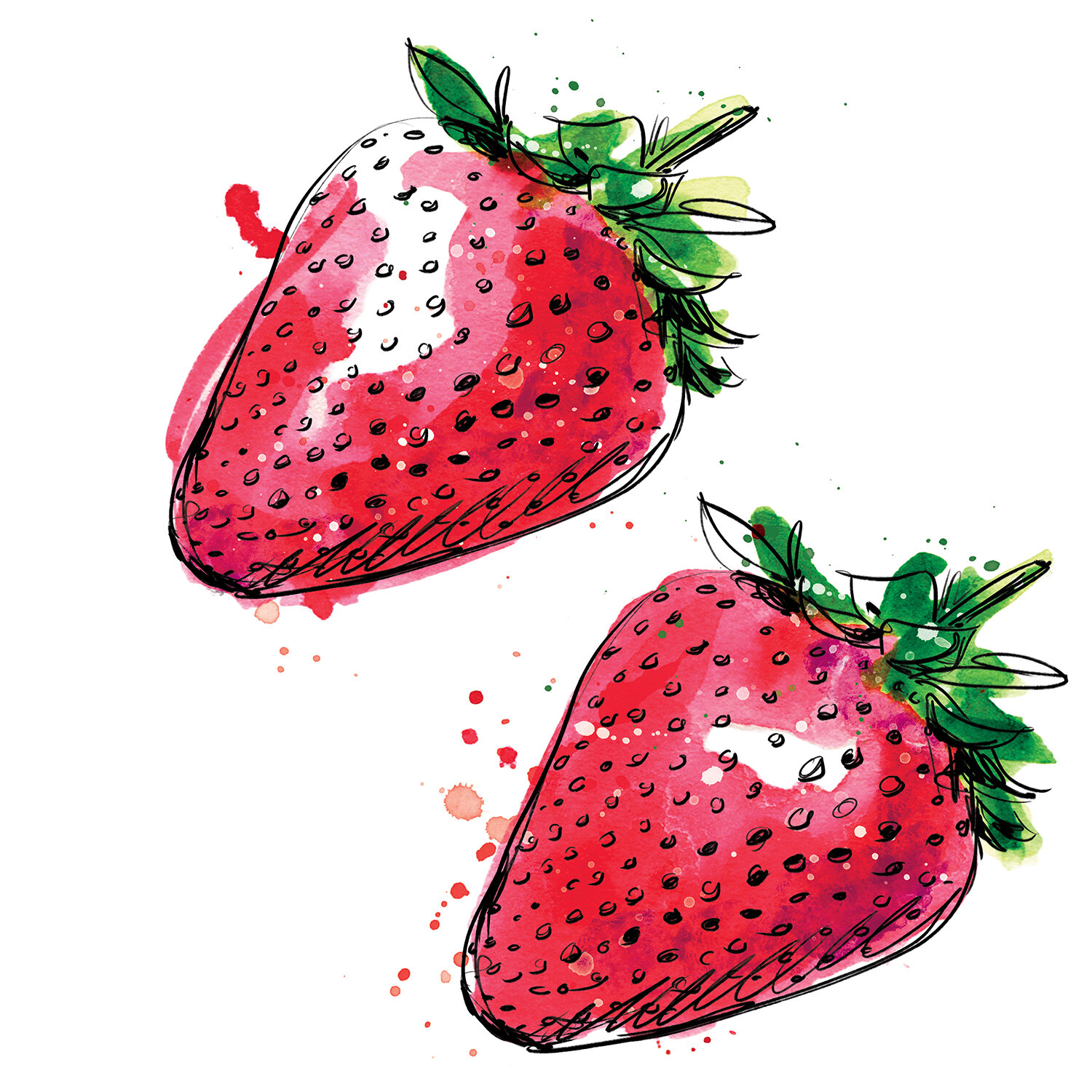
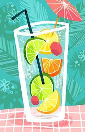
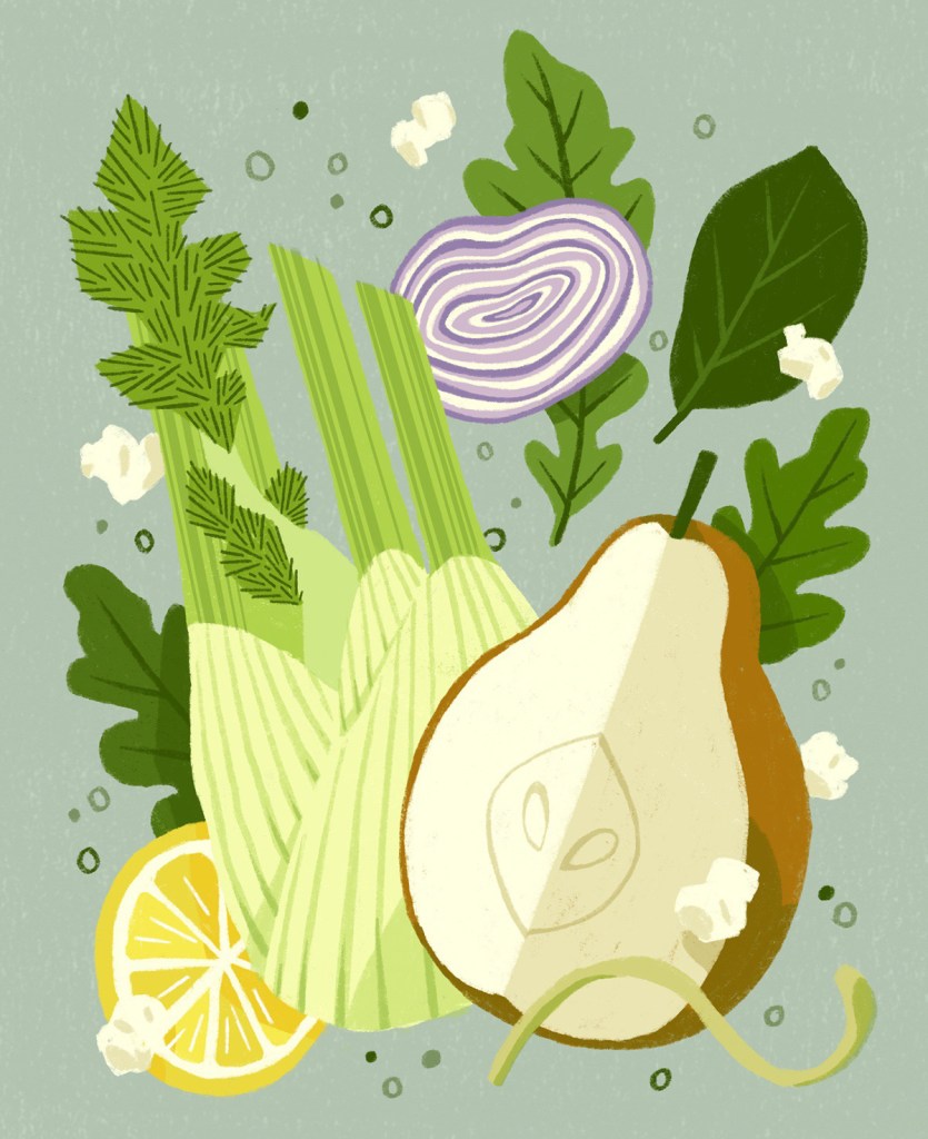
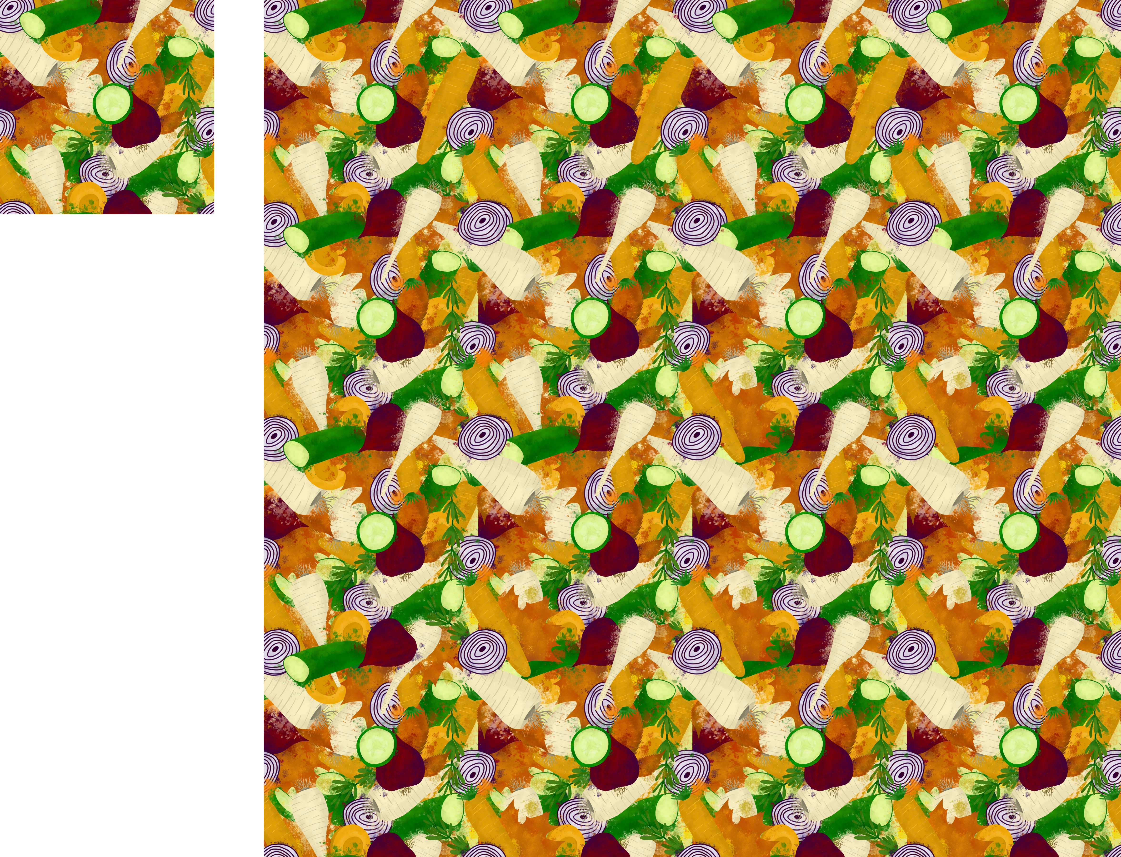
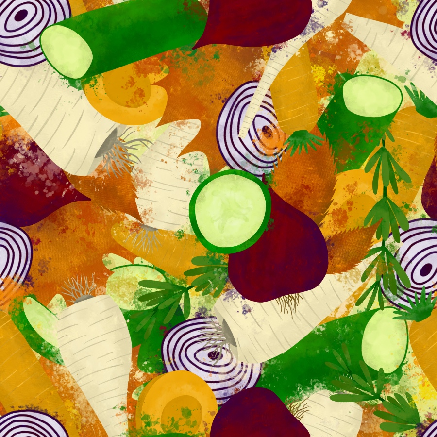
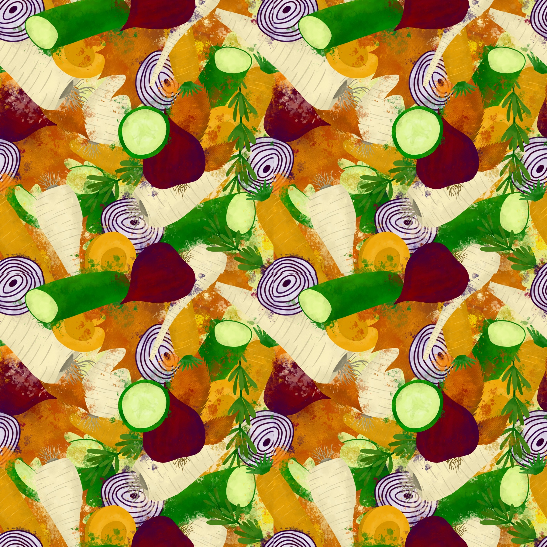
For summer I chose strawberries, blueberries, oranges, lemons, a sprig of mint, and ice cubes. For autumn I chose courgette, parsnips, carrots, red onion, rosemary, and fallen leaves. I was cautious to make sure I wasn’t picking too many different elements, and that there would be colours that complemented each other without overwhelming the piece. For example, for autumn I opted for red onions over potatoes as the deep purple from the onions would fit nicely in the spread.
I wanted to do a quick mood board for referencing, one for each piece, consisting of the elements chosen to illustrate. I intended on using this to pick colours for a colour palette, and to reference later when doing my initial sketches. Whilst collecting content for my mood boards, I realised I didn’t know whether to draw my fruit and vegetable elements as whole or as segments. I made sure to include imagery of both where possible so I could decide later whilst sketching.
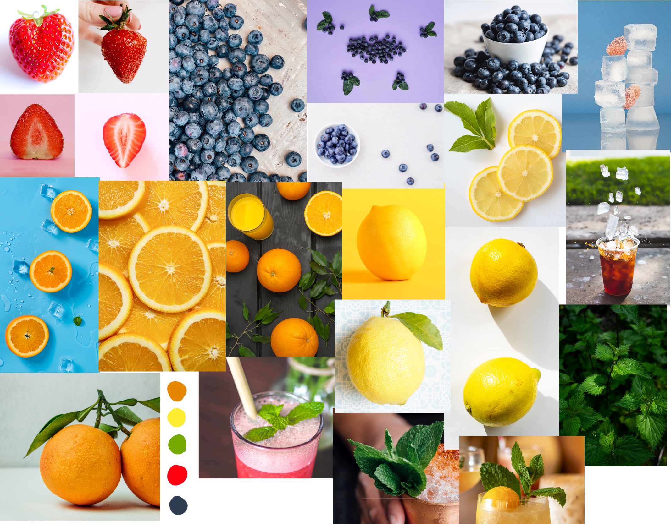
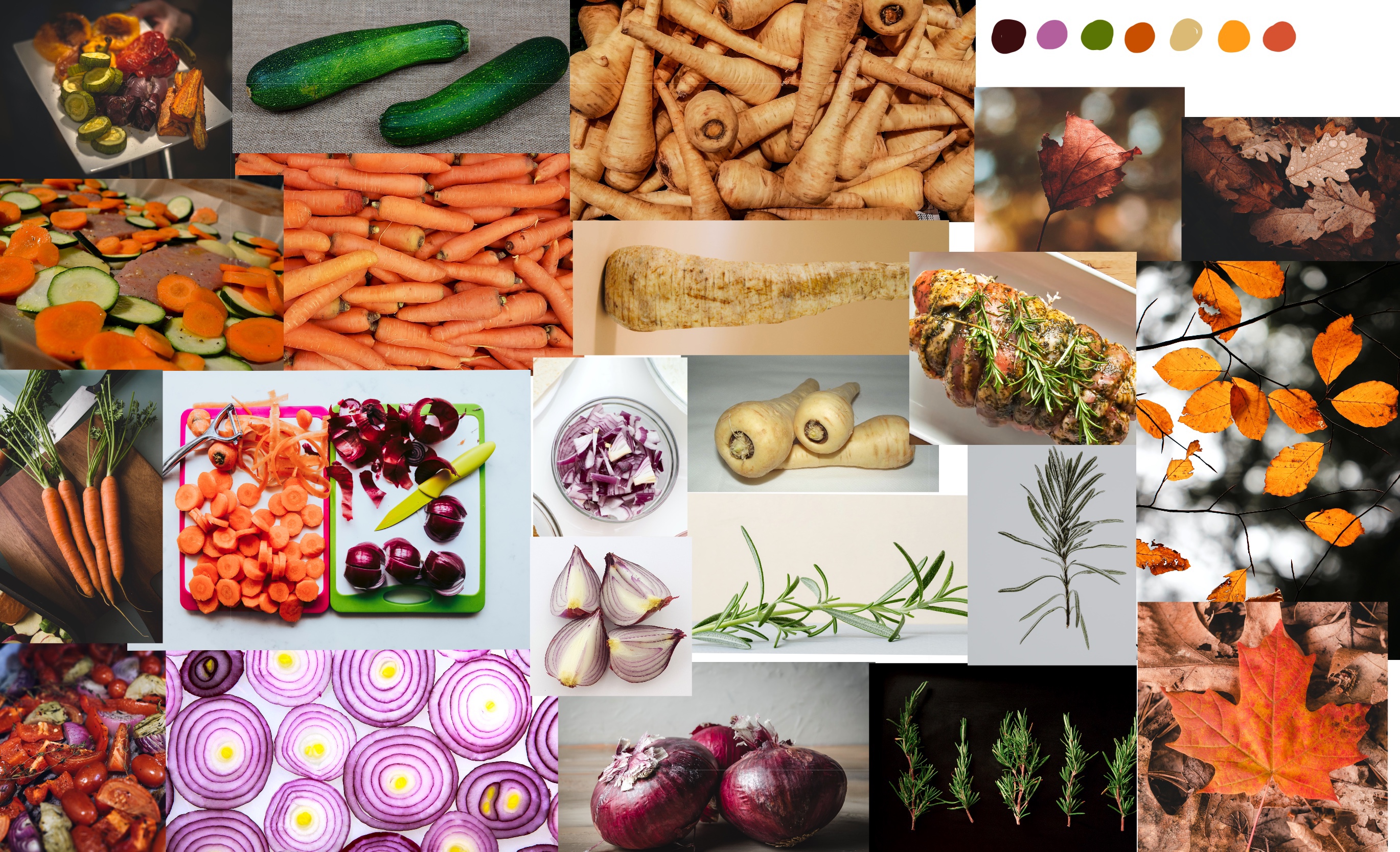
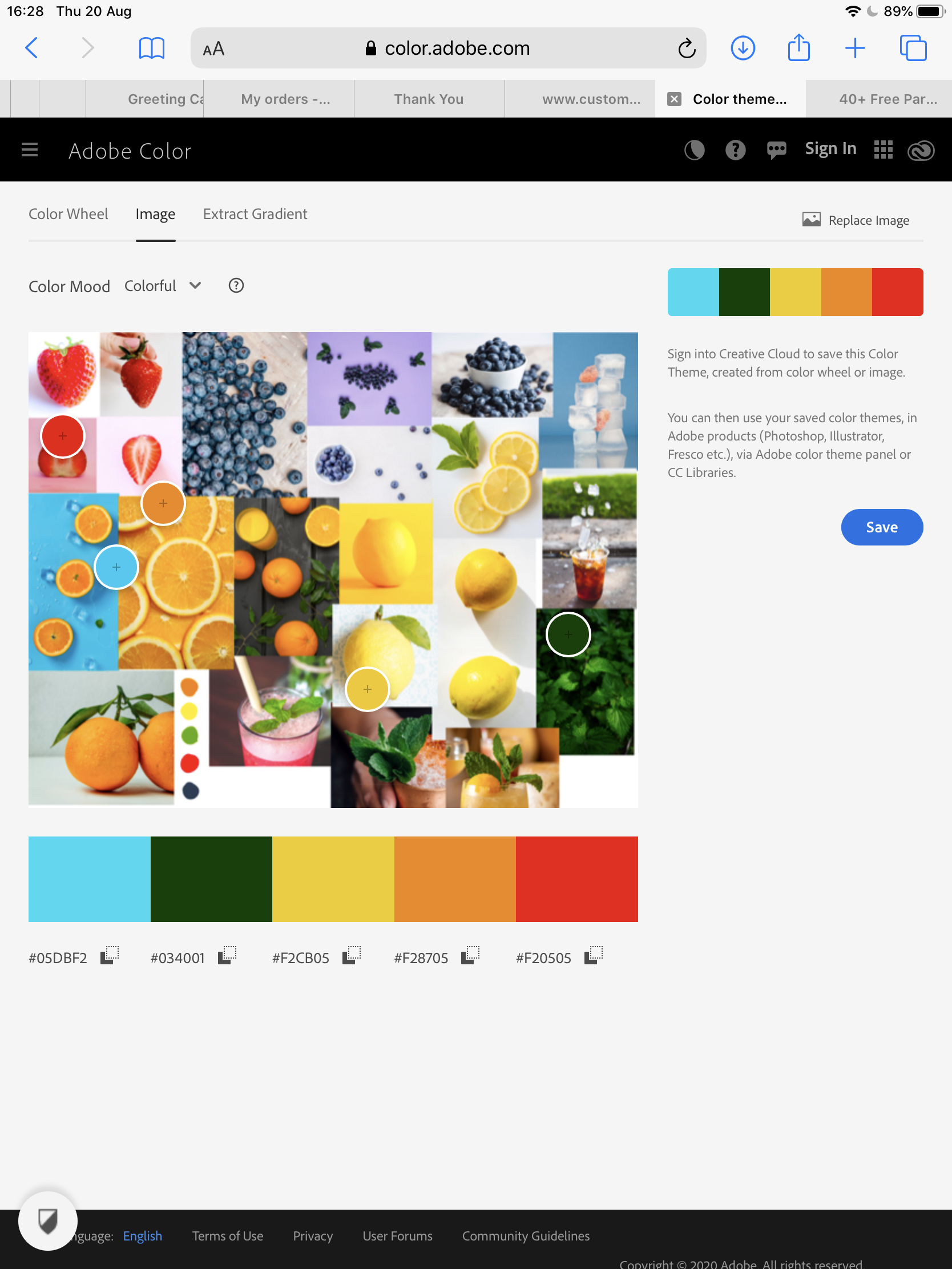
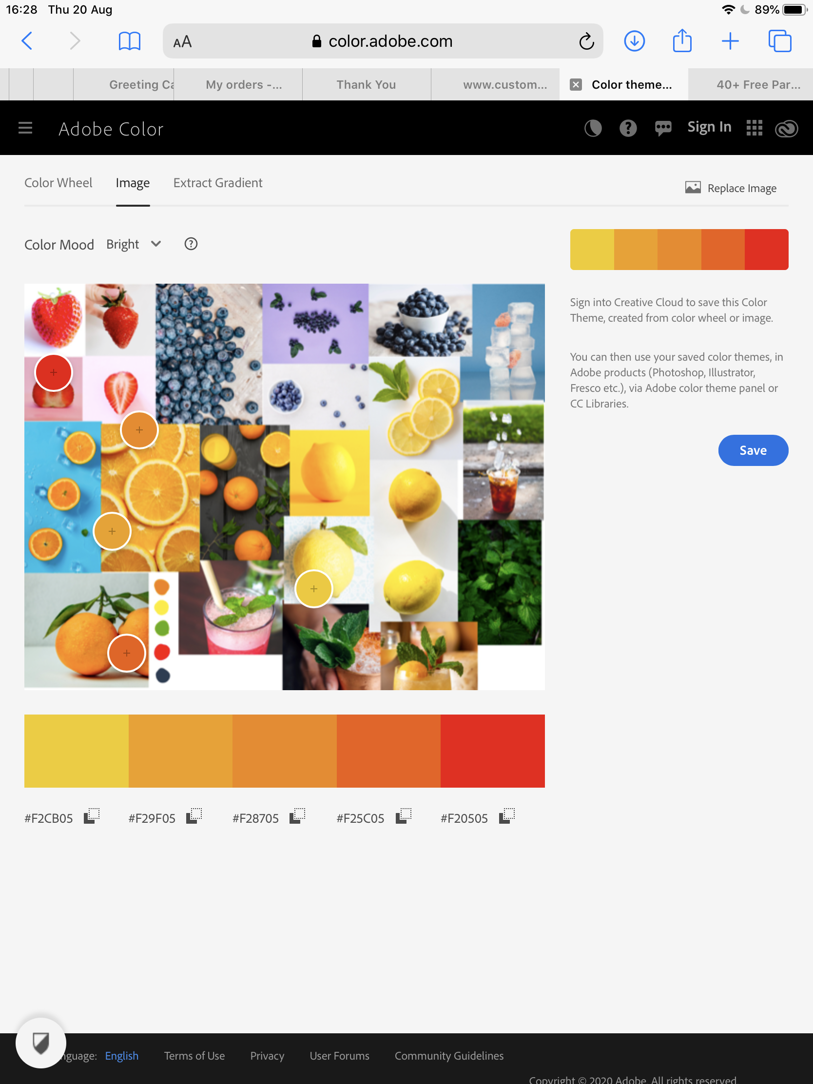
Once my mood boards were completed, I swatched a few colours from each and added them. I then used Adobe Color to try to pick some colour palettes to build from. This didn’t work so well, as the app was picking out colours from the backgrounds of individual images in my mood boards. I decided to rethink my approach and pick a central colour for each piece to build around. As both pieces would contain orange elements I decided to use this as my base colour, which I thought worked especially well as a ‘summer’ orange and an ‘autumn’ orange are both very different. I then picked harmonious base colours for my elements and potential background colours, remembering the advice Kimberly had given me around what colours are least appealing.
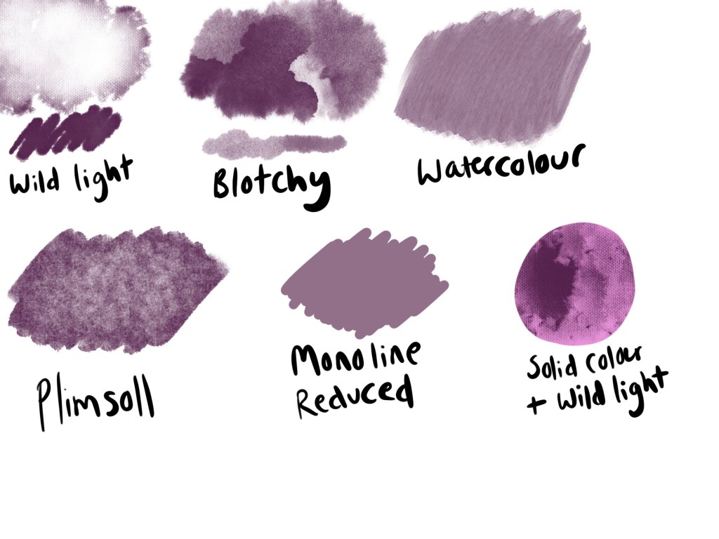
I also decided to do another swatch sheet of texture brushes, like I did in Exercise 12, as I found it really useful to have something to reference whilst I worked. This also meant I could experiment a little with how the brushes performed, and have a rough idea of how I was going to use them going forward. I then began roughly sketching out each element of my final designs, testing the angles they would be placed at, and trying to figure out how much to include. I also used this as an opportunity to experiment with sliced and whole produce, trying to ensure the elements would be recognisable but still flow nicely together. Once I was settled on some final sketch designs, I put them together in a single document, and added some rough colour swatches in the background for fun.
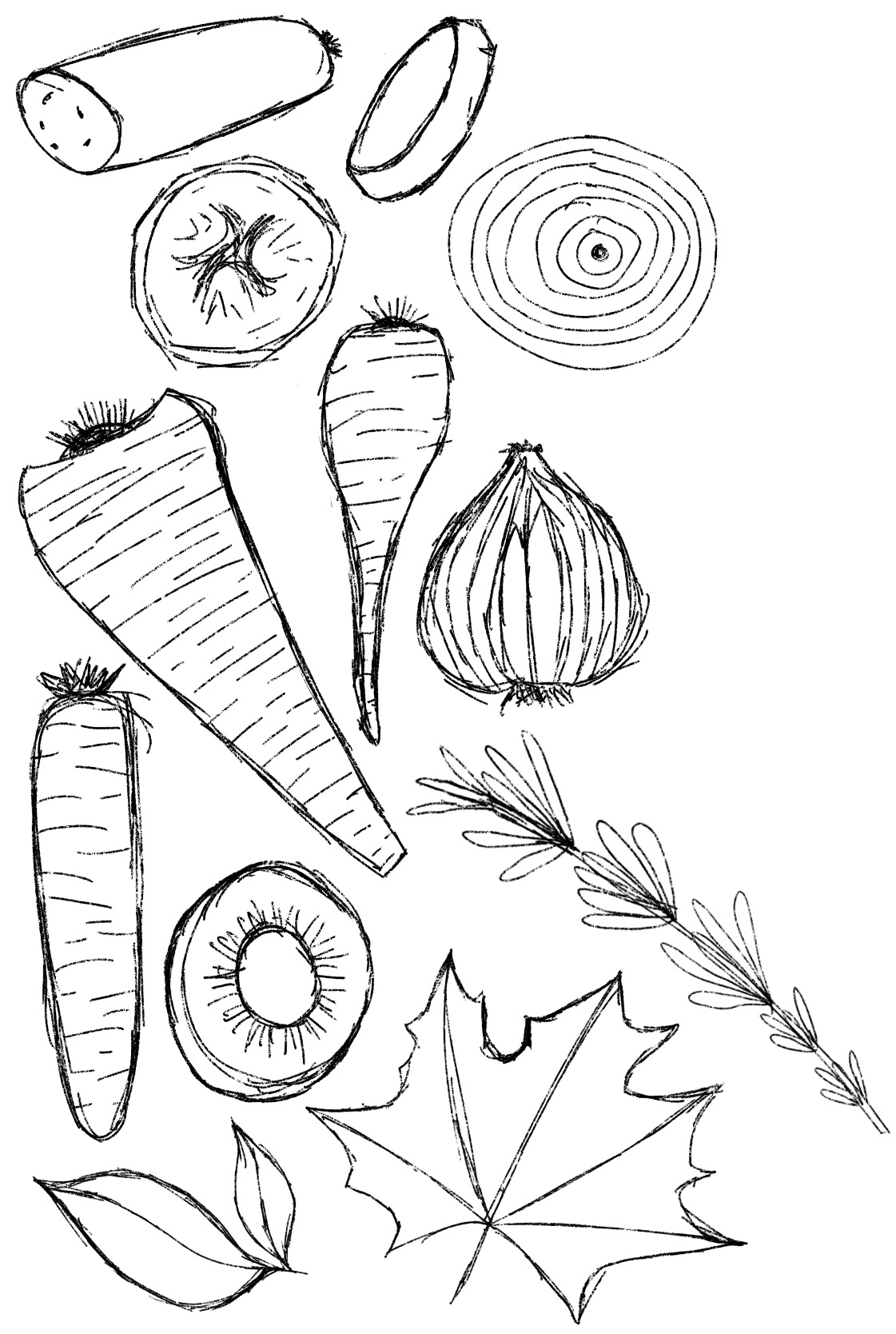
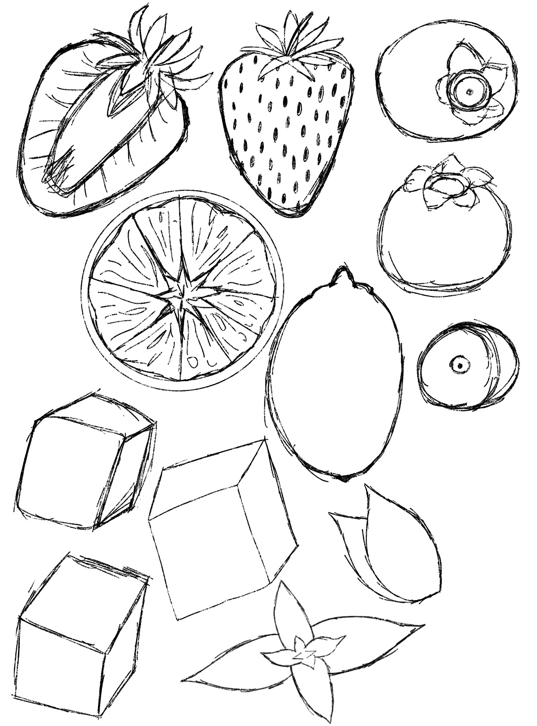
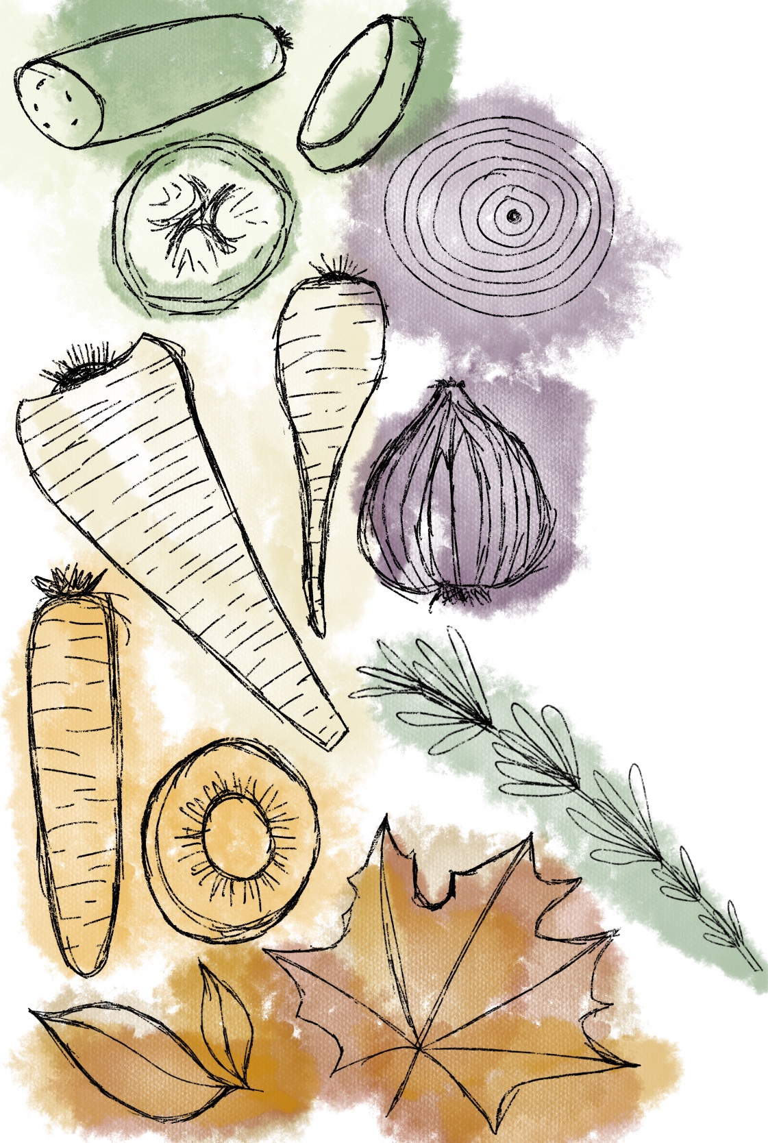
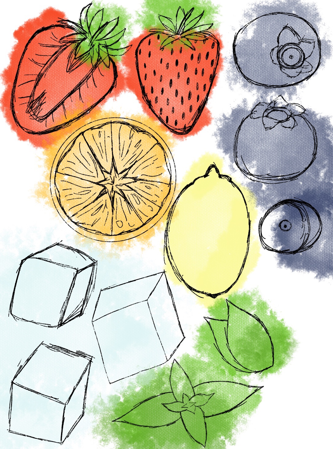
I decided to have a mix of whole and dissected produce in each of my designs. I thought the variation in elements would give more visual interest, and some produce leaned more naturally to being sliced. I still didn’t have a plan for exactly how my elements would fit together, or how I would incorporate text, but my focus for now was on ensuring the elements looked fresh, appetising, and fitted the softer vibe that was found in my research.
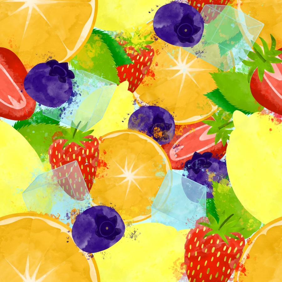
My next step was to begin adding colour and texture to each element. I started by blocking in colour on separate layers in the general areas which I wanted filled. I wasn’t too focused on adding shading or detail, as I knew that would come later. Then, I began adding texture layers. My favourite brush out of my swatches was ‘wild light’. I liked how it interacted with the colour behind it and how it interacted with itself. It was a lot like using watercolour, and applying varying amounts of pressure created differing opacity. I started using this to shade and soften the look of my elements, using color-hex to ensure the shades and highlights were within the same colour palette.
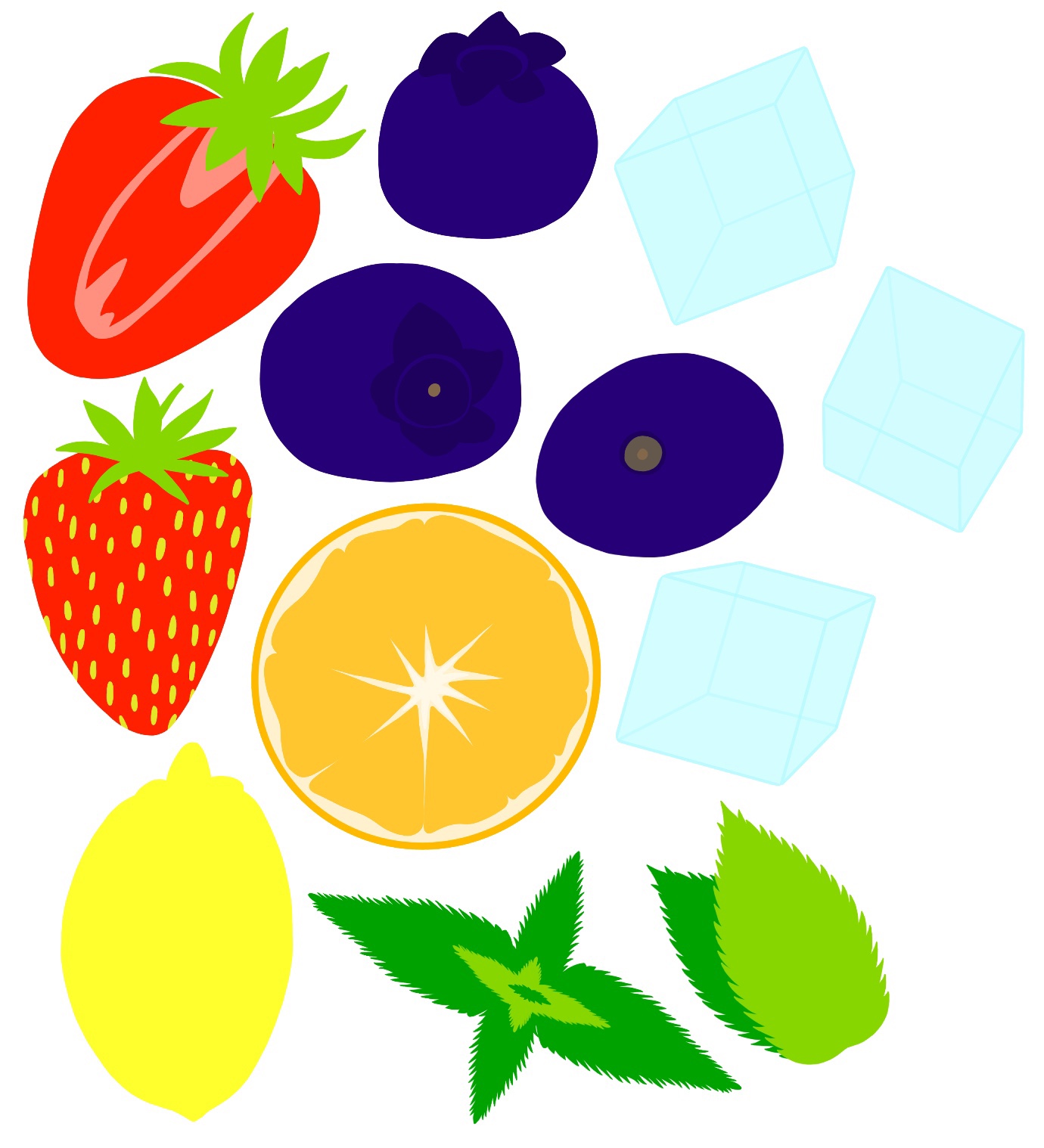
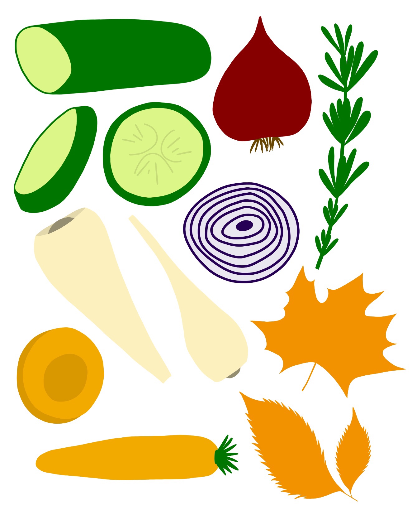
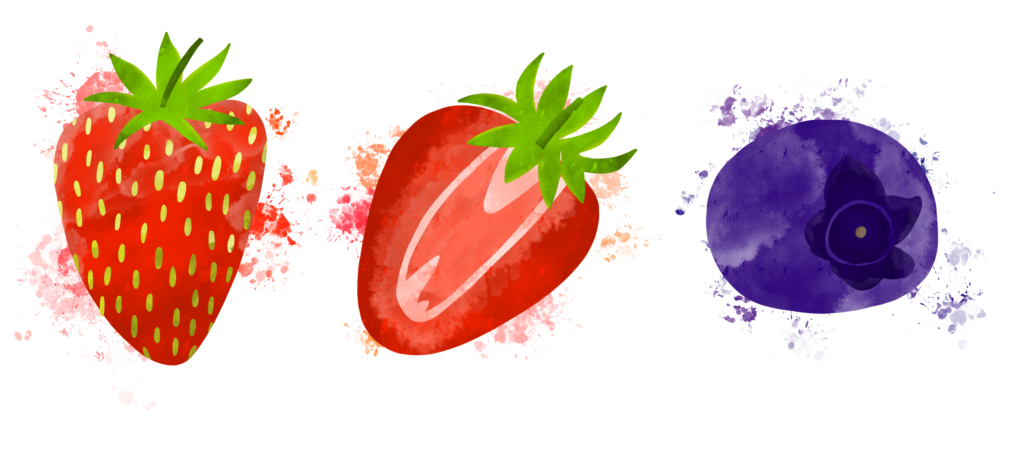
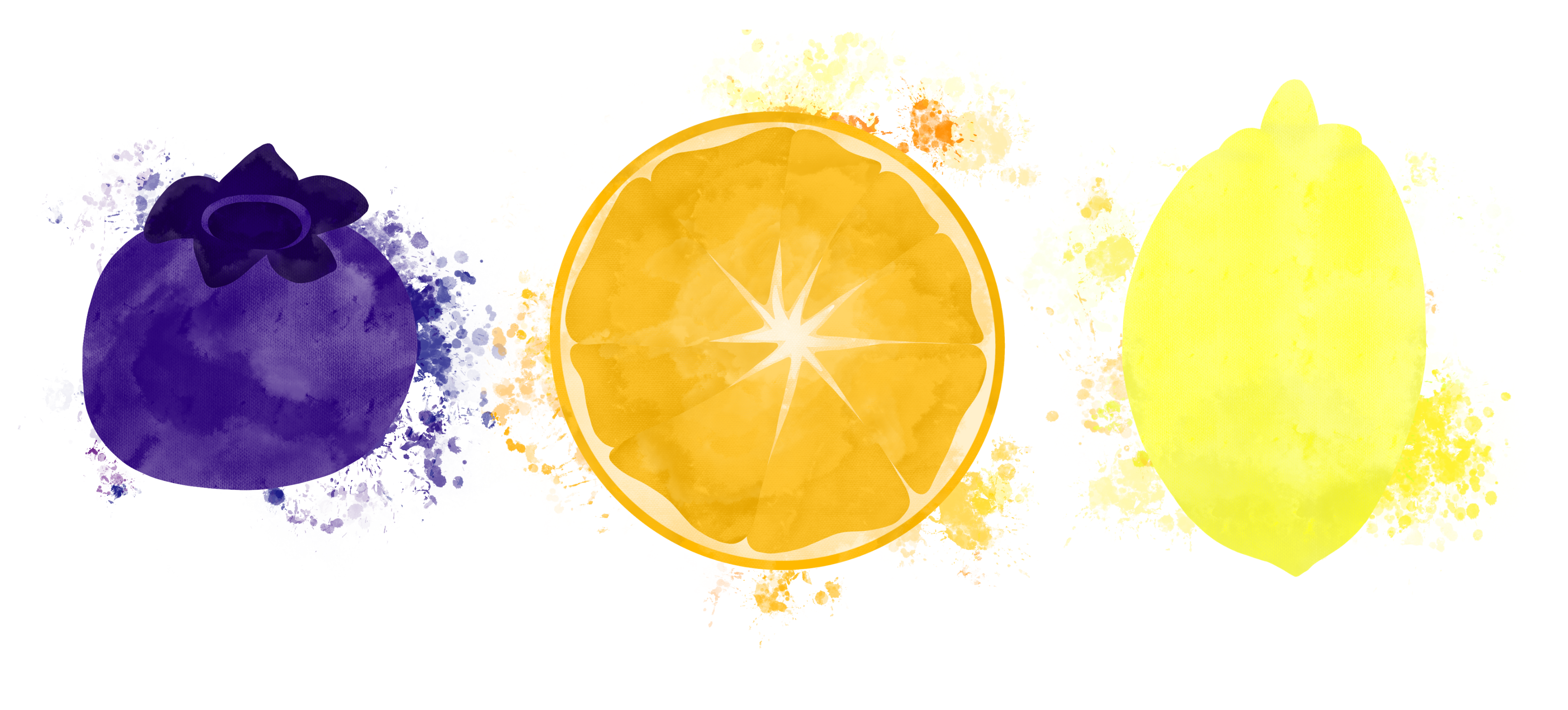
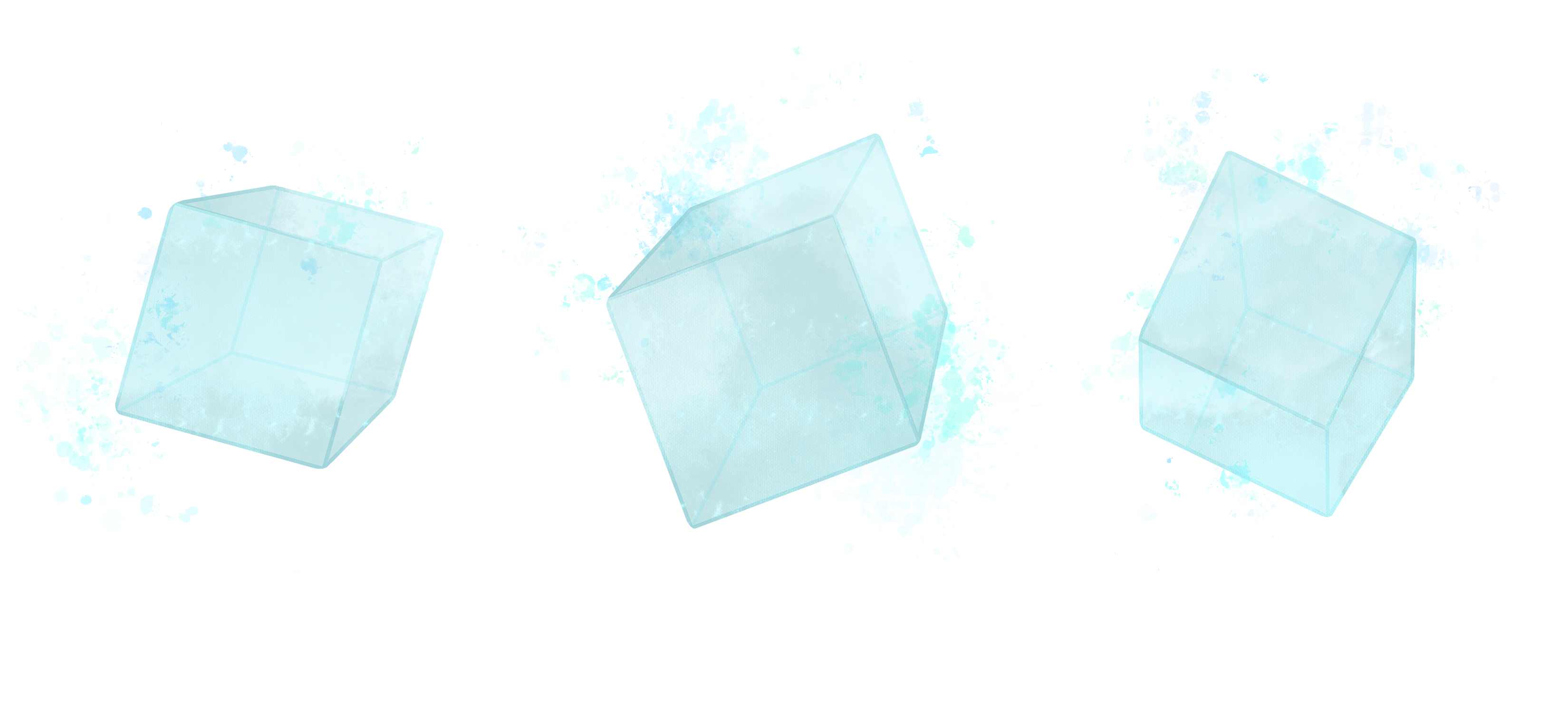
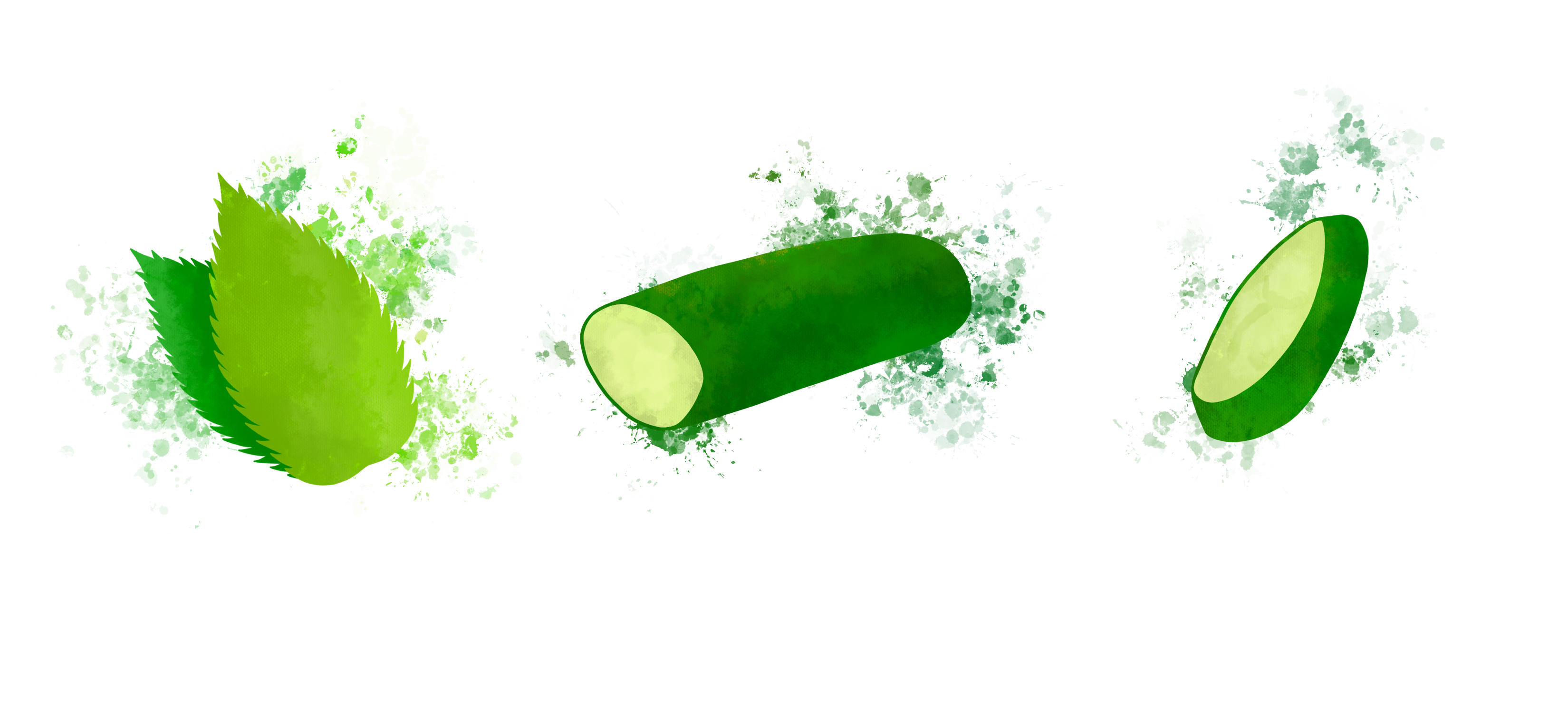
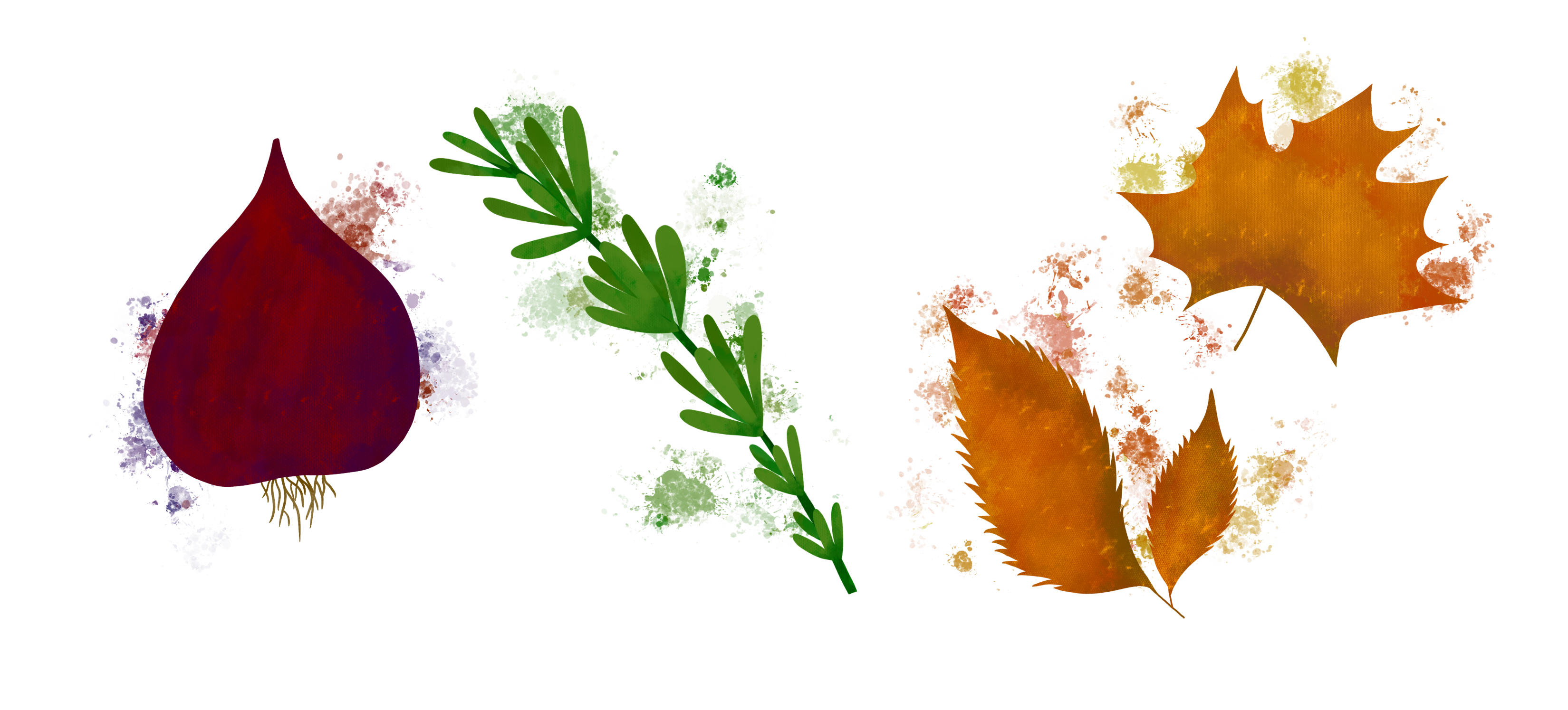
Alongside using the wild light brush, I added some missing detail – and fixed the roots on the onion – using the ‘studio pen’ brush. Old habits die hard, as they say, so in some places I did resort to my usual brushes for shading as it’s what I know best. I made sure, however, that wherever I did this, the watercolour texture was still prominent. Once I had sufficiently added texture and shading, I used a splatter brush to further the watercolour look I was going for. I thought this was a great addition as not only does it appear to be watercolour, it also evokes thoughts of ‘juice’, which fruits and vegetables are full of. A juicy fruit or vegetable means it’s ripe, which is most appealing.
I showed some of these elements to friends, and posted them in the OCA Visual Communications Discord server, and multiple people remarked how the image made them ‘want to eat fruit’, ‘thirsty’, or ‘crave a Sunday lunch’. This was very reassuring and showed me that I was on the right track with what I was doing.
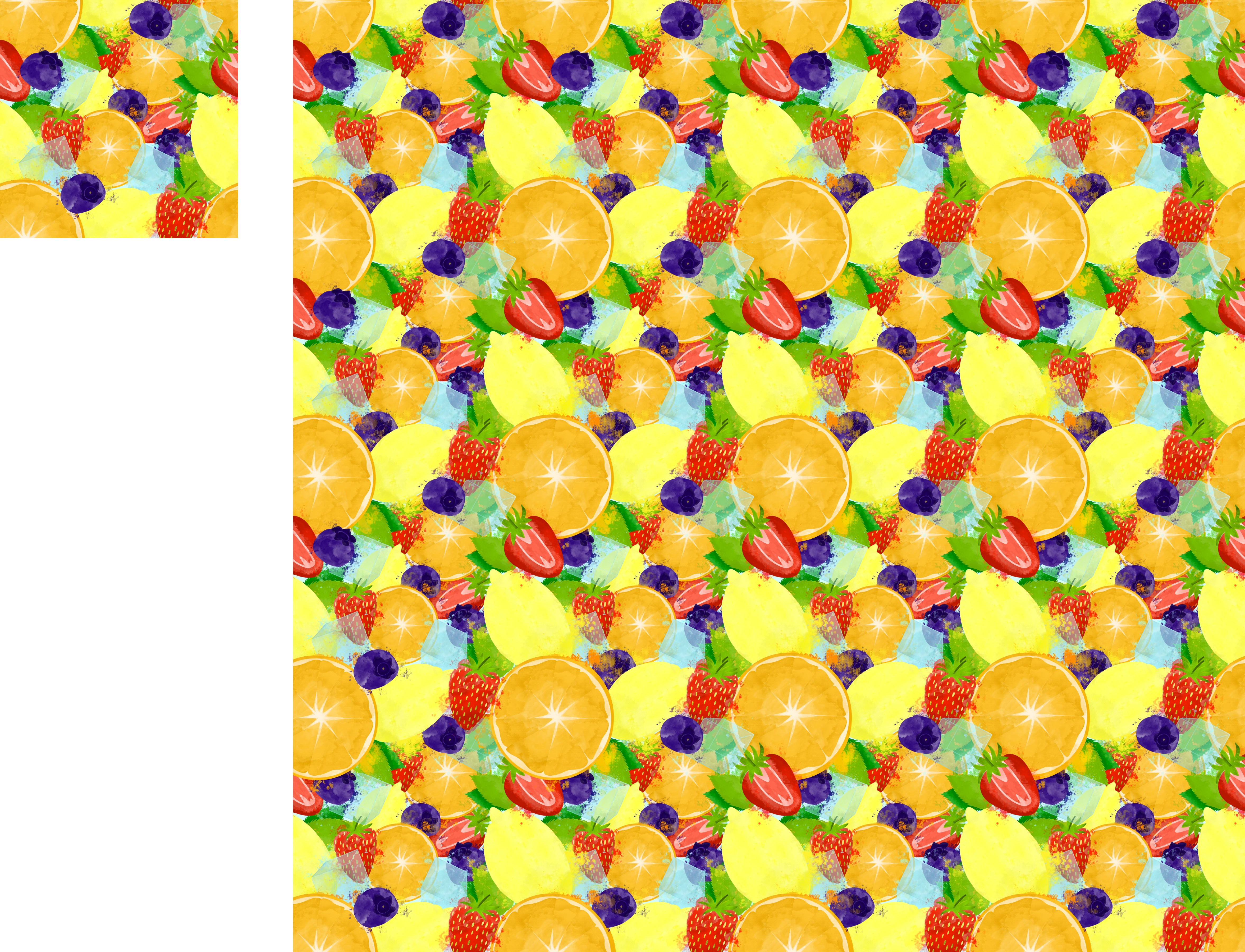
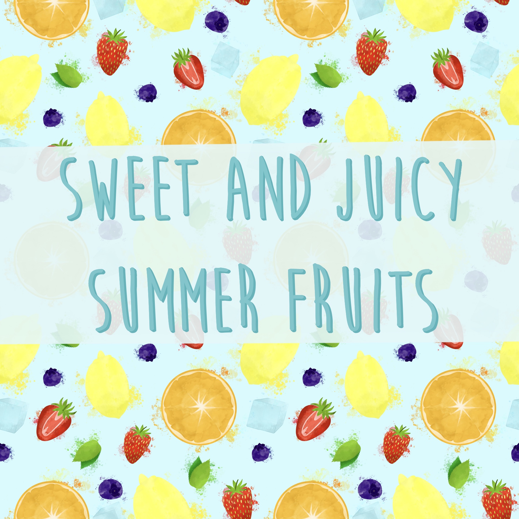
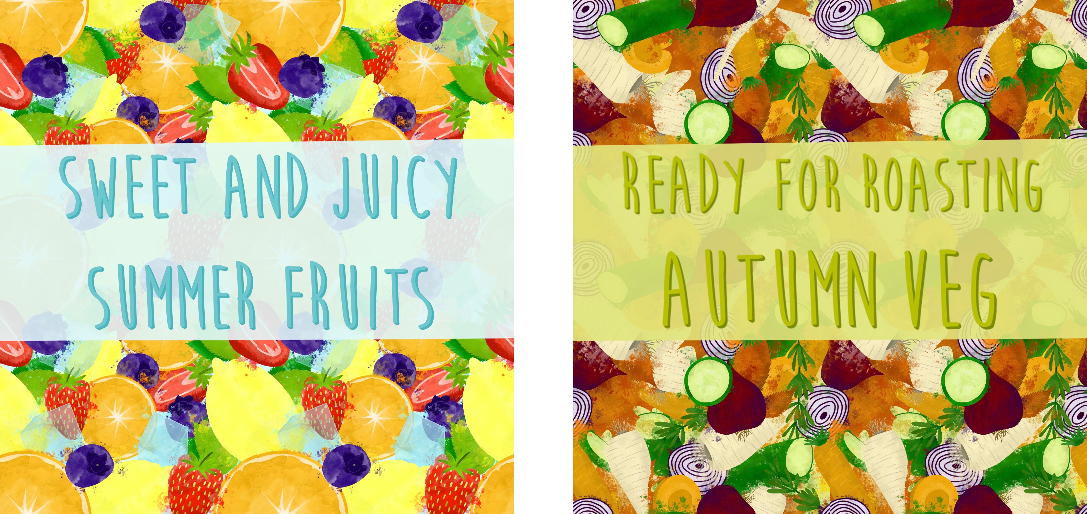
After completing each element, I began creating a seamless pattern. I have experience doing this, and typically I use both Procreate and Affinity Designer to do so. I arrange the elements in Procreate, switch over to Affinity to create the repeat, then go back into Procreate to add the final touches. I started by arranging the elements in the centre of the canvas, as this is where the repeat is formed. I also tested changing the opacity of the elements, as watercolour is typically less solid, but I preferred the solid look. I then took my design over into Affinity to begin my repeat.

This, however, was proving difficult for this piece. It generally is an inefficient way to create repeats, but it’s easy for beginners. Taking an already positioned design into Affinity and cutting it as a repeat, then moving it back into Procreate, means you cannot alter the elements once they have been positioned. Sometimes that’s fine, but with a big overlapping pattern like this, the ability to move elements freely is necessary. I knew that it was possible to create patterns directly in Affinity Designer, but hadn’t learned how to as it felt quite advanced.
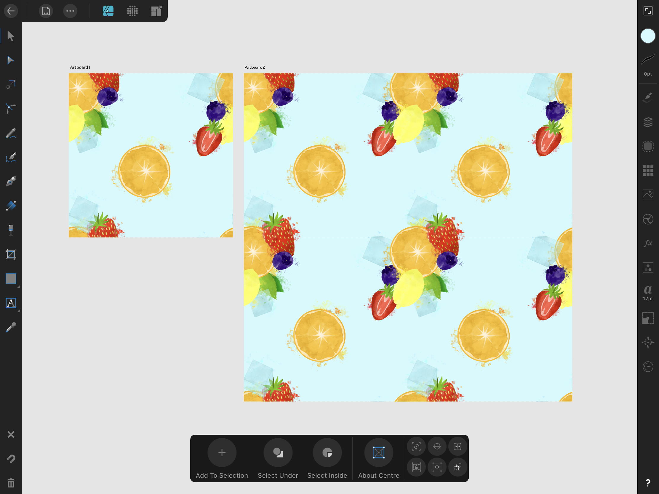
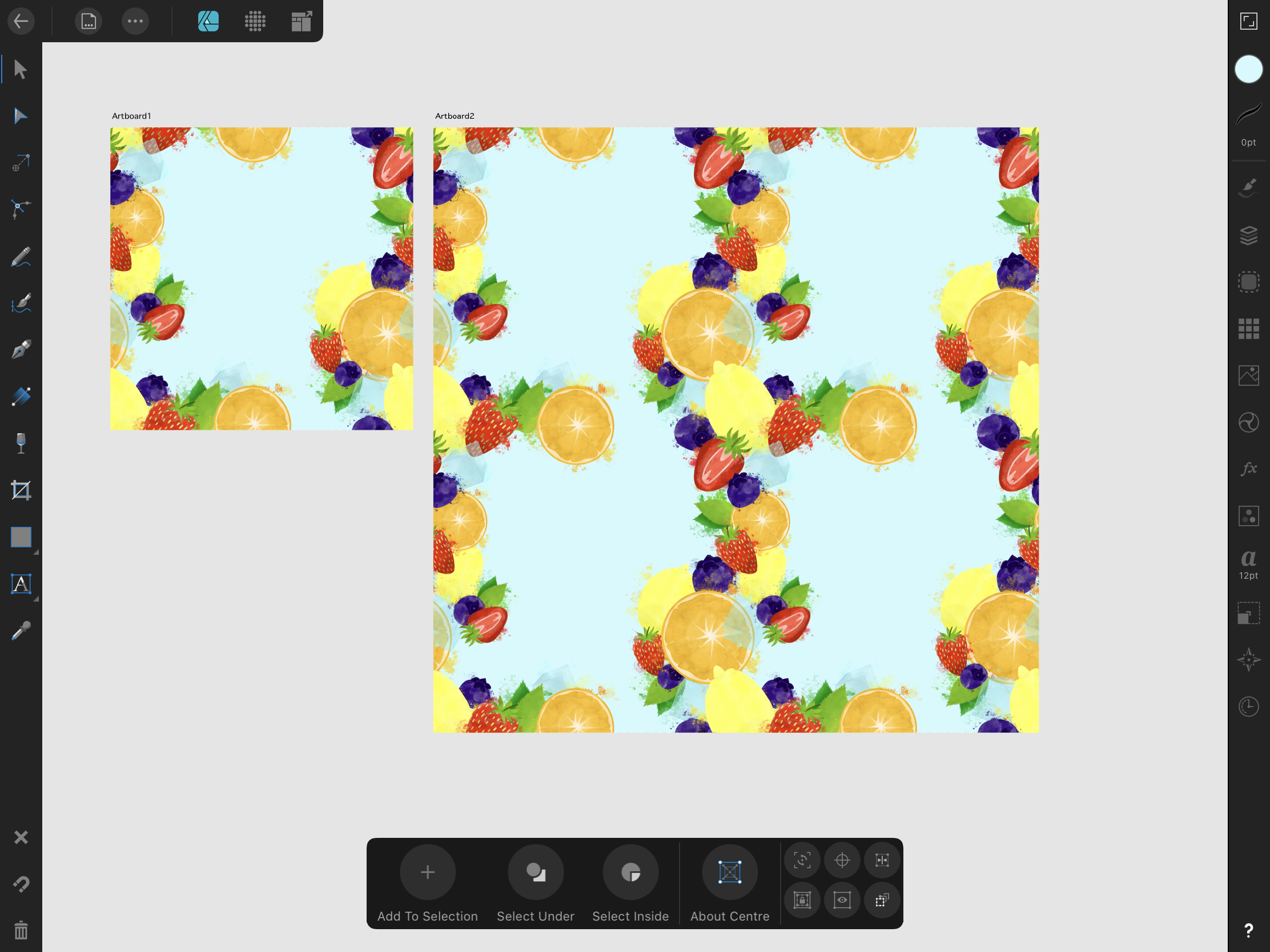
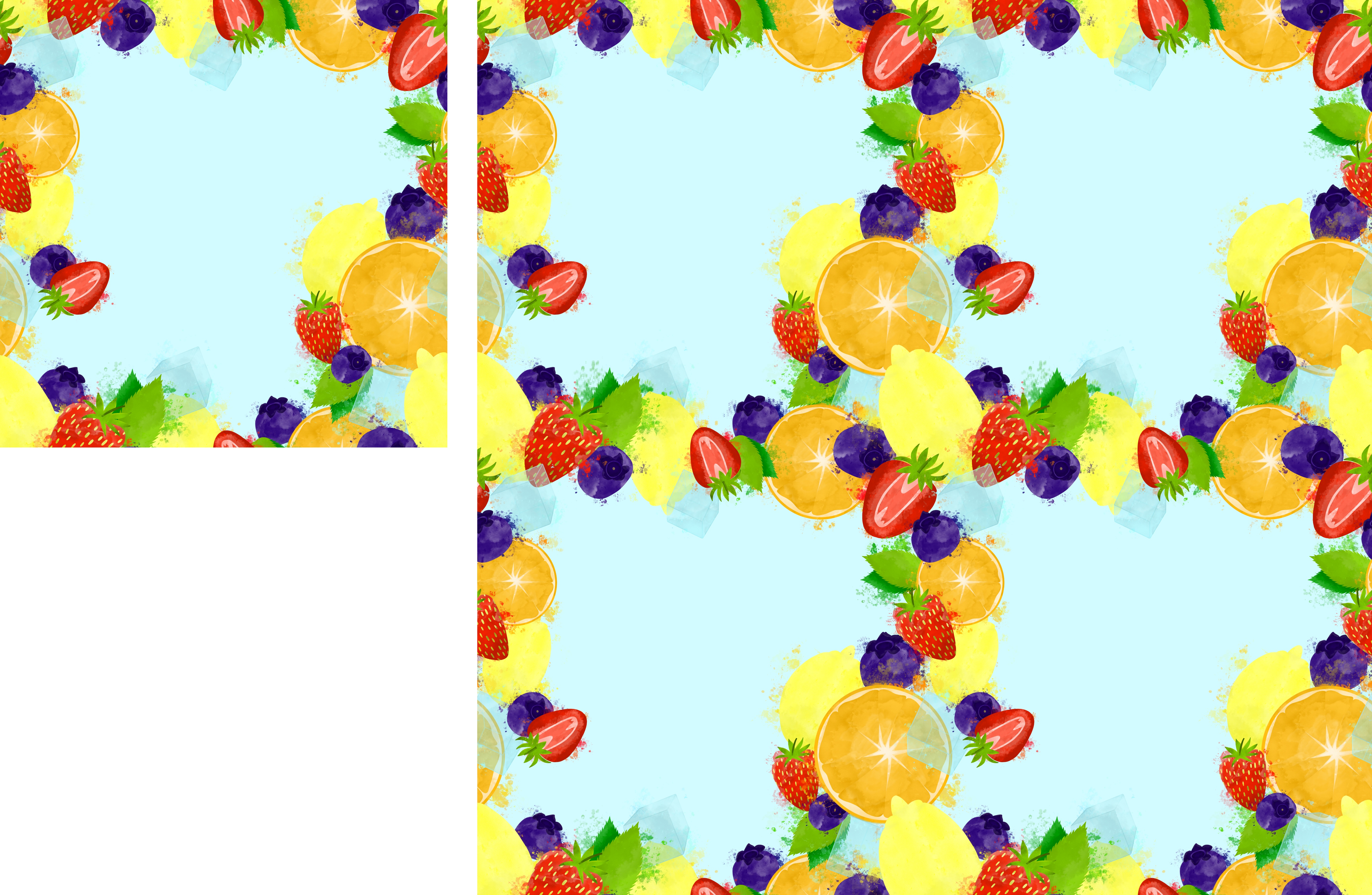
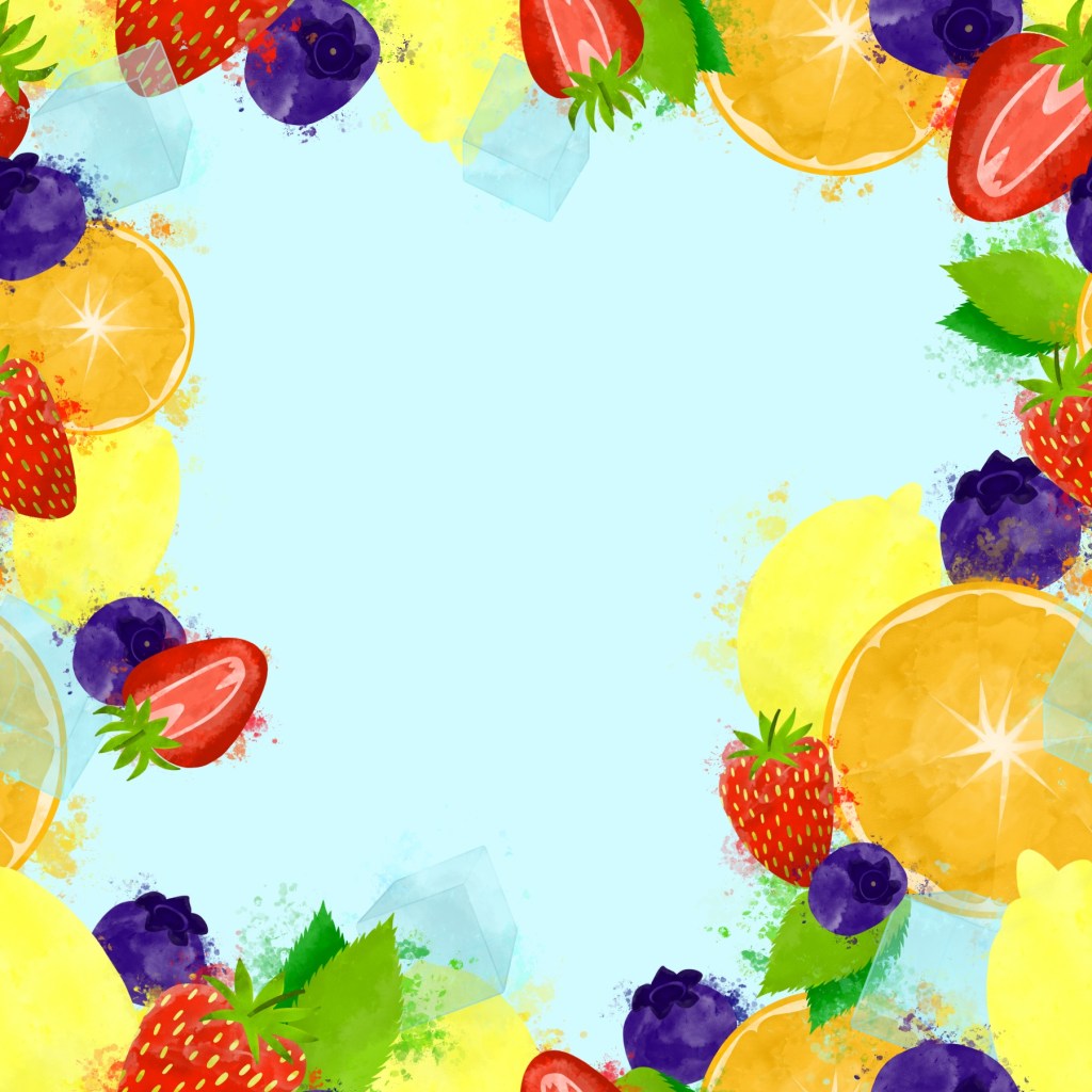
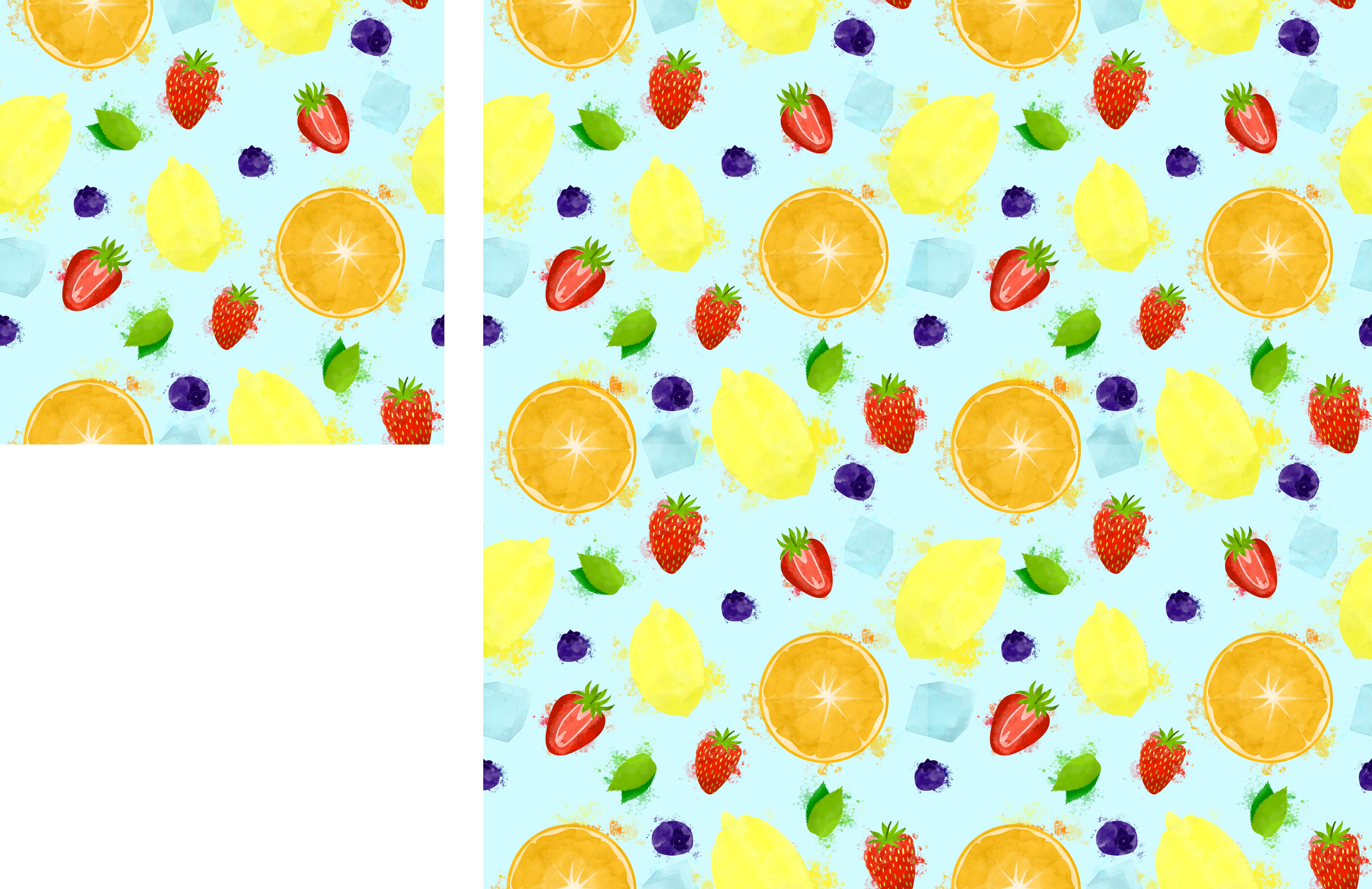
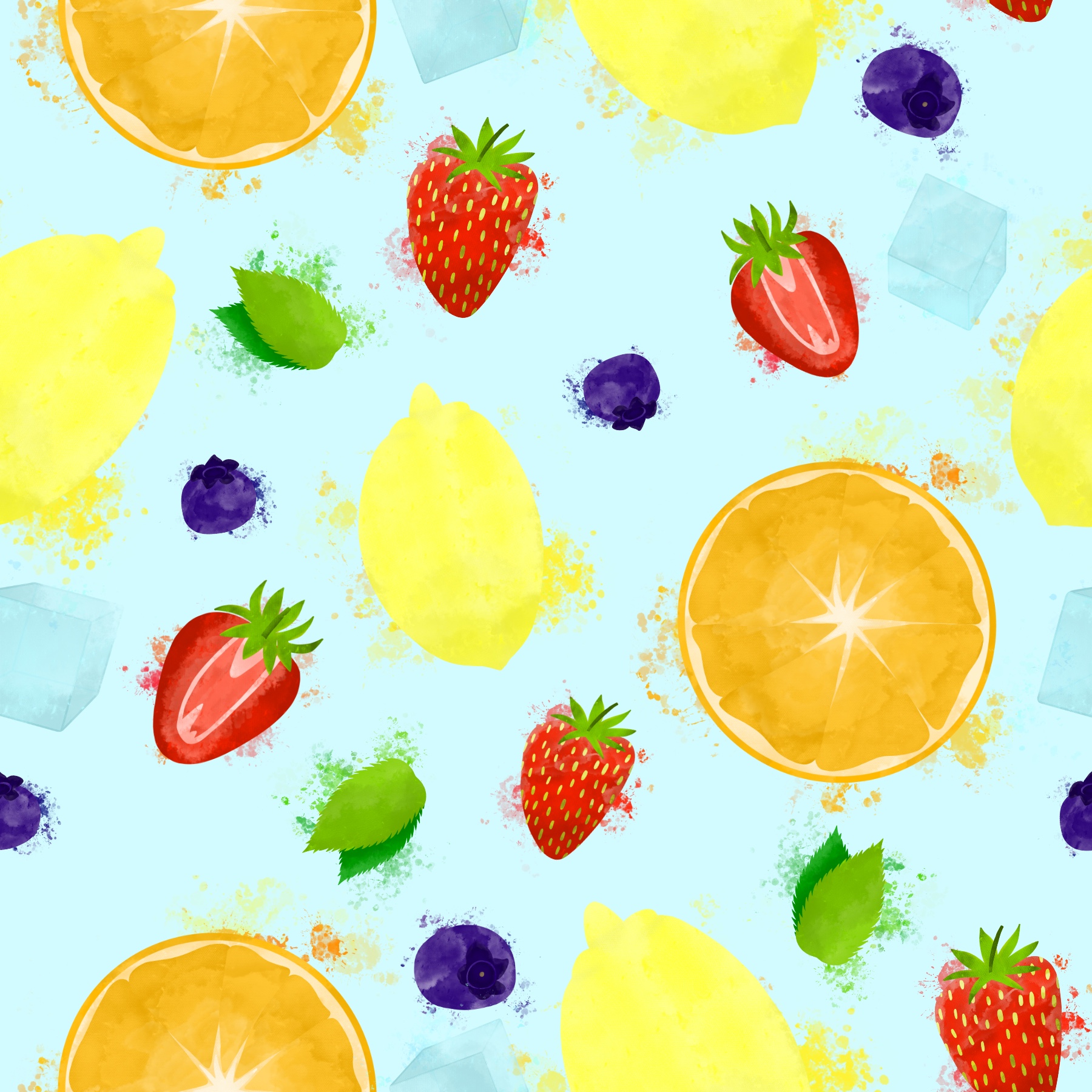
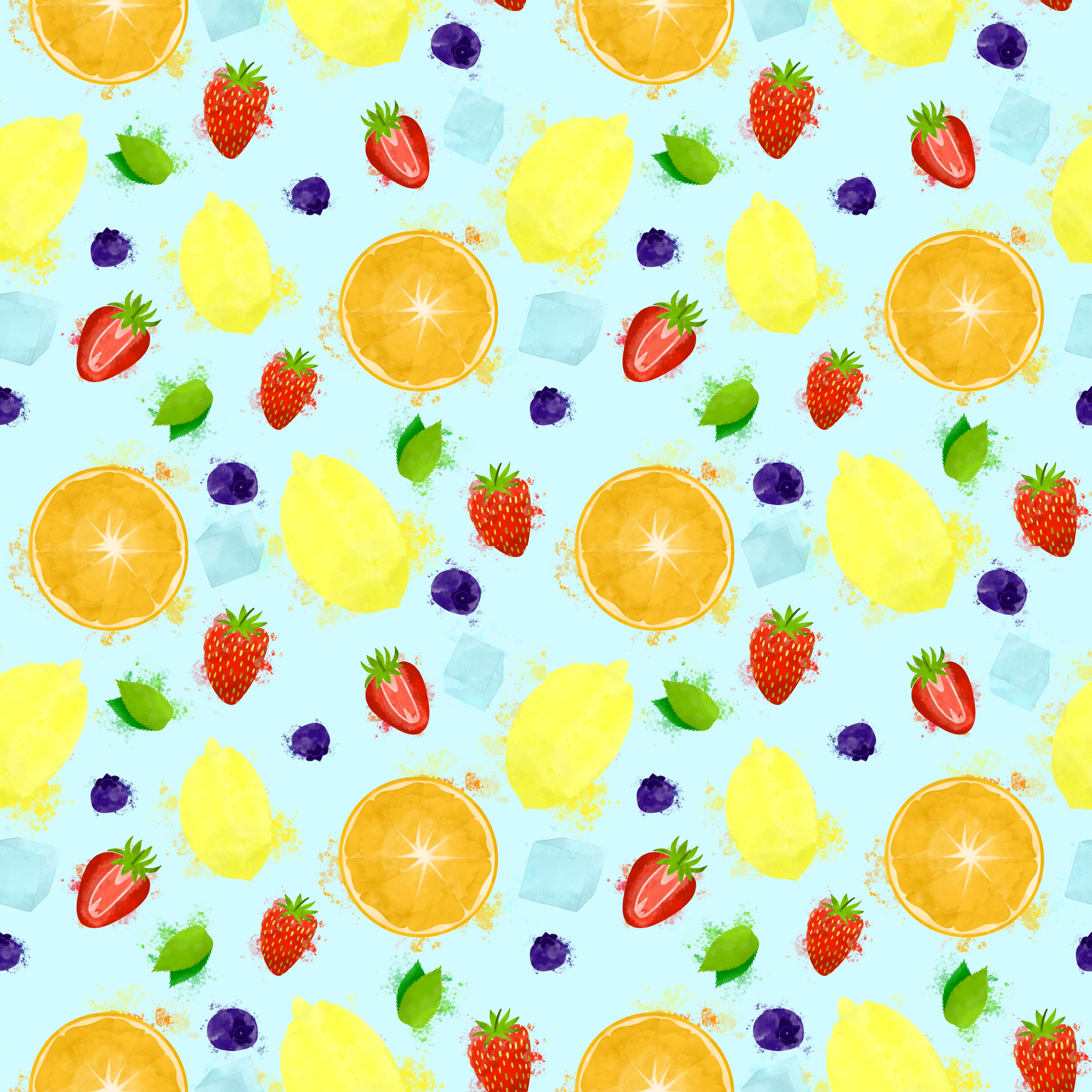
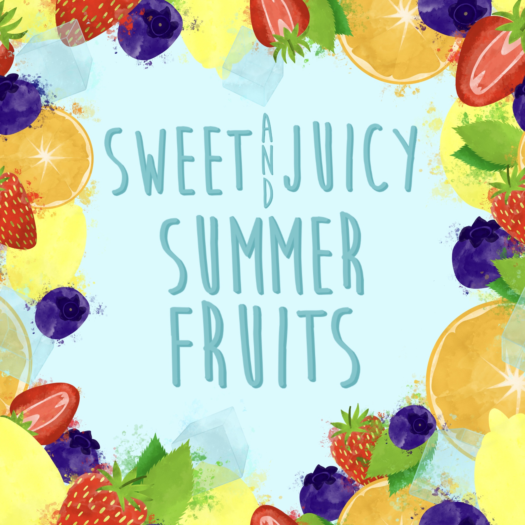
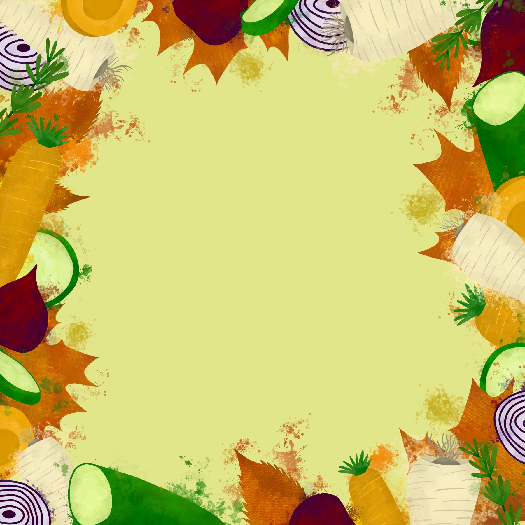
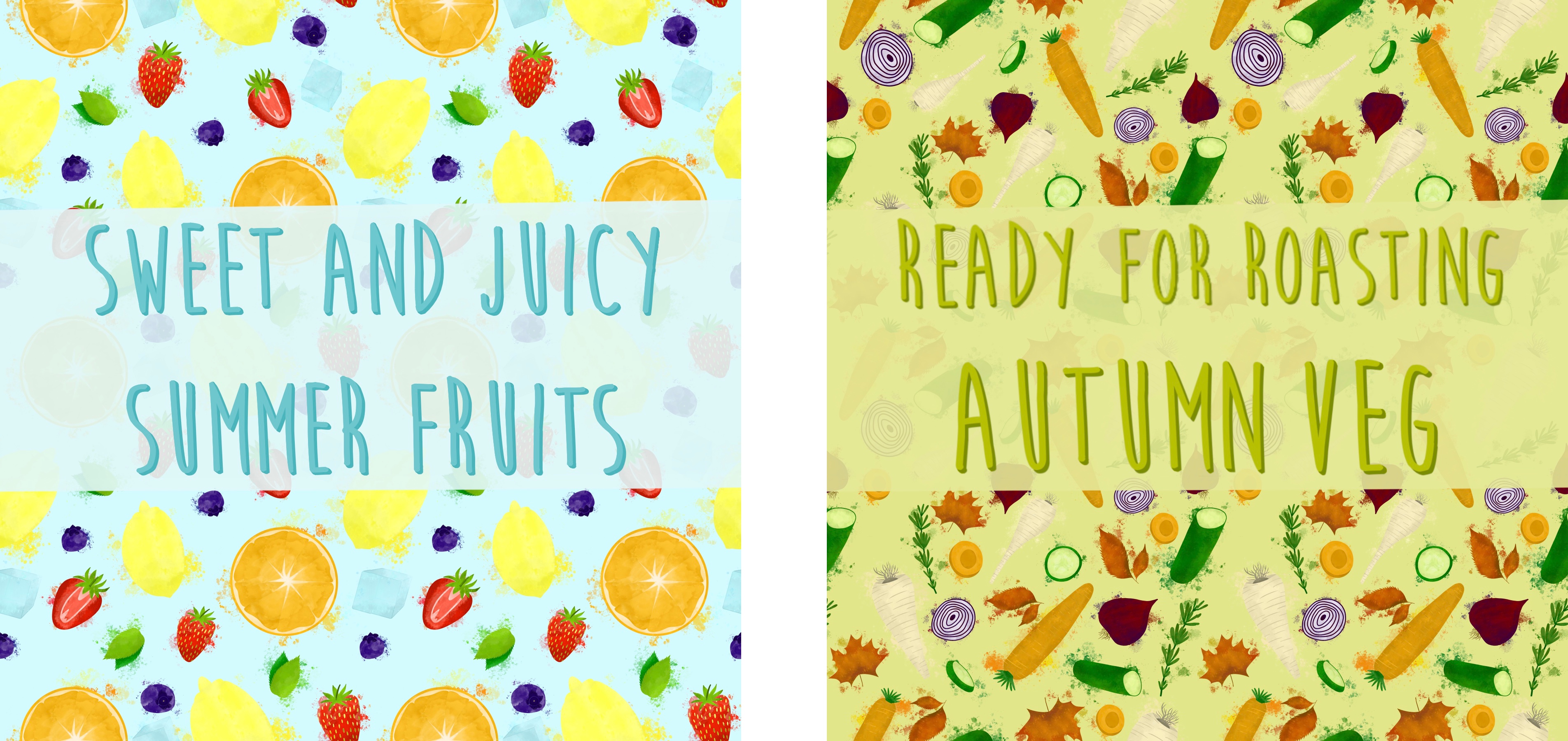
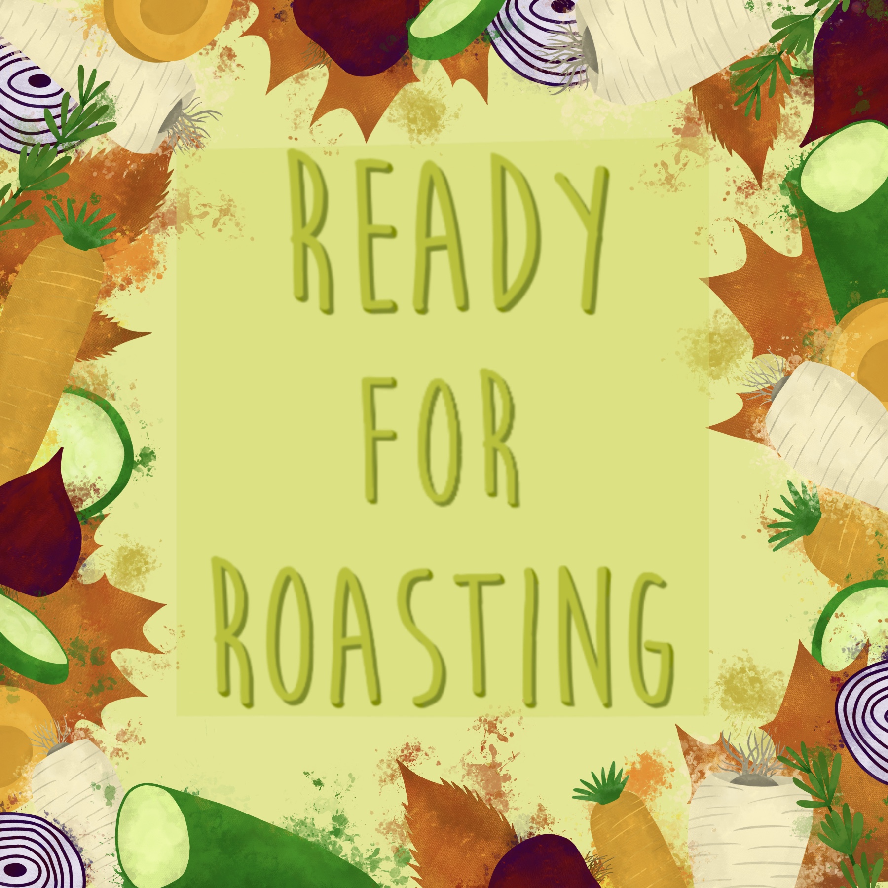
I transferred all of my elements to Affinity, and began watching Liz Kohler Brown’s Skillshare class on seamless repeating patterns in Affinity Designer. This class was super helpful, but I was still finding it very difficult to get going. After several hours of struggling and not fully understanding why, I took a step back from my piece. At this point, I had a sort of border frame with my elements, rather than a coherent pattern, and I really liked how it looked. I also, upon reflection, had figured out that I was working at too big of a size for what I was attempting. My canvas was 6×6 inches, and I wondered if 3×3 would be easier. Through working, I now had three solid ideas for a final piece: a border, a busy overlapping pattern like my original goal, or a looser, less busy pattern, much like the ones I found whilst researching.
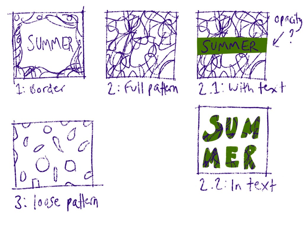
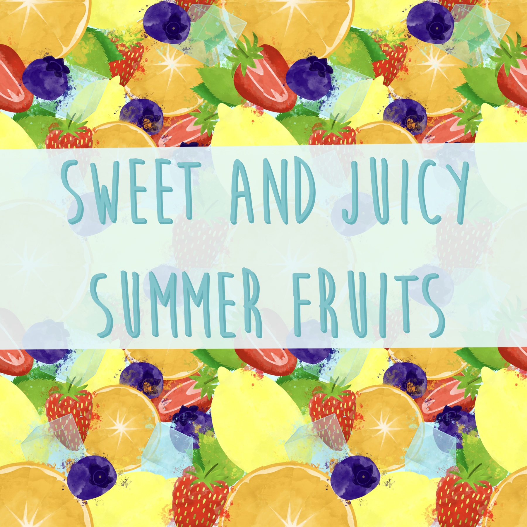
I sketched out my three ideas so I had them to hand, and also sketched out some possibilities for text addition. I altered the border design, as it originally was meant to be a pattern and so several elements were in awkward places. I then changed my canvas size to 3×3 inches and began developing the two pattern ideas. The smaller canvas size made it so much easier to work with, and I found I was way less overwhelmed. I think at this point I also had a better idea of how to create patterns using just Affinity Designer.
Once I had all three of my designs ready, I attempted to pick one to take forwards and work with. I wasn’t keen on the idea of creating three more designs for ‘autumn’. I added text to the designs to help this decision process, but I was really stuck. Thankfully, the pattern overlay on the text didn’t work so well, so that got rid of an idea. I could see use for all three of the designs, both as a point of sale display and as packaging and promotion. I feel like at this point in a design process, I would show my client the three options, and ask them for feedback. They would be choosing which they wanted, and if they wanted all of them.

I decided to go ahead with making the same three designs for autumn, and hoped that seeing them side by side as cohesive pieces would help me pick one for the point of sale display. The process was easy now that I had figured it all out, and just required me fitting the elements together. I did have a slight issue with some incorrect seams in the busy pattern that I just couldn’t seem to fix no matter what I did. Otherwise, this was a straightforward process.
After adding text, I displayed all three options side by side. Unfortunately, this got me no further in my decision making process. I could very easily see all three designs as point of sale displays. I decided to post the three options on several different social media platforms, asking my friends, followers, and fellow students which was their favourite and which they could see being in a supermarket.
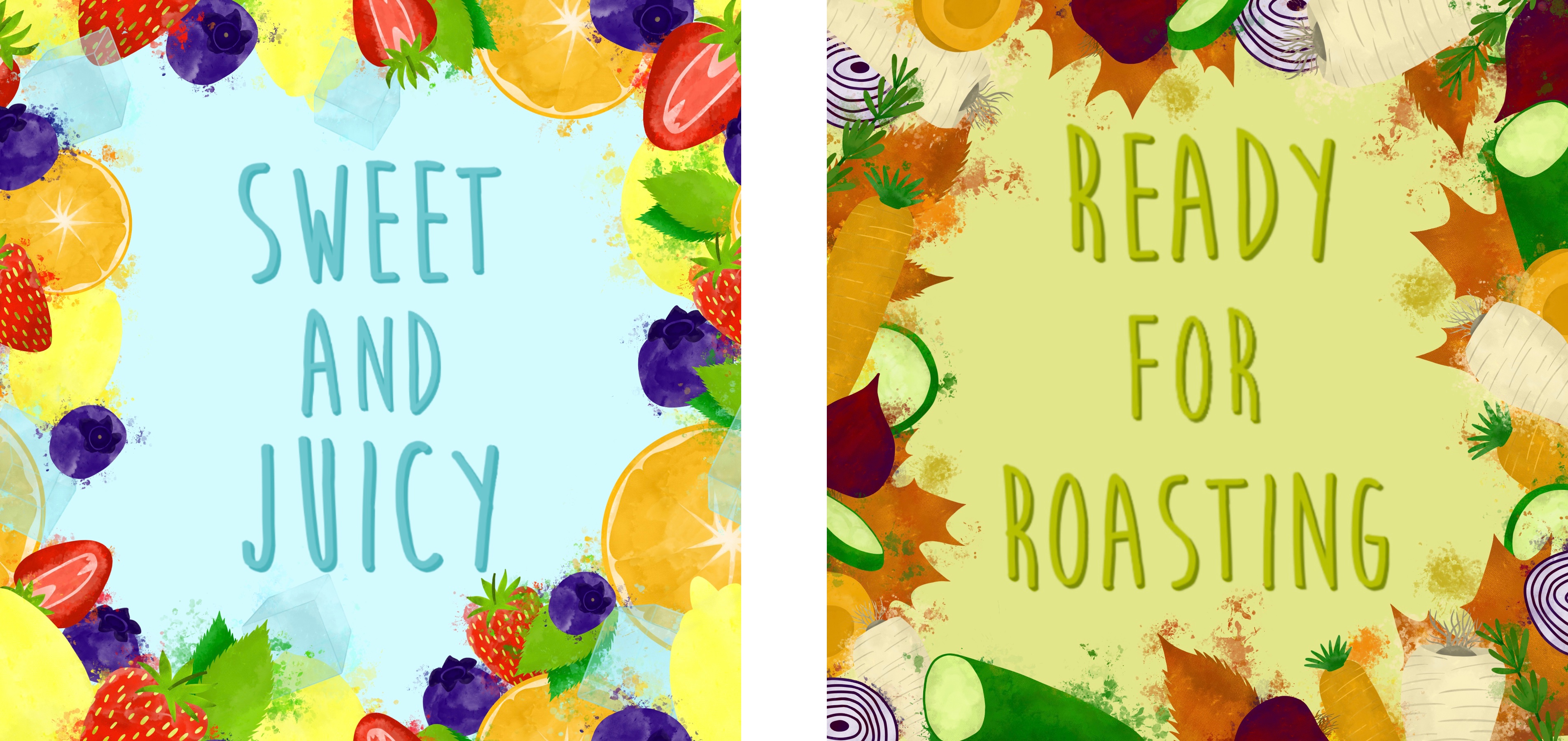
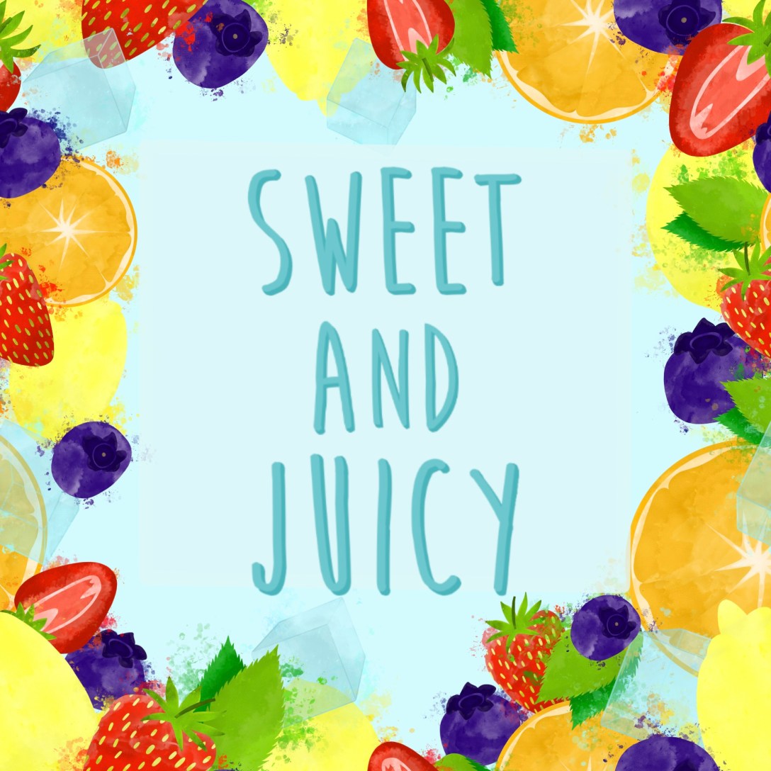
The overwhelming response was that option one – the border display – was the best. Several people picked the busy pattern, and a couple picked the looser pattern, but even then, they commented on the border display. This was not my goal going into this assignment, and I really like how the patterns look, but I agree that a border is likely to be used for a point of sale display. I went back and edited the pieces slightly as I feel an opaque background behind the text helps it pop more. With that, I was finished.
As I said earlier, I feel like at this stage my client would decide which they preferred and which they want to take forward. I’m glad I have the other pieces as options, and that I designed each element separately so they can be used again or easily altered going forwards. This is useful when working with clients as you can produce a whole new design whilst still keeping it thematic. I really like how the colours in each of my designs complement each other when side by side, and that the two designs work cohesively together. You can tell that they are for the same supermarket, and that they are meant to go together. I was very intentional about tying the two designs together and I think my attempts have worked.
I do think I could’ve been a bit more decisive in this process. I wanted to experiment with different possibilities before considering ideas for my final piece, which ended up leading to me producing multiple options for a final piece instead. I don’t think the process I have used was bad, and it worked very well for this assignment, but maybe for future assignments a different approach will be needed. Regardless, I’m very happy with my final pieces and with how I used my research and experiments to inform my process.

[…] me with a brief I am already pretty familiar with, as it is near-identical to the one for Assignment 2 of Key Steps in Illustration. A local greengrocer has asked me to produce a point-of-sale display to go above the fruit and […]
LikeLike