This exercise asked me to provide an illustration to be used on the menu of a sophisticated, high quality fish restaurant. The image would be used at a small size on the menu – 40mm x 40mm – but if successful would also be used as a logo on stationary and vans. Therefore, the illustration needed to be simple, clear, and versatile.
From dissecting the brief, I felt my key points when developing this illustration were that:
- The restaurant is upper market and high quality
- The ingredients used are fresh
- The theming of the restaurant is modern, bright, and contemporary
- The image produced must be sophisticated and clear
To start off with, I began looking at a wide variation of high class seafood restaurants to see how they currently advertise and what imagery is commonly used. I looked through the top restaurants on TripAdvisor and took screenshots of any imagery found on menus, as well as used throughout websites. I also took screenshots of any logos or fonts, so that I could reference these too. I then saved images of restaurant interiors, exteriors, or food served at the restaurants in order to compose a mood board of the general ‘vibe’ these sorts of restaurants have.
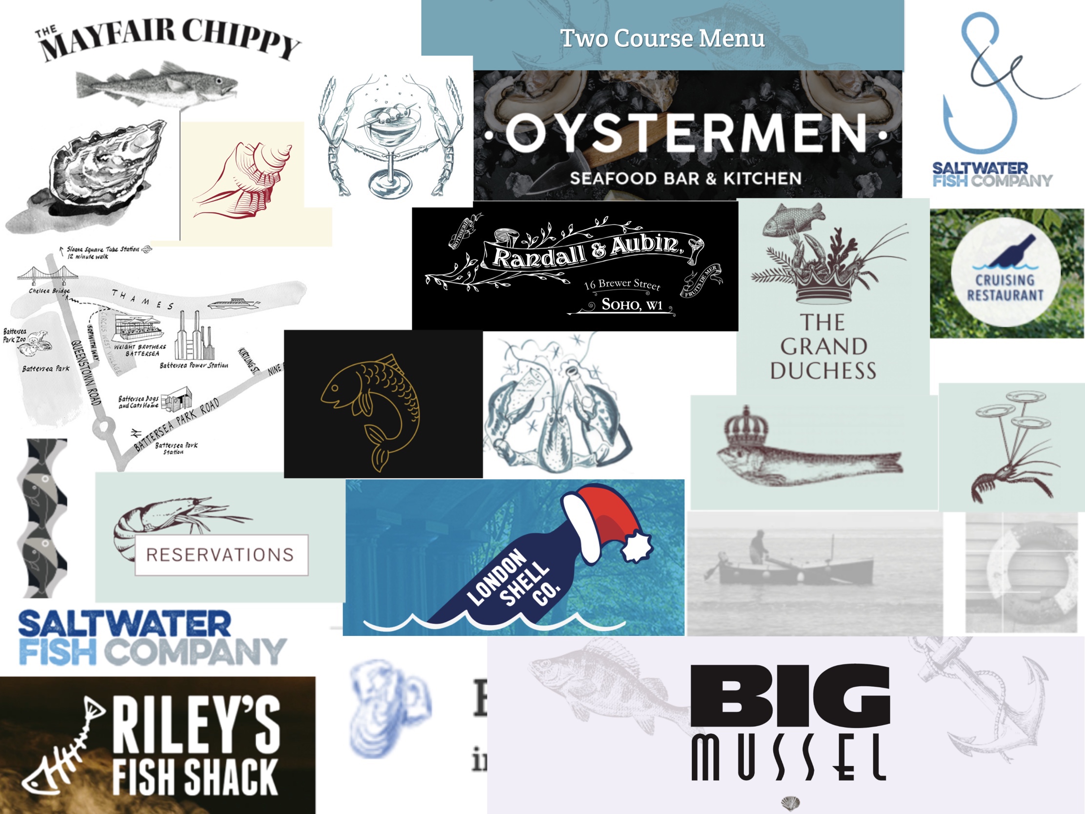
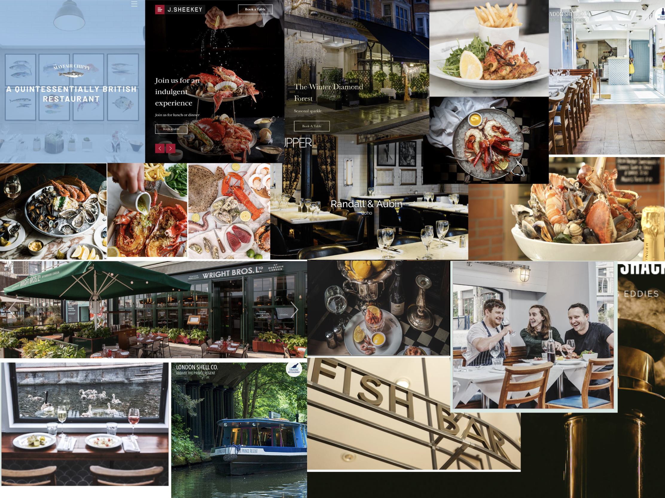
I felt that there were two kinds of designs repeatedly used throughout the imagery I collected – the first was simple ink or line drawings, the second was bolder solid vector images. There was a consistent dichotomy in the interiors of the restaurants, either dark and mysterious, pulling from vintage aesthetics, or bright and airy. I knew I would be doing this digitally, at least in part, as digital images are much easier to manipulate for several purposes whilst maintaining quality – so I began experimenting with brushes in Procreate to see how these different styles could be used.
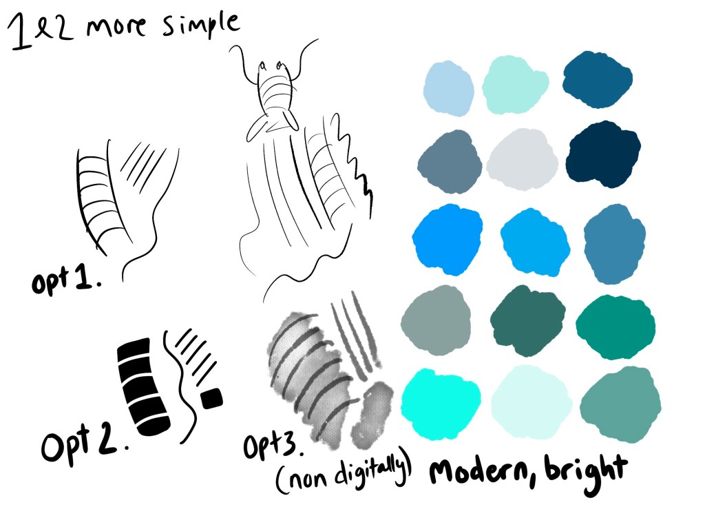
I also tried to do a watercolour type style which would go with the ink drawings, but this would most likely have to be undertaken traditionally. I felt this wasn’t fit for purpose, so scrapped that idea pretty early on. At this point I also composed a colour palette, taking from the colours seen in my mood boards, and bearing in mind the ‘modern, bright, and contemporary’ descriptor in my brief.
Next, I needed some content for my image. I began listing off all the things I could think of that I associated with seafood, marine life, and the seaside in general. I also Googled the most popular seafood dishes, and asked a few friends what popped into their heads when they thought about seafood restaurants. I then searched Pinterest for references of all of these things in order to get inspiration and narrow down my options, as at this point I had about 30 elements written down!
This, thankfully, helped me a lot with choosing content. I was inspired by the images I saw when researching that contained both sea creatures and an object, like the fish wearing a crown or the lobster holding champagne. I liked the idea of combining one object with one creature and creating a narrative with the two. I had an extensive list of objects to pick from, and a handful of animals I was eager to draw, so I began sketching out ideas.
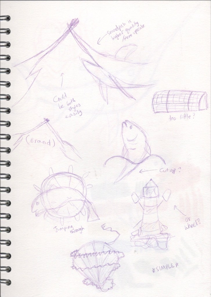
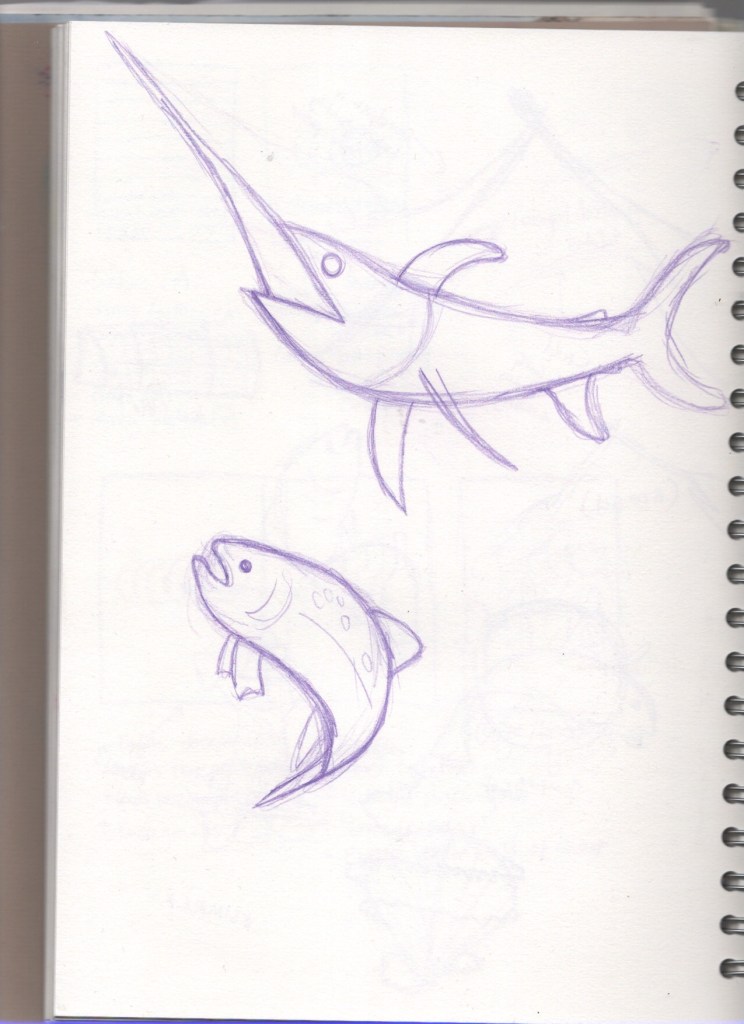
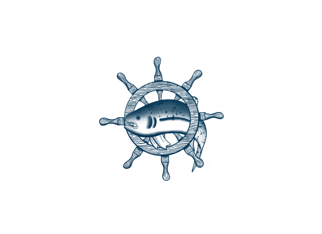
My favourite of the ideas I had were the two swordfish engaged in battle, with a fork and a knife as their swords, and the salmon in water/in the wheel. I drew out a swordfish and salmon in order to scan them in and recreate digitally. At this point I wasn’t sure whether I would be using the ink drawing style, or the solid vectors, so I made sure whatever designs I created could be fully illustrated in either style. Once I had created some line visuals, I decided to share them on my Facebook profile and ask my friends which they thought suited the brief best, as I was stuck on which I preferred.
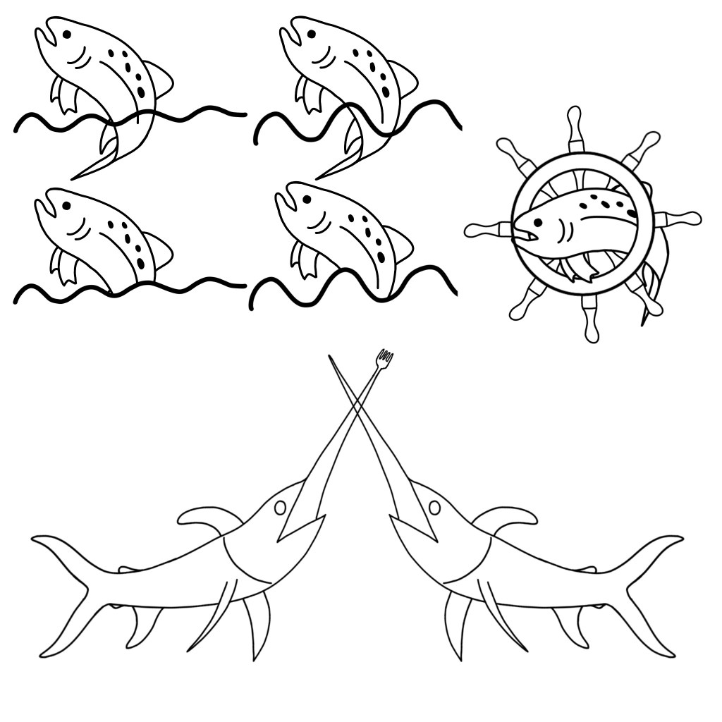
I got around 40 responses, with an overwhelming number of people preferring the salmon drawings. The general consensus was that the salmon in the wheel was most appropriate. After hearing varying opinions, I agreed with this, and I started getting excited about executing the final design. The design could very easily be either ink drawing or vectors, but the more I thought about it the more I felt my style was more in keeping with the ink drawings. I also felt the wood grain of the wheel lends itself well to this sort of design.
Unfortunately, none of the time-lapse recordings for this exercise have properly rendered. I think the issue is that I started my canvas with a sketch that I later deleted, which has caused the videos to show a completely black screen. My process in producing my final illustration was to use a fine ink liner brush and draw varying textures and lines. I also added some gentle shading with airbrushing tools, and used these to indicate colour variants in the salmon.
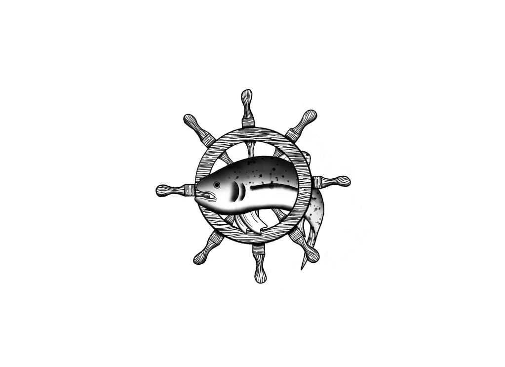
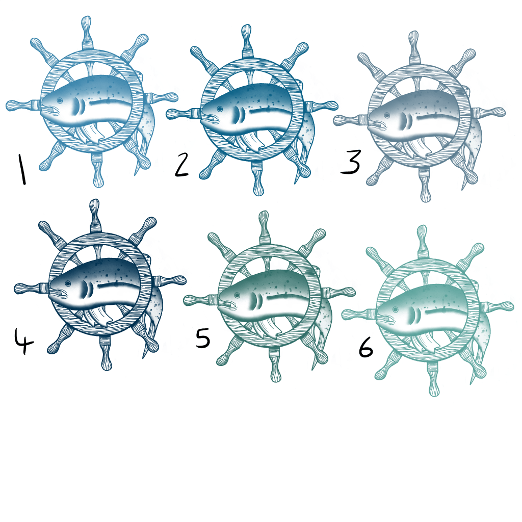
I then picked some colours from my colour palette, opting for a single colour to ensure simplicity, and tried out how they would look on the design. I wanted to go back to my previous audience and see how they felt about the final design and potential colour options, so I picked 6 variants that I thought looked the best and presented them to my Facebook friends once again. The results were pretty split between options 2 and 4, which meant it was up to me to decide which was best. I picked option 2, as I felt the darker blue was too moody and went against the bright and contemporary vibe the restaurant has.

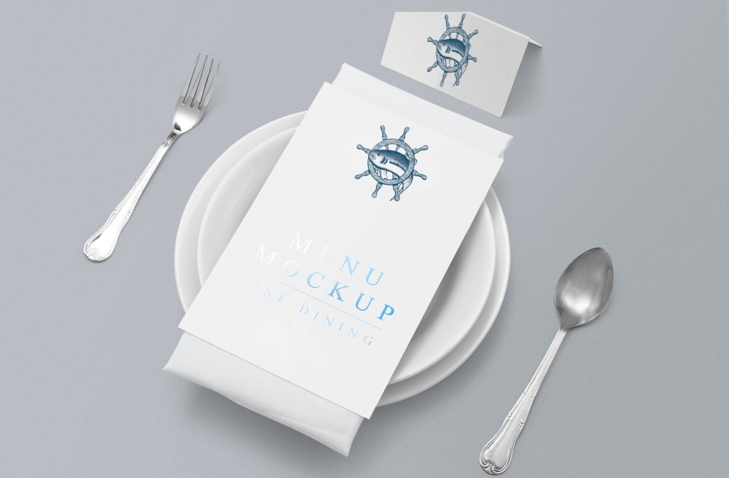
To finish, I attempted to place the illustration on various pieces of stationary, menus, and vans, in order to see how it would look in a real world setting. I found this incredibly difficult, mainly due to the fact that mock-up templates for the objects I wanted were very difficult for me to come across. I’m still struggling with where the best place to find mock-ups is, especially as a student (I.E, I won’t be using them commercially and I can’t afford licenses), and also with using mock-up files with the software I have. I did manage to put the logo onto a menu, and I love how it looks.
Overall, I really loved this exercise. Being able to fulfill briefs and apply research is a super enjoyable process for me, and I love seeing my designs come together. Polling my friends on their opinions was a great idea and helped me enormously, so I think I’ll do this more often when struggling on progression. I’m really proud of my final design, and I would actually consider adding it to my professional portfolio!

[…] tea towels especially, and I might revisit this later. I could also use the fish logo created in Exercise 25 for a pin badge, or another set of stickers […]
LikeLike