This exercise asked me to create three book jackets for travel guides featuring the following locations: Istanbul, Helsinki, and Milan. The client wanted me to create diagrammatic illustrations that brought together many elements, and for the text in the image to be hand-drawn. I had to provide client visuals for all three and a mock-up for one.
To begin, I went through the brief jotting down what I thought was needed for this exercise. The brief stated that the book jackets must be ‘the size of an existing travel guide’, so I decided the best place to start was to look at existing guides. I went to the Waterstones website and browsed through their travel section. I was surprised to see illustrated covers, as in my mind travel guides were usually photographic in design. It was definitely useful to challenge this preconception and to see how other artists had tackled this brief.
Several of the books I found featured diagrammatic illustrations on their covers, such as Walks in London that you shouldn’t miss, Bookshop tours of Britain, and Mad Dogs & Englishmen. The artists for all three of these book covers used maps of the areas in question as a background for their illustrations, adding in various landmarks and key features in the foreground, much like how the brief for this exercise suggests. As these were the only diagrammatic illustrations I could find, and as they all fit into a similar theme, I felt pretty certain that I would do something similar. I was aware that I had to create 3 book jackets and I knew already that I wanted them to work together as a family of guides. Whilst researching pre-existing travel guides I came across the Lost Lanes books by Jack Thurston. They are a family of illustrated travel guides, and they look fantastic together. Each is very recognisable as a part of the collection whilst still maintaining individual identity. This was useful to see and I took note of how to create a cohesive collection.
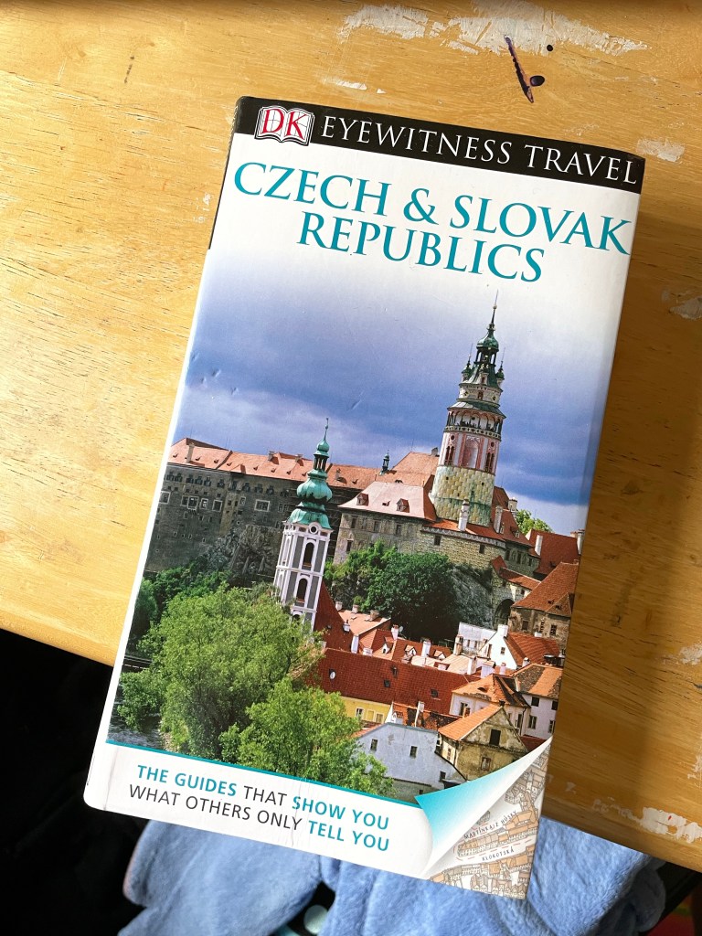
I now felt I had a good idea of what was acceptable illustration in the market of travel guides, so I decided at this point to measure a travel guide I had on hand in order to begin planning my illustrations. This book cover is 13x22cm on the front and back, with a 2cm spine. I opened up a Procreate canvas in anticipation of needing it later at 28x22cm – twice the width of the book plus the spine. This didn’t allow for many layers as it was quite big, so I halved the measurements to ensure I had plenty of room. I then added a rough marker for where the spine would be, so I would know whilst working where everything would sit on the finished book jacket.
My next research point was the general topic of ‘diagrammatic illustration’. I revisited Exercise 18 to see if I had any research there that would be useful. Most of my research was geared towards the illustration I created in that exercise – instructions on making a cup of tea – and so didn’t quite translate to this exercise. I looked back at the Pinterest board I created at the time, and found that it mainly featured ‘dissection’ type illustrations. I couldn’t see how I could both ‘bring together many elements’ and also do a ‘dissection diagram’ approach to this project. I did try to look again for other examples of diagrammatic illustration but I didn’t have much luck.
With the research on existing travel guides in mind, I decided to move on to researching my 3 cities. I also kept in mind that maybe I’d be able to somehow use the dissection diagrams, though I wasn’t too set on this idea. I grabbed a scrap piece of paper and began scrolling through Wikipedia, Google, and TripAdvisor, making notes of everything I thought was important and relevant about each three of the cities. I was immediately drawn to the fact that the cities all have high quality, intricate, well-known public transportation networks. The maps for these are instantly recognisable, even if you don’t know the specific ins and outs of that city’s system. I decided to start exploring these maps as a basis for my designs in Procreate.
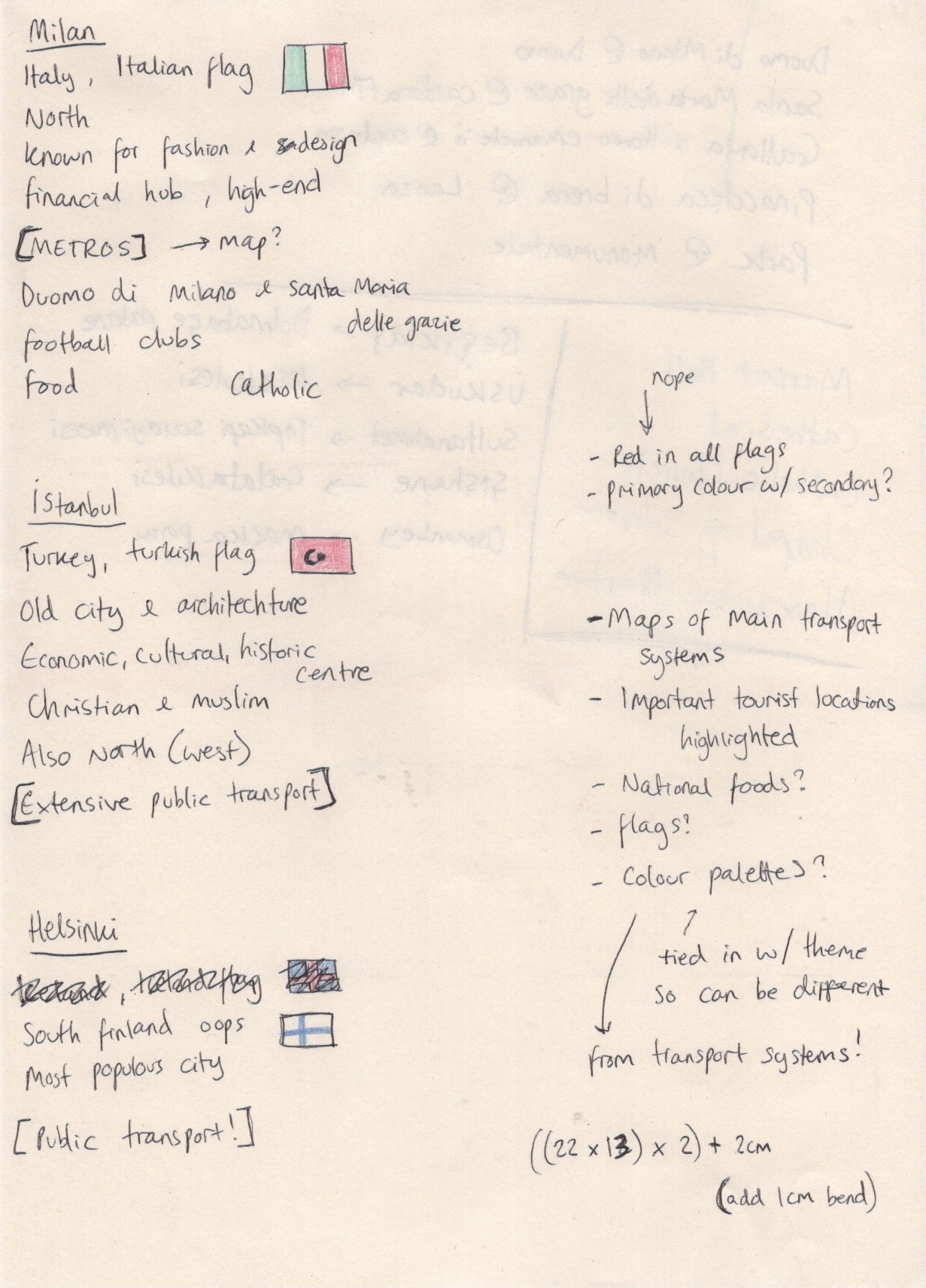
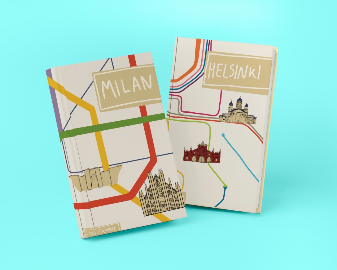
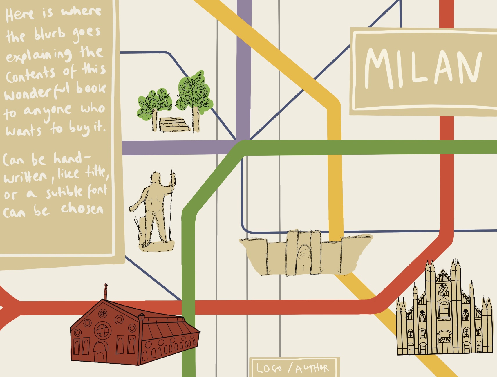
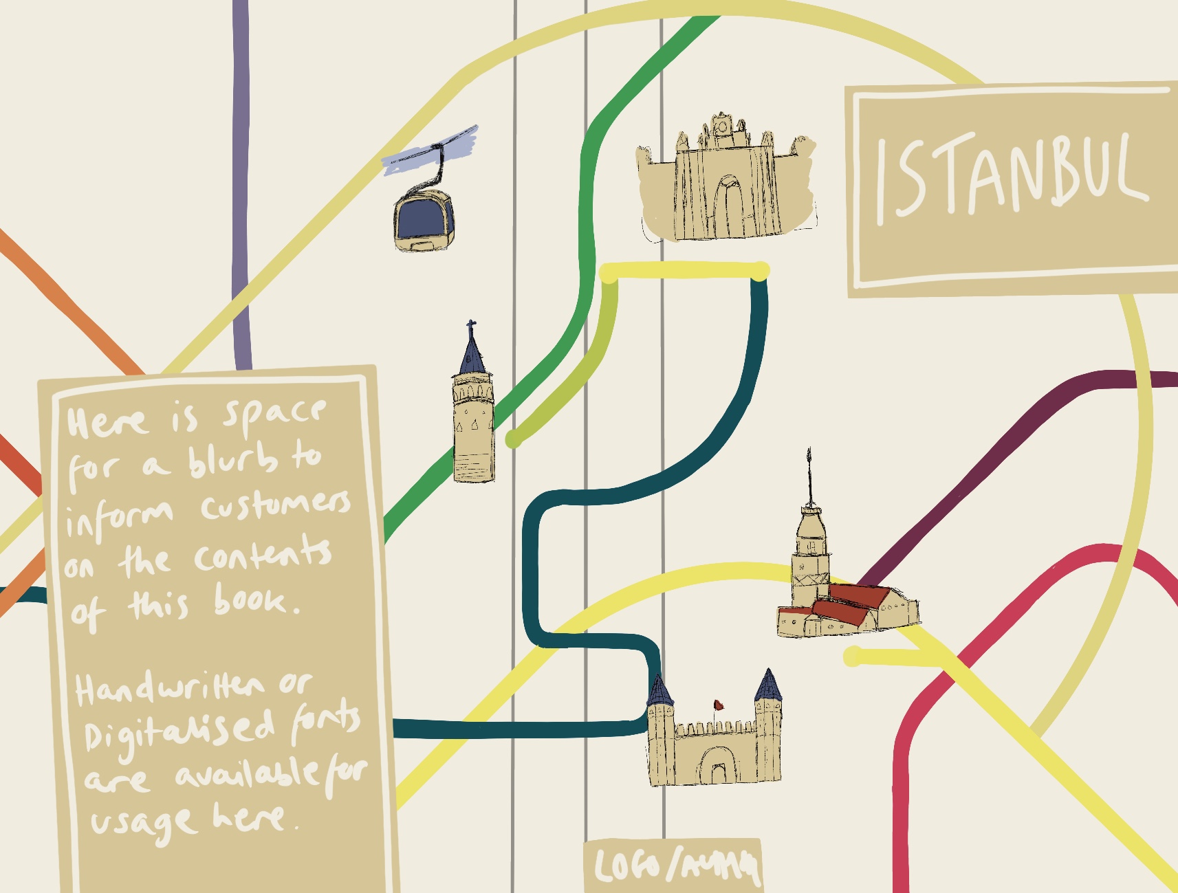
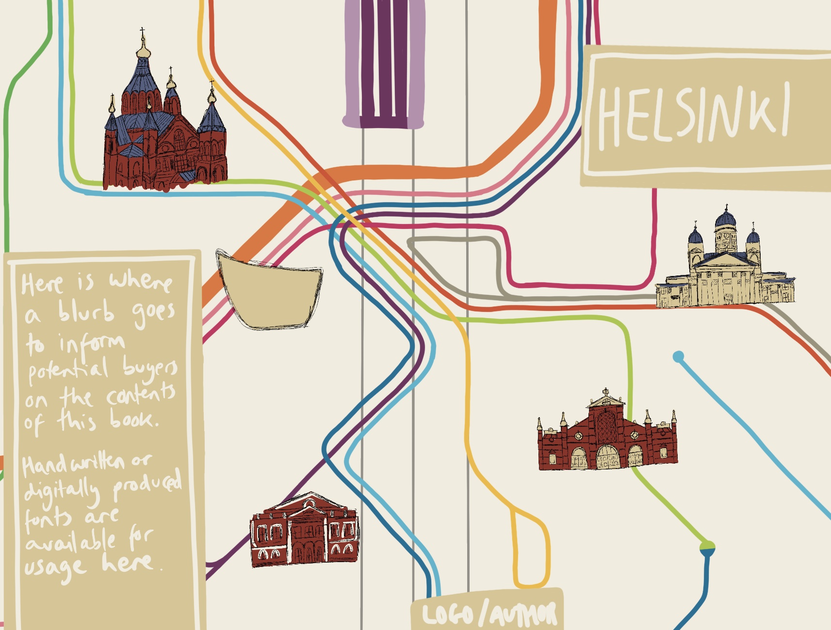
This was tricky, as not knowing the cities very well meant I wasn’t sure where the important tourist attractions actually were. I began with Milan, as it’s the only city I’ve visited of the three, and referenced TripAdvisors ’10 Best Things to see in Milan’ list, along with Google Maps, to plot out where key elements would go. I also took a starting point colour palette from the colours used in the metro map. I then roughly indicated where the title, blurb, and author’s name would go. I repeated this process on separate canvases for Istanbul and Helsinki. This was a bit harder as I was completely unfamiliar with the cities.
After sketching out the placement of my elements and choosing which tourist attractions to feature (based on location and importance combined), I began creating my client visuals. I decided to skip the ‘line visual’ stage of this process, jumping straight to colour roughs, as colour was a core feature of these designs. I began by loosely tracing the existing transportation maps before adding in sketches of each landmark with vague colour behind them. Initially, in my Milan cover, I was putting a lot of effort into these sketches. I was sketching them on paper to get a feel for the buildings, then I was trying to perfectly draw outlines of each one in procreate. I quickly realised the importance of ‘rough’ in ‘colour rough’, and remembered that back in Exercise 20 I learned that you just need to indicate the general shape or concept of what will eventually be illustrated properly.
This was super helpful, especially as I was questioning how on earth anyone could do this for clients in the ‘real world’. The answer: you stop being a perfectionist! I started just sketching my ‘getting a feel for the shapes’ sketch directly into Procreate, and using that as a placeholder. I then marked out a little less roughly where title text, blurb, and author’s name would sit. Whilst doing all of this I realised I would need more colours than just those of the transportation network, and that the three guides wouldn’t be quite as ‘family’ if they didn’t share some key colours. Based on the content in my illustrations – mostly old cathedrals, churches, art galleries, and other buildings – I felt I wanted to ‘antiquify’ the covers. I chose a cream tone for the background, and I darkened the transportation map colours using a brown overlay. I used the same brown shade to mark out the text areas.
It was really hard to leave the illustrations like this. I have so many ideas for how to fully illustrate them, and so much more I want to add, but I’m trying to scale back and not do too much too soon. Client visuals are supposed to be simple, demonstrating the positioning of elements, which elements will be used, and showing the general feel of the piece. I feel like I achieved that with all three visuals. It’s hard, though, not to continue and to see through my vision right to the end.
Next, I had to create a mock-up. I tried to use the same PSD mock-up file that I used in Exercise 21, but this proved to be difficult. The dimensions of the book jacket I had chosen were wildly different to the dimensions of the book in the mock-up file. I visited freepik and looked through their free mock-up files hoping to find a book with similar dimensions. I couldn’t seem to find one. I did at this point start wondering whether I could photograph the book I had to hand – as this was where I got the dimensions from – but I pretty quickly brushed off this idea due to the sheer complexity of it.

I downloaded a few new mock-up files to experiment with and found one that fit perfectly. I wasn’t a fan of the bright blue background colour, but my inexperience with Affinity Designer meant I struggled to figure out how to change it. The book jackets looked great when presented like this. I was disappointed I couldn’t use a mock-up that showed both the front and the back of the book, but I felt this would do.
Throughout this exercise I was very focused on the idea of presenting this to a client and working with their requirements. I decided quite early on that I wanted to compile a PDF of the work in this exercise as if I were really presenting to a client. I also decided that in this circumstance I would provide a selection of text options, rather than putting the text in the visual. I have indicated where text will go, and then the client gets to choose which text they would like to see go there. So, next I began to explore handwritten text as required from the brief.
I have seen a lot of handwritten text throughout much of my research in various exercises. An overwhelming amount of this has been in children’s book illustrations. I revisited my Pinterest board created in Exercise 24 and noted which fonts I liked best. Using handwritten text can be really tricky when trying to create something sophisticated or professional. Many of my choices when creating the visuals were influenced by the knowledge that handwritten text would be used. I was grateful to have this foresight, as I think it completely changes a design.
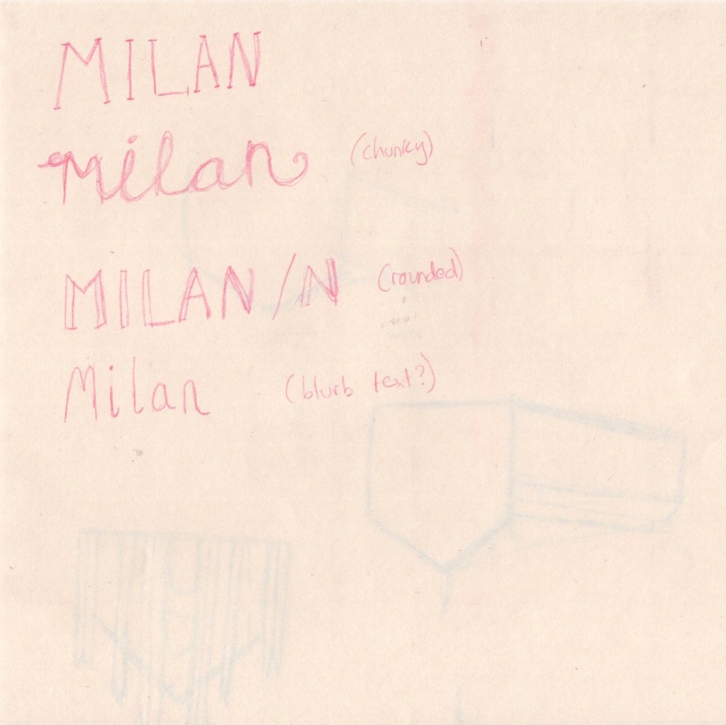
I sketched out a couple of ideas before moving into Procreate to explore them further. I love typography and font-making, so this was easy for me. Using a template I got from a skillshare class as a background, I explored several different text options. I also tested out different textures, variations in upper and lower case, and provided multiple colour options too. I was really happy with the selection I had produced. Next, I moved on to creating the PDF I would hypothetically be giving to a client.
As I did this in Affinity Designer, there is no time lapse footage. I will do my best to explain what I did and why, though! Originally, I thought I would be doing something extremely simple, just the images in a document with a little text to explain what it all is. I started doing this – originally using Apple Pages – and realised I had no idea what a proposal document was meant to look like. I asked around to see if anyone had any examples, but had no luck. So, I Googled it, and I was instantly overwhelmed by the quality and design expectations in these documents. They were often entire works of art themselves! This is understandable, as when working with clients your aim is to be the best out of a sea of applicants.
With not a lot of time to spare, and knowing I was already biting off more than I could chew, I decided to take a middling approach. I would put effort into the style and design of the document, but I wouldn’t go all-out crazy either. This is also where I decided to move into Affinity Designer, as it’s much more fluid as an app. I found the standard size of a PDF page, and opened up a canvas at this size. I then added in the three client visuals, and tried to build around it. I chose to add a border to the right, along with the title, my name, and a hypothetical ‘client’. I also added a description of the images below. I played around with various colour options, including adding various background colours too, but ended up leaving it a plain white. I saved this as a PDF, then grouped the layers and hid them.
Moving on to page two, I flipped the border to this time be on the right of the document. I added the book mock-up, a title for it, and another short descriptor. Below, I added the plain black text options with an explanation of how they could be used, and another header to the left. The placement of this header was hard to get right, and I’m still not sure about it. It seemed to look weird no matter where I placed it. Again I saved this as a PDF, grouped the layers and hid them, then got to work on the third and final page. Here I added the 6 colour variants for the text. I put the border at the top of the page before adding a title and descriptor. I played around with this page for quite a while, worried that it looked too orderly and boring. I tried moving around the images, moving the header, adding extra borders and changing where they’d go. I ended up sticking with the original design, as it felt safest. I then saved that third page as a PDF file, and opened up adobe’s free PDF merging software. This was quick and easy to use, and I finally had a professional client proposal built!
(To view the PDF please click the ‘download’ button above)
I really really loved this exercise, and I’m so excited with both my final result and the PDF. My only disappointment is that I wasn’t able to fully illustrate these covers. I am so happy with my concept development, my ability to see an idea through, to navigate any problems that come up, and to visualise illustrations that work well. I am finding it easier and easier to tackle briefs with enjoyment and be happy with the outcome! I might come back to this exercise some day and ‘finish it off’. I’m also really happy to have had the opportunity to explore properly communicating with a client and how to produce good proposals. Hopefully as time goes on and I gain more experience here my files will look even better!
