My final assignment for Key Steps in Illustration is finally here! The assignment is designed to be an opportunity to look back on the work I have created throughout the course, and to reflect on what I’ve enjoyed, the successes I’ve had, and the areas of illustration I’m most interested in. It gives me a chance to use all of the skills I have gained so far in creating something I’m truly passionate about. To quote the Key Steps in Illustration PDF: ‘you have the maximum capacity to show off your interests and talents’.
The title of the assignment is ‘Seven Days’. How I chose to interpret that could be objective or subjective, and I was asked to produce either seven separate, one large diagrammatic, or a continuous strip illustration. The media, methods, context, and intended audience were entirely up to me. I had to write myself a brief to follow that includes these things and that showcased my ‘interests and talents’ as said above. I also had to specify the final size and size I was working at. I had to submit all working stages from initial ideas to finalised artwork.
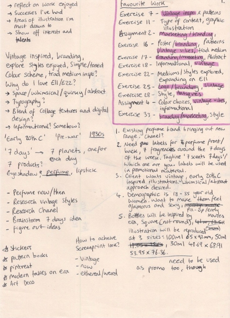
This was a huge task. Ordinarily, when I approach a project I begin by dissecting the brief and identifying what my first steps will be. I didn’t really have a brief here, so the first step was to figure out what I wanted to create. I began by writing the key points I needed to look at for my brief: reflecting on work I’ve enjoyed, successes I’ve had, identifying which areas of illustration I’m drawn to, and showing off my interests and talents. I didn’t know how to answer most of these questions, so I decided to look back over my learning log at the work created during the unit. I wrote down each of my favourite exercises/assignments and a few notes on why I enjoyed each one. Once I reached the end of my log, it became apparent that there were trends in what I enjoyed.
My favourite exercises and assignments were typically those that involved branding or marketing in some way, and often had vintage-inspired designs in them. I also enjoyed exploring new mediums, designing and using patterns, restrictive colour palettes, and abstract or fantastical content. I was surprised by this outcome,as it was clear my interests as an artist have shifted over the course of the year – but pleasantly so, as I feel I’m starting to find my footing and begin clearly identifying areas of interest and exploration. My favourite work completed during this unit are the pieces in Exercises 11 & 22. I wanted to understand why, and see how I could push this even further, so I started jotting down ideas.
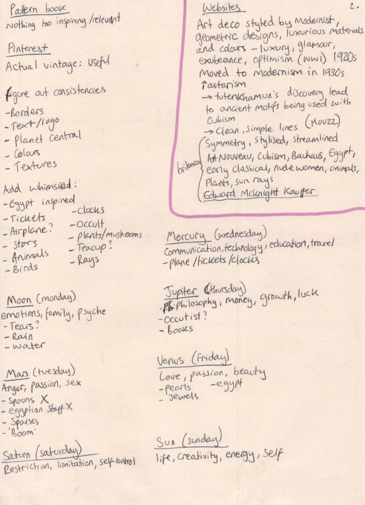
I liked the space theme, the mediums used, the styles mimicked, and most of all the whimsical and abstract content. I definitely wanted to explore some sort of obscure vintage designs in my brief, but I was stumped as to how. I have explored the 1950s in Exercise 7, and the 1960-70s in Assignment 3, which left me wanting to investigate a new era not yet looked into. I understood how post-WWII euphoria drove technology and colour into the everyday home, and the impact this had on both fashion and design, but I knew little about the pre-war era. I did some brief Googling of imagery from the 1920-30s and found I preferred the modernism of the 30s to the excess of the 1920s, but there was a lot of crossover and very little that was clear-cut between the two. I settled on ‘pre-war’ as a generalised era and moved on to identifying my audience and context.
I quite easily landed on my connection to the theme of ‘seven days’. With the concept of space at the forefront of my mind, I knew early on that I wanted to incorporate planets – specifically those that are the namesakes for the days of the week. Monday is named after the moon, once being known as ‘moon day’, Tuesday after Mars, Wednesday after Mercury, Thursday after Jupiter, Friday after Venus, Saturday after Saturn, and Sunday of course after the Sun. This connection is one I frequently think about, as it’s my method of remembering the Italian names for the days (lunedi, martedi, mercolodi, giovedi, venerdi, sabato, domenica). I next had to figure out how this planet concept, tied to my love of vintage styles and kooky content, would translate into a marketable product.
My first thought was the beauty industry. I’m unsure on how I landed there, but it seemed to work. Eyeshadow palettes, lipstick bottles, perfume lines… I wasn’t sure if it made sense. I thought about which areas I’d already created content for: bands, supermarkets, biscuits, book covers, museums… maybe I could do an informational diagrammatic illustration about the days of the week, and how they connect to the planets – but then how would I create something abstract? I left it alone to brew in my mind while I chatted about my ideas with some friends, trying to pry out some inspiration. Whilst responding to the question ‘But how would that work?’ when discussing my beauty industry ideas, a seemingly perfect concept hit me.
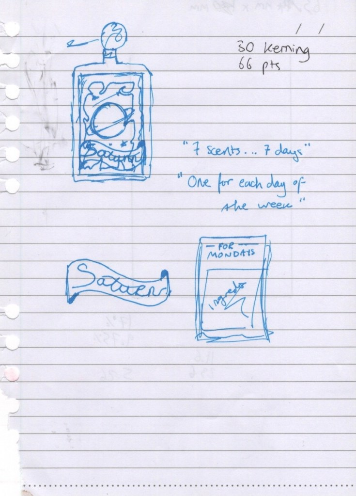
At 11pm, half asleep and midway through watching a film, I grabbed the nearest piece of paper to me and scribbled out my concept, plus taglines and names. I excitedly rambled to my housemate about how perfect this was and how I would truly be finishing the course with a bang, then groaned audibly the next day as I realised this torn and scribbled on piece of notebook paper would have to end up in my learning log. A lesson in always having a sketchbook to hand! My concept: a (then unspecified) perfume brand is releasing a new line of fragrances, one for each day of the week. They want labels for their seven bottles, each with an individual illustration, and one for the back.
The next day I set out to write my brief. I wasn’t sure how to approach this, as the briefs throughout the Key Steps in Illustration unit are very instructive – explaining exactly how to approach them – whereas client briefs in the real world are less so. I spent some time researching how to write briefs, and I looked at the student briefs available for this year’s D&AD awards. Looking at these, and the responses to them, was incredibly inspiring and motivating. I felt like my brief was realistic, but also that I could easily tackle one of the ones available on their website.
The majority of the articles I read on how to write a brief emphasised describing who you are as a client, what your company stands for, and how your moral code should be portrayed. This didn’t feel useful to me, as my brief didn’t need to be that in-depth. After a lot of digging around I came across this article on C’monde which, whilst still focused on detailing how your company functions as a client, had some really useful questions which I could use as a starting point. I began noting down answers to relevant questions on my research sheet, and found I needed to do a bit of research. The key thing I needed to know was what size my illustrations would be reproduced at.
I found a picture on Google Images from a company that sells custom perfume bottles, and used this as a guide. It took a lot of maths to figure out a proportional decrease in size for the 3 different bottles, but I got there in the end! I also decided to choose Chanel as my brand, without very much research, as I felt it was appropriate for the vintage style, and also for the target market and sex appeal. Once I had the details worked out, I wrote up my brief.
Perfume Bottle Design & Promotion
Chanel is releasing a new line of perfumes and requires an illustrator to design packaging (labels and boxes) and promotional material. We recognise that one fragrance simply isn’t enough for the busy day-to-day life of the modern woman, so we want to provide more choices to fit everyone’s schedule. The line will consist of seven different perfumes based on the seven days of the week, with the taglines ‘7 days, 7 scents’ and ‘which one are you?’ to be used in marketing campaigns, alongside the imagery created for the perfume bottle labels.
Our target market is 18-35 year old women and our goal is to make them feel glamorous, sexy, and powerful, every moment of every day. With the current revitalisation of the ‘roaring 20s’, we’d like the branding for this perfume line to be inspired by early 20th century vintage aesthetics. In fact, we’re even returning to our own roots and will be modelling the perfume bottles off of our classic 1920s look.
With the stress of the pandemic and current global climate, we want our customers to feel like our fragrances transport them into another world. A whimsical and abstract approach is desirable for this purpose. We want our customers to feel ownership and belonging with their chosen fragrance, but also remain open to the possibility of purchasing all seven – one new fragrance for each new escape.
What We Want
We need seven unique labels, one for each perfume bottle, and one label for the backs. The labels will be reproduced on three different bottle sizes: 100ml at 92x65mm, 50ml at 77x54mm, and 30ml at 69x49mm. The label illustrations will also be used in promotional materials and on the outer packaging for the perfumes. Please submit client visuals, completed illustrations, and at least one mock-up.
Once I had finished polishing off my brief, I was able to move on to my regular illustration processes.
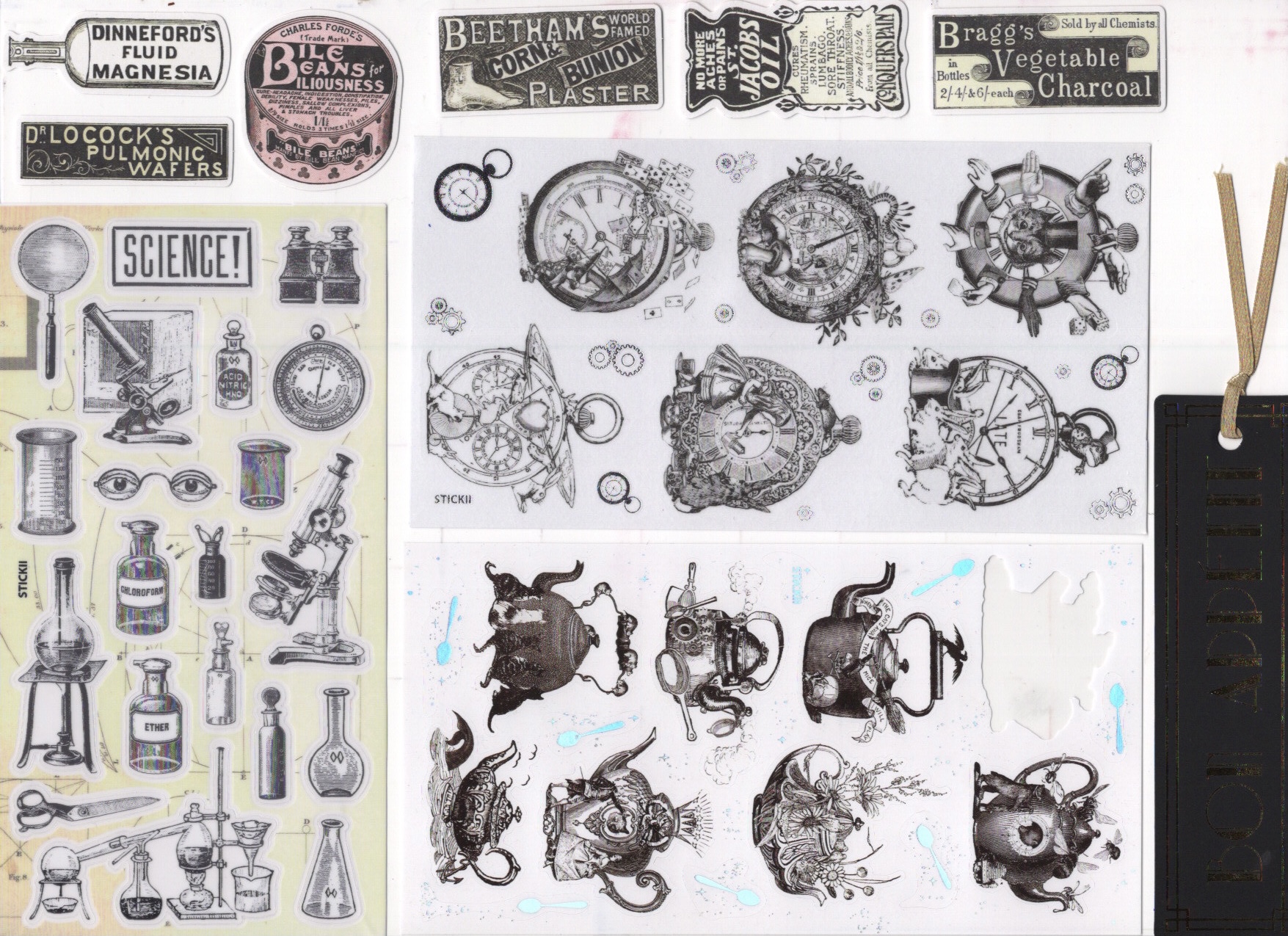
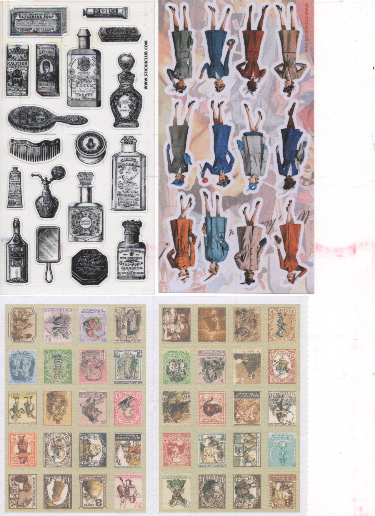
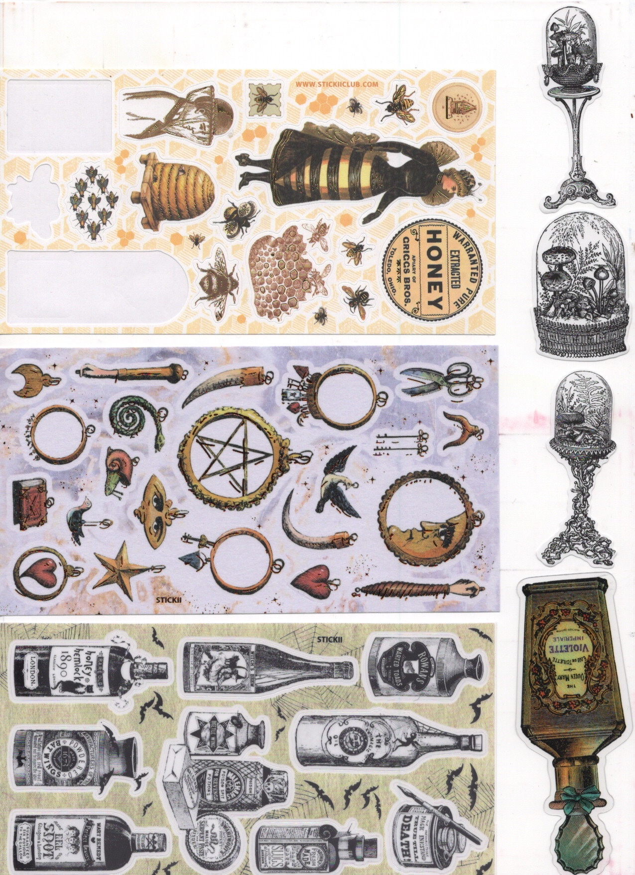
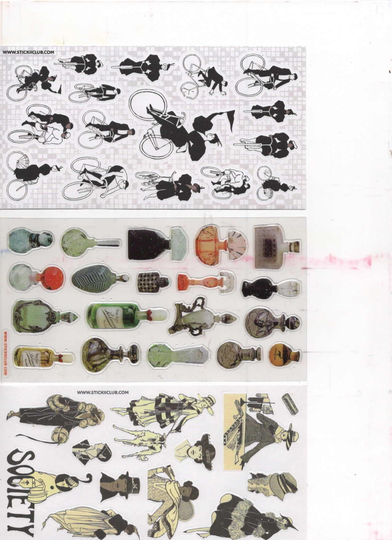
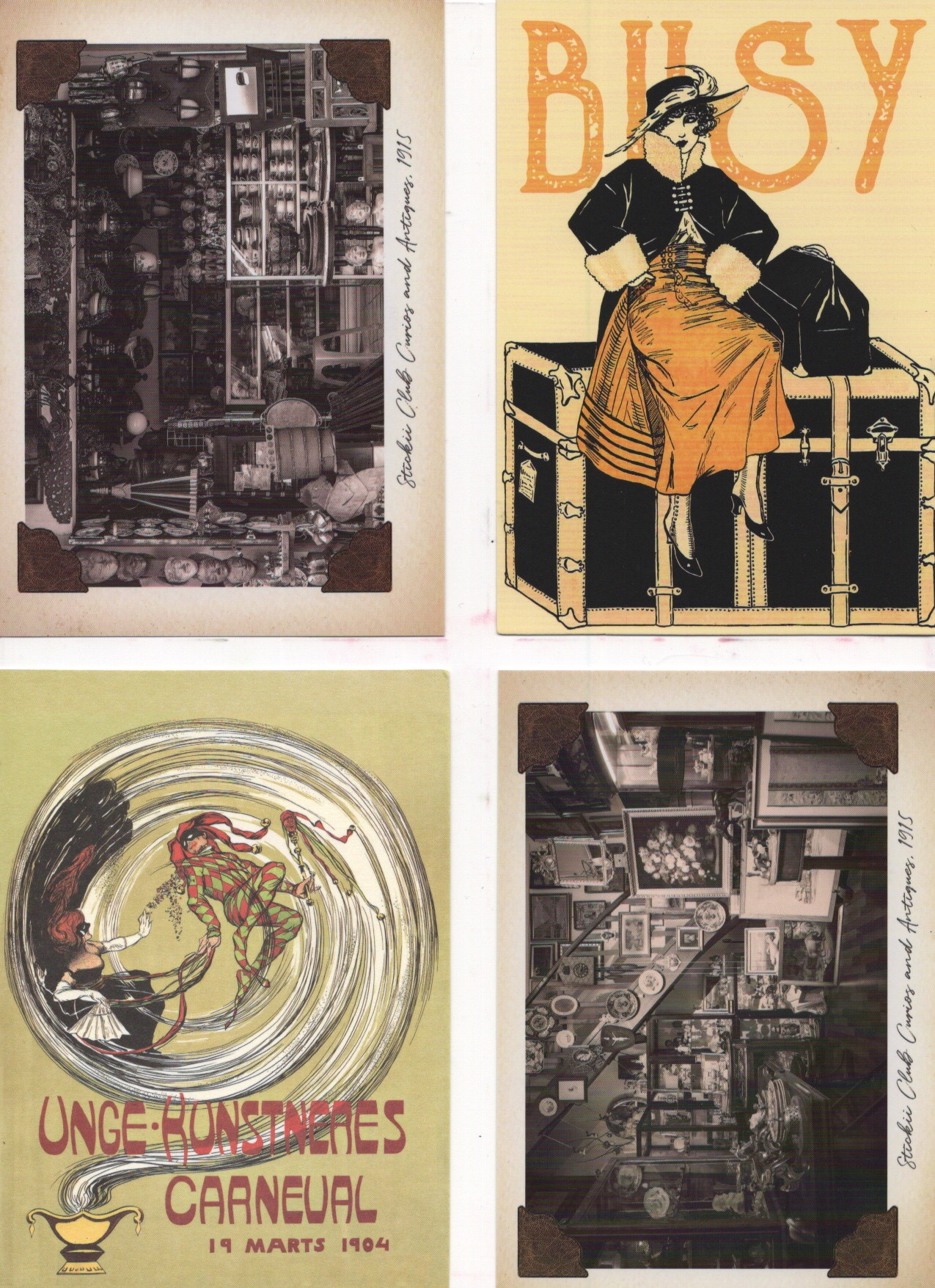
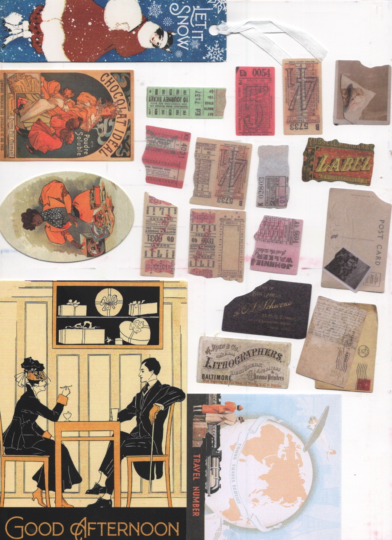
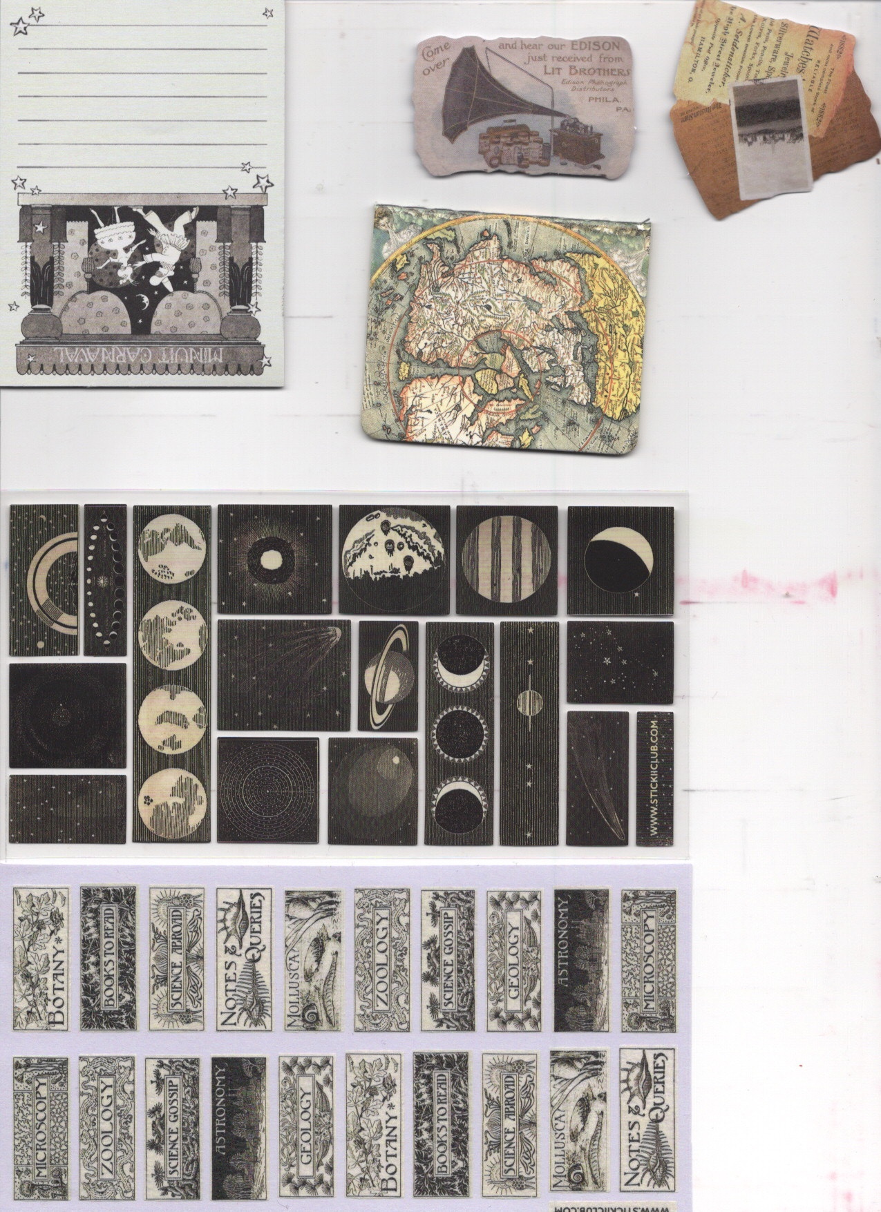
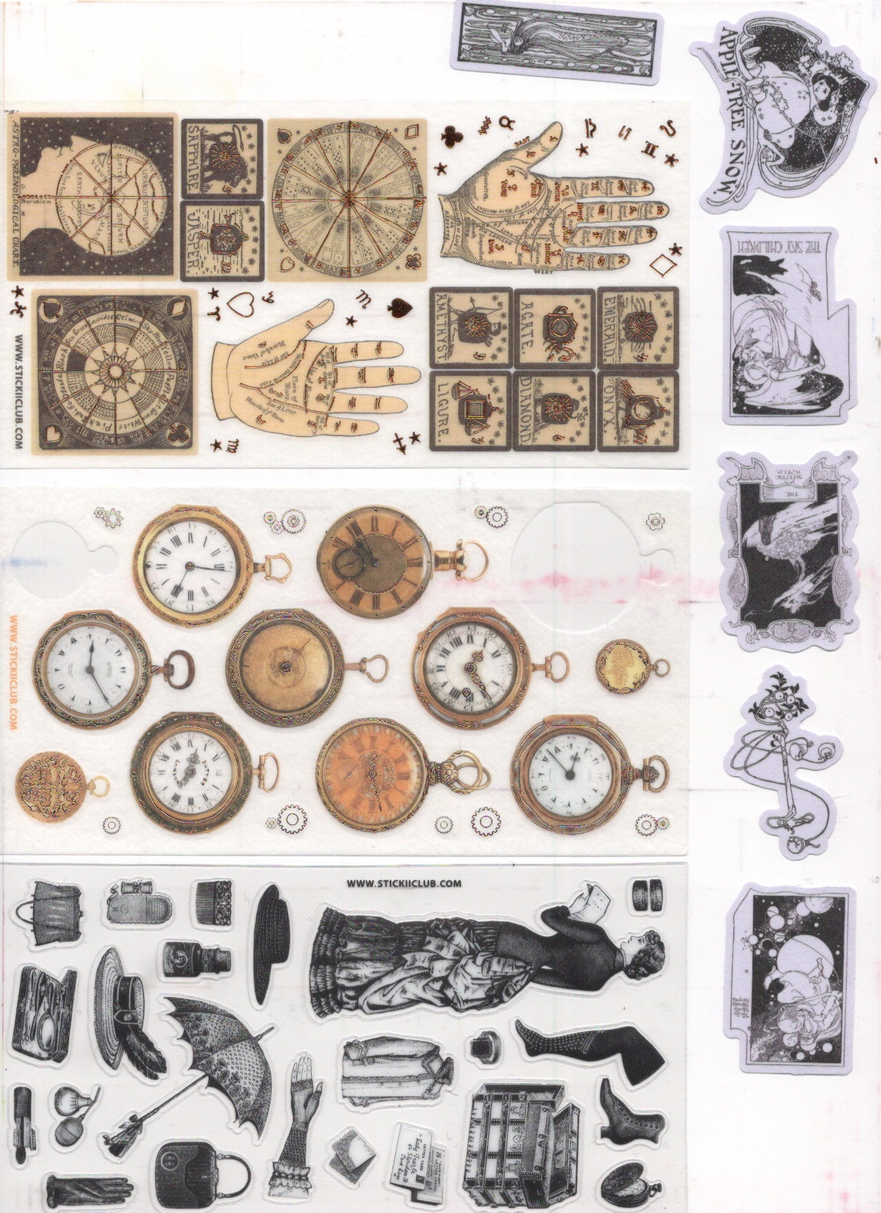
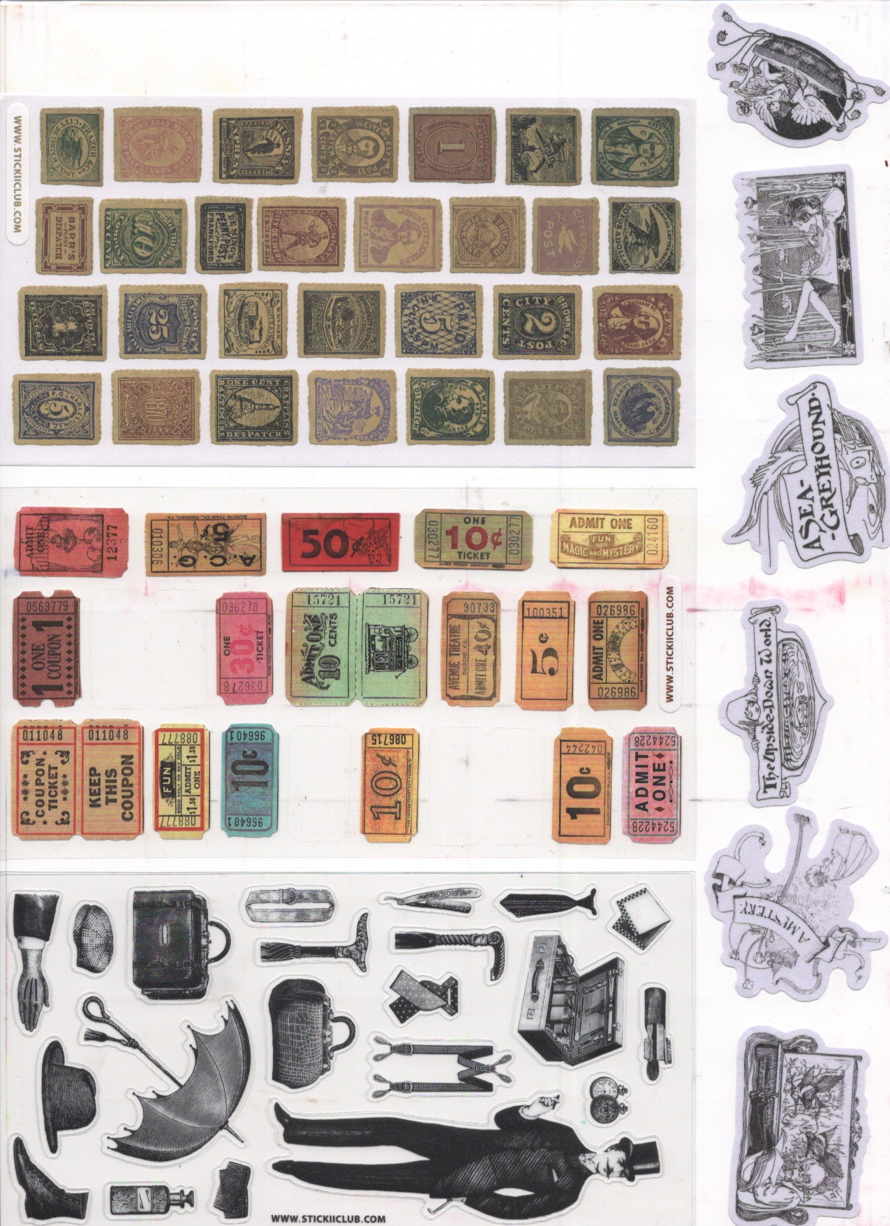
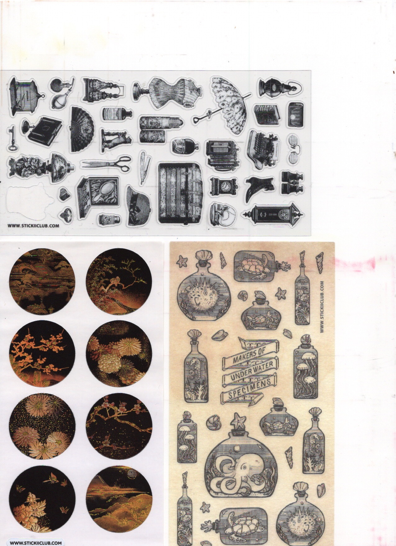
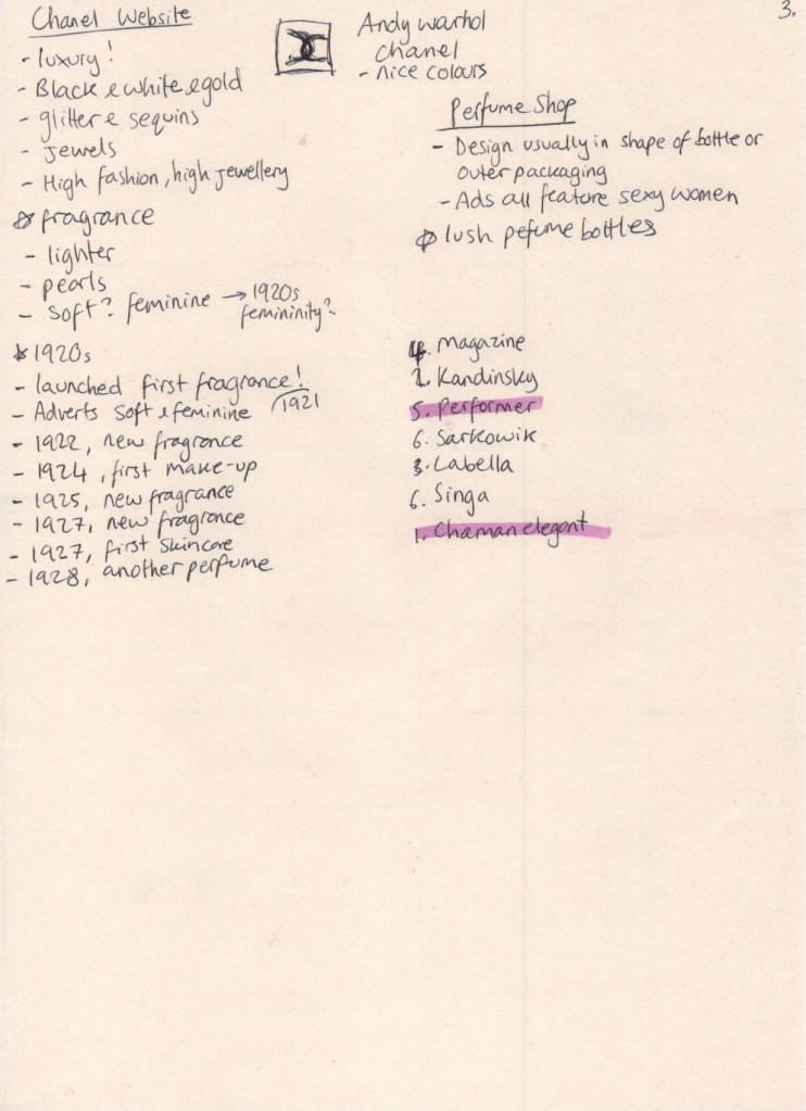
I started by listing some key research points: perfume throughout history, pre-war styles and aesthetics, the history of Chanel, and figuring out how to connect it all together. I decided to begin by researching the design styles of the 1920s/30s, prompted by the arrival of my monthly sticker subscription pack from Stickii. I have been a long-time member of this subscription service, opting unsurprisingly for the ‘vintage’ pack. I use them every month in planners and my sketchbook, and I’m frequently inspired by the collections they put together. This month’s theme was ‘For science!’ and it featured two sheets of graphic illustrations of planets. I was so excited as it was exactly the sort of look I wanted my final pieces to have.
I have never before properly sifted through all of my stickers in order to use them as reference material, but I thought now was a better time than ever! I picked out all of the illustrations that inspired me or that I felt were connected to both the chosen era and the content I wanted to include in this piece. I scanned them all in to better look through them and in order to reference them with greater ease. Whilst using what resources I had to hand, I decided to look through The Pattern Sourcebook, a favourite reference book of mine, to see what jumped out. Unfortunately, not much from the era felt relevant or inspiring, so I left it alone.
By this point my research sheet was starting to overflow, so I started a new one. I then took to Pinterest to see what I could find. I wanted to look at actual imagery from the 20s-30s as well as modern takes on the era, and then any and every kind of whimsical and wacky illustrations in order to find inspiration. For my first Pinterest board – pre-war aesthetics – I had a lot of luck! I found plenty of examples of advertising and illustration in the era I was looking at. I then tried to look for modern takes on the era, but wasn’t finding much on Pinterest. Whilst researching, however, I realised that the term ‘Art Deco’ originated in the 1920s, so I began to look further into this movement.
I found that the Art Deco movement was characterised by modernist and geometric designs, focusing on luxurious materials and colours. The optimism that followed the ending of World War I led to a growing cultural taste for glamour, exuberance, and anything expensive. Interiors were draped with velvets and silks, and bold colours such as reds, golds, and blues were heavily featured (source). There was a fascination with ancient motifs, inspired by the discovery of Tutankhamun’s tomb, taking inspiration from ancient egypt as well as other early classical eras. This style was often then combined with the ongoing cubism movement. (source) Beauty, simple shapes, and extravagant detailing were central to Art Deco designs. Symmetrical, stylised, and streamlined drawings, commonly featuring references to nature and history, such as nude women, animals, plants, sun rays, or the aforementioned classical motifs. (source)
The Britannica article led me to explore the work of Edward McKnight Kauffer, an American graphic designer who worked for most of his life in the UK. His simplified, bold drawings are perfect examples of graphic illustration in the context of the Art Deco movement. I wondered why I’d gone so long without seeing his work.
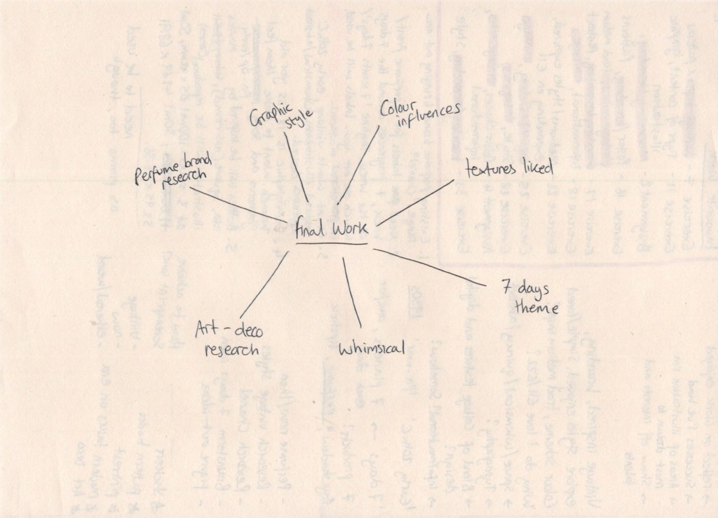
I was beginning to get a little overwhelmed at this point, as there was just so much that was inspiring me. I felt that I could sit for days and follow hundreds of trains of thoughts, researching everything I could get my hands on. I needed to centre myself and regain focus.I decided to draw a mindmap of sorts, showing what information I needed in order to complete my final illustration. This meant I could focus on what was important and relevant, rather than getting lost going down various avenues of interest.
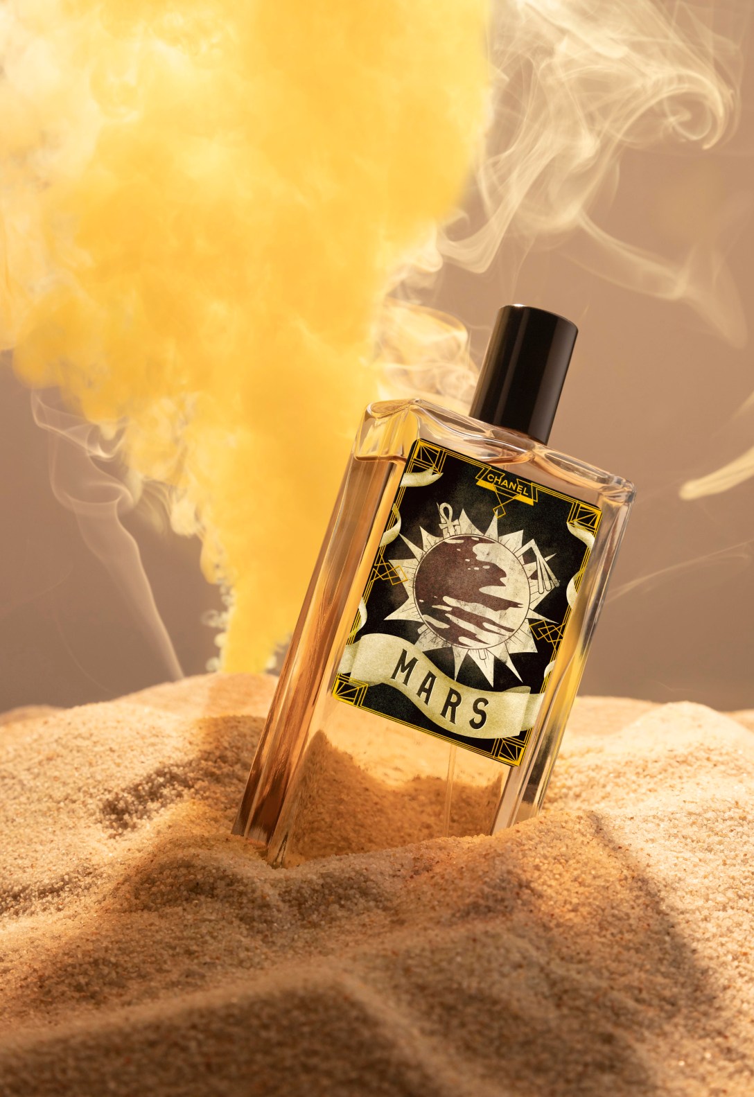
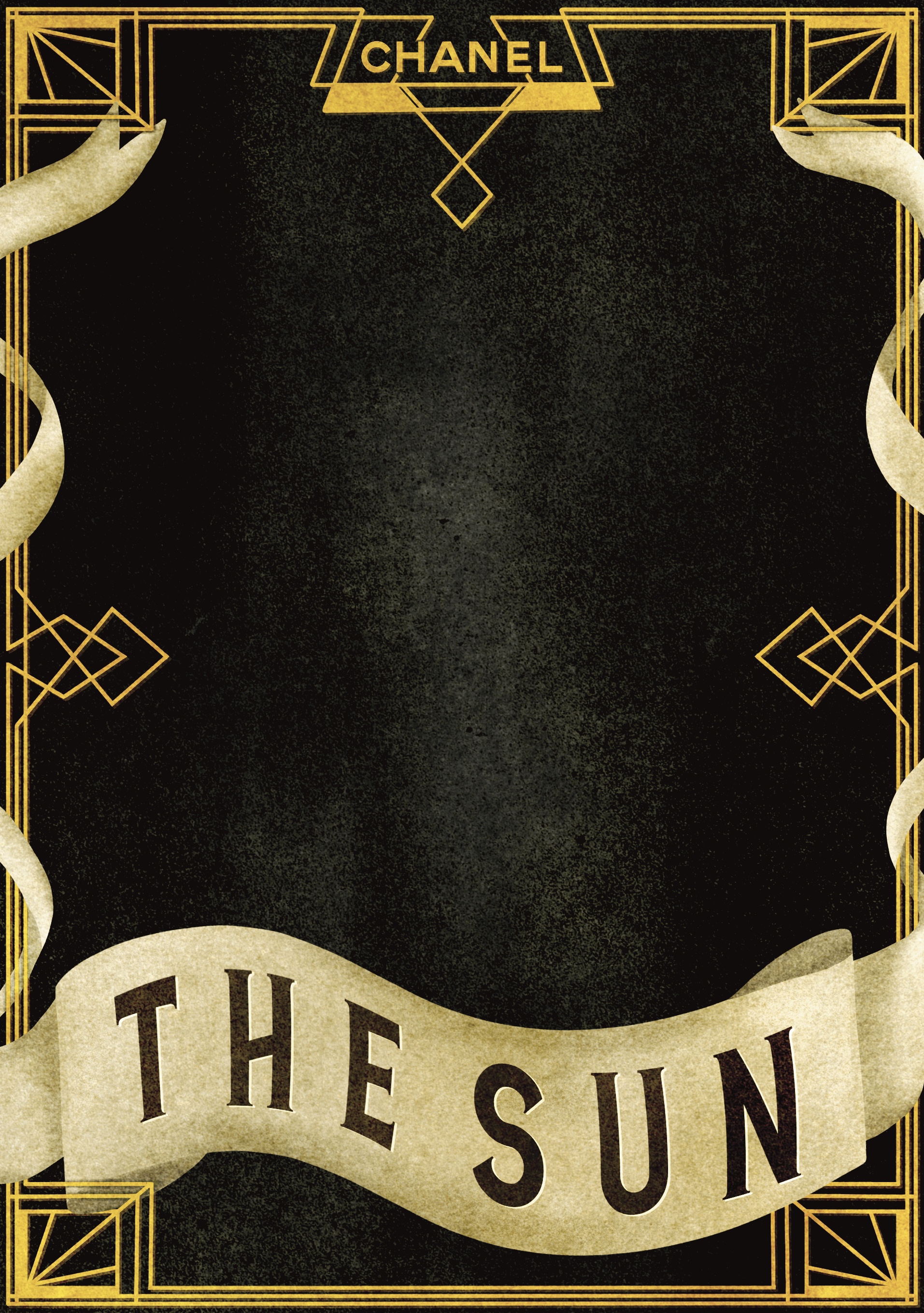
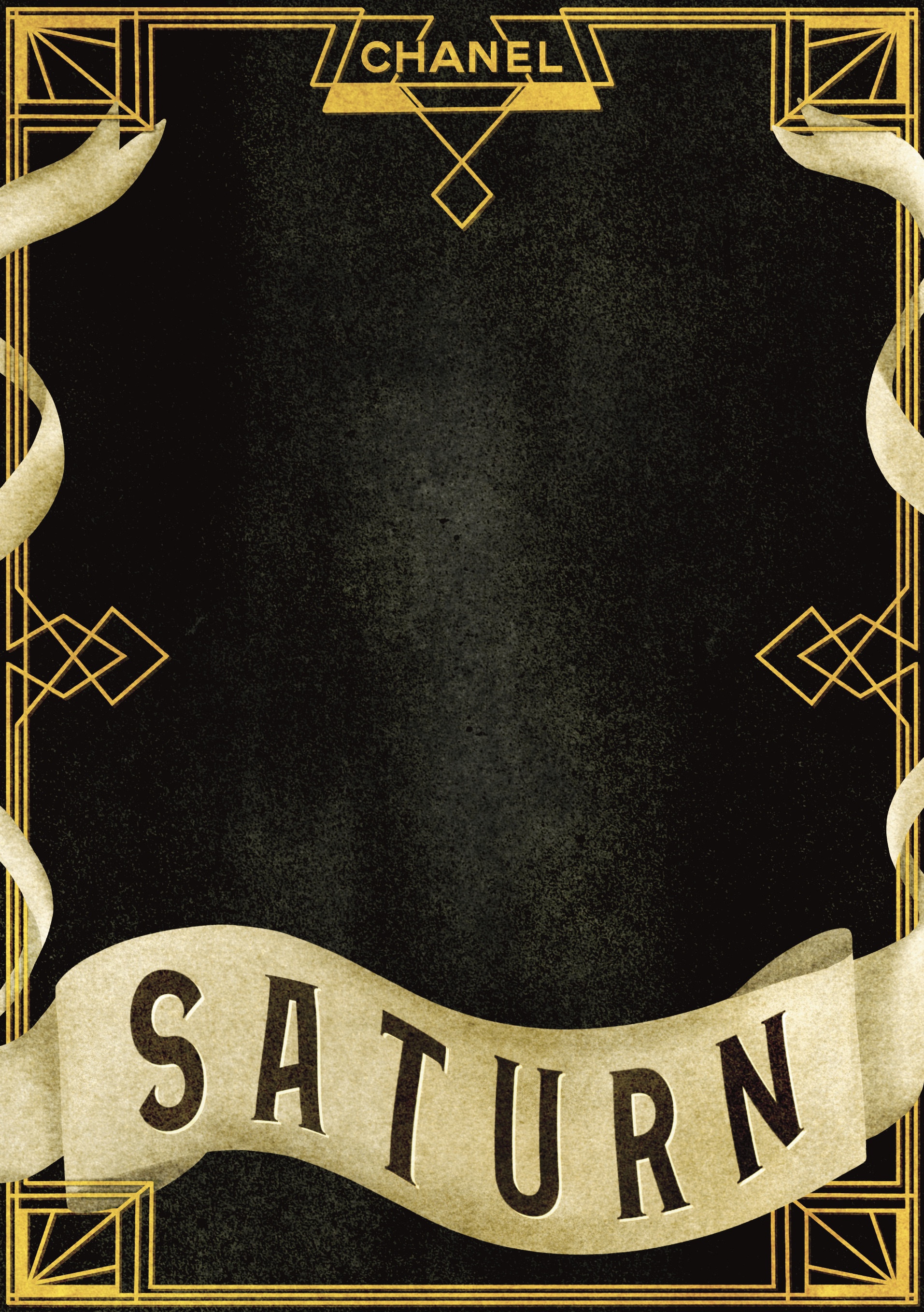
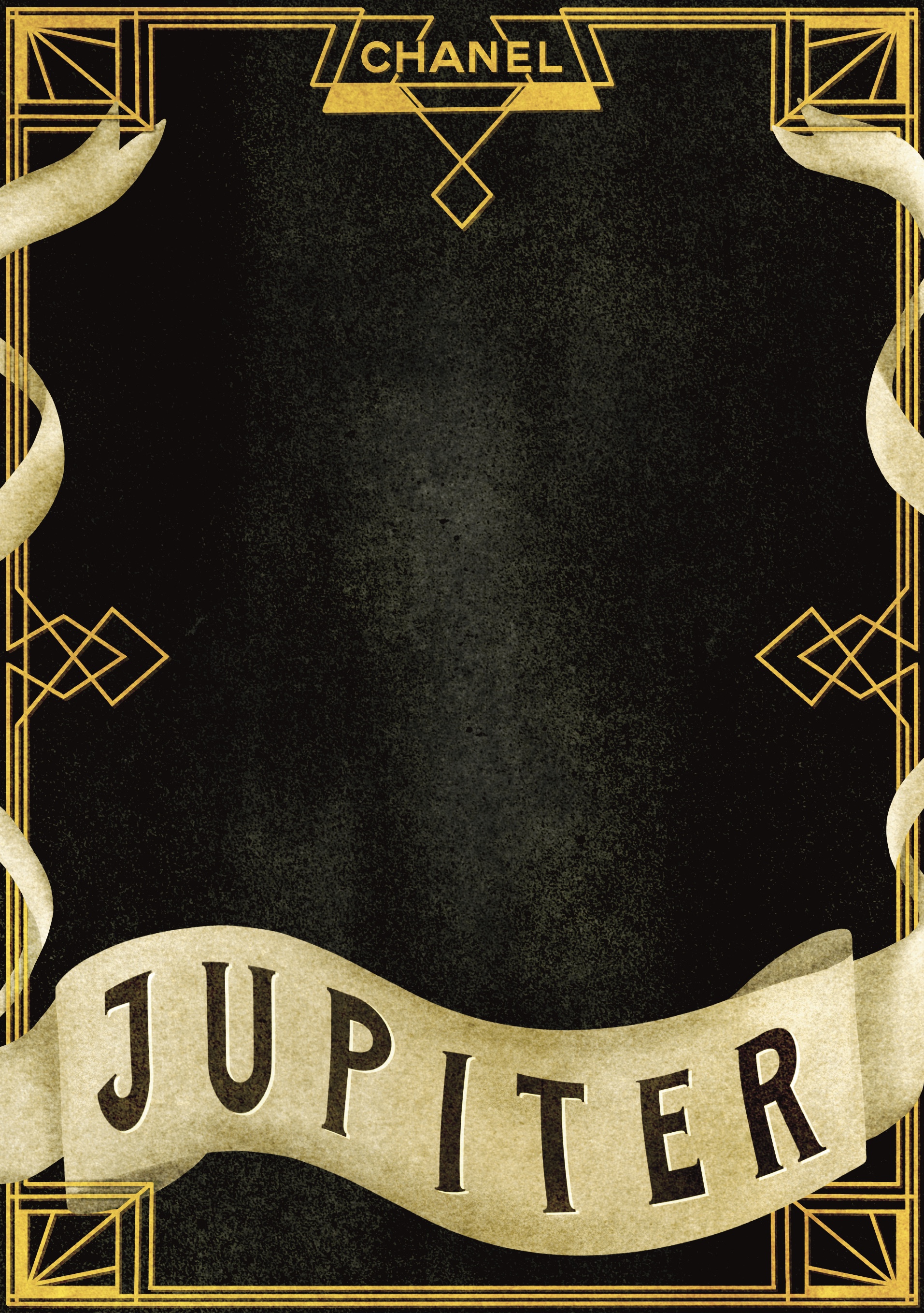
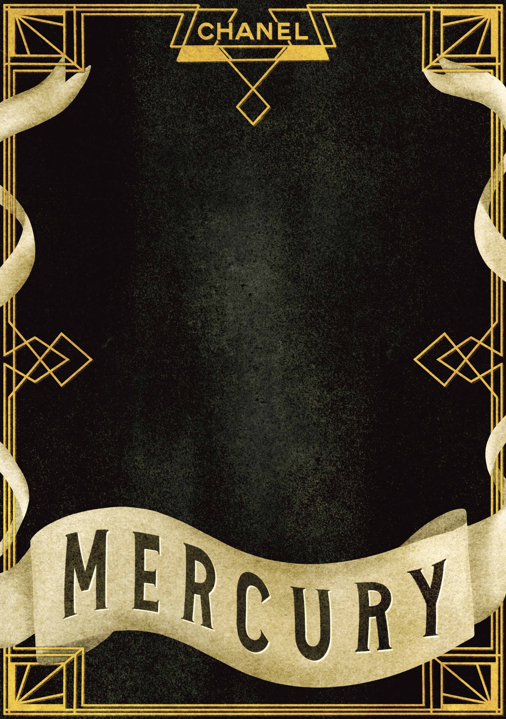
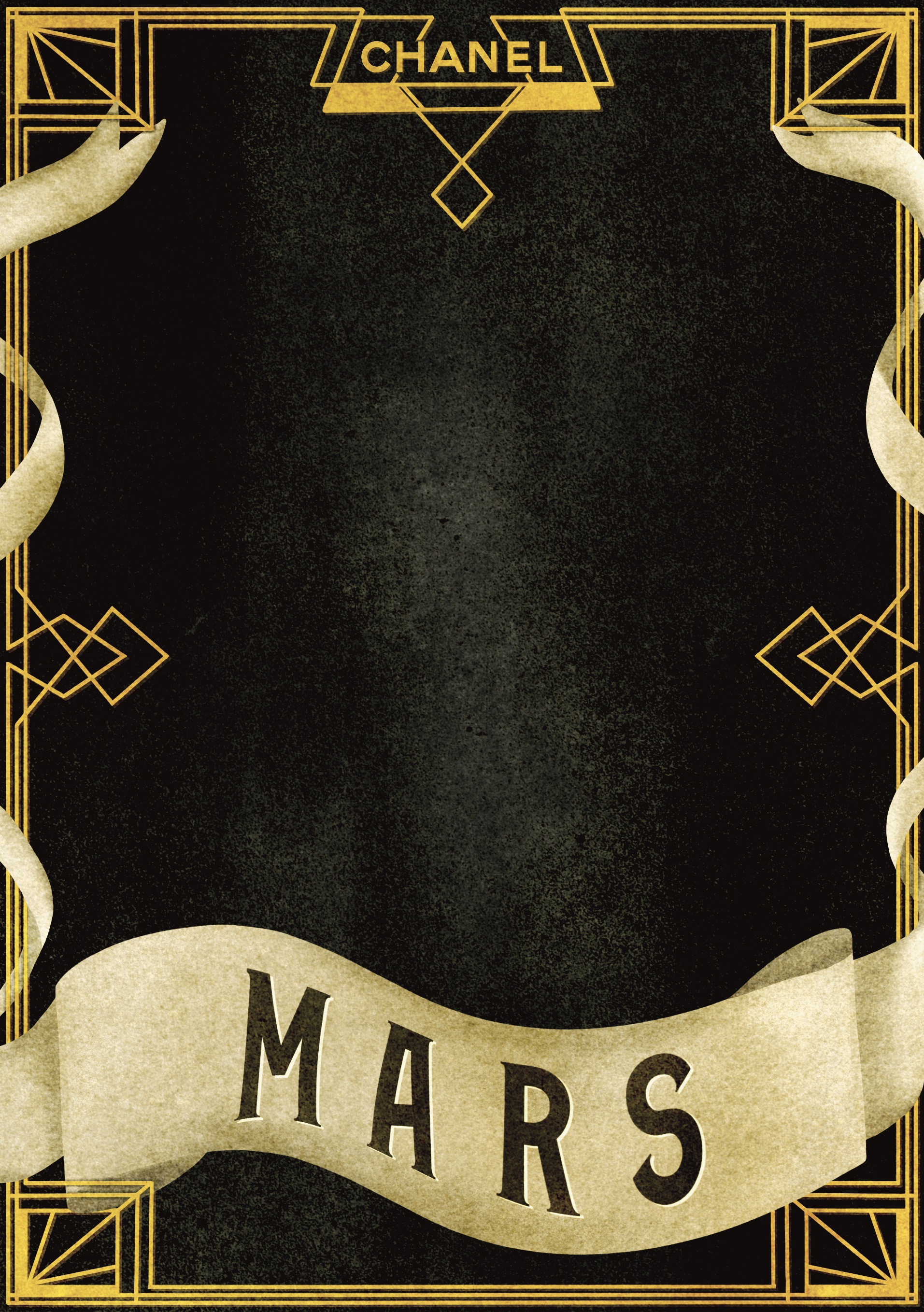
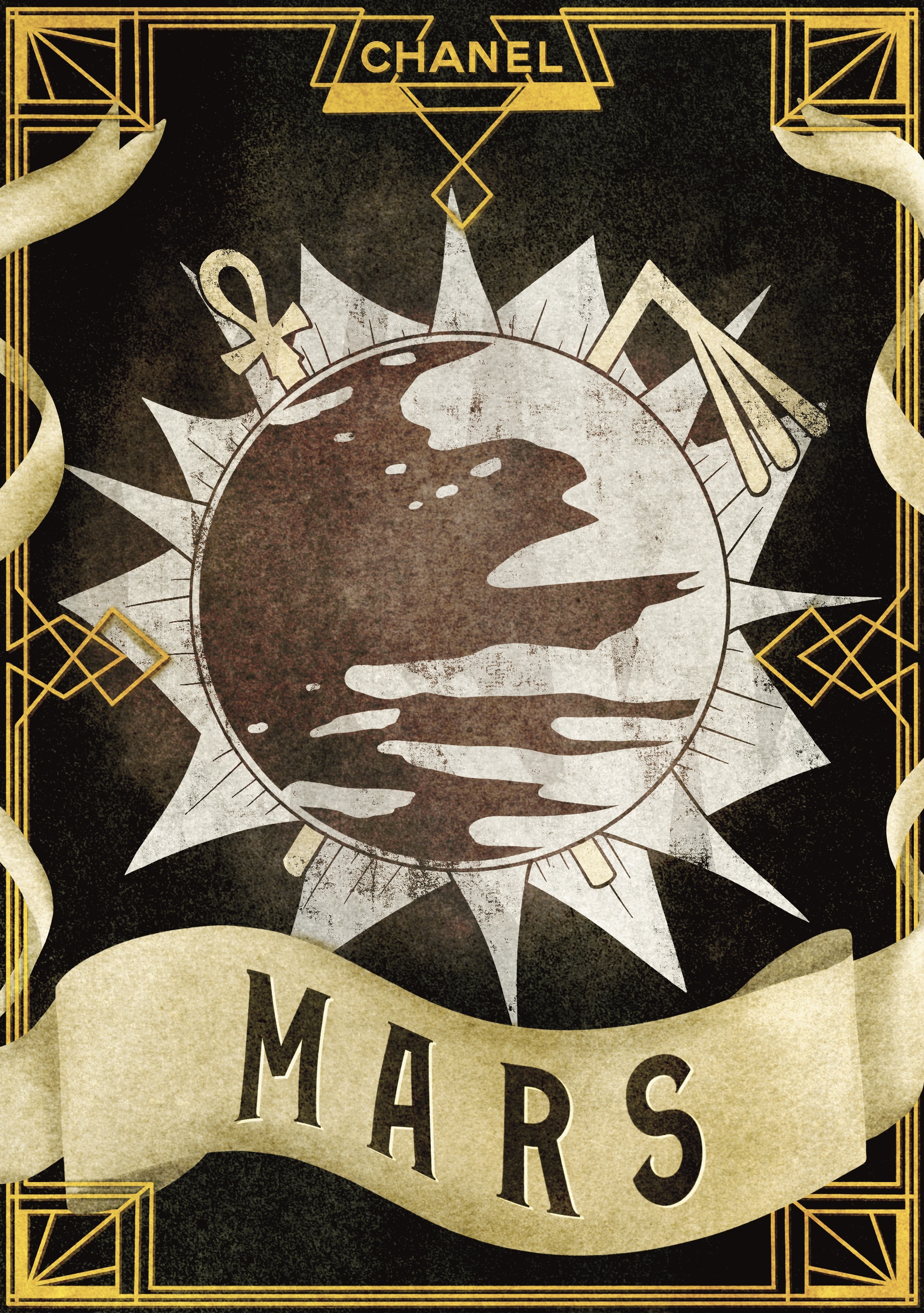
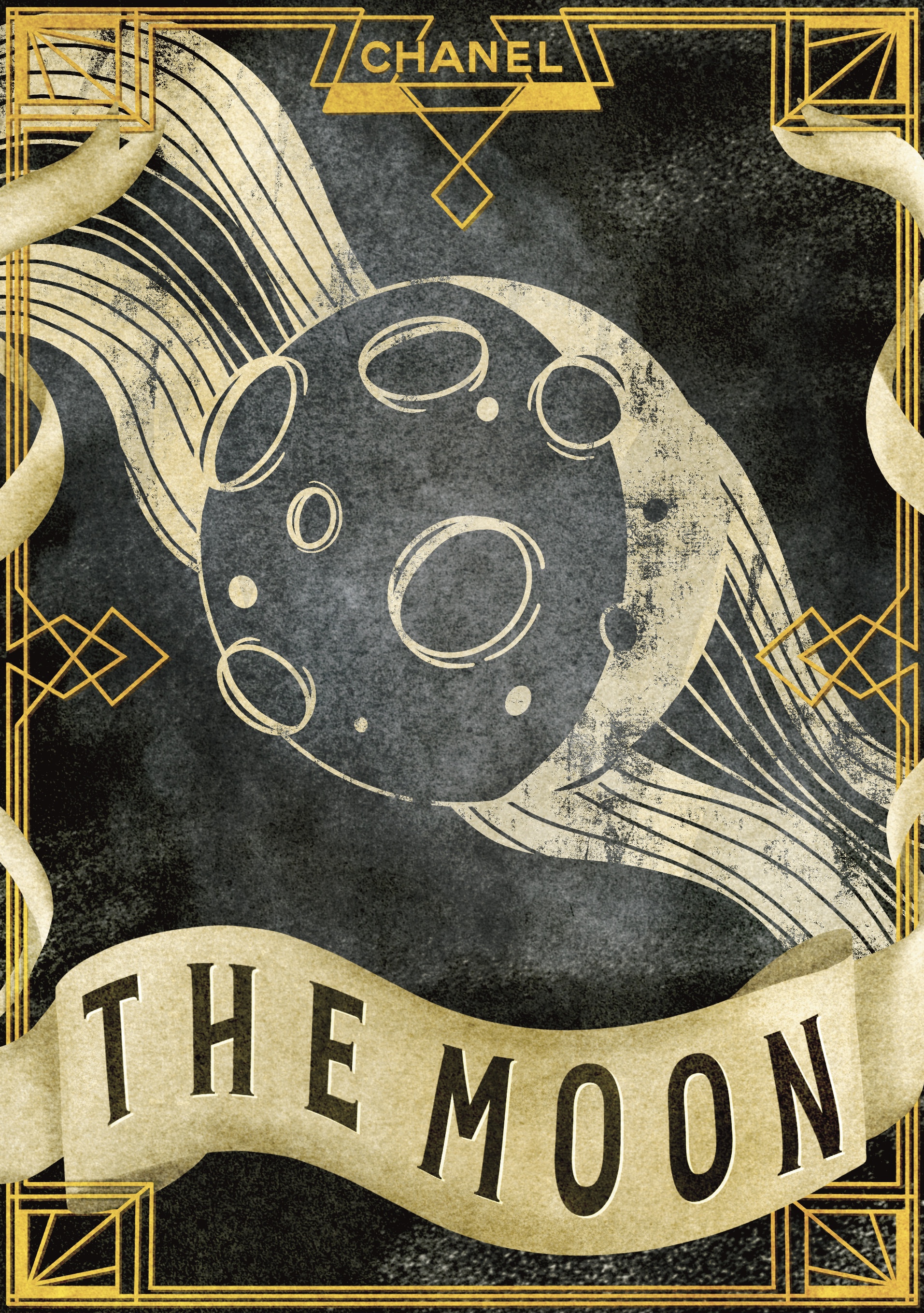
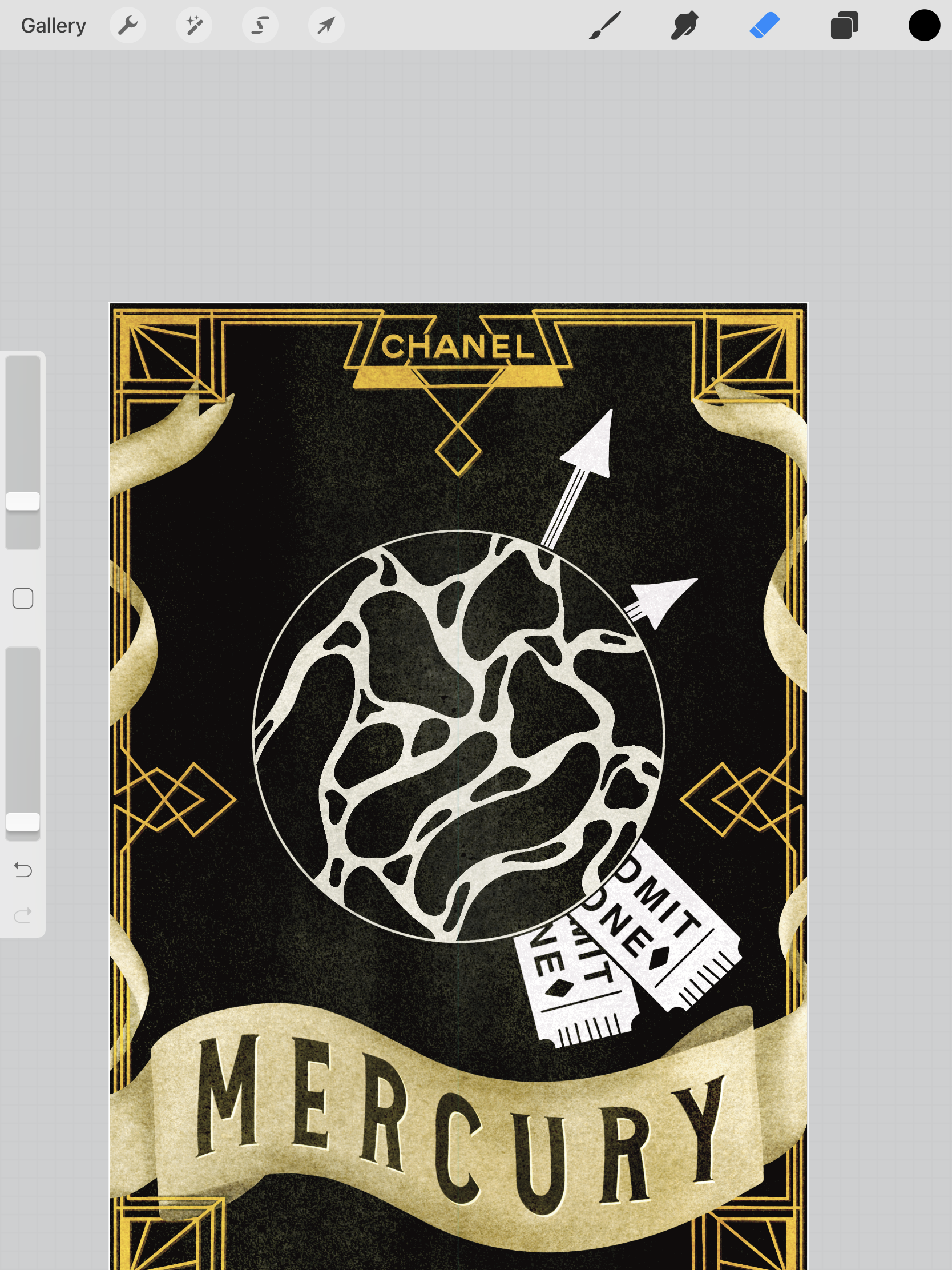
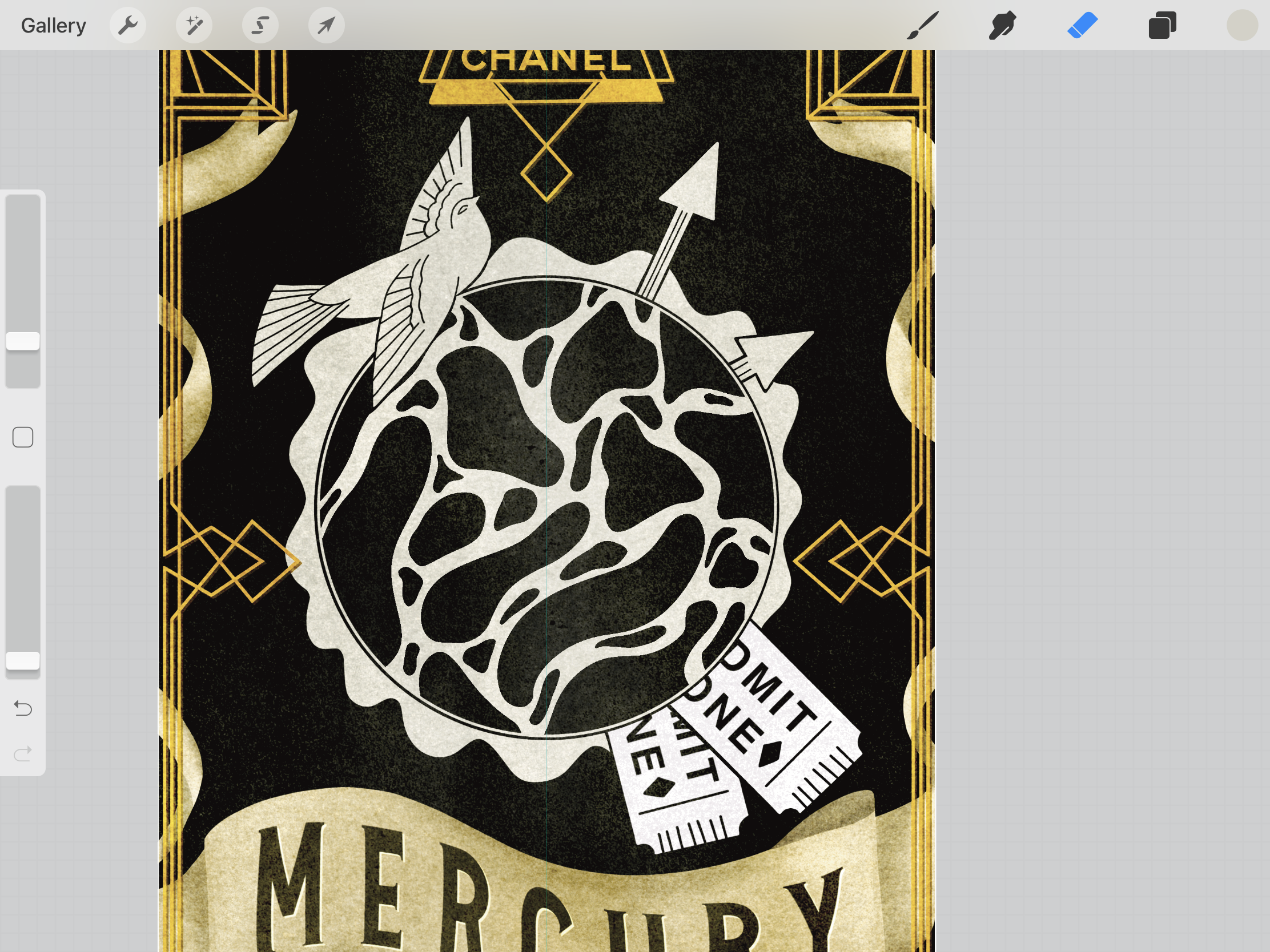
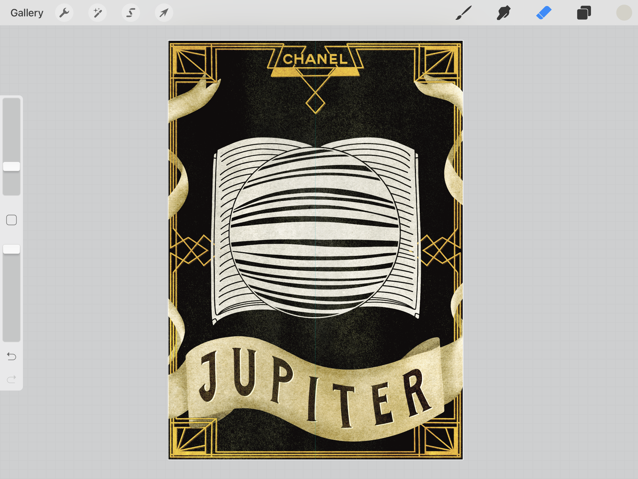
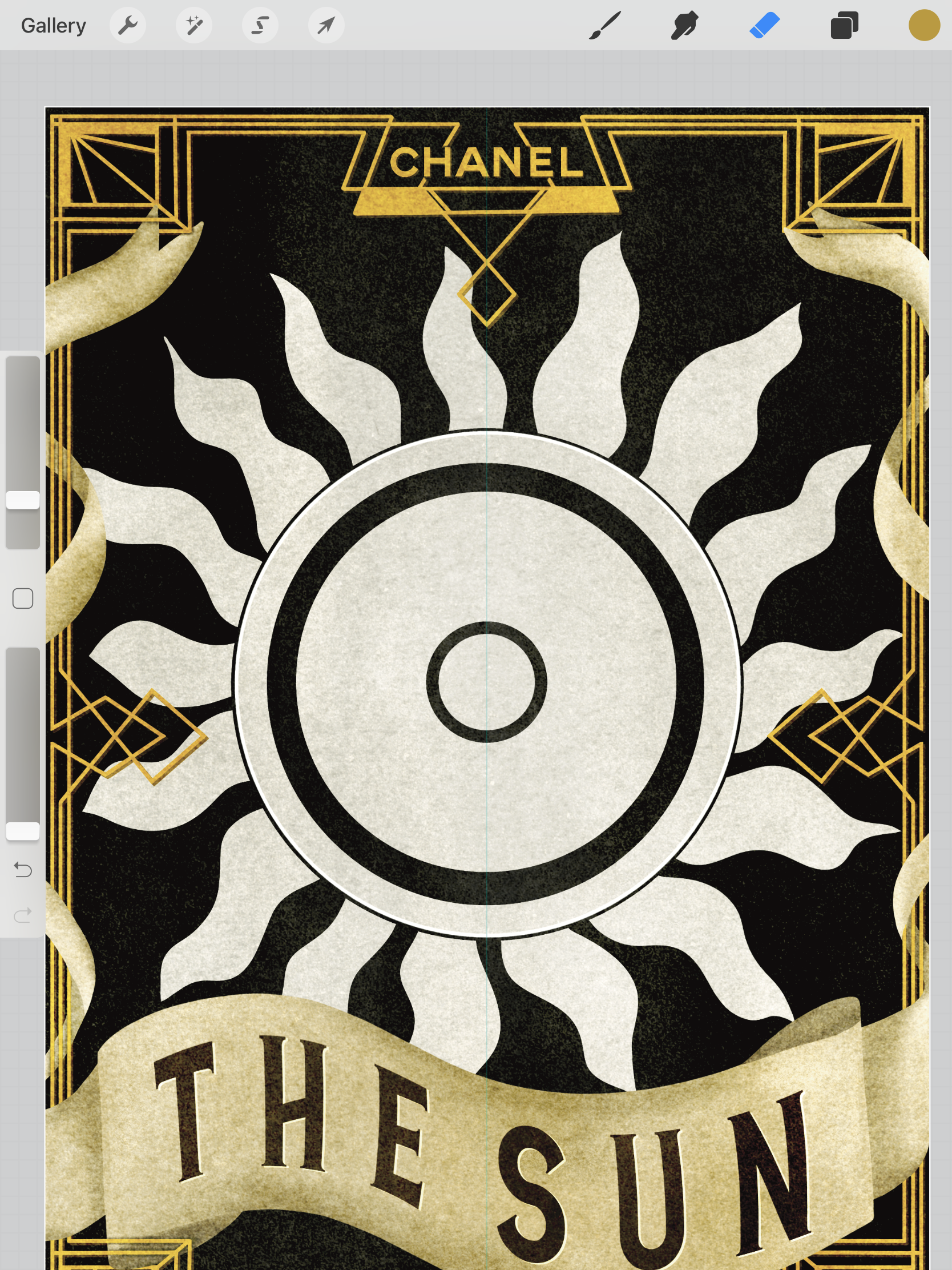
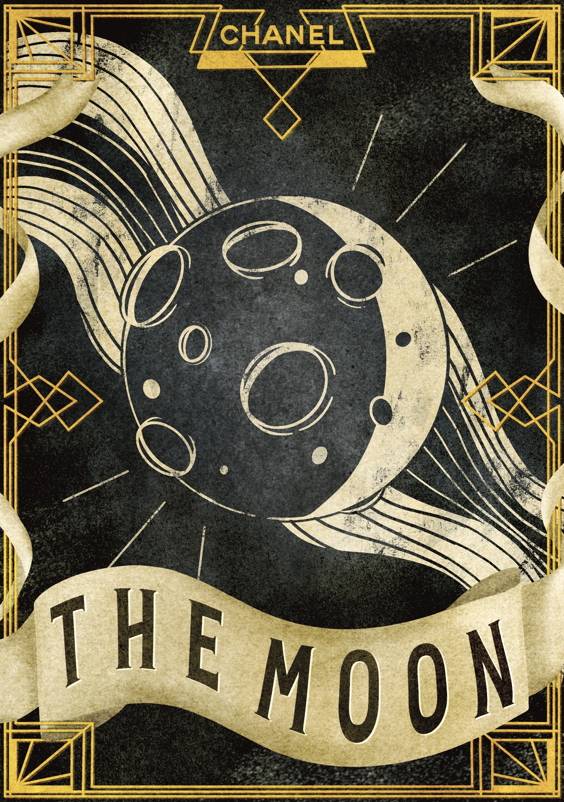
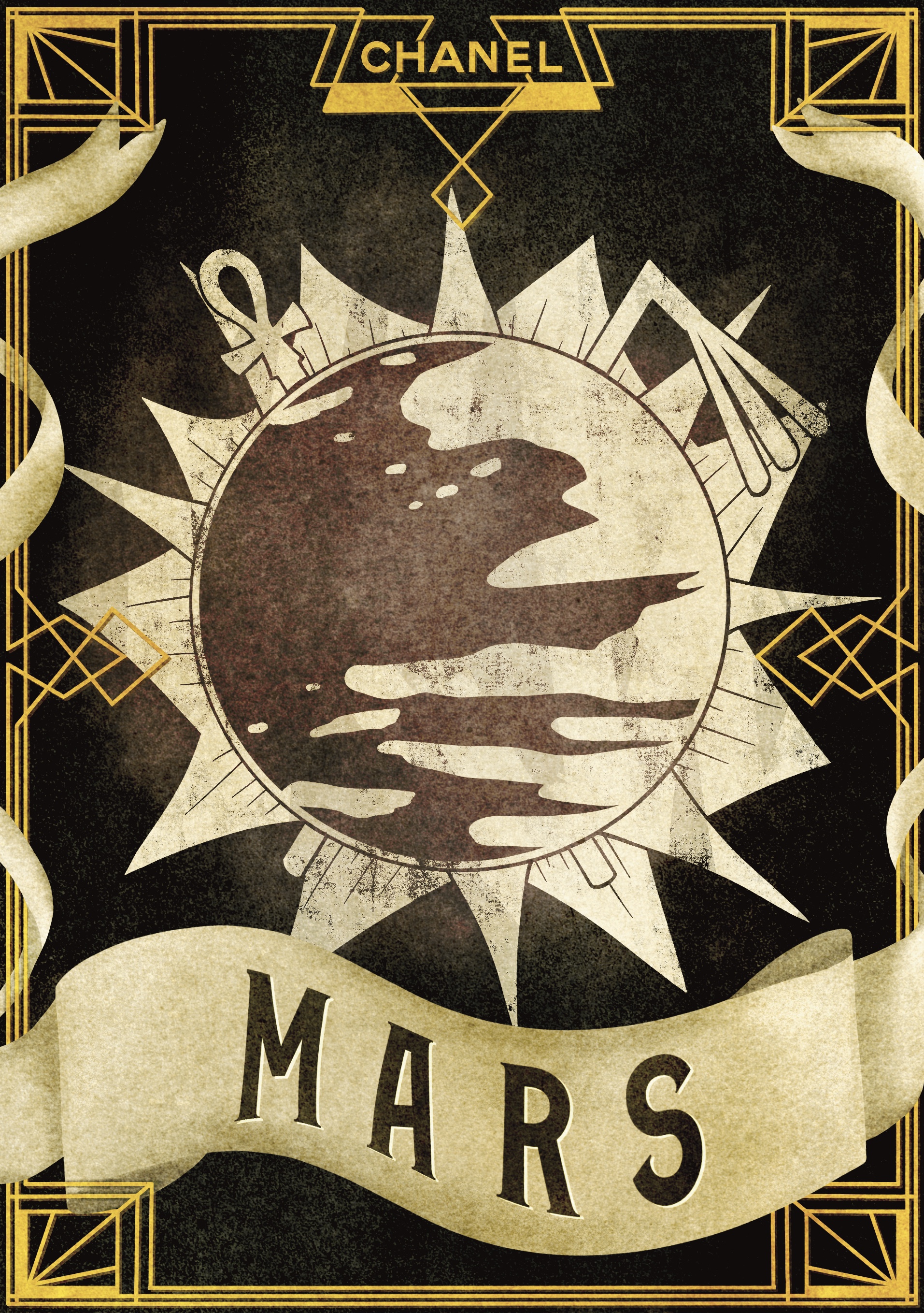
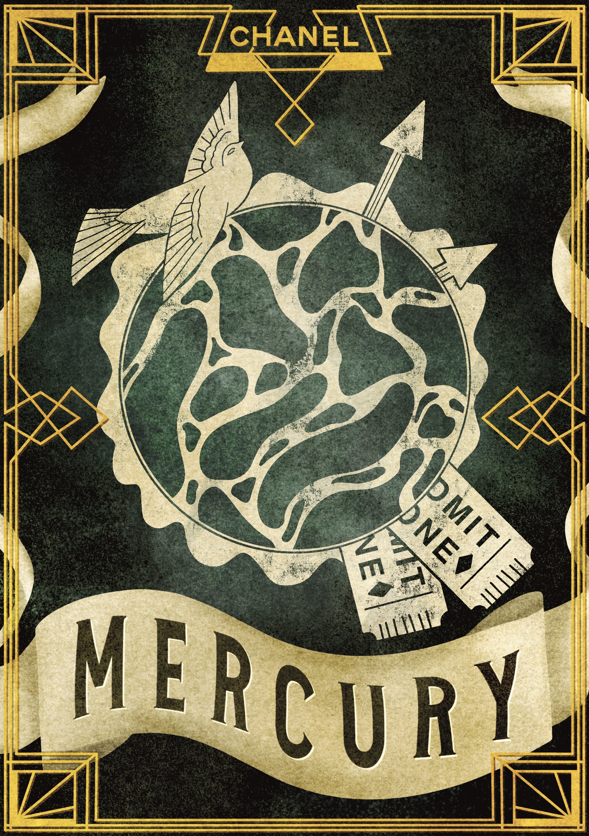
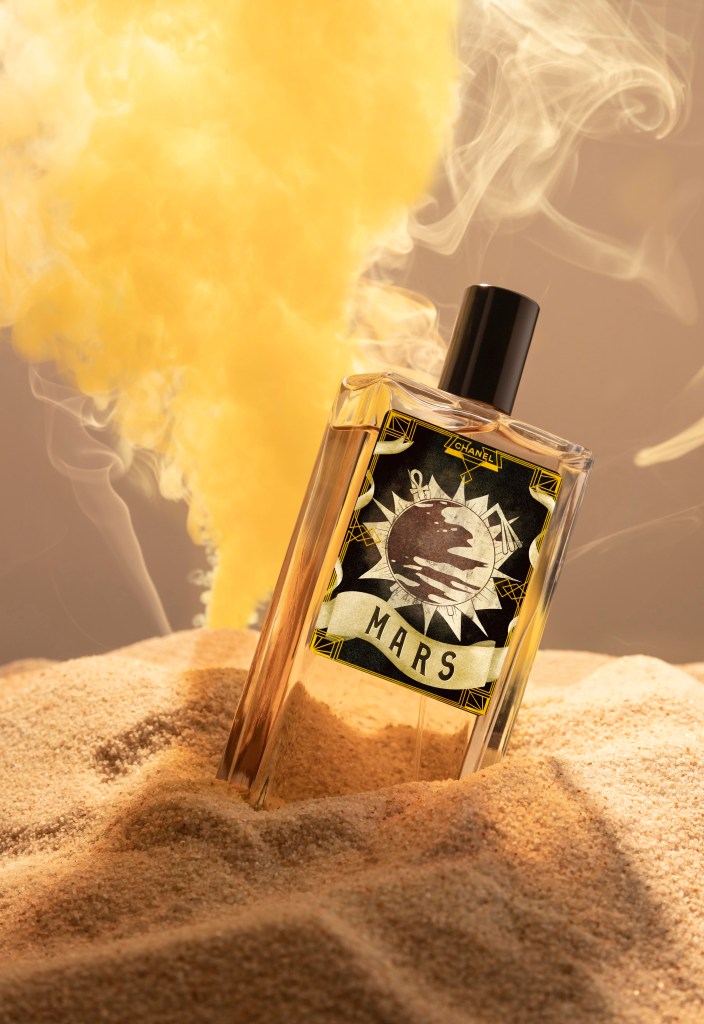
I find that most of my idea development happens when I’m disengaged from my work. I sit and mindlessly play games or scroll through social media, and my brain ruminates on whatever it wants, which often leads back to the current projects I’m working on. As much as you can try to plan to do research then generate ideas, the two often happen simultaneously. By the next morning, my mind was overflowing with possibilities for the content of my final illustrations. I began my day by writing out everything in my head in order to keep track of it. I wanted all 7 of the labels to have the same border, featuring typical Art Deco designs, the Chanel branding, and the name of the fragrance. Each would also feature the planet they are based upon in the centre of the design, framed by the border. Then, using the astrological meaning of each of the planets, I would add one or two other elements such as Egyptian staffs forming an ‘X’ behind the planet Mars, the astrological representative for anger, passion, and sex.
It was an underdeveloped idea, but it was an idea. More importantly, I was extremely excited about it. I referenced my sticker scans to get more inspiration for what sort of objects could be featured in the illustrations, and remembered I was going to create a Pinterest board filled with abstract inspiration. I loved looking for work to add to this board, and I find it so inspiring. I’m definitely going to build on it and take it forward in my degree as a reference board for the sort of work I want to be creating.
I was ready to jump straight into illustrating at this point, but I had one last research point which I wanted to briefly explore: the marketing of perfume and the history of Chanel as a brand. I began on the Chanel website, and learned to my surprise that the first Chanel fragrance was launched in 1921, popularising itself in the exact era I’m drawing inspiration from for this project. This felt like something I could have known sooner, but I was excited that it all seemed to fall into place. I also took some notes on how the website was designed and any elements I felt would be relevant when designing my labels. Next, I visited the Perfume Shop online store to look at how the perfume was marketed. The majority of labels were very simple, often just text. I found that the design elements of the perfume tended to be in the shape of the bottle and the outer packaging. I thought about whether there were any perfume brands I knew of that had similar labels to the ones I wanted to create, and after some research I found that the Lush brand perfumes hit the nail on the head.
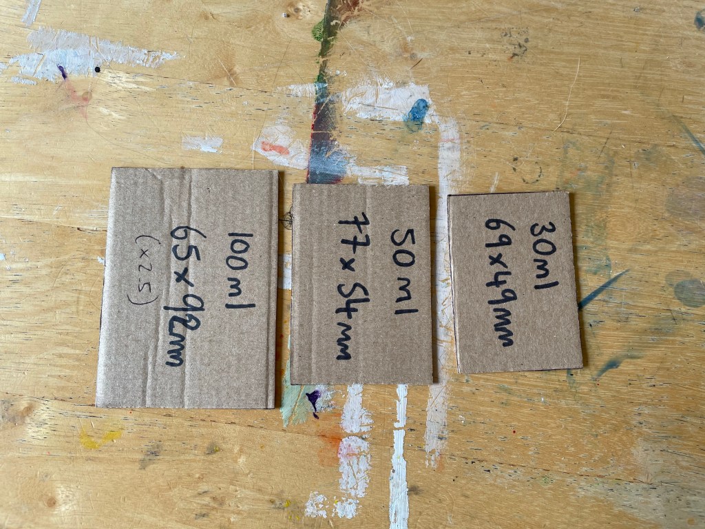
I was confident now that I could go ahead and begin exploring ideas. I wanted to start by creating a border and background for my designs, as they would be consistent throughout all 7 illustrations, and then from there I could begin figuring out the content. I opened a Procreate canvas at the largest print size – 92x65mm – then realised I had no idea how big this actually was in the real world. I wanted a reference for the 3 print sizes so I could envision them whilst illustrating my designs, in order to ensure nothing would be missed or under-developed. I cut out cardboard templates of the three sizes, and pondered how I would create something that worked on such different scales. I also decided to size up my canvas a little, by 2.5x the size of the 100ml bottle, as I find sizing down is easier than sizing up. Throughout my illustration process I continuously referenced the three templates I had created, and I found this step very useful.
Due to the size of the smallest bottle, I started questioning how much detail I could really include in the illustrations. I wanted these to be fabulous and whimsical pieces with a lot going on, but it wouldn’t be readable or recognisable at a small print size. I cautiously decided to continue on, following my original plan of creating a border first and then figuring out the designs later.
I started by sketching out the idea I had developed for my border over the many days of research. I then began blocking it out using a simple black monoline brush. I used the symmetry tool whilst doing this to ensure I was perfecting this key Art Deco component. When I got to drawing the round detailing on the corners, I realised my design needed to change. I couldn’t keep up that perfect, smooth, and symmetrical style I was going for. I browsed through some of the images that came up on Google when I searched ‘Art Deco borders’ and changed my design to be more in-line with the style. I really enjoyed this process.
Next, I moved on to the scroll I wanted for the text. I was feeling conflicted about this, as it wasn’t really in line with any of my research. To me, a grandiose banner of text is whimsical and has Alice in Wonderland type vibes, which fit my brief well, but it wasn’t the standard in the 20s and 30s. I canvassed the OCA Visual Communication Discord server group for help – asking that if an illustration is inspired by an era, does it have to be 100% historically accurate, or can it have other influences? The general consensus was that something simply being inspired by an era just has to take, well, inspiration from it, and it doesn’t need to totally replicate the style of time itself absolutely. When I explained my brief further, people even pointed out that taking inspiration from other influences would increase the abstract and whimsical feel of the piece, almost as if it can’t quite be placed in time.
I chose the scroll that I thought looked best and moved on to colouring. I also decided I wanted to use a textured canvas for the piece, like I did in Assignment 3. I referenced the tests I did during that assignment to pick which one I wanted, and settled on the vintage canvas. I chose a gold tone for the main frame of the canvas, and a warm dark grey for the background. I also found a PNG of the official Chanel logo to add to the top of the label. I decided to add bits of the banner wrapped around each side of the main frame to try to tie it in a bit better, which worked really well. I then moved onto text. Initially, I really wanted to design my own font for this, but given the amount of work I had set myself up to do I decided it would be wiser to pick one instead.
I went to 1001freefonts and typed in the word ‘mercury’ as it was sufficiently long enough to give me a good idea of how the fonts would look. I then downloaded 7 different fonts to choose from and play around with. Throughout my research I had encountered a great deal of text, so I didn’t feel the need to do further research and felt I had a good handle on it. I tested out the fonts and picked two favourites – one called Performer, and one called Chaman Elegant. I then moved on to shading and adding detail. When I got to using the font, I realised that neither of my choices really worked for this piece. They both felt really superimposed and unnatural. I tried out another one of the fonts, Sarkowik, and I felt it looked a lot better. I used the warp tool to make the text ‘flow’ with the banner, which was somewhat tricky, but led to great results. Once finished, I duplicated the canvas 6 times and added the text for the other labels.
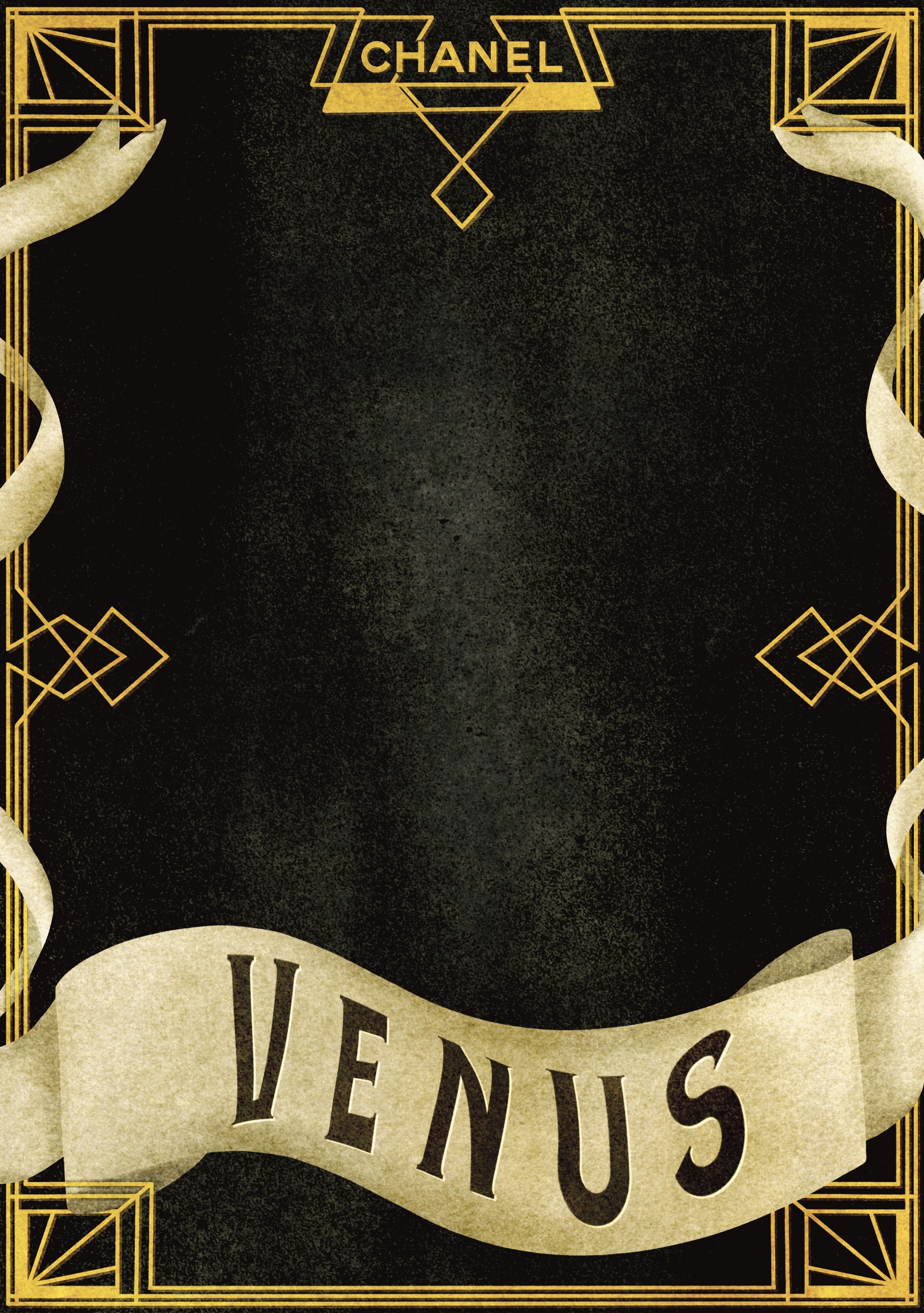
I then moved on to planning my main illustrations. I had initially planned to thumbnail these, but I ended up sort of just going with the flow. I began by sketching out some rough ideas on paper before moving into Procreate. Originally I wanted to draw all 7 planets on the same canvas, so I could compare them and make sure they worked alongside each other. I duplicated one of the canvases before removing the text so I could see how they worked in context. I started with the Moon, as it represents Monday and therefore the ‘first’ in the set. I played around a little with shapes, shading, and styles, but couldn’t quite figure out how I wanted it to look. I then started experimenting with textures, hoping that this would inspire me. I managed to find a way to make the illustrations look screen printed, which was one of my goals, and I took some time away to try to clear my head.
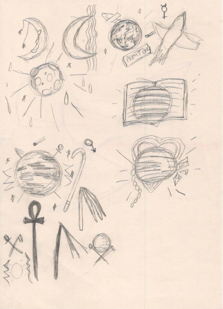
When I came back, I decided to start with Mars as I had a pretty clear idea for what I wanted to do. I started by drawing out the shapes of the objects I wanted to include. I then erased around each of the objects to make them stand out, following a similar technique as in Exercise 11. Once I was happy with how the design looked, I filled in the shape on a blank layer with a textured brush to create the screen printed effect. I then used a splatter brush to add stars in the background, and used a combination of the cloud brush and blending modes to create a smokey coloured background, inspired by the colour associated with the planet. I was extremely happy with how this looked. I felt like I’d found the perfect balance – it wasn’t too much, or too little, and would work at a wide range of sizes.
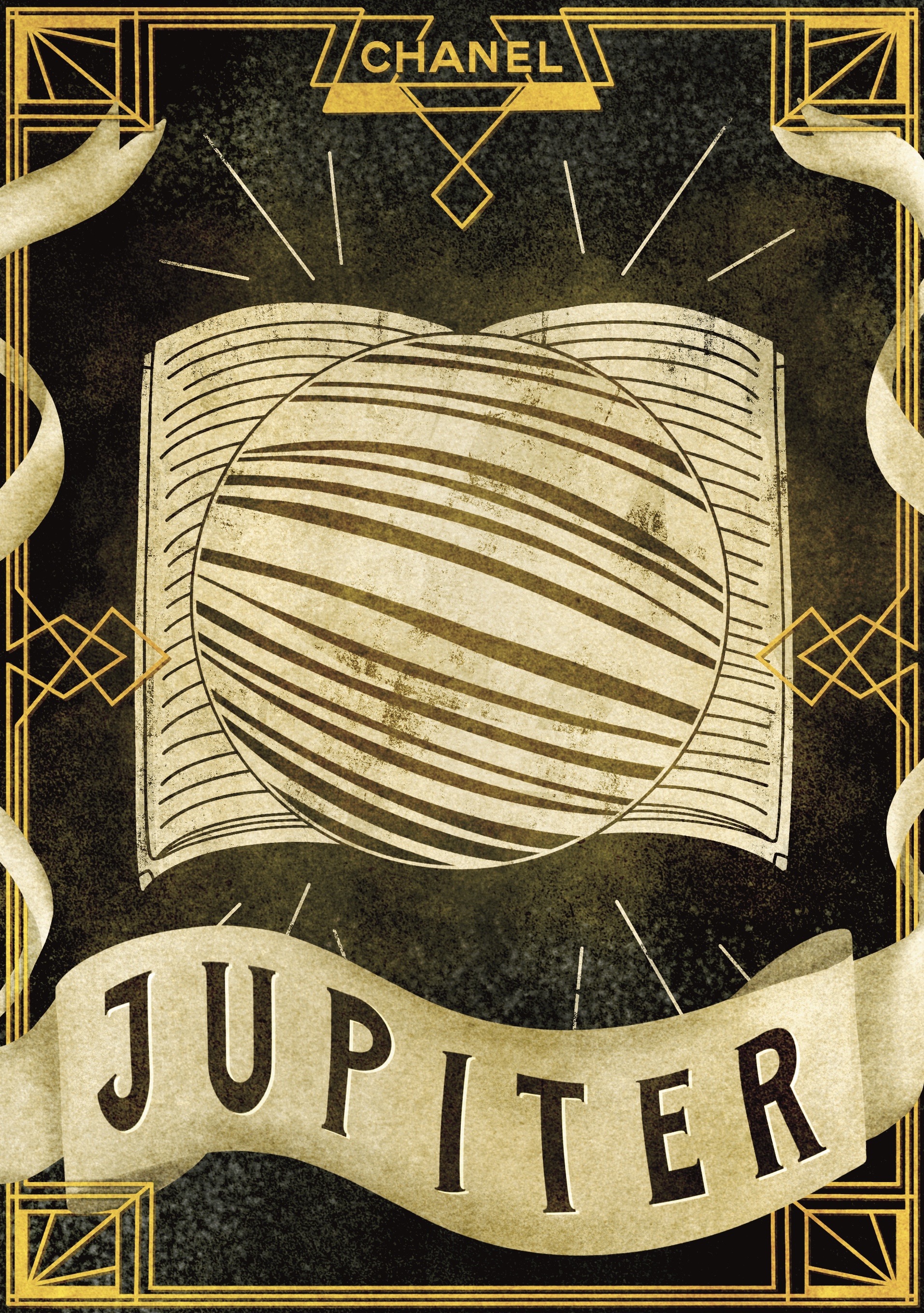
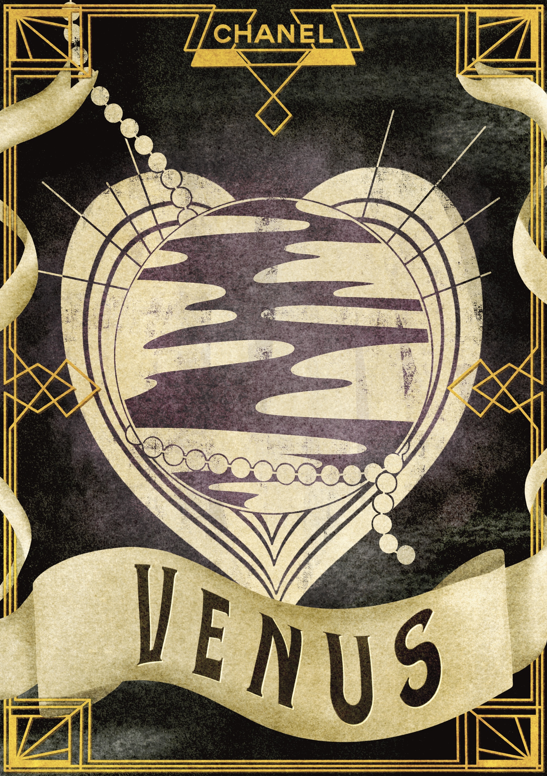
I followed this same process for the rest of my designs, so I won’t include a time lapse video for all of them. Throughout my design process I continually referred to my already completed designs to ensure I wasn’t straying too far from how they looked, maintaining consistency whilst still producing different designs. My first three designs – Mars, the Moon, and Mercury – all went incredibly well. The pattern behind the Moon was meant to look like water, and the objects in the Mercury piece relate to Mercury’s astrological association with travel. I then moved on to Jupiter and Venus, which I felt strayed a little from the three I had already produced. The book behind Jupiter refers to the philosophical relevance of the planet, but it feels like the piece is lacking a little. The hearts behind Venus are in keeping with the planet’s astrological associations, but I’m not sure if they work. I felt like I was losing my way a little bit and found myself frustrated.
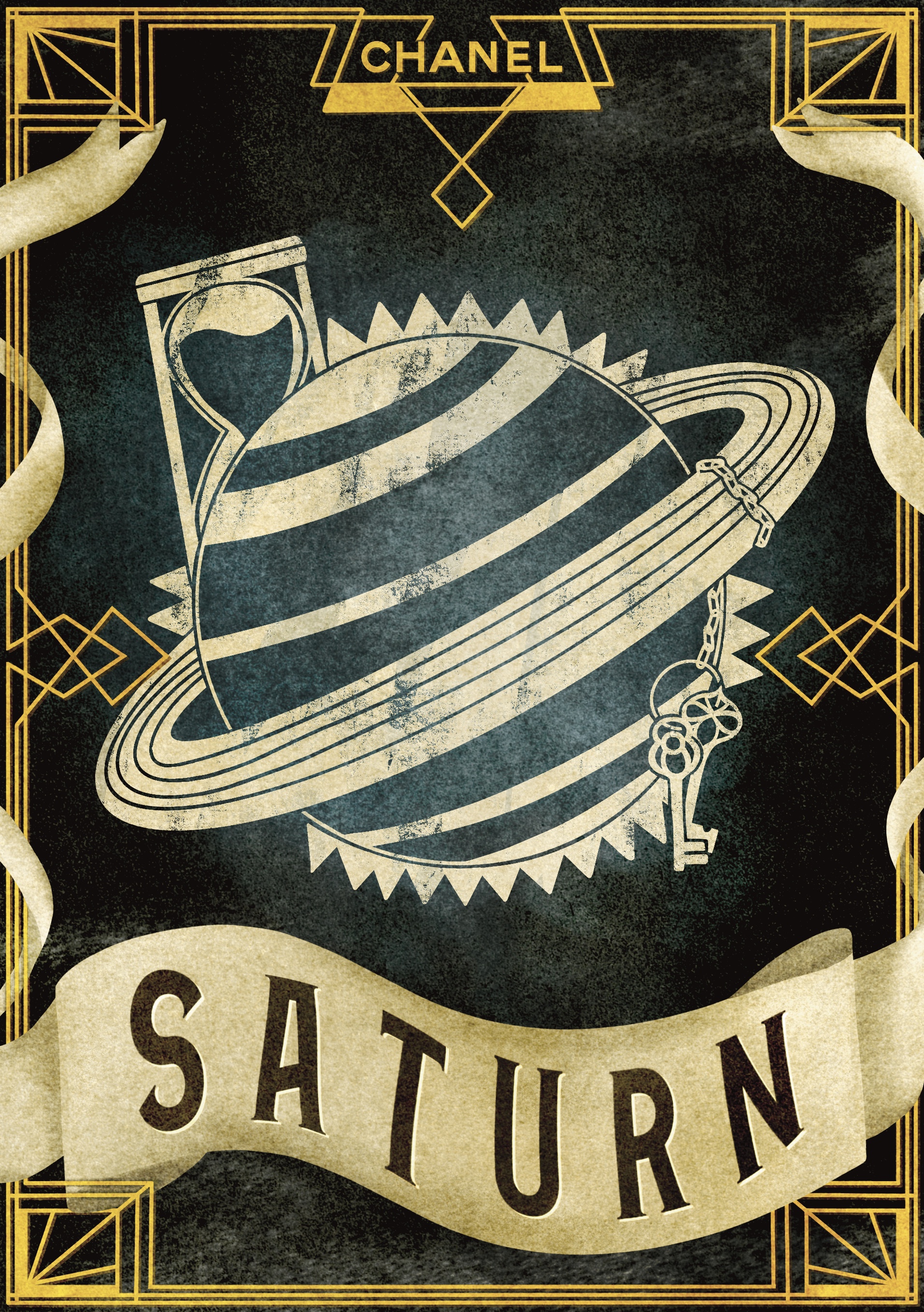
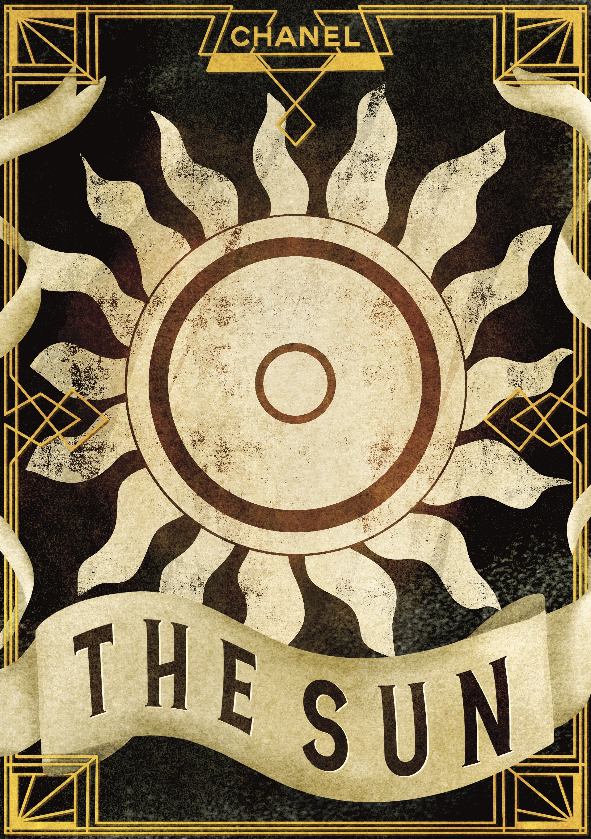
When I moved onto Saturn, I really felt stumped. I didn’t know how to add to this piece in a way that kept it desirable to purchase. ‘Restriction, limitation, and self-control’ are not particularly positive traits. I started researching other historical meanings of Saturn and found that the Roman god of Saturn was the god of time. That’s when I got the idea for the hourglass. The keys on a chain are a nod to the restriction and limitation aspect, and the tight sharp border represents self-control. I feel this piece fits in perfectly, more so than the two I’d done previously. I then moved onto the Sun, which proved tricky too. I didn’t want to overwhelm the piece with too many elements, but I was running the risk of leaving it far too simple. I wanted to figure out how to match the simplicity of the Moon piece, while still incorporating the elements I wanted. I tried variations on sun rays and considered adding plants as a reference to the ‘life’ meaning found in astrology. I ended up leaving it in it’s simple form, as after a week of working on these pieces I was beginning to burn out and lose my creativity.

I’m not sure how to sum up this write-up. I took a day away from it all in the hopes a better conclusion would come to me, but I still feel stumped. Looking back on the work I have produced throughout this unit brings up a lot of feelings and thoughts. When I compare the work I produced/created for this assignment with the work from Assignment 1, I am astounded. In the past 14 months my skills as an illustrator have grown enormously, and the foundations for my practice have been laid out plain and simple. I am so excited about working now, I have let go of so many of the preconceived ideas I had about what makes art really art, and I have loosened up on my rigidity and expectations of myself. I don’t panic as much when I make mistakes, nor do I dread fulfilling briefs. In fact, I embrace them.
Having the opportunity to write my own brief was a wonderful learning experience. I definitely set the bar a little too high – not higher than what I’m capable of, just too much for the short time I had to complete it. I know now that I’d like to continue working in this way, considering audiences and doing thorough research before completing pieces, even if they’re just my own and for fun. Having a solid and planned out direction is enormously helpful. From the conception of my brief for this assignment, all the way throughout my full illustration process, I was excited. I feel like I can pinpoint my interests, style, and what it is I enjoy and want to explore further.
Finishing my first unit feels triumphant, and also a little sad. I am excited about moving on to my next unit and developing my sketchbook skills, but I will miss the experiences I have had throughout this unit. Seeing my own growth and creativity as an artist bloom has been wonderful. When I first began, I didn’t really view myself as an artist, nor did I feel art was a particularly big part of my life. I felt trapped by my own boundaries and expectations, and it made me scared to ever pursue anything. Now I couldn’t imagine spending my time doing anything else. This assignment has shown me that I’m capable of creating my own projects, following what I’m passionate about, and that I can function as an independent illustrator. That feels like a success.

[…] time researching and illustrating imagery that is inspired by the early 20th Century, such as Assignment 5 of Key Steps in Illustration. One of my long-term goals is to figure out my favourite elements from each design movement and […]
LikeLike