
This exercise asked me to undergo one of Johannes Itten’s exercises exploring colour. I had to draw two grids of squares and fill one with colours I like, and the other with colours I dislike. Then, I had to emulate Itten’s style whilst exploring different combinations of colours to represent abstract ideas.
I was a little put off by this exercise as my understanding of colour theory is pretty solid at this point, and it felt like a box-ticking task. Picking colours I enjoy is easy, as I already have multiple palettes on Procreate that I’ve spent years curating. Picking the colours I don’t like was harder, as I’ve come to see all colours as useful and necessary within design work, as colours look different based on how they’re used and the colours used around them. A colour might look unpleasant when isolated, but look a lot nicer when part of a composition.
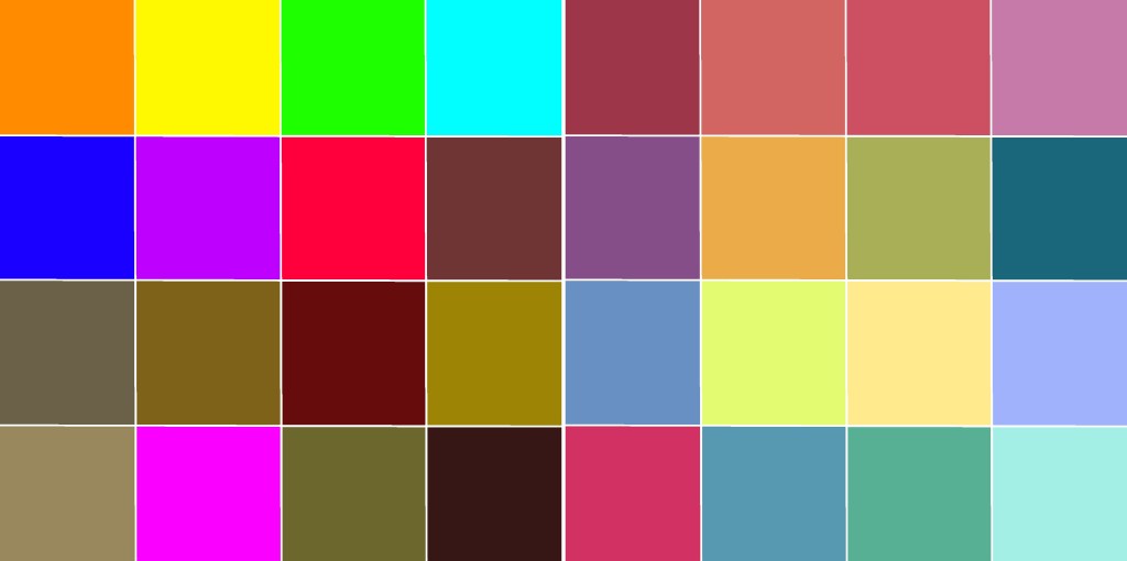
The colours I like (right) and dislike (left)
The exercise says that ‘we tend to pick bright colours as the colours we like’, and ‘the colours we think we don’t like as much are often more subtle’. I felt very conscious of this as I was picking my likes and dislikes, knowing my preferences are the opposite of this. I find bright, neon colours very garish and difficult to look at. They have their place in context, but they’re not colours I ever go for intuitively. I love softer, muted, vintage-inspired colours, and most of my work draws from these palettes. The exercise asks to compare the two and ask which looks better, and unsurprisingly, I much prefer my liked colours. Neon tones and muddy browns do not complement each other!
I moved on to exploring colour combinations for the abstract concepts listed in the exercise. This was a difficult task, as I struggled to identify colours that I hadn’t already used or that felt accurate to the concept. Some colour combinations just looked awful once I put them together, too. I also found I kept coming back to yellow for so many of the words – trying to push myself into other colours was tricky! I think it’s hard for my autistic brain to connect tangible things to abstract concepts in this way. I find researching and drawing from that to be a lot easier than having to think up this stuff for myself.
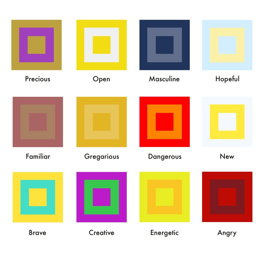
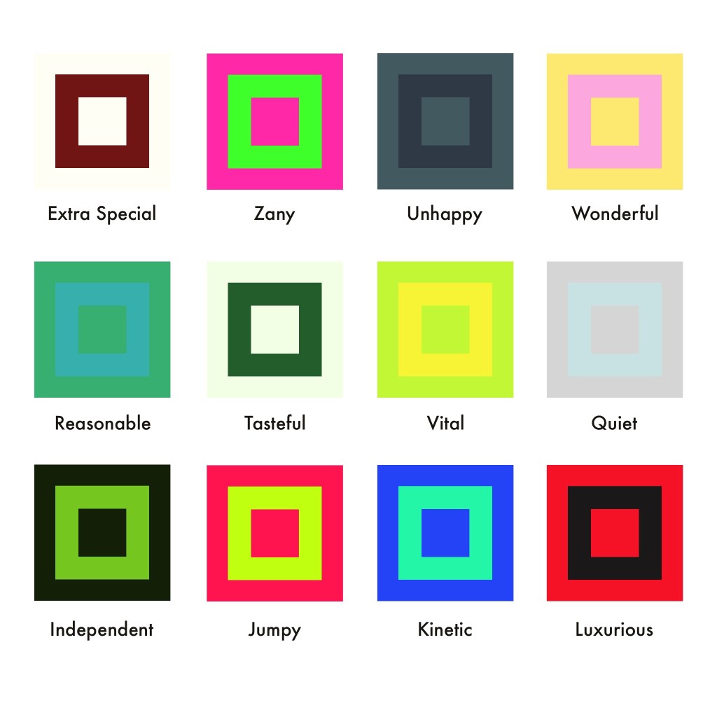
Colour compositions chosen for each of the words shown
I’m writing this learning log a few weeks after completing the exercise, and looking back, there are several of these colour combinations that I don’t feel work well. Familiar, Extra Special, Tasteful, and Energetic all could do with some tweaking (or whole new colours!). Some of these concepts – such as Extra Special – were difficult for me as it felt no different to Precious, or Luxurious, which I had already chosen colours for. So many concepts had a lot of overlap in meaning, and pulling them apart wasn’t easy.
Ultimately, this exercise did end up feeling like box-ticking, but it showed me where my weak points are. I rely a lot on research and experimentation to figure out how to use colour in a piece – and I’ve put in a lot of work identifying which colours I like and don’t like over the years. Finding a consistent colour scheme that shows up in my work was a focus of mine for some time, and I like that now it’s very instinctual for me. Maybe, I need to do some more work with muddy browns and neons, just to stretch myself a little bit!
