
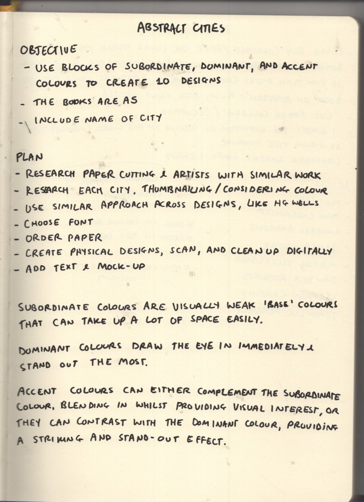
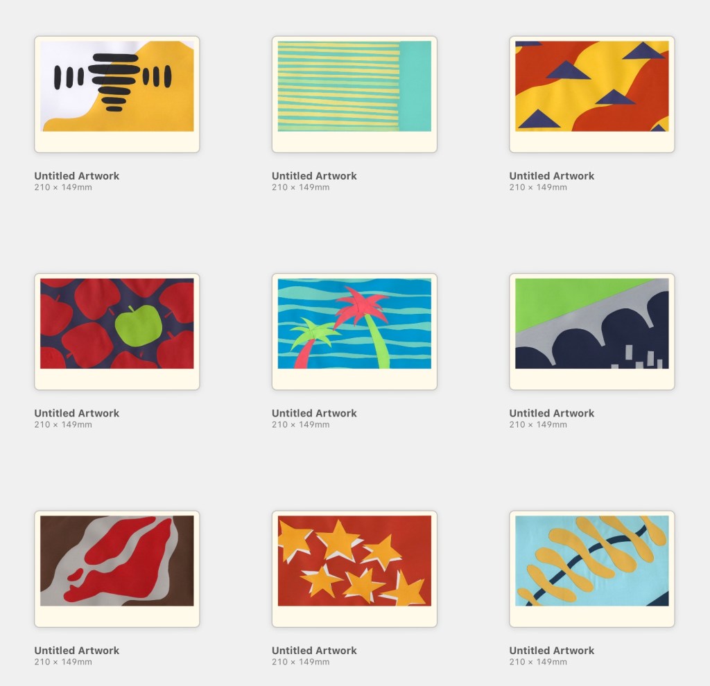
This exercise asked me to create 10 abstract designs to be used as book covers for travel guides. I was provided with 10 cities to design for and was asked to use blocks of subordinate, dominant, and accent colours. The books were to be printed in A5 landscape format, and the covers had to feature the name of the city alongside or incorporated into the design.
As an OCA Visual Communications student, this exercise is a little bit notorious – having a reputation for taking an enormous amount of time and driving everybody crazy in the process. I was looking forward to finally trying my hand at it! I could’ve made this really easy for myself, following my usual design approach and creating some really fun digital designs, but of course, I chose to make it excessively complicated and stepped way beyond my comfort zone.
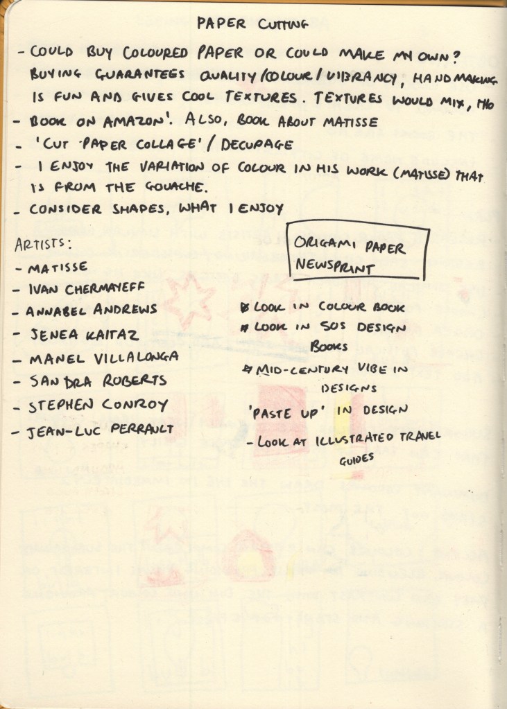
Throughout my research in this unit, I have seen many examples of paper cut-outs in graphic design, whether intentionally used for artistic effect, or simply used because that’s what technology allowed at the time. I’d like to branch out a bit in my design work and try to use more traditional mediums rather than grabbing my iPad every time I approach a brief, and thought this would be a great opportunity to explore the papercutting medium – especially as the work I’d previously seen screamed ‘abstract blocks of colour’.
Before researching each of the 10 cities, I began collecting some papercutting references, starting with Cezanne. My tutor had recommended his work to me and I found it particularly inspiring. I began adding his work to a Pinterest board to reference later, then expanded my research to other artists.
I ended up on the Saatchi Gallery website, where there was a huge collection of papercut artwork. These went onto the Pinterest board, too. I briefly had a look into paste-up in design, to see how I could emulate this today, but it felt like too much of a diversion, so I came back to explore graphic designers specifically.
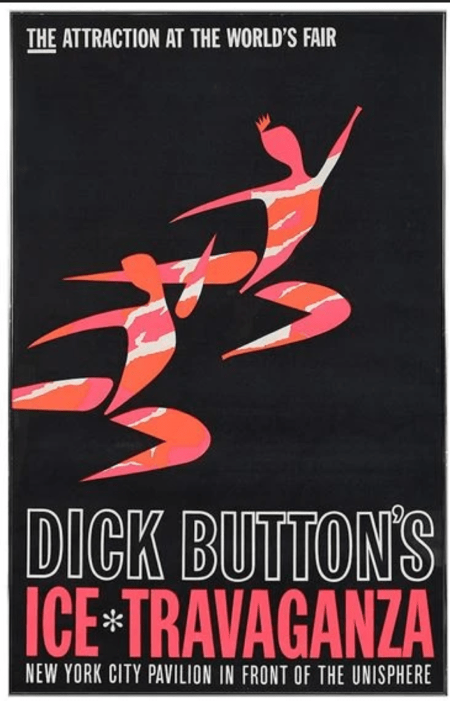
In a previous exercise, I had come across Ivan Chermayeff’s work and made a note of it to reference again in this project. He is most famously known for his logo work – specifically the CNN, PBS, and National Geographic logos – however he created a huge number of collages in his time, most of which are abstract collections of papers. I love the way each shape is haphazardly cut or torn, giving a childlike feeling to each piece. The positioning of the papers is recollective of Saul Bass’s work, especially in the Ice Travaganza poster below, but taken to a more abstract extreme.
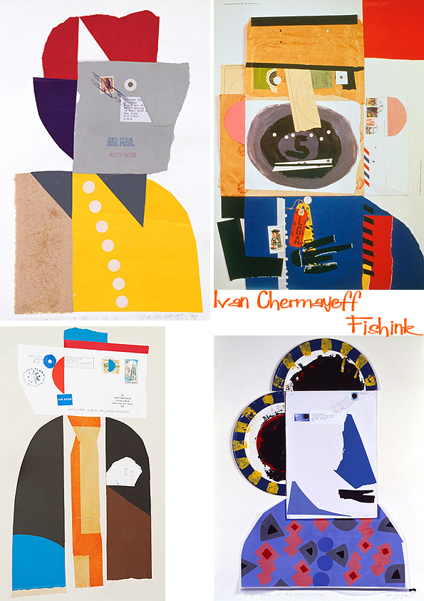
Some of Ivan Chermayeff’s work
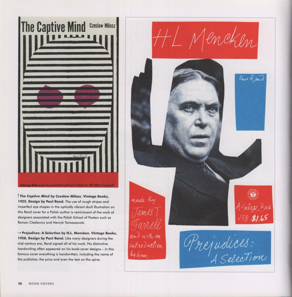
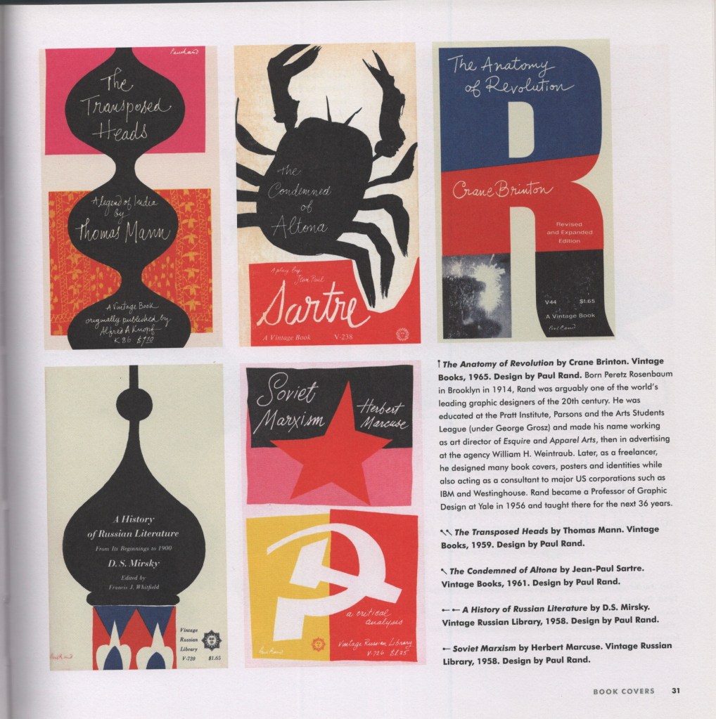
Next, I looked at one of my favourite books to reference, Mid-century Modern Graphic Design by Theo Inglis. I’ve found many examples here of this paper cut-out style, and wanted to find some book covers specifically, to see how the style translates for this purpose. Pages 30-31 were the strongest for me, showing many different covers from Paul Rand – another designer of today’s iconic logos – utilising this fun, messy, papercut style. The colours are very simple throughout, too, and got me thinking about how I would explore colour with my own designs.
Theo Inglis’s Twitter profile is also filled with design inspiration. In 2019, he updated a daily thread of Mid-Century Book Designs, many of which fit the style I aim to achieve. It was a lot of fun scrolling through and seeing how different artists approached book covers in the era!
I then wanted to explore some of the language used in the brief: subordinate, dominant, and accent colours. I wanted to have a better understanding of what these were, so I could effectively choose and arrange my paper. I found that subordinate colours are visually ‘weak’ and used as base colours – things like white, creams, browns, blacks – anything that easily fills space and is comfortable to look at in that context. Dominant colours, on the other hand, draw the eye in immediately and stand out against the subordinate colour. Accent colours can complement or contrast against the dominant colour, either blending in whilst still providing some visual interest, or standing out and leading the eye around the image.
This reminded me of an art lesson way back in primary school where we discussed a famous landscape painting where the artist had added a spot of blue in the centre in order to draw the eye to that location. It was fascinating having that pointed out, as it wasn’t noticeable until you really looked. It was so effective and blended in seamlessly with the rest of the painting. Unfortunately, despite a lot of searching and wracking my brain, I can’t remember the painting or artist. The colour theory has stuck with me through life, however!
As this medium is totally new to me, I had to identify my practical approach before beginning the designs. I don’t have a large stock of coloured paper to hand and needed to figure out what I would use to achieve the style. Cezanne painted large sheets with gouache, then cut them once they’d dried. Painting and intentionally adding texture to paper is popular throughout collage, as it creates visual interest and excitement within each individual cutting. It’s a lot more work, however, and would add additional issues such as the paper potentially bending from the paint, colours being inconsistent, and textures being incompatible or looking overdone.
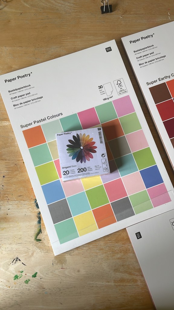
I initially wanted to go to an art or craft shop and pick out single sheets of paper once I knew my colour schemes and could match them, but there wasn’t anything like this near me. I was also struggling to find something that gave me what I wanted online – at least, one that was reasonably priced! My Mum recommended origami paper, which I was unsure of based on the size and weight of it, but I took the lead and ended up finding Rico Design, who have a huge amount of paper on offer. I bought 3 A4 pads of various paper, and two square origami packs, ensuring I had all bases covered.
Back when I was designing travel guides for Key Steps in Illustration, I had a hard time finding reference material. Travel guides typically use photographic designs in their covers, showcasing the location and usually the most recognisable or popular tourist spot. Now, I feel like I have a better idea of what to look for, and luckily for me, the Mid-Century era was filled with illustrative travel guides! I mostly wanted to get a sense of the layouts of the covers, rather than looking at the designs themselves, so I could figure out where to place text, and what kinds of fonts to use. I collected some reference imagery for the covers, then separately collected references for typefaces I was interested in.
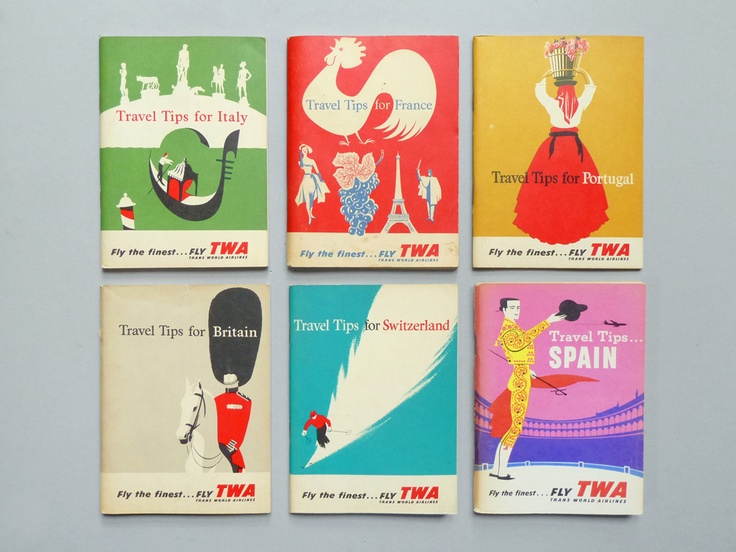
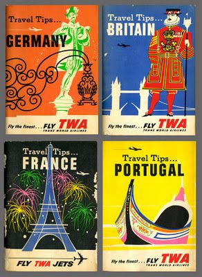
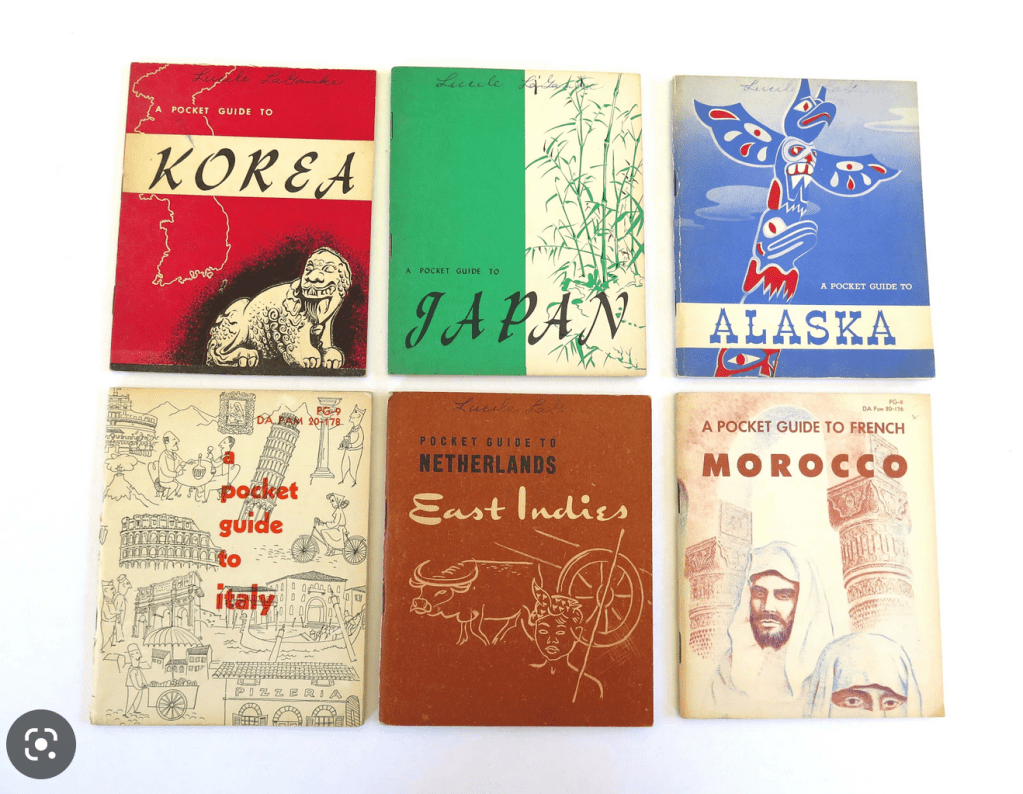
Reference imagery of vintage travel guides
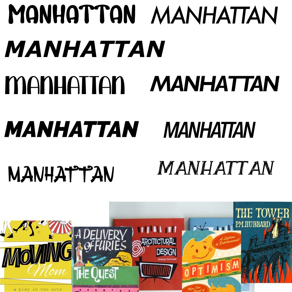
Exploring typefaces
I added the typeface inspiration to a Procreate file and started exploring some of my fonts. I grabbed a few new ones from 1001fonts that I felt fit the vibe, too. I was unsure at this stage which I liked best and decided to come back to it once all of my designs were finished as I’d have a clearer idea of how they fit together. I wanted to use the typeface to have uniformity and consistency throughout the collection of designs.
Now, finally, I could begin my research for each city.
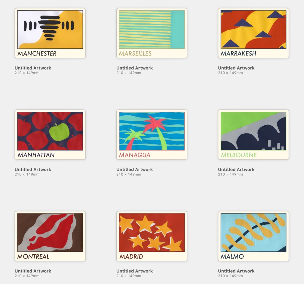
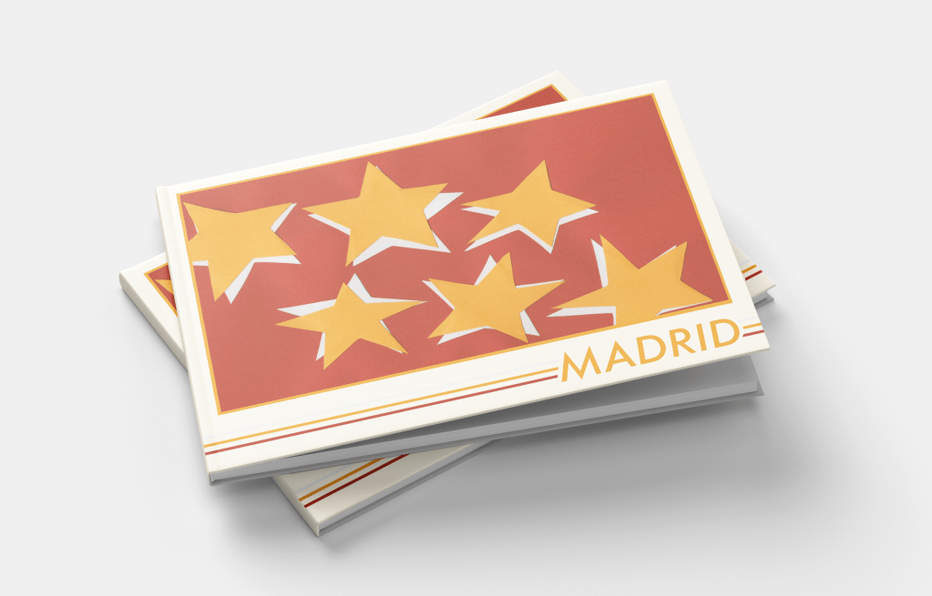
Madrid
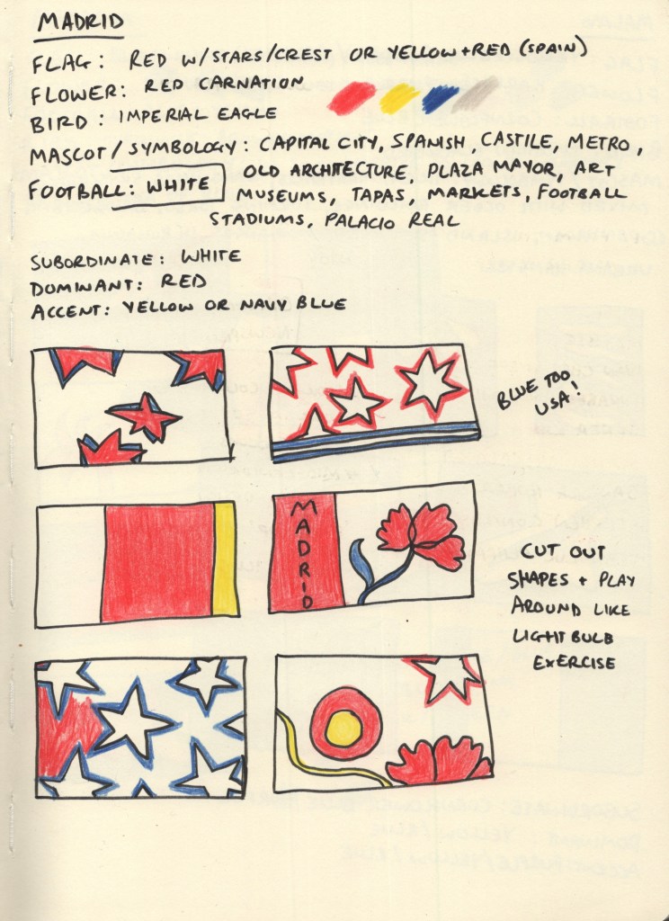
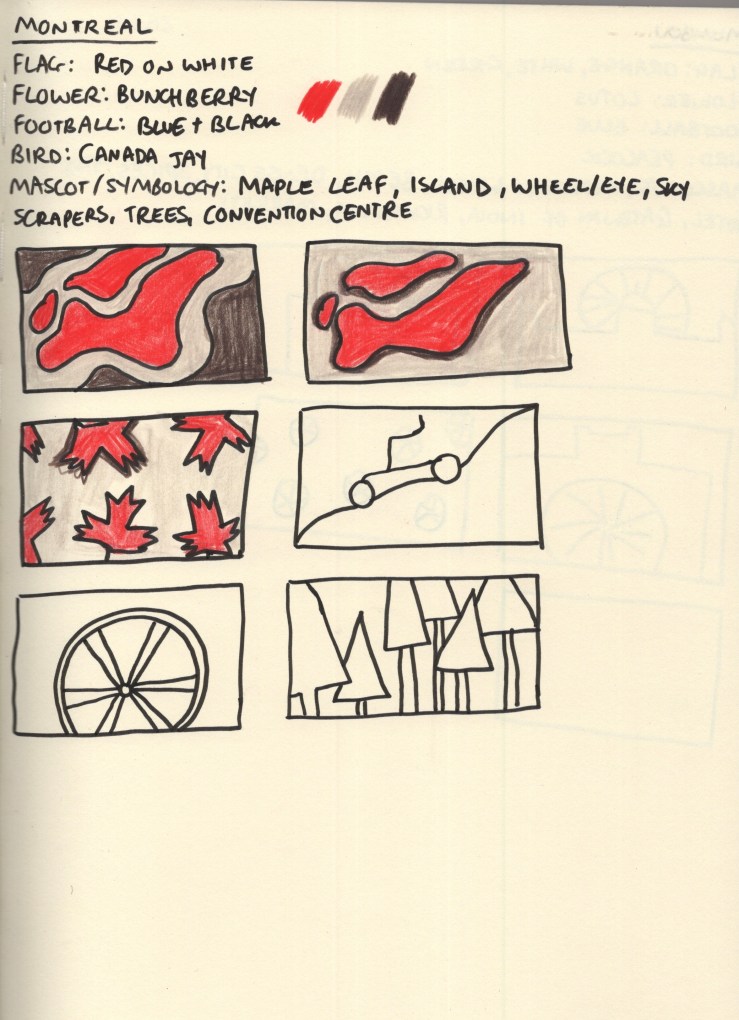
For each city, I started with 5 research points: the flag of the city or country if there wasn’t one, the national flower and bird, the local football team, and any famous mascots or symbology connected to the city. I chose these as I felt they’d give me a variety of colours and shapes to draw from during my thumbnailing process. I wanted to create as much visual interest as possible, whilst ensuring the colours I used were simplistic and recognisable for the city.
Madrid has its own flag, red with seven white stars, and the Spanish national flag is red with a yellow stripe through the middle. Its football team play in white, and the national flower is a red carnation. The national bird, the imperial eagle, has bright yellow feet and accents around its nose. I built a colour palette from this: red, yellow, and white being obvious choices. I added a dark/navy blue to the mix as I felt it complemented the existing palette nicely. I then began exploring thumbnails using coloured pencils.
Through thumbnailing it became clear to me that the blue combined with the red and white really felt like ‘USA’, not like Spain, especially where I’d tried to use stars. I changed up my colour palette a bit when the paper arrived, too. I ended up using red as the subordinate colour, yellow as the dominant colour, and white as the accent colour.
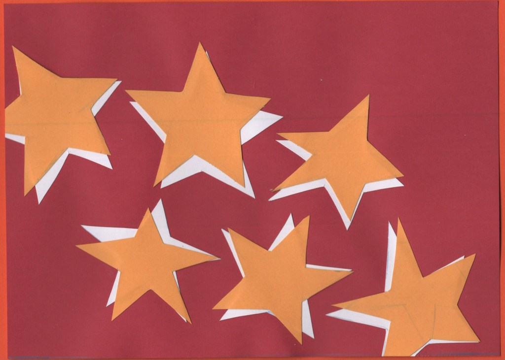
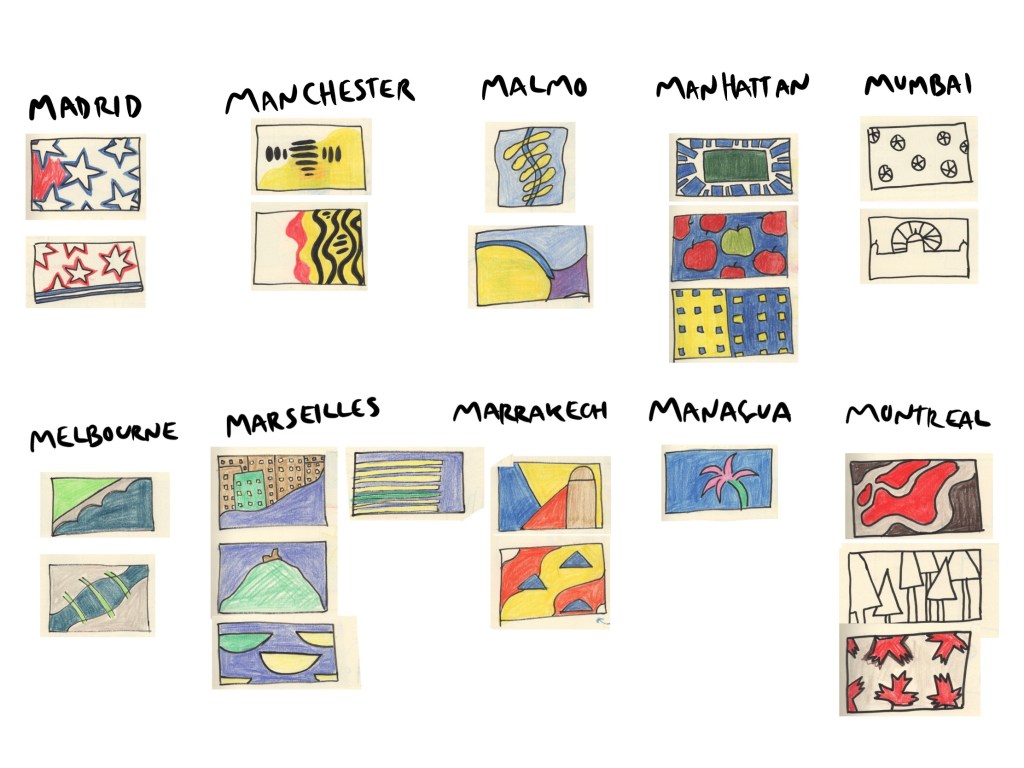
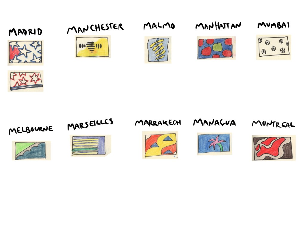
I finalised my designs once I had completed research for all 10 cities. However, due to the nature of this exercise, I wanted to keep each city contained within its own header. There were two ‘types’ of designs throughout my thumbnails: ones with the same thing repeating across the page, and ones with a landscape-adjacent design. My finalised designs consisted of 5 of each – and Madrid’s was the repeating star concept inspired by the flag of the Community of Madrid. I also felt this was one of the strongest designs I had sketched out.
For the design, I cut out 6 stars, not trying hard to have them be even or equal, but also ensuring they were readable as stars. I then traced the stars onto white paper and cut out another 6. I placed the white stars on a red piece of paper cut to A5 size and then overlaid them with yellow stars. I wanted them to look disjointed and rough, not like a smooth and consistent drop shadow. This was actually one of the final pieces I worked on and I, unfortunately, forgot to add a 7th star, which I regret now. I think it’s a strong design, and I’m happy with it, but it would make more sense with a 7th!
I then scanned the design and made edits in Photoshop to ensure the colours were correct and there were no blemishes or pencil lines left on the work.
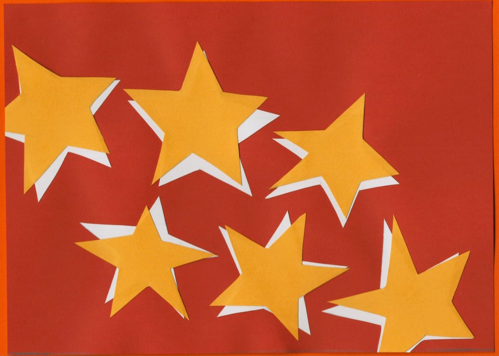
Before and after editing digitally
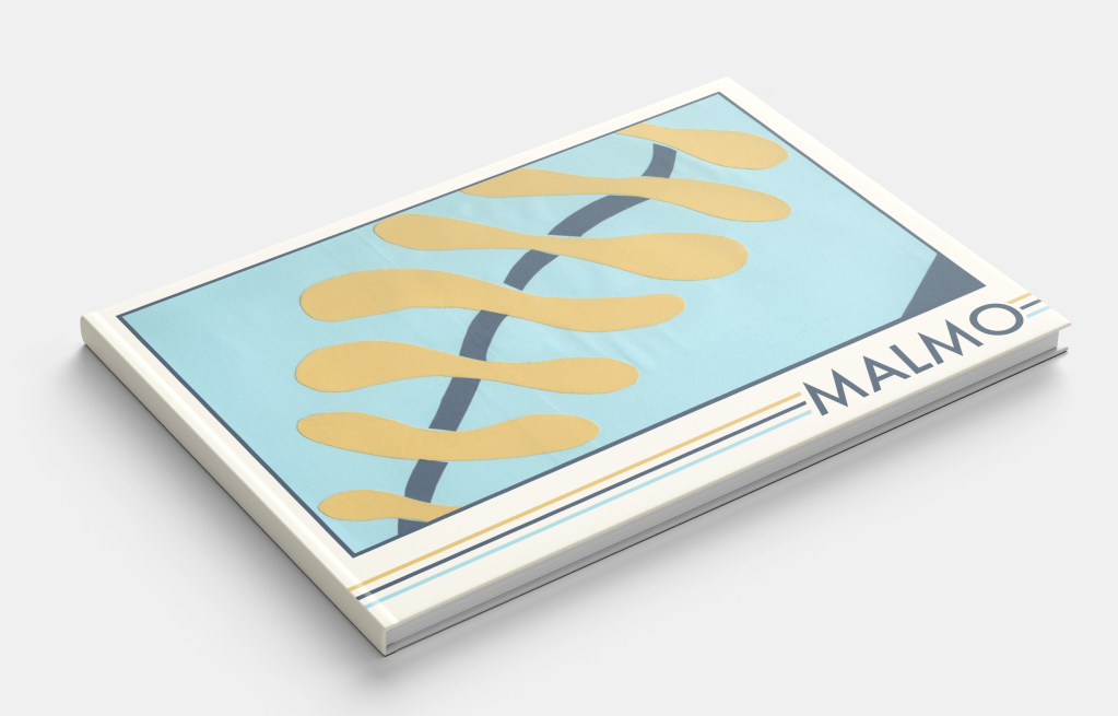
Malmo
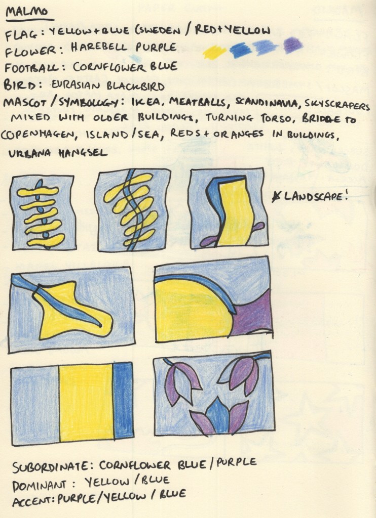
Malmo does have a flag, but I had to dig for it. The Swedish flag is very well known and it’s the colour scheme used for Swedish brands such as Ikea for this very reason. Malmo’s football team play in a cornflower blue, which I felt complemented the Swedish flag colours perfectly. The national flower, the Harebell, is a purple shade similar in saturation to cornflower blue, so I noted it down in case I wanted to add it to the piece somewhere.
I was immediately drawn to the architecture of the ‘Turning Torso’ building, especially its name, and also to the shapes of the bridge to Copenhagen and the island where it becomes a tunnel. I explored how I could utilise these in my design compositions, though initially, I forgot that I was supposed to be designing in landscape. Harebells have a very interesting shape to them and were a flower that I had never seen or heard of before, so I tried throwing them in too.
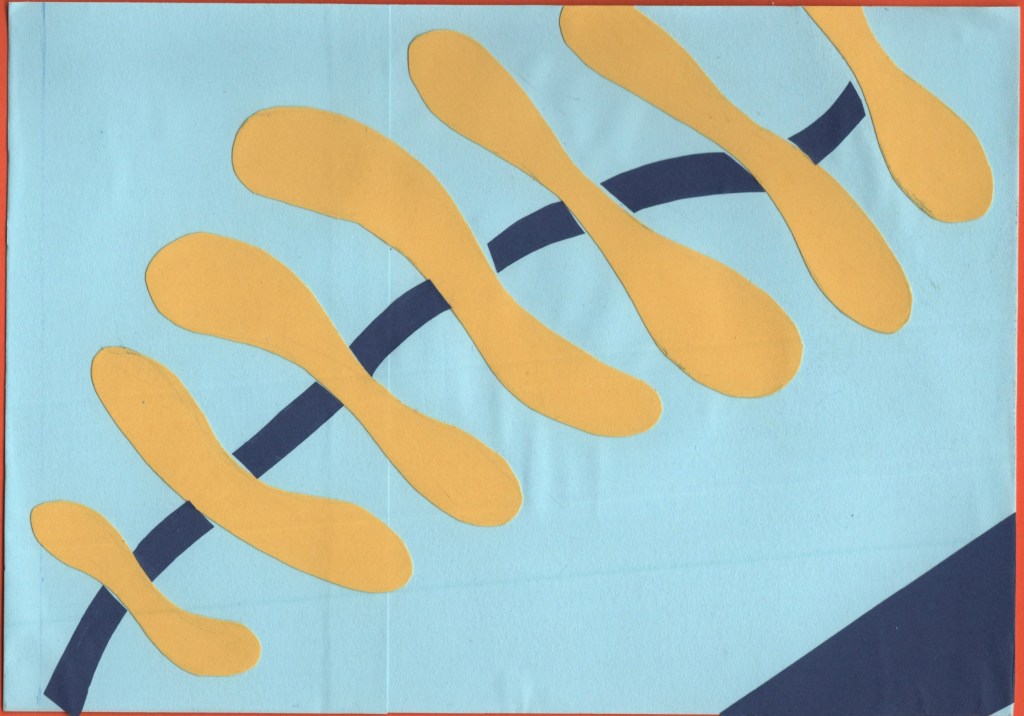
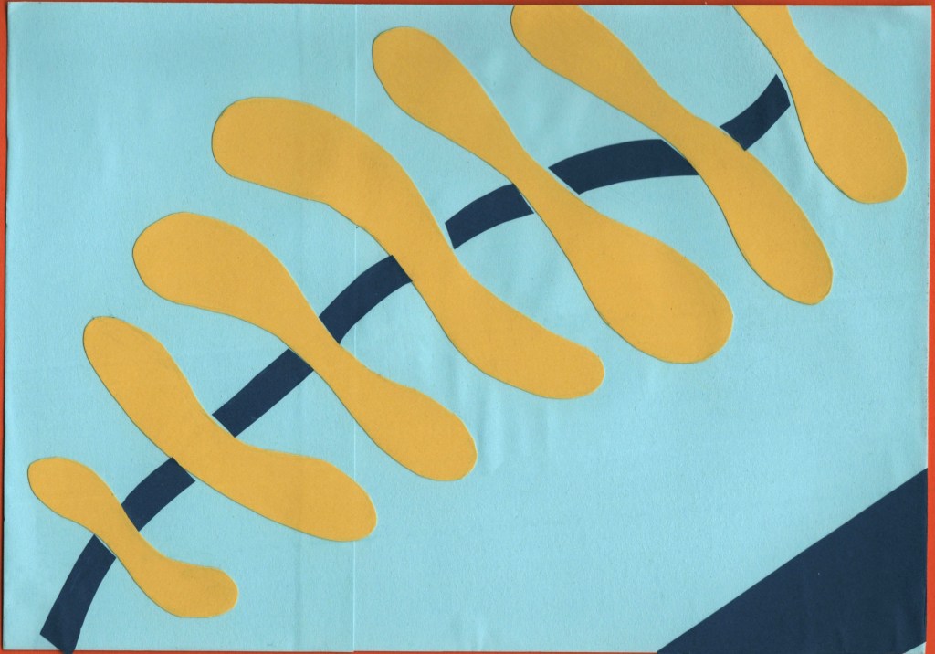
Ultimately, the wiggly spine-like design inspired by the Turning Torso was a clear winner. This might have been my favourite design at the thumbnail stage across all 10 cities. The colours, shapes, and concept all make my brain very happy! For the paper-cutting process, I layered squares of light blue paper onto an A5 piece of card to ensure they were the right size. Then, I cut out the spine pieces and added darker blue curves in between.
The blue is a bit darker than the standard Swedish flag, but I think it works nicely. I also added a triangle of darker blue in the bottom right corner just to break up some space a bit. I feel it really completes the piece. I then repeated the scanning and editing process as I did for Madrid, and I think it makes so much of a difference!
Before and after editing digitally
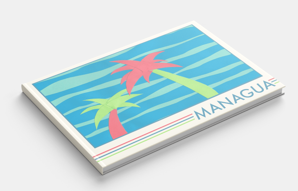
Managua
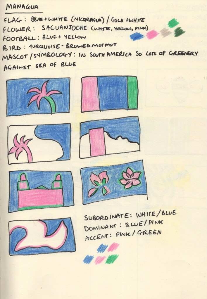
For the colour scheme of this design, I stepped away from flags and leaned more into the natural environment of Nicaragua. This stood out to me the most when I was looking at photos of Managua, and I was especially drawn to the beautiful pink colour of the Sacuanjoche flower. Combining this with a deep blue to reflect the sky and sea, and a vivid green shade to show the lush palm trees and jungle that stretches out into the city made for a really gorgeous colour palette.
I was unsure of the design of this piece to start with, as I felt like I was playing it too safe. Just having palm trees on the cover didn’t feel abstract enough. I didn’t feel as passionate about any of the other pieces, though, and I was excited to explore ways of organising the cut-out leaves. I also loved subverting the colours and using pink in this way.
There was a lot of trial and error that went into the actual cut-out stage, rearranging and re-cutting lots of the pieces. Eventually, I decided it needed something more to make it pop, and I added a second background colour. This really helped to tie it all together!
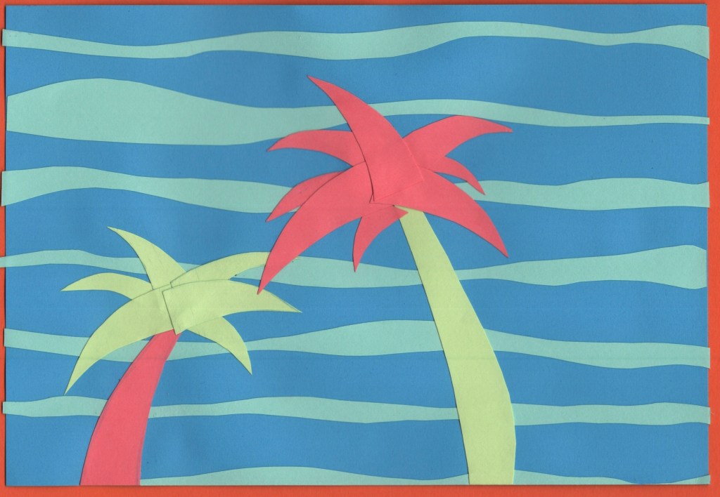
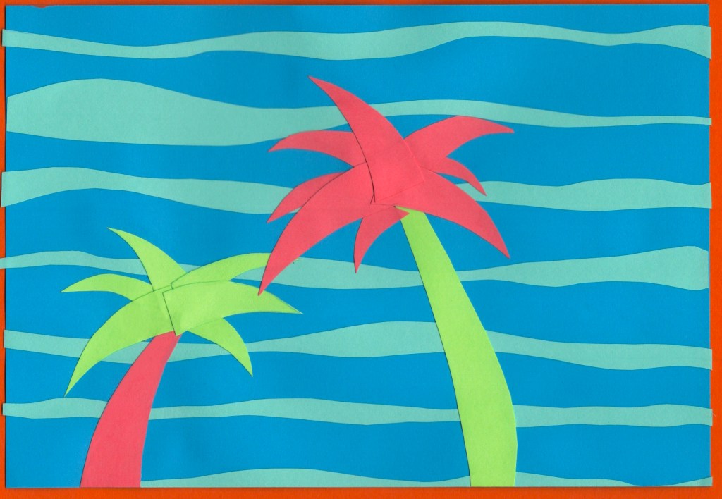
Before and after editing digitally
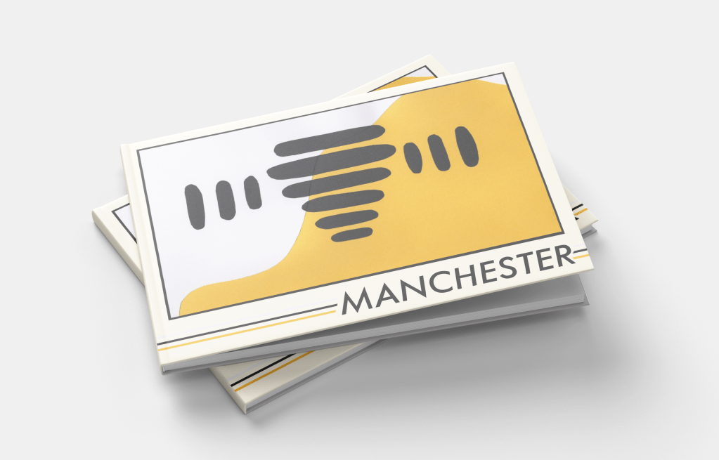
Manchester
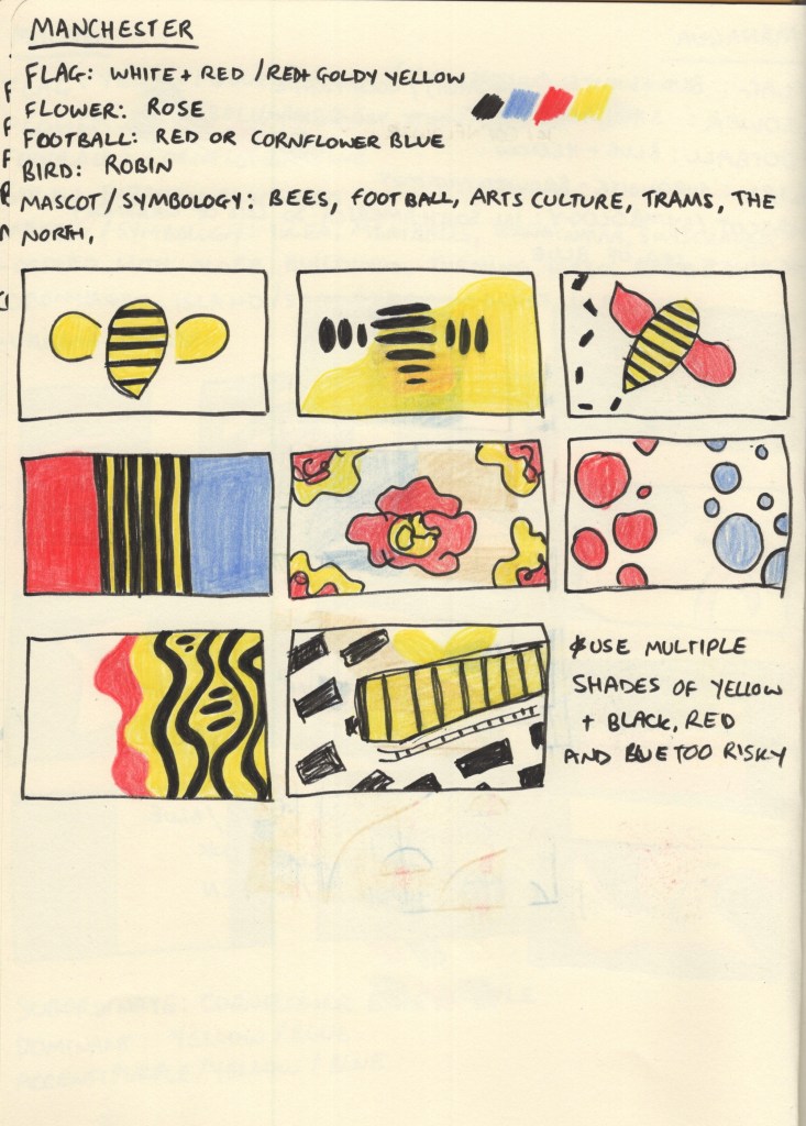
As soon as I read Manchester on the brief, I knew I wanted to do something with bees. The worker bee is a very widely known mascot of Manchester, and after the arena bombing that happened in 2017, it was spread around the UK as a sign of solidarity to the city. I can’t think of Manchester now without thinking: bees.
Still, I went through the same research process as with the other cities and explored colour options. It was tough, as I’m very familiar with the rivalry between both football teams and wanted to avoid favouring either in my colour choices, but I wasn’t really sure where else to get colours from. The English flag doesn’t really scream Manchester specifically, and the red in that context just makes me think of Manchester United.
I tried out some different options throughout my thumbnails, looking at how I could use the colours and various shapes and inspiration I could pull from. The abstract bee thumbnail was my favourite, though, which was expected. This was a very simple design to cut out, which by the time I got to it (I think second last!) was a huge relief. I had a lot of fun organising all the bee bits, and feel really good about the final design.
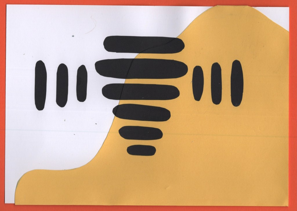
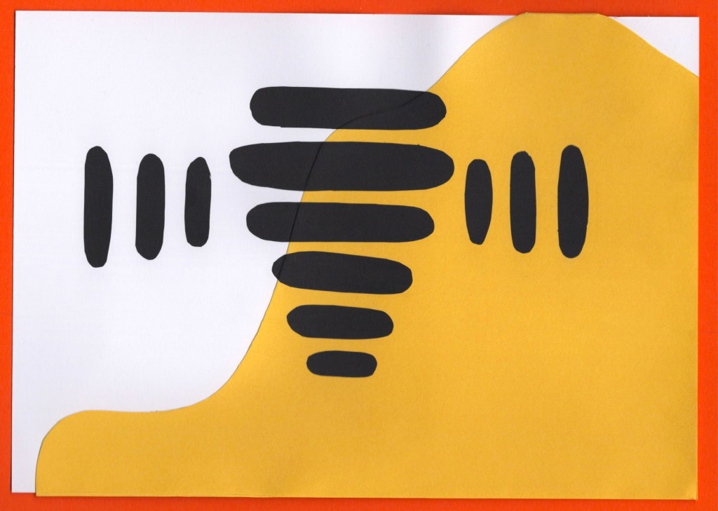
Before and after editing digitally
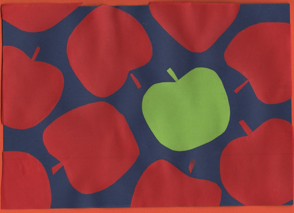
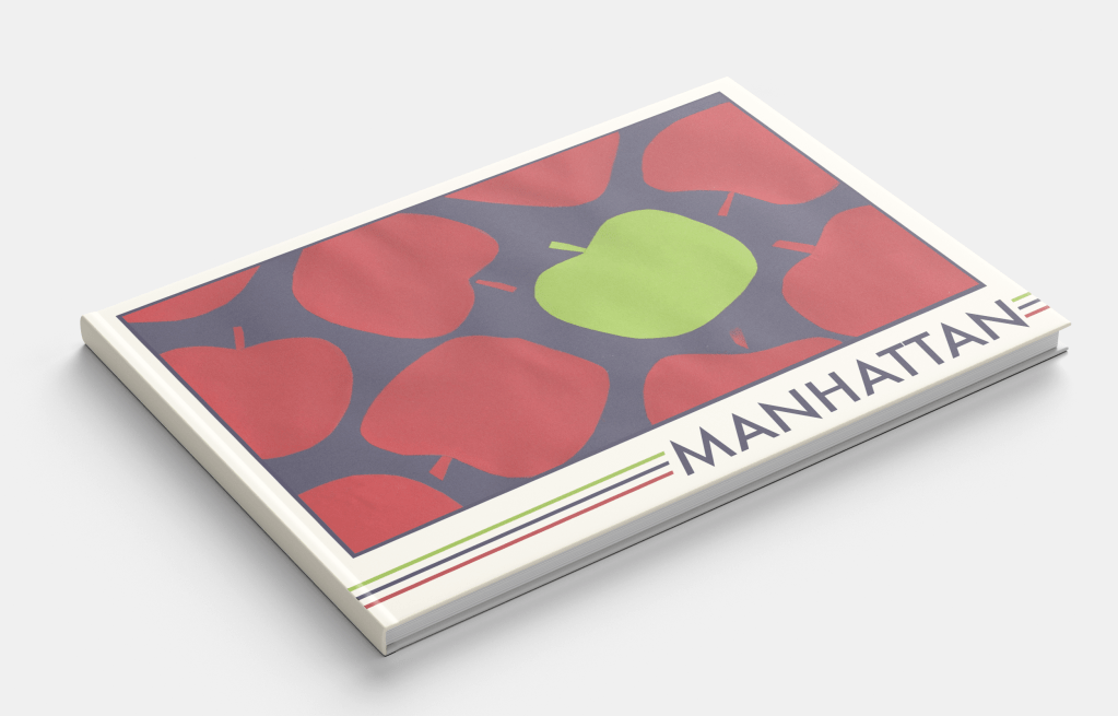
Manhattan
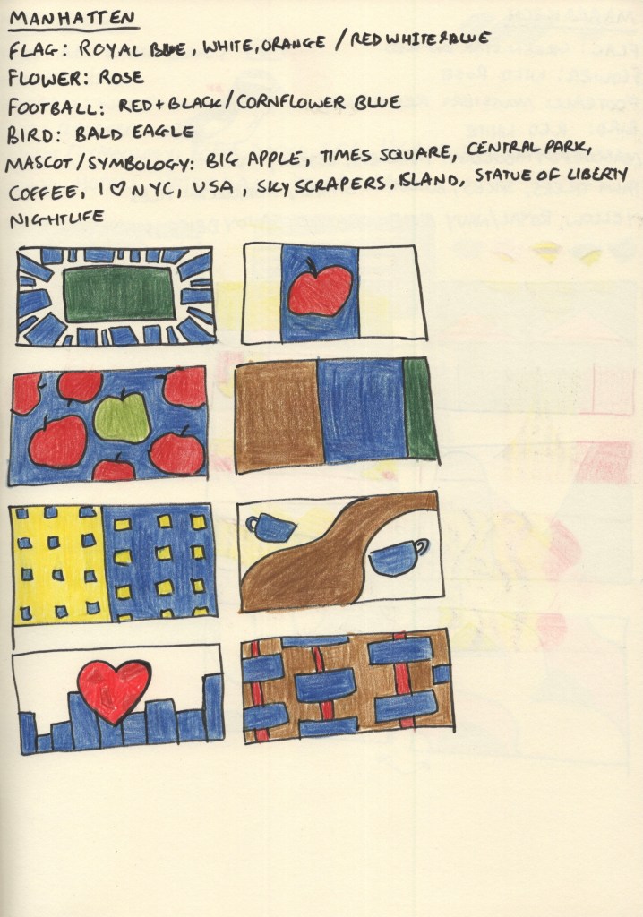
My colour-choosing process for this destination was similar to Managua. Manhattan has its own flag featuring horizontal blue, white, and orange stripes – though it’s not particularly well known. Football – or soccer as it’s known over there – is not particularly popular in the USA either, and there wasn’t a clear Manhattan football team. The red, white, and blue of the USA flag are iconic, so I noted them down as options, but the iconography that comes to mind when I think of Manhattan and the wider New York City area influenced my colour choices a lot more.
Manhattan really comes alive at night – the lights against the deep navy sky and waters around the island are very memorable. My thumbnails focused on colours I saw throughout images of Manhattan, and featured shapes inspired by its most famous symbols; the big apple, skyscraper apartment buildings, central park, and of course – coffee. This was probably the most fun city for me to explore as there’s a wealth of existing imagery to draw from and experiment with.
For my final design, I chose the apples, both as it fits my ‘same thing repeating across the page’ theme, and because I enjoyed the subtle nod to New York City. The central park and zoomed-in apartment buildings were close runners-up, however, and it was a tough decision! This was the first paper-cutting I did, and it was a great introduction. I especially enjoyed figuring out how to make each apple unique in shape, whilst still ensuring they looked like apples.
Before and after editing digitally
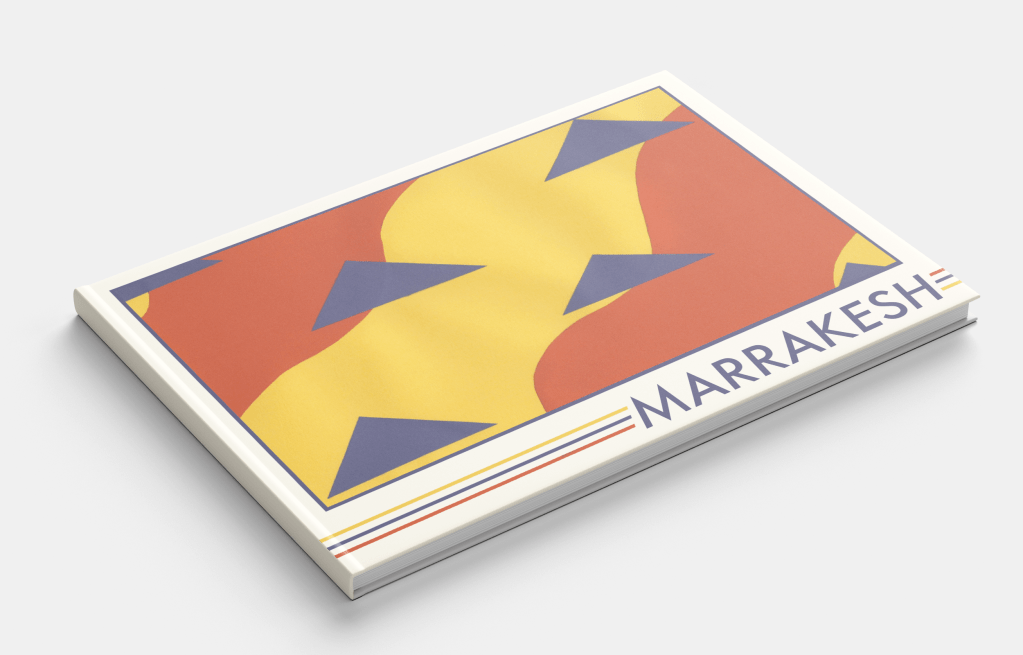
Marrakech
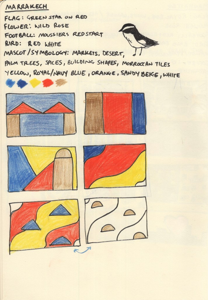
Choosing a colour palette for this city was very easy, Marrakech screams oranges, yellows, and blues from the second you imagine it! The Moroccan flag – a green star on red background – didn’t really have associations for me with the city itself, and the national flower, bird, and local football teams didn’t fit either. Though I thought the bird – moussier’s redstart – had a really cool colour distribution in its feathers and thought maybe I could do something inspired by that.
The vast market stalls filled with spices set against a backdrop of rich blue skies and expansive deserts are ultimately the inspiration for my colour scheme. The shapes and composition of my thumbnails, however, were trickier to explore. I didn’t have a lot of ideas and it took a lot of thinking, researching, and thumbnailing before I felt I had something I could work with. It’s hard when ideas don’t come immediately, but this is why I find thumbnailing so useful as it pushes me to explore things I probably wouldn’t have otherwise.
Sand against spices with the triangles of market stall roofs is the visual aim of my chosen design – and it fits into my theme of repeating items. This was a relatively easy piece to put together. I used a yellow A5 sheet for the background and cut two pieces of orange paper to go on top. Then, I cut and placed the triangles to represent the roofs. I’m really happy with how it turned out, it feels very true to the vibes of the city!
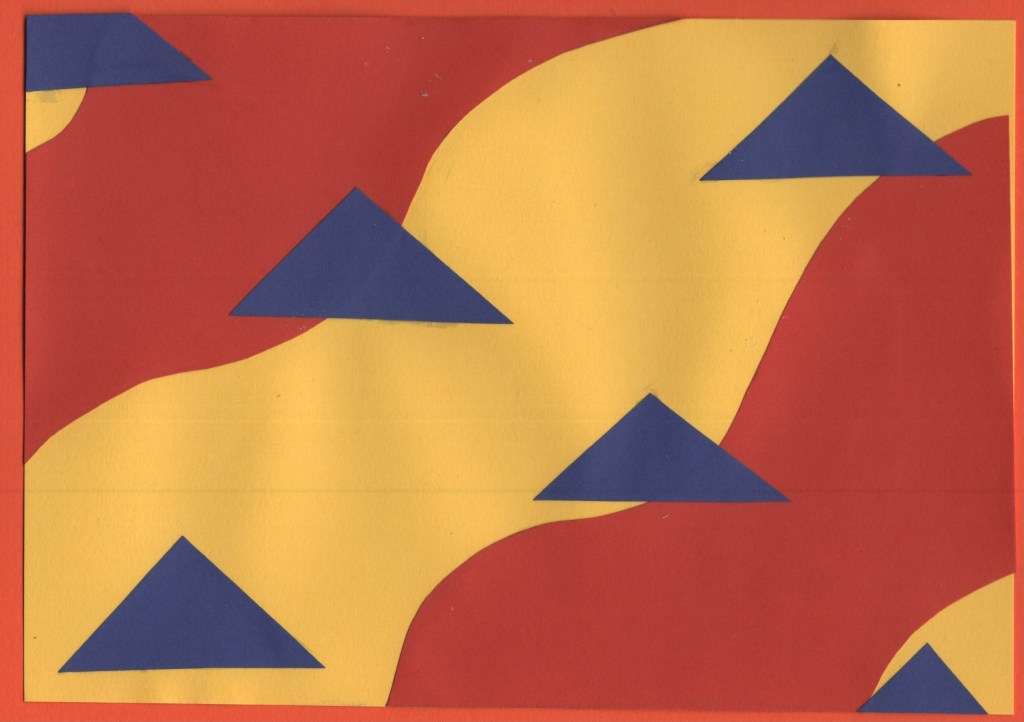
Before and after editing digitally
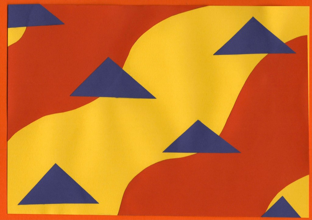
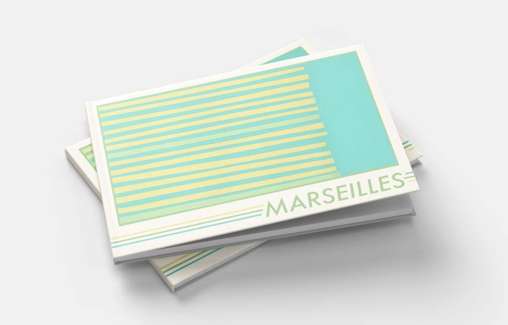
Marseilles
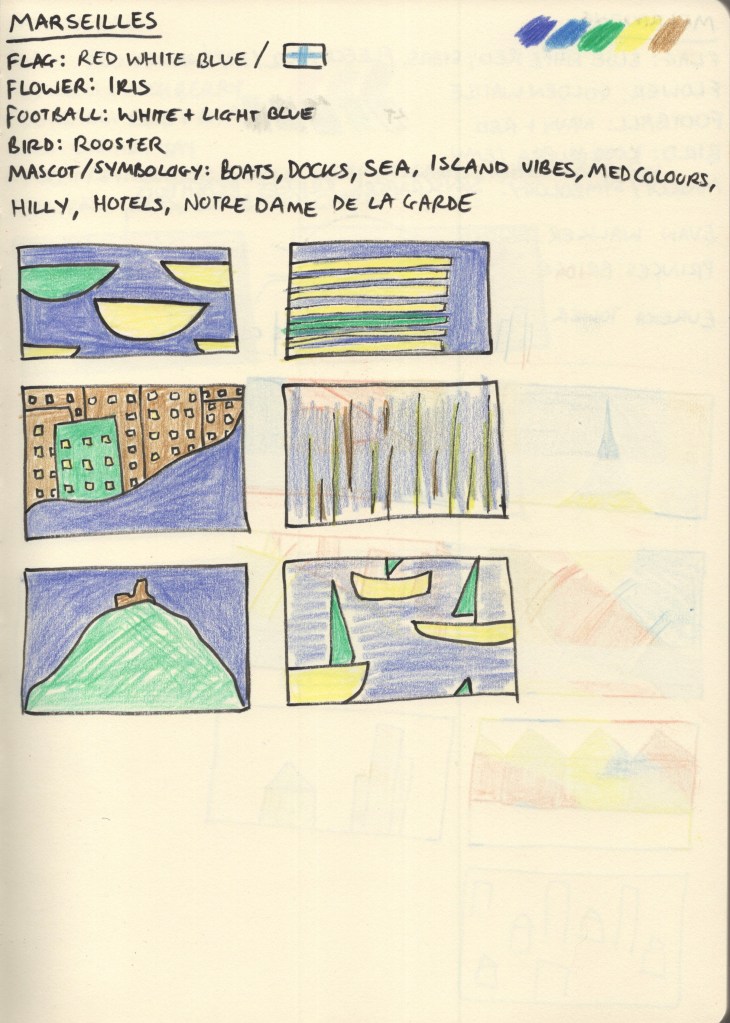
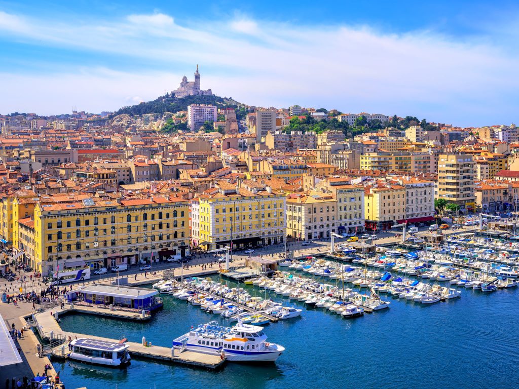
Both the flag of Marseilles and Olympique de Marseille, the local football club, share colour schemes of light blue on white. The city itself sits on the Mediterranean and boasts a huge harbour jam-packed with boats, mirroring this blue-and-white pairing. A large hill rises from the harbour to form the rest of the city, filled with greenery and dotted with sandstone buildings. The colour scheme for this design jumped out of the photographs with ease – pale yellows, greens, blues, and soft brown.
Coming up with ideas for this city was fun, there are a lot of unique shapes to play around with, and I especially enjoyed figuring out how to make recognisable objects look more abstract. The design I chose for my final piece is supposed to represent the harbour as seen from above – lines upon lines of boats docked and waiting. I am really happy with how I developed this idea, and I think the finished piece looks fantastic. I wanted each piece of paper to be slightly different in size and shape, and I think I struck a nice balance of ensuring it didn’t look too messy whilst still fitting that goal.
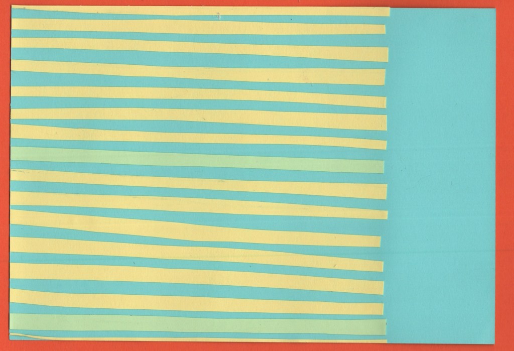
Before and after editing digitally
Melbourne
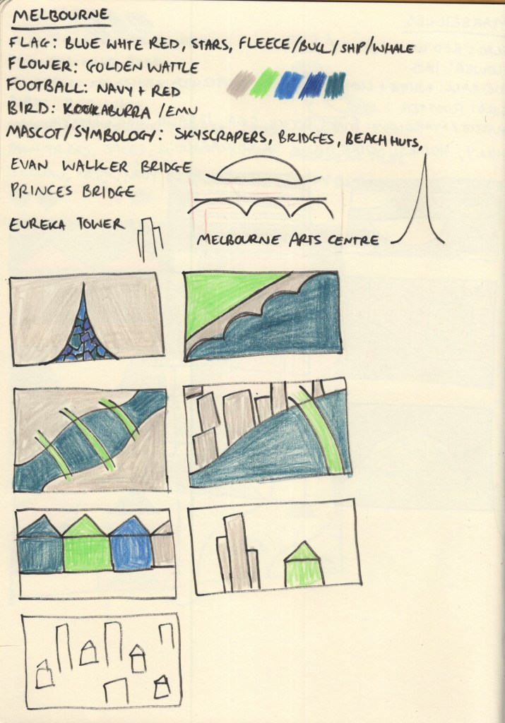
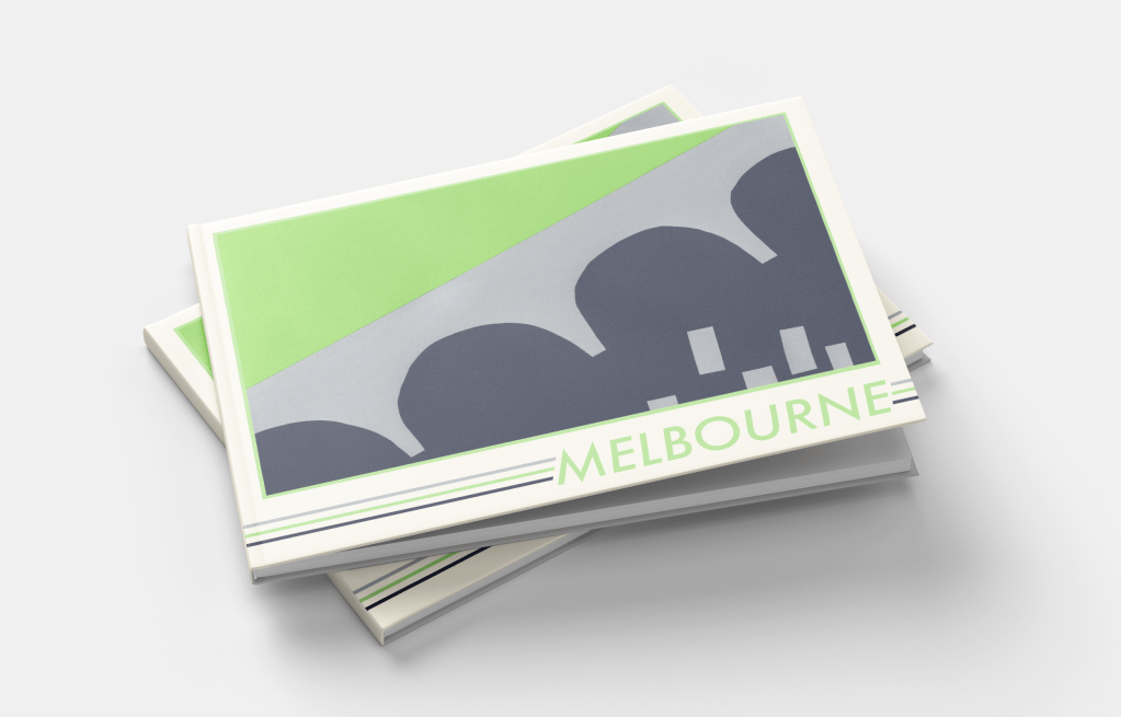
Melbourne was another tricky one to pick colours for. At first, nothing really jumped out at me. Australia’s national flag is another one featuring red, blue, and white, and whilst Melbourne has a locally recognisable flag of its own, it shared much of the same colour scheme with just a hint of yellow. I spent a long time scrolling through pictures of Melbourne from varying angles and trying to find a way to create a unique colour palette that wasn’t just a copy of Manhattan – as the city is very similar!
My colour scheme of deep blue to represent the rivers, grey to represent the skyscrapers, and bright green to show the beautiful parks and greenery within the city ended up working out well. I feel like this is more of a ‘daytime’ colour scheme, whereas Manhattan was very much a ‘nighttime’ colour scheme – almost every picture I found of Melbourne was bright, sunny, and during the day, so I think this reflects it really nicely.
I also struggled to find inspiration for the designs for this piece. Melbourne has a lot of bridges across the Yarra River which runs straight through it, and I ended up focusing on this for my final piece. I used the Princes Bridge as inspiration and formed a divide between the built-up areas of skyscrapers, and the lush green parks that sit on the river banks. I didn’t feel confident about my colour palette or concept going into the final design stage for this piece, but I enjoy how it turned out.
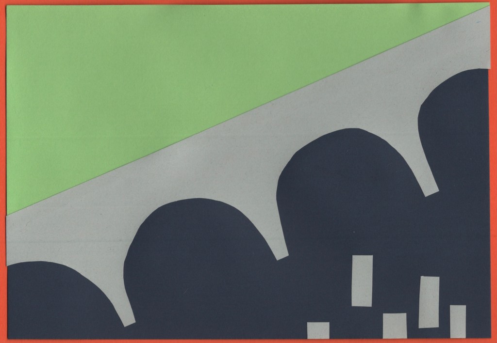
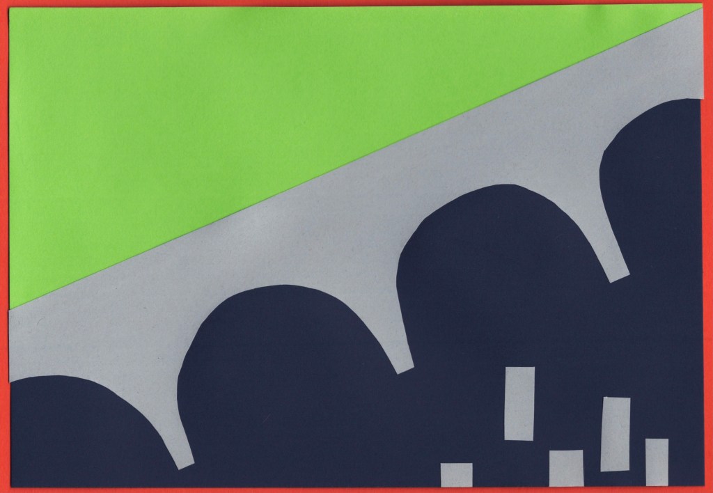
Before and after editing digitally
Montreal
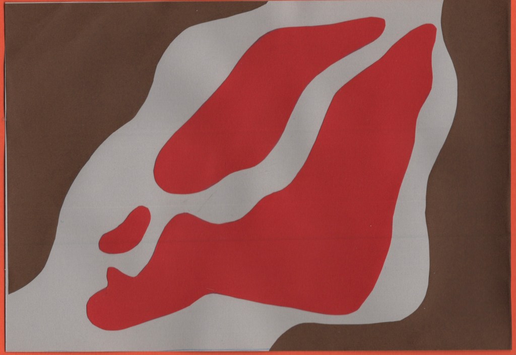
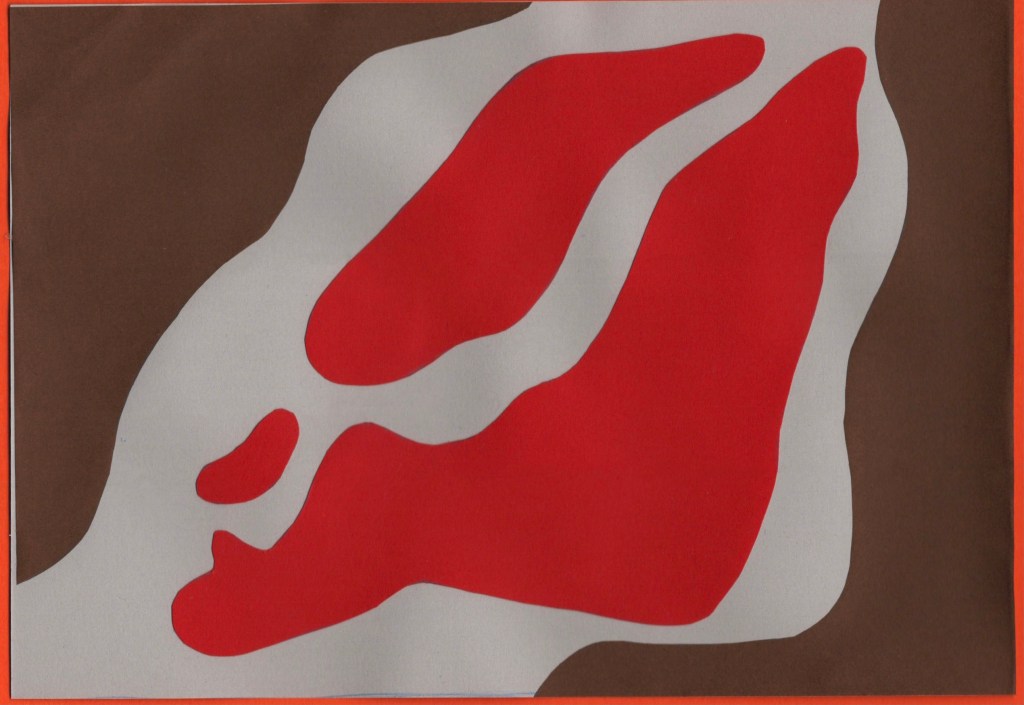
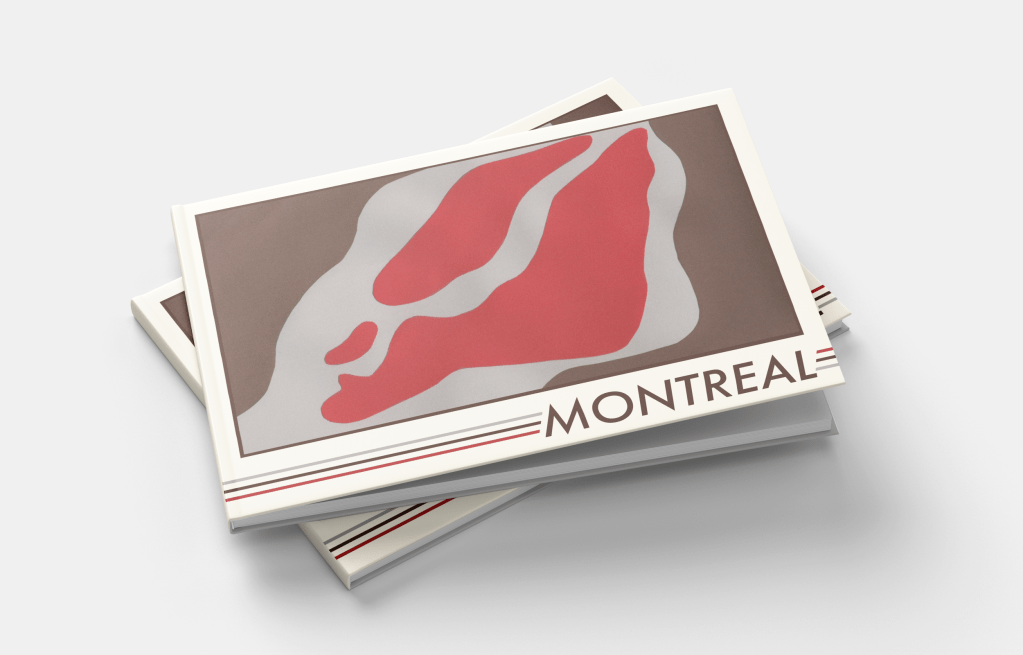
Montreal was another city that felt like it had an obvious colour scheme to me. The red maple leaf on the white background of the Canadian national flag is especially relevant, as the province of Quebec – where Montreal is located – shares 89% of Canada’s maple syrup production. This also made brown a very natural choice of colour for me, both as it complements red really nicely, and as it reflects the deep colour of maple syrup. A light grey was chosen as a nod to Montreal’s business district, once again filled with skyscrapers. It also softens the piece out nicer than a bright, bold, white.
I tried a few different thumbnails for this piece – though by this point in my research I was getting a bit fatigued with colouring, especially knowing I would be using slightly different colours when I had the paper. Montreal is an island in the Saint Lawrence River with quite a distinctive shape. I experimented with how to represent this, along with the iconography of the maple leaf and trees. I felt my top-down view of the island was the strongest concept, so developed this fully.
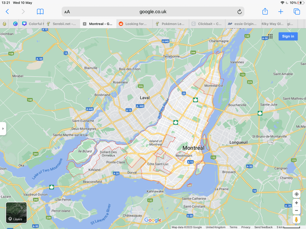
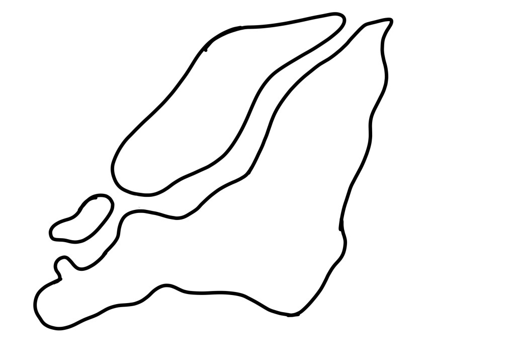
To capture the shape accurately, I took a zoomed-in screenshot of google maps and then traced this with a bold black line in Procreate. I was still aiming for rough, misshapen cut-outs, but I wanted to ensure it looked like Montreal. I then traced this onto a piece of printer paper and transferred it to my red paper to make cuttings. I’m glad I thought to do this instead of drawing from observation, as I think it would have only vaguely resembled the city!
Before and after editing digitally
Mumbai
As the final city I researched, Mumbai really got the short end of the stick. I was quite bored of the repetitive process by this point and felt there was no point in adding colour. I then, frustratingly, forgot to set aside paper for this design, which meant it completely left my mind for the rest of the exercise. I did not create a final piece for this city, which I am disappointed in myself for. However, with such a huge task at hand, I feel it’s easier to forgive myself, knowing how much work went into the other 9 designs.
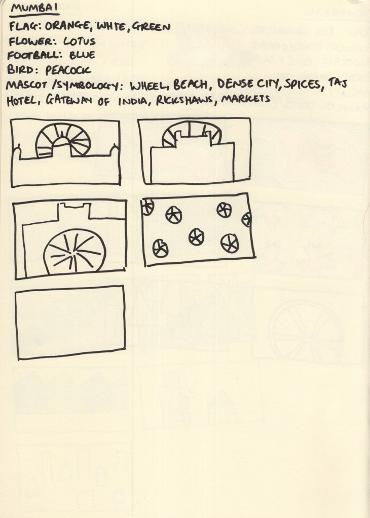
My colour scheme for Mumbai was taken from the flag of India and the buildings in the city – a sandy brown, orange, and green. My thumbnails were inspired by the Gateway of India, the Taj Hotel, and the wheel icon used on the Indian flag. In the process of choosing my final pieces, I picked the repeating wheel design and planned to play around with my paper choices to figure out which colours to use where.
Narrowing down my ideas
During the paper-cutting stage of this exercise, I decided to take some video footage showing my process. I found the medium quite difficult overall despite it being enjoyable. I’m not particularly good with my hands or working within 3D space and typically opt to do any exercise that requires cutting and sticking in digital software to avoid the issues that come with it. I also feel like no matter how ‘good’ at it I am, the process takes four times as long as it would if it was digital or even just drawing in a sketchbook. There’s a lot of waiting, fiddly bits, and patience required, and after prolonged exposure I get a bit fed up.
I really pushed myself beyond where I’m comfortable for this as I wanted to experience the medium and its possibilities properly. It’s easy enough to create a paper-cut effect digitally and mimic the designs I created here, but I wouldn’t have an appreciation for and understanding of the medium in the ways I do now otherwise.
I had a lot of limitations to work within when considering designs, which was a welcomed challenge. For example, too many colours used in each piece would have been extra work for me, so I aimed to use no more than 3. Using paper has limitations that digital software doesn’t, and if you cut something incorrectly, you have to scrap that and start again. I was really forced to slow down and consider thoroughly each step of this design process, which was beneficial in a lot of ways, though irritating in others.
I’m not sure if my designs reflect my papercut inspiration, but they do feel like they fit into my body of work well. If I’d created them digitally, I likely would have used more colours and added a lot of textures – which I did consider at the digital editing stage of each piece. However, I really appreciate the simplicity of the designs and I feel they meet the brief of ‘abstract blocks of colour’ perfectly.
Once I had scanned and edited each design, I began figuring out how to add text in Procreate, drawing from my previously collected references of travel guides. I began by adding a cream border to each design, framing it in the centre of the cover. Then I played around with adding different fonts, identifying which positioning looked best. I also added a border on the inside of the frame, using a colour from the collage to make it pop a little. I felt Futura looked best and modernised the pieces a little.


I felt the covers were lacking something, so I played around with motifs and additions until I settled on adding three lines along the base of the cover, one for each colour used in the collage. My text colours were pulled from the cut-outs and darkened slightly. I feel this makes each piece look cohesive whilst still tying all 9 together as a set. Finally, I tweaked all of the colours used until I felt each looked its best.
Finally, I found some A5 landscape book mockups and placed my designs on them to see how they’d look in reality. This is my favourite part of any design process, it brings the creation to life and reassures me that I know what I’m doing! I feel so proud of each piece and how they look, though I’m not sure if they fit the travel guide market. Maybe that’s because I’m still stuck on travel guides using photographic covers!
I feel relieved to be finished with this exercise, proud of myself for pushing myself through difficult and challenging processes, and excited about what I managed to produce despite that. There were many moments of ‘this is all terrible and I suck’ throughout this exercise, but I did it. Maybe my final designs would look more professional and polished if they were 100% digital, sure, but I’m really glad I chose to explore a medium I was unfamiliar with. Not sure if I’ll ever do this again, though…digital paper effects sound great right now.
