
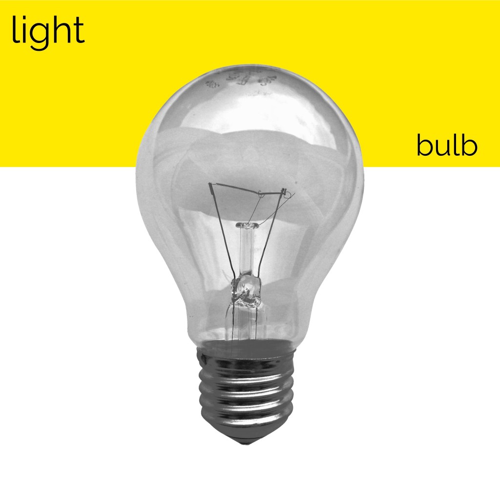
This exercise was focused on exploring composition to see how altering the placement of colour, text, and imagery changed the visual dynamics of a design. I was asked to use only an image of a light bulb, the words ‘light bulb’, and a block of colour of my choice. I had to develop as many arrangements of these three things as I could possibly think of, being playful and inventive in my choices. I was then asked to edit these arrangements down to about 20 designs that represent the different approaches I explored.
Through the exercises in Part Three I have started to develop a strong sense of the areas of design I want to branch out into more. When I researched Josef Muller-Brockmann for the Visual Literacy Research Point, I noted that I wanted to try out his black and white cut-out photos, so I decided to implement this here, and generally focus on emulating the Swiss design style. I began by making some notes on how I wanted to achieve this, then I sketched out 20 thumbnails of different starting points for my compositions. Creating these thumbnails was a lot of fun and helped get me into the right headspace for this exercise.
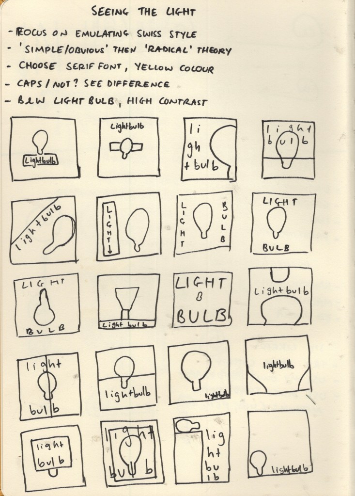
Sketchbook page exploring initial thumbnails and ideas
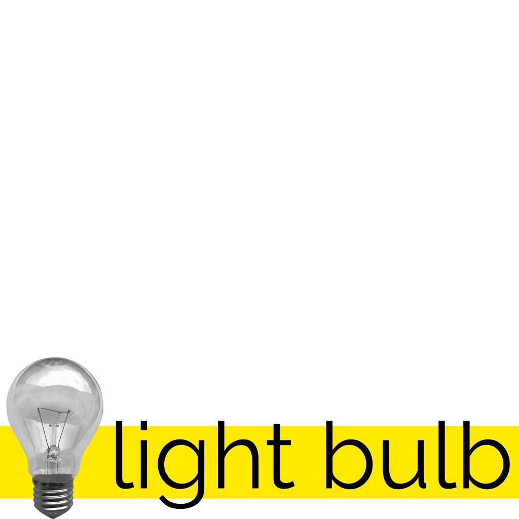
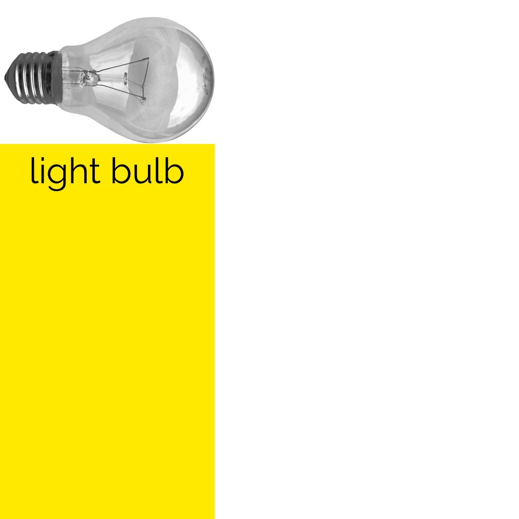
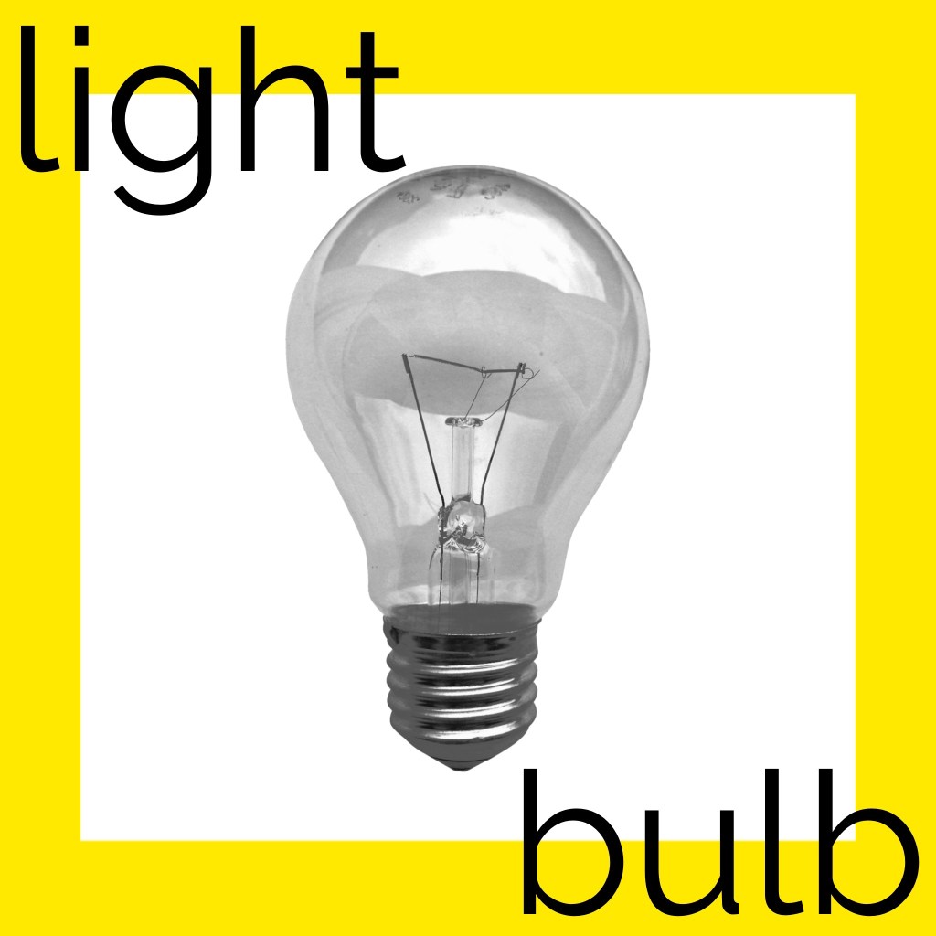
I decided to go with yellow as my colour, both because it’s representative of light, and because bright yellows were commonly used in Swiss design. I downloaded the image provided of a light bulb and reduced the saturation to make it a black-and-white image. I then played around with the contrast and levels to try to capture the harsher tones a photocopier gives, as was used around the time Muller-Brockmann worked. As for my font choice, I initially wanted to obtain a free or cheap personal-use license for Akzidenz-Groesk, the iconic Swiss style font, but this was proving hard to find. I researched for alternatives, and Helvetica came up several times.
I’m personally not a huge fan of Helvetica. It just doesn’t sit well with me in the same way other fonts do. I added the text ‘light bulb’ to my canvas in Helvetica, anyway, and pondered what other sans-serif fonts I had that gave a Swiss style vibe. I duplicated the text and tried a handful of fonts before settling on a modern sans-serif font – Raleway. I was actually introduced to this font by a fellow OCA student who used it in their design guide for the OCA Student Association, and I’ve become very fond of it.
Timelapse video showing experimenting with compositions
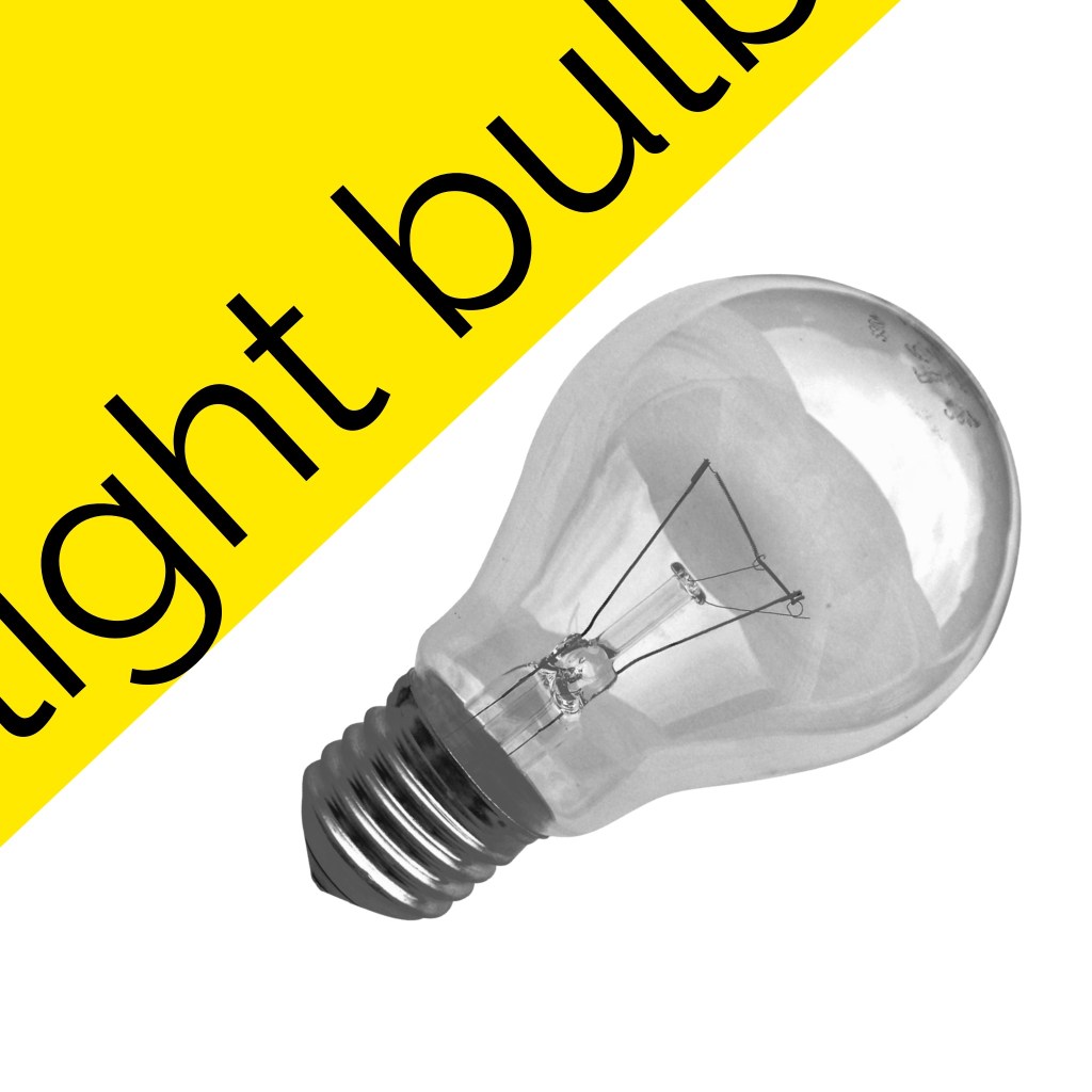
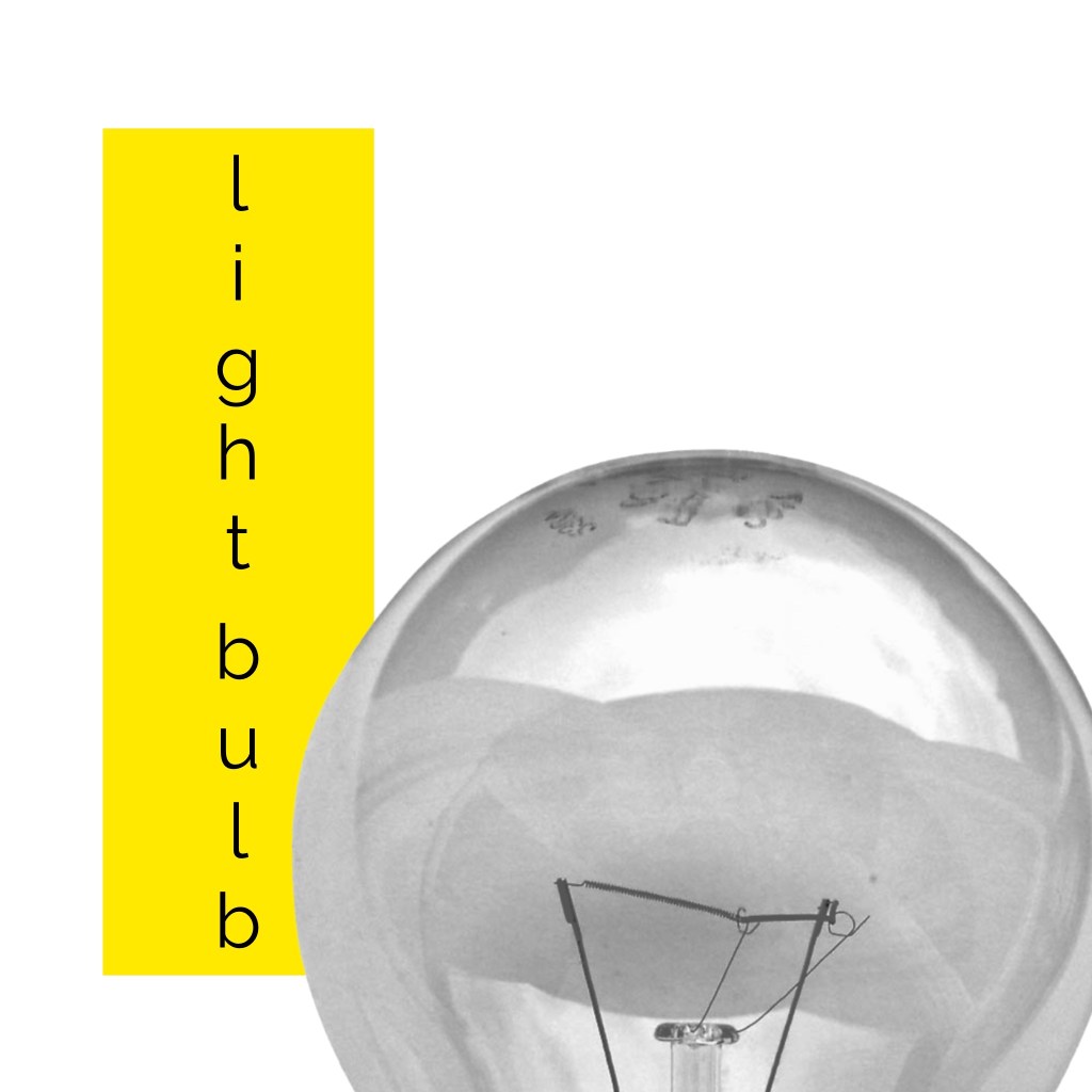
From there, I began experimenting. This whole experience was extremely fun. I very mindlessly moved around each object in as many ways as I could think, saving each rendition before quickly moving on to the next one. Approaching in this way made me feel removed from the design and more connected to the carefree, playful part of my brain. I wasn’t focusing on whether each image looked good or not, I was just creating for the sake of creating and the sake of exploration. This helped me push the limits and investigate new ways to organise the elements in question without worrying too much.
I used each of my initial thumbnails as starting points, then let my brain intuitively guide me to varying compositions, following whatever came up. If I found myself struggling a bit, I would move on to the next thumbnail and begin the process again. In the end, I came up with 149 compositions, which feels a lot less than I expected. If I had continued this exercise for several hours longer, I probably could create over 500!
Video showcasing each of the designs I saved
Stepping away from the experimentation process and viewing the results in a more concrete way, I can see immediately where certain compositions ‘work’, and where others don’t. I can also see quite clearly how different arrangements say very different things. Being detached from what looks ‘good’, however, helped so much with the ability to consider other compositions, and led to more options for a ‘final’ composition than I would have been able to achieve when stuck in my head. Loosening up and exploring in this way could really benefit my compositions and design choices.
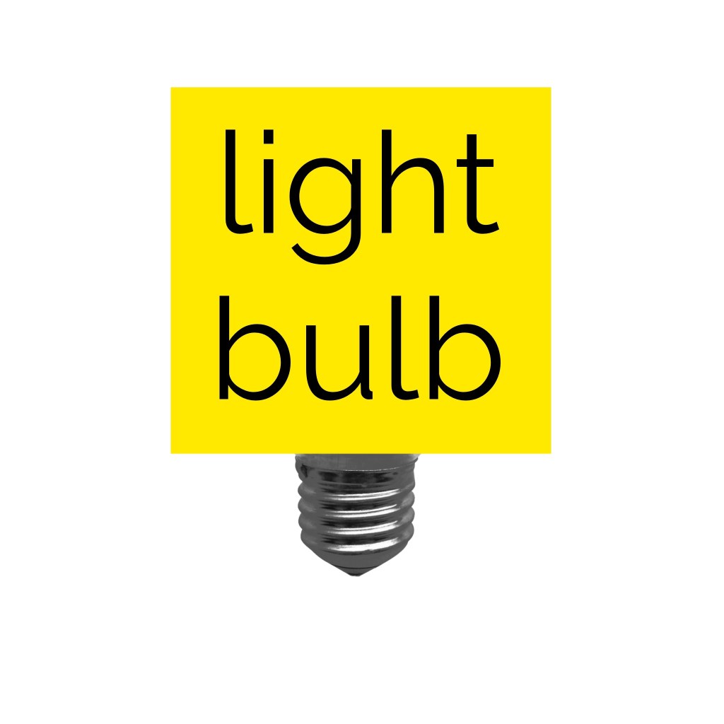
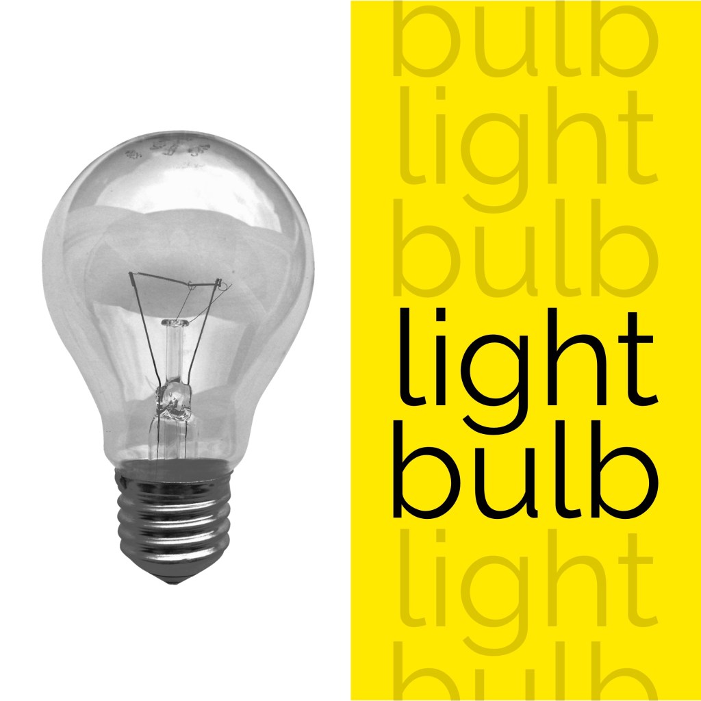
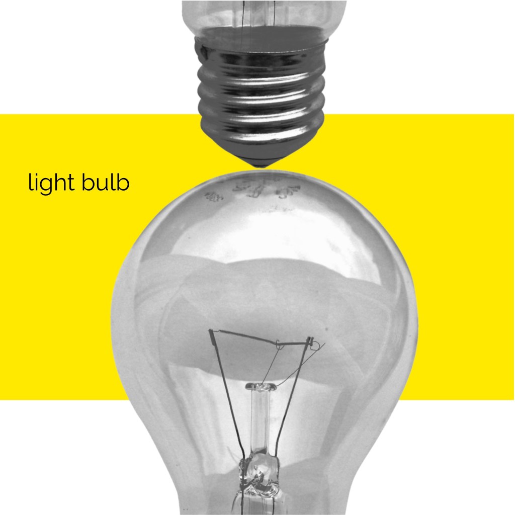
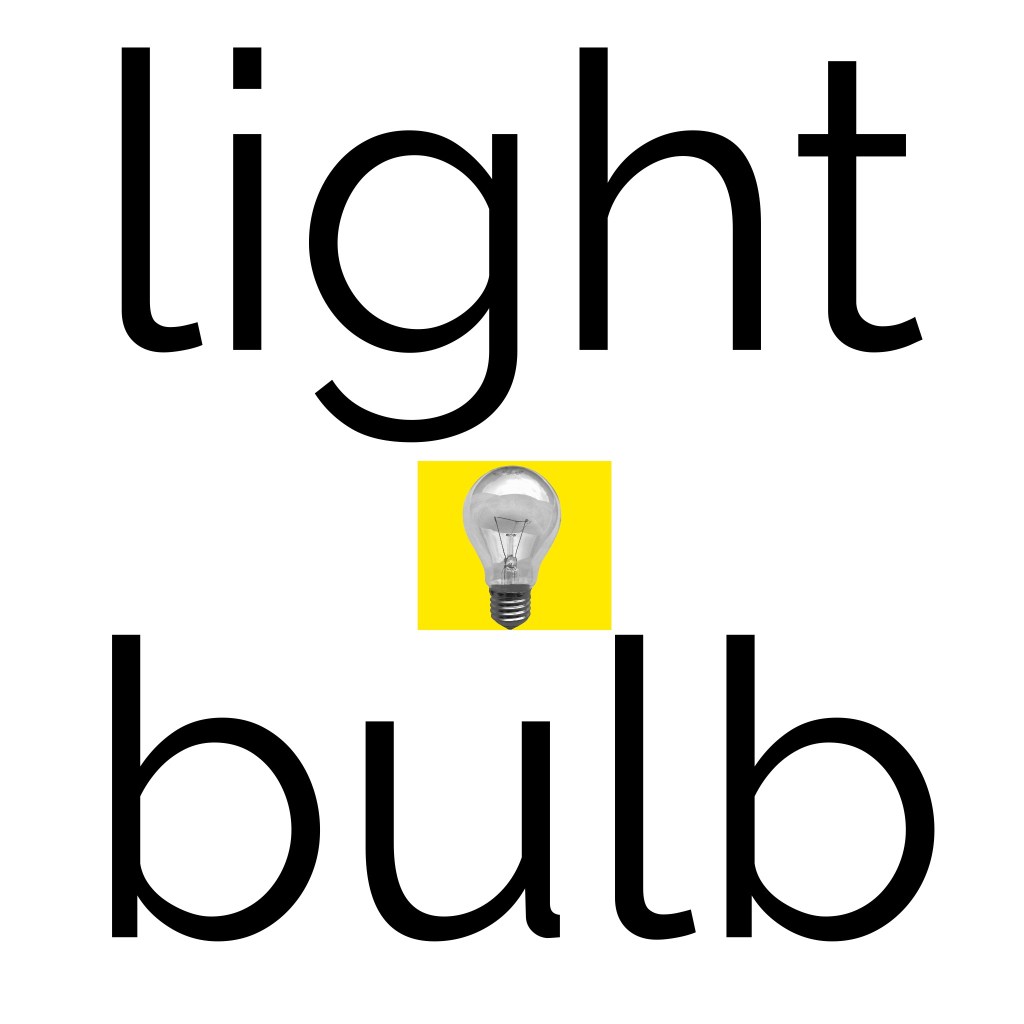
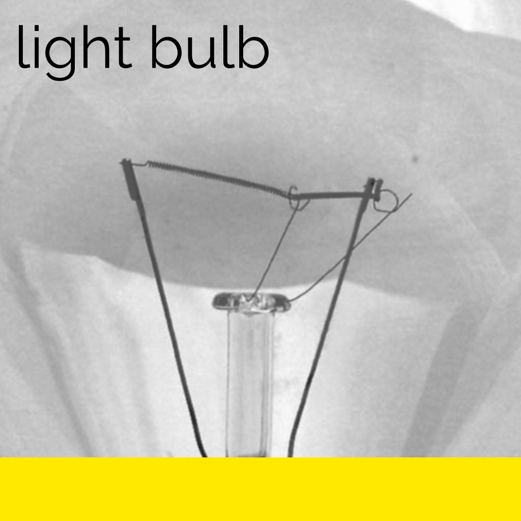
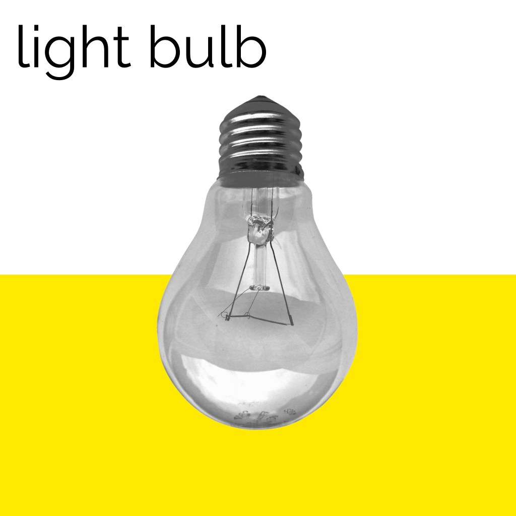
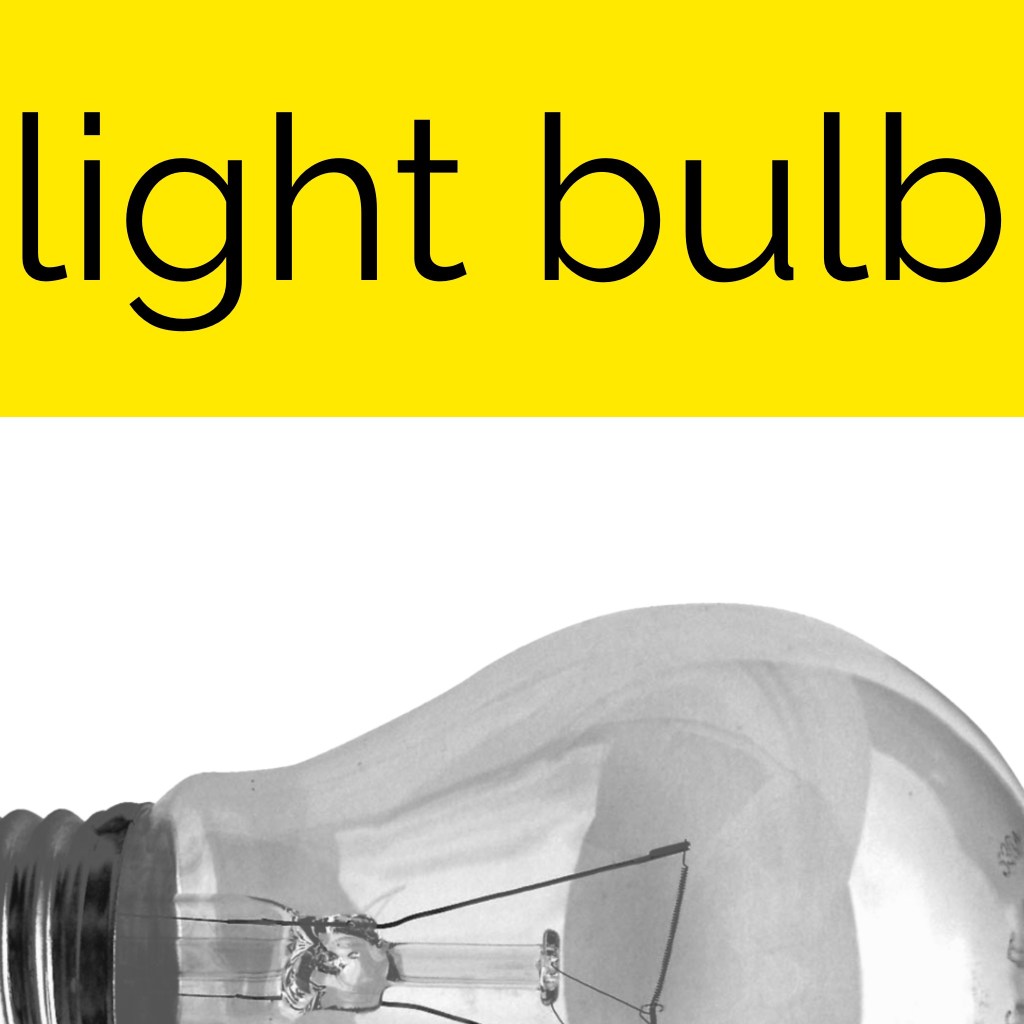
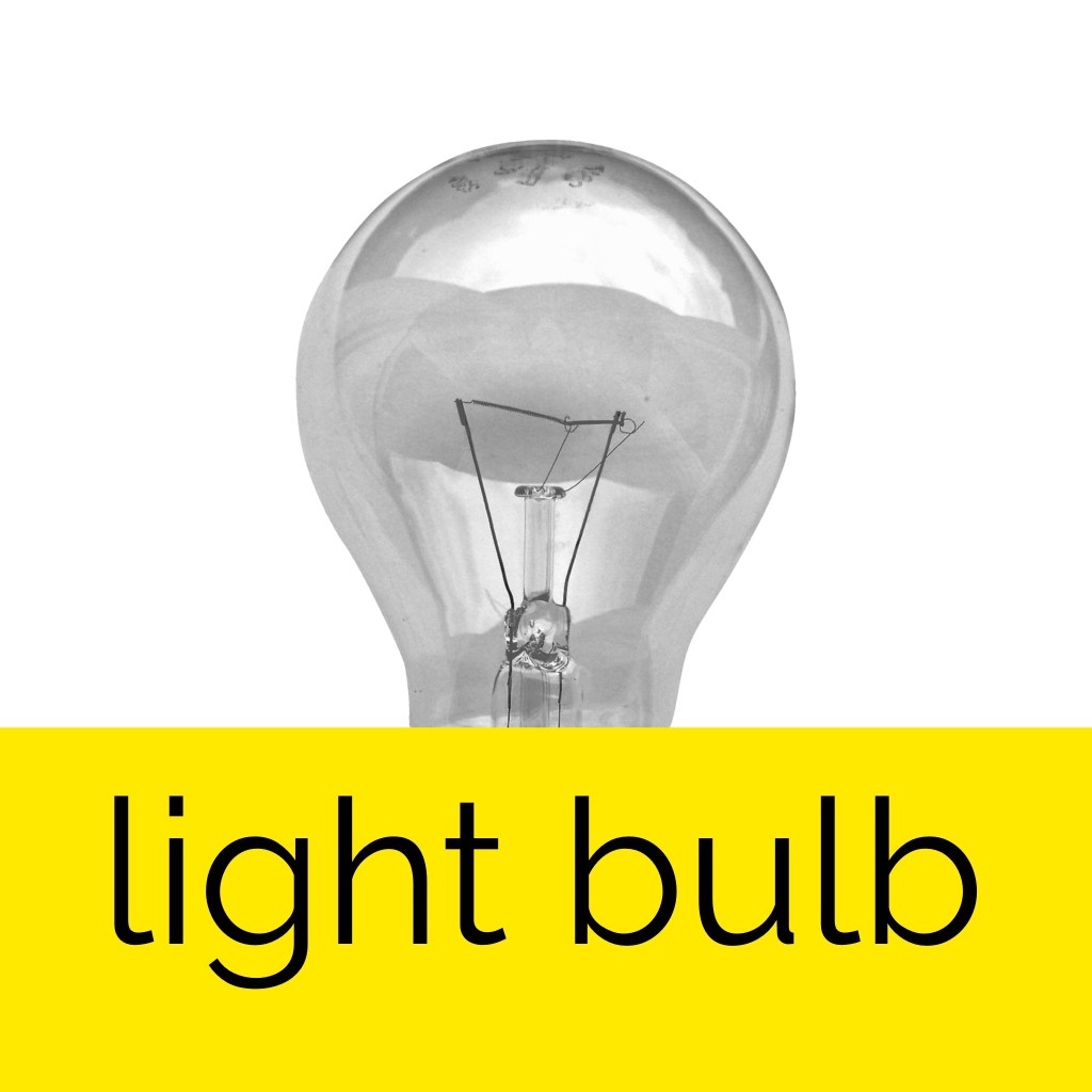
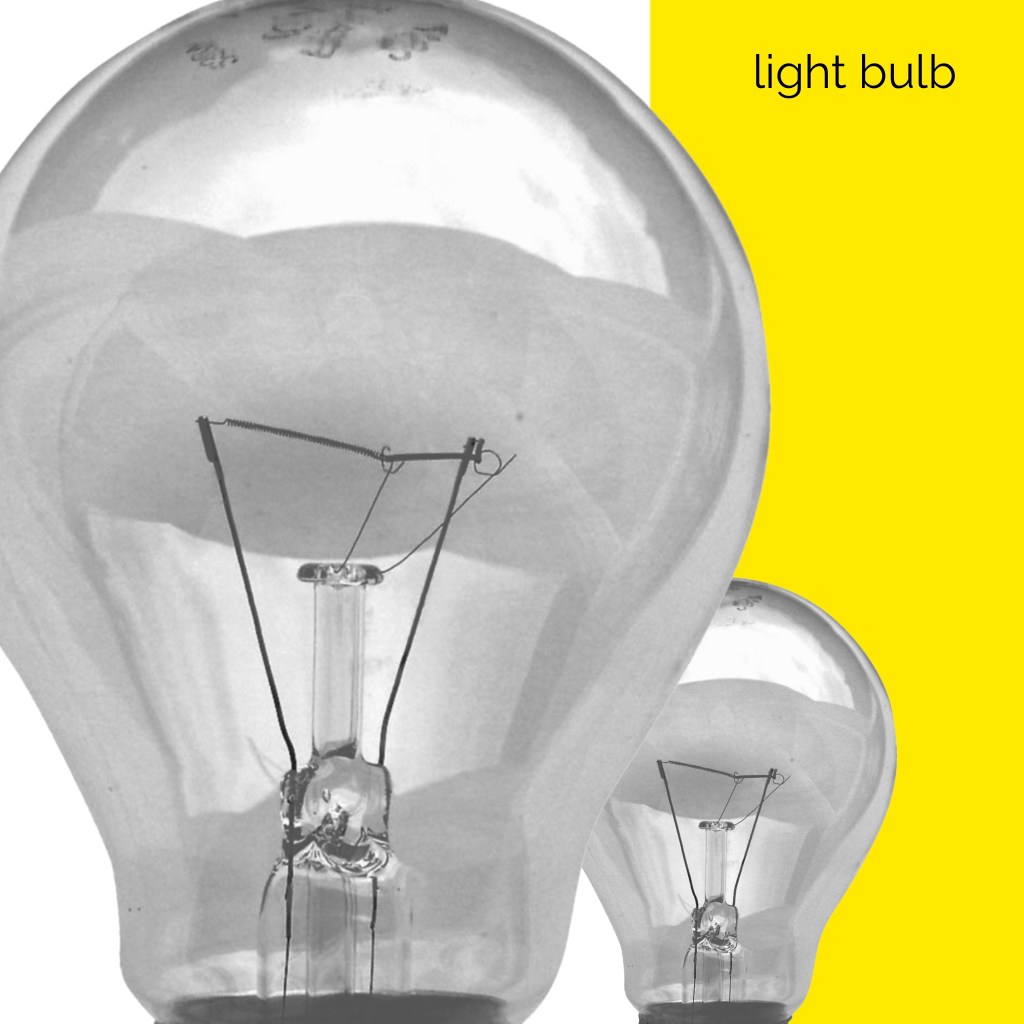
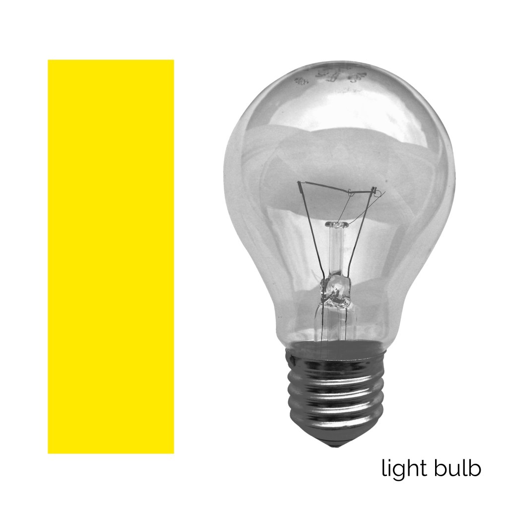
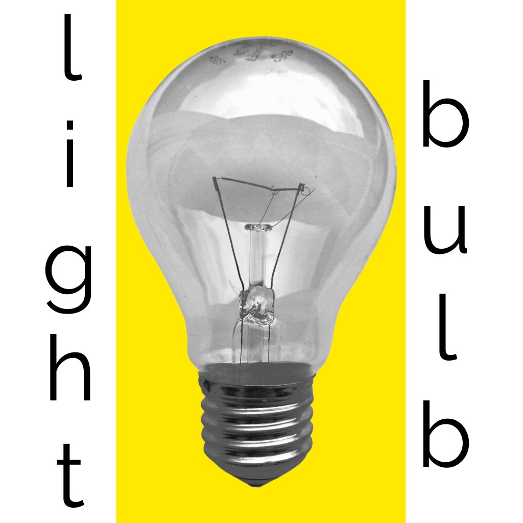
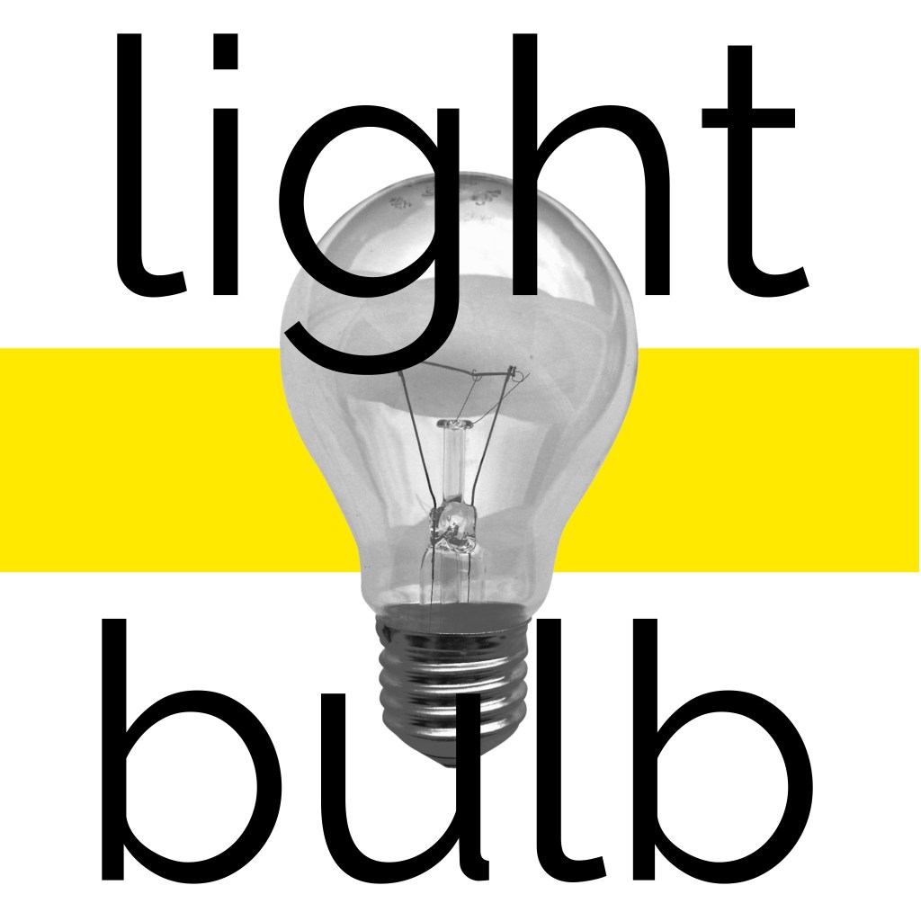
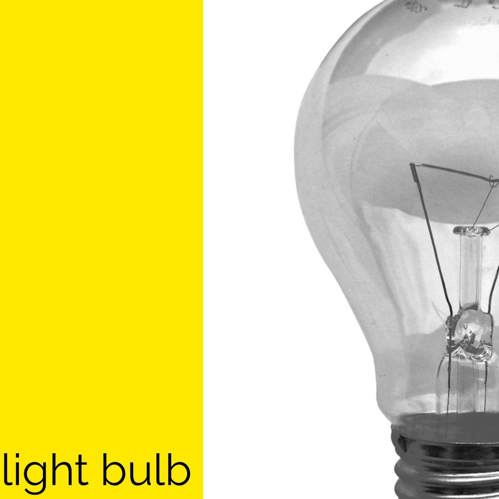
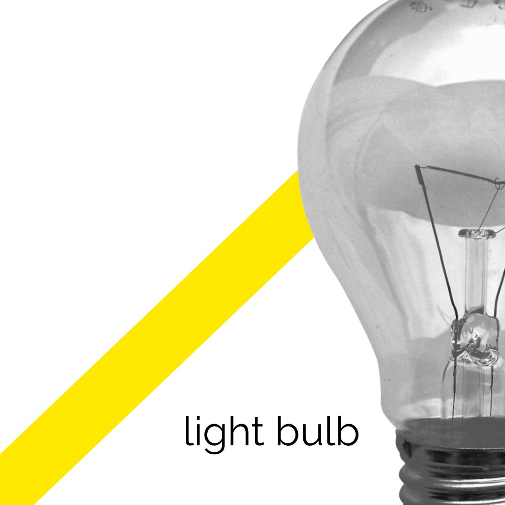
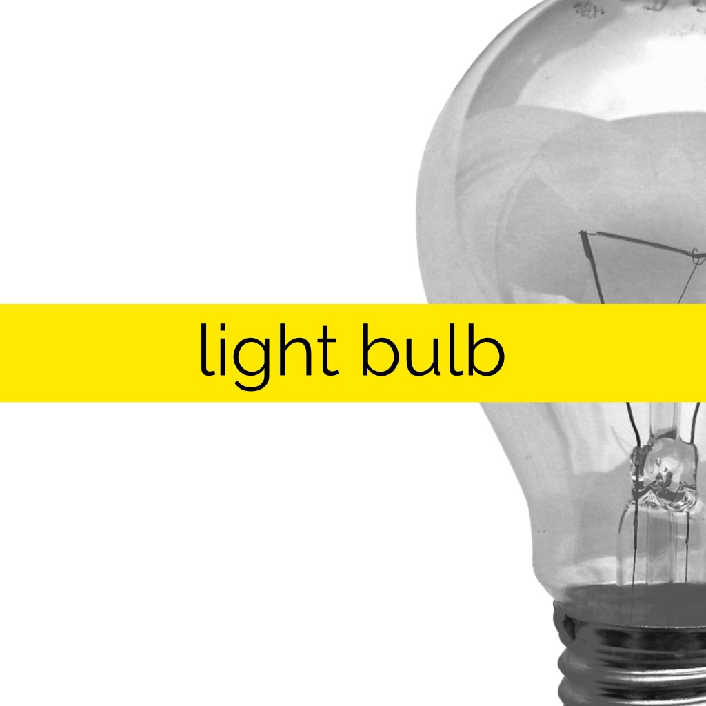
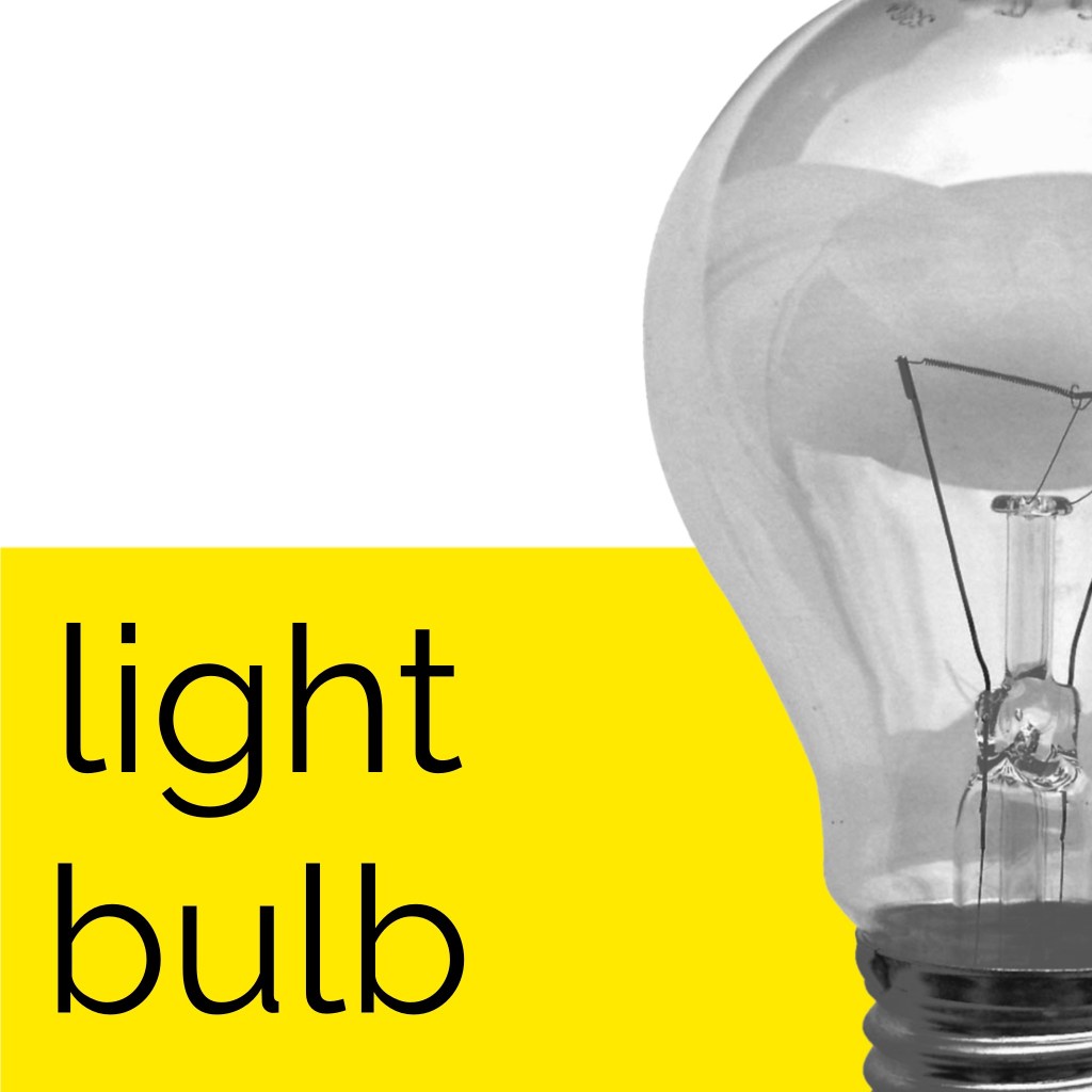
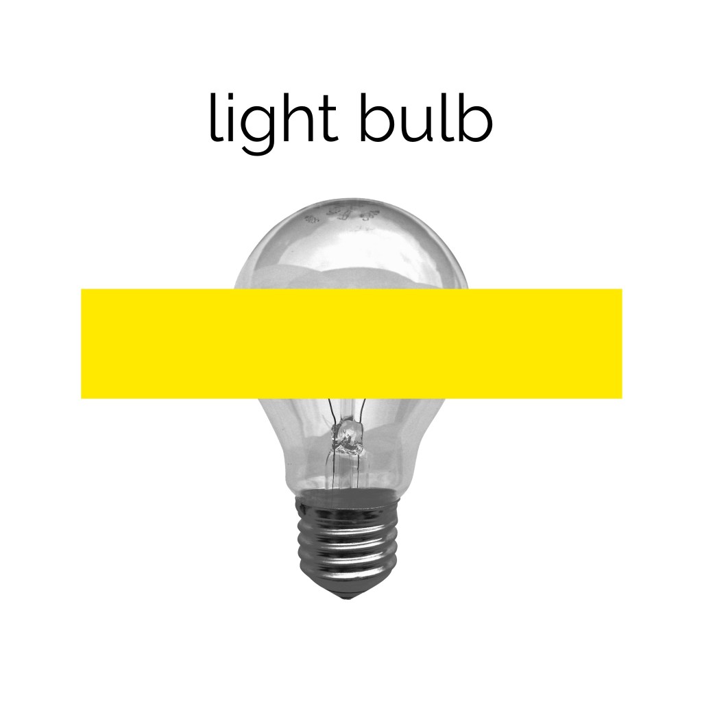
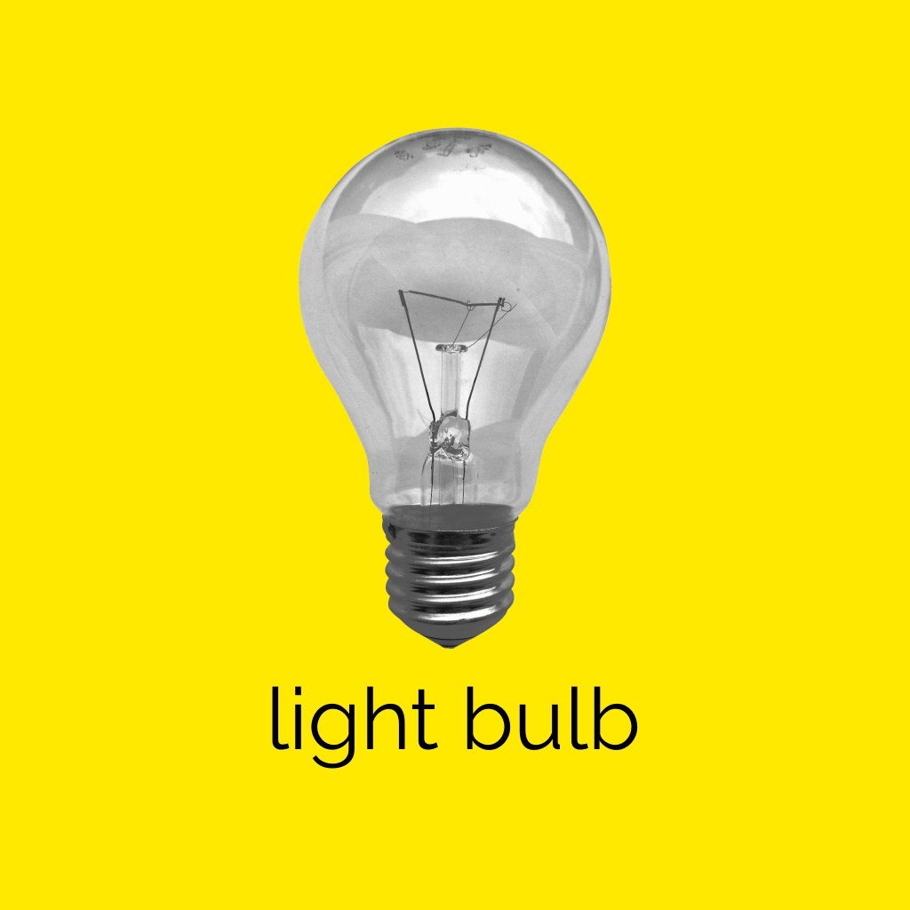
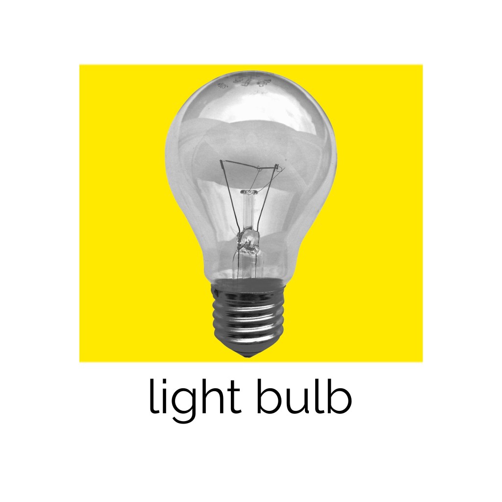
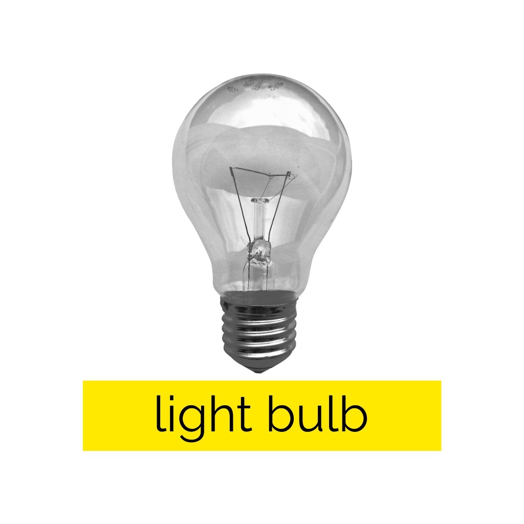
26 of my designs displaying the variations in approaches to composition
Narrowing down my compositions to around 20 designs was difficult. I managed to whittle them down to 26 which I feel represent the different approaches I tried and experiments I did. Some designs I prefer more than others, and those that I do prefer, I feel could easily be an advertising campaign for somewhere like Ikea. I love using limited colours, imagery, and dramatic compositions, but never have I considered trying an exercise like this whilst designing a piece to push my work to its limits. I think it’s a very successful approach!
This exercise was fun, informative, and inspiring. I am glad I got an opportunity to explore more of the Swiss design style and find new ways to approach my design work. I hope to remember to incorporate more of this into future projects.

[…] really enjoyed Exercise 9 and how it made me think differently about my design work – mainly that it was so […]
LikeLike