To finish off Part Three I was asked to put everything I have learned together – exploring composition, symbology, visual dynamics, and most importantly: colour. I had to create a poster that celebrated any colour of my choosing, using only tints and shades of that colour and its complementary colour. I could be creative with my design, using photographs, illustrations, text, and collages, if I wanted to. I needed to create at least three versions of the poster, and one final piece.
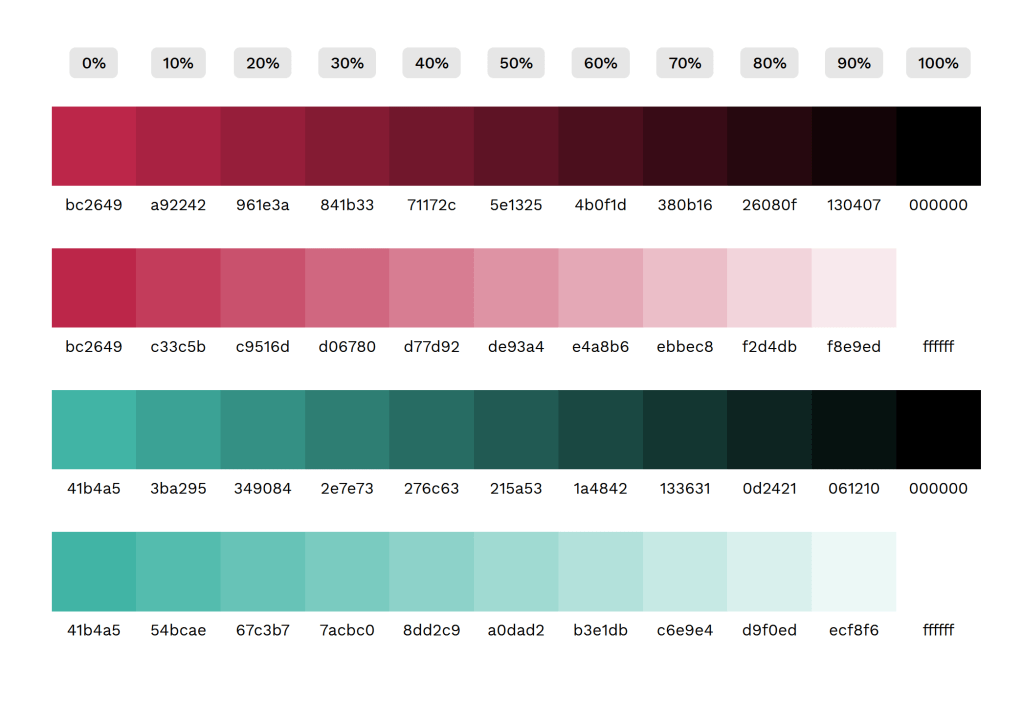
I had already decided on a colour for this assignment several weeks in advance when messing about in Photoshop. The software features some Pantone swatches which reminded me of the Pantone Colour of the Year for this year – Viva Magenta. This is a gorgeous, deep, bold pink-red shade, and I knew I wanted to explore it further for this brief. Before I began anything else, I jotted down the hex code for both it and its complementary Pantone shade – Waterfall – and used this website to create a colour palette.
Next, I began to do some research into the colour itself. Choosing the Colour of the Year felt a bit like cheating, as Pantone have already written a bunch of articles about why they chose the colour and what meaning it has, but this actually was extremely helpful, as there was a lot I probably wouldn’t have thought about. Later, when I asked friends and fellow students their thoughts, they had very different ideas about what the colour represents. Having both the professional perspective and the more generalised perspective helped me come up with more designs than I would have otherwise.
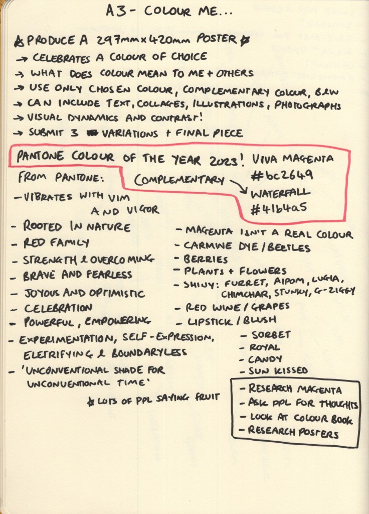
Pantone’s descriptions of the colour were very focused on its appearance in nature, that clothes dyed in similar colours often use carmine pigment, and that the colour represents strength, bravery, and a joyous overcoming of boundaries. It’s a celebratory colour in and of itself. My friends all said that it made them think of summer, of fruits and dresses and drinking wine. Make-up was referenced a lot, too, and that it felt like a very regal colour.
My own thoughts were similar to Pantone’s: I thought of flowers and of joy and celebration. But, I also thought about the fact that magenta isn’t even a colour at all. This is so fascinating to me, the science of colour and how we perceive it has always been mesmerising to me as an artist, and I was eager to explore how I could represent that what the viewer is looking at isn’t really even there. I also, unsurprisingly, thought about Pokemon, and how many of them share the colour scheme I chose.
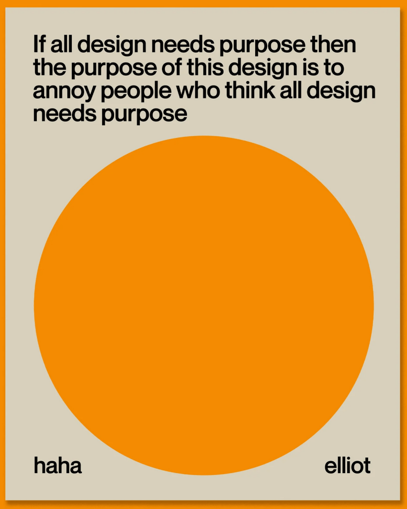
I’ve been thinking a lot lately about why I am doing this degree and the purpose it holds for me. I saw a post aimed at student designers that said the most important thing you can do for your portfolio is to take every brief and make something you love, make it relevant to you and your interests and what you want to be doing in life. It resonated with me, and I felt like that was something I was already doing, but I’ve noticed more that I seem to mould myself and my work to each brief, changing my style and approaches depending on what is asked of me.
Whilst this is useful in order to explore what I enjoy and to learn how to be flexible in my design process, I have very little that I’d want to put in a portfolio from my three years of working. For this assignment, I really wanted to make something that excited me. I wanted to make something I would enjoy looking at, that I would enjoy making again and again, and that fit into the contexts I want to work in.
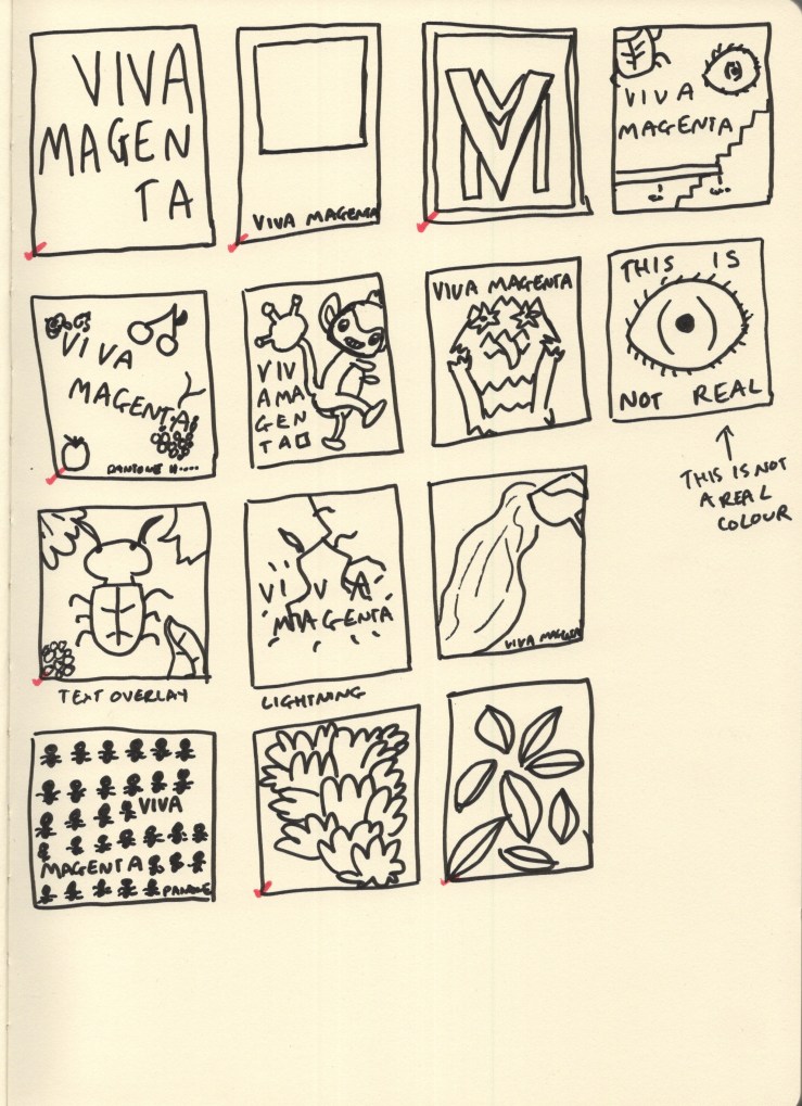
When it came to thumbnailing this was my main focus. I explored a lot of very different ideas, drawing from the huge variety of meanings I had collected in my research. I also took a look at The Designer’s Dictionary of Colour by Sean Adams, which unfortunately doesn’t have a section on magenta specifically. It does, however, have a chapter on fuchsia, which is close enough, and contains some great inspiration for minimal palette work.
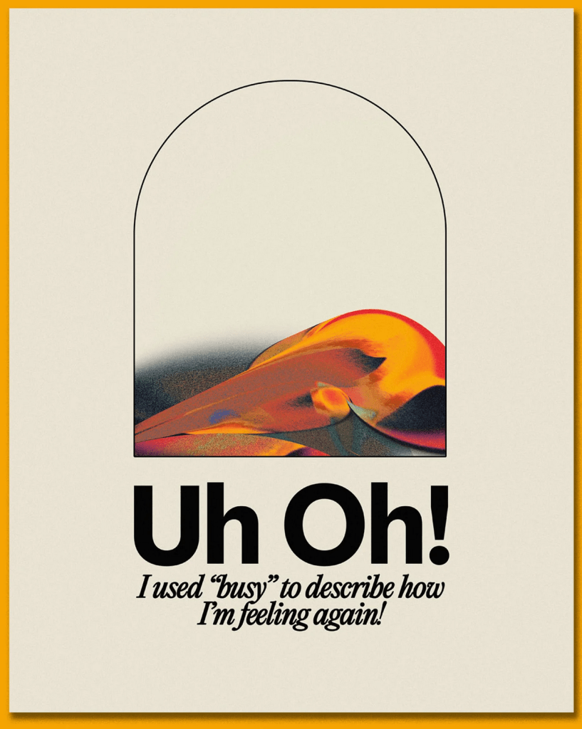
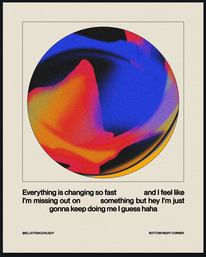
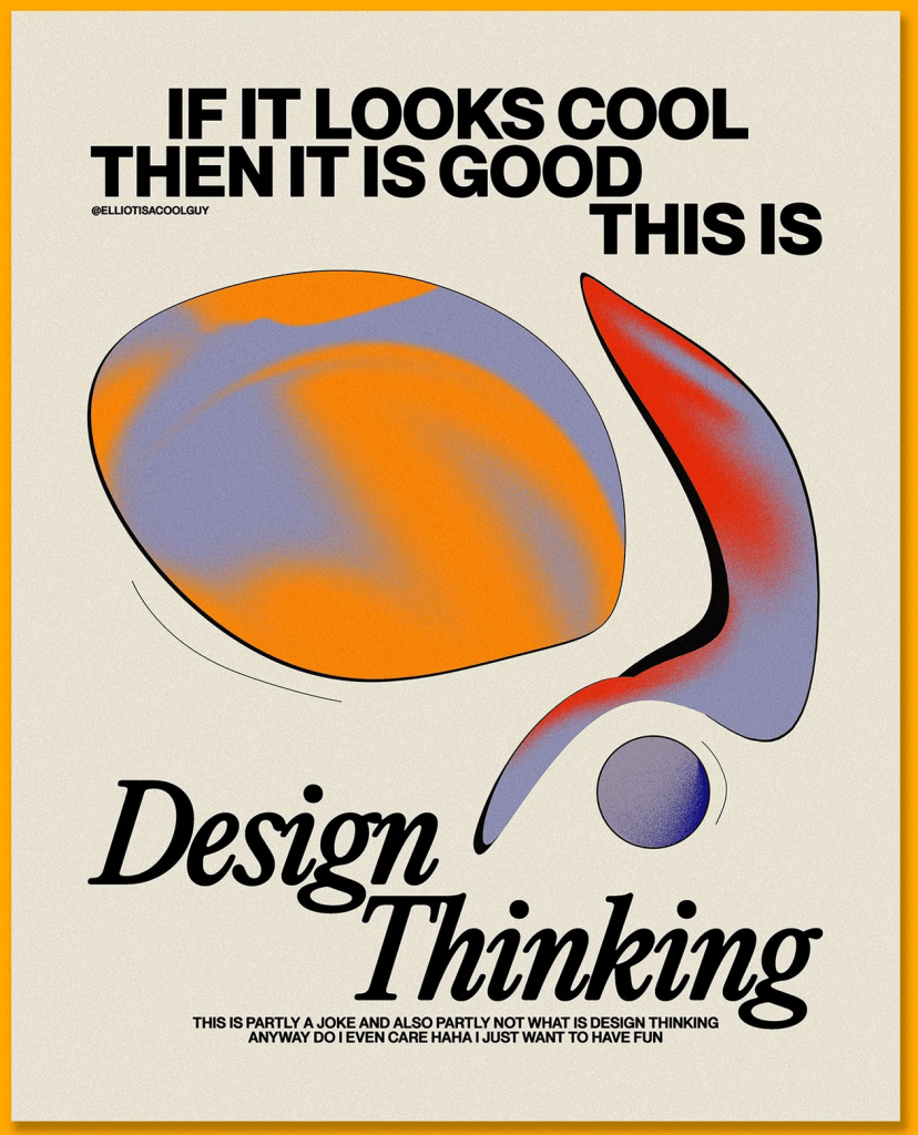
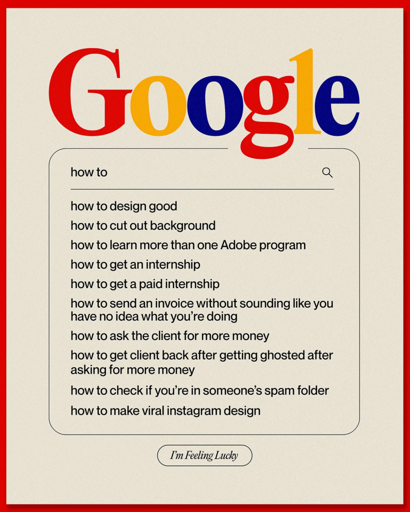
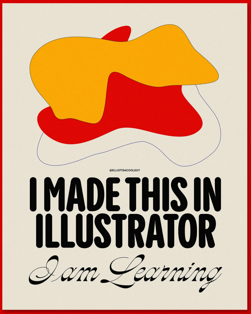
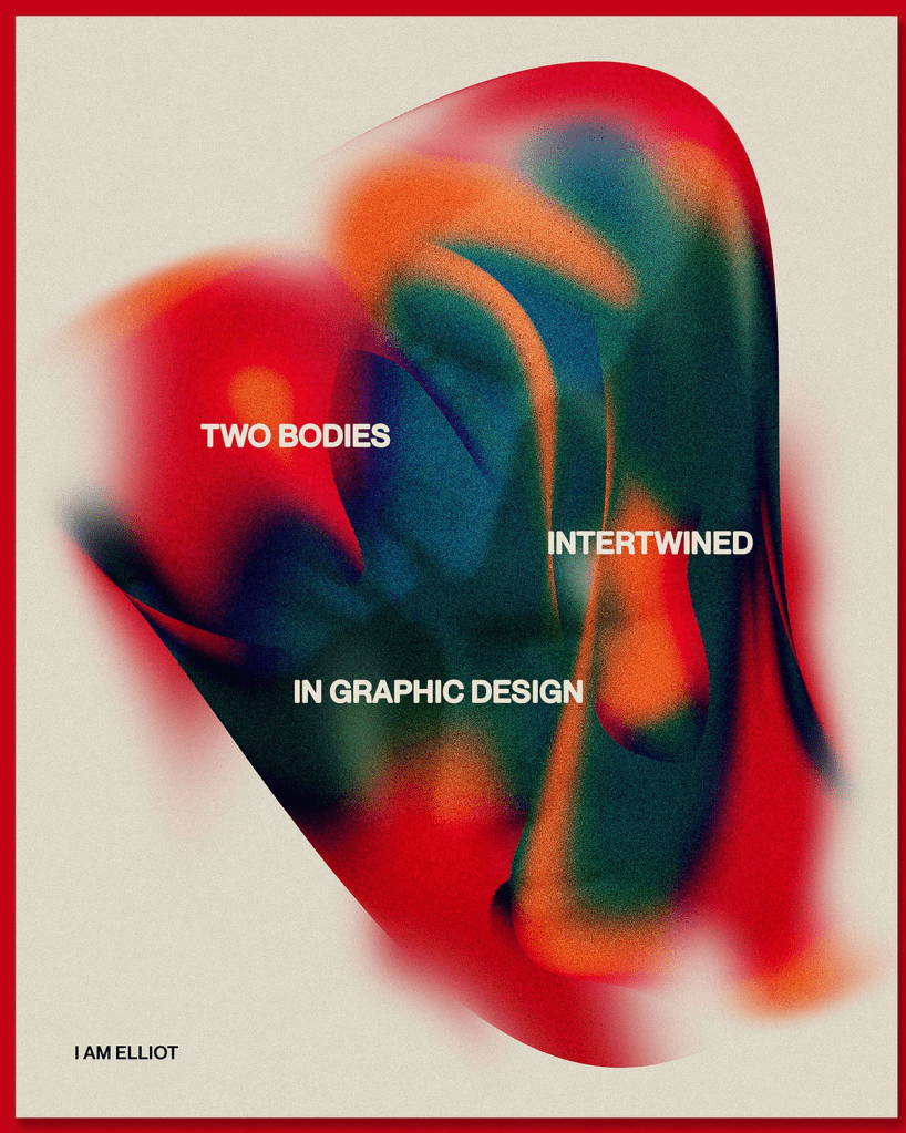
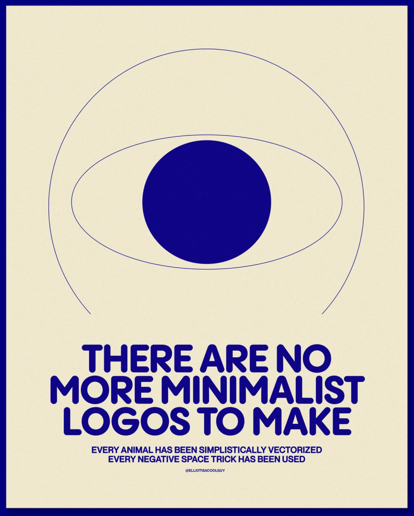
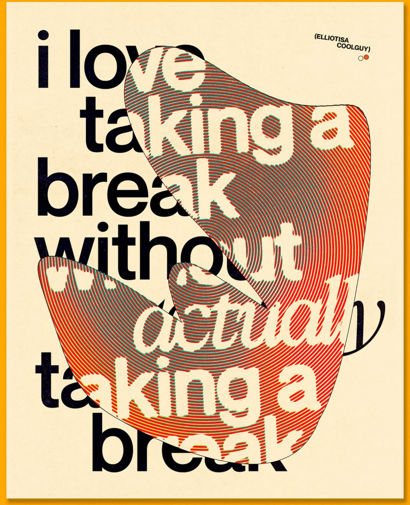
I’ve done a lot of work with posters over the years, and a lot of research on artists who specialised in the field, so I didn’t feel a strong need to research the area again. However, recently I’ve been really inspired by some of the work I’ve seen on Instagram from young designers such as Elliot Ulm (@elliotisacoolguy) and I wanted to collect some to reference for this assignment.
I love seeing designers in similar places to me sharing their experiences and work in a casual way. Often there feels a huge disconnect between me and ‘the design world’, but these designers make it feel a bit more real and closer to home. I also see a lot of themes and trends across their styles that are also present in my work, which always reminds me that I am a part of the current ‘era’ of design, even unconsciously. I would love to research the question of ‘what comes first, the trends or the articles calling them trends’ in my critical reviews at Level 2.
I really enjoyed Exercise 9 and how it made me think differently about my design work – mainly that it was so freeing and I produced so many varied design options that I wouldn’t have otherwise. I decided to start working in Photoshop without much of a plan for which of my thumbnails would be my final design in order to try this exercise again – just playing around without much of a goal and seeing what I came up with. Doing this always makes my work feel a lot more fun, which is a huge bonus, and I think I come up with some awesome designs in the process.
Thankfully, I figured out how to screen record my Photoshop process this time, and managed to capture some of my playing. Unfortunately, the screen recording doesn’t capture everything, and it was slowing down my laptop immensely, so I couldn’t record too much of the process. My designs felt a bit like pancakes, where the first one has to be awful in order for the rest to be fantastic, and I felt they got better the more I explored and questioned. I downloaded a bunch of fonts from Adobe Fonts to experiment with and tried to loosely follow my thumbnails similar to how I did in Exercise 9.
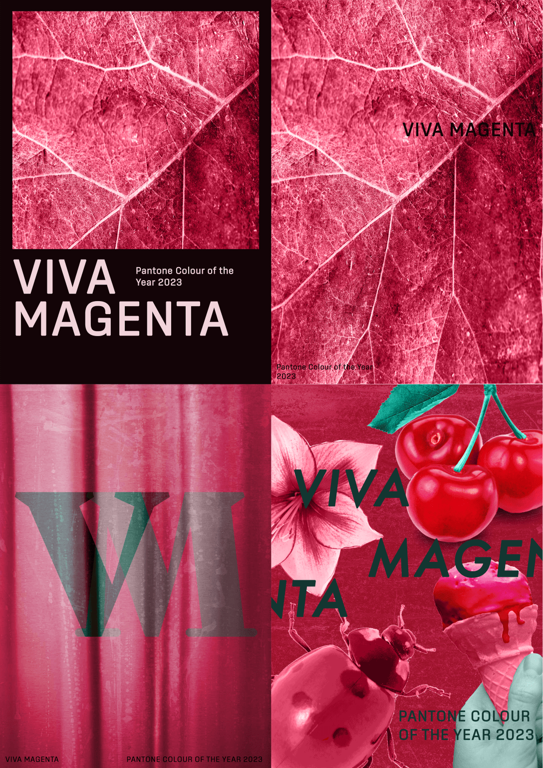
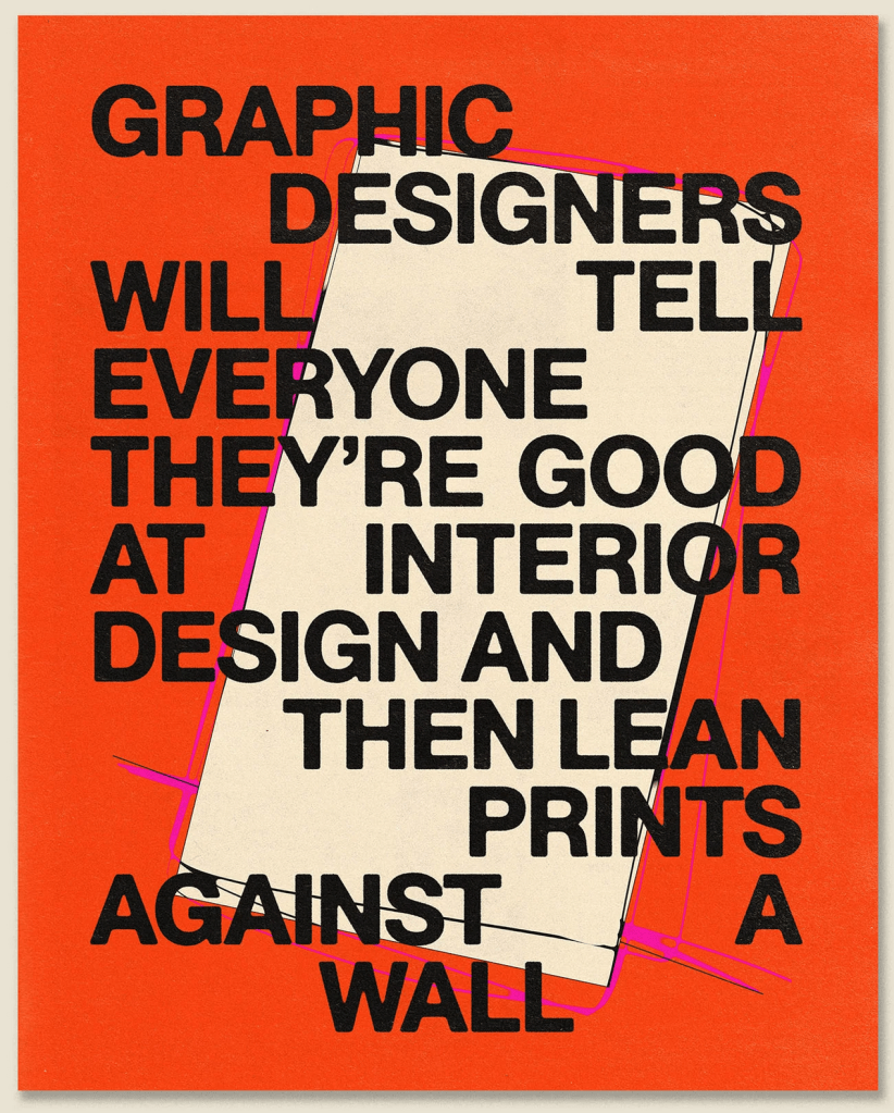
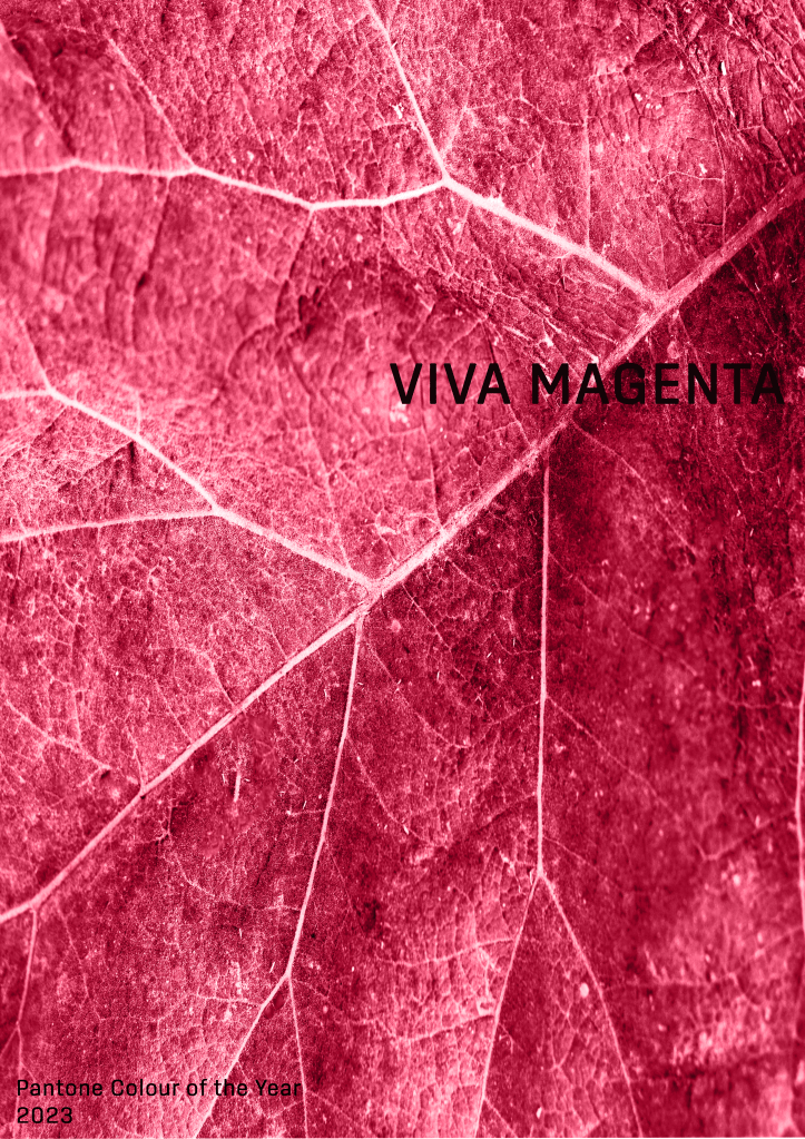
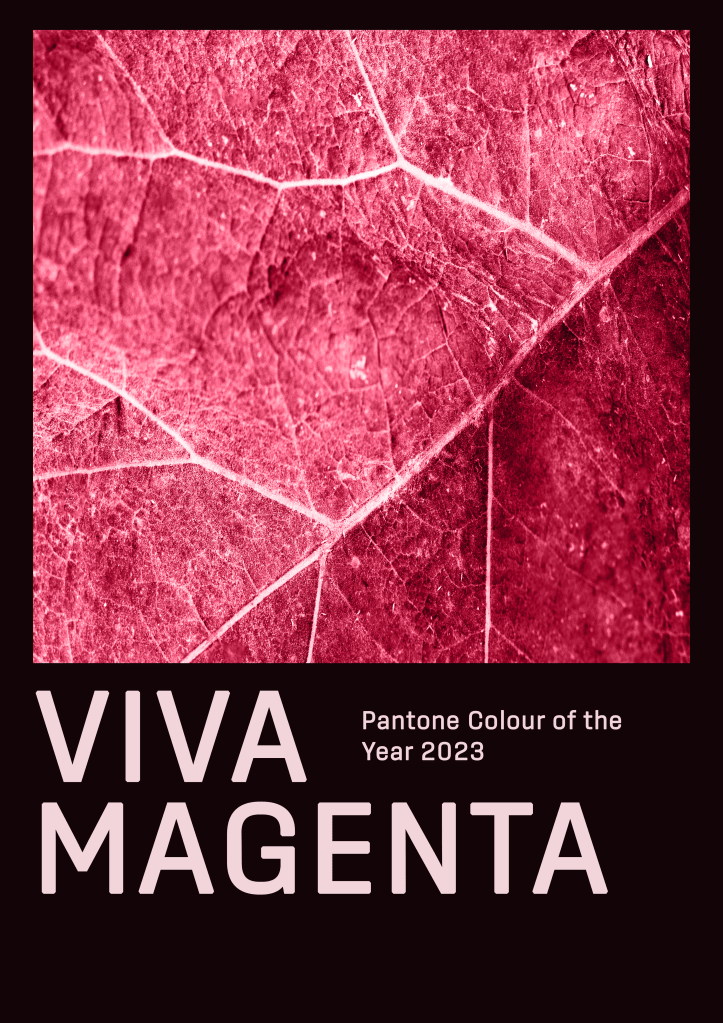
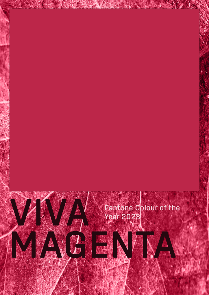
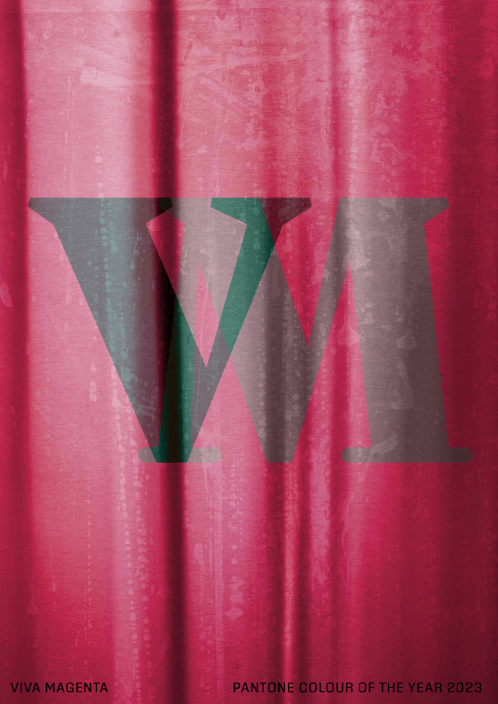
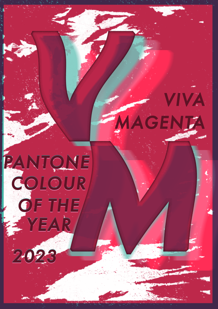
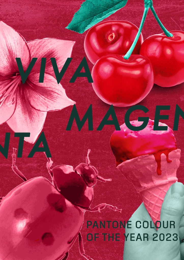
I produced 9 different versions of the poster, all of which had very different vibes and elements. I explored collaging with stock photos, manipulating text in various ways, and using textures and natural elements to create interesting backdrops. They are all very rough and unpolished as I didn’t want to spend too long perfecting each piece, knowing they weren’t all going to be officially used as my final piece.
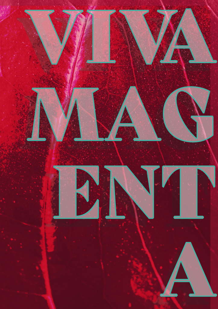
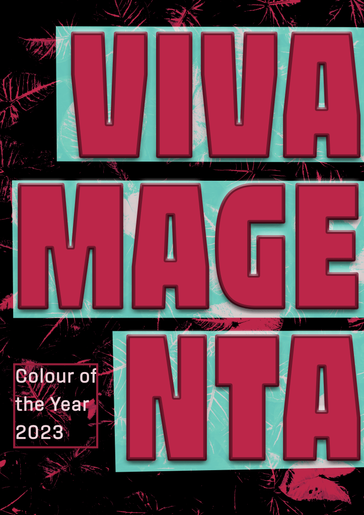
Once I felt I had enough ideas to work from, I took a step back from them to think about what it was I was trying to communicate. I really enjoyed so many of the posters, and narrowing them down to one piece was going to be a challenge. I put together my favourite four designs and sent them out to friends and other OCA students to ask for some feedback on them.

Feedback was very mixed, which made it even harder to figure out the strongest idea. However, one of my friends asked me a great question: who is your audience?
I had already decided my audience was myself. I wanted to create something that made me happy. But as I thought about this question, I realised that I had been subconsciously working for a very specific purpose: to advertise the colour. I was imagining in my head that there was a Pantone exhibition at a local art gallery showcasing work from the past 100+ years that featured this year’s Colour of the Year. A celebration of the colour, just as the brief described, but from a slightly different angle.
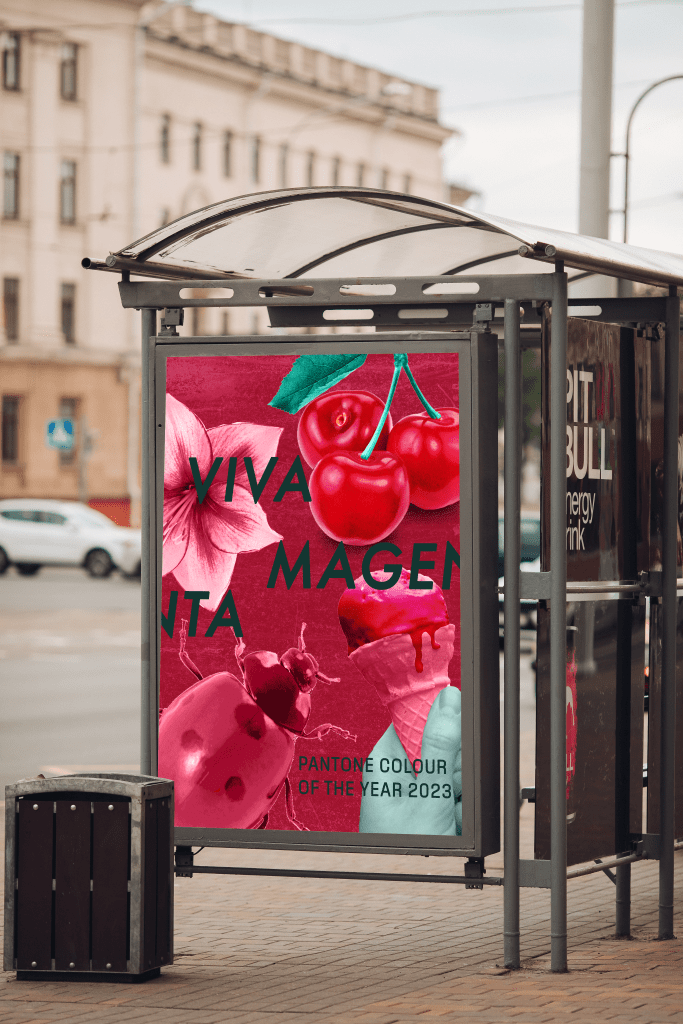
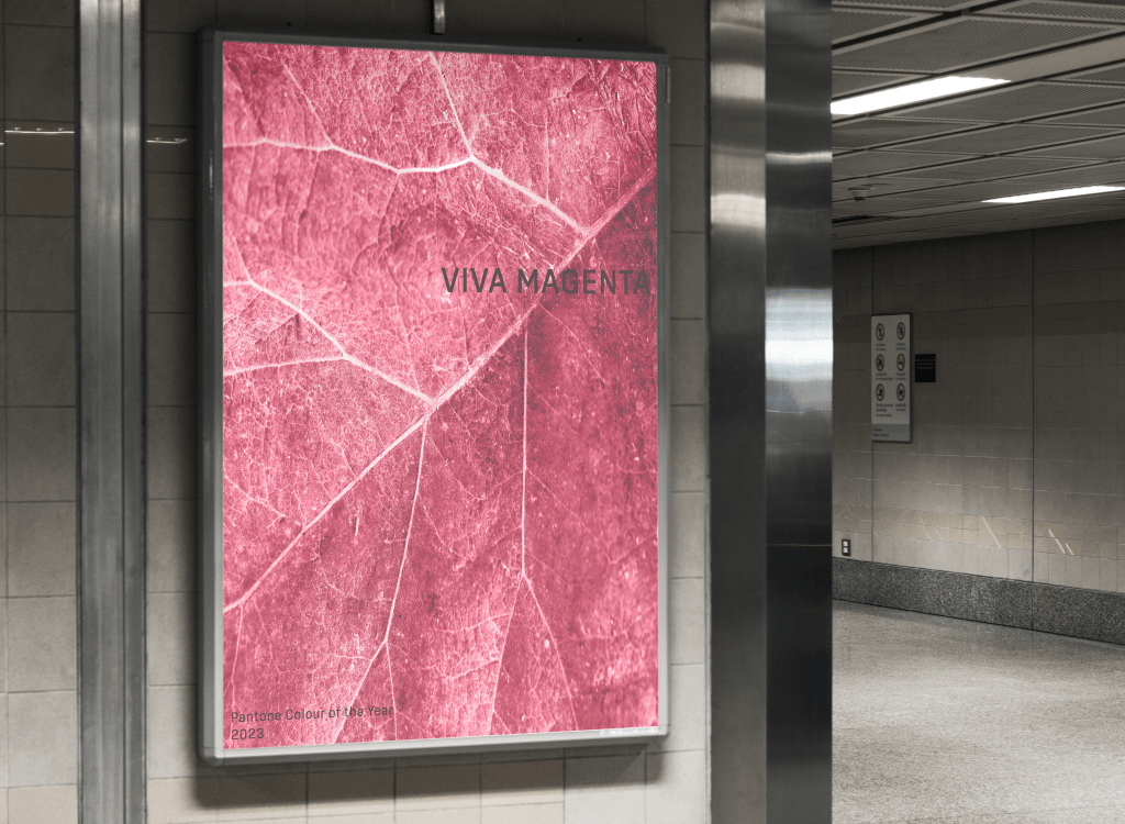
Advertising and marketing are where my passion lies. I love creating things that draw a passerby in. In my head, this was a poster for public transport, walked past on the daily commute, eye-catching in a way that makes you curious to find out what that is. I wanted people to be googling ‘viva magenta colour of the year 2023 pantone’, even if they weren’t going to visit the exhibition itself.
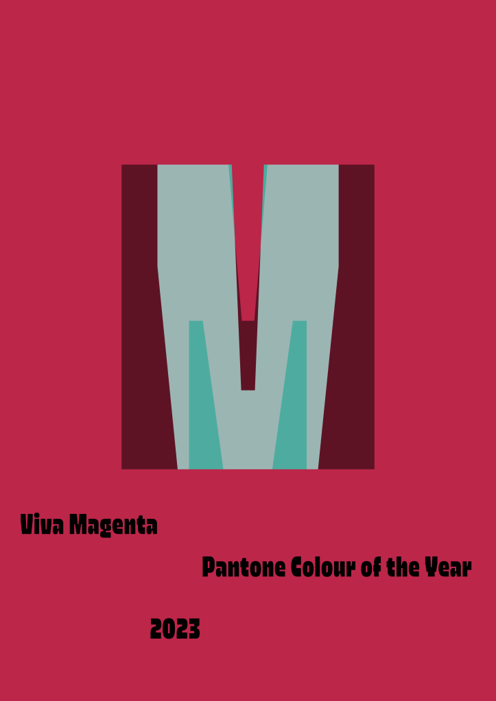
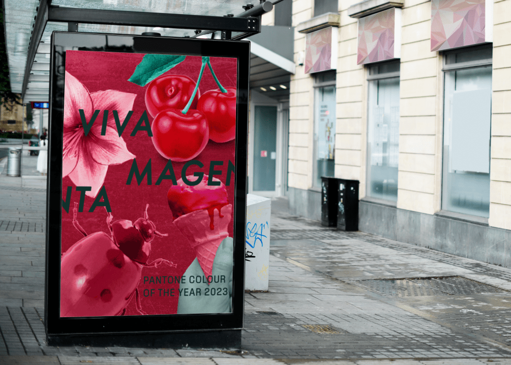
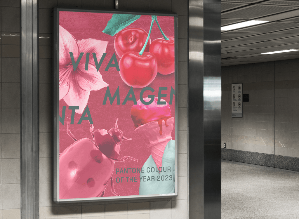
Another friend gave a breakdown of the vibes each piece gave them. They said the first felt chic, classy, and official, as did the second, however the second felt like it was for a design book about the colour. The third they felt was for a fashion collection – which I had previously said too – and that the fourth was perfect for social media and targeted the Young Adult demographic. This put me off the fourth design and made me favour the first two, as an upmarket gallery was what I had envisioned.
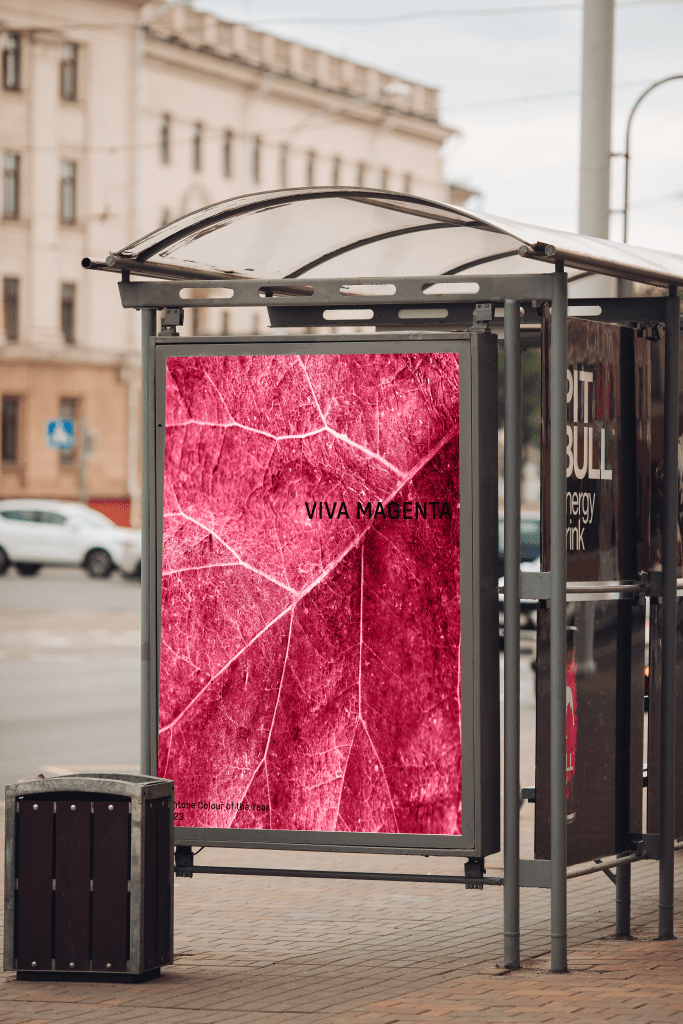
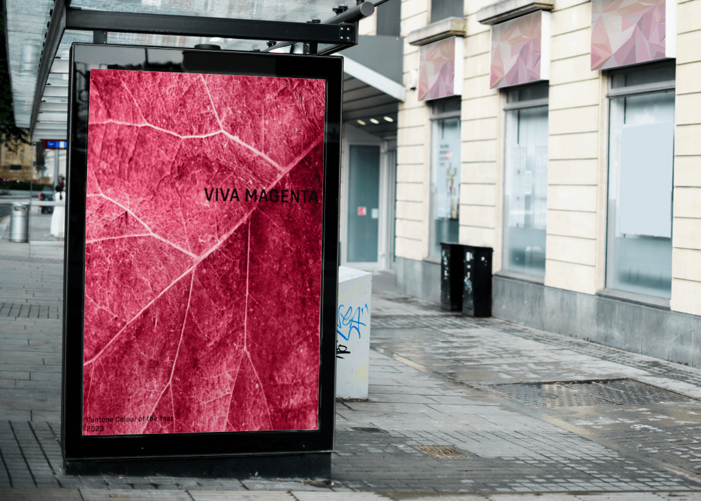
The fourth design, however, is probably the strongest at bringing together all the elements of Part Three in a powerful way. Colour, collage, composition, and an exploration of visual space have all been included. It’s striking and celebrates the colour without further explanation. I felt like it was an obvious winner, but I couldn’t stop myself thinking about the other three. They felt more ‘me’ as a designer, more like something I would see at a bus stop and not be able to stop thinking about.
I managed to narrow down the three to one, and thought, Hey! Why not put them on bus stops and see how that changes my perspective. I always find that mocking up my work helps me see potential in it as it is brought into the real world. I found some really great mockups that fit my vision and put each poster in them. Doing this definitely improved my feelings about the fourth design, but it didn’t really change my love for the second design. There’s something about how minimalistic it is that feels so good for me.
Instead of polishing off one of these designs, I have decided to leave them in this unfinished state until I receive feedback from my tutor. I will then pick one of the two and tweak it a little – mainly improvements to the text legibility and placement – for it to be my final piece. Right now, however, I really can’t decide! I love all of the designs I came up with for this assignment and these two the most.
I had so much fun with this assignment, which is a huge difference from normal. Don’t get me wrong, I usually enjoy the work I do, but my approach has really shifted throughout Part Three. I’m starting to see the importance of making work I want to make, and especially the importance of letting go and really playing with what I’m doing. I feel like I try really hard to follow rules and meet expectations (one’s I set for myself!) rather than just following what’s interesting to me – despite constantly talking about wanting to break boundaries and let go.
I think it’s cool that Pantone’s perception of Viva Magenta – brave, empowering, experimental, and breaking down boundaries – are all things I have learned how to embody throughout the exercises and assignment. I really have celebrated the colour through both my work and my design process. I’m so excited to see how Parts Four & Five turn out with this newfound freedom in my work, and whether I’ll be able to maintain it through until the end.
