The focus of this exercise was to embark on a deliberate process of stylisation. It had 4 steps to it; the first was to draw either a cat or a dog from reference and make it look ‘real’, the second was to attempt to draw it again using no more than 5 lines, the third was to make a collage from cut-outs of magazines, and the fourth was to produce a drawing of the collage and add at least one other element in order to create a narrative.
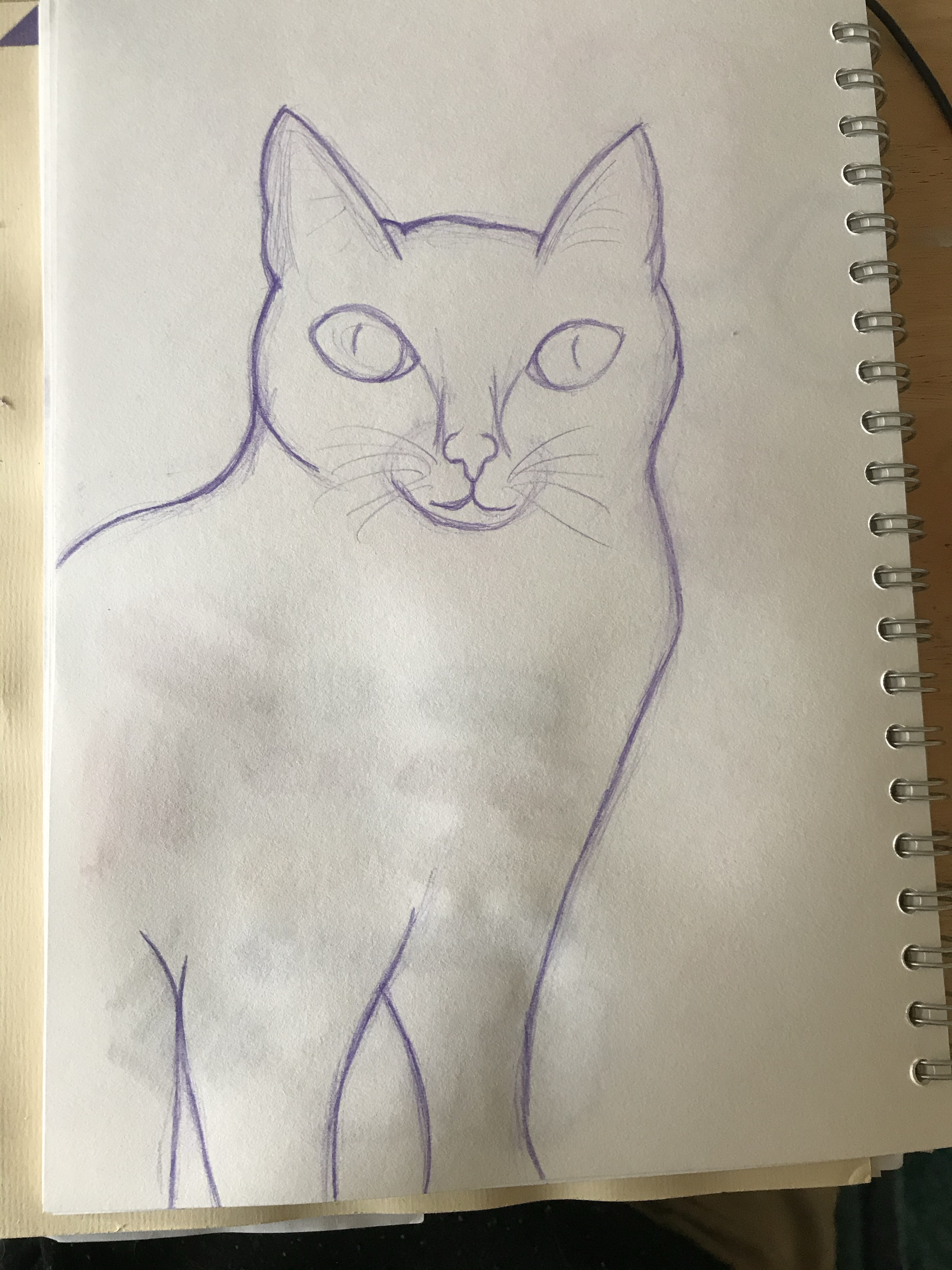
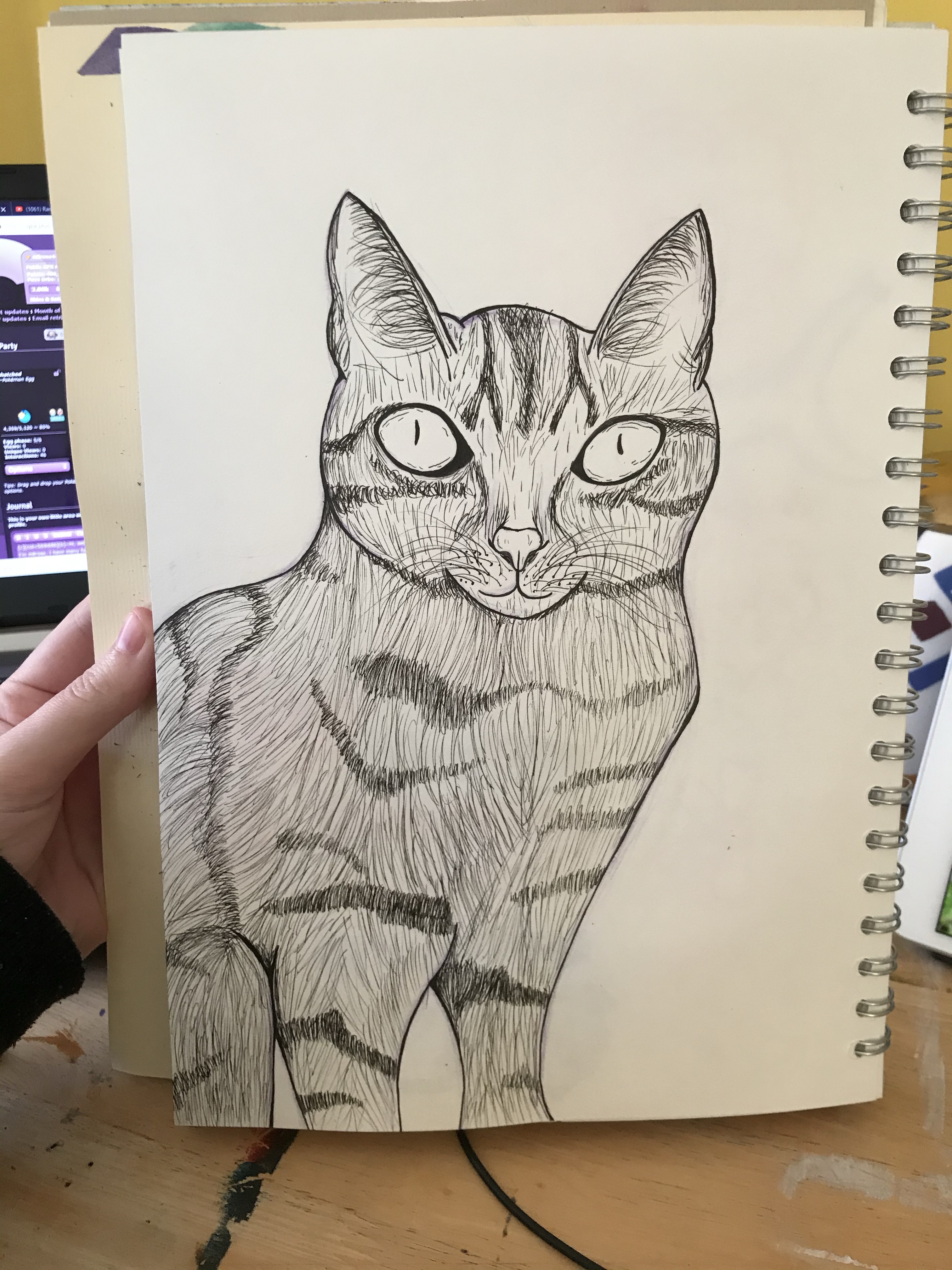
I wasn’t too excited about this exercise when going into it, as I honestly wasn’t sure what it could offer me. Plus, I felt it was quite a long and drawn-out process for achieving a unique style, something I didn’t want to undertake every time I illustrated something new. I think of myself as a ‘cat person’ through-and-through, so I trawled Pinterest to find a good reference to begin with. I picked an image of a nice little tabby sitting in a relatively normal position and sketched it out. I then chose to ink it using drawing pens, adding in the texture and the detailing of its fur. I had a lot of fun doing this and was amazed at how far my drawing ability has come since I started this course. This may actually be one of my favourite drawings to date!
My initial cat drawing, sketched and then inked
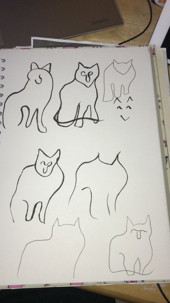
Next up was to draw the cat with no less than 5 lines. This was unsurprisingly a challenge for me. I decided to begin with an ink brush pen, rather than a pencil, in order to push myself out of my comfort zone and force myself to accept the imperfections. It was hard to figure out where the lines were needed in order for the image to still be readable as a cat, and using a pen meant the shapes didn’t always work fantastically. I then used a smaller inking pen to see if gaining more control would alter the imagery, and whilst it did make it easier I feel the brush pen drawings were more effective. I think I probably could’ve pushed this task a bit further and experimented even more, but visualising those 5 lines was getting harder and harder by the minute.
Cat drawings using no more than 5 lines
I then had to create a collage of my cat. The instructions for this part of the exercise stated ‘Have fun introducing surreal elements. Deliberately distort. How far can you bend reality?’. It also asked for a collage made from magazine cut-outs and printouts. As stated before, I don’t really have much collage material (though my collection is slowly growing) and I find it much easier to work digitally in this way. When collaging, I will typically have an idea of what I want the finished piece to look like, or what kinds of materials and textures I’d like to portray, and then I go out and find source material to cut this from. For example, I may think ‘maybe cat’s fur could be feathers’ and then I will go and find stock images of feathers. I felt that for the sake of the exercise, however, it was important to have a limited range of material to work from.
The challenge for me here was to make something unreal, to push the boundaries of ‘cat’, and I wouldn’t be successful in achieving this if I used my usual collage process. I found generatormix.com, a random image generator that uses Pixabay as a source, and decided to generate around 50 images and save every single one. I would then be limited to these images when picking my collage material, forcing me to be more selective and imaginative in how I create my final image.
A screenshot showing a selection of the images I had saved for my collage
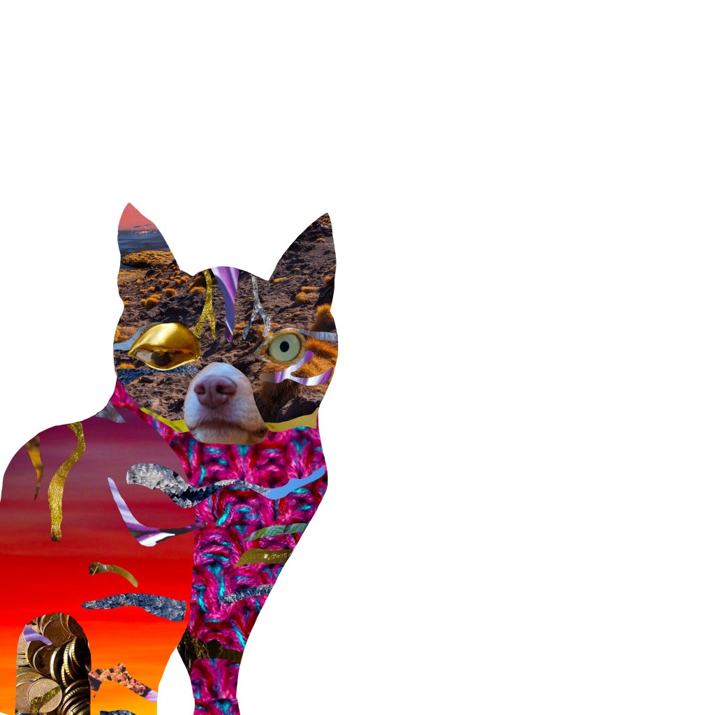
To begin, I scanned in my first cat drawing in order to give myself an initial framework. I then started with the facial features, taking inspiration from Hannah Hoch’s collage work and usage of facial distortion. I built a body around that, trying to select fun and interesting textures and patterns for various parts of the body, and using placement of the various cut-outs to indicate where the different body parts connect. Finally, I picked a handful of interesting scenes to add in the fur markings. The finished result is really weird and chaotic. I don’t dislike it, but I’m not sure if I would share it with my friends beaming with pride, either.
My cat collage
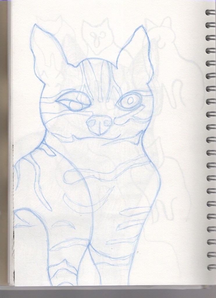
The instructions for the exercise very clearly indicate that the drawing taken from the collage should not be a tracing. I prefer sketching on paper anyway, so this worked well. I used my collage as a reference and once again drew a cat, making it look ‘real’ – if ‘real’ was the cat in the collage, of course. Whilst sketching I realised I wouldn’t be happy with the piece unless I added colour, which meant I would probably go back to working digitally. Because of this, I kept my sketch rough and marked out the most important areas of the drawing. I started to really love this character I was creating, and began thinking about who it would be, what its background was, what narrative I wanted to introduce into the image, and where I would take it.
A sketch of the collage
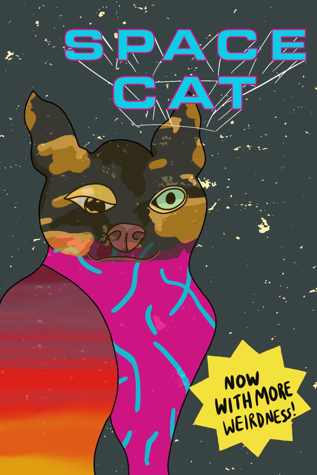
It all got too exciting, and I got a bit too involved in it. I came up with an entire world for this cat to live in, a whole style for the universe and vague plotlines for it to exist in. I decided it would be the main character in a comic called ‘Space Cat’ – it is a foreign, otherworldly breed of cat, and it does not live on Earth but in space with other space cats (and dogs and other animals too!). I could’ve spent weeks developing this character and the world it lives in, and designing panels for an entire story. I will probably go on to do this, and Space Cat will live in a collection of original characters for years to come. However, for the sake of this exercise, I caught myself before taking it too far and produced a colour visual of the front cover of the prospective comic book ‘Space Cat’.
‘Space Cat’ comic book cover – rough colour visual
I am aware it’s very rough, but a huge learning curve in part 4 for me has been knowing when to stop. I find that often I put 200% into each and every exercise, wanting to explore all options and develop as much as I possibly can at each stage. This isn’t necessarily a bad thing, but as the exercises started requiring more work and becoming more involved, I needed to learn that not every single project can be taken beyond what is necessary.
There was a lot of focus on producing colour visuals in this part, and to begin with I was very apprehensive to do this. The rough colour blocking stage of my illustrative process is my least favourite part, and the stage at which I feel my art looks the worst. Leaving my work unfinished and rough feels scary – like I haven’t done enough – and I know I could do better. But now, coming to the end of this part, I understand the benefit and I am starting to be okay with leaving things undone. I (hopefully) won’t leave Space Cat unfinished forever, but if I do, I’m okay with that.
This exercise ended up being wonderful for me and a way to develop ideas that I’d never considered before. Whilst yes, it is a lengthy process, I think I may adopt some of the steps into my illustrative process. I am a long-time fan of surrealism and I feel like in this exercise a lot of things ‘clicked’ in my head on how I can make it a reality in my work. I’m very grateful for it as an exercise, and I really feel I learned a lot.
This exercise asked me to design a tattoo for a friend based on the word ‘Mum’. The design would also be used on a Mother’s Day card, so it needed to be versatile and work at various different scales. I was asked to research the history of tattoos and body art, and explore tattooing in multiple different cultures. Finally, I had to produce a finished illustration ready for tattooing.
I am a big fan of tattooing and have a number of them myself, and I keep track of certain trends within the industry. Because of this, I already have a very good understanding of modern tattooing conventions and processes. I feel that this definitely gives me an edge when approaching this exercise, as I have a good idea of what clients might want when getting tattooed themselves. I don’t have a super in-depth understanding of the history of tattooing, however, so to begin this exercise I watched two videos that I hoped would provide further insight.
The first video I watched, made by the YouTube channel Grunge, was called The Old and Bizarre History of Tattoos. I was drawn to this video as I felt it would provide some interesting history, rather than a general overview. It was incredibly informative and covered a great deal of the art of tattooing and its origins. Two 5000-year-old Egyptian mummies were found to have the first figurative tattoos, which appear to depict animals, and these are the oldest known examples of aesthetic tattooing. However, tattoos have been found on bodies preserved in ice dating from as early as 3250BC, although these were thought to be intended as medicinal as they were mostly just lines etched over areas where joint and spinal issues were found.
The video also provided insight into the darker side of the history of tattooing, detailing the ways in which nonconsensual tattooing was used to permanently mark criminals and other socially ostracised people – most infamously done by the Nazis, who tattooed identification numbers onto Jewish prisoners during the Holocaust. This was especially traumatic as Judaism specifically forbids tattooing as a religious principle, although Grunge notes that this has not stopped young Jewish people getting tattoos today, especially ones related to Jewish iconography.
Christianity, meanwhile, has never had a blanket ban on tattooing, although Christian missionaries often outlawed the cultural tattooing practices of the areas they colonised – presumably to help pave the way for their own cultural overhauls. Christians have often held negative beliefs against tattoos within more modern history and the association with atheism and the devil has created a stigma against tattooed individuals within western and Christian societies.
The stereotyping of people who have tattoos as violent or criminal is a strong cultural bias that still remains today. The video mentioned that at times this has caused lawyers to advise defendants to cover their tattoos due to the possibility of them inciting negative bias from the jury. Today, this negative bias still remains, mostly within the older generation, and it’s ties to Christianity are probably to blame for this. Although, in the 1800s, heavily tattooed people used this stigma to their advantage by appearing as ‘freaks’ in circuses – crowds were particularly drawn to tattooed women, and this became one of the few ways women at the time could earn their own money.
The younger generation nowadays seems to have gravitated towards an opinion that tattooing is a high form of artistic expression. Tattooing is a highly competitive industry and only the best make it to the top. I know from my own experience that opinions on tattooing are divided generationally, and I would be very interested in seeing how that bias changes based on age. This change in perception began in the late 1950s, described in Grunge’s video as a ‘tattoo renaissance’. TIME magazine covered this resurgence in 1970 with an article that called body art ‘the vogue of counterculture’ and seemingly society has never looked back.
Unfortunately, cultural appropriation is a growing issue within tattooing, as cultures which had their tattooing practices banned are now seeing white westerners appropriate those same styles of artwork. Many people do not realise the roots of tattooing and how indigenous peoples were brutally harmed for engaging in the art. However, on the flip side, many indigenous peoples are reclaiming their ancient tattooing traditions as a means to honour their ancestry, and discussions around the harm that cultural appropriation causes are becoming mainstream.
In contrast to the Grunge video, this short video by Allure was rather uninformative, showcasing specific trends in tattooing across the 20th century and into the 21st. Despite the history of tattoos not being especially white or western in origin, this particular throwback is incredibly Americentric, focusing on tattooing trends which surfaced in American culture. This evidences the extent to which tattoo culture still suffers from cultural appropriation, as white Americans show off tattoos that have been blatantly appropriated without any respect for their original meanings or heritage. While the video was short and not especially informative, it was useful to me to see a visual depiction of how tattoo designs have changed over time.
Next, I decided to research the various styles of tattooing in order to decide which styles would influence my piece. I looked at two articles, A Beginner’s Guide: Popular Tattoo Styles Briefly Explained and Ultimate Guide to Tattoo Styles: Popular styles explained with images. Both were incredibly informative and provided enough information for me to easily narrow down which styles I appreciated without further exploration. The tattoos wizard article was especially useful as it showed the same design, a llama, in every style listed. This meant I could compare the styles easily and see which I would prefer to work in.
I narrowed down the styles I liked to 6: New School, Traditional/Old School, Neo Traditional, Illustrative, Anime, and Psychedelic. These styles all allow for bold colour and thick line work – elements I gravitate to in my own artwork, as well as in my preferred style of tattoos. In terms of my brief, Anime and Psychedelic styles don’t seem appropriate, so I cut them out and focused on the remaining 4 styles. I went to Pinterest to obtain some reference material in order to compare them in more depth and to figure out which style I wanted to go forward with. I started by looking at Old School style tattoos, and found so much reference imagery that I found myself getting lost in the beauty of the art style. Finding tattoos in the other 3 styles, however, seemed to be proving difficult, perhaps because they are less iconic.
My love of Old School tattooing combined with the lack of reference imagery for other styles made me wonder if I should proceed with this style as my focus, so I went back and read over the descriptors for the styles with my brief in mind. I realised that it would work perfectly, as Traditional tattooing focuses heavily on meaning and symbolism within the imagery. My next step was to research traditional symbolism for the concept of motherhood and honouring your mother, and to look for existing Old School tattoos themed around the word ‘mum’.
My first thought was to look at flower meanings, as many Old School designs feature them, as well as typical Old School symbols and general symbology associated with mothers. I found this article about which flowers to pick for mother’s day, which was perfect for what I needed. From reading it I noted that carnations are associated with mother’s day, azaleas refer to beauty and love, camellias are a sign of gratitude, and that various shades of roses communicate varying kinds of love. I then looked at this article from Ancient-Symbols.com and observed that the chalice and triple goddess are both familiar symbols for motherhood.
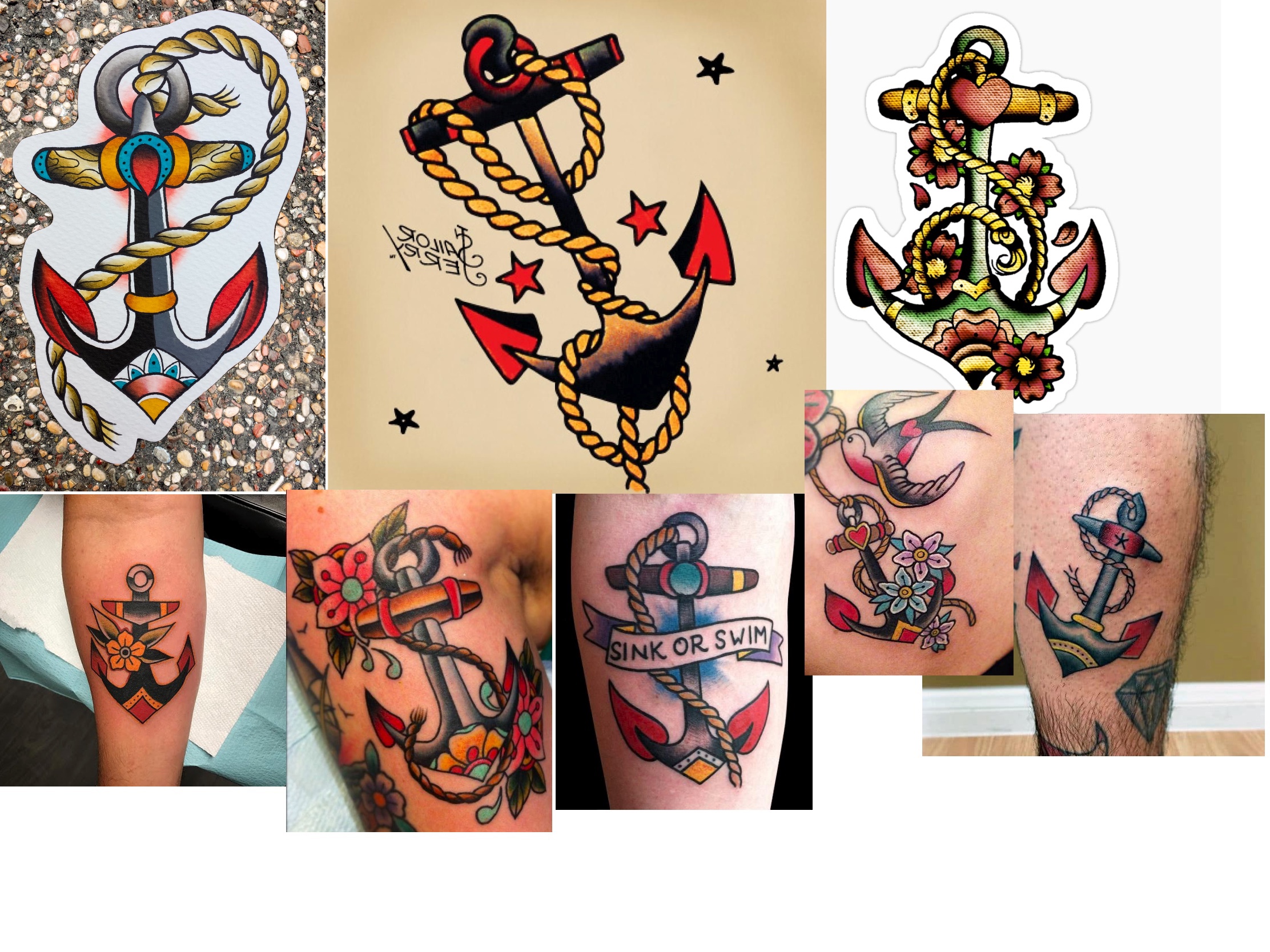
The concept of roses representing all love, not just romantic, made me wonder whether other ‘love’ symbology could be translated to a familial love. I found an article on love symbols and their meanings and from that felt that hearts, swans and doves, and maple leaves, were the most likely to lend themselves to the Old School style. Lastly, I checked out the Sailor Jerry website, as it featured a page on traditional tattoo meanings. Sailor Jerry is known as ‘the father of Old School’, so seeing what symbols he used felt important. I noted that swallows were used, which connected to the swans and doves I had previously taken note of, to mean ‘returning’. I thought this might relate to the idea of always coming back home to your family. I then read that anchors were used to represent stability, and often historically featured in tattoos with the word ‘Mum’.
I then started noting the key features of the style and which colours were included in the very simple colour palette. I found that primary colours, along with black, were the only colours used in very early Old School designs. More modern Old School style allows for secondary colours too, however with very limited variation and shading. The designs are very bold and have clean, heavy linework throughout. Bearing this in mind, and using my Pinterest board as a reference, I began sketching out ideas for my final illustration.
My initial ideas sheet
I also experimented with what colours I could use in my finished piece, unsure of whether I would design the tattoo digitally or paint it. Painting is a common technique that tattoo artists use when designing flash, though more artists are moving towards digital design based on its versatility. I found that I was struggling with developing my ideas on paper as I felt I needed to have very equal, symmetrical, and consistent linework, as is key to the Old School style. I decided to move into Procreate to finish brainstorming.
Time lapse video showing my idea development progressFinal ideas
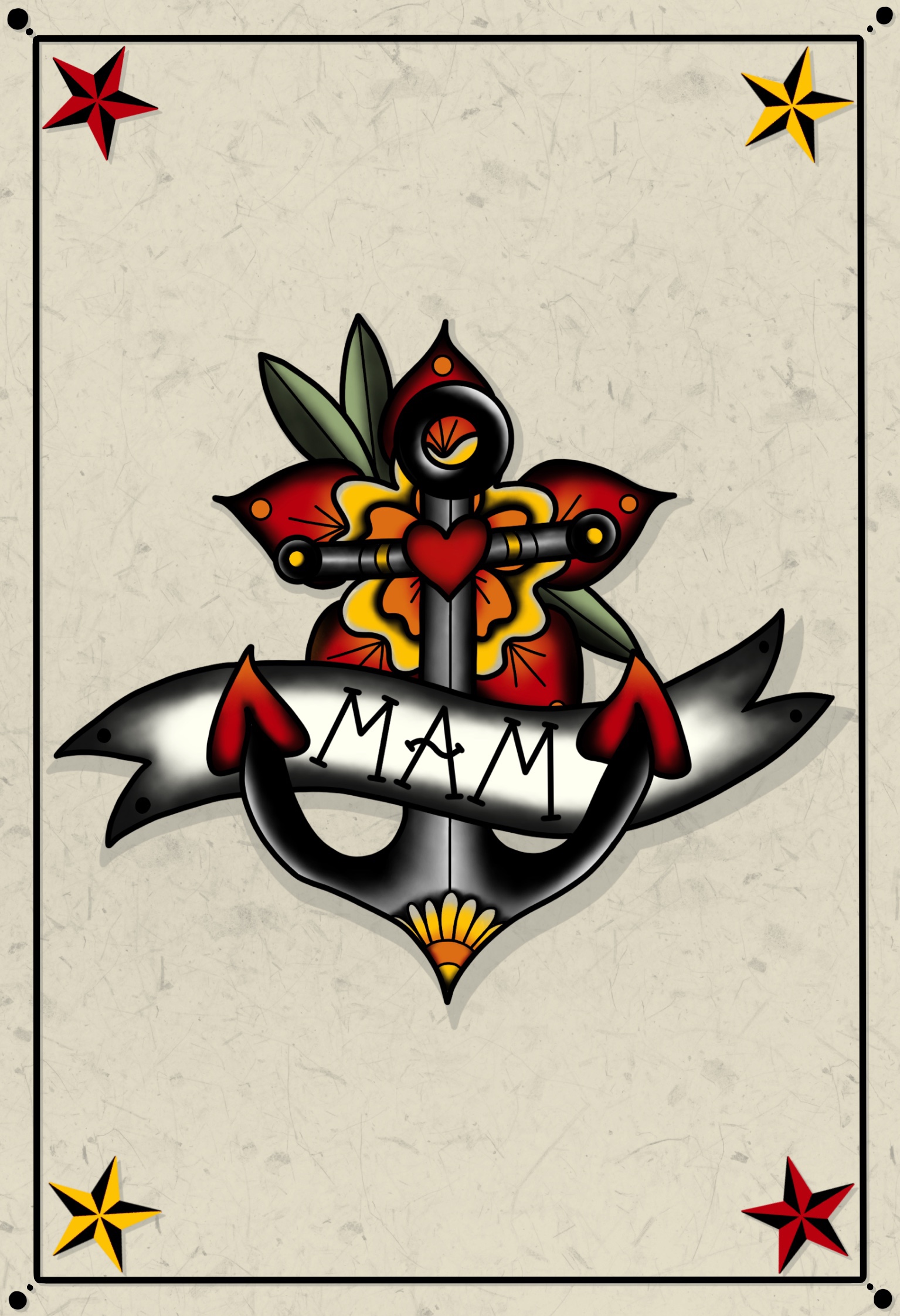
I was focused on three main ideas – the chalice, the heart, and the anchor. The heart felt very traditional, but I was very keen on including flowers in my design, and I liked that this allowed me that space. The chalice, however, felt like I was putting my own spin on the Old School style, but I couldn’t seem to get the ribbon to work in the way I wanted. The anchor seemed quite simple, but effective, and I ended up choosing this to develop even further. At this point in my design process, I opted to go for the word ‘Mam’, rather than mum, as a nod to my Geordie heratige. I was quite impressed with my idea sheet, though, and felt it looked akin to typical tattoo flash.
In order to further develop the anchor concept, I opened the original drawing in it’s own canvas. It felt quite plain and boring, and I wasn’t sure how to work past this. I knew I wanted to add flowers, but I wasn’t sure where or how to impliment them. I decided to create two mood boards – one of existing flower designs, and one of anchor tattoos, in order to use them for reference. I then started sketching in the additional elements onto the basic anchor design. I found drawing the flowers was quite tough, as they do need to be very precise, so I drew a guide based on a pre-existing design. This helped a lot.
Mood boards of tattoos for reference
Once I was happy with my line visual, I began experimenting with colours. Thankfully, as I had a reduced palette, this was quite easy. The hard part was figuring out exactly which primary colours I would use. There are so many variants in the shades of red, blue, and yellow! I found a website that sells tattoo ink and took screenshots of some different shades in order to colour pick from these. I found a red and yellow perfectly, but finding the right shade of blue was trickier. I also wanted to stick to the roots of the style and ensure I was getting a true middle-point for my secondary colours. I used this Hex Code colour blender to obtain this. I ended up with three varying colour palettes to pick from, and ended up – somewhat frustratingly – going with the first one.
Three colour palette options
Time lapse of my process further developing my idea and creating a colour visualFinished colour visual
Now that I had a colour visual, I could start on perfecting the final design. I started by filling in some heavy line work, then added colour where needed, and lastly spent some time shading various areas to get that authentic Old School look. Most of the articles I read about Old School specified that the style was light on shading – however, visually I feel this is untrue. Many, if not all, of the tattoos I saw – even the ones on the Sailor Jerry website – used black ink shading and blended colours. Perhaps this shading is simply gentle when compared to other styles, especially ones such as realism.
Final illustration design processFinished illustration
I am immensely proud and happy with this design. It feels original and unique, and not as if I just copied pre-existing designs, which is not hard to do when a style requires so much traditionalism. It also fits the brief very well, and I could see it existing on flash that I look through on a regular basis. It also translated easily onto a greetings card, as shown below. Overall, I had a lot of fun with this exercise and enjoyed the process from start to finish. It’s definitely an area of illustration I would be interested in exploring even further.
Greetings card front and insideGreetings card mock-up
This exercise asked me to provide an illustration to be used on the menu of a sophisticated, high quality fish restaurant. The image would be used at a small size on the menu – 40mm x 40mm – but if successful would also be used as a logo on stationary and vans. Therefore, the illustration needed to be simple, clear, and versatile.
From dissecting the brief, I felt my key points when developing this illustration were that:
The restaurant is upper market and high quality
The ingredients used are fresh
The theming of the restaurant is modern, bright, and contemporary
The image produced must be sophisticated and clear
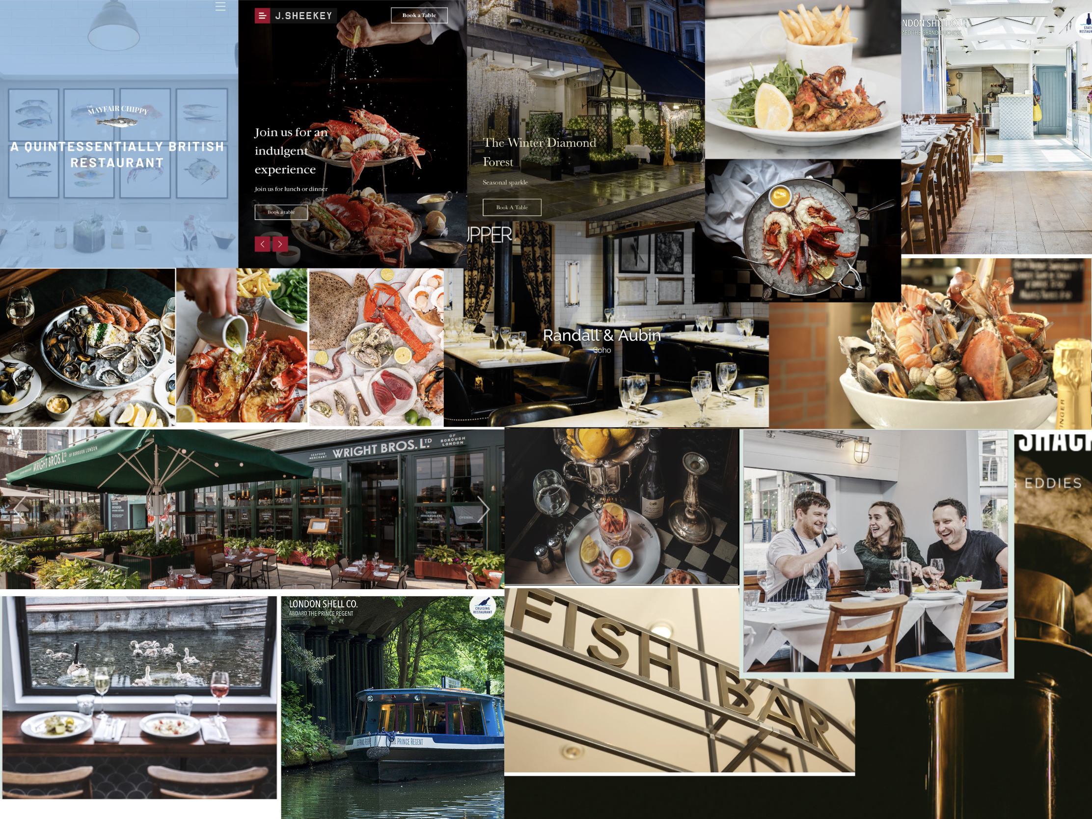
To start off with, I began looking at a wide variation of high class seafood restaurants to see how they currently advertise and what imagery is commonly used. I looked through the top restaurants on TripAdvisor and took screenshots of any imagery found on menus, as well as used throughout websites. I also took screenshots of any logos or fonts, so that I could reference these too. I then saved images of restaurant interiors, exteriors, or food served at the restaurants in order to compose a mood board of the general ‘vibe’ these sorts of restaurants have.
Mood boards/references from my research
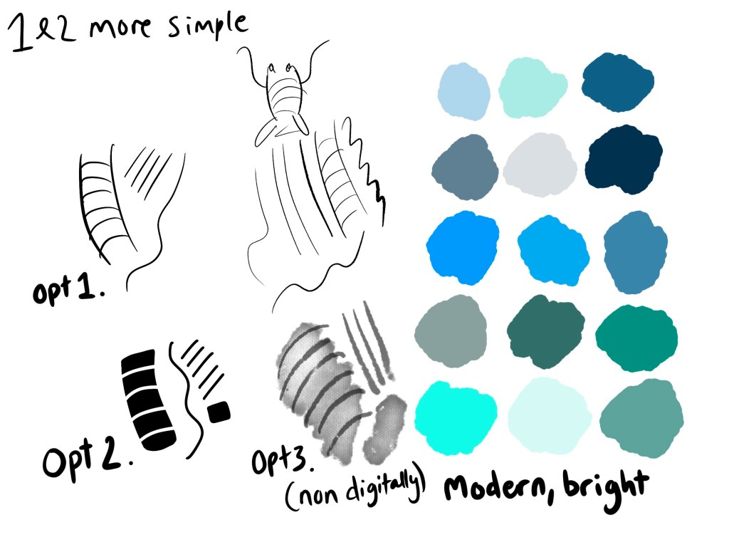
I felt that there were two kinds of designs repeatedly used throughout the imagery I collected – the first was simple ink or line drawings, the second was bolder solid vector images. There was a consistent dichotomyin the interiors of the restaurants, either dark and mysterious, pulling from vintage aesthetics, or bright and airy. I knew I would be doing this digitally, at least in part, as digital images are much easier to manipulate for several purposes whilst maintaining quality – so I began experimenting with brushes in Procreate to see how these different styles could be used.
Colour palette and brush experimentation
I also tried to do a watercolour type style which would go with the ink drawings, but this would most likely have to be undertaken traditionally. I felt this wasn’t fit for purpose, so scrapped that idea pretty early on. At this point I also composed a colour palette, taking from the colours seen in my mood boards, and bearing in mind the ‘modern, bright, and contemporary’ descriptor in my brief.
Next, I needed some content for my image. I began listing off all the things I could think of that I associated with seafood, marine life, and the seaside in general. I also Googled the most popular seafood dishes, and asked a few friends what popped into their heads when they thought about seafood restaurants. I then searched Pinterest for references of all of these things in order to get inspiration and narrow down my options, as at this point I had about 30 elements written down!
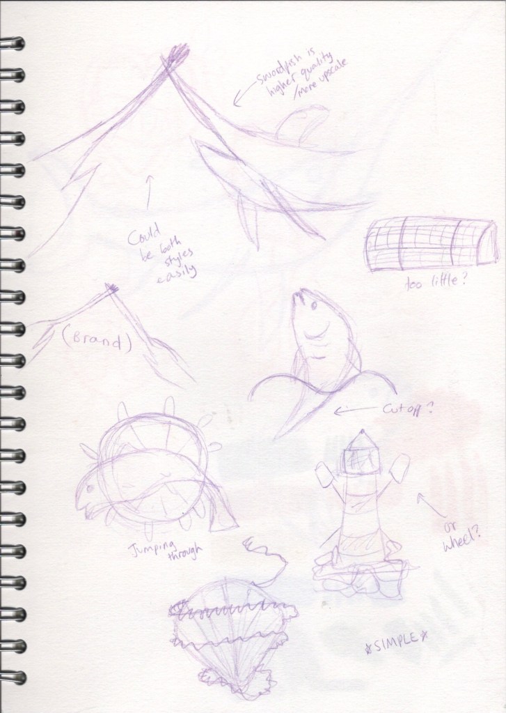
This, thankfully, helped me a lot with choosing content. I was inspired by the images I saw when researching that contained both sea creatures and an object, like the fish wearing a crown or the lobster holding champagne. I liked the idea of combining one object with one creature and creating a narrative with the two. I had an extensive list of objects to pick from, and a handful of animals I was eager to draw, so I began sketching out ideas.
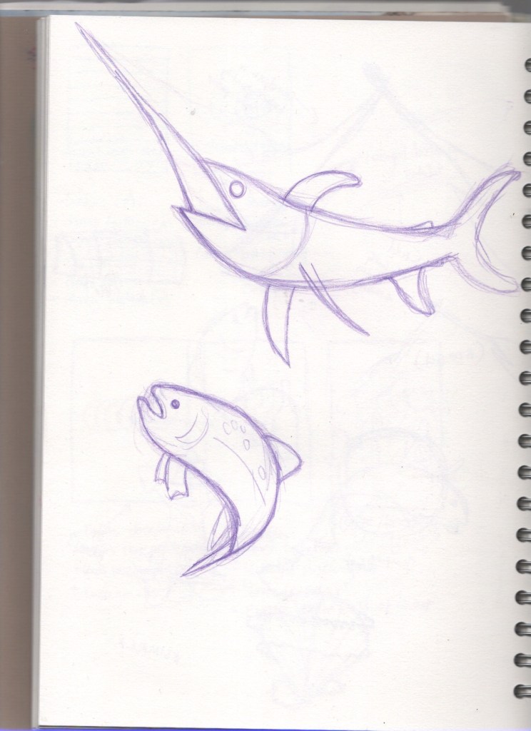
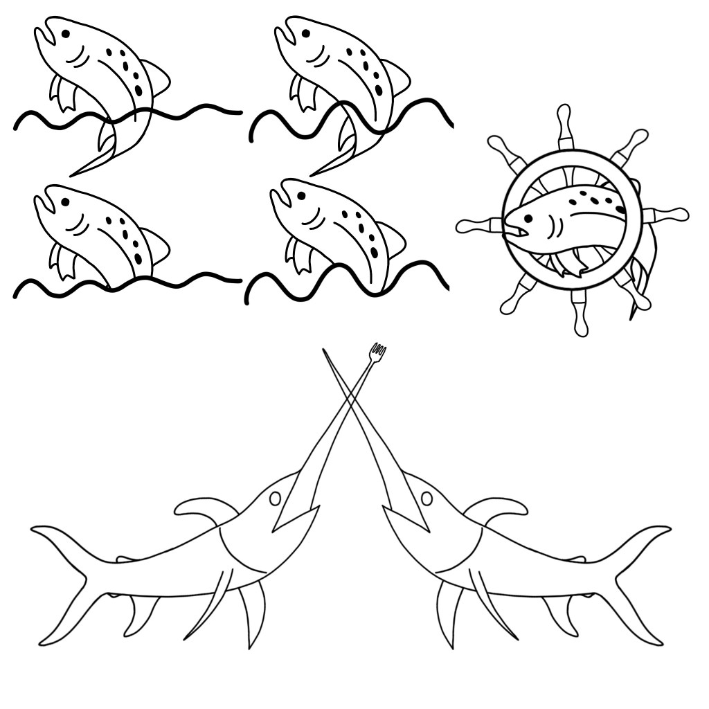
Initial ideasSketches of a swordfish and a salmon, used as a base for my line visuals
My favourite of the ideas I had were the two swordfish engaged in battle, with a fork and a knife as their swords, and the salmon in water/in the wheel. I drew out a swordfish and salmon in order to scan them in and recreate digitally. At this point I wasn’t sure whether I would be using the ink drawing style, or the solid vectors, so I made sure whatever designs I created could be fully illustrated in either style. Once I had created some line visuals, I decided to share them on my Facebook profile and ask my friends which they thought suited the brief best, as I was stuck on which I preferred.
Selection of line visuals that I posted on Facebook
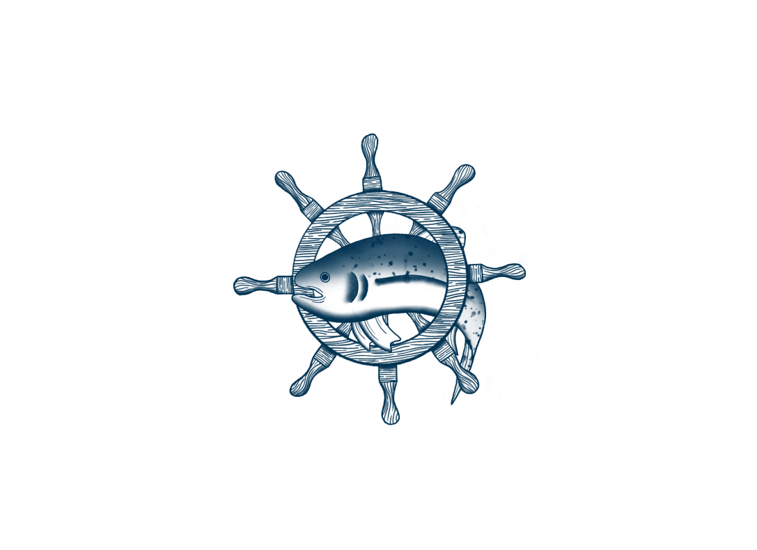
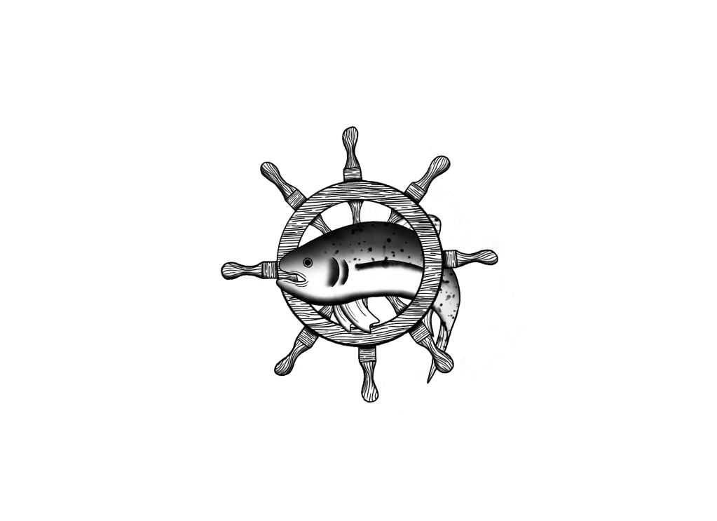
I got around 40 responses, with an overwhelming number of people preferring the salmon drawings. The general consensus was that the salmon in the wheel was most appropriate. After hearing varying opinions, I agreed with this, and I started getting excited about executing the final design. The design could very easily be either ink drawing or vectors, but the more I thought about it the more I felt my style was more in keeping with the ink drawings. I also felt the wood grain of the wheel lends itself well to this sort of design.
Unfortunately, none of the time-lapse recordings for this exercise have properly rendered. I think the issue is that I started my canvas with a sketch that I later deleted, which has caused the videos to show a completely black screen. My process in producing my final illustration was to use a fine ink liner brush and draw varying textures and lines. I also added some gentle shading with airbrushing tools, and used these to indicate colour variants in the salmon.
Finished logo before colouring
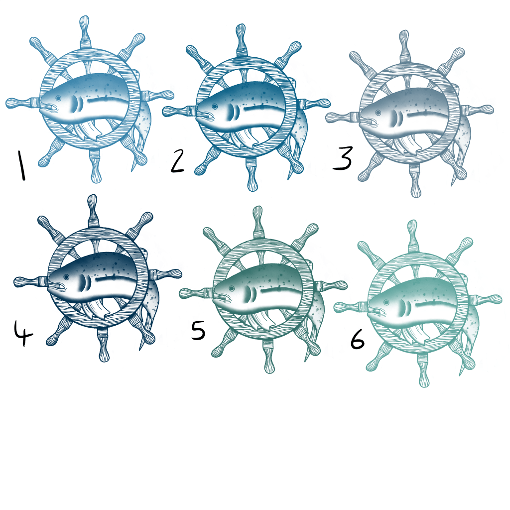
I then picked some colours from my colour palette, opting for a single colour to ensure simplicity, and tried out how they would look on the design. I wanted to go back to my previous audience and see how they felt about the final design and potential colour options, so I picked 6 variants that I thought looked the best and presented them to my Facebook friends once again. The results were pretty split between options 2 and 4, which meant it was up to me to decide which was best. I picked option 2, as I felt the darker blue was too moody and went against the bright and contemporary vibe the restaurant has.
A selection of colour optionsThe final coloured illustration
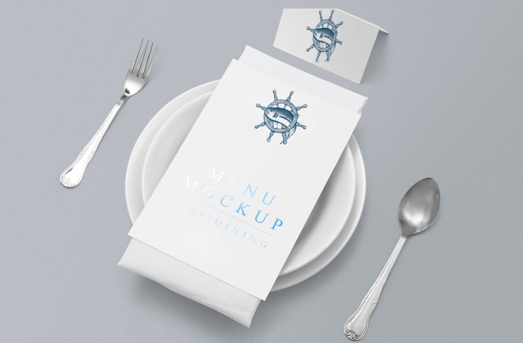
To finish, I attempted to place the illustration on various pieces of stationary, menus, and vans, in order to see how it would look in a real world setting. I found this incredibly difficult, mainly due to the fact that mock-up templates for the objects I wanted were very difficult for me to come across. I’m still struggling with where the best place to find mock-ups is, especially as a student (I.E, I won’t be using them commercially and I can’t afford licenses), and also with using mock-up files with the software I have. I did manage to put the logo onto a menu, and I love how it looks.
Mock-up of a menu featuring my design
Overall, I really loved this exercise. Being able to fulfill briefs and apply research is a super enjoyable process for me, and I love seeing my designs come together. Polling my friends on their opinions was a great idea and helped me enormously, so I think I’ll do this more often when struggling on progression. I’m really proud of my final design, and I would actually consider adding it to my professional portfolio!
In this exercise, I was asked to produce a cover illustration for a natural history book aimed at children ages 7-11. The title of the book was Animals from Around the World. The illustration needed to encourage children to choose the book from a library shelf or in a store. I had to draw up three ideas as coloured client visuals and include information on the final size, format, and where type will be positioned.
I began by looking at existing children’s book covers in order to find themes and similarities between them, and to ensure I would be meeting my target. Luckily, in Exercise 22I had touched slightly on children’s illustrations whilst exploring the watercolour medium, so I had a slight idea of how the covers would look. I created a Pinterest board and filled it with examples of illustrated front covers. Whilst looking through the board, I took some notes on patterns I noticed throughout. I was focusing on how characters – especially animals – were depicted, the other content featured, how type was used, and consistencies in stylebetween artists.
When looking at the notes I made on the content of the Pinterest boards, I noticed the following recurring themes:
Handwritten, playful fonts – often incorporated into the illustration itself
Variation in size and shape of text
Very stylised drawings
Simple colour schemes, only a handful of colours used in each illustration
Generally light, bright, soft colours
Lots of pastels and muted tones
Emphasis on textures – natural ones especially
Simple, uncluttered scenes. One or two objects, lack of background, very basic focal mechanics
Lots of animals, nature, fun characters – animals that are characters themselves
A lot of empty space used to draw in the eye and create emphasis
The majority of the illustrated books I could find on Pinterest seemed to have educational leanings, but I did want to specifically look for nature and natural history books, in order to see if they were any different. The key differences I noticed were the usage of text – often the text was capitalised or bold rather than being more handwritten and illustrative – and that the focus of the images was the text itself, rather than any characters.
Based on the findings from my research, I decided to use either watercolour, collage, or digital mediums to create my final illustration. These mediums seemed the most present in the illustrations I looked at, and they lend themselves to the styles and colours commonly found within children’s books. I had also begun getting ideas for content for my illustration, so my next step was to explore these further.
The brief of ‘Animals from Around the World’ is quite generalised. There are so many animals in the entire world that could be featured here. Initially, when hearing this title, my brain conjures up standard zoo creatures – lions, tigers, zebras, giraffes, elephants, etc. However, the majority of these animals are from the Sahara desert, which doesn’t quite meet the ‘around the world’ brief. In order to counter this, I wrote out 6 of the 7 continents – accidentally forgetting about Antarctica – and began jotting down animals from each of them. At first, I picked mostly well-known mammals. Then, I went back and added reptiles and birds, and some fish too, and ensured I wrote some slightly more obscure options.
Young children often gravitate to what is recognisable, so it is unlikely they will pick up a book decorated with animals they haven’t ever seen before. But, likewise, the appeal of a natural history book is that it features educational and new material, and parents are also involved in the process of buying children’s books. I felt it was important to include a mix of well-known and lesser known animals, to appeal to everyone involved.
My shortlist of relevant animals was as follows:
Africa – Lion, Elephant, Giraffe, Zebra, Crocodiles, Ostrich Asia – Panda, Tiger, Elephant, Orangutan, Komodo Dragon, Hornbill Europe – Fox, Badger, Moose, Squirrel, Bat, Salamander, Owl North America – Wolf, Bear, Bison, Polar Bear, Eagle, Alligator, Snakes South America – Llama, Sloth, Anteater, Monkeys, Toucan, Macaw, Piranha, Iguanas Oceania – Koala, Kangaroo, Kiwi, Emu, Snakes, Kookaburra
I then collected reference imagery for each of these animals, in order to get a feel for them. I had several ideas for layouts and narratives at this point, so I created some thumbnails and began sketching. My first idea was to have a stage with a variation of animals on it, and a banner above stating ‘animals around the world’ – almost like a world showcase. The second idea I had was to do a diagrammatic illustration showing where each animal is from on a globe. My third idea was to pick one feature character for each continent, and to draw them on the front cover, imagining that they would feature throughout the book as characters teaching you about where they come from and the other animals that you can find in their homes. These characters would tell the story, so to speak, and the cover would be where you first meet them.
My fourth idea was based off a realisation I had while collecting reference material that there are a lot of variants of similar – or the same – animals throughout the world. There are numerous examples of this: Indian and African elephants, Bengal and snowy tigers, variations on snakes and birds and even bears. I thought it would be cool to see these animals looking in the mirror and a regional counterpart to be looking back. I struggled with developing this idea, however, and ultimately didn’t progress with it. My final idea was to illustrate a simple cover with text as the focal point, as seen in the natural history books I researched, featuring a selection of animals around the text.
My initial idea thumbnails
My favourites of these ideas were the diagrammatic illustration, the animal characters telling the story concept, and the simple natural history book design. I tried to develop these ideas further but was struggling to do so on paper. I switched over to Procreate, where I have a bit more freedom to cut and paste and change where things go. In order to do this, however, I needed a canvas size. I Googled the most common children’s book sizes, and picked 3 that I thought would fit my ideas best: 8×10 inches, 8×8 inches, and 10×8 inches.
Developed ideas in procreate
After sketching out rough ideas and placements, I decided to sketch the animals on paper before scanning them in as the basis for my line visuals. This gave me a chance to draw the animals in several different styles, and in varying amounts of detail. I decided to begin with my world map idea, so I focused on creating ‘headshots’ of each of the animals I would be featuring. I picked two from each region, ensuring I had a healthy mix of well known and slightly more obscure creatures throughout. Once they were scanned in, I created a simple line visual and made some slight changes to where various elements were placed. I also tried out some different text placements until I found one I was happy with.
Sketches of animals
Time lapse of work on map colour visual
Next, I began adding colour. I found this part of the process quite difficult. It was less that the idea of colour blocking was hard, and more that I wasn’t sure how much I needed to communicate. I didn’t want to do too much at this stage, wanting to avoid wasting my time on perfecting the colour visual trying to keep it from looking artistically ‘bad’. However, I also felt that without adding the textures, shading, and detailing that I normally would put in an illustration, much of the image would be lost. Looking at the final colour visual as a stand alone illustration, I hate it – but it isn’t a final illustration, there’s a lot more work that I would put into it, and that’s something I found hard to accept. Leaving the work unfinished and ‘bad’ was hard for me.
I moved on, nonetheless, to the 6 characters design, essentially repeating the process as above. I used the same sketches as I did for the headshots, and drew bodies onto them in Procreate. This step probably could’ve been done with a bit more precision and care – I think I was overwhelmed with having 3 colour visuals to finish, and I was very cautious about not spending too much effort and energy on each piece. I was thinking that, if I was working with a client, they would pick from the 3 the concept they enjoyed the most, and I would go back and do more sketches and studies to perfect my finalised designs. This actually ended up being my favourite final design, so I feel like I’m slightly more critical of it and of my process.
Time lapse of work on characters colour visual
For my last colour visual, I wanted to do something a bit different. As I was unsure whether I would use collage or watercolour for the final illustration, I wanted to give an example of how that might look. Creating a colour visual for collage is very difficult, as I discovered. In future, I think I’ll most likely create a colour visual like the ones above, and then use collage techniques to fill the spaces. My idea was that the finished illustration would look somewhat like the work I produced in Exercise 22, but I feel like the final colour visual here looks rushed and messy. I almost feel like I simultaneously spent too long and also not enough time on this piece. I love the concept and the idea behind it, but the half-finished execution does not look great. I also, upon reflection, dislike the colour scheme I used.
Time lapse of text-focused colour visual
This exercise was overwhelming due to the amount of content required and my feeling that nothing was done to a high enough standard. I’m struggling to find a balance between enough and too little, which I think is something I will hopefully get a handle on over time. I have a tendency to overwork myself and give more than I need to, and doing anything less than that feels inadequate. When I have a brief like this, one that requires multiple unfinished (or finished, for that matter) pieces of work, I need to figure out how to distribute my time and decide which parts are important to perfect and which I can let slip a little. Hopefully, though, this is something that will come through practice and further engagement with similar briefs.
From the perspective of the brief, however, I absolutely loved this exercise, and I enjoyed both getting to illustrate animals and create content for children. Illustrating in this style and for this audience is something I would love to carry on with, and in some ways aim to do long-term. Figuring out my style and how I like to draw various things is exciting, and learning that I enjoy drawing animals this much was great! I just wish I could be more okay with my unfinished work. Staring at it feels like a challenge, and I just want to hide it from the world. This is a good but difficult thing to do for me, for sure.
This exercise was focused on learning how to create for specific audiences. I had to produce three illustrations to be used as a series of A3 posters to publicise a museum. The posters had to each target one of the following audiences: Children ages 5-9, Teenagers, and a general adult audience. I had to select one object for each of the audiences and create an image centered around that. I was asked to consider whether I wanted the illustrations to be a ‘family’ or very different, and how I would make the same exhibition interesting to many groups of people. I had to produce colour visuals of all three posters, and complete one of them.
To start with, I began researching the three target audiences to get a clearer idea of my market. It made sense to me to start with the youngest audience and work from there, so I began by researching marketing strategies aimed at children. I found this article by Concordia University St. Paul (CSP) which states that children influence the buying habits of their parents, which makes them a key target demographic for marketers. More relevant to the exercise, the article included the statistic that children influence family trip destinations 94% of the time – this would make them a crucial target market for museums, as appealing to a single child can bring a whole family’s worth of traffic.
Another article I found, hosted on Socialnomics, was clear about the need for caution when coming up with marketing campaigns specifically aimed at a young audience. The article stated that ‘many kids are savvy enough to detect when someone is being inauthentic … out-of-touch pandering creates negative brand perception’, meaning that children know when they’re being talked down to and that advertisers must be careful to avoid pushing too hard to be relatable and patronising their audience in the process. This tied into the suggestion in the exercise brief that I should avoid playing into stereotypes and generalisations.
I then researched how marketers approach advertising to a teenage audience. I found an article on Business.com which outlines tips on how best to market to teens, opening by saying ‘when it comes to reaching young people, technology and trends are key’. The article stressed the importance of having a ‘cool factor’ – meaning that any brand wishing to capture a teen audience’s attention must remain up-to-date with new trends and always remain current. Business.com also observes that teens are a socially-conscious demographic and are drawn to brands which ally themselves with social justice causes. I thought about ways I could incorporate this into my poster in order to appeal to the teen demographic, especially in the wake of the current social justice movements such as Black Lives Matter, environmental concerns, and LGBT rights.
I struggled to find reference material for marketing toward a general adult audience, as this is incredibly vague and can encompass just about anything. When I think about how something geared towards this audience would look, I feel as if it would be more sophisticated, boring, and have more of an educational focus than the previous two target markets. I also feel, however, that young adults share many qualities with the teen category. Due to advances in technology there is a lot of overlap between the interests and popularised content that teens and young adults engage in. This is also a contributing factor to why its hard to gauge what a general adult market might enjoy. I decided to start looking at pre-existing museum posters to see if I could understand this market better and begin generating ideas inspired by what’s already out there.
I mostly used Pinterest to find these posters, though I also looked on Behance and tried to use Google but didn’t have much luck. A consistent theme I noticed is that even the most modern posters were heavily inspired by vintage designs and seemed to blend the contemporary with the vintage, as is often seen in current designs. They were all very illustrative and artistic – this could be due to the fact that many of the posters were for art galleries, but even the museum posters had central illustrative elements. This was definitely inspiring to see and it helped me get a get a sense of what needed to feature in my own posters, especially regarding text and text-based content.
Almost all of the posters I looked at used a sans-serif font, and often opted for dramatically curved and smooth lettering, whilst also intentionally leaving certain words in lower case. This really added to the ‘modern vintage’ vibe. There were numerous examples of families of posters which was really useful for getting an idea of how my own family of posters could ultimately look. I also noticed that the ones that seemed to be aimed towards children tended to use playful illustrations featuring children and animals with lots of bold colours and plenty of texture. I decided these were important elements that I would try to work into my own poster.
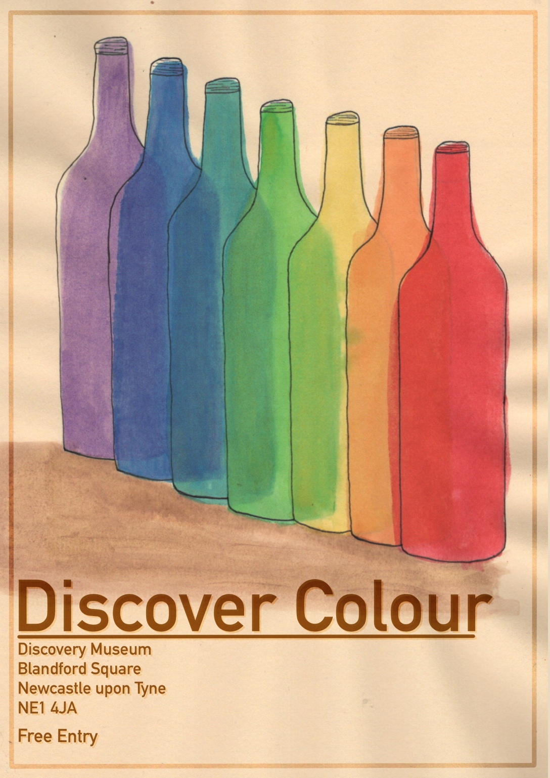
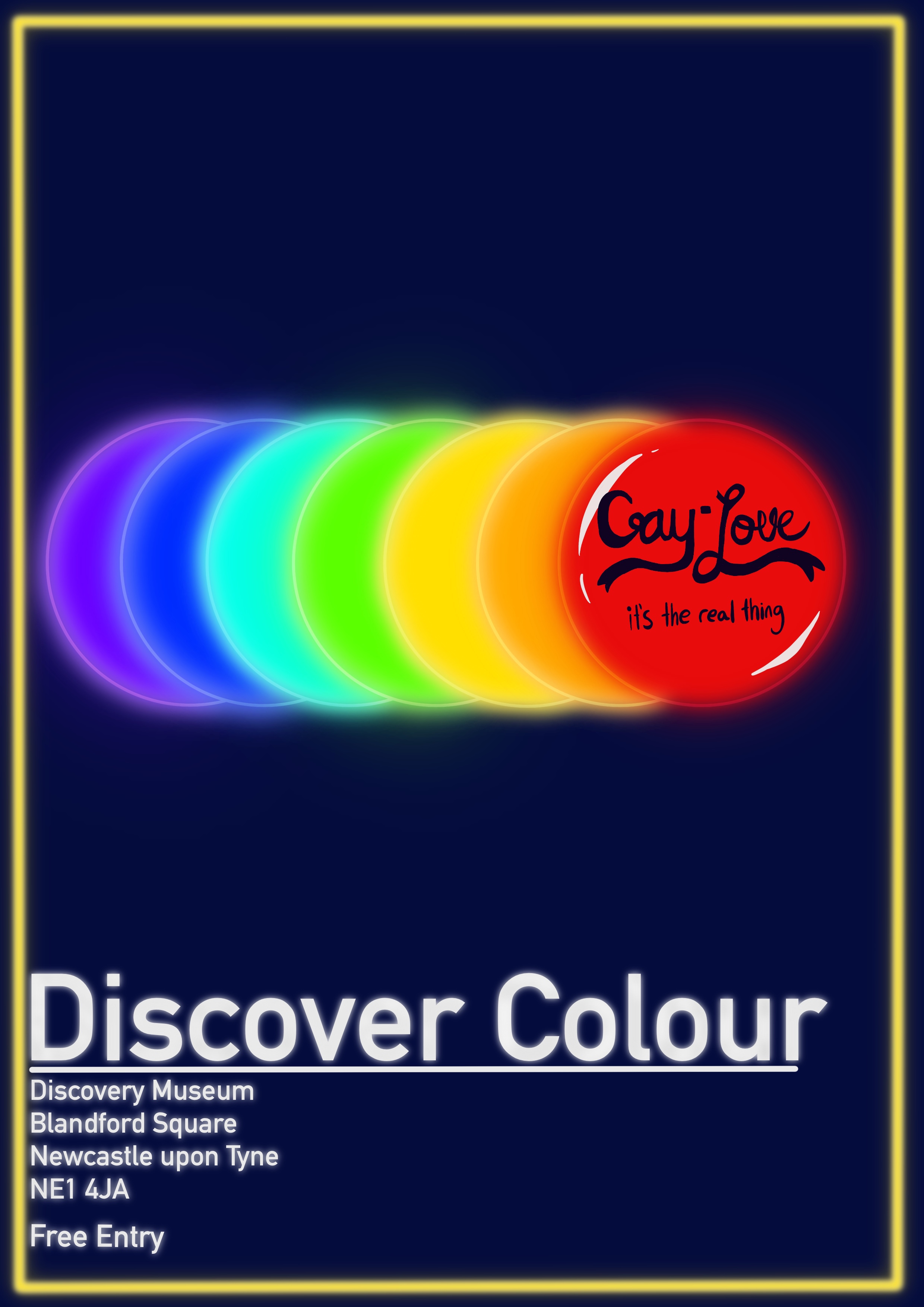
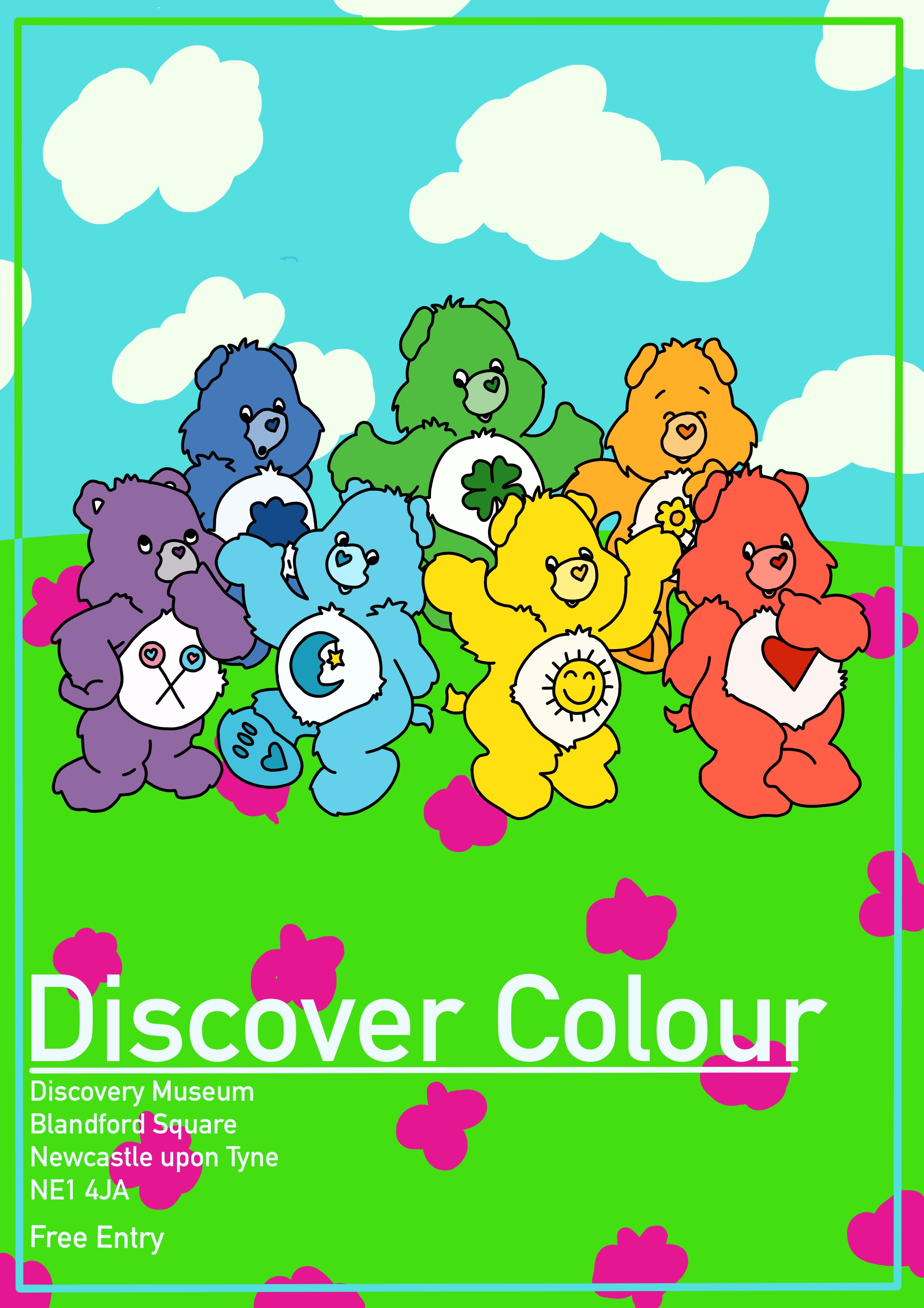
The exercise brief asked me to visit an exhibition in person and document it. Due to COVID-19 there are currently no exhibitions available to do this with. I would’ve loved to have visited my local museums for this exercise, and I’m sad that I wasn’t able to. Thankfully, many museums and galleries have started featuring online tours of their exhibitions. At first I wasn’t keen on them as they aren’t as immersive or engaging as real-life exhibits, and it took a while for me to find one I was inspired by. The Discovery Museum in Newcastle, my favourite local museum, has an online exhibition called Colourful Discoveries. As a lover of colour this exhibition was fascinating and the concept felt like something I could easily work with.
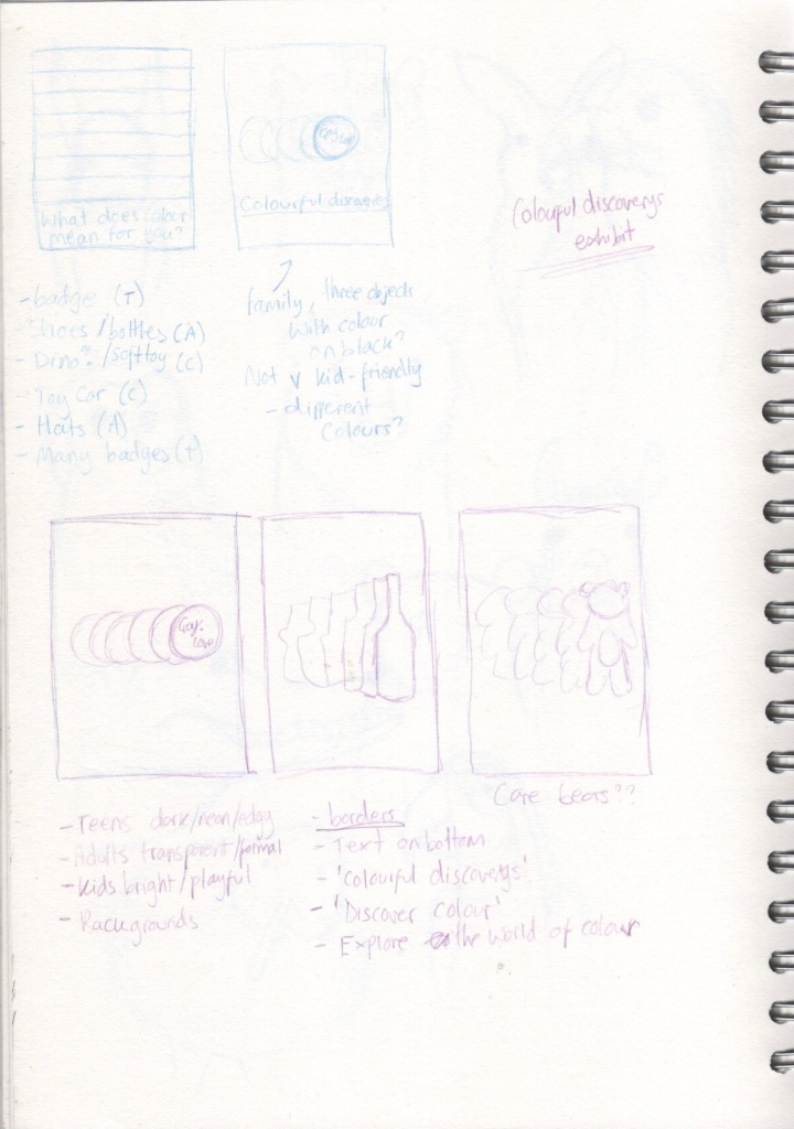
Next, I had to pick one object for each of my posters. I really liked the ‘gay love’ badge and felt it fit the teen profile really well, as I’d already established that the teenage audience is drawn to social justice movements. I thought the illustration could centre around one badge, or maybe many. For adults I considered shoes, bottles, or hats for my object. This was the hardest audience to work for, as it was so broad and generalised. The objects all felt a bit boring and there was nothing connecting me to them. I also found that the lack of resources detailing how to market to such a wide audience left me stumbling around in the dark a little. For children, I considered plastic dinosaurs, soft toys, or toy cars. These felt appropriate to the market and featured heavily throughout the exhibition.
My initial ideas
My idea development for this exercise was pretty rapid. I umm’d and aah’d around which objects would fit best, but the central concept came quickly to me and felt like a perfect idea. My first idea was a very brief pride flag style poster with the words ‘what does colour mean for you?’ written at the bottom – aimed at a teen audience – but that was scrapped once I focused on the badge concept. I definitely wanted a family of posters, and I thought they would tie in together really well if I did one repeating object in all the colours of the rainbow. For the teen poster I would design a bold, edgy, neon illustration of the ‘gay love’ badge repeated in every colour. For the adult poster, I would do a more formal upscale poster, using muted tones and transparency in the colours, featuring wine bottles in repeating colours. And for the children’s poster I would feature Care Bears in bright bold eye catching colours, perfect for this concept as they already come in a wide variation of colours. I also wanted to feature identical borders and text on all three to further tie them together.
I moved into Procreate to begin sketching out some more finalised concepts. Frustratingly, I didn’t save these sketches but they are visible in the progress videos below. I began by creating a border and adding the text I wanted and duplicating this canvas so I had 3 copies. This meant I could work with the exact same framework for each one. Then I sketched out the general shape of the objects and began lining them. As the posters were relatively simple, there wasn’t much sketching involved as I could just repeat objects. However, for the children’s poster, I was conscious of the fact Care Bears are a known brand and that they would have to be properly represented. I chose to trace the general outline of some pre-existing care bears for the colour visual as I wanted them to be recognisable. If I was working with a client on a paid project, I would likely not choose Care Bears as they aren’t my intellectual property.
Video of my design process for the ‘teen’ poster
Video of my design process for the ‘adult’ poster
Video of my design process for the ‘childrens’ poster
Next, I started blocking in colour for the posters. This was difficult as finding the line between colour visual and finished artwork is hard for me. I always want to just complete the entire illustration as I feel it doesn’t look ‘good enough’ when left as a colour visual. For the teen poster I tried to evoke a neon light feel to it. I’m not sure how well I achieved this, but I guess it’s unfinished work. In the adult poster design, I intentionally offset the lineart and the colouring, attempting to go for a sketchy watercolour style. And for the children’s piece I went as bright and bold as possible. When I put these three colour visuals together, I feel they are cohesive and fun. They are really exciting as I feel they could actually be used for a museum exhibition. I really like how the concepts have turned out. My only real criticism is that the children’s poster isn’t entirely my work. Had I have chosen this poster to fully illustrate, I would definitely have tried to draw the characters myself, or I would have picked a different theme.
My three poster colour visuals, shown side by side to portray how they link together
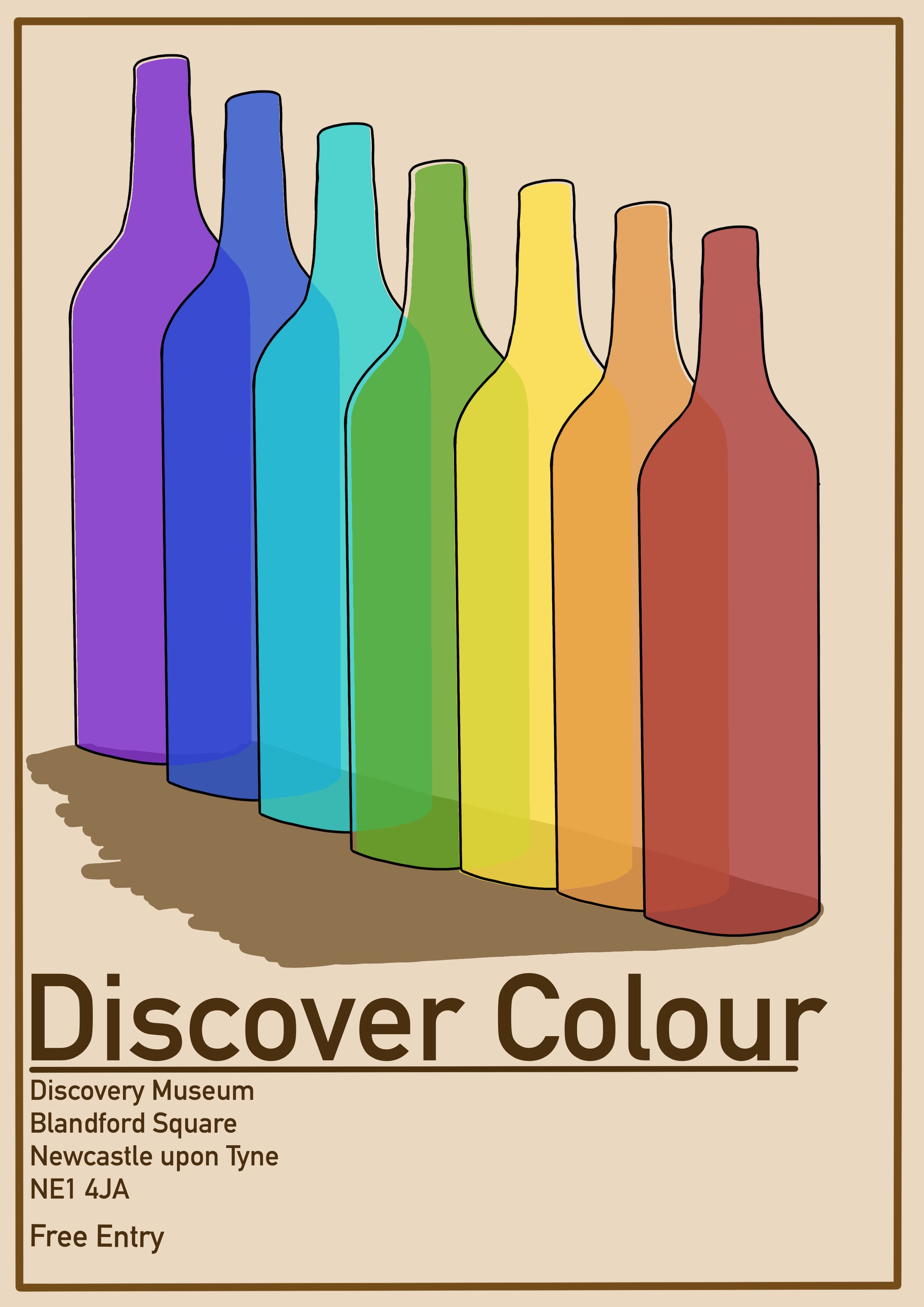
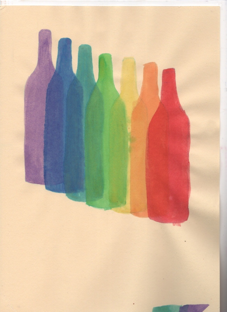
Originally I wanted to research how to create a perfect neon effect and further develop the teen poster. However for Christmas I was gifted a set of drawing inks – a medium I have wanted to explore for a long time – and I felt they would look fantastic if used for the general adult audience poster. After swatching my colours I set up a palette with some watered down rainbow tones. I picked darker colours and, where necessary, mixed inks together to get the rustic ‘old and and sophisticated’ feel I wanted. I then printed an A4 copy of my line art to copy onto some pastel paper. I picked this paper as I wanted to have a slightly cream/brown background, and I knew from experience that this paper held up well when wet.
In hindsight, I probably should’ve experimented with this a bit. The paper crinkled and I couldn’t get it to flatten again no matter how hard I tried. This meant the final scanned in product didn’t look anywhere near as polished as I would’ve liked. If I did this again, I would stain a high quality piece of watercolour paper using coffee or tea bags, then paint my illustration over that. In fact, using ink instead of tea/coffee may work even better as ink is not water soluble.
I traced my design onto my paper using a light box. I also ended up regretting this decision, as the pencil was very dark and I had to erase it before painting, and then the lines were too faint and I couldn’t make out what I was meant to do. I would in future leave the lightbox on and paint the design without sketching it out first. This way I could be sure I was doing the right thing. Then I got to paint the bottles, the thing I was most excited for! I began with the furthest away bottle, with my goal being to layer them over each other working my way towards the red one. I was a little too overenthusiastic, however, and did not leave enough drying time between layers. I think this is a pitfall of digital art, you get so used to instantaneous results that waiting for things like paint drying don’t occur to you! I know that ink dries waterproof, but sadly I didn’t know how long it took for that to happen.
The ink painting of the bottles for my final illustration
I forced myself to slow down and take breaks between each layer. I still managed to mess this up several times, but overall I think it looks okay. Once I finished painting each bottle I added some linework. I was intentionally messy and disjointed with this as I wanted to capture that sketchy look Ihad envisioned. I also added some bottle cap detailing as I felt the bottles were a bit plain without. I think this added to the piece massively, and I really like how it looks. Finally, I scanned in the painting and added the border and text to it, tweaking the colours slightly to make it all fit.
My final illustration
Illustrating this piece was a huge learning curve for me – largely because I was using a medium I haven’t ever used before – but also because I was forced to leave most of my work unfinished and messy. I feel disappointed with my results because of this. I know they could all look better and have more potential, and I know if I re-did the final illustration with a lot more experimentation and practice, it could be perfect. But, I am also trying to embrace these things and try to view them as part of the learning process. Being okay with unfinished work is an important step in my artistic journey, I think, especially coming from a place of perfectionism. The insight I gained from the research in this exercise, and my confidence in my ability to design for a specific purpose, have both been very rewarding nonetheless.
This exercise asked me to find a range of illustrators who use a particular medium, and catalogue them according to similarities in the way they use tools. I had to analyse the different ways materials can be used, and explore how individual artists have developed their creative practice using them. I then had to recreate previous work of my own in two styles that I felt were visually appealing based on the research I had gathered.
To begin, I thought about the different areas of media I am interested in. It was hard to narrow these down, as I am quite interested in mixed media and exploring mediums as much as possible. I decided to research four mediums that I currently enjoy using and would like to use more going forwards: watercolour, collage, digital design, and ink. Watercolour and digital design are my two focal points currently in my artwork, with ink being a medium I occasionally play around with. Collage, however, I have very little experience with and oftentimes have difficulty using. I definitely find digital collage easier, and I have a deep appreciation for collage art.
The first place I looked was IllustrationX, a website I have had a lot of luck with previously when researching artists. Here I found several watercolour and collage artists thanks to their search system. I also have an art Instagram accountwhich I use to get inspiration, appreciate other artists work, and to share my own. I decided to look there, too, as there are artists I admire who I know use specific mediums I am interested in. I also looked on Behance, as I follow many illustrators there too.
I found many watercolour, collage, and digital illustrators, but really struggled to find artists who used ink as a primary and singular medium. I was shocked to find this as I feel like I see so many ink illustrations in passing when scrolling social media, though maybe these are sketchbook doodles rather than finished pieces. Most of the artists who used ink did so in mixed media, though there are two artists I wanted to mention as their usage of the medium is incredibly inspiring.
Heikala is a coloured ink artist who produces mostly portrait scenes. Her usage of ink is similar to a contemporary usage of watercolour, and in a videoabout her favourite art supplies she explains that ‘[She] had been using watercolours before that for many years, and coloured inks felt like a pretty similar medium’. I love the way she captures scenes and presents shadows and lights. Her work is flat, and matte, which are desirable qualitiesto me. Matt Schumacher works with gouache alongside ink in his illustrations. His work is similarly flat, though looks less like watercolour. It appears he uses ink to add incredible detail and darkened areas to stand out against the gouache areas of his work. The effect is striking and emotive.
Art from Matt Schumacher (top four) and Heikala (bottom four)
A notable distinction between these two artists is the mood conveyed in their work. Heikala emotes soft, gentle, and calm feelings with scenes of young girls in magical and beautiful settings, often using light tones and subtle shading. Schumacher however illustrates moody, dark, stormy works, evoking feelings of loneliness, anger, and a general cold vibe. His usage of ink furthers this contrast, as it is mostly black and heavy. One picture that shares similarities to Heikala’s work is ‘Beach Shack’, however the woman portrayed is older and there is a distinct feeling of power and smugness within it. The positioning of the character combined with the colours being brighter and softer towards the top of the image shows she is ‘rising above’ something.
‘Beach Shack’ by Matt Schumacher
When looking for watercolour artists I ensured I selected a variation in style and context. It’s easy to gravitate towards illustrations and techniques I feel are visually appealing and inspiring and to overlook the wealth of options out there. I chose work from 4 artists: Agnes Ernoult, Mae Besom, and T.S Spookytooth – all of whom are children’s illustrators – and Ollie Maxwell, who specialises in packaging. Watercolour illustrations seem to be favoured for children’s books, perhaps due to the soft and gentle nature of the medium. Choosing three artists who create work for this context allowed me to see the variation in how this can be used.
Illustrations by Agnes Ernoult
Agnes Ernoult’s illustrations are fun, whimsical, and exciting. The colours are bright and bold, and any shadows are subtle and gentle. Any depicted light sources engulf the image and are often a focal point for the image. The subtle background details, presumably added using a fine paint brush and weak paint, enhance the images greatly without distracting from the story. The detail is minimal and playful, and successfully continues the narrative without overwhelming or crowding the image. Her characters are stylised in a dramatic and almost caricaturistic way yet are still in keeping with the uplifting mood she conveys.
Similar techniques and styles can be seen in Mae Besom’s work, with soft colours, gentle shading, and a whimsical vibe to them all. The detailing, however, is more subtle and blended. There is less empty space and more of a general sense of where detailing could be. Her characters are slightly less dramatically distorted, yet still somewhat stylised. The textures used also differ, as in Ernoult’s work dry brush is often visible, but in Besom’s images the texture of the paper itself combined with the natural flow of watercolour creates its own textures.
Illustrations by Mae Besom
The illustrations of T.S. Spookytooth create a stark contrast to those of Besom and Ernoult. Spookytooth’s storylines and characters seem to favour a darker and more frightening theme, which is no shock seeing as the illustrator’spseudonym is ‘Spookytooth’. These illustrations seem to favour darkness, directly contrasting Ernoult’s love of large bright spaces. Rather than gentle shading being used, gentle lighting is utilised instead, much to the same effect. You could probably invert the colours of one of Ernoult’s pieces and end up with something akin to Spookytooth’s designs.
Spookytooth’s characters are stylised similarly to Besom’s, not straying too far from reality. The way detail is added is almost like a mid point between Besom and Ernoult, bold and obvious, but sparing. The textures used are again similar to Besom’s, taking advantage of the paper and medium itself. It’s incredibly interesting to see how the same techinques reversed can create such vividly different looks, but still be relevant for the same context.
Illustrations by T.S. Spookytooth
Ollie Maxwell’s work is completely different from the children’s illustrations. As the audience of his work is adults, and the purpose is to advertise, there is much less emphasis on the whimsical. His work is much more sophisticated and grown-up. It is still playful, albeit not in the same way as the previous artists. The children’s illustrations are playful in their character design, layout, and usage of colour. Maxwell’s work is typically of stand-alone objects without backgrounds or narratives.
The playfulness in his work comes from the usage of the paint itself, the minimal linework, the overflow of colours, the vague shaping of objects, the purposeful inaccuracies, and the hinting of shapes and shadows. Added textures are minimal and there is a greater emphasis on seeing the object in question for what it is. The designs are very simple, and the usage of white space is very effective and unique when compared to the book illustrations.
Illustrations by Ollie Maxwell
Collage, as a medium, is distinct compared to watercolour in how expressive it can be. There is only so much you can do with watercolour, as the opaque tones and gentle colours are fairly restricting. Collage can look like almost anything, as you have a large range of options for creating texture, pattern, shape, and contrast. It’s bolder and more striking, featuring sharper edges and more abstract designs. A key difference is the use of metaphors and symbolism to infer meaning, rather than illustrating exactly what you want the viewer to see.
I picked four collage artists to focus on, Kavel Rafferty – who often creates work for editorials, Hannah Hock – an illustrator recommended to me by my tutor, and users Griefmother and Dorlabeth on Instagram. Griefmother writes poetry and uses collage to illustrate passages from her work, and Dorlabeth creates abstract pieces fitting various themes. It seems collage is less often used for a specific industry and more used for self expression, experimentation, and pushing boundaries within art.
Illustrations by Kavel Rafferty
I was drawn to Kavel Rafferty’s work as I appreciated the ability to provide narrative whilst maintaining an abstract and free style. She seems to isolate objects within an image and create patterns, or use pre-existing imagery to fill these spaces. The mismatched positioning and carefree line-art and doodling is fun and allows your eye to easily wander around the images. The elements within her illustrations are quite flat and simple, contrasting with the usage of shading in watercolour illustrations.
Hannah Hoch’s artwork is similarly random, featuring overlapping shapes and imagery. Hoch’s work pushes the boundaries of what ‘art’ really is. Unlike Rafferty’s illustrations, Hoch’s don’t have an immediate or obvious narrative. They are abstract and experimental and leave you to form your own meaning. Rafferty’s focus is on objects and scenery, but Hoch’s work focuses more on human form and shapes. Cutouts of eyes, hands, legs, and various other body parts feature frequently in her designs. There is also repetition in individual images, with a specific theme repeatedly referenced. Her work is chaotic and busy, often utilising as much of the available space as possible.
Artwork by Hannah Hoch
Artwork by Instagram user Dorlabeth
The repetition and theming within images demonstrated in Hoch’s work can also be seen in Dorlabeth’s collages. Her work has more of a clear narrative than Hoch’s, but still maintains the randomness and busyness. Griefmother’s work, however, is much more stripped back. The focus is on the words within the illustration, as the images are meant to accompany poetry. Unexpectedly, these collages call back to my earlier discussions of watercolour paintings as the focus is less on the art itself and more on the story being told. Watercolour children’s illustrations will accompany text the majority of the time, and the art is an aide to express emotions and depth within the narrative. Collage could definitely be used in children’s books to the same effect, which is not a connection I had made previously.
Artwork by Instagram user Griefmother
Digital illustration is a huge industry that is gaining popularity more and more each year. It is hard to find an active artist who doesn’t utilise digital software to some degree in their work. Digital artwork can look like anything, with the ability to create traditional looking imagery becoming easier and more accessible as technology advances. Techniques that I have described when analysing watercolour and collage can be used in digital illustration as well, along with various techniques unique to the medium. Illustrations that appear to be mixed medium are commonly seen in digital design, as the ability to do this is so much easier.
Narrowing down a handful of digital illustrators for this research task was a challenge, as there are so many variations in style and usage of the medium. I decided to focus on 6 different artists who have unique styles, but who overlap quite a lot in how they use the digital medium and in what they illustrate. Natalie Orshilevich (user nat_orsh on instagram), Kay Hunt (user ohkayyay on instagram), and Instagram user Byamiee, all have a focus on character design in their work. Marion Blanc similarly often focuses on characters, but also illustrates objects and scenes, similar to Yvette Earl and Freya Niamh of Freya Niamh Design who typically illustrate architecture, cityscapes, and other scenery.
Illustrations by Natalie Orshilevich (1-3), Kay Hunt (4-5), and Byamiee (6-8)
Natalie Orshilevich’s work is very textured, making use of heavy pencil texturing throughout her work. Despite being digital, this technique makes her illustrations look as if they could have been drawn traditionally. Her character designs utilise features we often associate with cuteness, such as overly large eyes and small mouths. The colour palette she uses, combined with the clothing often featured, give her illustrations a very vintage feel. Her work is also quite childlike, both in subject matter and in design. The clouds in the background of the first piece, for example, are incredibly simple, but they are effective at contributing to the overall vibe of the piece.
Kay Hunt uses similar textures to Orshilevich, however her work appears more obviously digitally created, although she uses some scratchy textures which keep her pieces from looking too digitised. She also designs her characters to look very typically cute, with large heads and small facial features. Her style differs from Orshilevich in that her colours are much deeper and richer, with a strong contrasts between subjects and backgrounds. Even her pastel tones are much more intense. Hunt’s pieces also feature natural imagery and convey a feeling of whimsy and childlike playfulness – this can be seen in the stars falling into the girl’s hand in the first image, as they are simplistic and could conceivably have been drawn by a child, much like Orshilevich’s clouds.
By contrast, artist Byamiee uses very little texturing in her work at all, and those that are present are very subtle and intentional. While Natalie Orshilevich’s characters are the most proportional of the three, Byamiee’s characters are the most exaggerated with crazily outsized bodies – while her similarly simplistic smiles are reminiscent of the other two artists, she takes the typical ‘cute’ look to an extreme beyond anything by Orshilevich or Hunt. Her work is the most overtly digital, embracing the styles of the medium and frequently using bold colours like blues, reds, and pinks in order to create eye-catching contrasts, unlike Orshilevich’s washed-out tones and louder than Hunt’s. There is an aspect of the surreal in her work – her characters could be alien or human, as they push human features to almost absurd proportions while maintaining a recognisably human shape. While all three artists depict human forms in incredibly stylised ways, Byamiee takes this experimentation the furthest.
Illustrations from Marion Blanc (1-3), Yvette Earl (4-6), and Freya Niamh (7-9)
Marion Blanc’s style is similar to Byamiee in that is it very obviously digital, making use of subtle textures and bold lineart combined with simple shapes and similar colour palettes of blue, red, and pink to compose her artwork. Where Blanc’s work differs is that her colours are softer and less vibrant, making her images feel more calm and less intense to view. Her subject matter is equally as whimsical, but features much less surreal proportions – the surreal features in her work include placement of subjects, such as the whale in the gumball machine, the moon in the woman’s hair, and the constellations in the swimming pool. A key difference between Blanc and the previous artists I’ve explored is that she doesn’t tend to feature just one main character, instead preferring to portray objects and scenes.
To contrast the styles of the previous digital artists, Yvette Earl’s work is dramatic, bold, and cartoonish. All her pieces feature evening or late-night settings with very dramatic lighting and heavily contrasting colours. There is still an element of unreality to her work due to the intense saturation of these colours and the complete lack of texture. The realistic way she portrays the sky in her pieces also contrasts against the buildings and makes their unnatural attributes stand out. Her linework is relatively messy, evoking that childlike feel present in all of the digital art I’ve looked at so far. Her work is reminiscent of adult cartoons and how their backgrounds often look. I was particularly drawn to her work as it features iconic buildings from Newcastle, where I live, and seeing these familiar locations depicted in such an unfamiliar way felt really unique. It was super interesting to see someone use digital mediums to create art like this.
Freya Niamh’s style uses textured spaces in a way that reminds me of collage. Her work is very ‘sketchy’, which creates a feeling of depth, and she has a very distinct colour palette which she uses to great effect. I really love the sketchiness of her pieces – she very intentionally uses texturing in certain locations to draw the eye and make it stand out against other sections of the piece. Her use of a textured lining brush really helps with this, and it looks like doodles from a sketchbook that have been refined and perfected. She focuses on architecture and scenery for her subject matter, and then adds her own personal spin on it by using her distinctive colour palette – it’s very stylised and unrealistic and almost surreal, which reminds me of Yvette Earl’s work. Both artists use existing locations as a canvas for their own unique style.
Book cover by Kavel Rafferty (left) and work by Marion Blanc, the illustrations I chose to recreate
The next step for this exercise was to pick two pieces of art by separate artists and recreate a previous illustration of my own in both styles. I chose work from Kavel Rafferty and Marion Blanc as a basis to work from, as I wanted to explore these mediums more and I was very inspired by their work. After some consideration I decided to recreate the illustration I produced for Exercise 11, as I felt I didn’t get to explore this piece fully and also that the simplistic black and white nature of the original piece meant I wouldn’t have any preconceived ideas of how it ‘should’ look and would feel comfortable with drastic changes.
Kavel Rafferty’s illustration was made as a book cover for Debrett’s Guide to Entertaining Etiquette. It is a collage-style digital creation featuring a range of textures, disjointed outlines, suggestive shapes, and simplistic colours. I used Procreate to illustrate both of my pieces, as I felt I would be able to best match the original styles this way. I also do not have a great deal of physical collage materials. I had so much fun with this piece! It is one of my favourites to date. I loved being able to explore in this way – fitting textures and patterns and cut outs into a piece. The colours look fantastic and the whole piece really works well together. I feel this could be used for a children’s book or some sort of advertising campaign. Below you can see my full design process. I really want to create more like this in future!
Design process for Kavel Rafferty inspired illustration
I struggled a bit more with the second illustration, as it took more thought and consideration than the first. Collage as a style is very experimental and playful, and you can essentially throw things at a wall and see what sticks. Marion Blanc’s style, however, is a lot more clean and intentional. It took a while for me to feel comfortable with it and figure out how to recreate specific features of her work. Once I had it figured out, though, I loved the design process and I think the finished piece is beautiful. I chose to use the same colour palette as my inspiration but inverted the primary and secondary shades, using blue tones as my background and red tones to add effects. This decision, plus my decision to use a texture filter on the entire piece, made a huge difference to my work.
Design process for Marion Blanc inspired piece
I am extremely happy with the results of this exercise. I feel like I learned so much about the various mediums I am interested in exploring, and the illustrations I produced look incredible and true to their inspiration. I’m also glad they look like my own style too – I feel like I got the midpoint down perfectly. It’s also really fun to see all three pieces side by side: the original, the collage, and the clean digital design. Creating a series like this was inspiring and I would love to work in this way more often.
My finished illustrationsAll three illustrations together
Assignment 3 required me to produce a poster for either an Early Music concert, a Jazz evening, or a pop group. The poster would be reproduced at A3 and would need to include the title of the event, the date, time, place, and any other appropriate information. I had to be sure to include thumbnails and visuals in my process, alongside research and idea development.
I decided to go with ‘pop group’ as I felt I could have the most fun with this brief. At first I was a little confused as to how to illustrate a poster for this context, as a photographed image of the artist performing is what comes to mind when I think of it. After some brief research however, I realised the possibilities were endless!
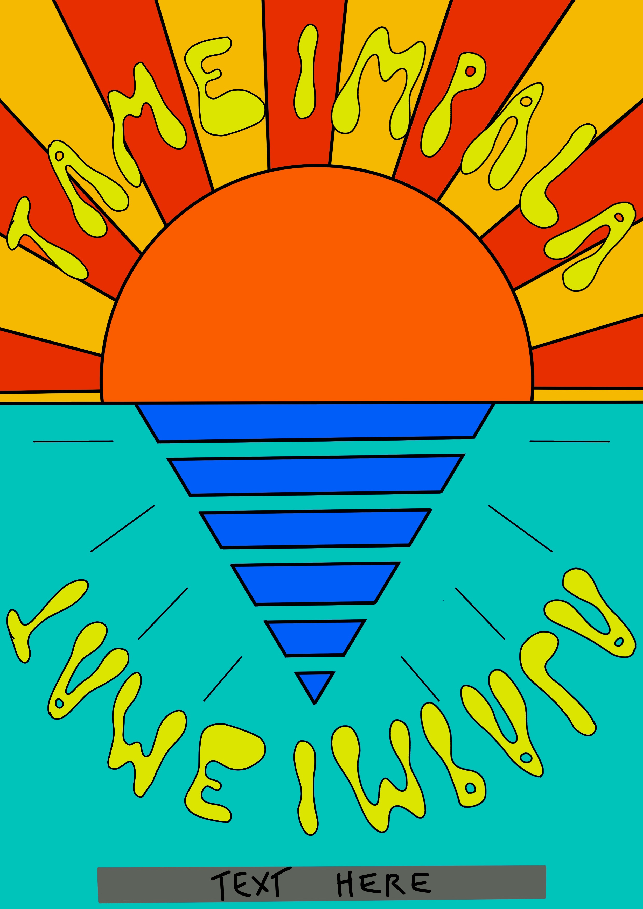
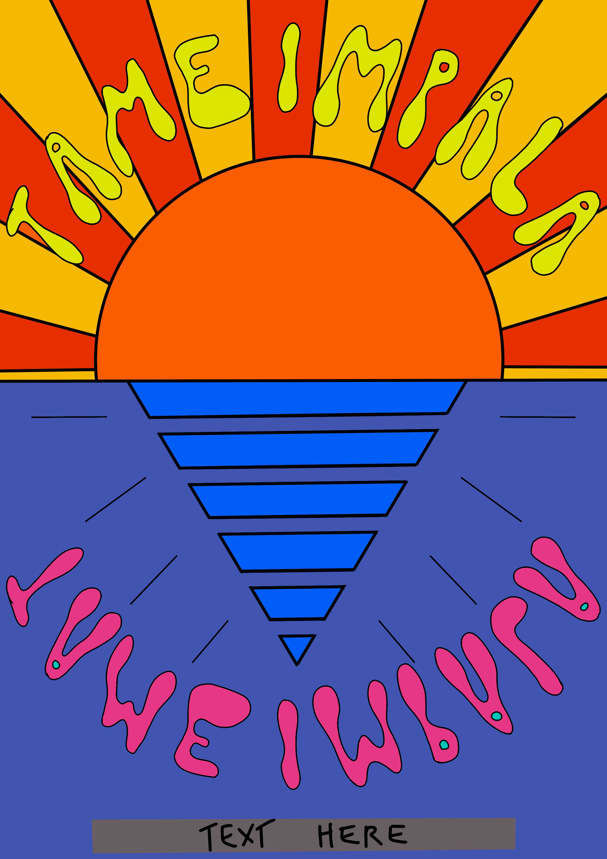
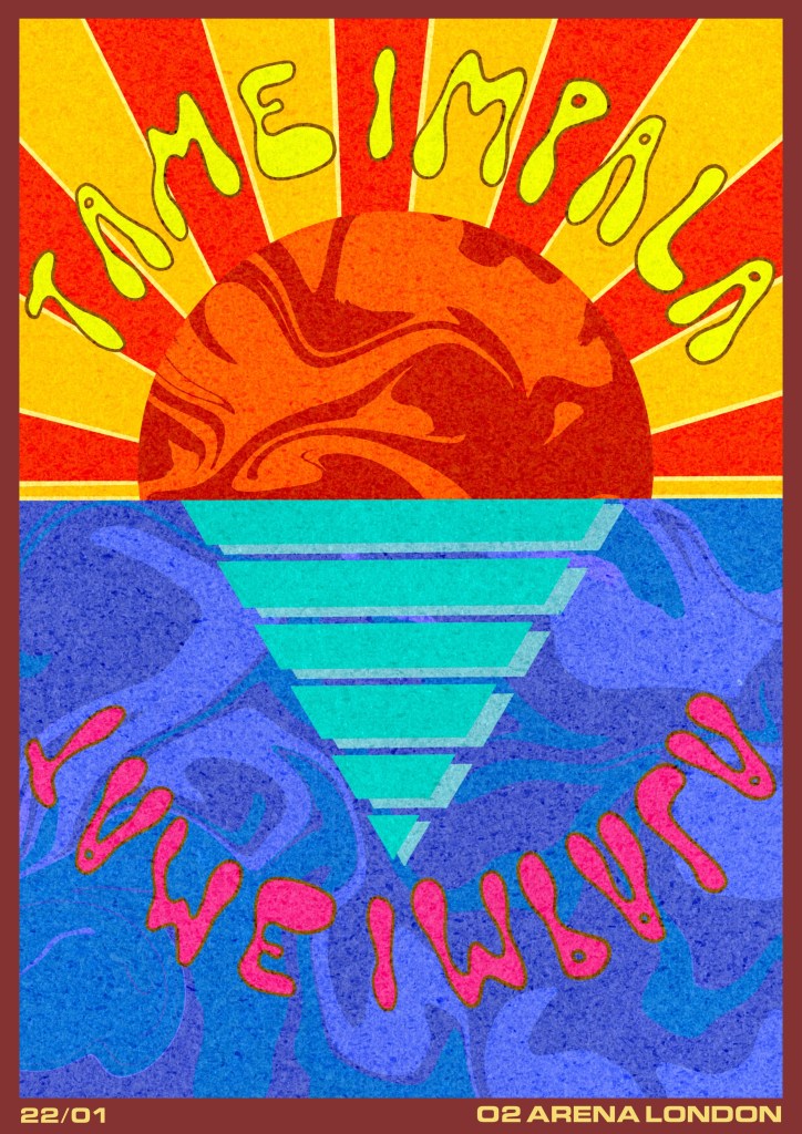
One of my favourite bands, Tame Impala, have a very distinctive style in their poster art. It appeals to me due to how colourful and playful it is. I decided I wanted to ultimately produce a poster for a Tame Impala concert based on this. However, I didn’t want to limit my research to art already created for Tame Impala, so I started out researching other posters out there, including for music festivals and other pop artists.
I listed some of my favourite bands and also looked through the current top 40 chart for pop music, making a list of various artists in order to see their promotional material. I found it interesting thatmost of the art produced for the artists whose music I enjoy were inspirational and the sort of art I enjoy looking at and creating. There was a lot of bold colour, fun typography, and texure. These posters were mostly illustrative and featured either surreal and abstract designs, or album covers from the current tour. Rarely was the band featured on the poster other than in name.
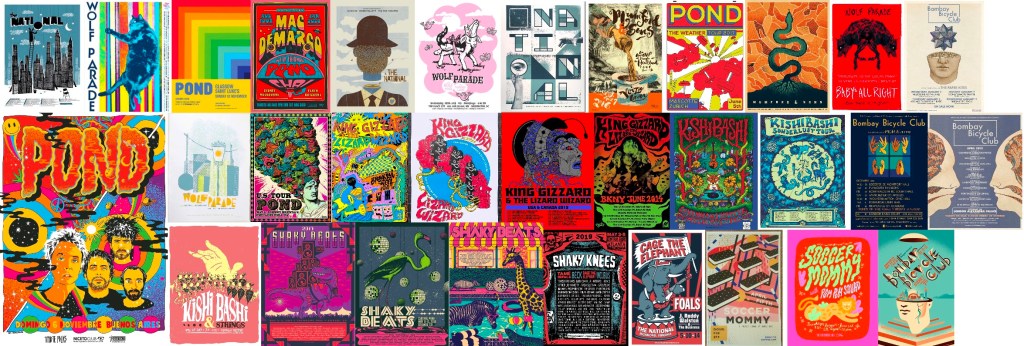
Posters found in my initial research
In contrast, the posters from mainstream pop artists almost all featured photographs of the artist, and very little illustrative elements. They typically had a great deal of text alongside a single image. I think this is probably because so often in mainstream pop contexts, the face of the artist is the brand. They are immediately recognisable and known to almost anyone, even if you dislike them musically. The only thing a poster promoting a large pop group’s tour needs is their faces. The illustrative posters I found for the artists I personally listen to are not for very well-known bands. Their brand is often connected to a specific creative movement, which lends itself to more illustrative and artistic designs.
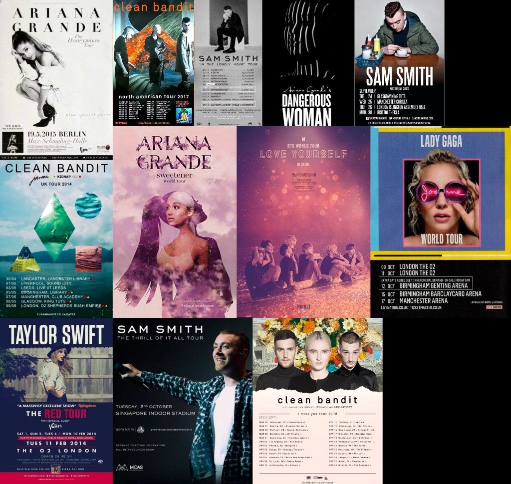
Posters from famous pop artists
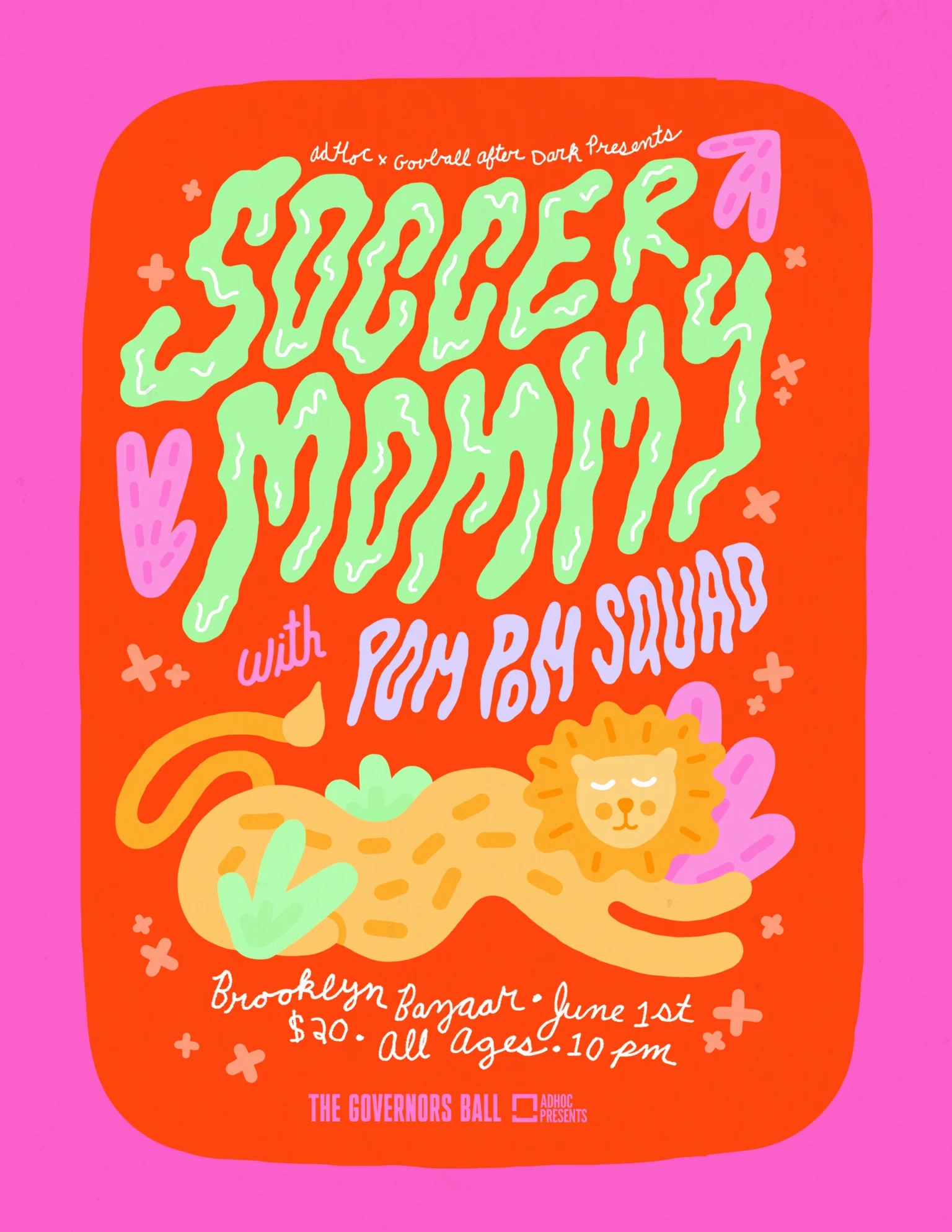
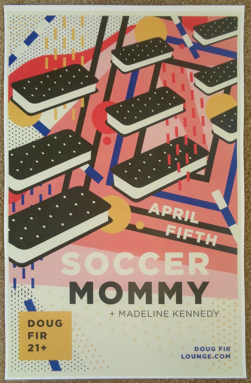
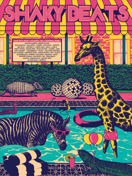
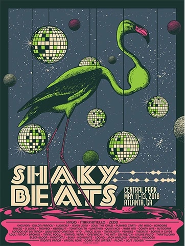
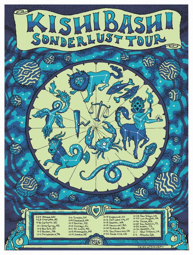
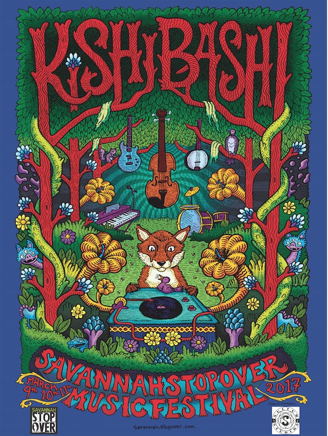
My favourite posters were from the first batch of research – the ones featuring more illustrative and colourful designs. The designs I liked the most were the ones for Soccer Mommy, Kishi Bashi, and a music festival I came across called Shaky Beats. I loved the usage of colour, contrast, and texture, plus the randomness of the content in the images. I especially appreciate how the typography has been illustrated to be a part of the image, rather than awkwardly alongside it.
My favourite posters found from researching
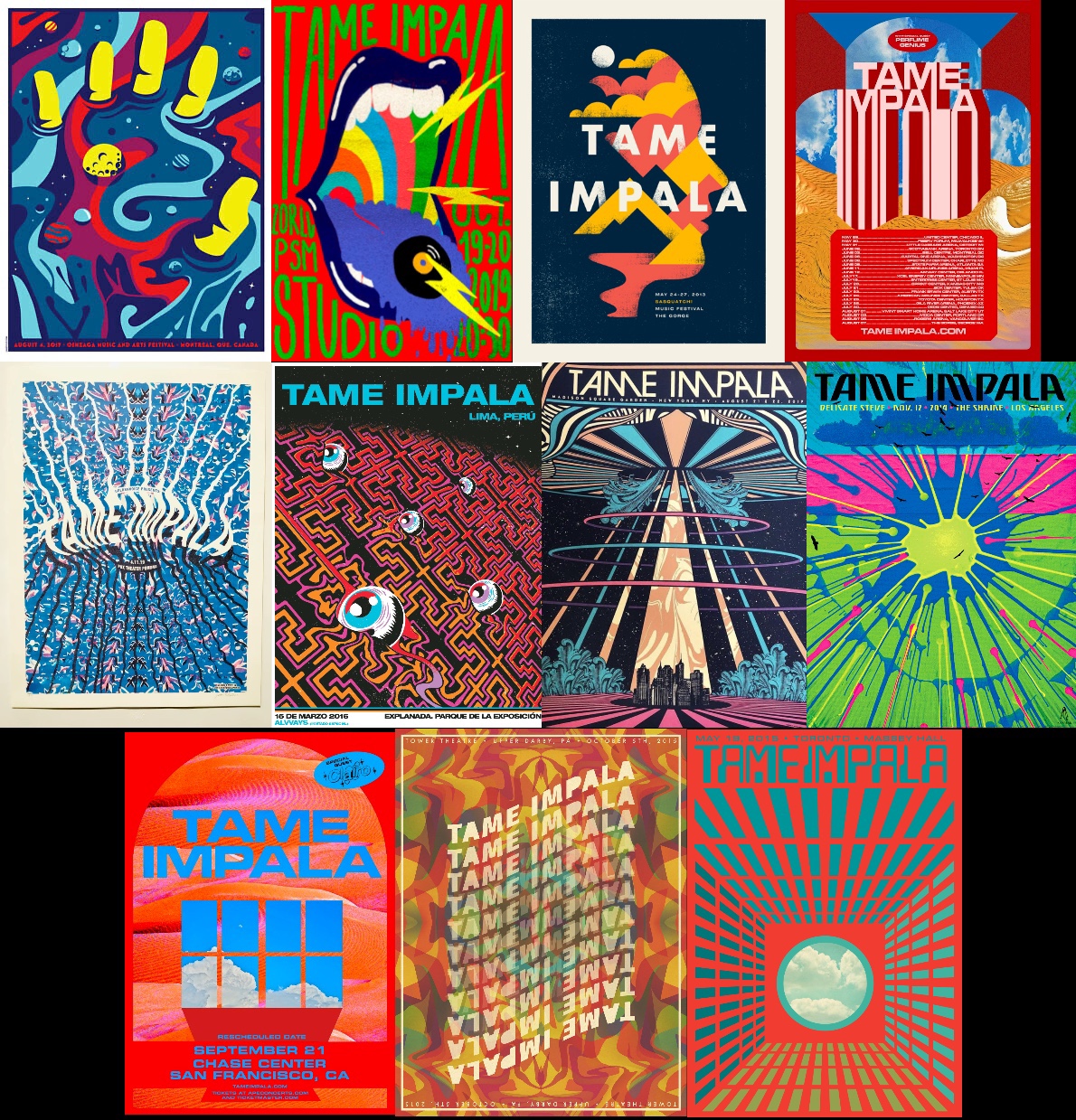
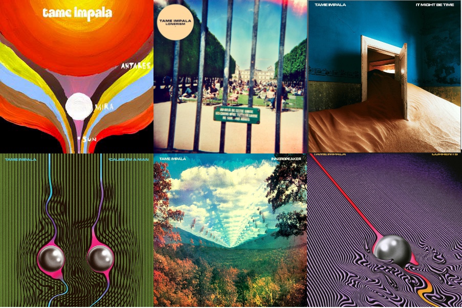
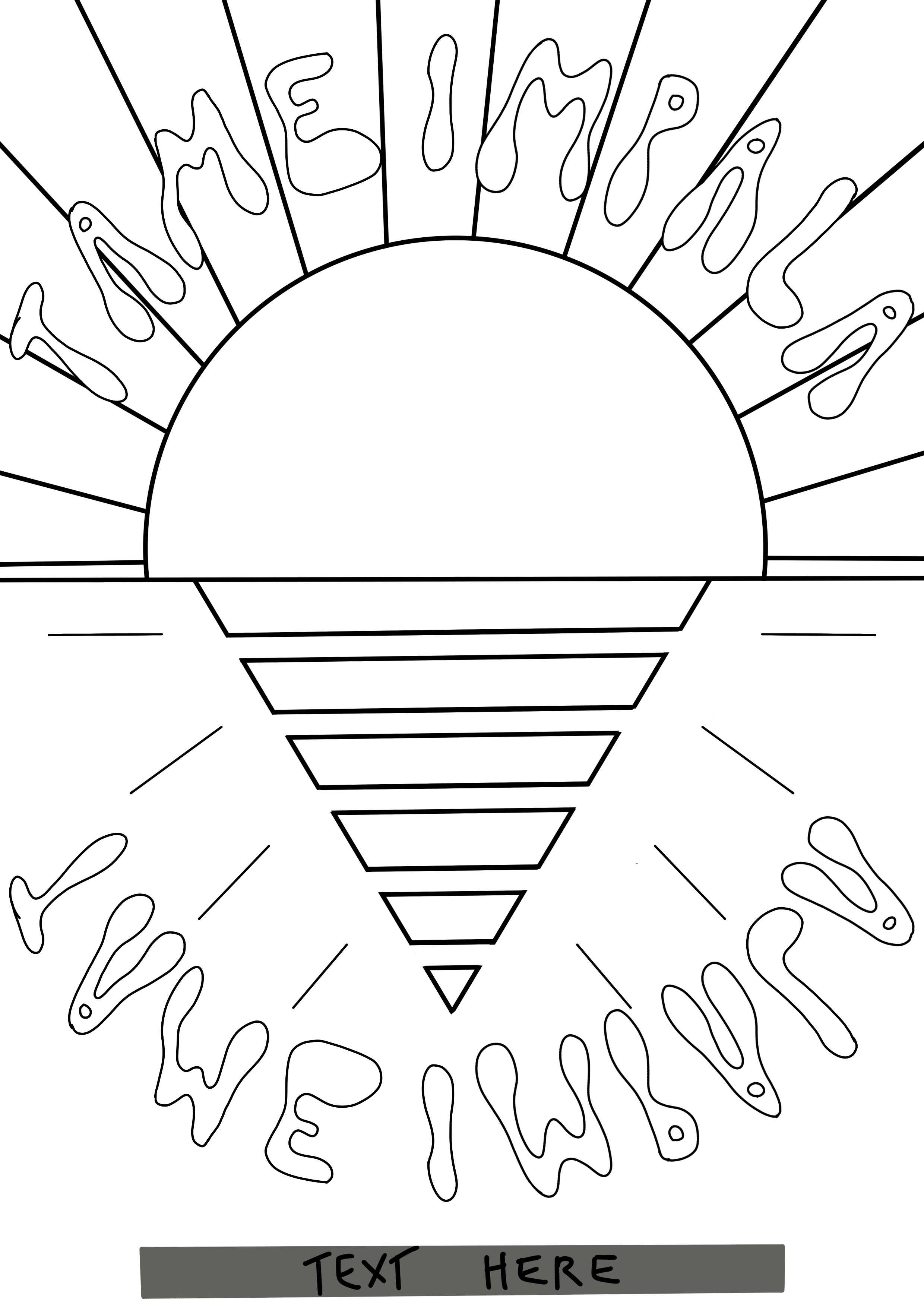
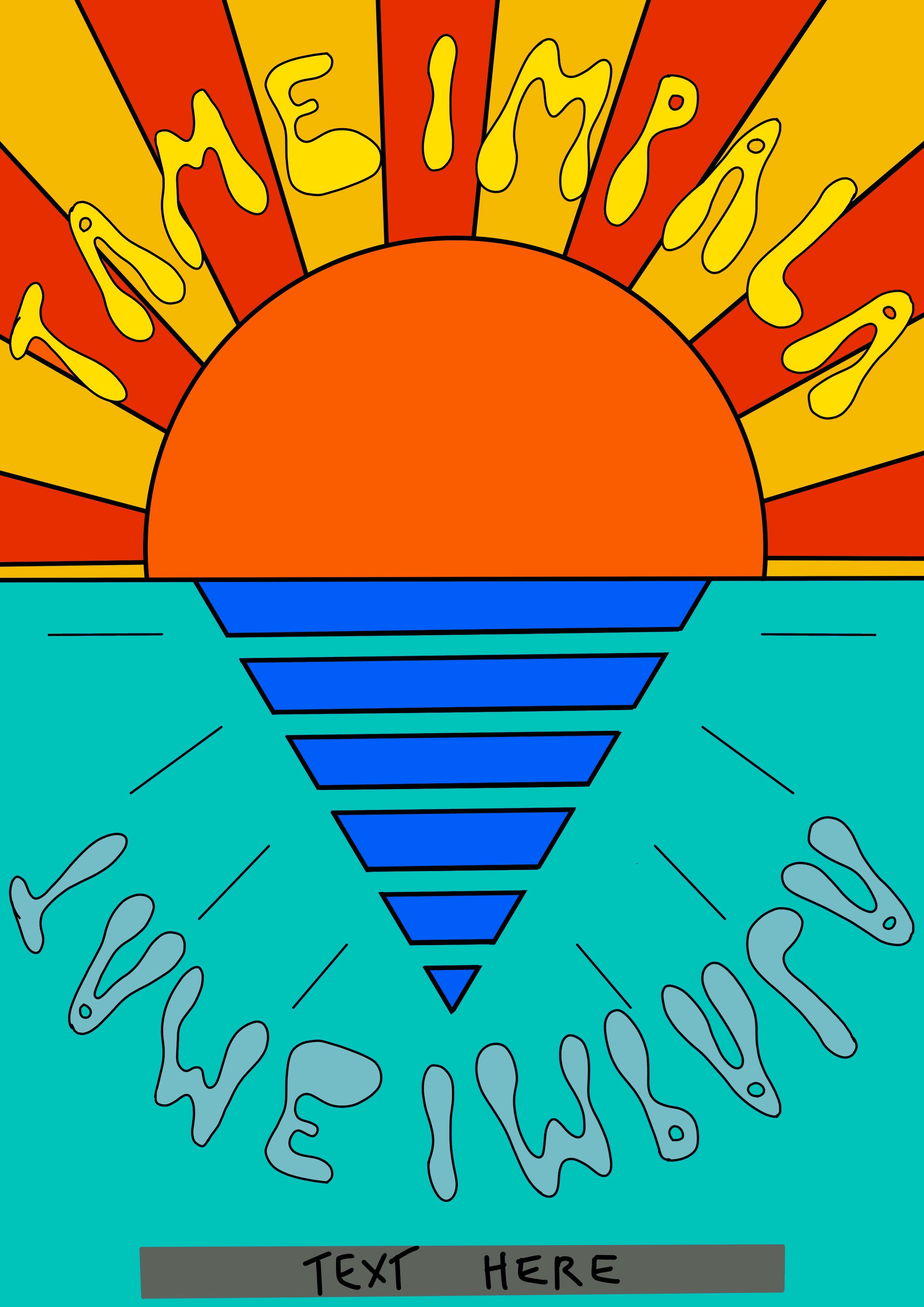
At this point in my research process I already had started thinking of ideas and ways I could explore the content I added to my final illustration. However, as I mentioned before, I’m aware that Tame Impala have a very specific style in their merchandise and promotional materials. I collected various posters from previous concerts and also some album art to reference them. I noticed similarities, for example borders were often added around the main illustration, a similar font – often the same one – is used throughout, the colour palettes are bold and striking, and a lot of patterns are incorporated into the designs.
Examples of previous Tame Impala concert posters, and 6 of Tame Impala’s album covers
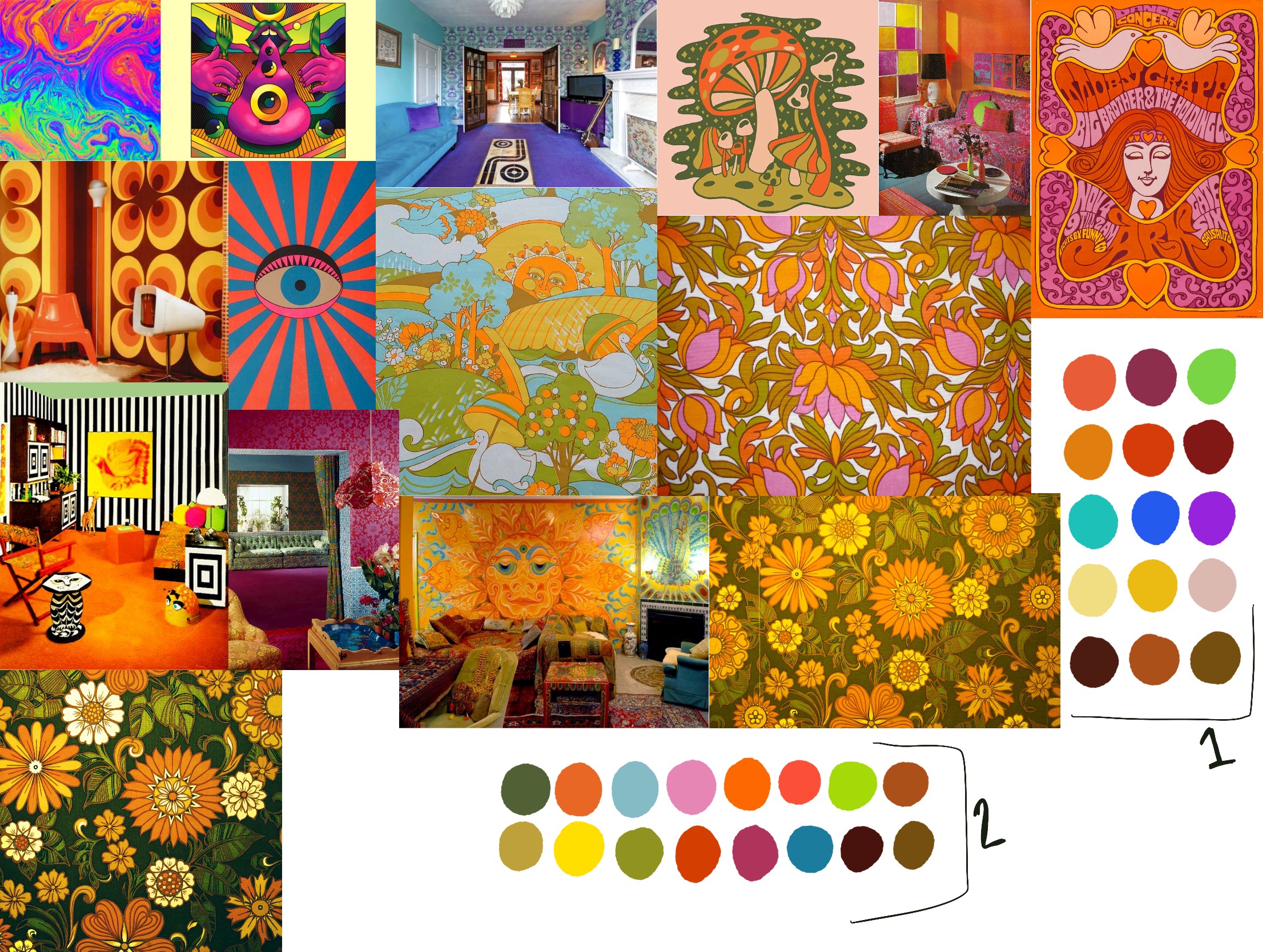
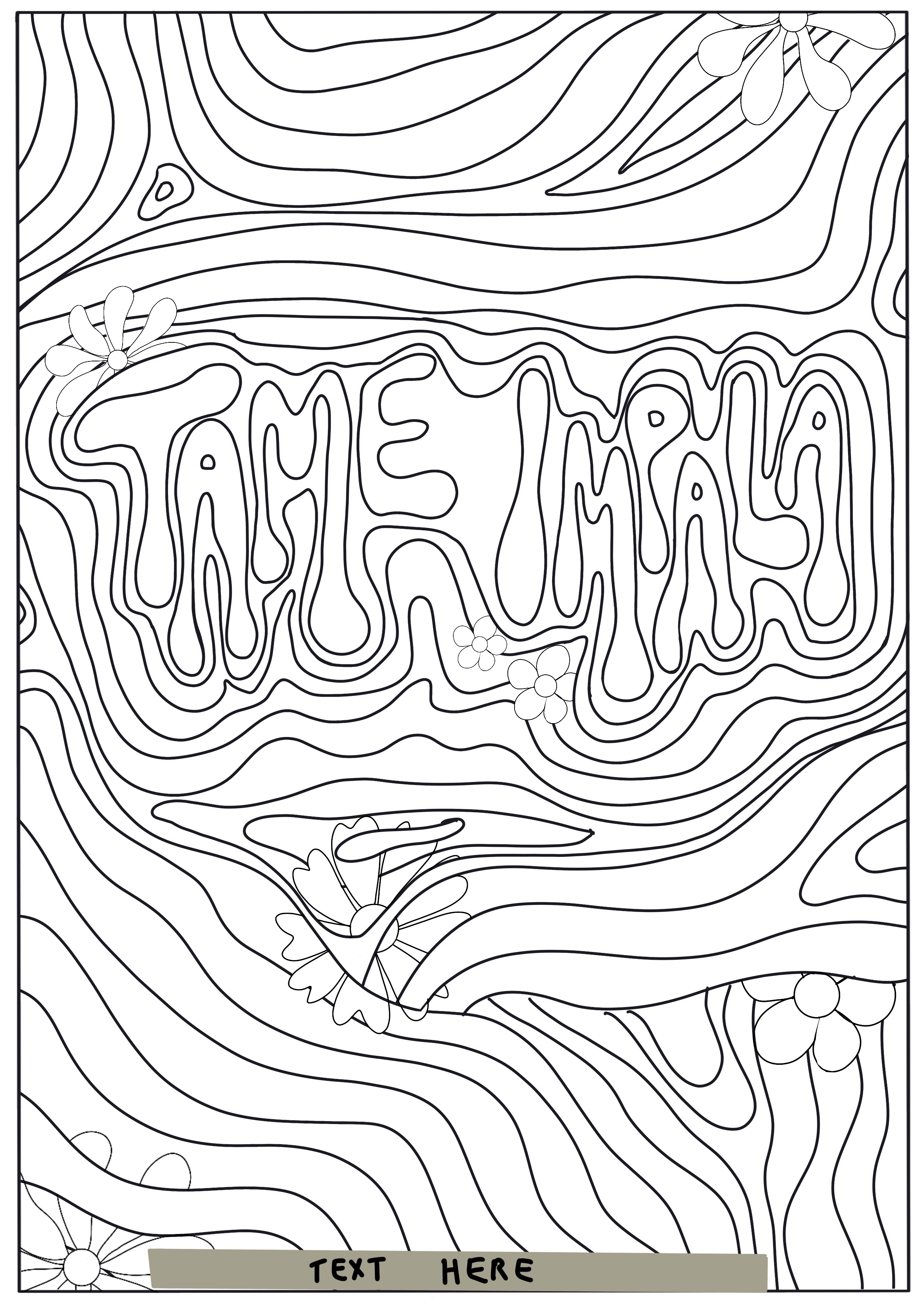
A consistent theme I found across both Tame Impala’s posters and the illustrative posters I had researched earlier is that they drew heavily from psychedelic imagery. Tame Impala musically can be best described as ‘Psychedelic Rock’ – and even those artists that aren’t musically psychedelic had a vintage 60s/70s era vibe to their posters. I decided my next step was to research the era in question and gather reference imagery to inspire both content and a colour palette.
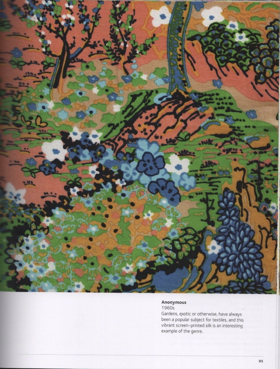
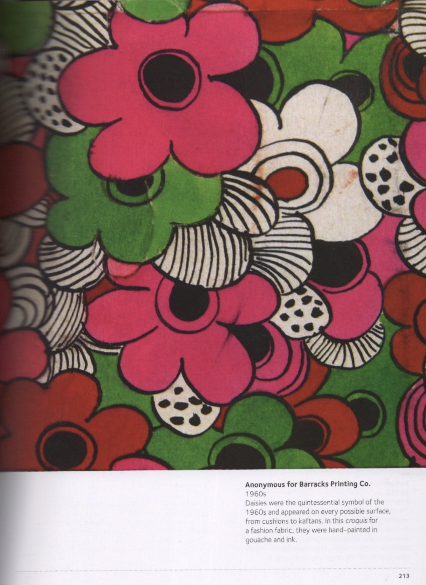
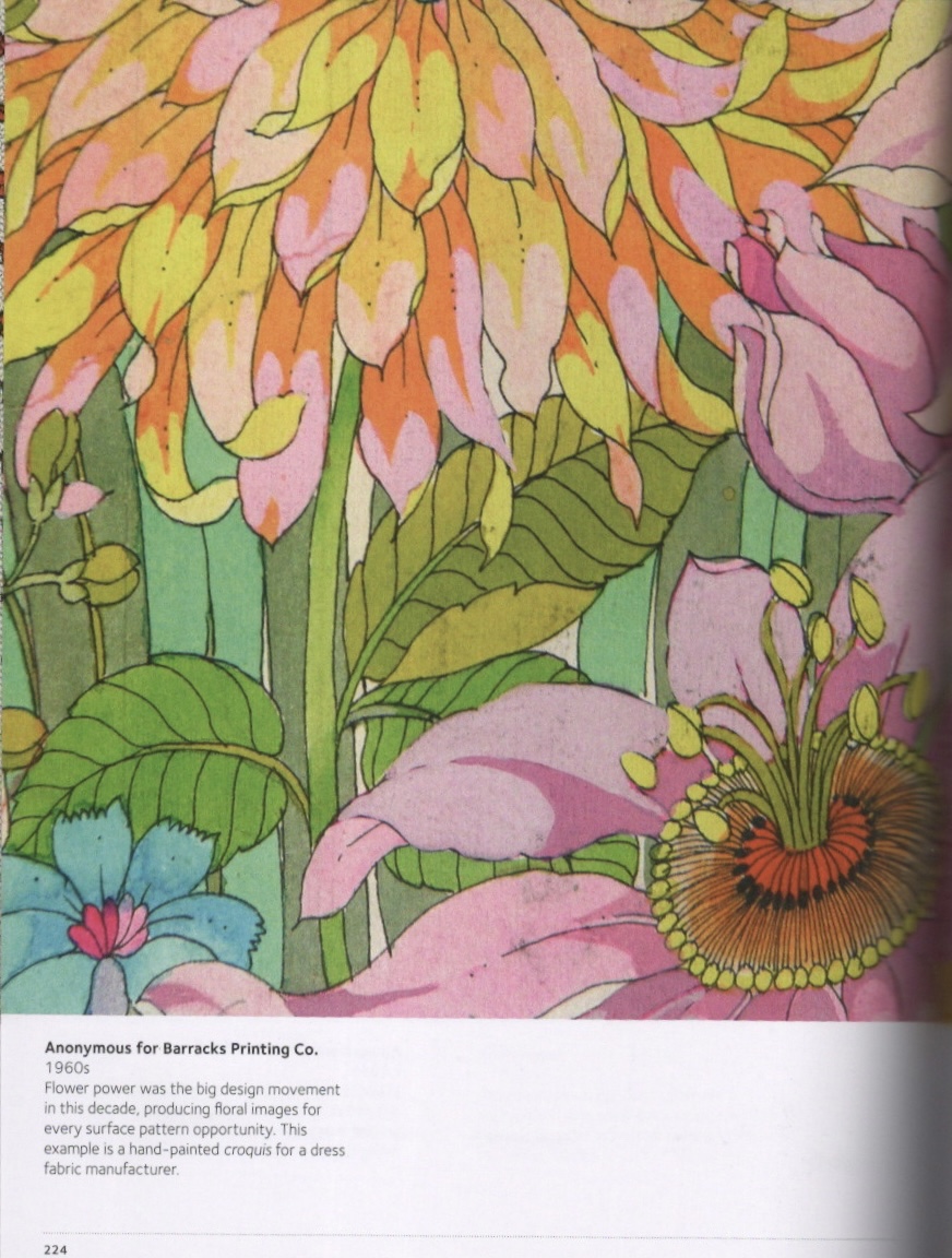
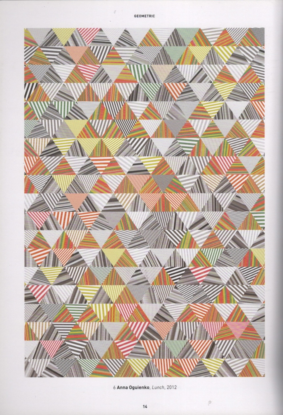
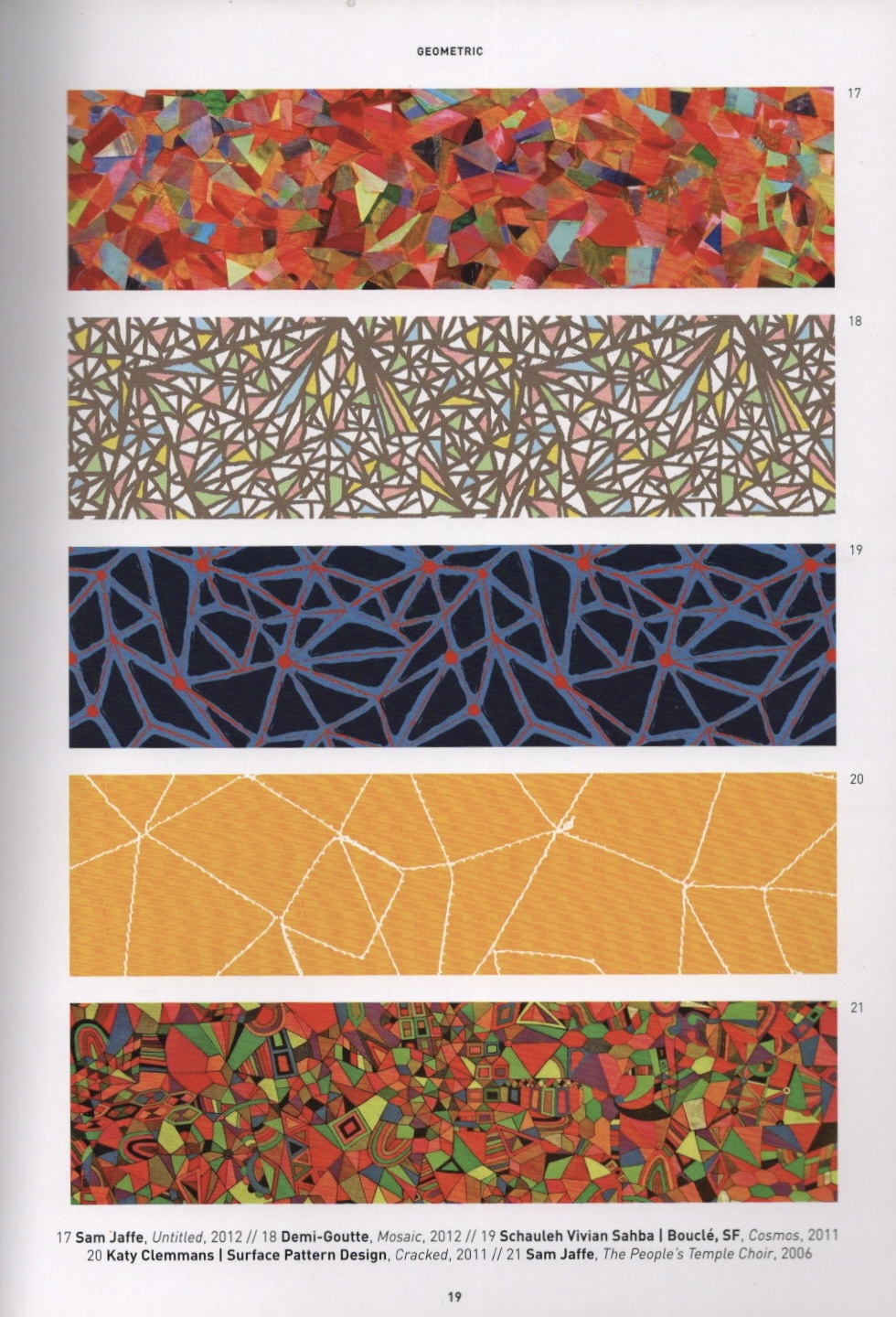
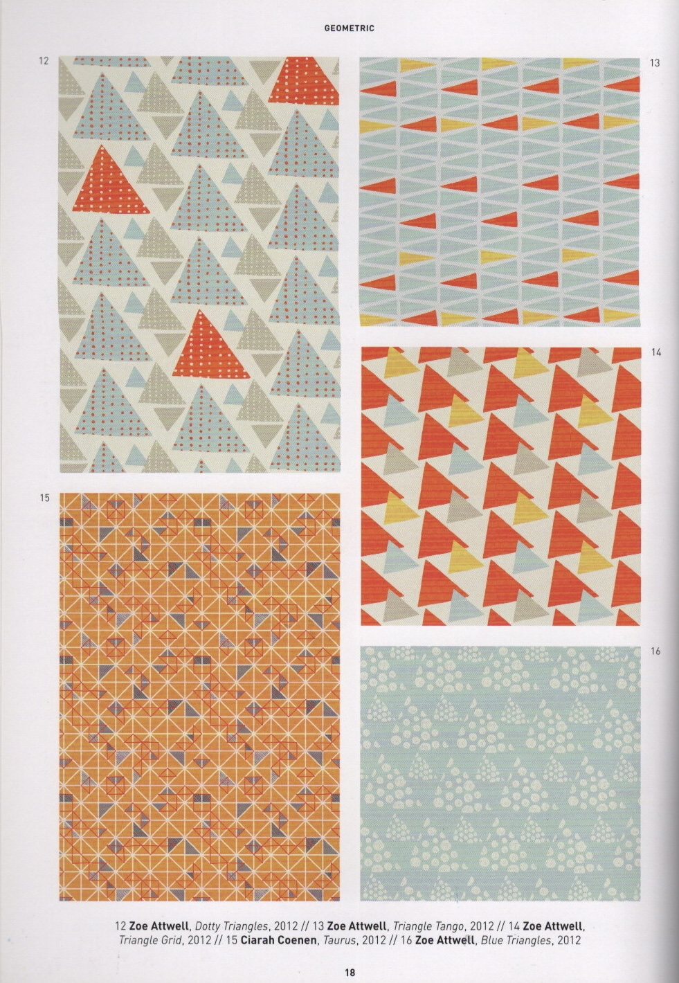
I started by looking at various patterns and illustrations available online. Some of them didn’t seem relevant as modern psychedelia leans towards bright, neon tones, whereas older colour palettes are more muted. I then researched interior furnishings and decor of the time period as I thought they would be useful in determining popular styles of the time. As I knew patterns would be used in my final design, I then used two books – The Pattern Sourcebook by Drusilla Cole, and The Pattern Base by Kristi O’Meara – to find further reference material.The Pattern Sourcebook contains a wide range of historical surface pattern designs, which was useful for gathering material direct from the time period. The Pattern Base, however, contains modern surface design. I used this book to find designs similar to those used in the posters I had collected.
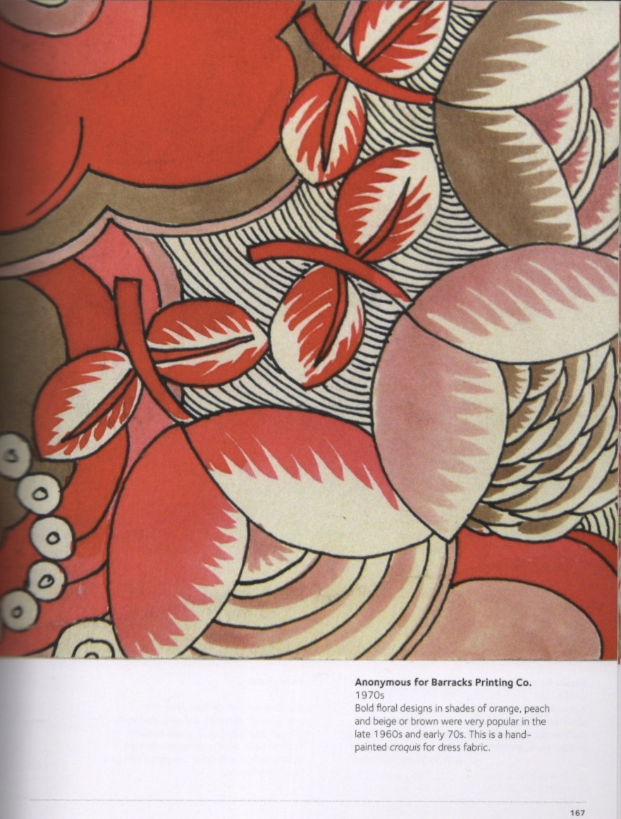
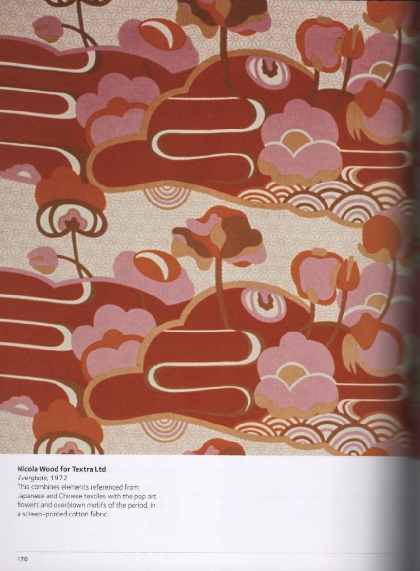
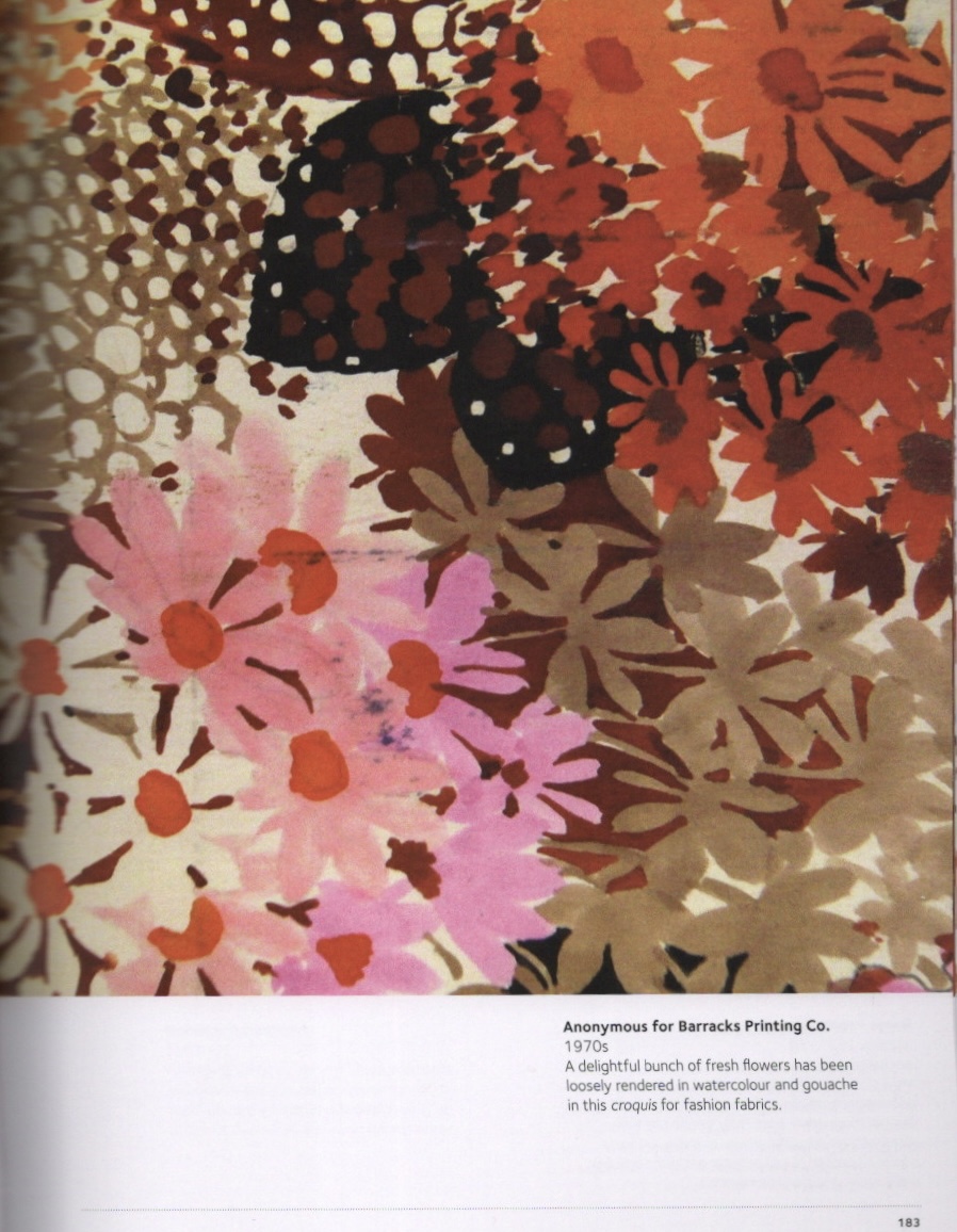
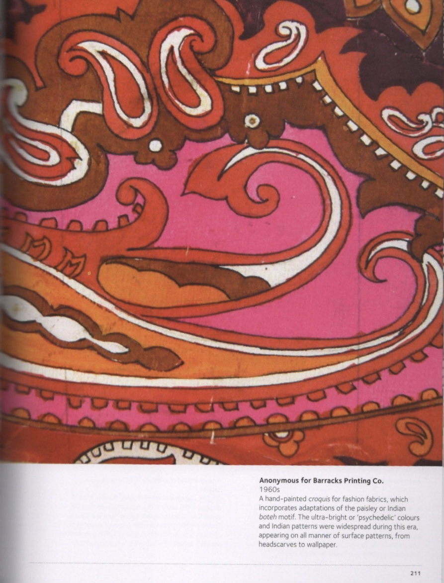
Pages from The Pattern Sourcebook by Drusilla Cole
Pages from The Pattern Base by Kristi O’Meara
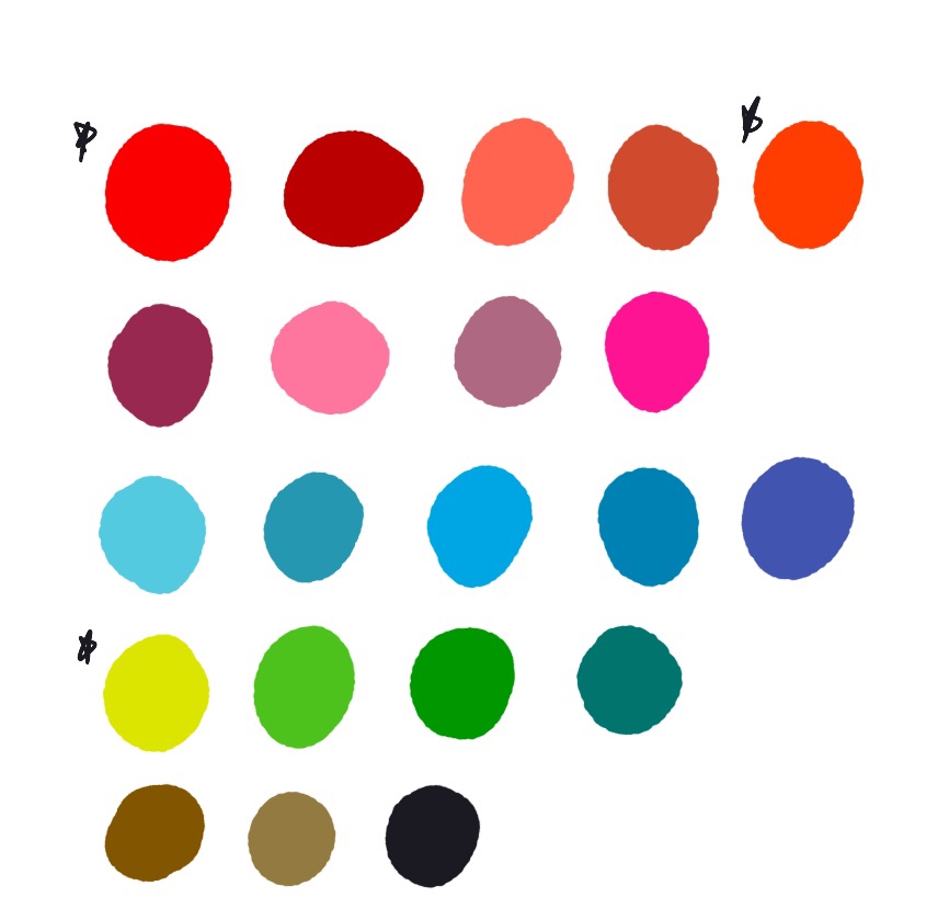
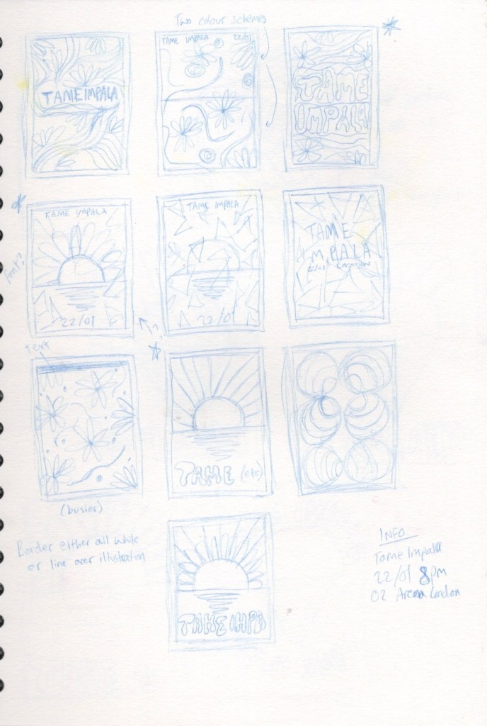
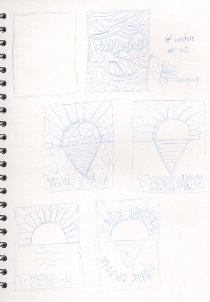
Using the reference imagery I had collected online, I created a basic moodboard to reference from. I then selected a range of colours that I felt stood out or were frequently used throughout. I also created a swatch sheet of colours selected from the Tame Impala posters to ensure I would remain within their creative style. At this point I had many ideas for the theming of my poster and jotted down some of them. I was drawn to the floral designs commonly seen in the reference I had gathered, the random abstract swirls, and the geometric patterns. The usage of orange tones seemed prevalent too, and I wanted to include this in my final piece.
The mood board I created with colour palette ideas, and some colour swatches taken from Tame Impala’s pre-existing posters
Ensuring my poster looked vintage was important to me. I own a set of ‘Magic Paper’ files for Procreate which add various textures to your entire illustration. I tested these out in order to find one I felt would work best. The ‘cork board’ paper texture provided a nice grainy effect to the canvas, and I decided to work with this. I also tested out some brushes as I felt the ones I typically use may not work best in this context. Another way I wanted to reference the psychedelic era was with how I used text – incorporating it into the illustration rather than laying it on top.
Some examples of how different ‘magic paper’ files impact illustrations, including the cork board file I used for my final work, and a sheet of brush swatches
Besides a general ‘psychedelic vibe’, illustrative text, and pattern involvement, I wasn’t sure on the actual content of my poster. Many of Tame Impala’s existing posters don’t have specific content beyond this, so they were hard to draw inspiration from. I decided to begin sketching out any ideas I did have, however, in the hopes that it would produce more ideas and get my creative juices flowing.
My first idea thumbnails
I began by sketching out some small thumbnails and filling them with various ideas. This did, as predicted, help me develop ideas even further. I also decided on what information needed to be included – the artists name, a date for the concert, and a location. I chose two of my favourite ideas and drew some larger thumbnails on a different page to develop them further. The first of my favourite ideas was quite set in my mind and difficult to develop at this point as it thrived of the randomness and abstract qualities it had. The second idea, however, I wasn’t totally happy with and wanted to work on further.
Further developing my favourite ideas
The final thumbnail I sketched out ended up being my favourite for this design. I opened an A4 canvas in Procreate and began sketching out the two poster designs I liked the most. I then created line visuals indicating where content would go in the finished illustration. For the first idea, I was still at a point of struggling with communicating it. The finished illustration would be quite complex and abstract, so planning it to this degree felt like ‘ruining’ the randomness of it. Instead of plotting out exactly where every flower and line would go, I added a few flowers to show that they would be included, and some rough line art to show the general concept.
Line visuals for my two favourite design ideas
The abstract floral design was my favourite of the two, and the one I was the most excited to develop further. However, looking at the pre-existing Tame Impala posters left me very uncertain. I didn’t feel like this design fit the same theme or worked alongside them. I decided to step away overnight and look back at it the next day to make sure I was choosing the correct design.
It was hard to give up on the design I was most excited about. I felt the second design was too boring and plain, whereas the first design had a lot of activity and movement within it. Ultimately, the second design did work better as a Tame Impala poster. I realised I could add patterns within the shapes and still meet my criteria on theming. The next step was to create colour visuals and figure out the direction I would be taking this piece in.
Various colour visuals for my final illustration
Incorporating the orange tones I initially wanted was easy with this piece, as the sun and rays coming from it lend themselves to those colours naturally. As my aim for this poster was for it to look like an abstract geometric sun rising over the sea, I chose to use blue tones for the lower half of the poster. Blue and orange are complimentary colours, so this worked well together. Finding the right shade of blue was tricky though, and I really struggled to find one that felt ‘right’.
Trusting my ability to intuitively pick colours whilst working, I decided to begin the final illustration process and hope the right shade of blue would come naturally. The magic paper layers I was using altered the colours too, which meant the shades of blue looked differently in the final piece. I also knew I would be adding pattern to the piece and hoped this would make the colour choice work better.
A time-lapse video showing my final illustration process
Using my line visual as a base, I began outlining the elements of my illustration. I then added colour and pattern. I chose a marbling pattern similar to one used previously in Tame Impala’s posters. I added this to the sun and also to the blue background as I felt the contrast in placement of the pattern would look most visually appealing. The marbling improved the colour of the sea area as I had hoped it would. I also changed or removed the line art to better fit the theme. I decided to add a ‘shadow’ on the reflection in the sea, too, to add a little more content to the image.
My final illustration
Next, I started considering how I would add text for the remaining information. I was keen to use Tame Impala’s signature font for this. Some research showed they use the font Microgramma which is requires a fee to obtain. I decided to look for a similar free font and found OPTIEdgar Bold which worked as a good substitute. I wasn’t sure where to position the text on the illustration, and I remembered that initially I wanted to add a border. I opened the completed illustration in a new A4 canvas and resized it in order to have a border displayed. I then added the date and location of the concert at the bottom of the poster, on the border.
My final poster with text added
I played around with the colour of the border for a while before settling on this brown shade. The red undertones compliment the piece nicely and it feels very vintage. I’m not sure, however, if this font – or the border for that matter – works particularly well with this piece. I showed it to some friends who disagreed and said it was very appealing, but I think in general I am dissatisfied with this illustration. I’m impressed with my level of research, understanding of the brief, they way in which I have met my own criteria, and that the poster fits in with Tame Impala’s other designs – but visually as an illustration I preferred the concept of the other design idea I had so much more. That feeling has made it hard for me to feel satisfied and accomplished with this piece.
I decided to find some poster mock-up files in order to see how the illustration would look if used in real life. I hope that this would give me a chance to appreciate it more, or to see any glaring issues and alter them. It took a while for me to find some decent free mock-ups, but I ended up with three that really helped and took my poster to a whole new level.
Mock-ups showing my finished poster design
Seeing the poster in real life scenarios definitely made me feel like it did work as a concept. I would be excited to see this in person, and would definitely at least research the concert to see if I would enjoy going. I think it’s possible that I could’ve experimented with text placement more, but I also don’t think the final text placement looks bad.
I thoroughly enjoyed the process of this assignment. The research and idea development was a lot of fun, and it’s really exciting seeing ideas coming together. I also found it incredibly useful have line and colour visuals available, alongside references and research, as it made the final illustrating stage so much quicker and easier. I’m finding a lot of value in breaking down these stages into smaller, less stressful, self-contained activities, and seeing that the quality of my final work is improving due to this. The exercises in Part 3 have taught me a lot about the benefit of slowing down and taking time to repeat steps and iron out the kinks earlier on. I’m looking forward to taking this into the rest of my work throughout Part 4.
This exercise asked me to create a book cover mock-up for a pre-existing book using either a new illustration or one that I have previously designed. I had to explore how to make a good mock-up, and ensure the book cover included any relevant information.
I have made mock-ups before, notably in the Abstract Illustration exercise. I struggled a little at the time as I do not use Photoshop, but instead Affinity Designer as I prefer to work on my iPad. I was unable to find a tutorial for how to use PSD mock-up files in Affinity, so ended up needing to use a free online software on my laptop. This was a hassle, so my goal in this exercise was to learn how to use Affinity for this task.
I decided to choose Harry Potter and the Philosophers Stone as my book. It is a classic, and I have read it several times, so I know the contents of the book well enough to easily design a book cover. I wanted a simplistic, dialed back, classic look for the cover, as I really wanted to focus on the mock-up part rather than illustrating something. The illustration process for the cover was fun regardless, though I was tapping in more to my graphic design skills than my illustration abilities.
The front and back covers fully designed
I created three panels in Procreate – one for the front, one for the back, and one for the spine. I opted for a deep red background all over with a mustardy gold as a secondary colour – signature colours for the Harry Potter series as it represents the ‘house colours’ for Gryffindor, the title characters’ school house. On the front cover I added a simple outline of the main character’s glasses and the scar he is most known for, as I feel this symbol is so highly recognisable almost everyone would know which book it is. I chose a classic typewriter font for the text as I felt it best complemented the designs. On the back cover I copied the blurb text from a copy I had to hand, and added the outline of a wand with a slight glow behind it. I left the spine plain bar the number ‘1’ – indicating that this is the first book in a series of seven – and the same outline of glasses.
Prior to designing the book cover I researched typical print sizes for covers to make sure any mock-up I tried to use wouldn’t be drastically different in shape and size. This made the mock-up creating process somewhat easier, but it was still complicated. I began looking online for some free pre-made mock-up files to work with. I found a file with multiple book mock-up options on mockup-design.com that had a royalty free license. I also, to my excitement, found a video tutorial on using PSD mock-up files in Affinity Designer. I watched the video and figured it would be incredibly easy to put together the final mock-up. I was sadly wrong.
I opened the first mock-up file in Affinity, hoping to have a layout of the front, back, and spineall together. I followed the instructions in the tutorial placing my image into the document where required. It was working well so far! However, the book cover I had designed was 2D, and a mock-up is created to look 3D. This meant some distortion was required on the book cover image in order to make it appear as if it was really a book lying there on a table. That’s easy enough, I’ve done it plenty of times before. Unfortunately, and to my despair, Affinity Designer lacks a distortion tool. I don’t understand the logic behind this, but I now had a huge hurdle to overcome.
Procreate does have a distortion tool, and I’m very familiar with using it. It has limited capabilities though as it is primarily meant as a pixel art tool. I figured I could open the file in Procreate, reshape the book cover images, move back into Affinity, then place the newly shaped images into the mock-up. Even this, however, had its difficulties. In order to achieve a perfect alignment, I needed my image layer to have low opacity. If I changed the opacity of the image after I had already started distorting it, the nodes would move and I wouldn’t be able to achieve such intricate movements. Some of the files were too large of a size for Procreate to handle, or had layers within that were incompatible with it’s capabilities.
After much trial and error (and frustration), my solution ended up being as follows:
Open the mock-up file in Affinity Designer
Save the file as a JPEG image
Open the image in Procreate
Open the book cover image in the same document
Lower the layer opacity of the book cover image
Distort the image to fit the mock-up book
Restore the opacity to the image, and save as a PNG (making sure to remove the background)
Open the mock-up in Affinity once again, and insert the distorted image
Fit to the boundaries of the mock-up and save the completed image
This is a long-winded and slightly frustrating way to achieve a completed mock-up. But, it works! I wish Affinity Designer had a distortion tool as it would improve my life hugely in this regard. I might be able to find a quicker, easier solution to creating mock-ups, but for now this works fine even if it does take a little extra time. I was able to create two book cover mock-ups using this method and my illustrations, and I’m really impressed with them. Even if the cover is quite simple, I feel it is something I would actually see in a shop.
My finished book mock-ups
I am glad I achieved the goal I set out to in this exercise. I now have some way of creating mock-ups from my iPad, which does help in some regards. I can see how useful mock-ups are for designers to use when selling their work. Viewing your work in the context it is made for can help with making design choices and ensuring it looks how you envision it without going through the manufacturing process. I really enjoy being able to see my work in real world contexts and would like to include making mock-ups in my design process.
I would like to preface this by saying that I am unlikely to work with clients in the future due to health issues, so at the time of completing this exercise I felt frustrated and saw little point in doing it. In hindsight, having used the knowledge from this exercise in Assignment 3, I can see how this step in the illustration process is valuable whether I am working for myself or for a client. It helped me see issues in my work in advance, and better plot out what my final piece would come to look like. Going forward, in client focused exercises, I intend to focus on how this benefits me as an artist outside of commercial work and try to get as much out of them as I did from this.
This exercise was intended to help me edit an image to its main structural form and to practice creating a clear visual. I had to pick two finished illustrations that contain a range of content, then reproduce them at least two and a half times larger and in proportion to the original illustrations. I had to create a line visual describing the content within the illustration without adding colour or detail.
As the illustration had to be recreated at 2.5x the size of the original, I decided to pick a relatively small illustration to work with. I have a deck of tarot cards illustrated by Kim Krans that I felt suited the exercise well. They are printed at 7x12cm, so I worked at 17.5x30cm. I picked a handful of cards that I felt had a lot of content, and from that I created line visuals of two of the illustrations.
Illustrations from The Wild Unkown tarot deck
The first illustration was of a leopard surrounded by beams of light with the four suits of tarot – Swords, Pentacles, Wands, and Cups – at its feet. I began sketching with a light coloured pencil, marking out the shapes and general forms. I then used a darker colour to emphasise certain lines and indicate where detail should be. I chose to add a small area of pattern to the leopard to indicate that it would be covered in it. I also indicated where the text would go.
My first line visual
The second illustration was of a lion holding a rose in its mouth. I chose to be slightly less detailed and more indicative of general shapes in the line visual I created. I struggled with this, as it didn’t look great visually as I didn’t feel I’d created a good representation of the lion. I emphasised some lines around the rose to make it stand out against the lion’s mane, but otherwise left the line visual in the lighter base colour.
My second line visual
I feel like I could’ve explored this exercise more, but I was struggling with the nature of working backwards from a completed illustration, and I also had a hard time selecting illustrations to work from. I can see the importance in creating line visuals to show how final illustrations will look, especially in the context of working with a client, but I think I would get more use doing so in my own work rather than working from pre-existing designs.
For this exercise I had to make a small collection of items around a chosen theme and then use a digital camera to photograph the objects from various viewpoints. I was meant to experiment with zooming in and out, angles and positioning, different combinations of shapes and textures, and how the objects could be placed with each other. I then had to draw the various still life layouts in formats that differ from my camera viewpoint in order to further explore them. Finally, I had to pick my favourite design and ensure it communicated a specific idea about the theme I picked, and then draw it on a larger scale.
Out of the four themes – ‘Festival’, ‘The morning after’, ‘Summertime’, and ‘Workshop’ – I felt the most accessible to me was ‘Summertime’. I was quickly able to gather objects for this; a swimming costume, some suncream, my passport, a water bottle, a pair of sunglasses, a baseball cap, and a floral headband. This selection fit the theme well and also offered a wide range of textures, patterns, shape, and size, allowing me to experiment more. I then arranged the items on a small square table, hoping it would come in handy as a border later on.
At first, I very carefully positioned the items, ensuring everything was visible and organised. I then photographed this arrangement from various angles, exploring the possibilities. Through doing this, I started seeing how I could rearrange the items to look more exciting and tell different stories. Different viewpoints suited different arrangements better, and once I started photographing I could envision these changes easily. I then started moving around the items quite a bit, changing them depending on the angle I was photographing and the message I wanted to convey.
The photos I took
I actually found the process of moving around the objects more useful for exploring viewpoints than the photographing. Taking photos was helpful as it enabled me to see the items in a different light, but from these photos I continued to move around the objects, seeing what I could create next. It was very useful for idea generationand exploring how the placement of items can change the mood of a scene.
My 5 favourite viewpoints and compositions
In total I took around 40 photos. There were 5 in particular that I thought had really interesting viewpoints which I wanted to explore more, as they had quite different viewpoints and conveyed very different feelings. I also wanted to sketch some less ‘appealing’ compositions, just to experiment and see how they work out. I began by drawing out 7 shapes, aiming for irregular and unusual, in order to draw out my still life. I wasn’t thinking much at the time about which images I would reproduce here, which was useful as it forced me to work in shapes I wouldn’t normally.
Sketches exploring formatting
Next, I picked viewpoints that I felt fit each shape best, ensuring the message could be communicated and the objects in the still life clear enough to be understood. This sketching process was really enjoyable. I liked trying to figure out how to position objects within the confinements of my frames, and I felt like the progress I have made with sketching and drawing was highly visible. My favourite frame shapes were the square, the circle, and the odd zig-zag cut out I had drawn. I really liked how full the circle and square frames were, the busyness and sort of chaotic and spontaneous compositions within them appealed to me more than the more orderly, clear layouts of the other sketches.
The zig-zag frame was simply fun and different, which I appreciated too. When sketching within this frame, I started thinking about other ways I could utilise this ‘cut out’ effect. I considered a possibility of adding opaque circles of colour over a sketch, randomly and almost ‘cutting out’ or highlighting areas of it. I decided to continue with this idea and experiment with it a little, seeing how it impacted the composition and layout of my piece. I did a very rough sketch of one of the photos to act as a base for the colour, then used watercolour paint to add circles. I did like the concept, but wasn’t sure if it was right for this composition or exercise.
Further sketches and experiments
In my initial sketches I only sketched one of my five favourite images, so I decided to draw out four more frames and sketch the remaining layouts. Throughout the sketching process I had been considering what mood I wanted to convey with my imagery. I settled on ‘fun’, as I felt this was very summery and could be expressed easily with the viewpoints I had explored. The four square sketches I completed didn’t quite scream ‘fun’ to me – my favourite was still my initial square sketch. It felt a little too chaotic, however, and some items were unrecognisable. I went back and looked through my photographs again and found a similar composition and viewpoint that I felt was a clearer image and still conveyed ‘fun’.
The basis for my final drawing
I chose to stick with the square format as I was enjoying how my sketches looked. I also decided to zoom ina little to get a fuller image. I then sketched out the composition in a lighter colour pencil, before going over it with a darker pencil and establishing the lines. When drawn on a larger scale without colour or a great deal of shading, I feel like there’s too much empty space in this image. This could be changed slightly if I had added the pattern to the swimming costume, but I opted not to as it was quite complicated. I really like the composition, however, and definitely think it could be a starting point for a completed illustration.
My final drawing
There were several different words I think these objects illustrated – ‘holiday’, ‘packing’, ‘beach’, ‘prepared’, ‘summer’, and of course ‘fun’ – are all examples I came up with when exploring the viewpoints. It was really interesting to see how changing the composition of the objects, along with how the objects were being viewed, changed the meaning of the image. I felt it was a useful tool for idea development and exploring possibilities when reaching a final design. This exercise also helped me with learning the importance of drawing the same object repeatedly, especially from many different angles. I gained a lot from doing this and I would like to repeat the exercise often with various objects in order to widen my drawing abilities.